
Abstract
Background:
Self-monitoring blood glucose (SMBG) is facilitated by application available to analyze these data. They are mainly based on descriptive statistical analyses. In this study, we are proposing a method inspired by artificial intelligence algorithm for displaying glycemic data in an intelligible way with high-level information that is compatible with the short duration allocated to medical visits.
Method:
We propose a display method based on a numerical glycemic data conversion using a qualitative color scale that exhibits the patient’s overall glycemic state. Moreover, a machine learning algorithm inputs these displays to exhibit recurrent glycemic pattern over configurable extended time period.
Results:
A demonstrator of our method, output as a glycemic map, could be used by the physician during quarterly patient consultations. We have tested this methodology retrospectively on a database in order to observe the behavior of our algorithm. In some data files we were able to highlight some of the glycemic patterns characteristics that remain invisible on the tabular representations or through the use of descriptive statistic. In a next step the interpretation will have to be done by physicians to confirm they underlie knowledge.
Conclusions:
Our approach with artificial intelligence algorithm paired up with graphical color display allow a large database fast analysis to provide insights on diabetes knowledge. The next steps are first to set up a clinical trial to validate this methodology with dedicated patients and physicians then we will adapt our methodology for the huge data sets generated by continuous glycemic measurement (CGM) devices.
Keywords
Diabetes is a major problem1,2 in terms of both public health and economic costs for all affected countries. This study focuses on patients suffering from type 1 diabetes. For this type, many studies recommend and demonstrate that the use of self-monitoring blood glucose (SMBG) meters offers significant progress for managing diabetes in terms of reducing hyperglycemic and hypoglycemic periods. Understanding the significance of self-monitoring data is greatest when glycemic data collection has been organized in a structured manner.3-7 The structure of these data is enhanced by adding key information, such as daily life information. The use of more recent personal glucometers makes it easier to record information (semiautomatic process). All these data should be taken into account upon each physician’s visit in order to yield objective quantitative and qualitative information on glycemic events that occurred over the period prior to the visit, thus allowing the physician to establish a detailed diagnosis. The amount of data recorded over a 3-month period may however contain several thousand measurement points. This mass of information—considered as Big Data—must then be preprocessed with analysis software to provide the physician with a summary overview. Some manufacturers of self-monitoring tools provide the basic analysis and data visualization software with their glucometers. These software programs perform statistical analyses on various time slots during the day or on specific days of the week.8-10 Statistical analyses are often in a conventional descriptive format and remain largely unused by practitioners during consultation and decision-making. 11 In general, these calculations are restricted to the mean, median, standard deviation, and interquartile (between first and third quartiles); they are presented in tabular format. These tools also feature graphical display modes that use conventional statistical representations; a few such modes will be described below. The time series of blood glucose values are often shown by a scatter plot Figure 1. The scatter plot is often superimposed with other information, as is the case with several diabetes management software packages. For example, the average daily value gives an overview of the glycemic trend over an extended period. This value is often qualified by the standard deviation, which provides critical information on the variability of blood glucose. Hirsch 12 and Kovatchev 13 used this information to indicate the level of glycemic control a long-term risks as a more reliable indicator than HbA1c taken on its own. Using the mean value and standard deviation has drawbacks however: very sensitive to extreme outliers and the interpretation of standard deviation is biased due to the non-Gaussian, yet not right-skewed, distribution of blood glucose values. According to Rodbard et al the median would be more representative than the average because of its lower sensitivity to exceptional extreme values, as opposed to the average when the number of measurements is sufficient. Also according to Rodbard et al, the overlay of the median line and the first and third quartiles on the graph of the daily blood glucose values, when correlated with meal times and dedicated time segments, is more relevant and understandable than a histogram or distribution of repetitions (frequency distribution), which results in information loss on specific observations. Histograms are used to depict the distribution of blood glucose values over time and to identify the rate of hyperglycemia and hypoglycemia associated with a color code Figure 2. This representation with histograms clearly highlights the asymmetric distribution curve (ie, non-Gaussian) “sliding” to the right. One consequence of this asymmetry in the time series representation Figure 1 is a graphical minimization of hypoglycemia as compared to hyperglycemia, which appears to be more accentuated. Correcting this bias by applying an operator, such as the logarithm (log10) may compensate for the asymmetry and then results in a normal type data distribution. 14 Moreover, this transformation allows for the use of many statistical tools, in assuming data normality: blood glucose variability constitutes an essential element. One of the best evaluators for variability, according to Rodbard, is the IQR (or interquartile range) is not sensitive to extreme values (outliers) and does not require a normal distribution. Boxplot provides a quick understanding of all components, as shown in Figure 3. Although helpful for its visual and synthetic layout, this representation remains nonintuitive for those without an extensive background in statistics. Other forms of graphs are often available, such as “pie”. Additional materials include data sheets in tabular format with glucose measurements per time slot, medications, insulin injections, and other background notes. Through various studies,15,16 Rodbard suggested to modify conventional methods of viewing data from SMBG in order to adapt to physicians’ constraints during their quarterly consultations. Using a color code or “stacked bar graph”, Figure 4, while facilitating and accelerating the interpretation of glycemic measurements over several months. This visualization requires a learning phase dedicated to the large, which prove to be less intuitive. Other studies make use of glucose measurements by adding a predictive characteristic. An alternative glucose index has been developed to predict abnormal glycemia as a means of optimizing diabetes treatment and monitoring. Kovatchev et al introduced a new variable to determine the risk
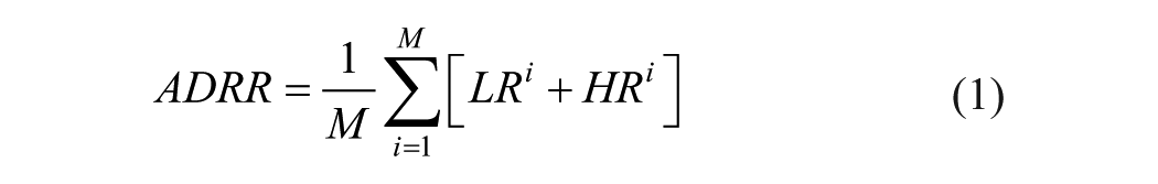
of hyper-/hypoglycemia: ADRR, or the average daily risk range for associating a risk index with a given period. Equation 1 shows that the expression of this variable does not use raw glucose values but instead a standardized form to output the same weight to hypoglycemia as to hyperglycemia. For each glucose value, an index is then calculated separately for hypoglycemia (L) and hyperglycemia (H) on each day i, for averaging over the entire period M. This variable is used to predict abnormal glycemia (both severe hyperglycemia and severe hypoglycemia), which according Kovatcev et al has a good level of robustness since at least three blood glucose measurements are required daily for 14 days. This performance has been evaluated experimentally on a clinical trial. On the other-hand, through use of data mining methods, Bellazzi et al proposed a combination of signal processing methods and artificial intelligence tools. The first step consists of modeling the time series (TS) glucose values as the sum of three components:

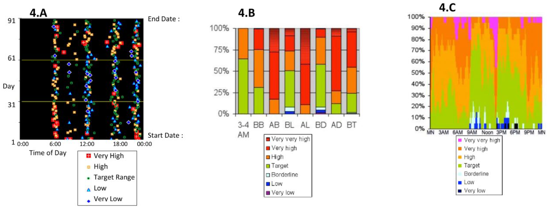
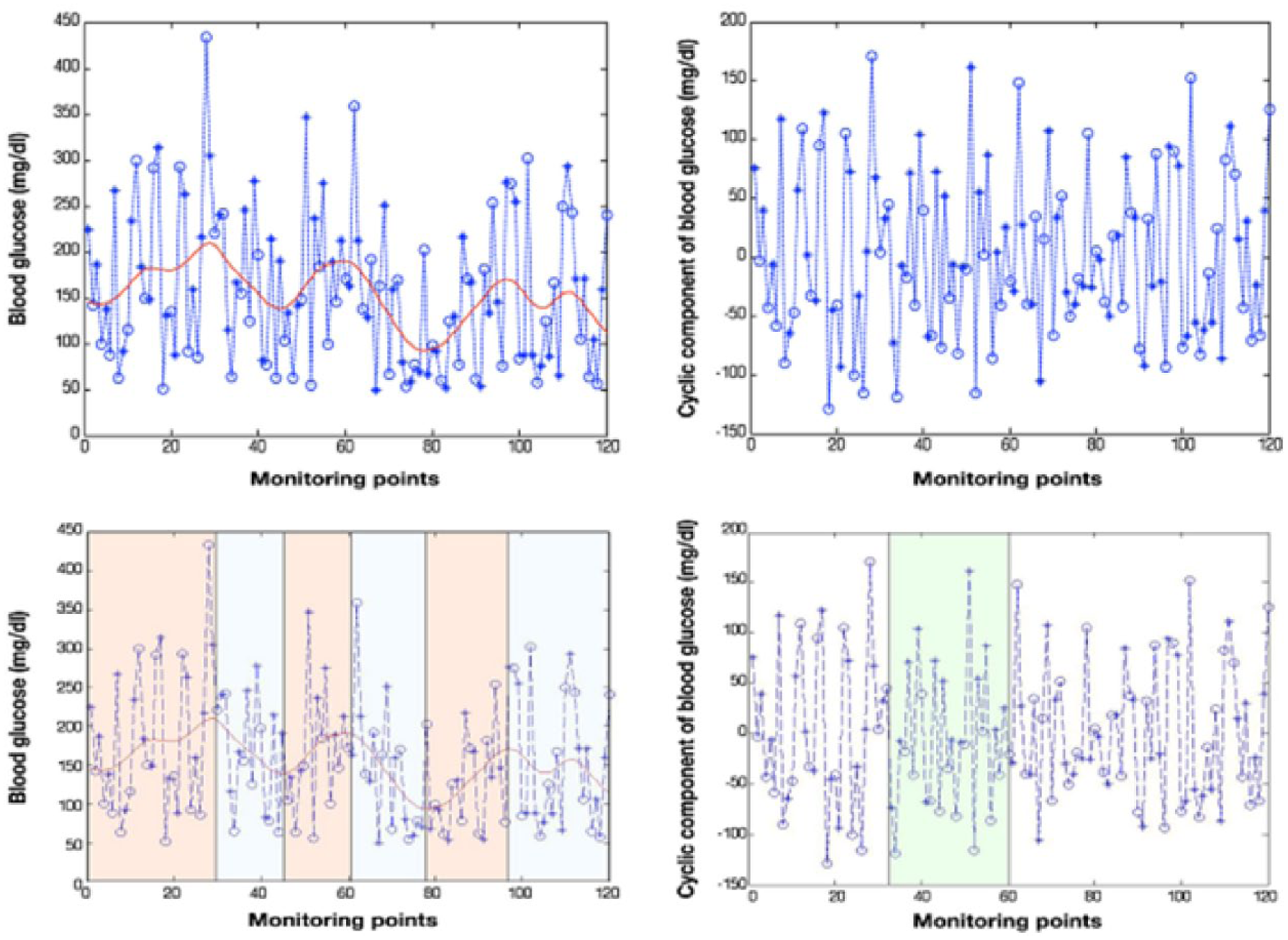
where Ti denotes the trend component, Ci the cyclical component and εi the stochastic component. These three components are extracted from the data using various mathematical tools (Kalman filters, least squares, etc). An artificial intelligence technique called temporal abstraction (TA) will then serve to define the temporal interval sets characterized by the occurrence of exceptional event(s). For example, the TA “state” will all be time intervals characterized by a state in {low, normal, high, very high} (in terms of blood glucose). For the TA “trend” among {ascending, descending}, the determination makes use of the decomposition step in Equation 1. This structural analysis (TS) and the temporal abstractions (TA) applied to the analysis of blood glucose time-series data are shown in Figure 5, where Bellazzi et al applies a blood glucose time series on two time slots (+ = breakfast, O = dinner). The left-hand panels display an extraction of the Ti component from Equation 2 of the raw data with a red line. These trends are indicated by the superposition of yellow rectangles (upward trend) and white rectangles (downward trend). The graph in the upper right shows the filtration of the cyclical component Ci from Equation 2. It is straightforward to isolate the marked green area characterized by a TA “maximum sugar for breakfast” and the TA “minimum sugar at dinner”, which might be viewed as a conjunctive rule. This relatively complex approach is far from intuitive, yet it allows extracting high-level information that is complementary with statistical approaches. More recent publications17,18 use pentagon to display multiple parameters (5) with synthetic view Figure 6 or group different information (from different institutions, different devices) in a optimally organized view to minimize cognitive load and maximize effectiveness of diagnosis. This study seeks to develop a graphical representation that simplifies the monitoring of blood glucose levels over a long period (approx 3 months) by highlighting, through data mining algorithms, recurrent glycemic patterns characteristic of the patient’s behavior without requiring the use of calculation or prediction algorithms. This objective is achieved through adapting a visualization method used in other applications (temperature maps, DNA expression level maps) to glycemic data. To simplify the process with smart connected glucometer device we developed a prototype application embedded with the proprietary software of the glucometer. This visualization is an extension of the scale developed by Richard M. Bergenstal et al. 19 In this article they suggested a dashboard called AGP (ambulatory glucose profile) for glucose reporting and analysis with numerical indexes (avg glu, %HbA1c, SD glu, IQR glu, freq for different ranges of glu, etc) and nested time plots (for the hours of the day or days of the month). In this article we use the term profile in a different way than the one used by Bergenstal. We call profile a significant color pattern over time rather than an AGP report summarizing several metrics.
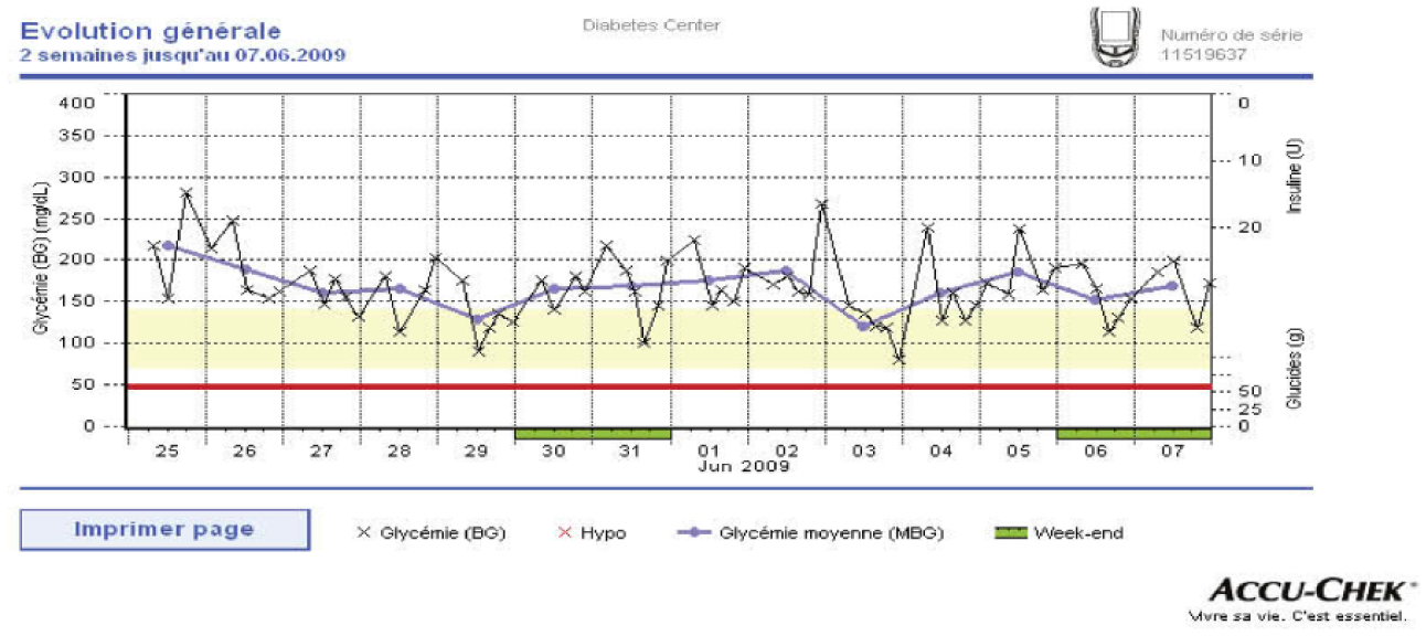
Graph of temporal variation of glycemia superposed with daily mean values (critical hypoglycemia threshold set to 50mg/dl).17 Accu-Chek Smart Pix software V3.0 Roche.
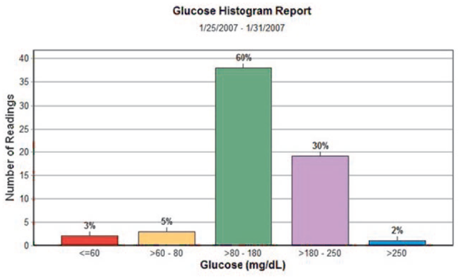
Density of distribution of blood glucose values associated with a color code (software CoPilot V4.2 Abbott).
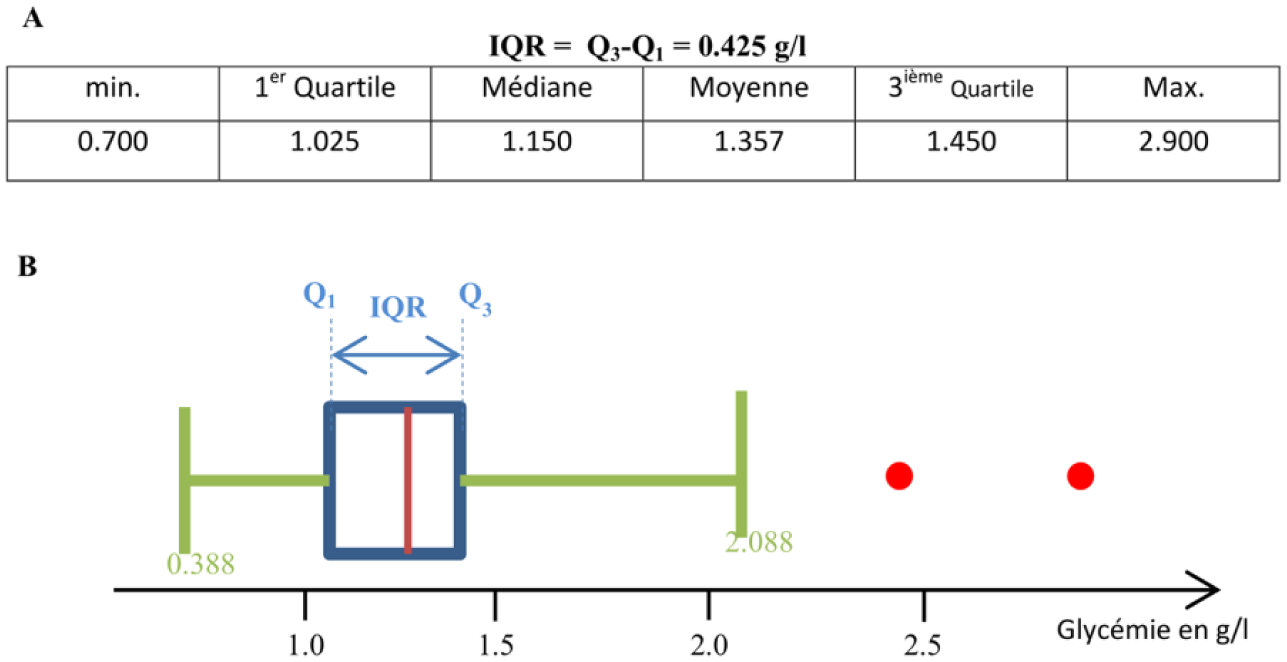
Representation of the dispersion by IQR in (A) tabular form, (B) graphic boxplot type.
Representation of different blood glucose values according to Rodbard 2009 15 : (A) scatter plot with graphic symbols and color coding for 3 months; (B) color-coded stacked bar graph on dense data.
Structural analysis and temporal abstraction proposed by Bellazzi et al. 22
Glucose pentagon representation with 5 parameters.
Materials and Methods
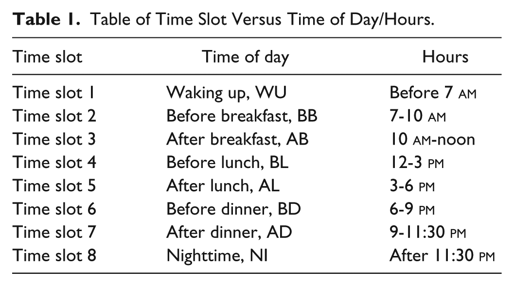
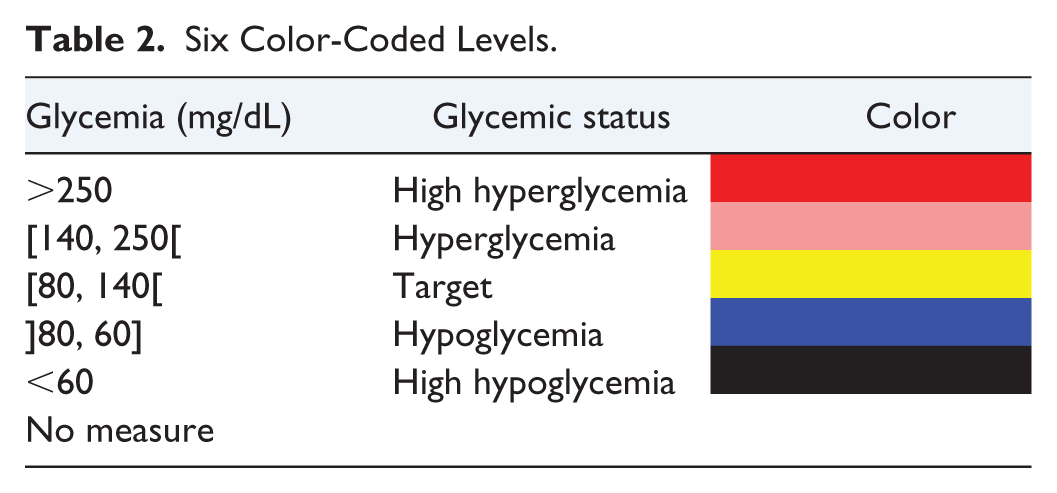
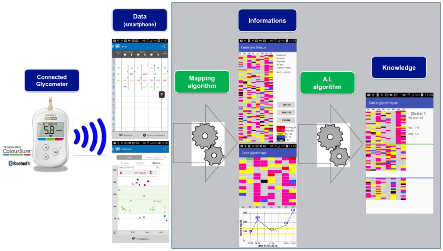
We use anonymous glycemic data from a database made of 62 patients using several glucometer devices. The content collected herein included time-stamped measures of glycemia (with date, time, and time slot), other contextual information and unrestricted comments. For this study, we only considered the values of time-stamped glycemia for all days regardless of the number of data points they contain. The first data processing step consists of standardizing the data from different device brands in order to generate a unique output. For this purpose, we employed a matrix structure, whereby each row represents a day and each column a time slot number in chronological order. The correspondence between the time slot number and the time of day is synchronized with the glucometer definitions set by the patient though a default mapping table could be used. These times of day must naturally be tied to the patient’s eating habits to ensure maximum relevance for the analysis (see Table 1). The second step entails transforming the numerical scale of blood glucose levels into a qualitative scale that highlights information on the patient’s glycemic status rather than the numerical value of glycemia. To be successful, we used a color scale encoded on 6 levels (see Table 2 and Figure 7).
Table of Time Slot Versus Time of Day/Hours.
Six Color-Coded Levels.
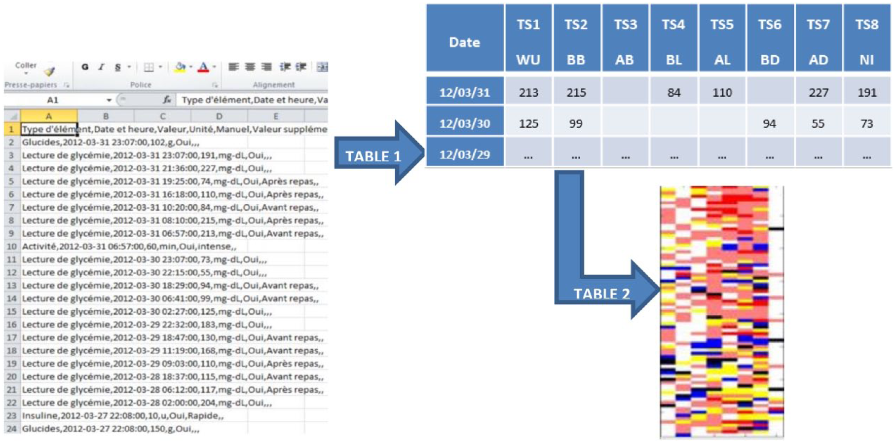
Process raw device data (~400 rows) to standard glycemic matrix representation transcoded with 6 color level.
In Table 2 physicians suggest 5 categories of glycemia according to their severity. Bergenstal used a similar scale with 6 levels of severity. In our demonstrator these levels can be modified, if necessary, by the physician.
The core of our process is based on artificial intelligence algorithm (AI involves machines that can perform tasks that are characteristic of human intelligence) to make emerge high-level meaningful information (ie, knowledge).
Machine learning is simply a way of achieving AI, it is a process based on analysis of some training data sets. That will allow us to highlight relevant information. Machine learning is not here used to generate a predictive model since it has been often described that diabetes is quite complex to predict. We focus our effort in understanding the recorded information instead of setting any prediction. In this perspective adding more data samples would not necessarily improve our algorithm. For this task, we applied an algorithm that consists of grouping a set of multidimensional vectors according to their similarity. Each group will thus be of a homogeneous composition and suitable for characterization by a single consensus vector. In our case for example, all vectors will be the days, and each time slot will represent one dimension of the vector. In comparing daily returns to evaluate their similarities in terms of glycemic profile (ie, time slot values), we obtain groups of similar days and can proceed to identify patients’ “glycemic pattern” characteristics (depending on group size—cluster). With a more formal expression, we can model this problem and solve it using the K-means algorithm: 20
Let

where
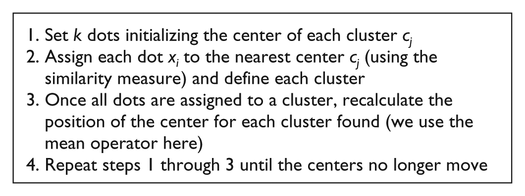
The execution of this algorithm is illustrated in Figure 8 for m = 2 dimensions (time slots)
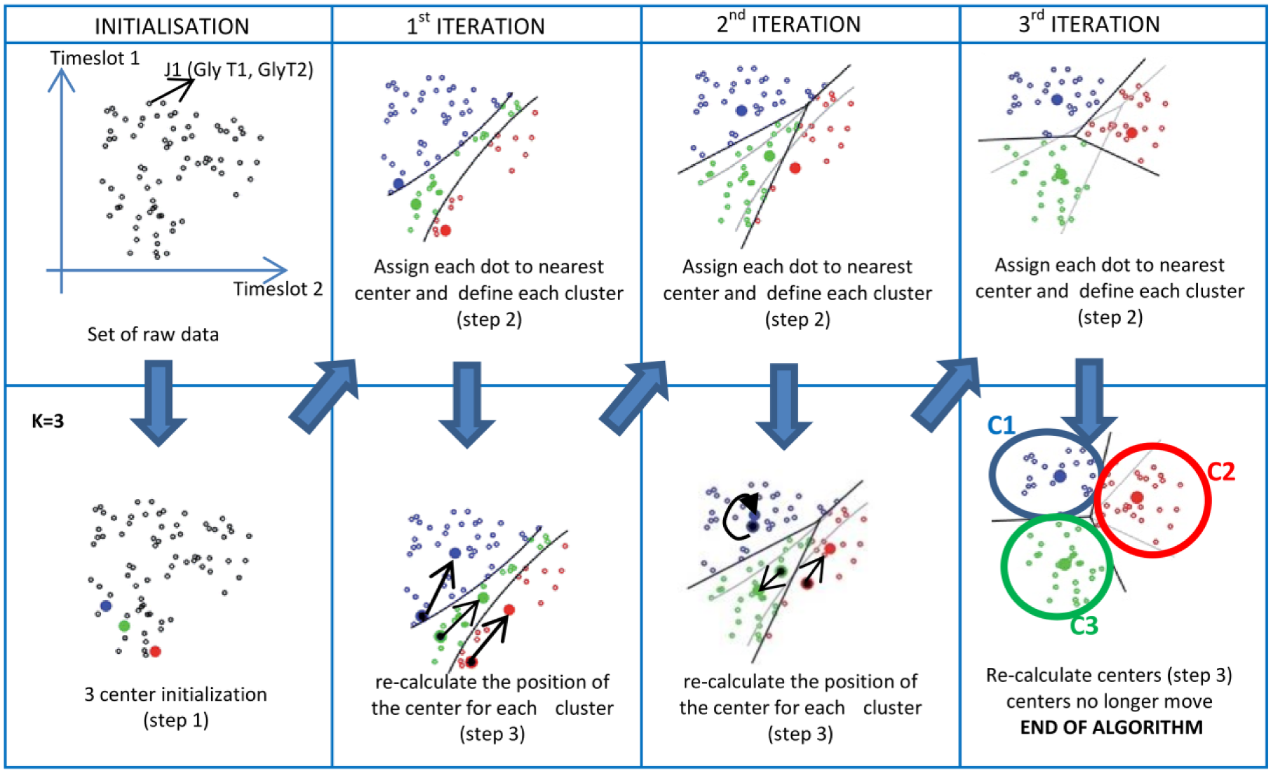
K-means algorithm step by step. To simplify we used only 2 time slots (2Dgraph). We identify 3 groups of points in the scatter plot that represents 3 characteristic glycemic patterns.
To test and select clustering algorithms (unsupervised classifier) we have used the data mining workbench of machine learning WEKA developed by the Waikato University.
The main parameter to challenge is K, the number of cluster that we choose to be understandable according to the data by experience.
The second parameter is the type of the distance between objects to compare to achieve classification (objects are vectors of glycemia per day denoted by
Results
To develop a demonstrator, the algorithm has been implemented in an Android smartphone. We analyzed data file that we transferred to the phone one by one. The analysis was performed one set of data at a time. For all of them, a visualization map was processed then using k = 3 for the K-mean algorithm, we had some clusters defined for every of the 62 samples. But only 19 were clearly understandable. We chose one of them as an example for the demonstration
The analysis of raw glycemic values data in the digital matrix is obtained by means of a qualitative conversion according to the 6 color code, it may now be used to identify consensus glycemic pattern during the period between two quarterly consultations (ie, approx 90 days) applying K-means algorithm. One example is provided in the Figure 9. This glycemic map with high variability does not, at first sight, reveal any general color trend. Use of the K-means algorithm on all days for k = 3 (this parameter was found by iterative test with incremental values for K. The value used is the one that gives the most interpretable patterns) yields the two following groups, with each representing a dominant weekly trend. The first cluster, which covers 34% of days, shows that the patient is hypoglycemic before and after breakfast and hyperglycemic before and after dinner and then hyperglycemic and highly hyperglycemic at night. This glycemic map also emphasizes missing data that could also be interpreted.
The second cluster—made of 24% of days—indicates that the same patient is hypoglycemic when waking up as opposed to hyperglycemic both before and after dinner but does not measure glycemia at night.
These two clusters provide useful information for the physician to complete his diagnosis, which is considerably more difficult when just looking at glycemic raw data.
From another data file we could use parameters of the application to restrict the analysis for only post- and preprandial timeslots, the result of the clustering on the Figure 10 identify 2 dominant clusters: one for hypoglycemia during wake-up (45% of the days) and one for hyperglycemia during dinner period (59% of the days).
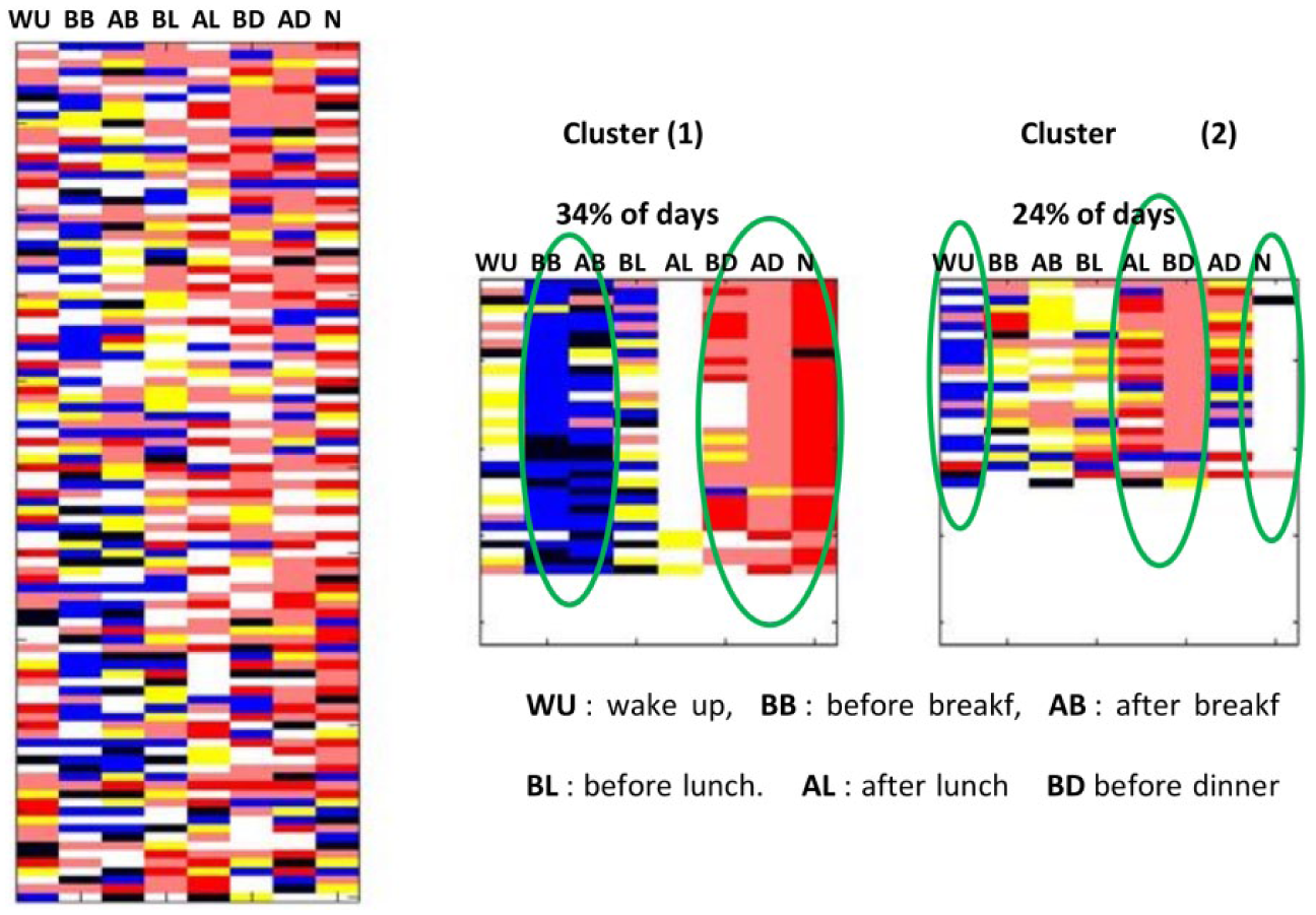
Highlighting weekly behavior by applying the K-mean algorithm.
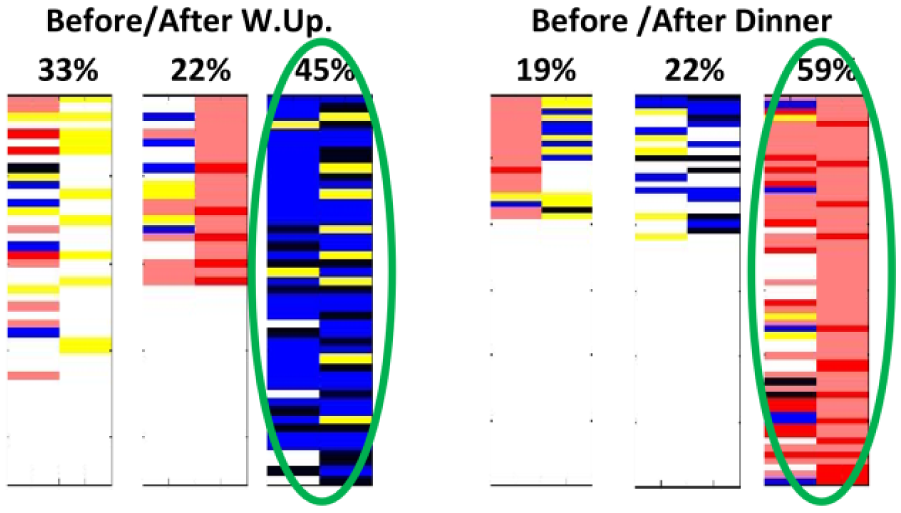
Pre-/postprandial analysis.
Discussion
We initiated this study after the physicians’ feedback of an unmet need for data visualization. Through their practices, recovering glucometer data was already a technical challenge. Using the device provided interface or previously described method for data visualization required technical options that often they could not install in the Hospital network. Our main goal was then to provide an easy-to-use tool, interoperable, or at least used on a very friendly interface that would provide, at a glance, as much information as possible. This is why we did not compare our process to any other existing ones. Then the expertise of the physician would complement the analysis. The algorithm was supposed to preanalyze more information than a regular human brain can do, in a short time and provide a visual scale according to the thresholds asked by physicians themselves.
Through our methodology, we follow a two-step process. The first one is a global intuitive visualization of data through a color-code overview. Three technical advantages are that (1) reading and interpretation are instantaneous (compared to a numerical value in tabular format), (2) no need for pretreating the blood glucose values to compensate for the “asymmetry” of hypoglycemia since the color code is neutral, (3) the reading step is independent of the blood glucose measurement unit (either mg/dL, mmol/L or g/L).
The second step results in applying an machine learning algorithm that provides the physician with a thorough analysis of the patient’s most frequent glycemic pattern based on several significant periods (eg, weekly, pre-/postprandial, day of week, time slots, waking up in the morning/nighttime). This postprocessed information of glycemic data is based on heat maps visualization; interpretation can therefore be processed very quickly with minimal training.
We can anticipate three levels of benefits of this methodology once deployed as a mobile application (Figure 11; through the pilot study, the app has been deployed on Android phone; the demo version is available upon request):
1- For the physicians: During the visit, more data will be globally analyzed to overcome a specific behavior we noticed through patient data: the “white coat effect”. The patient behavior in monitoring his glycemia could be different the month before the visit in comparison with the months before. Through our process, a bigger time scale of data is considered avoiding any “cheating” or “misleading” on data collection. Furthermore, data are postprocessed for physician convenience, to emerge the knowledge on glycemic repetitive motifs and patterns that could not be qualified otherwise.
2- For the patient: The visual representation of data should be more intuitive to understand the daily data. That could bring a new insight on the diabetes understanding and management. Furthermore, it should become a decision-making tool to help and improve any decision about daily treatment. The wide-scale data visualization should become for the patient an education tool to appreciate his pathology on the long-term.
3- Shared decision making: the data could be contextualized on the long-term emphasizing, for example treatment doses, life events, and quality of life. In the long term it would be an efficient way to prevent comorbidities that are quite silent and asymptomatic for patients. The algorithm is already multiparametric (multiple dimensions) and allows the integration of various complementary variables.
Two-step process of glucometer data analysis.
This method is consistent with other methods, since we based our analysis on usual thresholds, usual metrics and usual physician’s practice. Moreover this methodology could be used as a complement of any other method.
This methodology could be adjusted to any glycemic data collection device such as continuous glycemic measurement 21 (CGM) devices that generated huge amount of data. This algorithm could, eventually, be adjusted to the use of several glucometers by one patient.
Our visualization process seems to be more intuitive than the ones described by Rodbard et al that could be evaluated with patients in upcoming studies. Another tool proposed by Bergenstal called AGP provide a dashboard with standardized metrics summarize glycemic patient profile. But the amount of information on one panel is not easy to read: the overall cognitive charge and perception of such tools, as already discussed by Bowen et al, should be of priority concern to ensure that technology by itself does not create a limitation of the software use. Finally, our tool does not provide—so far—any prediction process, as described by Bellazzi et al 22 since this field seem to require a lot of contextual data to be optimized.
Conclusion
Through this work we have highlighted characteristic patterns that underlie information and potential benefits that must be validated by physicians in an upcoming clinical trial. Usually, one month of glycemic data is analyzed during the visit. With this method, we can easily analyze three months of data and even much more. The overall temporality of the knowledge is increased. We can anticipate that seasonal changes should appear in sort of glycemic patterns that impact the overall pathology evolution understanding. The next step will be to scale up the use of this app for Android device and to analyze the impact of this technology on patients, physicians, and the process of shared decision making and expand our methodology for the huge data sets generated by continuous glycemic measurement devices.
Footnotes
Abbreviations
AB, after breakfast; AD, after dinner; ADRR, average daily risk range; AGP, ambulatory glucose profile; AI, artificial intelligence; AL, after lunch; Avg, average; BB, before breakfast; BL, before lunch; BG, blood glucose; CGM, continuous glycemic measurement; DNA, deoxyribonucleic acid; Glu, glucose; HbA1c, glycated hemoglobin A1c; IQR, interquartile range; NI, night; Q1, first quartile; Q3, third quartile; SD, standard deviation; SMBG, self-monitoring blood glucose; TA, temporal abstraction; TS, structural analysis; WU, wake-up.
Declaration of Conflicting Interests
The author(s) declared no potential conflicts of interest with respect to the research, authorship, and/or publication of this article.
Funding
The author(s) received no financial support for the research, authorship, and/or publication of this article.