
Abstract
Graphical presentation of blood glucose monitoring systems’ (BGMSs) accuracy typically includes difference plots (DPs). Recently, 3 new approaches were presented: radar plots (RPs), rectangle target plots (RTPs), and surveillance error grids (SEGs). BGMS data were modeled based on 3 scenarios that can be encountered in real life to highlight strengths and limitations of these approaches. Detailed assessment of BGMS data may be easier in plots with individual data points (DPs, RPs, SEGs), whereas RTPs may facilitate display of large amounts of data or comparison of BGMS. SEGs have the advantage of assessing clinical risk. The selection of a specific type depends mostly on the kind of information sought (eg, accuracy in specific concentration intervals, lot-to-lot variability, clinical risk) as there is no “absolute best” approach.
In diabetes therapy, blood glucose monitoring systems (BGMS) are widely used to monitor blood glucose (BG) concentration. Depending on the specific therapy regimen, sometimes they are also used to estimate or calculate required medication doses, especially in insulin-dependent people with diabetes. BGMS should provide high-quality measurements to enable people with diabetes to rely on measurement results as inaccurate results may lead to clinically inappropriate decisions.
The measurement quality of BGMS is often assessed in evaluations, where BGMS measurement results are compared to results from a laboratory glucose analyzer. These evaluations typically include graphical presentations of the results; most commonly these are traditional difference plots (DPs).1-11
Recently, 3 new approaches to graphically assess analytical system accuracy of BGMS were introduced: radar plots (RPs),12,13 rectangle target plots (RTPs),14,15 and surveillance error grids (SEGs). 16
With the introduction of these new graphical presentations for BGMS accuracy, it is important to demonstrate their respective strengths and limitations, and to highlight scenarios in which some approaches provide more information or make information more easily accessible than other approaches.
Methods
Difference Plots
In DPs, the difference between BGMS results and comparison method results is plotted over the comparison method results. This presentation is sometimes called “modified Bland-Altman” plot, and in some variations, percentage differences or a combination of differences and percentage differences are plotted. DPs are recommended in International Organization for Standardization’s (ISO) standard ISO 15197, 1 and they are commonly used in BGMS system accuracy evaluations.2-11 Often, some kind of additional information is provided in DPs, for example, system accuracy criteria defined in ISO 15197.
Each data point is plotted individually in DPs, and the level of accuracy is represented by the location and the spreading of these data points. The closer a data point is to the zero line, the more accurate the measurement was.
Radar Plots
RPs12,13 also show differences between BGMS results and comparison method results for individual data points, but these differences are plotted in polar coordinates. Similarly to DPs, differences and/or percentage differences can be plotted, and additional information, like system accuracy criteria, can be incorporated. In their originally proposed form, RPs show differences for BG concentrations <100 mg/dl and percentage differences for BG concentrations ≥100 mg/dl, so that ISO 15197 system accuracy criteria are represented by circles.
The absolutes of the differences define the location of the data points, that is, the distance from the center of the plot, and the sign of the differences indicates the hemisphere (positive sign: upper hemisphere, negative sign: lower hemisphere). The direction with respect to the center of the plot in which the data point lies depends on the comparison method result. In RPs, high accuracy is represented by tightly grouped data points close to the center of the plot.
Rectangle Target Plots
In RTPs, 15 differences for glucose concentrations <100 mg/dl are grouped and percentage differences for glucose concentration ≥100 mg/dl are grouped separately. For each group, tolerance intervals are calculated based on mean and standard deviation of the differences in the group. Rectangles show the cross-section of these two intervals. The bias, that is, the systematic measurement difference, between BGMS and comparison method indicates the center of the rectangle, whereas the imprecision, that is, the scattering of the measurement differences, influences the size of the rectangle. In RTPs, high accuracy is represented by small, centered rectangles.
In the original publication, 15 RTPs were color-coded depending on system accuracy. This color-coding was not applied in this work, because all data fulfilled ISO 15197:2013 criteria (see below).
Surveillance Error Grids
SEGs 16 categorize individual data points by clinical risk. Data points are plotted in a scatter plot. In the original SEG, the clinical risk score is color-coded (dark green: no risk, yellow: medium risk, dark brown: extreme risk); this color code is also presented in the SEG plot.
High accuracy is represented by data points close to the line of identity.
Model Measurement Data of Blood Glucose Monitoring Systems
BGMS measurement data were modeled in different scenarios. These models were created to simulate a system accuracy evaluation based on ISO 15197:2013: 1 (1) reference measurement concentrations were distributed as stipulated in ISO 15197:2013; (2) data for three different test strip lots were modeled; (3) the modeled data had to fulfill the minimum system accuracy requirement of ISO 15197:2013. The last parameter was added to highlight that even systems fulfilling this minimum requirement can show qualitative differences.
The following three scenarios were modeled. All of these scenarios can be encountered in a similar fashion in real system accuracy evaluations.
the BGMS exhibits a nonlinear, concentration-dependent systematic measurement error
the BGMS’ test strip lots exhibit different systematic and random measurement errors
the number of investigated test strip lots is increased from 3 to 6
In addition, data were modeled for a BGMS that shows more than 95% of results within ±10 mg/dl (below 100 mg/dl) and ±10% (at or above 100 mg/dl) of the comparison method to provide an example for a highly accurate BGMS (Figure 1).
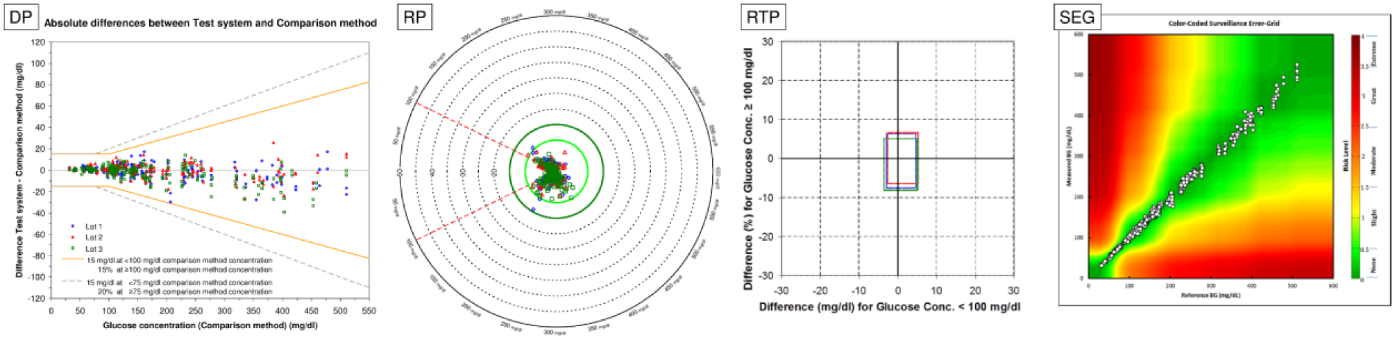
BGMS showing a high level of accuracy. More than 95% of individual results are within ±10 mg/dl (at glucose concentrations <100 mg/dl) or within ±10% (at glucose concentrations ≥100 mg/dl).
Data simulation was performed in Microsoft® Office Excel 2003 Service Pack 3 (Microsoft Corporation, Redmond, WA).
In addition to model data, all plots were also used to display data from four system accuracy evaluations (2x BGStar, 1x MyStar Extra, 1x MyStar Dose Coach; Agamatrix Inc, Salem, NH). These plots can be found in the supplemental data.
Results
Plots with individual data points (DPs, RPs, SEGs) allow for more detailed assessment of data than RTPs, in which data are first categorized depending on glucose concentration, and then averaged. RTPs might therefore miss important information, if the BGMS exhibits a concentration-dependent difference in accuracy. Figure 2A shows model measurement data for a BGMS with a nonlinear concentration-dependent systematic measurement difference with each of the four approaches. Additional data were modeled for a BGMS with similar average measurement difference, but without the nonlinear concentration-dependency (Figure 2B). DPs depict this concentration dependency quite clearly. In RPs and SEGs, this dependency is also visible, although maybe not as clearly as in the DPs because of overlapping data points in RPs and smaller scaling in SEGs. In the RTPs, however, information about this dependency is lost, and the rectangles in both parts of the figure look similar, because measurement differences are averaged.
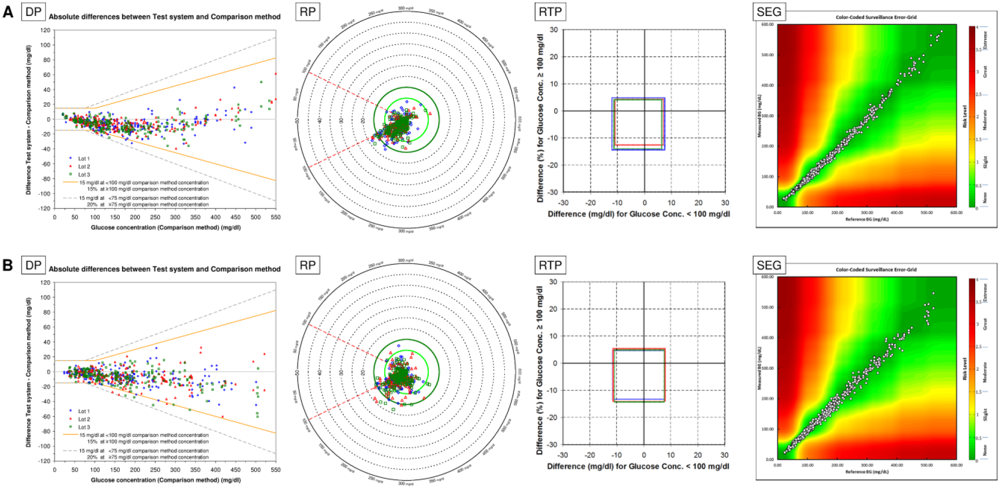
Concentration dependency of BGMS results. Model data in part A and part B have similar bias and imprecision, as presented in RTP, but measurement error in part A is concentration-dependent.
RTPs and RPs, that is, plots in which ideal accuracy is represented by the center of the plot, can make accuracy information more easily accessible, because small, centered rectangles and data clusters, respectively, indicate high accuracy. RTPs also can convey trueness and precision of the data more easily than other plots by different location and size of the rectangle, as shown in Figure 3. The DP indicates that the red triangles exhibit higher average differences (bias) than the green squares, and that the blue diamonds are spread wider than the other two, that is, these values have a larger imprecision. However, the imprecision within red triangles and green squares cannot be compared as easily, as is true for the bias of the blue diamonds. In the RTP, on the other hand, the large differences in bias and imprecision between the three lots are easily visible. In the standard RP and in the SEG, all data points have the same symbol, so that information about different test strip lots is lost. If, however, the RP is adapted to show different test strip lots in different symbols and colors, bias and imprecision can be estimated better, comparable to the DP. The SEG software used for creation of the figures did not allow changing of symbols.
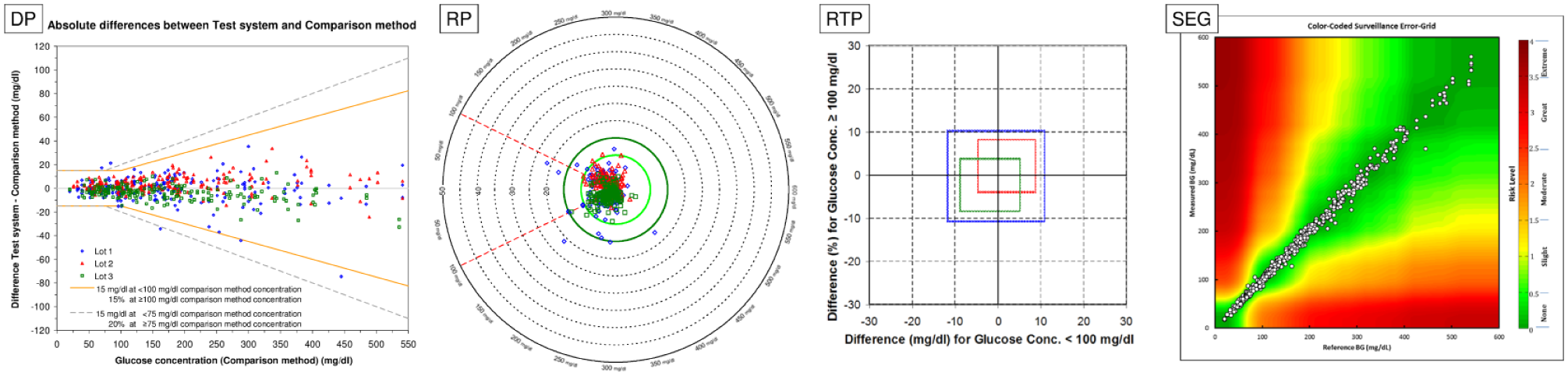
Variation in bias and imprecision between test strip lots.
Plots with individual data points may become harder to read with increasing numbers of data points, whereas RTPs are not affected as much, as shown in Figure 4. In the DP, the large cloud of data points prohibits meaningful comparisons between the six test strip lots, although it hints at differences in bias at least between the blue diamonds, red triangles and the turquoise circles. In the RTP, it becomes apparent that there are differences between all six test strip lots in bias and imprecision. Color-coded RP conveys parts of this information, whereas SEGs do not adequately show this difference. Showing and comparing data from multiple test strip lots may therefore be easier in RTPs than in DPs, RPs, and SEGs, for which data may have to be split up into multiple graphs. This also applies if, for example, the number of data points is increased, except for RTPs being completely unaffected in that case.
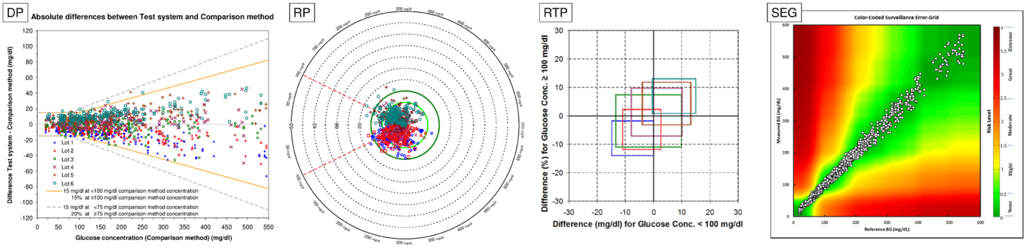
Display of 6 test strip lots instead of 3 test strip lots.
SEGs, by assessing clinical risk, have a unique feature in comparison with the other approaches. Assessing clinical risk is, in itself, not a new idea,17,18 but the SEG is based on much more recent data than, for example, the consensus error grid that is based on a survey from 1994. 17 Another advantage of the SEG over older approaches is that the developers avoided having sharp borders for different risk scores. In the consensus error grid, a difference of 1 mg/dl can lead to the measurement result not being classified as having “little or no effect on clinical outcome” (risk score B), but as being “likely to affect clinical outcome” (risk score C), while in the Clarke error grid, it could also result in a nonadjacent risk score, as, for example, risk score A (“no effect on clinical action”) did not only have a border with risk score B, but also with risk scores C and D (“could have significant medical risk”). In SEGs, on the other hand, risk scores are applied on a quasi-continuous scale, therefore eliminating the issue that differences of a few mg/dl have a large effect on the risk score.
Conclusions
The graphical approaches discussed in this publication have different strengths and limitations. Selecting a specific type of graphical presentation depends mostly on the kind of information sought and the amount of data to be presented.
Detailed assessment of BGMS data may be easier in plots with individual data points (DPs, RPs, SEGs) than in RTPs, which are based on averages and standard deviations.
With an increasing number of data points, DPs, RPs, and SEGs become harder to read, whereas RTPs are not as affected. In addition, information about trueness and precision can be accessed more easily in RTPs by the location and size of the rectangles, so that showing and comparing data from different BGMS or different test strip lots, for example, when estimating lot-to-lot variability in a BGMS’ manufacturing process, may be easier in RTPs. SEGs have the unique advantage of assessing clinical risk associated with the individual data points, which may be more helpful than the other approaches to physicians or health authorities.
RPs and RTPs may be beneficial when assessing overall system accuracy, because high accuracy is presented by a small and centered data point cluster or rectangle.
It is important to note that there is no “absolute best” approach, because each approach can encounter data for which it is less well-equipped than one of the other approaches.
Footnotes
Acknowledgements
The SEG analysis software was kindly provided by its developer Christian Wakeman, University of Virginia. Data from this manuscript were previously presented at the American Diabetes Association’s 76th Scientific Sessions (ADA 2016), June 10-14, 2016, New Orleans, Louisiana, USA, the 16th Annual Meeting of the Diabetes Technology Society (DTM 2016), November 10-12, 2016, Bethesda, Maryland, USA, and the Advanced Technologies & Treatments for Diabetes 10th International Conference (ATTD 2017), February 15-18, 2017, Paris, France.
Abbreviations
BG, blood glucose; BGMS, blood glucose monitoring system; DP, difference plot; ISO, International Organization for Standardization; RP, radar plot; RTP, rectangle target plot; SEG, surveillance error grid.
Declaration of Conflicting Interests
The author(s) declared the following potential conflicts of interest with respect to the research, authorship, and/or publication of this article: SP and CH are employees of IDT. FF and JS are employees of Sanofi-Aventis GmbH, Frankfurt, Germany. GF is general manager of the IDT (Institut für Diabetes-Technologie Forschungs- und Entwicklungsgesellschaft mbH an der Universität Ulm, Ulm, Germany), which carries out clinical studies on the evaluation of BG meters and medical devices for diabetes therapy on its own initiative and on behalf of various companies. GF/IDT have received speakers’ honoraria or consulting fees from Abbott, Ascensia, Bayer, Berlin-Chemie, Becton-Dickinson, Dexcom, LifeScan, Menarini Diagnostics, Novo Nordisk, Roche, Sanofi, Sensile, and Ypsomed.
Funding
The author(s) disclosed receipt of the following financial support for the research, authorship, and/or publication of this article: Funding of the original studies and support for writing were provided by Sanofi, France.
Supplementary Material
Supplementary material is available for this article online.
References
Supplementary Material
Please find the following supplemental material available below.
For Open Access articles published under a Creative Commons License, all supplemental material carries the same license as the article it is associated with.
For non-Open Access articles published, all supplemental material carries a non-exclusive license, and permission requests for re-use of supplemental material or any part of supplemental material shall be sent directly to the copyright owner as specified in the copyright notice associated with the article.