
Abstract
Blood glucose meter system analytical performance is assessed by comparing pairs of meter system and reference instrument blood glucose measurements measured over time and across a broad array of glucose values. Consequently, no single, complete, and ideal parameter can fully describe the difference between meter system and reference results. Instead, a number of assessment tools, both graphical (eg, regression plots, modified Bland–Altman plots, and error grid analysis) and tabular (eg, International Organization for Standardization guidelines, mean absolute difference, and mean absolute relative difference) have been developed to evaluate meter system performance. The strengths and weaknesses of these methods of presenting meter system performance data, including a new method known as Radar Plots, are described here.
Blood glucose monitoring systems (BGMSs) are used by people with diabetes to monitor and manage their blood glucose levels, which may prevent or delay complications associated with poor glycemic control.1,2 Correspondingly, a wide array of BGMSs are available to individuals with diabetes. The accuracy of results obtained from BGMSs is important because they may be used, for example, to calculate an appropriate insulin dose; inaccurate meter system results can lead to insulin dosing errors,3-5 and these errors have the potential to be clinically important, as shown by modeling analyses. 6 Thus, it is important to assess meter system performance and communicate these performance results to the public. This commentary is from the perspective of a diabetologist and someone who works in the industry and must communicate meter system performance information to regulatory agencies, health care payers, health care providers, and people with diabetes.
What Is Meter System Performance?
This commentary focuses specifically on the analytical performance of BGMSs, meaning the performance attributable to the meter system itself (as opposed to the user, the blood sample, or changing experimental conditions). To assess meter system performance, a laboratory reference instrument is used to measure the glucose concentration of a blood sample; this result is defined as the “true” glucose concentration. The BGMS is also used to measure the glucose concentration of the same blood sample, and this result is then compared with that of the reference instrument. It is important to note that the assumption that the measurement taken with the laboratory reference instrument is “the truth” is inherently flawed, as error is also associated with this instrument (and the error inherent to the reference instrument becomes more consequential as the BGMSs being tested become more accurate and precise). 7 It is also important that the validity of the laboratory reference method used for comparison to the meter system results should be established by monitoring the instrument’s accuracy and precision using National Institute of Standards and Technology traceable serum controls 8 spanning the range of samples being tested.
Multiple pairs of glucose measurements are made over time and across a broad array of glucose values. As a result, no single, complete, and ideal parameter can fully describe the differences between meter system and reference results. Key measures of comparison include precision (the degree of dispersion of deviations from the reference) and trueness (the average deviation of measurements from the reference; Figure 1).
Graphical representation of the concepts of precision and trueness. A circular target is used to illustrate precision (the degree of dispersion of deviations from the center of the target) and trueness (the average deviation from the center of the target).
Multiple methods have been developed to assess BGMS performance data, each with its own strengths and weaknesses. These methods and the information they convey are described here using anonymized data from 3 meter systems to illustrate different performance characteristics.
Graphical Representations
Regression Plots
Perhaps the simplest method of presenting meter system data is using Cartesian coordinates to plot the reference value on the x-axis and the BGMS value on the y-axis, for each pair of measurements, to generate a regression plot. 9 Ideally, the x- and y-values would be identical, and all data points would fall on the line y = x. In the examples illustrated in Figure 2, the data points for meter A fall near the line at y = x; the data points for meter B fall within a broader area around the y = x line; and the data points for meter C, while in a relatively tight band, are not centered on the line at y = x.
Visualization of BGMS accuracy using regression plots. For each panel, the black diagonal line represents the ideal scenario (y = x); ISO criteria are plotted using dashed lines; the red line denotes the regression line; and the regression equation and R2 value are shown in the top left corner of the plot area. BGMS, blood glucose monitoring system; ISO, International Organization for Standardization; YSI, YSI glucose analyzer.
Using linear regression analysis, a best-fit line for a given dataset can be compared with the ideal scenario by generating a regression equation and R2 value. A meter system with higher accuracy, such as meter A, will have a slope closer to 1 and a y-intercept closer to 0 compared with meter systems with lower accuracy, such as meters B and C. An R2 value close to 1 indicates that the data are linear and precise (as seen in the plots for meters A and C); however, the R2 value alone provides no information about accuracy. While both meters A and C have an R2 value close to 1, meter A is more accurate than meter C because it has much higher trueness. It is also important to note that comparing R2 values between different studies is difficult because the R2 value is highly influenced by the range of glucose values.
Accuracy guidelines from the International Organization for Standardization (ISO) can also be incorporated in regression plots. For example, dashed lines can be plotted on the graph to represent ISO 15197:2003 accuracy guidelines 10 (meter system results within ±15 mg/dL or ±20% of the mean reference result for samples with glucose concentrations <75 mg/dL and ≥75 mg/dL, respectively) or the updated ISO 15197:2013 guidelines 11 (meter system results within ±15 mg/dL or ±15% of the mean reference result for samples with glucose concentrations <100 mg/dL and ≥100 mg/dL, respectively). The more rigorous ISO 15197:2013 guidelines are represented in the regression plots as dashed lines that are tighter around the y = x line than those of ISO 15197:2003. For both sets of ISO criteria, a greater number of data points for meter A fall within the lines compared with those of meters B and C.
Using regression plots as a method of representing meter system accuracy data has several advantages including enabling assessment of large amounts of data, quantification of the comparisons between meter system and reference results, and visualization of extrinsic criteria (eg, ISO guidelines). However, a straightforward comparison of BGMS and reference results is impractical due to the many parameters generated using regression analysis (eg, slope, intercept, R2 value). In addition, regression analysis does not allow for simple visual assessment of the intrinsic bias (ie, systematic error) of a meter system.
Modified Bland–Altman Plots
Using modified Bland–Altman plots, 12 the difference between meter system and reference results is plotted on the y-axis, with reference results plotted on the x-axis. Ideally, all data points would fall on the line y = 0; however, any intrinsic bias of a meter system would be illustrated with data points trending either above or below the y = 0 line (indicating positive or negative bias, respectively). For example, as illustrated in Figure 3, meters B and C both show a negative bias. Similar to regression plots, ISO accuracy guidelines can be incorporated into modified Bland–Altman plots, with the more stringent ISO 15197:2013 criteria represented by lines that are narrower in the vertical dimension than those of ISO 15197:2003.
BGMS accuracy visualized using modified Bland–Altman plots. For each panel, the black diagonal line represents the ideal scenario (y = 0) and ISO criteria are plotted using dashed lines. BGMS, blood glucose monitoring system; ISO, International Organization for Standardization; YSI, YSI glucose analyzer.
A strength of using modified Bland–Altman plots to evaluate meter system accuracy is that it allows for simple visual assessment of the degree to which meter system results differ from the reference; moreover, these plots allow for the detection of intrinsic meter system bias (ie, systematic error). However, modified Bland–Altman plots themselves do not provide any numerical measures to describe the data.
Error Grid Analysis
While regression plots and modified Bland–Altman plots represent the analytical error associated with BGMSs, they do not convey the possible clinical significance of that error. The surveillance error grid (SEG) 13 is a tool used to assign a level of clinical risk associated with BGMS measurement inaccuracies. The SEG is a refinement of the Clarke error grid 14 and Parkes error grid15,16; compared with the older grids, the SEG allows clinical risk to be quantified with greater precision, particularly for low levels of risk. Using error grid analysis, the data are plotted in the same manner as in a regression plot, with reference results on the x-axis and meter system results on the y-axis; however, the data overlay the error grid contained within the plot area (Figure 4). The SEG is color-coded to represent clinical risk, with the level of risk associated with each possible BGMS reference result pair having been empirically determined using a survey of diabetes clinicians. 13 The grid encompasses 15 risk zones, but color-coding using a continuous spectrum of color captures an even greater degree of nuance in SEG plots.
Surveillance error grid analysis to evaluate the clinical risk associated with BGMS inaccuracy. As shown in the legend, the level of clinical risk associated with each pair of BGMS and reference results is represented by a color on the grid. BGMS, blood glucose monitoring system; YSI, YSI glucose analyzer.
The ability of error grid analysis to indicate the clinical significance of BGMS error is useful, as this is the ultimate consequence of meter system error. However, error grid analysis specifically assesses acute clinical risk and not the risk associated with chronic meter system imprecision. Because people with diabetes using intensive insulin therapy may measure their blood glucose 6 to 10 times or more each day, 17 the potential consequences of even relatively small meter system errors on insulin dosing3-6 could be compounded over time.
Tabular Representations
International Organization for Standardization Guidelines
As noted previously, ISO 15197:2003 10 and ISO 15197:2013 11 guidelines specify accuracy criteria for BGMSs (with meter systems required to have ≥95% of results within the limits defined above) and are used by regulatory agencies to assess meter system accuracy. The number and percentage of BGMS results within defined error limits, including those specified by ISO, can be presented in tabular form. As shown in Table 1, 99.5% and 99.1% of results for meter A were within ISO 15197:2003 and ISO 15197:2013 error limits, respectively; thus, meter A surpassed both sets of ISO accuracy criteria.
Assessment of BGMS Accuracy Using ISO Criteria (Meter A).
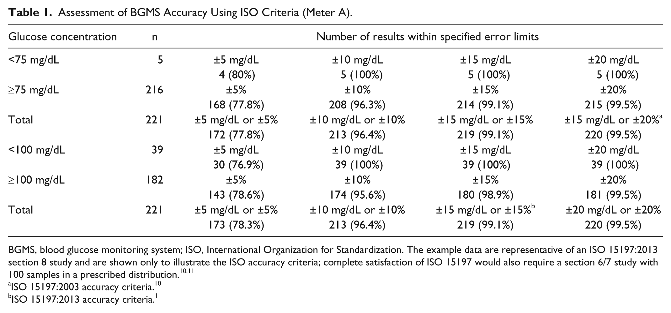
BGMS, blood glucose monitoring system; ISO, International Organization for Standardization. The example data are representative of an ISO 15197:2013 section 8 study and are shown only to illustrate the ISO accuracy criteria; complete satisfaction of ISO 15197 would also require a section 6/7 study with 100 samples in a prescribed distribution.10,11
ISO 15197:2003 accuracy criteria. 10
ISO 15197:2013 accuracy criteria. 11
While ISO guidelines are a simple and effective measure of BGMS accuracy, the relatively arbitrary boundary between acceptable and unacceptable error likely oversimplifies meter system performance. Moreover, these guidelines do not specify any criteria for 5% of meter system errors; thus, there is no limit to the error allowed in up to 5% of BGMS results.
Mean Absolute Difference (MAD) and Mean Absolute Relative Difference (MARD)
MAD and MARD 18 further simplify the tabular representation of meter system error by quantifying an entire dataset with a single numeric value, either in terms of absolute error (MAD) or percentage error (MARD). As shown in Table 2, the MAD and MARD values for meter A were lower than those of meters B and C, indicating that meter A has a higher degree of accuracy than the other meter systems. However, although these analyses are useful for comparing multiple meter systems in a single study, MARD is not a sufficient statistic and cannot by itself be used to describe meter system quality. 19
MAD and MARD Analysis of BGMS Accuracy.
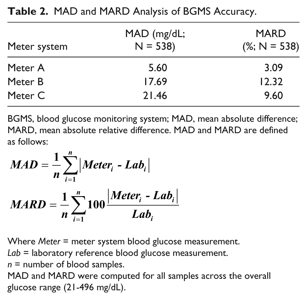
BGMS, blood glucose monitoring system; MAD, mean absolute difference; MARD, mean absolute relative difference. MAD and MARD are defined as follows:
Where Meter = meter system blood glucose measurement.
Lab = laboratory reference blood glucose measurement.
n = number of blood samples.
MAD and MARD were computed for all samples across the overall glucose range (21-496 mg/dL).
Radar Plots
Radar Plots are a new way to visualize BGMS analytical performance. Using this method, differences between BGMS and reference instrument measurements are plotted using polar rather than Cartesian coordinates. While the same information is plotted using a Radar Plot and a modified Bland–Altman plot (ie, the difference between BGMS and reference results vs reference results), the circular contours of constant error levels in Radar Plots add another dimension to the visualization of the distribution of meter system error. Figure 5 shows that the data points for meter A cluster around the center of the plot while those of meters B and C are generally further from the center, indicating lower accuracy. Consistent with the previous visualizations of meter system performance, the data points for meter B are more dispersed and thus less precise than those of meter C. As with regression plots and modified Bland–Altman plots, ISO guidelines can be incorporated into Radar Plots (although as a circle as opposed to lines).
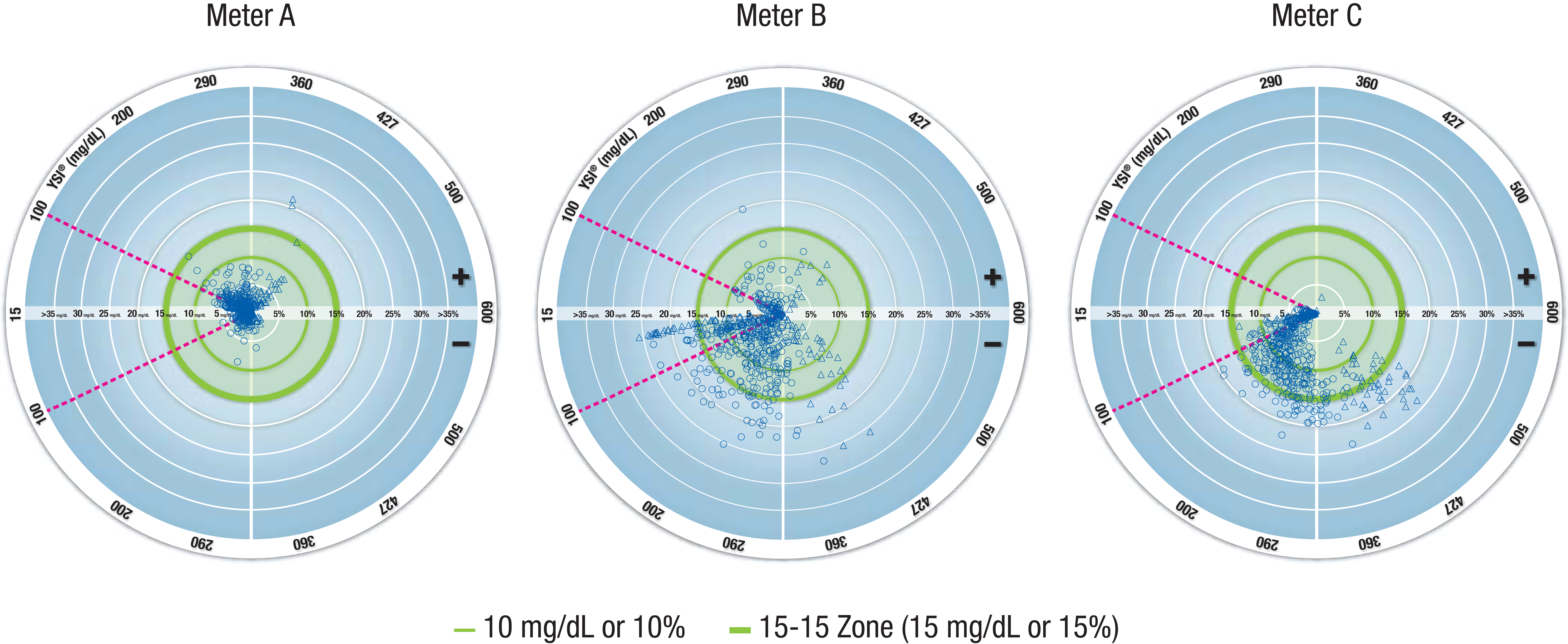
Visualization of BGMS accuracy using Radar Plots. Each data point represents the error of a meter system result; error is given in units of mg/dL for YSI results <100 mg/dL (region of the plot within the magenta dashed lines) and in units of percentage for YSI results ≥100 mg/dL (region of the plot outside the magenta dashed lines). The outer green circle (bolder line) represents ISO 15197:2013 accuracy criteria; data points within this circle (the 15-15 Zone) meet these criteria. In a Radar Plot, the distance from the center of the plot to a data point indicates the magnitude of the meter system error. The direction of a line connecting the point to the center indicates the value of the laboratory reference measurement. If the point is above the horizontal midline, the error is positive (ie, the meter system overestimated the laboratory reference blood glucose value). If the point is below the horizontal midline, the error is negative (ie, the meter system underestimated the laboratory reference blood glucose value). If the laboratory reference blood glucose value is <100 mg/dL (~5.55 mmol/L), then the errors are expressed in mg/dL (or mmol/L). Otherwise, the errors are expressed as a percentage of the laboratory reference measurement. BGMS, blood glucose monitoring system; YSI, YSI glucose analyzer.
Radar Plots simplify the presentation of meter system performance data by including multiple measures of analytical performance (accuracy [in terms of average error and based on ISO criteria] and precision) in a single graphic. While modified Bland–Altman plots and regression plots provide some of the same information, Radar Plots do so in a more intuitive fashion. Because of the Radar Plot’s resemblance to a target, a tight clustering of data points in the center of the plot intuitively represents higher accuracy and precision. Moreover, Radar Plots can facilitate visual comparison of multiple meter systems in a single study. However, as with any plot, the plot itself does not provide a numerical measurement of meter system performance.
Conclusions
Although assessing BGMS performance is important, it is not straightforward because pairs of blood glucose measurements from a meter system and reference instrument are compared over time and using a variety of glucose concentrations. In addition, there are multiple measures of meter system performance, including accuracy and precision. Given this complexity, a variety of methods have been developed to assess meter system performance, broadly divided into graphical and tabular representations. Each method has advantages and limitations that should be acknowledged when used to interpret data. Radar Plots are a new method of assessing BGMS performance and are a valuable visual indicator to illustrate meter system accuracy and precision, as well as to compare the analytical performance of multiple meter systems in a single study.
Footnotes
Acknowledgements
I would like to thank Scott Pardo, PhD, PStat®; Bern Harrison, BA; Robert Morin, MD; and Jane F. Wallace, BA, CCRA; of Bayer HealthCare LLC, Diabetes Care, Whippany, NJ, for their review of the technical details in this manuscript. Medical writing assistance was provided by Courtney St. Amour, PhD, of MedErgy, Yardley, PA, and was supported by Bayer HealthCare LLC, Diabetes Care.
Abbreviations
BGMS, blood glucose monitoring system; ISO, International Organization for Standardization; MAD, mean absolute difference; MARD, mean absolute relative difference; SEG, surveillance error grid; YSI, YSI glucose analyzer.
Declaration of Conflicting Interests
The author(s) declared the following potential conflicts of interest with respect to the research, authorship, and/or publication of this article: DAS is a full-time employee of Bayer HealthCare LLC, Diabetes Care.
Funding
The author(s) disclosed receipt of the following financial support for the research, authorship, and/or publication of this article: This work was supported by Bayer HealthCare LLC, Diabetes Care, Whippany, NJ.