
Abstract
Multiple-point glucose profiles are now acknowledged, in the diabetes literature, as a key way for people with diabetes to analyze and interpret blood glucose control (BGC).1-3 Combined methods to visualize relevant blood glucose information are increasingly recognized as a more effective method of explaining actionable glucose profiles.4,15(p564) This commentary is written from the perspective of a person with type 1 diabetes and might add value to the existing understanding about relevant ways to display BGC data. Through discussion of the limits to current multiple-point glucose displays, for example, AGP “dashboard,” a proposed alternative method of graphical display that brings together HbA1c and self-monitored blood glucose (SMBG) test data is presented.
Keywords
Diabetes is a particularly relevant concern in our present society. Diabetes has been associated with pervasive economic, health, social, and practical costs.5,6 Within the United Kingdom it is estimated that £170 million per year could be saved through better understanding and diabetes management (based on 2009-2010 data). 7 Given the current lower than desirable incidence of people with diabetes achieving safer HbA1c targets, the potential savings are perhaps not surprising. In the most recent National Diabetes Audit,8(p19) it is reported that over 35% of patients in England (from a sample of 2 150 634 included in the audit data) have “increased risk” HbA1c results and 8% have “exceptionally high risk” HbA1c readings (HbA1c > 58 mmol/mol and HbA1c > 86 mmol/mol, respectively). While data from this report may not be representative of the entire United Kingdom population of people with diabetes, they highlight discrepancies between target and recorded blood glucose control (BGC).
A number of measurements can be utilized to monitor BGC such as self-monitored blood glucose (SMBG) and HbA1c, the strengths and limitations of which will be discussed later. Evidence indicates that intense BGC (of people with type 1 diabetes) delays and reduces the likelihood in the (potential) onset of longer-term complications,9,10 which might also help reduce the aforementioned associated costs. Along with the significant investment in and development of SMBG meters, there have been a plethora of discussions on the amelioration of blood glucose data display, analysis, and interpretation.1(pp61-62),2(pp64-66),11-14 While several multiple-point glucose profiles have been proposed, at present there is no standardized format to present this combined relevant BGC data.
In 2012, a panel of diabetes specialists met with the aim of recommending standardizations of blood glucose data analysis and presentation, as summarized by Bergenstal et al. 15 The article highlights the potential positive benefits of a uniform glucose report for BGC. Although the panel made recommendations with regard to the visual display of AGP “dashboard” data, this article asserts that it is possible to make further improvements to the display of multiple-point glucose profiles. The AGP “dashboard” presents multiple-point glucose data in 3 parts: statistical summary, visual display, and daily views.15(p570) However, it does not display actual HbA1c results in a visual format. It is probable that actual results, as opposed to estimated, would provide more factual information to the person with diabetes and in turn lead to increasingly effective BGC.
The aim of this commentary is to present an alternative method of displaying multiple-point glucose profiles. The proposed format places emphasis on providing the person with diabetes with accurate statistical information regarding both HbA1c and SMBG readings through a clearer graphical display. A Tukey-style box plot is used to show multiple-point glucose profiles and is displayed together with a line graph that conveys key information on actual HbA1c data.
Accuracy of SMBG Measurement Systems
There are a number of glucose self-monitoring systems, which characterize diurnal blood glucose patterns, currently available on the market. From these the individual chooses a system that has features most suitable to their requirements. Since the inception of SMBG meters there has been emphasis on the accuracy of the various instruments.16(pp86-90) However, in a recent study it has been identified that many SMBG meters fail to meet recommended accuracy criteria. Freckman et al 17 conducted a comprehensive evaluation of the analytic accuracy of 34 (from a total 43) SMBG monitoring systems, 27 of which met minimal and 18 met stricter accuracy criteria according to the newer 2013 DIN EN ISO 15197 standards. 18 It has also been recognized that approval requirements for these devices, for example, the Confomité Européenne certification process in Europe, do not necessarily ensure acceptable accuracy of glucose meters. 19 Nevertheless, as highlighted by Heinemann et al,19(p435) while quality of measurement via blood glucose meters can be increased to a certain degree, equal consideration to the total system accuracy that accounts for patient factors and interferents is of critical relevance to minimize errors.
Use of HbA1c
Historically, HbA1c has been employed as an indicator of the probability of the occurrence and severity of secondary clinical conditions, such as micro- and macrovascular complications. Consequently, the value of HbA1c data has been reflected in the great emphasis placed on this laboratory measure by, for example General Practitioners and Diabetes Specialist Nurses. Indeed, Rankin et al20(p89) found through a qualitative investigation, overemphasis of HbA1c readings—in often cursory encounters with health professionals—seem to be more common place than one might suspect: “Clinical appointments were felt to focus mainly on examination of HbA1c readings, with limited opportunities to acquire further information, particularly if patients’ results were within acceptable parameters.” Thus, this tool can be (mis)used by health practitioners to make an absolute judgment about diabetes management.
BGC can be interpreted through, arbitrarily labeled, rank order categories. The quantitative “cutoffs” for these rank order categories are set by the National Institute for Health and Care Excellence (NICE; an independent quality standards agency for health and care improvements) for adults with type 1 diabetes in the United Kingdom and are typically displayed in tables such as Table 1.
Blood Glucose Control Target Levels and Related Units of Measurement.
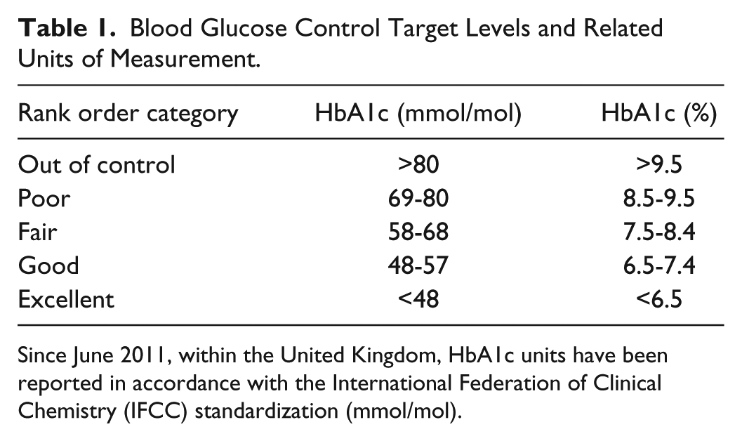
Since June 2011, within the United Kingdom, HbA1c units have been reported in accordance with the International Federation of Clinical Chemistry (IFCC) standardization (mmol/mol).
As analysis of HbA1c data tends to focus on central tendencies, as opposed to distribution of blood glucose results, there is a higher likelihood that this information will lead to value judgments; that is, decisions based on limited information. In psychology it is acknowledged that words (ie, diagnostic labels) used to describe categories can become a cause of stigma.21,22 Therefore, it is possible that words used to describe category dispersions of HbA1c might also lead to value judgments being made. Vocabulary such as “poor” or “out of control,” although perhaps accurate, could cause anxiety without providing the person with diabetes with strategies to improve his or her BGC. Research has showed a positive relationship among anxiety, depression, and metabolic control, with higher HbA1c readings. 23 These value judgments might not be beneficial for the person with diabetes and it is possible these judgements might even disempower the person with regard to his or her diabetes management. Importantly, graphical displays do not require arbitrary labels and provide more statistical information, which may lead to the person with diabetes making more informed decisions.
The value of HbA1c for a person with diabetes and their health care provider(s), then, is its use as a longer-term predictor of diabetes complications and the evidentiary support that improved control of HbA1c has on complication risk.9(pp983-984) However, as is widely known, the HbA1c result only accounts for the central tendency over an 8- to 12-week period prior to test date, which fails to account for the distribution of a patient’s blood glucose data.
Presentation and Representation of Blood Glucose Data
Studies have shown that often the most effective way to describe, explore, and summarize a set of numbers is to depict them through graphical displays, particularly in comparison with tabular presentations.24,25 Yet statistical graphs often used, as the standard format, to depict SMBG, such as the use of scatter plots to display glucose results against date and time, have come under increasing scrutiny.13(pp1121-1122),14(p1389) This scrutiny is due to the low data density that these formats of data display yield with regard to BGC. Data presentation and representation of BGC are integral to people with diabetes, their support team, and the capacity to make informed decisions regarding management of diabetes. Ineffective interpretation of graphical information can have dire consequences on decision making, as exemplified by the decision to launch the Space Shuttle Challenger on January 28, 1986. Tufte26(pp38-53) eloquently explains how 13 charts—constructed to affirm the choice not to launch—were ineffectively presented, which consequently influenced a proper evaluation of the risks to launching. Equally, evidence with which to base a decision in relation to—corrective, preventative, or maintenance—action with the factors that influence glucose control must be meaningful to the reader to ensure the minimization of the risk of improper evaluation.
Though increasing acceptance has been documented in the diabetes literature that both HbA1c and SMBG data need to be combined to reflect BGC effectively.4(p428),15(p563-564),27,28 At present, the majority of SMBG software programs do not have the function to input data from other instruments such as HbA1c results (eg, FreeStyle Auto Assist, which accompanies the FreeStyle InsuLinx system and Diabetes Management Software™ that is compatible with OneTouch® Verio® IQ). Equally, HbA1c graphs do not include graphical display of SMBG patterns.
One review article graphically depicts the SMBG data download from the meter of a triathlete with type 1 diabetes.4(pp428-429) A scatter-plot style graphic is used to display modal data (collated across 10 days) and a frequency graph depicts the overall glucose trend and additional summary data. Although some discussion is made about the importance of multiple-point glucose profiles, quantitative HbA1c data were not included in the graphical presentation. Another article discussed a systematic approach for analysis of SMBG data known as the “pattern analysis”; however, this does not display HbA1c or SMBG data graphically.2(p67) Furthermore, Rodbard27(pp439-440) describes how the AGP dashboard is probably, at present, the most informative and useful method to display blood glucose data graphically, from the many that can be chosen. Rodbard goes on to point out, however, that there are limitations to the AGP dashboard blood glucose data presentation and that some variations would be of use. In relation to the proposed graphical presentation that follows, the AGP dashboard displays estimated HbA1c data in a tabular format, whereas this commentary graphically presents actual HbA1c data, which echoes Rodbard’s comment that “variations would be of use.”27(p439)
The landmark Diabetes Control and Complications Trial article depicted HbA1c and SMBG data together.9(p980) However, this display lacks data density. For instance, capillary-blood glucose measurements in a 24-hour period are shown, with the 25th and 75th percentiles indicated by vertical lines and medians displayed by small black boxes. A similar portrayal is conveyed for the glycosylated hemoglobin data, the main difference being the X axis, which shows year of study across a 10-year period. Key statistics relevant to BGC are missing such as the modal glucose and maxima and minima glucose values in relation to time of day. Also, the data do not show intraindividual glucose variability but depict interindividual glucose variation.
Rodbard27(p440) places emphasis on the fact that one size does not fit all and there is a need to balance standardization with customization in the visual display of BGC information. He also states that although standardization should be strived for, it “must be done in a manner that permits flexibility and fosters innovation.” One way in which this may come to fruition is by applying graphic design principles related to clearer visualization and data density when designing multiple-point glucose profile displays.
Proposed Method of Multiple-Point Glucose Profile Display
To demonstrate the proposed method of multiple-point glucose profiles, an example of actual data from a person with type 1 diabetes has been used. The BGC measurement for the first 3 months was 86 mmol/mol (see Figure 1). This result indicates that on average blood glucose was 14 mmol/L, which contrasts with a target (or expected) average result of 6.8-8.6 mmol/L.
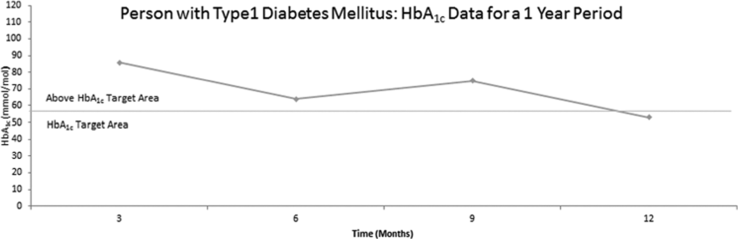
HbA1c results for a 1-year period. The HbA1c target parameter is indicated by the horizontal line that intersects 57 mmol/mol.
When discussing this result, the health practitioner stated that “according to your recent three monthly HbA1c you have ‘out of control’ blood glucose control” and asked what could be done to improve this. The patient was likely to have limited confidence in identifying how to improve their 3-month result, based on the information given in Figure 1. The 6-month result has decreased compared to the 3-month (by 22 mmol/mol), which would be interpreted as “fair” blood glucose control and provides a historical time comparison with the previous HbA1c score. However, the graph lacks data that would allow the person with diabetes to make informed decisions about SMBG profiles. Even at 9 months when HbA1c increased to 75 mmol/mol and decreased to the target of 53 mmol/mol at 12 months, the data presentation in Figure 1 is unlikely to lead the patient to affirm reliably the precise changes that led to the achievement of these HbA1c results.
To form a clearer logic of data display and analysis of overall BGC it is proposed that HbA1c and SMBG be brought together and integrated where possible. Figure 2 shows a Tukey-style box plot displaying multiple-point glucose profiles with the related HbA1c information.
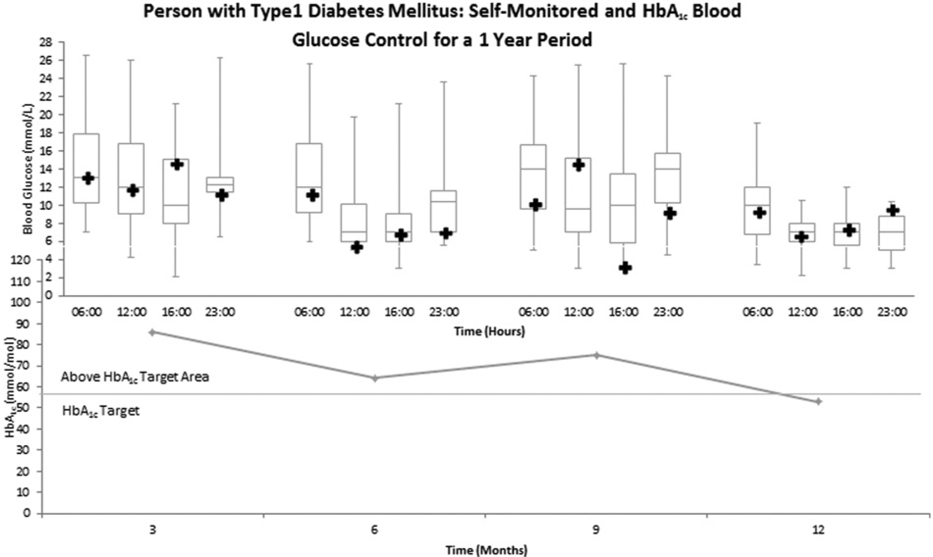
Graph display of HbA1c information at 3-monthly intervals, in the lower portion (illustrated by a trend line), and box plots, in the upper portion, that display self-monitored blood glucose results related to each 3-monthly interval. Specifically, the medians are shown by the horizontal lines inside the boxes, the 25th and 75th percentiles are shown as the bottoms and tops of the boxes, and the minimum and maximum values are shown as the small horizontal lines below and above the boxes.
This graph displays 4 SMBG readings per day (superimposed data across each time point for each 3 monthly period), although it would also be possible to display 8 or more readings per day which would be more in line with the considerable thought that has been given to how to obtain glucose values such as “structured testing.” 29 Figure 2 is richer in data content than Figure 1. It has been designed based on features of effective graph design principles and would be of practical use when discussing BGC during clinical appointments.26(pp96-137) The clearer visual layout and data density would be particularly informative for the patient. In addition to HbA1c scores in Figure 1, Figure 2 shows, first, the distribution of each 3-monthly HbA1c result across the year portrayed by the box plots. In acknowledgment of the fact that the mode is often of importance as it reveals the most frequent blood glucose for a set time period, a variation of box plots that display the mode (indicated by the dark plus signs) was chosen. Figure 2 also shows, second, SMBG to be more skewed at 6 months than 3 months, as indicated by the asymmetry of the vertical lines, that is, the distance between the lowest horizontal lines and the lowest edge of the boxes illustrates the range of where the lowest 25% of scores fall, and at 12:00, 16:00, and 23:00 the vertical lines are shorter at 6 months compared to 3 months. Third, from 6 months to 9 months there is an increased proportion of hyperglycemic events revealed by the larger interquartile ranges at 12:00, 16:00, and 23:00, and increased modal values of 15 mmol/L and 10 mmol/L (at 12:00 and 23:00, respectively), which reflects an overall increase in HbA1c. Finally, there was a reduction in the top 25% of SMBG scores from 3 months to 12 months as well as a reduction in maximum values during the same period, and there are no outliers. These reductions obviously contribute to the achievement of target HbA1c (for this case) of 53 mmol/mol. Thus, box plots can unveil key information, relevant to large blood glucose data sets, and take up the same amount of space that other less efficient data display methods use, such as multiple pie charts and frequency histograms.13(p1126),30(p241)Therefore, design solutions, rather than a content reduction, are one way to improve blood glucose data representation.
It must be noted that box plots are not the only way to design and construct SMBG data displays, and that these displays can also include comparisons with factors known to influence diabetes such as insulin versus food. Rodbard14(p1392) recommends the use of stacked bar charts as a more compact and efficient way to interpret SMBG data, especially as this format can be used to compare time segments within a day or between a date range and is compatible with spreadsheet software such as Microsoft Excel. This recommendation demonstrates the room for choice in the type of graph and the details made prominent. By routinely utilizing and discussing graphical displays such as that depicted in Figure 2 in clinical appointments, it would be possible for more informed decisions to be made with regards to management of diabetes.
Conclusion
The prevalence of diabetes is a growing concern not only for the United Kingdom but worldwide.6(p815),31 While current methods of HbA1c data presentation are often suboptimal, there is increasing evidence supporting the advantages of multiple-point glucose profiles, particularly enabling the person with type 1 diabetes to engage with HbA1c and SMBG data simultaneously. Clinical studies have presented this information graphically, although research indicates this is perhaps not yet commonplace in daily clinical practice.20(p89) However, these methods of presentation lack data density and are unlikely to afford a person with diabetes the opportunity to visually interpret his or her BGC. Overall, based on effective graph design principles, this commentary asserts that Tukey-style box plots together with a line graph enable a person with diabetes the opportunity to visually interpret his or her BGC.
Footnotes
Acknowledgements
I would like to thank Ceri Bannister, Jillian and William Kay, Martino Ercolani, JP and Charley McCumisky and the team at JDST for comments that helped improve this article.
Abbreviations
BGC, blood glucose control; NICE, National Institute for Health and Care Excellence; SMBG, self-monitoring of blood glucose.
Declaration of Conflicting Interests
The author(s) declared no potential conflicts of interest with respect to the research, authorship, and/or publication of this article.
Funding
The author(s) received no financial support for the research, authorship, and/or publication of this article.