
Abstract
Background:
Some physicians in intensive care units (ICUs) report that electronic health records (EHRs) can be cumbersome and disruptive to workflow. There are significant gaps in our understanding of the physician–EHR interaction.
Objective:
To better understand how clinicians use the EHR for chart review during ICU pre-rounds through the characterisation and description of screen navigation pathways and workflow patterns.
Method:
We conducted a live, direct observational study of six physician trainees performing electronic chart review during daily pre-rounds in the 30-bed medical ICU at a large academic medical centre in the Southeastern United States. A tailored checklist was used by observers for data collection.
Results:
We observed 52 distinct live patient chart review encounters, capturing a total of 2.7 hours of pre-rounding chart review activity by six individual physicians. Physicians reviewed an average of 8.7 patients (range = 5–12), spending a mean of 3:05 minutes per patient (range = 1:34–5:18). On average, physicians visited 6.3 (±3.1) total EHR screens per patient (range = 1–16). Four unique screens were viewed most commonly, accounting for over half (52.7%) of all screen visits: results review (17.9%), summary/overview (13.0%), flowsheet (12.7%), and the chart review tab (9.1%). Navigation pathways were highly variable, but several common screen transition patterns emerged across users. Average interrater reliability for the paired EHR observation was 80.0%.
Conclusion:
We observed the physician–EHR interaction during ICU pre-rounds to be brief and highly focused. Although we observed a high degree of “information sprawl” in physicians’ digital navigation, we also identified common launch points for electronic chart review, key high-traffic screens and common screen transition patterns.
Implications:
From the study findings, we suggest recommendations towards improved EHR design.
Introduction
Use of electronic health records (EHRs) has become the norm: for example, over 96% of US hospitals are now “online” and operational with a certified EHR system (Office of the National Coordinator for Health Information Technology, 2017). Unfortunately, studies reporting potential benefits such as increased productivity and efficiency have been mixed (Buntin et al., 2011; Krousel-Wood et al., 2018), and vendor attention to user-centred design principles has been suboptimal (Balestra, 2017; Ratwani et al., 2015). Moreover, many clinicians remain dissatisfied with the current user experience (Downing et al., 2018). A deeper understanding of the user experience is central to achieving the ultimate vision of intuitive, user-centred EHR systems.
How physicians spend their time and apply their skills may play a leading role in clinicians’ dissatisfaction with the EHRs because much of the time is spent retrieving or charting information. This leads to frustration. In one study, for each hour spent face-to-face with clinic patients, physicians spent close to 2 hours in the EHR (Sinsky et al., 2016). Therefore, investigating digital workflows may reveal opportunities for improvement, allowing physicians to refocus where and how they spend their time. To date, the body of literature characterising EHR workflow patterns among physicians remains relatively small, consisting mostly of exploratory studies using hypothetical patient cases or studies limited to outpatient settings (Hultman et al., 2016; Kendall et al., 2013; Reichert et al., 2010; Zheng et al., 2009). One study that incorporated direct observation in the live hospital environment to analyse EHR workflow found notable variation across users (Furniss et al., 2016).
One common EHR task performed across clinical settings is electronic chart review, or “chart biopsy” (Hilligoss and Zheng, 2013), where clinicians navigate through various pools of clinical data within the EHR to develop a mental model of a patient’s clinical condition. This is especially important in intensive care units (ICUs), where providers sort through over 200 variables and more than 1300 individual data points each day (Manor-Shulman et al., 2008). Nolan, Siwani, et al. (2017) recently observed physicians performing digital chart review on new ICU patients, finding it to be convoluted and prolonged. Despite the importance of chart review to patient care, many ICU clinicians find that EHRs are time-consuming (Carayon et al., 2015) and disruptive to workflow (Cheng et al., 2003). This suggests that significant gaps remain in our understanding of the physician–EHR interaction, especially in critical care settings.
Objective
The purpose of this study was to characterise and describe EHR screen navigation pathways and workflow patterns among physicians performing electronic chart review of ICU patients. Our goal was to better understand physicians’ digital information needs during pre-rounds and to better characterise the user experience in the EHR. Specifically, we set out to explore: What digital information do physicians prioritise while pre-rounding in the ICU? Where do physicians go in the EHR to find this digital information (i.e., which screens)? How do physicians navigate within the EHR to achieve their digital information needs?
Method
Study design
We conducted a direct, live observational study of physician trainees performing electronic chart review on familiar ICU patients during their morning pre-rounds. The current study received full approval from the institutional review board and was performed as part of a pilot test to inform a larger mixed-methods study on EHR usability in critical care settings (Khairat et al., 2019).
Setting
The study was performed within a 30-bed medical ICU at a tertiary, 905-bed academic medical centre in Chapel Hill, NC, USA, over the span of 3 days in December 2017 to February 2018. The medical ICU is staffed by one advanced practitioner team (managed by nurse practitioners) and four resident physician teams, each comprised of an upper-level resident physician (internal medicine) and one to two intern physicians (internal medicine, family medicine, emergency medicine or anaesthesia). During day shifts, two attending physicians supervise all patient care. Each attending physician is accompanied by a fellow physician (pulmonary and critical care medicine) and oversees two resident-led teams (sister teams). All patient records at the institution are contained within a single, vendor-based EHR system (Epic 2016, Epic Systems, Verona, WI, USA). This system includes a core clinical product that integrates all aspects of inpatient and outpatient clinical care, including administration, computerised physician order entry, clinical decision support, physician and nurse documentation, laboratory, e-prescribing and other functionalities.
Participants
Physician trainees rotating through the medical ICU during the study interval were invited to participate. Exclusion criteria included non-physicians (nurses, nurse practitioners, etc.) and physicians working in other critical care settings (e.g. surgical ICU, paediatric ICU, etc.). The final participants comprised a convenience sample of six internal medicine physician trainees (five residents and one fellow). All participants had used the EHR system daily for at least one year. Although small, this sample size aligns with Nielson’s observations that testing with five users is generally adequate to reveal 85% of usability problems (Nielsen and Landauer, 1993). This foundational theory has served as the basis for many similarly sized applied studies examining EHR usability (Hultman et al., 2016; Khairat, Burke, et al., 2018; Rizvi et al., 2017).
Recruitment and consent
Physicians were recruited for participation via email and flyers and then approached by study personnel to obtain verbal consent while in the ICU. Participants were told the purpose of the study was “to evaluate ICU clinicians’ EHR experience during pre-rounds through direct observation.” No patient personal health information (PHI) was recorded or collected at any point of the study. All study team members underwent full Health Insurance Portability and Accountability Act (McMahon and Lee-Huber, 2001) training, given that PHI was visible on the computer screens of physician participants.
Study procedure
Observation sessions were held on weekday mornings at the standard time during which the incoming day team began pre-rounding. Study personnel included four investigators who performed paired observation of individual physician participants to increase data validity and reliability. The study team rotated to form mixed pairs during each observation session to validate interrater reliability. After verbal consent was obtained, the paired observers positioned themselves discretely around the physician, who was seated at a workstation. To minimise participants’ awareness of being watched, study personnel remained silent and out of the participant’s direct visual fields during observation, while still maintaining an uninterrupted view of the physician’s computer screen. Observers recorded their findings by hand using a written checklist instrument and clipboard to capture the variables of interest, including total time spent reviewing an individual patient’s chart and screen navigation patterns. Time data were collected by one member of the paired observer team using a manual stopwatch, rounding to 5-second intervals. In the event of an interruption requiring the physician to physically leave – such as to evaluate a patient at the bedside – the study team noted the interruption, paused the stopwatch and resumed upon the physician’s return. For interruptions such as social interactions in which the physician did not physically leave the workstation, the stopwatch was not paused.
Study checklist instrument
We iteratively developed a paper-based checklist for data collection that guided study personnel during observation (Online Appendixes I–II). This instrument allowed the research team to capture data including EHR screens visited (total screens as well as their identity and sequence), total time spent and the presence of interruptions or distractions during electronic chart review.
Data analysis
One encounter was defined as one physician performing electronic chart review on one patient. For a given encounter, each of the paired observers used a separate written checklist. Our goals were to analyse the following aspects of workflow central to physicians’ electronic chart review: Total number and sequence of EHR screens visited Relative percentage of total views at the screen level (most and least visited) Total and average time spent (per patient) Screen navigation patterns and variation, both inter-user and intra-user, and Screen transition patterns (from screen X to screen Y).
The results are reported with descriptive statistics. For EHR screen identification and sequence, interrater reliability was calculated as percentage agreement between the two observers performing paired observation, with agreement defined as both observers recording the same EHR screen in the same sequential workflow position. This method was chosen due to ease of calculation, ease of interpretation and our assessment that two observers would be unlikely to guess when recording EHR screens and unlikely to incorrectly record the same screen by chance (McHugh, 2012). Between-group analyses were not performed, given that all observed chart reviews were unique, that is, no two physicians reviewed the same patient record. All analysis was performed in Microsoft Excel 2016, version 16.15 (Microsoft Corporation, Redmond, WA, USA).
Results
A total of 52 complete EHR chart review encounters were performed by six unique ICU physician trainees in approximately 3 hours of pre-rounding chart review activity on familiar patients. Individual physicians performed electronic chart review on an average of 8.7 patients (range = 5–12). Table 1 provides a summary of the observation sessions and physician characteristics. The physician cohort represented varying levels of training (range, postgraduate year = 2–6) and critical care experience. Interrater reliability for screen identification and screen sequence during the paired observation sessions ranged from 75.0% to 85.9% across the six participants; aggregate interrater reliability was 80.0% (Online Appendix III).
Participant characteristics.a
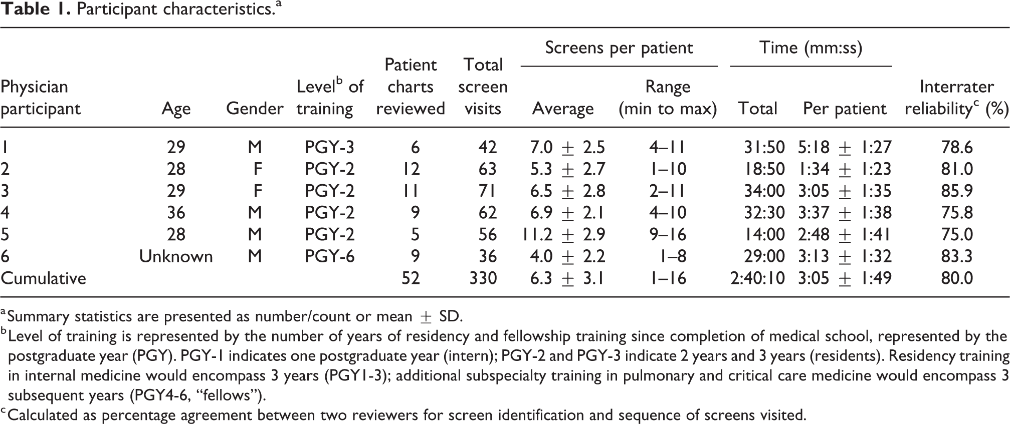
a Summary statistics are presented as number/count or mean ± SD.
b Level of training is represented by the number of years of residency and fellowship training since completion of medical school, represented by the postgraduate year (PGY). PGY-1 indicates one postgraduate year (intern); PGY-2 and PGY-3 indicate 2 years and 3 years (residents). Residency training in internal medicine would encompass 3 years (PGY1-3); additional subspecialty training in pulmonary and critical care medicine would encompass 3 subsequent years (PGY4-6, “fellows”).
c Calculated as percentage agreement between two reviewers for screen identification and sequence of screens visited.
EHR screen visits
In aggregate, the six physician participants viewed 20 unique EHR screens across 330 total screen visits while performing electronic chart review. On average (SD), physicians visited 6.3 (±3.1) total screens per patient (range = 1–16).
As seen in Figure 1 and described in Table 2, the following four screens were viewed most commonly, accounting for over half (52.7%) of all screen visits: Results review, which displays laboratory, imaging and diagnostic studies (17.9%); Summary/overview, the “home page” of the patient’s chart (13.0%); Flowsheet, which integrates physiologic and laboratory data over time (12.7%); Chart review tab, which houses longitudinal clinical notes and narrative data written by physicians, nurses, pharmacists and allied health staff across previous encounters (9.1%).
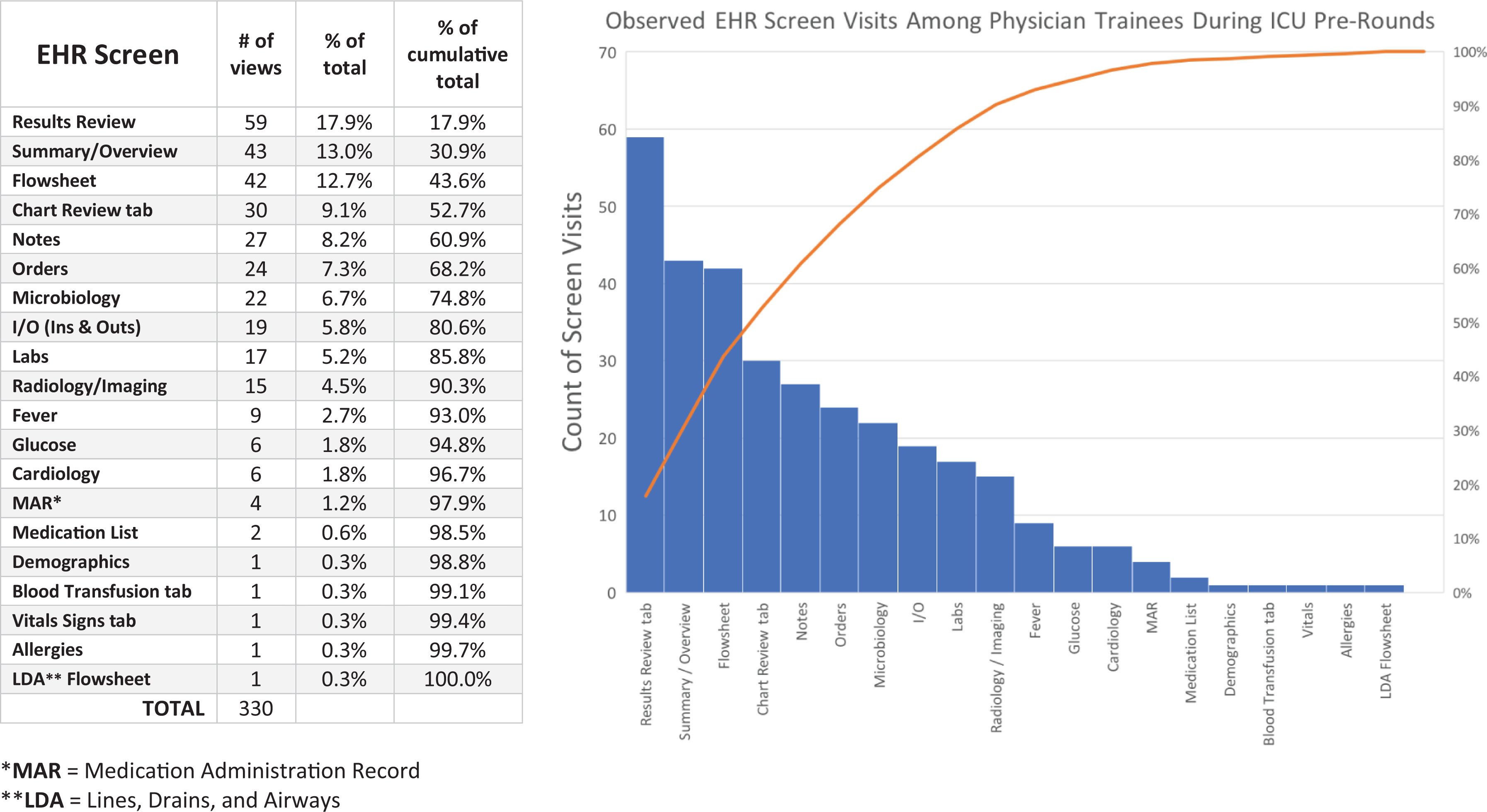
Breakdown of screen visits by discrete EHR screen (n = 330 screen visits). The table (left) provides the granular data for the pareto chart (right). Discrete screens are listed by proportion of total screen visits, in descending order. EHR: electronic health record.
Characteristics of top four high-traffic EHR screens for ICU physician pre-rounding.
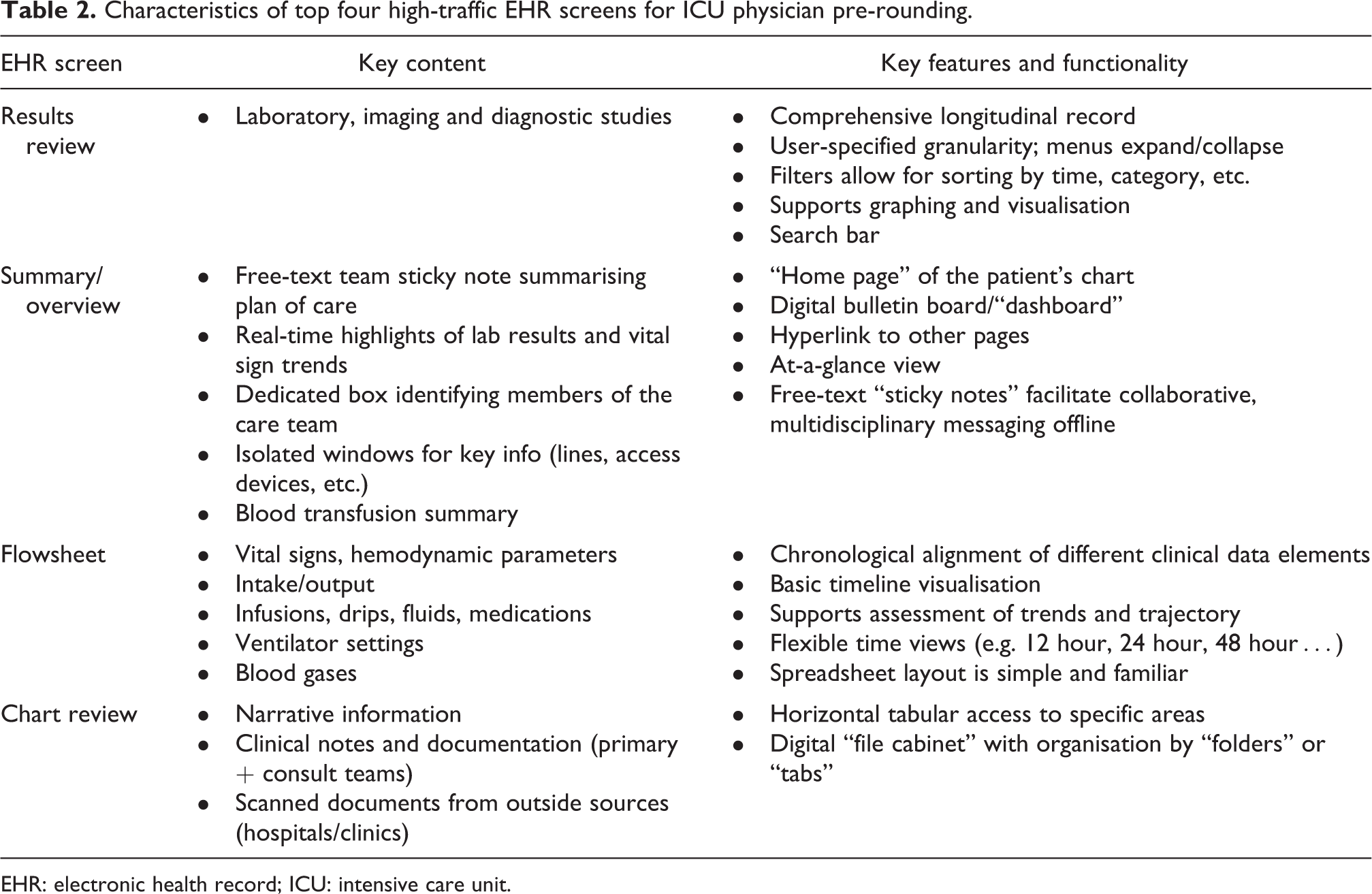
EHR: electronic health record; ICU: intensive care unit.
Three additional screens were also commonly viewed, such that these seven screens together accounted for approximately 75% of all screen visits during pre-rounding encounters: Notes, containing all clinical documentation by physicians, nurses, allied health and other clinical team members for the current hospitalisation (8.2%); Orders, displaying active laboratory, medication, nursing and other orders (7.3%); Microbiology, showing all microbiology testing for the hospitalisation (6.7%).
Of the 20 discrete EHR screens viewed, 5 were only viewed once across all 52 physician chart review encounters: demographics, blood transfusion tab, vital signs tab, allergies and lines, drains, airways (LDA) flowsheet. We observed, but did not quantify, heterogeneity in the degree of interface customisation at the user level: Whereas some participants had rearranged the ordering of their tabs and menus, others used a more “off-the-shelf” interface. This was most apparent on the summary/overview screen.
Time spent
The six physicians cumulatively spent 2 hours and 40 minutes reviewing a total of 52 unique ICU patients. On average, physicians spent 3:05 minutes per individual chart review encounter (range, average duration per physician = 1:34–5:18 minutes). As multiple confounding variables were identified, including the daily call cycle (e.g. on call, post-call) and differences in patient condition and clinical acuity, no further stratification analysis was performed with respect to time. The nature and frequency of observed distractions varied widely across EHR chart review encounters, with nonclinical social interactions (e.g. congenial small talk) occurring most frequently (∼53% of total), followed by clinical interruptions (∼38% of total) such as in-person questions involving physician or nurse colleagues related to the plan of care (Appendix IV).
EHR screen navigation pathways
Sequential tracking of EHR screen visits revealed a high degree of variability across different physicians. Of the 52 total electronic chart review encounters, 48 (92.3%) involved unique screen sequences. For 50 of the 52 patients, physicians began the chart review process by looking first at one of the four screens: summary/overview (30.8%), notes (30.8%), results review (19.2%) or flowsheet (15.4%). From there, a high degree of branching was observed. Figure 2 provides an aggregated screen navigation pathway map across all participants, demonstrating the variable pathways taken from start to end for a given chart review encounter.
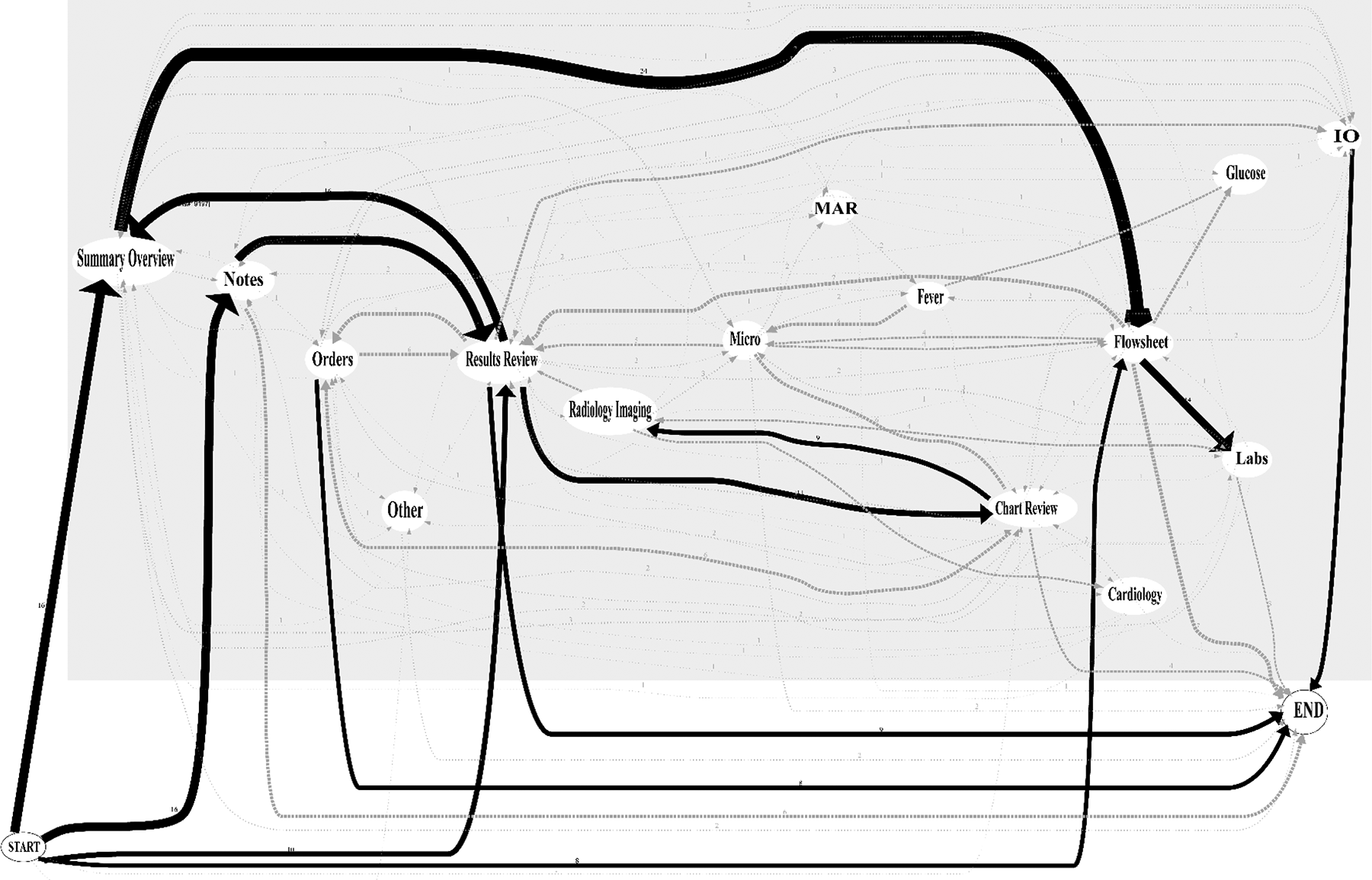
Aggregate mapping of physician screen navigation pathways during pre-rounding chart review (n = 330 screen visits). Sequential EHR screen visits are mapped across six ICU physicians, reflecting the variable digital pathways taken by physician users performing electronic chart review for a single patient from start to end. Arrow thickness indicates relative frequency of navigation patterns. MAR: medication administration record; IO: ins and outs; Micro: microbiology; EHR: electronic health record; ICU: intensive care unit.
Individual physicians seemed to demonstrate some degree of consistency in their own navigation pathways, often visiting the same screens in the same sequential order for different patients. However, few discernible patterns or similarities emerged when comparing the navigation pathways across separate physicians. Figure 3 depicts navigation pathways comparing two separate physicians.
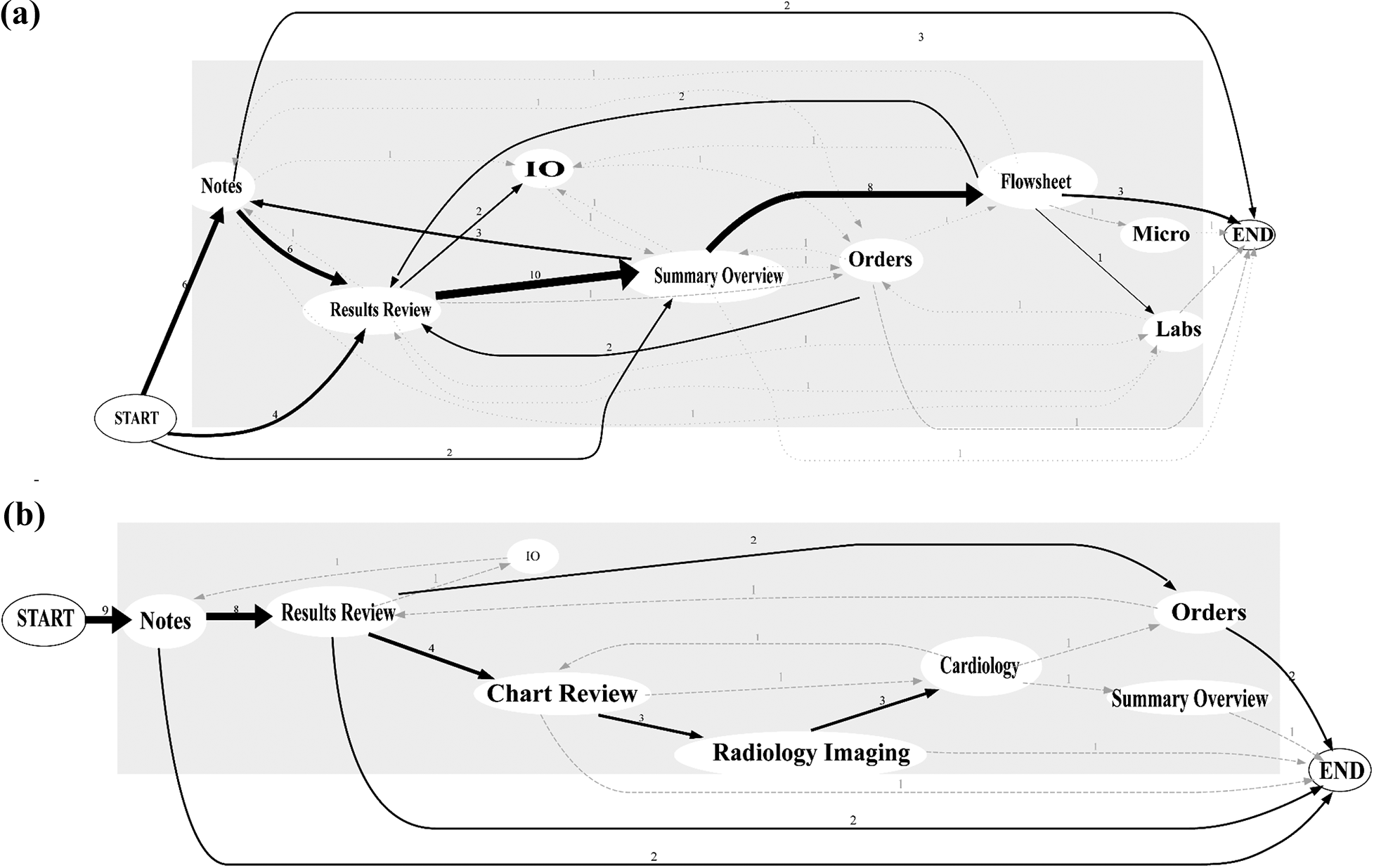
Representative mapping of individual physician screen navigation pathways. Arrow thickness represents the frequency of a given navigation pathway. User 1 (panel a), reviewing 12 patient charts, demonstrates more variability with screen pathways, starting on one of the three screens and almost always routing through flowsheet. User 2 (panel b), reviewing 9 patient charts, demonstrates more homogeneity, starting exclusively with notes and never visiting the flowsheet. For 1 of the 9 patients, user 2 visits only one EHR screen (notes). MAR: medication administration record; IO: ins and outs; Micro: microbiology; EHR: electronic health record.
EHR screen transition patterns
A screen transition matrix is presented in Figure 4, providing the observed frequency of physicians transitioning from one screen to another during chart review. The four most frequently observed transitions across all physicians included (% of all transitions): Summary/overview → flowsheet (8.6%), Notes → results review (5.8%), Results review → summary/overview (5.8%), Flowsheet → labs (5.0%).
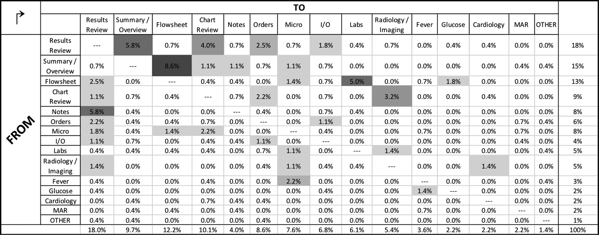
Heat map matrix of aggregate screen transitions across physician users (n = 278 total screen transitions). Relative screen transition frequency is calculated in aggregate across all users. Screen transitions were identified and tabulated from the observed series of sequential screen visits as documented by research personnel using the study checklist instrument. MAR: medication administration record; IO: ins and outs; Micro: microbiology.
The most common “destination” during electronic chart review was the “results review tab” screen, accounting for 18.0% of all screen transitions. This occurred most commonly as physicians transitioned from the “notes” screen to “results review” (5.8%). The next most common destination screens, in descending order, were “flowsheet” (12.2%), “chart review tab” (10.1%) and “summary/overview” (9.7%).
Discussion
This direct, live observational study of physician trainees performing electronic chart review during ICU pre-rounds provides a glimpse behind the screens, offering a small window into physicians’ digital information needs and EHR clinical workflows in the ICU. Key findings include four EHR screens comprise over half of all screen visits during pre-rounding, physicians typically “launch” their chart review from one of the four screens and certain screen transitions appear to occur more commonly than do others. These data support broader conversations around ways to optimise, redesign and develop more user-centred EHR systems. We provide several such suggestions in Table 3 and discuss these in context below.
Focused recommendations for EHR design and implementation to support physician users in the medical ICU.a
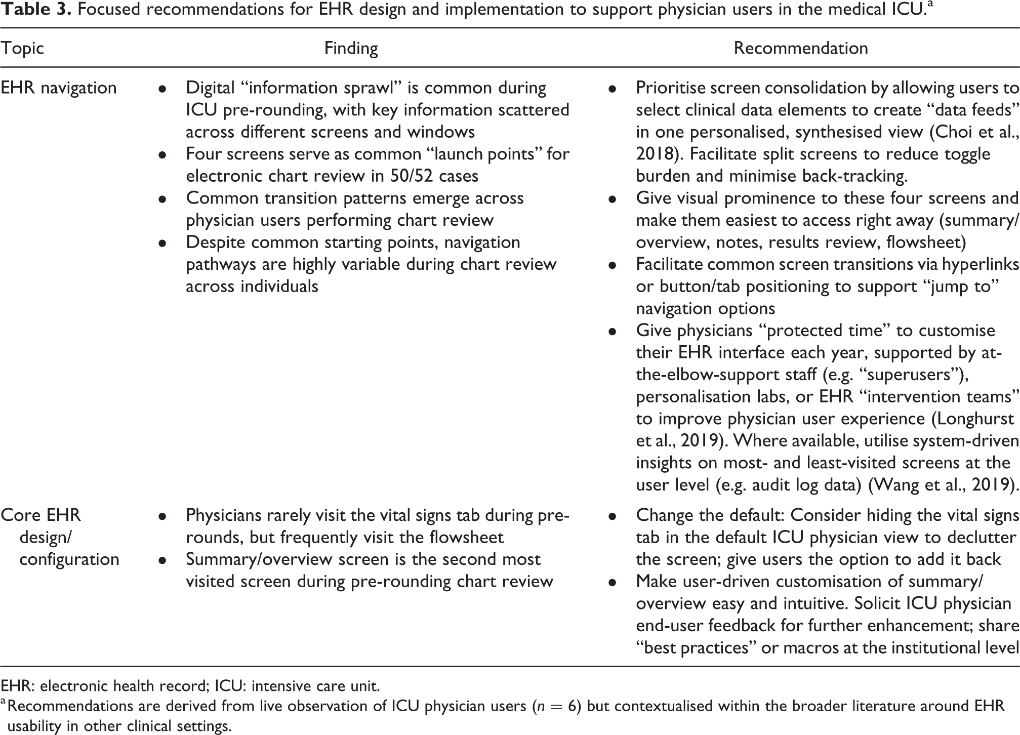
EHR: electronic health record; ICU: intensive care unit.
a Recommendations are derived from live observation of ICU physician users (n = 6) but contextualised within the broader literature around EHR usability in other clinical settings.
EHR screen visit patterns
The result that four screens account for over half of all screen visits during ICU pre-rounds, and seven screens comprise approximately 75% of all screen visits, forces us to consider why these screens are so highly trafficked: is it the content/clinical data they contain, design aspects/features of the screens themselves or elements of both?
We suspect the primary explanation for the relatively high traffic across the top four screens lies in the data elements they contain, which are critical for clinical summation, abstraction, synthesis and decision-making, regardless of the patient’s primary diagnosis. However, there may be other similarities across these four screens related to interface design rather than content. Although we do not attempt to quantify information density here (e.g. calculating a screen complexity score (Fu et al., 2007)), it could be that these screens all display a relatively high amount of clinical and demographic data with minimal dead space. In addition, these four screens may provide a high degree of navigational flexibility, allowing users to access many other screens quickly by way of hyperlinks, tabs or expandable/collapsible menus. Thus, physicians may favour these screens because they convey key clinical content in an economical manner and they provide navigational efficiency and flexibility.
EHR navigation patterns
Among this cohort, users almost always began their electronic chart review on one of the four screens, suggesting common navigational “launch points” or on-ramps to a digital highway. However, although physicians’ starting points suggested a degree of homogeneity, their subsequent navigation patterns, beginning at the second screen, remained highly variable. Despite this, four screen transitions emerged as more common across users. Efforts to improve the user experience might focus on streamlining these particular transitions through larger buttons or “jump to” tools to decrease the click/scroll burden.
This study also found that physician navigation pathways during electronic chart review are nuanced and highly variable, with many routes to get from “start” to “end.” Some of this variability may be explained by patient factors: for a hypothetical patient with septic shock, the “fever tab” screen may be valuable; on the other hand, for a patient with diabetic ketoacidosis, the “glucose flowsheet” screen may be more relevant. Additionally, physician factors may explain some of the variability in navigation pathways: A particularly tech-savvy physician might reconfigure the layout of menus and tabs to support a preferred sequence of screens, whereas his or her colleague might rely on the default interface and layout.
Despite the high degree of inter-user variation in screen pathways, we observed less intra-user variation. We found that individual users tend to follow a distinct and preserved “road map” guiding their EHR workflow from one patient to the next. Our results found that individual users tend to progress through the same sequence of screen visits when reviewing multiple patients, suggesting a systematic and methodical cognitive approach to information-seeking. This observation –that individual users tend to establish and stick to a unique preferred path – could support the development of “My EHR Activity” trackers, perhaps derived from audit log data, to facilitate personalisation at the individual level. For example, if a given user tends to view screens A → D → E → B for most patients, then the EHR system might offer tailored tips to support this pathway, ridding one’s screen of low-traffic tabs or reconfiguring one’s interface to yield fewer mouse clicks. (We note that the EHR implementation at our institution includes similar functionality to support interface customisation at the individual level, but data on its uptake are lacking. As this feature already exists within Epic Systems, it is less likely to require additional effort for maintenance or redistribution of resources for many institutions.)
One observation that we found surprising was relatively low screen traffic (∼1% of all screen visits) involving the medication administration record (MAR) screen. This screen contains a log of all medications ordered, given and scheduled for a particular patient – helpful information for titrating therapies in critically ill patients. Although our observational data do not explain the low traffic, they are hypothesis generating: we wonder, based on conversations with physician colleagues, whether the MAR screen layout and scrolling burden are a deterrent for use during pre-rounds; alternatively, perhaps the MAR is visited more frequently during formal team rounds, where there is more collaborative focus on order entry.
Context, implications and recommendations
Our observation of highly variable EHR screen navigation pathways across individual users aligns with prior work (Kendall et al., 2013; Nolan, Siwani, et al., 2017; Reichert et al., 2010). Given the consistency of this finding, there may be implications for user-centred EHR training. Rather than classes or modules that walk novice users through step-by-step screen workflows (first click here, next click here…), perhaps a task-based, sandbox-style framework is more appropriate for initial training, and greater attention should be paid to EHR competency over time (Longhurst et al., 2019). Prior work from Hultman et al. (2016) has demonstrated the importance of EHR usability assessments in the context of interface redesign. Identification of high-traffic screens during ICU pre-rounding can advance and inform our efforts towards continued system improvements. Vendors and designers might use these data to triage redesign proposals, noting the potential yields in user satisfaction by focusing on just four screens. Furthermore, identification of highly prioritised screens and data elements supports the development of theoretical models of EHR workflow (Khairat, Coleman, et al., 2018) as well as efforts to build visualisation dashboards for critical care (Khairat, Dukkipati, et al., 2018; Wright et al., 2016). Whereas Nolan et al. examined physicians performing initial chart review on unfamiliar ICU patients, our findings add a new dimension because we examined a different use case (Nolan, Cartin-Ceba, et al., 2017; Nolan, Siwani, et al., 2017). In contrast to their observation that physicians prioritise clinical notes above all, we found that EHR screens housing structured data (results review and flowsheet) appeared to be more highly prioritised, perhaps because physicians performing chart review on familiar patients seek 24-hour changes in laboratory values and physiologic parameters over narrative data.
Building on the work of Zahabi et al. (2015), who recognised the importance of EHR design based on a “natural” clinical workflow, our work enhances understanding of digital workflows in the medical ICU. We have previously used the term “information sprawl” (Khairat et al., 2019) and wish to reintroduce the concept here to characterise the current state of EHR user experience: with key information spread out across multiple screens, a complex and labyrinthine navigation approach can be required, at times resembling a digital scavenger hunt. We frequently observed physicians jumping laterally across 10+ EHR screens for a single patient, often toggling back and forth between the same few screens.
The results of our study reinforce the metaphor of information sprawl and support Sinsky and Privitera’s call to create a more “manageable cockpit” for clinicians, a decluttered digital environment “free of information overload…and cumbersome workflows that cumulatively contribute to a hazardous environment” (Sinsky and Privitera, 2018: 741). Towards this end, we join Nolan et al. and others in providing recommendations for user-centred EHR design and training, integrating suggestions from our small observational study with ideas published previously in the EHR usability literature (Table 3).
Recommendations include greater freedom for individual customisation on the “summary page” of the chart, better facilitation of common navigational transitions and eliminating low-traffic tabs/screens from the default view. Furthermore, with increasing emphasis on the link between EHR use and physician burnout, greater emphasis on user personalisation may translate to less physician time spent in the EHR (Butler, 2019). Relatively low-cost strategies might include increased focus on personalisation during initial user training, periodic deployment of at-the-elbow-support staff (super users) beyond the initial implementation phase or “protected time” for personalisation.
Strengths and limitations
Strengths of our study include the live observational design and involvement of experienced users, allowing for better analysis of the natural care environment compared to simulation testing. Similar observational assessments of EHR usability have been performed in critical care (Carayon et al., 2015; Nolan, Siwani, et al., 2017) and emergency department (Khairat, Burke, et al., 2018) settings. Although we were unable to validate our EHR observations with audit log data, the paired observation design and observed range of interrater reliability (75.0–85.9%) support the assumption that our observations accurately captured physicians’ actual activity. Finally, we provide transition matrices and novel screen pathway maps to highlight the many permutations of EHR workflows and screen pathways among physicians in the ICU. By capturing the complexity and chaos at the heart of the user experience, these visualisations add imagery to an important and evolving story – How are physicians experiencing the EHR? We hope the next chapter of the EHR story will involve enhanced user-centred redesign.
We acknowledge several limitations in our study. First, our work was limited to the medical ICU at a single institution using a single EHR system, which limits generalisability. However, this EHR vendor (epic systems) has traditionally been one of the leading EHR systems worldwide (Monegain, 2020), so our findings may be relevant to other institutions using the same system. Second, participants were young and their use of EHRs may not generalise to older physician users, as prior work has suggested (Khairat, Burke, et al., 2018). Third, our study involved a short observation time relative to other observational studies of clinicians (Walter et al., 2019) and contained a small number of participants from a convenience sample, which introduces the possibility of sampling bias. However, we note Nielson’s foundational theory of usability testing with as few as five users (Nielsen and Landauer, 1993) and other applied studies with small sample sizes (Hultman et al., 2016; Khairat, Burke, et al., 2018; Rizvi et al., 2017). Fourth, as with all observational studies, a Hawthorne effect may have occurred, though we attempted to limit this by using broad language during recruitment and inconspicuous positioning of study personnel during observation. Fifth, we observed just one EHR task, though we considered pre-rounding chart review to be relevant: although the specific screens may vary, the task itself is common across specialties and care settings and the workflow is comprehensive, exposing many EHR functionalities. Furthermore, our findings from pre-rounding workflows may yield insights to improve efficiency of other ICU workflows, which is important given prior estimates that trainees often spend 4+ hours per day in the EHR (Wang et al., 2019). Sixth, as EHR workflows vary greatly by role and task, our findings from physician ICU pre-rounds may not be generalisable to other clinical settings, although we identify areas where our findings and recommendations align with prior work. Lastly, we are unable to share screenshots due to contractual restrictions, which limits the clarity of the results we report. Despite these limitations, we feel these findings help to advance our collective understanding of the physician–EHR interaction in the ICU.
Future directions
Future work to understand the physician–EHR interaction in the live environment could incorporate EHR audit log files to analyse workflow in more detail, possibly correlating screen navigation with measures of workload (such as mouse clicks) and quantifying time per screen or activity with more granularity (Krawiec et al., 2019; Wang et al., 2019). Further extension of this work should include users from other clinical roles, different ICU settings, different institutions and different EHR vendors. Examination of additional aspects of workflow could better characterise “information sprawl,” such as the degree of toggling between the EHR and external programs (web browsers or calculators). Lastly, simulation testing, using eye-tracking devices and screen capture software, could provide insight at the sub-screen level to facilitate “decluttering” of key screens.
Conclusion
When performing electronic chart review in the medical ICU during morning pre-rounds, physicians in our study demonstrated highly variable screen navigation pathways. However, for all physicians, the chart review process tended to be brief (∼3 minutes per patient on average) and highly focused (four screens comprised over half of all EHR screen visits). We identified key “launch points” for electronic chart review, high-traffic screens and common screen transition patterns. From these insights, we add suggestions towards more streamlined and user-centred information systems.
Clinical relevance statement
This work is a step towards understanding how physicians navigate through EHRs to complete clinical tasks, specifically performing chart review on familiar patients during ICU pre-rounds. The study explores key EHR screens and provides specific, user-centred recommendations for EHR implementation and screen redesign from the perspective of physician–user stakeholders.
Supplemental material
Supplemental Material, APPENDIX - Analysing EHR navigation patterns and digital workflows among physicians during ICU pre-rounds
Supplemental Material, APPENDIX for Analysing EHR navigation patterns and digital workflows among physicians during ICU pre-rounds by Cameron Coleman, David Gotz, Samantha Eaker, Elaine James, Thomas Bice, Shannon Carson and Saif Khairat in Health Information Management Journal
Footnotes
Ethical approval
This study was performed in compliance with World Medical Association Declaration of Helsinki on Ethical Principles for Medical Research Involving Human Subjects and was reviewed by the University of North Carolina at Chapel Hill Institutional Review Board.
Declaration of conflicting interests
The author(s) declared no potential conflicts of interest with respect to the research, authorship, and/or publication of this article.
Funding
The author(s) received no financial support for the research, authorship, and/or publication of this article.
Supplemental material
Supplemental material for this article is available online.
References
Supplementary Material
Please find the following supplemental material available below.
For Open Access articles published under a Creative Commons License, all supplemental material carries the same license as the article it is associated with.
For non-Open Access articles published, all supplemental material carries a non-exclusive license, and permission requests for re-use of supplemental material or any part of supplemental material shall be sent directly to the copyright owner as specified in the copyright notice associated with the article.