
Abstract
Video-on-demand (VOD) interfaces have become a ubiquitous feature of contemporary screen culture. But despite their prevalence and the significant amount of time we spend in these liminal spaces, these interfaces are – within the field of TV studies at least – relatively under-theorised and rarely the subject of focused critical interrogation. Indeed, it has been noted that there are simply ‘no established methodologies in TV studies for studying interfaces’ (Johnson, 2017: 124). In addressing this methodological gap, this article develops and demonstrates an empirical and quantitative approach to the analysis of television VOD interfaces, taking its cue from ‘distant reading’ (Moretti, 2013).
According to a 2016 study (Maglio, 2016), Netflix users were spending on average almost twice as long selecting a title when compared to their cable TV viewing peers (17.8 minutes compared to 9.1 minutes, respectively). Cumulatively this added up to more than 2 hours spent navigating the Netflix interface every week. A more recent report from Nielsen in 2019 found that subscription video-on-demand (SVOD) users aged between 18–34 took a mere 9.4 minutes on average to select a title (Nielsen, 2019). Although a more conservative figure than the earlier 2016 report, it is still the equivalent of more than an hour each week. Even at this lower estimate, it is clear that today’s television viewers spend a considerable amount of time browsing video-on-demand (VOD) interfaces.
Whilst interfaces have been a staple feature of television for many years and in various guises, including the electronic programme guide (EPG) or in the form of now defunct teletext services such as Ceefax, they have tended to assume a relatively marginal role in both the experience of watching television and subsequently in television scholarship itself. However, in an age of streaming and on-demand content, graphical user interfaces (GUIs) have become a ubiquitous feature of domestic screen culture and have therefore taken on greater cultural significance. More than ever before in the history of this medium, these complex, interactive and omnipresent windows profoundly influence and organise our encounters with audio-visual texts.
Yet despite their prevalence in contemporary screen culture, and despite the significant amount of time we spend in these liminal spaces, television interfaces are – within the field of TV studies at least – relatively under-theorised and rarely the subject of focused critical interrogation. Indeed, according to Jan Distelmeyer, even though these GUIs have become ubiquitous, ‘media studies analyses of common user interfaces are still not common’ (2018). To some extent, this dearth of critical attention can be attributed to the fact that interfaces are often regarded as ‘non-places’ (Chamberlain, 2011) and are usually designed to be highly inconspicuous. As Debra Ramsay points out: ‘from the perspective of the practice of interface design…the interface should ideally be so unobtrusive as to be almost invisible, with the eventual aim of making it disappear altogether’ (Ramsey, 2018: 284).
This lack of critical attention is not only due to the inconspicuous nature of the interface, but it is also the result of a number of other methodological obstacles that media studies scholars must first overcome. Their analytical resistance is such that, as Cathy Johnson points out, there are currently ‘no established methodologies within TV studies for studying interfaces’ (Johnson, 2017: 124). This lack of suitable methodologies is disconcerting, but it is also entirely unsurprising given the significant challenges associated with studying interfaces: they are highly ephemeral and subject to constant change in terms of both content and design; they are often driven by complex algorithms which operate upon enormous and proprietary datasets; and they are therefore ultimately highly resistant to analysis through more traditional research techniques (Kelly, 2020). Their study requires specialised methodological competencies that are not often taught, acquired, practiced, or shared within more ‘traditional’ (i.e. analogue) fields such as television studies. This article is thus a response to Distelmeyer’s (2018) and Johnson’s (2017) observations regarding the lack of research or established methodologies within the field, in that it develops and describes one possible approach to the study of television interfaces.
The article begins by briefly defining the interface, specifically in the context of contemporary television, whilst also demonstrating its growing cultural significance as a kind of liminal space at the threshold of interpretation (Genette, 1997). Following this, the article describes and demonstrates one way to examine VOD interfaces, utilising some relatively accessible and common research techniques and tools. Broadly speaking, the approach taken here involves ‘scraping’ a range of data from the BBC’s iPlayer interface once a day over a 2-year period. This data includes the horizontal and vertical position of content as it appears on the desktop version of iPlayer, as well as programme title, availability, duration, genre, category, and synopsis, amongst other variables. This dataset is then analysed and visualised in order to identify large-scale patterns and derive new insights about VOD platforms – insights that would not be possible through the type of ad hoc observation and/or close textual analysis that has characterised previous studies of these now ubiquitous interfaces. Finally, this article will briefly consider these findings in relation to the broader aims and objectives of the BBC. In this way, it uses the iPlayer’s interface as a means of testing and interrogating the delivery of public service values in an era of on-demand content.
What is an interface?
While there is a limited amount of scholarship addressing interfaces within the field of television studies, television interfaces have nevertheless been a pervasive feature of the medium since its inception. Today they are most visible in the form of the VOD graphical user interface, but they have existed in various other guises over the years. The Oxford English Dictionary (2002) defines an interface as ‘a point where two things meet and interact’, and in that sense even the earliest television sets, with their various dials and switches, clearly adhere to this definition.
In addition to the dials and switches that adorned the very first receivers, it is possible to identify numerous other types of interfaces, some hardware some software, but all of which still exist today: the remote-control device (RCD); the electronic programme guide (EPG); the VOD graphical user interface. However, it is the latter of these – the VOD GUI – that is the primary focus of this article. In contrast to the RCD and EPG, both of which have received their fair share of scholarly attention (see, for instance, Bellamy and Walker, 1996; Uricchio, 2004), the GUI has been subject to far less critical scrutiny.
Television’s various hardware and software interfaces demand our attention, not only because of their prevalence but also because they have profound implications for how, why, when, where and what we watch. Their influence exists not only in physical terms, such as the way that the design of a remote control determines the layout of a VOD interface (and how we ultimately navigate through that interface and discover content), but in ideological terms too. As James Ash maintains, ‘interfaces operate as the site of new economies and forms of power’ (2016: 4). He elaborates:
Rather than just inert tools or lumps of matter, interfaces of all kinds are central to the shaping of perception itself and, with it, how we anticipate, recollect and prepare for events in a world that is moulded by and emerges from the very logics of the interfaces we use to engage with this world (Ash, 2016: 4)
This view of the interface as a site of ideological power and contestation, where their design can determine a user’s behaviour and/or limit their choices, is a common theme in other critical accounts of GUIs. In one of the first studies of television’s now commonplace graphical user interfaces, Daniel Chamberlain (2011) draws attention to the way that these liminal spaces are often designed to elicit certain kinds of user behaviours. The GUI interface, Chamberlain argues, is the virtual equivalent of a ‘scripted space’, a concept he borrows from the field of geography and which refers to ‘exceptionally planned physical environments’ (2011: 239) that are designed to encourage the movement of people through specific predestined pathways. Chamberlain cites several examples of ‘non-virtual’ scripted spaces, such as cinemas and theme parks, but there are perhaps even more obvious examples that we could add to this list, including airports and supermarkets. Although there are always exceptions, ‘scripted spaces’ are more often than not designed to encourage the physical movement of people in such a way as to maximise profit (or to adhere to a certain ‘narrative’ as is often the case in cultural institutions). Implicit in Chamberlain’s account, then, is the idea that virtual interfaces are also designed to achieve certain economic goals. The ‘scripted space’ is thus a useful conceptual framework, particularly when applied to commercial services such as Netflix or Amazon Prime Video. Whilst it might seem less applicable to public service broadcasters (PSBs) for whom profit is not their primary goal, this ‘scripting’ can still be used to deliver other, more PSB-oriented forms of value. As James Bennett and Niki Strange note, the priority for these platforms is to ‘serve and fulfil public service (PS) obligations and engage viewers in new relationships’ (Bennet and Strange, 2008: 106), a priority that can (and is) achieved via the ‘scripting’ of the PSB interface.
This concern with the power dynamics between the interface and the user is a common focal point in other accounts of GUIs. For instance, drawing on work in cognitive psychology, Mel Stanfill (2015) develops an approach called discursive interface analysis which attempts to address some of the methodological inadequacies in previous studies of web interfaces. Stanfill’s account draws specific attention to the cognitive, physical, sensory and functional affordances of web interfaces and, despite using a very different conceptual framework to Chamberlain, nevertheless arrives at a similar conclusion: ‘ultimately, discursive interface analysis of these industry sites demonstrates that new media have actually not radically altered the traditional ideal of passive consumers who should grin and take what they’re sold’ [emphasis in original] (Stanfill, 2015: 1069). Elsewhere, Johnson offers a compelling demonstration of how close analysis ‘can reveal how interface design is used by organisations in an attempt to engender certain kinds of user behaviour’ (Johnson, 2019: 110). This assertion is reinforced in Johnson’s conclusion that online TV interfaces ‘create an illusion of abundance and plenty…minimise interactivity while creating an illusion of user agency…[and] orient user behaviour towards viewing’ (2019: 113).
Collectively, these works all employ close analysis in one form or another as their primary methodology. By utilising a qualitative approach, they are able to highlight the crucial role that interfaces play in the contemporary viewing experience, drawing our attention to how they function like paratexts in the sense that they can significantly influence if not determine what we choose to watch (see, Gray, 2010; Kelly, 2018). But the use of close analysis invariably limits the critical scope of such research, resulting in accounts that inevitably privilege issues around user experience (UX) design and the (im)balance of power between the user and the interface. Moreover, close textual analysis tends to encourage synchronic rather than diachronic readings: in other words, it results in studies that typically perform close textual analysis on a VOD interface at a fixed point in time (or over a short period of time) rather than across an extended period.
Although these works have made a significant contribution to this field by laying the necessary conceptual foundations for future research in this area (including this very article), we nevertheless need to develop other tools and approaches that are more attuned to the study of VOD interfaces and that are ultimately able to ask and answer different research questions (see Lobato, 2018a). The methodology developed and described below is an attempt to do just this. In particular, it seeks to move from the synchronic model of previous studies to a more diachronic approach. The intention here is not to diminish the value of close textual analysis as a method for studying VOD interfaces, but rather to develop an approach that can build upon the important insights and observations that these earlier studies have already contributed. The remainder of this article thus responds to Ramon Lobato’s (2018a) call for more innovative methodologies to study VOD platforms, specifically those that can be utilised in a way that complements rather than replaces existing research methods. To that end, this article proposes a more quantitative methodology, one that could be viewed as antithetical to close textual analysis, but which builds upon and can work in tandem with these earlier studies.
From close to distant reading
As already established here, the analysis of VOD interfaces poses significant methodological challenges (Distelmeyer, 2018; Johnson, 2017, 2019). This explains why much of the current literature on television interfaces, including those works discussed above, have tended to utilise qualitative methods (i.e. close textual analysis), resulting in accounts that focus primarily on the design, layout, features and effects of VOD interfaces. This study, however, utilises a very different approach, one that is more quantitative and more akin to ‘distant reading’ (Moretti, 2013).
‘Distant reading’ is a methodology most often associated with literary theorist Franco Moretti (2005, 2013). Simply put, it refers to the macroscopic analysis of a text or, more often than not, a corpus of texts. Distant reading takes its cue from network theory which, Moretti explains: is a theory that studies connections within large groups of objects: the objects can be just about anything — banks, neurons, film actors, research papers, friends…— and are usually called nodes or vertices; their connections are usually called edges; and the analysis of how vertices are linked by edges has revealed many unexpected features of large systems. (Moretti, 2013: 132)
Whereas Moretti’s version of distant reading relies heavily on natural language processing (NLP) to analyse different elements (such as keywords, locations, themes, style, etc.) within and across a text or corpus of texts, a distant reading of BBC iPlayer is a much different proposition because it occurs at an even more abstract level. Rather than scrutinising aspects within the texts themselves (for example, dialogue within the programmes, locations, imagery, actions, framing, etc.) and examining them as part of a network a la Moretti’s form of distant reading, it focuses instead on the relationship(s) between the various meta-data attached to each title within the iPlayer interface: date, time, title, synopsis, availability, genre, channel, and so forth. Nevertheless, the method developed here still shares the same basic principles and objectives of Moretti’s model of distant reading insofar that it too seeks to reveal wide-scale patterns that would be impossible to divine via small-scale qualitative analysis.
This is not necessarily a novel approach within the context of media studies. As Lobato (2018a) points out in his discussion of what a new VOD research agenda might constitute, film and television scholars have a history of conducting large-scale quantitative research. For example, in the case of television, he cites several pioneering studies that have used large quantities of scheduling data to explore questions of cultural and ideological flows. What is different today, however, is that this work can now largely be automated – and in many cases, it can only be automated because the volume of data being produced is so significant. Moreover, VOD platforms are highly resistant to the kinds of analogue quantitative methods of yesteryear and therefore demand a very different kind of approach (Kelly, 2020). There is no interface equivalent dataset to the broadcast schedule, for example. This is one of the primary challenges of studying a VOD interface and explains why previous efforts have tended to focus on the design and features of these platforms – namely because these elements remain relatively consistent and open to scrutiny. It is therefore much easier to talk about the way in which content is structured (in grids and carousels, for instance) and the different features that an interface might include (such as the option to build playlists or browse by channel) than it is to talk about wider patterns of content exposure. This is partly because what is offered to us by the interface is often algorithmically dependent on a combination of factors, including the time of day, the user, the platform, the location, and so forth. In other words, it is possible to make generalisations about the design of an interface, and the implications of these designs, but it is far more difficult to make generalisation about what the interface is actually offering us. Personalisation is a core feature of most VOD services, but it also presents the biggest methodological challenge for media studies scholars.
Why BBC iPlayer?
Distant reading has clearly worked for other disciplines such as Literary Studies (see Moretti, 2005, 2013) but this is largely because the data utilised in these fields – namely written works – are much more widely available and more standardised than the data associated with VOD services. In fact, when it comes to VOD platforms, there is little if any such data to begin with. As such, and as has been argued elsewhere (Kelly, 2020), it is incumbent upon television scholars (and media scholars more broadly) to find innovate ways to create, archive and share such data. This article represents an attempt to put this call to action into practice.
In light of the methodological challenges involved in the study of VOD interfaces outlined above, and lieu of any data that might help us to overcome or circumvent these challenges, this study focuses on a service that is relatively conducive to such analysis: BBC iPlayer. There are several reasons as to why iPlayer is more amenable to distant reading compared to other VOD services. Firstly, unlike SVOD platforms such as Netflix, BBC iPlayer does not sit behind a paywall. This makes it much easier to scrape, not only from a technical viewpoint but from a legal one too (because its data is essentially in the public domain). Secondly, BBC iPlayer is more receptive to distant reading because it is considerably less personalised (and less algorithmically driven) when compared to other similar platforms. As BBC Director of Content Charlotte Moore explains, ‘iPlayer is curated…it’s a cutting edge tech platform – but it’s run by humans. Not assembled by algorithm, but carefully curated by people’ (2019). 1 Although BBC iPlayer requires users to sign in before they can view any content, there is no need to sign in to view the interface itself. As such, there is a ‘generic’ version of iPlayer which features no personalisation at all, and upon which this study is based.
Whilst signing in inevitably changes what is offered to us – for instance, there are rows for ‘next episodes’ for series that a user has been watching as well as other rows with tailored recommendations based on past viewing behaviour – the personalised and non-personalised versions are remarkably similar, with the former clearly an extension of the latter. A quick comparison of both personalised and non-personalised versions proves as much: whilst the personalised version contains a total of 13 rows (each containing 12 titles) the non-personalised version contains a total of 10 rows (again, with each row containing 12 titles). Of the 10 rows featured on the generic, non-personalised version of iPlayer, 9 of these also appeared in the personalised version. Of those 9, 8 were identical in terms of content and the order of content (only the top ‘featured’ carousel included a small number of differences – with 10 out of 12 titles identical on both). In itself, this is an interesting insight given that many VOD services, particularly SVOD platforms such as Netflix, are known for offering highly personalised experiences. To some extent, however, the limited amount of personalisation present on BBC iPlayer is unsurprising given their public service remit and can be seen as consequence of their obligation to appeal to both a collective public as well as a range of niche identities and tastes. Fortunately, the limited amount of personalisation found on this platform allows us to perform a distant reading of the iPlayer interface with a high degree of confidence that the data captured/titles recommended will not be unique to just one user (almost 80% will be the same for everyone). Consequently, this method allows us to make generalisations that are applicable to the average iPlayer user’s experience – something that would not be possible to do with a service such as Netflix.
Finally, it is worth noting that BBC iPlayer was selected for this study not simply because it is relatively conducive to distant reading, but also because public service broadcasters are often overlooked in critical accounts of VOD interfaces. Indeed, by focusing on BBC iPlayer this article will contribute to emerging debates around content prioritisation in the context of public service media. As Elenora Maria Mazzoli and Damian Tambini note, ‘whether content should be prioritised because it is deemed to serve public and societal values and achieve public interest objectives in only recently becoming a topic of policy debate’ (2020: 4). Despite the fact that platforms such as BBC iPlayer have been around for more than a decade, Mazzoli and Tambini note that we are still very much in an embryonic moment for these VOD services with ‘several public and private institutions’ currently in the process of ‘drafting ethical standards, ranking guidelines and general content policy guidelines as part of their corporate responsibility efforts’ (Mazzoli and Tambini, 2020: 4). The method described below is therefore intended to better equip media scholars so that we can measure the efficacy and suitability of these systems and help inform the policies being developed around them.
Method
Having outlined some of the key debates and methodological gaps in the current literature surrounding VOD interfaces, and having explained why BBC iPlayer is particularly suited to such an analysis, this section provides a brief overview of the methodology.
Broadly speaking, the method developed here can be divided into three distinct phases, which typically occur in most datacentric workflows: (1) scraping, (2) parsing and cleaning, and (3) analysing and visualising.
Scraping
‘Scraping’, or ‘web-scraping’, refers to the process of extracting data from one or more websites. The subject of this research, the generic (i.e. non-personalised) desktop version of BBC iPlayer, is comprised of a 10 x 12 grid of content (10 rows, with 12 tiles in each), with each of the 120 titles containing at least five (i–v), but sometimes up to eight (vi–viii), pieces of metadata (see Table 1). As such, there were up to 960 pieces of data collected on any given day. The scrape itself was performed using a free visual web-scraper, in this instance a programme called Parsehub. 2
List of variables scraped from BBC iPlayer.
However, before one can begin the process of scraping data from a VOD platform, there are a number of important methodological issues to consider. First and foremost, the time and frequency of the scrape must be taken into account as they will have a significant bearing upon the data that is eventually collected. The content featured on a VOD interface usually varies depending on the time of the day. A broadcast schedule will feature certain genres more prominently at certain times of the day, and most VOD interfaces operate on a similar logic. Scraping iPlayer in the morning would therefore produce different results compared to scraping it in the evening – particularly in terms of genre. This hypothesis was tested by comparing the 9 am and 9 pm versions of iPlayer several times. Although it tended to be the case that 9 out of 10 categories were the same (and in the same order) the content that appeared within these categories differed significantly in terms of sequence. This has particular ramifications in terms of the ‘discoverability’ (Lobato, 2018b; McKelvey and Hunt, 2019) or ‘exposure’ of content not least because titles featured within the first three to four columns are immediately visible, whereas the remainder can only be discovered by actively navigating through each row. Although there tended to be consistency between categories, where there were differences, they were notable. As is to be expected, certain categories were more prevalent in the morning version of iPlayer (such as ‘Best of Kids’) whilst others were more popular during the evening (such as ‘Binge-worthy’). Given this temporal variance, a decision was made to scrape iPlayer once a day (for a period of more than 2 years from August 2018-April 2021) during ‘primetime’, between the hours of 8 pm and 11 pm. This was largely because primetime is when iPlayer is subject to peak usage and therefore the data gathered (and subsequent insights generated through an analysis of the data) would have a much wider relevance. It is important to bear in mind, then, that the data (and the subsequent findings/results) are a reflection of what BBC iPlayer’s interface looks like during ‘primetime’.
Parsing/cleaning
Scraping rarely yields a perfect dataset, one that is immediately ready for analysis and/or visualisation. Instead, data typically requires parsing and cleaning. 3 In terms of the former, there were a number of variables that required parsing in order to enrich the dataset. For example, the location of a title (its vertical and horizontal position within the interface) could not be determined through the initial scrape but was added at a later date (using a script written in the programming language R and based on the order in which titles appeared within the dataset). This created new variables called ‘row’ and ‘column’, thus adding a critical piece of data that could be used to calculate the average position of any given title, genre, etc. As will become clear from the findings below, these additions to the dataset are crucial as they reveal important new insights about the average position/prominence of certain titles and genres over an extended period of time.
Other important variables also needed to be parsed or were missing altogether. In terms of the latter, this included the channel of origin for each title. Prior to October 24th 2017, this data was present for each title on iPlayer (the channel became visible when the user’s cursor hovered over a particular title) and would have therefore been easily extractable. However, with this data no longer present within the interface, the only option was to add it after the initial scrape. Again, this was achieved by writing a custom script in R, which visited the website for each title in the dataset and extracted (where possible) details of the programme’s channel or brand from the page’s metadata.
The final key piece of data that was extracted from the original dataset was the ‘box-set’ designation. This often appeared within the title, synopsis or series field and therefore needed to be parsed for the purposes of analysis. Parsing refers to the process of breaking down a sentence or string of symbols into their smallest constituent parts. In the field of computer science, parsing is often necessary because data that is extracted is often a combination of strings or values that cannot be properly examined through data analysis. To take an example from my own analysis of BBC iPlayer: the ‘title’ field sometimes contains only the title of a programme (e.g. Killing Eve) but sometimes it contains the ‘title’ and other information (e.g. ‘Killing Eve: Series 1’). In this instance, we need to separate these values (title/name of series) into two distinct observations so that they can be analysed correctly. We can also create additional observations based on this process of parsing, for example whether we are being offered an individual episode or an entire series (resulting in a new observation that details whether a programme was offered a box-set.)
As well as the variables listed above (i–viii) the final dataset includes seven additional variables (ix–xv) (see Table 2).
List of variables added to the dataset after the initial scrape.
Analysing/visualising
The final and perhaps least labour-intensive part of the process was analysis and visualisation. However, this stage still required a number of methodological considerations. For instance, given the size and scope of the final dataset (which contains 15 variables and over 1.2 m different observations) it is possible to devise an almost infinite number of queries, ranging from the very broad (what genre is the most popular overall?) to the much more granular (what is the average duration of period dramas originally available on BBC Two on a Monday in February?) As such, this final stage of analysis and visualisation was modelled on John Tukey’s notion of ‘exploratory data analysis’ (EDA) (1977) – a method that has its roots in the 1970s but is still widely practiced in data science today. Essentially, EDA advocates an atheoretical approach to data analysis. The idea is to approach the dataset without a hypothesis already in mind, thus allowing the data to speak for itself and to generate its own insights which can then be explored further by the data analyst. One of the main strengths of this approach is that recognises and mitigates against the fact that large datasets can quite easily reinforce preconceived hypotheses (boyd and Crawford, 2011).
In order to adhere to the principles of EDA, this final stage of the research utilised an industry standard data visualisation software package, Tableau. One of the key advantages of this particular programme is that it allows the user to experiment with and visualise data in real-time. This, in turn, enables us to quickly perform distant readings of the dataset, allowing the data to essentially speak for itself. Indeed, a number of interesting patterns emerged through this process of EDA, a few of which are discussed in the final section below.
Findings
In order to demonstrate the value of using distant reading to analyse VOD interfaces, there follows a brief discussion of three key patterns that emerged through a preliminary analysis of the iPlayer dataset. They can be summarised as thus: The visibility of channels has declined significantly over time. The number of ‘box-sets’ has steadily grown. Factual genres (such as Arts, News, Documentary, and History) tend to be the least prominently positioned.
The declining visibility of channels
At the very beginning of the scrape, August 13th 2018, just two titles on iPlayer that day were not attributed to one of the BBC’s many channels (e.g. BBC One, BBC Two) or brands (e.g. BBC Sport). Although these channels and brands do not actually appear on the main landing page of the interface itself, clicking on any given title would take the user to a page on which the channel/brand was clearly displayed. Branding content in this way was the norm at this time. Most scrapes during this early period only yielded a small number of titles with no channel or brand affiliation. However, by late May 2019, there was a discernible shift in how content was being branded – or rather de-branded – on iPlayer. This de-branding of content was gradual but by early December 2019 more than half of titles were no longer being attributed to a channel or brand (see Figure 1).
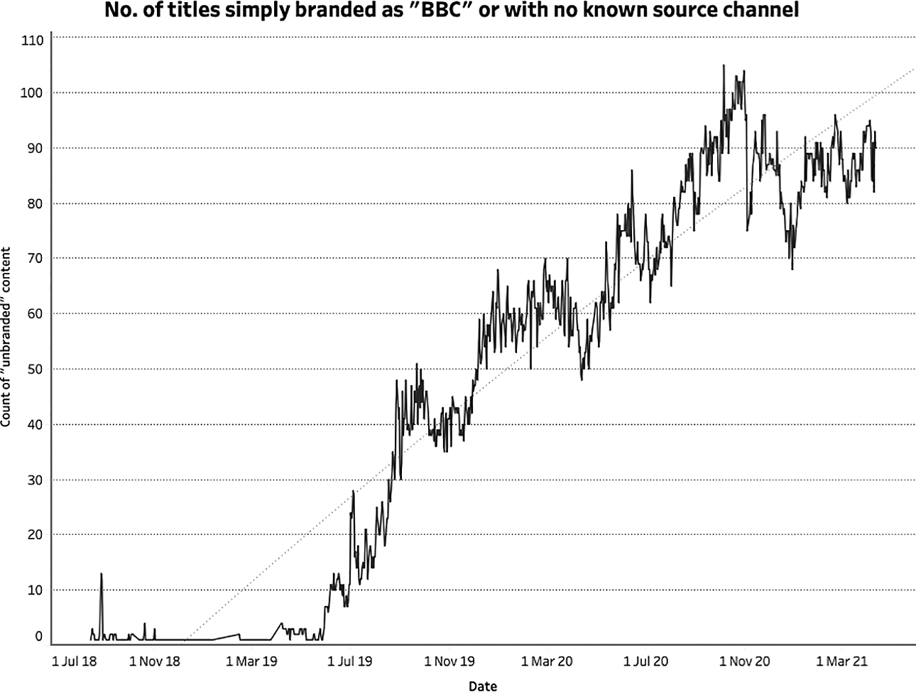
De-branding of content on BBC iPlayer. The x-axis represents the total number of titles (out of 120) that had no channel or brand affiliation. It is clear that this has increased significantly over time (y-axis).
It is unclear as to why this may have happened, but the gradual nature of this development suggests that it was more likely the result of an editorial decision (or a series of editorial decisions) rather than a change in any algorithm (if it had been the latter, one would expect it to happen instantaneously). Either way, the process of EDA proves its value, drawing our attention to a curious pattern in the data and inviting us to explore this anomaly further. Indeed, this is exactly the kind of diachronic insight that would be impossible to glean via close textual analysis alone.
The gradual decline of channel visibility on BBC iPlayer is significant for a number of reasons. Whilst a detailed discussion of the importance of branding is beyond the scope of this article, it is still worth briefly considering the implications of this particular development. As has been well-established, branding plays a crucial role within the media industries (see Grainge, 2007; Johnson, 2012). According to Johnson, ‘branding attempts to shape, control and/or manage the values attributed to products and, through this, the uses to which the product is put’ and in this way it can be considered ‘a form of mediated and dynamic communication that constantly frames and reframes the relationships between producers, products and consumers’ (Johnson, 2012: 4). In the context of television, channels function as brands that convey certain values and can ultimately influence what we choose to watch (e.g. through channel/brand allegiances) and the expectations that we might bring with us. This clearly applies to the BBC whose various channels all have distinct identities and objectives. BBC One, for example, is known for producing programming with a broad appeal, whilst BBC Three is a much more youth-oriented network. On BBC iPlayer, however, these frames (to paraphrase Johnson, 2012, 2019) are increasingly absent, resulting in a space in which categories and genres, rather than channels, play a more significant role in shaping the viewing experience.
Of course, it should be noted that iPlayer does include an option for users to browse by channel. This is located at the very top of the interface which, once clicked, reveals a dropdown menu that displays the BBC’s portfolio of channels. It should also be noted, however, that in design terms this option is not very prominently featured. Instead, it employs a small white font on black background. As such, it could be argued that the interface encourages users to browse via titles offered on the main landing page, though this assertion would need to be evidenced with actual user data from the BBC. Either way, the fact remains that the branding of content (in terms of channels) has significantly declined over time, regardless of how the interface is structured or how viewers choose to navigate it. Whereas when we are watching broadcast television we have to choose and browse by channel, this is entirely optional in the realm of VOD. For those browsing iPlayer via the main landing page, genre and channel are the primary organisational frames, whereas for those browsing via channels, it is an entirely different experience altogether – not just in terms of what they discover, but also in terms of how that content is framed and branded.
The rise and fall of box-sets
A second significant albeit less pronounced pattern that emerged through the process of EDA is the rise and fall of box-sets. To be clear, the ‘box-set’ designation refers to entries in the interface that are linked to an entire season (or seasons) of a programme rather than individual episodes. Between late August 2018 (when the scrape began) and mid-December 2018, the total number of titles labelled as belonging to this category never once exceeded 40. 4 However, there was a sudden spike in the number of box-sets shortly after this, peaking at 55 (out of 120 entries) on December 13th 2018, followed by 53 on December 15th 2018. In other words, almost 50% of the entire interface was comprised of box-sets around this time. This sudden growth was somewhat unsurprising given that this occurred mid-December, just before the Christmas period – a period in which television viewing tends to increase significantly. The sudden spike of box-sets suggests that the BBC not only recognised this growth of viewing but sought to encourage it by actively promoting the binge-watching of complete series. Indeed, the pattern appeared again during the same period in 2019, peaking on the December 21st with a total of 62 box-sets – more than half of what was on offer via the main page of the iPlayer interface that day (see Figure 2).
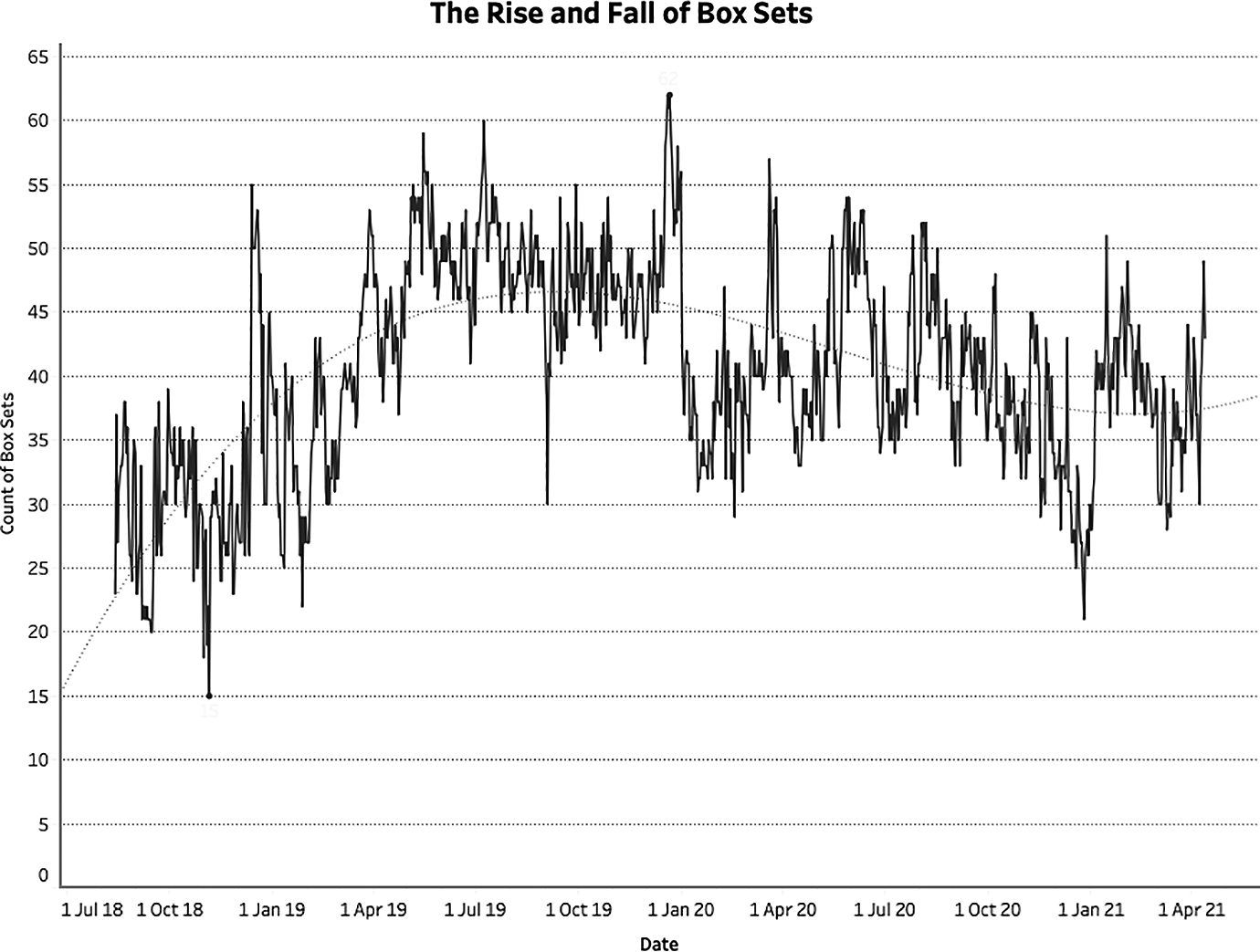
The number of box-sets on the iPlayer landing page from August 2018 to April 2021.
In addition to these spikes, we also see several notable troughs. For example, between the two Christmas periods described above, there was a brief but significant dip in the number of box-sets on offer. At the very end of August 2019, the number decreased from 49 (August 30th 2019) to just 30 (September 3rd 2019). It then remained significantly below previous levels for approximately 1 week. As with the notable de-branding of content discussed above, this sudden dip in the data once again draws our attention to an interesting anomaly, inviting us to explore further.
Interestingly, this sudden decline in the number of box-sets appeared shortly after a series of articles appeared in the British press claiming that the BBC were strong-arming independent producers by trying to extend licensing rights (from 30 days to 1 year) without offering further compensation. 5 This dip might therefore be read as the BBC’s reaction to this publicity, a volte-face in which they reluctantly, if only briefly, narrowed the window of availability of much of the content on iPlayer, resulting in far fewer titles being made available as complete box-sets. Equally, it might have been the case that independent producers were emboldened by the reports and took action themselves, demanding that they either be fairly compensated or that their programmes be withdrawn. Whilst both of these explanations are purely speculative, the data nevertheless highlights a significant if temporary change in the iPlayer’s offerings which prompts further investigation whilst offering empirical evidence to support any subsequent findings.
This temporary dip notwithstanding, the overall pattern of box-set availability on BBC iPlayer can be described as an initial period of growth (from an average of around 30 to an average of around 50) that has since settled to an average of around 40 (i.e. one-third of all offerings). This is a particularly interesting though perhaps problematic trend given the BBC’s public service remit. Indeed, it could be argued that the promotion of box-sets and binge-watching is antithetical to the aims and objectives of public service broadcasters, not least because it narrows the variety of content a user might encounter and consume, and therefore limits their exposure to a mix of different ideas and viewpoints. The BBC itself has acknowledged the importance of content diversity in an individual’s media diet and the need to mitigate against the potentially negative effects of ‘algorithmic echo chambers’ in which more of the same content is being recommended to viewers (Savage, 2019). Their aim is to create a public service algorithm that challenges audiences, making it more likely that they will ‘stumble onto something new, instead of content that simply reinforces their views’ (Savage, 2019.) In light of this, it could be argued that the prevalence of box-sets on BBC iPlayer, which is usually around 30% of all offerings on the default page, is counterintuitive to these ambitions.
At the same time, however, the BBC have more recently suggested that increasing its offering of box-sets is potentially in the public interest – especially in the context of the COVID-19 pandemic. According to a statement released shortly before the first UK lockdown began on March 23rd 2020, ‘a number of box sets [were] being brought back to BBC iPlayer to help keep people entertained during these unprecedented times’ (BBC, 2020) (as represented by the sudden spike in late March 2020 in Figure 2). Clearly, this contradiction in the BBC’s own thinking around its approach to content recommendation demonstrates that iPlayer faces a difficult task in striking the right balance between variety (which we might associate more with the serendipity of the broadcast schedule) and similarity (which we might associate more with the binge-watching of online content).
Factual genres are the least prominently positioned
The third and final trend that this article will briefly discuss is the prominence, or rather the limited prominence, of certain genres. Up until March 2020, of the 21 genres listed on iPlayer, 6 factual genres tend to be the least prominently positioned, with the vast majority featuring in the bottom half (see Table 3). This list includes history, documentary, news and the arts. As is the case with the significant number of box-sets on iPlayer, the limited prominence of factual genres could be considered problematic in the context of a public service interface. Although the production of fictional genres such as entertainment, comedy and drama are part of the BBC’s remit, and positioning them prominently within the iPlayer interface therefore enables them to meet these particular public service objectives, the data underpinning this research indicates that factual genres are given significantly less prominence.
Most popular genres on iPlayer, August 2018-March 2020.
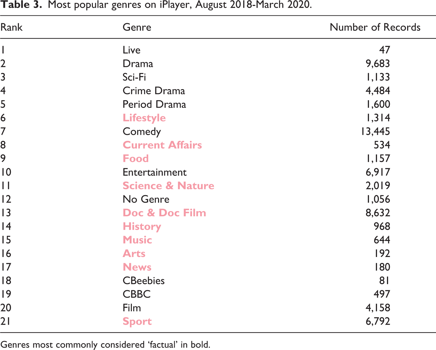
Genres most commonly considered ‘factual’ in bold.
In terms of this im/balance between factual and fictional genres, it is interesting to note that from March 2020 to August 2020 there was a much more even spread, with ‘News’ in particular climbing from 17th to 2nd place in the list of most prominently positioned genres (see Table 4). This sudden growth in the prominence of ‘News’ within the interface is most likely a result of the COVID-19 outbreak and is evidence that the BBC is meeting its public service obligations by increasing the prominence of certain genres to meet the changing needs of the public.
Most popular genres on iPlayer (during first several months of COVID-19 outbreak), March 2020-August 2020.
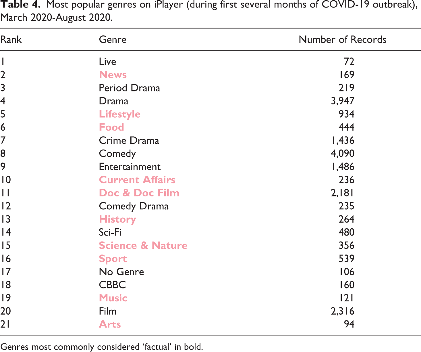
Genres most commonly considered ‘factual’ in bold.
Whilst the prominence of factual genres has grown over time, particularly in response to the recent COVID-19 pandemic, this measurement of prominence is based on the average position of any given genre within the interface but does not account for the frequency of said genre. Thus, it is a measure of prominence, but not necessarily an accurate measure of popularity or exposure. Indeed, once we take the number of titles for this same period (August 2018 to August 2020) into account, the picture changes quite dramatically in terms of exposure to factual and non-factual programming (see Table 5). Here we see that those genres most commonly associated with factual programming are significantly outnumbered by the remaining genres (27,634 to 57,188) (see Figure 3). It should be noted, however, that this is a very broad interpretation that relies on how the BBC chooses to classify its various titles. The boundary between factual and non-factual is far from clear-cut, and my attempts to distinguish between the two using genre has obvious limitations. For instance, it is entirely possible that several of the categories that have been identified as factual could include non-factual programming, and vice versa. Furthermore, factual programming doesn’t necessarily entail programming with strong(er) public service values, and vice versa. Even though it is not perfect, this factual/non-factual binary still gives us a general sense of the balance of content present on iPlayer.
Overall popularity of genre: August 2018-August 2020.
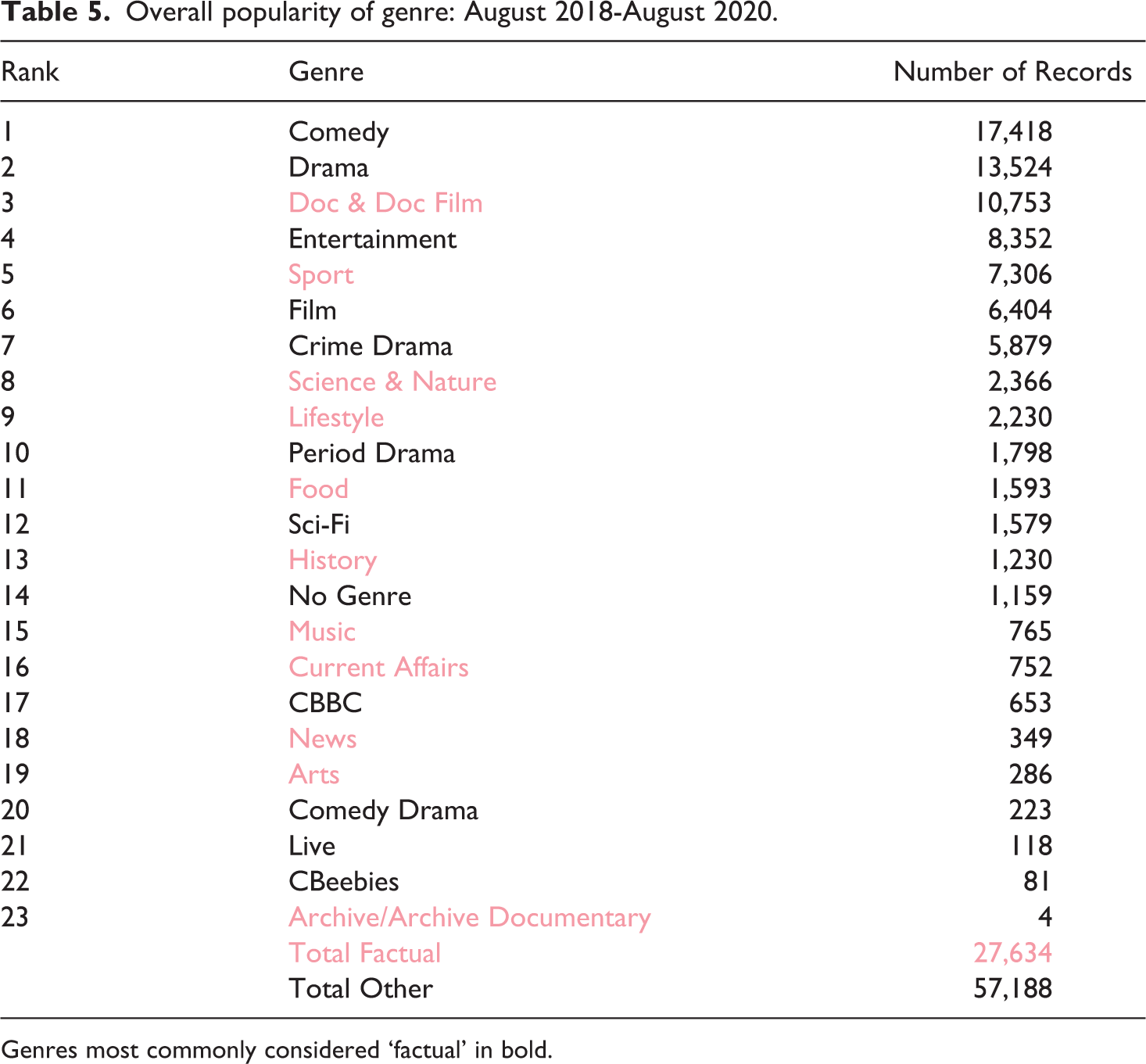
Genres most commonly considered ‘factual’ in bold.
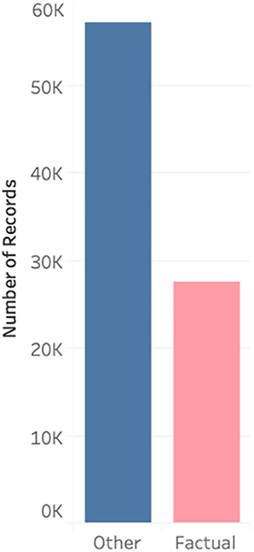
A visual representation of the total number of titles for factual vs other genres.
It is also interesting to note that the vertical position of these genres is remarkably consistent, as is evident from the heat maps below (see Figure 4). If anything, this suggests that there is a significant degree of editorial control over how content is organised on iPlayer (see Grainge and Johnson, 2018). Even if these positions are determined by an algorithm, the algorithm itself will merely be a reflection of an editorial policy, one that clearly ranks genres according to their perceived importance. In this instance, the ranking is as follows: drama (row 5) > comedy (row 6) > documentary (row 7) > entertainment (row 8) > sport (row 9) > film (row 10).
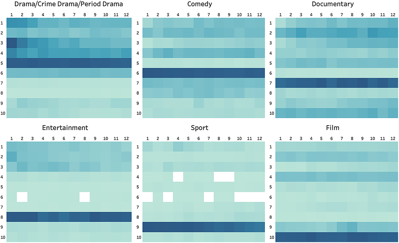
A heat map of content on the iPlayer according to genre, August 2018-April 2021.
Conclusion
VOD interfaces have become a ubiquitous feature of contemporary screen culture and play a crucial role in our viewing experience by influencing, if not determining, what we choose to watch. However, as objects of study these interfaces are highly resistant to analysis. As such, this article has argued that we must develop more innovative and bespoke methodologies, specifically ones that can offer more macroscopic and diachronic views of these platforms so that we can better understand, amongst other things, their wider dynamics of choice and content exposure. To that end, the article proposed and outlined a model of distant reading, and demonstrated some of the key insights that such an approach can offer. Indeed, the three findings briefly discussed above could not have been ascertained via a more synchronic and close reading of BBC iPlayer. That is not to say that close readings of VOD interfaces are any less valuable as a research method. Rather, a distant reading of iPlayer offers us an entirely new perspective, in this instance providing a more macroscopic lens through which we can interrogate and evaluate the degree to which this platform is fulfilling the BBC’s various public service objectives.
Close and distant readings offer very different perspectives and thus produce very different insights, but this does not necessarily mean that they should be regarded as mutually exclusive methodologies. Instead, we can combine the two, for instance by using a top-down approach to first identify patterns and anomalies at a higher abstract level (the macroscopic) before ‘drilling-down’ to explore them at a more granular level (the microscopic). Equally, it would be possible to adopt a bottom-up approach, beginning with observations gleaned through close reading (for example, the removal of a particular feature or option from an interface) and ‘drilling-up’ to see how these smaller changes impact choice and exposure on a broader, diachronic level.
As VOD platforms continue to grow in popularity, so too will the demand for innovative new methodologies that will enable us to more effectively study and measure these platforms – and not just for academics, but for governments, policymakers and other stakeholders too. As has been argued here, distant reading is the perhaps the most obvious candidate to fill this methodological gap. However, it is not a one-size-fits-all solution and has several limitations. For example, the method described above works well for public service platforms and/or those services that feature a limited degree of personalisation, but such platforms are the exception rather than the norm. How then are we to document and analyse the much more ephemeral and highly personalised interfaces of commercial platforms such as Netflix or Amazon Prime Video? Clearly there are numerous methodological barriers that we are yet to overcome. However, it is certainly worth the effort and, as the example of BBC iPlayer clearly demonstrates, distant reading produces unique and highly valuable insights.
Footnotes
Declaration of conflicting interests
The author(s) declared no potential conflicts of interest with respect to the research, authorship, and/or publication of this article.
Funding
The author(s) received no financial support for the research, authorship, and/or publication of this article.