
Abstract
Inductive analyses of visuals remain sparse in fields dominated by quantitative methods. This might come from the lack of systematic inductive methods to present the analysis of visuals in all their complexity and richness, especially in empirical articles limited in word count. In this article, we detail three steps to show more robustness in the analyses of visuals by gradually removing “visual messiness” from raw visuals. This method builds on visual semiotics to generate visual chains of signification presented with icons to demonstrate how messy visuals are gradually interpreted. While this presentation of the analysis of visuals can communicate more information in fewer words and allow the use of unauthorized visuals, removing visual messiness reduces polysemy and increases visual salience to better focus the attention of the readers on the subject of inquiry. This method expands the analytic tools available to researchers and might increase the perceived legitimacy of inductive analyses of messy visuals for some academic reviewers, which can lead to more publications of such analyses.
Introduction
Messy phenomena and objects resist interpretations from single vantage points (Law & Singleton, 2005). Increasing the salience of visual elements when presenting an analysis of visuals is especially important when these elements are otherwise camouflaged behind, buried under, or lost among irrelevant visual stimuli or “visual messiness”. Whereas Shao et al. (2024) urge to embrace visual messiness and resist the need to standardize qualitative research into mechanically applied templates (Köhler et al., 2022), we offer a complementary perspective to dealing with, and theorizing from, visual messiness. Namely, we suggest a method to show transparent inductive analyses of visuals by gradually removing visual stimuli irrelevant to answering research questions. The suggested method does not aim at ignoring visual messiness; rather, it focuses on harnessing the generative potential of such messiness.
Similar to explaining how words were spotted in a word search puzzle, putting in writing how patterns were found in messy visuals can be challenging. The proposed method of distilling visual patterns into icons provides a potential solution to an enduring issue (Langley et al., 2023): How can the inductive analysis of messy visuals be robustly presented to increase its perceived legitimacy? Here, robustness refers to “decisions made about which features are significant and which can be ignored” (Banks, 2018, p. 119). This question implies the well-known tradeoff of presenting the analysis of visuals with the least words possible in the most convincing way.
Our objectives are to push the boundaries of robust presentation of the inductive analysis of messy visuals, to increase the analytical resources available to researchers studying messy visuals, and to respond to the pressures on the presentation of detailed qualitative data analysis (Cassell & Symon, 2012; Shortt & Warren, 2019), especially in fields dominated by quantitative methods. In line with Shao et al. (2024), we argue that visual messiness is not the issue; instead, how we approach it, theorize from it, and present it has been overlooked and the method introduced in this paper presents one inroad toward embracing visual messiness.
More specifically, visuals contain rich qualitative data but involve specific challenges in analyzing them and presenting these analyses (Pain, 2012) in a detailed way, especially in empirical articles limited in word count. Scholars who analyzed visuals have been criticized for refraining from reporting how the analysis of visuals led to findings (Grange & Lian, 2022) and several scholars lamented that the rationale and procedure for the analysis of visuals are not always discussed thoroughly (Glaw et al., 2017; Grange & Lian, 2022).
Studies that managed to demonstrate analytical robustness in empirical articles when analyzing visuals tended to present a few visuals produced by the participants of the study who already consented to publish these visuals (e.g., Chen, 2018; Empson, 2001; Figoureux & van Gorp, 2021; Roger & Blomgren, 2019; van Leeuwen & Zonjic, 2023). We can speculate that these studies presented fewer visuals than desired to allow some depth in their description, reported fewer analytical dimensions, and described their analytic methods less transparently, while respecting a limited word count. Although the analysis of the visuals might have been executed more systematically, the final presentation of the analysis of visuals in articles might appear highly interpretative for concerned academic reviewers.
Empirical studies might still use visuals mostly to triangulate other sources of data and avoid to put the inductive analysis of visuals center stage (Mason, 2005). This appears to be a loss of opportunities because methodologies to analyze visuals present well-documented conceptual and methodological foundations (e.g., Fazeli et al., 2023; Grange & Lian, 2022; Page et al., 2022; Shortt & Warren, 2019; Topper & Bauermeister, 2021). However, this multiplicity of approaches for analyzing visuals can still appear “turbulent and incoherent” (Martin, 2014), with few tools to present more systematic, transparent, and detailed analyses of visuals (van Leeuwen & Jewitt, 2001). Although diverse styles of qualitative research reporting should be encouraged, researchers still seem to reinvent analyses of visuals “over and over again without gaining much methodological depth” (Pauwels, 2010, p. 546).
By way of moving forward and providing us with a robust way to embrace visual messiness, this article suggests such a method to transparently show inductive analyses of messy visuals in a flexible format suitable to empirical articles restricted in word count. We argue that this method will be of particular interest for at least four types of studies. First, for studies of unauthorized visuals (e.g., Höllerer et al., 2018; Jancsary et al., 2018) presenting challenges for theorizing as the reader can be prevented from seeing the leap from raw data to theoretical claims. Second, for studies in fields dominated by quantitative approaches putting pressure on qualitative research to be more “rigorous” (Cassell & Symon, 2012). Third, for studies where the intentions of the producers of the visuals are irrelevant to the research questions or could not be obtained, so could not be triangulated with different sources of data to increase the perceived validity of the study findings. This can occur when the intentions of the producers of the visuals might not be revealed, for example in highly strategic, sensitive, manipulative, surveillance, coercive, or alienating contexts (e.g., Anteby & Chan, 2018; Cappellaro et al., 2021; Crane, 2013). Finally, for studies in which the interpretations of the viewers of the visuals are not relevant to the research questions or could not be gathered, so could not be triangulated with different sources of data to increase the perceived validity of the study findings. The viewers’ interpretations of visuals might not be relevant when the visuals are voluntarily messy to intentionally trigger several interpretations, or the number of viewers is countless and highly diverse, such as viewers of online visual content.
The rest of the paper is structured as follows. We first discuss the limits of applying somewhat standardized templates (e.g., the Gioia methodology [Gioia et al., 2012]) in verbal-driven qualitative research to the analysis of visuals. Second, building on the previous point, we present three clues indicating that qualitative studies might remain limited in their capacity to present analyses of visuals in empirical articles and three reasons to remove visual messiness when presenting analyses of messy visuals. Third, we describe two analytical processes to generate visual chains of signification using icons and we present some affordances of icons made possible by such presentation of the analysis of messy visuals. Then, we illustrate how to present analyses of visuals with chains of signification using icons in three adaptable steps, allowing the demonstration of more systematic and more transparent analyses. We finally conclude with some limitations of the method, and avenues for further research.
Where is Our Gioia Methodology for Visuals?
Across several disciplines, qualitative methods have been traditionally pushed towards quantitative styles of reporting to strengthen their perceived methodological rigor by “providing a transparent and coherent audit trail of different steps in the analysis” (Cornelissen, 2017, p. 376). While such approaches have their merits, they have also been criticized for their straitjacket mentality that often exclude or streamline social and organizational realities (e.g., Shao et al., 2024).
Despite a broad range of analytical frameworks available to make sense of visuals, hardly any offer a straightforward inductive method to systematically present detailed analyses of visuals. Baart and Roos (2022) recently presented a procedure applicable across disciplines and for different research purposes to guide systematic, transparent, and replicable inductive analysis of visuals. Similar to the presentation method suggested in the present article, this analytical tool is atheoretical, accessible, user-friendly, practical, and designed for the analysis of visuals (Baart & Roos, 2022). However, this tool is appropriate for data created by the study participants, elicited by the researchers, and still presents important challenges in reporting the analysis of messy visuals alongside interviews, observations, and a thick description of the context.
The method suggested here to present the analysis of messy visuals can be conveniently contrasted with the Gioia methodology (Gioia et al., 2012), typically analyzing verbal data. Among other mainstream methodologies to analyze and present qualitative analysis, the Gioia methodology can be used to analyze visuals, but might not be the most appropriate to harness the full potential of such analyses, especially following critical and postmodern perspectives. We first draw some parallels and highlight differences between this mainstream qualitative methodology and our approach.
Figure 1 shows how elements identified across visuals were converted into words and then condensed into higher levels of abstraction using the Gioia methodology. The visual elements identified include the number of their occurrences across a set of drawings about digitalization projects available on the website of the Port of Rotterdam. These visuals consistently communicate notions of control by automation, but also tradeoffs to access the data essential to train algorithms. While control involved notions of manipulation and surveillance, automation was associated with time savings in the visuals. Wavelengths, happy faces, hourglasses, and clocks consistently represented automation across the set of visuals. This choice of visuals can expose why some people or companies were reluctant to share their data and why digitalization embedded control into the automation of collective decision-making. These findings might not be easily revealed by the producers of the visuals for strategic reasons and might also not be interpreted by viewers since the visuals might be intentionally messy or deceitful. Example of Analysis of Visual Elements Found Across Visuals Using the Gioia Methodology.
When analyzing visuals, researchers can play the role of “glorified reporters” of what “knowledgeable agents” choose to communicate (Gioia et al., 2012). However, knowledgeable agents are interpreters, can be politically correct and strategic in their statements, and can show cognitive biases (attribution bias, groupthink, in-group and out-group biases, etc.). Moreover, researchers might not assume that people communicating visually are aware of what they communicate or can express their thoughts freely, coherently, and transparently. While the Gioia methodology advocates for a “journalistic” approach to analysis, we rather promote a “forensic” approach (Gioia et al., 2022). In such analyses, the role of the researcher can be extended to interpret what visuals could mean, what the producers of the visuals could express regardless of the intentions they claim, and how the viewers could interpret the visuals, beyond what they explain. These analyses might however necessitate more extensive theoretical explanations, context description, and discussion of the findings to appear legitimate for some academic reviewers.
We argue that the assumptions about the primacy of verbal data involved in using the Gioia methodology greatly limit the analysis of messy visuals. For instance, the Gioia methodology assumes that reality is socially constructed, but is less appropriate in paradigms where languages (including visual languages) are pre-existing foundations of this reality, for example in critical or postmodern approaches. Similarly, as the Gioia methodology focuses on the simultaneous representation of the informant’s and the researcher’s voice (Gioia et al., 2012, p. 18), researchers quickly encounter challenges when moving from visual data to textual analysis as “transposition between semiotics inevitably introduces discrepancy” (Iedema, 2003). Yet, the Gioia methodology should not be treated as a rigid template to follow but as a systematic approach aimed at generating trust and rigor (Magnani & Gioia, 2023). Importantly, given the steady increase in systematic qualitative approaches such as the Gioia methodology, there is reason to believe messy visual data require similar approaches. Not to ignore visual messiness but to embrace it as a source for theorizing.
Why do we Need Another Method to Present the Analysis of Messy Visuals?
While reviewing articles analyzing visuals, we identified three main clues indicating that qualitative studies face enduring challenges in presenting analyses of messy visuals in empirical articles. After presenting these clues, we offer three reasons to gradually remove visual messiness when presenting analyses of messy visuals.
First, concerns of publishers over unauthorized visuals might limit authors to describe visuals textually (e.g., Carollo, 2020; Höllerer et al., 2013; Kärreman & Alvesson, 2009) or present “exemplary” visuals (e.g., Höllerer et al., 2018; Jancsary et al., 2018). In addition, according to our experience and several testimonies from seasoned colleagues, studies of visuals that cannot access or report the intentions of the producers and the interpretations of the viewers of the visuals might be perceived too interpretative. This challenge is likely to arise in fields dominated by quantitative methods, but also when readers evaluate the legitimacy of studies theorizing from data.
Second, standalone visual analyses might appear invalid or inadequate for some academic reviewers because they fail to triangulate at least three independent sources of data (Mason, 2005). Although some recent empirical studies have analyzed only visuals (e.g., Hardy & Phillips, 1999; Lefsrud et al., 2020), scholars mostly used visuals in conjunction with interviews, observations, and documents to complement or support their fieldwork (Toraldo et al., 2018; Zilber, 2017) and often to triangulate findings (Mason, 2005). In addition to presenting other sources of data for triangulation purposes, presenting the actual visuals still necessitates describing the visual elements retained in the analysis and justifying why other visual elements were ignored. This can be a challenge when presenting the analysis of several messy visuals within journal articles with word limits.
Finally, researchers often customize their analysis of visuals, which necessitates extensive explanations (Pauwels, 2010). This can replace the visual messiness inherent to social realities with conceptual messiness, as the legitimacy of visuals and their consequent analysis need to be justified on a case-by-case basis. Conversely, a more transparent and systematic way to present the analysis of messy visuals can be needed to increase perceived legitimacy and to free words in empirical articles, while still explaining the visuals and the theorizing based on them. Importantly, as illustrated with the Gioia methodology, systematic approaches to analyzing qualitative data have the potential for creative theory development as well as clarity and transparency in the eyes of reviewers, editors, and, ultimately, readers (Gioia et al., 2022). Based on the above, we now detail three reasons why the gradual removal of visual messiness could be more systematic in analyses of messy visuals.
Reason 1: Increasing Visual Salience
Removing visual noise in the form of unwanted visual stimuli when presenting analyses of visuals has the potential to increase visual salience. Visual noise is acknowledged to cause tunnel vision (Mackworth, 1965), to disrupt conceptual integration in reading (Gao et al., 2011), to increase visual contrast thresholds (Kersten, 1984), and to significantly affect recognition memory (Meng & Potter, 2008). Visual noise increases resources “allocated to word-level processing, at the cost of attention paid to semantic analysis,” and the recall of the most important ideas decreases with increasing visual noise (Gao et al., 2011, p. 83).
Tunnel vision occurs because priority is given to visual stimuli central to the eyesight (Mackworth, 1965). According to Mackworth (1965), selective visual attention usually involves that someone’s gaze travels from one source of visual stimuli to another while sampling only essential stimuli. To reduce random search, eye movements are often planned according to stimuli at the periphery of eyesight. Visual noise can complexify this peripheral matching, which impairs visual pattern recognition because similarities can no longer be recognized quickly between stimuli central and peripheral to the eyesight. However, other issues can arise in the absence of visual noise, such as visual polysemy.
Reason 2: Navigating Visual Polysemy
Effectively dealing with visual noise can increase visual salience, thus helping us to navigate visual polysemy, which refers to the potential number of different interpretations a visual can elicit. Multiple interpretations of a single visual can be a resource for producers of the visual but it can also represent challenges when analyzing visuals (Banks, 2018). For example, messy visuals allowing several interpretations can be an intentional choice from the producers of the visuals and viewers interpreting visuals might not consider the strategic choices behind the full range of options available to the producers (Cappellaro et al., 2021; Eisenberg, 1984).
Different relationships between visual elements can contribute to polysemy. Visual cues, for instance, can imply connection, similarity, or opposition (Maes & Schilperoord, 2008). These different relationships between visuals, along with the various interpretations of the viewers, give rise to polysemy. Moreover, more straightforward comparisons are easier to interpret (Sopory & Dillard, 2002), while inaccurate comparisons are more challenging to interpret (Gkiouzepas & Hogg, 2011). The similarity between the visuals simplifies interpretation, while ironic comparisons are more difficult to interpret than metaphorical similarity (Colston & Gibbs, 2002). As a consequence, a visual suggesting irony may be less favorably received and less well remembered by viewers (Whaley & Wagner, 2000).
Although more polysemic visuals are more open to interpretation than less polysemic visuals and more likely to motivate curious viewers to process polysemy, polysemy can also frustrate the viewers. More precisely, viewers can engage in interpreting a visual until it becomes too polysemic (Lefsrud et al., 2020). Whereas an open interpretation of messy visuals would only be limited by the creativity of the viewers, an analysis guided by evolving research questions with clear objectives should allow the gradual removal of visual messiness toward answers to these questions.
Reason 3: Focusing on the (Evolving) Research Questions and Research Objectives
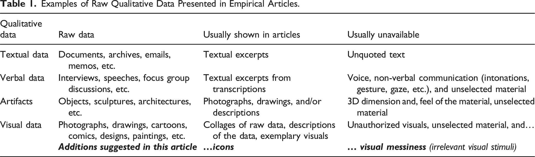
Examples of Raw Qualitative Data Presented in Empirical Articles.
Although entirely transparent, only presenting visual raw data does little to keep the readers’ attention on the research objectives and final research questions and might even distract their attention away from the analysis supporting answers to these questions. For instance, in our experience of attending conferences where qualitative data are presented and presenting our own qualitative data in conferences and in articles, viewers are naturally curious about the intentions of the producers when presented with raw messy visuals, regardless of the research objectives or the final research questions of the study. These considerations are rarely raised when only excerpts of interviews, speeches, or documents are presented in conferences and empirical articles. This is arguably because textual data messiness has been removed, and raw textual data are simply not available to the readers. However, concerns regarding data messiness seem to be absent in the presentation of archaeological visuals (e.g., Davison & Giovannoni, 2023; Radermacher, 2024) where audiences better understand that the report of the producers might be unavailable, along with the interpretation of the targeted viewers of the visuals.
Similarly, unless the research question concerns the interpretations of visuals by different receptors or focuses on a limited number of simple visuals, knowing the interpretations of all possible audiences of a set of messy visuals might quickly lead to an unrealistic and never-ending data collection and analysis. For example, the number of different interpretations of messy visuals available online can potentially be infinite, considering the number and diversity of potential receptors that can access such visuals.
This position might appear radical to some but it is coherent with Barthes’ notion that a “text” is made of multiple “writings” and its producer always quote previous “authors”. According to Barthes (1977), the explanation of a production cannot be sought in the producer, as if it were the voice of a single person. Therefore, when “the” producer of a visual explains it, the explanation remains incomplete. Similar to an “author” who only translates “a ready-formed dictionary” (p. 146), the producers of visuals mostly borrow from a pre-existing repertoire of representations and significations. Studies of visuals are often interested in the “unsaid” messages transporting and reconstructing implicit and taken-for-granted realities (Shao et al., 2024). The researchers can thus extend the interpretations of messy visuals to answer research questions requiring the analysis of the wider context of production of those visuals. These analyses are especially appropriate when the context presents strategic, sensitive, manipulative, coercive, surveillance, and alienating dimensions, and in critical and postmodern approaches.
To summarize, gradually removing visual messiness can increase visual salience, help us navigate visual polysemy, and enable readers to better focus their attention on the final research questions and objectives. Qualitative researchers are already removing textual data messiness in empirical articles by carefully selecting excerpts from interviews or documents, yet, to the best of our knowledge, there is a paucity of methods that enable us to do the same with messy visual data. Dealing with visual messiness appears imperative as “[t]he visual is not something to be known from nowhere, but rather requires an embodied, locatable researcher to see, sense and feel from somewhere” (Shao et al., 2024, p. 29).
In the two following sections, we describe the elements of visual semiotics that we use to embrace visual messiness by gradually removing it through chains of signification using icons. In doing so, we describe two analytical processes: (a) zooming in on a minimal representation of meaning and (b) zooming out on a maximal representation of meaning.
Visual Semiotics
To reach beyond the illustrative dimension of messy visuals, several scholars adopted a semiotic approach (Klein & Amis, 2021). Semiotics is the study of the creation and communication of meaning using signs and assumes that signs can convey shared meaning (Fiol, 1989). Semiotics provides a framework for interpreting messy visuals and their effects on audiences by connecting the visuals to structures of socially constructed meaning (Barthes, 1981). Since semiotics offers many useful concepts but no precise methodological guidelines (Mingers & Willcocks, 2014, 2017), semiotic analysis can be adapted within existing methodologies to study messy visuals within broader frameworks offered by case studies, grounded theory, ethnography, etc. (Mikhaeil & Baskerville, 2019).
We now detail two analytical processes to present visual data structures using icons based on visual semiotics to push the boundaries of transparent presentation of the analysis of messy visuals, to increase the analytical resources available to researchers analyzing messy visuals, and to respond to growing institutional pressures on the presentation of detailed data analysis (Cassell & Symon, 2012; Shortt & Warren, 2019). The proposed method derives from the semiotics of Barthes (1977), who provided a set of concepts and theoretical principles for studying the meaning of signs. We now briefly introduce the elements of semiotics used to develop the method suggested with examples already illustrated with digital icons.
In semiotics, pre-existing systems of signs allow visuals to represent and communicate meaning. For example, a visual semiotic analysis can reveal metaphoric, symbolic, and stereotypical representations that simplify complex and abstract concepts. While a sign carries objective information independent of the sender or receiver, the meaning of a sign depends upon a shared set of meanings socially constructed (Mingers & Willcocks, 2014). Moreover, the communication medium carrying the representation “is not neutral or transparent, but itself has significant effects on the meaning – intended and unintended, recognized and not recognized” (Mingers & Willcocks, 2017, p. 17). According to Mingers and Willcocks (2014), information is the content of a meaningful message, “whether or not it corresponds with the meaning that the recipient actually derives from the message” (p. 62). The connotative aspects of a sign “exist before and beyond the individual’s use of signs” and “rely on pre-existing agreements about the meanings of particular signs” (p. 62).
In a visual semiotic analysis, the key to understanding patterns is to couple and decouple the referent of the sign (the reality represented), the signifier used to represent the reality (colors, icons, text, images, light, etc.), and the signified (the meaning of the visual). This decoupling is important since one referent might have several signifiers and meanings (Figure 2 left); one signifier might have several referents and meanings (Figure 2 right); and one meaning can have several signifiers and referents (Figure 3 right). For example, in Figure 2, light is represented by different icons (left), while the icon of a light bulb might represent several meanings (right). Signifier versus Referent. Nestedness of Meaning.

While scholars often take for granted the relationship among signifiers, referents, and meaning, Li (2017) argues that semiotics can show how the “meaning construction at the micro level transforms into meaning structures at higher levels” (541). Distinguishing between signifiers, referents, and meanings allows researchers to examine both the affordance of representing through a communication medium and the meaning of the representations (Jones et al., 2017).
A sign can also be an element of the signifier of another sign (nestedness of meaning). For example, in Figure 3 (left) the icon of a leaf can communicate seven different meanings depending on the more complex icon in which it is embedded. Figure 3 illustrates the nestedness of meaning in relation to the context. Figure 3 (right) shows that the same concept (money), might be represented with different icons across (national) contexts while it might still represent different meanings in a single (national) context. For example, while the sign for Indian rupee might only mean money in an Indian context, it might represent the Indian country in an American context. The possibility of multiple interpretations is a key challenge of working with messy visuals that stem from their polysemy (Banks, 2018). This is why specific interpretations of messy visuals might require more justification than the interpretation of textual data in empirical studies.
More specifically, in a semiotic analysis, a “chain of signification” (Barthes, 2012; Barley, 1983) comprises first-order signs and their meanings, which become elements of signs of second-order meanings, and so on. The representations of concrete concepts might combine into larger representations of more abstract concepts that might participate in the representation of even more abstract meaning.
Using visual chains of significations, an analyst can zoom in on each element of a visual until a minimal representation of meaning is reached or zoom out on a maximal representation of meaning. For example, Figure 4 illustrates how the representation of a cog in a visual (minimal representation of meaning) can be analyzed by zooming out on the mechanism it participates in, in this case, represented in the head of a character. Further zooming out, this character is found among a group of different characters in a crowd (maximal representation of meaning). This visual chain of signification can support the interpretation that the visual (right) represents the invisible cognitive divergence found in a population. Visual Chain of Signification.
Visual chains of signification offer replicable models of detailed analyses of messy visuals that present how visual data structures can emerge from open coding. Ideally, visual chains of signification would present the actual visuals analyzed in the study. However, we argue that visual chains of signification could be allowed to present icons, at least when the publication of visuals is forbidden. In addition to allowing the use of unauthorized visuals and removing visual messiness, icons afford other advantages absent in textual descriptions of messy visuals.
Affordances of Icons in the Presentation of Analyses of Messy Visuals
Visual media (style, genre, form, format) present action possibilities and constraints for the users (producers, distributors, or receptors), or “affordances”. While the affordances of the visual medium suggest the range of possibilities and tend to lead to particular interpretations, the constraints of a visual medium limit the number of alternative interpretations (Fayard & Weeks, 2014; Mingers & Willcocks, 2017) before the visual even reaches the interpreter. Producers create signs based on their assumptions of how the interpreters would perceive them through the visual medium. Affordances can be designed voluntarily or not in the visual medium by a producer and can be perceived or not by an interpreter (Fayard & Weeks, 2014).
An affordance perspective recognizes how a visual medium favors, shapes, invites, or constrains, a set of specific interpretations. While there can be multiple possible interpretations of a messy visual, interpretations are always situated and bounded by the medium that depends on the goals of a producer, the goals of an interpreter, and the context. The affordances of a specific visual medium in a given context are also always perceived in relation to, or in comparison with, other visual media or other contexts (Fayard & Weeks, 2014). Icons can be approached as a visual medium with specific affordances.
Icons are simplified, conventional, and standard symbols readily available in various software to integrate within written digital communications. Icons may be abstract representations and the meaning of an icon might have to be learned. For example, an elevator may simply be represented by two opposite arrows next to one another
Analysis of Drawings of Port Coordination Translated into Icons.


Source of the visuals: https://smartport.nl/en/roadmaps-projects/smart-logistics/.
Transparently reporting how many times each visual pattern (here relationships) appears in a set of messy visuals might increase the perceived legitimacy of the findings for some academic reviewers, especially in fields dominated by quantitative methods.
Visual Chains of Signification Showing how the Visual Representation of “Restricted Access to Confidential Data” was Interpreted Using Icons.


Source of the visuals: https://smartport.nl/en/roadmaps-projects/smart-logistics/.
This visual chain of signification, combined with the others, supports the interpretation that this visual represents restricted access to confidential data. This might be a message that the producers of the visuals would not easily admit since they might have intentionally avoided identifying who will have access to data and who will not should a digital platform based on blockchain be implemented in a port. This message ambiguity would arguably be more difficult to hide or appear more suspicious in verbal or written communication. This transparent interpretation does not exhaust the range of possible interpretations, but it might make more salient the elements relevant to answering the final research questions.
Unlike interviews, speeches, and documents where only textual excerpts are presented in empirical articles, presenting the actual visuals analyzed is akin to presenting raw data. Although the messiness of visuals is lost when distilled into icons, even more visual messiness is arguably lost when visuals are described with text. This is also similar to converting the emotional voice of an interviewee into text and only presenting short excerpts or when any raw source of data is converted, processed, and selectively presented. In fact, the readers of an empirical study can rarely access the raw data used in the study. For example, hearing the voices or seeing videos of study participants would be closer to the raw data than excerpts from the transcriptions of their interviews. Even when provided with the option, readers of empirical articles would probably not engage in reviewing the dozens of interviews, speeches, or documents analyzed in a study.
Presenting the actual visuals analyzed allows the readers to better assess the analytical rigor leading to the study findings, but presenting raw data might also distract the readers away from the final research questions and the study objectives. Using icons to present the analysis of visuals affords at least three important advantages. First, it allows the use of unauthorized visuals. Second, it can liberate words from overly describing the visual data to allow more claims based on the data. Third, it has the potential to help readers focus their attention by removing visual messiness.
Advantage 1: Removing Visual Messiness Using Icons
This constitutes a first affordance of presenting icons in empirical articles instead of presenting messy visuals. Distilling visual patterns into icons allows the analysis to move forward by selecting specific interpretations. This removes some of the visual messiness and invites the readers to focus on elements relevant to the final research questions. Table 1 presents the suggested addition of icons among the visual data presented in empirical articles.
For example, the analysis of visuals can consider the role of the producers of visuals in composing, framing, or editing visuals to privilege particular ways of seeing and to frame how visuals are interpreted by audiences (Klein & Amis, 2021). This might require that researchers interpret the visuals beyond what the producers or the viewers would claim in interviews. Showing to the readers the possible intent of producers might necessitate drawing attention to visuals that support this claim, which can be done by removing irrelevant visual messiness (refer to Table 2 for an example).
Advantage 2: Free Words to Theorize rather than Describe the Visuals
Visuals “accommodate disproportionately more information in a relatively small space in comparison with texts” (Radermacher, 2024, p. 4). The amount of information attributed to the visuals “is so rich that it can (supposedly) never be completely transferred into textual form” (Radermacher, 2024). Therefore, the rarity of analyses of visuals in some fields can be attributed to visual data being simply “too messy, too rich, too particular to be reduced to abstraction and linear theorization” (Banks, 2014, p. 405).
It is precisely because of visual messiness that analyses paradoxically need to be presented in more detail to demonstrate some transparency. The best way to highlight analytical elements legitimizing the findings might be through writing and directly showing the raw visuals, but some simplification or visual messiness removal might also be necessary for the sake of clarity. The objective is to emphasize an analytical focus where elements irrelevant to answering research questions can be discarded. For example, the analysis of a single visual can focus on the material (paper), the medium (magazine), the genre (comedy), the style (cartoon), colors, characters, discourses, narratives, representations of time, texture, gaze, space, distance, emotions, etc. However, the research questions might not require presenting the analysis of all these dimensions and what is lost in the presentation of visuals is comparable to what is omitted in the presentation of textual data.
Although important dimensions of visuals are lost when distilled into icons, icons remain visual and can potentially communicate more information in fewer words. This represents a second affordance of presenting icons in empirical articles instead of describing the visuals. For example, although one visual chain of signification might be described in full to transparently present the method, several additional visual chains of signification can then be presented without extensive explanations. Describing each visual in several chains of signification could necessitate a lot more text.
Presenting the actual visuals still necessitates describing the elements of the visual retained in the analysis and might also require to justify why other elements of the visuals were ignored. When using icons to present the analysis, this selection has already taken place through the choice of icons and is illustrated by the visual chains of signification. As such, icons communicate less information than the actual visuals but remove irrelevant visual messiness and communicate still more information in fewer words than multiple descriptions following the same steps. This might be important to convey more transparency, considering the limited words available for elaboration in empirical articles.
The instruction guides of most products today limit textual explanations and prefer the simplest drawings over photographs (Iedema, 2003). Figure 5 shows how the information communicated a visual representation falls on a continuum between the reality visually represented and words describing it. Icons can be more detailed to be closer to the reality represented or less detailed to the point of representing a concept attributable to a single word. In fact, alphabet letters can be considered completely abstract icons (McCloud, 1993). For example, the letter “I” can refer to a person or can mean “information”. In this example, the analyst can focus the interpretation only on the grand piano, only the piano keys, more broadly on music notes, or only describe the music with text. Whether they are sounds, visual, verbal, or textual data, what is relevant to present and how to present it in the analysis depends on the final research questions and the research objectives. Selecting Icons.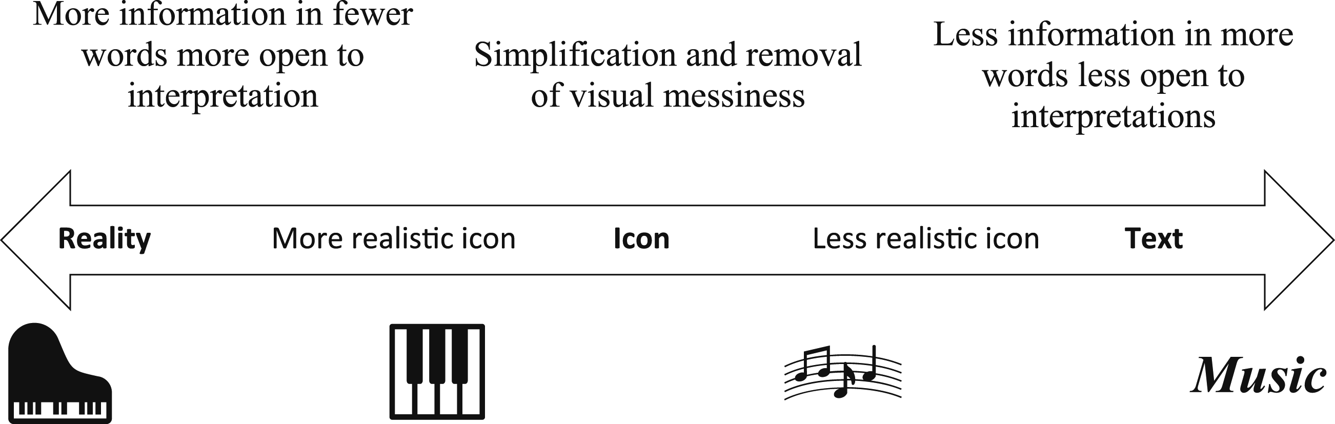
Incomplete Chains of Signification Within One Visual or Across Visuals.


Advantage 3: Allowing the Use of Unauthorized Visuals Using Icons
A third affordance of presenting icons in empirical articles instead of the actual visuals analyzed is to allow the use of unauthorized visuals. Presenting icons in analyses of messy visuals crafted for publication can be especially useful for famous or readily available artwork. Concerns about unauthorized visuals can prevent an analysis of visuals from being published, discourage researchers from engaging in the analysis of visuals, or even prevent researchers from considering visual data in the conception of study projects in the first place.
In the following section, we detail how the analysis of messy visuals can be illustrated through icons in visual chains of signification following three analytical steps: (1) generating visual chains of signification from messy visuals; (2) linking chains of signification across visuals using common icons; and (3) selecting chains of signification to be presented in empirical articles. Similar to the analysis of other sources of data and combined with the affordances of icons, these three steps gradually remove visual messiness from raw data and gradually focus the readers’ attention on answers to the final research questions.
Presenting Analyses of Messy Visuals with Visual Chains of Signification Using Icons
Within one visual or across several visuals, recurring elements can be identified and analyzed as patterns. In two or three dimensions, visuals develop their own genres and vocabularies that can be analyzed to find underlying intentional or unintentional messages. However, qualitative studies might lack methodologies to present detailed analyses of messy visuals in all their complexity and richness in empirical articles. When the length of the article is restricted or when the rigor or the legitimacy of the analysis is challenged, the underlying explicit method can be used as a framework and customized to the requirements of the analysis of visuals. Inductive analyses of messy visuals can apply three analytical steps to convince readers that the interpretation of raw visual data is credible, leads to defensible findings, and generates plausible conclusions. We elaborated an approach to conducting the analysis of messy visuals and presenting that analysis to describe or explain phenomena, possibly leading to theory building.
This presentation of the analysis of messy visuals is aligned with the need to develop transparency and legitimacy “that can meet the rigorous standards of trustworthy research” (Magnani & Gioia, 2023, p. 1). This inductive method allows for a systematic presentation of a progression in the analysis of messy visuals, for example, from concrete visual representations to concepts, themes, and dimensions by gradually removing visual messiness. Reporting concrete visual representations and the analyst interpretation might allow for a more transparent demonstration of the links between the raw visual data and the induction of concepts and their relationships which are the insight defining high-quality qualitative research (Gioia et al., 2012). We do not claim that this method is the only way to demonstrate more transparency in the analysis of visuals, but the method has the potential to diversify the means we have at our disposal to analyze and present messy visuals.
Building on the above, figures and tables of the previous sections were already presented using icons, including Table 3, which shows three visual chains of signification illustrated with icons. Meanings might remain open to interpretation when using icons to present analyses of messy visuals because one icon might still be interpreted in several ways. For example, in Figure 2 (left) a light bulb can be interpreted at least in five ways without any context. One concept can also be represented by multiple icons across contexts. For example, in Figure 2 (right) light can be visually represented with different icons. To further open the interpretation of visuals, Figure 3 shows that the same concept can be represented with different icons across contexts while still representing different meanings in a single context.
Zooming in and out relies on this nestedness of meaning, which states that the context defines the meaning of visuals, and the meaning of visuals changes according to the context. This justifies why a sound analysis of visuals should reflect the nestedness of meaning through some nestedness of interpretations. This can be done by presenting visual chains of signification that were generated from one or several visuals. Yet, only a few carefully selected visual chains of signification will probably be relevant and possible to present in an empirical article to inform the final research questions. We now explain three analytical steps that illustrate (1) how several visual chains of signification can be generated from a single visual, (2) how to select chains of signification to be presented in empirical articles, and (3) how chains of signification can be linked across visuals using common icons.
Step 1: Generating Visual Chains of Signification Using Icons
From zooming in on minimal representations of meaning and/or zooming out on maximal representations of meaning, visual elements are singled-out and a myriad of interpretations emerges early across several rounds of zooming in the analysis. Concepts and their icons can first emerge through “open coding” (Strauss & Corbin, 1998), which tries to adhere faithfully to the visual representations while pursuing the objective of removing visual messiness. This open coding can follow a qualitative content analysis (Fazeli et al., 2023) inspired by a grounded theory approach (Fazeli et al., 2023; Konecki, 2011). However, other methods can also be used and still be presented with chains of signification in empirical articles, including or excluding icons.
A single visual can generate several visual chains of signification. For example, the initial visual of Figure 6 is composed of several elements, and fully analyzing this visual involves zooming in on each element until a minimal relevant representation of meaning is reached or zooming out on each element until a maximal representation of meaning is reached. This process does not involve a definite number of steps since it depends on the level of detail of the visual and the level(s) of analysis the (evolving) research questions require. Visual Chains of Signification of a Single Visual.
For example, Figure 6 starts with a person sharing an idea (left) and first zooms in on the person, the bubble, and the idea. Here, the bubble does not mean much aside that it is the conventional way to illustrate speech. However, the fabric of the T-shirt, or the condition of the teeth might communicate social background in some cultures. Similarly, the color of the iris of the eyes might communicate ethnicity, and the dilatation of the pupil might communicate level of attention. The color of the glass of the light bulb, and the color of the metal of the screw (for example, red, yellow, green) might also communicate meaning (good/go, bad/stop).
Figure 6 is easier to understand when considering rounds of zooming in from the general to the specific toward a minimal representation of meaning. An analyst can also zoom out on the elements some visuals are embedded in toward a maximal representation of meaning, getting from the specific to the general and to increasingly abstract meaning. The person sharing the idea in Figure 6 could be surrounded by visual elements providing additional relevant meanings. This could involve additional rounds of zooming, extending the length of some visual chains of signification. A single visual can generate several visual chains of signification, but it does not mean all will be relevant to inform the evolving research questions and appropriate to present in an empirical article to answer the final research questions.
Step 2: Linking Visual Chains of Signification Across Visuals Using Common Icons
The usefulness of conducting rounds of zooming in and out to generate visual chains of signification presented with icons is perhaps most evident when visual patterns appear embedded in different visuals or a set of visuals with consistent meaning or when the same meaning is represented differently. Visual chains of signification using the same or different icons can then show how abstract concepts are consistently represented with the same or different visuals carrying the same or different meanings. In the case of consistent representations, the minimal representations of meaning might be the only common representations across visuals. In another case, different visuals might seem to represent the same maximal representation of meaning. Still, a more detailed analysis can reveal subtle but significant differences along visual chains of signification leading to minimal representations of meaning.
Step 3: Selecting Visual Chains of Signification to Inform Final Research Questions
While some studies investigate the form and content of the visuals, others focus on a narrower thematic focus (Pauwels, 2010). Developing tentative answers to the evolving research questions leads to increasing focus on visuals and their tentative relationships, and distilling them into icons for salience, analytic transparency, and clarity. Nascent interpretations might avoid existing theories, while analytical concepts and icons might become increasingly abstract with rounds of zooming and the embeddedness of concepts and icons. Gradually developing tentative answers to the evolving research questions will likely lead to modifying the questions to better match the emerging findings or even to formulate entirely new questions that can give rise to completely new conversations (Healey et al., 2023).
When the full set of chains of signification is available, we can carefully select the chains of signification to be presented in the analysis. The chains of signification configure the analysis into a visual aid and provide a graphic representation of the progression from messy visuals to concepts and their distillation into icons when conducting the analyses, thus strengthening robustness (Banks, 2018), rigor (Pratt, 2008; Tracy, 2010), and transparency in visual research. Abstracting lays the foundations for balancing the raw visuals with the necessary distance required to draw theoretical insights relevant to carving a theoretical contribution. Ideally, any reader should be able to track the concepts transparently in the grounded model from their icons contained in the chains of signification.
The interest in generating several visual chains of signification is to inform evolving research questions. Therefore, which visual chains of signification will ultimately be presented in an empirical article and which length each chain should be will depend on the evolving research questions and the adopted ontological and epistemological standpoint; as is the case with the Gioia methodology (Magnani & Gioia, 2023), the method in question should not be seen as a template to rigidly follow, but as a systematic method that enables the reader to understand how theoretical insights were derived from the raw data. Consequently, focusing on a single visual or a set of visuals, the most appropriate way to present an analysis of visuals involves choosing the most relevant visuals, the most relevant visual chains of signification, the most relevant icons, and the most relevant length for each visual chain of signification to inform the final research questions. Figure 7 shows how one visual could provide insights on different topics by generating different visual chains of signification. These topics could also be identified across several visuals in a set of visuals. Selecting Relevant Visual Chains of Signification According to the (Evolving) Research Questions.
Discussion: A Gioia Methodology for Visuals?
Methods can generate and shape theory (Van Maanen et al., 2007) through researchers writing their arguments into particular methods of research (Cornelissen, 2017). Our method aims to present the analysis of messy visuals to transparently demonstrate the connections between raw data and the findings. This is especially relevant in fields where qualitative methods are increasingly pushed towards a quantitative style of reporting to strengthen their perceived methodological rigor. However, a more quantitative logic to qualitative research also makes qualitative studies more conventional and standardized (Cornelissen, 2017).
As Magnani and Gioia (2023, p. 2) remind us, a qualitative methodology should not be used as a straitjacket template; instead, “it should be employed as a systematic approach to trustworthy and rigorous qualitative data analysis that allows for creative theoretical development and helps to communicate with reviewers and editors (Gioia et al., 2022)”. This also applies to the method presented and discussed in this paper; our point of departure was to extend prior work on visual messiness (Shao et al., 2024) by making a case for embracing such messiness and achieving clarity through the use of visual icons.
In the suggested method, each stage of analysis is presented as a link in a chain of visuals embedded (zooming in) or constituting (zooming out) each other and might not need further levels of abstraction. Some visuals might be messier than others, be more open to interpretation, or be more meaningful to some viewers (including researchers), but the objective of the method remains to show how the visuals were gradually interpreted. This process can involve conducting the analysis toward increasingly messy visuals or gradually moving to more concrete representations or less open meaning.
The Gioia methodology (Gioia et al., 2012) involves some assumptions that also apply to the method suggested here, but there are important differences related to the characteristics of visual data compared to verbal data. As the Gioia methodology, this method suits research approaches that assume reality is socially constructed. However, we argued that our method can be expanded to paradigms where pre-existing languages (including visual languages) constitute and shape reality such as in critical and postmodern perspectives. Therefore, using our method might not necessitate access to the producers of the visuals or the interpretation of viewers. On the contrary, the researchers might avoid assuming that the producers are free of cognitive biases, aware of what they communicate with visuals, or that they can express their thoughts freely visually. This might be the case in strategic, sensitive, manipulative, coercive, surveillance, or alienating contexts (e.g., Anteby & Chan, 2018; Cappellaro et al., 2021; Crane, 2013).
Thus, one role of the researcher can be to interpret what the visuals could mean and what the producers of the visuals could express. The researcher might also avoid assuming that the interpretation of a few producers or a few viewers will be representative. On the contrary, what is taken for granted, not paid attention to, or absent in a messy visual can contribute to answering evolving research questions in the study. Therefore, another role of the researcher can be to interpret how the viewers could interpret the visuals beyond what the producers and the viewers explain.
As in using grounded theory on which the Gioia methodology builds, the researcher might refrain from imposing prior constructs, hypotheses, or theories as preferred explanations of visuals and rather allow the emergence of new concepts guided by evolving research questions. As Gioia et al. (2012) lamented, force-fitting data into a method diminish “the potential value of those data, but also sacrifices the benefits of qualitative research’s flexibility in applying different approaches to fit different phenomenological needs” (p. 25). We also envision the suggested approach as a flexible, qualitative, inductive method promoting creativity and innovation, since qualitative methodologies treated as cookbooks might get in the way of demonstrating clear connections between data and findings.
Concluding Remarks
The systematic method for presenting the analysis of visuals proposed in this article can enhance the perceived legitimacy of qualitative research by gradually removing visual messiness, organizing raw visuals into chains of signification, and facilitating their assembly into a more transparent form in empirical articles. However, being systematic does not mean mindlessly following standardized protocols, and applying any qualitative method should not limit the potential for interesting insights. This is an important limitation of this method that should be added to the limits of interpretative qualitative research in general.
Researchers in fields dominated by quantitative methods typically include analyses of visuals with the analysis of other data to increase the validity of analyses through triangulation and by combining it with well-established methods perceived as more legitimate (Toraldo et al., 2018). The relevance of an analysis of visuals depends on final research questions and might employ multiple data sources for triangulation, but the heart of these analyses could more often be the visuals. Looking at what people visually create, as opposed to what they claim they did, is essential in qualitative studies. Visual representations reveal information about the producers without the need to conduct interviews or consult written documents. Yet, a more transparent presentation of the analysis of messy visuals might be required to convince reviewers and editors of the validity of the findings.
The analysis of visuals can reveal tacit and practical knowledge difficult to articulate in traditional methodological paradigms and explore knowledge difficult to articulate through speech or texts. Analyses of visuals could be allowed to stand alone in empirical articles and be recognized just as legitimate as standalone textual data analysis. To this end, we suggested an inductive approach to bring further robustness, legitimacy, and transparency to the presentation of the analysis of visuals so researchers can present defensible interpretations and convince readers that their conclusions are plausible. Obviously, this method will only prove helpful if it is used and refined by future research.
Footnotes
Statements and Declarations
Funding
The authors received no financial support for the research, authorship, and/or publication of this article.
Conflicting Interests
The authors declared no potential conflicts of interest with respect to the research, authorship, and/or publication of this article.