
Abstract
Graphic elicitation techniques, which ask research participants to provide visual data representing personal understandings of concepts, experiences, beliefs, or behaviors, can be especially useful in helping participants to express complex or abstract ideas or opinions. The benefits and drawbacks of using graphic elicitation techniques for data collection, data analysis, and data display in qualitative research studies are analyzed using examples from a research study that employed data matrices and relational maps in conjunction with semi-structured interviews. Results from this analysis demonstrate that the use of these combined techniques for data collection facilitates triangulation and helps to establish internal consistency of data, thereby increasing the trustworthiness of the interpretation of that data and lending support to validity and reliability claims. Findings support the notion that graphic elicitation techniques can be highly useful in qualitative research studies at the data collection, the data analysis, and the data reporting stages. For example, this study found that graphic elicitation techniques are especially useful for eliciting data related to emotions and emotional experiences.
Keywords
Graphic elicitation techniques ask research participants to draw or chart visual representations of a concept, experience, belief, or behavior. They can be especially useful in helping participants to express complex or abstract ideas or opinions that are difficult to capture via interviews alone (Crilly, Blackwell, & Clarkson, 2006). This article will discuss the benefits and drawbacks of using graphic elicitation techniques for data collection, data analysis, and data display in qualitative research studies. It will use a study of public library users' techniques for preserving personal digital information (Copeland, 2011) as an example of a qualitative study that employed multiple graphic elicitation techniques. The study used two graphic elicitation techniques—diagrams and relational maps—in conjunction with semi-structured interviews. These two very different types of graphic elicitation techniques enabled participants to identify and reflect upon complex thoughts and behaviors much more deeply than they could have done if interviews alone had been used to gather data, and they enabled the creation of concise visual snapshots of the complex resulting data for means of data analysis and reporting.
Literature Review
Graphic elicitation techniques are those that involve the use of diagrams or drawings that are either created by researchers or study participants within the context of a study (Bagnoli, 2009). The use of graphic techniques stimulates participants to recall knowledge and experiences, which can complement and extend data collected through the interviewing process. In addition to stimulating thoughts, these techniques record them for the purposes of continued participant recall; they also capture data for analysis and display.
In qualitative research, graphic representation tools are more commonly used for data analysis and reporting than for the elicitation of data from participants (Umoquit, Tso, Burchett, & Dobrow, 2011; Wheeldon, 2010), although their use for data collection does appear to be on the rise (Umoquit et al., 2011). Graphic elicitation is used when words alone cannot express or capture a subject matter completely. Thus, the use of these techniques allows the participant and the researcher to make connections within the domain that would not otherwise be possible. A graphic tool is used to represent information conceptually that has attributes of both text and images (Crilly et al., 2006). Examples of tools used with these techniques include maps, flowcharts, and timelines. The study presented here used relational maps and matrices to collect data.
Visual Matrices as Data Collection Methods
With its visual display of data, a matrix is one type of graphic elicitation technique. In mathematics, a matrix is defined as a rectangular object made of columns and rows populated with numbers relating to one another according to specific rules. The rows and columns of a matrix form a two-dimensional table of numbers or symbols (Pedhazur & Schmelkin, 1991). Miles and Huberman (1994) provide a description of how to use matrices for data analysis. Matrices increase the accessibility of large amounts of data by reducing the data to a one page visual display that summarizes connections between multiple study sites or participants (Nadin & Cassell, 2004). Like the constant comparative method (Glaser & Strauss, 1967), matrices are a valuable method for researchers to reduce and make connections across vast data collections.
In the examples presented by Miles and Huberman (1994), matrices were used to examine different aspects of the organizational structure of a school system in relation to time periods and conditions related to the implementation of a new system-wide program. Nadin and Cassell (2004) discussed the use of matrices to explore emergent themes in a study of small businesses and the influences of mainstream theory on the psychological contract. In these examples, matrices allow for the visual and immediate comparison of different business cases and different functional units within a school system in relation to a variety of relevant concepts or themes.
Lackey and Gates (1997) used matrices to analyze data in three different qualitative research studies on the topic of young caregivers to older family members. The studies used three different data collection approaches: phenomenology, ethnography, and survey. Lackey and Gates triangulated the major findings from each of these approaches, using a matrix to allow a complete picture of the phenomena to emerge with convergences and divergences among the three studies illuminated.
Researchers have also used matrices to analyze individual participant responses rather than focusing on larger units of analysis. Marsh (1990) used a matrix to analyze participants' responses in a study of health lifestyle change processes. The matrix allowed Marsh to simultaneously simplify, analyze, and verify conclusions drawn from the data, which were participant processes that promoted change in health behaviors. Fields (1988) used matrix analysis to explore the manner in which the contents of news stories are delivered on television news. Each newscaster's presentation was evaluated in terms of facial expression, camera angle, and text scripting. By using the matrix to analyze data collected, these researchers visualized and reduced data to allow for their entire study population to be analyzed at once.
Matrices have typically been used for data analysis rather than data collection in qualitative research studies (Crilly et al., 2006). However, the research study discussed here used matrices for both data collection and analysis. For each study participant, a matrix was created to show the relationship between content types and the location of their personal information given each type. Using the matrices for data collection allowed for each participant's personal technical information environment to be described. The data collected using the matrices was then analyzed from the perspective of the row (content type), the column (storage location), and as a whole entity (technical environment). Analysis was conducted at the level of the individual participant and at the level of the group of participants as a whole. The discussion presented below illustrates the different approaches to analysis.
Drawing Tasks as Data Collection Methods
Drawing tasks as data gathering techniques have been used with many demographic groups, from children (e.g., Rennie & Jarvis, 1995), to undergraduate students (e.g., Zhang, 2008), to the elderly (e.g., Reed, Payton, & Bond, 1998). Relational maps are one type of drawing task commonly used for data collection. Relational maps illustrate the conceptual distance between the participant and other people or objects, with the importance of the persons or objects diminishing as distance increases from the participant (Bagnoli, 2009). These maps can be drawn by the participants, or a structure or frame of a map can be provided by the researcher for participants to complete. For example, a relational map of a company could be comprised of a group of circles, each representing one employee, with the circles placed nearer or further from each other to show how closely the employees work together.
In his review of the use of pictorial representation in qualitative research, Stiles (2004) suggested that drawing techniques are largely underused because of perceptions that they produce data that are difficult to categorize, and that are open to subjective interpretation. Stiles claimed that “Images are still regarded by the academic orthodoxy as a subjective, inferior, or even eccentric form of data compared to words and numbers” (p. 127). He argued that carefully designed drawing tasks could overcome these potential weaknesses and yield rich data. Nonetheless, the belief persists that the analysis of visual data is subjective. For example, Zhang (2008), who used drawings to elicit undergraduates' mental models of the Web, warned that “the analysis of drawing is very subjective and vulnerable to misinterpretations” (p. 2089).
Still, Stiles' perspective seems to be gaining followers within the academic community, with an increasing number of qualitative researchers experimenting with a variety of drawing techniques. Umoquit et al. (2011) conducted a meta-analysis of studies that used diagramming techniques for data collection purposes. Based on their extensive review of multidisciplinary literature, they determined that drawing techniques are alternatively called “graphic elicitation,” “diagramming,” and “drawing,” depending on the disciplinary approach (p. 2). Umoquit et al. were able to locate 233 full-text articles that included discussion of participant drawing techniques, from which they selected 80 studies for analysis. Education was the most common academic discipline from which the studies stemmed, followed by healthcare, engineering, environmental science, geography, industrial design, psychology, and the social sciences. The authors concluded that the main benefits of diagramming were that it is complementary to a range of other data collection techniques (especially individual interviews and focus groups), and that it helps research subjects to focus and reflect on topics of inquiry.
As an example of one such study, Fox, McCormick, Procter, and Carmichael (2007) used a mapping task to ask educators to map out their educational networks. They stressed the importance of gathering participant commentary to explain the meaning of the drawings: “Without this commentary the value of the map is diminished” (p. 143). They also identified the amount of time necessary for analysis as a drawback to the technique, a drawback that Umoquit et al. (2011) commonly identified in the studies included in their meta-analysis.
Varga-Atkins and O'Brien (2009) focused specifically on drawing techniques used as data collection tools in combination with qualitative interviews. In contrast to Umoquit et al. (2011), they suggested that drawings and diagrams are two different modes of data collection that require different techniques for successful data elicitation. This contradiction is not surprising, as Engelhardt (2002) found within the literature, terms used to describe graphic elicitation techniques vary widely, such as the inconsistent differentiation between drawing and diagram.
Regardless of the specific terminology used to refer to these types of techniques, Kearney and Hyle (2004) explained that “The ability of drawings to surface unspoken thoughts and feelings has long been accepted by art therapists who have used this tool for many decades” (p. 362). They used participant-produced drawings to study the emotional impact of institutional change. They found the drawing technique useful for eliciting participants' emotions and as triangulation for data collected via other methods. Furthermore, they concluded, “The cognitive process required to draw leads to a more succinct presentation of the key elements of participants' experiences” (p. 376).
Bryans and Mavin (2006), who used participant drawings to study doctoral students' views of the research learning process, also found drawings to be useful in eliciting participants' emotions and emotional experiences. Bryans and Mavin concluded that after creating drawings participants became more aware of their own thoughts, opinions, and emotions, and they were better able to process and discuss them, which is a conclusion echoed by Vince and Warren (2012). Kearney and Hyle (2004), however, found that participants became uncomfortable when they were asked to create detailed drawings.
It is important to point out that drawing techniques are rarely used in isolation, largely because researchers find that isolated drawings are decontextualized and difficult to analyze. As Zhang (2008) explained, “It is useful to ask participants to describe their drawings because the descriptions to a large degree help reduce misinterpretations on the researchers' part” (p. 2096). Qualitative researchers often use semi-structured interviews to elicit explanations of drawings from participants, which was the case for the study described in this article. The interview enables participants to use words to provide crucial context and meaning for their drawings or other visual representations (Pink, 2006; Varga-Atkins & O'Brien, 2009).
Together these studies point to a number of common findings related to the use of drawing techniques as a form of data collection. There is widespread agreement that drawing techniques are helpful in triangulating data collected using other methods, are useful for eliciting data related to emotions and emotional experiences, and when combined with interviews or other non-graphic techniques, yield deeper, more complex data than otherwise can be collected. Commonly identified drawbacks include time requirements for data analysis, participant resistance to more involved drawing requirements, possible variances in interpretation due to researcher subjectivity, and the risk of decontextualization without sufficient verbal explanations from the participants who create them.
Theoretical Support for Graphic Elicitation Techniques
The use of graphic elicitation techniques for qualitative data gathering is limited, but it appears to be growing (Umoquit et al., 2011). The body of literature explaining and supporting these techniques is also small. Consequently, “there is a lack of supportive structure for the use of graphic elicitation in research interviews” (Crilly et al., 2006, p. 343).
There have been a few studies that have used a variety of theories to provide support for the use of graphic elicitation techniques. For example, Crilly, Blackwell, and Clarkson (2006) tied the use of graphic elicitation techniques as data gathering tools to the concept of “graphic ideation,” which “offers the opportunity to thoroughly examine a problem from a number of perspectives using visual representations to both record and stimulate thought” (p. 345). Other researchers have classified graphic representation formats according to their structural composition (degree of textual and visual content) (Banks, 2001), their level of format structure (Wheeldon, 2010), or their level of visual abstraction (Stenning & Oberlander, 1995; Strauss & Juliet, 1998). Vince and Warren (2012) suggested that the conceptual basis for using drawings to elicit participants' emotional responses to organizational change lies in psychoanalytic theory and the connection to the subconscious:
The usefulness of this research approach is that drawings tend to portray individual emotions effortlessly, since there are often unexpected and enigmatic aspects to an image. This assumption rests on a conceptual grounding in psychoanalysis whereby the emotional or “pre-rational” contents of the mind are revealed through images, including dreams as well as drawings. (p. 4)
Nonetheless, a commonly employed theory to underlie the use of graphic elicitation techniques seems to be missing from the literature (Umoquit et al., 2011; Wheeldon, 2010). Based on their review of the literature, Umoquit et al. (2011) concluded that an important step in the advancement of these techniques is the formation of just such a theory, as it “may help to further inform researchers regarding the appropriate use and applications for diagramming data collection approaches” (p. 7).
Study Objective and Research Questions
As shown above, the benefits (and drawbacks) of graphic elicitation techniques are becoming clearer within the literature. This study aimed to combine two different types of graphic elicitation techniques to harness the benefits and decrease the drawbacks of each individual technique. We sought to address two research questions:
What are the benefits of combining two different types of graphic elicitation techniques for data collection, analysis, and display purposes?
What are the drawbacks of combining two different types of graphic elicitation techniques for data collection, analysis, and display purposes?
The Personal Information Preservation Study: An Example of a Qualitative Study Employing Multiple Graphic Elicitation Techniques
The present study used two graphic elicitation techniques combined with semi-structured interviews to study public library users' digital preservation techniques for preserving personal information. Public library users were chosen as the focus of the study because they are underserved in terms of research and services related to digital preservation, whereas, in corporate and academic library environments, institutional repositories are being developed to meet the long-term digital preservation needs of scholars and corporate researchers (Lynch, 2003). No parallel services are being developed for public library users. Given the differences in library services by type of library, public library users are likely to have less knowledge of, and access to, resources related to digital preservation practices. Furthermore, the personal computing environment offers limited support for content organization and preservation, thus the likelihood that individuals will lose valuable representations of personal memories is very real (Jones, 2007). Based on these considerations, four dimensions of preservation and personal digital information were examined: (a) the steps that individuals are taking toward digital preservation, (b) how preservation decisions are informed, (c) affective responses to personal information, and (d) value attributed to personal information. Matrices were used to collect data on the first two dimensions and relational maps for the last two.
Participants
A large urban public library system, located on the East Coast of the United States, allowed the solicitation of participants for this research during various Friends of the Library monthly meetings. The study was limited to participants aged 18 to 65 years. Purposive sampling was employed to form a mixed gender, multi-generational participant pool. Participants were also required to own a personal computer and to express interest in the collection and long-term use of personal digital information. The Drexel Institutional Review Board (IRB) gave approval for 35 participants; however, data saturation was reached after interviewing 26 participants. While the larger population of the Friends of the Library group was diverse in terms of race, age, and gender, those who volunteered for the study were mainly female, white, and college educated. Sixteen females and ten males participated in the study. Tables 1–3 indicate the age, race, and education of the participants.
Participants by Self-Reported Age Group Membership

Participants by Self-Reported Racial Group Membership

Participants by Self-Reported Educational Attainment

Process of Data Collection
Data collection techniques were employed in the following order: (a) diagrams in the form of matrices, (b) semi-structured interviews, and (c) relational maps. The study participants met with the researcher either at a branch of the public library system or at a nearby coffee shop. All types of data were collected in one session lasting between 45 minutes and two hours, varying with the length of the participants' responses. Each session was recorded and transcribed.
Personal Information Matrices
Participants first completed two personal information matrices. The matrices were designed to gather information on the types of digital content participants collected and on the places where they stored their personal information. The first matrix was used to gather data on the types of personal digital devices (e.g., laptop, mobile phone, or external hard drive) the participants used for storing personal information. The second matrix was used to gather data on the web services (e.g., YouTube, Yahoo, or Flickr) they used for preserving personal information. Participants simply marked an X in each grid square that applied to their own personal collections of digital information. On average, the participants spent between 5 and 10 minutes filling in the two matrices.
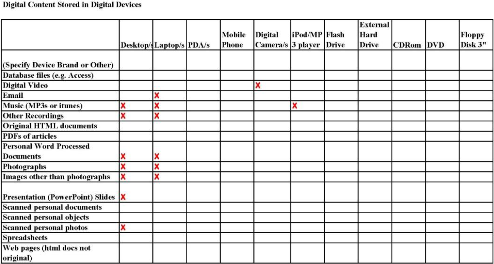
Figures 1 and 2 are the matrices completed by Oscar (all participant have been given pseudonyms), a 40-year-old male. A quick examination of these two matrices reveals that Oscar stores much more information on digital devices than he does on the web. Also, he saves information in many different formats and across a multitude of digital devices. Until completing these matrices, he had not thought about the extent to which his information was distributed or the amount of digital content he possessed. This is an example of how graphic elicitation increased the understanding achieved by both the participant and the interviewer.

Digital Content Stored in Digital Devices, Oscar, age 40, male
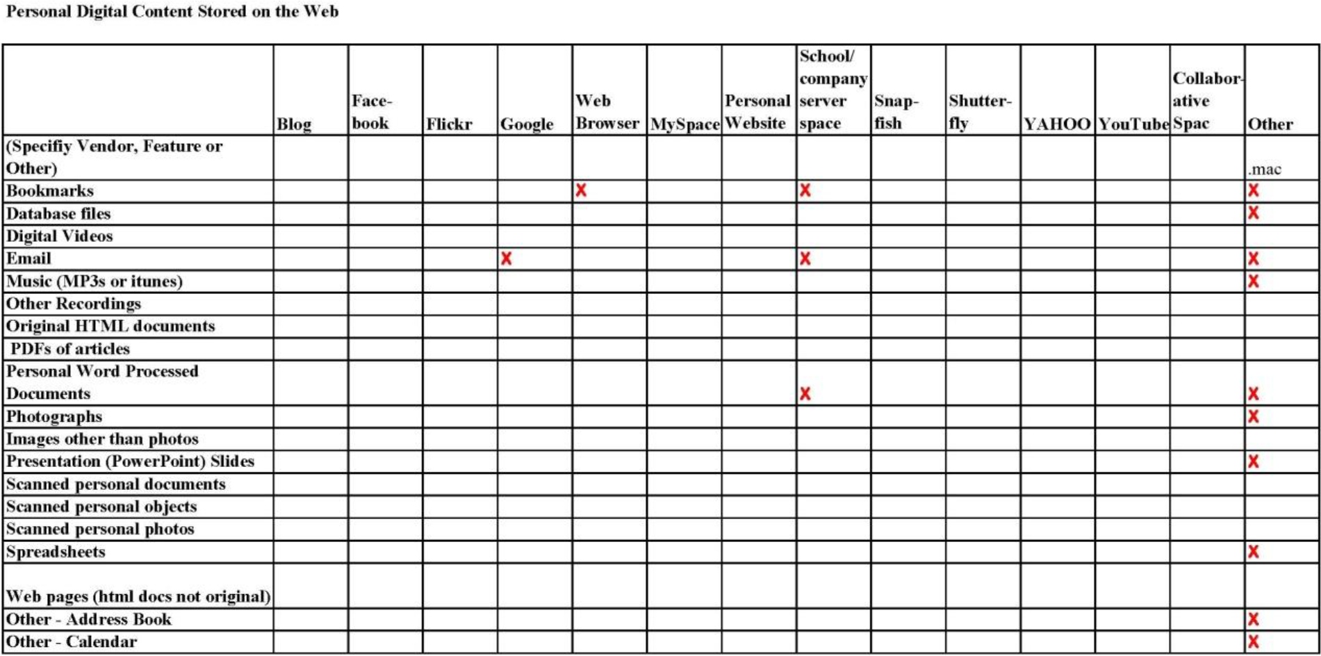
Personal Digital Content Stored on the Web, Oscar, age 40, male.
In another example, Figures 3 and 4, one can see that the location of Paula's information is much more concentrated and that she does not collect content in as many formats as Oscar. The matrix format makes the differences in participants' behaviors immediately observable.
Digital Content Stored in Digital Devices, Paula, age 20, female.

Personal Digital Content Stored on the Web, Paula, age 20, female.
In contrast to Oscar, Paula uses social network sites to store personal information. Overall, though, she has much less content stored on the web. The use of a diagram facilitates the researcher's observation of connections and comparisons that would otherwise not be viewable.
The matrices allow for immediate analysis by both the researcher and the participant. Furthermore, while the participants were filling in the matrices they were asking questions and making comments. Both the representation of the participants' technical information environments and the conversation elicited by the matrices allowed the interviewer to get a sense of how knowledgeable each participant was with different types of technology. In this way, the matrices formed the basis for future data collection through subsequent semi-structured interviews.
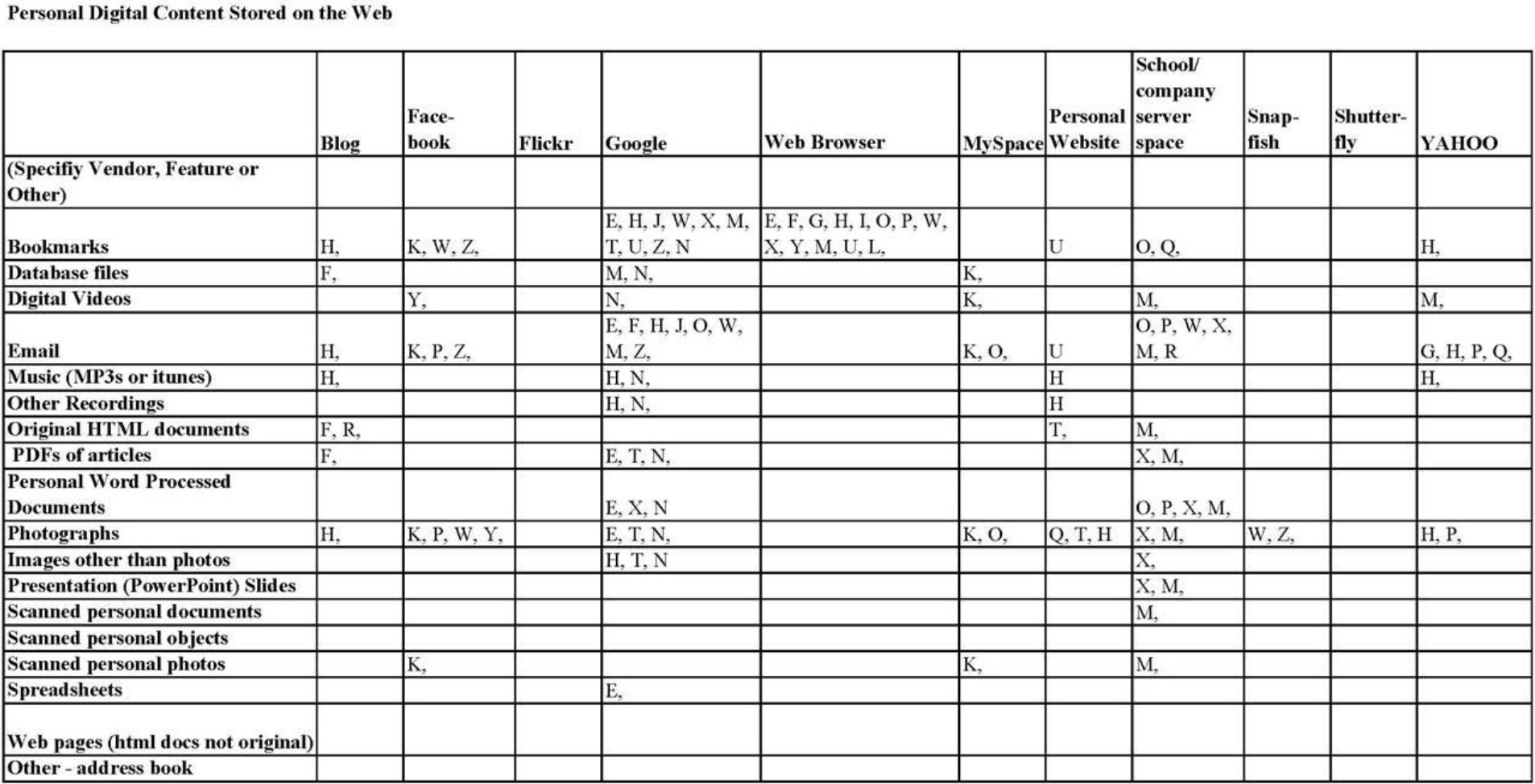
Collecting the data in a diagram format allowed the researcher to compare data from individual participants and also to analyze the group of study participants as a whole. In Figures 5 and 6, each letter represents one participant. Associated with each letter is a participant's pseudonym, for which age, gender, race, and educational level have been documented. The demographic attributes of each participant could be considered in relationship to other variables. For example, one could examine the relationship between age or gender and the use of certain technologies or content types by sorting the data by desired participant characteristics.

Composite for all Participants for Digital Content Stored in Digital Devices
Composite for all Participants for Personal Digital Content Stored on the Web.
By compiling the data collected from all the participants who completed the matrices, we were able to analyze the data for trends related to content types and storage locations. For example, we found that only participants in their 20s used Facebook to store personal information. Overall, the matrices facilitated efficient data collection and were an accessible point of entry for the purposes of data analysis.
Semi-Structured Interviews
Next, the participants took part in individual semi-structured interviews. Throughout the interviews, the researcher used the matrices to probe participants' responses and to help stimulate participant recall; participants then provided clarification and extension of the completed matrices. The introductory interview questions were designed to elicit information regarding the kinds of physical and digital information the participants collected and any values associated with either format. The second set of questions sought to understand the steps taken by the participants to preserve and organize digital information. The third set of questions focused on cognitive and affective issues. These questions asked participants to describe both a positive and a negative experience of using digital information. Also, participants were asked to discuss their preferences for information formats: physical or digital. This preference is important to understand because individuals have developed format preferences that vary with the context of use. The last set of questions sought to understand what sources of information or human resources the participants turned to for technical information and how they preferred to learn technical information.
Relational Maps–Personal Information Horizon
The relational maps used in this study were derived from Savolainen and Kari's (2004) concept of information source horizon. They define an information source horizon as an imaginary field that arises before an information seeker for both specific and general information needs (p. 417). An individual creates these horizons within the broader context of a perceived information environment. More valuable information sources appear closer in relation to the information seeker in this environment than do sources that are less important. Savolainen and Kari's data collection method was adapted to this study to elicit criteria of value for personal information. In their analysis, points were given to each source according to zone. All sources in the first zone were given three points, sources in the second zone two points, and sources in the third zone one point, reflecting the value of the sources. The points decrease in relation to an increased distance from the participant. Savolainen and Kari's participants were instructed to indicate in the center zone the information of most value to them in their daily life. In the middle zone, they indicated the next most valuable, and in the outermost zone the next most valuable. In other words, the information on the maps represents a decrease in value moving from the center toward the outer zone.
Participants in the present study were given two maps with three empty zones and asked to complete them. In the first map, participants were asked to indicate personal information items that were of value to them in their daily lives. The participants were allowed to define information items on their own. Typical items included letters, emails, photos, and computer files. Of the 26 participants, eight (31%) drew items not normally associated with information, such as clothing, furniture, or cars, on their personal information relational maps. This was an unexpected finding; the identification of physical artifacts is not normally associated with information or information items. The use of the maps brought these items to the researcher's attention and illustrated the relative importance of physical items as compared to more traditional information items, such as handwritten letters or computer files. For example, a female participant identified a set of baking pans inherited from a favorite aunt who loved to bake as an information item of extreme personal importance. She explained that the set of pans held special memories—or personal information—about her deceased family member. She kept the physical items as a method of preserving important personal information, even though they did not contain information in the traditional sense of words, data, or images.
In the second map, participants were asked to consider personal information they would like to preserve for at least five years. Participants were then asked to explain the criteria they used for determining the value of each of their personal information items, where those items were stored, and how they were maintained. These questions were designed to discover the preservation practices applied to their most valuable information items.
The relational maps were used to triangulate and extend the data collected from the matrices and the interviews. During the interviews, participants were asked about information preservation and value in different situations and contexts. For example, participants were asked to identify one physical and one digital item of great value to them. Their maps were checked to see if these specific items were indicated there as well. In this way, the maps served both as tools for jogging the participants' memories and as content for deeper interview discussions.
Also, participants were asked what type of personal information they used most frequently. In the personal information management literature, it has been speculated that use indicates value (Whittaker, Bergman, & Clough, 2010) and, therefore, information used most frequently should be targeted for preservation. In the case of the participants in this study, use indicated value more often in everyday-use information contexts rather than in contexts related to long-term use.
Each of the participant's completed maps represents a very individual way of thinking about personal information preservation. For example, Bill's information horizons show no clear path from one zone to the next (see Figures 7 and 8). He found it difficult to make clear distinctions between the zones. This ambivalence toward his personal information was also echoed in his interview responses:
That's like my life, honestly. At the same time it's like I was saying before. Most of that stuff I'm never going to look at it again unless it's sentimental, [but] there is something very comforting to having all your files.

Short-Term Personal Information Horizon, Bill, age 25, male

Long-Term Personal Information Horizon, Bill, age 25, male.
Cathy, in contrast, had no problems conceptually identifying separate zones within her horizon. Also, she listed very specific items and most of them were physical—the two digital items were her camera and her iPod. She is one of two participants who listed a pair of shoes on their map. They both viewed the shoes as sources of personal information—physical and visual reminders of important personal events and accomplishments.

Short-Term Personal Information Horizon, Cathy, age 44, female
The process of completing the maps facilitated the participants' understanding of the ways in which they made selections and value estimations of personal information and information items. Understanding their own selection and appraisal criteria then helped them to identify the personal information and personal information items that they were likely to preserve over time. As shown in Figures 7 through 10, Bill and Cathy indicated fewer information items as valuable for long-term use than for short-term use. This was the case with all of the participants.

Long-Term Personal Information Horizon, Cathy, age 44, female.
In many instances, the maps elicited general content types that could be used by the researcher to probe more deeply for specifics. When participants included a generic item such as photographs on their maps, the interviewer asked them if, for example, they had specific photos in mind. The interviewer then asked what values were associated with those photographs. This process helped the participants further refine their criteria for value. In this way, the data collection process aided both the researcher and the participant in understanding the participants' thoughts and behaviours.
As with the matrices, the maps helped the researcher identify themes and trends within the group of participants. Figure 11 compares the formats that, physical or digital, the participants valued most for long-term use (5 to 15 years). Most of the participants included physical and digital items on their maps (e.g., both print and digital photographs), showing a heavy overall group-level preference for the long-term value of both types of information.

Formats of Most Valued Information from the Long-Term Map for all Participants
Example of Triangulation
After the interview was completed, the researcher located each item identified as most valuable from the long-term map on the corresponding matrix. In this way, the researcher could evaluate the likeliness that the participants would have access to these items given the technical infrastructure supporting their most valued digital content.
Discussion
This study lends support to a number of the themes uncovered in the literature review. Most importantly, it provides clarification of the benefits and drawbacks of using graphic elicitation techniques for qualitative data collection and analysis purposes.
Benefits of Graphic Elicitation Techniques for Data Collection and Reporting
Data collected from the interviews served to verify and extend the data collected from the graphic techniques and vice versa. Without the use of diagrams and relational maps, the study would have yielded a much shallower overall picture of the participants' personal digital preservation behaviors and values. The use of multiple data collection techniques also helped to establish the internal consistency of the data, thereby increasing the trustworthiness of the interpretation of that data and lending support to validity claims.
This study also lends support to previous researchers' findings that graphic elicitation techniques are especially useful for eliciting data related to emotions and emotional experiences (e.g., Bryans & Mavin, 2006; Kearney & Hyle, 2004). For example, the value that participants most often attributed to items in the center of the long-term maps was an emotional connection to family and to self. “Emotional connection” yielded 145.5 points in analysis with the next largest category, “Documentation of family, events, places, and accomplishments,” yielding just 68 points. The visual data generation processes also helped to strengthen participants' abilities to focus on the study and helped to foster deeper reflection on the research topics, thereby generating deeper data than interviews alone would have yielded.
As far as data analysis is concerned, the two graphic elicitation techniques were highly effective for data reduction. As is often the case in qualitative research, a dauntingly large body of data was gathered for study. The total body of data included approximately 600 pages of raw data. The graphic elicitation techniques allowed for gathering data into individual data subsets for each participant and then easily comparing these smaller data subsets to examine similarities and variance among participants.
In addition to aiding in data collection and analysis, this study demonstrates that graphic elicitation techniques are useful for data reporting at both the individual and group levels. For example, Figure 11 shows that, on the whole, the study population desired long-term access to both physical and digital information items. The visual display of the aggregated data showed that the three participants desiring access only to digital items for long-term use were men, and the five participants desiring access only to physical items were women, clearly showing gender-based trends within the data.
Drawbacks of Graphic Elicitation Techniques for Data Collection and Reporting
This study also found evidence of some, but not all, of the problems identified in the literature as commonly resulting from the use of graphic elicitation techniques. The most frequently mentioned drawback is that these methods cannot be used alone because of issues related to decontextuality. Indeed, decontextuality would have been a problem without the interview component of the study. For example, the participants tended to indicate nonspecific categories of information types rather than specific information items of personal value (e.g., “photos” as opposed to “the photo of my mother and sister in Paris last summer”). Without the use of the interviews to probe for contextual details, the data collected from the maps would not have been nearly as useful, and the reliability and validity of the visual data would have been diminished.
As such, this study confirms the importance of triangulating data collected via graphic elicitation techniques with a nongraphic (verbal) technique, such as interviews. Without the opportunity to ask participants to explain their maps and matrices, there would have been decontextualization of the data that likely would have potentially increased the level of subjectivity during data analysis. For example, as mentioned previously, two participants listed pairs of shoes on their maps. Without the ability to ask why their shoes were seen as information objects, the researcher would have had no way of knowing. (For both participants, the shoes had traveled many miles and many places with them, and as a result provoked memories of their travels. As such, the shoes served as a memory cue to cherished events and experiences). The graphic elicitation techniques led to an unexpected finding; items such as shoes, clothing, and furniture had personal information value for about one third of the participants. It is likely that interviews alone would not have had led to this finding.
Another issue that arose related to differences in the participants' abilities to think spatially. These differences influenced each participant's understanding of the demands of the graphic format. For example, some participants began filling out the matrices immediately upon hearing the instructions, but others needed to ask questions about the process and review the instructions a few times before they could begin. Also, the number of items that the participants recorded on the maps varied. Some recorded as few as seven items and others as many as fifty items. Most of the participants recorded items within the parameters of the three established zones; however, some created a fourth zone and in-between zones, reinterpreting the task requirements according to their own unique spatial conceptions. Interviewing the participants after the maps were completed helped to illuminate and explain some of these interpretive differences, but they did complicate data analysis.
Furthermore, although the graphic elicitation techniques greatly aided in recording, reducing, and analyzing the data, the processes of compiling data from all of the maps and matrices was time-intensive. Numerous spreadsheets were needed for compiling the data according to selected attributes: one spreadsheet for the combined data for each content type from all of the participants; a second spreadsheet for the combined values attributed to each information item for all participants; and additional spreadsheets for data separated into age and gender groups.
In contrast to some past researchers' reports of unease associated with asking participants to draw or interact with diagrams (e.g., Kearney & Hyle, 2004), there was no observable discomfort on the part of the participants as they filled in the matrices or the maps, nor did the participants indicate displeasure at the processes. The two techniques appeared to engage and interest the participants rather than cause discomfort. For example, many of the participants said they learned something about themselves and about their information collections from the process of completing the maps and matrices, which indicated that they found the process informative.
Conclusion
As this study has shown, graphic elicitation techniques can be highly useful in qualitative research studies at the data collection, data analysis, and data reporting stages. Umoquit et al. (2011) concluded their review of the literature with three recommendations for researchers interested in using graphic elicitation techniques for data collection purposes:
Firstly, the diagrammatic approach should be chosen based on the type of data needed to answer the research question(s). Secondly, based on the diagrammatic approach chosen, it is important to select the appropriate instructions needed. Finally, presentation of final results should include examples of the original or recreated diagrams. (p. 7)
Key to using these techniques effectively is designing studies that can maximize the potential benefits and reduce the potential drawbacks of using visual data in qualitative research. Most importantly, graphic elicitation techniques should not be used in isolation but in combination with non-graphic techniques that enable participants to provide contextual explanations, such as individual interviews or focus group interviews. Through careful study design, researchers can harness the power of these techniques and help to convince dubious members of “the academic orthodoxy” (Stiles, 2004, p. 127) that visual data can be as effective as verbal and numeric data in helping to shed light on a research problem or area of interest, and provide researchers with another way of thinking and learning about human thoughts and behaviours.