
Abstract
To accomplish their missions, the operators of military unmanned aerial vehicles (UAVs) aggregate and process information from multiple sources under time constraints, while experiencing partial sensory deprivation. We aimed to design, develop, and evaluate the need for designated information aids in the form of visualizations of spatial and temporal patterns-of-life for specific operational mission phases. In an evaluation conducted to assess the usefulness of the proposed visualizations, experienced UAV operators from two nations were presented with five scenarios in a narrative format. Each scenario contained one information-aid visualization for a specific mission phase. Participants had to interpret each mission phase and rate the information aid. Results showed that, in general, most operators favored the aids, but their appreciation of specific aids depended on the mission phase. There were also statistically significant differences between the nations. The results emphasize the potential for equipping UAV operators with information aids in the form of visualizations of spatial and temporal patterns-of-life. Moreover, the findings underline the need for more rigorous analyses of operators’ missions, as the need for specific visualizations was shown to vary with mission phase, and some visualizations were found to be more widely useful than others.
Keywords
Introduction
The use of unmanned aerial vehicles (UAVs) in the military domain is continuously growing, due to their ability to execute dull, dirty, and dangerous missions without risking the lives of human operators (Cambone et al., 2005; Izzetoglu et al., 2015). The military environment is very dynamic, imposing heavy workloads on UAV operators (Marusich et al., 2016). Their work procedures and workload levels vary across platforms, organizations, and mission types (Peschel & Murphy, 2013). In all cases, operating a UAV requires, to some extent, controlling the vehicle and its payload, monitoring the sensor payload feed, sensemaking, and reporting (Back et al., 2021; Dixon et al., 2004; McCarley & Wickens, 2004). Tasks may be assigned to different team members (e.g., vehicle operator, payload operator, mission specialist, or commander) or centralized to one operator (Jenkins, 2012; Peschel & Murphy, 2013).
Since UAV operators are required to constantly make decisions, it is important that they maintain high situation awareness (SA). Endsley (1988) defined SA as how an operator perceives the environment, comprehends the meaning of this perception, and projects their comprehension onto future events. Factors limiting UAV operators’ SA include memory limitations, attention allocation and rapid shifts of attention, and fatigue (Chen et al., 2011; Endsley, 2000; Izzetoglu et al., 2015). Compared to piloting a manned aircraft, SA in the UAV domain is affected by lack of sensory feedback from the vehicle’s platform (McCarley & Wickens, 2004; Tvaryanas et al., 2006). Previously, it has been shown that high volumes of data, as opposed to a lack of data, can result in low SA (e.g., Marusich et al., 2016). Thus, if the information used by the operators is high volume, and the sources are numerous and varied in quality, it may reduce SA. SA reduction may hinder the decision-making process and indirectly decrease the quality of operators’ decisions (Marusich et al., 2016; Peters et al., 2015). In common UAV control workstations, UAV operators are required to interchangeably shift their focus between two or more displays, including the payload feed, the multifunction display (MFD; the vehicle’s health and status indicators), and the command and control (C2) map. This increases their workload and impacts proficiency (Back et al., 2021; Ruano et al., 2017). Hence, operators reallocate their cognitive resources (Goodrich et al., 2015) and adapt their SA and decision-making skills (Endsley, 2000; Thomas & Wickens, 2001) to the situation at hand.
To handle the high demands of the military environment, it has been suggested to use decision-support systems (DSSs) to sustain operators’ performance under stress. But due to the unstructured properties of the C2 domain, developing DSSs for C2 is challenging and, in some cases, even unfeasible (Leifler, 2011). Instead, support systems that focus on enhancing operators’ SA are more feasible. They have the aim of making information more accessible, by aggregating data, semantically analyzing it, or providing alerts (see Baader et al., 2009). Indeed, C2 support systems have been developed for the military domain (e.g., Ghanea-Hercock et al., 2007; Van den Broek et al., 2011). Developments in the UAV domain aim to facilitate multiple asset control, including ways to coordinate and communicate within the C2 domain (e.g., Calhoun et al., 2013; Weil et al., 2017). To this point, however, no known system has introduced historical data to UAV operators.
Since UAV operators must use intelligence information for their operations (Back et al., 2021; Jenkins, 2012), they use the existing information interfaces and support systems that were designed to provide the larger military population with SA support (i.e., battlespace awareness). However, the volume of available information is very high. The state of military UAV operators may be described as “drowning in data and starved for information”, according to Lt. Gen. David A. Deptula (as cited in Magnuson (2010)). The spatial–temporal information that appears on the C2 maps and displays is universal, and therefore not geared toward what UAV operators need. To illustrate, UAV operators’ regions of interest are generally tied to specific reconnaissance, surveillance or guidance missions in a very defined space (Back et al., 2021), whereas intelligence officers or commanders are interested in a broader area of operation (Figure 1). For example, UAV operators need to track a moving target, to monitor and familiarize themselves with a specific road junction or building, as opposed to a quarter of a town that may be of interest to others (see Zak, Parmet, et al., 2017). Thus, the UAV community does not fully access the underlying value of the information that is often missed, neglected, or not analyzed by UAV operators due to overload or cluttering (too much information). Further, once future automated systems are incorporated into the C2 domain, more information will be available, and the need for making it more accessible to UAV operators will increase even further.
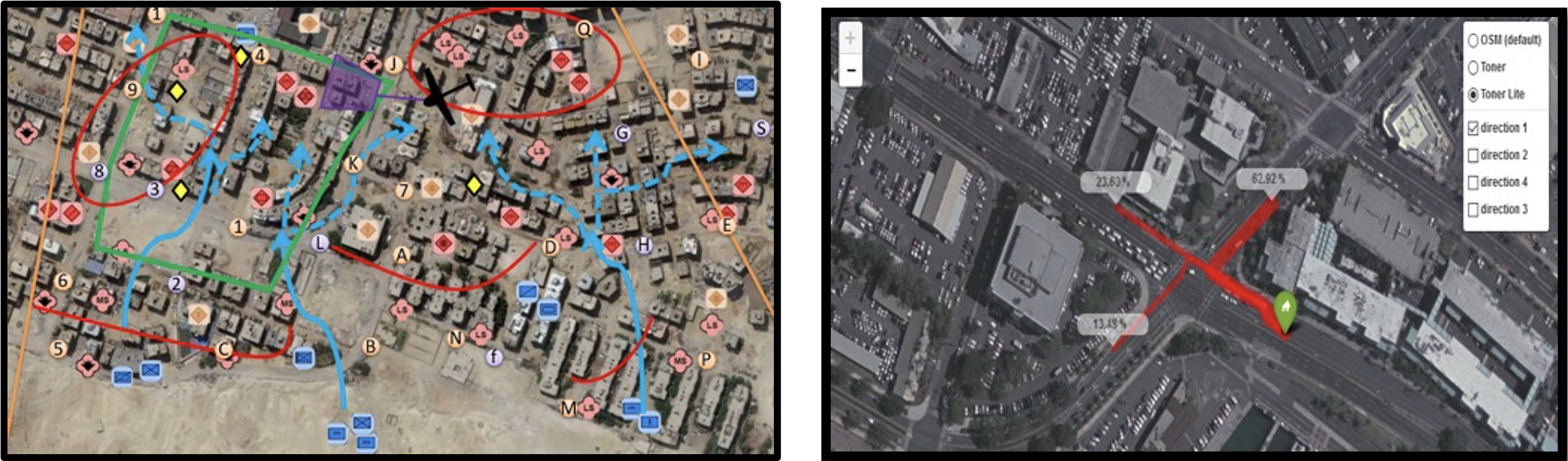
Left, a depiction of a generic C2 map. Right, a zoomed-scale map showing a region of interest for a UAV operator in a surveillance mission (Zak, Tapiro, et al., 2017). Note. C2 = command and control; UAV = unmanned aerial vehicle.
The topic of information decluttering and its cognitive benefits has been widely studied (e.g., Bisson & Blanch, 2012; Herr et al., 2017). Hence, it seems certain that C2 information can be designed to accommodate the needs of UAV operators. With this in mind, and responding to the lack of SA support systems specifically designed for UAV operators, a preliminary study aimed to identify operators’ unique requirements and how they differ from existing military intelligence information interfaces. Based on structured interviews with experienced UAV subject matter experts (SMEs), it was confirmed that UAV operators require very concise and particular
The aim of this demonstrator is to explore if and how patterns-of-life visualizations designed specifically for UAV operators can better utilize intelligence information, and hence improve mission performance. Particularly, two key questions were raised. First, how can patterns-of-life information aid operators with mission execution? Second, how can graphical representations of spatial and temporal information be distilled to support UAV operators in different mission phases and different military organizations? These questions are addressed in this study by focusing on providing the right information at the right time (Endsley, 2000; Peters et al., 2015) via visualizations of spatial and temporal patterns-of-life activities that aggregate historical information collected from past missions and other intelligence sources.
During missions, the UAV payload often captures information regarding high-value targets (HVTs) and the environment, but exploring the information collected is resource consuming and often even impossible (Bao, 2016; Marusich et al., 2016). To tackle this problem, our study endeavored to design visual information aids that can synthesize the collected information, as detailed in the next section. The aggregated information signifies spatial and temporal patterns-of-life activities, nullifying difficult or infeasible information exploration tasks. After developing visualization aids that aggregate the right information, it is important to ensure that the aids deliver the aggregation at the right time, as UAV missions are diverse and consist of various subphases (Jenkins, 2012; Oron-Gilad et al., 2006), each of which may require different aids. The patterns-of-life visualization aids were therefore tailored to major UAV missions by SMEs. Matching visualization aids with operational scenarios has seldom been studied. One of the few examples we found was an implementation of a dedicated system that changes levels of detail in the cybersecurity domain (Inibhunu & Langevin, 2016; Inibhunu et al., 2016). However, unlike the rapidly changing properties of the battlefield environment, the unknown variables in the cybersecurity domain are fewer, and therefore their approach may be unsuitable for the UAV domain.
As described in the “Method” section, an evaluation using UAV operators with diverse military experience from the United States (US) and Israel (IL) and was conducted. Experimental participants were presented with a single use-case story of an operational mission parted into five consecutive scenarios. Each scenario was used to evaluate a specific visualization for a phase of the mission. In each scenario, participants performed tasks involving the retrieval of important intelligence information twice: once without the visualization aid, and then once with the proposed aid. Next, they filled out a questionnaire and ranked the usefulness and necessity of each visualization aid they experienced for each scenario. Objective measures regarding the mission phases were obtained as well.
The results of this US–IL collaborative study, presented in the “Results” section, also address the differences between the two military organizations in terms of work protocols and culture. Inconsistencies between operators of the two nationalities were expected; therefore, the concluding sections are devoted to these commonalities and differences as well as to limitations and the implications for future research.
Construction of the Information Aids
Design, development, and evaluation of the patterns-of-life visualization aids in this study relied mostly on interviews with experts on UAV operation and visualization. The preliminary design step was devoted to learning the visualization requirements of military UAV operators. The development step, in several iterations, relied mostly on visualization experts. The evaluation step sought feedback and approval for the developed aids. This construction process yielded five patterns-of-life visualization aids (Figure 2).
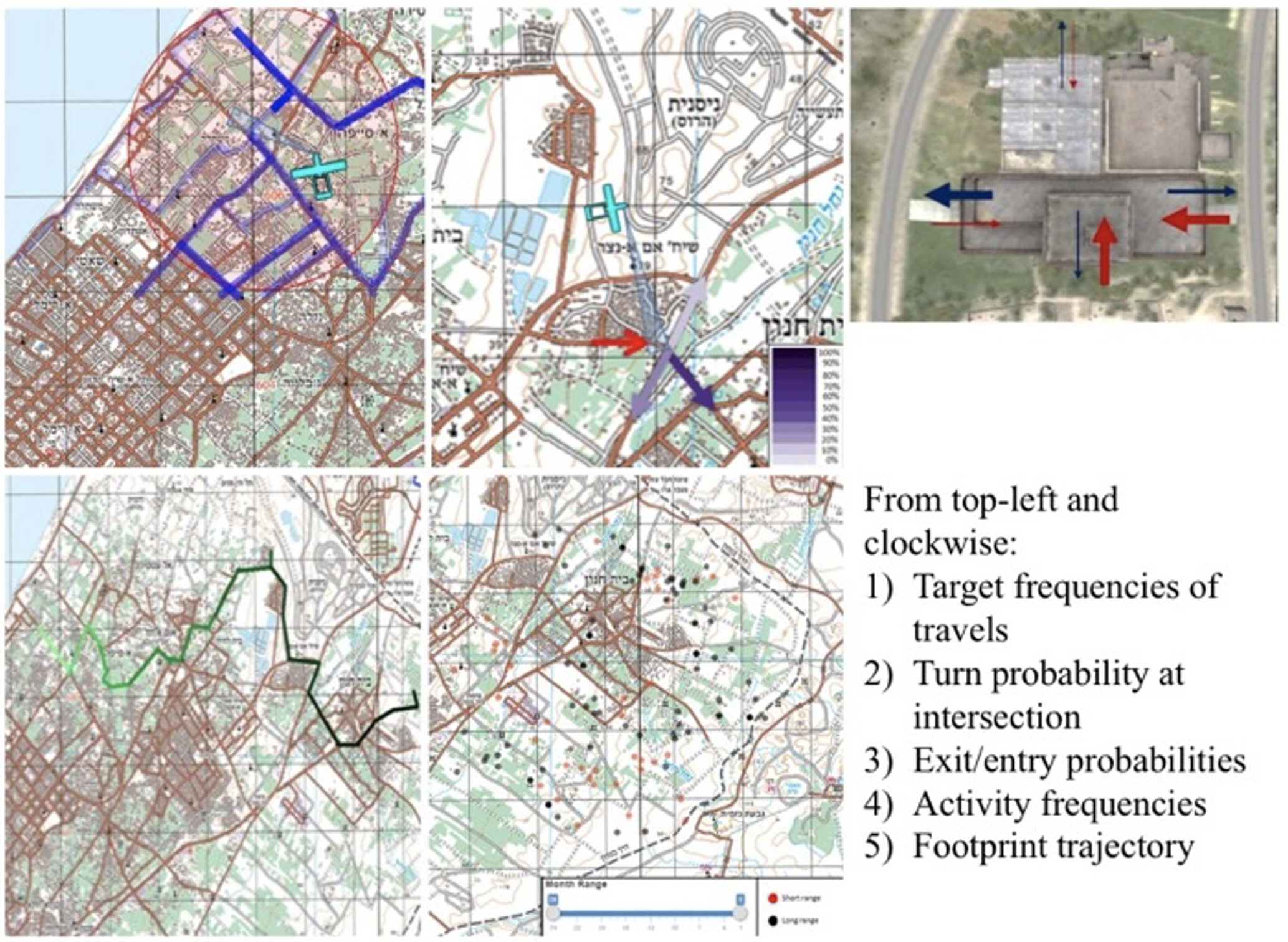
The five visualization aids.
Target frequencies of travel—This aid displays the frequency of travel for an individual target as blue lines over the roads on the map. The darker and more solid the color is, the more frequently traveled the route is.
Turn probability at intersection—This map aid shows the probability that a car approaching an intersection would turn one way or another. The darker the color of the arrow is, the more likely it is that the car will turn in that direction.
Exit/entry probabilities—This aid (superimposed on the sensor feed rather than on the map) shows the probability that a target would go through either a building exit (blue arrow) or a building entry (red arrows). The thicker the arrow, the more likely it is that a target will go through an exit/entry.
Activity frequencies—This map aid depicts two types of hostile and/or illegal activities: short-range (red dots) and long-range (black dots) rocket launches. The less transparent the dots, the more relatively frequent the activity is, and a time-selection bar can be used to highlight emergent trends or patterns over time.
Footprint trajectory—This aid shows information collected from the current mission, instead of aggregated from past missions, via a line on the map that represents the target’s movement trajectory. The darker the line is, the more recent the movement is.
Method
Experimental Subjects
Participants were 36 UAV operators from the US Army and the Israeli Defense Forces, classified here according to the type of UAV they were operating (Watts et al., 2012). All participants were qualified to perform in all UAV roles (Air Vehicle Operator—AVO, and Mission Payload Operator—MPO), which can sometimes change during a mission.
The US participants (n = 19) included 18 males and one female. Their age range was from 24 to 52 years (mean = 34), and accumulated flight hours averaged 2,010 (std. = 934; median = 1700). All were highly experienced operators of either the low-altitude, long endurance RQ-7 Shadow, or the medium-altitude, long endurance MQ-1C Gray Eagle. US participants’ flight hours were separated into time spent as an AVO and MPO. The MPO hours averaged 814 (std. = 761; median = 1000), and the AVO hours averaged 1,195 (std. = 425; median = 800).
The IL participants (n = 17) included 15 males and two females. Their age range was from 22 to 29 years (mean = 25), and their accumulated flight hours averaged 1494 (std. = 919; median = 1600). They were from six squads operating the medium-altitude, long-endurance Heron and Hermes 450 UAVs (n = 11) and Heron-2 UAV (n = 6).
Experiment Apparatus
The PowerPoint platform used for running and managing the experiment presented the instructions, mission information, and visualization aids. The interfaces and visualization aids conveyed mission information and relevant aggregated data using graphical mockups designed to represent a generic UAV control station (Figure 3). They were approved by Israeli SMEs to adequately represent UAV interfaces used by the participants. The mockup screen layout included three sections. The left section presented a map with the location of the UAV and the sensor path and starepoint. The right-top section presented the simulated sensor feed. The patterns-of life visualization aids designed, developed, and evaluated in this study were integrated into either the map or the sensor feed. The visualization aids were uniform between US and IL participants. Map type was chosen based on what the operators work with in their daily missions: US participants were presented with a regular map, and IL participants were presented with a satellite view map. Finally, the right-bottom section presented a static placeholder displaying the vehicle’s status. The PowerPoint presentation did not have any animation effects. To account for cultural, technical, and military differences that inherently exist between the two armies and their missions, both US and IL experts took part in the development of the scenarios and the allocation of visualization aids to each scenario.
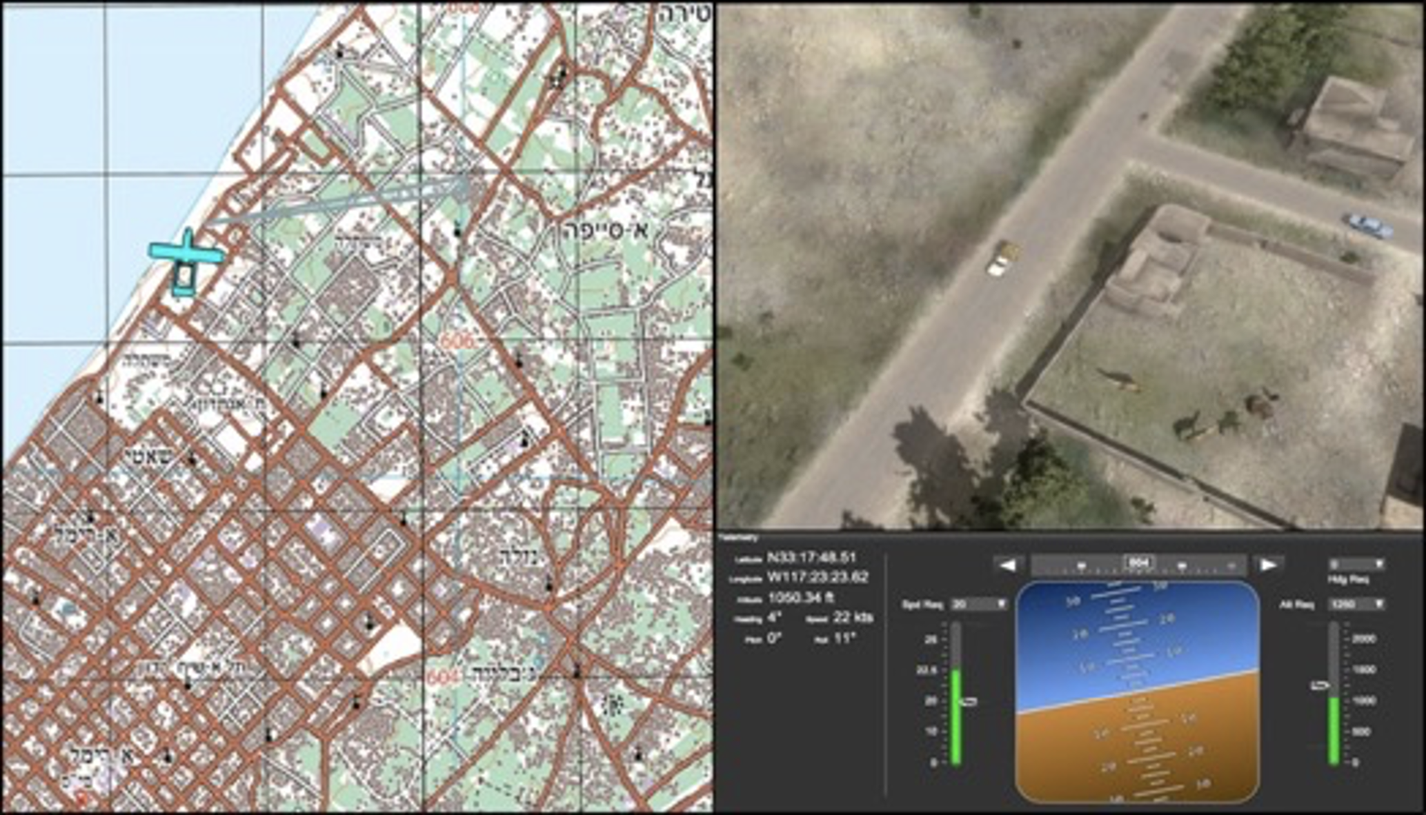
The UAV control station mockup. Left, a map with the UAV position and payload’s projection. Top right, the payload’s feed. Bottom right, UAV state data. Note. UAV = unmanned aerial vehicle.
Experiment Design
The experiment utilized the five visualization aids in an operational mission use-case. The use-case story described a UAV mission of reconnaissance and surveillance support for an interdiction attack, to prevent a suspected enemy rocket launch on friendly forces. Considering the right information at the right time constraint, the use-case story had five scenarios. Each scenario was different, requiring the respondent to perform a specific operational task. Scenarios were designed so that no participant would have an advantage, regardless of each participant’s prior experience. For each scenario, one visualization aid was assigned to help the respondent perform the task.
For each one of the five use-case consecutive scenarios, Table 1 details the task, description, and assignment. In this part of the research, all participants were asked to perform all five assignments twice, first without the visualization aid and then with the aid. No time constraints were imposed, and the duration of each assignment was approximately 20–30 s. The following procedure received the approval of both the US and Israeli authorities.
Scenario Descriptions, Visualization Aids, and Assignments
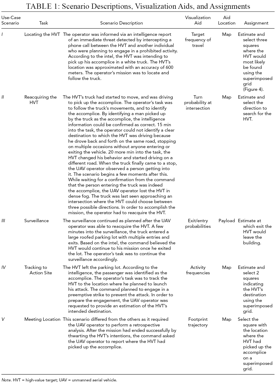
Note. HVT = high-value target; UAV = unmanned aerial vehicle.
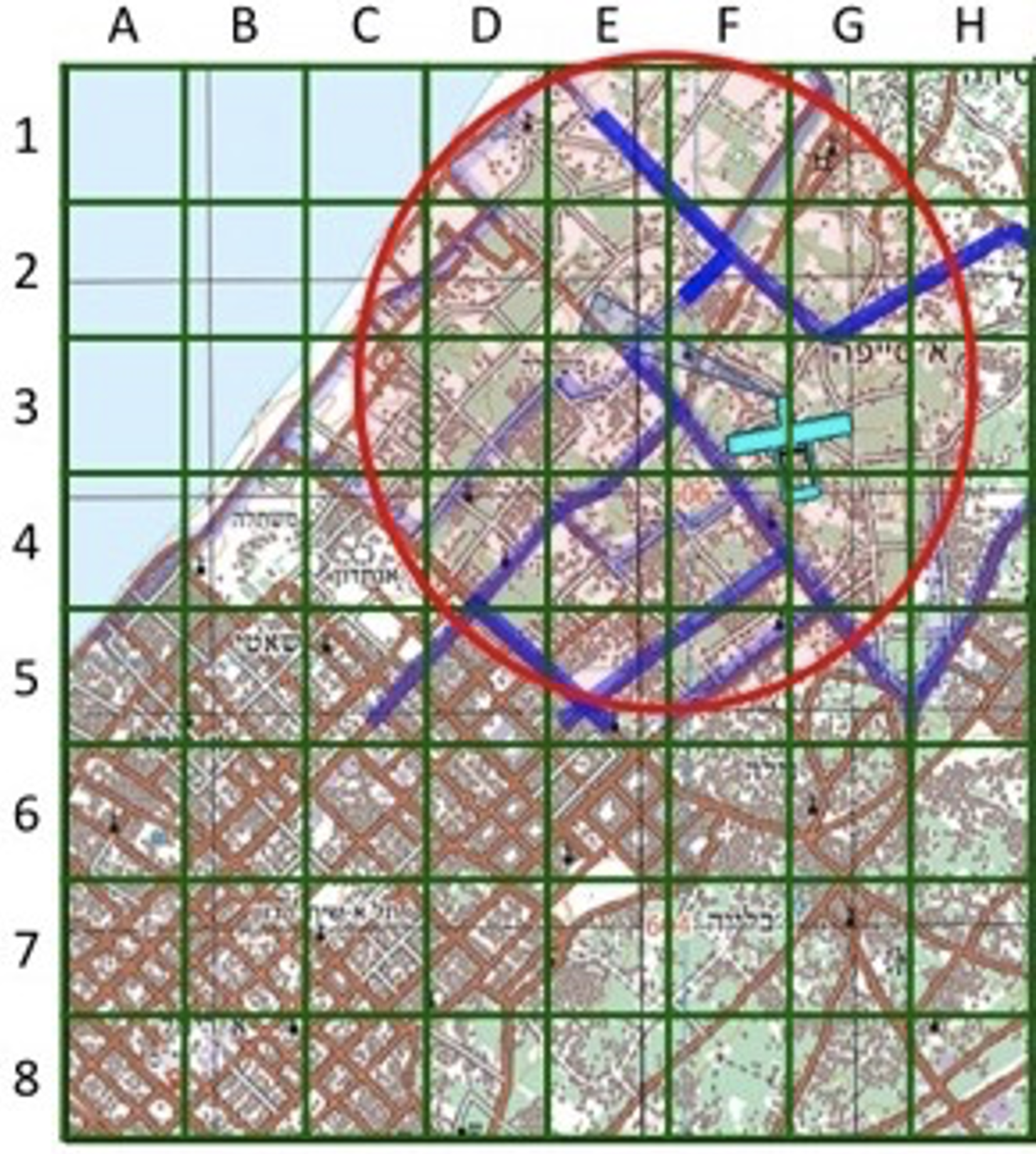
The superimposed grid used for collecting participants’ assignments answers. In some of their answers, participants were asked to select squares on the grid based on the assignment given to them (Table 1).
Evaluation Procedure
Participation in the research was voluntary, and all participants completed a demographic survey. An experimenter acted as a facilitator between the PowerPoint presentation, the use-case scenarios, and the participants. Participants met with the experimenters either individually (US participants) or in small groups of five to seven (IL participants). The difference in setup stemmed from the IL operators only being available in small groups at the same time, and not one at a time. Group participants were seated in a small classroom, each in front of a desk, with a common large projection screen. In the Israeli setup, the experimenter presented the PowerPoint demonstrator (in the order described in Table 1) on a large screen in front of all the participants. Each participant filled out a separate questionnaire about the visualization aid and the mission individually, without any interaction with other participants. In the US setup, each participant sat in front of a computer monitor, in a quiet room, while the experimenter controlled the PowerPoint demonstrator. Similar to the IL participants, the US participants filled out a hard-copy questionnaire.
The PowerPoint demonstrator presentation started with a brief description of the research and the experiment. Then the background of the use-case story was presented, describing the role of each participant as a UAV operator, and their mission. From that point, the five scenarios were described chronologically, once for each participant, as a story told by the experimenter. The storyline was paused after the description of each scenario and the experimenter asked the participants to perform the scenario’s respective assignment twice—once before the visualization aid was introduced and once afterwards, as detailed in Table 1. The map and payload feed presented to the participants were snapshots of the environment at the time of the pauses. Some assignments called for a superimposed grid (Figure 4) to be overlaid on the map during the questionnaire. After completing all assignments, participants were asked to complete the questionnaire and evaluate each visualization aid on scales of usefulness, necessity, and disturbance.
Measured Variables and Metrics
The measures collected during the experiment can be divided into three categories. The first two categories used a scale from one to five. The first category includes the task performance measures, which were derived from participant responses to the assignments detailed in Table 1. This measure addresses the first research question concerning the information requirements of military UAV operators.
The user preference measures of usefulness, necessity, mission phase, and disturbance are included in the second category. These measures correlate with the second research question, of using patterns-of-life information aids to assist operators in their work. The usefulness measure was rated by all participants and involved asking them to estimate how often they would use the visualization in real-life missions similar to the given situation, on a scale ranging from never to always. Questions regarding necessity, disturbance, and mission phase were added for the IL study that was conducted after the US data collection. The necessity measure was derived by asking the IL participants to estimate how necessary the information conveyed by the visualization was in the given scenario, using a scale ranging from not necessary at all to very necessary. The disturbance measure was derived by asking the IL participants to indicate if the visualization disturbed their work. It ranged from not disturbing (i.e., not affecting the operator’s ability to focus effectively) and not damaging (i.e., not actively disrupting the operator’s work), through disturbing but not damaging, to damaging, to very disturbing or very damaging.
The third category includes the timing measure, which addresses the right information at the right time issue. This measure corresponds to the second research question of distilling the information to match user needs. Questions used to derive this visualization–scenario match measure were presented differently to US and IL participants. US participants were asked to rank the visualization aids in terms of usefulness for reconnaissance, surveillance, and prosecution missions. IL participants were asked to rank, on a scale of one to five, how well the visualization aid fits the scenario. For each scenario, participants were asked to indicate the most appropriate visualization aid.
Data Analysis
Data analysis was conducted for US and IL participants separately, comparing the results when possible. Analysis was divided according to the three categories of measures: task performance, user preference, and timing.
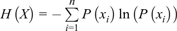
For four out of five assignments, participants were asked to provide multiple responses in the absence of a right or wrong answer, and hence the entropy measure was used. Shannon’s entropy (Shannon, 1948) measures the diversity of participants’ answers, or to what extent they agree with each other. It is defined as
Means and standard deviations were used to analyze the user-preference measures of usefulness and necessity, comparing the US and IL groups on the usefulness measure only. Analysis of the disturbance measure focused on the percentage of participants reporting that the visualization disturbed the work on their mission.
Analysis of the timing measure differed between the two nations. Means and standard deviations were used in analyzing US answers about the usefulness of each visualization aid in light of each mission type (i.e., reconnaissance, surveillance, or prosecution). IL answers regarding the fit ranking of the visualization aid to the mission phase were analyzed using means and standard deviations as well. For each mission phase and visualization aid, answers regarding the appropriateness of the visualization aid were combined in a matrix, comparing the percentages of participants who indicated that the aid was appropriate for the mission phase.
Results
Results are detailed separately for each country, and a discussion of the comparison is given in the “Discussion” section. In all bar-plot figures the black lines represent the standard deviations of the measures.
US Results
Task performance
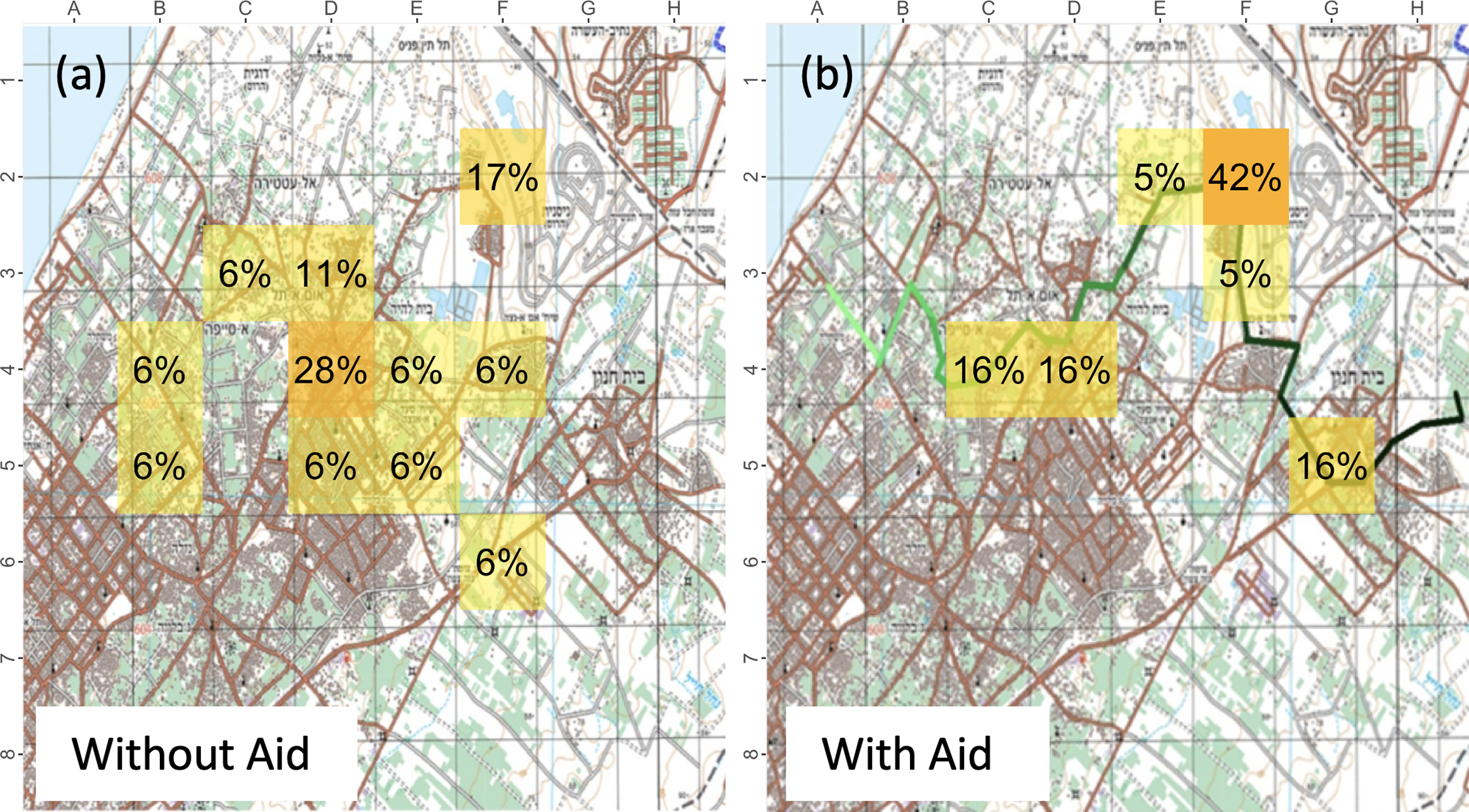
The results of the entropy measures are detailed in Table 2. Gain refers to the entropy improvement, that is, the entropy reduction due to introducing the visualization aid. The greater the entropy reduction, the more homogeneous the answers were among the participants. Figures 5-7 illustrate the task performance results on the map, where each square indicates the percentage of participants who selected that square. Figure 5 refers to the first task—locating the HVT, Figure 6 refers to the fourth task—tracking to action site, and Figure 7 refers to the fifth task—identifying the meeting location. Regarding the fifth task (i.e., remembering and identifying where the HVT picked up the accomplice), many US participants noted this was irrelevant to them since their current system allows them to mark events and locations on the map in real time; thus, they have no need to commit points of interest to memory. In each of the figures, section (a) illustrates participant performance before the visualization aid was introduced, and section (b) after its introduction.
Results for the Entropy Measures of Task Performance
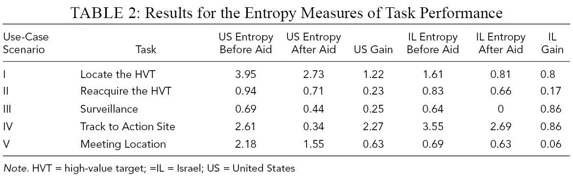
Note. HVT = high-value target; =IL = Israel; US = United States
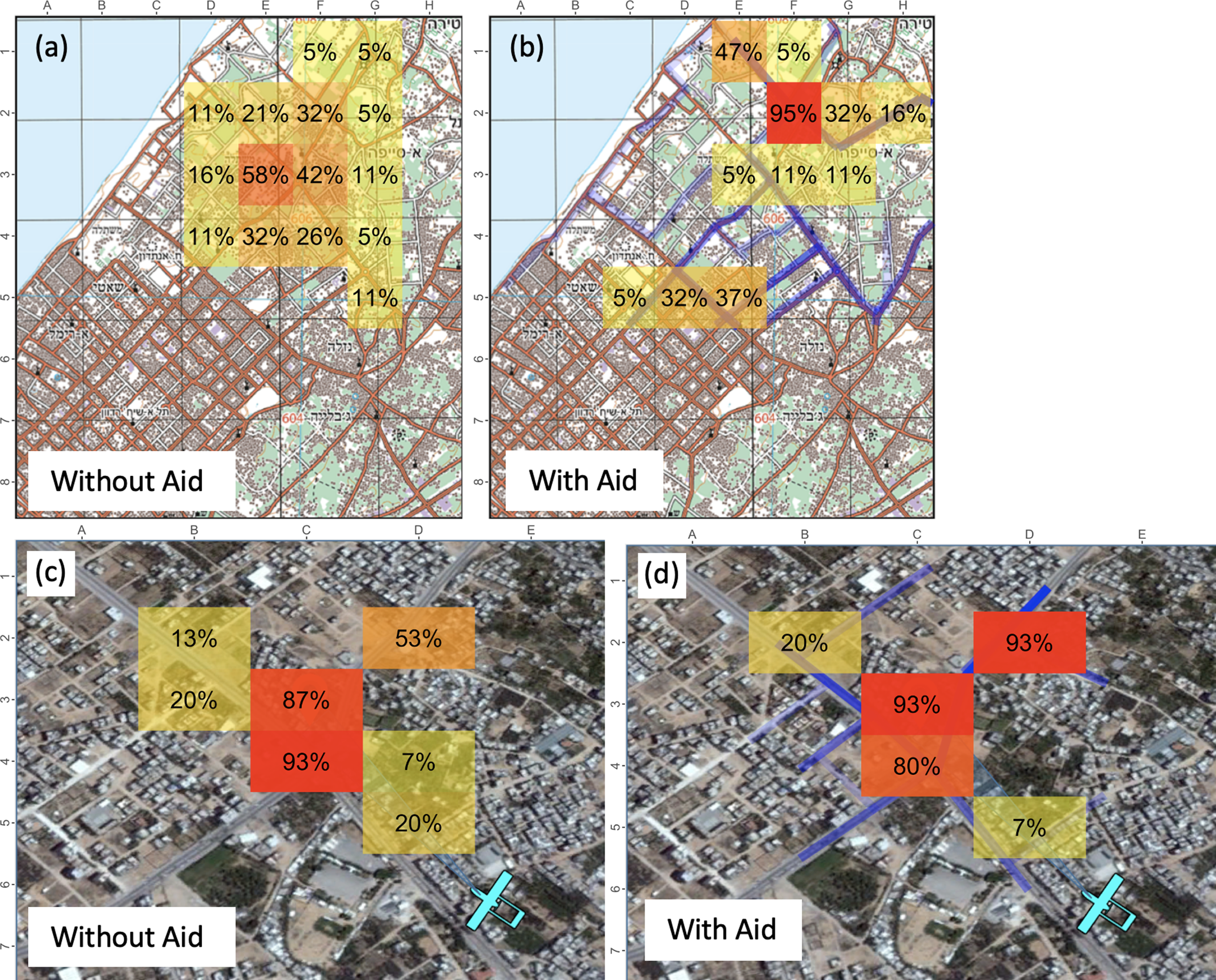
Heat map with assignment results for locating the HVT (Scenario I). (
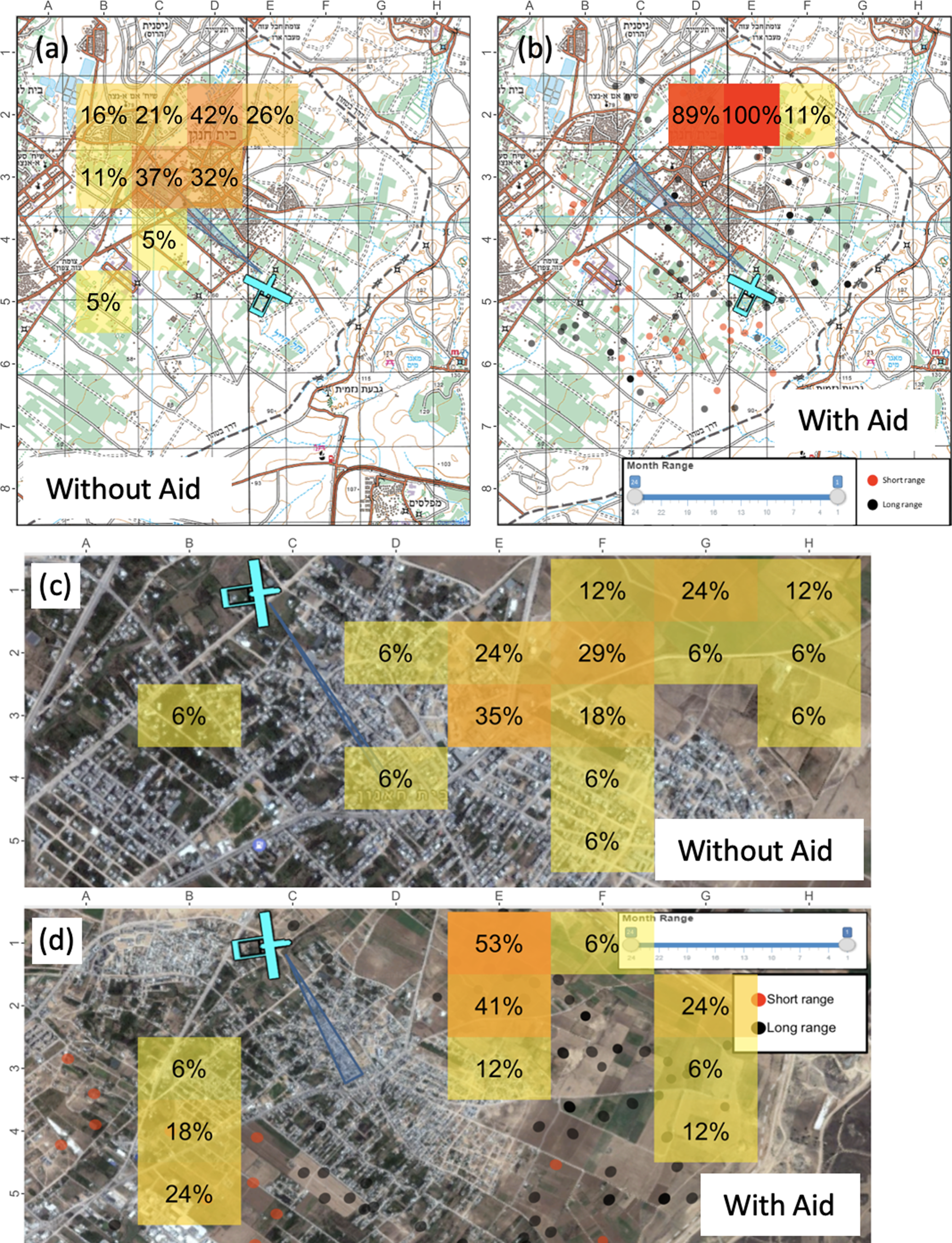
Heat map with assignment results for tracking to action site (Scenario IV). (
Heat map with US assignment results for meeting location (Scenario V).
User preference
Results for the usefulness measure are illustrated in Figure 8. The heights of the bars represent the means of the measures, where five is very useful.
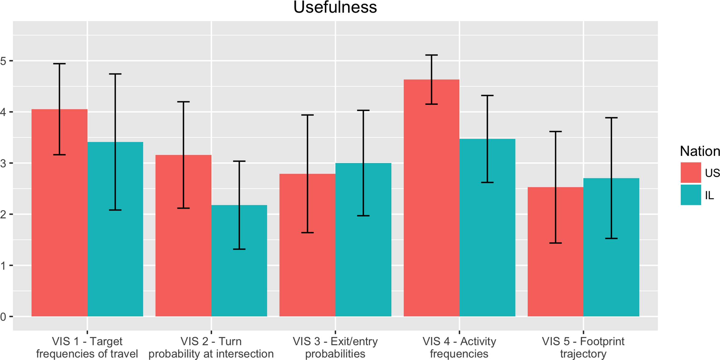
Ratings of usefulness (mean and standard deviation on a 1–5 scale) of each visualization for the US and IL participants.
Timing
Results for the visualization–scenario match measures are illustrated in Figure 9, where the reconnaissance, surveillance, and prosecution mission types are represented by different bar colors. The heights of the bars represent the means of the measures, where five is very useful.
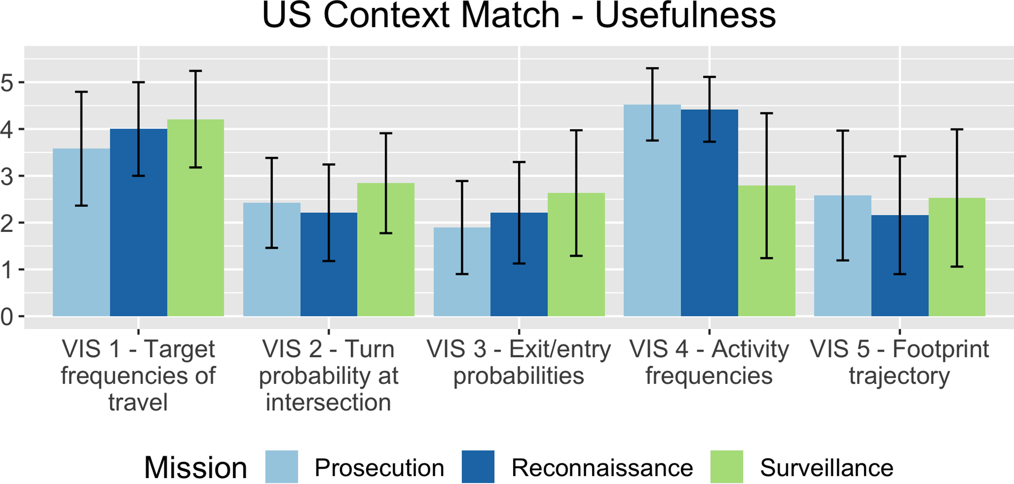
Perceived matching (on a scale of 1–5) in terms of usefulness of each visualization by mission type.
IL Results
Task performance
Table 2 also details the IL entropy measures, Figure 5 illustrates the IL task performance results on the map for the first task, and Figure 6 refers to the fourth task. In each figure, sections (c) and (d) refer, respectively, to results for IL participants before and after the visualization aid was introduced. It is worth noting, for the entropy results in the fifth task, that without the visualization aid, only two participants could remember from which square the HVT had been picked up, with entropy of 0.69. However, with the visualization aid, the number of participants who could remember this increased to seven, with entropy of 0.63. The meeting location task’s results are not illustrated in Figure 7 alongside the US results due to the lack of usable results from the task before the visualization aid was presented.
User preference
Figure 8 illustrates the usefulness measure, Figure 10 refers to the necessity measures, and Table 3 details the disturbance measures.
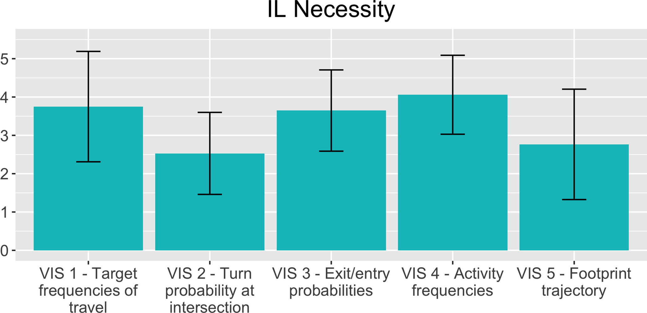
Ratings of perceived necessity (visualization mean and standard deviation) of each visualization by the IL participants.
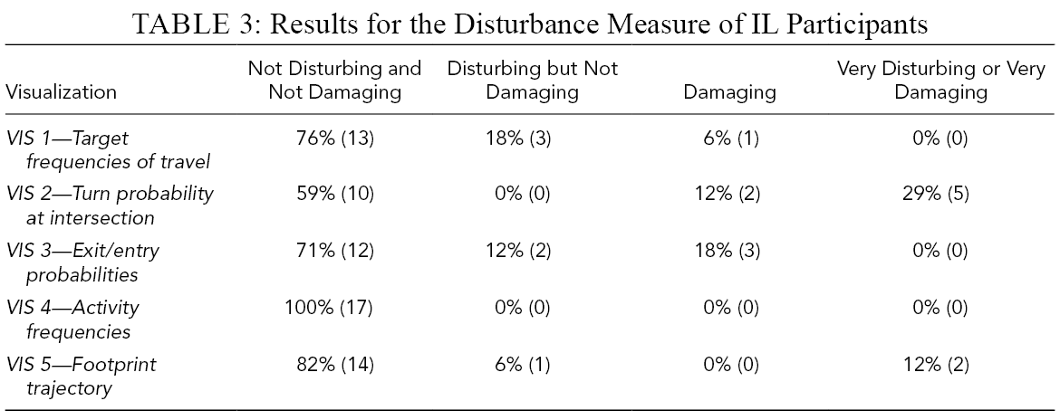
Results for the Disturbance Measure of IL Participants
Perceived matching of the visualization to the operational mission phase in the use-case PowerPoint demonstrator.
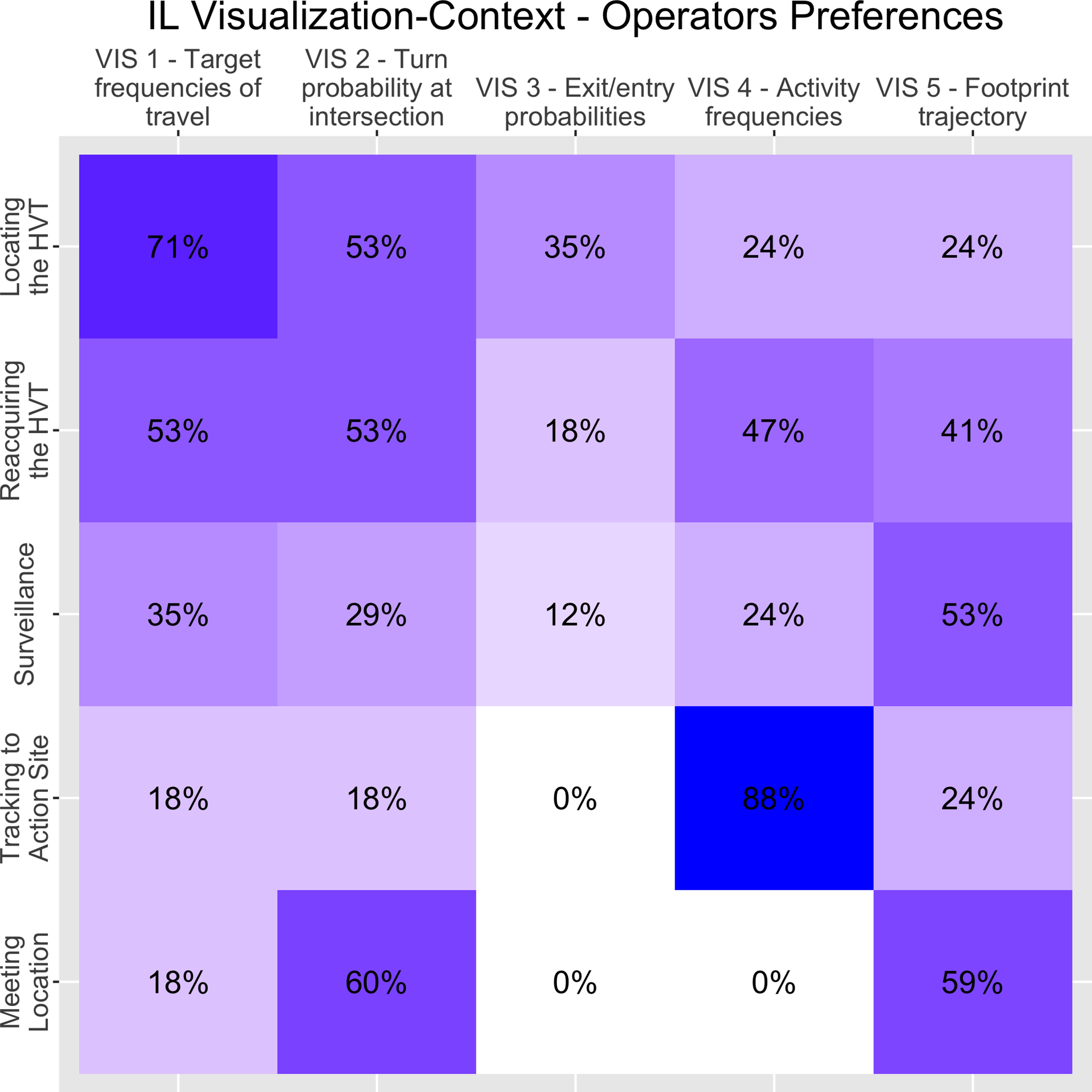
IL visualization-scenario matching matrix. Each cell represents the percentage of participants who wished to see a specific visualization aid in a specific phase. A perfect match would be represented by a diagonal of 100%.
Timing
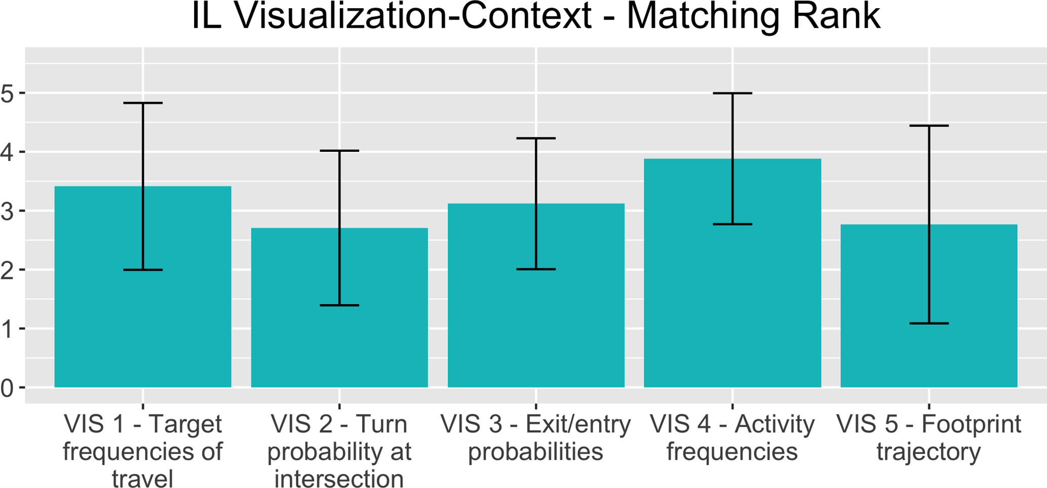
Results for the IL visualization–scenario match measures are illustrated in Figures 11 and 12 in two ways. Figure 11 illustrates the ranking of the visualization aids and the mission phases they were shown in. The heights of the bars represent the means of the measures, where five is the highest. Figure 12 illustrates the appropriateness matrix, where each cell represents the percentage of participants who wished to see a specific visualization aid in a specific scenario. The percentage is illustrated both by hue and by annotation. If all visualization aids were perfectly matched to mission phases, the diagonal would be 100% for every cell.
US–IL Comparison
Task performance
The reduction in response entropy, as demonstrated by the entropy gains in Table 2 and visualized in Figures 5-7, shows that the visualization aids influenced participant behavior. With the aids, participants’ answers converged, showing less diversity in answers compared to those without the aids. This indicates that the information conveyed, and the methods used to display it, supported the participants’ decision-making in each assignment task. However, further research is necessary to determine whether real-world datasets visualized in this manner would actually improve mission performance. It should be noted that, with Visualization#5 (footprint trajectory), a gain of 350% was observed in the IL results in terms of recollection ability. The number of participants who were able to provide any answer to the HVT pick-up location had drastically increased, from two participants when the visualization aid wasn’t available, to seven when it was.
User preference
While the visualization aids supported the participants’ decision-making in both countries, operators questioned whether they were essential. Analyzing the usefulness measure (Figure 8), both US and IL participants ranked Visualization #4 (activity frequencies) first (US: 4.64 and IL: 3.47, p value of difference:
Regarding the necessity measure (Figure 10), IL participants found Visualization #4 to be most necessary (with 4.05 points), with Visualization #1 (target frequency of travels) next. Visualization #2 was found to be the least necessary (with 2.52 points). Their visualization ranking order of necessity corresponded with the usefulness measure.
In terms of the disturbance measure (Table 3), some IL participants found most visualizations other than #4 to be irrelevant to their work and, to some extent, between disturbing and damaging. For example, almost half (41%) of the participants found Visualization #2 to be either damaging, very disturbing, or very damaging. Visualization #2 was also the one that IL participants found least useful and least necessary.
All in all, it seems that US and IL participants agreed that not all visualization aids were useful, even if they could assist them in their work. Some even found unnecessary aids to have a negative effect on their work. There was no consensus, however, regarding the ranking order of the visualization aids or the ranking scale.
Timing
It was evident that the matches between the visualization aids and the mission phases were less than perfect. The visualization–scenario match measures were collected differently for the US and IL participants and, therefore, were analyzed separately.
IL results
Participants’ rankings of the visualization–scenario match (Figure 11) were correlated with the usefulness and necessity rankings, with Visualization #4 (activity frequencies) perceived to be the best match (3.88), followed by Visualization #1 (target frequency of travels), with Visualization #2 (turn probability at intersection) as the poorest match (2.7). Figure 12 emphasizes this finding since, if the matchings were perfect, all cells in the diagonal would show 100%, and all participants would have agreed that the visualizations had to be shown in the phase they were shown in. Instead, the matching for Visualizations #1 and #4 was 71% and 88%; for #2 and #5, 53% and 59%; and for #3, 12%. Moreover, there was no consensus about which visualization aid should be presented in each scenario. For example, for the reacquiring the HVT and surveillance scenarios, there were no dominant visualization aids, and it was evident that Visualization #3 (exit/entry probabilities) did not fit any scenario.
US results
Figure 9 illustrates the correlation of each visualization with the mission types, based on participant rankings of the usefulness of each visualization for each mission type. Visualization #4 (activity frequencies) was perceived by participants as very useful for prosecution and reconnaissance missions, but less useful for surveillance missions when the target is already located and is being monitored. It is interesting to note that the US timing results are correlated with the US usefulness results (Figure 8).
Discussion
UAV operators were receptive to the concept of delivering mission-related patterns-of-life information via spatial–temporal visualizations. In the preliminary study (Zak et al., 2018), operators indicated that they wanted iconic, localized, and simplified presentations that will fit their typical missions (e.g., prosecution, reconnaissance and surveillance). In the current exploratory study, a PowerPoint demonstrator was used to provide the operational scenarios and visualizations. Using SMEs in both US and IL armies, objective and subjective measures were collected to evaluate whether the introduction of spatial and temporal patterns-of-life visualization aids can help UAV operators perform their missions more efficiently. This section discusses the results, details some limitations of this study that may have had an effect on the results, and highlights the study’s contributions.
Research Questions
As expected, presentation of visual aids impacted SA and the decision-making process, as is evident in the results from the convergence in answers to the assignments and, hence, reduced dispersion (Table 2). However, the results are inconclusive regarding user preferences and timing measures. Previous studies looking at data obtained from UAV sensor feeds (Ophir-Arbelle et al., 2013) have also shown such inconclusiveness, probably due to the variety in UAV missions, which dictates different visualization aids for each mission phase, as well as a more holistic human–system integration approach (i.e., also looking at training, work procedures, and other organizational aspects that differ between units and armies).
Differences between the two groups of participants can be attributed to work protocols, training, and systems. For example, US participants viewed Visualization#5 (footprint trajectory) as useless due to the existence of an alternate system that they already use. Cultural (e.g., motivation to serve in the army), experience, and organizational differences may also affect how participants assigned their scores to visualizations with similar perceived usefulness levels (Giegerich & von Hlatky, 2020; Nuciari, 2007). Other differences between the nations can be attributed to the limitations of this study. Nevertheless, even with the understanding that there will always be both inherent differences between military organizations and evolving needs for specific mission-phase visualizations, we argue that a comparison between organizations is valuable: (a) to facilitate standardized training regimes and operations across military organizations, and (b) to identify and develop basic visualization principles that comply with common needs that are necessary across UAV platforms and organizations, such as common standard language and common visualization symbols (similar to the NATO joint military symbology or MIL-STD 2525D) designed specifically for UAV operators.
In sum, responding to the first question of the study, all operators were receptive to the concept of adding patterns-of-life visualizations to the map (Figure 8). Moreover, there is evidence that the visualization aids improved operator performance (Figures 6 and 7). With respect to the second question, regarding the optimal form of distillation of the information at the right phase, there was no consensus (Figures 9 and 11). This raises the notion that a visualization aid–scenario match depends on the unique characteristics of the organization.
Limitations and Recommendations for Future Research
The experimental procedure of this study included running a PowerPoint demonstrator presentation to simulate the missions and tasks using mockups, and to manage the experiment. This procedure is simple to build and administer, but it is limited in its ability to evaluate participant’s performance with visualization aids. To broaden the scope of evaluation, future studies will use interactive hands-on simulations of real missions. This will provide assessments of how useful visualization aids are, especially when experiencing the aid in real time and with all mission components. In addition, objective workload measures could then be obtained.
Further, it emerged from the analysis that, although SMEs were consulted prior to assigning each specific visualization aid to a particular use-case scenario, the assignment was not entirely satisfactory. This may be one of the reasons why some of the aids ranked low on usefulness and necessity. Matching visualizations to operational settings requires many factors to be considered. It is recommended that this be addressed in further research that empirically examines matching factors.
Lastly, it is difficult to account for the organizational differences. US and IL participants were introduced to the same operational scenario via the same PowerPoint mechanism but with different map views (regular versus satellite view) and somewhat different questionnaires, compromising some aspects of comparison. While the usefulness measure and the scenario assignments were the same for both nations, other measures differed (the necessity measure and the matching measure were only collected from IL participants). Comparison between the groups is therefore incomplete. Future research should strive to more closely align the presentation and measures to fully investigate the cultural/organizational differences that may emerge. However, this limitation by itself represents one of the challenges of conducting a bi-national study; for example, there is no point in showing Israeli operators a regular map when they use a satellite view.
We suggest that future research will aim to address the following. First, use an interactive simulation to collect more objective measures of performance and workload. Second, attempt to solve the right information at the right time problem with an empirical and more data-driven method (e.g., dynamic simulation), considering not only new visualization aids, but also the relevance of the information currently shown on the C2 map to the operators. In contrast, the third topic is a suggestion to develop an interactive system to improve the visualization aid–scenario compatibility by generating an intelligent learning system and allowing participants to select the visualization aid at any given time. The fourth topic is taking into account the cognitive effects of automation (Smith, 2018). Such a study can test the bias that might affect UAV operators due to faulty or inaccurate patterns-of-life information aids.
Conclusion
This study explored if and how adding visualization aids showing spatial and temporal patterns-of-life can improve military UAV operators’ work, by looking at how such visualizations, designed specifically for UAV operators, improve their utilization of intelligence information. Within a use-case story, five prototype visualizations were introduced to professional military participants of two nations (US and IL) in different phases of the operational mission. Participants were asked to complete each operational task without and with a visualization aid, with the aim of answering two key research questions. First, in light of their unique operating requirements, it was important to see if the visualization aids addressed specific UAV operational considerations. In general, operators found the visualization aids useful. The first research question, which referred to the usefulness of such visualization aids, was answered to some extent. From the subjective measures it appeared that even the visualization aids that were perceived as less useful assisted UAV operators with their work.
The second research question considered the fit of each visualization aid to the particular operational scenario. It was addressed by collecting measures of the visualization–scenario match. Although the results did not provide an adequate answer, they emphasized the difficulty in determining a good match and showed the importance of investing more research effort into methodologies and learning mechanisms for fitting a visualization aid to particular scenarios. Evidently, the use of SMEs’ opinions alone to fit new and unfamiliar visualization aids to operational scenarios was insufficient. Incorporating visualizations must take into consideration the cost of showing irrelevant information; since military UAV operators require information distilled for their immediate task, presenting irrelevant information can become harmful and disturb their work. Overall, the analysis of our results is encouraging. To some extent, participants were assisted by most visualization aids in performing their tasks, even in cases of inconclusive preference.
Third, to confirm that the visualizations reduce workload, more data must be collected using a variety of workload measures. Integration of visualization aids to enhance accessibility to information and decluttering in real time remains an under-researched area. The current study highlights the potential benefit of implementing pattern-of-life visualization aids, a contribution that should also be considered beyond the military UAV domain.
Footnotes
Acknowledgments
This work is part of the US/Israel MOA/FMF on Rotorcraft Aeromechanics and Man/Machine Integration under Task 31, Rapid Interpretation of Temporal and Spatial UAV Data (RITSUD). With gratitude, we acknowledge the contribution of Professor Emeritus Nava Pliskin to this manuscript.
Author Biographies
Yuval Zak is a PhD candidate at the Department of Industrial Engineering and Management at Ben-Gurion University of the Negev, Israel. He received his MSc in 2015 from the same university.
Hagai Tapiro is a postdoctoral fellow at Ben-Gurion University of the Negev, Israel in the Department of Industrial Engineering and Management.
Thomas J. Alicia is an engineering research psychologist in the Human Systems Interface Technical Area of the U.S. Army Aviation Development Directorate in Moffett Field, CA. He has established a portfolio of basic and applied research focusing on unmanned aerial system automation and interface design, specifically as applied to multi-vehicle manned-unmanned teaming. He earned his PhD in applied and experimental human factors psychology from the University of Central Florida, USA.
Yisrael Parmet is an associate professor at the Department of Industrial Engineering and Management at Ben-Gurion University of the Negev, Israel. He received his PhD in 2000 from Tel-Aviv University.
Michal Rottem-Hovev, now an independent consultant, has practiced human factors engineering in various unmanned systems’ projects, for the last 25 years.
Grant S. Taylor is an engineering research psychologist for the U.S. Army Aviation Development Directorate’s Human-Systems Interface Technical Area, located at the NASA Ames Research Center in California, USA. His current research focuses on the development and evaluation of new system capabilities that allow a single operator to better utilize multiple unmanned aircraft systems. This includes the development of advanced automation, cognitive decision aids, and user interface designs, as well as the simulated environments in which the concepts are evaluated.
Tal Oron-Gilad is a full professor and the Chair of the Department of Industrial Engineering and Management at Ben-Gurion University of the Negev, Israel. She received her PhD in 2003 from the same university.