
Abstract
The by() option of the
New variables to show rank within groups and (if needed) separation of groups are easily constructed. Group summaries such as medians may easily be added. Graph types shown are dot charts, quantile plots, and displays using spikes to show differences between variables. Data examples are for ocean salinity and changes in weight of anorexic girls.
Keywords
The problem
Graphical comparison in Stata of data or results for two or more groups often hinges on showing those groups side by side using a
This column focuses on two solutions for simple descriptive or exploratory plots using some slight trickery.
First,
Second, using
The value of these small tricks is greatest with smallish datasets, say, whenever the number of observations is of the order of tens or hundreds, not thousands or millions. But with datasets that small, researchers not only can but also should use graphical designs that show all the fine structure in the data and allow an overview of their broad structure. Too many reports reach for histograms, box plots, or more modish designs that suppress or obscure fine details that may be interesting or important.
Tufte (2020, 100-101) urged the point vigorously: “Detailed data moves closer to the truth. No more binning, less cherry picking, less truncation. … To improve learning from data, credibility, and integrity, show the data.”
Two reservations should be flagged at the risk of emphasizing the obvious. Comparisons side by side or juxtaposed use just one graphical style: showing data or results superimposed in the same space is often possible or even preferable. The examples here are just indicative and not exhaustive of the possibilities.
Writing this column arose, as often, from explaining how to use Stata to get better results. But, as always, what data you have, why you are drawing a graph, and who will be reading your graph are also crucial.
Exploiting over() options in graph dot, graph bar, or graph hbar
The sibling commands
Salinity dataset
A small sandbox dataset of salinity measurements in three water masses of the Bimini lagoon of the Bahamas was given by Till (1974, 104) and reproduced by Hand et al. (1994, 203). There are 12, 8, and 10 measurements from the water masses. Till (1974, 104-113) showed no graphs; his main concern was one-way analysis of variance. A Stata-readable copy of the dataset is included with the media for this issue.

The data for each water mass are presented in what appears to be an arbitrary order. Without any information on the meaning of that order, we lose nothing by sorting before graphics. The same applies to the water mass identifiers, so we can calculate medians for each water mass (or any other summary if you prefer) as a preliminary to later sorting.

We could have used
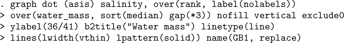
Figure 1 is a dot chart of these data, showing a simple contrast in salinity levels between water masses. Some choices here arise from personal taste or preference. Other details deserve emphasis.
Dot chart of salinity measurements in three water masses, Bimini, Bahamas
The new variable
We have reordered the water masses. Note that you can tune the gap between the outer groups. Naturally, you may choose your own alternative to 3 or accept the default spacing.
The
The salinity values vary over a narrow range. Showing zero not only is unnecessary but also would make comparisons much harder. Here and elsewhere, the best advice is usually as stated by Cleveland (1994, 93): “in science and technology assume the viewer will look at the tick mark labels and understand them”
The display has produced side-by-side quantile plots. See, for example, Cox (2005a, 2024) and those articles’ references if you are curious for more discussion.
We will come back to this dataset in the next section. For the moment, save the revised dataset:
A larger and more challenging example concerns weights before and after various treatments of anorexic girls. The data were provided by the statistician B. S. Everitt and are given in Hand et al. (1994, 229). The weights are said to be in kilograms, but—as also pointed out by McNeil (1996, 57)—must be in pounds. McNeil’s treatment includes some excellent graphs and inspired the choice of this example.
The treatments were given as cognitive behavioral treatment (29 observations), a control group (26 observations), and family therapy (17 observations). There seems to be no reason to follow this alphabetical order in presentation. For previous discussion and several graphs, see Cox (2009). Unequal group size was not mentioned then but is the twist now addressed directly.
The focus is the effectiveness of each positive treatment compared with the control of no treatment, so direct display of weight change will be of interest. For a first stab, we look at the data as provided but use the order of group medians of weight change. As before, use any different criterion if you prefer, especially if that makes more sense for your own dataset. In particular, any interest in analysis of variance should be matched by use of means.
Figure 2 is a dot chart of weights before and after treatment. Given sorting within treatments, it is also a quantile plot. A broad contrast emerges fairly clearly: the control group shows about equal frequencies of weight gain and weight loss and hints strongly at a regression effect too. Of the two treatments intended positively, family therapy appears more effective. There are the usual reservations about sample size, so many readers would be inclined to proceed to more formal modeling and testing.
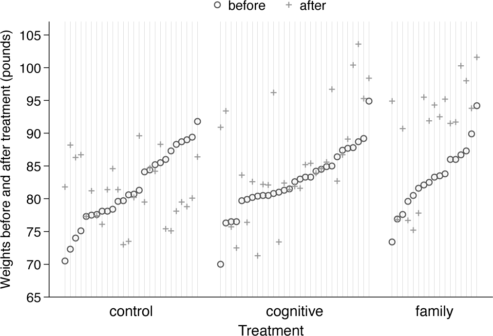
Dot chart or quantile plot of weights before and after treatment for various anorexic girls.
To get a feeling for magnitudes, readers in most countries may like to know that 30 (40, 50) kilograms are about 66 (88, 110) pounds, spanning the range shown.
What is different from the previous example? Group sizes are larger, and we are plotting two outcome variables rather than one. Because some weight changes were very small, there is some risk of overplotting. Although it is currently unfashionable in statistical graphics, I repeat the advice of Cleveland (1994, 164) that open circle and plus markers are a good pair because they are more easily visible even for identical values.
As with the previous example, we will return to this dataset and so save it for now:
We now switch to seeing how far we can get with
Salinity data
We read in the data again.

In case water masses tie on medians, we insist on sorting on the lower median first.

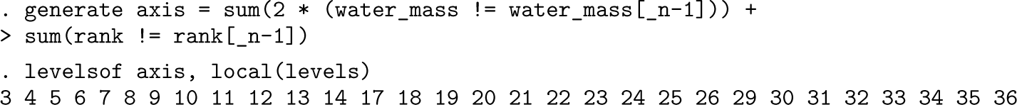
The observations are now in the order we desire. It will help perception if we insert extra space between each group (here each water mass). The customized axis variable increases by 1 each time we see a new observation and by 2 each time we see a new group. Choose your own alternative to 2 if you need a bigger or smaller space. We are going to add grid lines wherever there is a data point.
We need to label each group clearly. Optionally, you could add dividing lines between groups, thus getting closer to the default style with the
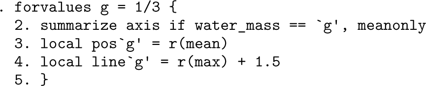
The labels belong opposite mean positions for each group. Any dividing lines belong after the last (maximum) position for all groups except the last group.
Because we are now dealing with
For present purposes, we insist that all medians are shown in the same way. For a presentation, you might go in the opposite direction, choosing different line colors and patterns and different marker properties. However, some consistency of colors is a very good idea. That is, the median line and the markers for each group are best shown in the same color.
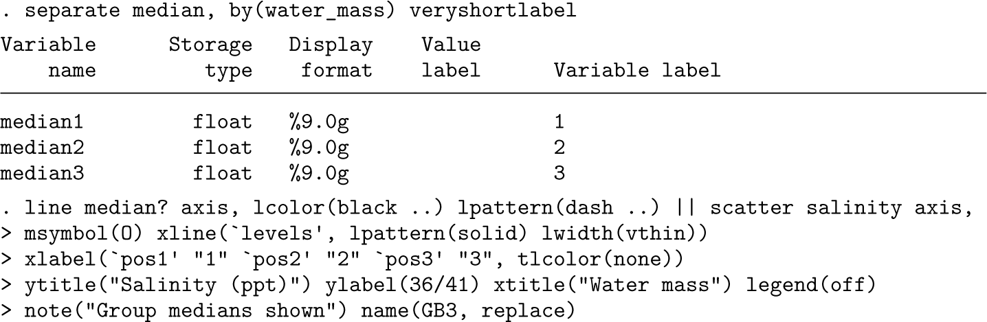
Figure 3 therefore goes beyond figure 1, especially in the sense that medians are shown too. Horizontal line segments for medians as well as dividing lines help to bind the groups visually. Again, we stress that other summaries could be better for your own data, depending. Just means? Or something customized such as geometric or trimmed means?
Dot chart or quantile plot of salinity measurements in three water masses, Bimini, Bahamas. Medians are shown for each water mass.
For our last burst, we revisit the anorexia data. The same basic tricks are used, starting with a customized axis variable.

One clean display (see Cox [2009] for exploration and discussion) sorts on weights before treatment and represents change by vertical spikes. Some readers may prefer arrows (Cox 2005b).
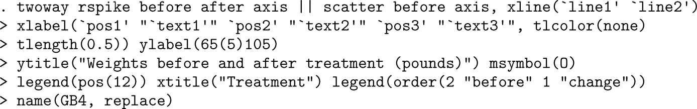
Figure 4 is thus another take on weight change, which is now more nearly explicit.
Weights before and after treatment for various anorexic girls. Subjects are ordered according to their weights before treatment. Upward and downward spikes show change after treatment.
We finally take this further by showing weight change directly. The plots are again quantile plots. The sting here is that the weights before and after treatment are no longer shown.
We need new rank and axis variables. The
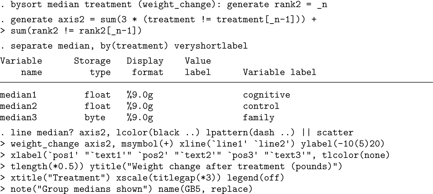
Figure 5 is our final take on weight changes. It does clarify the contrasts between the control group and the two positive treatments. For any journal or thesis publication, fitting some suitable model might now be considered.
Quantile plots of weight changes experienced by anorexic girls by treatment. Medians for each treatment are shown by horizontal lines.
As with all graphs here, all kinds of small and large variations remain possible, including emphasis on zero change as a crucial dividing line between weight gain and weight loss or just use of different colors.
In a previous tip (Cox 2020), the focus was on how the
The aim is to show some useful devices without too much sales pitch. Your own datasets might need something similar yet also something different. Although superficially contrasting, the two datasets used as examples have in common that identifiers are not available. For the salinity data, the reason is that the original details (location? time?) were never published. For the anorexia data, the primary reason is presumably maintaining confidentiality of sensitive data. In any case, identifiers would not help analysis. Other way round, the rank identifiers constructed to make the graphs possible at all could be suppressed without loss. But data for known entities, identified in, say, time or space, might benefit from display of identifiers, which might, in turn, imply swapping axes to supply enough space for readable labels.
Footnotes
About the author
Nicholas Cox is a statistically minded geographer at Durham University. He contributes talks, postings, FAQs, and programs to the Stata user community. He has also coauthored 16 commands in official Stata. He was an author of several inserts in the Stata Technical Bulletin and is Editor-at-Large of the Stata Journal. His “Speaking Stata” articles on graphics from 2004 to 2013 have been collected as Speaking Stata Graphics (2014, College Station, TX: Stata Press). He is the Editor of Stata Tips, Volumes I and II (2024, also Stata Press).