
Abstract
Quantile-quantile plots in the precise sense of scatterplots showing corresponding quantiles of two variables have long been supported by official command
Keywords
Introduction
Quantile-quantile plots, in the sense used in this article, compare precisely two distributions, whether as two groups of one variable or as two variables that are comparable (which at its simplest implies having the same units of measurement). As an immediate concrete example, consider domestic and foreign cars in Stata’s
One way or another, Stata has included official support for quantile-quantile plots since 1985. The STATA/Graphics User’s Guide of August 1985 included the do-files
However, what
Section 2 expands on the ideas of quantiles and quantile-quantile plots. Readers already familiar with those ideas may feel comfortable skipping or skimming through this section. Section 3 covers the new features introduced in
Quantiles and quantile-quantile plots
Just about every introductory statistics course or text covers several methods for comparing two-group data, or two-variable data, including various graphs (histogram or box plots, say), various summary measures (means or medians, say), and various significance tests (Student’s t or Wilcoxon-Mann-Whitney, say). In contrast, the method of quantile-quantile plots is often not covered in introductions to statistics. Indeed, the method is often not discussed in detail even in more advanced treatments of statistical graphics. Some otherwise excellent books do not get beyond the valuable but very specific method of normal quantile plots (Unwin 2015; Wilke 2019). The resulting plots, however, are easy to understand and may even be more informative, and hence more helpful, than other kinds of graphs.
The term “quantile” is often attributed to Kendall (1940) but can be found in Fisher and Yates (1938). However, it has acquired at least three distinct if related meanings, so we should tease them apart.
Quantiles in this context mean the entire set of values of a quantitative variable sorted or ordered from smallest to largest, the “order statistics” if you prefer. Terms such as quantile plot, used in this sense, go back at least to an outstanding article by Wilk and Gnanadesikan (1968). For general exposition, Chambers et al. (1983) and Cleveland (1993, 1994) remain authoritative and lucid. For Stata- related discussions, see, for example, Cox (2005, 2007b). Note that it may often be sensible and sufficient to plot selected quantiles, especially if a dataset is very large. That idea is not pursued further here, but for one line of attack, see particularly Cox (2016b). A related but distinct idea is that quantiles are summary measures based on some proportion or percent being smaller and the complementary proportion or percent being larger. Median and quartiles are likely to be very familiar examples. With extra detail about calculation recipes, the median is defined by 50% of values being smaller and 50% being larger; and each quartile, lower or upper, is defined by 25% of values being on one side and 75% of values being on the other side. Many terms have been proposed for measures based on different subdivisions of the cumulative probability range. See Cox (2016b) for an incomplete menagerie. The attraction of quantile as a term is that it covers all such cases without confronting readers with a term that may be unfamiliar. Indeed, the word is already available for any application for which a specific term has not yet been invented. Quantiles are also used to denote bins, classes, or intervals defined by such summary measures in sense 2. The median and quartiles, say, define four quartile bins, each holding about a quarter of any batch of values.
Back to quantile-quantile plots: For simplicity, first suppose that two groups are equal in size, with the same number of observations in each. After sorting or ordering each group separately, we could plot the smallest in one group against the smallest in the other; plot the second smallest in each group as another point; and so on until we plot the largest in each group as our last point. The resulting scatterplot includes all the information in the data about the two distributions, without any arbitrary decisions about binning (compare histograms) or about what to show by way of summary measures or important detail (compare box plots). Two distributions that are very similar would plot close to a reference line of equality y = x (say). Two distributions very similar but for an additive shift (the simplest reference case for comparison of two means or medians) would plot close to a different straight line, as would two distributions very similar but for a multiplicative shift. Real data could easily be more complicated, but that is precisely the point too. Other complications or features, such as grouping, outliers, or distributions being similar in the middle but different in the tails, would be matched by the configuration of the plot.
Often, two groups are not equal in size, but that is not a real barrier to applying these ideas. In
As mentioned in the Introduction,
Interpreting those quantities as in essence cumulative probabilities is to my taste as valid and indeed more helpful. So let’s explore that idea: exactly what
To make this concrete, imagine a toy sample of 5 distinct values that we can rank 1 to 5. Stata follows a convention that rank 1 corresponds to the lowest value. A rule that cumulative probability is taken to be rank / sample size would give such probabilities as 0.2, 0.4, 0.6, 0.8, and 1, which would not treat the distribution symmetrically. A rule of (rank — 1) / sample size would give us 0, 0.2, 0.4, 0.6, and 0.8, which is no better. Splitting the difference, with a rule (rank — 1/2) / sample size, an idea that goes back at least to Galton (1883, 1907), gives us 0.1, 0.3, 0.5, 0.7, and 0.9, which is pleasingly symmetric about its middle, and indeed a good solution. Assigning cumulative probability of 0.5 to the middlemost value with rank 3 of 5, corresponding to the median in this case, is an evident bonus. There are other solutions to this small problem, but the rule (rank — 1/2) / sample size is used by quantile, and so we stop there for now. Such quantities are often called “plotting positions”.
What the official command quantile does has been extended through the community-contributed command qplot. This was released as quantil2 (Cox 1999), but soon renamed. 1 The latest update to qplot is announced in a Software Update in this issue of the Stata Journal. Its full functionality need not be summarized here, but an immediate comment is that it offers another way to compare two groups, because the two sets of quantiles can be compared, directly and without interpolation, either superimposed or juxtaposed.
The help for qplot includes much more discussion and many more references.
New features
Two groups
Let’s look first at using
We will look at miles per gallon. It is not essential here, but will help mightily soon, to have automated methods of defining and working with axis labels. The commands
The
Figure 1 is a first quantile-quantile plot.
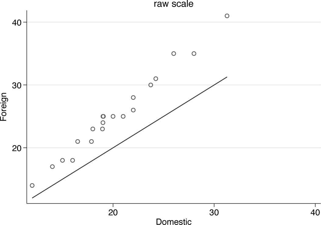
Quantile-quantile plot for miles per gallon comparing domestic and foreign cars. The solid line defines equality of distributions.
As often in such plots, there is a reference line of equality. If the two distributions were essentially the same, all data points would lie very close to that line. Clearly, there is extra structure in these data: quantile for quantile, foreign cars have higher miles per gallon than domestic cars, but the pattern of differences also shows a tilt compared with equality. The pattern is more complicated than just an additive shift.
The
Here and in many other examples you might want to enforce
Now comes a point that applies widely. The command for figure 1 included a
Transformations
Many researchers want to explore whether comparisons are easier or more effective on a transformed scale. That interest does raise other questions too. Often, an analysis needs to be based on much more than the marginal distributions of two groups or two variables. Conversely, comparison of two groups on one outcome sometimes is the entire problem.
In the immediate context of comparing two distributions, key issues include how far each distribution is symmetric or skewed; whether distributions have approximately equal spread or very different spread; and whether distributions are related by an additive shift, or something more complicated. More formally, the “ideal conditions”, ideal in the sense that they would make analysis and interpretation easier if they were true, are symmetry, homoskedasticity, and additivity.
Often, but I think unhelpfully, these ideal conditions are called assumptions, with sometimes undertones that failure to match assumptions invalidates an analysis. But statistics with data is applied mathematics, not pure mathematics or logic. Even simulated data always fail to match the ideals exactly, and, with real data, assumptions are at best matched approximately. A personal preference to talk about ideal conditions has splendid precedents in Anscombe (1961) and Anscombe and Tukey (1963). 2
Of these ideals, additivity is perhaps the most valuable goal if you have to choose. More generally, whatever brings data closer to a simpler systematic structure is most important in choosing a transformed scale. Here that means additivity is the main goal. In other applications, linearity of relationships is also a major goal. The relative importance of different ideal conditions (assumptions, if you must) is discussed in (for example) most better texts on regression (for example, Gelman, Hill, and Vehtari [2021]).
Sometimes, however, a specific transformation will help us move closer to all ideals, and we do not have to choose at all. Sometimes, but not always: McCullagh and Nelder (1989, 22) give a salutary example of how different transformations may be needed for different goals. Given a Poisson error distribution, square roots give approximate symmetry, the power 2/3 gives approximate homoskedasticity, while logarithms impart approximate additivity of systematic effects.
I tend to be positive about transformations, while also considering that the number of transformations that are really helpful is rather small. See McCullagh (2022) for similar remarks in a recent text. For that reason, and others, I do not put much trust in more formal approaches such as Box-Cox transformation, despite its wonderful name and the undoubted eminence of its authors (Box and Cox 1964). Nor, for different reasons, do I tend to use any of the official commands ladder, gladder, or qladder, which are based on trying out many transformations in the same exercise, a shotgun style differing from that in this article.
A transformation should spring out of a graph as imparting simpler structure—and be independently defensible.
With that high ideal in mind, let’s try out some transformations on these data. It is clear from basic summaries or graphs that mpg is moderately positively (right) skewed. Although getting closer to symmetry is as said not the most important goal, transformations that do that often take you closer to additive structure.
Cube roots, logarithms, and reciprocals are plausible candidates for transformations in this example. They were listed just now in order of increasing strength, namely, how much they change the shape of a distribution. Naturally, cube roots and reciprocals are powers, 1/3 and —1, respectively. It is not quite so well known that logarithms can be thought of as members of the same family, which is one of the main points of Box and Cox (1964). Additionally, or alternatively, see Tukey (1957, 1977).
A neat way to encapsulate family resemblance comes from a remark by Mosteller and Tukey (1977, 80). Transformations indexed by power p come from
The motivation for cube roots is most often pulling in positively skewed distributions. Like square roots, cube roots map zeros to zeros and otherwise pull in large positive values relative to small positive values. Specifically, cube roots to a good approximation map gamma-like distributions to normal distributions. Cube roots can have other advantages too (Cox 2011).
Anscombe (1981, 215) sets as an exercise showing that for an exponential distribution, transformation with the power 0.307 imparts equality of median and mode; 0.302 equality of mean and mode; 0.290 equality of mean and median. We can take this example in different ways. One is to underline that any ideal (here symmetry) is a little fuzzy until made more precise. Another is more optimistic and pragmatic: that nearby transformations will have similar effects. These powers are also close in practice to cube roots. 3
Logarithms work harder at pulling in positively skewed distributions. Of greater interest is that they imply multiplicative rather than additive relationships, so that logarithms map multiplicative structure to additive structure.
Reciprocals work even harder at doing that. They do reverse order of positive values, so that the smallest value of miles per gallon (in this example) becomes the largest value of gallons per mile, and vice versa. Some researchers correct that change of order by using negative reciprocals, but it seems to me simpler to work with reciprocals and accept that higher and lower groups are reversed. Mentioning units of measurement just now raises an even more crucial point: reexpression in reciprocals changes the units of measurement but does so in a way that may be helpful, or at any rate not especially confusing. In this specific case, although using miles per gallon for gas or petrol consumption is standard in the United States and some other countries, in many countries a reciprocal scale is more nearly standard, with units such as liters per 100 km.
More generally, keeping track of units and dimensions is always a good habit, which comes naturally to people with some background in applied mathematics, physics, or engineering, who are accustomed to principles of dimensional analysis (for example, Gib- bings [2011], Mahajan [2010; 2014], Santiago [2019]). Finney (1977) gave a splendidly concise and incisive overview of key dimensional principles for statistics.
So there are grounds for trying out each of those transformations and for comparing them with the original or raw scale. I recommend working a bit at keeping axis labels in the original units, which is a job for mylabels (Cox 2022)—unless you are not bothered by units on transformed scales.
In specifying a transformation to
Figure 2 shows the composite result, which seems fairly clear-cut. Cube root is not strong enough as a transformation to impart additive structure, but both logarithm and reciprocal work better, and the choice is between them. Formalizing choice as, say, a significance test procedure is best avoided. If you can see that one transformation works better, go for it. If you cannot see that, the choice of scale may not matter or can be made on other grounds. For example, there are many arguments that y = exp(Xb) is a more natural and more flexible pattern for systematic structure than the more traditional y = Xb, independently of the details of univariate or multivariate distributions. But that is a big theme that deserves longer and deeper discussion. Gould (2011) dives straight in on the key question.
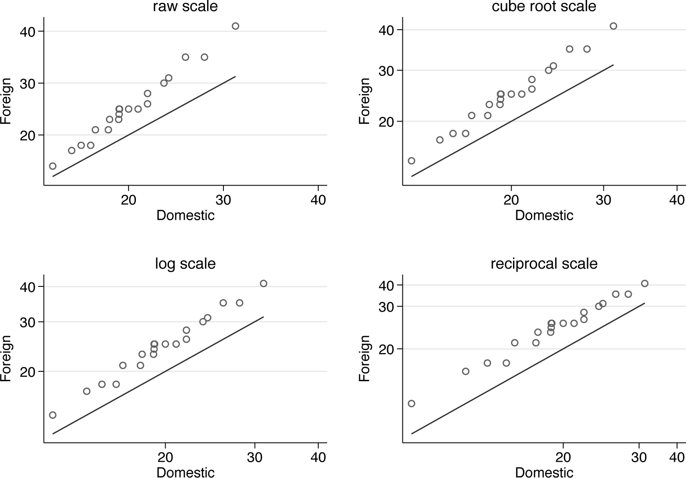
Quantile-quantile plots comparing miles per gallon for domestic and foreign cars on raw, cube root, logarithmic, and reciprocal scales
If you wanted to proceed further with some simple model, you would not be committed to transforming the variable and then (for example) carrying out a Student’s t test. You could work with a generalized linear model with a suitable link function, which would often be preferable.
In general, the effectiveness of a transformation of an entirely positive variable is tied up with the ratio of largest and smallest values, sometimes called the dynamic range. (A more subtle analysis is needed if values can be zero or negative as well as positive.) For miles per gallon, the dynamic range is 41/12 or about 3.4, which is large enough for transformation to be worth considering but not large enough for it to make an enormous difference in what you see. Some variables range over several orders of magnitude to the extent that use of a transformed scale is well nigh essential, at least for effective visualization. Examples are income or wealth, areas, populations, and plant height (Cox 2018).
Another simple guide to how much difference a transformation can make is given by plots of candidate functions over the observed range. The results are not shown here, but the commands just below show some technique. If a graph looks almost straight, the corresponding transformation does very little to change how the data are represented.
Let us move now to comparing two variables. Our first example concerns comparison of one variable with expected quantiles from some reference distribution. Official Stata commands in this territory are
Plots of quantiles against equivalent quantiles of a normal or Gaussian distribution are perhaps best now known as normal quantile plots. Other names in use (or disuse) are normal probability plot, normal scores plot, normal plot, probit plot, and fractile diagram.
Note that using egen is a little over the top here, but that device does extend easily to groups.
Figure 3 is a normal quantile plot for
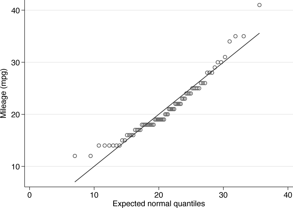
Normal quantile plot of miles per gallon. Note the systematic downward curvature imparted by positive skewness.
So we have produced a close copy of what
When a reference situation is equality, say, y = x, we can recast any comparison as a comparison with a reference situation that differences are zero, y — x = 0. The reference line will now be horizontal if we plot the differences y — x against something else, commonly the mean (y + x)/2. It could also be the sum y + x, a choice that yields the same plot but with different horizontal axis labels. The point is psychological and pragmatic. It can be easier to think about deviations from a horizontal line than from a sloping line. The rotated configuration may also make better use of the graph space.
Plotting difference versus mean is the leading example of a small graphical strategy, as urged by Tukey (1977, 153): “flattening by subtraction makes it much easier to see what is going on at more subtle levels.”
Plots of difference versus mean go back at least to the early 1950s. I found a reference to Neyman, Scott, and Shane (1953) in Brillinger (2008) and would be delighted to hear of earlier examples. Indeed, multiple independent inventions might be expected. Other borrowings, rediscoveries, or reinventions in present practice include Bland-Altman plots (especially in medical statistics) and MA-plots in genomics (M and A stand for minus and average). 4
The idea of plotting difference between quantiles versus mean quantile appears together with the idea of plotting difference between quantiles versus plotting position or cumulative probability in Wilk and Gnanadesikan (1968). Such plots are known as delta plots in psychology (De Jong, Liang, and Lauber 1994; Speckman et al. 2008). The options for such plots in
Using plotting position for the horizontal coordinate raises the question of how it is calculated. Almost all practices are included within a single-index family: for sample size n, a indexes choices within (rank — a)/(n + 1 — 2a). In particular, a = 1/2 leads to (rank — 0.5)/n, which as flagged in section 2 is the default for
Let us return to the mpg data. Here are two sample plots.
Figure 4 combines these plots. The syntax to produce the figure used
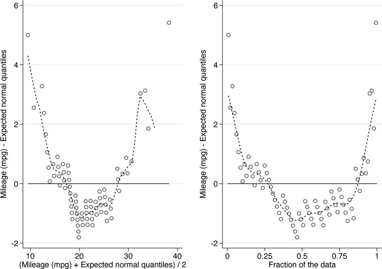
Normal quantile plot for miles per gallon, recast as difference versus mean and difference versus cumulative probability or plotting position. The downward curvature indicates positive skewness. See text for comments on the added smooth curves.
The
The natural guess is that tied values would be shaken apart if we were given some decimal places beyond the integer values. Some values would be a little higher and some a little lower. Researchers can do this shaking apart mentally. Jittering quantile plots is always an option too, but not an option I find especially helpful.
In general, differencing can amplify noise. That together with the specific challenge of ties encourages the display of a smoothed curve
By construction, data points on the
A keen reader may now wish to revisit the examples of sections 3.1 and 3.3, plotting differences versus the coordinate of your choice.
Let us look at a different example. A dataset supplied in the media for this issue of the Stata Journal holds measurements of maximum daily ozone concentrations for Yonkers, New York, and Stamford, Connecticut, in May to September 1974. Yonkers and Stamford are 21 miles (34 km) apart, although no winds promise to blow straight between them. The dataset was used by Chambers et al. (1983) and Cleveland (1993, 1994) to show quantile plot technique. The data are time series and are paired, but as the authors just mentioned, we will not touch on those key aspects of a full analysis.
Figure 5 makes a simple case. Logarithmic scale seems appropriate. In essence, the pattern is of multiplicative structure on the raw scale and additive structure on the logarithmic scale. Dynamic ranges are much greater here than in the miles per gallon example: 240/14 or about 17 for Stamford, 132/9 or about 15 for Yonkers, and 240/9 or about 27 when the variables are pooled. A strong effect of transformation is expected with those values.
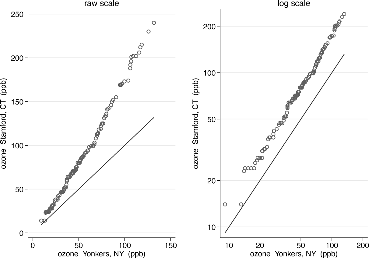
Quantile-quantile plots for ozone concentrations at Stamford and Yonkers in summer 1974, on both original and logarithmic scales
The ozone data contain two variables that could be used for experiment. Month of year could be a handle for exploring seasonality; it is a little arbitrary meteorologically. Day of week is for exploring a different kind of dependence and less arbitrary if, say, domestic or industrial emissions are different at weekends, or for other reasons in any weekly cycle.
The syntax might be something like
The result is not shown here, but the option is there for experiment, preferably using your own more interesting data.
Support for generate
A
Details of qqplotg
Syntax
Description
The two distributions may be of unequal size: if so, corresponding quantiles are calculated by interpolation.
There are two main syntaxes. In the first, emulating
In the second, the distributions are given by the values of varname for two distinct groups of groupvar named in the compulsory option
By default, a reference line of equality is shown to aid in identifying any systematic or random differences between the two distributions.
Optionally, the distributions may be plotted as differences between corresponding quantiles versus their means; or as differences between corresponding quantiles versus a fraction of the data (also known as cumulative probability or plotting position). In each case, a smooth will be added using twoway lpoly of the difference over its support.
Transformations on the fly are supported. It is suggested as essential practice to supply an informative note or title (unless an informative text caption is given otherwise); and as good practice to use axis labels on the original scale. See nicelabels and mylabels (Cox 2022) for support.
Options
group(groupvar) is allowed as a synonym.
A warning will be displayed if the transform creates missing values. For example, taking logarithms of zero or negative values would do that.
graph_options are other options allowed with
Conclusions
A recurrent issue with Stata, or any comparable software, is the small tension between writing a few command lines yourself to travel a modest distance—say, from A to E via B, C, and D—as compared with having access to a command that does B, C, D for you. I recall a conversation with a medical statistician at a very early Stata users’ meeting. I was enthusing about the scope for programming some task that was not wired into an existing Stata command. Their reply to the effect that needing to write code was a distraction from their main focus on doing statistics was entirely correct too.
Quantile plots (or quantile-quantile plots) are a case in point. Cox (2007b) was all about plots being accessible through simple steps. This article is mostly about a new command that, as it were, hides much small nitty-gritty from the user.
Quantile plots generally are, as readers will realize by now, a strong personal favorite
Supplemental Material
Supplemental material
Supplemental material
Supplemental Material
Supplemental material
Supplemental material
Footnotes
6
Pat Branton of StataCorp kindly provided historical information on commands in 1985 and 1986.
7
To install a snapshot of the corresponding software files as they existed at the time of publication of this article, type
Notes
About the author
Nicholas Cox is a statistically minded geographer at Durham University. He contributes talks, postings, FAQs, and programs to the Stata user community. He has also coauthored 16 commands in official Stata. He was an author of several inserts in the Stata Technical Bulletin and is Editor-at-Large of the Stata Journal. His “Speaking Stata” articles on graphics from 2004 to 2013 have been collected as Speaking Stata Graphics (2014, College Station, TX: Stata Press). He is the Editor of Stata Tips, Volumes I and II (2024, also Stata Press).
References
Supplementary Material
Please find the following supplemental material available below.
For Open Access articles published under a Creative Commons License, all supplemental material carries the same license as the article it is associated with.
For non-Open Access articles published, all supplemental material carries a non-exclusive license, and permission requests for re-use of supplemental material or any part of supplemental material shall be sent directly to the copyright owner as specified in the copyright notice associated with the article.