
Abstract
Visualisations are essential for communicating lighting design and are an elemental part of disseminating lighting-related research. The topic is closely connected to other topics, such as visual perception and cognitive decision-making. Designing visualisations that effectively and transparently communicate often complex data typically requires skills in several areas and is often argued to be both an art and a science. In the increasingly digital world and the continual digitalisation of the Architectural, Engineering and Construction industry, more data are available and needed in the built environment. For example, the concept of smart buildings, which depend on sensors and communication of subsystems to dynamically control various systems and features within the building, is evolving rapidly. Moreover, the availability and development of digital twins are expanding fast. Using real and manipulated images combined with relevant literature, this perspective article aims to raise awareness of a crucial topic and to guide future research. Concentrating on lighting-related data, this article addresses two aspects of information visualisation: using colour to visualise information and creating interactive visualisations.
1. Introduction
‘Seeing is believing’ and ‘a picture is worth a thousand words’ are common idioms illustrating the power of an image for making humans understand complex and interrelated information. Today’s Architecture, Engineering and Construction (AEC) industry is becoming increasingly digital, with processes involving a large amount of data and information for decision-making. Therefore, clear and effective information communication is essential for taking advantage of the abundance of information available. Furthermore, reporting research findings is key to developing the research field and sustainable design practices, exemplified in evidence-based design. The effective use of the increasing number of digital twins being developed similarly benefits from efficient data and information communication.
From a lighting perspective, information on many aspects and characteristics is needed to evaluate, for example, the quality of a lighting installation and/or to interpret results from different research studies. Also, to clearly understand the characteristics of a product, three-dimensional properties often need to be visualised. In lighting research, results are habitually reported in tables, figures (e.g. line- and bar charts) and colour pictures (e.g. false-colour representations showing illuminance, luminance or other lighting performance metrics). However, interactive visualisations of data, which are often available and currently increasing today, are underutilised tools for verifying and further exploring collected data and information. Furthermore, information can be quantitative as well as qualitative (e.g. the experience of a lit environment described, as the results of an interview). The verbal information in an interview is accompanied by additional information, such as facial expressions and body language. Focusing on the visualisation of quantitative data and information, 1 it was suggested that information is typically represented as a mix of conventional (i.e. learnt symbols) and sensory symbols (i.e. symbols adapted to the human perceptual processing system and do not require learning).
Visual graphics have several benefits for cognition. 2 Visualisations have the potential to function as a storage of information and thus free up memory capacity for, amongst others, a more detailed focus on parts of the representation. Also, visual representations can help organise related information. For example, in the early stages of a project, concept diagrams are often used for explaining main ideas and important aspects. Relationships between the information can be organised through hierarchies, adjacencies and intersections by the use of various visual attributes, for example line types, shapes, colour, 3 guided by the Gestalt principles (i.e. proximity, similarity, connectedness, continuity, symmetry, closure and common region and figure-ground). For a review on cognitive aspects related to visual representations, see Hegarty. 2
The science of information visualisation has been frequently investigated in the topic of Computer Graphics, and much basic theory is found in the current research literature.1,4–6 However, aspects of visual representation from the perspective of lighting-related data and information are less discussed within lighting research and practice, despite, for example, books on the history of computing and data visualisation7,8 or the introduction of a renewed graphical language for Lighting Design. 3 In their article, Peón-Veiga and Rozot, 3 discuss challenges related specifically to the visual communication of lighting design. They take a point of departure in the need for a lighting designer/researcher to visually communicate quantitative measures and qualitative information about lighting, perception and experience of space and changes related to time. Examples of organising and relating various aspects and criteria and methods for quantitative and qualitative characteristics are reported through the use of diagrams, and lighting design-related information communicated in plan views, sections, perspective views and schedules.
With currently available computational tools, the sky is the limit regarding choices. There is a large array of options, leading to an extensive selection of interpretations (both positive and negative). Therefore, the purpose is to examine the critical role of data presentation and visualisation in ensuring the accurate interpretation of lighting-related data. This role will be discussed based on the importance of genuine and unambiguous colour representations and the possibilities of interactive visualisations.
When discussing light and lighting visualisation, coloured and greyscale imagery are the most sensible choices because they directly convey the essential perceptual qualities of light: brightness, contrast and colour. Light influences both luminance and chromaticity, which are fundamental to how humans experience spaces. Coloured imagery allows the representation of correlated colour temperature, spectral power distribution and mood effects. In contrast, greyscale imagery isolates luminance contrasts, making it easier to analyse brightness without the distraction of colour. These forms of visualisation map closely to human perception. The human visual system interprets light through intensity and colour cues, not through, for example, abstract symbols or icons. Using imagery that resembles real-world appearance enables designers and researchers to predict visual comfort, glare and spatial ambience more accurately. In contrast, icons and schematic symbols oversimplify the continuous nature of light gradients, making it challenging to assess subtle differences in illumination. They are useful for technical documentation, such as wiring plans, but not for evaluating visual experience.
Three-dimensional diagrams add geometric context but often fail to convey actual light distribution and colour rendering unless paired with photorealistic rendering. For quick and intuitive evaluation of lighting effects, two-dimensional coloured or greyscale images are more effective because they are closer to what the eye perceives. Furthermore, these image types support both qualitative and quantitative analysis, as they can be processed for luminance histograms, colour balance and contrast ratios, providing objective metrics alongside subjective impressions. While three-dimensional computer graphics offer a visually appealing representation, their usefulness can be reduced because perspective views can obscure specific details (see, for example the first two figures in Wang et al. 9 ).
Hence, the topics of important aspects related to the use of colour and greyscale representations for reporting lighting-related data and information, and aspects related to using interactive visualisations of lighting-related data and information, will be considered in two separate sections. The article ends with a reflection on the two topics and suggestions for further research on how to report and communicate lighting data and information, for further development of the fields of lighting research and lighting practice.
Using real and manipulated images, combined with relevant literature, this opinion article aims to raise awareness of a crucial topic and guide future research. All images presented as examples originate from the authors’ own and actual research projects, where visualisation of lighting conditions was required. As the authors had access to original, raw imagery, these images could be modified and even interactively visualised for educational purposes.
2. Colour and greyscale representations
When discussing light-related information, colour representations must be genuine and unambiguous. Colour is an effective way to communicate data and information in an image. Therefore, colour maps should have characteristics supporting the task at hand without distorting the data and misleading the user.6,10 Gołębiowska and Çöltekin 11 refer to previous studies reporting on various aspects to consider in the design of visualisations, for example specific tasks or task types that users perform with the visualisations, participants or audience (e.g. laypersons or domain experts) or the device used to view the visualisation.
Visualising lighting-related information using various colour maps and greyscale representations can lead to various issues; for example a greyscale Black/White versus Rainbow colour map can lead to issues affecting lightness, brightness, contrast and constancy interpretation. 1 Results from lighting simulations (e.g. distribution of illuminance and luminance values) are often reported using pseudo-colour sequences, also referred to as ‘false-colour representations’ (see an example of an isorithmic map in Figure 1(a)). In the same way as in other scientific fields, different variants of the so-called rainbow colour map (i.e. a colour map relating to the physical spectrum) are frequently used to report lighting-related information.
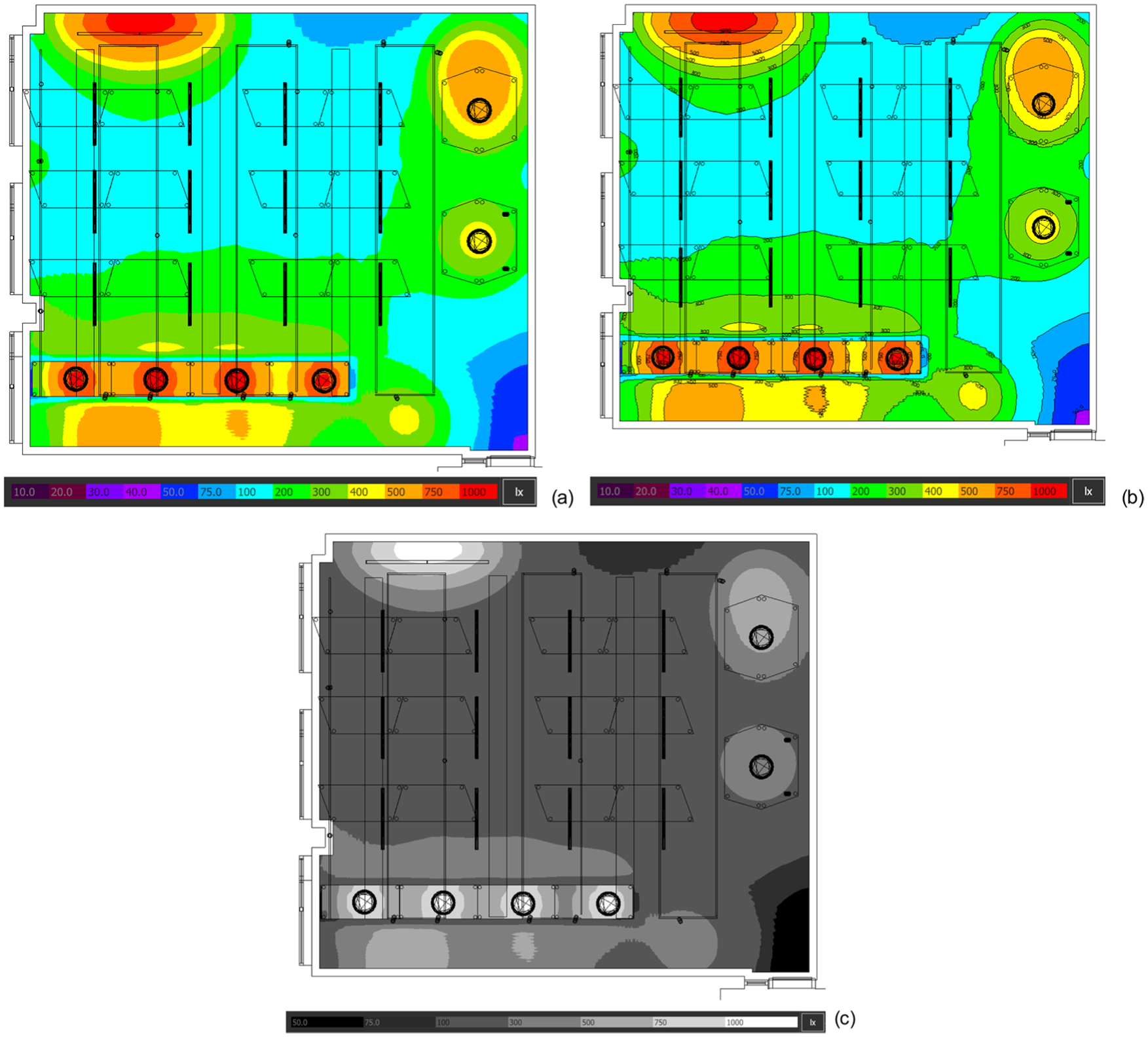
(a) False-colour representation of illuminance (lx) distribution using a rainbow colour scheme where the sequence of colours is provided in discrete steps; (b) The same false-colour scheme with addition of isolux lines; (c) Greyscale representation of the data shown in (a) and (b) (please note the reduced range of absolute values and colour range in the greyscale visualisation). The simulations were conducted using Dialux Evo. 12
Current recommendations suggest that a colour map should be perceptually uniform and ordered, ensuring accurate and truthful communication of data in a visualisation. 6 In this context, there has been ongoing criticism of the continued use of rainbow-type colour maps by both scientists and non-experts.10,13 These colour maps are associated with several critical limitations. For one, they are not monotonic in luminance. Moreover, they are not perceptually uniform, which can distort the variation in data. Third, rainbow-type colour maps partition the data into distinctly coloured bands, which can create false divisions in the data.
In recent articles, multiple authors have discussed possible reasons why rainbow-type colour maps are so frequently used by different users and occur as a default setting in many software tools despite the important limitations.5,11 These authors highlighted the attractiveness and familiarity of certain colour maps. They also mentioned conventions in the specific field of research and specific reasons for their effectiveness. On the one hand, it suggests that rainbow-type colour maps constitute an example of learnt symbols within the lighting field. 1 On the other hand, from the perspective of sensory information, which is likely relied upon by individuals with less specialised knowledge, the colours may not effectively convey aspects such as the light intensity on a surface or the brightness of a surface viewed from a specific position.
To facilitate the (correct) interpretation of interval data, especially concerning non-specialists unfamiliar with conventions in the field, isovalue contours with numerical labels can be included. 1 Figure 1(b) shows an example of a false-colour image with the addition of isovalue contours, such as isolux lines (lines along which the illuminance levels are equal).
Colour semantics, or the meaning of colours, is an important aspect. For example, the colour red is often associated with a warning. 1 Concerning light levels, this may imply that a red-coloured region is over-lit (see Figure 1(a) and (b)), but this may not necessarily be the intention of the designer reporting the information with a rainbow-type colour map. Moreover, some types of data have strong colour associations. Interestingly, Setlur and Stone 14 used an algorithm to create semantically meaningful colours for various categories of data. Furthermore, Thyng et al. 15 recommended using colours that intuitively relate to the data category if possible; for example, warm (‘red’) and cold (‘blue’) colours for temperature. For lighting, a yellowish-white colour could represent light in general, and data associated with a certain correlated colour temperature may similarly be semantically associated with colours ranging from bluish-white to yellow-orange. However, not all types of data have a strong association with particular colours. In those circumstances, consistent use of a colour map for the different parameters within a manuscript is, therefore, crucial to avoid confusion. 15
An additional example can be seen in Figure 2, in which ‘red’ indicates that a specific room in a museum is occupied (i.e. it is not available for another user) and ‘green’ indicates that the room is empty. However, the data might be seen from a different perspective, where the viewer focuses on which rooms are occupied (e.g. from a perspective of suitable lighting controls, or to analyse which rooms are occupied to a larger extent than others). In addition, some people may interpret the red colour as a room that does not fulfil requirements, such as lighting standard requirements. The floorplan in Figure 2(c) presents the same information as Figure 2(a) but uses a different colour combination, potentially reducing (unconscious) biases by choosing two colours that are less associated with positive and negative, while maintaining contrast between the colours.
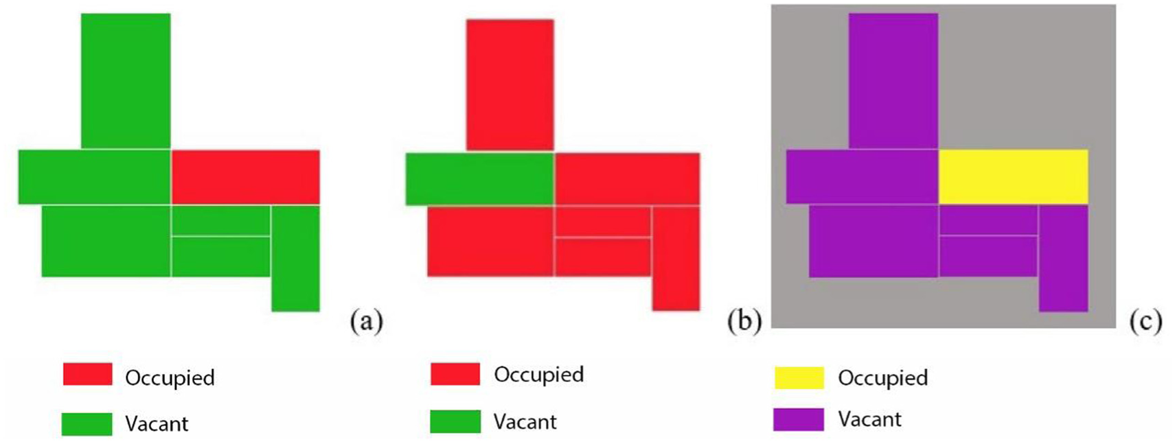
Simplified museum floorplans (a) and (b) showing qualitative colour maps with green and red colours indicating that a room is either ‘occupied’ or ‘empty’ at different points in time. Attempting to reduce a possible affective influence of green and red, floorplan (c) shows the same data as in (a) but with an alternative colour combination
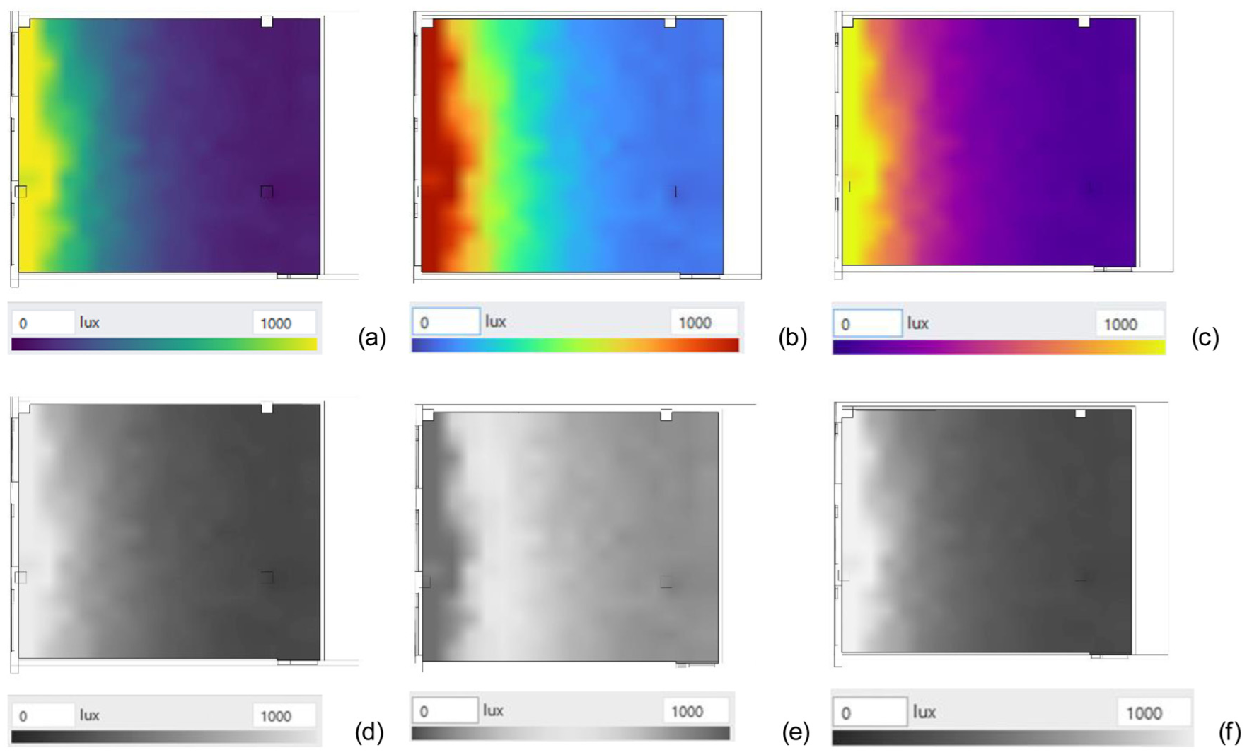
Typically, when dealing with lighting aspects, relative values are of utmost importance. Moreover, the characteristics of transitions in brightness values, whether smooth or distinct, are needed for assessing contrasts and determining glare. An ordinal scale, where darker colours show lower values and light colours have higher values (e.g. a greyscale colour map), should be the most suitable colour sequence for representing illuminance and luminance distribution. Figure 3 shows how a reverse brightness rendering can have a deceptive effect. The four 3D-perspective views report the illuminance distribution on the main surfaces in a room using different colour maps (different types of false-colour scales and a greyscale).
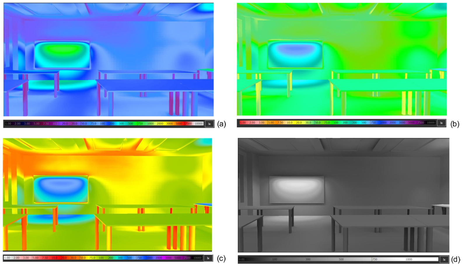
Four 3D-perspective views reporting the illuminance distribution on the main surfaces in a room using different colour maps, with colours available in the software 12 : views (a) to (c) have a false-colour scale and (d) shows a greyscale representation of the data shown in (a) to (c) (please note the reduced range of absolute values and colour range in the greyscale visualisation)
Furthermore, highly relevant for lighting, Figures 1and 3 show sharp transitions between the different colour bands, which can be misleading. Typically, transitions in light level and luminance are gradual within a room, and a rainbow-type colour map can, therefore, obscure important characteristics of the data.6,10,16
Although the greyscale is a perceptually ordered colour map suitable for representing relative values, where darker shades of grey represent lower values and lighter shades indicate higher values (see Figures 1 and 3(d)), there are important aspects that need to be considered. For example, the effect of simultaneous contrast increases the risk of misreading quantitative values from a legend. 1 The black body colour map (see Figure 4) has been suggested as an alternative, perceptually ordered colour map for reducing this issue. 13 The colours in the black body-radiation palette are based on the colour of a black body heated to different temperatures, where more red and warmer colours indicate lower temperatures and the more white and brighter colours indicate a higher temperature of the light emitted by the black body. 13
Data with a black body colour map, using colours available in the software, 12 to reduce the risk of simultaneous contrast (see greyscale colour map in 1(c)) while maintaining the increasing luminance to indicate a higher level of light
Also, a sequential single-hue colour map or another perceptually uniform colour map with monotonic luminance can be an appropriate alternative. 17 Typically, research articles require colour maps to maintain order when printed in black and white. Figure 5 reports the results from a simulation of daylight illuminance in a room using three assorted colour maps (two with monotonic luminance and a rainbow-type) and their black-and-white print equivalents. The two-colour maps with monotonic luminance keep their perceptual uniformity, even when printed in greyscale.
Classroom floorplans shaded with three different types of colour maps available in the software 18 ((a) monotonic type I; (b) rainbow and (c) monotonic type II) showing their respective light level patterns and shaded in greyscale/black-white print (floorplan (d) to (f)). In contrast, there is no similarity between the light levels and the greyscale representation in the middle (i.e. the rainbow colour-type map (floorplan (b))
Divergent colour maps (see an example in Figure 6) relate variants of two base colours to a neutral value (which typically is rendered white or grey). In Figure 6, the white colour represents a region around the value of 500 lx. However, a smooth luminance transition, without effects of Mach bands 19 between white, and blue and red, respectively, is important for a task requiring a higher resolution (e.g. assessments of areas with an illuminance close to, but not reaching 500 lx, and where there are good opportunities for using daylight with dynamic control of additional electric lighting).
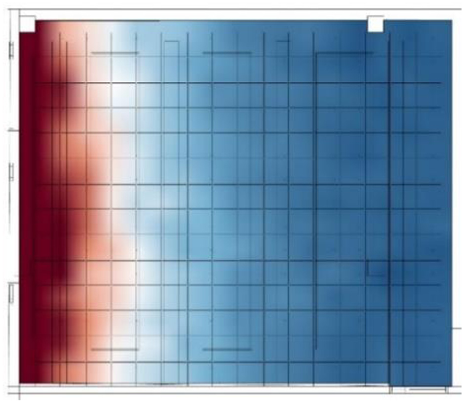
A divergent colour map, using colours available in the software, 18 has been used to focus on the illuminance supplied by daylight on 20th April, at 01.00 PM, above and below a certain value, in this case 500 lx. Thus, a divergent colour map is suitable to highlight data in relation to a critical value
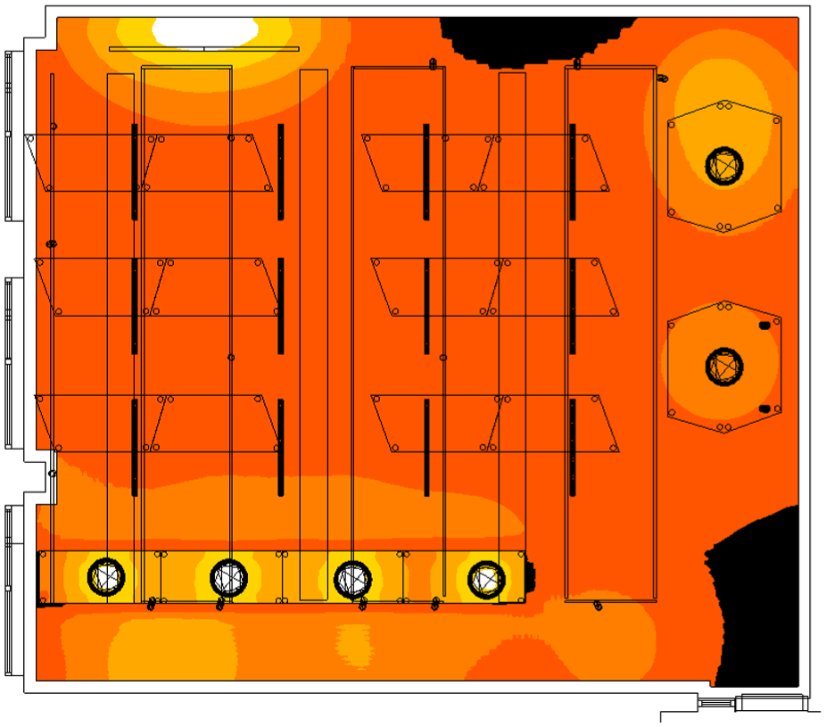
Moreover, the impact of the background is important to consider. Several authors report dark-light bias, where dark represents a higher quantity.6,17 In recommendations, the dark part of the colour map has been suggested to represent higher values. However, as mentioned earlier, when visualising lighting in a room/building, it seems intuitive to use a perceptually uniform colour map with the light part of the colour map representing higher light levels. It suggests that a darker figure background is often suitable for visualising light distribution (see Figure 7).
Colour bias or ambiguity not only applies to figures and images, but also to graphs and tables. Tables are suitable for a task requiring identifying an individual, precise value or comparing two values, but not for a whole time series of values. On the other hand, line charts are appropriate for analysing trends of time series of data, rather than identifying and comparing precise values. 21
In graphs, displaying nominal data with no specific order, six opponent colours (red, green, yellow, blue, black and white) and six other clear colours (pink, cyan, grey, orange, brown and purple) are recommended in the literature. 13 Figure 8(a) shows a bar chart that displays the results from a study where a group of participants rated their appraisal of three lighting scenes adapted for different learning activities, and Figure 8(b) reports the personal light exposure during the activities. In line with the colour coding recommendations, the lighting scene/learning activity categories and personal light exposure during the activity are represented using blue, green and red colours. For the appraisal ratings (attitude, aesthetics and satisfaction) different saturations of the colour of the category were used (Figure 8(a)). However, in the context of light exposure, colour semantics may indicate a preference for green, possibly due to its lower energy usage, depending on the perspective from which the figure is viewed (Figure 8(b)). Figure 8(c) shows an alternative of colours, inspired by colour schemes for qualitative data, suggested by Color Brewer 2.0 (Pennsylvania State University/University of Wisconsin-Madison), to reduce such affective associations while maintaining contrast between the colours when printed in greyscale.
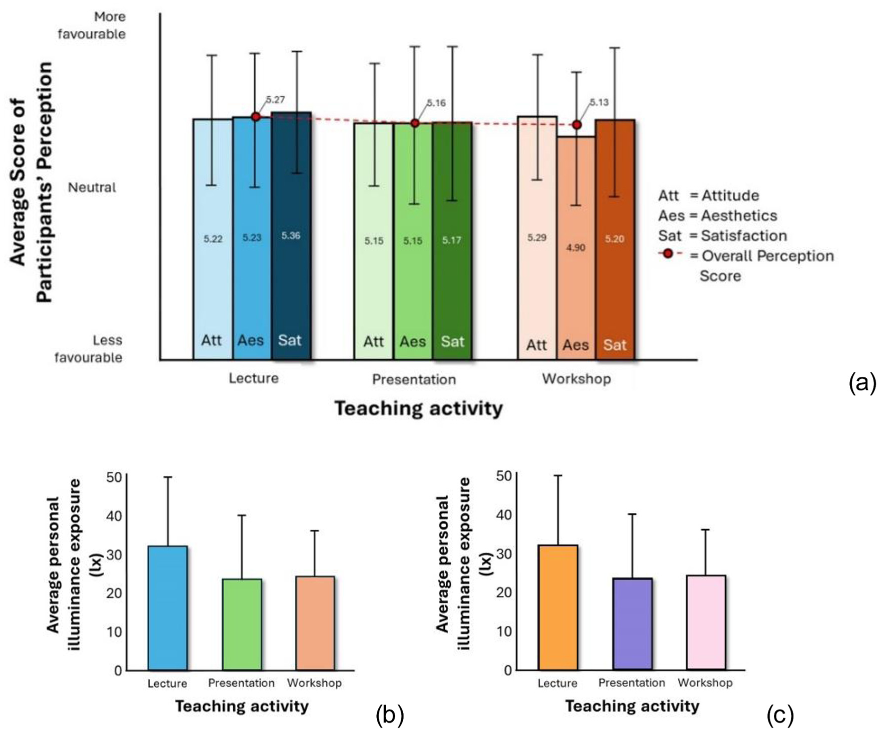
The first graph (a) shows three outcome items (attention, aesthetics and satisfaction) that were evaluated by a group of study participants distinguished by different saturations of the blue, green and red hues, which represent the three categories of teaching activity (i.e. lecture, presentation and workshop) respectively. Graphs (b) and (c) show two alternative colour combinations for reporting average personal light exposure, with the colour choice in graph (b) linked to the chosen hues in the study, while in graph (c), the colours have been chosen to reduce potential semantic effects
3. Interactive visualisations
Interactive visualisations provide extensive opportunities for interpreting and synthesising several types of integrated data, as well as a deeper exploration of complex data. Interactive visualisations can show an overview of the data, where, for example, trends can be identified, but also enable a more detailed exploration of specific data (e.g. zooming, panning, tooltip functions, drop-down menus and sliders). Opolka et al. 22 created a multi-view system for visualising data related to customer behaviour in a mall, adapted to the different stakeholders’ tasks and interests. Likewise, interactive possibilities are a central theme of data storytelling. An influential article by Segel and Heer 23 analysed case studies of narrative visualisations to create a framework. The authors identify seven basic genres (i.e. magazine style, annotated chart, partitioned poster, flow chart, comic strip, slide show, film/video/animation). Also, the extent to which the narrative should be author- and reader-driven through messaging and interaction is a crucial decision.
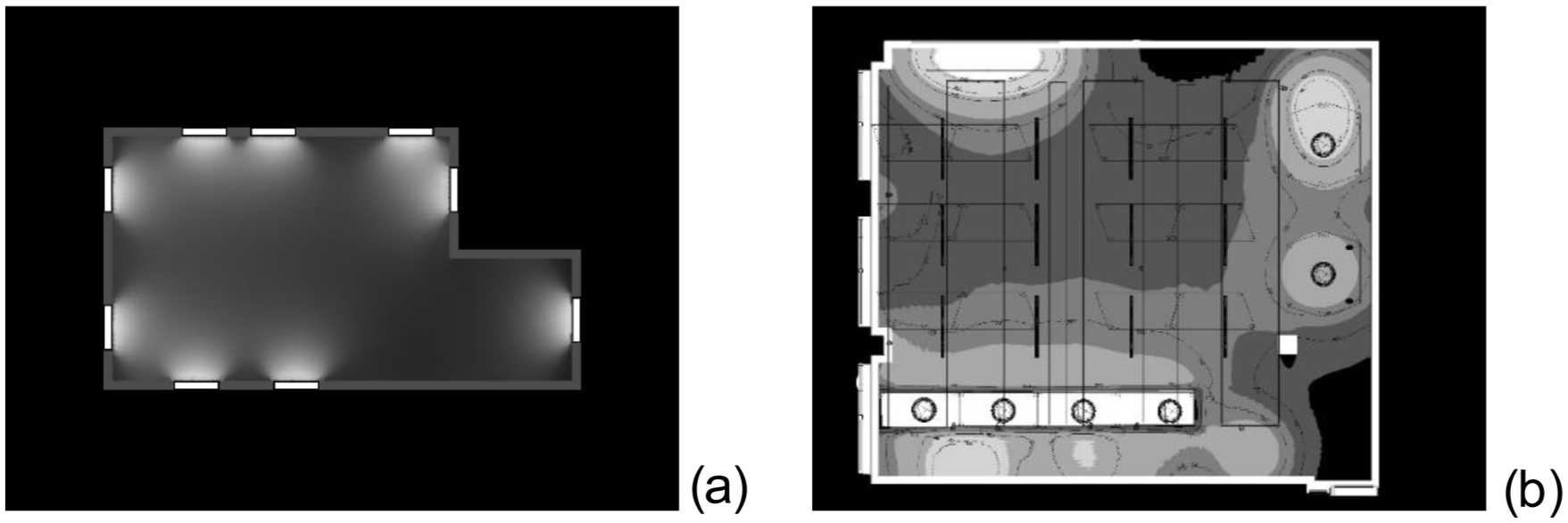
When designing human-centred lighting, the occupancy pattern is a fundamental parameter. Moreover, it is often relevant when investigating the impact of lighting in combination with other aspects of indoor environment qualities (e.g. temperature, humidity and CO2). For example, when designing and configuring settings of lighting control systems, the typical location of occupants is a critical aspect to consider for creating a balanced lighting situation, with suitable transitions of light levels and light distribution in the various rooms (e.g. based on visual tasks, room atmospheres) as well as energy use. Furthermore, with advancements in AI applications and machine learning, the data can be used to anticipate the movement of users to facilitate a dynamic environment adapted for the current use of a building and the needs of its occupants. Figure 9 shows an example of visualisation of occupancy data from a museum building (previously discussed regarding colour aspects) at three moments in time during the day (10.00, 11.30 and 14.30).
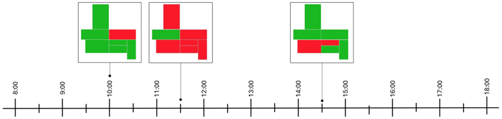
The occupancy pattern of a museum floorplan as a qualitative colour map (green and red colour indicate occupied and empty, respectively) on a timeline for reporting use of various rooms at different points in time (at 10.00, 11.30 and 14.30, respectively)
The possibility of an in-depth analysis of occupancy data allows for increased opportunities for exploring and understanding the use of a building, and for continuously optimising the lighting conditions. A web application has been used to create an interactive visualisation of occupancy at two museum floors and is shown in Figure 10. To investigate typical movements between rooms, the time of occupancy in different rooms on different dates can be explored by choices via dropdowns and by moving the time-slider.
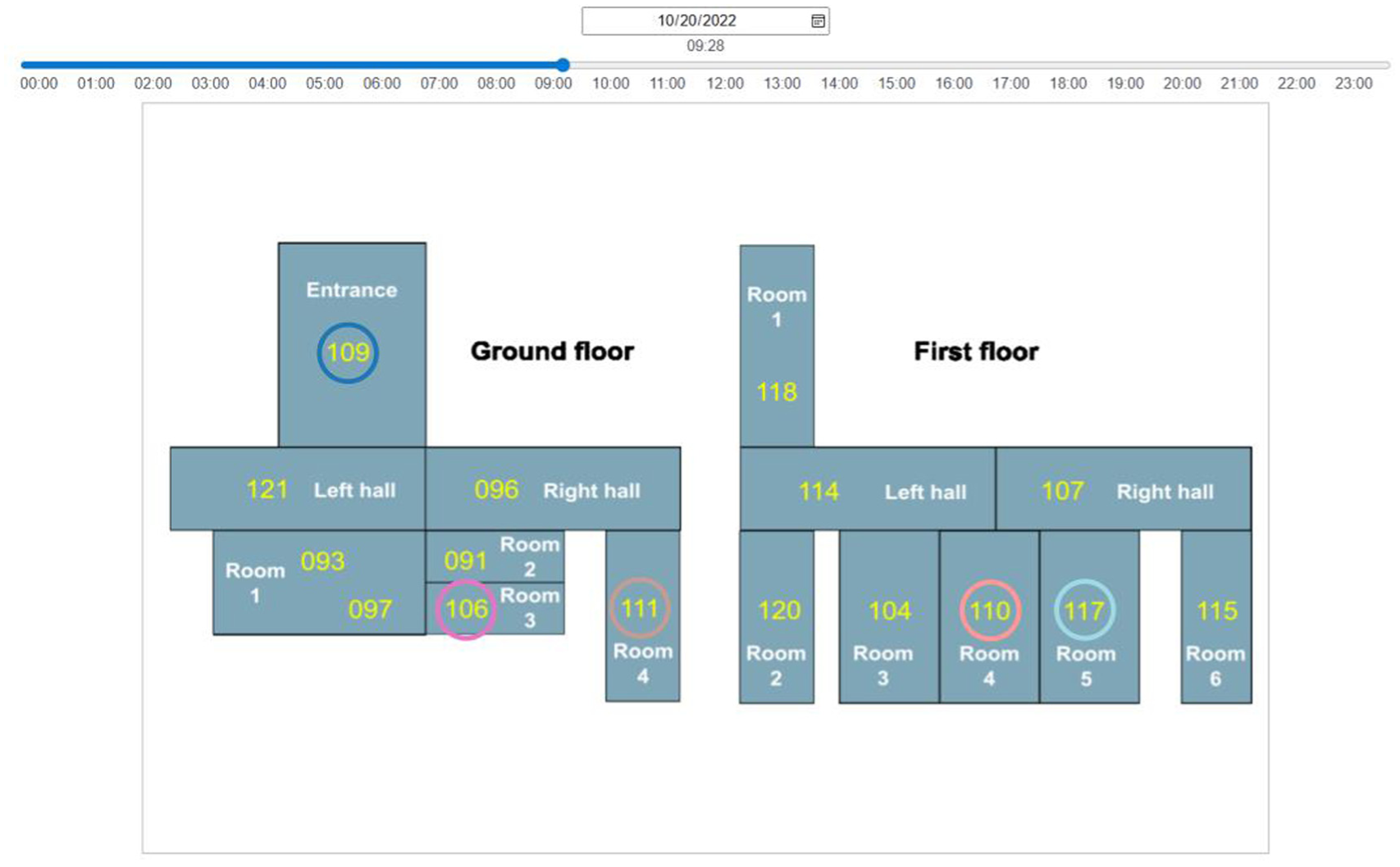
Floor plans of a museum with the sensors activated at a specific date and time. The web-based visualisation includes a drop-down option as well as a slider to alternate between different dates and times
From another perspective, the total activation of different sensors may be of interest, for example, in evaluating the room use. Figure 11 shows a visualisation of hourly sensor activations, reported using a cumulative bar chart for a specific day. Specific sensors can be chosen by ticking/unticking the boxes indicating the different sensors. Moreover, by hovering the pointer on specific parts of the cumulative bars, a tooltip reports the hour, sensor and number of occasions the sensor has been triggered during that hour. The colours used are based on a colour palette, with 20 distinct colours, to ensure a clear difference between the colours.
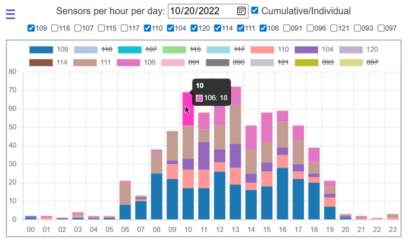
Cumulative activation of sensors during different hours
Examples of interactive parameterisation 24 of lighting data (annual hourly daylight availability in a room) can be seen in Figure 12(a) and (b) (also, see Bach et al. 24 for a review on design of dashboards). In the software, 18 the resulting data are hierarchically reported. In addition to a yearly overview, the user can interactively explore certain metrics yearly. Figure 12(a) and (b) shows the Spatial Daylight Autonomy (sDA), 300/50%, on a particular date and time in February and May, respectively. The parameter sDA, 300/50%, and sensors included in the analysis are selected in the drop-down tabs to the left; month and time can be correspondingly manipulated using the handles in the upper and lower diagrams.
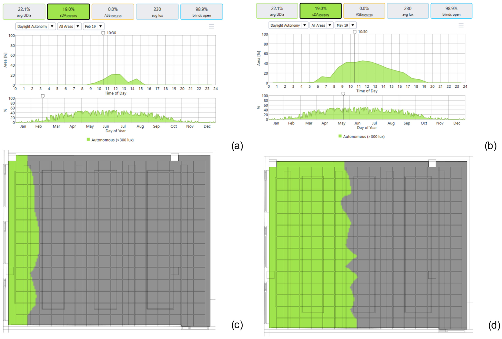
Results from analyses of sDA. In (a) and (b), the top graphs show the sDA on a specific day (i.e. the 19th of February and 19th of May), and the bottom graphs show sDA across the year. The five tabs above these graphs report a yearly overview, expressed using various performance metrics. The floorplans in (c) and (d) report sDA at 10.30 on the 19th of February and the 19th of May, respectively
In Figure 13, another metric, Useful Daylight Illuminance (UDI), has been selected in the drop-down to the left instead of sDA.
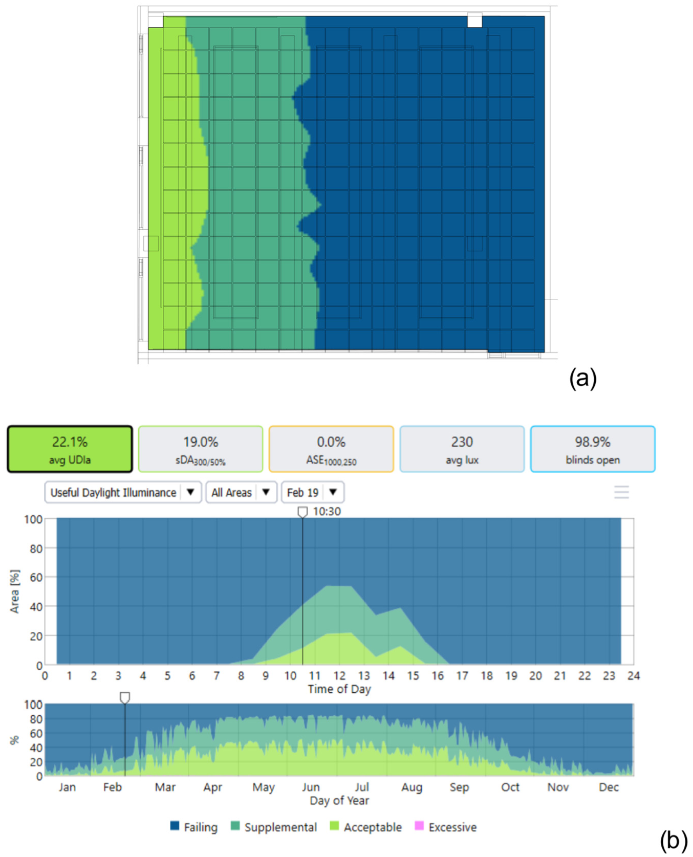
Both images show an example from the UDI analysis in the room as a function of time. In the figures, the UDI on the 19th of February is reported for a floor plan at 10.30 (a) and in hourly (b-top) and yearly (b-bottom) graphs. The five tabs above these graphs report a yearly overview, expressed using various performance metrics.
4. Reflections
Visualisation of data is traditionally seen as having both a scientific as well as an artistic aspect. Today, with the abundance of digital information that will be generated, visualisations of the data play a decisive role for various types of decision-making, for example in the process of evidence-based design. A large amount of data and complex interactions of different types of data can be communicated and further elaborated, leading to new insights. 1
Based on models of visualisation comprehension and a dual process for describing cognitive decision-making, Padilla et al. 4 reviewed the literature and proposed an integrative model for explaining how people make decisions based on visualisations. According to the dual process, people make two types of decisions. Type 1 decisions are made fast, easy and by default. On the other hand, type 2 decisions take longer time, are more contemplative, and require more effort (i.e. greater use of working memory). A visualisation is initially recognised via bottom-up attention with focus on primary features in the information (e.g. colour, edges and lines and foreground information). 4 The Gestalt laws (Gestalt means ‘pattern’ in German), including proximity, similarity, connectedness, continuity, symmetry, closure and common region and figure-ground, 1 are effective principles for guiding information visualisation, and to take into consideration (for an elaboration on using the Gestalt laws for pattern perception, see Ware 1 ). A contour can enhance a coloured surface representing a region, for example, a range of values depicted in a false-colour representation or a specific bar in a bar chart. In the three-stage model of perception described by Ware, 1 first initial features of the image – form, motion, colour and stereoscopic depth – are registered, and subsequently, patterns – regions and connections – are distinguished based on top-down driven tasks and related questions. In the final stage, objects and scenes are formed based on connections and shape from shading. In addition, Connor et al. 25 discussed neural processes to explain how bottom-up and top-down mechanisms interact to explain moment-to-moment visual attention.
Typically, data in research are reported in a static chart. However, interactive visualisation allows for showing data from different perspectives through web applications.26–28 Interactive visualisations, which allow a set of complex data to be temporarily reduced (by hiding parts of the data), enable increased opportunities for avoiding cognitive overload. In addition, it allows for a deeper exploration of the information (e.g. a digital twin where different types of data, e.g. lighting and heating/cooling data, can be viewed together, and in addition allowing a closer and deeper inspection of the data separately). Thus, interactive visualisation of lighting-related data is an interesting avenue for further research. Our exploration was limited to focusing on the visualisation aspects of colour and interactivity. However, aspects relating to visualising data in 3D,1,22,29–32 such as to communicate the interrelationship between data relating to different floors in a building, even though this may as well be heights in an urban area, are highly relevant for the lighting field.
Furthermore, often, there is a need to show dynamic aspects of a lighting scheme, especially regarding the increase in lighting research focusing on integrative lighting for supporting vision as well as physiological and psychological aspects related to effects beyond vision. Thus, the visualisation of moving patterns of lighting and views becomes an interesting and relevant topic for future investigations. 30 Another example of the potential of interactive visualisations for exploring and analysing complex and often dynamic situations is light pollution from outdoor lighting. Geographical Information System (GIS) data (e.g. on ecological aspects) can be linked with various relevant lighting data (e.g. levels and distribution of light, and colour temperature). See for example https://gobo-earth.projects.earthengine.app/view/nightness. Interactive capabilities of visualisation, extending to augmented reality (AR), virtual reality (VR) and mixed reality (MR) environments, with aspects related to space perception and movement, is also an exciting area warranting more research (e.g. highly relevant for the design of digital twins). 33 3D rendering software is increasingly common, and its capabilities are ever-increasing. Related to this, Hegarty 2 mentions that realistic representations, for example renderings or animations, are not necessarily easier to apprehend, and that less complex graphics can be more efficient in accurately displaying a process or a concept idea. Also, Tversky 34 emphasises the benefit of using drawings to illustrate and explain concepts. How different designers and engineers think with visualisations 1 and how non-experts read different types of visualisations in the various stages of the construction engineering process are thus important topics (to be) discussed within the lighting community. 35
The target group audience and the purpose are decisive aspects to consider; that is, what one wants to show and to whom are fundamental. 36 Everyone has a mental scheme for translating a certain visualisation. 4 For example, lighting designers are used to a convention, such as a rainbow-colour type map, for showing illuminance and luminance distribution using false-colour schemes (for an elaboration of important aspects and principles for effective communication using visualisations, see Hegarty 2 ). The purpose of visualisations is often to support decision-making by people with various levels of familiarity with the topic of lighting. Several recent studies have explored the potential benefits of colour nameability, showing that, depending on the task, colour nameability can help hue recall and tasks focusing on extracting specific values from a map. 17 In addition, cultural influences need to be taken into consideration. Therefore, more research into important factors for facilitating the interpretation of different stakeholder groups is desired. However, basic processes related to human visual perception and established principles should be a part of the foundation. 1 Most often, there is no contradiction between designing a visualisation based on the fundamentals of vision and perception and the intended task of the visualisation. Currently, there are many resources, based on our current knowledge and state-of-the-art scientific knowledge, available to support the design of visualisations for different types of data and information.37,38
Experiments using eye tracker methods, surveys and workshops are examples of methods that can be exploited for further study of how different audience groups read visualisations, as well as information about how researchers and practitioners think when designing visualisations. It is crucial to increase the understanding of the various tasks in which lighting-related data are used in order to take advantage of different colour map characteristics. Furthermore, the ever-increasing amount of data that is available nowadays suggests increasing our focus on aspects of data visualisation storytelling, to efficiently communicate the connection between complex data while providing the reader opportunities to further explore the data.22,23,39
Concludingly, the content of this article highlights that the field of lighting has its specific lighting-related data that are associated with certain properties and characteristics that need to be visually communicated to different target audiences clearly and effectively through suitable visualisations. Therefore, it includes a call for a continuing discussion and further investigation of the topic within the researcher and practitioner community to develop domain-specific recommendations and guidelines for reporting lighting-related data and information. Due to the requirements of data visualisation, including skills from different topics (e.g. computer and cognitive science) in addition to the domain-specific topic of lighting science and design, further research into the visualisation of lighting-related information would benefit from an interdisciplinary approach.
Footnotes
Acknowledgements
The authors thank Jönköpings läns museum, Anders Arvidsson, Robin Kochauf, Gustav Carlsson, Peter Larsson Green, Viktor Ljunggren, Eveline Ingesson, Andreas Axelsson, Bilal Zafar, RatnaKala Sithravel and Mikael Petersson for their support in the project.
Declaration of conflicting interests
The authors declared no potential conflicts of interest with respect to the research, authorship and/or publication of this article.
Funding
The authors disclosed receipt of the following financial support for the research, authorship and/or publication of this article: The INTERPRET study is supported by the Bertil and Britt Svensson Foundation for Lighting Technology (project ref. 2023 vår-17) with in-kind support by ROL Ergo AB, Jönköpings läns museum and VINNOVA (Crowd Mapper, reference number 2020-04002).