
Abstract
Mental health research increasingly considers individual differences such as personality traits and sociodemographic factors, yet existing analytical practices rely largely on statistical software, which limits exploratory analysis and hypothesis generation. From a visualization perspective, there is a lack of domain-informed design studies that investigate how interactive visual analytics can support the joint exploration of these factors. We present a visualization design study conducted in close collaboration with personality psychology experts, aimed at supporting exploratory analysis of relationships between sociodemographic, personality, and mental health data. Through an iterative co-creation process involving interviews, design workshops, and prototyping, we designed FFM-MHI Vis, an interactive visualization system integrating coordinated views such as parallel coordinates, boxplots, scatterplots, and Sankey diagrams. The system was evaluated with domain experts through a task-based study comprising six analytical tasks. Results show high perceived usability (84.92 ± 1.94), perceived usefulness (91.42 ± 1.65%), and ease of use (87.14 ± 1.67%). We contribute with reflections and lessons learned from the design process, demonstrating how visualization can effectively support exploratory analysis and hypothesis generation in personality and mental health research.
Introduction
The topic of mental health has been gaining more attention in recent years, focusing on how we promote, protect, and care for mental health. 1 According to the World Health Organization (WHO), mental health can be defined as “a state of complete physical, mental, and social well-being,” 2 underlining that mental health is integral to overall health. 3 Several factors affect mental health.4–7 They can range from external factors, such as society as a whole or the professional occupation, to individual differences like personality. In particular, individual differences are the primary contributor to mental health levels.8,9 Personality is the agglutination of habits, traits, attitudes, and ideas. 10 On the one hand, neuroticism is linked to higher engagement with mental healthcare, even in people who may hold negative attitudes about seeking treatment. 11 Additionally, traits like extraversion have been weakly linked to higher social support seeking, while conscientiousness may also play a positive role in support networks, both of which are protective for mental health. 11 On the other hand, personality disorders (e.g. borderline or avoidant) are associated with wide-ranging mental health difficulties, poorer psychosocial functioning, and diminished quality of life. 12 Considering the significant role of personality as central and dynamic factor influencing mental health, its assessment and consideration are increasingly integrated into prevention, diagnosis, treatment, and recovery strategies in modern mental health care.9,12,13
Social and demographic contexts also have a strong influence on personality by defining one’s decision-making process. 14 Several studies address the interaction between personality and sociodemographic factors to verify how the latter shapes personality disorders 15 or parental burnout, 16 among others. Although there is access to these types of data, further research that leverages personality and sociodemographic factors in their relationships with mental health is needed to extend our understanding of these synergies. 17 Moreover, the results of these studies are aggregated usually into tables. 18 A tabular presentation is not suitable for efficiently exploring multidimensional or temporally rich mental health data, although it presents informative data as well as precise. 18 A recent research agenda highlights the lack of tools to digest and visualize such amounts of data.19,20 This problem motivated the present study. Our goal is to leverage visual analytic tools to allow the user to “comprehend large amounts of data immediately and perceive emergent, unanticipated properties” while facilitating “the understanding of large-scale and small-scale data features.” 21
This work described a visualization design study with personality psychology experts based on a 16-month collaboration. We explored which information visualization techniques are more suited to analyze the relationship between sociodemographic, personality, and mental health factors. Our objective is that, by exploring data through visualization, experts can generate research hypotheses that later can be tested with the data. Our work follows the nine-stage framework 22 design study methodology. In particular, we conducted semi-structured interviews with domain experts to design and prototype an information visualization tool. The tool was suggestively named FFM-MHI Vis and its main objective is to support domain experts focused on the relationship between the three categories of data (sociodemographic, personality, and mental health factors) through well-known chart types: parallel coordinates, boxplot, scatterplot, and Sankey diagram. We also ran user tests to assess both the utility and the usability of the prototype. Finally, we summarize the findings of this design study.
The contributions of this paper are threefold. First, we provide a problem characterization and abstraction of analytical practices in personality psychology, identifying challenges faced by domain experts when exploring relationships between sociodemographic, personality, and mental health data. Second, we present and validate an application-oriented visualization design, developed through participatory design with psychology experts, which integrates established visualization techniques to support exploratory analysis and hypothesis generation. This validation includes task-based utility and usability evaluations, reporting performance as well as perceived usability, usefulness, and ease of use. Third, we offer reflections from a long-term, real-world collaboration with domain experts, highlighting lessons learned and design considerations for applying information visualization methods in psychological research contexts.
Related work
Recent advances in interactive information visualization systems have increasingly focused on integrating individual differences, in particular personality, mental health status, and socio-demographic context, to support psychological research and clinical insight. Tools like the Tulsa Life Chart 19 offer life-course visualizations of mental health trajectories, enabling transdiagnostic comparisons across age, sex, and diagnostic groups. HealthPrism 23 extends this approach by incorporating behavioral sensor data and contextual variables to explore factors influencing children’s well-being. Similarly, mobile applications 24 using the Omaha System facilitate the visualization of complex interdependencies between psychosocial, environmental, and physical health domains through techniques like alluvial diagrams and parallel coordinates. Shiono et al. 25 further emphasize dynamic exploration of individual psychological states over time, providing a novel lens on personality and mood evolution through interactive utterance-based representations with an interactive visualization system for psychological topology. TherapyView 26 is another relevant example focused on mental health conditions, including anxiety, depression, and schizophrenia. The system analyzes psychotherapy session transcripts to generate visual representations that provide a concise summary of the content covered in each session. Finally, MBTIviz 27 analyzes a MBTI-demographic dataset to calculate age, gender, and occupation percentages for each MBTI and study correlations between those variables. Together, these systems illustrate a growing emphasis on holistic, person-centered analytics in psychological visualization research.
While these systems highlight the potential of visualization tools to support personalized mental health insights, most remain researcher-driven and lack direct involvement from end users in their design. Addressing this gap, Sama et al. 28 present the only known study to adopt a co-design methodology. The authors extended the mindLAMP platform 29 by implementing a clinician-facing data visualization dashboard named mindLAMPVis. It integrates both active (self-reports, cognitive assessments) and passive (digital phenotyping) patient data, including socio-demographics, clinical phenotypes, and behavioral patterns. Furthermore, the dashboard is used to detect patterns (such as relapse in schizophrenia) and compare complex trajectories across various patient-level factors. This research gap clearly shows the lack of empirical data to provide robust guidelines for practitioners to leverage psychological factors on the design pipeline of visualization systems.
Among the state-of-the-art research in human–computer interaction, user-centered design 30 has proven to be an effective framework for increasing system usability, acceptance, and relevance. 31 Central to this approach is the explicit consideration of stakeholders’ needs, abilities, and practices throughout the design process.32,33 Beyond improving usability, user-centered methods support rapid iteration34,35 and foster stakeholder engagement, which has been shown to improve both system quality and long-term adoption. 36 Within this paradigm, participatory design (PD) has been widely adopted to surface domain-specific requirements and to co-create solutions with end users.37,38 Grounded in principles such as mutual learning, empowerment, transparency, and shared ownership, 39 PD has proven particularly valuable in sensitive domains, including mental health, where contextual knowledge and trust are critical.40–42 However, while these studies demonstrate the benefits of involving users, they often focus on usability outcomes rather than on articulating transferable design knowledge.
Visualization design studies provide a complementary methodological lens by explicitly connecting domain problems, design decisions, and reflective insights. 22 As defined by Sedlmair et al., design studies aim not only to produce a working system but also to contribute generalized lessons that refine visualization design guidelines. Prior work has successfully applied this approach in diverse domains,43–45 demonstrating its effectiveness in uncovering latent domain needs and shaping visualization idioms accordingly. 46 Despite known challenges, including managing scope and balancing generality with specificity,22,47 sustained collaboration in design studies has been shown to increase trust, rapport, and co-ownership between visualization researchers and domain experts. 43
While there is a growing body of work on visualization systems for psychological and mental health data, most existing approaches emphasize analytical outcomes or system functionality, with limited attention to how design decisions emerge through iterative collaboration with domain experts. In particular, we found no prior visualization design study that systematically addresses the joint exploration of sociodemographic, personality, and mental health factors through a co-creation process. This absence limits the availability of empirically grounded design rationales that could inform visualization practitioners working in personality psychology and related domains. To address this gap, we conducted a design study that documents the iterative development of FFM-MHI Vis, a visualization system co-designed with a personality psychology expert to support pattern analysis across these intertwined dimensions. The following section details the iterative design process that guided this work.
Design study methodology overview
Sedlmair et al.’s nine-stage framework for visualization design studies 22 offers a well-established methodological foundation for addressing complex, real-world problems through close collaboration with domain experts. Rather than prescribing a linear process, the framework characterizes design studies as iterative and reflective, spanning phases concerned with domain understanding, problem framing, design exploration, system realization, and knowledge dissemination. As such, it has been widely adopted to support visualization research in domains where analytical practices, data characteristics, and user needs are not yet well understood.
We adopted this framework as a guiding structure for our collaboration with personality psychology experts, using it to organize and reflect on the progression of our design activities. Our work primarily engaged stages from learn and winnow, focused on understanding the experts’ analytical practices and challenges when studying relationships between sociodemographic, personality, and mental health factors, through cast and discover, where we abstracted domain questions into analytical tasks and explored candidate visualization solutions through iterative prototyping. These stages informed subsequent design and implement activities, during which the visualization concepts were refined and realized as a functional system.
Throughout the process, the framework supported a continuous dialog between usability considerations and analytical expressiveness, ensuring that the resulting tool remained both accessible to domain experts and capable of supporting in-depth exploratory analysis. In line with Sedlmair et al.’s emphasis on reflection, insights gained during deploy and evaluation were used to consolidate design decisions and articulate lessons learned. In particular, we carried out a visualization design study for 16 months in close collaboration with personality psychology experts. Figure 1 depicts the co-creation phases. We conducted four formal discussion meetings with a focus on paper and rapid prototyping48,49 based on related literature.22,46,47 Although our sample was small, the co-design activities offered an overview of the mental model and experience of the experts throughout the design study. Moreover, the constant discussions allowed us to adjust the prototype to the requirements of the experts. Together, these stages structure the design study reported in this paper and provide the foundation for the development of FFM-MHI Vis.
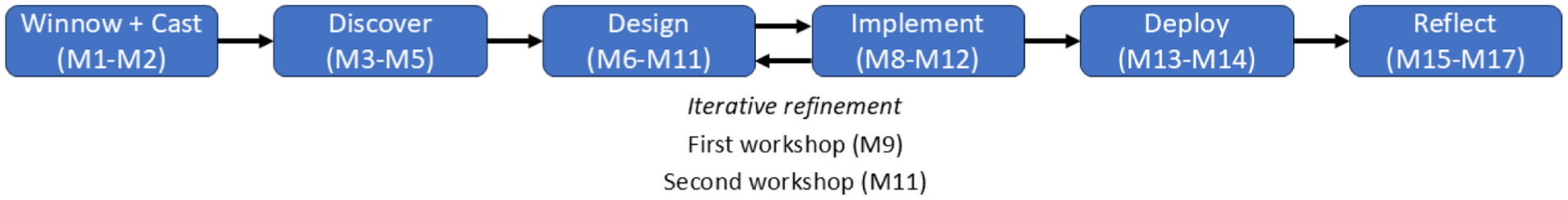
Overview of the iterative design study process.
Learn, winnow, and cast: Establishing the collaboration and problem frame
The objective of this phase was to gain a deep understanding of the target domain, identify appropriate collaborators, and frame a tractable research problem aligned with expert needs. Through initial engagement with the (Omitted Research Center) at (Omitted University), we identified a group of domain experts working at the intersection of sociodemographics, personality, and mental health. Discussions focused on the structure of their database, the types of variables collected, current analytical practices, and practical constraints in data exploration. It included the mentioned factors, and the expert used the data in their studies. However, such a large amount of data hinders the analysis process, which led to psychology experts constantly seeking alternative ways to process the data in collaboration with computer science experts through visualization techniques. Three experts took part in the co-creation process to design FFM-MHI Vis, whose inclusion helped eliciting requirements and design ideas and improving our design decisions in every development stage. 46 One expert was a PhD candidate in personality psychology and the other two were professional personality psychology clinicians. These three experts are co-authors of this paper.
Key takeaways
The key takeaways from this phase included the establishment of a clear collaboration with defined expert roles, agreement on which subset of the data and tasks would be most relevant for visualization support, and an understanding of expert needs and pain points that would guide the design study.
Discover: Problem characterization and abstraction
The objective of the discover phase was to elicit expert analytical questions, explore potential visualization solutions, and identify candidate tasks that a visualization tool should support. We conducted semi-structured interviews to understand the experts’ reasoning, priorities, and current challenges in exploring their dataset. Moreover, we assessed whether data visualization could provide a beneficial approach to their research pipeline and, in that case, which features must be present to fulfill the necessary tasks. 46 This work allowed us to position the design study regarding information location and task clarity. 22 The following sections present the problem characterization and our reflections from the interview.
Domain
Personality includes stable differences that exist in individuals.
50
Nevertheless, one cannot define personality without also defining personality traits
51
and checking what can be drawn from them to analyze someone as a whole. Over the years, researchers clinically studied several theories about personality. In this study, we follow the Five-Factor Model 288 (FFM),
52
also known as “Big Five,” since it is composed of the five most important personality traits existent in one’s personality
53
:
Regarding mental health, Veit and Ware Jr. 56 developed the Mental Health Inventory, also named MHI-38. Its primary goal is to measure general psychological distress and well-being with 38 questions that evaluate five different factor groupings: anxiety, depression, behavioral/emotional control, general positive affect, and emotional ties. The first three factors are related to psychological distress, while the last two are associated with psychological well-being. 56 This questionnaire allows researchers to measure the Mental Health Index (MHI), and several subsequent smaller questionnaires were created to ease data collection like the MHI-5. 57 In particular, the MHI-5 has shown a correlation between 0.93 and 0.95 with the original MHI-38.58,59
Finally, sociodemographic factors include a combination of social and demographic factors. While social factors (e.g. wealth, household, education, social mobility, employment status, income inequality, and community safety 60 ) affect the lifestyle of oneself, demographic factors (e.g. age, gender, and marital status) are more related to the statistic study of human populations.
Semi-structured interview
We conducted a semi-structured interview with a personality psychology researcher in the discover phase. 22 Its purpose is to characterize and abstract the domain problem met by the experts. In addition, we can better understand the types of tasks and information we need to make available. The interview started with an introduction by the expert regarding the domain. Then, the expert explained how they use the dataset currently and the most frequent tasks of the experts in a domain-specific language. Afterward, we asked 10 questions to understand which requirements the visualization tool should meet. The questions translated from (Omitted Nationality) are the following:
Data
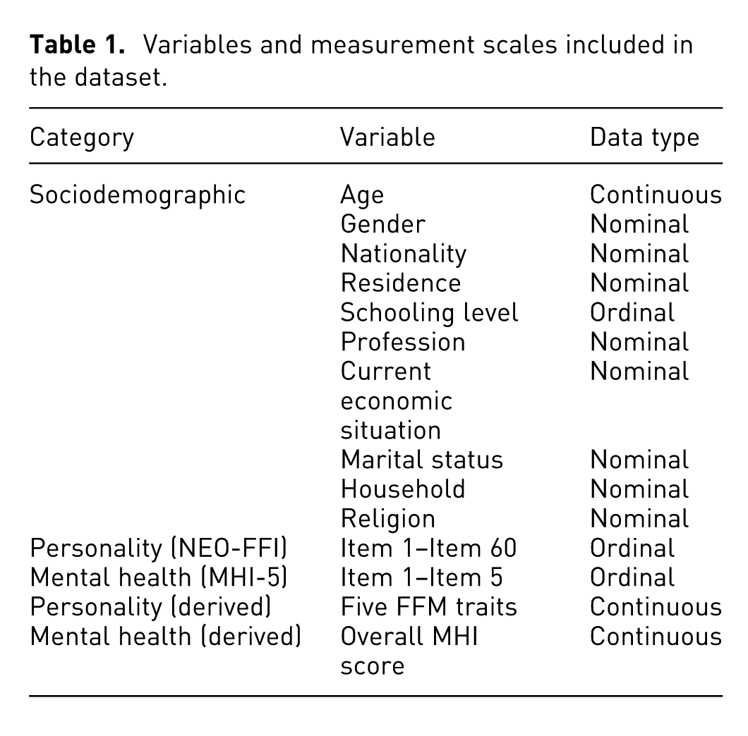
We used a novel research-orientated database comprising 814 adults from the general population (mean age = 40.09 years, SD = 14.25 years; 60.8% female; 48.8% with higher education). The co-authors of this article collected the data to support the study of multidimensional psychological phenomena by jointly collecting standardized measures of personality traits, mental health indicators, and sociodemographic variables in a unified, linkable data structure. Table 1 presents each variable and its data type. Data pre-processing included calculating the values for each of the FFM traits, resulting in five more variables for personality (continuous), as well as a MHI score (continuous). We also created a script to convert an SPSS file into a .csv. For the purposes of this work, we sampled 200 individual records (70 male, 130 female) ranging from 18 to 76 years old (mean age 41, SD = 13.25; 65% female; 42.5% with higher education).
Variables and measurement scales included in the dataset.
Use cases
The domain expert reported that the purpose of the database is to study the population from a macro perspective. Based on personality psychology, the domain experts create hypotheses to verify whether there is any relationship between a set of psychological variables, such as FFM traits or the MHI. One familiar use case is to collect and compare data from two samples. For instance, psychology researchers collect data from the general population to serve as the ordinary sample, and the second from individuals diagnosed with depression. Then, domain experts study whether there are moderation effects between the psychological variables through quantitative statistical methods. Finally, the domain expert explained exemplary use cases concerning the database we have at hand. For instance, experts want to check whether there are clusters based on age groups or gender that show inter-differences in mental health or personality characteristics.
Expert tasks
Following the discussion with the domain expert, we understood that the researcher actively wants to comprehend whether intersections between sociodemographic, personality, and mental health factors exist. Although this high-level domain task looks exploratory, we actively promoted the researcher to narrow it into low-level tasks. This approach allows us to focus the design process and, at the same time, contextualize the expert intentions into primitive visual analytical tasks. 61 Additionally, we include a translation of the domain tasks into abstract forms of visual analytical. The following Expert Tasks (ET1–ET3) were derived directly from the semi-structured interview questions (Q1–Q10):
In particular, ET1, focused on quantifying and visualizing psychological variables, was informed by questions regarding individual and overall scores (Q2, Q5, Q7); ET2, concerning filtering across multiple variables, was guided by questions on comparison and conditional filtering (Q3, Q4, Q5); and ET3, regarding aggregated views by age groups, was derived from questions about grouping and overview (Q1, Q5, Q7). Additional questions on interface layout, visualization idioms, color encoding, and platform preferences (Q6, Q8, Q9, Q10) further informed the design decisions. By abstracting these tasks into common terminology in the visualization domain, we hope that researchers in other domains can more easily understand this domain study and apply the design outcomes to other situations. 62 Additionally, these tasks suggest that we follow a strategy such as the Focus-plus-Context rule, where viewers can check the object of interest in detail while getting an overall impression of all the surrounding information. 63 The information location should be predominantly in the visualization. However, the interpretation of personality and mental health scores is implicit knowledge of the expert.
The researcher showed a strong preference for scatterplots when asked about their knowledge of information visualization methods. We believe that the core academic education of the expert may be responsible for this preference since their current data analysis procedure leverages only scientific software such as spreadsheets or SPSS. Both these tools commonly use scatterplots and line charts to display information based on a query from the researcher to perform a statistical test. Therefore, these practices hinder the interaction with other types of data visualizations, emergent data patterns, and preemptive data analysis. Indeed, they may decrease the quality of data analysis since performing one statistical test at a time with such a multidimensional dataset may be too cumbersome and require a lot of time to be conducted. In addition, the researcher highlighted that it would be relevant to have a color scheme that favors an immediate assessment of an ordinal item and that a dichotomy semantic was not appropriate. Finally, the researcher asked that the tool should have a single page and be preferably a website available in a desktop setting since they were more familiar with this technology.
Key takeaways
In the discover phase, we identified the core analytical needs of the personality psychology expert and clarified how a visualization tool could support their research. Three expert tasks were derived from the semi-structured interview: visualizing and quantifying psychological variables (ET1), filtering samples across multiple variables (ET2), and examining aggregated distributions by age groups (ET3). These tasks were informed by specific interview questions regarding data scope, comparison, grouping, and interaction preferences. The expert emphasized scatterplots for individual-level analysis, the use of color encoding for rapid ordinal assessment, and a single-page, desktop-oriented interface. Collectively, these insights established both the functional requirements and the visual strategies that guided subsequent design iterations, while also confirming the relevance of integrating sociodemographic, personality, and mental health factors into coordinated visualizations.
Design: Converging on a coherent visualization concept
The objective of the design phase was to refine candidate visualization solutions into an integrated system concept that effectively supports the experts’ analytical needs. This section includes the design of the prototypes, the workshops to refine them, and our reflections on the activities.
Choosing the idioms
By using analogy-based creativity methods 64 as well as the visualization awareness method, 65 we designed a curated collection of possible visualizations focused on the data and task types. In particular, we chose the previous set of idioms based on their ability to depict relationships between continuous/ratio (e.g. the FFM traits and the MHI) and categorical data (e.g. sociodemographic factors like marital status and gender). The main goal of this phase was to understand the stakeholders’ preferences regarding the implementation of the idioms. We considered the following idioms: radial bar charts, radar charts, parallel coordinates, Cleveland dot plots, scatterplots, boxplots, histograms, and heatmaps (see Figure 2).
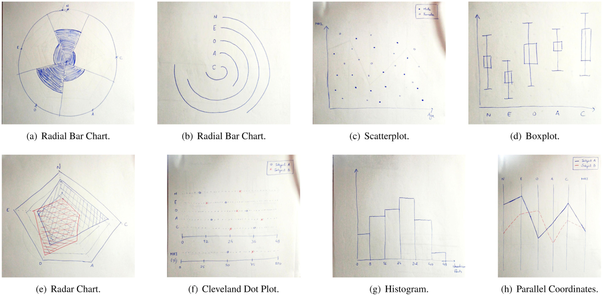
Examples of sketches of different charts designed for the converging workshop. (a) Radial bar chart. (b) Radial bar chart. (c) Scatterplot. (d) Boxplot. (e) Radar chart. (f) Cleveland dot plot. (g) Histogram. (h) Parallel coordinates.
We conducted another semi-structured interview with the same expert from the problem characterization session. In contrast, we started by showing the idioms one at a time to the researcher and explaining how they could visualize information. Then, we encouraged the researcher to externalize their ideas regarding which visualizations looked easier to understand and how they could apply them to their domain. In addition, we asked six questions based on the experts’ tasks to check how much information density the researcher would like to find on the screen and point out their preferred interaction method. The questions translated from (Omitted Nationality) were the following:
The expert’s answers to questions Q1–Q6 provided concrete guidance for narrowing down the set of idioms and defining their intended use. The expert consistently favored representations that are commonly employed in psychology research and perceived as analytically trustworthy, which motivated the selection of scatterplots and boxplots over more decorative or unfamiliar alternatives. Responses to questions concerning interaction (Q3 and Q4) highlighted the importance of direct manipulation and detail-on-demand, leading to the use of sliders for filtering and color-encoded heatmaps complemented by hover interactions for precise item-level inspection. Feedback on layout and coordination (Q5 and Q6) emphasized the need to separate global overviews from detailed individual-level views, while maintaining visual linkage across idioms. These insights directly informed the configuration choices detailed in the following reflections, where each selected idiom was refined in close collaboration with the expert.
Results
The sketches of the possible visualizations rendered many discussions, providing the experts an initial view of how their ideas could lead to a concrete tool. In line with the expert’s responses to Q1 and Q2, which emphasized analytical familiarity and interpretability, the expert showed interest in the following idioms: a
Regarding the parallel coordinates, we agreed, in line with the need to compare multiple psychological variables simultaneously (Q1), that it should contain six axes corresponding to each of the FFM traits and the MHI score. Each line would represent the scores of a subject across variables. In addition, the axes should include a drag-and-drop behavior to organize them in the most convenient order and support filtering through brushing, addressing the expert’s preference for direct manipulation expressed in Q3. It must also be easy to compare the values of a single individual with the global average of the sample.
We also agreed, following the discussion prompted by Q2, that the scatterplot should present each individual as a circle, with position encoding age and a selected psychological variable among the FFM traits or the MHI. This configuration allows experts to explore relationships between continuous variables while maintaining a familiar analytical representation. The heatmap was also straightforward, particularly in response to Q4, as it should contain all answers to the NEO-FFI and MHI-5 questionnaires. Each column corresponds to an FFM trait or the MHI, and each line represents an individual item. A user can perceive response patterns through color encoding while retaining the possibility of inspecting exact values on demand.
In contrast, we brainstormed whether representing each psychological variable with an individual boxplot or histogram would be advantageous. Since both idioms resulted in similar perspectives of the data, and following the expert’s interest in preserving both summary statistics and distribution shape (Q1), we opted for a
Key takeaways
In the design phase, we refined candidate visualization idioms into an integrated concept tailored to the expert’s analytical workflow. The semi-structured co-design activities clarified both the preferred visual representations and interaction strategies. Scatterplots and boxplots were selected for individual-level analysis due to their familiarity and interpretability, while parallel coordinates supported multi-variable comparisons. Violin charts were chosen to convey distributions alongside summary statistics, and a Sankey diagram was introduced to explore sociodemographic relationships. Interaction design emphasized direct manipulation, detail-on-demand, and coordinated views, with layout choices separating individual-level details from global overviews. These insights ensured that the final prototype aligned with domain-specific reasoning while remaining flexible and analytically robust.
Implement: Realizing the design
The objective of the implement phase was to develop a fully functional visualization tool based on the refined design. According to the previous visualization choices, we implemented a high-fidelity prototype, which we developed across two iterations concerning interface design principles based on Kachkaev et al., 66 including consistency of encoding, transitions between views, and the data are the interface.
First Iteration The first version of the prototype contained a
Prototype used in the first refining workshop.
The three experts (E) were able to complete all tasks with little to no help from the developer. After accomplishing all tasks, they verbally evaluated the system, enumerating its pros and cons and making some suggestions. In particular, E1 stated that the parallel coordinates chart should present the average scores of each group of subjects of the same age extent, instead of doing so for each subject. Although this aggregated view of the data is one of the expert tasks, we did not implement it at the time. E1 also reported that they preferred a simple boxplot rather than a violin chart since they did not think that showing the overall distribution in-depth is important. E2 said they would not modify the dashboard since they enjoyed working with all the idioms implemented except the violin chart. Additionally, E2 reported that a help menu would be helpful to know how to work with the charts if the developer did not explain them and their purpose beforehand. Finally, E3 stated that the violin plots should have tooltips to inform which were the quartile values and the sample mean value while hovering over a trait, instead of looking at these measures with the naked eye. This user also thought the Sankey chart was valuable and easy to understand; however, the scatterplot was somewhat confusing, with a tooltip while hovering a particular dot being the most relevant component of this chart. Overall, E3 reported that the system was easy to understand and use. Indeed, the implemented transitions were a positive approach to detecting the changes while applying filters.
We should replace the violin chart with a boxplot with tooltips for the quartiles based on this feedback. Moreover, the comments on the age aggregation allow us to conclude that the parallel coordinates chart is the privileged idiom to contain this representation. Aside from these changes, the number of filtered subjects currently should also be added to the left drawer.
Second Iteration After iterating the prototype, we conducted an additional refining workshop with the domain expert from the problem characterization session. Again, the participant started by exploring the prototype by themself, followed by a set of tasks. Similar to the previous workshop, we address the experts’ tasks:
Once again, the expert completed all tasks in the presented order with little help from the developer. After finishing them, we asked for new feedback about this version. The researcher referred that each node of the Sankey diagram could present a tooltip, thus identifying the number of subjects that node links. Overall, the tester thought the system had a clean and intuitive design.
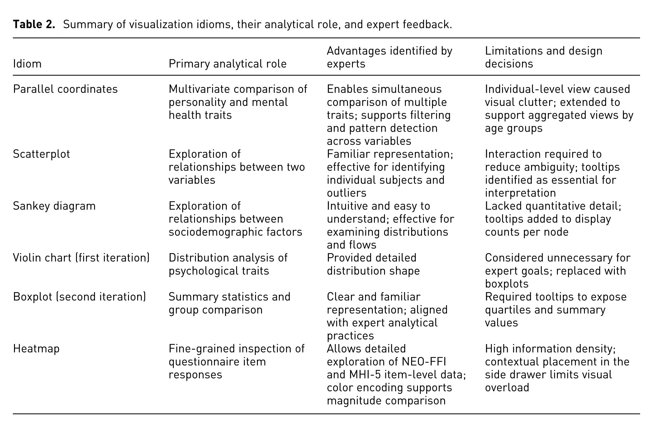
To consolidate the outcomes of the two refinement iterations, we summarize the role of each visualization idiom, along with its main advantages and limitations as identified during the expert workshops, in Table 2. This summary highlights how each idiom supported specific expert tasks, as well as the design trade-offs that motivated subsequent modifications, replacements, or enhancements. By explicitly contrasting the idioms, this overview clarifies the rationale behind the final set of visualizations included in the system and illustrates how expert feedback guided the refinement process, which we introduce in the next section.
Summary of visualization idioms, their analytical role, and expert feedback.
Key takeaway
The implementation phase translated the refined design into a fully functional prototype through two iterative workshops with domain experts. The first iteration validated the overall selection of visualization idioms and identified improvements, such as replacing the violin chart with boxplots, adding tooltips, and supporting age-based aggregation in parallel coordinates. The second iteration confirmed these refinements and further highlighted enhancements for interactivity and interpretability, specially regarding tooltips for the Sankey diagram. Across both iterations, expert feedback guided critical design adjustments, ensuring that the tool effectively supported the intended analytical tasks while maintaining usability and clarity.
FFM-MHI overview
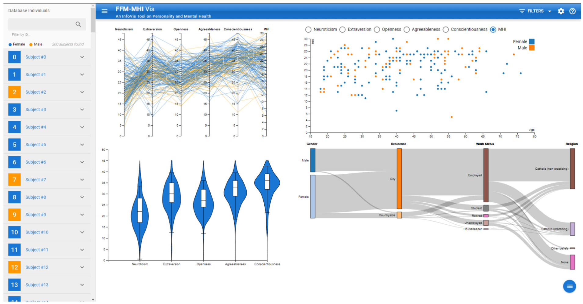
Figure 4 depicts a screenshot of the interface. FFM-MHI is composed of three main components: (i) an observable view, (ii) side drawers, one for each side, and (iii) a filters and settings panel. This section provides an overview of each FFM-MHI component, including our reflections from the semi-structured interviews conducted with the domain experts and the design decisions.
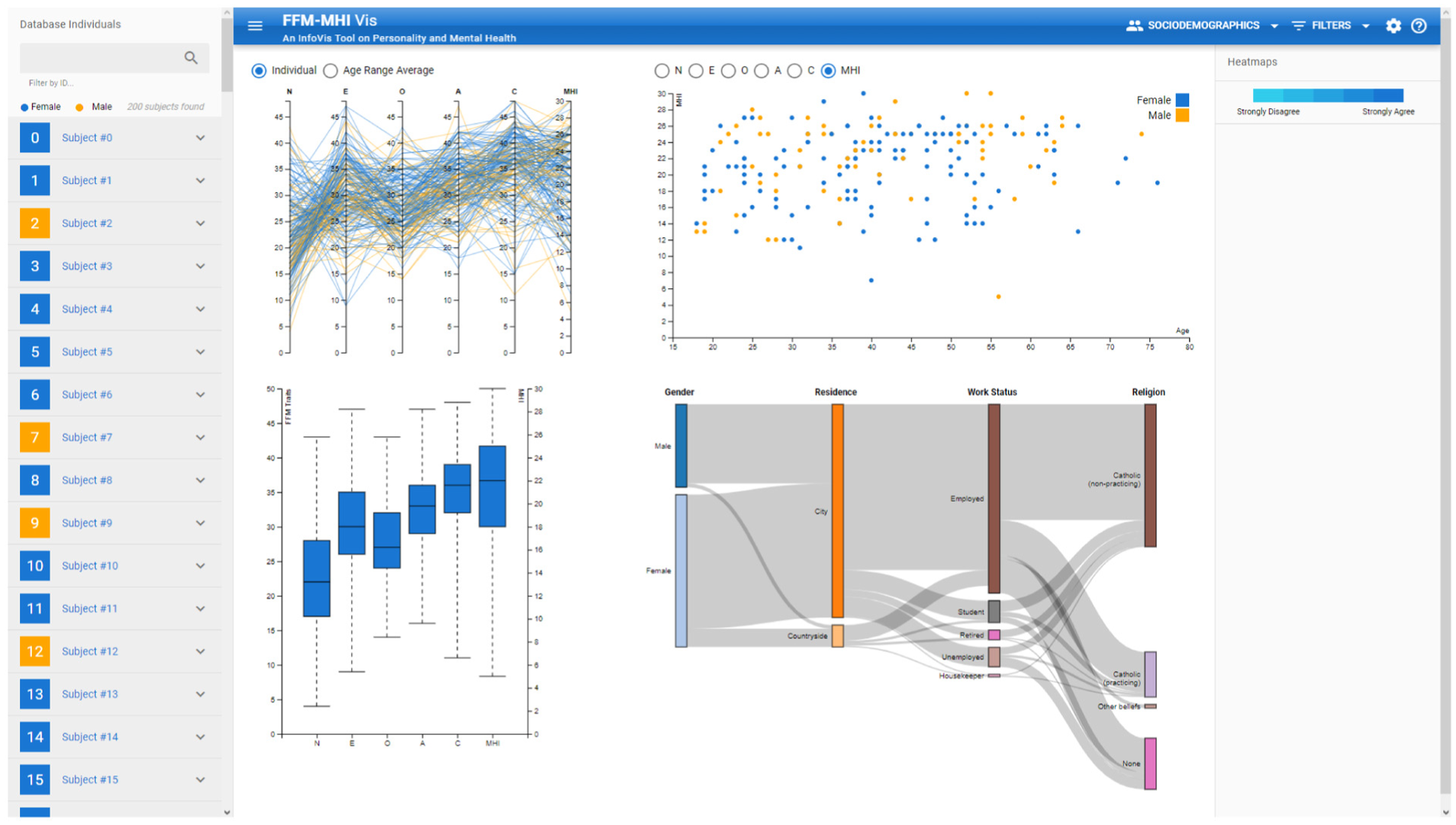
Screenshot of FFM-MHI Vis. The dashboard contains four main idioms: a
Observable view
The Observable View (OV) contains four idioms that allow the researcher to explore the data through visualization. The design of the OV is a result of an intensive collaboration with the domain experts, comprising a total of four semi-structured interviews with three personality psychology. The idiom in the top-left is the
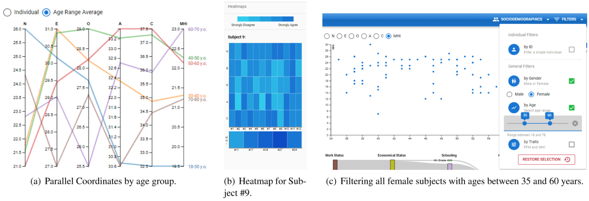
Screenshots to showcase features of FFM-MHI. (a) Parallel Coordinates by age group. (b) Heatmap for Subject #9. (c) Filtering all female subjects with ages between 35 and 60 years.
The
Side drawers
The
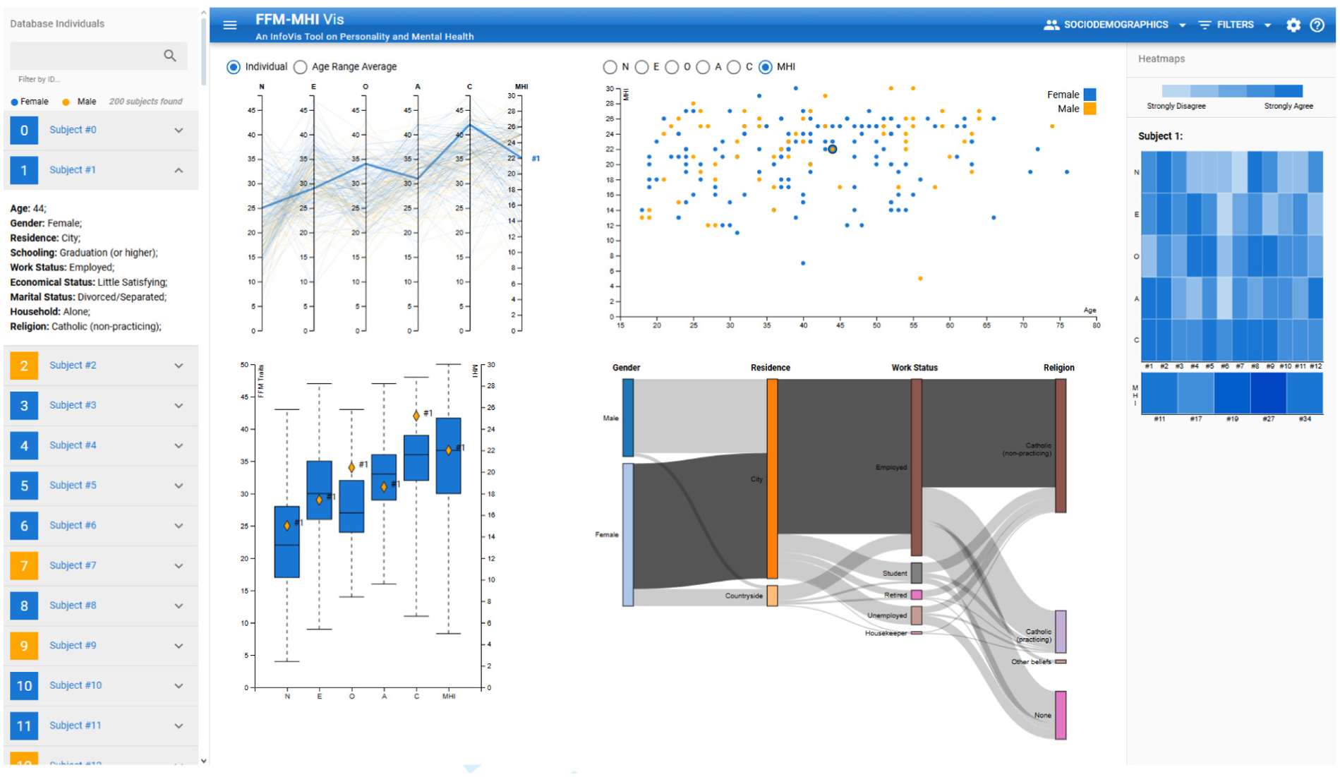
Example of a subject with ID
Filters and settings
We included several menus to interact with the idioms to help the user explore data and filter the database. On the top bar, there is a menu for the sociodemographic factors. It shows a checkbox for each factor which enables axis selection on the Sankey diagram. It is also possible to change the order of the axes by a drag-and-drop behavior. In addition, there is a menu of filters where the researcher can filter a subject by ID or each sociodemographic factor (Figure 5(c)). While filtering for the latter, the user can apply multiple factor filters simultaneously. Finally, the researcher can change the gender color encoding with RGB or HEX codes or a color picker. In addition, there is a help menu with a compilation of slides containing text that helps the user to understand how to interact with the system.
System implementation
FFM-MHI Vis is a single-page application running on a web browser. We used HTML5, Vue.js, Quasar, and D3 to program the client-side to render the page and its elements. The server-side uses a simple Node.js to load, save and change the user preferences on-the-fly. The tool is able to load other datasets with the same data structure. It is open-source and available at (Ommitted URL).
Deploy: Tool evaluation
The deploy phase focused on presenting the implemented system to the domain experts for real-world use and gathering feedback to refine the tool. One pitfall of design studies is the experimental demand characteristic effect,67,68 which leads domain experts to be very likely to offer favorable feedback. As such, we decided to perform both utility and usability tests. The former is a case study where experts are concerned with the usefulness of the prototype to their work. In contrast, we can conduct the latter with any subject to evaluate not only utility, but also efficiency, safety, memorability, learnability, and satisfaction. 69
Participants
A total of 30 participants (21 male, 9 female) ranging from 21 and 60 years old (
The participants’ familiarity with the domain, visualization, and each idiom ranges from average to familiar, as depicted in Figure 7. These results indicate that users were more familiar with chart types commonly used in their research area (e.g. scatterplots and boxplots), and less familiar with less frequently encountered idioms (e.g. parallel coordinates and Sankey diagrams). In addition, we were able to verify that participants were not well familiarized overall with the FFM and MHI models. We believe that this factor has a positive impact, allowing the information visualization techniques to be evaluated instead of the knowledge of the psychology topics.
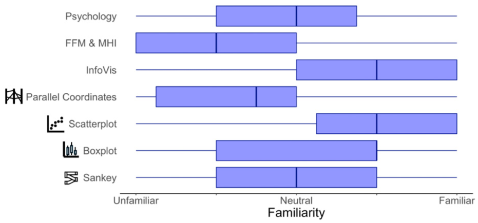
User familiarization with the topics of interest for this work.
Apparatus
We conducted the user studies through videoconference software to share and record the screen. We used a timer to collect task completion time. Additionally, three questionnaires were used to evaluate the system: System Usability Scale (SUS), 70 Technology Acceptance Model 3 (TAM-3), 71 and NASA Task Load Index (NASA-TLX). 72 While we measure the perceived usability through the SUS, we opted to collect only the perceived usefulness and ease of use from the TAM-3. Finally, the NASA-TLX assesses six dimensions regarding user interaction: mental, physical, and temporal demands, as well as performance, effort, and frustration. All three dimensions have been discussed in related works to assess the quality of the apparatus.73–75
Procedure
Each usability test consists of three parts: (i) fill in a form to collect demographic data, including familiarity with the topics of interest for this work; (ii) explore the tool until the participant is ready to conduct tasks; (iii) perform six tasks, in a random order, with a think-aloud protocol; and (iv) fill in another form consisting of the SUS, TAM-3, and NASA-TLX scales. This new set focuses on prompting the user to interact with all elements in the tool. In particular,
Regarding the utility tests, we first allowed the participants to explore the tool and try one possible use case that they would apply through statistical methods. We then asked them to perform the mentioned tasks following a think-aloud protocol. We only collected qualitative feedback in a follow-up interview.
Usability testing
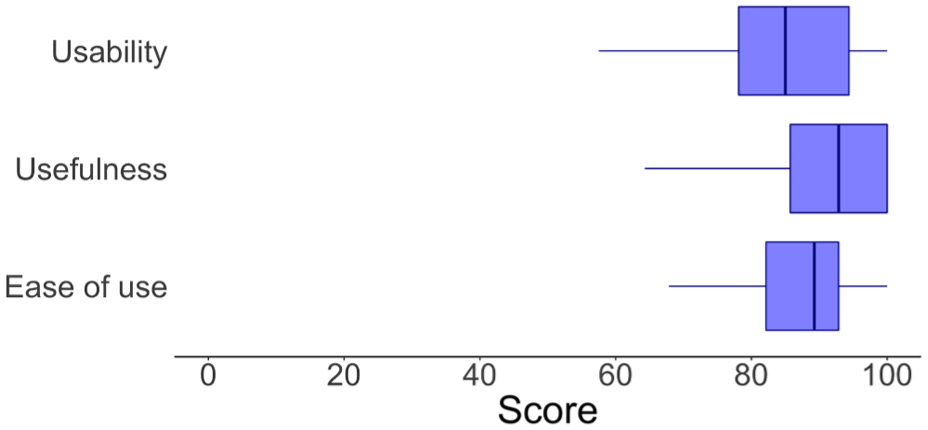
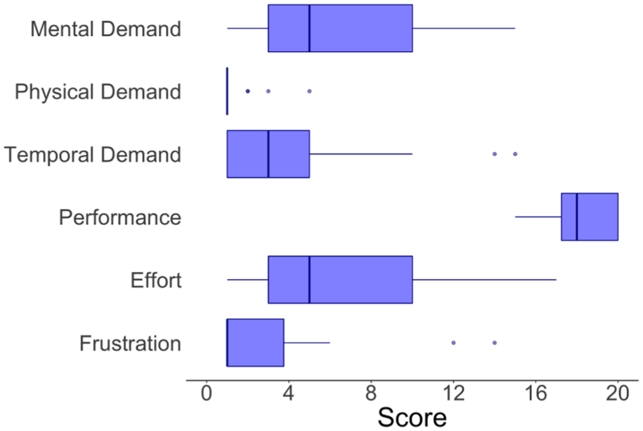
We conducted usability tests with the 30 participants to complement our prototype evaluation. The prototype scored 84.92 ± 1.94 in perceived usability, 91.42% ± 1.65% in perceived usefulness, and 87.14% ± 1.67% in perceived ease-of-use (Figure 8). These scores show that participants assess the quality dimensions of the prototype with high scores. Regarding the NASA-TLX, results are also positive since the lower the score for each metric (except for performance), the better the system is 72 (Figure 9). We can see that the workload has most of its dimensions in the bottom half, and that the self-assessed performance was highly scored.
Distribution of self-assessment metrics regarding the apparatus.
Distribution of NASA-TLX metrics regarding the apparatus.
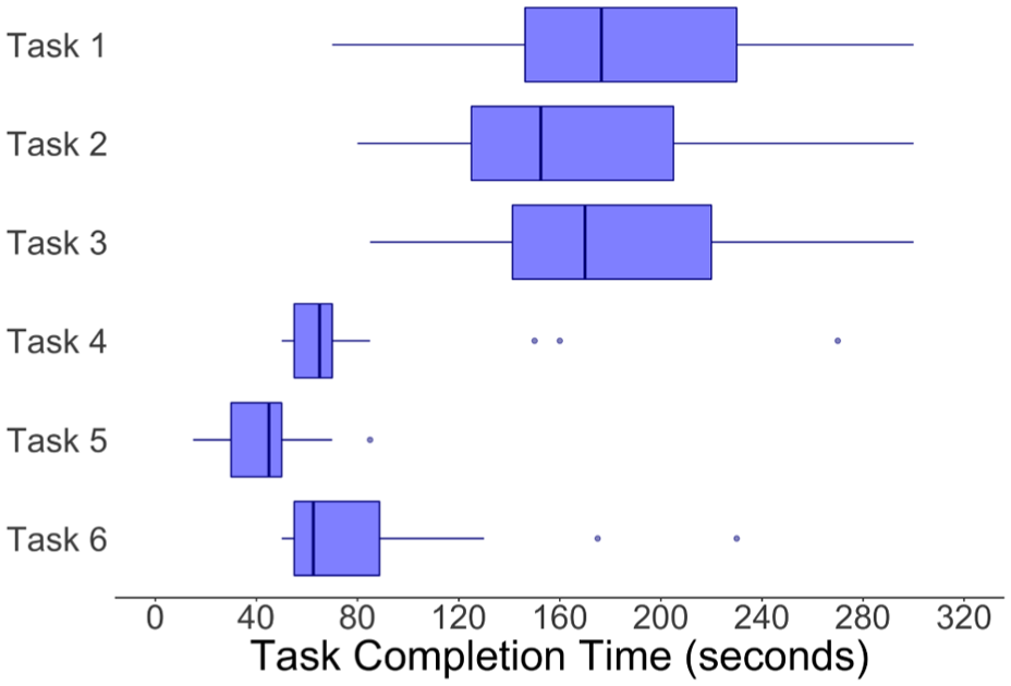
Regarding user efficiency, Tasks T1 to T3 are more complex and have more steps to be accomplished. Therefore, we expected that the times for each of these would be higher. Their time distributions were very similar, taking around 3 min to complete each task. In contrast, Tasks T4 to T6 are easier to fulfill, thus being expected at smaller time intervals. Indeed, this tendency held with the measured time intervals being around just 1 min. These results suggest that participants were able to complete multi-step analytical tasks within a few minutes, indicating that the system supports efficient exploratory analysis workflows (Figure 10).
Distribution of task completion times.
Utility testing
We conducted utility tests with three psychologists. While applying a use case, one expert stated that the visualization dashboard was a good starting point to explore the data before running any statistical method. In particular, the charts provided “clues” and a “visual expectancy” regarding the data by offering a “configuration of the data from an aesthetic scope.” Hence, these visualizations supported a “pre-analysis of the data” to assess whether other variables could provide interesting findings on not preregistered relationships in the study. The expert also added that the graphical analysis supported the “identification of outliers in the sample.” The major drawback of solely using visualization is that “the dashboard could not provide the certainty of statistical analysis” to find group differences. Despite the boxplots providing a “more statistical, quantitative visualization,” the remaining charts were more focused on a “visual arrangement of the data.”
Concerning the tasks, only one user suffered from internet connection problems for a period and did not complete a task. Testers completed the remaining tasks in less than 4 min. Despite finding the system confusing at the start of the experiment, one tester expressed satisfaction with the global coherence and general aspect of the interface after completing the tasks. Other experts stated that the system was fun to work with. However, a first-time user may feel difficulties interacting with the interface conveniently. In particular, they would need to decipher what the meaning of more uncommon idioms is first. Participants also said the tool was clean and suggestive. The third psychologist claimed that the system was very intuitive, even stating that “it is much easier to work with data via charts and direct manipulation than with statistical software such as SPSS.” These observations indicate that the system complements traditional statistical analysis by enabling a rapid, visual pre-analysis phase, where experts can identify patterns, outliers, and candidate relationships before formal hypothesis testing.
Key takeaways
The deploy phase evaluated the visualization tool’s utility and usability with both domain experts and general users. Usability tests with 30 participants demonstrated high perceived usability, usefulness, and ease of use, with task completion times aligning with expected complexity levels. Utility tests with psychologists confirmed that the dashboard effectively supported pre-analysis, exploratory insights, and identification of outliers, complementing traditional statistical methods. Participants emphasized the tool’s intuitive design, clarity, and interactivity, while noting that less familiar visualization idioms might require initial guidance. Overall, feedback validated that the system meets the intended analytical objectives and provides a practical, engaging means for exploring multidimensional psychological data.
Case study example
To demonstrate the novelty and utility of the tool, we present a case study illustrating how FFM-MHI Vis can support expert analysis (Figure 11). We focus on the personality trait
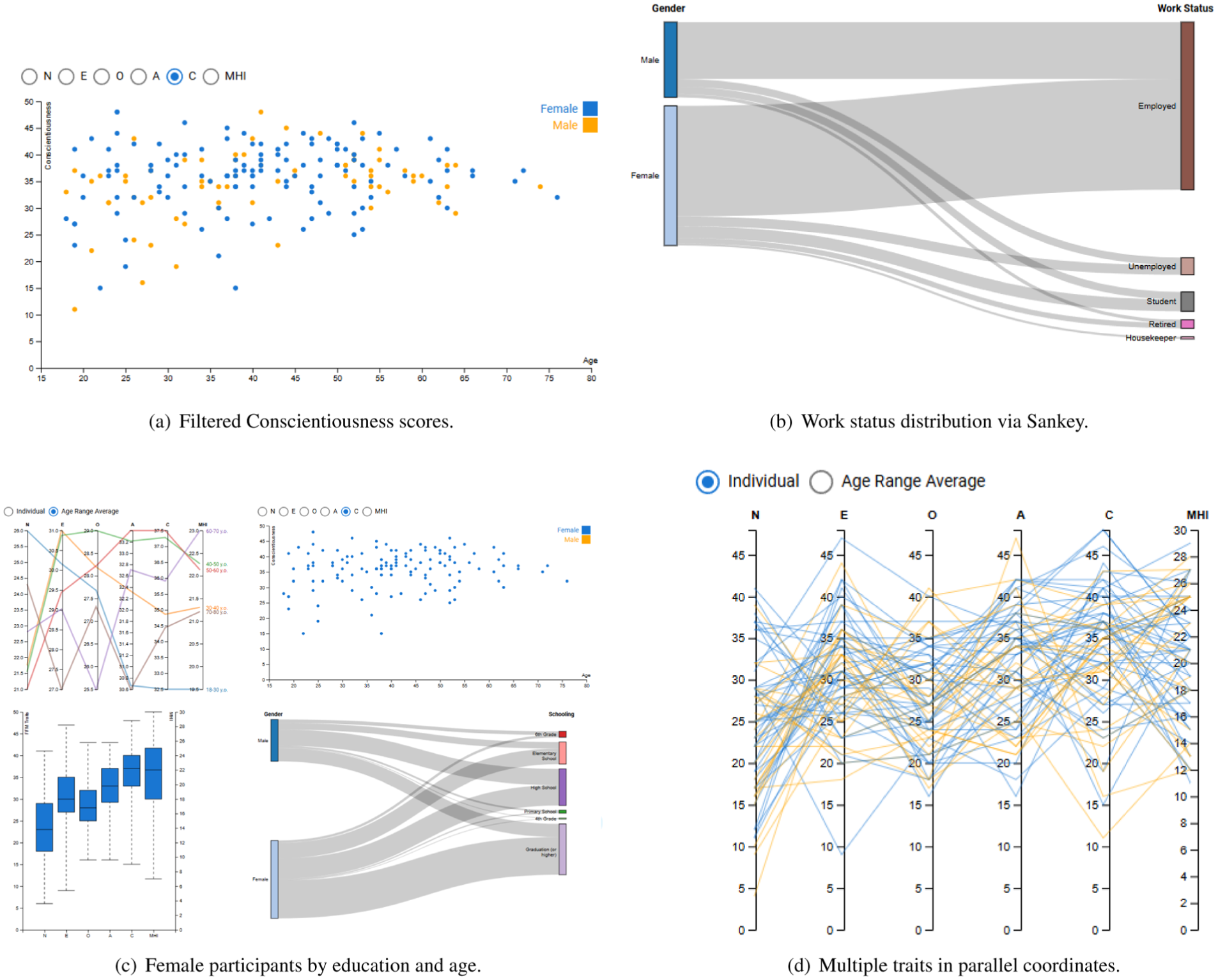
Screenshots to showcase the case study example. (a) Filtered conscientiousness scores. (b) Work status distribution via Sankey. (c) Female participants by education and age. (d) Multiple traits in parallel coordinates.
The analysis begins by filtering the dataset to display only the range of Conscientiousness scores of interest (Figure 11(a)). Using the Sankey diagram, experts can observe the distribution of work status for individuals within the selected score range (Figure 11(b)) or filter for female participants to observe how Conscientiousness scores intersect with educational attainment and age groups (Figure 11(c)), providing insight into demographic patterns and potential psychological implications. Experts can simultaneously examine how mental health scores vary relative to the general population in the boxplots (Figure 11(c), bottom left chart). The parallel coordinates view allows experts to explore multiple variables at once (Figure 11(d)), such as the other personality traits, to identify trends and potential correlations across subgroups. Throughout the analysis, the tool supports experts in iteratively refining their queries, applying multiple filters, and visually comparing distributions. This step-by-step exploration enables conclusions to be drawn based on the observed patterns in the data. Experts can identify clusters, detect outliers, and compare subgroups without relying solely on traditional statistical methods, which typically require multiple sequential analyses. Instead, the system supports rapid exploratory analysis and hypothesis generation through interactive visual inspection. The strength of FFM-MHI Vis is that it offers many potential scopes through which the experts can analyze the data.
Reflect: Lessons learned from expert collaboration
The objective of the reflect phase was to analyze the outcomes of the design study, evaluate how effectively the visualization tool supported the experts’ analytical tasks, and extract lessons for future design work. In this design study, we changed the way experts look into a problem regarding the intersections between sociodemographic, personality, and mental health factors. Indeed, while the most common approach to analyzing highly informative tables is through statistical software such as SPSS, in this design study, we introduced visualization techniques to the domain experts. The nine-stage design study methodology structured the development of FFM-MHI Vis throughout the collaboration. Early semi-structured interviews revealed that experts typically relied on tabular data and regression models, motivating the need for visual overviews that support pre-analytical exploration. Co-design workshops helped identify which relationships experts most frequently investigated (e.g. between personality traits and sociodemographic factors), directly informing the choice of coordinated views such as parallel coordinates and Sankey diagrams. Iterative prototyping and feedback sessions guided interaction design decisions, including the emphasis on direct manipulation through filtering, reordering, and brushing, which experts described as more intuitive than parameter-based statistical queries.
When we deployed the tool to evaluate whether it met the experts’ goals, each evaluation task (T1T6) was designed to exercise one or more of the expert tasks (ET1ET3) identified in the design study. Tasks T1, T2, T5, and T6 primarily addressed ET1, as they required participants to explore individual and aggregated questionnaire scores, examine distributions of psychological variables, and analyze relationships with sociodemographic factors. Tasks T2 and T3 supported ET2 by having participants apply multiple filters across psychological and sociodemographic variables to identify subgroups and clusters. Finally, ET3 was exercised through T3, where participants aggregated data by age groups and analyzed trends across these defined groups. We also created tasks related to customization (T2 and T4) to assess learnability and configurability, reflecting experts’ interest in adapting visual encodings to their analytical preferences. This explicit mapping ensured that each core interaction in the system—including filtering, reordering, direct manipulation, and aggregation—was exercised in a realistic analytical context. It also demonstrates how the design study methodology directly guided both the evaluation task design and the functionality of the tool, aligning the study with real-world analytical workflows in personality psychology.
Utility results also showed positive qualitative feedback by the psychology experts, highlighting how relevant participatory design techniques are to design tools with the end users. 78 In particular, this new data analysis strategy allows experts to visually explore large volumes of data instead of running multiple regression models before diving in-depth into the data. To diminish the experimental demand characteristic effect,67,68 we also conducted usability tests with participants outside this domain of knowledge. Our system scores 84.92 ± 1.94, 91.42 ± 1.65%, and 87.14 ± 1.67% in perceived usability, usefulness, and ease of use, respectively, which shows that we designed the system well and that even participants without psychology expertise were able to understand the information and interact with the system. Participants were also efficient with the low task completion times. Therefore, the system met the expectations, and it can be of great help for experts and people outside the area of expertise to analyze these types of data.
Notes from computer scientists
Similar to León and Breiter, 46 we noticed that social science experts were focused mainly on publishing their research, while their interest in the design study was to check how the tool could help them with their data analysis. Although our prototype was well received, we believe that it would still take some time for personality psychology experts to migrate from their typical statistical software to visualization tools. This inertia to adopt other data analysis strategies may arise from the core academic education of the experts since SPSS is the obligatory software for data analysis in the psychology courses at their university. Consequently, psychology experts may be entrenched in analyzing data using advanced descriptive statistics methods. It may explain the final relatively-simple visual analytics system since this type of software works with well-known idioms such as scatterplots, line charts, and boxplots.
However, we found that participants invested in collaborating with us, providing valuable and necessary domain expertise for a successful design process. They were also interested in learning how to apply visualization techniques to their research. We believe that the most valuable lesson learned is that personality psychology is a rich, underexplored domain that holds promise for visualization if experts invest in educating experts in information visualization to produce novel techniques.
Notes from personality psychologists
The system is pragmatic, functional, and useful from the psychologists’ perspective. Moreover, the psychologists claimed that FFM-MHI is technically simple to use and can be generalizable. Quoting the domain expert, “It has the potential to be applied in the research area, in terms of nomothetic analysis, supporting a graphical and numerical analysis. There are also advantages in idiographic assessments terms, allowing the exploration of a wide range of partial references.” She also highlighted the broad possibility of analyzing several interacting data simultaneously. We believe that information visualization techniques can be a set of innovative auxiliary instruments in the personality psychology area, with possibilities for expansion.
Limitations
The major limitation of this study is the sample size. A larger sample of experts per workshop would allow us to gather more feedback and enrich the prototype development process. Regarding the tool itself, it presents scalability issues when the dataset contains more than 250 subjects. This effect is present in the scatterplot especially. Moreover, we did not push the development of other features such as responsiveness or user customization. Although the prototype only presents three data types (FFM personality traits, MHI and sociodemographic factors), other variables with similar data characteristics like the HEXACO 79 personality model can replace the mentioned variables with a few changes. Furthermore, the system uses a static database, meaning that users must reload the tool to modify the dataset. Beyond this technical limitation, our evaluation also presents methodological constraints, namely the absence of a controlled comparison between visualization-based exploration and traditional statistical workflows (e.g. regression analysis in SPSS). While qualitative feedback suggests that the system accelerates early-stage data exploration, future work should quantify this effect through controlled experiments measuring analysis time, accuracy, and insight generation. Finally, a further limitation of the prototype is the absence of explicit graph titles, which may make the interpretation of some views more difficult, particularly for first-time users or for less familiar visualization idioms. While this choice was motivated by a clean, dashboard-style design to encourage exploratory analysis, future iterations should incorporate concise titles or lightweight annotations to improve immediate interpretability without compromising visual clarity.
Conclusions and future work
This design study has highlighted the need for visualization tools to help personality psychology experts analyze the intersections between sociodemographic, personality, and mental health factors. We followed a co-creation approach to identify opportunities where visualization can improve data analysis techniques. We started with workshops to elicit the requirements as well as to design and develop an visualization tool. We evaluated the prototype with utility and usability tests. We included our reflections and findings on the different phases of the design study.
Future work includes repeating the study with a larger sample of experts, specifically addressing a wider range of visualization knowledge among the participants. In addition, we would like to conduct several creative visualization opportunities 47 to explore more methodologies to elicit design requirements. A more heterogeneous sample may allow experts to explore a broader set of initial ideas and collect feedback from multiple distinct scopes. Moreover, we would like to conduct a study to compare whether using our tool in their daily work routine affects the workflow of the experts. Finally, recent advances have explored the use of artificial intelligence-powered tools to address mental health, 80 motivating future investigations into how AI-driven methods could complement interactive visualization tools in supporting experts’ analytical workflows.
Footnotes
Author contributions
Diogo Mestre: Conceptualization, Methodology, Software, Validation, Formal analysis, Investigation, Writing–Original Draft, Visualization.
Rute Pires, Bruno Gonçalves, Joana Henriques-Calado: Methodology, Resources, Writing–Review & Editing, Supervision.
Tomás Alves: Conceptualization, Methodology, Formal analysis, Writing–Original Draft, Visualization, Funding acquisition.
Sandra Gama: Methodology, Writing–Review & Editing, Supervision, Funding acquisition.
Funding
The authors disclosed receipt of the following financial support for the research, authorship, and/or publication of this article: This work was supported by national funds through Fundação para a Ciência e a Tecnologia (FCT) with references SFRH/BD/144798/2019, UID/50009/2025, UID/50021/2025, UID/PRR/50021/2025, and UIDB/315/2025.
Declaration of conflicting interests
The authors declared no potential conflicts of interest with respect to the research, authorship, and/or publication of this article.