
Abstract
The rise of open data in the cultural domain is democratizing access to complex datasets usually presented as large multivariate and multilayered graphs. However, the exploration of such datasets is challenging for laypersons. The objective of this work is to develop and evaluate a new method for exploring and understanding a specific type of multilayered graph that combines a large bipartite graph with a set of tree structures. This paper proposes MuzLink, an interactive visualization tool that allows the user to navigate, search, locate, and compare collaborative and influential relationships between musical artists through the exploration of musical adaptations. The proposed tool is based on a set of connected timelines visualizing how an artist’s collaborations, inspirations, and influences evolved over time. This design study is conducted in close collaboration with BAnQ, the national library and archives agency of the Quebec government. A controlled user study, done with a group of BAnQ users, and two case studies, show how the proposed approach is capable of performing a considerable set of analytical and exploratory tasks.
Introduction
This design study tackles the visualization of a multivariate bipartite graph of artists (songwriters, composer, singer) and songs, which also embeds an additional tree layer structure encoding the possible musical adaptation relations between songs. Song adaptations history (among which are so-called remakes and covers) is as old as time, and it tells us a lot about cultural movements in our societies, 1 the music industry, 2 and how creativity aspects such as inspiration and influence can be entangled. 3 It has long been a field of interest for musicology but nowadays, thanks to the rise of open data portals, 4 these datasets are becoming more accessible to popular music enthusiasts.5,6
However, such hybrid graph structures are challenging to explore, especially for non-expert users possibly having low visualization literacy. Although graph visualization is a well-researched topic, there are still limits to the number of attributes and nodes that can be displayed, and easily explored, on a screen. 7 This design study presents a research work conducted in collaboration with Bibliothèque et Archives Nationales du Québec (BAnQ)– the national library and archives agency of Quebec government – which, as part of an open data innovation project, has shared a previously unpublished music database, listing adaptation trees, and collaboration graphs between artists. The underlying structure of this dataset is not limited to the field of music, but also applies for instance to scientific literature, and open source code: essentially every network of timestamped items produced by various entities.
We propose MuzLink, a novel interactive tool to explore and analyze artists’ collaborations and inspirations through their songs over time. The target users are the average library visitors who wish to explore music data, discover new songs and artists, and thus might then borrow a musical album from the library collection. The proposed system targets several questions (detailed in Section “Design Process and Task Abstraction”), that those typical users could seek to answer. These questions were defined through the design process involving both BAnQ experts and visitors.
Contributions
MuzLink is an artist-centered design based on connected timelines to enable understanding of collaboration and inspiration relationships with other artists. The design was made to facilitate the identification, the search, and the comparison of those relationships over time under an overall exploratory context. The main contributions are the following:
We propose a visualization model called MuzLink to visualize an hybrid structure combining a bipartite graph and a set of hierarchical trees, in an exploratory context. Specifically, the model aims to help identify and understand complex relationships – that evolve over time – between artists and songs in the musical domain.
We implement a fully functional and interactive web-based MuzLink prototype. The system is publicly available online. This prototype stays in sync with the original dataset since it directly consumes BAnQ’s public API.
We evaluate how MuzLink helps answer the identified questions by conducting a controlled user study involving 18 BAnQ visitors. To evaluate the strengths and weaknesses of the tool, we measure the task response time, gather quantitative and qualitative feedback, and analyze the interaction logs. We also conducted two case studies with two BAnQ employees, and a non-expert history teacher.
Dataset
Over the last decade, librarians from BAnQ built a unique dataset of around 24,000 songs and 19,000 artists. The available attributes for both songs and artists are detailed in Table 1. Among the available song attributes, a few stand out:
Song and artist attributes.
Music glossary: to better communicate the dataset particularities throughout this paper, we use the musical glossary below. We will often refer to these terms throughout this paper.
Following Munzner data abstraction, 8 the BAnQ dataset can be seen as a combination of two different data structures:
A
Bipartite graph and tree representation. The graph edges are gray and the tree edges are red. The artists are in blue on the left and the songs in orange on the right.
Furthermore, by merging the two data structures, this dataset can also be seen as a multivariate network, where each node is an artist and each edge is a relationship (Figure 2). This relationship is characterized by up to three roles (among author, composer, and interpreter) and by a relationship type (collaboration or inspiration). Unlike the collaboration, the inspiration is directed: an artist can be inspired and/or can inspire.
Multivariate network representation of Figure 1. By merging the two data structures, it is possible to create a single network between artists. Each edge represents a relationship derived from song. Artists’ roles are shown on both ends of the link.
While many graph and tree visualization models exist, visualizing this bipartite graph while explicitly displaying the tree structures is challenging. The structure has also several characteristics – heterogeneous links according to the type of relationship, possibly multidimensional role, and heterogeneous attributes on the ends of the links – that are just as challenging to represent with existing techniques tackling the visualization of multivariate networks as we will see in Section “Related Work.”
Design process and task abstraction
This section first describes the questions the target users of MuzLink seek to answer. From this set of use cases, we then derive user tasks, up to their abstract forms. The target users’ questions were identified during the design process conducted in collaboration with BAnQ and an initial literature review on tree and graph-based visualization systems.9,10 The whole design process, from beginning to final implementation before the formal user study has relied on informal discussions and brainstorms with BAnQ collaborators and potential users. It lasted around a year, and covered use cases identification, but also collecting feedback on possible designs along the way, using a user-centred iterative design methodology.
User-centered questions
The overall target users are the BAnQ website users and library visitors. The general exploratory objective from a user’s perspective is to discover unsuspected relationships between artists and to analyze how these relationships evolved through time. We identified a set of 11 fundamental questions at different stages of the data analysis process. These questions are shown in Table 3.
Questions for the analysis of song adaptations data.
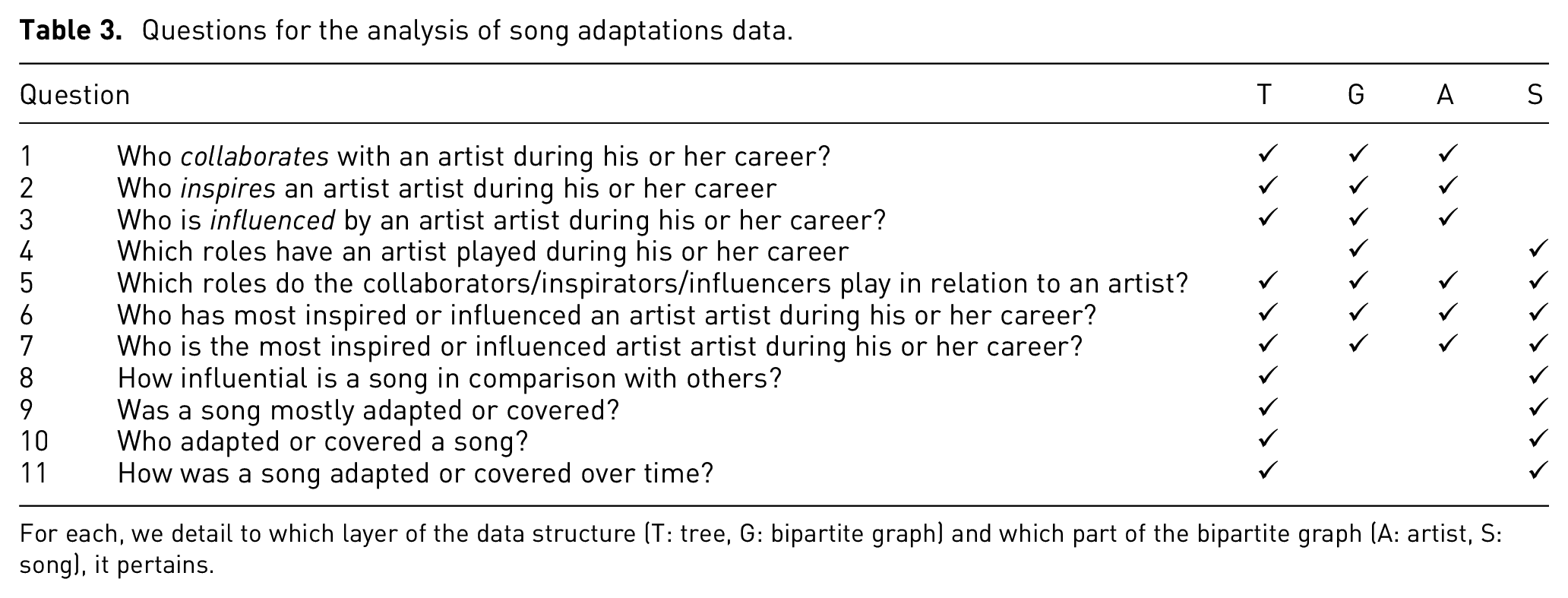
For each, we detail to which layer of the data structure (T: tree, G: bipartite graph) and which part of the bipartite graph (A: artist, S: song), it pertains.
Questions Q1 through Q3 seek to explore all relationships between artists – collaboration and inspiration relationships – from an artist’s perspective. Question Q4 and Q5 explore the roles played in these different relationships – author, composer, and/or interpreter. Question Q6 seeks to locate the most inspired or influenced artists for a given artist. Q7 compares all artists to find the most influential or inspired. Question Q8 through Q11 focuses on single songs. While Q8 seeks to find the more influential songs, Q9, Q10, and Q11 seek to describe the influence of a song. Q9 describes the type of influence – adaptation or cover. Q10 highlights the artist who produced said adaptations or covers. Q11 characterizes the influence of the song over time.
Task abstraction
Task abstraction is a key step in the design process to detach the use cases from the domain-specific language.8,11 In the following paragraphs, abstract tasks are written in italics.
Starting with a known artist, the users should be able to explore, discover, and enjoy the sometimes surprising relationships that exist with other artists. Specifically, they must browse the distribution of his songs, inspirations, and influences over time – essentially following an artist’s career through their production and influences in a sequential manner. Using the adaptations tree’s topology, the users can precisely trace back the origin of a song or explore its influence over time. They should also be able to locate the outliers (the most influential songs, the oldest ones, etc.). They should also identify the roles played for each song.
The user not only wants to summarize an artist’s relationships over time, but also wants to compare them with other artists, for example, by determining whether one artist is more influential than another. This comparison is made possible by the appearance of features and trends in the data.
Related work
The dataset is a combination of a bipartite graph and trees (Figure 1). The dataset can also be seen as a multivariate graph between artists (Figure 2). Since the tasks identified are primarily concerned with exploring relationships of all types between artists, work related to multivariate graphs is more relevant than work related to bipartite graphs. As shown in Section “Design Process and Task Abstraction,” the temporal aspect of the data is crucial in answering some questions. As a result, our literature review focuses on multivariate graphs, trees, and timelines. We also reviewed academic publications visualizations, which have many features similar to our dataset: a bipartite graph composed of authors and publications, coupled with numerous citation trees.
Multivariate graph visualization
Multivariate graph visualizations can be divided into two main types of layouts: node-link layouts and adjacency matrices. 7
The node-link layouts allow an efficient topological exploration. 7 To visualize and explore relationships between artists, Miller et al. 12 proposed Linked Jazz. It uses a force-directed node-link layout, where each node represents an artist, and each edge a relationship between two artists. The layout allows a good level of exploration, but links between artists aren’t categorized by relationship type or role. This makes it difficult to understand the artist’s sphere of influence and collaboration. To better communicate the nature of relationships, some visualization tools encode attributes directly on the edges or the nodes.13–15 This is well suited when there are few attributes and the topology must stay readable. Otherwise, it is also possible to encode data on nodes via their position, either by positioning them in sets,16,17 or by positioning nodes on the x/y axis.18,19 This is well suited when the attributes are more important than the topology.
Adjacency matrices are generally not well suited for large and sparse graphs like ours. 20 While they are powerful visualization tools to locate outliers and features in a dataset when attributes are ordinal, they are not suitable for exploring specific nodes.21–23
While a multivariate graph visualization could be effective at representing artists and their relationships, it would not show individual songs and their adaptation trees, which is required to answer many questions from Table 3. In a nutshell, multivariate graph layouts on their own are not sufficient for our specific use case. Integrating a second visualization technique to make up for their weaknesses can greatly enhance the range of possible tasks. Such a combination can be seen for instance in MizBee by Meyer et al., 24 which uses a radial graph visualization to compare two genomes, combined with aggregated chromosome and block views to highlight specific features. Also dealing with genetic data, Seo and Shneiderman 25 developed a tool combining node-link and matrix layouts to effectively bring to light genetic patterns. As our dataset combines two structures, combining complementary visualization methods is thus an interesting way to increase the number of possible tasks.
Tree visualization
Tree visualization layouts can be divided into two categories: explicit – via node-links – and implicit – via a treemap-like layout. 26 Node-links are generally more understandable for non-expert users, 27 but quickly consume more screen space. Conversely, treemaps can represent a greater density of data, but are less suitable for topological tasks. 28 Yet, some techniques, such as Cushion Treemaps 29 and Squarified Treemap, 30 allow for better visualization of the tree structure.
Our music dataset contains thousands of relatively small trees, each containing an average of 10 elements. As the trees are simple and the visualization is mainly addressed to laypersons, the node-link representation is the most relevant for a single tree.
For the representation of multiple trees, the literature proposes a few different techniques. Separate trees can be visualized via small multiples. 31 From this layout, associated nodes are visually linked via an edge.32–34 While this technique allows direct relations to be traced between nodes, it does not scale well. To overcome this weakness, nodes can also be colored.35,36 This technique is better suited to give an overview of the relations between trees. Alternatively, node-links can also be fused to provide a natural model for hierarchical structures. 37 This method works best with a few structurally similar trees. To overcome the weaknesses of the techniques mentioned above, some works propose 3D visualization methods. By positioning the trees on parallel planes, and linking them either with edges or color, it is possible to visualize the trees in small multiples or by overlapping them with a 90° camera rotation.38,39 These techniques do not guarantee that the equivalent nodes will overlap, which is necessary to ensure readability. 27
Timeline visualization
A timeline representation can be linear, radial, spiral, or irregularly shaped. 40 Among these, the linear representation is the most adapted to support the positioning of items chronologically following a sequence. Radial and spiral representations are more suited for periodic time visualization where a full rotation could represent a year or a month.
Attempts at representing graphs on timelines have already been made. EdgeMaps is a tool to explore the relationships of influence between entities. 19 It was used to represent influential relationships between philosophers. They are arranged on a timeline, and an interaction reveals directed and weighted edges from/to other entities. While this model shows the overall influences between philosophers, it doesn’t show the publications through which this influence was calculated in the first place.
Academic publication visualizations
Publication and citation network datasets share several similarities with the BAnQ dataset. They are composed of a bipartite graph with publications and authors instead of songs and artists. Publications are part of citation trees, just as songs are part of adaptation trees. The notable differences are 1) the lack of distinct roles for publication authors and 2) the average depth and size of the citation trees, which are much greater. This section presents past works related to the visualization of academic publications, and how they manage to facilitate exploration tasks. We organize them into three categories: works that have strong focus on 1) publications, 2) authors, and works that are 3) general tools targeting multivariate graphs yet applied in the context of publication visualization.
Publications
Matejka et al. 42 developed Citeology, an interactive tool specifically focusing on the publications themselves and arranging them on a horizontal timeline. For each reference, an edge is drawn from the source to the target publication. An interaction on a specific publication highlights its associated edges. Many works have been carried out for the representation of citation networks over time using similar semantics.43–46 They allow many exploratory and topological tasks in citation trees. However, as they are publication-oriented, they are not tailored for collaboration and influence network analysis between authors.
CitNetExplorer by van Eck and Waltman 47 proposes a similar node-link layout. Nodes representing publications are instead arranged on a vertical timeline and colored according to a categorical attribute, such as academic institution or scientific field. The name of the main author is written on the nodes. This method displays the evolution of authors’ publications over time, and is efficient at analyzing their influences and collaborations. Although the tool shows authors, the use of the labels alone makes it difficult to locate and quantify relationships around a single author. Some works44,45 instead divide the authors in separated rows on the timeline. While these layouts are more readable, they do not scale well for large networks of authors.
General graph visualization tools like Gephi and GraphViz can efficiently represent citation networks on forced-directed node-link layouts. These layouts can easily display the topology between publications, but does not scale well for large networks. Adding zoom and filters capacities can however greatly increase the readability and usability of this layout. 48 By encoding the publication year with color, node-links layouts can also display the evolution of citation networks over time. 49 By instead encoding the publication authors with color, it is also possible to explore the relationships between authors for a subset of publications. 45
To allow deeper graph exploration, Zhao et al. 50 proposed PivotSlice. It allows an expert user to subdivide an entire dataset into several meaningful sets with flexible filtering and ordering capabilities. It can effectively display relationships for a subset of authors, but does not scale well for larger networks.
Authors
General graph visualization tools can also be used to efficiently represent co-citation network around authors.45,51,52 While these layouts are effective for topological tasks, they do not scale well for large networks and can only represent few nodes and links attributes. Elmqvist and Tsigas 53 proposed the use of the Growing Polygons technique to better represent hierarchies of articles with long citation chains. It performs well for the analysis of influences between publications and detection of collaborations and influence between authors. However, the amount of concurrent authors that can be shown on a same visualization while staying readable is also limited.
Huang and Huang proposed the InterRing Visualizer 54 to display the co-citation network around one specific author over time. It uses a radial timeline, where each concentric circle represents a year. The tool is effective at showing the evolution of relationships over time, but is limited to one type of relationship and requires an interaction to analyze the related publications.
General tools
Other tools, not limited to the analysis of citations, are well suited to better represent more metadata. Dörk et al. 55 proposed PivotPaths, an interface representing up to three facets of a complex dataset (e.g. authors, publications, keywords, categories) at the same time by agglomerating nodes from a graph into adjacent sections. A user study revealed it was a pertinent tool for exploration and focus tasks. However, it cannot display the codependent relationships between entities (e.g. influence relationships between authors). Nobre et al. 56 proposed Juniper, a tool combining a tree and table view to efficiently visualize several node and edge attributes on very large and complex graphs. A user study with a publication dataset revealed that this model is well suited for focused tasks on relationships between authors and their publications. However, with its great flexibility also comes a greater learning curve, which may not be adapted to our target audience. Moreover, the complexity of influence and collaboration relationships in music, which are necessarily characterized by one or more roles, cannot be effectively represented by Juniper’s two dimensional table.
MuzLink
Based on the target users, the identified tasks, and the literature review, we conducted an iterative conceptualization process to design the proposed MuzLink tool. We present it in this section, and motivate each aspect of its design.
Entry point
One of the first design choices was to determine the entry point of the visualization. The questions in Table 3 either focus on a single artist
A multi-part visualization
To efficiently answer all 11 questions from Table 3, the visualization was divided in five views: the Connected Beeswarm Timelines (Figure 3, ①), the Artist Lists (Figure 3, ②), the Detail Sheet (Figure 3, ③) and the Artist Overview (Figure 3, ④), and possible Edge Cases View (Figure 3, ⑤). The Connected Timelines mainly serves as a topological visualization of songs’ relationships. The Artist Lists serve as an aggregation representation of related artists. The Detail Sheet shows detailed metadata regarding a selected song in the Connected Timelines. The Artist Overview gives a summary of the type of productions and the sphere of influence of the artist. The Edge Cases notifies about any peculiar situation with the ongoing artist, such as self adaptations.
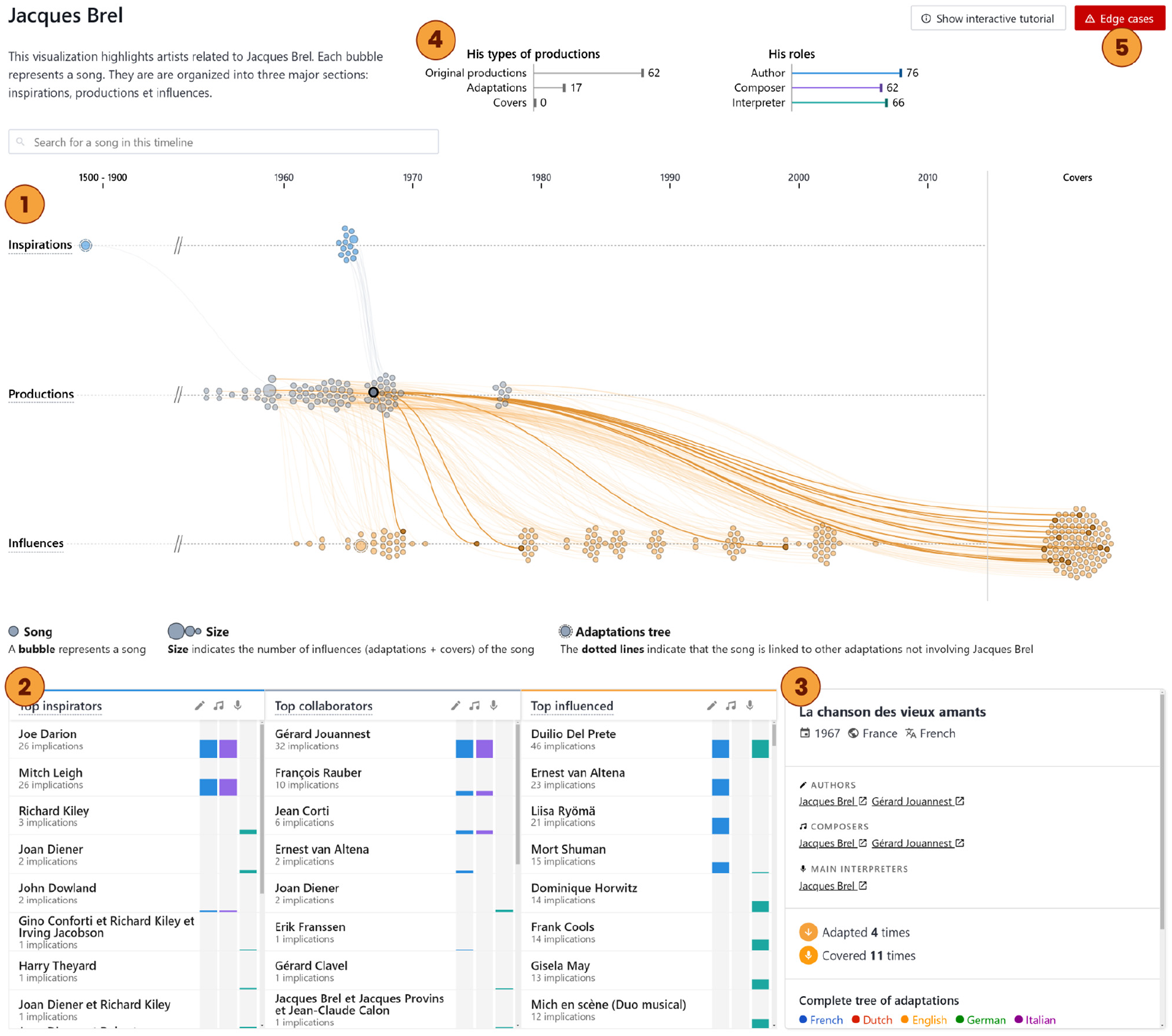
Overview of the proposed tool: MuzLink is an artist-centered interactive visualization tool that allows non-expert users to explore musical song adaptations, and relationships between artists involved in these adaptations. Here, the user is exploring French singer Jacques Brel. The tool is divided into four linked interactive views. First, the Connected Timelines ① based on beeswarm plots: the middle one gathers Jacques Brel’s songs, the top one gathers all songs that inspired him and the bottom one gathers all songs that were inspired by him. In a similar fashion, the Artist Lists ② show artists who inspired, collaborated with, or were influenced by Jacques Brel. Hovering a song – in this case “La chanson des vieux amants”– shows the song adaptation tree it belongs to. Clicking on it also reveals its Detail Sheet ③. The Artist Overview ④ summarizes Jacques Brel’s production. Edge cases are highlighted at the top right corner ⑤.
Connected beeswarm timelines
To allow deeper explorations, showing each item – songs and artists – on an atomic level is an important consideration. As shown by Anscombe’s quartet,
41
especially for large and complex datasets, a summary hides the true data structure, resulting in information loss. After filtering songs related to a given artist
In other words, for the central view (Figure 3, ①), we only consider songs in which
For each kind of song above (inspirations, productions, influences), we build an associated timeline (see Figure 4). This attribute-driven grouping allows to quickly reflect the relationship nature between songs. 7 For each timeline, songs are horizontally positioned by their release year. This linear and chronological layout was chosen to better read items in a sequential order. 40 Spatially encoding the time variable allows efficient queries about properties of the distribution of songs over time. This target is implicit in most of the identified user questions in Table 3. When large swaths of the timeline are empty, they are cut to maximize screen utilization. 40 In order to preserve visibility of the songs while maximizing screen space usage, overlapping is avoided using a force algorithm implementing a velocity Verlet 57 numerical integrator. We used d3.js’s simplifed implementation by Mike Bostock (https://github.com/d3/d3-force) in which each node has the same mass, therefore an equivalent acceleration, which is used to calculate the position over time. These beeswarm timelines also enable the intuitive visualization of the song distributions over time, while still allowing to see and interact with individual song items.
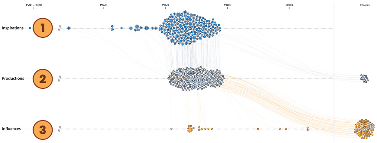
Connected timelines for artist Claude François: inspirations ①, productions ②, and influences ③.
Since each node is part of a tree, all associated edges are added on top to effectively create connected timelines. All edges are drawn with a low opacity and a small Bézier curve to reduce the visual clutter. The node-link tree visualization is chosen for its expressive representation better suited for network topology and connectivity tasks. 58 The beeswarm layout prevent edges from completely overlapping. The accumulation of edges provides rich visual cues regarding the trend and distribution of the relationships, while still allowing users to explore individual trees with an interaction.
As stated earlier, since we limit the set of songs to adjacent inspirations and influences, some adaptation trees are not fully visible in this connected timelines view. To mitigate this aspect, we introduce two additional encoding on the song marks. First, each song encodes its popularity level in terms of adaptations – that is the sum of its adaptations and covers – using the area visual channel. Besides, to indicate if some edges of a song are not visible (geodesic distance to
The extreme right region of the connected timelines’ view is devoted to songs whose release date is not available and thus cannot be positioned on the associated timeline. In the BAnQ dataset, only covers are concerned with this missing piece of data, therefore the more intuitive “Covers” label. With other datasets, this region could be used for any N/A year songs, using for instance a stripped face encoding to distinguish covers from adaptations.
It may happen that a song should theoretically belong to multiple timelines. For example, it happens if: (1) artist
Artist lists
While the connected timelines view presents the relationships between the
Unlike the timelines, the lists are aligned horizontally. While a timeline naturally reads from left to right in the west, a list naturally reads from top to bottom. Each artist in the list is represented as a table row with the following data:
His
His
The
An artist can belong to many lists at the same time. For each list, the artists are ranked in order of involvement, from the most involved to the least involved. This way, it is easier to scan which artists are the most significant for each category. With the small role filters at the top of each list (Figure 5, ①) it is possible to rank and filter by a specific role (author, composer, or interpreter).
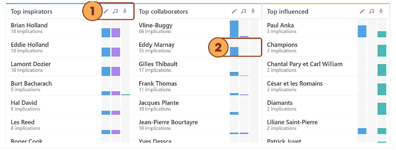
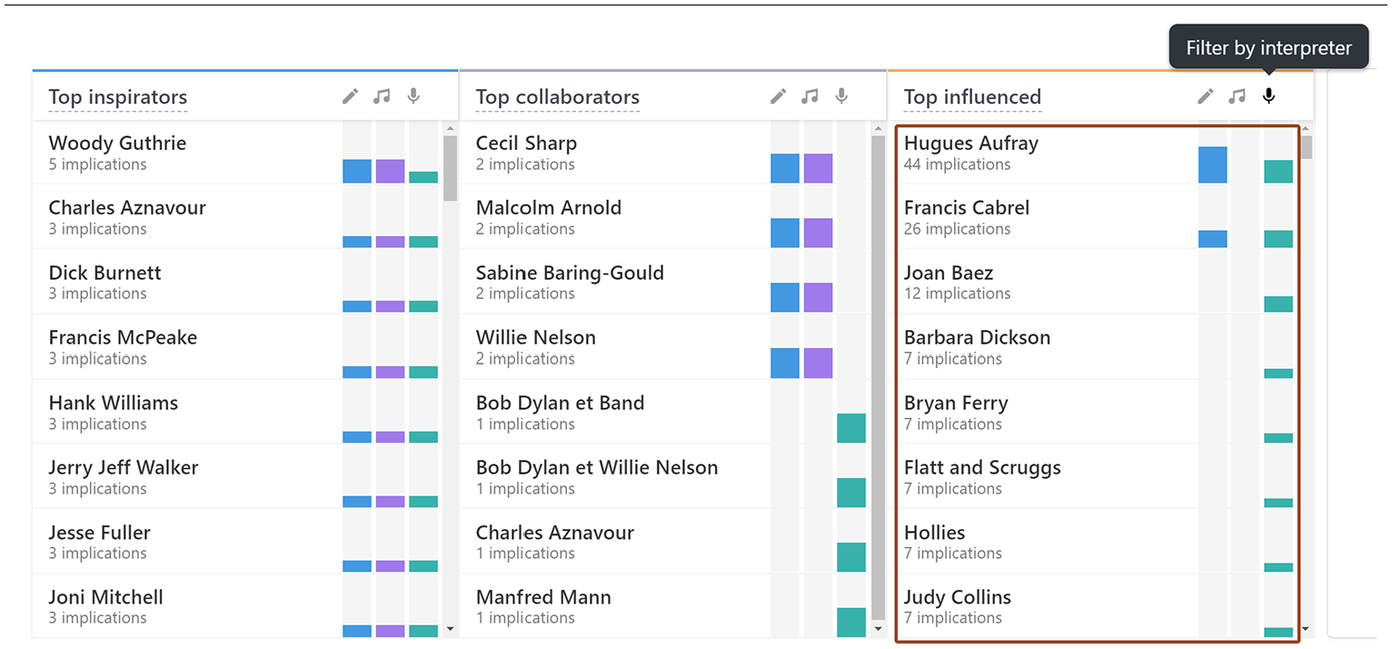
Artist Lists are divided into three columns where each column contains related artists ordered by the number of relations. The first column lists the top inspirators, the second lists the top collaborators, and the last lists the top influenced. Users can filter the lists by roles ①. Each artist on the list has a small bar chart showing the role distribution ②.
Detail sheet
Selecting a song on a timeline brings up its Detail Sheet on the bottom right corner (Figure 6). This sheet displays all the song’s metadata: name, release year, origin country, lyric language, authors, composers, interprets, and source song. Additional stats regarding its sphere of influence are shown: the number of adaptations and the number of covers. At the bottom, the full adaptation tree in which the selected song is part of is displayed. This full tree offers additional insights compared to the timeline tree:
The timeline only displays a maximum of three levels per tree: one level above and one level below the artist’s productions. The full tree allows users to explore hidden levels for a specific tree. This is particularly useful to find the distant root source of the song. Conversely, it may be used to find the distant adaptations of a song.
Each node part of the tree uses the color channel to encode the language of the lyrics. This provides insights regarding the direction of inspiration flows between languages.
While timelines effectively represent inspiration flow patterns over time, their layout is less suited for the topological reading of a single tree. The full tree provides a hierarchical view that is easier to read and follow, especially when the number of nodes is large.
The Detail Sheet shows more details about the selected song: the release year, the country, the language, the artists and their roles, the source song, the number of adaptations, the number of and covers, and the full adaptation tree. If the tree is too large, the section becomes scrollable.
Artist overview
At the top is a general overview of the artist’s productions (Figures 3, ④, and 7). The first chart shows the sums of the different types of production: original songs, adaptations, and covers. The second chart shows the sums of the roles assumed for all his productions: author, composer, and interpreter. The bar chart visualization allows efficient comparison between different values. 8 Therefore, this representation makes it possible to accurately compare artists with each other.
Edge cases
Peculiar situations with an ongoing artist, called “Edge cases,” are highlighted in the top right corner (Figure 8). There are three types of edge cases:
A song may appear two times, both on the inspirations timeline, and the influences timeline. This situation arises when the song is both an inspiration and an influence for the artist (Figure 8, ①).
A artist may be involved in both the original song and the adaptation. In this case, the two linked songs will appear on the productions timeline (Figure 8, ②).
A artist may be influenced by two different songs from the same adaptation tree. In this case, the two linked songs will appear on the inspirations timeline (Figure 8, ③).
When at least one edge case is found, the edge case view appears in the top right corner. Users may interact with it to reveal them. A small sentence is automatically generated for each edge case using the name of the song and the artist involved.
The Artist Overview shows the types of production artists made and the roles they bore over their career.
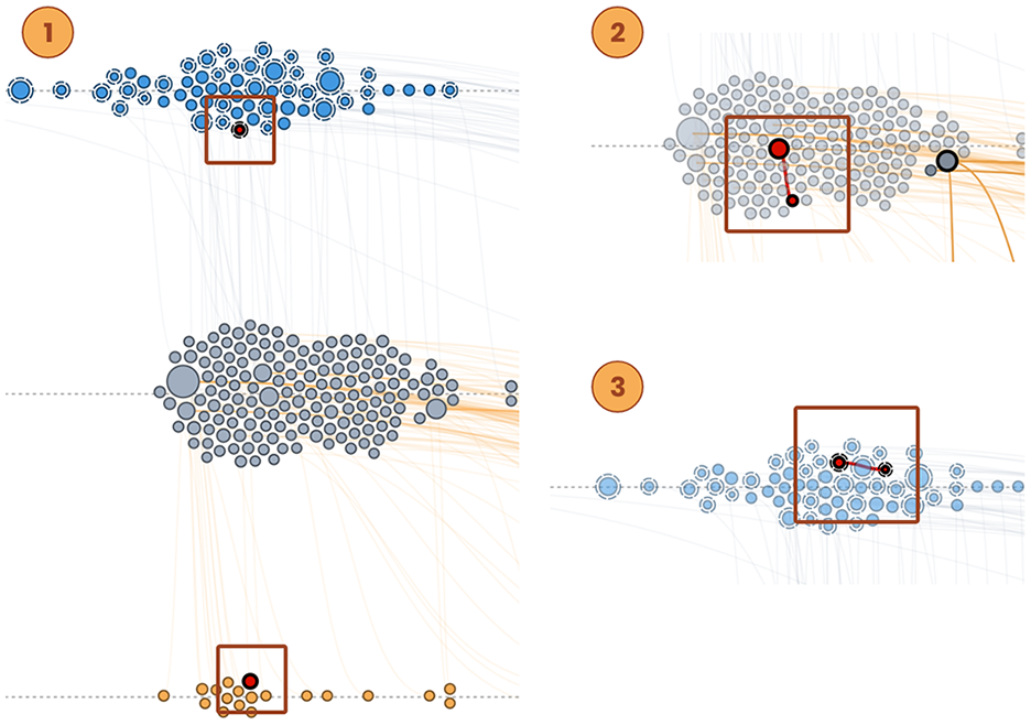
Three types of edge cases that can be observed in the connected timelines. The edge cases view helps clarify these peculiar situations to users.
Interactions
Being a multi-part visualization, adding interactions to MuzLink was primordial to take advantage of all views and effectively link them.
Interactivity across views
The Connected Timelines and the Artist Lists are the primary views of the tool. While they are spatially close and semantically related through the use of the same three dimensions (inspirations, collaborations, and influences), interactions are paramount to conceptually link them and facilitate the transition from one view to another.
When the user hovers an artist from an artist list, all songs in which the artist was involved are highlighted on the corresponding connected timeline. Likewise, hovering a specific chart band from an artist list only highlights the songs in which the artist was involved for the hovered role. This interaction reinforces the relationship between the two views by making it possible to locate an artist’s production from the artist lists to the connected timelines.
Song context and metadata
As songs are the basic unit of visualization, it is essential to highlight their characteristics and metadata. Hovering a song on a timeline highlights the nodes and edges from the tree it is part of, revealing its context in relation to the artist and through time. Highlighting the edges a single tree make them precisely visible, compared to having low opacity when not hovered. This kind of filtering interaction, showing a limited part of the trees (actually, one single tree), along with the temporal x-axis organization, reminds the Semantic Substrate approach of Shneiderman. 16 However, an important difference is that we use beeswarm plots (vertical packing), instead of an experimental vertical jittering to reduce edge crossings in Semantic Substrate. In our context, beeswarm plots is more adapted since they allow for instance to much better estimate the temporal distributions of songs.
Hovering also reveals a tooltip, explicitly showing some song’s metadata: its title, release year, production type (original song, adaptation, or cover), and original artists listed by roles. A click on a song locks the tree highlight and opens the Detail Sheet. This main goal of this tree-lock interaction is to facilitate the navigation in an adaptation tree, by allowing the user to move from one song to another in the selected tree without loosing the track of it in the meantime. Hovering a song on the full tree highlights the same song on the Connected Timelines view, and hovering a song on the Connected Timelines view also highlights the same song on the full tree. This bidirectional interactivity helps conceptually and semantically connecting the two views while facilitating the transition from one view to another.
Search bars
The large quantities of items on the timelines sometimes make it difficult to find a specific song. A search bar above the Connected Timelines’ view allows to quickly find a song by its title. A song selected from the search bar is highlighted on the Connected Timelines view and its associated Detail Sheet appears at the bottom, quickly providing its full context and metadata. Another general search bar, is also located in the upper right corner, allowing to search artists and songs in the whole BAnQ dataset.
Navigation and discoverability
The visualization was designed to facilitate the discovery of relationships between artists. Therefore, it allows a fluid and natural navigation between the different views by artist. Users may navigate to another artist’s view by clicking on an Artist Lists’ item or an artist from the song’s Detail Sheet. Alternatively, users may search a specific artist (or song) on the previously mentioned general search bar at the upper right corner.
Onboarding
Since the dataset structure is complex and the interface rather original for a layperson, we designed an onboarding strategy which supports users in learning how to use and read a new interactive visualization. 59 MuzLink’s onboarding consists of an internal – in the visualization tool itself – guided tour, integrated for the first use. The tour goes through all parts of the tool in a logical sequence, basically following a storytelling approach. This technique is an effective method for imparting knowledge. 60 Visitors can revisit the guided tour as many times as they wish.
Implementation
We propose a web-based version of MuzLink using HTML, CSS, and JavaScript. It leverages the D3.js library to build all SVG visualizations and the vue.js framework for interactions. A demo is publicly available here: https://muzlink.witify.io. Although the tool is fully functional, it is important to note that it has been optimized for 1080p screens and the Chrome browser. The tool communicates directly with BAnQ’s server. It is therefore always in sync with the latest data.
User study
To evaluate the effectiveness of MuzLink, we conducted a formal user study, presented in this section, and two case studies (see following section “Case Studies”). For the user study, we designed an experiment which we detail hereafter, that introduces the participant to MuzLink and assigns tasks to be solved with the tool.
Experiment overview
The experiment, conducted in a physical room, is a fully automated quiz. Participants present themselves in the room and answer the quiz on a computer on their own. To minimize the influence on participant responses, members of the research team can only answer questions related to technical issues or questions regarding the organization and structure of the experiment. We did so in order to get closer to a context similar to a user visiting the BAnQ website on its own at home, or in situ at BAnQ general library for instance.
We recruited 18 participants – 9 men and 9 women – between the ages of 24 and 74 with no particular skills or education. Of these, 10 went to university. The others have college degrees. Participants are not familiar with the dataset and never used MuzLink before the experiment.
The objective of the experiment is to evaluate MuzLink’s performance in answering all questions form Table 3. It is divided in four main phases:
Tasks used during the controlled user study.
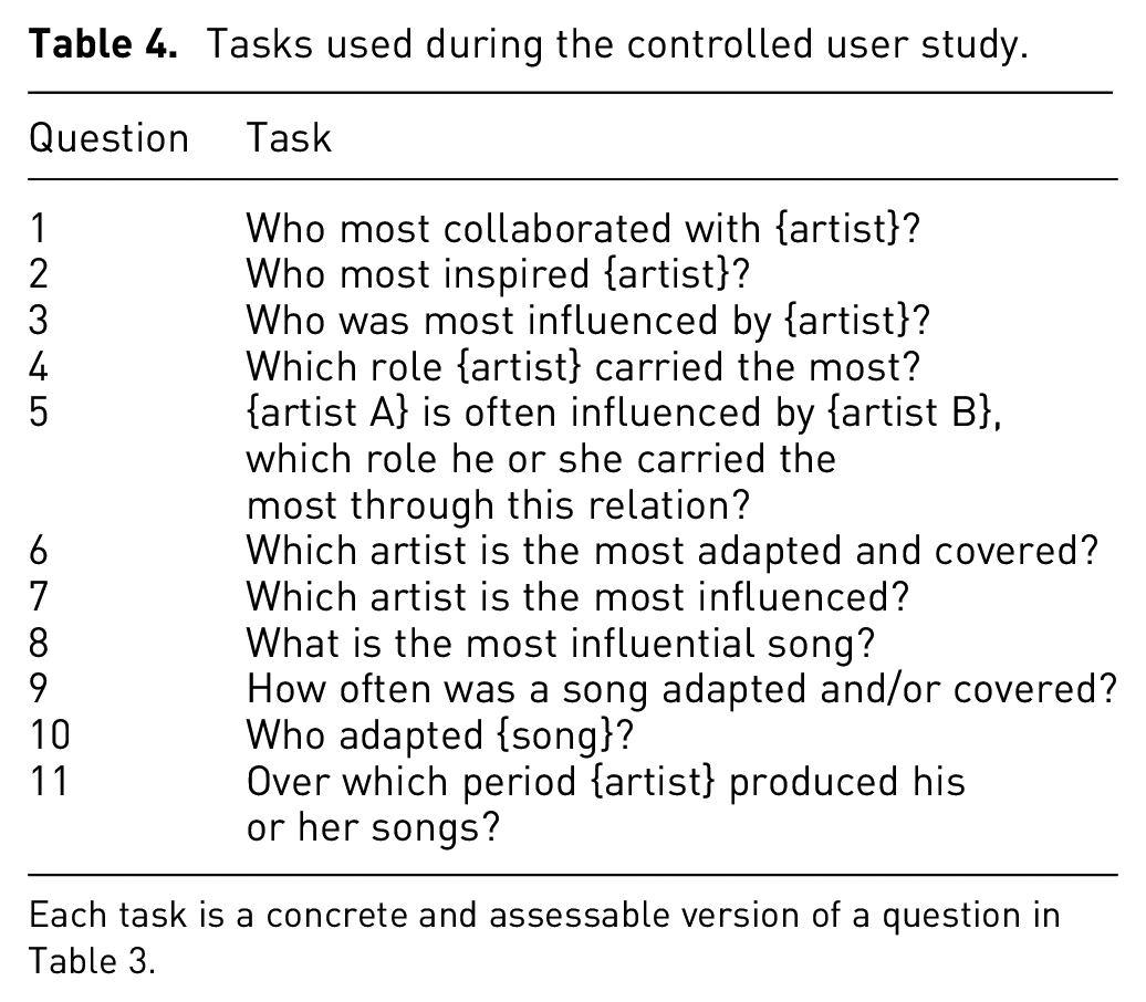
Each task is a concrete and assessable version of a question in Table 3.
Results
Task completion quality
The quiz is divided into 11 concrete and assessable tasks derived from the 11 questions in Table 3. To reflect actual usage as closely as possible, the quiz uses BAnQ’s dataset. To ensure a direct evaluation of the tool, rather than the knowledge of a particular artist, each task concerns a different artist. We have chosen those specific artists for each task so that there is only one possible valid answer. The participant is unable to select a new artist while completing a task.
Figure 9 shows the verdicts of the participants’ answers. Figure 10 shows the average time required to complete each task. All tasks were successfully completed by the majority with an average response time of about 10.1 s.
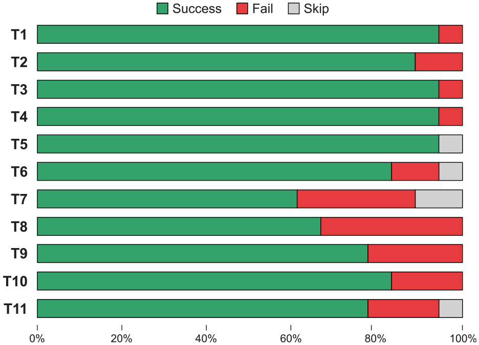
Score for each task during the experiment. Successful tasks are in green, failed tasks in red, and skipped tasks in gray.
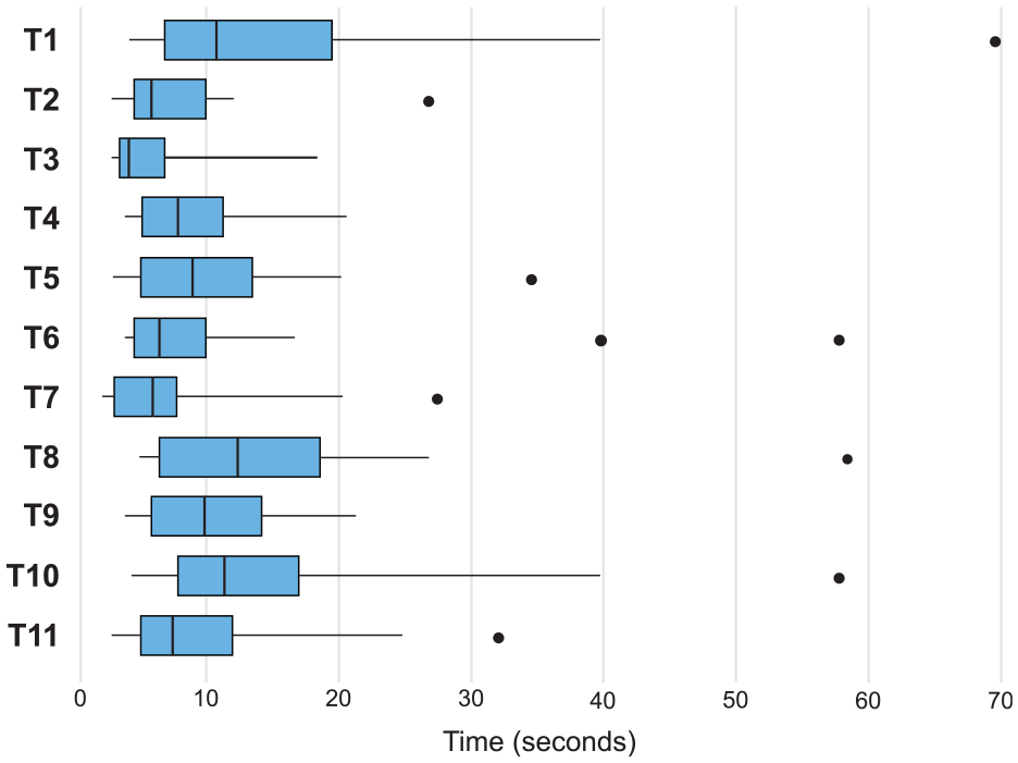
Distribution of the time it took for participants to complete each task during the experiment. Outliers are shown as dots.
Tasks 1, 8, and 10 took the longest time to complete. We believe it’s natural that the first task takes the longest since the participant must first become familiar with the tool. Task 8 requires comparing areas, which is more difficult. 8 It also explains why this task is one of the most incorrectly answered. Furthermore, out of the 18 participants, 4 selected one of the adaptations of the most influential song, rather than the most influential song itself. Therefore, we believe part of the lower score for this question is due to a bad understanding of the glossary we introduced through our tool. An interactive onboarding process may better communicate this vocabulary than the current passive guided tour. Moreover, visual cues to help differentiate inspirations and influences, such as icons and color, could be added to the labels and tooltips. Task 10 took longer since it required several steps: search a song with the search bar, select it, find its adaptions, and their respective artists. Despite its greater completion time, it remains very successful.
The Task 7 had the highest failure rate, which is surprising since it’s the exact reverse of Task 6. Task 6 asks for the most adapted and covered artist, while Task 7 asks for the most influenced artist. An analysis of the responses revealed that five participants chose the most adapted and covered artist on both tasks. Since the format of the question was exactly the same, we believe that some participants might not have noticed that the question had changed between Task 6 and Task 7. This problem could have been avoided by highlighting the difference between the questions with two different colors. Rather than asking them in sequence, it would also have been appropriate to distance them in the questionnaire to avoid confusion.
Level of engagement
During the Exploration phase, participants were free to explore the dataset using our tool. Real-time logs generated throughout this phase include artist and song click, artist and song searches, artist and song mouseovers, and role filter clicks. These logs were generated from the quiz web interface client and sent in real time to a database. On average, participants visited 2.8 artists, including 0.8 via the search bar. Since the exploration period took 8 min the participants thus visited each artist for a little less than 3 min on average. Participants took the time to visit each artist in detail. They hovered 37.8 artists on the lists, 81.3 songs on the timelines, clicked on 6.8 songs, and used the role filters about seven times. We believe these logs indicate that the tool induces a good level of exploration and interactivity.
Quantitative and qualitative feedback
Following the Exploration phase, participants were asked if they discovered any new information. Of the 18 participants, 16 claimed to have learned new information as a result of their exploration. More specifically, many mention having discovered new unsuspected relationships between artists. Others claim to have learned the origin of several songs.
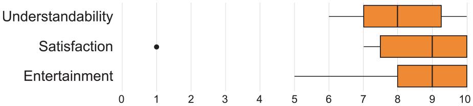
We then asked participants to give quantitative and qualitative feedback on three different aspects: understandability, satisfaction, and entertainment. Understandability measures the ease at which the participant understood the tool. Satisfaction measures the perceived level of appreciation for the tool’s ability to answer questions. Entertainment measures the level of enjoyment using the tool. Each participant gave a score on a 1–10 Likert scale, where 1 represents disagreement and 10 represents agreement. They also added a comment to justify their score. Figure 11 shows score distributions for each aspect. Overall, the scores are favorable in every aspect.
Quantitative feedback score distribution for each aspect. Outliers are shown as dots.
For the understandability aspect, the vast majority of participants say that the tool is easy to understand and easy to use. Six participants pointed out that the unusual layout requires a little time to adapt, but once familiar, it becomes easy to read. Some participants were concerned not to manage to untangle the links between the timelines, but they quickly realized that the interactions were enough to answer the questions.
For the satisfaction aspect, the majority of the negative comments underline the incompleteness of the dataset rather than the visualization itself – which is a good sign in our case. The tool successfully propelled the discovery among the participants, who quickly understood the limitations of the dataset. Five participants underline that the tool is effective in discovering new relationships, the information is clear and quick to access.
For the entertainment aspect, eight participants mention being pleasantly surprised by their discoveries. The tool was effective in quickly identifying relationships between artists. Eight participants appreciated the colorful graphic aspect and the smooth transitions, which compelled them to explore. Three participants do not consider the tool enjoyable, mentioning that the visualization is very technical and not suitable for the entertainment of average people.
General comments at the end of the experiment are generally positive. Seven participants underline their enthusiasm for the tool and are excited to see the project evolve. Two participants add that it would be relevant to include filters, pointing out that it is sometimes difficult to navigate through the adaptation trees. This navigation aspect will be addressed in the discussion.
User study limitations
As any visualization based tool, MuzLink requires a learning curve, notably because of the newly introduced glossary. The participants in our user study had little time to familiarize themselves with MuzLink during the tutorial phase, prior doing the tasks. Besides, as described in the beginning of the “User Study” section, they were only allowed to ask questions related to technical issues or the experiment organization. We followed that guideline because we wanted to first evaluate MuzLink as close as possible as in the context of an online tool offered by BAnQ to their website visitors. So the participant’s understanding of the tool relied on the onboarding tutorial we designed, and his/her subsequent experience during the task phase.
The user study has a large number of questions, some of them sometimes seeming similar (T1–T3, T6, T7). Participants may get demotivated or tired during the experience. Moreover, due to the learning curve, the first question seemed to take longer to answer. This might stress, as discussed in last paragraph, that the onboarding guide is not yet optimal. Since the questions are quite independent and unstructured, no assimilation or contrast effects should occur. We therefore did not feel the need to randomize the questions. However, in a future user study gathering more participants, this strategy could help reduce the learning curve bias that might be seen in the response times.
Case studies
This section present two case studies that took place during October and November 2020. The first one, outlined below, was conducted with two librarians from BAnQ, who did not participated in the design process underlying the development of MuzLink. The second case study was conducted with a college history teacher. He is a music enthusiast yet non-expert in this field.
When we contacted these users, we told them about the BAnQ dataset, and the fact that we developed a visualization tool that enables its exploration. We then asked them if they would have an interest in using this tool to fulfill a goal of their own they would have to define. We then met the participants by video-conference and introduced MuzLink to them in a 20 min session. During that interactive session, we presented them the tool and onboarded them to the different views and interactions. Then we gave them 2 weeks to use MuzLink in order to fulfill their goal, and asked them to get back to us when they finished. We then had a second meeting, in the form of an open interview, where they told us about their experience, discoveries, conclusions, and so on.
CS1: Exploring an artist’s adaptations over the world
This case study was conducted with two domain experts from BAnQ. They were mainly interested in the career and influence of a particular artist. The first user, UA, explored the Beatles, while the other, UB, explored the popular French singer Serge Gainsbourg. These librarians are familiar with the dataset. They have already explored it in raw spreadsheets, but have never seen it visualized. They had no prior experience with MuzLink and did not participate in its design process up until this case study.
Initially, users used the artist search bar in the header to search the artist of interest. Once they were on the artist’s visualization, the first thing they noticed is the distribution of inspirations and influences over time. The Beatles and Serge Gainsbourg are very influential artists, thus have many more inspirations than influences, both in terms of adaptations and covers Figure 12.
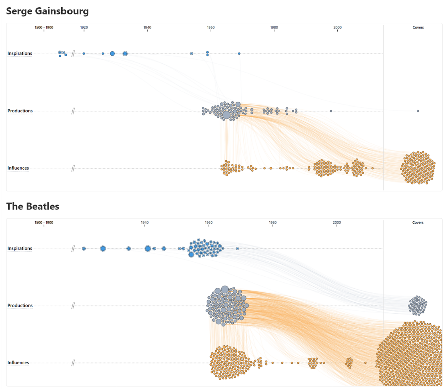
As shown by the large quantity of orange nodes, the Beatles and Serge Gainsbourg are very influential artists.
The librarians then explored the data in detail. At first, they explored the Top influenced artists in the artist lists. They hovered the artists, revealing all songs in which they were implicated on the timelines. This interaction drew the librarians’ attention to specific adaptations and covers Figure 13. They hovered these songs on the influence timeline, revealing the titles, the implicated artists, and the adaptation tree they are part of. These trees propelled them to the exploration of other related adaptations and covers. Both users frequently used YouTube on the side to listen to unknown adaptations they discovered during these iterative navigation steps in the dataset using MuzLink. To analyze songs in detail, they also clicked on them, revealing their Detail Sheet views, notably in order to see the country and language they were produced in. They also looked at the complete adaptation trees in the Detail view to display all adaptations colored by language. Users noticed that highly influential songs are often adapted in more than five languages. This view allowed UA to discover that Thierry Wolf adapted 17 songs from the Beatles in French. UB found that Serge Gainsbourg’s most popular song, Poupée de cire, poupée de son, was adapted 20 times in 15 languages, and covered 41 times. UB also discovered that Serge Gainsbourg got inspiration from very old melodies dated from the 19th century from Chopin and Dvorak Figure 14.
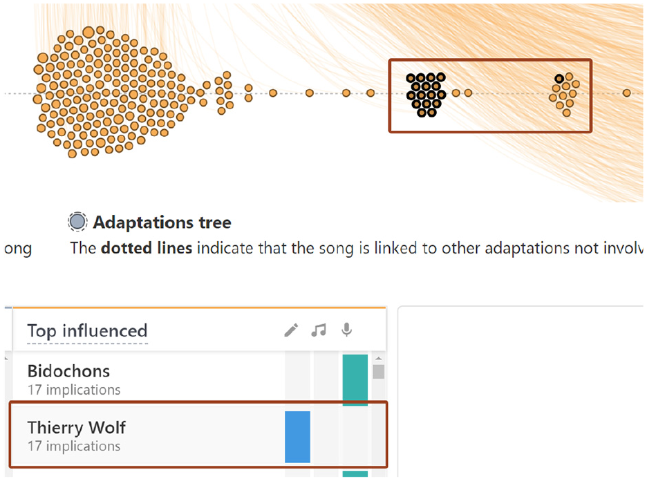
Hovering Thierry Wolf highlights the songs in which he was involved as an author.
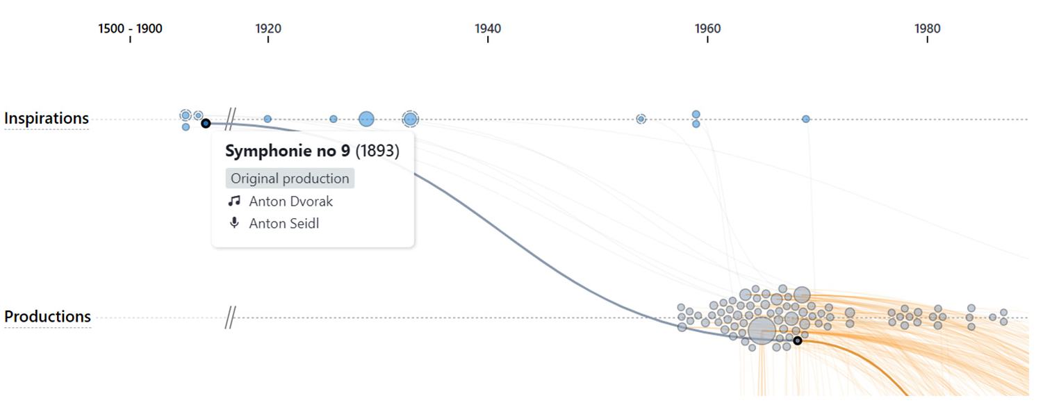
Serge Gainsbourg was influenced by old melodies, such as Dvorak’s 9th Symphony.
At the end of the exploration, they claimed to have better understood the influence of an artist through time. They learned what are the most influenced artists regarding the Beatles and Serge Gainsbourg, and also which of their songs are the most adapted and covered. Both users stressed that explorability potential of the tool is high and indicated for BAnQ visitors. However, they also stated that it could be a powerful analytical tool for their work at BAnQ with minor usability adjustments such as adding more filters on the timelines to allow a deeper inspection of the songs, and the possibility to see and export song lists for a specific artist in the Artist Lists. UA also mentioned that it was sometimes difficult to navigate the adaptation trees. Yet we observed that UA forgot about the tree-locking interaction, whose goal is indeed to facilitate this exploration. Another improvement they identified in order to improve the analysis potential would be to enable the user to fixate the highlight of songs in which an artist from the Artist Lists is implicated. Presently, these songs are temporarily highlighted by hovering an artist but as soon as it is not hoverered, the highlights are off. These improvements are addressed in the following section. Both users claimed the tool was easy to understand and use. They both had a lot of fun exploring the dataset, so they went several hours without noticing (4 h for UA and 2 h for UB).
CS2: Analyzing a musical period
This case study was conducted with a third user UC, who is a college history teacher. He is not a domain expert, but shows a keen interest in music. He is not familiar with the dataset and had never used MuzLink before. His goal was to learn more about the most influential artists involved in popular songs during the late 60s.
Initially, UC used the artist search bar to find popular artists he knows from the 60s. For each artist, he browsed the Artist Lists and recognized several influenced artists, confirming his knowledge. He also discovered numerous unknown inspirators and influenced artists. Hovering these artists helped him highlight the songs in which they are implicated on the timelines. He then analyzed some of these songs by hovering them, revealing the titles and implicated artists. Like UA and UB from CS1, he also frequently used YouTube to listen to unknown adaptations.
Using the role filters, he found the most influenced authors and the most influenced interpreters for many songs Figure 15. To further explore an inspirator or an influenced artist, he clicked on it in the Artist Lists to open a new MuzLink page for this artist. As an historian, he was also interested in the predominant themes of pop music during this period. The size of the disc on the timelines allowed him to quickly find the most influential songs. Clicking on the disk revealed the Detail Sheet with the complete adaptation tree. UC used it to explore in which language popular songs were adapted Figure 16.
By using the role filter, we can reveal the most influenced interpreters.
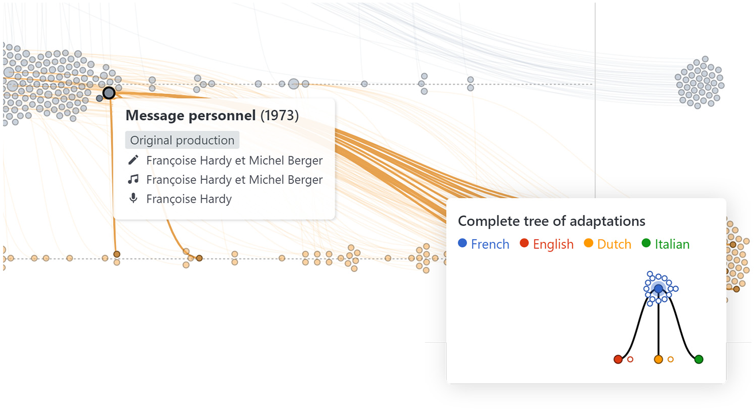
As shown on the complete tree of adaptations, “Message personnel” by Françoise Hardy was adapted and translated in three languages.
At the end of the exploration, UC said he has a better understanding of the influential artists from this period. Starting from his initial knowledge, UC mentioned:“I am really impressed by the discoveries I made, and besides, I had a lot of fun using the tool.” As a history teacher, he said it is would be a relevant tool to demonstrate the influence of one artist over another during his music history class. UC stated also it is a powerful tool to answer questions of who and what influences where and when. Although the user said he enjoyed a lot using the tool, he also declared it was not easy to fully understand at first, because of the complexity of the data. However, once he got used to it, it allowed him to have a deeper understanding of influential relationships between artists. In total he spent an hour using MuzLink, separated into two 30 min sessions. As UA in CS1, the user UC also occasionally forgot about the tree-locking interaction, resulting in sometimes a tree jittering effect when hovering sets of packed songs. Among the improvements he would like to see added to MuzLink, UC mentioned: “adding some historical events on the timelines could be relevant. Besides, some topics and themes can be popular during some periods of time, and less during others. That might be out of the actual scope but adding those kind of dimensions tackling the question of why some songs are popular in terms of adaptations would move the tool further.”
Discussion
In this section we sum up what can be discussed and learned from our overall design study, including the user study and the two case studies we conducted to evaluate MuzLink.
Takeaways
The user study shows that MuzLink makes it possible to answer the questions in Table 3 reliably and quickly. The majority of participants showed great interest in the tool and stated that they discovered new information. Feedback and log analysis indicate that the tool is fitted for musical exploration, and have a high discoverability potential. Overall, the users feedback was positive in terms of how well MuzLink can facilitate the exploration and analysis of musical adaptations and artist relationships. All three users from the case studies concluded that using the proposed tool let them achieve the goal they preliminary defined. It is also satisfying to see that for these three users, using the proposed tool helped them make numerous discoveries, and triggered the need and the pleasure to listen to the songs they discovered on Youtube. This stresses the potential for BAnQ to indeed leverage the borrowings in their music collections, for instance by including a “Put that song’s album in your borrowing cart” function in the Detail sheet.
A notable difference between the user study participants and the users from the case studies is how they were prepared and introduced to the tool. This confirms the importance of the onboarding to such tool, either autonomous and automated, or helped by a real person. Numerous design choices we made, have been set based on the fact that our target users are non experts. From the qualitative feedback we have, both from the user study and from the case studies, we believe that we achieved a rather good trade-off, since most of the users stressed the learning curve of MuzLink, yet acknowledging that after a few minutes using it, it allowed to achieve a deep understanding of the dataset complexity.
Among the trade-offs and lessons learned, the one dealing with the amount of graph information shown stands out. This issue is common to all approaches dealing with large graph and tree visualizations. During our design process, we regularly questioned the choice we made of showing only the adjacent song nodes to a given artist production (the Connected Timelines view). Our designer intuition indeed often balances between the “the more data density the better” and the “less is more” philosophies. We believe that depending on the most important tasks we want the user to achieve, an in-between may have the best of both worlds.
As discussed in the “Related Work” section, the context of citation networks in academic publication visualizations use dataset having several similarities with the one we used. Can some lessons be learned for this application? MuzLink has an artist-centred design, so one could wonder first if it could be easily adapted to author-centred publications visualizations. By replacing songs with publications, the proposed tool could fuel exploratory tasks on collaborations and influences relationships around a single researcher. The size of the discs could encode the number of citation of each publication. Color could be used to categorize publications by journal, topic, or institution. As citation trees often are deeper and wider than adaptation trees, additional timelines could be added to display additional levels, one level above the inspirations and one level below the influences. An common popular analysis task that is targeted with publication visualization is to understand and compare the influence between research domains in terms of knowledge flow, or on a different level, the influence and popularity of specific journals inside a research field. In MuzLink, we chose the artist dimension as being the one that structures the different timelines. However, since a domain or a journal could be also associated to each visual item (publications), one could totally switch to a domain-centred or a journal-centred connected timeline representation and thus tackle these tasks in the context of publication visualization. This would raise a scalability challenge since the number of publications in a research field, and also a journal, can be huge. Simpler and more practical square unit-based representations, or a two-level interactive aggregation representation could be explored toward that perspective.
Limitations and future work
Interactions
Two participants of the user study and the two users from CS1 wished they could have more filtering options on the songs such as based on the language, countries, and so on. For the user study participants, the underlying motivation is to help the user simplify the amount of information and ease the navigation which sometimes felt tedious. Regarding the CS1 users, it was more about an analytical potential improvement need (such as their wish to enable song list exportation). For the sake of simplicity, we did not fully take advantage of the color visual channel for song marks. Instead of using it to better distinguish the three kind of songs, we could use it to encode (and possibly let the user filter through an interactive legend) information such as languages of songs. On another aspect, two users from the case studies also missed the tree-locking interaction, resulting in increasing the difficulty to pursue adaptation trees exploration tasks on the timelines. Designing and proposing an interaction, which then is missed by the target user, is a common pitfall. These feedback show that a future work would be here to better onboard on that interaction.
Higher-order influence analysis
The conducted evaluations show that MuzLink help users understand the influence of an artist on others, in terms of song adaptations, and how this influence evolved throughout its career. The tree visualization (either directly on the timelines, or in the Detail view) also helps understand the influence of a song in terms of its adaptations. Yet, higher-order questions such as “How an artist’s popularity, in terms of adaptations, impacted the number of its adaptations over time?” are difficult to answer with the proposed approach. A future research avenue could be to derive some artist popularity metrics that could added to the network structure to enable the analysis of flows of influence, like the approach developed by Renoust et al. 61 for citation networks, using h-index as a scientist metric. More generally, the goal is to understand how the different layers of the graph are entangled. An interesting interaction to add in that perspective could be the leapfrog interaction proposed in Detangler that allows to explore higher-order edges by pivoting between artists and songs in dual directions. 62 Presently, only one pivoting direction is enabled: when a user hovers an artist in the bottom panel, it highlights all the songs he is involved in on the timelines. On a broader perspective, the UC user from the second case study also pointed out that MuzLink could be improved if it was combined with more data, such as historical events and songs’ topics. At the beginning of this design study, we indeed sought to collect the lyrics of all the songs in our dataset, for instance using web semantic and open data portals, in order to enable the use of NLP topic extraction techniques. Unfortunately, too many lyrics of old songs from our dataset could not be found online. But we agree with UC that it would be a great improvement.
Whole dataset entry point
For the exploration of large datasets such as ours, Schneiderman’s 63 mantra proposes an approach starting with a large overview, then leaving to the user the choice to zoom and filter and then analyze the details. In future work, adding a global view, summarizing all artists at the same time, could improve MuzLink’s entry point. As a kind of h-index summing up two perpendicular productivity measures for researchers, one could think of a two dimensional index for artists (number of both inspirational and influence relationships) that could be for instance used in a simple bubble chart gathering all artists. Yet, the integration and combination with the MuzLink view has to be carefully designed.
Conclusion
The inspirational, influential, and collaborative relationships between artists constitute a complex dataset, which can be described as a hybrid tree and graph structure, or as a specific kind of multivariate graph. We proposed an approach based on connected beeswarm timelines to explore evolving relationships between artists over time, through their process of adapting and covering songs. To support this objective, we conducted a controlled user study and two case studies to evaluate the strengths and weaknesses of the tool. Results show that MuzLink is an enjoyable tool, effective for performing many discovery tasks in an exploratory context. Although we applied MuzLink to a music dataset, we believe it could be adapted to other fields with similar datasets, such as film and scientific publications when the focus is on the relations an authority has had along the time, and its influence/inspiration. Moreover, the connected timelines, due to their rich visual language, could be exploitable in other contexts where items from mutually exclusive sets are linked through time, such as influences across scientific fields, artistic movements, schools of philosophy, academic institutions, etc.
Footnotes
Acknowledgements
The authors thank Marielle St-Germain, Dominique Piché, Jean-François Gauvin, and Michel Gagnon for their helpful support to this project.
Funding
The author(s) disclosed receipt of the following financial support for the research, authorship, and/or publication of this article: This work was supported by a grant from the Secrétariat du Conseil du Trésor du Québec in collaboration with BAnQ, and a NSERC grant (RGPIN-2015-06025).
Supplemental material
Supplemental material for this article is available online.
References
Supplementary Material
Please find the following supplemental material available below.
For Open Access articles published under a Creative Commons License, all supplemental material carries the same license as the article it is associated with.
For non-Open Access articles published, all supplemental material carries a non-exclusive license, and permission requests for re-use of supplemental material or any part of supplemental material shall be sent directly to the copyright owner as specified in the copyright notice associated with the article.