
Abstract
How to display questions that are part of a battery in self-administered surveys is an important decision. Battery items may be displayed in a grid in a mail survey or computer web survey, but are often displayed as individual items on mobile devices. Although past research has compared grids to item-by-item displays in computer and mobile web surveys, almost no work has compared these displays in mail surveys. Additionally, many web survey templates use wide rectangular buttons to select response options in individual items using a mobile-optimized design, different from the standard round answer space format typically used in mail surveys. In this study, we experimentally test grid versus item-by-item displays and round radio buttons versus wide rectangular buttons for battery items in a probability-based general population mixed-mode mail + web survey of adults in Nebraska. Consistent with past research, we find that item-by-item displays reduce straightlining rates compared to grid designs. We also find that respondents are less likely to select the last two response categories in the item-by-item displays than in the grid displays. Smartphone and computer web respondents have higher item nonresponse rates than mail respondents, and web respondents have lower straightlining rates than mail respondents, accounting for respondent characteristics. Reassuringly, there is no difference in data quality outcomes across radio button versus wide button formats. These findings replicate past research that item-by-item displays reduce straightlining but may shift answer categories. These findings suggest that questionnaire designers can combine round radio button answer spaces on mail surveys with wide buttons on web surveys on battery items with little difference in data quality.
Keywords
Introduction
Self-administered surveys are increasingly used to gather information by survey and market researchers (Olson et al., 2021). Mixed-mode mail and web “web-push” designs permit those who do not have easily accessible home Internet access to be included in the study, overcoming a problem of coverage with web surveys alone (Dillman et al., 2014). Achieving similar measurement quality across modes, however, may require making the design of the questionnaire as similar as possible, also known as unified mode design. Moreover, as web surveys can be completed on computers or mobile devices, surveys with a web component are also mixed-device surveys (Link et al., 2014; Peterson et al., 2017), and thus unified device design may also be needed. Mixing both modes and devices makes achieving unified designs more difficult, especially on certain question types.
Battery items, in which multiple items are asked under a common question stem and set of response options, can be difficult to design for mixed-mode/mixed-device surveys. In mail surveys and in web surveys completed by computer (hereafter “computer web surveys”), these items are typically visually displayed in a grid format. However, survey researchers could decide to display them in an item-by-item format, repeating the response options with each subitem. For instance, a researcher may implement an item-by-item approach to maintain a unified design when using mobile optimization of the web survey. Mobile optimization often defaults to displaying battery items in the item-by-item format to avoid making respondents scroll across response options (Revilla & Couper, 2018). Yet item-by-item formats have their own challenges. In mail surveys, item-by-item formats take more space than grid items, increasing survey length and possibly survey costs. In web surveys, item-by-item formats require vertical scrolling and may separate the question stem from the subitems if the list is long. Thus, researchers may be tempted to break with unified design and provide battery items in the grid format for those answering by mail or by computer web but in an item-by-item format for those answering by mobile web.
Furthermore, mobile optimization often changes the layout of the inputs for item-by-item displays from a mail-centric set of radio buttons (displayed as small circles) to a web-centric set of wide buttons (each response option is fully encompassed in a rectangular clickable box) (Antoun et al., 2020). While the wide buttons can be used in both computer and mobile web surveys, they are quite different from the answer spaces conventionally used in mail surveys, creating another potential deviation from unified design.
Despite the growing presence of web-push mixed-mode surveys, surprisingly little work has examined if or how bringing design features from mobile optimization into both computer web and mail surveys to achieve unified design for web-push mixed-mode surveys is necessary. Such research requires a careful comparison of grid versus item-by-item displays and answer space designs in computer web, mobile web, and mail surveys. Although considerable work has compared battery item designs in web surveys, only one study we are aware of has incorporated mail (and then only the grid format) into experiments (Kim et al., 2019) and none have examined whether wide rectangular buttons used in a web questionnaire can be transported to a mail questionnaire versus a more common round radio button format. Thus, in this paper, we address the following research questions: 1. Do measures of data quality for battery items differ across item-by-item versus grid formats? 2. Do measures of data quality for battery items differ across mail and web modes and across web devices? 3. Do measures of data quality for battery items differ depending on whether the display format uses mobile-optimized wide buttons or non-optimized radio buttons?
Background
Grids versus item-by-item displays
Item batteries are a series of items that have a common question stem and response options. Questions that form a scale are often asked as item batteries, but not all batteries are part of a scale. In self-administered surveys, the primary visual design decision is whether to display batteries as a group in a grid or to display each item separately, called an item-by-item design (Couper et al., 2013, 2017; Dillman et al., 2014; Revilla et al., 2017; Vehovar et al., 2022).
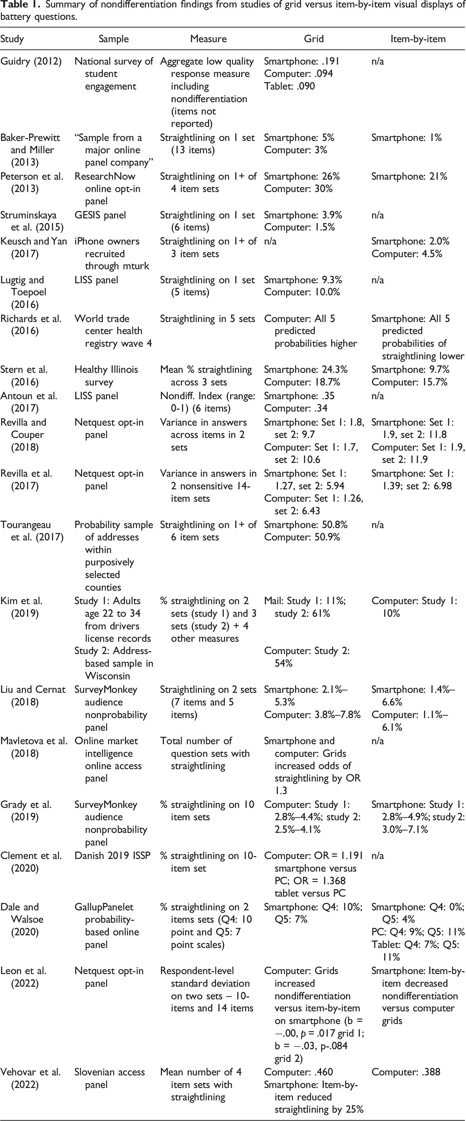
Two theoretical frameworks inform how grids may influence the quality of survey answers. The first is a visual design perspective. Drawing on the Gestalt principles of proximity and common region (Dillman et al., 2014; Smyth & Olson, 2020) and the “near means related” heuristic (Tourangeau et al., 2004), a set of items that are displayed physically together (proximate) and within a defined space (common region) will be perceived as both physically and conceptually grouped. As a result, individuals are likely to answer them similarly, resulting in possible nondifferentiation of answers (Krosnick, 1991). By breaking the proximate placement and removing a common region for the question, an item-by-item format may interrupt the perception of connections between items compared to a grid format, allowing respondents to process, interpret, and answer each item individually. Because each item is displayed and processed individually rather than being “lost” in the grid, the item-by-item display may reduce item nonresponse rates. That is, the perception of more connectedness created by the grid format and less connectedness in item-by-item displays suggests that answers to items displayed in a grid format will be lower quality than those displayed in an item-by-item design. In particular, questions displayed in a grid may be more likely to be skipped, straightlined (the same response provided), and answered with more nondifferentiation (similar responses provided) than those in item-by-item displays.
The second is a survey burden perspective, which predicts that satisficing is more likely to occur on the more burdensome format (Roßmann et al., 2017). Some have argued that grid designs are inherently burdensome (Peytchev, 2009). In contrast, others have argued that displaying questions in a grid may make survey questions easier and more efficient to answer because the respondent can quickly learn the set of candidate response options (Couper et al., 2001; Debell et al., 2019; Krosnick, 1991; Roßmann et al., 2017; Toepoel et al., 2009). Item-by-item designs add visual length to self-administered surveys because each question must be displayed separately. Survey length is a common proxy for survey burden (Bradburn, 1978). Thus, a survey with questions displayed in an item-by-item format may be perceived as more burdensome than the same questions displayed in a grid because of the added length due to separate presentation for each item and repeated display of the response options.
Summary of nondifferentiation findings from studies of grid versus item-by-item visual displays of battery questions.
Grids across modes and devices
Web and mail surveys both use visual communication, and may yield few mode differences in responses under a unified mode design. However, even with a common design, respondents may be differentially motivated to answer questions across these modes. For instance, mail surveys with long lists of questions may result in respondents more easily skipping an item, either inadvertently or on purpose. The length of a mail survey is immediately visible, unlike in web surveys that typically display only a few questions at a time, possibly increasing perceived burden experienced by mail respondents. Additionally, web surveys can use more active encouragement of answering questions, providing error messages if respondents leave questions blank or providing guidance on which rows or columns the respondent has answered.
Furthermore, completing a survey on a mobile device may be a difficult task (Couper & Peterson, 2017; Keusch & Yan, 2017; Peytchev & Hill, 2010; Struminskaya et al., 2015). Grids may pose particular problems for mobile devices because of the considerably smaller screen size of these devices. Smaller screen size may result in more inadvertent selection of responses (the “fat finger” problem) or require more horizontal and vertical scrolling in grids or on long sets of items, decreasing the probability of hidden response options at the end of grids being selected (Couper & Peterson, 2017; Peytchev & Hill, 2010).
Yet mode comparisons in general population samples have found few differences in overall substantive answers between web and mail surveys, with differences primarily observed in sample composition and in Internet access and usage (see reviews in Fowler Jr. et al., 2019; Suzer-Gurtekin et al., 2019; Tourangeau et al., 2013). Previous research has found higher item nonresponse rates on mail surveys than computer web surveys (Israel & Lamm, 2012; Lesser et al., 2012; Marken et al., 2018; Messer et al., 2012; Millar & Dillman, 2012), but has not found consistent differences in item nonresponse rates or in other indicators of data quality for questionnaires completed on mobile devices versus computers after accounting for possible selection into using a particular device (e.g., Keusch & Yan, 2017; Krebs & Höhne, 2020; Lugtig & Toepoel, 2016; Lynn & Kaminska, 2012; Mavletova, 2013; Revilla & Couper, 2018; Sommer et al., 2017; Toepoel & Lugtig, 2014). Response distributions also tend to be similar across computer and mobile device questionnaires (Clement et al., 2020; Keusch & Yan, 2017; Tourangeau et al., 2017).
The data quality outcome that has received perhaps the most attention across devices for battery items is nondifferentiation or straightlining (Table 1). Existing studies vary notably in how they operationalize nondifferentiation, the number of item sets examined, and the population of interest, and few studies have examined this design feature in a non-panel probability-based sample of the general population. Somewhat surprisingly, there is only one study of which we are aware that compares responses across battery designs on a computer web questionnaire to those obtained from a mail questionnaire, although it excludes an item-by-item condition in the mail (Kim et al., 2019). Additionally, it is unclear whether the studies conducted on smartphones used wide buttons or radio buttons on the item-by-item displays because screenshots are not uniformly provided (Dale & Walsoe, 2020). Nevertheless, the common pattern is that grid displays have higher levels of nondifferentiation than item-by-item displays, with mixed results across web devices.
Wide versus radio buttons
“Mobile optimization” approaches are common when conducting web surveys. In a mobile-optimized questionnaire, wide rectangular buttons often replace smaller radio buttons for the single answer item-by-item questions presumably to give respondents a bigger target to touch to register their response (Antoun et al., 2020; Mavletova et al., 2018). Few studies have examined whether wide buttons versus radio buttons in web surveys affect answers, and those that have find inconsistent differences in the distribution of responses (Antoun et al., 2020; Dale & Walsoe, 2020). While mobile optimization can often work well in web surveys because the same design can be used for those answering on a computer and mobile device (i.e., unified device design), it can be challenging to achieve unified mode design between mobile-optimized web surveys and mail surveys because wide answer buttons are highly unconventional in mail surveys. If the wide-button design is emulated in a mail survey to achieve unified mode design with a mobile-optimized web survey, it is unclear whether respondents to the mail survey will know how to answer since the wide answer spaces lack a distinct space to check or fill in on paper, possibly increasing respondent burden (Figure 1). Respondents in a mail survey may be more likely to skip items displayed with wide buttons (which become shaded rectangles in a mail survey) compared to the same items displayed with small answer space circles, although this design feature has not been empirically evaluated in mail surveys. Thus, we will also examine whether data quality differs when we display item-by-item designs with radio buttons versus wide buttons across modes and devices. Display of wide buttons for item-by-item questions in mobile web, computer web, and mail questionnaires.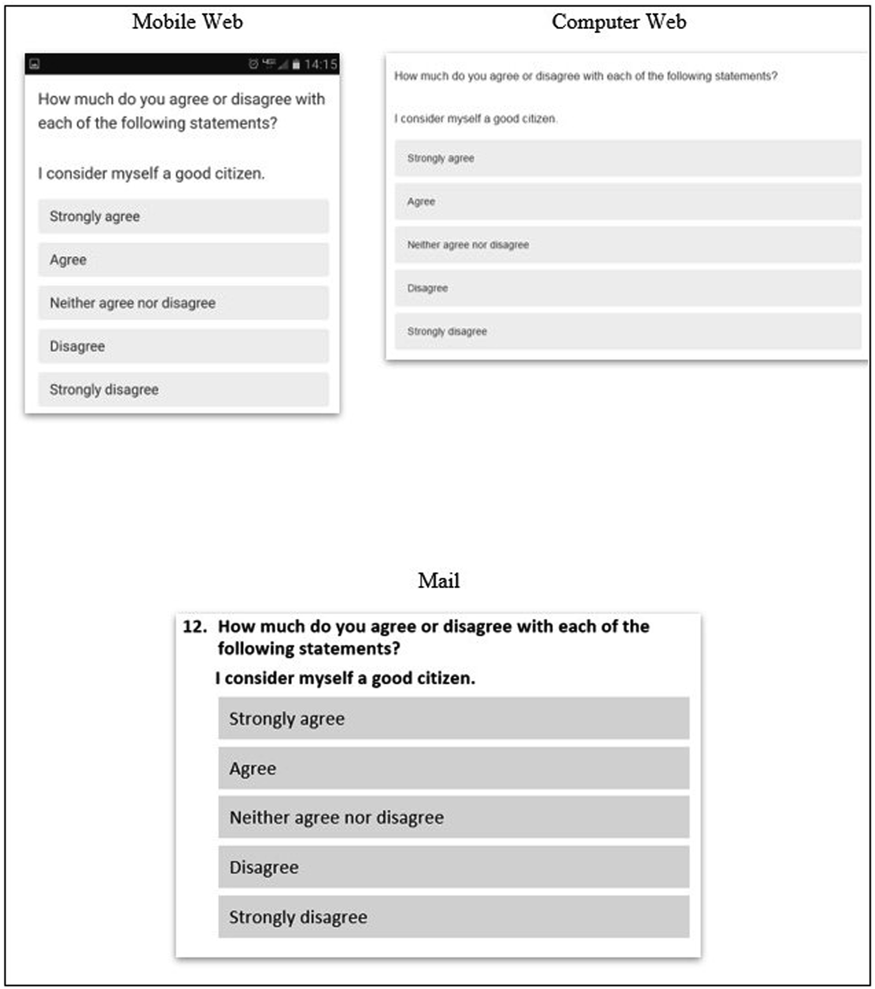
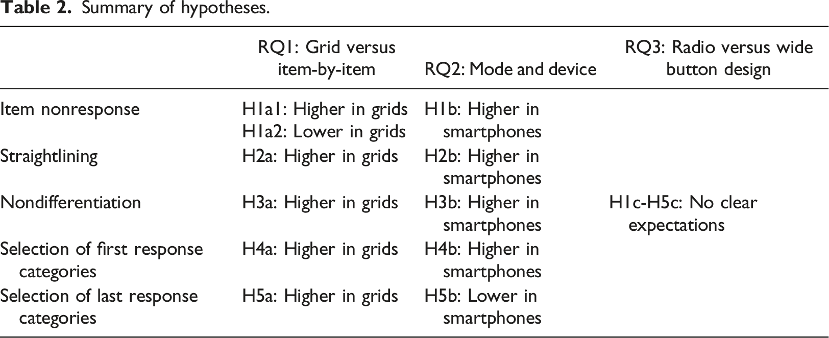
Summary of hypotheses.
Data and methods
We use the 2017 Community Values and Opinions in Nebraska Survey (CVONS) in which a simple random sample of 10,000 Nebraska households was selected from an address-based frame, and one adult (age 19+) with the next birthday was selected from the household. CVONS was fielded from March 8 to May 18, 2017, by the Bureau of Sociological Research at the University of Nebraska-Lincoln (AAPOR Response Rate 2 = 28%, n = 2801 respondents). CVONS used a sequential mixed-mode design, offering the web survey URL in the first two postal mail contacts and both the web survey URL and a mail questionnaire in the final mailing.
All addresses were randomly assigned to a question design condition (grid or item-by-item, n = 5000 in each condition), fully crossed with the visual format conditions (radio button or wide answer space, n = 5000 in each condition; n = 2500 in each combination). Respondents remained in their assigned condition across modes or devices selected to complete the questionnaire. Consistent with most mobile-optimized web survey software displays for item-by-item formats (Hu, 2020; Mockovak, 2018; Revilla & Couper, 2018), vertical response options were used for the item-by-item display in all modes and devices (Figures 1 and 2). Mail questionnaires in both formats were 12 pages long with the same questions on each questionnaire page across conditions. Examples of radio button grid versus item-by-item displays in mail, computer web, and mobile web modes and devices.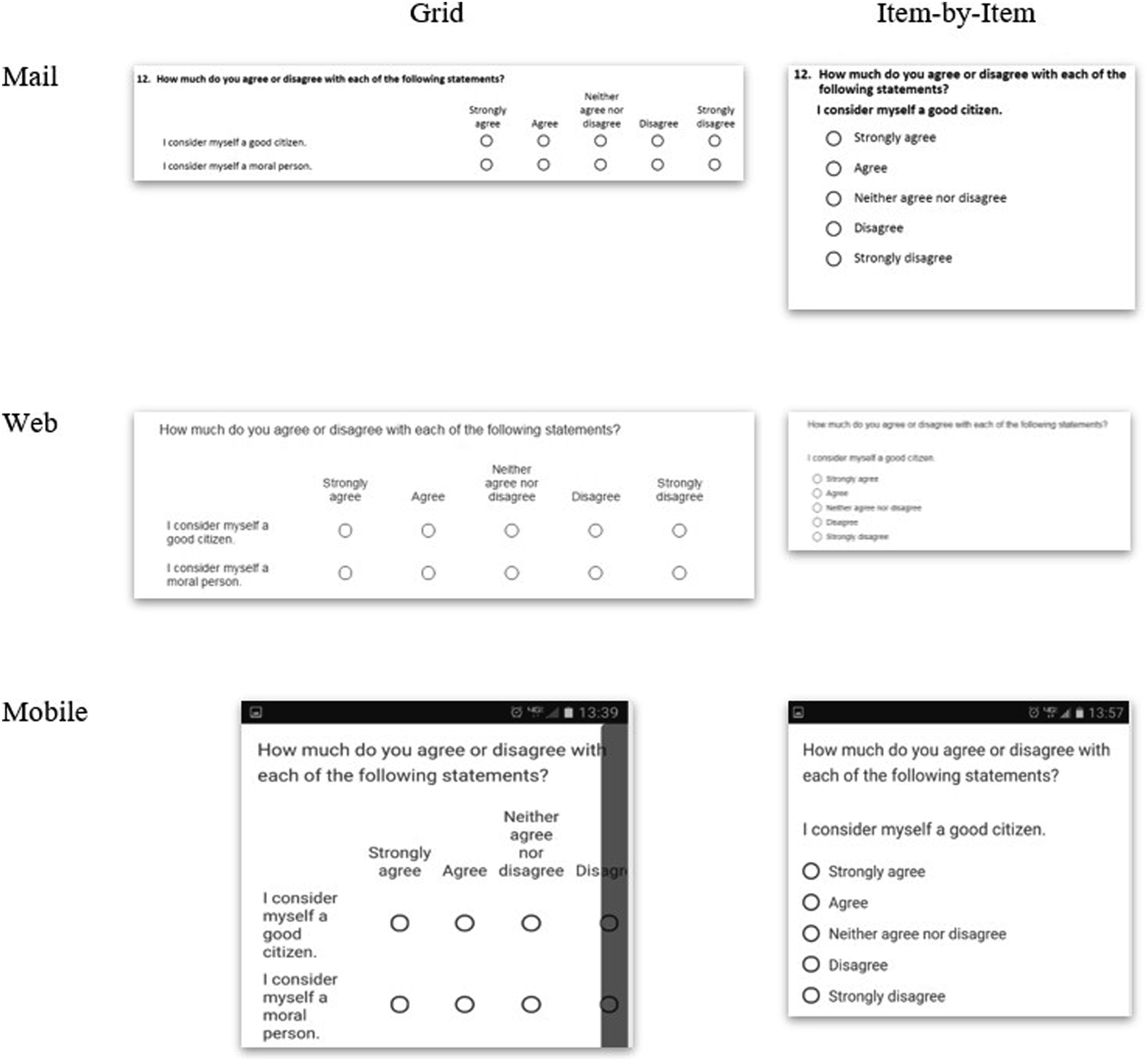
The answer space format conditions on the web were achieved through two different Qualtrics templates. In the “minimal” template, the answer spaces for both grid and item-by-item questions were identified through radio buttons (small circles) with a black outline and white fill when unselected that turned dark grey when selected (see Figure 2). In contrast, the “Qualtrics 2014” template enclosed each response option in the item-by-item questions in a wide button (Figure 1) that displayed as grey but turned red when selected. The grid items in this template used red-rimmed circles instead of black-rimmed circles. Both templates used hover to highlight grid rows light grey when a cursor hovered over them in the computer web mode. Versions of the mail questionnaire were formatted to match each web template.
The grid versus item-by-item experiment was conducted on three attitudinal batteries and one behavioral battery (see Appendix A for full wording). The first battery (B12) on citizenship and community attitudes contained six items with a five-point fully-labeled scale from strongly agree to strongly disagree, all positive valence (I consider myself a good citizen). The second battery (B24) measured perceptions of safety with five items that were both positive (I feel safe where I live) and negative (I worry about becoming a victim of a crime) valence and five fully-labeled response options ranging from never to always. The third battery (B27) measured perceptions of fairness of the criminal justice system (Treatment of people accused of committing a crime) with four-point fully-labeled response options ranging from very fair to not at all fair. The behavioral battery (B15) measured time demands with a five-point fully-labeled response scale from never to always; this battery contained items that were positive valence (You were able to do almost everything you needed to do) and negative valence (You had too little time to perform daily tasks).
Dependent variables
The first dependent variable is item nonresponse. We examine item nonresponse within each battery by summing the number of unanswered items in each battery. The total number of items asked in the battery (constant across respondents) is included as an exposure variable. The average item nonresponse rate across the batteries is 2.6% (n = 2705).
We then examine two measures of nondifferentiation. The first measure examines straightlining, in which identical responses for each item within a battery were coded as 1 and responses that used at least one different answer category were coded as 0. Respondents who skipped items in the battery were included as straightlining if at least two answers were provided that used the same answer categories. The average straightlining rate across the batteries is 11.1% (n = 2657 answered at least two questions in at least one battery). The second measure of nondifferentiation is calculated as the respondent-level standard deviation (also referred to as within-subject inter-response variability) of answers to the j items within the battery:
The final dependent variables are from the responses to the questions themselves. First, we calculate the total number of selections of the first answer category within each battery for each respondent. Then we examine the total number of selections of the last two response options in questions with five scale points (Q12, Q15, Q24) and the last response option in questions with four scale points (Q27) across the items in the battery. This dependent variable indicates the most likely answer categories to be hidden in a grid format on smartphones. We calculate the total number of questions answered in each battery (varying across respondents) as an exposure variable in the models below to model the rate of selecting these response categories. The average rate of selecting the first response option across the batteries is 15.2% (n = 2657 answered at least one item in at least one battery) and the last two response options across the batteries is 21.8%.
Independent variables
The first independent variable is the format of the battery items – grid (52%) or item-by-item (48%).
The second independent variable is an indicator of the self-selected mode or device used to complete the survey. The completion mode – mail (28%) or web (72%) – and web device smartphone (21% of web respondents), tablet (8%) or computer (71%) - was identified from sample tracking forms and paradata based on operating system, browser, and screen size among the web respondents.
The final independent variable is whether the survey format used radio buttons or wide buttons. Overall, 50% of the respondents answered using the radio buttons format and 50% using the wide buttons format.
Control variables
To account for self-selection into device, the models control for respondent sex, age, education, race, and where the respondent reported responding to the survey (at home or at work/elsewhere). The question and visual format conditions were also fully crossed with three cover letter conditions in which framing the participation request varied; we also control for the cover letter text experiment conditions and include fixed effects for the four batteries to account for differences in content. Respondent-level characteristics did not differ across the grid versus item-by-item format (Appendix Table B; all p > .15).
Analyses
We estimate regression models using Stata 17.1 to examine whether the data quality outcomes vary across grid versus item-by-item format, mode or device, and wide versus radio buttons. Our experimental design factors were assigned at the respondent level, not at the question level; that is, there is no within-respondent variation in the key independent variables. Thus, we use population-average models accounting for clustering of the four batteries within respondents (McNeish et al., 2017).
For the count variables (item missing; selecting the first or last response options), we estimate Poisson models (xtpoisson) with exposure variables of the number of questions in the battery (item missing) and the number of items answered (first/last response options). For the continuous outcome of nondifferentiation, we use GEE models (xtgee) with batteries nested within respondents. For our dichotomous outcome of straightlining, we use logistic regression (xtlogit) models. We estimate each population-average model with robust standard errors and an exchangeable within-respondent correlation (using the pa vce(robust) options). For instance, to test the effect of web versus mail modes, let the batteries denoted with i = 1, …, 4 and respondents be denoted with j = 1, …, n, we estimate with a link function of g (Yij):
We then test whether the effects of the grid versus item-by-item display vary by mode or device and grid versus item-by-item display vary by radio versus wide buttons using two-way interaction effects; we also examine the three-way interaction between grid versus item-by-item display, mode or device, and by radio versus wide buttons. Because we estimate six interaction effects for each outcome, we use a Bonferroni correction of p = .05/6 = .008 to indicate statistical significance for an interaction term. We estimate all models in two sets: including the mode indicator (mail vs. web) and the device indicators (mail, smartphone, tablet, computer). We also estimated models only for the item-by-item display condition to isolate the effects of the radio versus wide buttons; all conclusions were identical as in the interaction effects models.
In all analyses, missing values for the predictor variables were multiply imputed 20 times using sequential regression imputation with Stata’s ice command. We account for multiple imputation using the mi estimate commands. We account for the nonresponse adjustment weight by incorporating the grand-mean centered survey weight as a predictor variable (Snijders & Bosker, 2012).
Results
Grid versus item-by-item designs
Population-average model coefficients and standard errors predicting five data quality outcomes.
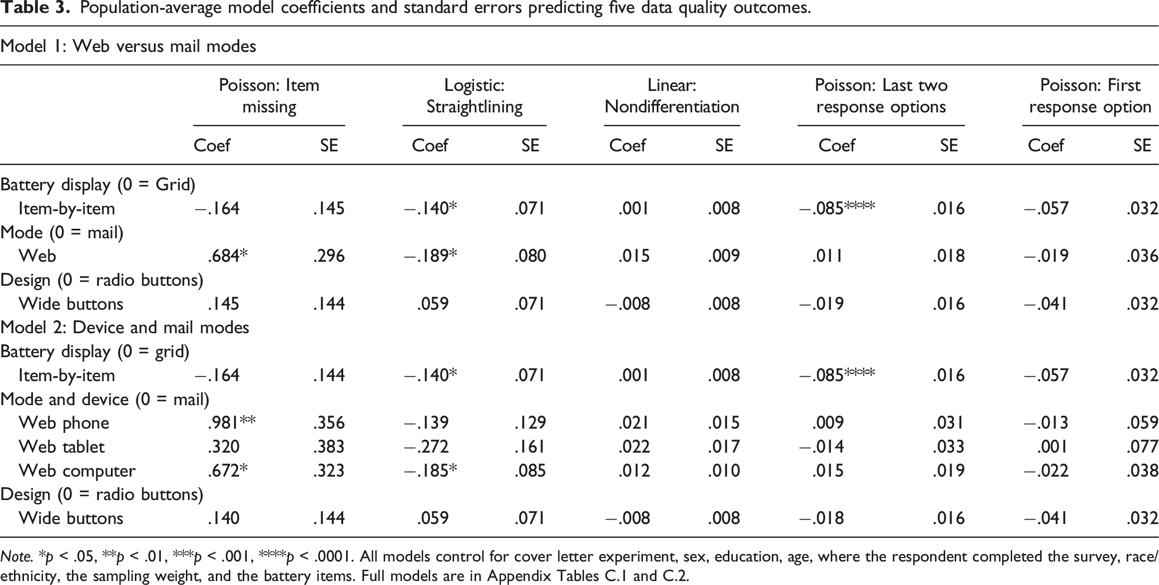
Note. *p < .05, **p < .01, ***p < .001, ****p < .0001. All models control for cover letter experiment, sex, education, age, where the respondent completed the survey, race/ethnicity, the sampling weight, and the battery items. Full models are in Appendix Tables C.1 and C.2.
Modes and devices
Differing from past research, item nonresponse rates are significantly higher in the combined web devices than in the mail survey (H1b, Model 1, Table 3, p = .026). When we examine the web devices separately, consistent with our hypothesis, smartphone respondents (H1b, Model 2, Table 3, p = .007) and computer respondents (p = .044) have higher item nonresponse rates than mail respondents, but there is no difference between the tablet and mail respondents (p = .40) Additionally, straightlining rates are lower in the combined web mode than in the mail mode (p = .02); looking at the web devices separately, the computer web respondents have lower straightlining rates than the mail respondents (p = .029), but there is no difference for the smartphone (p = .28) or tablet (p = .09) respondents, inconsistent with hypothesis H2b. Inconsistent with our hypotheses, there is no overall mode or device difference in nondifferentiation (H3b, Model 1 mode: p = .12; Model 2 device: p = .38), selection of the last two response options (H4b, mode: p = .55; device: p = .76), or selection of the first response option (H5b, p = .94).
Radio buttons versus wide buttons
There is no difference overall in the measurement error indicators for respondents who received the design containing radio buttons versus the wide button design. (H1c-H5c, p > .20 for all models).
Interaction effects
There are no statistically significant two-way interaction effects between mail versus overall web and the grid versus item-by-item format or radio versus wide buttons on any of the measurement outcomes (p > .08 for all interaction effects, Appendix Table C.3). No statistically significant interaction effects are present for the mail and individual web devices and the grid versus item-by-item format or radio versus wide buttons on any outcome other than nondifferentiation (overall p = .007 and p = .006). There is slightly more nondifferentiation (smaller standard deviation of answers) for those who answered on tablets with item-by-item displays and with wide buttons than with grids or with radio buttons (Appendix Figure C.1), but no difference in nondifferentiation in item-by-item and grid designs for those who answered via mail, web computer, or smartphone. None of the three-way interactions are statistically different from zero.
Discussion
Researchers often decide to display sets of questions with a common question stem and common response options in grids, but optimization on mobile devices may display these grid questions as individual items, undermining attempts to achieve unified designs. We examined whether these two methods of displaying battery items and the use of wide versus radio buttons affected answer quality across mail and web devices. We found that item-by-item displays yielded lower straightlining rates than the same items displayed in a grid, suggesting an increase in data quality for item-by-item displays and consistent with a visual grouping hypothesis. Respondents were also less likely to select the last two response options when shown in an item-by-item display, suggesting that they may have not fully processed the response options. Future research should explore whether these differences emerge because respondents are less likely to process the response options in the item-by-item format or because they are anchored to the visually grouped endpoints in the grid format.
It is reassuring that there were few differences between the mail modes and web devices on the outcomes examined here. Unlike past research – conducted largely before smartphones were used for web surveys – we found higher item nonresponse rates among the web respondents than among the mail respondents and especially higher item nonresponse rates for the smartphone respondents, consistent with a hypothesis that responding on smartphones is burdensome. Even though web respondents were more likely to leave an item missing, they were less likely to straightline than mail respondents when they did answer these questions, inconsistent with the single other study that compared straightlining on web and mail modes (Kim, et al., 2019). The higher levels of straightlining for mail respondents were not concentrated in only one response category across all respondents, as the rates of selecting the first or last response options for mail respondents did not differ from any of the web devices. The general lack of differences in data quality outcomes between the two self-administered modes confirms that these modes can produce very similar results with unified mode design.
As web survey software templates increasingly use wide buttons as a default, we are also reassured that there are no differences in any of the data quality outcomes across the radio buttons and wide buttons for the items examined here. This was true overall and for the item-by-item condition alone. Thus, researchers conducting mixed-mode surveys who want to use a wide button default in their web survey and radio button-style answer spaces in their mail survey are unlikely to see notable shifts in the distribution of answers, at least for battery items.
Many previous studies have examined the design of battery items in self-administered surveys, largely showing that item-by-item displays yield lower levels of straightlining than the same items displayed in grids. This work replicates and extends past work in two ways – comparing web survey respondents with mail survey respondents and comparing the display of the response categories for the item-by-item questions as radio buttons versus wide buttons. Nevertheless, more work can be done. Although we accounted for multiple characteristics of the respondents, we did not examine whether the effects of the experimental (grid vs. item-by-item; wide vs. radio buttons) or observational (mode and device) independent variables varied across characteristics of the respondents. To the extent that one design feature or device is more burdensome, then the challenges of answering may be exacerbated for persons with lower cognitive abilities. Additionally, although the items examined here were part of a battery, they were not necessarily designed to create a scale. As such, we did not examine interitem correlations or latent variable models. Future work could examine these measurement outcomes where appropriate. Finally, although we looked at four batteries with vastly different topics and response scales, all batteries had only four or five response options and a limited number of items. We also looked at three attitudinal batteries and one behavioral battery. Future work could examine different topics, more response options, and more scale items.
Decisions to display a battery in a grid or not, to have multiple modes of data collection, or to permit mobile optimization on web displays are important. The analyses presented here indicate that researchers may see little effect of these decisions on the quality of answers, at least on these measurement indicators. Consistent quality of responses across design features is critical when developing unified mode designs.
Supplemental Material
Supplemental Material - Display of battery items in web and mail surveys: Grids versus item-by-item and radio versus wide buttons
Supplemental Material for Display of battery items in web and mail surveys: Grids versus item-by-item and radio versus wide buttons by Kristen Olson, Jolene D Smyth, and Angelica Phillips in International Journal of Market Research.
Footnotes
Acknowledgements
Earlier versions of this paper were presented at the 2018 Midwest Association for Public Opinion Research annual meeting and at the 2019 European Survey Research Association Conference.
Declaration of conflicting interests
The author(s) declared no potential conflicts of interest with respect to the research, authorship, and/or publication of this article.
Funding
The author(s) disclosed receipt of the following financial support for the research, authorship, and/or publication of this article: Data collection for this study was funded by the UNL Office of Research and Economic Development. The analysis was partially funded by Cooperative Agreement USDA-NASS 58-AEU-5-0023, supported by the National Science Foundation National Center for Science and Engineering Statistics.
Data availability statement
Replication information is available at https://osf.io/tuyfg/?view_only=460ac82e67554c7a947de2d8923b6eca (Olson, 2023).
Supplemental Material
Supplemental material for this article is available online.
References
Supplementary Material
Please find the following supplemental material available below.
For Open Access articles published under a Creative Commons License, all supplemental material carries the same license as the article it is associated with.
For non-Open Access articles published, all supplemental material carries a non-exclusive license, and permission requests for re-use of supplemental material or any part of supplemental material shall be sent directly to the copyright owner as specified in the copyright notice associated with the article.