
Abstract
This study focuses on the pitch deck, a slide presentation typically used in the world of business and innovation. The aims of the study reported are, firstly, to identify the use of visual elements in the pitch deck and, secondly, to relate the use of these elements to specific sections of the pitch deck. A total of 96 slide decks produced at the Start-up Chile accelerator program were analysed. Results show that pitch decks have a very diverse composition and that the use of specific visual elements tends to vary according to the topic presented by the slide, thus contributing to a better understanding of the pitch deck as a multimodal genre.
Introduction
The entrepreneurial pitch, a genre commonly used in the world of business and innovation, has been generally defined as a fast oral presentation (Sabaj et al., 2020). But, as some have pointed out (Spinuzzi et al., 2014), the pitch is regularly presented alongside a visual slide presentation called the pitch deck. However, in spite of its use as a central component of the pitch, the pitch deck itself, with only a few exceptions (Cabezas and Bateman, 2024; Spinuzzi et al., 2014, 2015a, 2015b; Williams et al., 2019), has mostly been left unexplored. Furthermore, even when researched, the pitch deck has been studied only regarding its reception (Williams et al., 2019), rhetorical content (Spinuzzi et al., 2014, 2015a, 2015b), or the internal distribution of its slides (Cabezas and Bateman, 2024). This means that there is still little we know about the visual composition of the pitch deck, something that limits our understanding of the pitch deck as a multimodal artefact and of the pitch as a genre.
Slide presentations, more widely, have been studied from a variety of perspectives. From studies describing the creation process of a slide presentation (Djonov and Van Leeuwen, 2013; Spinuzzi et al., 2014, 2015a, 2015b; Zhao and Van Leeuwen, 2014; Zhao et al., 2014), their reception (Bucher and Niemann, 2012; Williams et al., 2019), their use within a classroom (Feng, 2021; Soliman, 2023), and even outside of it (Garrett, 2016), among others. A consequence of this has been the focus on different components of a slide presentation. Some studies have described aspects as detailed as the number of words (Garrett, 2016), whereas others have opted for a broader approach, and described the structure of a presentation and the distribution of content among its slides (Cabezas and Bateman, 2024, Spinuzzi et al., 2014, 2015a, 2015b). Others have even gone beyond the constraints of the slide deck and have described the gestures and movements of the presenter (Valeiras et al., 2018; Valeiras-Jurado and Ruiz-Madrid, 2020). This present study will focus on the slide deck and, more specifically, on the composition of the slides. That is to say, instead of describing the structure of a slide deck, or the slide as a complete or indivisible unit, this research will describe the individual elements contained within every slide. These individual visual elements, also called ‘layout units’, can be understood as ‘elements which are perceptually salient when a reader encounters a page, or page spread, as a whole’ (Bateman, 2008: 116) and be classified as typographic, graphic, or composite.
The visual composition of the slide decks has commonly been studied in relation to academic genres, such as conference presentations (Atai and Talebzadeh, 2012; Bucher and Niemann, 2012; Diani, 2015; Rowley-Jolivet, 2000, 2002, 2004; Zapletalová, 2014), theses defences (Kmalvand, 2015) and university lectures (Feng, 2021; Zhao and Van Leeuwen, 2014). Most of these studies have, at the same time, used similar categories and exhibit a similar scope to the ones first developed by Rowley-Jolivet (2000, 2002, 2004). Slide presentations have, thus, mostly been described in terms of the overall composition of their slides, instead of the individual elements within those slides. Moreover, although slide presentations were first utilized in the world of business communication (Gabriel, 2008), there is still little that we know of their use in this context. Thus, the present study seeks to contribute to the understanding of slide presentations by analysing a genre used in a context outside of academia and by shifting the focus onto the inner components of the slide to achieve a more detailed understanding of the individual elements used in the pitch deck and some of its sections.
The main objectives of the study are to identify the visual elements, or layout units, most commonly used in pitch decks, as well as to describe how these elements are distributed among a pitch deck’s slides. By doing this, the research aims to contribute a better understanding of the use of visual elements in slide presentations. Finally, this article aims to contribute to our knowledge of the pitch as such, a high-stakes genre through which newcomers in the world of business and innovation try to obtain funding, mentors and collaborators to make their ideas a reality.
Literature Review
The study of the visual composition of slide presentations was started by Rowley-Jolivet (2000, 2002, 2004), who analysed 90 scientific conference presentations in three different fields: geology, medicine and physics. This author (Rowley-Jolivet, 2000) first classified the elements used in conference presentations according to their semiotic type (categorized as linguistic, mathematical and visual) and, in later works (2002, 2004), according to their visual types, which were related to particular semiotic types. Thus, linguistic elements were classified as scriptural; mathematical elements as numerical; and visual elements as figurative I (regular photographs), figurative II (technical photographs) and graphical (conceptual images).
As described in her work of 2000, Rowley-Jolivet found the use of these ‘visual semiotics’ was the most frequent among all three fields, corresponding to almost 60 percent of the elements presented, and even surpassing 80 percent in the case of geology. In her later work (Rowley-Jolivet, 2004), this description was expanded by describing the individual visual profiles of these three fields. Rowley-Jolivet reported that geology used a high percentage of figurative elements, particularly photographs, as well as graphics. Scriptural elements were less common, being completely absent from 8 of the 30 presentations analysed. Medicine, meanwhile, used scriptural, numerical, figurative and graphical elements in almost equal amounts, and even the use of the two different types of figurative elements was similar, presenting both regular photographs, as well as ultrasounds, topographies and X-rays in equal measure. Finally, physics seldom used figurative elements, instead preferring the use of graphical visuals, something that was part of all the presentations and amounted to over 40 percent of the elements identified. Physics also had the peculiarity of being the only field in which the use of ‘hybrid visuals’ is explained in more detail. As described by the author, the combined use of scriptural and numerical or graphical and numerical elements was very common in this field, present in 25 percent of the slides analysed.
Later studies of slide presentations have been greatly influenced by Rowley-Jolivet’s (2000, 2002, 2004) work. Researchers have followed her approach both by studying conference presentations and other academic genres, as well as by using similar, and in some cases the same, categories. In the case of Atai and Talebzadeh (2012) and Zapletalová (2014), for example, both analysed conference presentations and only modified Rowley-Jolivet’s (2002, 2004) categories by expanding them to include hybrid elements. Similarly, Bucher and Niemann (2012) studied scientific presentations and modified Rowley-Jolivet’s categories by merging the scriptural and numerical elements into textual ones, considering all images simply as figurative elements and adding mixed elements as a category. Meanwhile, Kmalvand (2015) and Diani (2015) used the same categories as Rowley-Jolivet (2002, 2004) without modifying them, although Kmalvand (2015) used them to analyse a different academic genre, the master thesis defence.
Most of these studies have also followed the work of Rowley-Jolivet (2000, 2002, 2004) in using the type of visuals as a unit of analysis, although this unit was never clearly defined by Rowley-Jolivet. As a consequence, some authors have considered these units to mean each of the multimodal elements present in a slide (Kmalvand, 2015), while others have considered it as a descriptor of the slide as a complete unit (Diani, 2015; Zapletalová, 2014), and others again have instead explicitly named the slide as their unit of analysis (Atai and Talebzadeh, 2012; Bucher and Niemann, 2012). This makes comparing results difficult, even cases where the same or similar categories were utilized.
The studies by Atai and Talebzadeh (2012), Diani (2015) and Zapletalová (2014) both used similar categories, all three based on the work of Rowley-Jolivet (2000, 2002, 2004), and analysed the same genre, conference presentations in the field of applied linguistics. Atai and Talebzadeh (2012) analysed 20 conference presentations from Iranian conferences on applied linguistics and found scriptural slides to be the most common, representing 74.6 percent of the total number of slides analysed. The second most frequent type of slide was numerical, although it represented only 10.7 percent of the slides. This means over 85 percent of the slides presented did not contain any images. What is more, slides that were composed of only graphical or figurative elements represented only 3.5 percent of the total.
Zapletalová (2014) studied seven conference presentations from an international conference on applied linguistics with native and non-native English speakers. Similar to the results presented by Atai and Talebzadeh (2012), Zapletalová (2014) found 71.4 percent of the slides presented only scriptural elements, although in this case none of the slides analysed were completely numerical. Instead, the second most common type of slide was figurative (9.5%) followed closely by two types of hybrid slides – scriptural/figurative (8.9%) and scriptural/graphical (8.3%). Regardless of these differences, the results seem to confirm the idea first presented by Rowley-Jolivet (2004) of each field having a distinctive ‘visual profile’, with the visual profile of applied linguistics conferences being composed principally of scriptural slides, a complete divergence from the profile described, for example, for geology (Rowley, 2004).
Diani (2015) further analysed the multimodal composition of conferences in applied linguistics by considering the distribution of different types of slides among the rhetorical moves of conference presentations. A total of 1,680 slides from 56 presentations were classified according to their type of visual content. Similar to the results described by Atai and Talebzadeh (2012) and Zapletalová (2014), most slides were classified as scriptural (75.8%), followed by numerical slides (9.3%), figurative slides (8.4%) and graphical slides being the least common (6.4%). At the same time, Diani (2015) found that the title of scriptural slides coincided with the IMRD model (Introduction, Methods, Results and Discussion) developed in genre theory to describe the structure of research articles by Swales and Swales (1990). This confirms the idea, first presented by Rowley-Jolivet (2002), that conference presentations might follow a similar structure to that of a research article. This idea is also confirmed by Atai and Talebzadeh (2012) and Zapletalová (2014), but Diani (2015) goes even further by also analysing the steps of the slides and the type of content utilized to realize them. Thus, Diani notices that slides used for different moves have particular multimodal traits. Introduction slides, for example, are described as using bullet points to give an outline of the presentation. Meanwhile, results slides are highlighted as using the largest diversity of slides (scriptural, numerical, graphical and figurative). Finally, other slides, such as thank-you slides, are described as being usually composed of an image together with an expression of gratitude towards the audience and the personal information of the presenter. This regular use of particular multimodal elements is also described, although tangentially, by Rowley-Jolivet (2002), who notices the use of two consecutive tables in medical conference presentations, one to present the patient, followed by a second one for the characteristics of a tumour. The main difference among these studies is that Diani (2015) describes the use of multiple elements used at the same time on the same slide, meanwhile Rowley-Jolivet (2002) describes them as sequences, implying a linear order.
Contrary to the approach taken by these authors (Atai and Talebzade, 2012; Diani, 2015; Rowley-Jolivet, 2000, 2002, 2004; Zapletalová, 2014), Kmalvand (2015) considered each individual element on a slide, although he only measured their presence or absence instead of measuring the total number elements utilized. Thus, instead of classifying a slide as scriptural, Kmalvand (2015) measured the number of slides where scriptural elements were present. This can be considered a small difference, but it can give us a more accurate idea of the individual components of a slide presentation. Kmalvand analysed 70 theses defence presentations in the field of applied linguistics. Results from his study showed that scriptural elements were present in all the 1,578 slides that formed his corpus, followed by numerical elements, which were present in 62 out of the 70 presentations analysed but in only 22.5 percent of the slides. Graphical and figurative elements were even less common, present in less than half of the presentations. Only 9 percent of the slides had any graphical element, while figurative elements were present in 2.9 percent of all slides and 31.4 percent of all presentations. These results, although from a different genre, show similarities to the composition of conference presentations in the field of applied linguistics – particularly in the overwhelming use of slides presenting only scriptural elements, something that is even more evident when measuring the total number of slides with scriptural elements and not just the scriptural slides.
Kmalvand (2015) also goes further by providing more details on what constitutes a scriptural, numerical, graphical and figurative element. Thus, scriptural elements are, for example: title, student’s name and literature review. Meanwhile numerical elements are mathematical formulae and tables, and figurative elements are mentioned to be portraits and photographs. Similarly, Zapletalová (2014) provides his own examples although, instead of being individual elements, the author describes a collection of elements presented within a slide. Hence, a scriptural slide was defined as constituted by title of paper, author and affiliation. Meanwhile, similarly to Diani (2015), a thank-you slide is described as photos accompanying a goodbye phrase. These descriptions (Diani, 2015; Kmalvand, 2015; Zapletalová, 2014) can be related to the idea of sequences presented by Rowley-Jolivet (2002), although they lack a temporal component. Instead, they can be seen as a more granular description of the elements used in a slide presentation, a visual profile of particular slides instead of the overall presentation.
Zhao and Van Leeuwen (2014), meanwhile, described what they called the visual practices of PowerPoint in seven university lectures. Instead of using the categories developed by Rowley-Jolivet (2000, 2002, 2004), Zhao and Van Leeuwen (2014) analysed the use of bullet points, layout and types of images, as well as the semiotic relations that occurred between different elements. Visual material apart from written text was broadly classified into photographs, maps, clippings, paintings, graphs, cartoons and logos or icons. Contrary to the results on conference presentations and theses in the field of linguistics, university lecturers in history utilized images in 74 percent of the total 268 slides analysed. All seven presentations utilized photographs and paintings. Meanwhile maps and graphs were part of three presentations. Cartoons and icons were found in two of the seven, and clippings were used in only one of the presentations. Only the total number of each image type was measured, however, which makes it impossible to know the number of visuals that were used in single slides or in a presentation. Even when the authors (Zhao and Van Leeuwen, 2014) mentioned the use of bullet points, those are also not measured or related to the use of any specific type of visual. Thus, the composition of the slide presentations is only described in broad terms, even though the study tried to put their focus on the elements within each slide and not the slide as a complete unit.
More recently, Feng (2021) analysed slide presentations of 33 lectures from linguistics courses at Peking University, what he called instructional PowerPoints. Among other things, Feng measured the type of images found in the presentations and described their relation to the text present in the slides: a total of 1,911 slides were analysed, from which only 15 percent (287 slides) contain images, following the description of other academic slide presentations in the field of linguistics (Atai and Talebzadeh, 2012; Diani, 2015; Kmalvand, 2015; Zapletalová, 2014). Images were classified as artistic, naturalistic or schematic. At the same time, artistic images were subdivided into cartoon and painting, and naturalistic images were divided into people, object, animal, or mixed. Contrary to the results described by Zhao and Van Leeuwen (2014), photographs were not the most common. Instead, artistic images represented 45 percent of the total number of images present, making them the most common. Moreover, the author (Feng, 2021) mentions that about 50 percent of the images used in the presentations serve only an aesthetic function or, as he puts it, ‘half of them are just randomly chosen to fill in the blank space’ (p. 189). This is a sharp contrast to previous results, where the use of a certain type of visual elements, or group of elements, is related to certain types of slides or rhetorical functions, and never described as simply decorative.
Other studies, such as Bucher and Niemann (2012) and Garrett (2016), have presented a description of the composition of the slides analysed only tangentially. Their interests have focused, instead, on other aspects related to the use (Garrett, 2016) and reception (Bucher and Niemann, 2012) of slide presentations. In both cases, the composition of the slides is described in broad terms simply to establish variables that can be related to other characteristics external to the slide presentation. Bucher and Niemann (2012), for example, studied the differences in the reception of text-only, pictorial-only and mixed slides. Thus, the only information related to the composition of the slide was the number of each type of slide found in the corpus. Meanwhile, Garrett (2016), researched the use of slide presentations from lectures outside of the classroom. The number of slides, words, paragraphs and images were considered as variables, as well as the number of pixels and bytes of the images. The author then related these, as well as other variables, to the number of downloads each presentation received during a semester so as to understand which kind of presentation was mostly used by students outside the classroom. In both studies, therefore, the composition of the slide presentations is given just as a methodological step necessary to better distinguish differences in either their reception or use.
Methodology
The research described in this article focuses on the pitch deck as a visual component of a pitch presentation, hence only the slides shown during the pitches were analysed. More specifically, it seeks to describe the multimodal composition of pitch decks produced in an accelerator program, as well as to identify how those elements are distributed across different types of slides of a pitch deck. To achieve this, the multimodal elements of 96 slide presentations were identified and counted. The distribution of these elements was then measured according to their distribution across slides presenting different topics. Through these steps, the study seeks to answer the following specific questions:
Which visual elements are most commonly used in pitch decks?
How are these elements distributed among different slides?
Is there functional variation in the distribution of elements across topics?
Data collection
The corpus collected for this study consisted of 96 slide presentations, or 1513 slides, created by participants of the Chilean accelerator program Start-up Chile. The pitch decks were created between 2017 and 2018 after the participants had received training and feedback from the program. The pitch decks were presented in an event called Pitch Day where a group of finalists were selected to be part of the Demo Day, a final event where a smaller group of participants had the chance of presenting their pitch, gaining more media coverage as well as further funding and mentoring. Because of the international nature of the program, all documents are created and presented in English.
Data analysis
The present study deviates from the work of Rowley-Jolivet (2000, 2002, 2004) by changing the scope of its unit of analysis. Instead of considering the slides as a complete and indivisible unit, this study considers the slide as a unit composed of a diversity of visual elements. These smaller units, which coincide with the layout units of the GeM model (Bateman, 2008), were inspired by the types of images mentioned in Zhao and Van Leeuwen’s work (2014) in their description of lecture slides, as well as by the elements classified as compositional layout units by Hiippala (2012) for the description of tourist brochures. The image units mentioned by Zhao and Van Leeuwen (2014) consisted of photographs, maps, clippings or screen captures, paintings, graphs, cartoons and logos or icons. Meanwhile, the layout units named by Hiippala (2012) included paragraphs, headings, captions and photos, among others. These units served as a starting point but also had some limitations: firstly, although Zhao and Van Leeuwen’s (2014) image units were utilized for the study of slide decks, their work left out all typographic elements; secondly, and in contrast, although Hiippala’s (2012) layout units included typographic elements, they were used to describe a different genre and multimodal artefact which overlaps only partially with the elements present in pitch decks; and, finally, the elements mentioned in both studies are only exemplified with images, but never described, so their recognition is left open to interpretation. Because of this, 16 types of visual elements were first identified by analysing 8 of the 96 pitch decks. These categories were later simplified and evaluated for completeness by applying them to a third of the corpus (32 slide decks). A final selection of 12 categories (Table 1) was then used by the author to manually identify and classify the elements of the entire corpus.
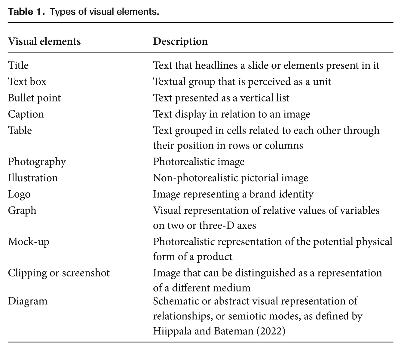
Types of visual elements.
At the same time, slides can be grouped according to their topics, or main idea presented by a slide or sequence of slides. Topics allow us to characterize how the slide deck is functionally structured as a whole and so may be related to the notion of generic stages or genre moves commonly assumed in genre theory (Swales and Swales, 1990) but, because of the limitations of the pitch decks as only one component of a pitch presentation, these stages will be identified simply as topics. In summary, therefore, the slide is considered here both a segmentable unit, composed of multimodal elements, as well as contributing to a larger unit, namely the topic.
Topics were identified in a previous work (Cabezas and Bateman, 2024). There, a model consistent of 18 topics was developed and used to classify the slides of the same 96 pitch presentations utilized also for this present work. Four coders analysed the entire corpus and identified the presence and distribution of these topics. Results showed only a small selection of the topics were present in a majority of the pitch decks. Based on that, this present study will focus only on the slides with topics present in over 80 percent of the 96 pitch presentations, namely (Cabezas and Bateman, 2024: 9):
Company: The slide presents company name, logo, or contact information.
Team: The slide presents team members.
Product: The slide presents the products or services of the company.
Problem: The slide presents a problem or nuisance to be solved.
Achievements: The slide presents the current achievements of the company.
Results
The results of the corpus analysis will be presented in two different sections. First, the presence of different visual elements will be described in terms of the overall slide presentation. Second, to further understand the composition of the individual slides, the use of visual elements in the five most common topics will be described in more detail. Finally, illustrations of the most common composition of these topics based on the results of the analysis will be presented. These illustrations will exemplify how visual elements are distributed in specific topics.
Presence of visual elements per slide deck
Most of the visual elements identified were present in over half of the 96 slide decks analysed (Table 2). The only three exceptions were the use of bullet points (45.83%), graphs (35.42%) and tables (8.33%). Graphs and tables, in particular, were also the type of visual elements with the least number of elements per slide deck, appearing mostly only once per presentation. In contrast, text boxes, logos, captions and photography appeared in over 95 percent of the slide decks analysed. What is more, these elements were some of the most common in the corpus, appearing over 10 times per presentation on average.
Distribution of visual elements in the corpus (% in bold).
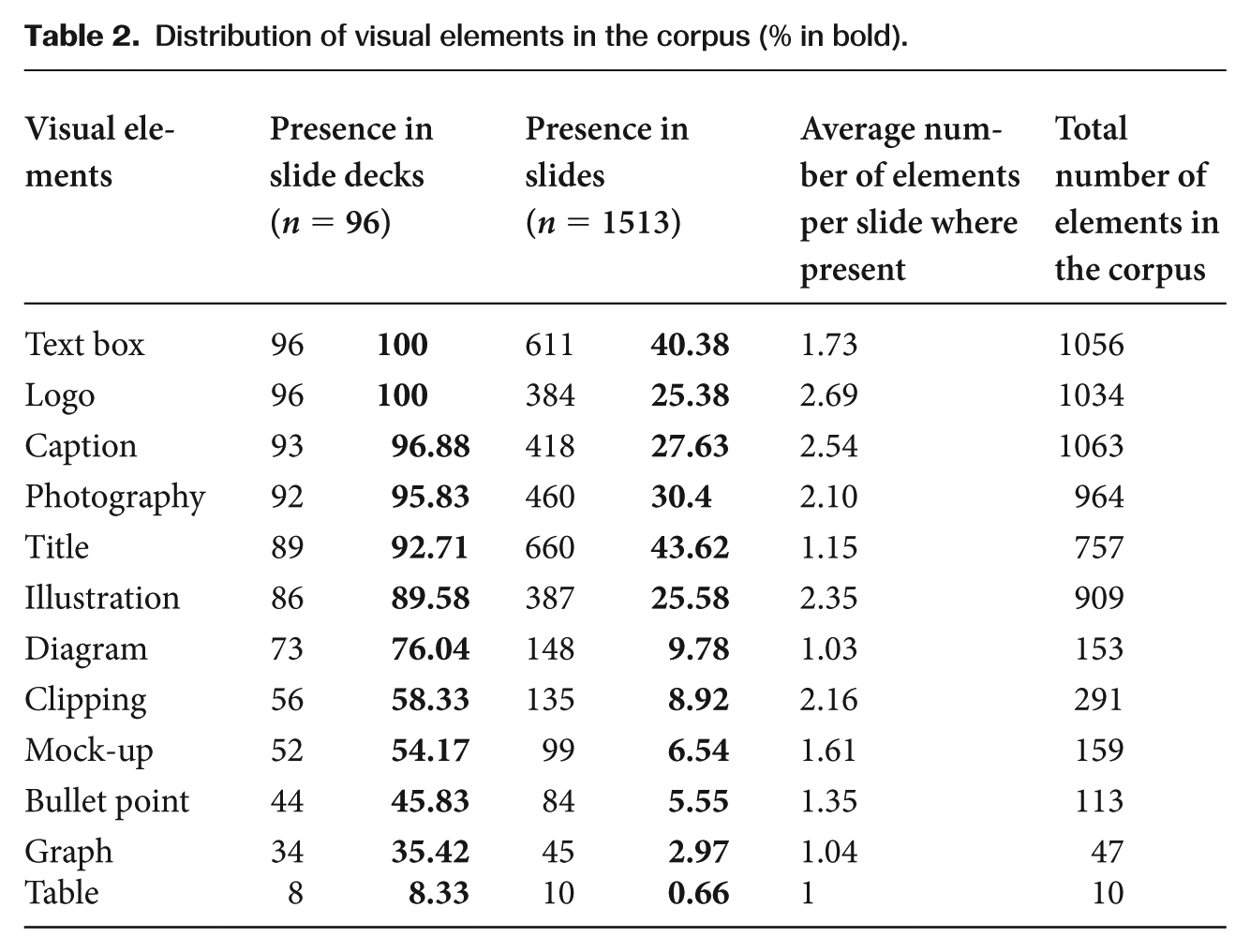
The use of the elements on individual slides, in contrast, was not as widespread. None of the visual elements appeared in all the slides. Moreover, titles and text boxes, even though they appeared in the largest number of slides, could only be found in around 40 percent of slides. This means that the visual elements are not distributed equally across the slides of a pitch deck, making the composition of the slides diverse even within the same presentation and contrasting with the idea of ‘visual profiles’ at the level of the entire slide deck as presented by Rowley-Jolivet (2000, 2002, 2004). Instead, the results follow what Diani (2015) already described, although in passing, regarding conference presentations. Slides with different function seem to also have their own particular composition, something that will be clearer in the next section.
This variability is further evidenced when considering the use of other visual elements, such is the case with logos, which have one of the largest total number of elements in the corpus (1034), and yet are present in only 25.38 percent of the slides (384 of 1513). This means, in broad terms, that their use is concentrated in fewer slides per presentation but that, when we find them, they usually appear in groups. The same can be said of other visual elements such as captions, photos, illustrations and clippings, all of which appear, on average, in groups of two or more elements.
Other elements, in contrast, tend to appear only once per slide. This is the case for titles, bullet points, graphs and tables. The use of a single title per slide makes sense as its role is usually to explicitly state the topic of the entire slide. The rest of the elements, meanwhile, share the particularity of also being the least frequent, appearing in the least number of pitch decks and slides. Thus, they are the most scarcely utilized elements in pitch decks by every metric.
The overall presence, or lack thereof, of certain elements such as logos, illustrations and tables is also a departure from what has been described in other genres. The presence of logos in university lectures (Zhao and Van Leeuwen, 2014) was very limited, for example, comprising only 2 percent of the images identified, meanwhile their presence in pitch decks was far more common (25.38%). Images, similarly, were present in 15 percent of the slides from university lectures in the field of linguistics (Feng, 2021), but the use of illustrations alone was higher in the pitch decks, occurring in 25.58 percent of the slides, and photographs were also present in 30.4 percent of the slides. In contrast, even though tables seldom appeared in the pitch decks, they were highlighted as a recurrent type of visual in conference presentations from the field of medicine (Rowley-Jolivet, 2002), even though the extent of their use was not reported.
Distribution of visual elements per topic
To further understand the distribution of visual elements among the slides of a pitch deck, their use will now be described related to the topic of the slides where they are being utilized. This analysis focuses on the five most common topics of the pitch decks, as determined in previous work (Cabezas and Bateman, 2024). These five topics were present in at least 80 percent of the 96 pitch decks as also analysed in the current work. The topics, presented in order of frequency from most to least commonly used, are ‘company’, ‘team’, ‘product’, ‘problem’ and ‘achievements’.
In Table 3, the use of visual elements is presented according to the percentage of slides where they appear for each specific topic: that is, within each topic the number of slides with an occurrence of a specified visual element is divided by the total number of slides for that topic. This then takes account of the variation in the total number of slides per topic present in the corpus and makes the comparison between different topics possible. For example, we can see that the use of text boxes in the three topics – ‘problem’ (32.72%), ‘product’ (31.49%) and ‘achievements’ (33.77%) – is similar, even when the total number of slides they appear on is not, with ‘problem’ and ‘product’ having text boxes in close to 90 slides each, while ‘achievements’ was present in only 52 slides; similarly, ‘team’ is present in only 108 slides, while ‘product’ has almost three time as many slides, with 289 slides in the corpus. This then permits the comparison of results across topics with differing total numbers of slides as shown in Table 3.
Percentage of slides with presence of the visual elements per topic (%).
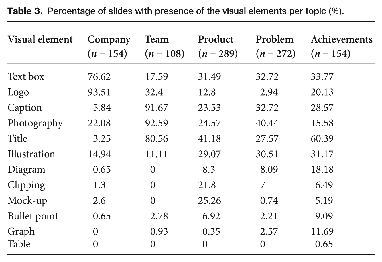
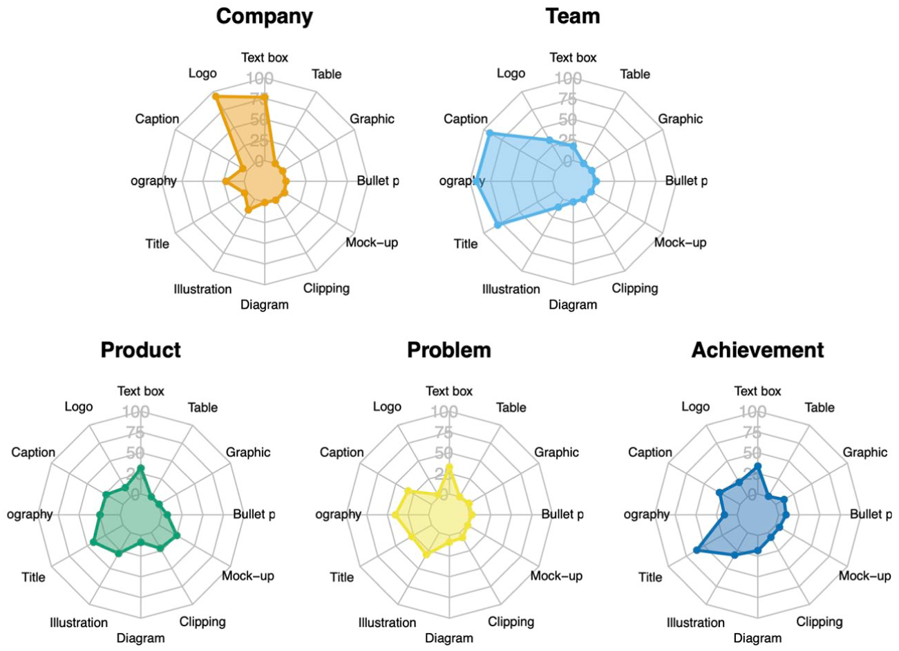
By considering the topic of the slides, therefore, it becomes possible to see clear differences in the presence and distribution of certain elements (Figure 1). Such is the case with logos, which are present in 93.51 percent of ‘company’ slides, while their use is scarcer in other topics, being present in only 2.94 percent of ‘problem’ slides. A similar situation can be seen in the five most recurrent elements, their presence being more common in certain topics than others. Thus, it is far more common to find captions, photography and titles in ‘team’ slides, where they are present in over 80 percent of these slides, than in any other topic.
Distribution of type of visual elements across different topics.
The least recurrent visual elements seem to also be present in certain types of slides rather than others. Such is the case for clippings and mock-ups, which are present mostly in slides presenting the product, and are completely absent from other topics such as ‘team’ (Figure 1). The presence of graphs, as well, even though low in ‘achievements’ (11.69%), is almost zero in the other four topics. Bullet points too, even though the difference is not as pronounced as with other elements, are more frequently used in ‘product’ (6.92%) and ‘achievements’ (9.09%) slides than on the slides of the other three topics.
Illustrations, meanwhile, seem to have a similar use in slides presenting ‘problem’ (30.51%), ‘product’ (29.07%) and ‘achievements’ (31.17%) topics, where they are present in almost a third of the slides for each of these topics. Even their use in ‘company’ (14.94%) and ‘team’ (11.11%) slides is not as low as is the case with other elements. This may be related to what Feng (2021) described as the decorative use of visual elements in slides, which would mean illustrations have a more general use independent of the topic, or rhetoric function, of the slide, hence their presence is more consistent across different types of slides, although this would require further investigation.
At the same time, it is possible to see differences in the diversity of elements used across the topics (Figure 1). Some topics utilize mainly the same elements, such as the case with ‘company’ which uses two elements, logos and text boxes, both present in over 75 percent of the slides. Meanwhile, other topics tend to be more diverse in their composition. ‘Product’, for example, not only presented a wider selection of visual elements, but also varied more in their use, with no element being found in even half of the slides (Table 3). This means that certain topics, such as ‘company’ and ‘team’, have a very fixed visual composition, while other topics, such as ‘problem’ and ‘product’, tend to be more flexible.
The number of elements present on a slide (Table 4) also shows differences according to the topic. Photographs, for example, appeared in groups of four elements when utilized in ‘team’, and only as an individual element when present in ‘company’, ‘problem’ and ‘achievements’ slides. Similarly, clippings were used in larger amounts in ‘problem’ slides but, when utilized in ‘company’, only one clipping is used. Titles, diagrams, graphs, and tables were the only types of visual elements that appeared only once per slide regardless of the topic. Thus, the visual composition of a pitch deck changes depending on the topics both in type of elements as well as in the number of elements present per slide, something that will be addressed further in the following sections.
Number of visual elements present per slide.
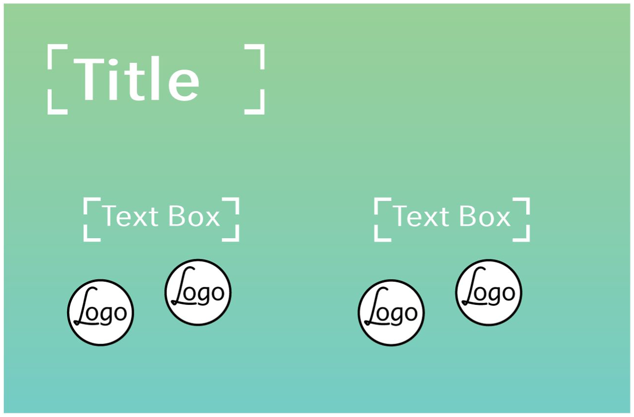
Company
As reported in a previous study (Cabezas and Bateman, 2024) ‘company’ is not only the most recurrent topic, present in all the pitch decks analysed, it is also, in almost all cases, the first topic presented in a pitch deck. Thus, these slides serve as an introduction to the pitch, as well as a first introduction of the company. It is then no surprise that in 93.51 percent of these slides (Table 3) one can find logos which serve to visually identify a company.
‘Company’ slides, as illustrated in Figure 2, also tend to use few types of elements, mainly logos and text boxes. Furthermore, even the use of these elements tends to be minimal. ‘Company’ slides presented, on average, 1.22 logos and 1.54 text boxes per slide. This means that a prototypical company slide would be composed most of the time of the company logo plus two text boxes, one presenting a slogan or value proposition of the company, and a second one which would give further information concerning the company, such as their website, or the presenter, such as their name.

Use of visual elements in ‘company’ slides.
These elements tended to be presented in the centre of the slide, with the logo using most of the space and the text boxes positioned beneath it. This distribution of elements is similar to the ‘title slide’ lay-out described by Djonov and Van Leeuwen (2013), but presents some important distinctions. The predominant use of a logo as the principal element of the slide, for starters, contrasts what the software PowerPoint suggest to its users, a layout with only two text boxes and no suggested space for images. Furthermore, the use of those text boxes also differs from what is described in other studies as ‘title slides’ (Atai and Talebzadeh, 2012; Djonov and Van Leeuwen, 2013; Zapletalová, 2014; Zhao et al., 2014). Here, there is no title describing the presentation, instead the text, which tends to be smaller, serves either to establish the name of the company, or its value proposition, and to identify the presenter.
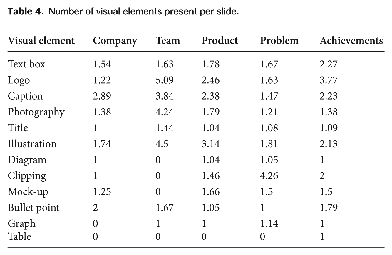
Team
‘Team’ slides contain mostly three elements: titles, photography and captions (Table 3). These elements appear in over 80 percent of the slides in the case of titles and over 90 percent in the case of photography and captions. Similarly to ‘company’, ‘team’ slides are also both very frequently used and, when used, are very consistent in their composition.
‘Team’ slides (Figure 3) are, on average, composed of 1.44 titles, 4.24 examples of photography and 3.84 captions (Table 4), one per piece of photography. This means that, when presenting the team, team members are usually introduced with individual images of each person accompanied by a caption identifying the name and position of the person in the company. Additionally, in almost a third of ‘team’ slides (Table 3), one can find the use of logos. These elements are usually presented together with the photograph and caption of each team member, used as a shorthand for their previous work experience or achievements.
Use of visual elements in ‘team’ slides.
Product
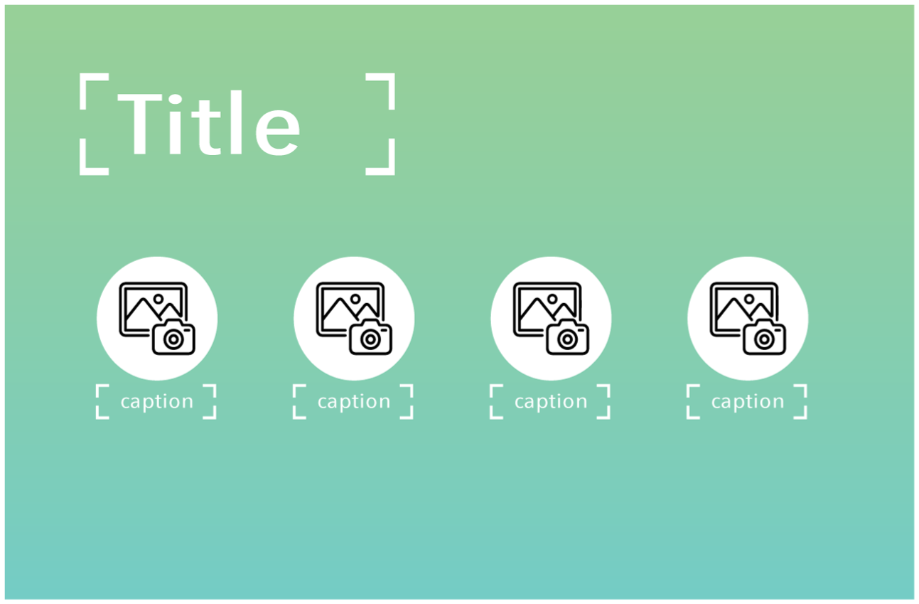
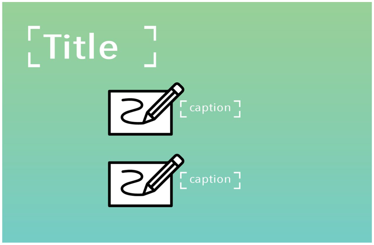
‘Product’ slides, in contrast to ‘company’ and ‘team’ slides, have a more varied composition, both in the type of elements used, as well as in the similarities between slides. Thus, while no element was present in even half of the slides, there are several elements that can be found in around 25 percent of ‘product slides’ or more (Table 3). Such is the case for titles, text boxes, illustrations, photography, captions and mock-ups. Even clippings were present in 21.8 percent of the slides, making ‘product’ the slides with the most frequent use of this type of element.
When present, most of these elements appear in pairs, the only exceptions being titles, which appeared only once, and illustrations, which appeared in groups of three (Table 4). Thus, as we can see in Figures 4 and 5, products are regularly presented by a combination of several elements. These can be photography accompanied by text boxes or by mock-ups with illustrations and captions giving further details of the product being showcased. Sometimes, a photograph may appear instead of a mock-up, used together with illustrations and captions, or the captions could be used without any illustration and instead be related directly to a photograph or a mock-up.

Use of visual elements in ‘product’ slides.
Use of visual elements in ‘product’ slides.
The variety of element types utilized in ‘product’ slides makes them widely different from the use of academic slides which have been described as composed of mainly one type of element (Atai and Talebzadeh, 2012; Diani, 2015; Rowley-Jolivet, 2000, 2002, 2004; Zapletalová, 2014). In contrast, ‘product’ slides use a diverse type of elements in several configurations. Figures 4 and 5 are, therefore, only two examples of the many different combinations these slides take.
Problem
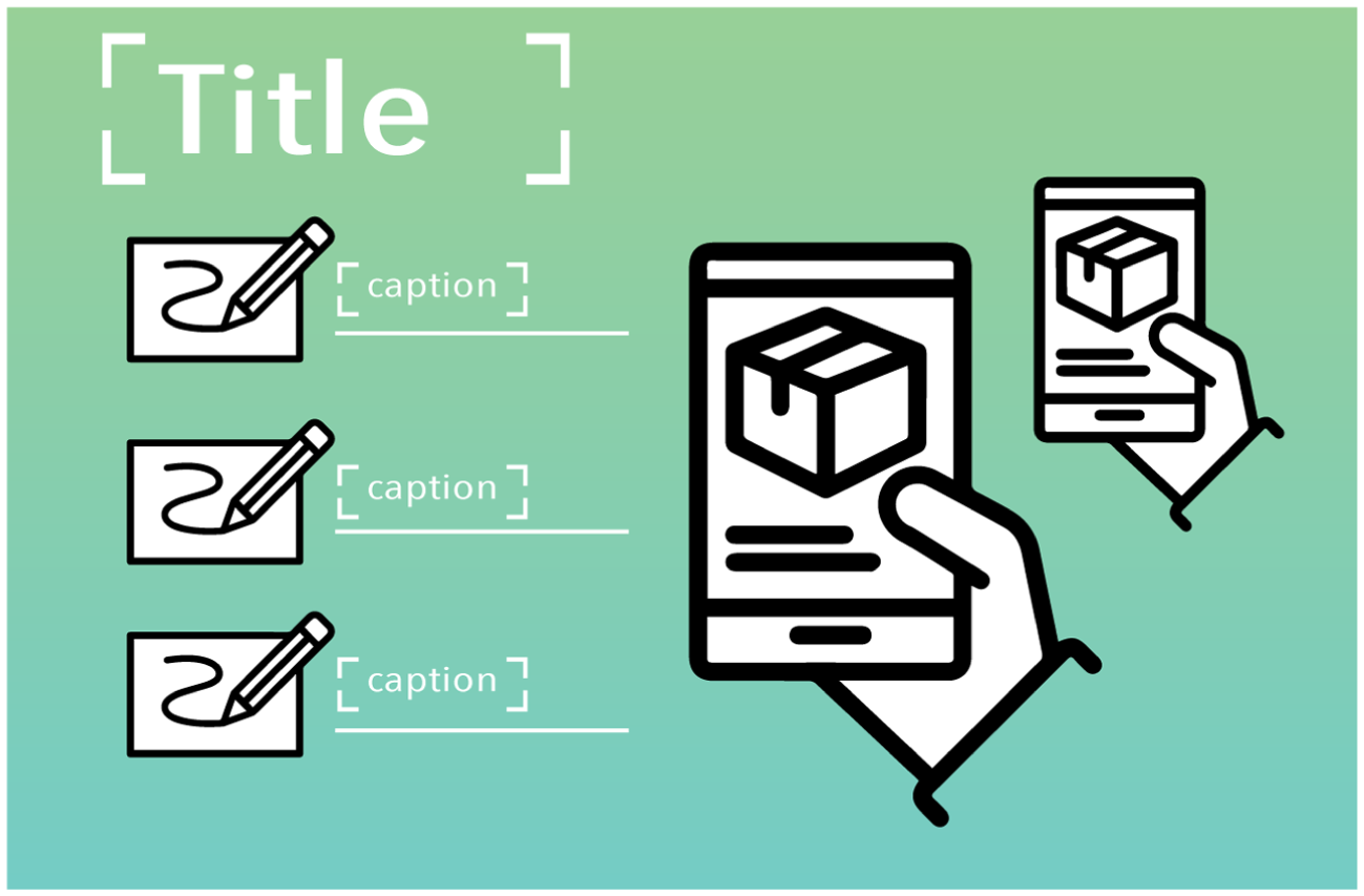
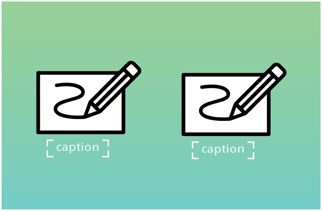
‘Problem’ slides are mostly composed of five types of elements (see Table 3): photography, text boxes, captions, illustrations and titles. Similar to product slides, ‘problem’ slides tend to be very diverse with most of these elements appearing in about a third of the slides, except for photography, which appears in 40 percent of the slides (Table 3). Meanwhile, the number of each element is on average lower than in product slides. This means that ‘problem’ slides tend to be less cluttered than ‘product’ slides, with most elements appearing only once or twice per slide, as is suggested in Figures 6 and 7.

Use of visual elements in ‘problem’ slides.
Use of visual elements in ‘problem’ slides.
The use of fewer elements, as well as the combination of images and text, makes ‘problem’ slides the closest to the academic slides shown in other studies (Feng, 2021; Soliman, 2023; Zhao et al., 2014), with slides using a single image alongside a text. These academic slides tend to follow the layout structure given by PowerPoint of one image, either on the right or the left side of the slide, presented together with text, most commonly a bullet point list, something that seldom happens in pitch decks. ‘Problem’ slides instead have a more varied distribution of its elements, which rarely resemble the ones used in academic genres.
Achievements
‘Achievements’ slides, similar to ‘product’ and ‘problem’ slides, are also very diverse, with most elements appearing in around 20 percent or 30 percent of the slides. This is the case with text boxes, illustrations, captions, logos and diagrams (Table 3). The only exception is titles, which appeared in a little over 60 percent of the slides. Contrary to the ‘team’, ‘product’ and ‘problem’ slides, ‘achievements’ slides utilize photography far less frequently and are present in around 15 percent of the slides. In contrast, this is the topic with the highest use of diagrams among the five presented in this work, although diagrams appear in only 18.18 percent of the slides overall.
When used, again most of the elements appear in pairs, except for titles and diagram, which appear on their own, and logos, which appear in groups of four. As depicted in Figure 8, ‘achievements’ slides can be similar to ‘problem’ in their use of illustrations accompanied by captions, although the use of titles for the slide is more common for ‘achievements’ slides. These slides tend to use more text boxes together with logos, similar to ‘team’, where logos were used as a shorthand for the achievements of team members; in this case, they serve as shorthand for the achievements of the company (Figure 9).
Use of visual elements in ‘achievements’ slides.
Use of visual elements in ‘achievements’ slides.
Conclusions: Pitch Decks As A Multimodal Genre
The aim of this article was to provide a detailed profile of the distribution of multimodal elements within pitch decks. To achieve this, different types of visual elements were identified and counted across the slide presentations overall, as well as within specific topics. The results showed that the composition of the pitch decks is very diverse, both in the types of elements utilized as well as in the composition of the different slides. Thus, even when most of the visual elements identified were present in more than two thirds of the presentations, none of them were present in even half of the slides analysed. Nevertheless, when considering the topics of the slides, there are clear differences in the elements used depending on topic, thus showing functional diversification within those topics that contribute to the definition of pitch decks as a multimodal genre. The presence of logos, for example, was very common in ‘company’ slides, while they were almost completely absent from ‘problem’ slides. Providing a detailed functional profile of this kind thus establishes a first step for further examination of the communicative visual strategies that are employed according to the topics being pursued. This could ultimately serve as the basis for understanding the rhetorical function of these visual elements.
The visual composition of pitch decks also showed differences in the visual composition reported for other presentation genres. Conference presentations, for example, were described as most commonly using visual semiotics in the fields of geology, medicine and physics (Rowley-Jolivet, 2000), and scriptural in the case of applied linguistics (Atai and Talebzadeh, 2012; Diani, 2015; Zapletalová, 2014). This contrasts considerably with the results of the present study, where most slides contained a mixture of elements from what could be considered visual and scriptural semiotics. At the same time, the use of certain types of elements highlighted in these studies are scarcely used in pitch decks, such as the use of tables in medical conference presentations (Rowley-Jolivet, 2002) and bullet points in applied linguistics (Diani, 2015). Pitch decks, instead, utilized text boxes more frequently than bullet points. Similarly, logos are commonly used in pitch decks, an element that has not been reported in other genres, such as lectures (Zhao and Van Leeuwen, 2014). Thus, the results of the study seem to suggest pitch decks have specific visual compositions, different from that of conference presentations and university lectures. It remains to be seen, however, to what extent such differences are a consequence of different genres and disciplinary practices, or possibly of changes in presentational strategies over time.
The variety of elements in different slides also shows a departure from the idea of Djonov and Van Leeuwen (2013) and Zhao et al. (2014) that the default layouts of PowerPoint may influence the creation of certain types of slides. Although the specific layout of the slides was outside the scope of this study, it is still possible to identify certain aspects of the used of a slide that relate, even if indirectly, to the use of certain layouts. This can be done here by considering the frequency and quantity of elements present in them, or the absence of certain elements commonly suggested by the default layouts, something that contrasts the composition of slides in academic presentations according to different studies (Feng, 2021; Soliman, 2023; Zhao et al., 2014). For example, the overall lack of bullet points across all pitch decks (Table 2) shows there is not a strong use of a very common layout option given by the software. This also differs from the university lecture decks that Djonov and Van Leeuwen (2013) analysed which used bullet points in 35 percent of the slides. The use of logos, as well, shows that certain slides tend to have a larger number of elements than what any layout suggests and, therefore, that slides were constructed or customized by the participants of Start-up Chile beyond any layout suggestion or restriction given by the software. To fully understand and compare the specific use of default layouts, and recurrent layouts more generally, a further study that considers variables such as the size of the visual elements and their distribution in the space of a slide would be needed, as well as the specific software used to create them, or even the potential use of templates.
To address all such questions, the results and limitations of this study demonstrate the necessity of a more granular approach in the analysis of slide decks. In other words, it is important to consider the slide not as a single unit but as a segmentable component of a slide deck. This approach would help to give a more detailed description of the visual composition of the slides and, by extension, the slide deck as a complex artefact. As seen previously, the composition of the slides varies through the topics of a slide presentation in both type of element, as well as in the number of elements presented per slide. This means that, if the slide is considered the basic unit of analysis, many characteristics will be lost, such as number of elements, their layout and their specific function within the presentation. Hence, by going beyond the slide and considering individual elements and their distribution, as well as other factors, such as the topic of each slide, the oral presentation that accompanies the slide and the function of each element, it will be possible in future to better distinguish the use of slides in different genres for a more comprehensive contrastive overview of this area of multimodal communication.
This study highlights the characteristics of one part of a slide presentation, the slide deck itself. As such, this study should be considered, not as a definitive description of the pitch as a communicative event, but as a starting point to understand the use of slides in this specific genre. The description of the layout units, or visual elements, across different types of slides shown in this study, in particular, hopes to offer a new perspective on the study of slide presentations: one that would not only give a more detailed understanding of the diverse ways a slide deck, the pitch deck, utilizes such elements, but would also serve as a starting point to create better guidelines tailored to the specific rhetorical function of each particular slide and not just of the slide deck as a whole.
Footnotes
Data Availability Statement
Data sharing not applicable to this article as no datasets were generated or analyzed during the current study.
Biographical Note
PAULA CABEZAS is a PhD student at the University of Bremen. Her research currently focuses on the entrepreneurial pitch as a multimodal genre.