
Abstract
To the general public, text-to-image generators, such as Midjourney and DALL-E, seem to work through magic and, indeed, their inner workings are often frustratingly opaque. This is, in part, due to the lack of transparency from big tech companies around aspects like training data and how the algorithms powering their generators work, on the one hand, and the deep and technical knowledge in computer science and machine learning, on the other, that is required to understand these workings. Acknowledging these aspects, this qualitative examination seeks to better understand the black box of algorithmic vision through asking a large language model to first describe two sets of visually distinct journalistic images. The resulting descriptions are then fed into the same large language model to see how the AI tool remediates these images. In doing so, this study evaluates how machines process images in each set and which specific visual style elements across three dimensions (representational, aesthetic and technical) machine vision regards as important for the description, and which it does not. Taken together, this exploration helps scholars understand more about how computers process, describe and render images, including the attributes that they focus on and tend to ignore when doing so.
Keywords
Introduction
Generative artificial intelligence, ‘software systems that create content as text, images, music, audio and videos based on a user’s “prompts”’ (Yang et al., 2024: 2), has exploded in the public’s awareness and in industry applications since late 2022 and early 2023 (Liu and Wang, 2024). Generative AI has been used for diverse applications across personal and professional contexts, including being used to create award-winning images in photo competitions, to create more diverse fashion models in the advertising industry and to increase the efficiency of game designers’ routine tasks (Demopoulos, 2023; Marr, 2024; Parshall, 2023). Each of these examples is accompanied by potentially different challenges, risks and opportunities that are specific to that context. One context that is productively unique for the context of this study is journalism, where accuracy or fidelity is prized and expected by industry practitioners and audiences alike (Shapiro, 2010). Within the visual realm, generative AI can be used in journalism for many purposes but early research (Thomson et al., 2024) suggests that some news outlets report publishing AI-generated content only when the content has gone viral and they are reporting on it or seeking to debunk it. Other examples suggest some individual practitioners and news outlets have taken a more liberal approach, using generative AI to show stories that could not otherwise be told or to illustrate articles for a visual online ecosystem that demands images to attract engagement, increase reach and tell stories more holistically (Growcoot, 2023; Meade, 2024) .
Even when the visuals in question are not made or edited by AI, audiences sometimes suspect they have been, which casts doubt on the credibility and trustworthiness of journalists and news outlets. A recent example of this was when global news agencies circulated – and then retracted – an image of the Princess of Wales with her children after visual inconsistencies in the image suggested it had been manipulated (Orr and Aidone, 2024) and audiences speculated that ‘Kate may have used AI to edit family image’ (McGuinness, 2024). The image had been offered to the news media by the royal family as an official photo, but they failed to disclose the way it had been made and edited.
While many might be selective about which images they publicly share from their private camera rolls or might overtly edit their images before posting them online (Thomson, 2021), the Middleton controversy represents a different type of context as press images have a sometimes quite dramatically different set of conventions around production and editing compared to ordinary people’s everyday snapshots they make, edit and post online. This is because journalism adheres to a practice that seeks to normatively be ‘accurate, fair, and thorough’ (Society of Professional Journalists, 2014), regardless of the reporting format or medium. Visual journalism, for example, has also been defined by attempts to create and share ‘the visual pursuit of objective reality as we now know it – the most accurate recording of life events a human being can make’ (Newton, 2013: 50) and journalists’ professional codes of ethics similarly prescribe that ‘Editing should maintain the integrity of the photographic images’ content and context’ and that journalists and editors should not ‘manipulate images or add or alter sound in any way that can mislead viewers or misrepresent subjects’ (NPPA, 2025). Thus, when Middleton and Kensington Palace published a photo that had been edited within the typical conventions of ordinary social media users, tension arose when news agencies circulated the image further and, in doing so, gave the image credibility it perhaps did not fully deserve.
The controversy and speculation surrounding this image, how it was made or edited, and what it claims to represent is a perfect entry point for an empirical study into how machines process and describe images in a context like journalism where accuracy is prized. Indeed, news outlets, journalists and fact-checkers are grappling with how to verify viral content online as well as vouch for the credibility and accuracy of citizen-produced content they receive or integrate into their own reporting (Thomson et al., 2020). At the same time, AI is also offering journalists and documentarians new ways to tell stories that they previously could not pursue due to time, access, safety, sensitivity, or resourcing reasons (Matich et al., 2025). Given these fears and challenges, as well as opportunities and potential benefits, this study tries to explore how AI tools describe and create images to contribute to the scholarly understanding of what, precisely, machines process visually and how they do it, as well as to assist journalists and news outlets in their quest to use AI tools in safe, responsible and ethical ways.
As Berger (1972) argues, seeing is a subjective experience that is influenced by personal attributes and sociocultural conditioning. Indeed, audiences bring various characteristics, some innate and some learned, to their viewing experiences (Cohen, 2018). In addition to innate characteristics such as age and sexuality, and socially conditioned experiences, such as religion, humans also bring their education, or lack of education, to viewing experiences. This includes historical and technical knowledge as well as various visual literacies that can inform the way an individual sees, understands and makes meaning from visual phenomena (Gluibizzi, 2010).
Overall, seeing is a subjective and social experience that can be shaped by gender, age, class, religion, ability and ethnic background, among other attributes (Moore and Dwyer, 1994). Yet, while humans have scores of attributes and characteristics that inform and shape how they see, how do machines and computers process images and what might the implications of this be for the unique context of journalism? As the literature review that follows expands upon, the field of computer vision has existed since the 1970s but we still do not fully know, some 50-plus years later, all the intricacies of how computers process images (Szeliski, 2022).
The complexities of computer vision, accompanied by some considerable confusion and misunderstanding, have expanded as generative artificial intelligence has burgeoned in the past few years (Zhou et al., 2024). Indeed, AI-generated or AI-edited images made or altered through services like Midjourney, DALL-E, or Stable Diffusion have been called ‘magical’ (Laba, 2024) and the underlying systems powering those images have remained for the majority of society, quite opaque (Leone, 2024). This article thus aims to explore how computer vision processes and describes human-produced images and, correspondingly, how it then uses AI to visualize and re-mediate what it renders in the context of journalism. More specifically, this article aims to contribute to the scholarly understanding of computer vision’s sense of visual ‘style’ and which attributes it finds important to describe as well as which attributes it ignores or minimizes when visualizing the descriptions it creates. Style has been called ‘an aspiration of, and part of the essential process of, journalism’ (Shapiro, 2010: x), but has tended to be studied from the perspective of linguistic style rather than visual style. Research that has focused on photojournalists’ output, however, has found that professional photojournalists tend to offset the subject rather than centre it in the frame, to photograph from in front of those depicted and at a closer distance, and to focus on individuals rather than groups compared to non-professionals (Greenwood and Thomas, 2015), leading the authors to conclude that ‘photographs made by citizens do not generally reflect the aesthetic standards expected of professionals’ (p. 615). Additional research (Solaroli, 2017) found that older photojournalistic styles, such as photographing from the front, keeping the camera parallel to the horizon line in a composition and ensuring sharpness and clarity in the image are being challenged by some elite photojournalists in favour of a more ‘emotional’ photojournalism (Brennen, 2010) that features blurred, grainy, out-of-focus images and dramatic chiaroscuro lighting.
As journalists and news outlets continue to experiment with when and how to use generative AI, the results of this exploration can contribute to visual communication scholarship while also aiding journalists and news organizations in their attempts to use AI in prosocial and responsible ways.
Literature Review
This literature review briefly traces relevant scholarship on image classification, description and generation, and then turns its attention to visual style and various ways to conceptualize this within the generative AI context. After this, I present the two key research questions of our study.
Image classification, description and generation
Asking computers to describe images can be a form of image captioning, whereby the machine performs tasks such as scene classification and semantic segmentation to return low-level information about the input (Ricci et al., 2024). This is a difficult task for computers due to the huge range of possible image–description pairings and the task’s utility is also challenged by image captioning processes that traditionally returned only a single sentence description.
Using large language models can help return more accurate and rich descriptions; however, the accuracy of the description can be affected by how similar the subject in question is to other subjects (Ren et al., 2024). For example, a classifier might confuse a lion, a tiger and a cat because they share some similarities even though they are different species within the same taxonomical family.
In general terms, large language models like ChatGPT 4o process images through a multi-step approach (Lang et al., 2024). First, the user references, uploads or links to some source material, which is an image for our purposes. Depending on the type and attributes of the source material, some preprocessing and normalization might be required. Next, the model uses neural networks to identify image features, including edges, colours, shapes and textures. Finally, the model uses natural language to describe the results of the extraction and to describe the scene being depicted.
Training is an essential part of this process. AI models are trained on large (but often unrepresentative) datasets that, in this case, contain pairs of images and text descriptions so that the models can learn to associate certain visual features with certain textual descriptions (Cui et al., 2023; Li et al., 2023). Factors including the language of training data, the training data context, the amount and type of training data available, and the way the model is programmed to work can all affect the results and how accurate or appropriate they are (Thomson et al., 2024).
A description’s structure, length, phrasing and word choice all affect the resulting output (Lu et al., 2023). Prompts that are too short or too vague will not have the required detail to produce an accurate image. Those who have studied prompt engineering recommend a description or prompt ‘template’ that specifies the desired medium, the subject matter and any artist or source image whose style the user would like to inform the output (Oppenlaender, 2023).
When following this template, a reference to an artist’s name or source image largely acts as a proxy for having to define and articulate specific attributes of visual style, such as use of colour, level of realism versus abstraction and compositional positioning. However, in zero-shot learning cases, when AI models have to recognize and describe objects or concepts that they have potentially never encountered before (as in the case of a user uploading an image and asking the AI to describe it), such templates are not useful (Wang et al., 2019). As such, being aware of various style attributes and categories is necessary to evaluate how well AI tools perform when describing the visual style of images. To this end, Laba (2024) suggests that three dimensions (representational, aesthetic and technical) are important to consider when discussing the visual style of AI-generated outputs. She defines the representational dimension as encompassing the output’s subject matter or setting (e.g. who or what is represented); the aesthetic dimension as encapsulating aspects such as art movements and art styles; and the technical dimension as incorporating aspects such as the image’s aspect ratio or level of realism. Other scholars, such as Liu and Chilton (2022) and Westberg and Kvåle (2024), suggest that colour palettes, textures, lighting, motifs and perspective are also relevant aspects within the ‘aesthetics’ dimension, as would other semiotic resources, such as the distance between the subject and the viewer (Greenwood and Thomas, 2015; Kress and Van Leeuwen, 2020).
Given the uneven attention in the scholarship to generative AI’s understanding of visual style within journalism and the need to explore how AI processes images and remediates them, this study proposes the following two research questions:
As journalism is a culturally specific practice that relies on unique conventions and expectations (Zelizer, 2005), including those around accuracy and fidelity, knowing how generative AI systems describe and remediate journalistic materials is important so that practitioners can know which use cases might be able to be employed in their journalistic work and which should be left to other industries and contexts. These are not abstract or hypothetical questions. Research shows that some journalists are already using generative AI systems to process visual assets and add keywords and metadata to them (Thomson et al., 2025) and some are also using written journalistic reporting as input to produce visual output, such as in the case of an AI-generated animated documentary (Tordecilla, 2025). Knowing more about how generative AI systems process and remediate images within the context of journalism will inform such use cases.
Methods
In order to advance this study’s aim to explore how computer vision renders and describes visual style within a journalistic context, a diverse set of prize-winning human-created images was first identified and selected. This set included 27 images drawn from two of the 2024 Pulitzer Prize categories (‘breaking news photography’ and ‘illustrated reporting and commentary’). The breaking news photography Pulitzer was awarded to the staff of Reuters for ‘raw and urgent photographs documenting the October 7th deadly attack in Israel by Hamas and the first weeks of Israel’s devastating assault on Gaza’. The illustrated reporting and commentary Pulitzer, in contrast, was awarded to Medar de la Cruz, a professional illustrator and a jail-and-prison-services assistant for the Brooklyn Public Library, for ‘his visually-driven story set inside Rikers Island jail using bold black-and-white images that humanize the prisoners and staff through their hunger for books’. By selecting these two categories, the sample includes a mix of images from diverse image genres: namely, 15 images in a photorealistic visual style that were created by cameras and 12 lower modality ink drawings that were created by hand.
In addition to offering contrasting visual styles for analysis, the images complement the study’s focus on how AI describes and renders visual style by providing materials for analysis in a journalistic context. Additionally, as the ongoing conflict in the Gaza Strip is attracting significant mis- and disinformation, including in visual, AI-generated or -edited form (Walter, 2024) and situations like these are ones that journalists are actively having to cover and to fact-check, this also makes the aims of the present study relevant for analysing these images and reflecting on the limits and possibilities of AI vision for journalistic storytelling.
As the number of generic visuals – including stock photography – in the news rises (Anderson et al., 2025) and the number of professional visual journalists dwindles as iPhone-wielding reporters or ‘citizen photojournalists’ who lack specialization in visual journalism take their place (Allan, 2017; Solaroli, 2017; Thomson, 2024), the Pulitzer Prize-winning image pool provides a unique and important dataset. These images are what professionals regard as the pinnacle of the industry’s output and what they regard as worthy of special attention, recognition and commentary. The selection of Pulitzer Prize-winning images in this study is therefore appropriate and generative because the work is made by professionals who operate differently from stock photographers or other non-specialized reporters who make work for manifold genres or who lack professional training and possess different values and aesthetic sensibilities (Greenwood and Thomas, 2015; Thomson and Uddin, 2023). These images, therefore, allow for an understanding of how generative AI models – many of which are trained on material originating outside of journalism – process and understand visual style in a very specialized and particular field with unique conventions and expectations.
Each of these 27 images was first uploaded to ChatGPT-4o and the AI tool was asked to describe the image. The large language model spent an average of 168 words describing each of the 12 illustrations. It spent an average of 153 words describing each of the 15 camera-created photographs. In all, the LLM spent an average of 160 words describing each of the images in the sample.
These descriptions were then fed back into the same AI tool with the request to ‘create an image based on the following description’. Each image the AI generated was then downloaded and saved for analysis. The ‘Memory’ setting on ChatGPT was turned off so that previous images or descriptions would not influence subsequent outputs. The AI-generated descriptions were saved, and the AI-generated images and the original images were placed side-by-side in a computer program for further analysis and evaluation. Specifically, the analysis used the constant comparative method (Glaser, 1965; Kolb, 2012) to systematically evaluate how the source and AI images were similar or different and to analyse the text descriptions to see how they mentioned (or ignored) visual style attributes. Though my approach was systematic, the analysis was influenced by the author’s professional training and experience in visual journalism. Had the analysis been undertaken by others without this background, some of the analysis’s nuance would likely be lost, although the broad contours of the analytical approach could be repeated by others.
A small sample was required to attempt this multi-method approach and to meaningfully evaluate and analyse the 27 source images, the more than 4,000 words of AI-generated descriptions, and to reflect on and analyse the 27 AI-generated images that were generated through the AI tool’s descriptions. As mentioned earlier, Pulitzer Prize-winning images were selected both because of their diversity in form (camera-created versus hand-drawn visuals) and also because of their prominence. Pulitzer Prizes are awarded to ‘distinguished’ examples that adhere to the ‘highest journalistic principles’ (Topping et al., 2024). By elevating these images, the Pulitzer Prize Board thinks they are worthy of additional public exposure and commentary. Certain categories, such as the ‘Illustrated Reporting and Commentary’ category included in this study’s sample, for example, also recognize work that is ‘characterized by political insight, editorial effectiveness, or public service value’.
Findings
Evaluating style attributes in the AI-generated descriptions
The study’s first research question was concerned with the specific ‘style’ attributes (across the representational, aesthetic and technical dimensions) that a large language model, ChatGPT, described when processing human-made images in two diverse visual forms (camera-produced photographs and hand-drawn illustrations) within the context of journalism.
Technical dimension
Findings from the analysis of the technical dimension will be presented first as this dimension plays a fundamental role in shaping the proportions of the image frame and, therefore, the compositions that are possible to be filled with representational material and stylized through aesthetic choices.
Orientation and aspect ratio
About 59.2 percent of the original source images were in horizontal orientation and had a 2:3 (4:6) aspect ratio. The remaining 40.8 percent of the source images were in vertical orientation and most had an aspect ratio close to 5:7. The AI-generated descriptions of all the source images ignored orientation entirely. As a result, when the descriptions were fed back into the AI tool to recreate new images based on the descriptions, they were all in the ‘default’ 1:1 (square) aspect ratio that is common across many text-to-image generators (Tan et al., 2019).
Level of realism
For the hand-drawn illustration images, the AI tool roughly specified the level of realism in each image by noting in its description that the image was an ‘illustration’. For the camera-generated images, however, the AI tool did not specify the level of realism or the form or modality of the image (i.e. as a camera-created photograph). Indeed, the word ‘photograph’ is not present in any of the descriptions, nor are descriptors such as ‘photorealistic’ or ‘lifelike’. Thus, with these images, the AI tool seemed to interpret the default level of realism as high and photorealistic, unless explicitly prompted otherwise.
Representational dimension
The AI tool described who or what is represented largely in generic and literal terms. Gender is only specified roughly half the time and ethnic background or skin colour are ignored completely. Age is also ignored save for the extremes – when children are shown, these are noted as such and when older people are shown, these are also noted. People, objects and features of the landscape are described but cultural context is largely devoid from the descriptions. In only three cases is culture explicitly mentioned: twice with headwear (in the case of a woman’s hijab and a man’s kippah) and once with a flag. However, other signs of national and cultural context, including Hebrew writing on a building in the shelter photo and the Arabic writing on the photo of the man lying with his head resting on a body bag, are ignored in the AI-generated descriptions (see Figure 1). This speaks to the potential dominance of certain cultures over others and to the (non-English) language limitations of AI tools. The AI tool also ignored descriptions of the body weight of those depicted, in a similar finding to Westberg and Kvåle’s (2024) study of AI descriptions and images.
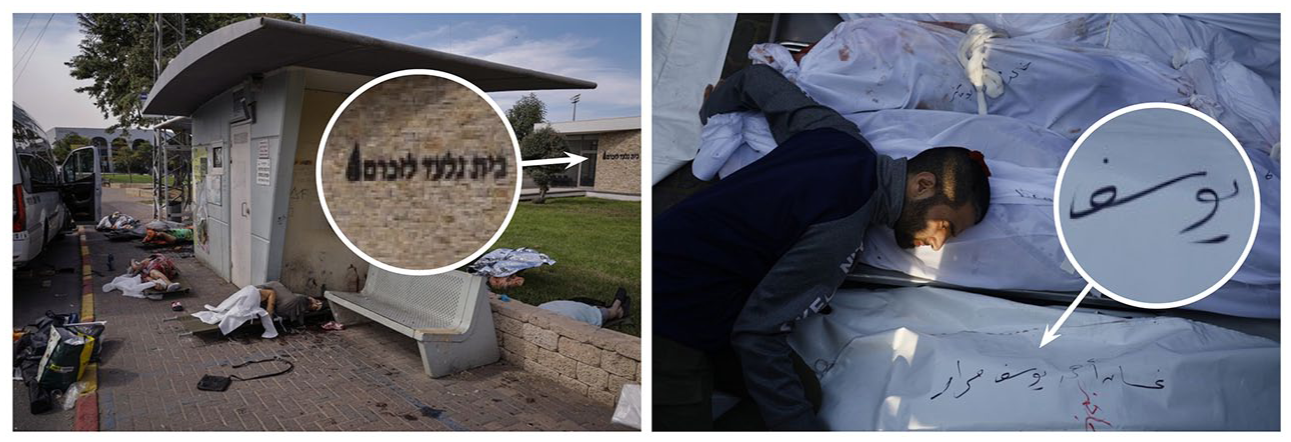
National and cultural context ignored in the AI description. Photo at left by Ammar Award. Photo at right by Mohammed Salam. 3
Aesthetic dimension
The aesthetic dimension is the one with the highest number of potential variables, including art movements, art styles, colour palettes, textures, lighting, motifs and perspectives. Yet it is also one that was largely ignored in the AI tool’s descriptions of the images.
Lighting or time of day 1 are only mentioned four times across the 27 image descriptions. Three of these references are in relation to action that is happening at night and one reference relates to the time of day as being either early in the morning or late in the evening.
Regarding colour, the illustrations are consistently described as being black and white but, for the colour photographs, colour is mentioned rarely. Indeed, only 10 references to colour are made (in relation to someone wearing ‘dark clothing’, ‘fiery arcs’, a ‘yellowish hue’, ‘white tank top’, ‘pink outfit’, ‘blackened walls’, a ‘white cloth’, a ‘red hijab’, ‘white coverings’ and a ‘white shroud’). References to colour are also overwhelmingly localized (e.g. referring to objects within the frame) rather than globalized (e.g. specifying the overall colour temperature of the image or the relative saturation or level of contrast).
Some proxemic and positioning information is included in the descriptions (e.g. ‘the cityscape below’, ‘in the centre’, ‘sitting closely together’, ‘on the right side of the image . . .’). These are included roughly half the time. However, semiotic resources, such as the vertical or horizontal angle of the viewer or whether the scene is parallel or oblique to the viewer, are never specified in the AI descriptions. Similarly, focal length and field of view, or how close or far away from the subject the viewer’s perspective is, are only specified twice in the descriptions (‘the perspective emphasizes the long, narrow hallway’ and ‘the perspective focuses on the inmate’s hands’).
Texture is described rarely in the photos. Several references to atmospheric conditions (‘thick with dust’, filled with ‘lingering smoke’ and ‘hazy’) exist and two references exist in relation to the quality of interior surfaces being ‘plain’ or ‘rough’. However, overall, the quality of the surfaces in terms of texture are frequently ignored in the AI descriptions.
Visual (art) style was only described in the illustrations. Here, they were referred to sometimes as ‘woodcut’ – or ‘graphic-style images with high contrast, bold and heavy lines, and heavy shadows or shading.’ (For accuracy, the illustrations were ink drawings, not images created using the woodcut process.) Other semantic cues, including that the scene was ‘dramatic’, ‘sombre’, ‘stark’, ‘institutional’, ‘quiet’ and ‘reflective’, were also used somewhat sparingly.
Identifying similarities and differences in the visual styles between the source and AI-generated images
The study’s second research question was concerned with how the visual style of the human-made source images were similar to or different from those made by AI-generated processes. The results from the hand-drawn illustrations will be presented first and will be followed by the press photography results.
Visual style of the illustrations
Despite the AI description including the term ‘black and white’ in each image summary, the AI versions of the illustrations looked largely monochromatic but had subtle hints of yellows, creams and browns in the highlights of each image.
Because of the lack of specificity in the descriptions around vertical and horizontal angle and subject-to-viewer distance, the perspective adopted by the AI roughly matched that of the source images in only 2 of the 12 images.
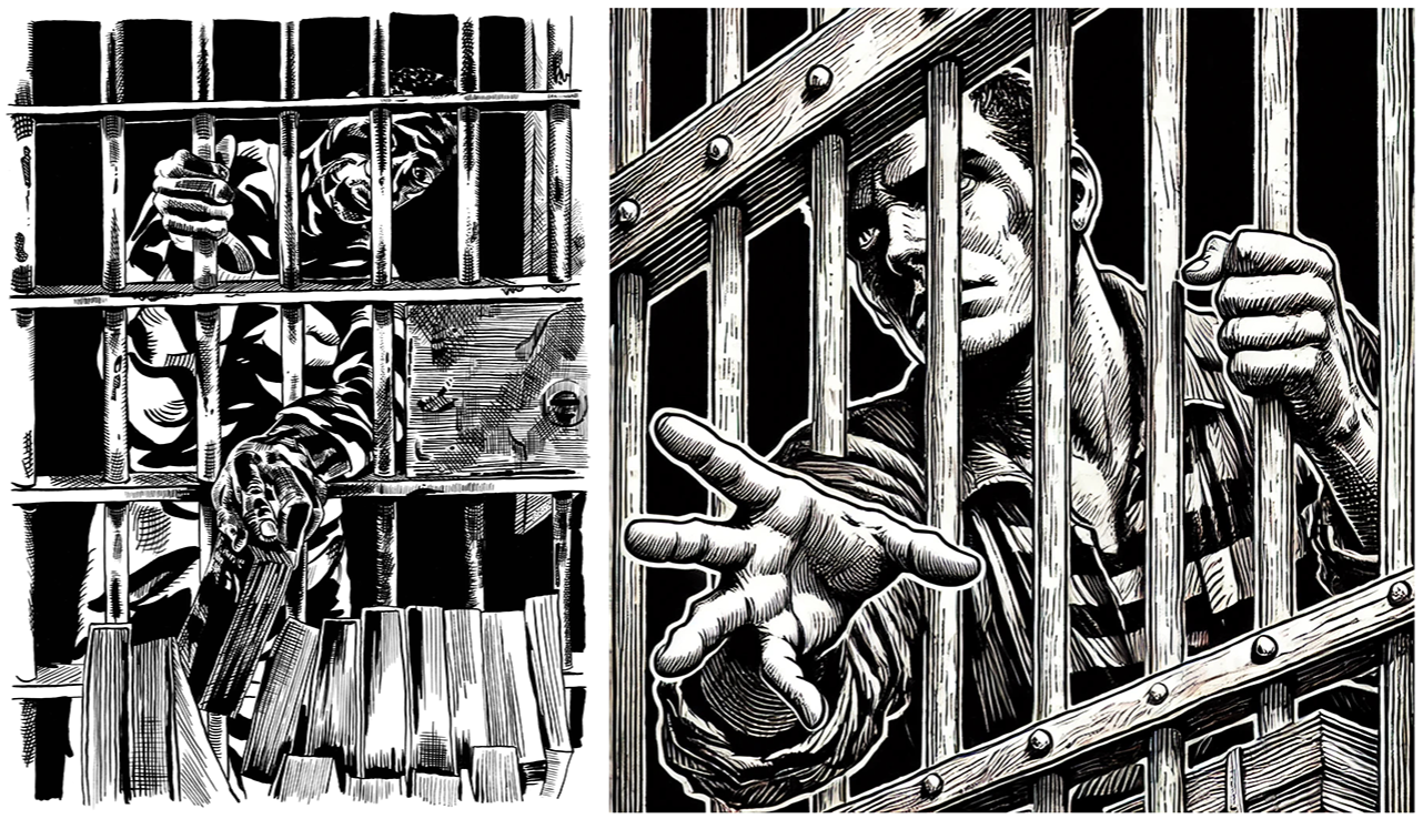
Many of the hand-drawn illustrations had a different relationship to the borders of the image frame than the AI-generated versions (see Figure 2). As examples, the compositions in source images 1–3 and 6 do not extend to the edges of the frame like the AI-generated images do. None of the hand-drawn images has a ‘stroke’ (border) applied to the frame so the white of the canvas (and the white of the magazine page or digital screen the original story is being viewed on) blend into one another. In contrast, the AI-generated images all have compositions extending to the edges of the frame, making these look more boxy than the hand-drawn illustrations, which often have more organic shapes because of the interplay between positive and negative space in these compositions.
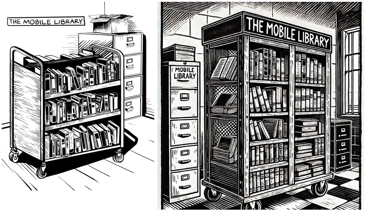
Different relationships to the edge of the image frame. Illustration at left by Medar de la Cruz. 2 AI-generated image at right by ChatGPT-4o.
In terms of fidelity to the prompts and to the source images, the AI tool took significant liberties. As examples, in the second source image, 2 the jail system is mentioned in the inset speech bubble emanating from the radio so the AI imagined the listener was in jail themselves and pictured them adjacent to a wall of prison bars; in image three, the mobile library cart is waist-high and the AI description (correctly) states the cart has three shelves but the resulting AI image shows a mobile library cart with five shelves that is nearly the height of the ceiling (see Figure 2); in image four, the AI description (correctly) notes the interaction is happening between two men with another two men, one of whom is in a wheelchair, close behind but the resulting image shows the interaction taking place with two men, including one in a wheelchair; in Figure 4, the drawing of the map is simplistic and the buildings shown are lacking detail while in the AI version, the buildings are much more detailed with windows and towers featured; in image six, the AI mistakes a wall of prison bars for a shelf with library books and, as a result, the AI image features numerous floor-to-ceiling bookshelves when none are present in the source image; in image seven, the AI shows two figures speaking to one another while in the source image, only one person is shown; in image eight, the shields are long and rectangular and the prisoner is wearing a solid-coloured outfit in the source image while in the AI image, the shields are circular and the prisoner is wearing a stereotypically striped outfit; in image nine, the interaction takes place between two people but in the AI version, the conversation is shown as taking place among five or more people spread throughout the image; in image 10, the window slats are horizontal in the source image but are shown as vertical bars in the source image; and in image 12, the side walls are shown as plain in the source image but are shown in the AI version as being filled with barred doors on both sides.
Visual style of the press photography
Perhaps the most striking difference between the press photography source images and the AI-generated versions is the way colour is rendered in both. 3 Perhaps because of how rarely colour was mentioned in the descriptions (and the way it was mentioned without descriptive detail when it was referenced), or perhaps because of the AI model’s underlying training data, or a mix of these factors, the AI-generated images were much more vibrant and colourful than the wire service source images (see Figure 3). The source images were overall low in contrast, largely showed muted colour palettes, and overall had low dynamic ranges. In contrast, the AI images were bursting with colour. The blood in image three, for example, is a vivid red when, in the source image, it is significantly darker and appears almost black. The mourners in image four are shown in direct light in the AI version rather than in shade in the source image and the AI versions of images 6–14 each show significantly more contrast, dynamic range and dramatic lighting than the source images. This underscores the lack of attention in the AI descriptions to colour and lighting and/or suggests training data that have, on average, more contrast and evidence higher dynamic range than the press photographs in this sample. This seems to converge with Machin’s (2004) earlier work on the colour intensification of stock photography (which can be a significant source of training data for AI models).
The press photos and AI-generated versions treated colour differently. Photo at left by Evelyn Hockstein. 3 AI-generated image at right by ChatGPT-4o.
Compared to the illustrations, the AI versions of the press photographs matched the viewer’s perspective more often, roughly half the time (compared to about 16% of the time with the illustrations).
The AI versions of the press images seem to visually exaggerate features of the source image compositions for dramatic effect (see Figure 4). For example, in the first image, the AI-generated description mentions only a single vehicle. In the AI visualization of the description, there is a column of four or more vehicles with another two vehicles on the other side of the road, going the opposite direction. The repeated pattern formed by these vehicles, complete with gun-wielding occupants, is much more striking in the AI version compared to the source image. As a second example, only four body bags are seen in the last press photography source image but, in the corresponding AI version, more than forty body bags can be seen in a seemingly endless series of rows.
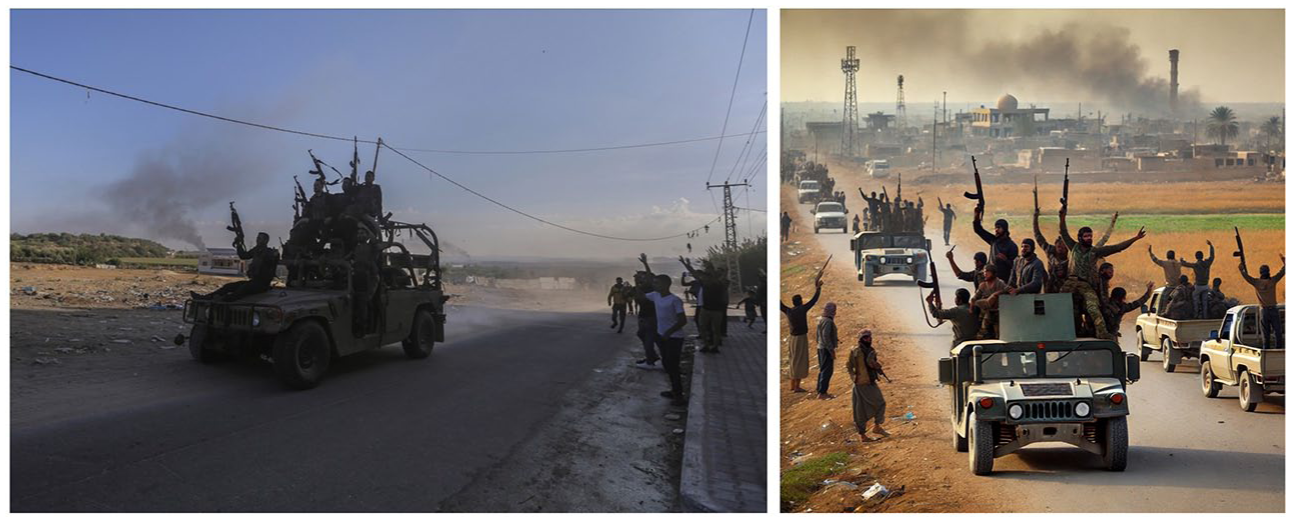
The AI-generated images were more dramatic than the source images. Photo at left by Ahmed Zakot. 3 AI-generated image at right by ChatGPT-4o.
The AI versions of the image also draw on stereotypes without the prompt specifying these. For example, in Figure 3, the image from the press photographs shows only a single kippah being worn; the AI version shows two and a third man wearing a wide-brimmed hat. Two of the men wearing hats also have long white beards even though none of the people in the source image do.
Discussion and Conclusion
Overall, computer image processing seems to pay unequal attention to visual style across the three dimensions of representational, aesthetic and technical. AI tools like ChatGPT that use computer vision and algorithms to process, describe and render material seem to draw most heavily on the representational dimension. By focusing on who or what is featured, the activity, if any, that is happening in the scene and, to a lesser degree, distinctive art styles, if any are present, the AI tool is able to describe between perhaps 50–70 percent or so of what the source images depict and, in turn, to approximate a rough visualization in turn that tries to show the features outlined in the description.
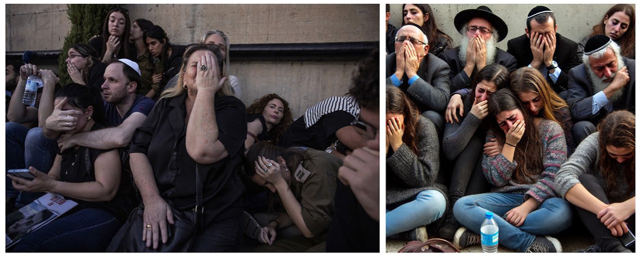
At first glance, the AI images appear stunning and, by drawing on social and cultural stereotypes and a hyper-rich visual style that is full of contrast, a sweeping dynamic range, interesting light and perfect positioning (attributes also identified in Westberg and Kvåle’s, 2024, research on AI-generated images), it is able to deliver images that in some ways seem to outshine the original (award-winning) journalistic source images. Yet, a closer inspection also reveals that some of the more subtle visual style attributes of the original source images have been ignored by the AI description and subsequent remediation. An example of this comes from the press photo of the injured woman in the red hijab (see Figure 5). In the original source image, the photographer selected a slow shutter speed to obtain motion blur on the figures adjacent to the injured woman in the centre. This thoughtful choice of camera settings and timing allows for the visual metaphor of ‘her world stood still’ to be relayed and for extra attention to be paid to this central figure while the motion-blurred figures adjacent to her are seen as less important. The AI version ignores this attribute entirely and, as a result, the figures surrounding her are all frozen solid just as she is. The visual metaphor is lost and the photographer’s choice to highlight her is ignored. (The AI version also incorrectly assumes that the woman is mourning over someone else and includes a referent for her grief – a presumably deceased body in the foreground – rather than correctly understanding the woman herself is injured and in pain.)
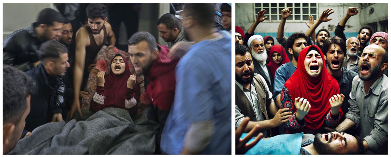
Blurred and frozen motion alter the focus of the image. Photo at left by Ibraheem Abu Mustafa. 3 AI-generated image at right by ChatGPT-4o.
What does this mean for how generative AI is trained and learns to process, describe and render images in a journalistic context? Based on the press photography examples, it would seem that large language models should pay closer attention to the effects of camera settings, including shutter speed, aperture and ISO, as well as contrast and dynamic range, when they are learning to process, describe and/or render images. Representational features and their positionings matter, but so, too, do the way those representational features are rendered through choices around particular vantage points, camera settings and human ‘ways of seeing’ (Berger, 1972), including the possibility of visual metaphors. Based on the hand-drawn illustration examples, attention to a specific art style, such as ‘woodcut’, cannot eclipse the key storytelling features of an image. As an example, in the first source image (Figure 6), it is clearly seen that the inmate is grasping one book from a row of books on the cart. In the AI version, there is, perhaps, the hint of a book in the extreme lower right-hand corner but this aspect would likely be lost unless a caption drew the viewer’s attention to it. The AI description of the source image notes that the ‘inmate is reaching through the bars with one hand, holding a book or several books’ but this part of the summary is not found in the description’s first sentence. AI should not only be able to describe what is happening but also to discern what parts of the scene are more or less important and incorporate this weighting into the description. For all the images in the sample, a closer attention to technical features, too, such as aspect ratios, would also ensure that these important aspects of visual style are not ignored by AI.
Uneven attention to an image’s storytelling features. Illustration at left by Medar de la Cruz. 2 AI-generated image at right by ChatGPT-4o.
At a deeper and more provocative level, large language models would not just need to be able to process literal features of an image in order to describe and remediate its style more effectively within a journalistic context. They will also need a deeper and more grounded understanding of human culture, of various identities and lived experiences, of the conventions, ethics and standards of various professions and contexts, such as journalism, and the ways that a scene can look different and be interpreted differently based on these various vantage points and expectations. As an example, the illustrator, De La Cruz, identifies as ‘a person of color’ and has previously spent time in jail (Schou, 2024). How do those two attributes affect his vision and style, and how can AI learn those details in order to inform how it describes and remediates De La Cruz’s work? The ethnic backgrounds of the people in De La Cruz’s illustrations are ignored in AI’s description of them, as are any wider environmental attributes, such as a national context or culture. This is despite De La Cruz saying in an interview:
I'm a person of color, and 99% of the people there [inmates on Rikers Island] are people of color. I feel like I'm trying to do something for people who look like me. That's what inspired me to seek this out. It was not just another job. It was a calling. (Schou, 2024)
Gaining awareness of a creator’s intent and motivation, whether a librarian or journalist, to make images can and should inform how they are then described and remediated. This presents both an opportunity and a challenge for large language models, which are often developed by non-representative identities and without broad consultation with people of varying lived experiences (Cui et al., 2023; Li et al., 2023). These models also seem to lack the necessary discipline- or industry-specific awareness and data to be used to their full capability in contexts like journalism. Including a reverse-image search when a large language model is asked to describe an image can potentially provide more context that can lead to a better rendering of the image’s visual style. In this case, a reverse-image search for any of the 12 images in the series would lead to De La Cruz being the artist and to biographical information about him and his approach. Likewise, the same images would also link back to the story as published in The New Yorker and to vital contextual details, such as that the story takes place on American soil, involves people on Rikers Island, and was published in a journalistic context. These details would allow the large language model to assess whether the description it generates and any resulting remediated visuals are representative of the facility’s and inhabitants’ characteristics, and whether the image converges with or diverges from journalistic ethical norms and conventions, leading to a more nuanced depiction of visual style than is possible only through a surface-level description of an image’s features.
Based on this study, it would seem that generative AI systems could improve the usefulness of their image descriptions (and potential utility in journalistic contexts) by including other attributes of visual style—such as the number of people in the frame, the distance between the camera and the subject; whether the composition is parallel with or oblique to the subject, and whether it uses a centred or offset compositional approach—that the literature indicates are important features of photojournalistic style (Greenwood and Thomas, 2015). Similarly, consistently paying attention in the descriptions to the presence or absence of blur or grain, the image’s depth of field and focus attributes, and its lighting conditions (Brennen, 2010; Solaroli, 2017) would help generative AI systems more robustly attend to the aesthetics and technical dimensions of visual style that are seemingly ignored in favour of the more dominant representational features that are described.
Limitations and opportunities for future directions
The study’s analysis involved close evaluation of more than 4,000 words of AI-generated description of the images in the sample and a close reading of the 54 images in the sample (the original 27 and the remediated versions created by AI). 4 While at first glance this might seem a rather modest sample, the purpose of the study was to identify the attributes across three dimensions (representational, aesthetic and technical) that AI focused on its descriptions of human-made images in a single context: journalism. By identifying these aspects, future studies that have larger sample sizes and are quantitative in nature could test how widely these attributes are focused on in bigger data sets and how they might converge or diverge with these results across other industries and contexts.
Recalling that a description’s structure, length, phrasing and word choice all affect the resulting output (Lu et al., 2023) and that ChatGPT returned, on average, descriptions of around 160 words, future research might explore at which point longer descriptions cease to improve the quality of the resulting output as well as integrate industry perspectives on AI-edited or -generated output along with an analysis of the output itself to provide a richer and even more integrated contribution.
Footnotes
Acknowledgements
This article is dedicated to Dr Nataliia Laba, who invited me to join a panel about AI and visual style, and, in doing so, motivated me to think about this topic and further develop it through an empirical approach.
Article Note:
This article includes depictions of death, mourning and armed conflict originating from the 2023 attack in Israel by Hamas and the first weeks of Israel’s assault on Gaza. Viewer discretion is advised.
Data Availability Statement
Data sharing is not applicable to this article as no datasets were generated or analysed during the current study.
Notes
Biographical Note
TJ THOMSON is a Senior Lecturer at RMIT University and an Australian Research Council DECRA Fellow. His research is united by its focus on visual communication. A majority of his research centres on the visual aspects of news and journalism, and on the concerns and processes relevant to those who make, edit and present visual news. He has broader interests in digital media, journalism studies and visual culture and often focuses on under-represented identities, attributes and environments in his research. TJ is committed to not only studying visual communication phenomena but also working to increase the visibility, innovation and quality of how research findings are presented, accessed and understood.
Address: RMIT University, 124 La Trobe St, Melbourne VIC 3000, Australia. [email: