
Abstract
This article explores typographic placemaking by comparing the design and public launch of two city fonts: TilburgsAns (2016) and Dubai Font (2017). Building on recent work on semiotic technology and graphic ideology, the authors examine how these fonts’ visual features and the promotional discourses surrounding their launch are utilized for placemaking, and how this is facilitated and constrained by technology and ideology. The results show that the two projects of typographic placemaking build on a similar repertoire of semiotic technology, but make different use of it. The authors sustain that this difference is explained by the political aims of the two projects, on the one hand, and their economic and organizational scale, on the other. A postcolonial perspective further underlines their geopolitically and historically different preconditions.
1. Introduction
More and more cities communicate their established or aspirational position within the world’s social and economic order by using exclusive customized fonts. While there are many kinds of city fonts, they all have in common that they draw on or establish a relationship between a graphic form and a particular city. 1 In this sense, they are part of a larger category of typefaces that are discursively and ideally as well as graphically linked to particular places. Earlier research has focused on sets of letterforms and typefaces that through history have come to stand for a particular nation or localized ideology (e.g. Bain et al., 1998; Järlehed, 2015), and fonts that have been commissioned for branding particular nations (Mattern, 2008). At another level, particular urban neighbourhoods have given names to fonts that more or less explicitly claim to represent them (e.g. Piccadilly, SoHo and Södermalm). In all cases, the relationship between the typeface and the place is supposedly a win–win deal: the fonts build on the status and reputation of the places and place names, while the places ideally get a personal and distinct graphic–visual form for their marketing and branding. In general, these fonts claim to draw on earlier and existing graphic expressions of the place’s identity.
In this article, we aim to explore how city fonts, as part of placemaking practices, produce particular identities and social orders. The aim is pursued by answering the following two questions:
(1) How is place created with typographic and discursive means in the cases of TilburgsAns and Dubai Font? We are thus concerned with place as primarily a social construct, linking and ascribing cultural, historical and political qualities to a specific geographic locale. The cities referred to by city fonts are both ‘real’ geographic and social places, and fabricated place products or brands.
(2) What
To answer these questions, we build on the increasing body of work in sociolinguistics, social semiotics and critical (type) design studies that conceptualize typography as a social practice and semiotic technology closely linked to ideology (Järlehed, 2015; Järlehed and Jaworski, 2015; Londoño, 2015; Mermoz, 1994; Salen, 2001; Spitzmüller, 2012; Walker, 2001). We approach typography as a social practice in the sense that we consider what people make or try to make with it, and also as semiotic technology since we are interested in how it affords meaning-making (here related to city branding). Typography then comprises the knowledge, practice and technology used to design, produce and deploy ‘marks on a substrate’, where ‘“substrate” refers to any surface on which marks are made: paper, stone, and electronic display device’ (Walker, 2001: 10).
This article compares two city fonts: TilburgsAns (2016) and Dubai Font (2017). 2 While TilburgsAns (see Figure 1) was designed by graphic designer Sander Neijnens and illustrator Ivo van Leeuwen as an artistic project to typographically portray the Dutch city of Tilburg, the bi-scriptal (Latin and Arabic) Dubai Font (see Figure 2) was commissioned by the Executive Council of Dubai, designed by a Monotype team led by Nadine Chahine, and distributed to millions of users through a collaboration with Microsoft and their software suite Office 365. The two fonts are different in several ways and illustrate the complexities of typographic placemaking. As a bottom-up artistic intervention into urban space, TilburgsAns invites users to play with social norms and the boundaries of image and writing. Dubai Font was launched as a gesture of promoting diversity and openness, but this contrasts with its top-down design and oversight intent on branding one of the world’s leading tourist destinations and its authoritarian regime. While the differences seem obvious at first, a closer analysis of the two cases shows there are similarities. Both fonts illustrate the prototypical urban entrepreneurial idea (Harvey, 1989) that a city can be conceived as a simple and coherent entity, with a single identity and public image, lending itself to smooth branding work. In both cases, the audience is invited to download and use the font, hence illustrating the current trend towards ‘participatory design’ (Keshavarz, 2016) and participatory place branding (Kavaratzis and Kalandides, 2015). In the end, the principal difference is largely the economic and organizational scale that each project has been conceived and executed on. Furthermore, a postcolonial perspective underlines the lopsided historical preconditions that inform the implemented discourses and strategies.
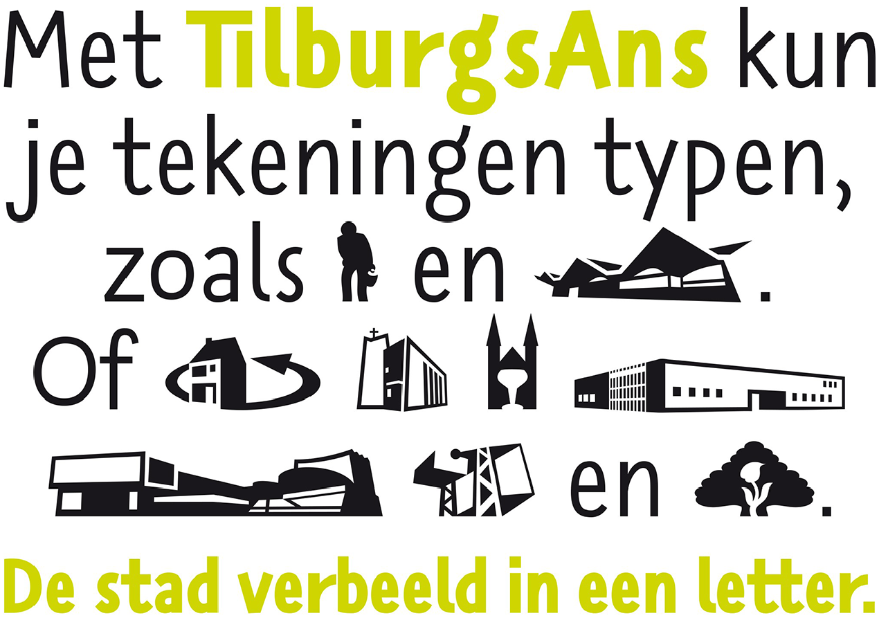
Type specimen for TilburgsAns, displaying a mix of letters (in two different weights) and pictograms.Source: Sander Neijnens and Ivo van Leeuwen. Reproduced with permission.
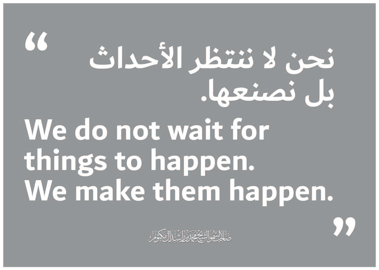
Type specimen for Dubai Font from the global press release, displaying the font in Arabic and Latin scripts.Source: Nadine Chahine.
2. Conceptual Framework
The two fonts bear the names of cities and are meant to celebrate and brand them. They are hence part of city branding, the practice and process of creating a differentiated and attractive narrative and visual identity for a city in order to compete with other cities in the international market of politics, trade, business and tourism (Kavaratzis, 2004). According to Woolard (2016: 36), branding, and its writing practices, are foremost forward-looking, aiming at the creation of a new or renewed public image and (visual) identity. At the same time, most branding practices draw on modernist assumptions about the value of origin, roots, history, etc. and hence include backward-looking references. As we will show, this double temporal perspective is central to the promotional discourses of city fonts.
Visual communication technologies and their capacity to facilitate and effectively communicate differentiation are key for understanding the branding process and its affordances. More specifically, we propose to examine ‘how social and semiotic assumptions and norms are inscribed in semiotic technology’ (Poulsen et al., 2018: 594), and how such assumptions and norms, or ideology, materialize in the public launch of city fonts. Here, semiotic technology encompasses both the fonts as a writing technology and the technologies used for designing, distributing and using fonts, including design software (e.g. Glyphs), communication media and platforms (e.g. Twitter and Office 365), and end-user licence agreements. Although we cannot delve deeply into all these dimensions of semiotic technology, in the analysis we will touch upon several of them to illustrate how they afford and constrain social norms and meanings.
This brings us to the concept of graphic ideology. Spitzmüller (2012: 257) defines it as ‘any set of beliefs about graphic communication means articulated by users as a rationalization or justification of perceived orders and communicative use of graphic elements’. We can illustrate this with the pictograms designed by Otto Neurath for Isotype, and later developed for ‘universal’ usage. They suggested representing human bodies and behaviours in an abstracted ‘neutral’ and ‘objective’ way which would make them universally recognizable and applicable. The Isotype pictograms were ‘appealing to the supposedly objective faculty of vision rather than to culturally bound interpretation’ (Lupton, 1986: 58). However, Lupton argues that ‘a pictogram functions by connecting with the culturally bound expectations of the people using it. It does not have an automatic, natural link to its object, but rather uses a figurative image as the starting point in a chain of associations’ (p. 51). Hence, there are no neutral graphic or typographic forms; they are always invested with social value and meaning, and thus part of ideological negotiation and reproduction.
The producers of city fonts typically state that the fonts stand for or represent certain – idealized – characteristics of the city. They furthermore suppose that the envisioned use of the fonts will contribute to both strengthening this standing-for relationship and promoting the city brand. For the process to be successful, they rely on people’s recognition and acceptance of the font as standing for the city. Within linguistic anthropology, the notion of enregisterment has been used to describe the process whereby a linguistic form becomes publicly recognized as a social emblem, i.e. as standing for or representing a social category and associated geographic places (Johnstone, 2013). With regard to typography, Järlehed (2015) demonstrates the enregisterment of the Basque typeface as a visual repository of the country’s heritage.
Continuing this line of work, we assume that not just the designers and producers of city fonts, but everyone that uses and comments on them contributes to the collective process of establishing a standing-for relationship between typographic form and place. Such relationships are realized in different ways in different settings. Yet, typographic placemaking seems especially dependent on the ideological frameworks of particularism/authenticity and universalism/anonymity (Woolard, 2016). At first sight, to gain authority as representing a particular place and its history, to serve as the visual and graphic face of a city, a city font ‘must be perceived as deeply rooted in social and geographic territory’ (p. 122). With Woolard’s poetic words, it needs to ‘talk with a voice from somewhere’. At the same time, however, to attract a broader international audience, the two studied fonts, like many others, are designed to talk with ‘a voice from nowhere’ or in an unmarked way, thus assuming ‘to be able to represent and be used equally by everyone precisely because they belong to no-one-in-particular’ (p. 25). Our analysis shows how these two ideological frameworks are constantly at play and balanced in the promotional discourses of the two city fonts. If Neurath’s pictograms pretended to talk with ‘a voice from nowhere’ and represent everyone, they effectively excluded people with bodies deviating from the athletic norm. Analogously, the pictograms included in TilburgsAns are presented as unique indexes of specific local buildings and people, but for someone without local knowledge, the indexical reference is opaque, and they appear as generic symbols without local attachment.
Critically responding to such ideological cleavages, Mermoz (1994: 280) calls for a typographic history-writing challenging the narratives produced by the agents of typographic products. Postcolonial perspectives are particularly relevant to avoid repeating a Eurocentric history-writing and ‘typographic ethnocentricity and racism’ (Bringhurst, 2015: 90). The relation between Latin and Arabic must be seen in the light of colonial relations and orientalism (Said, 1978), in which the colonizing West is dependent on constructing the Other. Western modernity is then attached to progress whereas non-Western culture is seen as primitive, logics invented to legitimize colonialism (Mignolo, 2011: 282). Drawing from Ahmad’s (1992) analysis of ‘Third World intellectuals’ being West-educated émigrés rather than local ones because of colonial structures, Abdullah argues that, in the Arabic design field, ‘the émigré fits the selective admission and canonisation criteria of design history’ and that ‘it is not an accurate representation of design cultures in the Arab world, but rather what is ‘global’ and readily available’ (Abdullah, 2017: 42). A comparative study of design products and cultures from European and Arab contexts must therefore be seen in the light of colonial relations and the asymmetries thereof.
3. Methods and Data
Our analysis departs from the launch of two city fonts, and now examines the practices and texts that drive and comment on this launch. To this end, we draw on multimodal critical discourse analysis (Machin, 2013), examining the fonts’ mediated use and emplacement (Scollon and Scollon, 2003), as well as the discourses produced about them by the designers (on the webpages and in social media), the users (in social media) and commenters (in news media). This way, we aim to cover, on the one hand, how graphic ideology is produced and reproduced through discursive attributions of social values and meanings to the fonts and, on the other hand, how promotional discourse and semiotic technology are used to link the fonts to the cities, i.e. as part of the aspired enregisterment.
For reasons of space, we cannot develop a proper analysis of the fonts themselves but we focus on what different agents in our textual data say about them, i.e. we examine the discursive ascriptions made about the fonts’ perceived meaning, function and value. To this end, we build on Van Leeuwen (2006) and Johannessen and Van Leeuwen (2018) who show how typographic meaning primarily results from the working of experience and connotation: people ascribe meaning to typographic forms and styles based on their prior experiences of similar forms, their users and contexts of use. When designing a new font, typographic features can be ‘imported’ from one context into another as signifiers of ideas and values (Van Leeuwen, 2006: 146). Such features are ‘conventional depictions, informed by and endowed with experiential meaning potential, of what certain kind of graphic traces look like’ (Johannessen and Van Leeuwen, 2018: 179). Similarly, the city fonts examined here are not direct representations of the typographic style of the cities (if there is such a thing); rather, they derive from a complex design process involving several hands and negotiating different interests which are then discursively ascribed to the final products when launched and marketed.
Dubai Font is promoted via a website (dubaifont.com), 3 and three social media platforms: Twitter, Instagram and YouTube. TilburgsAns is promoted via a website (tilburgsans.nl), Twitter and Facebook. For reasons of comparison, we limit the examination to the fonts’ webpages and Twitter accounts (https://twitter.com/DubaiFont, https://twitter.com/TilburgsAns). To compose our sample, we used Vicinitas Twitter Analytics tool to download the textual and visual content of all the tweets of the two Twitter accounts. As of 20 June 2020, the @tilburgsans account contained 860 tweets and the @dubaifont account 937.
To complement this data, we collected international media commentary on the two projects, consulted the talks given at the 2017 TypoTalks conference in Berlin by Sander Neijnens and Ivo van Leeuwen, and Nadine Chahine (https://www.typotalks.com/), as well as two talks given by Chahine at Konstfack University of Arts, Crafts and Design in Stockholm (2019 and 2020). Finally, we held a series of email exchanges with Sander Neijnens in October 2020.
4. The Politics of Type Design
We begin this first analysis section by looking into the narratives and values of Arabic and Dutch typography. Second, we examine the vocabulary of and challenges posed to the design process through the lens of the monolinear, a characteristic that both typefaces share but relate to in different ways.
4.1. East–West, calligraphy–typography
As a consequence of colonial relations, one concern of the Arab design world is the reliance on Western influence at the expense of cultivation and visibility of design practices departing from and relevant to more local and regional contexts (Abdullah, 2017).
Calligraphy has traditionally held a strong standing in the Arab world as it was not replaced by print as early as in the Latin world. The relationship between calligraphic forms and typography, and the adaptations to the Latin-based technology, from movable type to modern type design, are therefore still complex and remaining unexplored. The typographic style called ‘Simplified Naskh’ (see Figure 3), which is the one most commonly used in print, was in fact invented by Linotype in the 1950s to meet the demand of faster production, but ‘seen through the eyes of calligraphers, Simplified Naskh is almost an abomination’ (Chahine, 2012: 47). This can be understood as cultural standardization and ‘writing the other’ by Western type foundries (Salen, 2001).
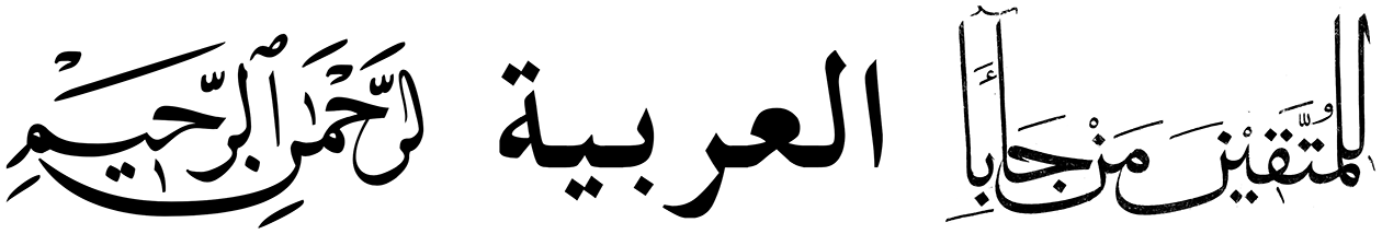
From left to right: Calligraphy style Naskh, typeface based on Simplified Naskh, calligraphy style Muhaqqaq. Images are collected from Wikimedia Commons and licensed under CC BY.
Various attempts have been made to add to the limited repertoire of Arabic typefaces and to match Latin typefaces with Arabic equivalents to meet the needs of increasing bilingual communication globally (Khera, 2003; Smitshuijzen Abifarès, 2006; Gerner, 2009). Nadine Chahine is perhaps the most well known, being the designer of Arabic versions of Helvetica, Frutiger and Zapfino. Hence, her recruitment is key to the legitimacy of Dubai Font, not only because of her expertise and recognized name, but also because she represents ‘Modern’ Arabic typography.
If Arabic typefaces and practitioners are underrepresented in the field of graphic design and typography, Dutch equivalents are overrepresented (Min Choi, 2014). ‘Dutch design’ has become a popular subject for books and exhibitions of design in general, and graphic design in particular. It is thus not surprising that the source of inspiration for the Latin version of the Dubai font is presented as ‘Dutch design’ on the font’s website (see next section). The relatively low value ascribed to Arabic type design in this biscriptal font is in this way being compensated for by the long tradition and high reputation of Dutch type design.
4.2. Monolinearity
While, in Latin typography, monolinearity – letterforms with strokes of the same visual weight and without serifs – connotes rationality and calligraphic scripts rather the opposite, in Arabic it is the other way around: calligraphy connotes manuscript culture and thus has a certain dignity, and monolinear may seem less sophisticated. These circumstances pose a dilemma for the design of combined Latin–Arabic fonts.
When presenting Dubai Font in Berlin 2017, Chahine described its design as a hybrid between two Arabic calligraphy styles: Naskh (the style usually deployed for Arabic typefaces) and Muhaqqaq (a more monumental style) (Chahine and al-Mahri, 2017). According to her, the aim was to create a modern typeface, thus it had to be monolinear, and therefore it lacks the contrasts of calligraphy, apart from in some places where there are variations so that ‘the movement of the pen’, attributed as ‘the heritage’ and ‘elegance’, is present. Chahine further explained that the most time-consuming challenge in designing the typeface was to create a monolinear Naskh that would not appear childish. Hence, the ‘effort’ (see Johannessen and Van Leeuwen, 2018) put into the design had to be perceived by users in order for the font to gain authenticity and authority.
Both Dubai Font and TilburgsAns were presented at the TypoTalks in Berlin 2017 and the designers gave keywords for each design project. Keywords for the Dubai Font are ‘heritage’, ‘roots’ and ‘modernity’ (positioning Dubai as exceptionally modern in relation to the surrounding geographies through quotes like ‘we don’t have a lot of modern cities in the Middle East’ and ‘it is comforting to see prosperity in a region full of conflicts’). Aligned with the use of the concept of modernity, the aesthetics are related to a linear concept of time, manifested in descriptions such as ‘[the typeface] extends on one hand to the past and on one hand to the future’ (Chahine and al-Mahri, 2017).
The designers of TilburgsAns linked the keywords that describe their font to the city of Tilburg and its population by consistently using the word we. We are: ‘raw’ (as in industrial architecture), ‘idiosyncratic’, ‘surprising’ (the city is poor but has a modern museum), ‘experimental’, ‘humorous’ and ‘swinging’. The designers repeatedly mentioned the workers’ identity of the city – ‘we’re not a classy city’, the typeface should not be ‘too beautiful’ and the idea when designing the typeface was to ‘not straighten it [the letterforms] out’ as it then ‘loses character’, but rather to ‘keep it swinging’ (Van Leeuwen and Neijnens, 2017).
As opposed to the design brief’s demand for seriousness, formality and monumentality for the Dubai Font, TilburgsAns designers adapt a script-like and informal style in their design, based on an idea of quirkiness and movement, and a consciousness of value hierarchies. Building on experiential meaning potential (Johannessen and Van Leeuwen, 2018), these discursive assignments aim to enregister specific meanings and values of place: while Dubai Font positions itself in relation to a concept of modernity, TilburgsAns, leaning on the already high status and success narrative of Dutch design, positions itself in relation to the concept of class identity.
5. The Politics of Place
In varying degrees, all city fonts build on the history and culture of a particular place and aim to represent and promote it. Typography hence serves as a mediating resource between a place and people’s perception of that place. The question then arises: how are ‘place’ and ‘placeness’ created with typographic and discursive means in relation to city fonts?
5.1. Naming
The most immediate answer is by naming. Place names reproduce (and sometimes challenge) existing and often conflictual social histories and feelings of belonging to a place (Rose-Redwood et al., 2010). They are therefore always invested with ideology and power. Dubai Font is named in English and Arabic (خط دبي), thus drawing on the positive indexical values such as ‘modernity’, ‘trendiness’, ‘youthfulness’ and ‘cosmopolitanism’ that are generally attached to the English language (James, 2014) to promote the font both locally and internationally. In contrast, TilburgsAns appears to be a monolingual name, combining the name of the city with the Dutch proper female name Ans – a fictional personality embodying TilburgsAns’ alter ego: ‘Ans is humorous, joyful, open-minded, direct, never out of fashion and the best friend that a sans serif city could have.’ 4 However, the name constitutes a bilingual pun, playing with the originally French word sans (without), in typography used for describing typefaces without serifs.
While the two names create locality and local anchoring both through the toponyms and the local language choices, in order to create globality and talk with a ‘voice-from-nowhere’ (Woolard, 2016), the Dubai Font builds on the indexical values of the English language while TilburgsAns relies more on humour and claims to authenticity. This further contributes to constructing the Dubai Font as primarily directed towards ‘outsiders’ (global tourists and investors) and TilburgsAns towards ‘insiders’ (residents and visitors ‘in the know’), yet both capitalize on place as a resource for international branding.
5.2. Language choices
Language contributes to typographic placemaking in at least four ways. While both fonts (1) support many languages and (2) are promoted in different languages, TilburgsAns additionally (3) includes dialectal features, and (4) explicitly refers to ‘accent’ for describing the font.
Both fonts are designed to support a large group of languages (Dubai Font supports 2 scripts and 23 languages, TilburgsAns supports 28 languages). However, while the detailed information on the number of supported languages is central in the promotional discourse of Dubai Font, such information is lacking in the Tilburg case. Instead, focus is placed on the expressive qualities of the different languages’ visually salient elements, e.g. glyphs displaying diacritics: ‘Ans spreekt haar talen. Het font bevat de Duitse ß, de Noorse å, de Poolse ł, de Spaanse ñ, de Turkse ş, de IJslandse ð en de Hongaarse ű.’ (Twitter, 6 February 2015).
Technology plays an important role in the selection of languages supported. According to Sander Neijnens, TilburgsAns was designed with the software Glyphs which includes default settings for language choices: ‘We have chosen to design all characters for Western, Central and South European languages (see attachment) [see Figure 4]. We did not check this categorization further but relied on the knowledge of the software developer’ (personal communication, 7 October 2020). This shows how digital fonts result from complex sets of semiotic technologies, which calls for more detailed explorations of power relations between human and technological actors than is possible in the scope of this article (cf. Poulsen et al., 2018).
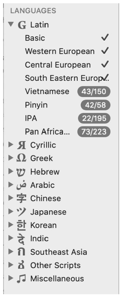
Drop-down menu for language choices in Glyphs.Source: Sander Neijnens. Reproduced with permission.
A central claim in the launch of the Dubai Font is that it is biscriptal and multilingual, which is presented as stressing the ‘diverse’ and ‘inclusive’ character not only of the font, but also of the city (https://dubaifont.com/). Since 80 percent of Dubai’s population consists of foreign guest workers, it is a genuinely multilingual place. However, only 4 of the languages most spoken in Dubai (Ethnologue, 2020) are supported by the font: English, Arabic, Urdu and Farsi. The other 23 languages are rarely or not at all spoken in Dubai. While this might appear like an act of ‘language laundering’ (Woolard, 2016: 29), obfuscating the uneven power relations that condition multilingualism in Dubai, there are probably also economic reasons: to cover all the largest languages spoken in the city, the Dubai Font would need to be developed for several scripts and this would be costly (Chahine, 2020).
Overall, the designers of TilburgsAns are very aware of visual language’s potential for differentiation and localization. Several of the icons are produced by typing dialectal words, and the font also features a dialectal glyph in the shape of an experimental punctuation mark (Figure 5). Based on the typical Tilburg expletive jè (pronounced as yeah in English), the meaning of the punctuation mark is that of an affirmative doubt and, according to the designers, it ‘expresses relativity and humour, mixed with a touch of irony’ (Van Leeuwen and Neijnens, 2017). This is just one example of how TilburgsAns consistently deploys humour in their discursive localizing work. Upon launching their second font, TilburgsAnsText for running texts, they described it as ‘a Sunday Suit that Ans wears when she’s going out of town. In those cases she speaks without accent – as good as possible – but you can still hear that she’s from Tilburg.’ 5 The ‘accent’ is constructed here as something that binds the ‘speaker’ to a particular place and restricts her movements, thus reproducing the ideology of authenticity (Woolard, 2016: 24). But, since TilburgsAns can put on many different dresses, so to speak, Ans, or the user of the font can choose to be more or less local/authentic, though never fully pass as ‘being from nowhere’.
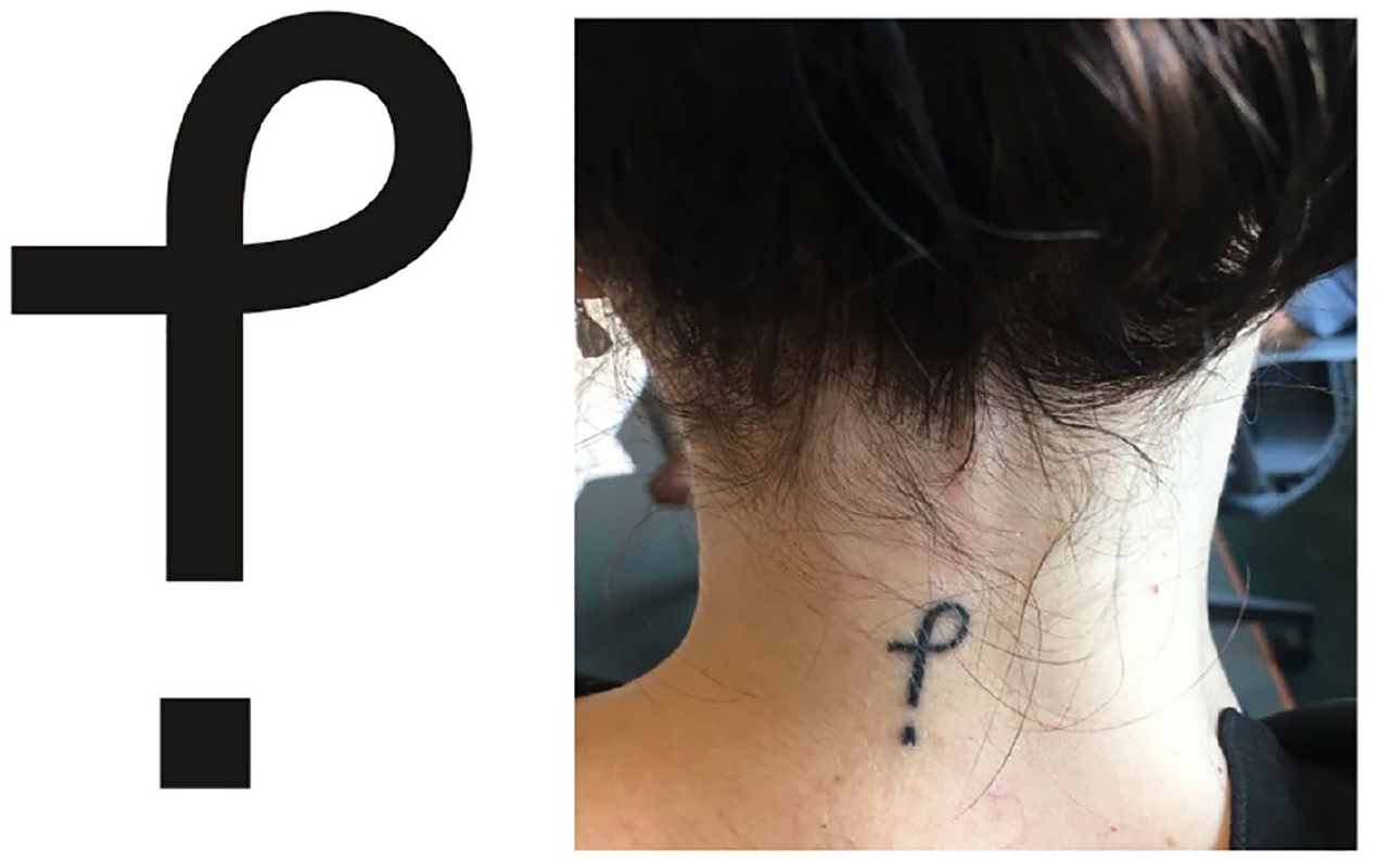
The new punctuation mark and glyph, the Tilburg ‘jè’, has been tattooed on people’s bodies, signalling the social recognition of its metacultural value. © Photo: Sander Neijnens: https://fontsinuse.com/uses/32446/je-tattoo. Reproduced with permission.
5.3. Images and pictograms
Typographic placemaking is further achieved through the images in the fonts, i.e. pictograms (TilburgsAns), and the images selected for promotional discourse (both fonts). TilburgsAns presents a visual celebration of a local place and its cultural heritage through the innovative usage of ligatures to produce pictograms, or stylized images of Tilburg landmarks, personalities, events and terms (see Figure 1). The procedure is illustrated in the video TilburgsAns – the Movie (VeeMee Visuals, 2016) where, for example, the letter sequence ‘Interpolisl’ upon completion transforms into an image of the headquarters of the Interpolis insurance company. The semiotic technology of digital fonts is here deployed both to produce locality and to unsettle the boundary between image and writing, stressing the increasingly multimodal character of typography (Van Leeuwen, 2006). As of October 2020, the 123 pictograms of the font represent a place characterized by cultural and industrial heritage, modern art, sports, local slang, and historical and modern personalities. The TilburgsAns icons further contribute to local placemaking by including dialectal words – such as kaajband (kerb stone) and knòrrie (canary) – conveying a colloquial everyday character to the font and, by association, the city.
In addition, visual placemaking is made in the promotional texts and videos of the two fonts. In two of the videos, TilburgsAns – the Movie (VeeMee Visuals, 2016) and Dubai Font – #ExpressYou (Y&R, 2017), words are written which are then transformed into images, sounds and ambiences. While TilburgsAns uses analogue sounds ‘from the past’, such as a typewriter, street organ, ‘gypsy’ accordion and a steam engine, the Dubai Font uses digital screens and the sounds of typing on a laptop. The multimodal presentation of the two fonts constructs two distinct local ambiences, one analogue, popular and backward-looking, the other digital, formal and forward-looking.
5.4. Emplacement
The meaning and value of any sign depends on its placement in physical and social space. Scollon and Scollon (2003) defined ‘emplacement’ as the process of situating signs and language in material space, and how this impinges on the social meaning potential of the signs. As part of the public launch of the Dubai Font, ‘language objects’ (Jaworski, 2015) formed with the font were placed around the city (Day, 2017). The idea of the campaign was to invite passers-by to take photos to share on social media, thus aiming at a quick and massive reach of local and international audiences. However, photos of the giant 3D letters are generally devoid of people, often displaying the letters behind velvet ropes as in a gallery, hence indexing exclusivity rather than an inclusive invitation to interaction (e.g. https://twitter.com/DubaiFont/status/863820414556008448?s=20).
The producers of TilburgsAns worked in a different, yet similar way. They focus on people’s use and support of the font, rather than on monumental objects (see Figure 6). TilburgsAns employs a financing model that is reminiscent of crowdfunding. Apart from subsidies from different local entities, a major part of the funding comes from a so-called letter adoption plan. Businesses, organizations and private persons can sponsor the typeface by ‘adopting’ a character, or a numbered space character for a certain sum of money. In exchange, ‘adopters’ receive ‘a nicely framed, signed print of the related letter, figure, symbol or accent’ (The Brochure, see Figure 6). Images on social media show how the two designers travel with such framed letters to different places, thus performing an emplacement action. Indirectly, they also associate the font with an air of DIY and open-minded entrepreneurship that may challenge the understanding of authenticity ‘as naturally given’, and help contribute to shifting ‘the definition of self and community from origins to goals’ (Woolard, 2016: 36). The adoption plan emerges here as a semiotic technology that efficiently helps promoting Tilburg-related actors at the same time that they help in promoting and enregistering the font.
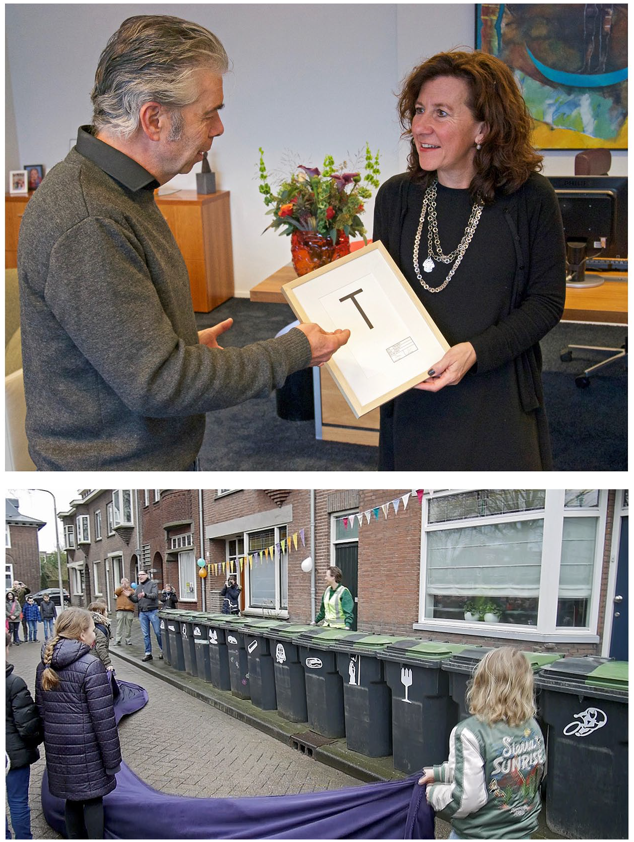
Images illustrating emplacement actions. Reproduced with permissionSource: https://twitter.com/TilburgsAns.
While both fonts invent artefacts to represent and emplace them (public monuments versus framed pictures), Dubai Font’s emplacement work is rather punctual and short-termist, whereas TilburgsAns uses a performative, relational and long-term strategy towards establishing social recognition and eventually naturalization of TilburgsAns as a Tilburg emblem.
6. The Politics of Expression
The Dubai Font. Designed to unite the world through the power of expression. (https://dubaifont.com/)
In this last sub-section, we analyse how the meaning and value of the notion of ‘expression’ is conceptualized and used in the promotion of the Dubai Font and TilburgsAns.
On the day of the launch of the Dubai Font, Hamdan bin Mohammed, the Crown Prince of Dubai, published a video on Twitter where the written content centred on the concept and value of expression: ‘Expression knows no boundaries or limits. Expression is strength and freedom. It defines who you are. Now you have a new way to express yourself, your beliefs and life experiences. Dubai Font.’ 6
The importance of ‘expression’ for the Dubai Font became even clearer when the PR agency ASDA’A BCW was commissioned for a first promotional campaign, 7 named #ExpressYou. According to the agency, ‘#ExpressYou was designed to encourage self-expression and promote reading and creativity – values that the city, a melting pot of cultures, heritage and modernity, promotes’ (ASDA’A BCW, 2017). The campaign comprised semiotic technology ranging from a Snapchat filter and official pages on Instagram and Twitter, to a film and the installation of 3D letters in the Dubai streetscape.
However, the campaign met criticism in international media and by NGOs working for Human Rights: What’s missing from Dubai’s new motto is a little asterisk with fine print, ‘Except that anyone who says something the emirs don’t like goes to jail,’ said Sarah Leah Whitson, the executive director of the Middle East and North Africa division of Human Rights Watch. (Stack, 2017)
The criticism saw #ExpressYou as hypocritical given the limited freedom of speech in Dubai. Only a month before the launch of the Dubai Font, the most well-known of the regime’s critics, human rights activist Ahmed Mansoor was arrested and, in December 2018, he was sentenced to 10 years’ imprisonment ‘for insulting the “status and prestige of the UAE and its symbols”, including its leaders’ (Human Rights Watch, 2020).
Such accusations stand in stark contrast to the promotion of the Dubai Font, celebrating it as a medium for ‘expression’ and ‘diversity’, but they come across as consistent at a closer look: the fine print of the terms and conditions that accompany its use . . . insist that the Dubai Font cannot be used ‘in any manner that goes against the public morals of the United Arab Emirates or which is offensive or an affront to the local culture and/or values of the United Arab Emirates’ and that users of the font also agree to ‘irrevocably submit to the jurisdiction of the Courts of the Emirate of Dubai’. (Leech, 2017)
These terms and conditions are not shown under the website’s Privacy Policy, but are only accessed upon downloading the font. They are hence downplayed in relation to the dominant discourse of openness and diversity in the rest of the website.
Contrary to the terms and conditions of the Dubai Font, the only requirements for downloading TilburgsAns are to respect the copyright and give credit to the owners, and not to modify and/or sell the font. The two fonts are here operating with place-related style in two different, yet similar ways. While the promotional discourse of the Dubai Font does not really say it should be used for expressing anything ‘in a Dubai way’ – which is how TilburgsAns is promoted – this is pretty much what is stated in the fine print ‘terms and conditions’: they restrict any expression that is made with the Dubai Font in moral, cultural and political terms. As we have seen above, the promoters of the Dubai Font stress that it serves for expression in general, and for the expression of individual selves all over the world (cf. the collaboration with Microsoft). The Dubai Font hence represents a somewhat ambiguous relation to place: while it is supposed to celebrate the heritage of Dubai and to promote the city as a modern and innovative high-tech destination, it downplays much of the real politics of the place. The same can be said about TilburgsAns, but the other way around: on the one hand, the discourse about it is heavily invested in placemaking and particularistic/authenticating ideologies while, on the other hand, the usage is not explicitly restricted in any place- or culture-specific way.
7. Type and Place: Concluding Remarks
One of the reviewers of this article said: ‘this is really not so much about two fonts as about two cultures’. We sustain that it is not about two cultures. The promotional discourses of the fonts play with the idea of cultural (and other) distinctiveness, but these two fonts are rather part of a consistent capitalist discourse and practice of place branding that has spread globally. Like city logos, they are building blocks of a globalized and standardized semiotic register for making symbolic and economic profit out of ‘place’ (Järlehed, 2021). As we have shown with our analysis of graphic ideology, this globalized discourse of placemaking and branding necessarily contains a tension in the sense that it builds its authority and efficiency on an elaborate balancing of particularistic and universalistic claims. In this sense, our analysis of ideology in typographic placemaking corroborates Woolard’s (2016) observation from the field of minority language revitalization where the two ideological complexes of particularism/authenticity and universalism/anonymity emerged as co-constitutive and sometimes fuzzy. Yet, our data and findings call for a further discussion of globalization, on the one hand, and postcolonialism, on the other.
In a similar way to how Starbucks, in order to conquer new markets and increase their sales, ‘devised a global design strategy to communicate locality across a number of stores’ in different places (Aiello, 2018: 196), the city fonts examined here and other similar ones (e.g. Alfabeto Bilbao and Chatype) develop a global design strategy to communicate locality not just in but also beyond ‘their’ city. In the case of Dubai Font, the audience is explicitly located across the world, and is supposed to use the font beyond Dubai’s borders to promote its reputation and attractive features to global policymakers, tourists and investors. With TilburgsAns, the ambition is less far-reaching but nonetheless of a similar kind, especially since the font was adopted for the city’s branding work. Overall, the city fonts’ material presence on our screens (with enormous potential for the Dubai Font through Office 365 to get into our homes and working spaces) and in place (e.g. on urban signage), and as texture in everyday environments, aim to create and reproduce a similar ‘distinctive globalising experience of urban everydayness’ (Aiello, 2018: 206) as the one produced by Starbucks and other global corporations.
As much as the two fonts share being part of a graphic ideology of globalization and place branding, they enter this arena with different preconditions geopolitically and historically, which we have analysed from a postcolonial perspective. Given that design is a Eurocentric field often imported to the Arab context rather than the opposite, it is dubious that a font project departing from local dialect, with reference to taste hierarchies and class, promoted by backward-looking stories and aesthetics, like TilburgsAns, would be successful and recognized if it had originated from an Arabic instead of a European context. Thus, the discourses must be understood as results of a colonial past and present.
While TilburgsAns conveys an idea of ‘who’ and ‘where from’ – by reproducing a romantic ideology of authenticity with reference to accent and a class-based identity – it does not necessarily entail locality and territorialization since the cultural and technological domination of Latin and the high value of Dutch design make the font appear as modern and globally available, without articulating and emphasizing such properties in their marketing. Dubai Font’s parallel use of the English language to achieve ‘modernity’, and the ‘neutral’ and ‘anonymous’ graphic design of the font, makes Arabic doubly marked: both culturally (from an international or Western point of view) and graphically: beautiful calligraphy but few good digital typefaces (cf. Chahine and al-Mahri (2017)).
Finally, we have shown how typographic placemaking involves a large set of semiotic technology – from design software, over websites and social media, to user licences and innovative models for crowd-funding – and that each one contributes to the production of graphic ideology. Yet, the necessary distribution of knowledge between humans and technology is only addressed superficially in this article and needs more research. Moreover, the formulations in end-user licence agreements about city fonts being ‘free’ to use are often legally dubious (Scola, 2013) and hence pose questions about the normative operation of semiotic technology.
To conclude, despite differences in terms of political and economic resources, the two city fonts present many similarities regarding how they conceptualize ‘place’ and deploy graphic ideology and semiotic technology to represent and brand a unified and standardized idea of the city through a single typeface.
Footnotes
Acknowledgements
Early drafts of this paper were presented at seminars at the University of Hong Kong and the University of Gothenburg. We would like to thank the colleagues who attended the seminars for valuable feedback, as well as Adam Jaworski for reading and commenting on a later draft. We are also most grateful for the constructive comments that we received from the anonymous reviewers.
Funding
The authors received no financial support for the research, authorship and publication of this article, and there is no conflict of interest.
Notes
Biographical Notes
JOHAN JÄRLEHED is a researcher and teacher in the Department of Languages and Literatures at the University of Gothenburg, Sweden. His research centres on the interaction of language, images and space in processes of social change.
Address: Department of Languages and Literatures, University of Gothenburg, Box 200, Göteborg 405 30, Sweden. [ email:
MARYAM FANNI is a graphic designer and PhD student in Design at HDK-Valand Academy of Art and Design, University of Gothenburg, Sweden. Her research interests include feminist and decolonial design history-writing, critical urban studies and rights to the city.
Address: Academy of Art and Design, University of Gothenburg, Göteborg, Sweden. [ email: