
Abstract
Considering the importance of visual representations for communication between stakeholders in landscape planning and design processes, the authors identify a lack of critical visual research methods supportive of the disciplines involved. As part of such a method, they have developed an analytical framework based on semiotic and iconographic theory that enables a visual content analysis and iconographic interpretation of landscape design representations. Two projects from Rebuild by Design, a participatory transdisciplinary design competition organized in the New York City area after hurricane Sandy, were analysed to demonstrate this framework. The article presents a semiotic vocabulary based on four categories: medium, mode, formulation and knowledge with which to ‘read’, discuss and potentially create design representations. This enables a syntactic analysis for assessing the semiotic complexity of design representations in terms of validity, readability and interactivity. This assessment enables further qualitative study of the production and interpretation of landscape design representations in practice.
Introduction
Landscape planners and designers find solutions to a broad range of spatial issues on a wide range of scales. Current issues include human health and well-being with attention to climate, water and energy as well as spatial quality issues arising from ongoing urbanization (Van den Brink and Bruns, 2014). In addressing these issues, landscape planners and designers use diverse visual representations such as sketches, drawings, maps, models and video to express design proposals for future spatial layout and aesthetic quality to an increasingly diverse set of stakeholders (Raaphorst et al., 2017).
The legitimacy of these design representations has become crucial due to the decisive role they play in the range of political, social and ecological challenges that landscape planners and designers face. Moreover, whereas previously landscape plans and designs might have been considered as blueprints for construction, nowadays they are tools (Mertens et al., 2010) for finding possible multifunctional and integrated landscape solutions (Thering and Chanse, 2011; Van den Brink and Bruns, 2014).The objectives of these representations vary during participatory planning and design processes. Sometimes the visuals have to provoke an active debate, or maybe they have to illustrate jointly-made decisions. Moreover, design images have to engender effective communication between people with different levels of visual literacy. Therefore, effective visual communication in participatory processes with an increasingly diverse group of stakeholders, such as decision-makers, NGOs, community-based groups and the general public has become a vital component of landscape planning and design processes.
Although a number of studies relating to visualizing landscape transformations exist, most of them discuss, for example, different materials (e.g. pencil, paint, paper, models) (Pallasmaa, 2009), skills (e.g. drawing in perspective, the use of colour) (Treib, 2008), sensorial qualities (e.g. hyper-realism, atmosphere drawing, brightness and contrast) (Amoroso, 2012; Kullmann, 2014; Lewis, 2012) and techniques (e.g. photography, digital modelling, GIS, CAD) (Macdonald, 2012; Mertens et al., 2010). Other literature explores the potential use of digital technologies in the act of designing (Nijhuis, 2015; Steinitz, 2012; Walliss and Rahmann, 2016). However, the study of design representations as communicative entities, i.e. both the visual qualities and the content of the image and its relationship to the planning and design process and its phases, is scarcely addressed or only in general terms.
There is a lack of a critical visual research approach to studying visual landscape design representations in a comprehensive way (Dee, 2004). In developing such a critical visual research approach (Raaphorst et al., 2017), we aim to contribute to an understanding of the principles of effective visual communication in participatory landscape planning and design processes. Although research on visual methodologies generally identifies three stages in visual meaning-making: the production, the image and the audiencing stage (Rose, 2012), in this article we will focus primarily on the analysis of the image stage. We argue that, before studying the production and audiencing of images, there is a need for a good understanding of the visual content of landscape design representations (Raaphorst et al., 2017).
We draw on semiotic and iconographic theory to address the multiplicity of meanings that can be attributed to landscape designs and their representations. We argue that studying this multiplicity of meaning in terms of semiotic complexity helps to explain and anticipate the effectiveness of design communication between stakeholder groups and experts of different disciplines. In this explorative study, we address the question of how the semiotic complexity of visual landscape design representations can be analysed systematically. In answering this question, we developed an analytical framework for a visual content analysis and iconographical interpretation of landscape design representations.
We demonstrate this framework by applying it to designs used in two participatory design projects. These projects were part of Rebuild by Design (RbD), a design competition for generating multifunctional landscape solutions using an explicitly participatory and collaborative approach, set in the greater metropolitan area of New York in the aftermath of hurricane Sandy. The objective of this demonstration is to define a semiotic vocabulary with which to study the semiotic complexity of landscape design representations in a participatory setting.
This article is structured as follows. First, we describe how we can look at landscape, its representations and landscape planning and design processes from the point of view of communication. In the second section, we explore how this landscape perspective to communication can be applied in a visual content analysis of the RbD competition submissions. Finally, and in conclusion, we show how the images can be described in terms of their visual content and semiotic complexity and we assess the potential communicative qualities of the images through an iconographical interpretation.
Landscapes, Representations and Designs
‘Landscape’ is defined as ‘an area, as perceived by people, whose character is the result of the action and interaction of natural and/or human factors’ (Council of Europe, 2000). This definition emphasizes the diversity of landscape materiality; it is a perceived entity, composed of both natural and social components (Jacobs, 2004). There are different traditions of landscape design that employ different visual modes and media. The distinction of natural and social components, in particular, is reflected in the landscape design traditions of both European and American scholars and practitioners (Laurie, 1975; MacHarg, 1969; Ndubisi, 2014; Steiner, 2006). These traditions use the concept of ‘landscape systemics’ (Duchhart, 2007; Vroom, 2006). These systems are represented in maps, cross-sections and diagrams to illustrate how a given landscape ‘works’ and to identify the drivers of change (Barnett, 2013) (see Figure 1).
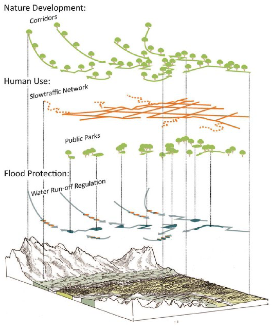
Example of schematic visual representation showing landscape systemics (Winder, 2014). Reproduced with permission.
Others conceptualize landscape as a perceived entity. Scholars who are part of this tradition argue that it is not only important to study how the landscape works, but also how the landscape is experienced (Van der Knaap, 1997; Van Etteger et al., 2016; Wylie, 2005). This perception of the real-life physical landscape is not static. It is based on experience (for example, by walking through the landscape in question), education, time of day, season and even our personal mood. It is also influenced by exposure to visual and verbal landscape representations, such as films, paintings or poetry (Cosgrove and Daniels, 1988; Mitchell, 2002). This continually changing landscape experience is often expressed with atmospheric images (Figure 2) or time-lapses.

Example of atmospheric visual representation showing the potential experience of a flood event (Valcarlos, 2014). Reproduced with permission.
Some scholars turned to textual metaphors in their search for new methodological foundations to enable them to grasp this diversity of perceived landscape meaning (Bellentani, 2016; Duncan and Duncan, 1988; Lindström et al., 2014). By attributing textual qualities to physical landscapes, or to visual representations of landscapes, these ‘landscape texts’ could be considered as communicative entities. As texts, landscapes acquire authors, readers and narratives (Potteiger and Purinton, 1998; Spirn, 1998), which positions the landscape planner or designer as someone who gains (or claims) authorship of the narrative they intend the designed landscape to express. In most cases, design representations that have to express such a story require a certain sequence of images, a collage (Figure 3) or moving pictures.
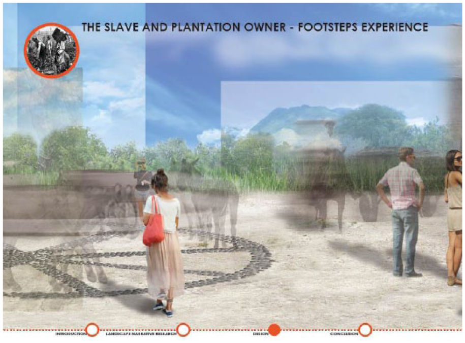
Example of a visual representation that shows the historical narrative of a landscape (Van Zuiden, 2016). Reproduced with permission.
However, we would be missing the complexity and multiplicity of landscape designs if we limited our understanding of landscape planning and design to just the implementable design and the story it tells. A ‘design’ is not always an end product: unrealized design ideas and concepts also have a strong influence on contemporary design culture (Cridge, 2015; Morrison, 2015). A design is also not a fixed materiality, i.e. a drawing, rendering, 3D model, building or physical landscape (Gough, 2016). Instead, designing is a process of creation and establishing authorship that involves the accumulation of knowledge, ideas, emotions and imagination (Cross, 2006; Rattenbury, 2002). These elements materialize in design representations through various visual techniques and media. Each of these representations contains specific communicative qualities that influence the planning and design process. For instance, a drawing can be seen as a producing agent or ‘ideational catalyst’ and not just as a representation of a landscape. Rather, it can depict the capacity of that landscape to be transformed into a desired future state (Corner, 1992).
We need to regard all kinds of landscape design representations as important means of visual communication that enable a critical reflection on a landscape design and on the process of that design’s creation. This includes expressions of how the landscape works as a system (Figure 1) as well as the atmospheric interpretation of sensory perception (Figure 2). We argue that theories on semiotics and iconography provide a foundation for an analytical framework with which to address the diversity of design representations and the multiplicity of meanings that can be attributed to them.
A Lens of Semiotics and Iconography
Semiotic theories describe how the meaning of signs is constructed and interpreted through a process of semiosis (Jappy, 2013). Peirce (1958), as cited by Eco (1976: 15), defines semiosis as an action or influence that involves the cooperation of three components: a sign or representamen, its object and its interpretant. Semiosis is always a triadic function and therefore not resolvable into actions between pairs. According to Eco (1976), following Peirce (1958), ‘everything’ has the potential to be a sign as long as it has a substantial significance to something else for someone. Visual representations of landscape designs, such as Figures 1–3, can thus be considered as signs. They also contain a great number of other signs within themselves, such as their visual elements, techniques and symbols. Even the planner’s or designer’s intention and knowledge embedded in the design can considered to be signs. As a whole, a landscape design and its many representations consist of multiple sign systems.
In this article, we are interested in the relationship between the design image (expression) and the design properties it refers to (content) as well as how this signifying relationship can – potentially – be interpreted in practice through communication. We adopt the hybrid theory of semiotics developed by Umberto Eco (1976) to study this relationship. In Eco’s theory, dyadic signification (Hjelmslev, 1953) is embedded within a triadic (Peirce, 1958) communication process. In this way, dyadic ‘semiology’ offers tools for defining categories and a semiotic vocabulary for a content analysis focused on the informed, descriptive meaning of landscape design representations: what kind of image it is, what it looks like and what kind of information it shows. Triadic semiotics connects these informed, descriptive meanings to possible interpretations in a process of communication. In this way, we embed the dyadic relationship of expression and content within a triadic system of interpretative sign production (Figure 4).
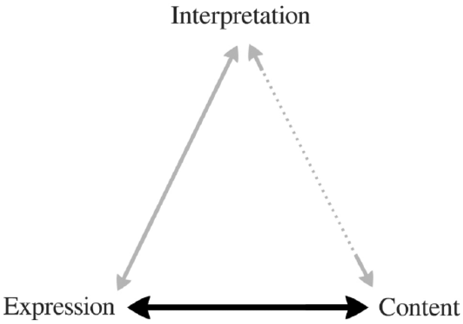
Hybrid semiotics (based on Eco, 1976): Dyadic theory of Hjelmslev (1953) embedded in the triadic logic of Peirce (1958).
The triadic logic of interpretation is not a closed process where certain content is to be transferred via an expression to establish a definitive interpretation. The interpretation of a sign forms a new ‘sign within the mind’ which refers to another object, which in turn may refer to something else (Eco, 1976). For example, a representation of a dike construction refers to the physical flood defence structure it represents. For an engineer, this image triggers a process of additional significations related to structural capacity, measurements and building materials. For a city planner, that same image signifies real estate exploitation, zoning regulations and budget restraints. This string of connotations, potentially endless, is known as a signifying chain.
Understanding the workings of signifying chains is necessary to study the semiotic complexity and possible interpretations of landscape design representations. This complexity arises along three lines of logic: semantics, syntactics and pragmatics (Morris, 1938). Semantics is defined as the study of the abstract relationship between signs and the objects they signify. Syntactics entails the relationship between signs, whilst pragmatics involves the study of the origin and use of signs in relation to their interpreters (Allwood, 1981). The interplay between these three concepts constitutes the complexity of meaning-making processes in practice.
Whereas the semantics and syntactics of landscape design representations can be systematically analysed using categories derived from the dyadic semiotics of Hjelmslev (1953) – as explained later in this article – the analysis of pragmatics requires an additional interpretive framework. As researchers, we are neither the authors nor the target group for design representations. Analysing the pragmatics of design representations requires that we interpret and reconstruct signifying chains outside the original context of the image. By collecting and sampling image data with a specific motif in mind – semiotic complexity – the researcher’s intuition becomes part of the method (Müller, 2011: 286). Knowledge of the researcher regarding design processes and competitions, public participation, climate change and flood defence projects determines the contextualization of the image data. Similarly, iconographers interpret historical works of art by reconstructing the historical context of the artwork (Panofsky, 1957). The iconographic tradition provides an insight into the conventionality – and predictability – of the way in which different types of meaning are constructed under different circumstances.
Following Van Leeuwen (2002), we distinguish three types of ‘pragmatic’ meaning produced by the semantics and syntactics of signifying chains: ‘representational meaning’, ‘iconographical meaning’ and ‘iconological meaning’. Representational meaning refers to the most direct expressional and factual meaning that can be derived from everyday experience, stylistic conventions and mediation by different visual technologies (Van Leeuwen, 2002). This type of denotative meaning constitutes an image’s ‘objectivity’ (Barthes, 1977: 19). It is the most commonly shared universal type of meaning based on practical everyday experience sensitive of social and cultural traditions (Panofsky, 1957). Iconographical meaning is based on generally accepted conventions: signs that are able to work together in a conventional manner. For instance, smiling figurines in a photomontage signify a safe, happy place, whilst dark clouds on the horizon above a dike structure could signify the looming danger of climate change. Furthermore, through intertextuality (Rose, 2012: 191), it is possible to relate an image to its context, whether this is, for example, a design proposal, a design competition or issues of climate change.
Finally, iconological meaning is derived from unconventional symbolism used by specific social groups (Van Leeuwen, 2002). These types of signs are used consciously or unconsciously, yet signify the underlying principles of their creation. Specific signs, reserved for specific disciplines, might lead others to over-interpret or misinterpret them. Without claiming we can predict ‘good’ interpretations, we could at least ascertain which interpretations are ‘bad’ (Eco, 1992: 52). For landscape planners and designers, the use of certain perspectives and colour schemes or even the inclusion of a flock of birds as a finishing touch, might seem conventional, yet could invoke unintended interpretations for stakeholders from other disciplines (Raaphorst et al., 2017).
Analytic Framework
The analytical focus of this article is the image stage (Rose, 2012) and therefore on the relation between the visual representation and the content it refers to. An analytic framework is necessary to code and categorize design representations in a way that facilitates a systematic content analysis of semantics and syntactics. We zoom in on the dyadic relationship of content-expression through the Deleuzian interpretation of Hjelmslev’s (1953) semiotic framework. This framework provides analytical categories with which to describe ‘expression’ and ‘content’ in ways that resonate with existing theories of map making (MacEachren, 1995) and cartographic ‘semiology’ (Bertin, 2011) that are well known within the disciplines of landscape planning and design.
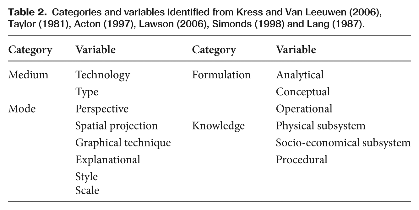
Hjelmslev was a linguist who developed dyadic semiotics into a form of logistics that is partly compatible with Peircean triadic logic (Eco, 1976; Parret, 1984). In total, Hjelmslev describes six analytical categories. Each so-called ‘plane’, the plane of expression and the plane of content, has its own form, substance and matter (Deleuze and Guattari, 1987; Hjelmslev, 1953; Taverniers, 2008). Deleuze and Guattari (1987) operationalized Hjelmslev’s (1953) linguistic framework for the poststructuralist semiotic analysis of non-linguistic signs, such as natural and social phenomena. They argue that the relationship between content and expression is not one of correspondence, as it is understood within Eco’s structuralist semiotic theory, but rather one of reciprocal forms of semiotic organization (Deleuze and Guattari, 1987: 50). For example, just as colour needs a certain shape to express itself, each of the six categories cannot exist without the other. They are fundamentally intertwined. We follow the reciprocal conceptualization of Deleuze and Guattari but, partly based on Chandler (2007), we translate the six categories into categories suitable for a visual analysis of landscape design representations (see Table 1). These translated categories are based on literature from art history (Acton, 1997; Taylor, 1981), film studies (Metz, 1973), environmental design (Lang, 1987) and social semiotics (Kress, 2009).
Operationalization of Hjelmslev’s (1953) categories for landscape design representations.
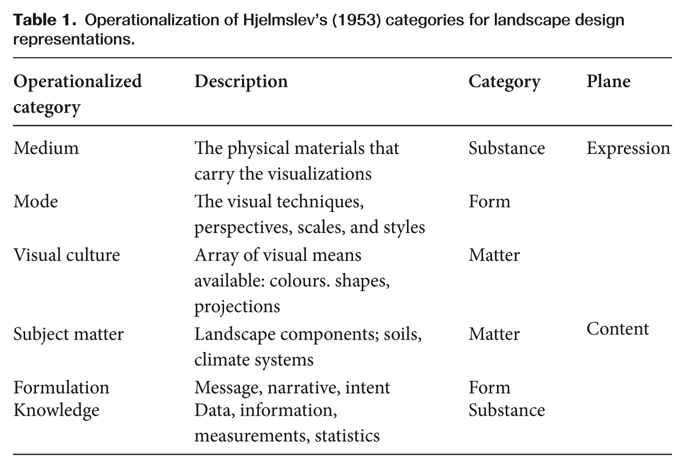
Both categories of matter are theoretical and embody the potential of content and expression (Deleuze and Guattari, 1987; Taverniers, 2008). Here, these categories determine the scope for the conceptualization of content and expression of landscape design representations within the context of participatory planning and design processes of multifunctional flood defence solutions. Since we define this scope as such, we only analyse the empirical categories, namely ‘knowledge’, ‘formulation’, ‘mode’ and ‘medium’, for the visual content analysis. The scope and context defined by the ‘matter’ categories are used to contextualize the images during the iconographical interpretation.
The expression categories of ‘medium’ and ‘mode’ are analysed visually akin to compositional interpretation (Taylor, 1981). We review the source material by, for instance, looking at what technique, perspective and visual style as well as which media were used to present the images. The content categories of ‘knowledge’ and ‘formulation’ are analysed by looking at the ‘anchorage’ (Barthes, 1977) of the images: their original descriptions, titles, subscripts, legends and references in the text.
Each of the four empirical categories has its own sign function and constitutes a semiotic component of the image as a sign system. These components evoke an arrangement of sign-systems that influence the design representation communication process. This arrangement is determined by syntactics: the relationships between signs. For this study, we identify and introduce three important syntactic relationships to conceptualize the way design representations are organized, namely interactivity, readability and validity (Figure 5).
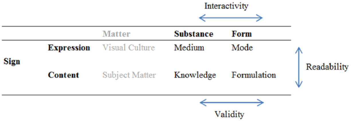
Syntactic relationships of validity, readability and interactivity.
Interactivity is the primary relation between the medium and the mode. For example, a sketch (mode) on paper placed on a table (medium) enables active participation because participants can, and may feel invited to, modify the drawing. Yet, that same sketch (mode) projected on a projection screen (medium) creates distance and prohibits openness and accessibility. Readability is the primary relation between the mode and the formulation. A 3D model from an eye-level perspective (mode) shows the height differences of landscape elements (knowledge) of a final design (formulation) in a visual way that adheres to human perception and scale. A height map with a 2D top view perspective (mode) presents the same knowledge, but presents it in a quantitative and mathematical way. Finally, validity entails the primary relation between knowledge and formulation. For example, whether the physical properties of a dike construction (knowledge) are characterized as a conceptual design (formulation) or as an operational design (formulation) validates the representation of that dike construction as either design principles or blueprints, respectively. These relationships, in turn, influence each other as part of a reciprocally functioning sign system.
If we connect Eco’s (1976) hybrid theory of semiosis with Hjelmslev’s (1953) logistic theory of content and expression (Figure 4) and operationalize that theory using the categories and syntactic relationships as defined in Table 1 and Figure 5, and then position iconographic theory in relation to pragmatics, syntactics and semantics, we arrive at the analytic framework of Figure 6.
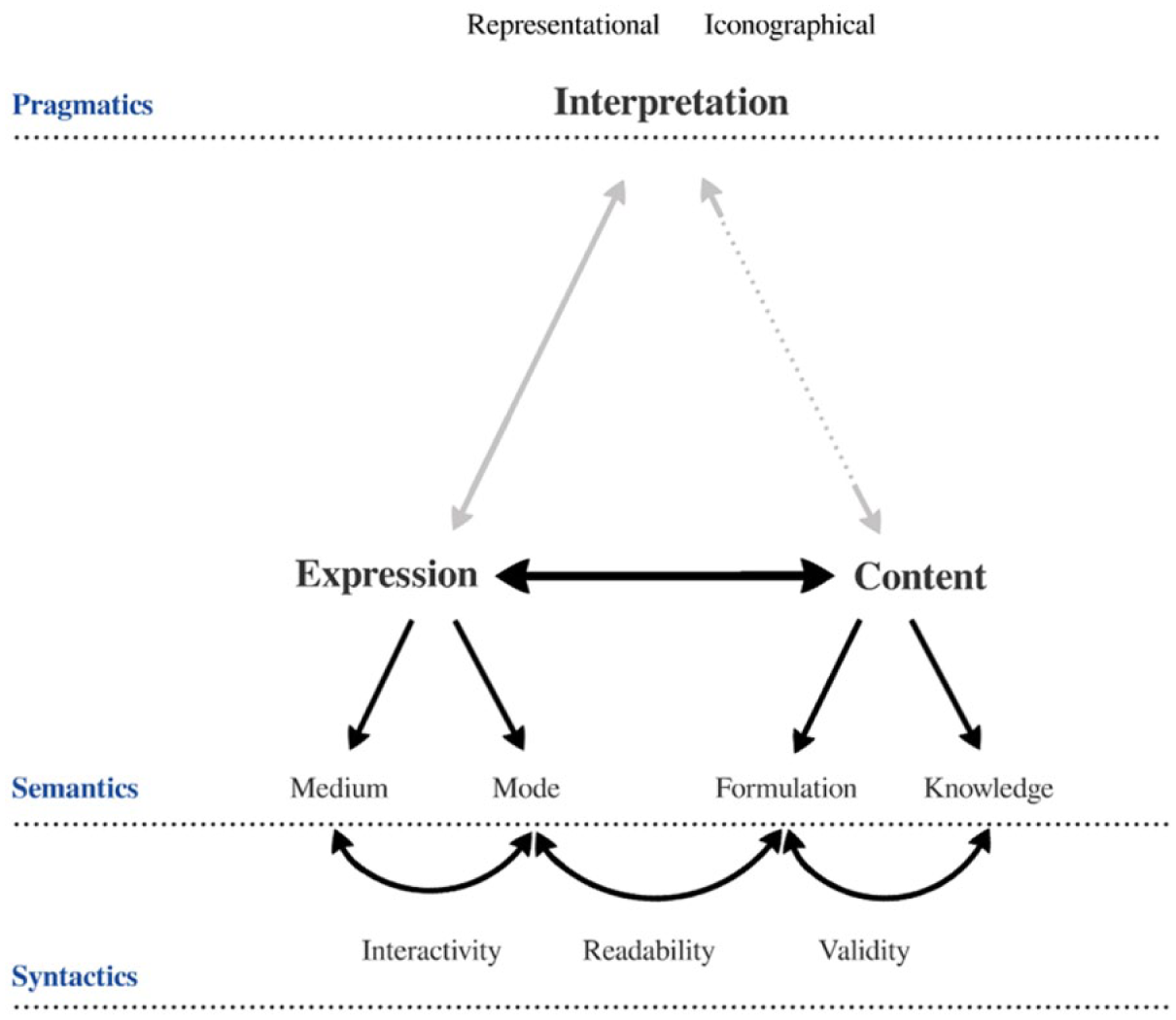
Analytic framework: combining iconography with Peirce (1958), Eco (1976) and Hjelmslev (1953).
The semantics and syntactics of the images, based on the four empirical categories derived from Hjelmslev, are analysed through a visual content analysis. The representational and iconographical pragmatics, defined by the two ‘matter’ categories of Hjelmslev, are analysed through an iconographical interpretation. The iconological layer is the most subjective and interpretive type of meaning. This type of meaning ideally consists of a synthesis of different political, social and cultural sources of information relevant to the images, such as other texts as well as verbal sources such as interviews (Müller, 2011). In this article, the focus lies on the image and the visual content that can be derived from that image. Therefore, we focus only on the representational and iconographical interpretations of the semantic and syntactic properties and on the syntactic relationships between the designated categories.
Images, Codes and Interpretation
The analytic framework presented in Figure 6 provides the basis for a visual study that demonstrates how semiotic complexity can be identified for further, qualitative analysis. This method consists of two parts: (1) a quantitative visual content analysis, and (2) a qualitative iconographical interpretation. First, we will describe the image material that was collected for our study.
Design projects
We applied our method to two submissions for the Rebuild by Design (RbB) competition. Design competitions, such as RbD, result in well-documented collections of visual representations from various design phases (Chupin, 2011). Furthermore, the multifunctional and participatory nature of RbD provides a good example for analysing the diversity of visual techniques used in the context of such projects. RbD began as a transdisciplinary participatory design competition, modelled after the ‘Dutch approach’ that advocates collaborative planning and design solutions on a regional scale (De Jonge, 2009; Sijmons, 1990; Vroom, 1990).
The goal of RbD was to arrive at multifunctional landscape solutions in the greater metropolitan New York area in the aftermath of hurricane Sandy in 2012. Since then it has become an innovative process capable of generating implementable solutions for a more resilient region (Ovink and Boeijenga, 2016). In 2013, the design brief (Rebuild by Design, 2013) stated that project teams were required to combine international, regional and local knowledge to, for example, achieve a comprehensive SWOT (Strengths, Weaknesses, Opportunities, Threats) analysis of the area, design regionally applicable solutions that have the public support of local communities and federal agencies, and strengthen the relationship between local and regional stakeholders.
Two of the seven winning RbD proposals were selected for analysis based on their scale, spatial and collaborative complexity as well as their specific flood challenge type: one river area and one coastal area proposal. The project areas are of a regional scale, i.e. land use consists of both natural and urban areas. Consequently, several economical and socio-political stakeholder groups are involved in the projects. A substantial part of the project teams consist of Dutch design firms that are well accustomed to the regional and collaborative approach that is advocated by RbD. The first proposal, the New Meadowlands plan (MIT-CAU et al., 2014), addresses the area of the New Jersey Meadowlands. This area is a 30.4 square-mile (79 km2) district, contains a preserved river wetland area and encompasses parts of 14 municipalities and 2 counties. This proposal was made by the MIT-CAU project team, which consisted mainly of MIT-CAU and Dutch design firms ZUS and Urbanisten. The second proposal, the Living With the Bay plan (Interboro, 2014), addresses Nassau County’s south shore. This area is a 155 square mile (250 km2) district, contains Long Island, part of Jones Beach Island, marshlands and many different villages and towns. The proposal was produced by the Interboro team, which consisted mainly of New York-based Interboro and Dutch design firms H+N+S, BoschSlabbers and Palmbout. Both proposals deal with a comparable diversity of landscape areas and stakeholder configurations yet the teams’ research approaches differ concerning the use of quantitative and qualitative data. This difference in approach enables us to compare different types of content within a similar design context. For instance, the MIT-CAU project strongly emphasizes statistical data, whilst the Interboro team uses mostly qualitative sources.
An inventory of the visual material produced during these two projects resulted in a database of 759 images: 203 images of the MIT-CAU project and 556 images of the Interboro project. These images are derived from different sources, such as presentation boards, project reports, slide show presentations and hand-drawn sketches from the designers’ archives. However, not all the images that were produced were made public. For instance, the majority of hand-drawn sketches are often discarded and destroyed once a design leaves its analytical and conceptual stages. Therefore, counting the absolute number of maps, sketches and photomontages does not result in a totally valid identification of the preference for certain modes or media during a particular phase in the design process. However, it does tell us what kind of visual materials were produced to communicate particular kinds of landscape design content in the context of a design competition. In the following section, we describe the methods used to analyse the images developed during these two projects.
Visual content analysis
In this article, we build on the work of several scholars (Bell, 2001; Kress and Van Leeuwen, 2006; Rose, 2012) who argue that a visual content analysis, focused on both the content and expression of images, can be applied for the quantitative analysis of qualitative semiotic materials. Content analysis stems from a ‘long and well-developed tradition of dealing quantitatively with qualitative data … where the issue is one of counting the frequency and sequencing of particular words, phrases or concepts found in the data’ (Miles et al., 2014: 43). When performing a visual content analysis, the researcher also counts and analyses how frequently certain visual codes occur in a defined set of sample images (Rose, 2012). However, the semiotic nature of our approach requires a strong focus on not just the occurrence, but also on the co-occurrence of visual codes to determine the syntactic qualities of the material. The question, therefore, is not how often a certain code occurs, but rather how often that code occurs in combination with other codes.
A content analysis involves the managing of a large collection of data due to the number of images and/or the number of quotations, codes and notes attributed to those images. For this reason, qualitative researchers are encouraged to use computer software to facilitate an efficient, organized analytical process (Lewins and Silver, 2007; Peters and Wester, 2007). For our analysis, we used Atlas.ti, a software package that allows the coding and subsequent analysis of both written and visual data.
Categories, variables and codes
Content analysis involves the classification of data into categories. Categories need to be explicitly defined into variables and values to enable a consistent study of content (Bell, 2001). In our case, the categories relate to the empirical semiotic components of media, mode, knowledge and formulation. Each of these categories is defined through variables describing visual qualities or dimensions (Table 2).
Categories and variables identified from Kress and Van Leeuwen (2006), Taylor (1981), Acton (1997), Lawson (2006), Simonds (1998) and Lang (1987).
For the expression categories, the technology and type of the medium (Kress and Van Leeuwen, 2006), the graphical techniques, spatial projection, perspective, scale, explanatory elements and style of the mode (Acton, 1997; Taylor, 1981), are all considered as variables. For the content categories, the formulation type relates to the design stage (Lawson, 2005; Simonds, 1998) and can be generally divided into analytical, conceptual or operational stages. Knowledge variables describe the different subsystems of the landscape (Lang, 1987) or describe the design process itself. The values of these variables consist of elements that belong to the same class. For instance, values of the medium variable ‘type’ consist of book, flyer or projector screen, whilst the mode variable ‘technique’ consists of values such as sketch, photomontage, map and 3D model. The conceptual formulation has values such as ‘design principles’, ‘design impression’ or ‘strategy’, whilst the knowledge of the physical subsystem contains values such as ‘biodiversity’, ‘soil’, ‘elevation’ or ‘climate change’.
Our content analysis involves three rounds of coding using an emergent coding strategy. By using such a strategy, the researcher becomes immersed in the data and creates a code list ‘on the fly’ by writing down the codes as they are encountered. In our study, these codes were grouped, evaluated and compared with existing literature on visual semiotics, iconography and landscape design. The material was revisited after the first coding round to ensure that codes, which emerged later on in the dataset, were applied consistently to the entire dataset. A third round was done as final verification of the coding scheme. This coding scheme constitutes the apparent description of visual materials: the semantic and syntactic codes.
A semantic code refers to an apparent object. It constitutes ‘what we see’ and can be determined with relative ease. Examples of semantic codes are media. We can easily determine whether an image comes from a book, poster or projection screen. Certain visual techniques can be distinguished as well, such as a 3D model, a satellite image or a photomontage. However, the distinction between a sketch and a drawing, or a design plan and a design concept, is more open to interpretation. These syntactic codes are more ambiguous and emerge during several rounds of coding.
In contrast to semantic codes, it is more difficult to define independent variables or mutually exclusive values for syntactic codes. Syntactic codes are more dependent on pragmatics and are therefore of a more interpretative nature. Bell (2001) points to the work of Kress and Van Leeuwen (2006) in explaining how certain theoretically informed syntactic concepts can be simplified into variables and values. For instance, Kress and Van Leeuwen define a variable ‘modality’ – which compares to the variable ‘style’ in our coding scheme – as ‘the degree to which certain means of pictorial expression (colour, representational detail, depth, tonal shades, etc.) are used’ (p. 252). This variable is defined as a range. Its values are a depiction of the degree to which that variable is present. For example, Bell (2001: 30) defines three values of ‘modality’: high, medium and low sensory modality.
In our study, we propose three general definitions of style: atmospheric, realistic and schematic. With an atmospheric style, the image contains a soft colour palette, little contrast and/or a ‘washed out’ effect. The image triggers certain feelings or emotions related to the perception and experience of the proposed landscape or area. With a realistic style, the image resembles a realistic view of the landscape. It uses natural colours that directly relate to the physical reality. Photographic components can also be included and little use is made of visual or artistic filters. With a schematic style, the image contains a lot of hard contrasts. A strong colour palette is used and there is little resemblance to the physical landscape. The image often contains numerals, lines and/or legend items.
Another example of a syntactic variable is that of formulation. In landscape architecture (Simonds, 1998) and in planning and design disciplines in general (Lawson, 2005), the design process can generally be categorized into three phases: the analytical, the conceptual and the operational. In the analytical phase, design representations show current landscape characteristics as objectively as possible. These representations aim to illustrate how a given landscape ‘works’, and to identify the drivers of change and what opportunities, threats and strong and weak points can be defined. In the conceptual phase, design representations show the main characteristics of the possible future state of a landscape, including eventual underlying principles of change. Conceptual images are of a visionary character and relate to desired or feared future situations. In the operational phase, design representations show the desired future state as it will be realized through the implementation of specified interventions. Operational images have a level of detail that fits the purpose of bringing across the message: ‘These are the changes to be made to the existing landscape and this is how it will look when the proposed transformations have been realized.’
Iconographical interpretation
We can select images based on different kinds of semiotic complexity by looking at the co-occurrence of different medium, mode, knowledge and formulation codes. For example, the modal complexity might warrant further analysis if more than one visual technique, style or scale is present in the mode category. Similarly, several knowledge codes might indicate a technically complex design, whilst different co-occurring formulation codes can produce images that are ambiguous in their message. We can also select images based on their syntactic relationships by looking at the co-occurrence between categories, e.g. how frequently combinations of mode and formulation codes occur.
The goal of the iconographical interpretation is to describe the syntactic relationships of the selected images and embed those relations in the pragmatics of their social context using representational and iconographical layers of meaning (Müller, 2011). The representational layer consists of the semantic and syntactic codes that emerge from visual content analysis: the types of knowledge, formulation, visual modes and the media that are used. The iconographical layer is described through intertextuality. This includes relating the different semantic and syntactic codes to each other ‘internally’ and arriving at the syntactic relationships of validity, readability and interactivity. It also includes relating the image ‘externally’ to other design representations that are part of the design proposal, as well as to the context of both a participatory design process and the RbD competition.
Demonstrating the Framework
We demonstrate our analytical framework in two phases. First, we give a semantic and syntactic account of the visual content of the image data. This overview provides us with a general understanding of the images used in the RbD competition in terms of semiotic complexity. Second, we describe the representational and iconographical meaning of three images to demonstrate how the syntactic relationships of validity, readability and interactivity can be interpreted.
Visual content analysis
Semantic and syntactic coding scheme
The three coding cycles of the visual content analysis resulted in the coding scheme of Table 3, which shows the categories, variables and occurrence of codes. These categories and codes form the semiotic vocabulary within the visual database. The ‘medium’ category has two variables: technology (analogue or digital) and type. These codes define the materiality of the medium and the way the audience can interact with the image. Most of the images collected are digital and are derived from the digital publication of the project book. The Interboro project team also provided digital presentation documents (152 images) and a presentation board (containing 42 separate images). The MIT-CAU project team produced a brochure (39 images) and booklet (5 images). Their presentation board consisted of only one image and we will address this later in this section.
Coding scheme and code occurrences for the categories, variables and values used in the visual content analysis of landscape design representations for each RbD project.
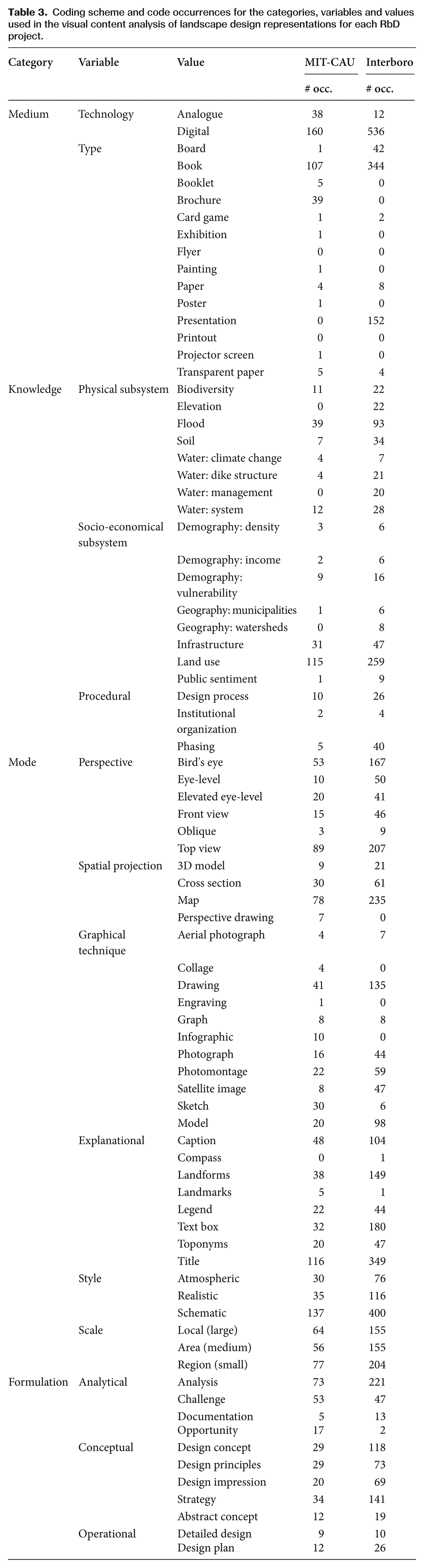
The ‘mode’ category consists of variables that relate to composition and technique, namely perspective, spatial projection, graphic technique, style, scale and explanatory elements. In both projects, the majority of the material consisted of maps, or drawings of maps, as well as photomontages, photographs and models. Most images have a schematic style (537), while atmospheric (106) and realistic (151) styles are used to about the same extent. The images show a slight tendency to focus on the regional scale with local and area scales following closely. Most explanatory elements are textual: titles, captions and textboxes occurring most frequently.
The ‘formulation’ category consists of analytical, conceptual and schematic variables. Most of the material consists of conceptual (396) and analytical (308) images, whilst only a few images (55) have an operational formulation. The ‘knowledge’ category is divided into codes relating to the physical subsystem (mostly flood and water related codes), socio-economical subsystem (land use and infrastructure related codes) and procedural knowledge, (about the phasing of the plan and the design process itself).
Syntactic co-occurrence analysis
The complexity of medium, mode, formulation and knowledge, as well as the semiotic complexity of the image can be described in terms of internal syntactics by looking at the frequency with which code combinations occur. For example, the co-occurrence of different style and formulation codes can help to assess the visual ambiguity of an image, e.g. whether the style ‘fits’ the type of formulation. Analytical images are mostly visualized in a schematic way to show specific – often quantitative – data, just as operational images show concrete physical interventions, required calculations and maps indicating location in a schematic way.
Table 4 shows the co-occurrence of style and formulation codes of the images belonging to the Interboro project.
Co-occurrence table of formulation and style codes of the Interboro project.
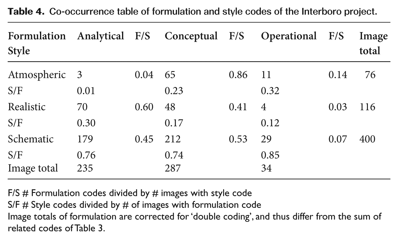
F/S # Formulation codes divided by # images with style code
S/F # Style codes divided by # of images with formulation code
Image totals of formulation are corrected for ‘double coding’, and thus differ from the sum of related codes of Table 3.
This co-occurrence table can be interpreted in two ways for each variable: out of 287 conceptual images, the majority (0.74) have a schematic style. However, we also see that out of 76 images with an atmospheric style, the vast majority (0.86) also have a conceptual formulation. By comparing both relationships (F/S and S/F), we can derive a relative preferred standard of style and formulation. For example, out of all the images with an atmospheric style, very few (0.04) have an analytical formulation. Out of all analytical images, very few (0.01) have an atmospheric style. It might warrant further investigation if this combination of codes does occur to see whether this was a deliberate choice of the makers and whether it affects the analytical qualities of the image.
Similarly, the visual complexity of the ‘mode’ category can be assessed by analysing the co-occurrence of different ‘mode’ codes. For instance, the combination of visual technique and explanatory codes helps to assess the self-explanatory qualities of the image, i.e. whether certain ‘anchorage’ is needed to guide interpretation when certain visual techniques are used. Table 5 shows the co-occurrence of explanatory and visual technique codes of the images belonging to the Interboro project. We found that the most occurring explanatory elements are textual: title, text box and caption. When we compared the different visual techniques with the number of explanatory codes that occurred, we saw that maps, cross sections and schematic models require the most explanatory elements. Sketches contain very few explanatory elements: no title or text box and perhaps at the most a caption. Other explanatory values, such as land forms, landmarks and toponyms, have an explanatory function in terms of geographical orientation and therefore occur mostly in geographical images such as maps and drawings.
Co-occurrence table of technique and explanatory codes of the Interboro project.
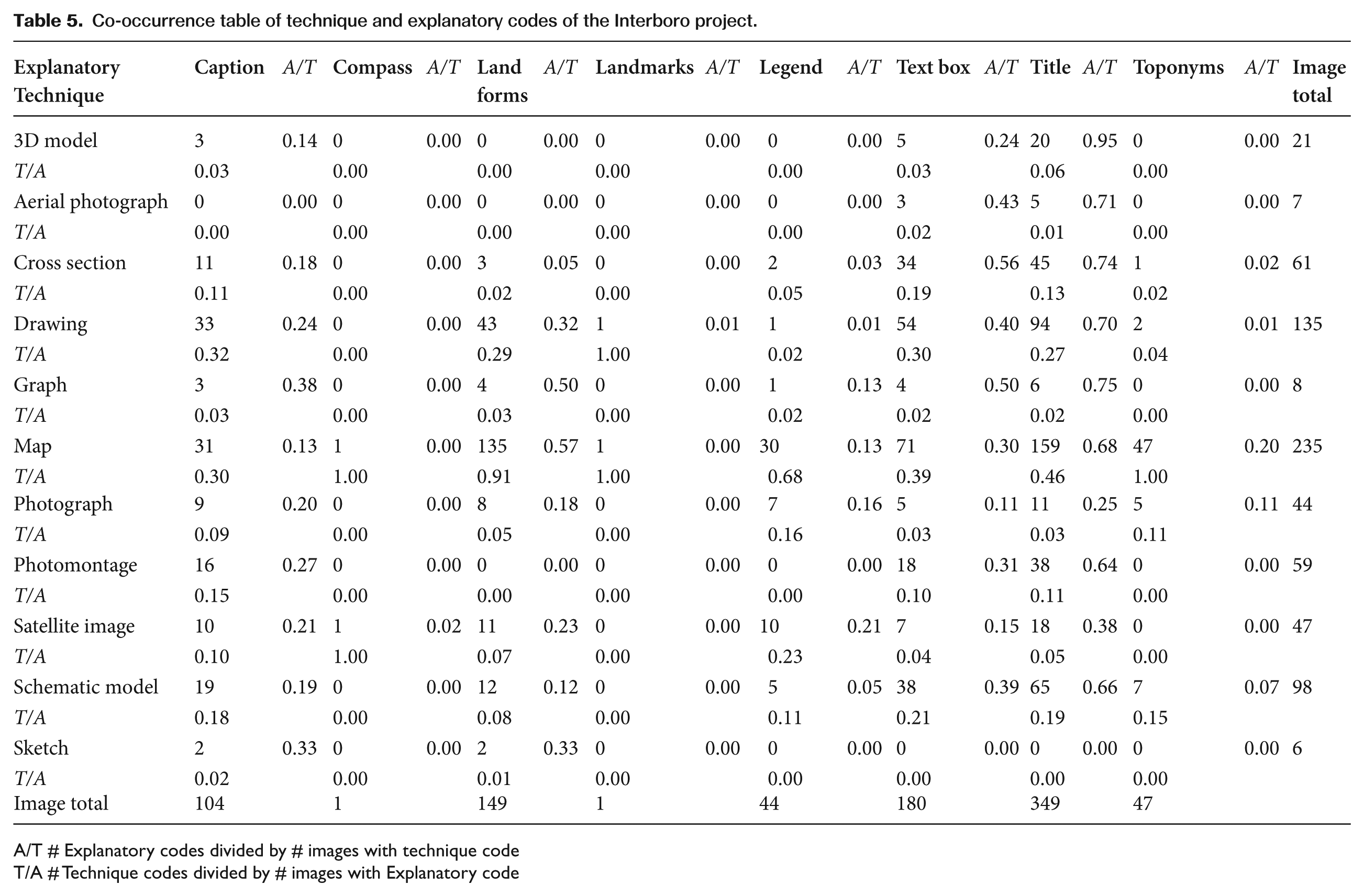
A/T # Explanatory codes divided by # images with technique code
T/A # Technique codes divided by # images with Explanatory code
A similar analysis is possible for the content of the image: the co-occurrence of formulation and knowledge codes. This type of analysis shows how several types of knowledge codes are used in combination to support an analytical claim, or the idea behind a conceptual design. The combination of mode and formulation sheds light on the preferred visualization choices for specific design phases, whilst the combination of medium and mode indicates whether an image was active or passive in terms of interactivity. We address these syntactic relationships by looking at the pragmatics of the images.
Iconographical interpretation
Pragmatics
Images can be selected on the basis of the frequency of code co-occurrence and subsequently subjected to an iconographical interpretation to study the images’ syntactic relationships of validity, readability and interactivity at the representational and iconographical layers of pragmatics. As an example, we interpret three images based on their semantic and syntactic codes and define their syntactic relationships.
The validity of an image depends on the way a formulation is related to the knowledge behind it. In the case of Figure 7, it was not the combination of codes that made the image stand out, but the lack of a certain combination of codes. The image shown in Figure 7 is coded with the variables and values presented in Table 6.
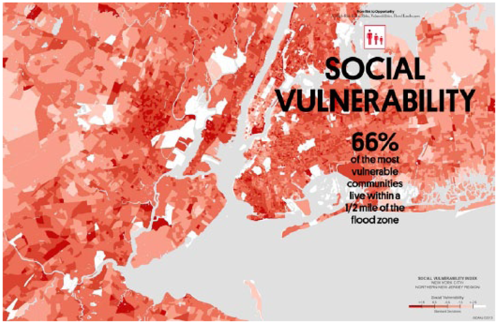
Validity: an image with an analytical formulation (MIT-CAU et al., 2014).
Codes attributed to the image of Figure 7.
Through a representational interpretation of the Figure 7 map, we can describe the greater metropolitan area of New York and note that the University of South Carolina’s Social Vulnerability index has been used to map the degree of social vulnerability in this area. Usually, an analytical image that promotes a challenge such as this includes several knowledge codes: vulnerability illustrated by flood scenarios or due to the elevation of the area. This image contains only the demographic vulnerability code. The question is whether this information is self-explanatory in a visual way, or whether it needs textual anchorage to convey its message.
The title and heading given to this image contain the words ‘vulnerability index’, ‘risk’ and ‘opportunity’. It also makes a strong claim: 66 percent of most vulnerable communities live within half a mile of the flood zone. The flood zone is an important element in this statement. However, a geographical depiction of the flood area is not visible on the map. The validity of the data on social vulnerability is not really in question. However, the statement in relation to the flood zone, and whether 66 percent of the population live within that zone, cannot be verified on the basis of the image and its textual anchorage.
A further iconographical interpretation – contextualization – helps to assess the validity of the statement illustrated by the map. The vulnerability index standardizes ‘indicators of vulnerability based on data such as income levels, poverty rates, ethnicity, language, and access to transportation. Additionally, on-the-ground fieldwork helped the teams gather knowledge beyond what they could glean from the data alone’ (MIT-CAU et al., 2014: 43). We therefore assume this index has sufficient scientific credibility. Through intertextuality, we also find that the map is part of a larger regional analysis that also addresses geographic topologies, the flood zone, pollution and vital infrastructure networks. In the context of a design proposal, with the understanding of how regional analysis works, the social vulnerability map can be placed in series with other similar maps. This allows the viewer to project the flood zone from the accompanied map in his or her interpretation of the social vulnerability map. This makes a statement such as the one on this map possible without displaying all the information in the same image.
Readability entails whether the mode and the formulation of the image are in coherence. The image in Figure 8 was coded with the following semantic and syntactic codes and was selected because of the rare co-occurrence of atmospheric style and analytical formulation (Table 7).
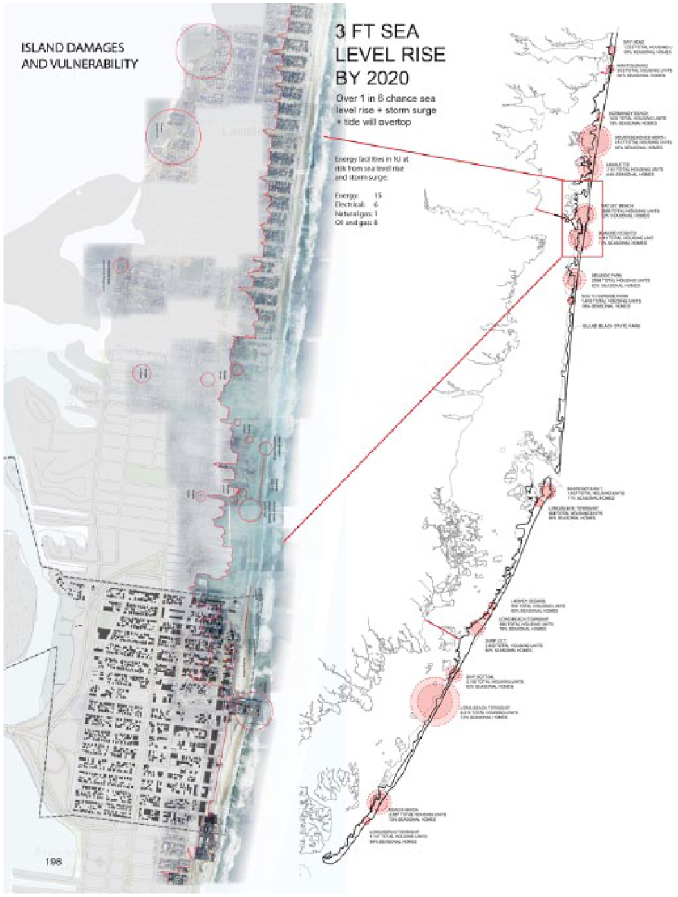
Readability: an analytical image with an atmospheric style (Interboro, 2014).
Codes attributed to the image of Figure 8.
At a representational level, the image depicts an analysis of coastal areas affected in the flood zone. The atmospheric style is applied to an overlay of a map with a satellite image of a small section of the coast. In combination with a schematic map, this provides an overview of the larger coast area and depicts the most vulnerable locations. The textual anchorage explains that sea levels are expected to rise and that a large number of energy facilities and houses will be at risk if there is a flood event in the future.
At an iconographical level, the atmospheric style adds meaning to the schematic map: the washed-out effect of the storm water could connote the severity of the flood. The affected areas are visible in a satellite image so one can see the individual houses. This provides both a strong sense of geographical orientation and an impression of the number of houses likely to be affected. The unaffected areas remain anonymous: they are visible as a schematic map on which one can only distinguish the streets and blocks. The mixture of visual styles therefore directs attention to the affected areas that are shown in more detail.
Interactivity is defined as the relationship between the mode and the medium, i.e. the way the audience is able to interact with an image. The image shown in Figure 9 was selected because the co-occurrence analysis of the medium ‘board’ with the mode ‘visual technique’ yielded only two codes for the MIT-CAU project (cross section and drawing, Table 8), whilst the board material in the Interboro project consists of eight different visual techniques.
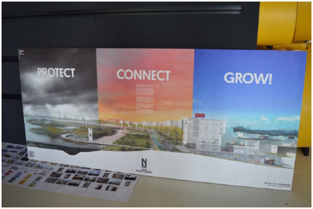
Interactivity: A board presentation with singular visual techniques (MIT-CAU et al. 2014).
Codes attributed to the image in Figure 9.
At a representational level, the image consists of a design impression of three different types of flood defence landscapes linked together in one strategy: ‘protect, connect, grow!’. The perspective drawing is placed on top of a cross section showing terrain elevation. The strategy is outlined in a text box in the middle of the poster in a relatively small font. In terms of interactivity, the board works on at least two levels of viewing distance: from afar through the title, concept terms and the design impression, and from close up through the fine print description.
If we analyse the board using an iconographic lens, the accompanied documentation tells us it was presented during an important meeting where the designers were able to comment and offer further explanations of the board. The choice of visual technique and style invites the viewer to interact not only with the board, but also with the designers themselves. As a communication device, such a board contains little information in itself, yet establishes a specific kind of interactive communication that triggers and facilitates discussion, embedded within the context of a design presentation.
These three examples of interpreting the validity, readability and interactivity of images illustrate how the frequency of combinations of semantic and syntactic codes can indicate a semiotic complexity that warrants further qualitative study.
Discussion and Conclusion
This article presents and demonstrates an analytic framework that enables a systematic visual analysis of landscape design representations. We conceptualize landscape designs as sign systems, to be interpreted by a range of different social actors and expressed through a variety of visual techniques and materials. Through this conceptualization, we are able to discuss design representations in terms of semantics, syntactics and pragmatics. The analytical framework that is based on these terms enables a visual content analysis and subsequent iconographical interpretation.
Our analytical framework is based on the assumption that dyadic and triadic semiotics complement each other. The writings of Eco (1976, 1992) demonstrate that such hybrid semiotics provide a comprehensive theory relevant to signification and communication, as well as an explanatory view on the logic of interpretation and possible over-interpretation. The issue of over-interpretation is especially relevant for an image-centred visual analysis such as presented in this article. Over-interpretation occurs when, from a minimal relationship (between expression and content), the maximum possibility is deduced (Eco, 1992). We therefore intentionally refrain from generalized conclusions that relate to the external meaning of the image, i.e. the meaning of the image in landscape planning and design practice. For example, it would not be valid to conclude that x percent of flood defence landscape designs are visualized using perspective y, technique z, based on the data collection used in this study. Instead, our analysis and interpretation of the data focuses on the internal semantic and syntactic meaning, and the iconographical context of the image.
Furthermore, when performing a content analysis, one must be aware of its quantitative characteristics. As Rose (2012: 102) states, ‘numbers do not translate easily into significance.’ Not every occurrence is equally important. A large occurrence might even be less significant. For instance, considering that landscape planning and design are inherent spatial disciplines, the majority of the images are based on maps. Thus, the frequent occurrence of the code ‘map’ in the content analysis is in itself not surprising. Moreover, that which is not shown plays an equally important part in the significance of images. We address these ‘invisible others’ (Rose, 2012) in our study during the syntactic analysis by considering a low co-occurrence of codes just as interesting as a high co-occurrence of codes.
As a semiotic entity, a landscape design representation contains categories and variables that always function in relation to each other. In our demonstration, the co-occurrence analysis involves the code combinations of only two categories or variables at a time. A further, in-depth syntactical study is possible by looking at the co-occurrence of multiple variables and categories to take into account all the semiotic properties of the image. Nevertheless, the categories and variables defined in this article do enable the systematic analysis of different design images.
The list of codes that emerged during this study is not a general checklist for the interpretation of landscape design representations. Each landscape design project is different in terms of both content and expression. Consequently, the list of codes and semiotic descriptions that emerge from analysing another project will differ to a certain extent as well. To strengthen the scientific validity of these descriptions, the coding scheme could be subjected to a review by an expert panel of landscape practitioners to solidify, for instance, the definitions of more ambiguous, syntactic codes.
The descriptions of the syntactic relations and pragmatics are based on the iconographical interpretation of the researchers to demonstrate the methodological qualities of our framework. In practice, the final iconological layer might prove to play a decisive role in the interpretation of design representations. For instance, the novelty of digital visualization techniques can distract viewers from interpreting the content presented (Lewis et al., 2012). In this way, low content validity could be consciously compensated for by the high interactivity of the medium. Similarly, showing the complexity of an urban microclimate system and claiming a high level of validity can consciously make the image more complex and unreadable. The iconographical interpretation should, therefore, be triangulated with its iconological meaning to comprehensively study the pragmatics of design representations. This can be done in a subsequent research phase through interviews with the producers and the intended audience of the images, or ideally by monitoring the design process. The analytical framework presented in this article is, therefore, by no means a shortcut to the truth. This framework does offer a way of assessing the semiotic complexity of visual design representations as a starting point for a more in-depth, qualitative research strategy.
In conclusion, our analytical framework substantiates the perspective that design representations are more than just images to be looked at. They consist of several semiotic categories, i.e. mode, medium, knowledge and formulation which contain variables and codes that function through an interplay of validity, readability and interactivity. These terms, resulting from our operationalization of semiotic and iconographic theory for the disciplines of landscape planning and design, provide a new vocabulary with which to ‘read’, analyse, assess, discuss and create visualizations of landscape designs.
We demonstrated our framework by using two RbD projects as examples. This demonstration showed that qualitative data analysis software such as Atlas.ti enables the researcher to process a large amount of visual data in both an explorative and a systematic way. It also resulted in a list of semantic and syntactic codes with which the researcher and/or practitioner can create a semiotic topology within a visual database. This topology allows a researcher to identify semiotically complex images by filtering out the most and least occurring syntactics.
Furthermore, our demonstration shows that a qualitative interpretation of landscape design representations is possible through an iconographic lens. This lens enables a researcher to better understand, for instance, how textual anchorage helps explain certain visual choices. It also allows us to derive more contextual information from the image compared to a semantic analysis. In this way, it is possible to identify those signifying and communicating elements of an image that could lead to over or under interpretation, which in turn could help to improve visual communication during participatory design processes.
Our conceptualization of landscape designs explains how planning and design practitioners, in making design representations, are also producing sign systems. From this perspective, the insights from our study can be used as visualization guidelines if we turn the process of sign interpretation into a process of conscious sign production. This can enable landscape planners and designers to consciously prevent possible misinterpretations of landscape designs by producing images that are more semiotically coherent. The ability to produce ‘semiotically conscious’ design representations would be a valuable skill for practitioners, especially considering the increasing complexity of participatory planning and design processes and the tendency for increased multifunctionality in future landscape design solutions.
Footnotes
Acknowledgements
The authors of this article would like to thank the anonymous reviewers for their positive and constructive feedback. The authors would also like to thank the Wageningen MSc students, MIT-CAU, and Interboro for the kind permission to use their image materials.
Funding
The research for this article was carried out in the context of the research programme ‘Multifunctional Flood Defences’, funded by the Stichting Technologie & Wetenschap (STW), part of the Netherlands Organisation for Scientific Research (NWO). Additional ‘in-kind’ funding has been provided by knowledge institute Deltares. There is no conflict of interest.
Biographical Notes
KEVIN RAAPHORST is a PhD Researcher at the chair group of Landscape Architecture at Wageningen University and Research. His background is in spatial planning and human geography, as well as in geo-information science. His primary research interests lie in the socio-political implications of how space and place are visually represented. In his current PhD project, he is developing a critical visual research approach for landscape planning and design using concepts based on (social) semiotics, iconography and visual discourse analysis.
Address: Landscape Architecture Group, Wageningen University, PO Box 47, 6700 AA Wageningen, The Netherlands. [email:
GERDA ROELEVELD is an expert in the field of spatial planning and research by design at knowledge institute Deltares. As a landscape architect, Gerda Roeleveld acquired ample experience in the field of spatial planning and policy making. At Deltares, she is currently working on concepts and methods to improve knowledge exchange and communication amongst scientists, designers, decision makers and other actors involved in participatory spatial development processes.
Address: Urban Land & Water Management, Deltares, Utrecht, The Netherlands. [email:
INGRID DUCHHART is an Assistant Professor at the chair group of Landscape Architecture at Wageningen University and Research. Her expertise lies in facilitating participatory landscape design workshops and applying ‘research through designing’ methods.
Address: As Kevin Raaphorst. [email:
WIM VAN DER KNAAP is an Assistant Professor at the chair group of Land Use Planning at Wageningen University and Research. His expertise lies in spatial planning processes surrounding climate change, water policy, and tourists’ perceptions of landscapes.
Address: Land Use Planning Group, Wageningen University, Wageningen, The Netherlands. [email:
ADRI VAN DEN BRINK is the Professor of the chair group of Landscape Architecture at Wageningen University and Research. His expertise lies in the enhancement of theory and research methods in landscape architecture.
Address: As Kevin Raaphorst. [email: