
Abstract
During a 10-week classroom-based study in a school in western Canada, 17 Kindergarten children had multiple opportunities to learn about how elements of visual art, design and layout in picturebook artwork are fundamental to meaning-making when transacting with this format of literature. Student application of learning about the concepts under study was explored when the children viewed and discussed wordless or almost wordless picturebooks, and when they created their own artwork or visual compositions. Findings from the content analysis of the Kindergarten children’s visual narrative compositions and individual interviews revealed their understanding of how colour, point of view, framing, line to show action, line to show emotion and implied line can be used purposefully by sign-makers to represent particular meanings. Furthermore, application of Halliday’s metafunctions conceptual framework to analyze three focus students’ visual narrative compositions revealed how their semiotic work concomitantly realized the ideational, interpersonal and textual metafunctions. Consistent with the tenets of social semiotics and sociocultural theory, the descriptions of the instructional procedures and student activities convey how the practices in the classroom shaped the students’ visual narrative compositions. The findings enrich understanding of how young children’s knowledge of various semiotic resources can enhance their understanding and interpretations of the kinds of communicative functions realized or fulfilled by various meaning-making resources, and can inform the design of their visual compositions.
Keywords
As a type of visual communication and representation, drawing can be used by children in many different ways and for diverse meaning-making purposes. Through drawing, children can represent thoughts and ideas, clarify concepts, express emotions and explore meaning in general via more concrete representations. Some researchers have broadened their consideration of children’s drawings by focusing specifically on children’s artwork that features drawings (e.g., Acer and Gözen, 2020; Soundy and Drucker, 2010). Other scholars have examined students’ drawings as part of their image making in multimodal print compositions (e.g., Dallacqua and Peralta, 2019; Moses and Serafini, 2022; Pantaleo, 2016, 2017, 2019, 2021; Rylak et al., 2022).
Some researchers have analyzed children’s multimodal compositions for evidence of their application of learning about semiotic resources used in the creation of picturebook artwork, design and layout. These individuals have used picturebooks as mentor texts to develop children’s awareness of and understanding about elements of visual art and design, and the meaning-making synergy among modes. During the case study research (Yazan, 2015) reported in this article, Kindergarten children experienced instruction about the meaning-making potentials of particular elements of visual art, design and layout features in picturebook artwork. The children had opportunities to apply their understandings of these semiotic resources when discussing a collection of wordless and almost wordless picturebooks, and when composing their own visual representations. A corollary of such instructional foci is the development of students’ visual literacy competences (Kędra, 2018).
In this article, I feature the analysis of the Kindergarten children’s visual narrative compositions and their individual interviews about their visual semiotic work to explore their intentional meaning-making with elements of visual art and design. To my knowledge, Kindergarten children’s experiences in learning about elements of visual art, design and layout in picturebook artwork has been examined by a paucity of researchers (e.g., Martens et al. 2018). As well, unlike other studies that are described below, my research featured solely wordless and almost wordless picturebooks. Although when reading/viewing the artwork of all picturebooks, readers must perceive, infer and interpret meaning, and consider the what, how and why of artistic choices, the demands of such semiotic work are heightened in picturebooks without words to suggest an initial layer of literal meaning. Furthermore, the findings from both the content analysis of the focus elements of visual art and design featured in the Kindergarten children’s visual narrative compositions, and from the analysis using Halliday’s (1975) ideational, interpersonal and textual metafunctions to identify the meanings realized by three children’s use of semiotic resources enrich the scholarship on young children’s visual semiotic work. Overall, the findings augment existing research on how young children’s knowledge of various semiotic resources can: enhance their understanding and interpretations of the kinds of communicative functions realized or fulfilled by various meaning-making resources; and inform the intentional design of their own visual compositions.
The selected literature reviewed below features studies that included preschool to Grade 4 children. A discussion about the use of picturebooks as mentor texts and students’ multimodal compositions is followed by an overview of the interconnected conceptual and theoretical frameworks of the study: Halliday’s metafunctions, social semiotics and sociocultural theory. Information about the research context and the methods of the study, and descriptions of the data analysis procedures and findings are followed by a discussion of the findings.
Picturebooks as mentor texts and students’ multimodal compositions
During the classroom-based study with the Kindergarten children, instruction and adult mediation communicated to them that elements of visual art, design and layout in picturebook artwork are fundamental to meaning-making of and with these multimodal ensembles. Indeed, as an art form, the picturebook format necessitates engagement in slow looking by readers. Importantly, knowledge about illustration elements and techniques can inform the slow looking engaged in by students and educators when transacting with picturebooks. Furthermore, according to Ray (2010), “helping children focus on the decisions illustrators have made in picture books can greatly expand their potential for decisive, purposeful action when they do their own composing” (43).
Many scholars use the term mentor texts when referring to model texts used as exemplars for writing pedagogy (Laminack, 2017). Although the term mentor texts was not always used by researchers to refer to the focus selections of literature used in all of the studies described below, picturebooks were used as model texts to develop students’ awareness and understanding of principles and elements of visual art and design, which subsequently informed students’ design and composition of multimodal texts. Regardless if picturebooks are used as mentor texts for learning about writing craft or for learning about elements of artwork and design, students need to identify and understand the what, why and the how of creators’ choices in order to compose their own work with purpose and independence and not simply imitate the mentors. Indeed, the researchers below reported how teaching students the applicable metalanguage for elements of visual art and design contributed to their agency when designing and explaining their own multimodal compositions.
During a study by Martens et al. (2012/2013), two Grade 1 teachers and an art teacher collaborated to develop students’ understanding of and abilities for making meaning with both the artwork and written language in picturebooks. Analysis of the students’ multimodal compositions revealed their understanding of the affordances of the semiotic resources of written language and image explored in the mentor picturebooks. Furthermore, according to Martens et al. (2012/2013), the children developed their awareness “that art, like written language, communicates meaning and that artists, like authors, make conscious, deliberate decisions about the use of line, colour, shape and so on” (291). Martens et al. emphasized that providing students with opportunities to talk about their artwork decisions communicates respect for them and their sign-making processes.
In another study, Martens et al. (2018) described how primary grade teachers used picturebooks as mentor texts to teach students about various elements of visual art and principles of design. Throughout the research, emphasis “was placed on how meaning is conveyed in the art” (Martens et al., 2018: 672). During Storying Studio, time was allocated for teacher read-aloud of picturebooks and presentation of mini lessons, and for student exploration of the mini lesson topics and for composing in writing and art. Descriptions of teachers’ lessons and examples of students’ visual compositions revealed how the children’s experiences with the picturebooks informed: their viewing behaviours; their knowledge and thinking about elements of art (e.g., line, space) and principles of design (e.g., contrast); and their creative representation of meaning.
Working with Grade 2 students, Kesler et al. (2021) conducted a study that focused on elements of visual art and design in Kevin Henkes’s picturebooks, writing craft moves, and the connections between techniques of writing and artwork. During a multimodal composing workshop, students applied their learning and created their own picturebooks. According to Kesler et al. (2021), the children’s semiotic work showed attention to “motion lines, setting details, drawing details … all to develop story elements” (23). The students’ retrospective accounts of their design choices revealed development of a design and writing metalanguage that affected their narrative understanding and compositional decisions.
During a classroom-based study with Grades 2 and 3 students, I (Pantaleo, 2016) explored how explicit instruction about elements of visual art and design affected students’ perception, appreciation and understanding of the artwork in picturebooks, as well as the subsequent application of the same foci elements in students’ own multimodal texts. Analyses of the children’s interview transcripts about their multimodal books revealed information about students’ design choices and intentional use of colour, point of view, perspective, typography, framing and line to realize varying purposes. As well, the students used the metalanguage they had learned during the research when describing and explaining their artwork.
A project conducted by Villarreal et al. (2015) featured a Grade 4 teacher using picturebooks as mentor texts during class read-aloud sessions “to strategically introduce students to various facets of illustrator craft, including visual elements, peritextual features, page turns, and elements of design” (267). Analysis of the students’ picturebooks created prior to and then following an in-depth exploration of ways “published illustrators craft their work” (Villarreal et al., 2015: 265), revealed how after the focused inquiry, the children’s artwork featured more complex understandings of visual elements and the intentionality of design decisions. For example, when talking about their second picturebooks, “the children had much more to say about their color choices” (Villarreal et al., 2015: 271) and their use of line demonstrated “more complex understandings of this visual element” (272).
The contextualized nature of the students’ semiotic work described in the above research underscores the importance of socially situating any analysis of the forms of communication and representation designed by children. Social semiotics and sociocultural theory are two frameworks that prioritize the social nature of students’ sign-making reception and production.
Conceptual and theoretical frameworks
Halliday, social semiotics and meaning-making
Halliday (1975) described language as a resource – a social semiotic system – for making meaning. However, he emphasized that in a culture’s “symbolic systems” through which meanings are communicated, language is only “one form of the realization of the social semiotic” (Halliday, 1975: 121). Halliday theorized that the semiotic resources of the mode of language fulfill three social metafunctions/meanings: ideational, interpersonal and textual. The ideational metafunction pertains to the representation of events, objects, participants, places, experiences and circumstances in an environment or the world. The interpersonal metafunction focuses on the use of semiotic resources by sign-makers to create “particular relations between viewers and the ‘world’ that they depict” (Jewitt, 2006: 44) through enacting attitudes, values, relations and social interactions. The textual metafunction refers to how semiotic resources are used to structure a text and to create coherence. Although the ideational, interpersonal and textual metafunctions can be considered independently, the three kinds of meaning occur simultaneously.
Kress and Van Leeuwen (2006) “adopted the theoretical notion of ‘metafunction’” (41) to their theorizing about how semiotic resources of the visual mode represent and communicate meaning. For example, in their grammar of visual design, which is situated “within the theoretical framework of social semiotics” (6), Kress and van Leeuwen described how sign-makers’ choices about point of view, gaze of subject, and shot distance are fundamental to the interpersonal metafunction. With respect to the textual metafunction, Kress and van Leeuwen explained how information value (placement of elements), salience and framing must be considered when analyzing the coherence and structure of a visual composition (177). They also have theorized colour (Kress and Van Leeuwen, 2002; 2006) and typography (Van Leeuwen, 2006) as modes and described how the affordances of their semiotic resources fulfill Halliday’s three metafunctions.
Researchers have reported on how Halliday’s metafunctions provided an informative analytical framework for identifying and understanding the multifaceted meaning of visual representations designed by children in particular contexts (e.g., Pantaleo, 2013; Hopperstad, 2010). Indeed, in accordance with Halliday’s fundamental principles for studying language, a social semiotic theoretical approach to meaning-making with all modes “focuses on processes of meaning making through situated practices and interpretation …. The emphasis is firmly on sign-making and the agentive work of the sign-maker in a specific place and time” (Jewitt and Kress, 2010: 342). In accordance with matters of central importance to those who adopt a social semiotics lens to multimodality, the research with the Kindergarten children focused on the following: meaning, meaning-making, “the resources for making meaning,” the meaning-makers, agency, and the social context (Bezemer and Kress, 2016: 16). The Kindergarten children’s sign-making was affected by their engagement with particular texts, the modes and semiotic resources available to them to make meaning, and their participation in various types of social discourses and meaning-making practices.
Sociocultural theory
Similarly, the central tenet of Vygotsky’s (1978) sociocultural theory is the socially and culturally situated nature of human development and behaviour, including language and cognition. According to Vygotsky, the socially situated construction of knowledge and development of higher order thinking skills involves interconnected social and individual processes, and is mediated by others and particular social practices. Indeed, Vygotsky (1978) wrote that “human learning presupposes a specific social nature and a process by which children grow into the intellectual life of those around them” (88).
Reflecting tenets of Vygotsky’s social theory of development, learning and meaning-making in general, Papandreou (2014) noted how children’s drawing “attitudes and practices are affected by the sociocultural practices with which they are familiarized” (97). Indeed, although children’s drawings are affected by their level of cognitive development and fine motor skills, a more holistic view of children’s visual representation work takes into account their communicative purposes and intentions, and a range of developmental, social and cultural factors. Recognizing the importance of understanding the sociocultural context when analyzing children’s visual semiotic work, the descriptions of the research procedures below provide information about factors that affected the Kindergarten children’s meaning-making, thinking and communicating in the research classroom. As the researcher and a teacher in the classroom, I acknowledge my ideological and pedagogical influences on all aspects of the case study research.
Case study research
The case study research with the Kindergarten children was intrinsically bounded and particularistic in nature (Yazan, 2015). As described by Yin (2014), “case study is an empirical inquiry that investigates” (16) particular phenomenon within real-life contexts over time. The implementation of the research procedures and the collection of data occurred in only one classroom of learners over a duration of approximately 10 weeks. Case study design is appropriate when the research involves working with children in classrooms because “it is impossible to separate the phenomenon’s variables from their context” (Merriam and Tisdell, 2016: 38). Case study research is also descriptive in nature. During the research in the Kindergarten classroom, multiple sources of data were gathered (e.g., artifacts, photographs, digital recordings, observations, interviews, researcher’s diary) in order to provide a rich description of the contextualized aspects under study (Yazan 2015: 139) and to understand and present participants’ point of view.
Research context
The research site was a public Kindergarten-Grade 5 dual track English and French Immersion school located in a middle/upper income area of a city in western British Columbia, Canada. At the time of the study, approximately 460 students attended the school. The Kindergarten classroom of Mrs. P. was selected purposefully as an “information-rich” case for in-depth study (Patton, 2002). Although I was familiar with Mrs. P. as a teacher in a local school district, we became better acquainted when she completed a graduate degree at my university. Mrs. P.’s interests in developing young children’s oral language, higher-level thinking and visual literacy competences were most evident throughout her graduate course work.
Applications to conduct the research received approval at both the university and school district level. Signed informed consent was obtained from those individuals required by university human ethic policies. A child-friendly script that described the research was read aloud to the students. Of the 17 students in the Kindergarten class, informed consent was granted by all of the parents/guardians.
When the research began in November 2021, all of the students were 5 years of age. The ethnic heritage of the 6 girls and 11 boys is as follows: European Canadian (12); Biracial (3 – South Asian/European Canadian; Iranian/European Canadian; Indigenous/Filipino); Filipino (1); and Serbian (1). One student is a dual language learner and another child had a full time Educational Assistant. Mrs. P. described the children as a “busy and diverse group of learners who need a lot of differentiation to meet the different levels in literacy and numeracy” (Mrs. P., personal communication, 22 March 2022).
Research methodology
Research procedures
From November 2021 to March 2022, for approximately 60–70 min/day for 3–5 days per week, I worked collaboratively with Mrs. P. as both a teacher and the researcher. Eighteen of the 48 days of the research occurred in November and December. The classroom-based research was negatively affected by COVID-19 in several ways (e.g., student absenteeism; access to the school/research classroom, which had consequences for the research procedures). Indeed, one child was absent for approximately 60% of the research activities and did not complete the final application of learning assignment.
Specifically, the research objectives were as follows: to develop students’ knowledge and understanding about elements of visual art and design used by people who create wordless or almost wordless picturebooks; and to explore student application of learning about elements of visual art and design when viewing and responding to wordless or almost wordless picturebooks, and when creating their own print artwork or visual compositions. The descriptions of the research procedures below also convey the embedded and overarching goals of the study: to provide the children with opportunities to develop their visual meaning-making competences; their aesthetic understanding; and their communication and higher-order thinking skills.
Elements of visual art and design
The elements of visual art and design, and processes taught and emphasized throughout the research were consistent with learning standards in the Kindergarten Arts Education curriculum (British Columbia Ministry of Education [hereafter BCME], 2016). For example, in Kindergarten, children are to develop their knowledge of the following: creative processes (e.g., “the means by which an artistic work is made” [BCME, 2016: 2]); colour; line; symbolism (e.g., the use of images, colours, lines “to represent abstract ideas” [3]); shape (2D compared to 3D); principles of design (i.e., “the planned use of the visual elements to achieve a desired effect” [4]); and works of art (i.e., “the results of creative processes” [3]). As well, Kindergarten students are to share creative works and engage in activities that enable them to document and reflect on their learning (e.g., “through drawing, painting, constructing new works”) (BCME, 2016: 2). The multiple opportunities for student engagement in dialogue during whole class activities and discussions were essential to each student’s construction of knowledge about the concepts under study, which were continually reviewed by Mrs. P. and me.
With respect to colour, instructional emphasis was devoted to particular concepts and terminology that were referred to throughout the research (i.e., primary, secondary, complementary, and value). The students viewed YouTube videos that included foundational information about colours, engaged in discussions about colour featured in a variety of sources (e.g., replicas of artwork, picturebooks, objects), and participated in lessons that provided them with opportunities to explore colour. Introduction of the term ‘primary’ involved talking with the students about the meanings of the word, and connecting their ideas to why red, blue and yellow are referred to as primary colours. The children viewed some images of Piet Mondrian’s artwork that features primary colours and then, using markers, created their own Mondrian-like artwork. A few lessons included me reading (and then rereading) pages of Mix It Up (Tullet, 2014). We talked about how to create secondary colours from primary colours and an anchor chart was created for student reference. Subsequently, the students engaged in three different activities with paint and used primary colours to make secondary colours. For another activity, students coloured a monster with primary and secondary colours, and then added construction paper facial features. The children also explored creating tints and shades by adding white and black to a primary colour of paint. Although challenging for the students, we engaged them in conversations about possible symbolic meanings of colours as opposed to the identification of objects that are particular colours.
For the element of line, the students first viewed a YouTube video. Mrs. P. created another anchor chart with the names of 15 types of lines and using whiteboards, the students made the various kinds of lines as we talked about them (e.g., wavy, vertical, diagonal, zig zag, dotted). In addition to creating alphabet letters with particular types of lines, the students suggested objects that feature different types of lines. On each of three primary and three secondary coloured strips of construction paper, the students drew a different type of line with a fine point black marker all the way across the paper. The strips were then glued on another sheet of paper. Finally, examples of implied line (physical/concrete examples and examples in picturebook artwork) were shared with the children and overall, they quickly grasped this abstract idea.
With respect to visual point to view, the students viewed multiple digital and print images and talked about how they were positioned as viewers to look at the images. As well as introducing the children to vocabulary to describe different visual points of view (i.e., front, back, side, close-up, bird’s eye, worm’s eye), we talked about why artists might choose to create their artwork using particular view points. The students used magnifying glasses and explored close-up images of objects around the room, and again we talked about their viewing experiences. In dyads, the children looked at and talked about Re-Zoom (Banyai, 1995), a picturebook that features a shifting visual point of view with each page turn. They also read the book backwards and as a class we talked about the design of Banyai’s wordless picturebook.
Other activities featuring visual point of view included the students using whiteboards and drawing, with direction, a variety of objects and living creatures from different visual points of view. The children also physically manipulated objects (e.g., plastic animals) and viewed them from various points of view. When I read aloud No, David! (Shannon, 1998), the children were encouraged to observe and talk about Shannon’s use of visual point of view. Using a document camera, and over two lessons, the students engaged in a class discussion of the wordless picturebook Woodrow at Sea (Edwards, 2017), and Mrs. P. and I modeled looking for and thinking about the artist’s use of colour, line and visual point of view.
For the design element of framing, the students looked at photographs, Internet images and picturebook artwork and identified what was being framed, the frame, and the purpose or effect of the framing. Concrete examples (e.g., the school yard fence, the classroom carpet) were also talked about with respect to framing. Using 3D geometric shapes, the children explored the use of framing for purposes of inclusion and exclusion. For another activity, the students were given a piece of paper with a small hole in the middle, which served as a lens to focus their framing, to explore the effect of such a limited view. Using whiteboards, the students drew objects and framed them in some way (e.g., drew something they liked to eat and framed it with a heart). The students assembled a 3D cube from a template, decorated it, glued it on a piece of paper, and framed it by drawing items around the cube that might be inside it. During a class read-aloud of Mr. Tiger Goes Wild (Brown, 2013), the children were prompted to look for examples of framing and line, including implied line, and to consider the potential meaning of Brown’s use of these elements.
When introducing the element of perspective, we talked with the children about two-dimensionality compared to a form that is three-dimensional. To assist the students with understanding the concept of depth, a circle was compared to a sphere, a square compared to a cube, and an outline of a human body on a piece of paper compared to their bodies. We talked about how artists of picturebooks use techniques to make their two-dimensional art appear three-dimensional, creating the sense of space. The students viewed multiple images and identified the techniques used by creators to make the illusion of 3D (e.g., overlapping; decreasing the size, distance between, clarity of detail and brillance of colour of objects in the background; including shadows; and creating linear perpsective). Mrs. P. engaged the children in a directed drawing activity that involved them creating linear perspective with a road.
Interactive picturebook sessions
Following the instruction about the elements of visual art and design, I began the small group interactive picturebook sessions. Acknowledging the challenges of choosing titles from the wealth of published wordless and almost wordless picturebooks, criteria used to select books for the research included the following: the potential interest and appeal to 5-year-old children, the range of opportunities for the children to observe how the foci concepts were realized in various artwork styles and narratives, and the nature and complexity of the plot. After much consideration of the almost wordless picturebooks I owned, I selected the following six titles, all of which feature a character or characters experiencing some type of adventure: Float (Miyares, 2015), Nope! A Tale of First Flight (Sheneman, 2017), Tuesday (Wiesner, 1991), Draw! (Colón, 2014), Wolf in the Snow (Cordell, 2017) and Polo and the Dragon (Faller, 2003). A synopsis of each focus almost worless picturebook is found in the Appendix.
The students were introduced to terminology for some physical aspects (e.g., dust jacket, hard cover, endpages) and layout characteristics (e.g., double-page spread, full bleed) of picturebooks. Primarily, these components were introduced with picturebooks featured during the instruction of the focus elements of visual art and design. The peritextual and layout features were also reviewed by Mrs. P. during whole class read-alouds and by me during the small group sessions.
For the small group discussion sessions of the almost wordless picturebooks, the students were organized into triads, although on occasion student absences resulted in dyads. The interactive sessions occurred at a table outside of the classroom. The length of the digitally-recorded small group discussions were affected by several factors (e.g., student personality and disposition, the picturebooks, hallway distractions). However, on average the small group sessions were 25–30 min in duration.
During the small group discussions, the students were encouraged to talk about their ideas, thoughts and feelings about the narrative; to provide evidence in the artwork that supported their thinking; to imagine the thoughts and feelings of characters; to generate ideas to fill in narrative gaps; to contemplate future narrative events; and to reflect on their speculations. In addition, student attention was directed to the elements of visual art and design they had learned about during the research, and they were asked to consider the effects and purposes of colour, point of view, line, framing and three dimensionality relative to the narrative. As mediator of the interactive sessions, I modeled various thinking, comprehending and oral discourse skills central to meaning-making with almost wordless picturebooks.
Visual narrative compositions
The students participated in a whole class visual arts activity after the small group discussions of five of the picturebooks. Time limitations resulted in no follow-up activity for one picturebook.
Following the work with the six picturebooks, the children were assigned the task of generating a character to feature in their own wordless narrative. As well as brainstorming ideas and displaying some images of picturebook characters (e.g., Mo Willems’s Pigeon, Elephant and Piggie; Ben Clanton’s Narwhal and Jelly), multiple age appropriate “how to draw” books were made available to the students. For several children, the scaffolded directions in the books were helpful in selecting and drawing a character. Using whiteboards, the students practiced drawing their character from various points of view (e.g., front, side, close-up, back). Both Mrs. P. and I shared an example of a finished story page we had created, and we explained our planning and composition processes.
After Mrs. P. shared her planning page, a large sheet of paper that featured four frames/panels (i.e., each frame was one page of the story), the children were given the same page format to plan a wordless narrative about their character. Although the students successfully drafted a wordless story, inadequate time was available for the creation of a quality project as Spring Break was approaching quickly. Therefore, we revised the parameters for the application of learning assignment. For the final product, the students created one page of their story that both profiled their character and conveyed some key information about events in the narrative. As well, on their one page of artwork the students needed to intentionally include the foci elements of visual art and design they had learned about during the research (i.e., colour, point of view, line to show action/movement, line to show emotion, implied line, framing, and 3D-dimensionality).
The students drew their artwork with an ultra fine point black marker and used pencil crayons to colour their drawings. The children had previous classroom experiences of using black markers (vs pencils) for drawing. From the beginning of the year, Mrs. P. had provided the students with instruction and constant reminders about the pragmatics of effective colouring. This activity was the children’s first in-school opportunity to use pencil crayons for colouring their artwork. Once finished, I individually interviewed each student about their artwork. The interviews were digitally recorded and occurred at a table outside of the classroom. I first prompted the students to tell me about their visual narrative compositions (i.e., what is going on/happening in their image), which I referred to as ‘artwork’ when talking with the children, and then asked them about their specific use of each of the required elements of visual art and design. The interviews ranged in duration from approximately 6–8 min.
Analysis of student data
For varying reasons, such as student disposition, oral language competence/facility and knowledge of the concepts under study, the children differed in their abilities to describe or explain the required elements in their visual narrative representations. In addition, the transcripts revealed that I neglected to ask a few children about their reason for using a particular element of visual art and design the way they did in their artwork.
As noted previously, due to absenteeism issues, one student did not complete the application of learning assignment. After transcribing the 16 student digital interviews, I engaged in content analysis. As I read through each interview and highlighted the focus elements of visual art and design, I also referred to the coloured photocopies of the children’s visual narrative compositions. I then created a table for each element (colour, framing, point of view, perspective, implied line, line to convey action, and line to show emotion) with students’ names constituting the rows. Using the tables, I read through the transcripts again and took notes about each student’s description of their use of each element. Frequency counts were tabulated for the inclusion of each element and for particular characteristics or features of each element (e.g., the type of point of view, techniques used to create three dimensionality). I also generated categories to describe the students’ use of some of the elements (e.g., reasons for using or effects of particular elements). This process was completed on three occasions and comparison of data tables revealed no differences. Findings from these analyses procedures are reported below.
Findings
Colour
With respect to their purposeful use of colour, two children identified one example, nine talked about two examples, four commented on three colours and one talked about four colours. Nine students identified at least one set of complementary colours in their artwork and overwhelmingly, the children’s reasons for using complementary colours were because they “go together” and they “look nice together”. Two students identified primary colours in their artwork.
Transcript analysis revealed 23 examples of the children using colour to convey symbolic meaning. One of the affordances for meaning-making with colour is association or provenance (i.e., meanings connected to the communicative purposes of colours in historical, social and cultural contexts) (Kress and Van Leeuwen, 2002; 2006). As described previously, the children participated in conversations about various potential meanings of colours. When talking about their reasons for using particular colours, the children associated colours with emotions (e.g., angry, happy), objects (e.g., water) and ideas or concepts (e.g., friendship, magic, bravery, curiosity, mystery, danger, intelligence).
Framing
Ten students talked about one example of framing in their artwork and six students talked about two examples. Nearly all framing examples featured the students’ main characters as the ‘what’ of the framing. The ‘how’ of the framing included mainly natural objects (e.g., trees, humans, iceberg, ocean, land, tunnel, snowflakes and seaweed). One student did not provide a reason when queried about the meaning of one of his framing examples. When asked to explain the significance of their framing, the two interrelated reasons offered by students were to focus viewer attention on a character and/or on something important. The discourse of four children conveyed their framing was significant because it focused on plot action.
Point of view
Seven of the 16 children described two examples of visual point of view in their artwork. Thirteen children talked about a front view and nine described a side view. Only one student drew a character from a back point of view. One student was not able to explain his design intention for drawing a side view of an object. I neglected to ask another student about his reasons for drawing his character from a front and side point of view. Eight children’s reason for drawing a character from a particular point of view was to show the character’s face. Eight students explicitly noted how the point of view enabled viewers to see the character’s emotions, and five children explained how the point of view allowed viewers to see the character’s actions.
Perspective – 3D
All but one student identified the element of perspective (3D) in their artwork. The children were not asked to explain the significance of their technique to create depth and distance. Two children created shadows in their artwork, and 13 included smaller-sized objects in the background to create a sense of distance. Although all 16 children have overlapping objects in their artwork, no child talked about this technique to create perspective in 2D representations. (This technique was not emphasized during the instruction on perspective or during the small group discussions of the picturebooks).
Line – Implied, action and emotion
For the required element of implied line, five students talked about two examples and 11 children talked about one example. Two children were not able to explain the significance of their example of implied line. In the artwork of eight students, characters engage in a “visual form of direct address” (Kress and Van Leeuwen, 2006: 117), which creates an implied line to viewers. Overwhelmingly, the students explained the purpose of the demand gaze is to make contact with viewers so they would focus on the main character and understand/appreciate their situation. Another eight students described how the characters’ eyes create an implied line to their destination or goal. Six students identified how other body parts of characters (e.g., body, finger, wing, face) form an implied line to their objective or intention.
All 16 students shared an example of line to show action/movement with four children providing two examples. The children used lines to show a variety of actions: running, walking, blowing wind, directing character movement, flapping, floating (on water and in the air), shining, jumping, and swimming.
For line to show emotion or feelings, 7 of the 16 children talked about two examples. One student used lines to frame a character’s head to show his excitement. For 15 examples, the children described how the nature of characters’ eyebrows convey their emotions, and for 7 examples, the students talked about how the lines used for a character’s mouth communicate feelings. Overwhelmingly, the children identified happiness as the emotion conveyed by characters’ eyebrows and mouths.
Thus, data analysis revealed how the children used the required elements of visual art and design with intention and for a variety of meaning-making purposes. To enrich understanding of how the elements of visual art and design in the children’s visual narrative compositions communicate and represent meaning, I engage in a semiotic analysis of three children’s compositions. Following each child’s (all student names are pseudonyms) explanation of their use of the foci elements of visual art and design, I describe how these elements communicate ideational, interpersonal and textual meanings. These descriptions of how the children’s visual semiotic work realize the metafunctions are not exhaustive.
Zantina
Zantina is a dual language learner. According to Mrs. P., in March, Zantina was independently reading leveled text beyond year-end expectations for a Grade 1 student but her comprehension of such texts was weak. Based on provincial assessment terminology to evaluate student progress (emerging, developing, proficient, extending), Zantina was 1 of 4 students assessed by Mrs. P. as “proficient” in Reading and 1 of 13 students assessed as “developing” in Writing in March.
When asked to describe what was happening in her artwork (Figure 1), Zantina explained, “The fairy is controlling the wand and the wand is making the flower. And both one of their magical friends came to their house and she was sad and she wanted a flower and now she’s happy because they made one for her.” When asked to talk about some colours she used in her artwork, Zantina explained she made the looping line (she identified it as such) blue “To show that’s it water for the plant that needs it.” Zantina also described her use of complementary colours and their potential meanings. “These are the complementary colours (points to them) .… It’s yellow and purple and they go together well and they pop.” When asked what the colours could mean she said purple can mean “magic” (the wand is magic) and yellow can mean “happy” (the wand is happy). Zantina’s visual narrative composition.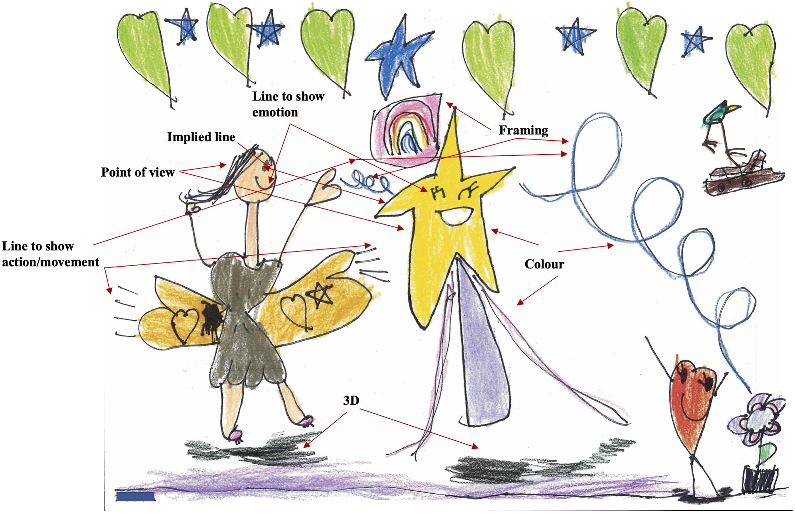
When asked to identify an example of framing, Zantina explained, “The rainbow is framed by the frame.” When asked why that framing is important she replied, “Because … so it won’t look like it’s a real rainbow.” Zantina also stated that, “The wand is being framed by magic” and the framing is important “To know what the wand is doing.” In the transcript excerpt below, Zantina shares her design choices about point of view.
S: Okay, that makes sense. Now, what about point of view?
Z: This one [wand] is a front view and this one is a side view of the fairy. And one of the eyes of the wand are winking.
S: So why did you make the wand a front view?
Z: To know what her emotion look like.
S: Oh, that’s a great idea. And then why did you make the fairy a side view?
Z: To look where she’s putting magic on the wand.
For the element of perspective, making a 2D image seem 3D in appearance, Zantina pointed to the shadows she created for the fairy and the wand. When asked about her use of line to show action, Zantina directed my attention to the fairy’s wings and explained, “Her wings are moving and the magic is starting going on.” With respect to line to show emotion, Zantina was very pleased with her use of line to create a winking wand.
S: Okay. What about line to show feeling or emotion?
Z: That’s she’s happy.
S: And how have you shown that with line?
Z: With some dots and lines and smiles.
S: With smiles. Okay. And what about here? On your wand?
Z: It’s winking.
S: Why is it winking?
Z: Because it’s smiling because it’s happy.
When I inquired about her use of implied line, Zantina quickly pointed to an example. “She’s [the fairy] implied to the wand.” I neglected to ask her why this implied line is important but it is logical as the fairy is transferring some of her magic to the wand.
With respect to the ideational metafunction, in Zantina’s artwork colour is used to signify “represented participants” (Kress and Van Leeuwen, 2006: 48) (wand), objects (water), events (transfer of magic), concepts (magic) and emotions (happy). Zantina’s lines to show action, the lines by the fairy’s wings and the looping blue lines, convey events happening in the represented world. For the interpersonal metafunction, the profile of the fairy establishes her relationship with the wand and ultimately the flower, and the frontal point of view of the wand positions it as visually addressing viewers (and as noted by Zantina, the wand is winking at viewers). A demand image requires “that the viewer enter some kind of imaginary relation” with the represented participants (Kress and Van Leeuwen, 2006: 118). This use of implied line as well as Zantina’s use of line to show characters’ emotions communicates interpersonal meaning. She also explained how her use of colour (yellow) conveys the wand’s emotions about events transpiring between the fairy, itself and the flower. Regarding the textual metafunction, the wand, which is the conduit for the fairy’s magic, is in the foreground and in the centre of the page. The close-up nature of the shot is also conveyed by Zantina’s use of shadows near the bottom of the page. The complementary colours on the wand, which make it “pop”, add further to its salience. In addition, Zantina’s framing contributes to the textual metafunction as the magic framing the wand connects the parts of her visual narrative composition (fairy, wand and flower).
Emeree
Emeree rarely volunteered to answer questions or contribute to whole class conversations. In March, she was 1 of 4 students identified by Mrs. P. as “emerging” in both Reading and Writing.
When I directed Emeree to “tell me about your artwork” (Figure 2), she pointed to the red dog and stated, “He’s mad that he went to the ocean.” She conveyed that the brown dog was happy to go to the beach and that the person is connected to the dogs because “They’re all family.” Emeree explained she coloured the large dog red “because he’s mad about being at the beach.” She also used two different values of blue to colour the ocean and stated she did so “Because it [water] looks different colours when you are far away.” For the boats in the background of her artwork, Emeree said she used complementary colours (red and green; blue and orange) and these colours “make each other pop.” Emeree’s visual narrative composition.
For framing, Emeree explained how the beach and ocean are framing the red dog, and that the brown dog, the person and the crab are also framing the red dog. When asked why the second example of framing is important, Emeree replied, “Because they’re [person and brown dog] his family.” Emeree was the only student who drew a character or object from a back view.
E: This guy [red dog] is a front view and this one [brown dog] is a back view.
S: Okay, so why did you make the red dog a front view?
E: So you know that he’s mad.
S: Right. So, we see its face. And then why did you make this dog a back view?
E: Because he’s looking at, like he’s looking at the dark ocean.
S: And you said he’s the one who’s happy to be there. Right?
E: Yeah.
For the element of 3D, Emeree stated that she drew the boats small to show they were far away. When asked about her use of line to show action, Emeree pointed to the red dog and the crab. She explained the lines to the left of the dog show “He’s moving on the sand.” and the lines below the crab show, “He’s jumping. He started on her head and then he jumped because he wanted to get the seagull.” Regarding line to show emotion or feeling, she explained the red dog is angry and viewers can tell by the lines she used for “His mouth and his eyebrows.” Emeree gave two examples of implied line. One implied line example is the human pointing to the red dog. “He’s pointing because he wants everybody … he’s trying to make him feel better so he’s trying to make everybody hug him.” Her second example of implied line is the demand image of the red dog. When asked what the dog might be communicating to viewers, Emeree said, “I’m mad.”
In Emeree’s visual narrative composition, ideational meaning is communicated through her use of colour and line to show action. For example, as well as conveying information about place/setting, the different colours of blue used for the ocean represent the perceived change in colour depending on a viewer’s distance from the water. The movement lines convey the actions of the represented participants in their world (e.g., the crab is jumping to catch a seagull and the red dog is moving in the sand). Colour is also used to communicate interpersonal meaning in Emeree’s artwork. She explained how she intentionally coloured the large dog red because it was unhappy about being at the beach. Other elements also contribute to creating social relations between the red dog and viewers: the frontal point of view (demand image), the lines to show emotion (eyebrows and mouth), and the close-up shot. As conveyed by Emeree, the size of the boats in the background communicate their distance from the dog, furthering the closeness of the canine. The back view of the brown dog simultaneously conveys meaning about its relationship with the red dog as well as creates a social relation with viewers – one of detachment. Emeree explained how the brown dog is pleased to be at the beach and viewers can infer information about this represented participant’s attitude from the back point of view. With respect to the textual metafunction, information value is communicated by the red dog’s large size and its placement on the page (foreground and centre). Indeed, the synergy of several elements of visual art and design, including the implied line created by the demand image, contribute to the red dog being “the most eye-catching element in the composition” (Kress and Van Leeuwen, 2006: 176). Emeree described how the red dog is framed by the human and brown dog showing how they are family (interpersonal function), and thus connecting the represented participants in the composition.
Zdenko
Zdenko was also 1 of the 4 students whose progress in both Reading and Writing was evaluated by Mrs. P. as “emerging” in March. On several occasions during the interview, I had to remind Zdenko to use “his words” as opposed to solely pointing to his visual work.
When I instructed Zdenko to “tell me about your artwork,” (Figure 3) he explained with gestures that, “He’s a hunter. And he’s coming towards the lion. But he [the lion] does not know where he [the hunter] is and he’s thinking if he’s gonna chase him again.” For colour, Zdenko pointed to his thought bubble. “I outlined this in red because red can mean danger.” When I inquired about the red colour of the jeep, he said, “It’s danger too because it’s the hunter’s.” Zdenko coloured the flag on the jeep green and he identified red and green as “complementary colours.” For framing, Zdenko said, “The trees are framing the lion.” and when queried about the importance of this framing, he stated, “So you can focus on him.” He also identified the ground above and below the lion as framing it and making the creature the focus of the picture. Zdenko’s visual narrative composition.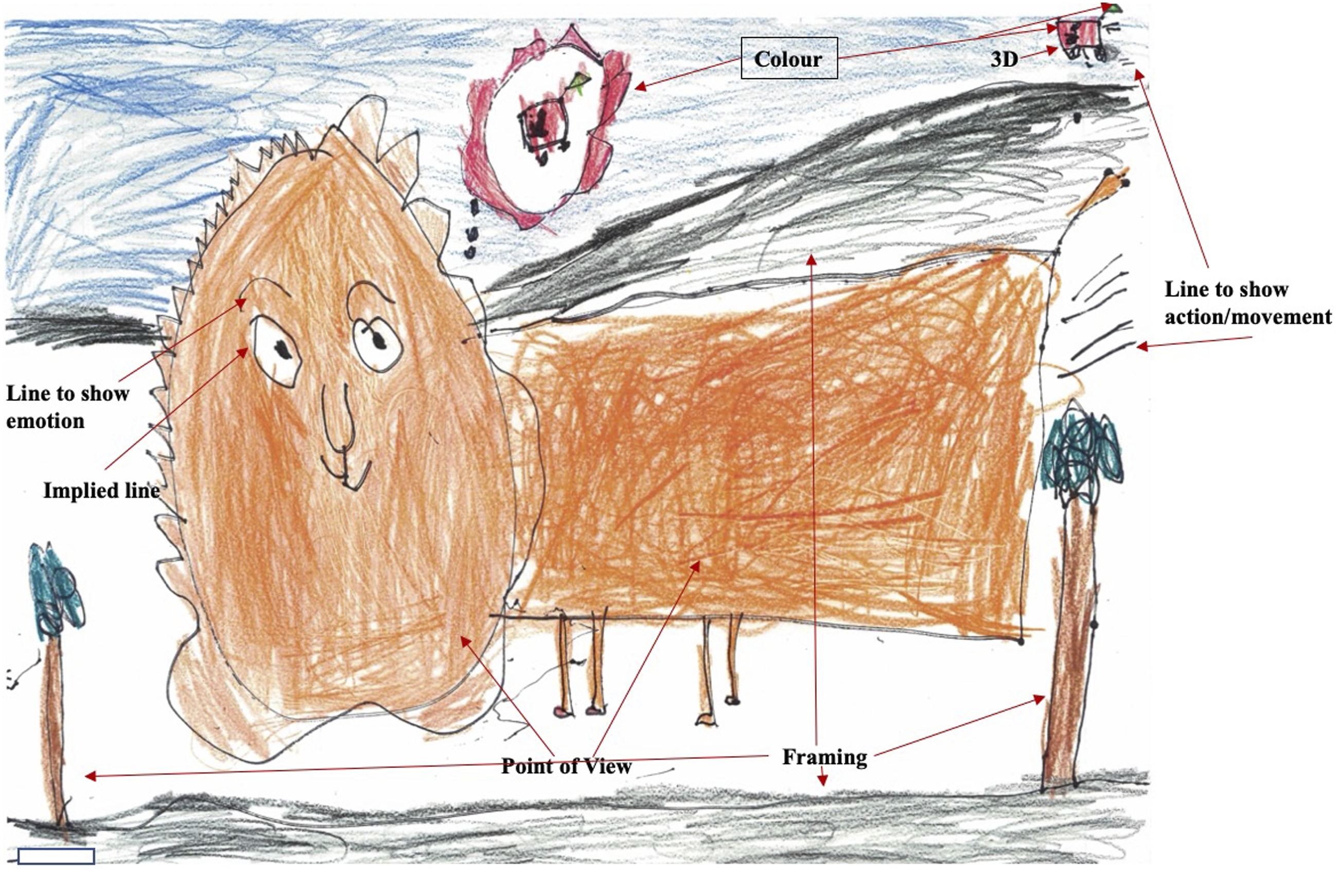
For visual point of view, Zdenko explained, “It’s like … he’s like looking … his body is facing that way but his head’s facing this way to us …. His body is a side view and the head is a front.” I neglected to inquire about his reasons for using these two particular points of view. Zdenko also conveyed that the jeep and the image in the thought bubble are side views. In regard to a technique that makes his artwork seem three dimensional, Zdenko pointed to the jeep and said, “Because it’s kind of small.” When asked about the location of the jeep, Zdenko said, “It’s on the mountains,” which provided further evidence of the vehicle’s distance from the lion.
For line to show action, Zdenko pointed to the five lines behind the lion and said the lines show “That he’s going fast.” He also noted how the lines at the rear of the jeep – “They’re behind the gas.” – convey its movement. With respect to Zdenko’s use of line to show emotions, he gestured to the lion’s eyebrows.
S: What about line to show emotion or feeling?
Z: These ones. [points to eyebrows]
S: What are those?
Z: Lines to show emotion.
S: And what are these?
Z: His eyebrows.
S: And how are they showing us how he’s feeling? How’s he feeling here?
Z: Happy.
S: Okay. Why is he happy?
Z: Because he’s [the hunter’s] not gonna chase him. But he thinks he might chase him.
S: That’s right. He kind of looks to me like he’s thinking here, right?
Z: Yeah, he’s actually thinking.
For implied line, Zdenko referred to the demand image of the lion. When asked why the lion would be looking at viewers, Zdenko replied, “So you could focus on him.” Upon further probing about what the lion might want viewers to know about it or its problem, Zdenko stated, “Because the guy in the jeep is trying to trap him.”
Meaning about circumstances in the represented world of Zdenko’s lion is communicated by colour and line to show action. Zdenko explained how he used red to outline the lion’s thought bubble and to colour the hunter’s jeep to convey danger. The goals of each represented participant are also conveyed by lines to show action. The lines behind the lion indicate its efforts to escape and the lines behind the vehicle communicate the hunter’s intentions. The lion’s attitude about and stance toward the hunter are also conveyed by Zdenko’s symbolic use of red. Furthermore, the use of red contributes to establishing relations between viewers and the represented participants. As well, in Zdenko’s artwork, meanings are enacted between the lion and viewers through the frontal point of view, the lines to show emotion (eyebrows), and the close-up shot. According to Zdenko, the size of the jeep on the mountains denotes its distance from the lion (and further emphasizes the lion as a close-up view). The demand image of the lion, which creates an implied line to viewers, contributes to establishing a relationship with viewers. As explained by Zdenko, the demand image of the lion makes people focus on it and ideally understand its circumstances. With respect to the textual metafunction, information value is conveyed by the lion’s very large size and its placement on the page (foreground and centre), and by the hunter’s tiny jeep located in the top right-hand corner. These aspects also contribute to the salience of the lion in Zdenko’s visual narrative composition. With respect to framing, Zdenko explained how the lion is framed by the two trees and by the ground above and below it. This vertical and horizontal framing also contributes to the salience of the lion in the composition and although not stated by Zdenko, serves to separate the lion from the hunter.
Discussion
The detailed descriptions of the research procedures, the content analysis of the students’ artwork, and the semiotic analysis of three students’ visual narrative compositions reflect the heuristic nature of case study research to produce in-depth contextualized understandings of phenomena under study, and to understand the knowledge or meaning constructed by participants (Yazan, 2015).
A social semiotic analysis of image focuses on a sign-maker’s choice and use of available semiotic resources, and explores how the deployment of these modal resources shapes particular meanings. The students’ visual narrative compositions and interviews convey their understanding of how colour, point of view, framing, line to show action, line to show emotion and implied line can be used purposefully by sign-makers to represent particular meanings. Furthermore, similar to findings reported by other researchers who used Halliday’s conceptual framework to analyze students’ visual representations (Pantaleo, 2013; Hopperstad, 2010), data analysis revealed how the visual narrative compositions of Zantina, Emeree and Zdenko concomitantly realized Halliday’s (1975) ideational, interpersonal and textual metafunctions. Examination of the types of meanings realized by various semiotic resources conveyed the multifaceted nature of the students’ sign-making and the richness of their visual representations.
Aiello (2020) stated that, “a semiotic understanding of visual images” must go beyond an evaluation of the three metafunctions in order to address the contextualized nature and specificity of images (14). Indeed, consistent with the tenets of social semiotics and sociocultural theory (Vygotsky, 1978), the descriptions of the instructional procedures and student activities convey how the classroom practices shaped the students’ visual compositions. Instructional emphasis focused on building the children’s knowledge about elements of visual art and design, and on developing their understanding and appreciation of how these semiotic resources are used intentionally by creators of picturebook artwork “to ‘work’ on the viewer in particular ways” (Aiello, 2020: 15). Furthermore, during the small group discussions of the picturebooks, my mediation directed student attention to the meaning-making potentials of elements of visual art, design and layout in picturebook artwork. Thus, similar to studies described in the literature review, (Pantaleo, 2016, 2017, 2019, Kesler et al., 2021; Martens et al., 2012/2013, 2018; Villarreal et al., 2015), during the research with the Kindergarten children, the picturebooks were used as mentor texts to develop student knowledge of the meaning affordances of particular semiotic resources and the intentionality of design work by creators of picturebooks.
Student engagement in discourse about the meaning-making potentials of semiotic resources, including the use of metalanguage, contributed to their understanding of how individuals, including themselves, can represent and communicate meaning (Pantaleo, 2016, 2017, 2019; Kesler et al., 2021; Martens et al., 2012/2013; Martens et al., 2018; Villarreal et al., 2015). Data analysis revealed some similarities in the children’s use of elements of visual art and design, which was unsurprising due to the students’ common classroom experiences and the criteria for the visual narratives. My observations and conversations with Mrs. P. indicated that overall, the children’s participation in the research expanded their repertoire of semiotic resources for communicating and representing meaning with image (e.g., line to show action and emotion, framing, implied line, point of view, visual perspective) and extended their knowledge about the potential meaning-making affordances of colour (e.g., colour harmony, symbolic meanings of colours).
In the sociocultural context of the research classroom, Mrs. P. and myself explicitly communicated ideologies and attitudes about the picturebooks, the children’s capabilities to engage in meaning-making with the concepts under study during the small group discussions, and the students’ abilities to design and create their own visual compositions. We positioned the children as competent meaning-makers, valued their artwork as important and significant (Papandreou, 2014), and recognized and promoted their semiotic work as both communicative and aesthetic in nature. The children’s visual narrative compositions reveal how students can represent their thinking through visual representation. As noted by Papandreou (2014), “to construct and transform symbols and meanings” requires substantial cognitive effort (97). Indeed, the visual compositions and interviews of Emeree and Zdenko, two students assessed by Mrs. P. as “emerging” in Reading and Writing, provide evidence of their solid understanding of the concepts under study, and convey the multifaceted importance of affording children with opportunities to represent their understanding in multimodal ways and of talking with them about their semiotic work.
Indeed, several scholars have reported on the significance of providing children with opportunities to talk about their sign-making decisions in their visual compositions and/or multimodal texts (e.g., Pantaleo, 2013, 2016, 2017, 2019; Hopperstad, 2010; Kesler et al., 2021; Martens et al., 2012/2013; Moses and Serafini, 2022; Rylak et al., 2022; Villarreal et al., 2015). Kress (2003) described transduction as the visible “process in which something which has been configured or shaped in one or mode modes is reconfigured, reshaped according to the affordances of a quite different mode” (47). The instructional activities on the focus elements of visual art and design and the small group picturebook discussions afforded the Kindergarten children with multiple opportunities to engage in the semiotic work of remaking meaning across modes – using oral language to talk about meaning represented or expressed in images. As well, during the individual interviews, the children engaged in transduction by using oral language to explain their design choices, and the intended meanings and affect realized by particular elements of visual art and design in their visual narrative compositions.
Conclusion
Aiello (2020) wrote about the need to consider spectators’ viewing practices as these impact the meaning possibilities of visual texts. Indeed, adults’ knowledge about elements of visual art and design affects how they view and talk about picturebooks with students, as well as how they look at children’s artwork and what they see in their visual compositions. Picturebooks are a common format of literature used by teachers in the primary grades. Some educators may need to develop their knowledge about and appreciation of elements of visual art, design and layout in these aesthetic objects, as well as the meaning-making synergy among the multiple modes in picturebooks. Just as students receive instruction about the semiotic resources, affordances and organizing principles of the mode of written language, they too should receive such instruction about the modes of image, colour, typography and layout. The learning opportunities afforded to the Kindergarten students conveyed to them how the compositional complexity of images requires viewer knowledge, attention, and critical consideration. Indeed, learning about elements of visual art and design can develop students’ awareness about the meaning-making possibilities and demands of images, can enhance students’ repertoire of ways to express themselves, and can contribute to students’ creativity in designing visual and multimodal compositions.
My multiple classroom-based research experiences have supported the practice of requiring elementary and middle school students to ‘try out’ and include various composing techniques in their visual or multimodal texts. These concrete experiences contribute to students’ repertoires of meaning-making resources that they can select from and/or adapt in their future semiotic work. Furthermore, such experimentation can develop students’ appreciation of other sign-makers’ use of composing techniques in their design work. Researchers could explore students’ application of composing techniques, both assigned and independently chosen, across other visual and multimodal compositions. Indeed, recently Mrs. P. sent me a photograph of an entry from Zdenko’s journal where his sequence of three drawings (using side and front visual points of view) of himself doing front flips in the water features several lines to show action. Furthermore, recognizing the limitations associated with the duration of the study in the Kindergarten classroom, researchers could examine students’ learning about and application of additional semiotic resources of image over a longer period of time and across the curriculum. Finally, researchers could explore how teachers’ knowledge about and application of Halliday’s metafunctions as an analytical framework affects their pedagogy, specifically their descriptions, analyses and interpretations of students’ visual and multimodal semiotic work.
Footnotes
Declaration of conflicting interests
The author(s) declared no potential conflicts of interest with respect to the research, authorship, and/or publication of this article.
Funding
The author(s) received no financial support for the research, authorship, and/or publication of this article.