
Abstract
This article surveys and compares literature on data journalism from two areas of inquiry: journalism studies and visualization research. As digital interfaces become an important access point for news, journalism and visualization scholars have begun to share a common research interest: data journalism. Given their radically different traditions and histories, these areas follow very different rules in how the topic is approached. The result is two parallel scholarships on data journalism with little points of contact. Arguably, developing research space for encounters and exchange of the two is an opportunity for expanding the academic discourse on data journalism. This study aims at opening this space of exchange through a systematic literature review. 121 articles, published between 2010 and 2023, are analyzed. Findings show that the two areas of research approach data journalism with very different aspirations. In relation to data journalism, journalism studies and visualization research could be compared with Lazersfeld’s distinction between critical and administrative research. These aspects cause various differences at an epistemic level, namely what, how and when knowledge about data journalism is produced.
Keywords
Introduction
The interaction between computer science, design and journalism has become of common interest for journalism studies and visualization research (Aitamurto et al., 2023; Bounegru and Gray, 2021). As digital interfaces has become an important point of access to news content, these areas of research have begun to investigate the role data have in journalism, from a practical, sociotechnical, and theoretical point of view. To this day, these areas clearly share this interest albeit coming from very different traditions.
Journalism studies sits within media and communication, and is devoted to looking at journalism as a social, cultural, technological and political practice (Tumber and Zelizer, 2019). This strand of research is characterized by the intersection of several academic traditions like sociology, political science, and science and technology studies (Ahva and Steensen, 2016). Journalism scholars see data journalism as an inflection of digital journalism (Steensen et al., 2019) with its roots in statistical methods (Coddington, 2015).
Visualization research is closely aligned with the field of human-computer interaction (HCI). Originally, this area was known as “information visualization” and has been concerned with researching data visualizations, computer generated graphical representations of data (Chen, 2010). The rise of big data as an important social and cultural phenomenon has determined a shift from information visualization to visualization research – expanding its scope to various other domains (Liu et al., 2014), including journalism (Bounegru and Gray, 2021). Visualization scholars look at data journalism as a form of reporting based on collecting, visualizing, and narrating data.
These two understandings of data journalism entail different ways to conduct research. Previous works have already addressed intersections between journalism studies and other fields like computer and information sciences (e.g., Ausserhofer et al., 2017; Steensen et al., 2019). Similarly, visualization research has been considered in relation to other domains, like digital humanities (see Jänicke, 2016). These articles are useful in broadening the scope of the original scholarship and understand how scholars are discussing similar topics in other fields. Such a comparison has not happened yet for journalism studies and visualization research. Especially in regards to data journalism the two strands of research have never been scrutinized together and therefore remain somewhat opaque to each other. Arguably, mutual exchange on how data journalism is observed and studied could be beneficial to both areas of research. This has the instrumental role of enriching both research areas and foster a joint scholarship on data journalism through new approaches, methods, and discussions (Aitamurto et al., 2023; Appelgren, 2023). In a complementary way, a direct comparison also helps the two areas in remaining separate and consolidate their independence in how they look at the phenomenon of data journalism.
This article describes and discusses the different research rationales of journalism studies and visualization research in regards to data journalism. Specifically, it is concerned with the epistemic differences in discussing this object of research: what, how, and when knowledge is produced. It is structured as a systematic literature review where journalism studies and visualization research are considered lenses to observe and interpret data journalism. This is done through an in-depth comparison of several publications: their terminology, approaches, and contributions. It provides an overview of data journalism studies produced by journalism and visualization scholars, by asking: What are the epistemic differences between journalism studies and visualization research in relation to the study of data journalism? To break down the complexity of this problem, three further research questions have been formulated.
The first question is concerned with study types, their research questions and aim.
Answering this question is crucial to highlight differences across the two branches of research. It gives insights on what knowledge is tailored and communicated among scholars. Doing so is helpful to identify divergences in what type of academic discourse is carried out around data journalism.
The second question narrows down the focus from the overall structure of a study to how theory relates with empirical materials and methodologies:
Journalism studies has been defined as empirically oriented (Steensen et al., 2019). Visualization scholars follow a similar ethos (Chen, 2010). The goal of this analysis is to understand how these empirical approaches differ in considering data journalism and what role does theory play in relation to the empirical understanding of the research object.
The third research question focuses on the use of terminology. Albeit the different premises, journalism studies and visualization research share data journalism as an object of study. To share common territory also presumes terminological and conceptual proximity. For example, terms like ‘data journalism’ or ‘data visualization’ are used in both. It remains unclear what are the differences and similarities regarding their use. Hence, the question:
This analysis pays attention to what terms and concepts are referenced and when. Its aim is to assess whether the two areas already share common understanding and use of key terms. It also emphasizes existing cross-pollinations, which could be of inspiration for future work.
In order to answer these questions, a systematic literature review is carried out. Following the same approach as Engelke (2019), this study begins with a presentation of relevant concepts. Then, a sample of scholarly works is collected and analyzed. Results highlight differences between the two areas of inquiry.
Data journalism, data visualization and data stories
Historically, data journalism has been at times matched with CAR – Computer Assisted Reporting, where statistics was used to create in-depth reporting (Coddington, 2015) – and with precision journalism, “the application of social and behavioral science research methods to the practice of journalism” (Meyer, 1989). Data journalism gained traction with the popularization of the World Wide Web at the beginning of the 2000s, when commercial and governmental databases started to become easily available to reporters for their research work (Garrison, 2000). In recent years, scholars have agreed on characterizing data journalism as a form of journalistic reporting done with data (Appelgren and Nygren, 2014; Bounegru and Gray, 2021; de-Lima-Santos, 2022).
Data visualization, programming, and interface design mark an important part in defining data journalism as a form of data-driven storytelling where narrative visualizations are employed together with traditional journalistic methods to create data stories (Baack, 2018; Ojo and Heravi, 2018). According to a classic definition, data visualization consists in using statistical charts to represent and highlight patterns within large datasets (Gershon et al., 1998). Data visualization gained further traction at the beginning of the 21st century (Gershon and Page, 2001), when the potential of storytelling has been discussed as a way to enhance information visualization. Today, data visualization is largely popularized in the journalistic domain. In the context of data journalism, data visualization is often referred to as narrative data visualization (Hullman et al., 2013; Hullman et al., 2013). This term implies a specific use of visualization as a “medium to engage viewers with complex and sometimes controversial issues” (Heyer et al., 2020).
The careful combination of data journalism and visualizations gives rise to the distinct genre of data stories, which includes long-form articles backed up by data (Lee et al., 2015). Visualization is used for each of these pieces to support one or more messages (ibid.). This term gained popularity among visualization scholars with the seminal paper from Segel and Heer (2010) in which data stories are presented as a genre of data-enhanced storytelling that requires a wider set of skills: computational, technical abilities coupled with journalistic and authorial talent. Prior to this, storytelling had already been linked to data visualization as the ability to combine various visualizations to create order within a large amount of data for the purpose of communication (Gershon and Page, 2001). In recent years, an increasing number of articles has referenced both data stories and data-driven storytelling as key components of data journalism (e.g., Anderson and Borges-Rey, 2019).
Method and materials
This study has been conducted as a systematic literature review, based on the work of Engelke (2019) and Ausserhofer et al. (2017). This approach allows for an in-depth search in peer-reviewed publications using relevant keywords to browse databases. Since relying only on these initial keywords would lead to a non-representative sample of publications (ibid.), the process starts with the analysis of a handful of studies, used to further identify a bigger list of terms. These keywords are used to query research databases to extract a higher number of publications. A sample of publications were collected through a preliminary research on Google Scholar using three main terms – “data journalism”, “data story”, and “data visualization”. As a result, 50 publications were selected. Half of the publications within this sample are published in journals that deal with journalism research; for instance: Journalism Practice, Digital Journalism, or Journalism. The other half belongs to publications and conference proceedings relevant for human-computer interaction; among them the Proceedings of the Conference on Human Factors in Computing (CHI), and the proceedings of Visualization & Visual Analytics (IEEE VIS). From the analysis of this sample over 60 keywords were collected. All keywords with a frequency equal or higher than 5% were used to query Scopus, the comprehensive database for peer-reviewed published research. In order to obtain an on-topic selection of publications, the query was formulated keeping in account several criteria: 1. The publication year had to be equal or greater than 2010. In this year, the European Journalism Center (EJC) published its first report on data journalism (Ausserhofer et al., 2017). The seminal paper by Segel and Heer (2010) on narrative data visualizations and data stories was also published. 2. The language of the article had to be English. The choice of English as language is done for practical reasons. Clearly this has the downside of skewing the sample towards Western-centric literature. However the wide use of English as the academic lingua franca ensures a certain degree of representativeness. 3. Publications must include all primary keywords and at least one of the secondary keywords (Table 1). Keywords with an occurrence higher or equal to 20% are part of the query. Keywords that have an occurrence between 20% and 5% are used to further specify it.
The Scopus query increased the sample size to 210 publications. This selection is further checked for consistency. Articles matching the following criteria were considered: 1. Articles presenting new contributions, material, and research. Book reviews, literature reviews, and editorials had been excluded as they do not produce original concepts. 2. Articles published in recognized journals and conference proceedings. The venues of publication were inspected for their credibility, paying attention to their other articles, aim, and publication criteria. This to avoid considering articles that do not undergo rigorous peer review. 3. Articles that explicitly mentioned data journalism or journalism. This criteria is relevant especially for visualization research, where data visualization is applied to domains like digital humanities, and contributions are at risk of being mixed.
Given these criteria, the initial query result had been narrowed down to 121 studies, with 70 belong to journalism studies, 52 to visualization research. The complete list can be found in Appendix 1. These publications were analyzed following the three main research questions and with a focus on abstract, introduction, research questions, contribution, and discussion. Each article had been read and tagged according to an inductive approach.
Results
Common study types
Across the sample, it is possible to identify several study types: different categories of research that can be used depending on questions and aims of the studies. The most common study types are content analyses, frameworks, case studies, and user centered studies. The term content analysis is used to define a distinct methodology which involves the analysis of communication artifacts and their features, such as text or images. As a method, content analysis can be used in combination with other research tools and for various aims. For instance, content analysis can be used with focus groups or interviews to complement a case study. Several instances across the sample show that content analysis is sometimes a study type. In this case, observations resulting from the analysis are used to deduct broader trends and guidelines for production. Frameworks summarize and communicate core knowledge to support other scholars or practitioners in analyzing a particular phenomenon, genre, or product. They differ from content analyses because they usually do not use empirical material. Instead, they rely on previous research and look at material through a defined theoretical approach. A case study is an in-depth examination of one or more cases. Its aim is to produce observations that can be more generally applied to similar contexts, artifacts, or individuals. Cases can be created ad hoc for the study or observed in real-world contexts. Data are sampled both qualitatively and quantitatively. User centered studies usually focus on a specific problem or need connected to a community of users. They have a strong link to their context, in this case the production and consumption of data journalism. Researchers initially frame the problem and then move to develop original design guidelines, visualization techniques or tool capable to solve these problems. To achieve consistent results, products are tested with users and audiences through qualitative and quantitative methods. Similarly to case studies, user centered studies contribute specific and general observations from an individual instance (real-world case, original prototype, etc.) that can be applied to a broader context.
These four types of studies are the most common across the two fields. Different traditions ascribed to these research areas implicate different studies’ structure and contributions. Below, these four types of studies are analyzed and presented. The findings proposed are relative to this sample.
Content analyses
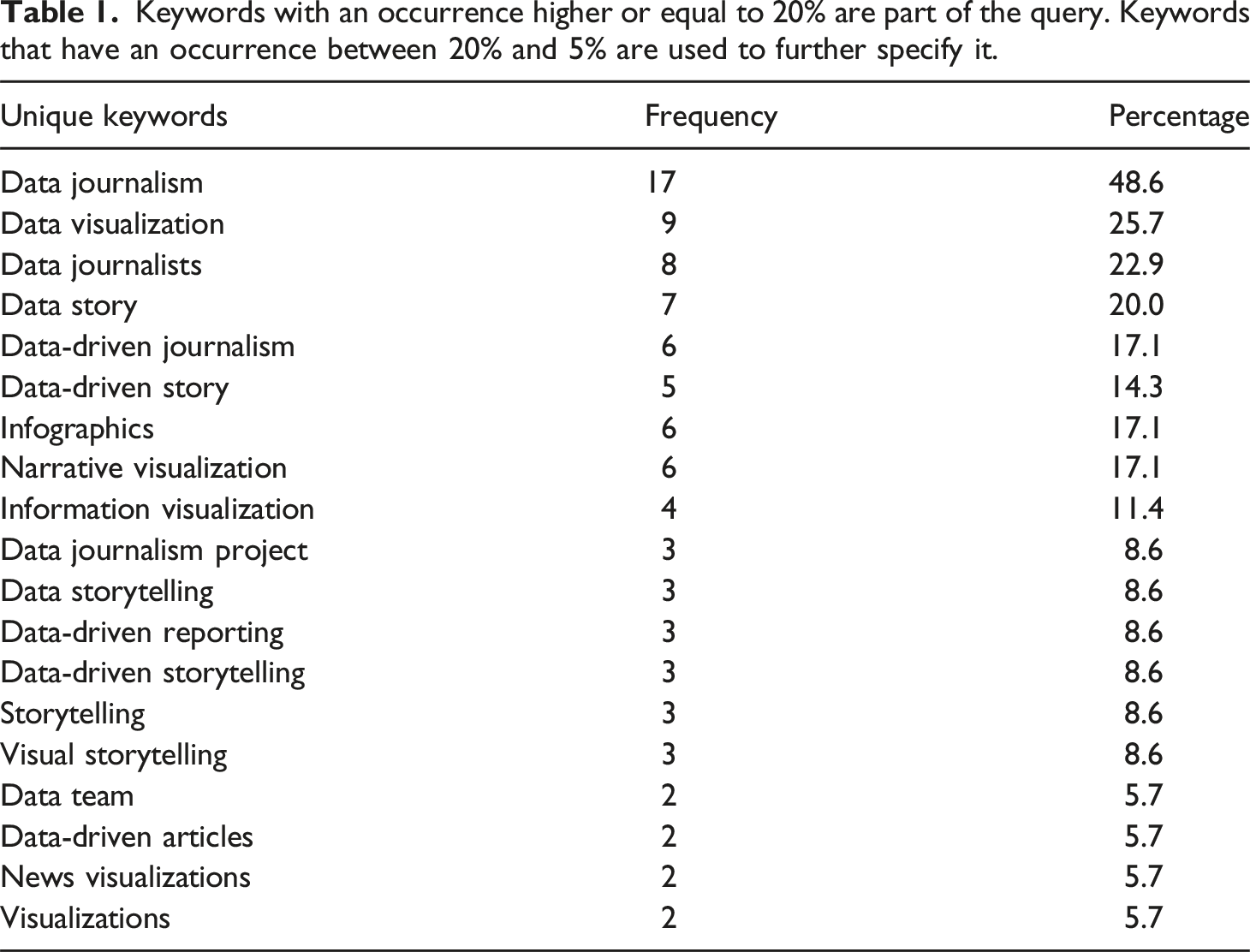
Journalism scholars consistently employ content analyses. These types of studies are built around a single concept, as visible in Figure 1(a). Concepts are defined according to previous work and then relevant content is sampled and analyzed. The size of the sample is variable, going from few to several hundred instances. Results are then discussed in relation to the initial concept, which gets expanded, re-defined, or enriched. Analyses focus on general definitions, as in the case of de-Lima-Santos (2022) that uses content analysis to “understand the practices, norms, and routines adopted by La Nación to produce environmental data journalism.” Technical concepts (e.g. interactivity) are also up for scrutiny. Zamith (2019), for instance, examines data journalism projects and their “characteristics linked to the concepts of transparency, interactivity, diversity, and information provenance”. The differences between content analyses in journalism studies (a) and visualization research (b) concern mostly the size of the sample and the contextualization of results and discussion.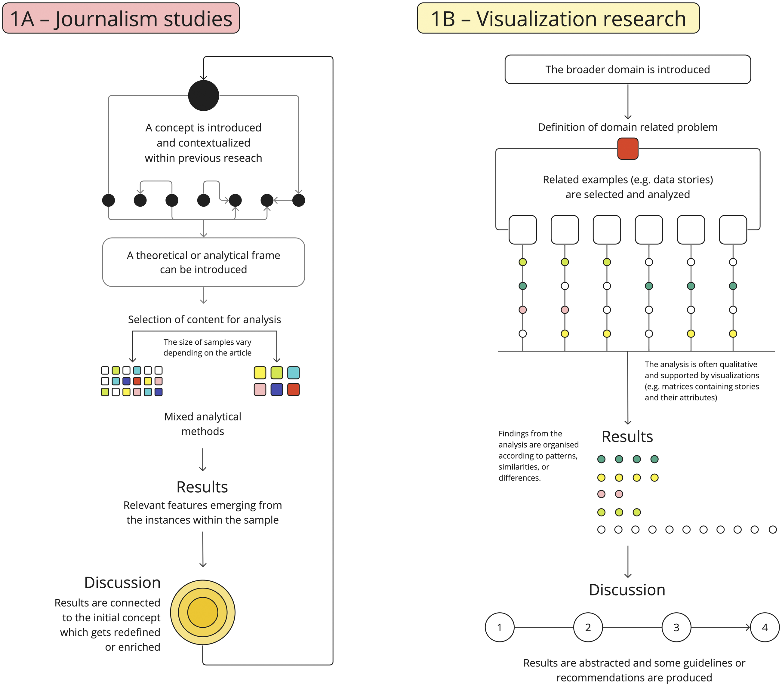
Content analyses on data journalism from visualization scholars are structured as shown in Figure 1(b). They contribute design guidelines or outline challenges within the domain of data journalism. Content analyses are conducted on a few instances – often data visualizations within news articles – and analyzed through a qualitative inductive approach. The analysis can concern visual and design characteristics of each unit of analysis; for instance, colors, interactivity, or type of chart. Results are put in relation with each other and with data journalism at large. The ambition behind content analyses is to identify “new directions of research” (Rodríguez et al., 2015), “articulate well grounded techniques and conventions to produce the desired communication with the audience” (ibid.), and monitor research opportunities for the visualization community (Smith, 2016). For these reasons, content analyses about data journalism in visualization research often include historical or critical overviews of data visualization.
Frameworks
Journalism scholars use frameworks-based articles as a base to understand practices and production patterns within and outside newsrooms. As shown in Figure 2(a), this often entails the mobilization of theoretical and empirical approaches as analytical frameworks. For instance, Fahmy and Attia (2021) use Pierre Bourdieu’s field theory as a framework to understand how data journalism is adopted by traditional journalists in Arab newsrooms. In other cases, frameworks are used to define a genre of data journalism. Lastly, and very seldom, frameworks are used to develop or improve products. This is the case for Vassis et al. (2021), contributing an empirically based evaluation framework for data journalism products, and Gupta et al. (2016) – proposing a process and visualization technique for electoral data. Within visualization research, frameworks are usually created to facilitate the analysis of journalistic visualizations. As shown in Figure 2(b), framework-based articles resemble content analyses. However, frameworks focus specifically on the role of visualizations, for instance “to systematically interrogate how charts and maps are used in relation to other narrative components'' (Garretón et al., 2023) or to identify new users and behaviors upon data visualization consumption (Hullman et al., 2013). Approaches are more likely to be mixed, combining theory-based and empirical assumptions. Results are discussed in relation to each other to detect patterns among individual visualizations. (a) shows how framework studies have a broader scope and analytical toolbox for journalism studies. (b) shows the importance of content analysis and the specialized scope of visualization frameworks.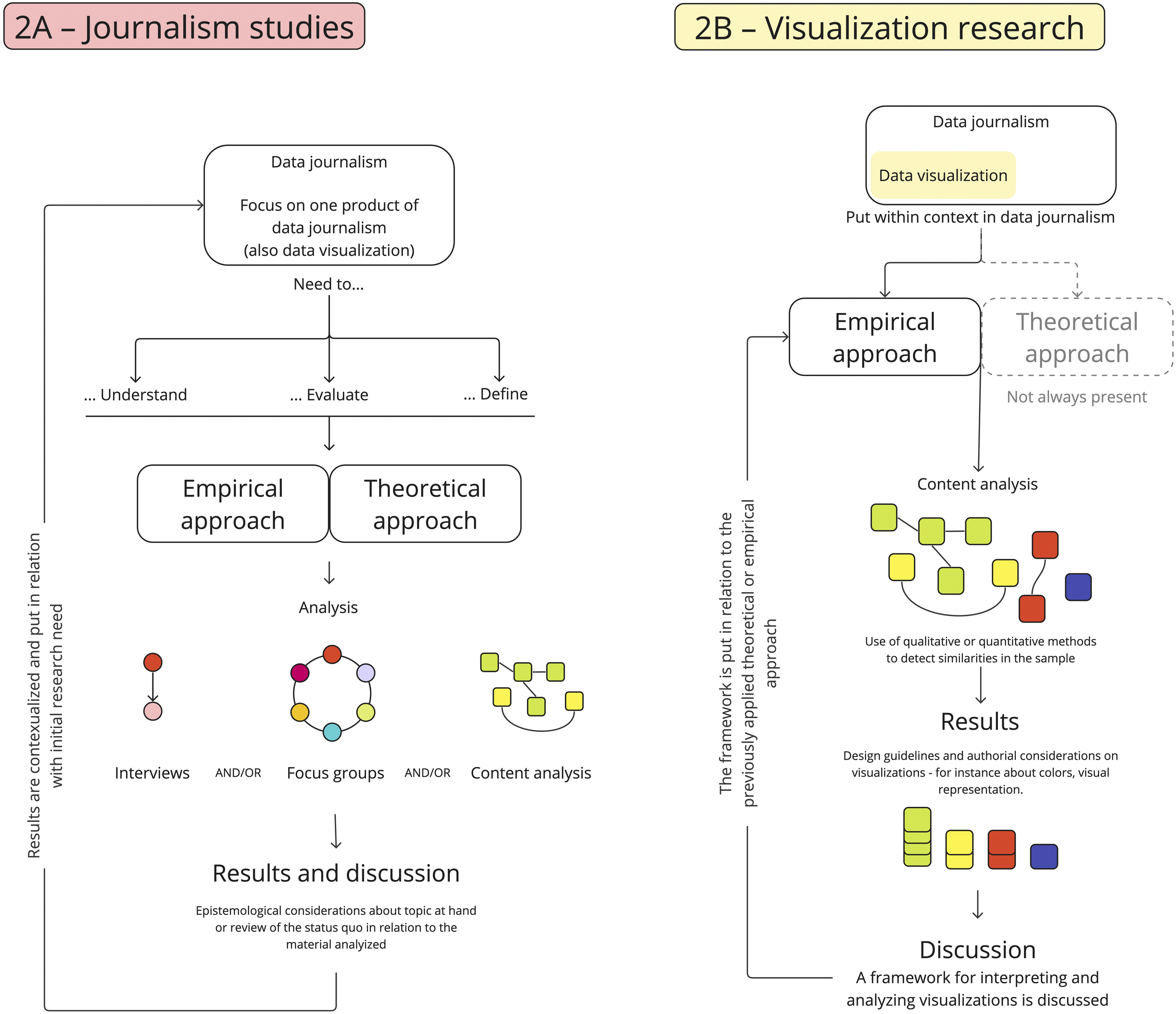
Case studies and user centered studies
Case studies and user centered studies are different study types, yet they present several similarities and overlaps. Journalism scholars favor the former, visualization researchers produce mainly the latter. For both, one case is always at the core and motivates results and discussion (Figure 3). Differences concern how definitions and research questions are framed at the beginning of the article and how results are discussed at the end. The diagrammatic structure of a typical case study. (a) details the contribution for journalism studies, (b) shows visualization research. Whereas journalism scholars set up an approach as scaffolding for the case study, visualization researchers pay more attention to the study setup, materials, and methods.
For journalism studies, case study articles analyze a particular instance or phenomenon of data journalism. They isolate certain trends, practices, and innovations occurring in newsrooms. Articles are structured around newsroom practitioners (e.g. journalists, programmers, or managers) and their work. Initially, a concept is put under scrutiny and contextualized within previous research (see Figure 3(b)). Then research questions are introduced followed by one or more case studies. The study setup includes methods such as interviews, focus groups, or content analysis. Several methods are mixed, spanning from qualitative to quantitative. Results are discussed against previous works and connected with the initial aspirations of the paper. Usually, this happens by establishing an explicit relationship between individual findings and broad claims, as done by Parasie (2015): “Findings contribute to a better understanding of how news organizations produce justified beliefs, as data-processing artifacts become major components of the newsroom’s environment.”
This is very different in user centered studies. As suggested by the name, these study types tend to isolate a research gap with strong dependency on context, audience members, and users. The gap is addressed by building an original prototype (e.g. visualization, article, or tool) that answers a specific need arising in the journalism community. The prototype becomes part of the study setup, together with other sampled materials, expert interviews or focus groups (see Figure 3(a)). In carrying out user centered studies, visualization scholars use mixed methodologies, comprising quantitative and qualitative techniques. Results are presented and discussed in relation to each other, the original users’ group, and the prototype – which becomes part of the scientific contribution. Illustrative goals for user centered studies are to “enrich the current practice of data storytelling” (Lan et al., 2022), or provide an “exemplary use case that […] software is able to support […] journalists'' (Wiedemann et al., 2018).
Theory, methods, and materials
In journalism studies, theory is used in two distinct ways, either to determine key concepts at the beginning of the study or to frame its results. In the first case, scholars reference previous work either to contextualize the development of their own theoretical framework or to justify a particular methodological choice. For instance, Borges-Rey (2016) uses Spradley’s principle of enculturation to select his informants. Some scholars refer to conceptual frameworks, or rely on historical definitions of computer assisted reporting and big data. Finally, researchers move to develop their own theoretical frameworks to answer epistemological questions on data journalism. In the second case, scholars use theory to interpret the results of their analysis. These studies are recent, pointing towards a possible new trend. Articles use for example frameworks like boundary work (Hamm, 2022). Others refer to theories like Peter Galison’s trading zones (Lewis and Usher, 2014) or Michel Foucault’s concepts of power and will to truth (Morini, 2023). This second group of works adopt an explicitly media sociology approach in connecting individual findings to broader theories that look at the interplay of media and society. Visualization scholars approach theory differently. The strong empirical and experimental tradition of visualization research stems from human-computer interaction. As a result, the methodology sections often include a clear study setup inclusive of specific empirical questions and hypotheses related to data journalism. Theoretical frameworks are rare and, when present, they tend to be borrowed from other fields (e.g. media and communication studies in Garretón et al., 2023).
In relation to methods and materials, journalism scholars often use interviews to inquire practitioners about their work – from data journalists to designers, including developers and technologists. If studies are presented as based on a mixed methodology then it is often implied the completion of interviews with content analysis of journalistic artifacts. The combination of these two methods allow journalism scholars to match the producers’ perspective with data stories, the material products of data journalism. For similar reasons, the analysis of case studies is also a viable method, although it is often restricted to existing websites, projects, or products. In the sample, only one article stands out by building on an original case study with visualizations designed by the authors (Gupta et al., 2016). Also visualization scholars prefer the use of qualitative methods to study data journalism, although in some cases, semi-quantitative and quantitative methods intersect qualitative ones. Content analysis is a fairly popular technique for collecting empirical material, but the majority of studies are centered around testing prototypes or visualizations originally designed for the study. Experimental settings – where a pair of stimuli are used to test interfaces and prototypes – are enriched by qualitative techniques like focus groups or interviews. This methodological diversity ensures a robust context for analyzing original material. This approach guarantees a certain degree of replicability and reliability in testing data visualization techniques and tools useful for the advance of data journalism as a visualization-enhanced practice.
Research objects
One clear difference between the two branches is how data journalism is characterized, starting either from original terminology or previous work. Journalism studies are characterized by a great deal of nuanced definitions for data journalism. Going from the role of computational methods and big data – “Data journalism is one of the forms that emerged in the context of increased data creation and quantification” (De Vuyst, 2018) – to the rise of transdisciplinary practices – “Data journalism serves as a bridge between scientific and journalistic standards” (de-Lima-Santos, 2022). From a pure content perspective, definitions of data journalism within journalism studies focus largely on its methodologies and data as its main source. The product of data journalism – e.g. articles or visualizations – are never central to these definitions. For instance, a common way to refer to data visualization is as “the combination of statistics and graphical elements” (Arrese, 2022). For journalism studies the focus is rather on which skills are needed to create visualizations and who creates them in the newsroom. As a result, cross-referencing is rare. Visualization research is rarely cited by journalism scholars, with some notable exceptions (e.g. Vassis et al., 2021).
Conversely, for visualization scholars the definition of data journalism is often short and general, with little pointers to its processes or professional aspects. These definitions center mostly on how data journalism “has become a mainstream means of presenting news to the public” (Hullman et al., 2013) or on motivating the inclusion of data visualization: “the data journalism process can be described in a few steps: collect the data, check and clean it, contextualize and combine it with other datasets, choose a narrative data visualization and add storytelling and interactive technique” (Alexandre, 2016).
When an extended description of the domain is needed, visualization scholars resort to definitions provided by journalism studies. These citations can be found at the beginning of articles, usually in the introduction or related work sections and are used to define the concept of data journalism and relate it to information visualization (e.g., Oh and Hwang, 2021). One of the most cited references is Lorenz’s presentation at the European Journalism Centre “Data-driven journalism: Status and Outlook” (Lorenz, 2010). The remaining citations belong to the branch itself or to the broader field of human-computer interaction. Rarely, concepts are derived from social sciences or media and communication studies. Expectably, visualization research is rich with descriptions of information or data visualization and other technical aspects connected to its use in journalism. A popular definition across the sample is the one from Card et al. (1999): information visualization is “the use of computer-supported, interactive, visual representations of abstract data to amplify cognition” (p.8). Further definitions of data visualizations focus on four main points: their context of use, their ability to efficiently represent numerical data, their use within a narrative framework to convey complex issues, and their power to facilitate information transfer and understanding between journalists and readers.
These results show some key differences in how journalism and visualization scholars look at data journalism. Journalism scholars structure their studies to provide a consistent frame of definitions to contextualize data journalism. Then, they work their way through empirical material to either enrich existing terms or define new ones. Visualization scholars initially define their area of research before using empirical materials to define techniques and guidelines for data journalism. Research goals differ. Journalism scholars often focus on newsroom workers, their practice, and the impact of technology on news production. Visualization researchers work on the creation and evaluation of tools, design guidelines, and visualization techniques to support and enhance journalistic work.
Discussion
In this article, 121 publications from journalism studies and visualization research have been analyzed through a systematic literature review. Initial research questions have focused on teasing out epistemic differences, looking especially at why, how, and what knowledge about data journalism is produced. By and large, findings show that the way in which journalism and visualization scholars discuss data journalism has clear parallels to Lazarsfeld’s (1941) distinction between “critical” and “administrative” media research. Journalism studies could be defined as “critical”: scholars are often concerned with the social role of data journalism as a type of media, its impact on journalists’ professional identities and practices. Conversely, visualization research seems to have an “administrative” focus, devoted to solve contextual problems for data journalists and assessing the use and impact of novel visualization techniques within the domain. Practically, this distinction has far-reaching consequences at several levels and determining various epistemic differences in how data journalism is studied.
First, despite having data journalism as their object of research, the two areas start from very different points of view. In other words, they have distinct reasons why they focus on data journalism. By and large, journalism scholars are interested in knowing what processes underpin data journalism, for instance they look at journalists’ skills and background when working with data. Priority is given to the assessment of data journalists status quo and their position or role in the newsroom. The application of specific technologies or the creation of products is only relevant in relation to journalistic culture and processes. Conversely, visualization researchers are focused on understanding what technologies, visualization tools and techniques can be used to solve contextual problems. These scholars are more concerned with the practical implications of using data for news-making. This difference influences how previous work and terminology is used. Journalism scholars’ definitions of data journalism take into account newsrooms’ practices and professionals as the most important aspects. Instead, visualization research prioritize in-depth and context dependent definitions of data visualization as well as a wide range of terminology connected to interactivity, design, and storytelling. Visualization research setup is often based on technical concepts, which are taken into consideration at a later point of the article to develop original prototypes and visualization strategies. Results are seldom related to previous work, but they are presented and discussed as answers to specific domain-related problems. The production of original definitions for terms like data journalism and professionalization is limited. This prompts visualization scholars to references from journalism studies where this type of terminology plays a vital role.
Interestingly, mutual referencing is not a two way street: journalism scholars rarely cite visualization research articles. Arguably, recognizing visualization research as a valuable source of knowledge could be the first step in establishing a mutual and recurring relationship between these branches of research. To support this development, future work could map relevant publications and proceedings across visualization research that deal with data journalism. As suggested by Wright et al. (2019), the inclusion of more diverse references could support the diversification of data journalism scholarship.
Second, the areas differ in how empirical material is collected and organized to generate knowledge. In general, empirical research is central to both areas. The participation in newsroom work and observation of existing practices extend to both visualization research and journalism studies. However, journalism studies and visualization research differ in their use of theory and choice of empirical materials. They present some similarities only in the choice of methods. First, journalism studies proves to be theoretically diverse – despite what previously asserted by Ausserhofer et al. (2017). Early contributions in the field are found to contribute their own theoretical approach, taking a theory-producing stand. However, recent articles rely much more often on existing theories from journalism studies, social sciences and media and communication. In this case, theory is introduced at the beginning or in the mid part as a scaffolding for the methodology. Knowledge is produced in direct relation to an explicitly defined theoretical model put in place at the beginning of the paper. For journalism scholars, this could be seen as a trend in how data journalism is approached, theory-driven rather than theory-producing.
Visualization scholars often use a fully empirical approach when looking at data journalism and its products, with little reference to existing theory. When present, theory is always positioned at the beginning of articles and results are seldom discussed or organized according to it. To this extent, most articles could be considered theory-informed, since statements do not necessarily rely on theory. Also the choice of empirical material differs. Evidence of this can be found in the differences between user centered studies and case studies. Structurally, the use of qualitative approaches like interviews, focus groups, and qualitative content analysis is similar. However, for journalism scholars, case studies are used to provide an account of how data journalism is produced in a specific context or how certain values are leveraged in the process of creating data-informed news. The research design for case study is usually focused on data journalists rather than audience members. Visualization studies often produce original material: user centered studies – which replace case studies –involve original prototypes and techniques to be tested on a selected audience or group of users. This element of novelty make user centered studies one pillar of visualization research. By addressing contextual problems, scholars strive at influencing the way in which data journalism is carried out at a practical level.
These differences in how knowledge is produced could be an important starting point for the evolution of both areas towards an interdisciplinary approach to data journalism – as suggested by Aitamurto et al. (2023). On the one hand, journalism scholars could leverage user centered studies and integrate design methods borrowed from visualization research to study the audiences of data journalism. On the other hand, visualization researchers could approach data journalism from a theory-driven perspective, developing tools, guidelines and visualization techniques that rely equally on existing theoretical frameworks and empirical findings.
Lastly, journalism studies and visualization research differ on what knowledge is produced. Different aspirations are reflected in the different types of studies. For journalism scholars, both content analyses and frameworks are largely deductive: the sampled material is analyzed based on a theoretical or empirical approach. Only case studies are mostly inductive, but still present the same aspirations. Results are produced to expand existing concepts or to highlight new journalistic practices based on data, technologies, or design. This scholarship is not necessarily concerned with directly influencing journalism practice and scopes, but focuses on observing and critiquing data journalism, its processes, methods, and influence on practitioners. Visualization research in the context of data journalism is concerned with the material aspects related to data and visualization. Researchers produce original prototypes that inform design and visualization guidelines for practitioners. As highlighted before, this is particularly evident in user centered studies, where the focus is on advancing visualization practices for reporting with data. However, these aspirations can be found also in content analyses and frameworks, where the final goal of scholars is to facilitate the interpretation and design of visualizations for data journalism. Problems related to data representation, analysis or collection are the priority. Knowledge is shared in the form of design solutions for improving the production of data journalism. These solutions are context aware, but do not fully take into account journalists’ professional identities or the societal role that visualization plays when embedded in journalistic beyond their intended target audience.
These differences in what knowledge is produced within the two areas pose both challenges and opportunities for interdisciplinary research. Given the key social and cultural role of journalism, scholars from journalism studies could benefit from the constructive and context-oriented aspirations of visualization research. This could prompt the creation of original case studies and fruitful hands-on collaboration between journalists and scholars. Vice versa, visualization research focusing on data journalism could make use of the inquiring and critical approach of journalism studies, in order to challenge existing ways of representing data for wide audiences.
Conclusion
For this article journalism studies and visualization research are compared against a common object of study: data journalism. Results have shown how these two areas of research differ on several epistemic levels according to why, how, and what knowledge on data journalism is produced. Journalism scholars – motivated by a critical approach (Lazersfeld, 1941) – look at data journalism through its processes and actors. Conversely, visualization researchers approach data journalism with motivations close to an administrative approach (ibid.) which – far from being reductive – allows them to expand the technical and methodological toolbox of data journalists while providing a context-aware assessment of how visualization interacts with the journalistic domain.
Arguably, it is not surprising that these two historically and traditionally different forms of inquiry focus on very different aspects when looking at the same phenomenon. After all, data journalism itself is twofold, being both a process and a product of newsrooms (Ausserhofer et al., 2017). Hence, either approach should be seen as not only fundamental, but also complementary to each other. This comparison has precisely the goal to write down these differences and promote a broader and mutual understanding of data journalism in all its facets and nuances across these two research traditions. This effort is not only descriptive, but has the potential to motivate further research in both areas. Journalism scholars could tap into solution-oriented and context-aware methods by extending their consideration to contributions coming from visualization research as a valuable source of inspiration. These methods could support the establishing of new ways to relate data and technology with journalism and improve scholars’ broad understanding of the role data has within newsrooms. Vice versa, visualization researchers could benefit from the critical approach to data journalism afforded by the journalism scholarship. The building of new hands-on approaches and techniques for journalists could benefit from a cultural and social oriented perspective that takes into consideration existing theories and epistemologies of data journalism.
In conclusion, by clarifying the distinctions between how these two research traditions approach data journalism, this study favors scholars from both areas and support a critical, solution-oriented, and cross-domain understanding of data journalism. This with the ultimate hope to foster interdisciplinarity, as future research efforts have the potential to not only influence each other, but become building blocks for a common scholarship on data journalism.
Supplemental Material
Different yet complementary: A systematic literature review on data journalism in visualization research and journalism studies
Supplemental Material for Different yet complementary: A systematic literature review on data journalism in visualization research and journalism studies by Francesca Morini in Journal of Journalism
Footnotes
Acknowledgements
The author thanks Prof. Henrik Örnebring for his kind feedback.
Declaration of conflicting interests
The author(s) declared no potential conflicts of interest with respect to the research, authorship, and/or publication of this article.
Funding
The author(s) received no financial support for the research, authorship, and/or publication of this article.
Supplemental Material
Supplemental material for this article is available online.
Author biography
References
Supplementary Material
Please find the following supplemental material available below.
For Open Access articles published under a Creative Commons License, all supplemental material carries the same license as the article it is associated with.
For non-Open Access articles published, all supplemental material carries a non-exclusive license, and permission requests for re-use of supplemental material or any part of supplemental material shall be sent directly to the copyright owner as specified in the copyright notice associated with the article.