
Abstract
Although data-driven ‘quantitative' journalism has increased in volume and visibility, little is known about how it is perceived and evaluated by audiences. This study helps fill this research gap by analysing the characteristics of quantitative journalism that a diverse group of 31 news consumers pay attention to and, within those characteristics, where their preferences might lie. In eight group interviews, participants read and discussed articles chosen to represent the diversity that exists in the forms and production of data-driven journalism. Our analysis reveals 28 perception criteria that we group into four major categories: antecedents of perception, emotional and cognitive impacts, article composition, and news and editorial values. Several criteria have not been used in prior research on the perception of quantitative journalism. Our criteria have obvious application in future research on how audiences perceive different types of quantitative journalism, including that produced with the help of automation. The criteria will be of interest too for researchers studying audience perceptions and evaluations of news in general. For journalists and others communicating with numbers, our findings indicate what audiences might want from data-driven journalism, including that it is constructive, concise, provides analysis, has a human angle, and includes visual elements.
Keywords
Introduction
The coronavirus pandemic increased the volume of data-driven news and information in circulation, with ‘numbers, graphs and rankings [becoming] widely shared' (Gray and Bounegru, 2021: 13). Public health experts recognise that news media reporting can effectively support public health programmes by disseminating relevant information and adding interpretation and context (Desai et al., 2021: e619). At times like this, then, societies’ very health and welfare depend, in part, on news consumers engaging with, understanding, and acting on numbers in the news. However, we currently have limited understanding of how news audiences perceive and evaluate such data-driven or ‘quantitative' journalism, which is increasingly being automated.
Taking a qualitative approach, this study aims to help fill that knowledge gap by analysing how a diverse group of 31 online news consumers perceive and evaluate quantitative news texts that span a range of topics, use different combinations of sources, and were produced using varying degrees of automation, including none.
Amongst other things, the results suggest that audience members want quantitative text-based journalism to be constructive and concise, provide analysis, have a human angle, and include visual elements.
As well as having direct relevance to journalists and others who communicate with data, the study’s results will assist researchers by proposing criteria and dimensions that can be used to measure the perception of quantitative journalism (including of the automated variety), and even news texts more generally, from the audience perspective. Prior studies on how audiences perceive quantitative journalism, including that which is automated, have used criteria that were originally developed to evaluate non-quantitative and non-automated content – some of it not even news. This raises questions about the validity of those studies’ results, because audiences may have judged news items using dimensions that did not fully capture the real-world characteristics of quantitative journalism. Our criteria and their dimensions, derived from our analysis of how audiences perceive quantitative news articles, are specific to quantitative news.
Our analysis reveals four major categories of criteria by which audiences perceive and evaluate quantitative journalism: antecedents of perception, emotional and cognitive impacts, article composition, and news and editorial values.
Respondents’ personal characteristics contributed to two antecedents of perception: relatability and statistical affinity, both of which could affect respondents’ perceptions and evaluations of articles.
Our participants often responded on an emotional level to articles, expressing various levels of valence, arousal, and liking. As well as affecting them emotionally, articles could also have a cognitive impact, depending on how much effort was required to comprehend the text or data they contained.
Article composition comprises linguistic features – such as word choice, narrative structure, and length – as well as the use of numbers and visualisations.
Finally, our news and editorial values category includes criteria that correspond with classical news values, such as originality and the presence of a human angle, as well as with normative journalistic values like objectivity. We also find that less commonly discussed dimensions are important to audience members, such as the interventionism found in so-called constructive journalism, and how consistent articles are in their geographical focus.
Before discussing our method and results, we first discuss literature on the evaluation of news texts, with a particular focus on quantitative journalism.
Literature review
Our understanding of how news audiences perceive quantitative journalism, and what they like and dislike about it, is very limited. Relatively few studies have even touched on these themes, and those that have were, mostly, exploring another primary research question, such as whether audiences prefer quantitative journalism over non-quantitative journalism (e.g. Mosier and Ahlgren, 1981), or automated quantitative journalism over human-written quantitative journalism (see Graefe and Bohlken, 2020 for an overview).
Although there is a considerable body of work on how news ‘quality' and ‘credibility' should be defined and measured, with some of it addressing the audience perspective, none of this work has, as far as we are aware, focused on quantitative journalism in particular. This omission raises questions about the validity of the results of the studies that have touched on audiences’ perceptions of and preferences for quantitative journalism, because the dependent variables (see Table A in Supplemental Material) they used – adopted from the general literature on news quality and credibility – may not apply to quantitative journalism.
This section continues with a brief discussion of what is meant by quantitative journalism before exploring some of the literature on perception criteria for journalism in general, and quantitative journalism in particular. It concludes with a statement of our research objectives.
Quantitative journalism
Quantitative journalism is a subfield of journalism (Coddington, 2019) that comprises the various approaches journalists take to dealing with quantified information. In this specialised form of journalism, reporters primarily rely on numbers, statistics, and ‘data to tell stories' (Anderson, 2015: 350). Part of a long tradition of empiricist and socio-scientific approaches to journalism, Meyer’s (1975) ‘precision journalism’ paved the way for a more digitised iteration of quantitative journalism, the computer-assisted reporting (CAR) of the 1980s (Anderson, 2018). In the late noughties, data journalism and computational journalism, including automated journalism, emerged as even more computerised and technology-dependent versions of quantitative journalism.
While most quantitative journalism articles share certain characteristics, such as an editorial focus on data and statistics, and the display of numerical information, some features, like the inclusion of quotes, may be harder to achieve in quantitative journalism when its production becomes more automated.
Perception criteria for news texts
Two criteria that are frequently used to evaluate news texts, including from the audience perspective, are quality (e.g. Urban and Schweiger, 2014; Koliska et al., 2021) and credibility (e.g. Newhagen and Nass, 1989; Sundar, 1999). However, scholars rarely agree on what dimensions make up such criteria and how they should be measured.
News quality is an ‘elusive' (Bachmann et al., 2022: 11) criterion that defies a standardised evaluation (Molyneux and Coddington, 2020). Scholars have used various definitions of news quality and operationalised its measurement differently (see Koliska et al., 2021). While some studies on news quality use normatively derived perception dimensions, other researchers have looked at the audience’s point of view, with findings sometimes showing overlap between the normative and audience-derived dimensions (e.g. Bachmann et al., 2022) and sometimes showing differences (e.g. Sundar, 1999).
Like quality, credibility is a multifaceted criterion and scholars have not yet reached a consensus on its definition (Appelman and Sundar, 2016). Some dimensions have been used repeatedly to measure the credibility of news texts, including ‘bias', ‘separation of opinion and fact', and ‘accuracy' (Newhagen and Nass, 1989; Sundar, 1999; Koliska et al., 2021). Much research on credibility proposes dimensions that reflect professional journalistic values (Appelman and Sundar, 2016). However, some studies have identified credibility dimensions that derive from particular audiences. Some of the dimensions suggested by Sundar’s (1999) sample of college students, like ‘objective' (380), overlap with normative ones. However, some of the dimensions suggested by Singletary’s (1976) sample of college students do not.
Most research – either with a focus on normative perception criteria or audience-derived perception criteria – does not clarify to which journalism topics or genres the criteria and their dimensions apply. Instead, the description of the stimuli used in most studies remains vague, for instance by characterising them as general-interest news (Bachmann et al., 2022) or online news articles (Appelman and Sundar, 2016; Molyneux and Coddington, 2020), or by using news articles from various unspecified outlets (Sundar, 1999). This lack of clarity prompts a question about whether the perception criteria that derive from such research can be applied to all variants of news text.
The perception of quantitative journalism
Studies that explicitly focus on the perception of quantitative journalism have been scarce. The only studies published before 2014 of which we are aware (Mosier and Ahlgren, 1981; Mayo and Leshner, 2000) sought to compare the perceptions of quantitative and non-quantitative news and used dimensions developed to explore the perception of ‘news' – in a general sense – on the radio, television, and in newspapers.
Mosier and Ahlgren (1981) justified their use of ‘accuracy', ‘trustworthiness', and ‘clarity' as dimensions with reference to similar dimensions used in earlier studies on the credibility of mass media (Jacobson, 1969) and TV and newspaper journalism (Merwin, 1971).
Mayo and Leshner (2000) drew on Meyer’s (1988) index for measuring perceptions of the credibility of newspapers, which was developed from Gaziano and McGrath’s (1986) measures of newspaper and television credibility.
The author of another study (Koetsenruijter, 2011) – which compared evaluations of the credibility of articles with semi-quantitative indicators, like ‘a lot', to evaluations of the credibility of articles with precise figures – also justified the measures he used with reference to Meyer’s (1988) index.
The increasing automation of quantitative journalism has, since 2014, prompted a new wave of publications on its perception. Again, the criteria of quality and credibility (see Table A in Supplemental Material) feature strongly. Sundar’s (1999) approach to measuring criteria like credibility and quality, which was developed for print and online news, was the most frequently adopted, along with Meyer’s (1988) measures of credibility. The next most frequently adopted measures were Gaziano and McGrath’s (1986) measures of credibility, followed by Appelman and Sundar’s (2016).
Although most studies set out to survey ‘quality' and ‘credibility', there has been little agreement on how to do this. Only three out of 13 studies (Waddell, 2018, 2019; Liu and Wei, 2019) that assess credibility use an identical set of measures (‘accurate', ‘authentic', ‘believable'). Similarly, just two out of six studies (Haim and Graefe, 2017; Melin et al., 2018) deploy the same set of measures for quality (‘clear', ‘coherent', ‘comprehensive', ‘concise', ‘well-written').
Additional criteria that studies sometimes examined included ‘readability', ‘likeability', and ‘trustworthiness', followed by ‘expertise', ‘objectivity', and ‘representativeness'. Whereas most of these criteria were developed for measuring perceptions of news, some research deployed criteria, dimensions, and measures that were borrowed from studies unrelated to journalism. Van der Kaa and Krahmer (2014) adopted the measures of ‘expertise and trustworthiness' used in a study on the credibility of computer products. Liu and Wei (2019) also examined ‘expertise’ but adopted measures from studies on the perception of celebrity endorsers.
Overall, research on perception criteria for news is characterised by uncertainty about the definition and measurement of relevant concepts, about which forms and genres of journalism criteria apply to, and the relevance of those criteria to the audience – as opposed to scholars and journalists. In light of these research gaps, this study aims to define the criteria news consumers use in their perceptions and evaluations of quantitative journalism and to suggest some of their likes and dislikes for this data-driven form of news.
Method
We conducted eight online group interviews (see, e.g., Frey and Fontana,1991; Bloor and Wood, 2006), each lasting 3 hours, in Spring 2021 with 31 demographically diverse (see Table B in Supplemental Material) news consumers resident in the UK, none of whom had professional connections to the media or academia.
Stimuli
The stimuli (n = 56) comprised quantitative journalism articles, covering a range of topics, from various UK local and national – as well as some international – sources. The sources were chosen purposefully to include a wide range of news outlets and publishers with differing geographical foci, backgrounds, funding models, target audiences, and ownership structures (see Table C in Supplemental Material). Some articles (n = 20) were automated, either by teams at PA Media’s RADAR or BBC News, using data-driven templates. Others (n = 13) were ‘hybrid': developed directly from the particular aforementioned automated articles (or from automated articles produced by Bloomberg) by journalists, for example by the addition of quotes from local spokespeople or by the cutting of content that was not deemed relevant to the target audience. The final set of articles (n = 23) were purely human-authored and drew on the same data used in the machine-written and hybrid versions. Six articles included data visualisations and were shown with and without the visual elements to isolate the use of visualisations as a confounding variable.
By using this mix of articles, we ensured that the stimuli reflected how the production of quantitative journalism can utilise automation and how its output can include varying amounts of quantitative, qualitative, and visual information.
To eliminate potentially confounding variables, we stripped the articles of bylines and the publishers’ logos and branding, keeping only the text and adding basic HTML formatting to ensure readability. Examples of three of the stimuli articles, as they were presented to participants, are provided in the Supplemental Material.
Procedure
The articles were grouped in 21 sets consisting either of three 1 articles where three versions (automated, hybrid, and human) of the same story were available, or of two 1 articles where either automated and human or automated and hybrid or human and hybrid versions were available.
We took special care to ensure that our respondents were exposed only to sets of stories that were relevant to their geographic location or topic interests.
We asked the participants to carefully read each article while taking notes and writing down adjectives that they felt would best describe each article. In an open-ended discussion, we discussed the participants’ notes. The degree of automation was at no time disclosed to the participants. With later fixed questions, we made sure participants discussed, if they had not done so already, what we considered to be some of the key characteristics of quantitative journalism, including numbers, data sources, and style.
Analysis
The group interviews were professionally transcribed, resulting in over 116,000 words that were analysed in MAXQDA using thematic analysis, with issue identification, mark-up, and theme development evolving over several rounds of coding between the three authors. In the Results section, participants’ names have been replaced by pseudonyms.
Results
Our analysis yielded 28 perception criteria, and dimensions thereof, which we grouped into four top-level categories: antecedents of perception, emotional and cognitive impact, article composition, and news and editorial values (see Figure 1). Summary of criteria, and dimensions thereof, used in news consumers’ perception of quantitative textual journalism.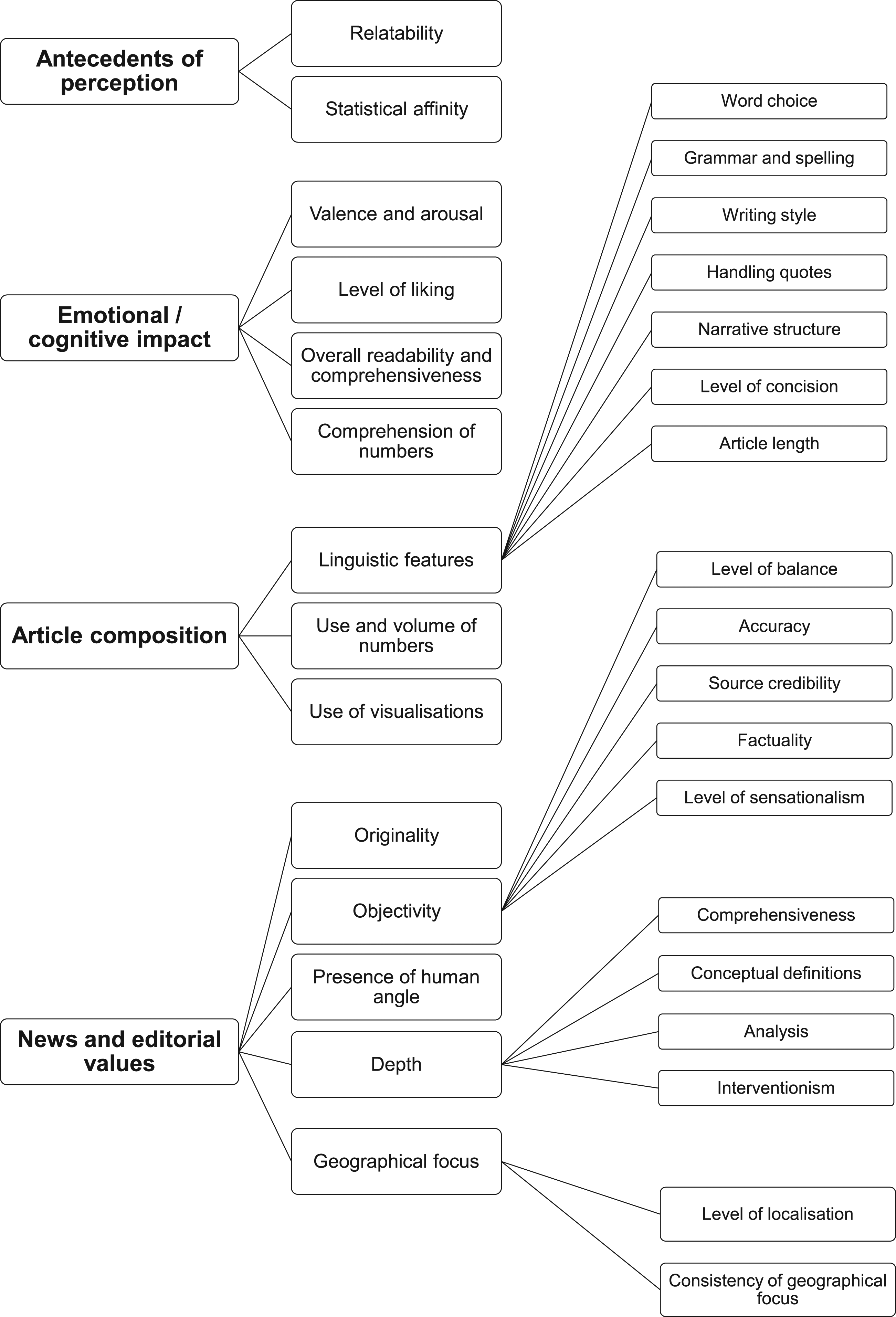
Antecedents of perception
Participants’ personal characteristics contributed to two antecedents of perception, relatability and statistical affinity, both of which could affect interviewees’ perceptions and evaluations of articles.
Relatability
Participants often judged articles in terms of relatability, with relatability dependent on location, demographics, subject matter, and experience.
Many interviewees found it easier to relate to articles that dealt with locations they knew.
Demographics had a bearing on relatability. Michelle could relate to a story about school exclusions, in part because she was a parent of ‘a child of school age'.
Subject matter, too, had a bearing. Caitlin stated that an article about the monarchy would be of interest only to those who were interested in the monarchy.
Statistical affinity
Participants made varying remarks on their tolerance for the use of statistics.
Participants sometimes expressed a definite liking for statistics in articles because they made ‘complex things easy to understand' (Mark), could hold authorities to account (Gemma), and were not ‘polluted' by opinion (Mark).
Some had very little tolerance for statistics in articles. For Caitlin, ‘figures just go in one ear and out the other'. While for some a resistance to statistics was linked to a preference for words, others, like Fraser, expressed some suspicion of statistics, which he said could be ‘cherry-picked'.
Interviewees’ affinity for statistics in stories could vary depending on the volume of numbers, their placement in the story, their source, the topic of the story in which they were used, and how they were presented, for example via the use of visualisations.
Emotional/cognitive impact
Participants often talked about the impact the stories had on them as opposed to the stories’ more specific qualities. These impacts took place on both an emotional and a cognitive level. Articles aroused, to varying degrees, positive and negative feelings (valence), which could be liked or disliked. On a cognitive level, both the articles as a whole and the numbers within them were comprehended to varying degrees.
Valence and arousal
Participants had a range of emotional responses to articles, which varied in their valence and strength. Descriptors of positive valence included: ‘interesting', ‘entertaining', ‘appealing', ‘engaging', ‘compelling', ‘attention-grabbing', ‘gripping', and ‘exciting'.
Descriptors of negative valence included: ‘shocking', ‘boring', ‘irritating', ‘frustrating', ‘dull', ‘bland', ‘saddening', ‘confusing', ‘off-putting', ‘disengaging', ‘infuriating', ‘annoying', ‘underwhelming', and ‘insulting'. Participants also spoke of being ‘angered' and ‘horrified' by articles. Several spoke of articles making them ‘switch off'.
Participants gave varied reasons for the effects that articles were having on them, including the topic of the story and its execution, with factors including the presence or otherwise of sympathetic perspectives.
Level of liking
Interviewees expressed their levels of liking for articles in a variety of ways, using absolute terms such as ‘love', ‘great', ‘perfect', ‘good', ‘nice', ‘like', ‘quite like', ‘didn’t think much of', ‘didn’t like', and ‘bad'. They also used comparative terms such as ‘prefer', ‘better', and ‘worst'. Liking could be associated with positive and negative valence. For example, Bethany ‘liked' one article ‘so much better' than another although she was ‘shocked' by its content.
As is discussed elsewhere, expressions of liking and disliking were often tied to the characteristics of articles, such as their length, use of visualisations, and compliance with editorial values.
Overall readability and comprehensibility
Participants had varying ideas about how readable and understandable articles were, in general terms. As discussed elsewhere, participants’ opinions about articles’ readability and comprehensibility were often tied to their evaluations of specific features of the articles, such as their narrative structure and comprehensiveness.
That an article was thought readable and ‘easier' did not necessarily equate to liking, with Gail, for example, criticising a ‘better written' article as ‘very sensationalist, very biased'.
Comprehension of numbers
Interviewees made varying remarks about the comprehensibility of numbers contained in online news articles.
As discussed elsewhere, participants’ comprehension of numbers was tied to a range of other perception criteria, including participants’ statistical affinity and how numbers were used in articles. For example, Philip thought rounded numbers were ‘easier to digest', with 45,000, for example, preferable to 44,947. For Caitlin, visual elements made it ‘easier to understand what all the figures' meant. A clear structure could have a similar effect, achieved, for example, through the use of single-sentence paragraphs (Bethany), or by the spreading of numbers ‘throughout the article' (Henry).
Some interviewees felt numbers were more comprehensible for certain types of people, such as scientists (Bethany).
Article composition
Participants often discussed articles’ linguistic, numerical, and visual features.
Linguistic features
Linguistic features of the news articles contributed to participants’ perceptions and evaluations, specifically word choice, grammar and spelling, writing style, handling quotes, narrative structure, level of concision, and article length.
Word choice
Several interviewees objected to the use of words – like ‘median' – on the basis that they were of too high a level for the average reader.
Some participants objected to ‘archaic' language, like the term ‘pay packet' (Andrew).
Some participants objected to language that they thought was too technical. For example, Fiona wanted simpler terminology in an article about broadband, such as ‘average, slow, or fast speed'.
Some interviewees objected to the use of abbreviations, like ‘ONS' (Lolade), or unexplained terms, such as ‘council tax precept' (Laura).
Grammar and spelling
Some participants noted instances where they thought there were errors in the language. For example, Tony noted a typo and said that such an error could induce a general scepticism towards an article.
Writing style
Participants sometimes praised articles’ writing style. Cheryl approved of the vocabulary used in a football match report because it made her feel she was ‘part of the game'. Tony thought the use of the word ‘audacious' in a match report was ‘quite descriptive'.
Interviewees sometimes faulted articles for a lack of linguistic variety. Laura criticised one article for containing seven instances of the word ‘median'.
Some participants had preferences with regard to sentence length. Gail liked the short, punchy sentences in one article, although Andrew did not.
Some participants made remarks about paragraph styles. For James, although not for Linda, single-sentence paragraphs improved an article’s readability.
Several interviewees spoke of articles resembling ‘reports' or ‘press releases' rather than articles. Hassan said one article read as though it had been written by ‘a research group' and lacked the ‘voice of a writer'. Mark, however, thought a report-style of writing could be appropriate in articles that were largely about data. Reuben thought a football match report sounded as though ‘a robot had watched the match and written down what had happened' and was ‘almost useless'.
Participants sometimes spoke of ineptitude in the language hindering understanding.
Handling quotes
Participants made varying remarks on the way in which articles handled quotes.
While some interviewees spoke of wanting quotes that expressed a variety of perspectives, others sometimes equated the presence of competing quotes with an absence of clarity (Fiona).
James thought an article had too many quotes, which meant he ‘had to keep going back and checking who is saying what'.
Several participants approved of quotes from people who were directly involved in a story. Fraser was less interested in hearing from people in a ‘position of power' than from ‘the people that have got the lived experience'.
Some participants spoke of wanting to read quotes from informed sources. Bethany approved of the quotes in an article about tree planting because the people ‘actually knew what they were talking about'. Michelle, however, said she never really considered where quotes had come from.
Interviewees made some remarks about the length and presentation of quotes. James liked how an article about bridge maintenance presented a quote as ‘one big quote'. In another article, he appreciated a minimal approach to quotes.
Participants did not always expect or desire quotes.
Narrative structure
Participants made varying remarks on narrative structure within articles. Gail thought an article ‘quite unstructured', because it was little more than a list and didn’t have ‘a beginning, a middle and an end'. Hassan liked an article that had a ‘first act, second act, third act', because it had a ‘flow'. The presence or otherwise of flow, however, was not necessarily the decisive factor in determining the response to an article.
Interviewees sometimes felt an article’s structure could be misleading, with certain information less or more prominent than it might be.
Some participants spoke of structure in relation to the presentation of statistics. Andrew liked that one article spread statistics throughout its length rather than presenting them all in one go. Lolade, however, approved of the structure of an article on homelessness whereby the statistics were presented first, and the article then moved on to solutions.
Level of concision
Participants made varying remarks on the levels of concision evident in articles.
Interviewees often liked articles in which comprehensiveness co-existed with brevity. For example, Leah thought one article was long enough to ‘contain the detail', but not so long that it became ‘boring'.
Participants thought non-textual elements could contribute to an article’s concision, for example by presenting information in tabular form (Deborah). Some participants felt articles failed to be concise. However, some interviewees, like Stuart, did not think all short articles married comprehensiveness with brevity. He thought that a ‘short' article on baby names lacked detail and said that it left him wanting more.
Some participants thought it was acceptable for levels of concision to vary depending on factors such as the subject matter of an article and the size of the screen it was read on.
Article length
Participants quite often thought articles were too long. Fiona had an aversion to longer articles: ‘when I see a long article I just automatically switch off'. Others, like Deborah, were willing to read longer articles if the subject was engaging. She sometimes associated greater length with fuller explanations of concepts and a welcome presentation of information from different sources.
Amy thought perception of an article’s length was affected by how interesting it was.
Interviewees’ tolerance for length was sometimes related to subject matter. Ahmed thought greater length was necessary for more serious subjects.
Feelings about length were sometimes related to non-textual elements. Caitlin was more willing to accept a longer article if the text was punctuated by visual elements.
Length was not necessarily a decisive factor in an article being received positively.
Use and volume of numbers
Participants often had preferences for how numbers in articles were used.
Some were positive about the use of numbers if the numbers were integrated into a ‘story' (Hassan), ‘illustrate[d] a point' (Linda), or presented alongside related quotes and explanations (Amy).
Some participants made comments about the use of ratios. Amy thought ‘sheer' numbers weren’t as ‘engaging' as percentages. Ben stated there were problems with using ‘absolute numbers' in the absence of percentages, and percentages in the absence of absolute numbers. In both instances, the reader could be given a false idea of a situation. However, Linda thought that being told how many black and white people per thousand were stopped and searched by the police had less impact than the use of an odds likelihood ratio: being told how many more times black people were stopped than white people.
Interviewees sometimes approved of less technical or more relatable ways of expressing numbers. Bethany thought the use of football pitches to express the size of an area was preferable to the use of hectares. Philip thought ‘rounded' figures ‘easier to digest'. Henry, however, had no trouble digesting the specific, unrounded figures used in another article.
Participants often approved of visual ways of expressing figures, with maps and graphs better than ‘just umpteen figures' (Linda). Ben, however, thought the graph in one article didn’t really add anything as it was just ‘reiterating the article'.
Some found the use of smaller rather than larger numbers more meaningful, for example numbers to do with the local level rather than the national. Participants sometimes remarked, with varying degrees of approval and disapproval, on the consistency or otherwise of how figures were expressed within articles.
Some interviewees felt that the type of article affected the way in which numbers should be used. Henry thought rounded numbers were suitable for a story piece, and specific numbers for a finance piece.
Participants made varying remarks on the volume of numbers contained in articles.
Participants often felt that articles featured too many numbers. Gemma, for instance, found articles that used ‘a lot of stats' were ‘not very appealing'.
Interviewees could associate larger quantities of numbers with difficulty of comprehension (Lolade) and recall (Laura).
Some participants thought greater quantities of numbers less suitable for certain – for example, local – audiences.
Participants could also think articles did not feature enough statistics.
Use of visualisations
Interviewees made varying remarks on the use of visualisations in online news articles.
Participants sometimes thought information contained in an article’s text would have been better represented in tabular form (Stephen) or as a visualisation. Participants particularly thought that figures should be given visual expression. Caitlin stated that pictures (including graphs) ‘stick in your mind far easier than a jumble of words and numbers on a page'.
Interviewees often approved of the presence of visual elements in articles for reasons such as their navigability, informativeness, enticing qualities, and how they added variety.
Some participants, like Fiona, seemed to have a basic expectation that news articles should feature visual elements. 2
Participants did not always approve of visualisations, however, for example if they were repetitive (Ben), added unnecessary detail (Philip), or were presented in ways (e.g. with a truncated y-axis) that were seen as misleading.
Some interviewees felt visualisations had been inadequately labelled.
Henry thought visualisations might be more suitable for certain kinds of topics, such as business or finance.
News and editorial values
Participants commented on various news and editorial values that they felt were present in the texts, specifically: originality, objectivity, the presence of a human angle, depth, and the geographical focus.
Originality
Some participants praised articles for providing them with information or a perspective that was topical or new to them.
Some interviewees criticised articles for a lack of originality. Hassan thought an article contained ‘no new information'.
Some participants felt certain subjects were unoriginal, but this did not necessarily mean that they were completely dismissive of articles about those subjects. Helen, for example, found the subject of an article on baby names unoriginal but the information it contained novel.
Objectivity
Within the broad category of objectivity, participants discussed level of balance, accuracy, source credibility, factuality, and level of sensationalism.
Level of balance
Interviewees sometimes remarked on the presence and diversity of perspectives presented in an article.
Participants sometimes thought that articles were insufficiently diverse in the perspectives presented.
Participants could have an exaggerated sense of a lack of balance. Linda felt that an article about police ‘Stop and Search’ practices quoted a race equality think tank ‘quite a lot' and quoted only ‘about one sentence' from the police, though the space granted to the sources was similar.
Interviewees sometimes praised articles for their diversity of perspectives, saying they made articles seem ‘better researched' (Deborah).
There was some suggestion that subject matter had a bearing on what perspectives should be presented. Ahmed thought it particularly important to represent ‘different opinions' when serious issues, such as children and mental health, were involved.
Participants were not always sure that balance was desirable. Ben felt the presence of a quote from a government spokesperson in an article about homelessness was a ‘cop-out', because it blunted what had otherwise been a strong, campaigning message.
That an article lacked balance did not necessarily mean that all feelings about the article would be negative. Gail thought an article on pay inequality was not balanced but was well-written and easy to read.
Accuracy
Some participants made remarks relating to accuracy within news articles.
Interviewees, like Gemma, sometimes doubted the validity of evidence. She thought a survey on the popularity of the monarchy ‘wasn’t actually accurate' because it was just ‘one study', and a ‘wider study' might have produced different results.
There was some suggestion that linguistic inaccuracy could mislead. Reuben thought a lack of clarity in one headline could give a misleading impression of how many hate crimes were associated with Burnley football club.
Hassan associated the presence of many statistics in an article with accuracy, as he thought it indicated that the article’s author had done ‘thorough' research.
Source credibility
Participants made varying remarks about source credibility.
Participants often spoke of trusting certain sources – like academics (Deborah), people who worked in the area addressed by an article (Bethany), or the Office for National Statistics (Helen and Deborah) – more than others. For several interviewees, but not all, the government was a less trusted source, as was, for Gail, ‘[a person] down the street'.
Participants could feel that insufficient information had been given about sources, which could hinder estimations of credibility.
Some participants did not give much thought to the credibility of sources, for reasons that included an assumption that the journalist had done their research (Natalia), and a belief that the figures in an article seemed ‘reasonable' (Michelle and Deborah).
Factuality
Interviewees sometimes wanted articles to contain facts and fewer opinions or even, as with Mark, data and no opinions.
While some participants, like Gail, remarked a lack of evidence for claims made in articles, others, like Philip, thought an article on pay inequality ‘had enough evidence' to back up its argument.
That an article was thought lacking in facts did not necessarily lead to its outright dismissal. Stephen thought an article should have been weighted more towards facts, yet thought its lack of facts made it easier to follow, and more ‘readable'.
Participants sometimes liked the presence of opinion, with Philip, for example, thinking it could provoke the reader into determining what their own opinion was.
Level of sensationalism
Some interviewees found the use of certain words sensationalist or emotive. Stuart felt an article about homelessness in his borough used ‘quite emotive words', like ‘spiralling'. He felt the language was ‘politically motivated'. However, Andrew liked the more emotive language (such as the word ‘eye-popping') in an article about Jeff Bezos.
Negativity could be equated with sensationalism. Helen, who is from the London borough of Newham, thought a line stating that Newham had the highest rate of homelessness in the country was sensationalist, because it was ‘trying to pick something bad out about the borough'. Articles that were thought sensationalist were not always dismissed entirely, also being considered ‘focused' and ‘effective' (Stuart), and ‘entertaining' (Philip).
Presence of human angle
Participants often approved of quotes from people directly affected by the issues covered in articles, saying that the ‘human touch' (Ben) made articles ‘more compelling' (Fraser) and added ‘validity' (Deborah).
Participants sometimes objected to the absence of a personal angle. Bethany thought an article about the stopping and searching of black people should have featured a quote from a black person.
Interviewees sometimes contrasted quotes from people directly involved in issues with quotes from organisations, and quotes from people in positions of power. Davina objected to quotes from politicians in an article about food poverty, because what was required was ‘quotes from people who live in food poverty'.
Participants didn’t always think an article needed a human angle. Mark didn’t miss such an angle in an article about police diversity, because the article ‘was supposed to be an objective look at the statistics'.
Depth
Participants made various remarks on the amount of information news articles provided. An article’s depth was discussed with reference to its comprehensiveness, whether it provided definitions of concepts or analysis, and whether it was interventionist.
Comprehensiveness
Interviewees sometimes thought articles not comprehensive enough in their provision of detail. Others appreciated the amount of detail articles provided, for example praising a comprehensive set of statistics (Cheryl) or facts (Stephen) or the ‘context' provided (Deborah).
Participants sometimes thought visual elements could make an article comprehensive.
Interviewees sometimes thought the amount of detail an article should provide was dependent on certain factors, such as story topic (Ahmed) and the intended readership (Fraser and Henry).
That an article was thought comprehensive did not mean it would necessarily meet complete approval. Mark thought an article on pay inequality contained ‘all the salient points' but seemed to be from just ‘one perspective'.
Conceptual definitions
Participants sometimes thought articles had failed to adequately define concepts, such as ‘housing insecurity'.
Some participants thought concepts had been used loosely. Ben and Helen objected to the use of ‘homeless' to refer both to a person living on the streets and a person living in temporary accommodation.
Interviewees sometimes praised articles for having adequately defined concepts.
Analysis
Participants sometimes approved of the analysis contained in articles, liking, for instance, how the article explained the figures (James) or discussed the wider implications of a story (Davina) or why the story happened (Amy).
Participants often criticised articles for a lack of analysis. Lolade, for instance, wanted an article on high homeless rates in Newham to explain why the rates were higher in that area.
Interviewees could think that analysis was less appropriate in certain articles, like sports stories, than others, such as ‘features' (Leah).
Interventionism
Participants, including Bethany, often approved of articles discussing solutions to problems. She thought an article on Stop and Search was ‘constructive' because it gave some sense of how we can ‘move on'.
Participants sometimes spoke of a preference for solutions over statistics.
Interviewees often criticised articles for failing to discuss solutions or mobilise readers.
Participants did not always require solutions. Mark thought it was acceptable for some articles merely to take ‘an objective look at the statistics'.
Geographical focus
Both the level of localisation and the consistency of any geographical focus played a part in how participants perceived the news articles.
Level of localisation
Interviewees often approved of news for being about the areas in which they lived, sometimes specifically approving of quotes from local people. Some participants also thought localised language could make an article more attractive for a local reader.
Participants did sometimes appreciate local articles that weren’t local to them. Reuben, from London, was able to appreciate an article about hate crimes and Burnley football club, in part because it contained ‘a good mix of Burnley and non-Burnley things', and had ‘national implications'.
Interviewees sometimes spoke of preferring a local focus in distinction to a regional or national focus. Ben thought the use of statistics at the local level more meaningful than statistics at the national level, because if ‘it's about a local level [then] I care’.
Participants did sometimes approve of a national focus, when, for example, the subject suited such a perspective (Amy).
Consistency of geographical focus
Participants sometimes objected when an article began with a local focus and then shifted to a wider focus. Helen thought an article on homelessness that discussed Newham, then London, then the national picture, had no ‘consistency' and she wasn’t sure what she was supposed ‘to get out of the article'. Interviewees sometimes specifically objected if a headline spoke of a particular place and the text failed to concentrate solely on that place.
However, participants sometimes had more tolerance for changes in focus. Stuart liked the structure of an article on homelessness whereby a local focus was followed by a national focus and then by a discussion of solutions.
Discussion
Most previous research on audience perceptions of quantitative journalism has examined how those perceptions differ, if at all, from perceptions of non-quantitative journalism (see, e.g., Mayo and Leshner, 2000) or depending on how the journalism was authored – using automation or not (see, e.g., Haim and Graefe 2017). This study takes a different approach, looking at the particular characteristics of quantitative journalism that audience members pay attention to and, within those characteristics, where their preferences might lie. As a result, we are able to offer, for the first time, a set of audience perception criteria, and dimensions thereof, specific to quantitative journalism, including that which uses automation in its production. These criteria and dimensions have obvious application for researchers undertaking studies on how audiences perceive different types of quantitative journalism, such as that produced with differing levels of automation or which varies along other dimensions, such as linguistic features. The validity of the results of prior studies on the perception of quantitative journalism may have been compromised, because those studies were not able to draw on a set of audience perception criteria specific to quantitative journalism.
Indeed, if we compare our criteria and dimensions (see Figure 1) with those used in prior studies on audience perceptions of quantitative journalism (see Table A in Supplemental Material), we can see that several of our items have not featured in prior research. One example is interventionism: our interviewees often commented on either the presence or absence of solutions to problems. Geographical focus is another new criterion, with our participants often commenting on articles’ level of localisation and sometimes on how consistent articles were in their geographical focus. Although our presence of human angle criterion is a well-established professional news value (Galtung and Ruge, 1965), surprisingly it has not been used in the prior studies we looked at (see Table A in Supplemental Material) and neither have our criteria that concern the use and volume of numbers and visualisations.
Some of our criteria do overlap with those used in prior studies, including accuracy, objectivity, and readability. We are, therefore, able to confirm their suitability in the specific context of quantitative journalism.
In some cases where there is overlap, our study offers more details on what audience members pay attention to. For example, although prior studies have used dimensions such as ‘well-written' (see, e.g., Haim and Graefe, 2017; Melin et al., 2018; Zheng et al., 2018), they do not suggest how readers might be evaluating articles on that dimension. Our study suggests that linguistic features, such as word choice, grammar and spelling, and how quotes are handled are all playing a part.
Building on Koliska et al.'s (2021) study on the perception of news videos, we make a distinction between the valence and arousal that articles provoked in readers, and how much readers liked those articles. Prior studies on quantitative journalism have tended to conflate these criteria, for example considering ‘interesting' and ‘boring' to be dimensions of ‘likeability' (see, e.g., Zheng et al., 2018). We have shown that emotional responses to articles can manifest in myriad ways along the axes of valence and level of arousal but also that liking is an independent criterion that can be associated with either positive or negative valence.
Also building on Koliska et al.'s (2021) work, we propose a category of criteria that contains two antecedents of perception to reflect how readers’ personal characteristics play a part in how they perceive and evaluate quantitative journalism.
As well as having direct application for those conducting research into audience perceptions of quantitative journalism, our set of criteria will also be of interest to researchers studying audience perceptions and evaluations of news in general. This is simply because there are relatively few studies that investigate the evaluative criteria audiences themselves use (see Sundar, 1999; Urban and Schweiger, 2014).
Finally, this study has started to explore what audiences might like and dislike about quantitative journalism (see also Link et al., 2021), an undertaking of direct relevance to journalists and others who communicate with data. Our findings provide indications that audience members want quantitative text-based journalism to be constructive and concise, provide analysis, have a human angle, and include visual elements. There appears to be a shared sentiment against the use of too many numbers, abstract scales of measurement, and technical terms. Readers, it seems, want numbers to be presented simply and relatably, be used in support of other aspects of the written text, and not get in the way of the narrative.
Of course, both the indications about audience preferences for quantitative journalism and the criteria used in their preference formation are provisional and no inferences should be drawn about the prevalence of our observations beyond the sample of this study. Although our sample of interviewees was diverse, it was not large or random enough to be truly representative of online news consumers. It would be useful, therefore, for further studies to test the degree of agreement within the broader population around which characteristics of quantitative journalism are important and in what way. However, we do believe that this study, despite its inevitable limitations, has made a valuable contribution to the important task of better understanding how news consumers engage with, understand, and act in response to numbers in the news.
Supplemental Material
Supplemental Material - Exploring audience perceptions of, and preferences for, data-driven ‘quantitative’ journalism
Supplemental Material for Exploring audience perceptions of, and preferences for, data-driven ‘quantitative’ journalism by Florian Stalph, Neil Thurman and Sina Thäsler-Kordonouri in Journalism
Footnotes
Declaration of conflicting interests
The author(s) declared no potential conflicts of interest with respect to the research, authorship, and/or publication of this article.
Funding
The author(s) disclosed receipt of the following financial support for the research, authorship, and/or publication of this article: This work was supported by the Volkswagen Foundation (88171-1).
Supplemental Material
Supplemental material for this article is available online.
Notes
Author biographies
References
Supplementary Material
Please find the following supplemental material available below.
For Open Access articles published under a Creative Commons License, all supplemental material carries the same license as the article it is associated with.
For non-Open Access articles published, all supplemental material carries a non-exclusive license, and permission requests for re-use of supplemental material or any part of supplemental material shall be sent directly to the copyright owner as specified in the copyright notice associated with the article.