
Abstract
Keywords
Introduction
In previous studies1,2 nearly 15 years ago, an interdisciplinary team and community-based advisors from the target audience developed CHOICES to address a genetic reproductive knowledge gap for individuals living with sickle cell disease (SCD) or sickle cell trait (SCT). CHOICES was a web-based, multimedia reproductive knowledge intervention built on a Windows platform and designed to foster informed decision making in young adults with SCD or SCT.3,4 Recently, in preparation for a new randomized controlled trial (RCT), young adults informed us that the CHOICES graphical interface was no longer visually engaging to our 18–45 year-old target audience, which could impact the effectiveness of an online intervention. 5 The purpose of this article is to present our methodological work focused on updating the CHOICES presentation format to be more modern and interactive for young adults with SCD or SCT with functions that are accessible on all computing devices.
Background
Significance and need for reproductive health education
SCD is a autosomal recessive, genetically inherited monogenic blood disorder affecting the structure of hemoglobin. 6 SCD is estimated to affect 100,000 Americans with one in 365 Black or African American infants and one in 16,300 Hispanic American infants born annually with SCD. 7 It is estimated that one out of every 13 Black or African American infants are born with SCT, 7 the carrier status. When individuals possess reproductive health knowledge necessary to make an informed decision, they are empowered to make reproductive decisions that align with their parenting goals. Yet, many individuals with SCD or SCT remain unaware of the potential genetic inheritance of their sickle cell status. 1 Scalable and culturally relevant interventions are crucial to reach the populations affected by sickle cell in America and world-wide to enable them to make informed reproductive decisions. It is important for web-based interventions to be accessible via all devices and browsers that could be used by the affected population.
Efficacy of CHOICES intervention
One such intervention was developed in collaboration with the affected community in 2009, but it was created using. Net technology. Although the intervention was highly acceptable to the target population,1,2 it lacked device and browser accessibility that is essential today. Despite the limited accessibility, in a previous RCT of 234 individuals with SCD or SCT,3,8 investigators found significant sustained difference in reproductive health knowledge for the intervention group compared to an e-Book usual care group. However, behavior concordant with parenting preferences was not significantly different (p > 0.05), perhaps because about half of the sample was not at risk of their children inheriting SCD and did not need to change their behavior. For the small sample at risk, there was a nonsignificant trend for one behavior change-- to partner with a person who would eliminate the risk. A detailed description of the initial CHOICES intervention has been published. 4
Follow up efficacy trial: Problem identification
We obtained funding (1R01HG011927) to test the effect of the intervention among individuals at risk and intending to have a child within 2 years. In preparation for the new trial, we found that individuals representing the target audience considered the user interface to be “dated” and not appealing. Through exploration of their meaning of “dated,” we discovered that the 3-D user interface design was the main issue (Figure 1). The users reported that the interactive element and videos were acceptable. They also reported that the content was interesting and engaging. Original CHOICES Homepage (Pre-Modernization): Initial version of the intervention interface, designed in early 2000s. Uses dated visual style, limited interactivity, and fixed layout not optimized for modern browsers or devices. In the original intervention was evaluated as “dated” because of the cluttered design characterized by boxing elements on the screen and Skeuomorphic design of buttons: buttons are 3D elements that imitate buttons in the real world.
Intended and refined upgrade plans
Since the CHOICES intervention was developed in 2009, we had planned to upgrade the technology for accessibility by Windows, Android, and Apple devices but we had not planned a user graphical interface upgrade. These updates reflect broader trends in digital health, where conversational agents, artificial intelligence, and multimedia learning strategies are increasingly used to improve engagement, personalization, and accessibility in online health education.22,24,25 However, to modernize the intervention to web-design features common in 2022, the Black and Hispanic young adults provided feedback that indicated a need for a more extensive upgrade than originally planned. That feedback indicated that some features seemed outdated from a contemporary perspective. Specifically, the navigation bar; cluttered design; skeuomorphic design; horizontally dominant layout; contrast, repetition, alignment, and proximity (CRAP) design, and unseen human narration were design elements that drove this perception. Here we report the process and outcomes of updating a conceptually sound but technologically outdated web-based, preconception reproductive-health-education intervention to make it relevant for today’s young adults with SCD or SCT.
Methods
Overview
In an iterative software development process from February 2022 to November 2022, an interdisciplinary team of health care and communication scientists, computer science specialists, and individuals similar to the target audience collaborated to revitalize an outdated, web-based reproductive health educational intervention. Actual study participants provided additional assessments to guide continued improvement. The Institutional Review Board (IRB) at our university approved our developmental work as part of preparation for implementing a RCT of the CHOICES intervention and the actual study with acceptability assessments.
Data sources
Research Team Testers. The initial testers included 20 members of our interdisciplinary team at the University of Florida. The team included 4 student researchers, 6 research staff, and 10 faculty members. Their ages ranged from >20 years (baccalaureate, post-baccalaureate, master’s, and PhD students) to >65 years. The team included 7 Black/African American, 5 Asian American, 1 Hispanic, and 7 White non-Hispanic individuals.
Demographics of the 82 acceptability users.

Procedures
Development Tasks. The development tasks began with a comprehensive review of the existing platform, followed by mapping initial requirements and enhancements. This process guided multiple development cycles that included iterative user experience design, development, testing and feedback by the research team. During development, features such as integrating the virtual human narrator to replace audio narration for inclusivity were accomplished. Other tasks included database construction, implementing question skip patterns to reduce participant burden, and programming upgrades for device and browser accessibility. Following the iterative development cycle, the new training platform was deployed, and the users tested and provided feedback on the platform (Figure 2). Development cycle. From initial review of the existing platform to user testing and feedback.
The two research teams--clinical and technical-- completed the tasks. The clinical team iteratively evaluated the cultural relevance of the interface design and virtual human for the target audience (18–45-year-old Black/African American/Hispanic/Latino individuals). Decisions regarding all changes were presented to the clinical team who then voted on the changes. The clinical team’s feedback on the graphical user interface design and virtual human options guided revisions that the technical team implemented. The technical team’s work was focused on functional tasks and, therefore, iterations were only needed to correct functional issues after the design iterations were completed. The process steps were simple: the technical team prepared a prototype, the clinical team reviewed, evaluated, discussed, and presented feedback to the technical team who prepared a revised prototype. The process continued until the prototype was judged final. The technical team developed the website on a development server where both teams conducted functional testing.
Testing tasks
Team members. Both the clinical team and technical team conducted the testing tasks including testing and feedback on the content accuracy, inclusivity, and functionality of the revised webpages. The accuracy and functionality testing tasks continued iteratively until the intervention appeared as intended for both treatment conditions (experimental and control) on Windows, Android, and Apple desktop and mobile devices.
We evaluated program functionality using a testing protocol report document that specified the testing condition, findings, and webpage identification number with opportunity to provide open-ended feedback. The dimensions of functionality being tested included skip-pattern accuracy, readability of text content for control and experimental conditions, virtual human accuracy, hyperlinks, media content, closed captioning, function of the menu of functions, parenting plan, and first nudge.
Upon receiving the testing reports, the programmers and web-developers identified the underlying issue and updated the program to address them. The iterative process continued until the CHOICES application functioned as intended without errors.
User Acceptability. When the CHOICES application functioned as intended, it was deployed on a production server to the 82 users who had received an informed consent process and signed a written consent document. These users accessed the website via a strong-password, engaged the application that was tailored to their situation, and completed a Computer Acceptability Scale (CAS).
Instrument
The CAS is a 20-item tool designed to evaluate participants’ perspective on the usability, acceptability, and credibility of computer-based tools, such as CHOICES. The CAS was validated in the SCD/SCT population 1 and has been used successfully in studies for more than 20 years9–12
Findings
Development tasks
Implement updated graphical user interface design
Figure 1 shows the original interface design and the need for a contemporary and visually appealing user interface design. With the exception of some photos, the media did not require updating. Figure 3 shows an example of one photo updated as a modern-day image. The final interface design that emerged from the clinical team feedback appears in Figure 4. Updated Educational Module Interface with Virtual Human Narrator: Modernized content screen demonstrating streamlined layout and embedded virtual human narrator. The narrator provides optional spoken guidance alongside textual information to support engagement, comprehension, and accessibility across diverse users. Modernized Questionnaire Interface (Post-Modernization): Streamlined question layout with improved spacing, legibility, and mobile-responsive design. The interface reflects updates based on user feedback to ensure ease of use across devices and reduce visual clutter.

Add virtual human
We added a virtual human narrator because the clinical team feedback favored use of a virtual human narrator rather than the original unseen narrator. The virtual human was designed to be representative of the sickle cell community and was voiced by local talent. It can be turned on or off by the participant at any time and can be replayed, if needed. The clinical team selected from several options for virtual human images, backgrounds, and voices. Figure 5 shows the image the clinical team selected because it was a fresh face, the background complemented the face, but the clinical team user feedback indicated that the automated voices were not acceptable for an African American target audience. Based on this feedback, an actor whose voice fit the image was identified to record the text. The recordings were synchronized with the virtual human and the page position for the virtual human was determined from the clinical team feedback for desktop (Figure 5) and mobile devices (Figure 6). Virtual Human Narrator on Desktop Interface: Synthesia-based AI narrator embedded alongside educational content to simulate interpersonal engagement and improve user attention and information retention. Virtual Human Narrator on Mobile Device: Responsive implementation of the virtual narrator interface, enabling consistent multimedia narration on phones and tablets with accessibility toggles.

Improve inclusivity
In the previous study, one participant indicated a lack of representation for same-sex couples. We recognized this gap and made a few minor revisions to ensure inclusivity of all potential parenting couples. For example, we ask participants to identify as sex at birth as male or female and gender identity as male, female, or transgender based on the National Institutes of Health recommendations and the genetic inheritance of sickle cell status. Additionally, two new scenario questions were added to the intervention to provide context on surrogacy or sperm donation options for same-sex couples.
Construct database
The technical team constructed a Structural Query Language (SQL) database to collect data from every click within the website. The investigators provided feedback to ensure the database would be adequate for the study aims and potential future projects using the data.
Question skip pattern
We updated the skip pattern to reduce patient burden. For example, if a participant indicated they did not have a sexual partner, the algorithm skipped the question regarding partner sickle cell status. The logic algorithm skip pattern also determined the tailored parenting plan for each participant based on how they answer certain questions. We addressed a previously identified logic flaw within the skip pattern algorithm that generated the parenting plans to ensure participants receive parenting plans concordant with their parenting desires. Members of the team worked to improve the algorithm to ensure that participants would receive a parenting plan that matched their parenting wishes.
Additional technological upgrades
The original intervention was designed to function on Windows and Android-based platforms dependent on. Net code, which did not work on Apple products. At the time of original development, only around 3% of nursing colleges were using Apple products. Currently, many institutions in the United States (U.S.) use Apple products. Due to this shift in the diversity of devices, the program code required major revisions.
The system was rebuilt using Spring 5.3.15, which is a new reactive web-based framework. It supports fully reactive webpages, and hence the website dynamically resizes itself according to the size of the screen. This change made the CHOICES website accessible from various device types. Java SE 1.8 was used to build the Spring application and the database is hosted on a Microsoft SQL Server. We used mySql connector as the JDBC connector and hibernate was used as an ORM. The sensitive user details are encrypted using SHA256 and stored in the database.
Boosters were a part of the original CHOICES intervention, but new to our current study is the inclusion of nudges. For example, if a participant answered a question incorrectly at the 6- and 12-months time points, a booster was queued for delivery to the user to review the relevant intervention content at 6- and 12 months. We designed the first nudge to be included in the initial CHOICES intervention and subsequent nudges before the 6- and 12-months time points were delivered external to the application.
Testing Tasks
Content accuracy, inclusivity, and functionality
During testing, we identified minor bugs in the program, such as the invalid routing of certain questions in the pretest based on participant responses. For example, when the participant indicated they had sexual partner, the algorithm would skip the question about which birth control methods they used, if any.
Another error identified during testing was a discrepancy between what the virtual human read to the participant and the text written on screen. After several iterations of testing and correction, functional testing by 3-5 clinical team members and 3-4 investigators, all of whom tested different situations and were well informed of the expected function, indicated all interactive and media content functioned appropriately and the data appeared appropriately in the SQL database.
From an ethical standpoint, the intervention’s design and testing were guided by core principles of user autonomy, inclusivity, and informed consent. To respect individual preferences, AI-driven features such as virtual human narration were made entirely optional, allowing users to turn them on or off at any point. Importantly, all interactions with the virtual human remained non-identifiable and observational; no facial recognition, behavioral tracking, or personally sensitive data were collected.
To support cultural relevance and minimize representational bias, the voice used for narration was intentionally selected to reflect the demographics of the study population, which consisted primarily of Black individuals (94%) and females (76%). The voice was reviewed for cultural appropriateness while avoiding stereotyped characteristics. No personalized virtual human narrators were used in this phase; the virtual human was rendered with a neutral appearance and minimal expressiveness to reduce unintended bias or social signaling. Technically, the narrated content was stored securely within the website’s database, which follows established security protocols, including authenticated access control and encrypted data storage. While the current version includes only one-way narration, future versions will support two-way conversational interaction. These upcoming features will incorporate encrypted text-to-speech and speech-to-text processing to ensure confidentiality, integrity, and continued adherence to privacy standards.
Additionally, extensive functional testing of the logic algorithm indicated the user’s parenting plans were generated based on their parenting choices. After 9 months of redevelopment, our results indicated that the educational program works as intended on Windows, Apple, and Android computer and mobile devices for both treatment conditions (experimental and control).
We obtained institution review and approval of the CHOICES web-based application from the university’s privacy and security group. The approved application was then deployed on the university health sciences production and database servers. The university provides 24/7 monitoring and routine server patch and upgrade deployment.
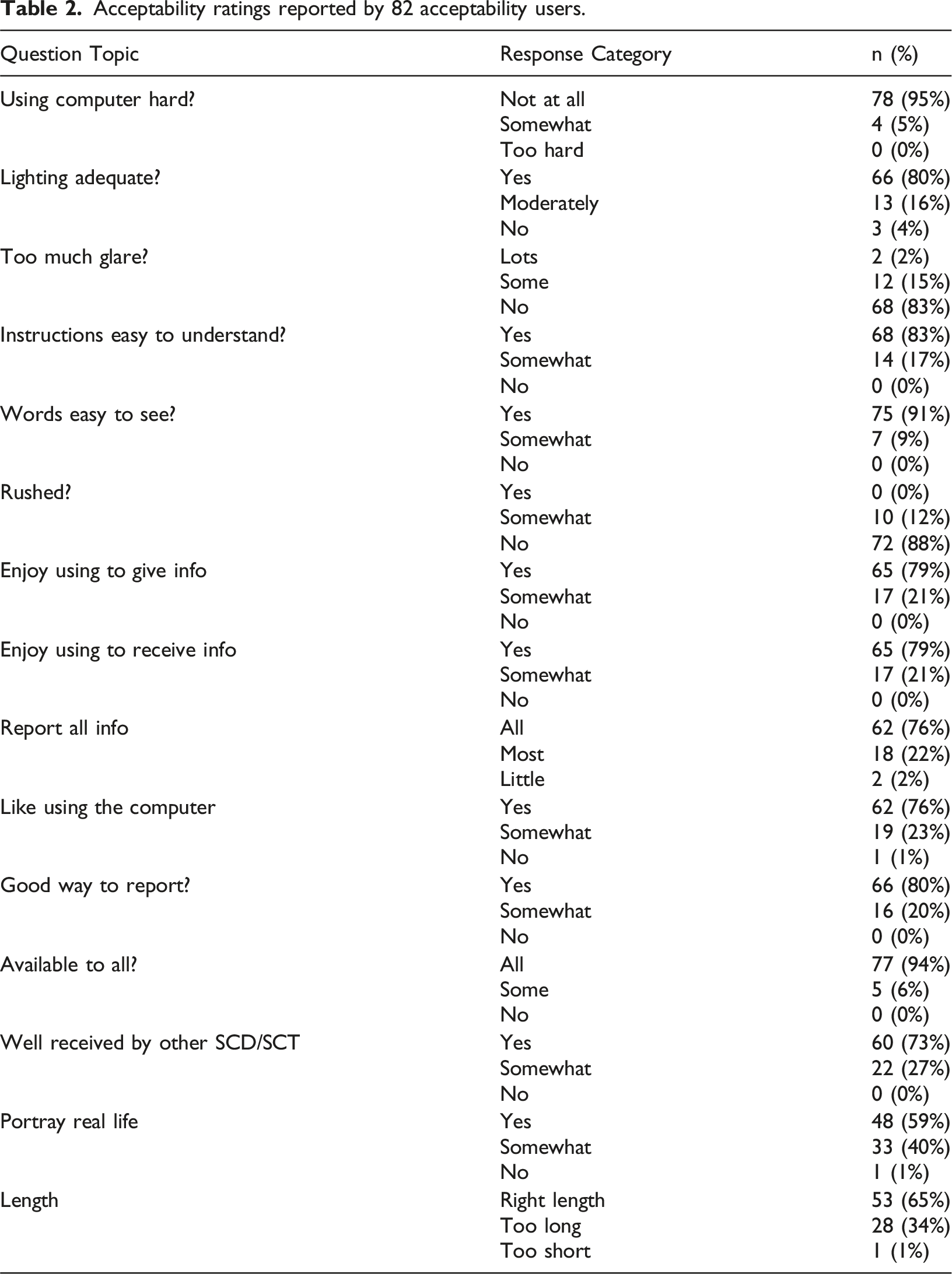
User Acceptability
Acceptability ratings reported by 82 acceptability users.
Discussion
The adequacy of the clinical team’s contribution to the revised graphical user interface was supported by the high proportions of the users who reported acceptability of the program. The inclusion of Black/African American and Hispanic young adults likely contributed to this success in updating the original CHOICES program, which was designed circa 2009. We were successful in modernizing several aspects of the original CHOICES user interface design that seemed outdated from a contemporary perspective. The navigation bar; cluttered design; skeuomorphic design; horizontally dominant layout; contrast, repetition, alignment, and proximity (CRAP) design, and virtual human narration were some of the design elements that drove this perception. We discuss these issues relative to contemporary user interface design principles and implications for successful user engagement with a lengthy program. Compared to the original version, the modernized CHOICES interface demonstrates clear improvements in visual hierarchy, navigation flow, responsiveness across devices, and usability. These changes, informed by user feedback and design theory, directly addressed participants’ perception of the earlier system as “dated” and contributed to the high acceptability ratings in the current evaluation.
Navigation bar
The navigation bar underwent a significant transformation, aligning with contemporary user interface design principles. Initially, the design featured a prominent top menu, typical of early 2000s websites. However, contemporary trends favor hidden side menus, a design feature adopted in the redesigned CHOICES login webpage. This adaptation aimed to enhance user experience by decluttering the interface and providing a more intuitive navigation system, which is crucial for engagement with the program.
The navigation bar is an organized list of the website’s main content, conveying the information architecture model of the web-based program.
13
Chen et al. pointed out that around the year 2000, typical designs featured very prominent navigation menus that occupied most of the left, top, and right areas of the page.
13
Figure 7 shows the login page for the original CHOICES website, with a large top menu, typical of that era. However, by the mid-2010s, most navigation menus were hidden, and that trend persisted over time. Figure 8 depicts the hidden side menu of the redesigned CHOICES login webpage, with Figure 9 illustrating the side menu open. Original Module Menu Interface (Pre-Modernization): Early version of the CHOICES module selection screen with non-responsive layout, limited visual hierarchy, and static navigation. This legacy design contributed to usability challenges identified by users. Modernized Login Page: Redesigned login interface with simplified layout, mobile compatibility, and updated security prompts. The clean design and improved flow reduce entry barriers and improve first-time user experience across devices. Redesigned Navigation Aid (Post-Modernization): New navigation aid using dynamic branching visuals and responsive layouts enhance clarity and reduce cognitive load.


Cluttered design
The redesign addressed the cluttered design prevalent in the original CHOICES website, which tended to lack minimalism and overuse colors and boxes, resulting in a visually busy interface. Early 2000s designs seldom featured simple color schemes and were typically not minimalistic, especially regarding white space use. 9 For instance, Figure 1 illustrates a sample page from the original CHOICES website that is heavily “boxed.” The top banner is enclosed by a light green box, and the main body of the page is surrounded by an orange box, with the entire page appearing to “rest” on a black background. This contrasted sharply with later design trends, which advocate for the heavy use of white space and embrace a sense of minimalism. Figures 3, 4, 8 and 9 depict samples of redesigned CHOICES pages that can be considered “less busy,” featuring more use of white space, in alignment with contemporary design trends. These adjustments enhance visual appeal and facilitate user interaction by reducing cognitive load. 9
Skeuomorphic design
The transition from skeuomorphic to flat design significantly improved the user interface. Skeuomorphism is a design approach characterized by elements imitating real-world artifacts or techniques that serve little or no actual purpose on the product in the new material. 10 Skeuomorphism was evident in the original CHOICES design, reminiscent of early 2000s design trends. However, the redesigned interface adopted a flat design approach, emphasizing minimalism and color, aligning with modern user interface design principles. 11 This shift enhances user engagement by providing a cleaner, more streamlined interface that is visually appealing and user-friendly. In the original CHOICES design, skeuomorphic elements, such as drop-shadows in the top menu and 3D images representing buttons like back and next at the bottom right corner of the pages, were observed. By the end of the 2010s, skeuomorphic design was replaced by ‘flat design,’ which utilizes minimalism and color to express the intentions of the user interface design. This flat design approach is reflected in the new design, where the back and next buttons are flat, and active buttons are highlighted in dark orange, while inactive buttons are gray (Figure 3).
Horizontally dominant layout
The redesign addressed the vertically dominant layout prevalent in the original design, which often necessitated vertical scrolling to access full content. Initially, the website featured pages requiring users to scroll down to view the entirety of the content. In contrast, contemporary websites commonly adopt a layout with a horizontal navigation bar, a large banner, the main content, and a footer from top to bottom. This horizontally dominant design, integrated into the redesigned CHOICES pages, eliminates the need for vertical scrolling, enhancing user experience by facilitating seamless navigation and access to content, in line with modern user interface design preferences. Since the late 2000s, many websites have embraced this layout to ensure users can access the most important content without the need for vertical scrolling. 9 Figure 8 depicts the side menu open.
Contrast, repetition, alignment, and proximity (CRAP) design
In addition to recognizing and aligning the CHOICES web application user interface redesign with current best practices, toward creating a new visual identity and design language, we applied Robin Williams’ well-known CRAP principle for website design. 14 Williams’ principles are widely utilized in U.S. college campuses to teach design. It states that for any visual design to be viewed as organized, unified, analytic, and professional, it must observe CRAP. 14
Contrast
When two elements are not identical in function, they should look and feel very different from each other, otherwise it may be perceived as a mistake. 14 With text, contrast can be achieved through font size, font family (e.g., serif, sans-serif), font weight (e.g., light, bold), style (e.g., normal, or italic), among other characteristics. However, this principle is also applicable to other elements such as buttons, and other user interface elements. Contrast can be used to separate different parts of a web page and aid the user in navigation.
Repetition
Styles and visual elements should be repeated across a page and across a website. This repetition can lead to a cohesive and consistent website. With CHOICES we adopted a consistent use of color throughout the site, including for the background. Similar page and section layouts were applied throughout the website, and the same treatment was given to images and graphics. This approach led to a consistent look and feel that increased the website usability since repetition allows a visitor to learn the page (or section) layout only once. 14
Alignment
Our minds like to imagine straight line grids when looking at things. 14 Users demonstrate a preference for equal distances, favoring symmetric spacing of elements and text. If elements are not aligned, they will be treated as different. For example, navigation bar text and body text are typically not aligned. Usually, they don’t have the same sizes or layout positions. This indicates to the user that they should be treated differently.
Proximity
Proximity (closeness of objects) can be used to group related items. 14 For example, the section heading must be close to the section text, figure caption close to the figure. Distance, however, can be used to visually separate unrelated items. For example, extra space before and after figures separate them from the text and other figures.
Although CRAP design principles provided the general theoretical scaffold that guided the redesign efforts, it is important to note that form is part of the content and cannot be separated from it. 15 Put simply, the redesign had to be mindful of the content and the target audience. To this end, the researchers also applied interaction design concepts. 16 In this process, the researchers identified and mapped the characteristics of the target “interaction heroes,” which are users with sickle cell trait or disease. A hero in interaction design is a person (or people) that can be described in detail. 16 This includes defining their name, age, their habits, lifestyle, socio-economic status, and even preferences. This mapping includes imagining when, how, and where the user will interact with the system. Is the user at home, work, or somewhere else? Is the user accessing the system with a desktop, laptop, or smartphone? Such details were defined to help the system design to connect with individuals, instead of designing for a “generic user”, as is so often the case in interaction design. 16 Our research team contributed expert lived experience and provided detailed information about the target population. Design elements such as font size, background colors, and the language implemented were driven by the interaction heroes defined early in the redesign process.
Virtual human narrator
The introduction of a virtual human narrator marked a significant advancement in user engagement. Online learning has become increasingly popular; however, users often prefer human interaction over interaction with computers and machines, perceiving computer-based training as boring. 17 To address this interaction, the redesign of the CHOICES user interface included a virtual human narrator for the content of the training simulation generated with Synthesia. 16
Synthesia is an AI video generation platform that utilizes Native Dubbing, an AI technique, to synchronize lip movements of a digitalized actor with audio or text scripts. The platform offers a wide range of human-look-alike virtual humans with different appearances. For CHOICES, a young Black virtual woman called Ruby was utilized, and a young Black voice actor was hired to narrate the text that appears in the CHOICES training webpages (Figure 10). Synthesia generated the virtual human narrator by having Ruby lip sync the voice actor’s narration. The virtual-human narrator was an optional add-on, providing users with the flexibility to choose whether to engage with it. This feature not only enhances user engagement and satisfaction but also streamlines content review processes, as any changes in the narrations can be quickly addressed without the need for new video recordings of a real actor, which is a much more complex endeavor. Ruby, a virtual-human narrator generated with the Synthesia platform.
The integration of AI and virtual human technologies in our intervention represents a significant advancement in digital health strategies. These technologies not only enhance user engagement but also hold promise in improving learning outcomes by delivering tailored information and behavior change strategies. Moving forward, exploring advanced AI capabilities and refining virtual human interactions could further elevate the effectiveness of digital health interventions, paving the way for broader applications across diverse health and educational contexts.
The use of a virtual human narrator offers several cognitive and behavioral advantages over static or purely text-based approaches. Research suggests that anthropomorphic agents can enhance perceived social presence, leading to increased attention, motivation, and retention of information in digital learning environments.20,21 In contrast to traditional voiceovers or static text, virtual humans can simulate interpersonal communication, reduce cognitive load, and support learner engagement through a sense of interactivity. 22 These features are especially important in health education, where emotional resonance and clarity of complex information can influence behavior change. 23 As such, virtual human narration in CHOICES was not only a design enhancement but a pedagogical strategy aimed at improving comprehension and trust among users.
Diversity and inclusion
The enhancements brought by the redesign reported in this manuscript also included aspects regarding representation for same-sex couples. These involved revisions aimed at enhancing inclusivity. By aligning participant identity options with National Institutes of Health recommendations and addressing genetic inheritance concerns, we aimed to ensure comprehensive engagement. Furthermore, the introduction of scenario questions on surrogacy and sperm donation for same-sex couples expanded the intervention’s relevance and applicability, fostering a more inclusive educational environment. Additionally, the use of narrated text through the application of virtual humans, captioned videos, among other elements help make the learning platform accessible to a diverse audience, catering to different learning styles and preferences.
Limitations and future work
Due to time and budget constraints, our approach was limited by the absence of formal large-scale usability studies with the target population. Instead, we leveraged our large multidisciplinary team, including lab members from the Media Effects and Technology Lab (METL) and the Virtual Experiences Research Group (VERG lab), many of whom shared characteristics with the target population. Our team also benefited from previous user-engagement studies, which included cognitive interviews focusing on each screen in the original intervention design. However, we recognize that not conducting large-scale usability studies or testing with individuals directly affected by sickle cell disease could limit our findings, potentially reducing their external validity. Despite this, it is important to note that the individuals who tested the system were mostly similar in age (around their 20s) and from the same country as the target users. This similarity and the high level of acceptability ratings from actual users support the validity of our findings and help mitigate potential biases or gaps in understanding the user experience and engagement with the developed website.
Although our study sample consisted primarily of Black individuals (94%) and females (76%), this demographic representation aligns with the project’s specific inclusion criteria and the epidemiology of sickle cell disease (SCD) in the U.S. The current work is part of a larger NIH-funded randomized controlled trial that targets young adults with SCD or SCT who are at risk of having a child with SCD. Given that 90% of individuals with SCD in the U.S. identify as Black, the composition of our sample reflects the actual user population for whom the intervention was designed. Therefore, testing the system with this population was intentional and appropriate for the study’s goals. Although this focus may limit generalizability to other racial or ethnic groups, it ensures high relevance and usability for those most impacted. Future work could explore how the CHOICES framework might be adapted for other genetic conditions and culturally distinct populations.
Future updates could include enabling the virtual agent to engage in active conversations with participants via voice and text. These capabilities have become feasible with the advancement and wider availability of generative AI and Large Language Models. In this context, participants could ask questions on demand and receive meaningful information as they complete the simulation, potentially enhancing its effectiveness. Additionally, a virtual conversational agent could provide tailored visual and textual content based on individual conversations. The virtual agents could also be customized for factors like skin color, ethnicity, and accent, which could increase user engagement and the overall effectiveness of the training simulation. To further improve the platform, we plan to conduct comprehensive usability testing. For example, eye-tracking analysis could help identify areas of interest, allowing us to enhance the layout of the simulation. Additionally, tracking users’ facial expressions could reveal emotions and non-verbal communication cues, helping us understand how different parts of the training simulation affect them. Information about users’ attention levels during the simulation could also be gathered. These methods would provide valuable insights into how users receive the content and guide further improvements.
To support future reproducibility, we have prioritized internal documentation of our modernization process, including decisions related to interface redesign and narrator integration. Although the intervention itself is currently restricted due to IRB protections and ongoing evaluation, we recognize the value of sharing implementation strategies and may explore opportunities to make aspects of our design or development approach available after the trial concludes.
Conclusion
Originally, our plan was to revise the program code so it would function on any device and browser and meet accessibility standards. However, we discovered the need to revitalize the intervention’s user interface aesthetics. We had to rebuild all database and underlying code to accommodate for the changes in the interface. This was necessary due to technical needs and the lack of previous proper documentation, which is not uncommon in developments motivated by research efforts. We developed and incorporated virtual human narration, included closed captioning for existing videos, added an interactive menu, and performed multiple iterations of testing to ensure the program was functioning as expected. Despite our previous belief that the updates would take only a few months, we soon discovered our anticipated timeline required three times as long.
One of the key learnings from our redevelopment process is the importance of proper documentation throughout the development cycle. The lack of comprehensive documentation significantly extended our timeline as we had to rebuild the database and underlying code. Therefore, we recommend that researchers or professionals undertaking similar updates to digital health interventions prioritize documentation from the outset to streamline future development processes and reduce potential setbacks.
Once the technology update was complete and the intervention was ready for participant engagement, we began recruiting and enrolling young adults with SCD or SCT who are at risk for having children with SCD and would like to avoid the risk. Now technologically modern and adherent to contemporary user interface design principles, we expect that our online reproductive education intervention will empower these individuals by providing them with the knowledge and behavior strategies necessary to implement their parenting wishes.
Beyond its immediate target audience, the updated intervention has the potential to make a broader impact in the field of digital health interventions. The modernized technology and design principles utilized in our intervention can be applied to various health and educational contexts. For instance, similar approaches could be adopted to develop online educational programs for other health conditions or to deliver health information and behavior change strategies to diverse populations. The integration of virtual human narration and interactive features can enhance user engagement and learning outcomes in a wide range of health and educational settings.
To ensure the ongoing effectiveness and relevance of our intervention, we have implemented mechanisms for collecting user feedback post-launch. We utilize a combination of surveys users complete in the end of the study to gather insights into users’ experiences, preferences, and suggestions for improvement. This feedback will be carefully analyzed and incorporated into iterative updates and refinements of the intervention.
Although our approach faced limitations, such as the absence of large-scale usability studies, we made significant strides in modernizing the technology and design of our intervention. We relied on feedback from our multidisciplinary team and representative cognitive interviews, which provided valuable insights. Future updates should consider integrating advanced AI capabilities, such as virtual agents for real-time, personalized support, and conducting extensive usability studies with a diverse population to further validate and enhance the intervention’s effectiveness. This approach aligns with current trends in digital therapeutics, where AI-mediated tools are increasingly used to support health behavior change and improve engagement.18,19
In terms of long-term feasibility, the modernization of CHOICES may offer cost-effective pathways for revitalizing other legacy digital health tools. Although the initial redevelopment required more time and effort than anticipated, the use of scalable technologies—such as responsive frameworks and modular AI narration—enables future adaptations with lower marginal costs. The virtual human narrator, for instance, reduces the need for repeated filming and production, allowing for faster, more affordable content updates. Future work should include a formal cost-effectiveness analysis to quantify the investment relative to user outcomes and explore how this modernization framework could be scaled to other interventions targeting different health conditions.
In conclusion, despite some limitations and challenges, our intervention has achieved considerable progress in technology and design. We are optimistic that with continued development and user feedback, our intervention will significantly impact the lives of young adults at risk for having children with SCD, empowering them with the knowledge and tools they need for informed decision-making, while also offering potential applications in broader health and educational contexts. Moving forward, we anticipate that our intervention will lead to improved health outcomes and increased awareness, thereby contributing to the growing body of knowledge on updating and enhancing digital health interventions.
Footnotes
ORCID iDs
Ethical approval
The Institutional Review Board at the University of Florida approved the CHOICES study and the developmental work reported in this article (IRB201803021). At this stage of the study developmental processes, patients were not involved. In the randomized controlled trial of the CHOICES intervention, all patients and individuals with sickle cell trait will give written informed consent (Clinical Trials. gov: NCT05292781).
Author Contributions
Contributed to the project conception and design: AGS, YY, AG, SK, DJW. Obtained funding: YY, AG, SK, DJW. Collected and analyzed data: BD, DG, TR, GT, AR, YY, SK, DJW. Performed design and programming tasks: AS, AL, RG. Wrote Manuscript: AGS, GMG, SK, DJW.
Funding
The authors disclosed receipt of the following financial support for the research, authorship, and/or publication of this article: This research was made possible by Grant Numbers NIH/U54HL090513 and NHBLI/1R01HL114404 from the National Institutes of Health (NIH), National Heart, Lung, and Blood Institute (NHBLI) and Grant Number NHGRI/1R01HG011927 from the National Human Genome Research Institute (NHGRI). Its contents are solely the responsibility of the authors and do not necessarily represent the official views of the NIH, NHLBI or NHGRI. The final peer-reviewed manuscript is subject to the National Institutes of Health Public Access Policy.
Declaration of conflicting interests
The authors declared no potential conflicts of interest with respect to the research, authorship, and/or publication of this article.