
Abstract
In caring for patients with sepsis, the current structure of electronic health record systems allows clinical providers access to raw patient data without imputation of its significance. There are a wide range of sepsis alerts in clinical care that act as clinical decision support tools to assist in early recognition of sepsis; however, there are serious shortcomings in existing health information technology for alerting providers in a meaningful way. Little work has been done to evaluate and assess existing alerts using implementation and process outcomes associated with health information technology displays, specifically evaluating clinician preference and performance. We developed graphical model displays of two popular sepsis scoring systems, quick Sepsis Related Organ Failure Assessment and Predisposition, Infection, Response, Organ Failure, using human factors principles grounded in user-centered and interaction design. Models will be evaluated in a larger research effort to optimize alert design to improve the collective awareness of high-risk populations and develop a relevant point-of-care clinical decision support system for sepsis.
Introduction
Sepsis is a spectrum of organ dysfunction induced by infection 1 with increasing incidence2,3 accounting for a total of US$20 billion in US hospital costs in 2011.4,5 Current public perception of sepsis is low, as 88 percent of Americans have never heard of sepsis, 6 even with a high estimated mortality rate of 25–30 percent. 7 Multiple scoring systems have been derived and validated with the purpose of quantifying illness severity associated with sepsis and the probability of various outcome measures. Standardized in 1991, the original conceptualization of sepsis hinged on two of the four Systemic Inflammatory Response Syndrome (SIRS) criteria. These definitions, focused solely on inflammatory excess, were challenged due to a lack of specificity and clinical utility.8–10 The Sepsis Definitions Task Force’s current definition of sepsis is no longer based on SIRS criteria, but instead based entirely on the objective existence of acute organ dysfunction as a downstream marker for the (mal)adaptive host response to infection. 5 The evolution of risk stratification measures provides opportunities to further evaluate quantified organ system dysfunction as a quality improvement strategy for early sepsis detection. This research evaluates the utility of alert design for two sepsis staging models: quick Sepsis Related Organ Failure Assessment (qSOFA) 5 and Predisposition, Infection, Response, Organ Failure (PIRO). 11
Clinicians are in need of improved electronic health record (EHR) alerts as clinical decision support (CDS) tools 12 to assist in early recognition of sepsis to combat high mortality rates. 5 Time pressure, competing demands, and ambiguous alert design reduce a user’s opportunity to detect signals in the face of “noise” and may lead to inadvertent confirmation bias. As a result, CDS developers, designers, and users aspire to improve alert management to achieve better acceptance rates and improved care delivery. Currently, there are a wide range of alerts for sepsis in automated electronic sepsis alert systems within various clinical settings,13–21 including alerts that integrate organ failure assessment scores and general severity scores; 22 however, there remains a lack of evaluation and assessment of these alerts, specifically on clinical preference.23,24
Compiling patient demographic and health information in a medium that affords rapid and accurate analysis to identify tailored treatment solutions, and delivering this information to the clinicians at the point of care can transform treatment. Unfortunately, many EHRs suffer from poor usability—providers struggle to use these systems efficiently, effectively, and safely. In response, we proposed to develop a framework to optimize EHR alert design to target sepsis 25 in line with human factors research best practice recommendations for the design of clinical reminders. 26 To determine how to best provide a sepsis alert to facilitate decision-making in the healthcare environment, we assessed the interaction of clinicians with health information technology (health IT) and the impact of CDS by controlling two design aspects: (1) how clinical information is displayed and (2) the level of content provided.
Methods
We developed four graphical model displays using two visual display types (text display and figure display) and two levels of content where level of content refers to the number of components required to calculate the score (PIRO representing high level and qSOFA representing low level). Display model prototypes were developed in Pencil, an open-source prototyping software (Evolus Co., LLC, Newport Beach, CA, USA). In the design of these displays, we considered the requirements of users performing the task and evaluated the impact of cognitive biases, usability, human factors principles, and user-centered design. All designs were created and intended for use by hospital staff, specifically on the general medical and surgical floor.
Results
The Figure Display Alert was designed using an adapted treemap to visually display a large amount of hierarchical data in a rectangular shape. 27 Treemap is a type of visual display described as a space-constrained visualization of hierarchical structures. This design is able to correlate a square’s size to possible point value, while still being able to indicate missingness, individual data elements, and raw values. The Text Display Alert was developed to appear similar to initial presentations of the original PIRO 11 and qSOFA 5 depictions. Both alerts will display an integration of a sepsis staging system with associated mortality rates. For both figure and text display, following general design considerations were used:
Physical organization. A convention for informational alert displays in healthcare is to frame the key clinical details with two blocks of standard information: patient demographics on top and a summary message with context at an appropriate level of severity at the bottom.28,29 It is particularly important to place routinely seen critical information such as patient name and triage admission time at the top of the alert where users can orient and re-orient to it easily. Negative space of the display should be taken into consideration of the display, to ensure users can digest information in manageable chunks without excessively separating related information. The use of negative space will also assist users who may be confused by physical separation of concepts, especially within the individual components of PIRO.
Visual cues and consistency. Fonts, colors, and placement of words that indicate meaningful outcomes need to be identical across displays for faster understanding. 30 Alerts should be displayed similarly, framed with a top and bottom box, and both displays (text and figure) require the same information.
Font size and typeface weight. Typeface weight is the thickness of the letters that can be expressed normal, bold, and so on. Font size and typeface width should be used in a clear and simple hierarchy to indicate the organization of content and reinforce differences in salience. Text at the same hierarchical level is recommended to have consistent size and typeface weight. Font should be appropriately sized for users to read a display and its components,29,30 and typeface width should be consistent throughout displays.
Color. A limited, clearly distinguishable palette of colors is recommended to fill space in a graphic. Both text and fill colors should be selected to establish good contrast, facilitating readability of text. 29 It is particularly important to select salient, standard-following and consistent colors when indicating alarm.
Three-dimensional (3D) effects. In development of the displays, and in consideration of the user, 3D effects were considered for texture for color-blind users, as well as to help users interpret when elements have been reached. 28
Text displays
The text display for PIRO (Figure 1(a)) provides a list of important variables that could be applied at the bedside, 11 based on a total of 33-point scale. Each part of the PIRO acronym contains a different list of variables within the “P score,” “I score,” “R score,” and “O score.” qSOFA (Figure 1(b)) is based on a total of three points: systolic blood pressure, altered mentation, and respiratory rate. Variables are displayed in no prioritization to severity. The display layout ensured that the most important information was placed in a prominent position to ensure it is seen31–34 and consistent with left to right reading comprehension in the English language.35–37
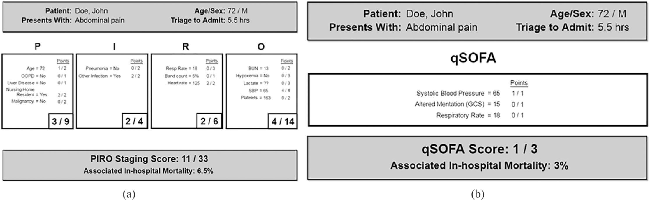
(a) PIRO text display and (b) qSOFA text display.
Physical orientation. P, I, R, O components are displayed in separate boxes under their acronym heading, with small negative spaces between each box to allow separate consideration of each heading. For qSOFA, components are presented in a single group, since separating three components would needlessly dissipate user attention. Critical information and total score and associated in-hospital mortality are at the top and bottom to frame the displays.
Font size. P, I, R, O labels are the largest to help users orient themselves. Summing scores are the next largest, emphasizing the scoring results for each heading and total score. Detailed scoring criteria are smallest, though still of legible size, cueing users to understand the availability and role of this information. The users are left with the task of understanding and prioritizing on text-based forms and rubrics.
Color. Light gray was selected for ease of text visibility within the text model, limiting the color palette to background, one fill color, and one text color.
Figure displays
The figure display (Figure 2(a) and (b)) presents the same information as the text display, illustrating each score component by letter. The alert is coded using colors, helping clinicians recognize patterns and exceptions, and making it quick and easy to identify if a patient’s condition has exceeded the associated thresholds. Over time, the clinician may associate certain patterns of the figure display alert with deterioration, using “at-a-glance” interface design.34,38 The treemap design is strictly proportioned to match the score weight of each variable contributing to the calculation and does not contribute to misleading comparisons that may be caused by bar graphing score dimensions of unequal weights.
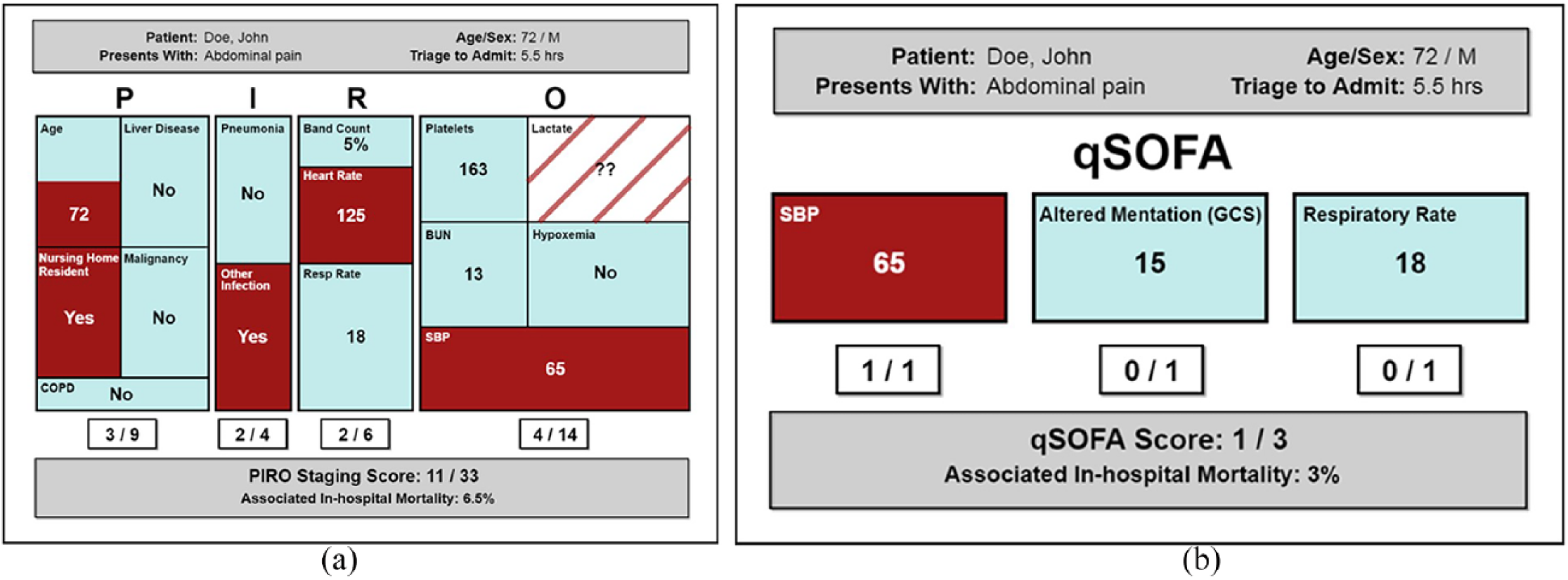
(a) PIRO figure display and (b) qSOFA figure display.
Physical orientation. This figure display follows the conventional vertical progression, compact for screen economy, but also has physical separation of concepts so that users may focus on one aspect at a time.29,38
Visual cues and consistency. All design aspects are standardized to help users perceive the designs between the text and figure. 3D effects were not included in figure display as they interfered with ability to perceive area in the treemap. 39
Font size. Typeface weights were consistent and clearly legible. P, I, R, O labels are the largest to help users orient themselves. Granular data and summing scores are of comparable size to allow users to pay attention to detail, the overall summary, or both according to preference. Health data labels are smallest as they are the most predictable and unchanging aspect of the display.29,30
Color. A dark red was used to indicate potentially alarming data that give cause for concern regarding sepsis diagnosis. In the figure display, this allows the user a glancing assessment of threat seriousness.29,30,40 Three colors were used: dark red for components that reached the threshold, muted blue for data that did not meet threshold, and gray to differentiate the patient demographics and summary score boxes. Missing information deserved special user consideration because it signifies incomplete diagnostic information, but not too much emphasis, which could detract from the display’s overall message. Missing data are shown with a fill color, the same color as the background, to indicate that it neither meets nor does not meet the threshold, and contains stripes to facilitate users’ perception that this information might be potentially concerning. Green color for non-threshold crossing components, considered during development, was not selected because it implies “safe” for users. 41
Discussion
Human factors principles, standards, and guidelines provided considerations for the design of text and figure displays. Traditionally, alerts are system components that serve to direct a user’s attention to information related to some parameter which has been exceeded. 42 Newer alerts, however, have advanced to the point of becoming a “type of automation that supplements the human powers of observation and decision.” 39 Alerts amplify the capacity of clinicians to continuously monitor changes in patient status and thereby support timely intervention. The purpose of an alert is to prompt an operator action, but poor alert system design has been a contributing cause of adverse events in numerous healthcare systems worldwide. The appeal of access to a large amount of clinical data must be balanced against the real possibility of information overload. Research demonstrates that medical displays are often incompatible with practitioners’ workflow and unnecessarily fragment patient information. 43 Information is often spread across multiple tabs and locations that require piecemeal information search and acquisition. This may confound practitioners’ ability to detect evolving changes, make it more difficult to attain a holistic view of a patient’s health state, lead to care inefficiencies, and frustrate clinicians. Recognizing limits on human working memory, clinicians need external automated information systems to support early detection of patient deterioration and improve timeliness of therapeutic response.
The timeliness and efficacy of clinical interventions may be enhanced with improved alert displays. Alert and warning complexity is especially prevalent in health IT. Despite this issue, there is little consensus on how alerts should be generated and displayed to the user41,44 as well as what level of interaction is appropriate. Future research will evaluate these four alert displays using realistic patient data in an EHR test environment. Novel analysis of the association between provider-, system-, and patient-level data on provider performance and preference will provide evidence-based principles and actionable design recommendations to develop a relevant point-of-care CDS system for sepsis. Usability testing in simulation using test patients and real cases will determine the value of each display model in the context of sepsis severity based on clinician response.
The intent of this work was to develop the models that will be used in future work to solicit performance and preference from clinicians. In this planned study, we are comparing two sepsis severity scores selected as a starting point based on the level of information provided. This could be expanded in the future to evaluate the impact of different severity scores. The design aspects, how clinical information is displayed and the level of content provided, are independent of additional considerations like why score elements are missing and how to measure the impact of missing information on display design. Finally, our work does not consider the impact of the complex clinical environment or unique clinical environments (emergency department versus intensive care unit) on display design and clinician response. These complexities and variances may impact user preference and graphic display design requirements. The visual display models discussed in this study are tailored to clinicians with the goal to better equip clinicians to understand their patients’ data through feature extraction and visualization embedded with different asynchronous alerts. Future studies include considering the impact of clinical environment on display design, and comparing additional scores besides PIRO and qSOFA, to alleviate the limitations of this study.
Footnotes
Declaration of conflicting interests
The author(s) declared no potential conflicts of interest with respect to the research, authorship, and/or publication of this article.
Funding
The author(s) received no financial support for the research, authorship, and/or publication of this article.