
Abstract
Introduction
Mood disorders such as anxiety and depression have increased by around 25% worldwide since the COVID-19 global pandemic, with young people being disproportionately affected. 1 However, only about 20% of young people experiencing psychological distress receive professional help.2,3 Stigma, embarrassment, low rates of mental health literacy, high costs and a lack of available services are among the reasons why so many young people remain without professional support. 4
Digital resources such as smartphone apps offer one possible solution to the low rates of help-seeking behaviour in young people. 5 Indeed, many young people report a preference for digital forms of support over face-to-face help when experiencing psychological distress. 6 Digital mental health interventions can be highly effective, 7 however, a key challenge is to make such interventions engaging, particularly to young people who are reluctant to access professional services. One systematic review 8 found that many currently available digital mental health interventions are not appealing to young users, with engagement rates as low as 10% 9 particularly in males. 10
The importance of aesthetics to digital engagement is well-established in the literature. Van der Heijden 11 found that visual attractiveness positively influenced perceived usefulness, ease of use and enjoyment of websites. More recently, Oyibo and Vassileva 12 found that the aesthetic appeal of a fitness app was strongly related to the use of persuasive features within the app such as goal setting and monitoring. In relation to health apps it has been found that apps which look sleek and modern, and that use vibrant colours and bold graphics are more likely to pique the interest of users. 13
Models of visual aesthetics in digital design propose a number of dimensions including lines, shapes, colours, and textures. 14 Colour is an important aspect of visual design, and many studies have investigated the appeal of particular colours in digital materials. Colour has three key properties: hue or shade, (e.g., red or yellow); the saturation or lightness/darkness of the colour; and the intensity or brightness of the colour. Hue is determined by the dominant wavelength of the light reflected by the object, while saturation refers to the amount of white light that is mixed with that hue, and brightness relates to the intensity of the light energy reflected by the source. Strong contrasts in hue and saturation tend to cause saccades (rapid scanning movements of the eye) and are therefore central to drawing visual focus 15
This tends to be confirmed in marketing studies. For example, Wang & Li 16 investigated how colour used in app icon design affected the number of downloads of the app. They found that apps with highly colourful icons containing high levels of brightness had the greatest number of downloads in a Chinese market.
Other studies report that websites using blue tones with medium brightness and medium and high saturation were rated as more aesthetically pleasing by users. 17 Such preferences can differ between genders, with one study using Twitter data finding that males tend to prefer blue tones and darker colours more than females, while females like magenta more than males. 18 Other studies have suggested that colour preferences differ according to context. 19
However, when considering the design of digital interventions on mental health, it is important to consider not only visual appeal but the possible impact of colour and other design features on emotions, mood and wellbeing. As with sound, response to colour involves both biological and cognitive processes. 20 Biologically it is believed that perception of colours is important for survival purposes. For example, red can signal aggression, since testosterone surges and increased blood flow can lead to a visible reddening of the skin.21,22 Thus studies have demonstrated that red light can stimulate the heart rate while blue light lowers it. 23
Emotional response to colour is also linked to cognitive associations and culturally acquired meanings. 24 Through repeated pairing, colours can come to be associated with particular meanings, therefore taking on a semiotic function. 20 The colour blue has been found to be highly associated with sadness, for example, while lighter colours like white, pink and yellow are associated with more positive emotions. 25 Visual artists may thus use colour to symbolise particular emotions such as by using subdued hues and tones like grey to symbolise a low mood or depression. 26 However, these meanings tend to be context-dependent, and therefore highly heterogenous. 27 Red, for example, can represent both anger or romance depending on the context.
The influence of colour on wellbeing has been investigated in a number of contexts. For example, lighting with high colour temperatures such as yellow, red and orange has been found to reduce fatigue and improve wellbeing in shift-workers. 28 Other studies have suggested that green can be effective in reducing stress because of its association with nature and healthy environments. 29 Given the importance of colour to both aesthetic appeal and emotional response, this is an important design feature to consider in the development of wellbeing apps. However, the semiotic value of colour in the context of mental health apps for young people has not been extensively researched thus far.
Furthermore, evidence suggests that young people with depression may respond to sensory stimuli differently to other people. For example, research has shown that when experiencing low moods, people often avoid music that is energetic, preferring sad-sounding music despite the fact that it may have a negative effect on their mood.30,31 This may be because of differences in sensory processing in depression and a tendency to sensory avoidance due to cognitive and sensory overload. 32 It is possible that the same principles apply to visual design and that use of particular colours or compositions may be overwhelming to users with pervasive low moods. However, this has not previously been explored in the context of visual design.
In this study we aim to investigate the associations that young people make between aspects of visual design such as colour, and emotions and mental health in the context of app development. MoodyTunes is a smartphone app which has been developed using a co-design framework to help young people learn how to use music to effectively manage their moods and to increase their mental health literacy. An initial prototype of the app was developed through a series of focus groups and co-design workshops with young people. However a usability study of this early iteration found that, although young people liked the concept of a music-based app for mental health, the aesthetic design lacked appeal. 33 The current study therefore reports on a series of workshops with young people that sought to explore issues of design aesthetics, and in particular the role of colour in a mental health app.
Methods
Study design
Focus groups and workgroups were conducted with young people to allow an in-depth examination of shared meanings and synergistic idea generation while allowing individual perspectives and ideas to be heard. 34 A general inductive approach was taken as described by Thomas, 35 in which findings were data-driven rather than based on prior hypotheses but were not designed to generate theory as in other inductive approaches such as grounded theory. We were also influenced by principles of practice-led research in that creative outputs formed part of the iterative and inductive process designed to elicit understandings of how design elements were received by participants, 36 which in turn informed development or modification of designs that were presented to subsequent groups.
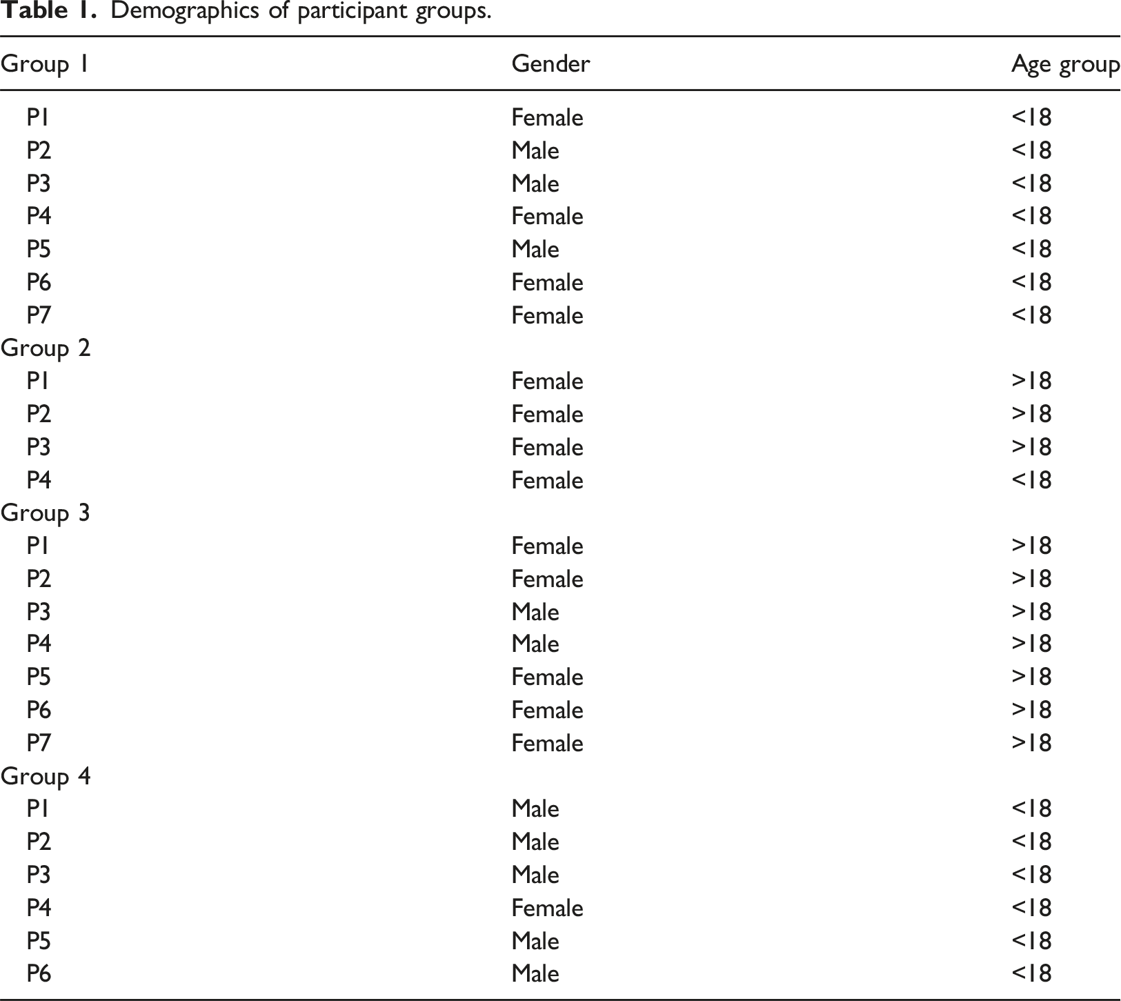
Participants
Demographics of participant groups.
Procedures
Ethics approval was obtained prior to commencement of the study from the Western Sydney University Human Ethics Committee (Approval number: H14544). University students were recruited via an internal study recruitment system (n = 7, Group 3) and were offered course credit for participation. Other participants recruited via social media or mailing lists of people who had previously expressed interest in being involved in research were offered a $AUD30 digital voucher for participation. Some snowballing took place within the recruitment process, with some participants inviting others to join the study. Potential participants contacted the researchers and were screened for eligibility via email. Eligible participants were emailed an information sheet and provided written consent, with participants under 18 years of age also providing parental consent.
Participants attended an online discussion of approximately one hour with the first author, a female researcher with a PhD working as an academic in a University, who has been the lead researcher in developing MoodyTunes. No one else attended the sessions other than the participants and researchers. Sessions were conducted using Zoom. Some of the participants were known to each other, however none were known to the group facilitator prior to the commencement of the discussion. Participants were reminded that they were free to withdraw from the study at any stage, and that they were also free to have their camera either on or off according to preference. Sessions were recorded using in-built Zoom functioning.
Materials
Powerpoint slides were used within Zoom using the ‘Share screen’ function to display screenshots of the MoodyTunes prototype. An overview of the app and its features were firstly described to participants. Screenshots of various currently available mental health apps and new design ideas for MoodyTunes were then used to elicit feedback about visual design preferences. Images of new design ideas evolved iteratively over the progress of the groups so that the final group reviewed design ideas that had been created based on feedback from earlier groups. Screenshots included visuals of a number of features including emergency health resources, mood rating icons, graphs for displaying mood over time and examples of gamification. A broad discussion guide was used to stimulate conversation about colour and other design features and their relationship to mood and wellbeing. However, conversations were allowed to proceed naturally on the basis of participant responses, with the facilitator taking particular care to draw out divergent perspectives.
Data analysis
Workshop discussions were transcribed verbatim using the inbuilt Zoom transcription tool which was then checked for accuracy against the recordings. Thematic analysis was then performed to determine broad themes. Initial coding was conducted independently by two of the authors in Microsoft Excel in order to generate discussion and develop an initial coding framework. Discussions were held between the two authors regarding any areas of disagreement in their coding in order to reach agreement upon the most accurate representations of the data. Once 100% consensus was reached between these two authors, a second wave of analysis was performed in a collaborative and iterative process between several authors with constant reference to the data, to refine the coding framework and begin to connect and organize the data into themes and subthemes. Given this process for ensuring reliability in the coding which emphasised reaching a state of consensus between all authors, inter-rater reliability was not calculated. 38 In the final phase of analysis, data was clustered into three higher order themes with subthemes (see Table 1). Memos were also taken throughout coding about group dynamics during the focus groups to provide insight into ideas that provoked conflicting viewpoints or broad consensus. 39 Notes taken by the group facilitator during the workshops also formed part of the data.
Results
Themes and Sub-themes.
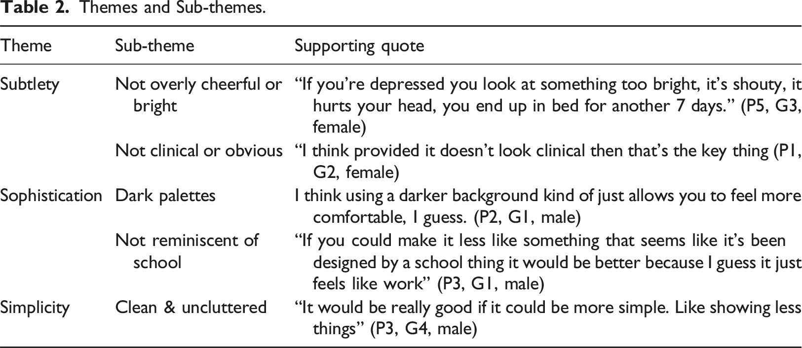
Subtlety
Participants associated colours with high levels of saturation and brightness with fun and cheerfulness, with a few participants expressing a preference for this. For example, one participant commented about a particular design: “It is colourful and it feels slightly nicer to look at, more fun and that makes it a little more appealing” (P1, G2, Female). She observed that a colourful look could make it “look at least vaguely positive in the app even if you’re not feeling that in person” (P1, G2, Female).
However, others noted that the use of colour needed to be subtle in order to avoid over-cheerfulness. One participant said: “Don’t make the whole thing too bright. Some elements of colour, but not like making the whole app too bright” (P3, G2, Female). This participant reported battling with depression for many years and describe how overly bright colours could affect her when in a low mood: “I get the idea of darker colours being gloomy. But I think if I were choosing, I want to use something that’s not going to hurt my eyes and remind me that I’ve been wasting away in my bed for seven days unable to get up. If you’re depressed you look at something too bright, it’s shouty, it hurts your head, you end up in bed for another seven days.” (P5, G3, Female).
Others agreed with the idea that too much brightness of colour was unappealing, saying: “I also sometimes find with some apps or depression talks and stuff like that they’re kind of almost sometimes overly happy and that can make you a bit uncomfortable. I think a darker background kind of just allows you to feel more comfortable” (P2, G1, Male)
Other participants similarly evinced a preference for subtle use of colour: “I guess a softer colour scheme. The first one is just a bit too sharp with its colours” (P3, G4, Male).
For some participants, hue was also something that needed to be used with subtlety, especially given the fact that the app was for mental health. When commenting on an example that was presented to participants, one person said: “It looks very much like the emergency app they’ve actually got for phones from the government… As soon as you go in it’s all this red and white and it’s really quite aggressive” (P1, G2, Female). Other users agreed that red, in particular, lacked the necessary subtlety, “I think you have to be careful that what people would see isn’t a harsh red, or it doesn’t look confronting.” (P3, G2, Female). In contrast, when presented with screen shots of a MoodyTunes design idea, one participant stated: “What I do really like is in fact the colours you use don’t feel like it’s medical, clinical. It doesn’t feel like there is something wrong” (P1, G2, Female).
Others suggested that a more subtle look also made the app appealing because the user wouldn’t have to worry about other people noticing it on their device. One participant said, “Maybe having colours that are either used by other apps or look similar to other apps just means that you’re not having to worry about opening it and suddenly you know very clearly a mental health app is popping up” (P1, G2, Female). This was noted as a drawback in other mental health apps and websites, “The reachout.com ones are all yellow and blue and as soon as you open them it’s very, very clear” (P1, G2, Female). While some participants expressed a liking for blue designs that were presented to them, other participants also noted that blue could be too closely associated with ‘feeling blue’ or sadness. “I think your idea of keeping it colours that aren’t associated commonly with sadness or anger could be good” (P3, G2, Female). In contrast, participants suggested using colours such as green, purple or pinks, or gradations of colour since they tend to be more neutral and to match other popularly available apps.
Sophistication
In addition to a subtle use of colour, both male and female participants also expressed a strong preference for designs that used dark palettes. Low levels of brightness in the colours used tended to be associated by participants with a sophisticated look, “I definitely like the darkness of the one on the right” (P4, G3, Male), “I like the dark background” (P3, G4, Male). For several, use of a darker background, enhanced the contrast of other colours, “I guess it makes the colours pop more as well” (P1, G1, Female).
Apps such as Spotify were appealing to users because of this dark, sophisticated and modern look, which contrasted with other digital platforms such as Google classroom which tended to have white backgrounds and bright colours. Thus, several participants appeared to associate white backgrounds and basic colours with school or apps for younger children: “I’ve noticed whenever we have a seminar at school they always do have very bright colours. Mostly the slides will be white with obviously the brand’s logo and usually that logo is either blue or quite a popping colour compared to the rest of say something like Spotify which is darker. I actually like Spotify” (P3, G2, Female). “The far left one, it does kind of look like a Google classroom. I think if you could make it less like something that seems like it’s been designed by a school it would be better because I guess it just feels like work” (P3, G1, Male).
Another similarly stated, “There’s a lot of apps these days especially for our age. We’re drawn to them because they look modern and quite eye-catching” (P2, G1, Male). While some element of uniqueness was considered important, making the app similar in design to other popularly used apps was also perceived as increasing appeal and accessibility, “It’s the exact same colours as Messenger, Instagram and Binge. I think it’s just quite accessible because I’ve already got those other apps on my phone” (P2, G2, Female).
Simplicity
An additional element of the sophisticated and subtle look that participants expressed a preference for, was simplicity of design and a lack of clutter. In response to various design ideas they were presented with, participants noted, “You could have it a bit cleaner I think” (P2, G1, Male), or “I think the first is just better because it’s just less complicated and cleaner” (P1, G1, Female).
Simple designs were appealing not just for aesthetic reasons, but for ease of comprehension. In response to a more complex design one participant stated, “It made me dizzy just looking at it” (P3, G2, Male). Another said, “The bottom right-hand corner one is really simple. It’s really clear, unlike the other top hand left corner one which looks like a stock market to me” (P3, G4, Male). Another participant summed this up by saying, “Maybe less is more, maybe simpler is better” (P5, G3, Female).
Discussion
This study sought to investigate how colour and other elements of aesthetic design influence mood and wellbeing in a mental health app. Participants expressed the need for subtlety, both in use of brightness and intensity of colour, and in the hues selected as a visual expression of the app’s purpose. They expressed a preference for dark palettes and sleek, sophisticated looks, with a clean, uncluttered, and simple aesthetic.
Of particular interest in these findings, is the way colour and design could interact with mental health. While cheerful, bright colours might seem to be appropriate in an app designed to improve mood, participants pointed out that the conflict with their current mood could be jarring, even causing physical discomfort. These findings are similar to those in research about other aesthetic experiences such as music listening. Studies in music psychology have found that young people are often attracted to music which tends to match their mood when feeling depressed, while more upbeat happy music can make them feel worse.31,40 Nevertheless, there was some recognition among participants that dark colours could be gloomy, and that use of subtle colour against darker backgrounds might provide a middle ground. This again, is similar to research in music psychology which suggests that music that is somewhat sad sounding but which transmits positive and hopeful messages is most effective in improving mood. 41 Thus, developers of digital mental health interventions need to be aware of avoiding overly intense colours especially in materials being designed for people experiencing severe episodes of depression.
This subtlety needs to also be applied so that the design does not overtly advertise the fact that it is an app for mental health. While in some cases - such as that of apps that provide emergency contact with health services - an attention-grabbing design might be desirable, discretion may be more important where the target market is users who are sensitive about privacy. Relatively low numbers of affected youths access professional mental support services,2,3 with perceived social stigma and embarrassment being a significant hindrance to help seeking behaviour. 2 Therefore, for many in this demographic, a design that is unobtrusive and that may blend in with other commonly used apps may be important.
Participants in this study suggested particular hues that they felt were more neutral, such as pink, purple and green, and strongly suggested avoiding colours commonly associated with negative emotions such as red or blue or overly cheerful colours such as yellow, a colour generally associated with joy. 42 Blue is commonly associated with ‘feeling blue’, although being a generally well-liked colour, 43 and participant viewpoints on this colour were somewhat mixed. Other studies have proposed, as did the participants in this study, that colours such as green are perceived as friendly and not as confronting as colours such as red. 44
In the case of the current study, colour had a semiotic value that was highly influenced not only by commonly understood meanings but also by the context of mental health in which it was being discussed. Participants reported a nuanced relationship between colour and mood, that encompassed other apps such as Spotify as a reference point or modulating factor in preferences, as well as experiences with other mental health apps. This harmonises with theories such as Kress and Van Leeuwen’s 45 who argue that colours and colour schemes can come to represent a cultural ‘grammar’ which differs in meaning for different groups based on their shared experiences and perspectives. Young people in our study were influenced by their experiences of mental health issues, their perceptions of other apps both for mental health and otherwise, and also by their understanding of how other people in their social groups would derive meaning from colours used. This highlights the importance of co-design principles in mental health apps rather than generalising from broad understandings about colour and design taken from studies in marketing or about health apps with other populations and in other contexts.
The need for simplicity is not uncommon in research regarding app design, and in digital mental health interventions more specifically. Theoretical models for developing eHealth materials such as the Technology Acceptance Model have emphasised the need for simplicity for ease of use and user engagement 46 and multiple studies have shown the importance of simplicity to reduce cognitive load in people with mental illness and to drive long term use.47–49 Visually simple materials can be processed more fluently 50 and are therefore particularly valuable for people experiencing the reduced motivation and impaired concentration inherent in depression.51,52
Despite the appeal of simplicity, participants did not want designs that looked child-like or were reminiscent of educational platforms, preferring a sophisticated and contemporary aesthetic such as is found in apps like Spotify. This is in harmony with other studies that have also found that young people feel strongly about not using apps that seem ‘cartoonish’, 53 or feeling ‘talked down to’ due to their age. 54
Limitations
The current study has demonstrated that visual design of mental health apps requires additional considerations in addition to general principles of visual design. People with mood disorders such as depression experience particular symptoms that may cause them to respond to colours and designs in ways that differ from that of other people. The study was limited by the fact that our groups contained both young people with lived experience of depression and those without experience of it, and therefore it cannot be assumed that the views expressed are completely representative of people with mood disorders. Future studies should use more representative sampling methods. The study was also limited to some degree by the need to conduct group discussions online due to the global COVID-19 pandemic. Future studies could engage in more creative and immersive experiences with a focus on people with lived experience of mood disorders in order to further explore the effect of colours on well-being in such groups.
In addition, this study was qualitative and involved a small group of young people. The hypotheses raised by the findings in this study should be studied in experimental settings with a larger sample for further validation before application in a design context. The influence of possible confounding variables such as digital literacy and prior experience with mental health apps should also be examined. Future iterations of MoodyTunes developed on the basis of the findings in the current study, should also be tested in order to assess the impact of the new visual design in an app delivery context.
Conclusions
The findings in this study highlight the highly contextual nature of the relationship between colour and mood, particularly in a mental health context. This has important implications for the design of websites, apps, and other materials and resources for mental health. Designs that are unappealing or that may have undesirable effects on mood or wellbeing in people with mood disorders, will likely be unengaging to end-users and may be less effective than they could be. Thus, this study has also reaffirmed the importance of co-design methodologies and of considering the specific needs of people with lived experience of mental illness in developing digital interventions for them.
Footnotes
Author contributions
SG and BD conceived of the study. SG, BD and EO researched background literature. All authors were involved in protocol development, gaining ethics approval and patient recruitment. SG and EO conducted primary data analysis with all authors approving final themes. All authors reviewed and edited the manuscript and approved the final version.
Declaration of conflicting interests
The author(s) declared no potential conflicts of interest with respect to the research, authorship, and/or publication of this article.
Funding
The author(s) disclosed receipt of the following financial support for the research, authorship, and/or publication of this article: This work was supported by the Mental Health Commission, NSW, Australia.