
Abstract
The goal of this qualitative study was to assess physicians’ perceptions around features of key screens within a prominent commercial EHR, and to solicit end-user recommendations for improved retrieval of high-priority clinical information. We conducted a qualitative, descriptive study of 25 physicians in a medical ICU setting. at a tertiary academic medical center. An in-depth, semi-structured interview guide was developed to elicit physician perceptions on information retrieval as well as favorable and unfavorable features of specific EHR screens. Transcripts were independently coded in a qualitative software management tool by at least two trained coders using a common code book. We successfully obtained vendor permission to map physicians perception’s on full Epic© screenshots. Among the 25 physician participants (13 female; 5 attending physicians, 9 fellows, 11 residents), the majority of participants reported experiencing challenges finding clinical information in the EHR. We present the most favorable and unfavorable screen-level features for four central EHR screens: Flowsheet, Notes/Chart Review, Results Review, and Vital Signs. We also compiled participants’ recommendations for a comprehensive EHR dashboard screen to better support clinical workflow and information retrieval in the medical ICU through User-Centered Design. ICU physicians demonstrated a mix of positive and negative attitudes toward specific screen-level features in a major vendor-based EHR system. Physician perceptions of information overload emerged as a theme across multiple EHR screens. Our findings underscore the importance of qualitative research and end-user feedback in EHR software design and interface optimization at both the vendor and institutional level.
Background
Electronic health records (EHRs) have changed the way that medical providers care for their patients. Physicians have expressed growing frustration with the click-heavy, data-busy screens of existing EHRs, in addition to stringent documentation requirements.1,2 Recent studies that stratified physicians by age showed that older physicians were more dissatisfied with EHRs than younger physicians.3,4 Scrolling through pages of notes and screens hunting for information may be one source of frustration.4–7
EHRs give physicians access to more patient data than ever before. 8 Data representation within current EHRs often falls short of users’ needs, leading to difficulties in pattern recognition. It is reported that 38% of the identified patient safety issues were associated with inconsistency between the informational needs of users and the content displayed by the EHR. 9 Data representation is a complex issue that requires input from end users in order to have a meaningful effect on EHR usability and decrease the incidence of patient harm related to information overload. Reduction of irrelevant data can prevent information overload and reduce the risk for medical errors. 10
EHR vendors have notoriously been protective of publishing screenshots of their products. 11 Cultural and contractual gag-clauses hinder the dissemination of screen shots with academic research, as well as research around data standards in screen-level display across different EHR vendors.12–14 Prior work has included publication of partial screenshots, such as order set boxes or allergy lists, to examine contextual variation – and the patient safety implications – of various EHR interface arrangements and displays.15,16 In an unique action, Epic© Systems granted permission to the authors to publish full Epic screenshots to help the goal of this research of improving EHR interface design.
Although the importance of user-centered design is well-recognized, EHR usability research into screen-level factors across multiple high-traffic screens has been limited. One recent ethnographic study examined some system features, but these were mostly restricted to information seeking and clinical documentation. 17 Another multi-specialty survey of 280 physicians demonstrated an association between some EHR design factors and burnout, but focused primarily on other challenges. 18 Given the high prevalence of provider dissatisfaction with EHRs, there is a need to assess physician perceptions around specific features of key EHR screens in the context of comprehensive clinical workflows. Any insights to improve the provider-EHR experience would align with the broader initiative to put “patients over paperwork” which has been championed by federal payers. 19
Objective
The goal of this study was to evaluate features of key screens within a prominent commercial EHR, and to investigate ICU physician recommendations for improved retrieval of high-priority clinical information. This study, for the first time, adds rigor to EHR assessment studies by mapping physicians’ perceptions onto full Epic© screenshots.
Methods
Study setting and participants
This qualitative, descriptive study was conducted at a tertiary academic medical center in the Southeast. Participants were recruited from the Department of Internal Medicine and the Division of Pulmonary and Critical Care Medicine, which provide staffing for a 30-bed medical intensive care unit (MICU). The medical center and MICU care team have used an institutionally-customized implementation of a certified EHR (Epic Systems, Madison, WI) since 2014. Institutional Review Board approval was obtained.
A purposeful sampling technique was used to achieve a breadth of representation of ICU physicians (residents, fellows, attendings). 20 Physicians engaged in this study were selected due to their extensive experience in completing EHR tasks in the ICU. ICU physicians were recruited through department emails, and 25 physicians and physician trainees volunteered to participate in the study. Only medical ICU physicians with current EHR experience were included in this study. Interviews were conducted in an EHR usability laboratory equipped with audio and video capturing capabilities technologies.
Data collection procedures
An in-depth, semi-structured interview guide was developed to elicit physician perceptions on locating information on the EHR, benefits and barriers of features to specifics screens within the EHR (Appendix A). The interview guide was informed by a literature review and domain expert feedback; interview questions were then refined with assistance from qualitative research experts at the study institution (Odum Institute for Research in Social Science). Interviews were conducted by one interviewer (SK) in person. SK is a male, PhD holder and at the time of the study was assistant professor with qualitative training on previous research projects. Each interview lasted approximately 10–15 min (range: 5–20 min), and was audio-recorded. Two research assistants were present during the interviews for note-taking. Interview participants were offered a $100 gift card as compensations for their time. Interviews were transcribed verbatim by two members (PF, SR) of the research team. Interview transcriptions were not returned to participants to comment or correct.
Materials
A list of seven semi-structured questions were developed by domain experts in critical care and health informatics to solicit feedback from participants (Table 1). The interview guide was tested in a pilot study including two medical residents at the ICU. There were three potential areas of interest: (1) information retrieval in the EHR, (2) perceived reactions toward key EHR screens: Flowsheet, Vital Signs, Notes/Chart Review, and Results/Lab Review, (3) possible solutions for better information retrieval. This approach to breadth over depth has been used before to describe complex provider and practice-level systems in qualitative research. 21
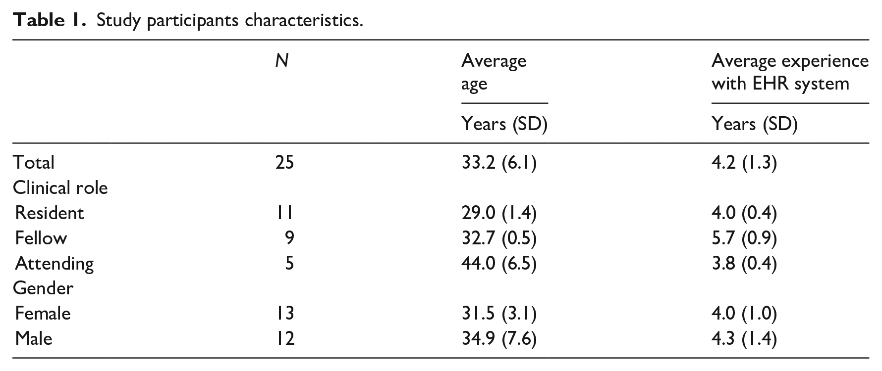
Study participants characteristics.
We selected these specific EHR screens (Flowsheet, Vital Signs, Notes/Chart Review, and Results Review) as an area for focused qualitative evaluation after discussion with a clinical subject matter expert as well as our prior findings from a live observational study that these screens, with the exception of “Vital Signs,” are among the top four most frequently visited screens by ICU providers during morning pre-rounds. 22
Analytic approach
Analysis followed an inductive approach to qualitative research and used the individual interview participant as the unit of analysis. Interview transcripts were independently coded in Dedoose©, a qualitative software management tool. All interviews were independently coded by two trained coders using a common code book. The code book was developed based on the research questions and topics from the interview guide and initial readings of transcripts by coders and the research team. Coders (PF, SR) pilot-tested the initial code book by independently coding two provider transcripts and met to discuss and compare their results and fine-tune the code book. A few concept definitions and decision rules were revised, and the enhanced version of the codebook was applied to remaining transcripts. (Final codebook available as Appendix B) Coding discrepancies were reconciled by discussion and consensus.
Coded excerpts were reviewed to identify the co-occurrence of similarities and differences within and across physician responses for a given code. Based on this review, code reports for each code were generated that included code definitions, a description of the emergent themes and sub-themes, and illustrative quotes. Emergent theme identification is an accepted method for organizing and evaluating qualitative data on health systems. 23 Participants did not provide feedback on the findings.
We categorized the emerging themes in each EHR screen using the Nielsen’s Heuristic Evaluation principles. 24 The mapping characterizes the positive and negative features in each EHR screen based on widely accepted usability evaluation standards, which add more rigor and generalizability to the study findings.
We mapped the emerging themes from the interview analysis onto Epic® screen shots to visually represent the positive and negative perceptions of physicians around the interface design. We used alphabetical letters to indicate positive perceptions of features, and numerical values to indicate negative perceptions of features. Additionally, we used color coding to show negative perceptions in red, and positive perceptions in green. Approval to publish screenshots of the institutional Epic EHR was approved by Epic® headquarters.
Results
A total of 5 h and 19 min of interviews were audio recorded for this study. Of the 25 physician participants, 13 were females, the mean number of Epic years of experience was 4.2 years, and the estimated average number of hours spent in Epic were 32.6 h per week. The distribution of participants spanned multiple clinical roles: 11 residents, nine fellows, and five attending physicians. We present approved Epic© screenshots in Figures 1 to 3 to provide context around participants perceptions of screen-level features.
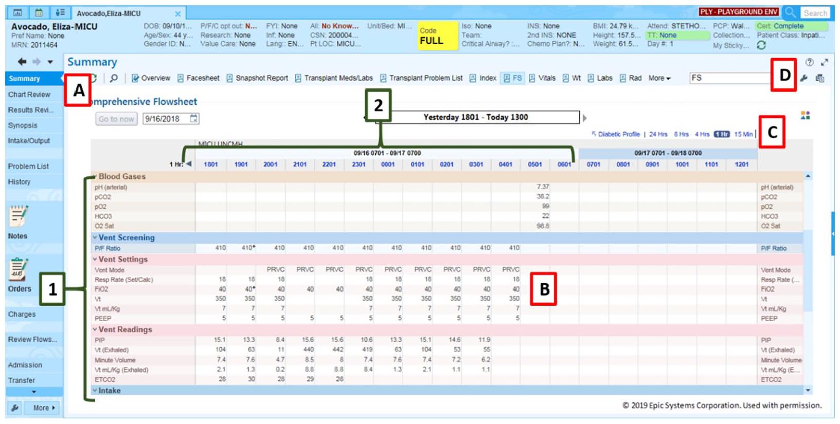
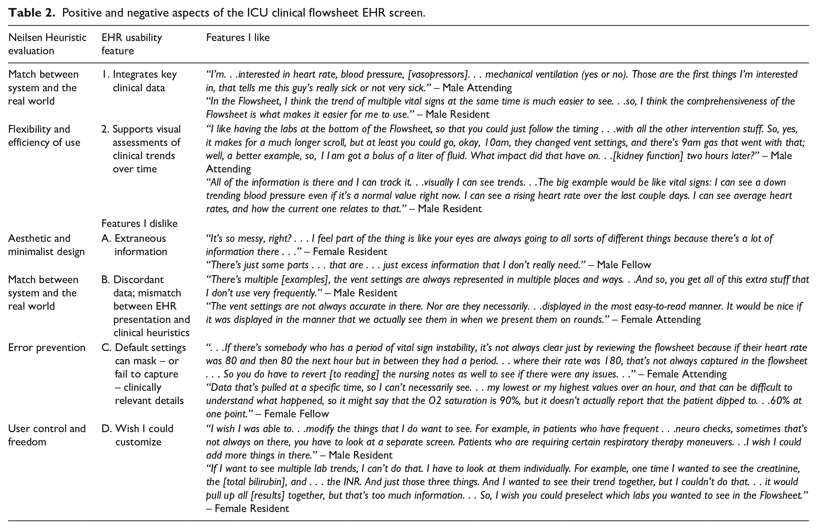
Mapping of physician perceptions on to Epic© ICU Clinical Flowsheet screenshot (Permission to publish obtained).
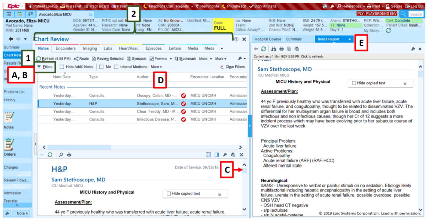
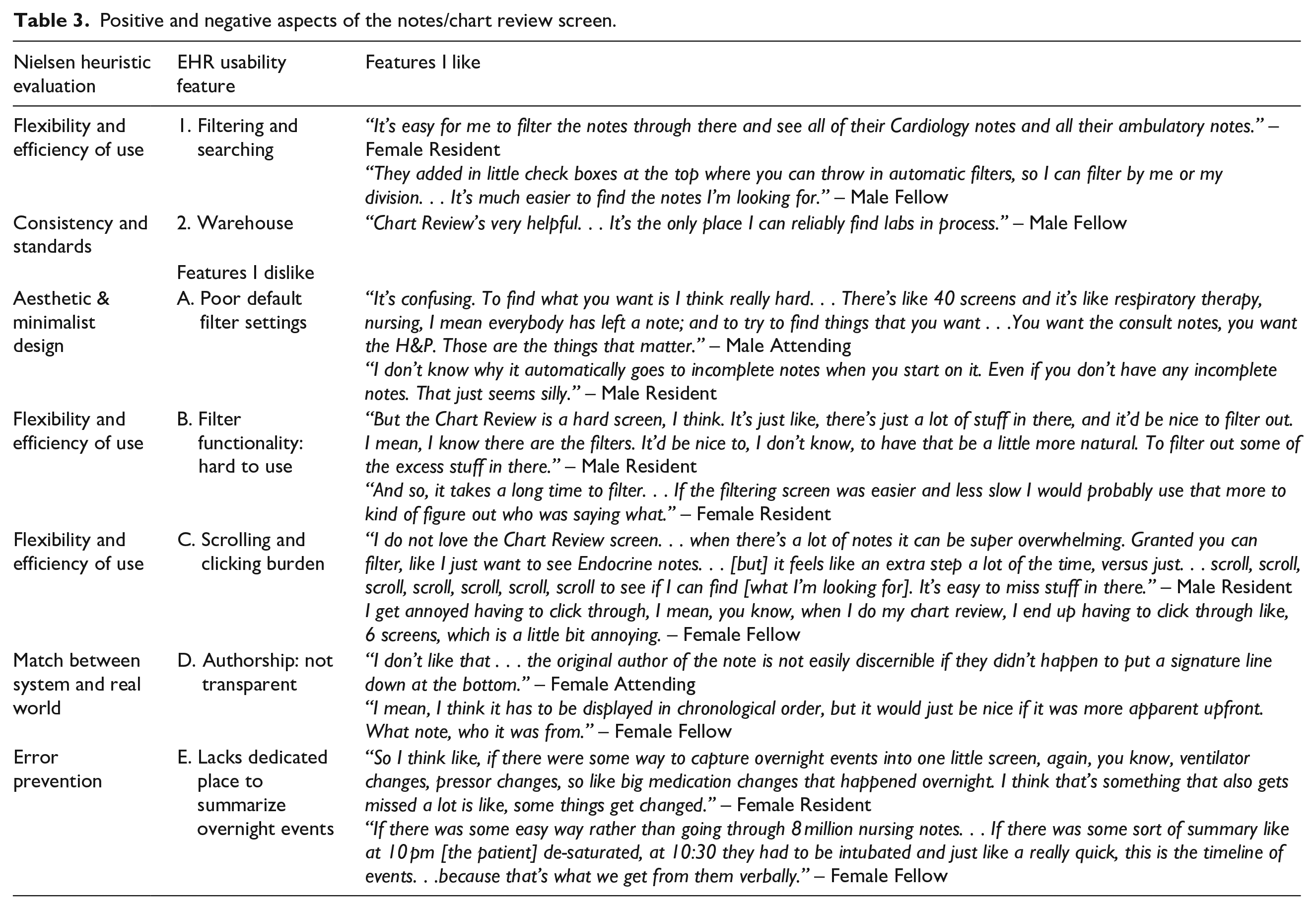
Mapping of physician perceptions on to Epic© Notes/Chart Review screenshot (Permission to publish obtained).
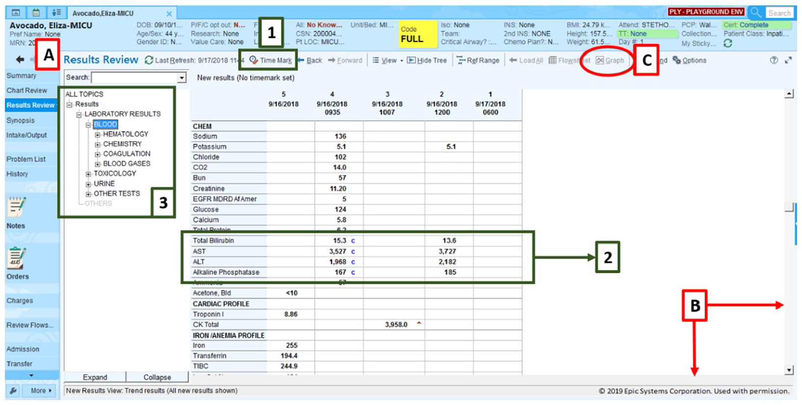
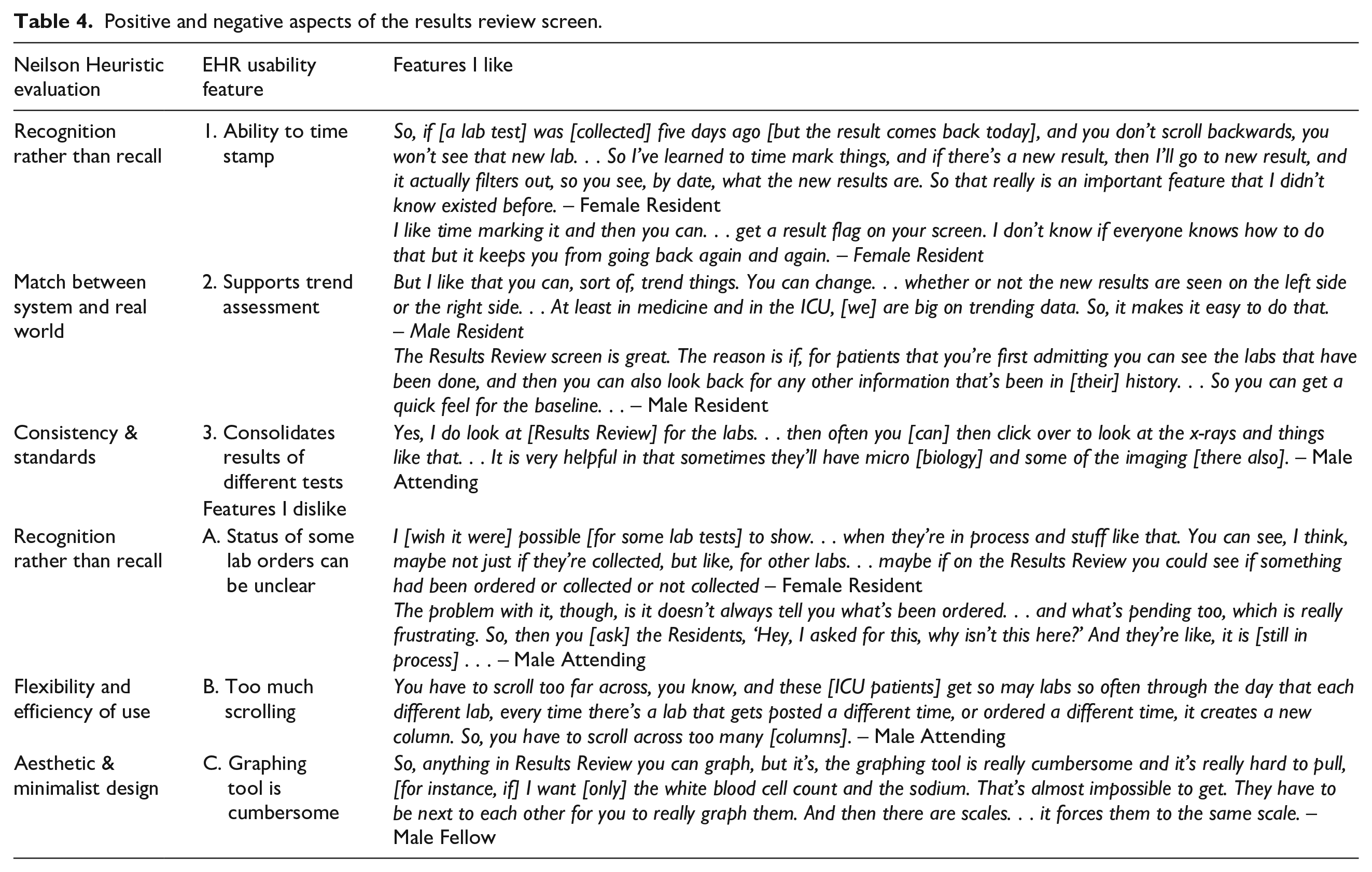
Mapping of physician perceptions on to Epic© Results Review screenshot (Permission to publish obtained).
Flowsheet screen
The overwhelming consensus among interview participants (n = 24 [96%]) was the flowsheet is the most useful and most often accessed EHR screen for clinical workflows in the medical ICU. Favorable features of this screen include: integration of key clinical data elements into a compressive view (such as vital signs, ventilator settings, and intravenous drips) and a tabular interface design that supports visual assessment of trends. Some participants mentioned that due to the large amount of patient information, it is sometimes a burden to sift and scroll through all the information to find what they need. Participants also mentioned that a learning curve comes with utilizing the Flowsheet screen. Table 2 details the features within the Flowsheet screen that participants liked and disliked or wish they could change. Figure 1 maps the features like and disliked on a full Epic© Flowsheet screenshot to illustrate the areas needed of a redesign.
Positive and negative aspects of the ICU clinical flowsheet EHR screen.
Notes/chart screen
Most participants (n = 18 [72%]) lamented the volume of notes that are generated in current clinical settings but noted the filtering/sorting functionality as the most favorable aspect of this screen. Unfavorable features of this screen included poor default filter settings, non-intuitive design and layout of the filter tool itself, the scrolling burden necessary to navigate this screen, and the lack of transparency around note authorship in some scenarios. We summarized participants’ attitudes toward favorable and unfavorable aspects of the notes/chart review screen, Table 3 and Figure 2.
Positive and negative aspects of the notes/chart review screen.
Results review screen
Most participants (n = 21 [84%]) voiced a favorable opinion of the Results Review screen because it consolidates laboratory, imaging, pathology, and other test result data which are organized and accessible from a hierarchical tree system on one screen, Figure 3. Other favorable features of this screen included the presence of a “time-stamp” feature – to allow users to recognize new results – and a flexible layout that supports trend visualization (e.g. chronological or reverse chronological ordering at the discretion of the individual user), Table 4. Among the unfavorable features were the horizontal scrolling burden, the lack of visual clarity around pending laboratory studies, and the cumbersome nature of the embedded filter/graph tool.
Positive and negative aspects of the results review screen.
Vital signs screen
The majority of participants (n = 19 [76%]) reported the Vital Signs screen to be one they rarely use in the medical ICU, preferring to review a patient’s vital signs in the Flowsheet screen where other patient data are integrated to provide clinical context. Unfavorable features of the Vital signs screen: vertical layout made it difficult to trend patient data at a glance, and it is less comprehensive than the Flowsheet.
Preferred content and characteristics for a patient-level dashboard screen
All interview participants (n = 25 [100%]) agreed on the need for an information visualization dashboard. They described what an ideal EHR dashboard screen would include in the medical ICU, both in terms of information needed and its desired “look and feel.” A “top 5” list of clinical data elements emerged across users: vital signs, ventilator data, laboratory data, active medications, and microbiology data. Participants also emphasized the importance of customization at the user-level, and that only data from the last 24 h should be presented. Table 5 summarizes participants’ recommendations for a user-centered, patient-level dashboard screen in the medical ICU.
Preferred content and characteristics of a next generation patient-level dashboard screen in the EHR.

Discussion
This study investigated ICU physicians’ experiences around key EHR screens and screen-level features within a prominent commercial EHR system, identifying information retrieval challenges and soliciting feedback from end-users for potential design solutions. To our knowledge, this is the first study to present and link full EPIC© screenshots of three prominent EHR screens (Flowsheet, Notes/Chart Review, and Results Review) to interface, layout, content, and navigation features that physicians identified as favorable and unfavorable. This study helps to distinguish which screens within a prominent vendor-based system display are reported by physicians to be the most useful and frequently visited, while also identifying specific elements of three particularly high-yield screens that make it easier to find information.
Generally, almost all participants recalled a time when they had challenges finding important patient information in the EHR due to confusing layout, design, or navigation issues. Multiple physicians noted challenges and inconsistencies with the layout of the medication administration record screen that made it difficult to identify current, previous, and future medications. Another design deficit identified by participants included the lack of quick views to show longitudinal trends in a patient’s weight across inpatient and outpatient encounters. Other patient information deemed difficult to locate included notes from other institutions or outside the EHR.
Recommendations for improved EHR screens
Study findings may vary in generalizability depending on the size, complexity, and choice of EHR in the ICU; however, there are main themes that are largely applicable. The main complaint about Flowsheets was that there was unnecessary information which increases the amount of scrolling required to find information. To improve this screen, developers should limit the overall information provided, making the screen more concise and only displaying critical data. Our participants identified key data to include: vital signs, weight, intake and output (including medications), ventilator settings, and lab values. The ability of an EHR to display clinically relevant data trends will be paramount to the success of any design. 25 Moreover, as users will interact with data in their own way due to role and experience, perhaps one recommendation for vendors would be to create a default Flowsheet but to allow users to easily “drag and drop” the data elements they prefer to see. Such enhanced customization functionality would best serve support a user-centered approach to patient data. 26
When asked about Results/Lab Review, a criticism brought up by multiple participants was the difficulty in identifying when a lab order was requested without specifically searching for them. A previous study has also demonstrated user difficulty related to this type of screen during their simulated study and subsequent discussion. 27 One solution at the vendor-level would be to create a screen or summary “widget” to display all pending studies and their current status (e.g. ordered, in process, not scheduled, etc.); in addition, vendors could re-tool current lab orders using a “pin” feature, “drag-and-drop” option, or “right-click; alert me when” feature to support users in maintaining situational awareness of pending studies. Users also identified too much scrolling as being problematic. This can be fixed by giving users the option to hand-pick which results are displayed in an intuitive fashion, perhaps with advanced visualization menus or quick check-box sorting functionality similar to that used on airfare sites.
Chart review screen was another screen that participants criticized heavily due to the amount of information that was displayed. The screen required too much scrolling and clicking and relied on an inefficient filter feature to sort through the notes. The number of screens on the top of the screen further contributed to the increased cognitive load of the user. Multiple steps are needed to fix this problem. We recommend eliminating the screens at the top of the screen as they are currently displayed and allow users to customize which screens they want to see. This ensures that no unneeded information is displayed. The filter feature can also be updated to allow users to more seamlessly and intuitively select a specific service and a date range by which to filter the documentation they view, the way that online hotel and e-travel websites present intuitive, interactive “slider” tools for swift filtering.
The vital signs screen was poorly reviewed by participants. A majority of the participants stated that they do not ever use the screen and view it as redundant given that Flowsheets carry the exact same information. One possible user-centered design change to emerge from this finding might be to remove the vital signs screen from the default physician view in the ICU setting. The more screens there are to filter through, the higher the cognitive load for the end user.
Strengths and limitations
The EHR used in this study, Epic©, is widely utilized in the US and commonly used internationally, suggesting that there is value in descriptive characterization. Other health systems utilizing Epic© may benefit from our analysis when considering their own customization or implementation strategies, especially given the relative dearth of screenshots previously available in the EHR usability literature. Study strengths included Epic© screenshots, a relatively large sample size for qualitative usability research; a diverse and representative sample; an excellent balance of physician roles, gender, and prior EHR experience. Lastly, we focused on four particular screens reported by physicians (and confirmed during live-observational study) to be most important for workflow. 22
Our study also has important limitations. First, it was conducted in single clinical setting at a single-site, and physicians were the only participants; as a result, we cannot exclude the possibility of selection bias. Future studies should include multiple hospitals and clinical settings. Second, the EHR screen layouts published in this paper are based on institutional customization, so the screenshots may not exactly match their respective counterparts at other institutions using the same EHR vendor due to differences in local customization or system version. Third, user interfaces and screen layouts often undergo subtle changes with system upgrades, so some aspects of the screen-level maps may become less representative in the future, though it remains important to archive such findings as the field continues to evolve.
Conclusion
This qualitative study of ICU physicians demonstrated a mix of positive and negative attitudes toward specific screen-level features in a major vendor-based EHR system. Physician perceptions of information overload emerged as a theme across multiple EHR screens. Our findings underscore the importance of qualitative research and end-user feedback in EHR software design and interface optimization at both the vendor and institutional level.
Supplemental Material
sj-docx-1-jhi-10.1177_1460458221997914 – Supplemental material for Physician experiences of screen-level features in a prominent electronic health record: Design recommendations from a qualitative study
Supplemental material, sj-docx-1-jhi-10.1177_1460458221997914 for Physician experiences of screen-level features in a prominent electronic health record: Design recommendations from a qualitative study by Saif Khairat, Cameron Coleman, Randall Teal, Salma Rezk, Victoria Rand, Thomas Bice and Shannon S Carson in Health Informatics Journal
Supplemental Material
sj-docx-2-jhi-10.1177_1460458221997914 – Supplemental material for Physician experiences of screen-level features in a prominent electronic health record: Design recommendations from a qualitative study
Supplemental material, sj-docx-2-jhi-10.1177_1460458221997914 for Physician experiences of screen-level features in a prominent electronic health record: Design recommendations from a qualitative study by Saif Khairat, Cameron Coleman, Randall Teal, Salma Rezk, Victoria Rand, Thomas Bice and Shannon S Carson in Health Informatics Journal
Footnotes
Acknowledgements
The authors would like to acknowledge the support of UNC ISD team and Epic©. As well as Thomas Newlin and Peter Fleming, MSN for their assistance in data collection and transcription.
Authors’ note
Thomas Bice is now affiliated with Novant Health, Monroe, NC. All authors had access to the data and a role in writing the manuscript.
Author contributions
Study concept and design: SK, CC, TB. Acquisition of data: SK, CC, VR, TN. Analysis or interpretation of data: PF, SR, RT, CC, SK. Drafting of the manuscript: SK, CC, RT, PF, SR. Critical revision of the manuscript for important intellectual content: SK. Thematic analysis: PF, RT, SR, SK. Administrative, technical, or material support: TB, SK. Study supervision: SK, SC. All authors have read and approved the manuscript.
Availability of data and material
All manuscript authors had access to study data.
Declaration of conflicting interests
The author(s) declared no potential conflicts of interest with respect to the research, authorship, and/or publication of this article.
Funding
The author(s) disclosed receipt of the following financial support for the research, authorship, and/or publication of this article: This work was supported under grant number 1T15LM012500-01 by funding Dr. Cameron Coleman to assist with designing, conducting, analyzing this study. Also, the University of North Carolina at Chapel Hill Office of the Provost Junior Faculty Award was awarded to Dr. Saif Khairat to run a pilot study that assisted in the design of the study design.
Ethics approval
Ethics approval and consent to participate Institutional Review Board (IRB) approval was obtained from the University of North Carolina at Chapel Hill prior to the beginning of this study. All participants provided written consent prior to the study.
Consent for publication
Approval obtained from Epic© to publish Epic© screenshots.
Supplemental material
Supplemental material for this article is available online.
References
Supplementary Material
Please find the following supplemental material available below.
For Open Access articles published under a Creative Commons License, all supplemental material carries the same license as the article it is associated with.
For non-Open Access articles published, all supplemental material carries a non-exclusive license, and permission requests for re-use of supplemental material or any part of supplemental material shall be sent directly to the copyright owner as specified in the copyright notice associated with the article.