
Abstract
This study will highlight the diagnostic potential that radar plots display for reporting on performance benchmarking from patient admissions to hospital for surgical procedures. Two drawbacks of radar plots – the presence of missing information and ordering of indicators – are addressed. Ten different orthopaedic surgery procedures were considered in this study. Moreover, twelve outcome indicators were provided for each of the 10 surgeries of interest. These indicators were displayed using a radar plot, which we call a scorecard. At the hospital level, we propose a facile process by which to consolidate our 10 scorecards into one. We addressed the ordering of indicators in our scorecards by considering the national median of the indicators as a benchmark. Furthermore, our the consolidated scorecard facilitates concise visualisation and dissemination of complex data. It also enables the classification of providers into potential low and high performers that warrant further investigation. In conclusion, radar plots provide a clear and effective comparative tool for discerning multiple outcome indicators against the benchmarks of patient admission. A case study between two top and bottom performers on a consolidated scorecard (at hospital level) showed that medical provider charges varied more than other outcome indicators.
Introduction
In what follows, a separation consists of an entire episode of care a patient had while admitted to hospital. By definition, a separation does not necessarily involve surgery.
Data visualisation tools in healthcare vary according to the intended audience. For the general public, in the United States, the Institute of Health Metrics and Evaluation 1 uses the US and worldwide data to produce several interactive visualisations. Another example from the United States, the Commonwealth Fund publishes yearly results from their scorecard on State Health system performance. 2
Individuals with more technical background can find several dashboards that aim at providing in a nutshell a more detailed view of the status of different health systems. In the literature, we can find detailed descriptions for building scalable dashboards. Scalable dashboards can be used to describe the status of a single facility or for comparative analysis across numerous facilities. 3
The aforementioned visualisation tools are part of benchmarking performance. It is important to recognise the difference between benchmarking performance and benchmarking practice. Performance benchmarking concentrates on calculating performance standards or benchmarks, a widely popular practice. Practice benchmarking is concerned with establishing reasons why organisations achieve the level of performance that they do. 4
Our work presents a scorecard which is another tool for benchmarking performance. Our intention is to facilitate quick comparisons across different medical providers (hospitals or specialists) that will encourage policy makers to engage in a practice benchmarking in those areas that they seem to need it.
Visual representation of performance and quality information is not an easy task. In 2016, Zwinjnenberg et al. 5 examined how information presentation affects the understanding and use of information for quality improvement. They conclude that bar charts or tables, and presenting outcomes as a percentage of positive responders or on a 5-point scale, enhance information understanding and use. They also found that benchmark information reduces understanding. One of the less preferred visualisations is radar plots.
Nonetheless, Thaker et al. 6 have presented how radar plots can be of use for integrating information on outcomes and cost and communicate the value of health care delivery for various forms of prostate cancer treatments. In fact, radar plots allowed a unique juxtaposition of outcome metrics and costing data. On one hand, the radar plot chart presents multidimensional metrics in a practical format for analysis. On the other hand, other graphical formats like bar charts or tables can help identify the performance of specific metrics; however, they create difficulty in conceptualising the overall value delivered.
We also share the view that radar plots can effectively convey meaningful information. Our main reasons are as follows:
Radar plots are able to convey a large amount of information.
Radar plots are able to easily convey a standard or benchmark.
Radar plots can provide a standardised view of different indicators on one scale.
Our scorecard is represented with a radar plot that will clearly represent several surgical outcome indicators. It is important to highlight that when we created the scorecard of a given separation, we only compared it against separations that had the same surgical procedure.
On the use of radar plots in healthcare, Saary 7 compiled a comprehensive list of references. In the United States, the Department of Health Services has prepared a step-by-step guide. 8 The following are just a couple of examples in which the authors used radar plots as comparative tools for outcome metrics: the papers written by Thaker et al. 6 and Stafoggia et al. 9 In the latter, the authors compare intra-hospital mortality and complications following surgical procedure for eight clinical categories of interest, namely cardio-surgical, cerebro-vascular, scheduled surgery, orthopaedics and others. We have also found a radar plot that seeks to compare the performance of several countries on four different indicators; the graph is quite difficult to read. 4
There are two drawbacks typically associated with radar plots7,9 that we aim to address with our approach:
D1. Missing data are usually misrepresented.
D2. The order of the variables can affect the reader’s interpretation of agent (e.g. hospital) outcomes.
With our approach, both of these issues are addressed. The dataset supplied to us is described under ‘Methods’ section. Our main results can be found under ‘Results’ section. Finally, our conclusions are presented under ‘Discussion’ section.
Methods
Dataset
In Australia, Medicare provides universal health insurance that delivers affordable, accessible and high-quality health care for citizens and permanent residents. 10 The elements of Medicare include free treatment for public patients in public hospitals and subsidised private treatment. The Australian Government subsidises private treatment through the payment of rebates or benefits for medical, optometric and certain allied health services listed in the Medicare Benefits Schedule (MBS). The MBS sets out the Medicare Benefits Schedule Fee (MBS fee) and the Medicare rebates for approximately 5700 services.
For treatment in a private hospital, if the doctor chooses to charge above the MBS fee, there is a ‘gap’ that the patient may be required to pay. Some private health insurers have arrangements in place which may cover some or all of doctors’ fees for hospital treatment. These are known as gap cover arrangements. Unless a patient’s private health insurer has a gap cover arrangement in place with their doctor which will cover all of the doctor’s charge, the patient may have to contribute towards the gap out of their own pocket. 11 In our dataset, this figure is reported as an out-of-pocket (OOP) amount.
Our dataset was provided by a large Australian private health insurance company. It consisted of 1-year worth of data (January 2014 to December 2014). Patients were admitted to hospital for one of the following 10 surgical procedures: shoulder acromioplasty, shoulder replacement, shoulder revision, shoulder arthroscopy, hip replacement, hip revision, knee replacement, knee revision, knee arthroscopy and knee anterior cruciate ligament (ACL). Several outcome indicators were provided.
Design
The following indicators contained in our orthopaedics dataset are of relevance in our study. These indicators fall into two categories: context indicator (CI) and outcome indicator (OI), as follows:
CI.1. Hospital where the separation took place.
CI.2. Surgery(ies) the patient was admitted for.
CI.3. Age of the patient.
CI.4. Gender of the patient.
OI.1. Length of stay, number of days the patient stayed in hospital. The value of 0 was given to same-day admissions.
OI.2. Number of medical services billed by the principal surgeon.
OI.3. Medical OOP amount from providers other than the principal surgeon, denoted by medical OOP not surgeon. This is the reported amount of money the patient had to pay to medical providers other than the principal surgeon for the hospital separation.
OI.4. Medical OOP amount from the principal surgeon, denoted by medical OOP surgeon. This is the reported amount of money the patient had to pay to the principal surgeon for the hospital separation.
OI.5. Prostheses charge. Amount charged for any prostheses equipment/devices used for items on the Prosthesis List published by the Australian Department of Health. 12
OI.6. Total charge. Total amount charged for the entire episode of care. This charge included medical and hospital charges.
OI.7. Hospital-acquired complication (HAC). This was a binary flag defined already in the private health insurance data provided to us. It flagged if any event occurred while in hospital that could potentially increase the cost of treatment or length of stay. Only 241 separations out of the 30,562 separations considered had a HAC recorded.
OI.8. Intensive care unit (ICU). This was a binary flag representing if the patient was transferred to ICU or not.
OI.9. Re-operation within 180 days, denoted by 180d Reop. This was a binary flag representing if a patient had a re-operation within 180 days after discharge. The re-operation had to be of the same type as the current separation.
OI.10. Readmission within 30 days, denoted by 30d Readmit. This was a binary flag representing unplanned readmissions. Readmissions had to be of the same type as the current separation.
OI.11. Overnight flag. This was a binary flag representing if the patient stayed in hospital overnight.
The indicators provided were the same as those considered by the Royal Australian College of Surgeons (RACS) in their surgical variance reports. 13 The RACS selected these indicators after considering the limitations of the dataset provided and in consultation with the Sustainability in Healthcare Committee, which comprises a panel of specialty experts, see RACS 13 for membership details. Even though these indicators can be easily measured for other surgeries, due care regarding their relevance is needed. Throughout this chapter, any aggregation performed at national level was performed by analysing our entire orthopaedics dataset.
Results
Scorecards
Scorecards were created using 12 of the indicators listed in the previous section: OI.1–OI.11 and CI.3. Note that indicators OI.1–OI.6 are continuous while OI.7–OI.11 are binary.
Since every continuous indicator has values with different units or ranges, a radar plot with our 12 indicators could be hard to interpret. Thus, we transformed our continuous indicators so that each uses values between 0 and 1 inclusive. This transformation was done per surgery type. Furthermore, our transformation respects the skewness of our data. We proceed as follows:
Step 1. Pick a surgery type.
Step 2. Pick a continuous outcome indicator, I, for that surgery.
Step 3. Create an array R indexed
Step 4. By removing repeated values and sorting in an increasing way, create a new array S indexed
Step 5. Define the function
Step 6. Using the indices of the values in S, the following formula transforms any
The number obtained in equation (1) is a number between 0 and 1 which can be interpreted as the percentile of the value
Step 7. We create a new array Tr R with n entries in which
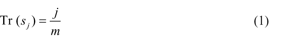
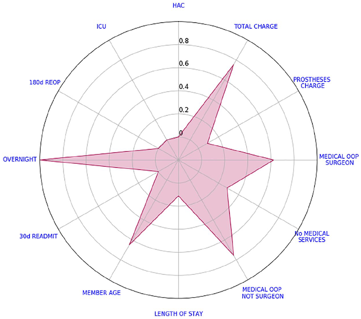
We say that this array stores the scores of the outcome indicator I. By plotting the scores of every outcome indicator in a radar plot, we create our scorecard. Figure 1 depicts the scorecard of a shoulder acromioplasty separation. A positive outcome is visually represented by a small polygon closer to the centre; conversely, a negative outcome is represented by a large polygon with vertices closer to the edge of the radar plot; in the literature, it is usually the reverse order. Not that binary indicators (e.g. overnight) are depicted with their actual values. Certainly, ‘Member Age’ is not an outcome indicator. It was included in the analysis to give some context on the patients being treated. Perhaps, older patients have longer lengths of stay.
Example of a shoulder acromioplasty scorecard.
From the scorecard of Figure 1, we can see that the patient had high total and OOP charges. Without a benchmark to compare against, we cannot say how high these charges are. The only binary indicator that was not zero is the overnight flag.
We now address the two drawbacks typically associated with radar plots, refer to D1 and D2 at the beginning of this chapter. Afterwards, we use these scorecards to find the median scorecard at hospital level.
Addressing drawback D1
D1. Missing data are usually misrepresented
Many authors use the value ‘0’ to represent missing data. This is problematic since some variables such as prostheses charge have ‘0’ as a possible value.
Recall that when creating our array R, we did not take into account missing values, refer to step 3. Also, for non-missing values, equation (1) ensures that the transformed value is a number between 0 and 1 inclusive. Hence, we assign the centre of the radar plot (the transformed value of ‘−0.2’) to missing values.
Figure 2 shows a separation with missing HAC. Every other indicator varies from 1 to 5 inclusive.
Example of a knee arthroscopy scorecard with a missing value.
Addressing drawback D2
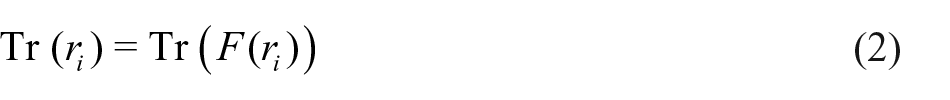
D2 The order of the variables can affect the objective interpretation of quantitative outcome values/variables
Consider the example depicted in Figure 1 and let us change the order of our variables. Figure 3 highlights the salience of the indicators member age and overnight flag. However, this is an interpretation which would be buried in the data presentation found in Figure 1. To avoid different interpretations, we will compare all these values against some benchmark. To this end, we calculated the median of every transformed value and the average of every binary indicator per surgery type at a national level. Subsequently, we obtained 10 different national scorecards, one for each surgery type. Figure 4 shows the 10 national scorecards on the same graph.
Shoulder acromioplasty scorecard with new ordering.
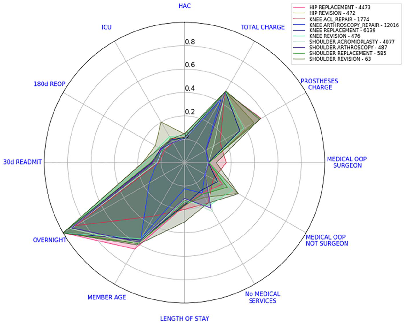
National scorecards. Numbers in the legend represent the number of separations considered.
Note that if one of our indicators (on a given surgery type) was approximately normally distributed, from equation (1), we would expect its transformed median value to be close to 0.5. By calculating the average of the binary indicators, we are actually calculating their relative frequency.
In Figure 5, we can see the example from Figure 1 with the national scorecard for shoulder acromioplasty juxtaposed. Our interest is immediately drawn to variables that are not only further away from the centre but also higher than the national scorecard. We can see that total charge is larger than the national benchmark but this difference is not as high as the differences in OOP amounts. Every other indicator appears to be relatively close to the national scorecard. This interpretation does not change if we alter the order of the variables, see Figure 6.
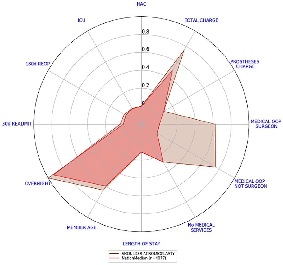
Shoulder acromioplasty scorecard versus the national scorecard.
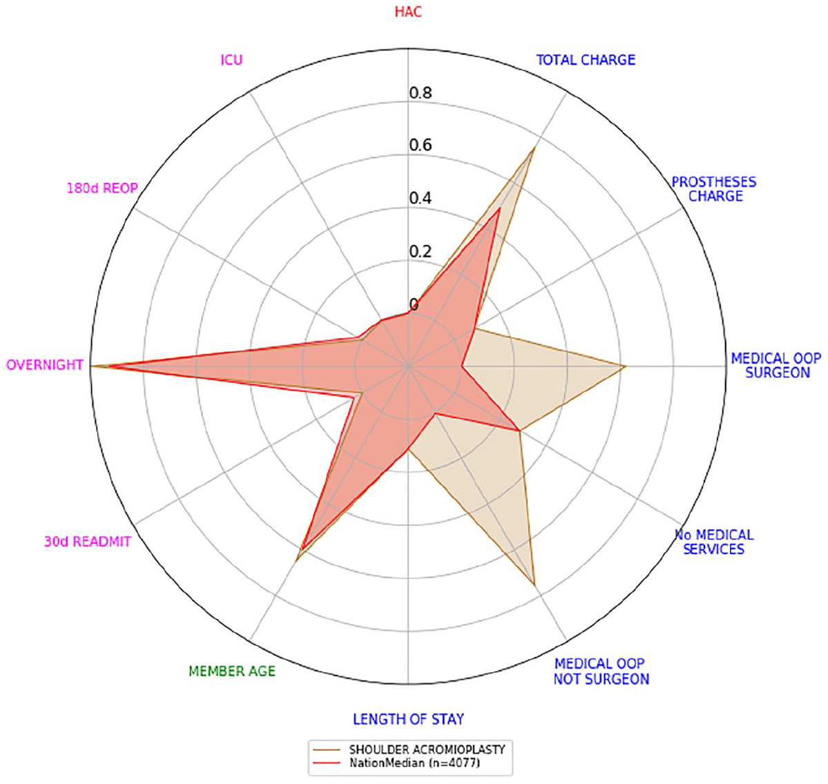
Shoulder acromioplasty scorecard versus the national scorecard with new ordering.
Hospital level scorecards
In the previous section, we showed how the separation scorecards can be aggregated at a national level. This time, we will repeat the same technique at hospital level. We selected two hospitals with substantial activity in orthopaedics surgery and a similar proportion of activity within each procedure (see Figure 7). They also had a casemix of procedures similar to our entire dataset (see Figure 8).
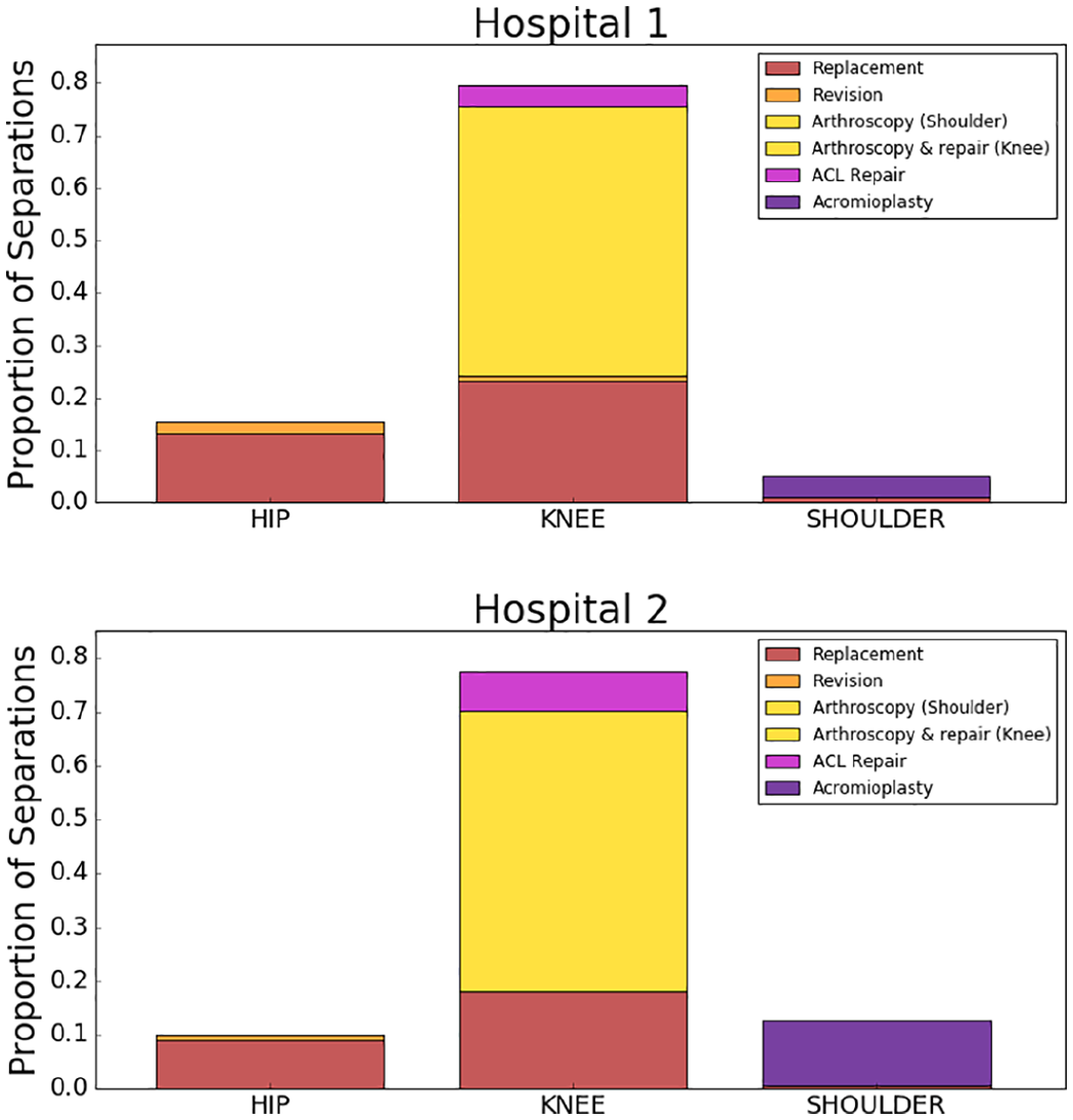
Surgeries performed by Hospitals 1 and 2.
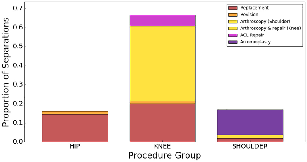
Distribution of surgical procedures in our entire dataset.
Let us look now at the surgery level scorecards of their knee arthroscopy and knee replacement separations. This will also show any other differences regarding the quality of care provided. Figures 9 and 10 show the surgery level scorecards for knee arthroscopy and knee replacement, respectively. Surgery level scorecards from Hospital 1 are well inside the national median scorecards, while the main differences with Hospital 2 surgery level scorecards lie in total charges and medical OOP amounts. Both hospitals seem to behave similarly in relation to HAC, ICU, re-operations, re-admissions, member age, length of stay and number of medical services.
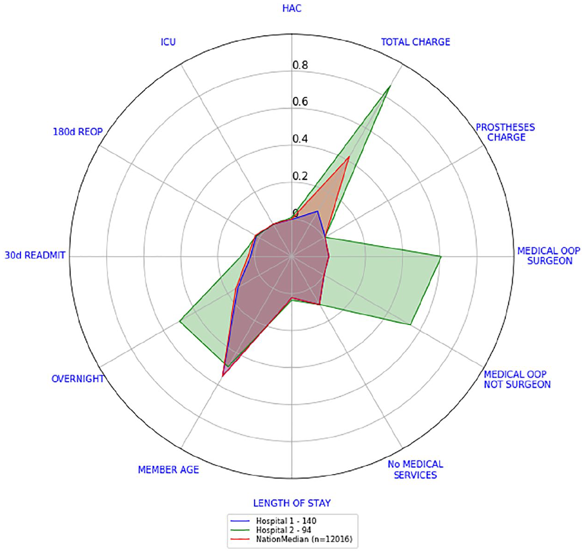
Hospitals 1 and 2 versus national scorecard – knee arthroscopies.
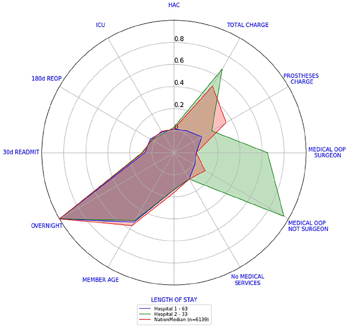
Hospitals 1 and 2 versus national scorecard – knee replacements.
For any given hospital, we could repeat this procedure and define a scorecard for each surgery type. This implies that there will be up to 10 different surgery level scorecards. Consequently, going back and forth between the 10 surgery level scorecards at hospital level (for comparison purposes) can be quite tedious. Thus, we looked for a simple way to consolidate the 10 surgery level scorecards of a hospital into one.
Consolidated scorecards
If we want to quickly assess a hospital’s current performance in all 10 surgeries, reading and understanding all 10 surgery level scorecards will be quite difficult. This section presents one way to consolidate these 10 scorecards into one.
Our consolidated scorecards were obtained after combining each outcome indicator scores into a single one. Recall from section ‘Scorecards’ that the transformed values of each outcome indicator and each surgery type ranged from −0.2 to 1, where the lower its value the better and is reserved for missing data. The following describes the procedure for obtaining the national consolidated scorecard:
Step 1. Pick one outcome indicator.
Step 2. For each surgery type, we computed the surgery level score (either by calculating the median of the scores if the indicator is continuous or the average of the values if the indicator was a binary one).
Step 3. Multiply each surgery level score calculated in step 2 by the relative frequency of each surgery type. We call these values weighted scores.
Step 4. Add all the weighted scores calculated in step 3.
Step 5. Repeat steps 2–4 for every outcome indicator.
The procedure just presented could be done also at surgeon level or hospital level. As an example, let us consider the transformed values of medical charge of a fictitious hospital, refer to Table 1. We will calculate the consolidated medical charge of this hospital. Table 1 also shows the median of the transformed medical charge values.
Number of separations and medical charge scores per surgery type of made-up hospital.
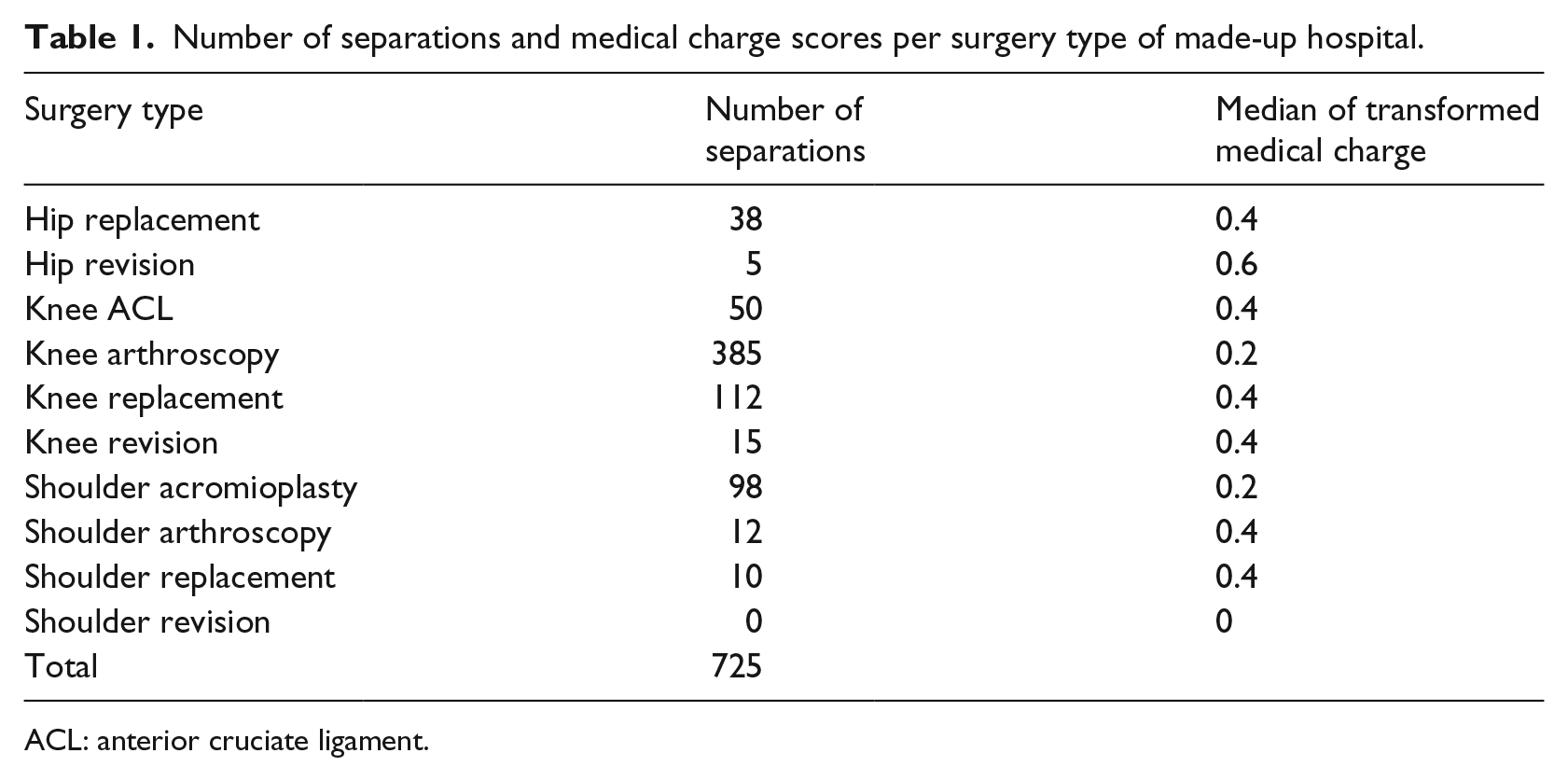
ACL: anterior cruciate ligament.
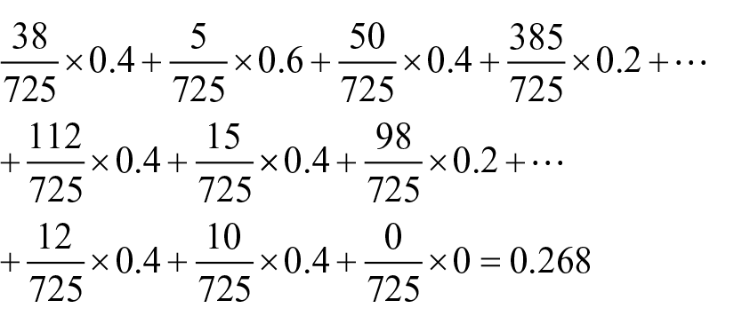
Following steps 3 and 4, we obtained the consolidated medical charge of the hospital
We repeat this procedure for every outcome indicator score. The consolidated scorecard of the hospital is created by plotting the values of the consolidated outcome indicators in our radar plot. In a similar way, we calculated a national consolidated scorecard.
Figure 11 shows the national consolidated scorecard while Figure 12 shows the consolidated scorecards for Hospital 1 and Hospital 2 compared against the national consolidated scorecard. If we were to look at the 10 different surgery level scorecards of Hospitals 1 and 2, we will draw the same conclusion as by looking at this individual graph: the only recognisable difference between these two hospitals is on cost indicators. Hospital 1 costs indicators, in comparison to the national scorecard, are either slightly higher (medical OOP not surgeon and prostheses charge), equal (medical OOP from surgeon) or lower (total charge), whereas Hospital 2 costs indicators are all considerably higher than the national scorecard (with prostheses charge being closer to the national benchmark than the rest). Every other indicator can be considered close to the national benchmark (with Hospital 2’s overnight indicator being somewhat larger).
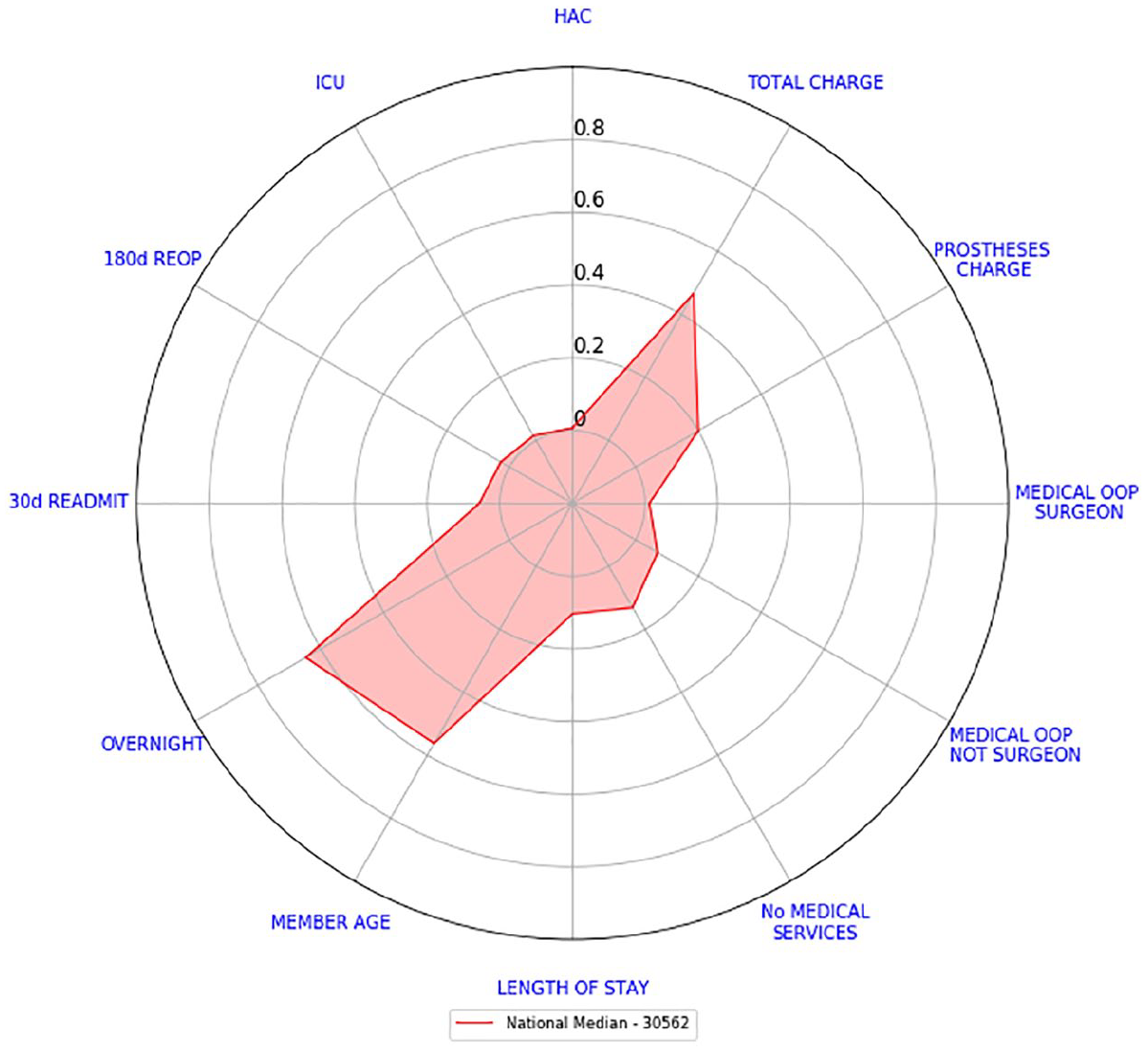
National consolidated scorecard.
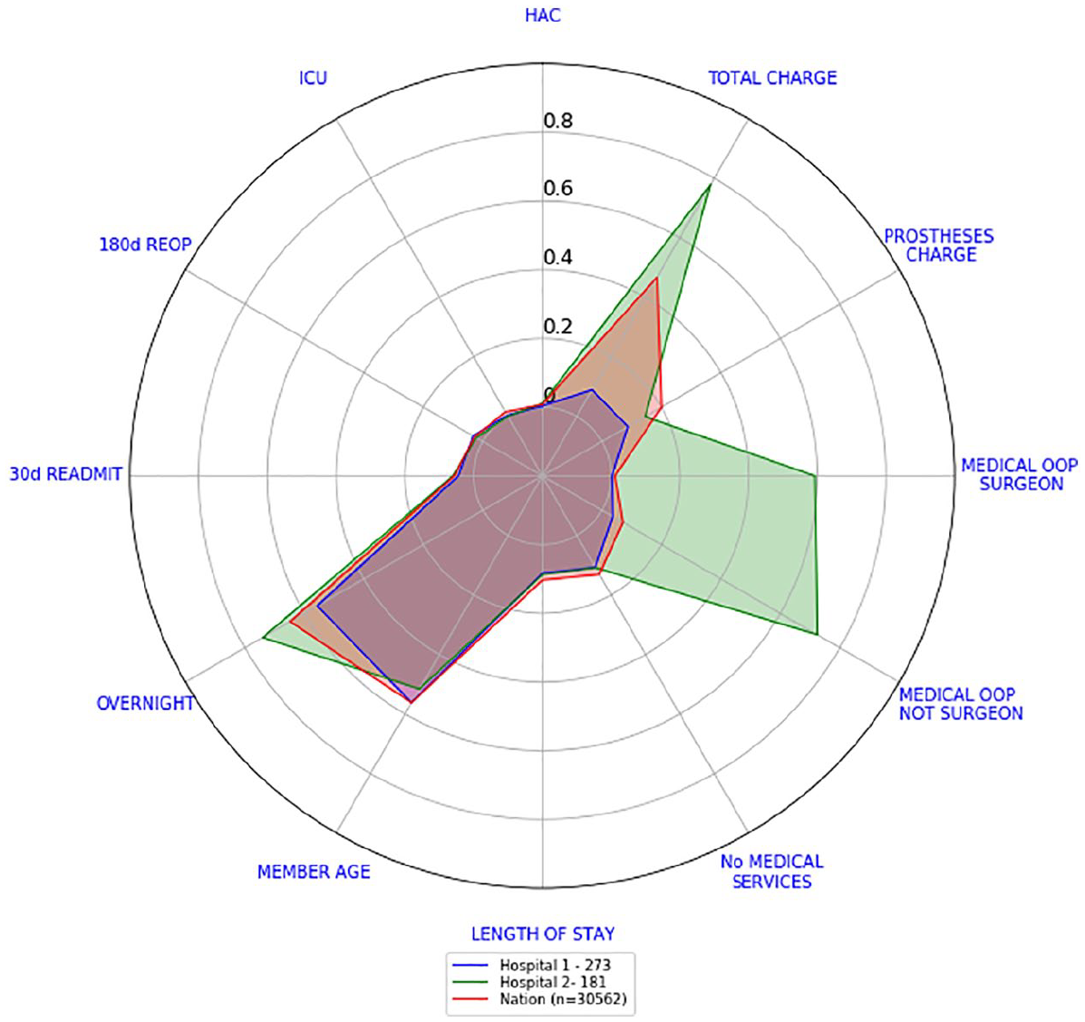
Consolidated scorecards for Hospitals 1 and 2 versus national consolidated scorecard.
This is the main value of radar plots. They enable a very quick examination of what indicators hospitals or doctors are performing better than some benchmark or their peers. Also, by grouping outcome indicators into domains (such as safety, effectiveness and efficiency), it also enables an assessment of whether performance is consistently good across all indicators or there are specific areas of concern.
Potential low and high performing hospitals
We present now how to categorise hospitals into potential low and high performers that warrant further investigation through risk-adjusted analysis, clinical review or other input. The hospitals we compared had at least 20 separations reported in total in our dataset. There may be hospitals with a small number of separations within procedures (43 hospitals out of 201 hospitals were removed for this analysis):
Sort in an increasing way hospitals according to the sum of the values that were used for their consolidated scorecards. This ensures that the order of the variables has no effect.
A potentially high performing hospital will have a sum that lies in the bottom 20th percentile. In our data, the bottom 20th percentile lies between [0.73, 1.99].
A potentially low performing hospital will have a sum that lies in the top 20th percentile. In our data, the top 20th percentile lies between [2.93, 4.55].
Remark
In our data, not two hospitals had the same sum of scores. Despite any small differences, each hospital was sorted separately.
For Hospital 1, the sum of the values that are calculated from its consolidated scorecard is 1.6. While for Hospital 2, its sum is 3.79. These figures place Hospital 1 as a potentially high performing hospital and Hospital 2 as a potentially low performing hospital. From Figure 7, we know that these hospitals have performed the same surgical procedures in a similar proportion. Further investigation of both hospitals is required in order to conclude if they are indeed low or high performers.
The 90th percentile consolidated scorecard
The consolidated scorecards created at hospital and national levels in section ‘Consolidated scorecards’ have a drawback. Consider the following scenario, suppose a hospital is performing 100 surgeries with 70 of them having the lowest prostheses charge values and 30 of them charging the highest prostheses charge value. This might be considered a very expensive scenario. However, our median scorecards will report that the median prostheses charge of the hospital is very close to 0 since they do not happen at least 50 per cent of the time.
For this reason, we will calculate the 90th percentile consolidated scorecard. We are not only interested in a benchmark that reflects how usually hospitals perform but also how badly they do 10 per cent of the time. This should give us a better picture of the performance of a hospital.
The reason for choosing the 90th percentile is mainly because the Australian Government has used it in the past (see Australian Institute of Health and Welfare 14 and how the performance indicator ‘time to admission to hospital from emergency department’ is reported).
For calculating the 90th percentile consolidated scorecard at hospital and national levels, we repeated the steps outlined in section ‘Consolidated scorecards’ with a small modification:
Step 1. Pick one outcome indicator.
Step 2. For each surgery type, we computed the 90th percentile of the transformed values of the outcome indicator selected.
Let us present now, how Hospitals 1 and 2 compare against the national 90th percentile consolidated scorecard. Figure 13 shows the national 90th percentile consolidated scorecard while Figure 14 shows the consolidated 90th percentile scorecards for Hospital 1 and Hospital 2 compared against the national scorecard. The differences in cost indicators are more evident. Hospital 1 costs indicators are all lower than the national 90th percentile with total charge and medical OOP from surgeon being the lowest ones. Hospital 2 costs indicators are still above the national ones. All other indicators are higher than the national ones.
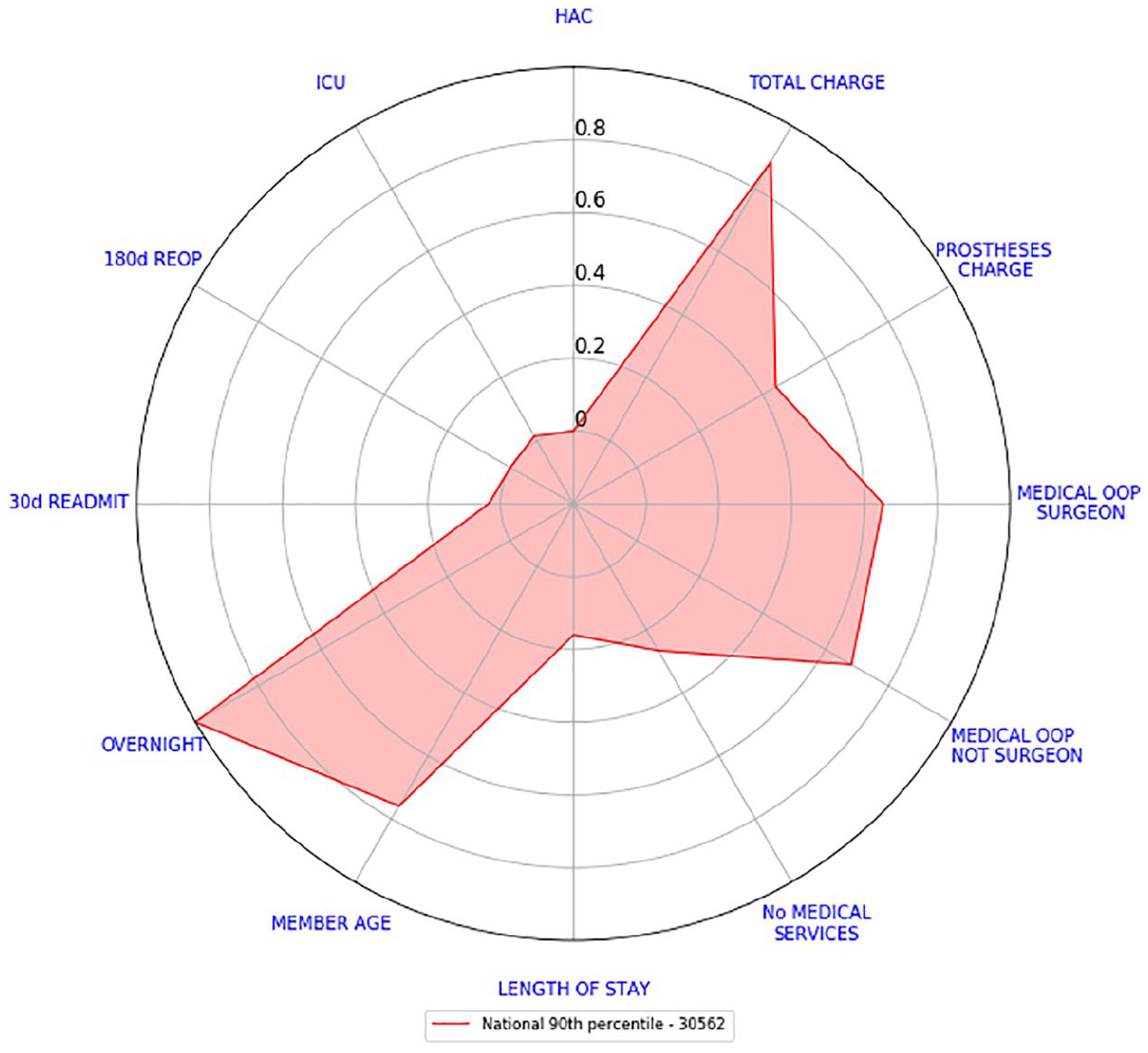
National 90th percentile consolidated scorecard.
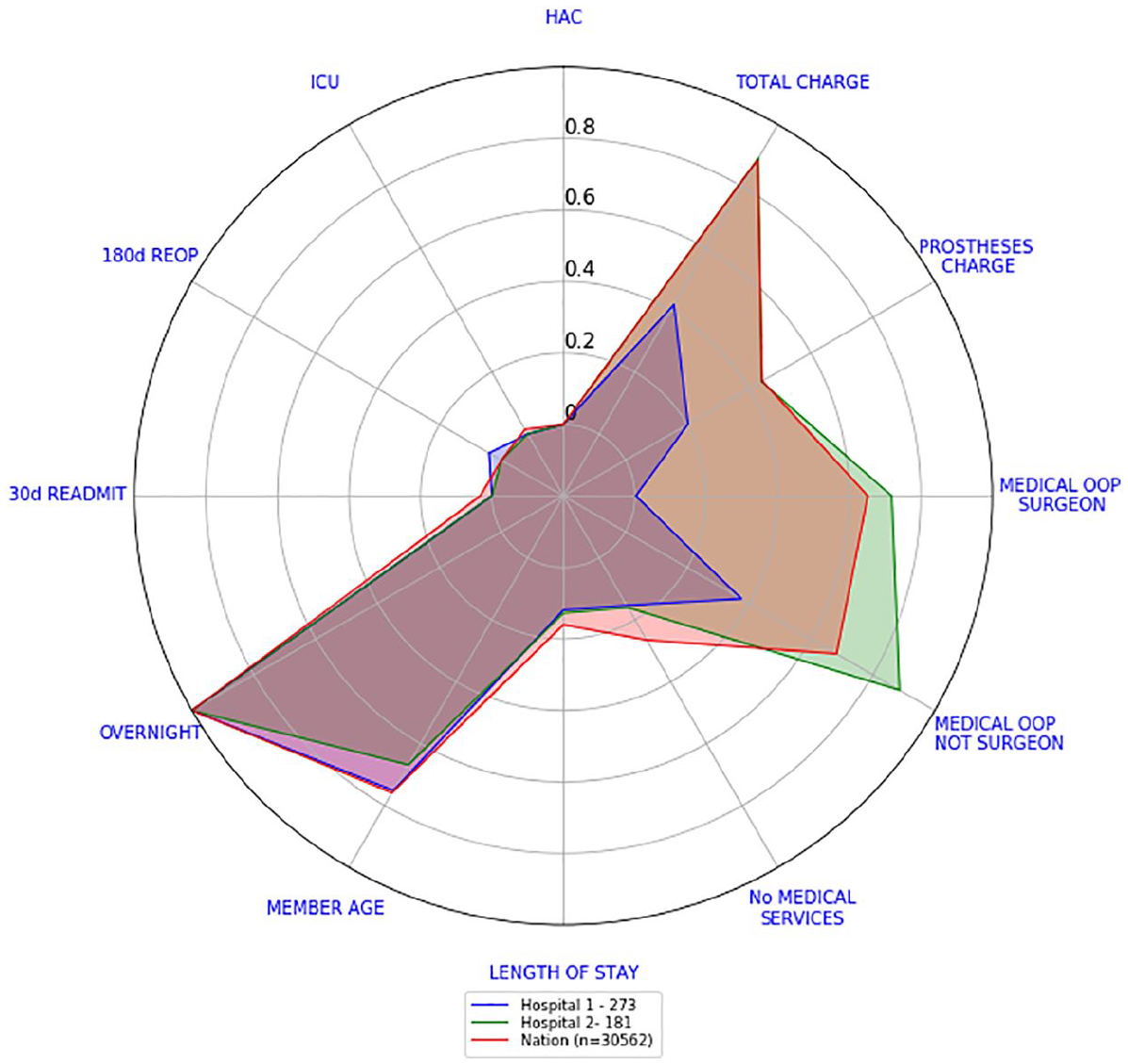
90th percentile consolidated scorecards – Hospital 1 versus Hospital 2 versus national.
By looking at Figures 12 and 14, we can see that although Hospital 1 costs were either on par or considerably better than the national median and 90th percentile, the number of overnight admissions seemed a little bit higher at least 10 per cent of the time. In the case of Hospital 2, their costs needed to be examined more closely in order to find out the reason behind this large difference.
Discussion
Radar plots provide a clear and effective comparative tool for discerning multiple outcome indicators at different levels of aggregation. We presented scorecards at separation level in Figure 1, at hospital level and at national level in Figure 12. We can, just as easily, create one for each surgeon.
For creating our scorecards, since every outcome indicator has different units and distributions they all need to be rescaled. The procedure explained in section ‘Scorecards’ not only does that but it also respects the skewness of each indicator.
Furthermore, the national median scorecards depicted in Figure 4 showed that indicators with high variability (any of the cost indicators for example) can, and will, draw the attention of the observer. To this end, having a scorecard compared against a benchmark reduces confusions and misinterpretations. Our attention will always be drawn to indicators that are clearly different from the benchmark given.
We have also presented a way to consolidate our scorecards into one, refer to Figure 11. As explained in section ‘Consolidated scorecards’, this was done to reduce the complexity of reading and understanding all scorecards quickly. This reduction in complexity comes at a price. For example, Figure 12 shows that the OOP values and total charge for Hospital 2 are of concern, but it does not show which surgery is driving these high values. We recommend using consolidated approaches sparingly.
The national consolidated scorecard can be argued to be influenced by the casemix at the national level across different procedures. This influence could make the comparisons made against Hospitals 1 and 2 irrelevant. We kept our comparisons with these two hospitals ‘as is’ because Hospitals 1 and 2 were chosen for having similar casemix of procedures as the national level (compare Figures 7 and 8).
In general, for creating our consolidated scorecards, we considered the relative frequency of the surgeries to be the only weighting factor. However, we can devise complex mechanisms to set up the weights. These mechanisms could then consider the casemix of the procedures. Furthermore, it is well known that hip (or knee) revisions can be considerably more complicated than hip (or knee) replacement surgeries. 15 A future line of investigation could consist of introducing this complexity into the weighting of the surgeries.
Hospitals were sorted according to an unweighted sum of all their scores. This ensured that the order of the indicators had no effect, and that every indicator had the same importance. We could have also sort them by efficient indicators only to see which hospitals seemed to be more efficient. Regardless of the sorting mechanism chosen, once potential low and high performers are found, they need to be further investigated through risk-adjusted analysis, clinical review or other input.
To account for the potential for our consolidated scorecards to misrepresent the behaviour of some hospitals, we also calculated the 90th percentile consolidated scorecard. Both scorecards together allow us to understand how hospitals usually perform but also how badly they do 10 per cent of the time.
Finally, our scorecards can reduce dramatically the amount of visual aids used in the RACS surgical variance reports. As an example, in the RACS report titled ‘Surgical Variance Report – General Surgery’ from 2016, 13 the first section corresponds to laparoscopic cholecystectomy procedures. To fully understand the variation of these procedures, the reader must go through 11 figures representing the statistical analysis performed on 11 outcome indicators of interest. There are 8 sections for different surgical procedures and 80 figures to go through in total. Our scorecards have the potential to reduce the total number to figures down to 8, only one per section.
Limitations
None of the data presented in these visualisations has been risk adjusted. Further work to develop appropriate risk adjustment is recommended. Consideration should be given as to whether risk-adjusted results could also be presented using radar plots and the issues that are likely to be found.
Summary table
Footnotes
Author contributions
D.M.M.-S. and C.S.M. acquired the data and analysed it. The authors made substantial contributions to conception and design, participated in drafting the article and revised it critically for important intellectual content. The authors gave final approval of the version to be submitted and any revised version prior to it.
Declaration of conflicting interests
The author(s) declared no potential conflicts of interest with respect to the research, authorship and/or publication of this article.
Funding
The author(s) disclosed receipt of the following financial support for the research, authorship and/or publication of this article: This research was funded by the Capital Markets Co-operative Research Centre.