
Abstract
This research explores the effects of light in terms of colour, surface colour configuration and finishes using simple and advanced methods in the development of biophilic lighting ambiances for remote northern architecture. Biophilic light and colour design can benefit inhabitants of subarctic regions, where drastic changes in the natural photoperiod can impact the mind and body. To predict the outcomes of light and colour, this research used reduced-scale models that replicate a north-oriented room and a specially designed mirror-box sky simulator, which emulates the lighting conditions and correlated colour temperature (CCT) of a northern sky. Physical models with distinct surface colour properties and the use of high dynamic range imagery (HDRi) techniques allow the recognition of quantitative effects and lighting attributes of main hue families such as red, green, blue and yellow. The results reveal that the colour and the surface colour configuration significantly modify the spectral properties of a lit ambiance measured in Equivalent Melanopic Lux (EML) and CCT. Surface colour configuration and finishes produce variations in the luminous attributes measured in intensity contrast. This combination of simple and innovative tools could predict light and colour effects in early design stages for responsive architecture in subarctic territories.
Keywords
Introduction
This research explores the effects of biophilic design patterns of light and colour by combining advanced and simple methods in the early design stages to generate responsive ambiances for remote northern architecture. Biophilic design 1 represents an innovative approach for northern contexts2,3 since it could help reconnect humans and nature through architectural elements. Within known biophilic patterns, 4 light source properties such as correlated colour temperature (CCT), colour, surface colour configuration and material finish could cause important perceptual and physiological impacts on humans.5–9 Distinct properties of light and colour in indoor space can potentially alter the reflected light that penetrates the human retinal eye affecting several photobiological effects, referring to image-forming (IF) and non-image-forming (NIF) effects. IF effects are related to vision and the recognition of characteristics of a space such as its configuration, surface, edges and colours conventionally measured in photopic illuminance. In contrast, NIF effects express several human biological processes triggered by light exposure in which the most important factor relies in the synchronization of the circadian clock, usually measured in Equivalent Melanopic illuminance.10–12 Light transmitted through the eyes to the brain can impact alertness and psychological well-being 13 directly, but also various circadian-related processes such as melatonin production, mood and sleep/awake cycles via a direct connection with the biological clock located in the hypothalamus suprachiasmatic nuclei. 14 Contextual daylight conditions in extreme latitudes such as northern Canada are characterized by drastic photoperiod seasonal changes and different daylight colour temperatures that can impact circadian synchronization affecting mind and body.15,16 This situation accompanied with cold temperatures during winter, early spring and spring 17 force people to spend a great part of their time indoors, interrupting proper daylight dose exposure. 18 Indoor spaces inhabited for long periods could integrate passive design strategies 19 to improve occupants’ spatial experiences. Research has demonstrated that the colour of surfaces could improve the indoor environmental quality in northern context based on on-site studies that have addressed aesthetic perception, 20 mood 21 and performance indicators such as cognitive tasks. 22 Yet, it seems necessary to study their IF and NIF effects due to their incidence in architectural lighting and find accurate methods allowing to calculate lighting outcomes for distant locations.
Light and colour in biophilic design for northern climates
Architects and researchers have conducted extensive investigations into the impacts of biophilic design on individuals where several advantages for northern occupants have been demonstrated. Light and colour features emphasize biophilic strategies, since they enhance essential factors that contribute to human well-being. It has been shown that physiological and psychological health23,24 can affect the experience of inhabiting spaces.25,26 Light is responsible for the synchronization of the circadian clock11,27 which is mediated by the quantity of blue light exposure27–29 absorbed by a subset of intrinsically photosensitive retinal ganglion cells (ipRGCs) located in the mammal retina.
30
Nevertheless, surface properties, such as colour and its reflectance, could affect light’s spectral characteristics and therefore melanopic light levels perceived by the human eye. Figure 1 summarizes a pilot study
31
that relates Equivalent Melanopic Lux (EML) exposure and potential of full melatonin suppression
32
of a blue and red generic room with similar cool white LED electrical systems (∼5180°K).
33
The graphic shows that a change of the hue variable in space slightly affects melatonin suppression in different percentages: bluish space at ∼94% and reddish space at ∼98%. Further differences are appreciated in photopic illuminance levels which serve to associate the lighting conditions with visual tasks and architectural programming. When compared the bluish scenario which generates similar EML and photopic values (∼200 lux), the reddish ambiance provides 9.6% more EML levels and 21% more photopic lux. The bluish scenario would therefore be relevant in a space where a specific level of circadian stimulation is required, but conditioned for activities that require low photopic lighting conditions.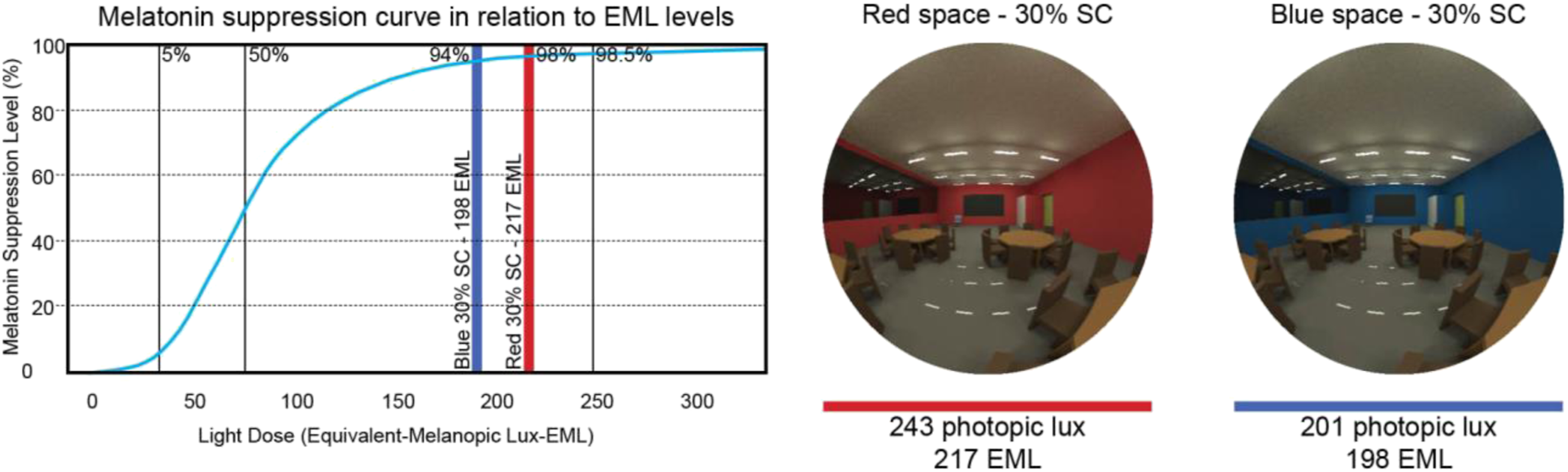
Colour temperature of light has also been demonstrated to generate physiological impacts on humans. Research determined that colour temperature could influence humans’ circadian stimulation, since higher CCT could emit higher spectral radiation in the blue portion as found in the research from Parsaee et al. 34 and Kozaki et al. 35 These findings apply to daylight and electrical lighting systems such as fluorescent equipment since their spectral properties effectively vary in the blue portion according to their CCT. Nevertheless, new findings have established that the effects related to circadian effectiveness are highly dependent on the light intensity penetrating the eye and not precisely on the temperature of a light source.
The combination of light intensity, CCT and colour can impact and create a set of impressions and develop a distinct spatial experience in interiors. Researchers have demonstrated that different types of sky conditions, whether direct or diffuse light, colour, configuration and finish can affect the quality of a lit space. Poirier et al. 36 confirmed that an ambiance can induce different descriptors according to the colour configuration. Dark colours and intense contrasts were considered less pleasant by participants in terms of visual comfort, compared to ambiances that used brighter and more luminous tones. Hegde and Rogers 37 demonstrated that colours can be perceived differently according to the spectral properties of the light source. Their conclusions highlighted that blue colours projected more positive subjective impressions under fluorescent than incandescent light contrary to red colours that were perceived more positively under incandescent lamps than fluorescent light. Rockcastle, Amundadottir and Andersen 38 tested several virtual scenarios under direct and diffuse light to understand the effects of intensity contrast. The results showed that spaces with higher light intensity contrast were perceived as more exciting compared to neutral and uniform ambiances considered as calming. Colour temperature also affects subjective impressions and perceptual occupants’ outcomes with respect to spatial configuration. Research from Manav 39 revealed that light source CCT could affect individuals’ preferences in regard to a room. Individuals demonstrated inclinations to a room with neutral white light at 4000°K could be preferred compared to a room with warm light at 2700°K. Kuijsters et al. 40 demonstrated that elderly people’s affective impressions were modified in relation to room atmospheres created by light CCT. A cool ambiance conceived under the concept of ‘active’ enhanced occupants’ arousal, while a warm ambiance designed under the concept of ‘cozy’ could be perceived as more relaxed. Finally, Viola et al. 41 studied the effects of white light and blue-enriched light to analyze self-reported alertness, performance and sleep quality effects on office workers. The experience demonstrated that blue-enriched light ameliorated several subjective measurements such as alertness, mood, performance, evening fatigue and irritability, amongst others. Although these studies discuss occupants’ responses to light, light colour temperature and spatial configurations, they do not explore their potential physiological responses, nor extreme climatic contexts such as northern latitudes. Studies have associated NIF effects with architectural elements such as CCT light sources, 42 intelligent facades 43 and coloured glasses. 44 However, only a few investigated the potential amelioration that colour in indoor surfaces could generate in northern communities.
Indoor lighting and colour qualities of northern buildings should enhance the spatial experience in indoor spaces by fulfilling people’s photobiological needs. Occupants of the north perform most of their activities indoors because of the harsh climate conditions and low outdoor temperatures during winter and spring that could provoke psychological drawbacks on individuals.
45
Although colours can generate positive subjective impacts on humans,
46
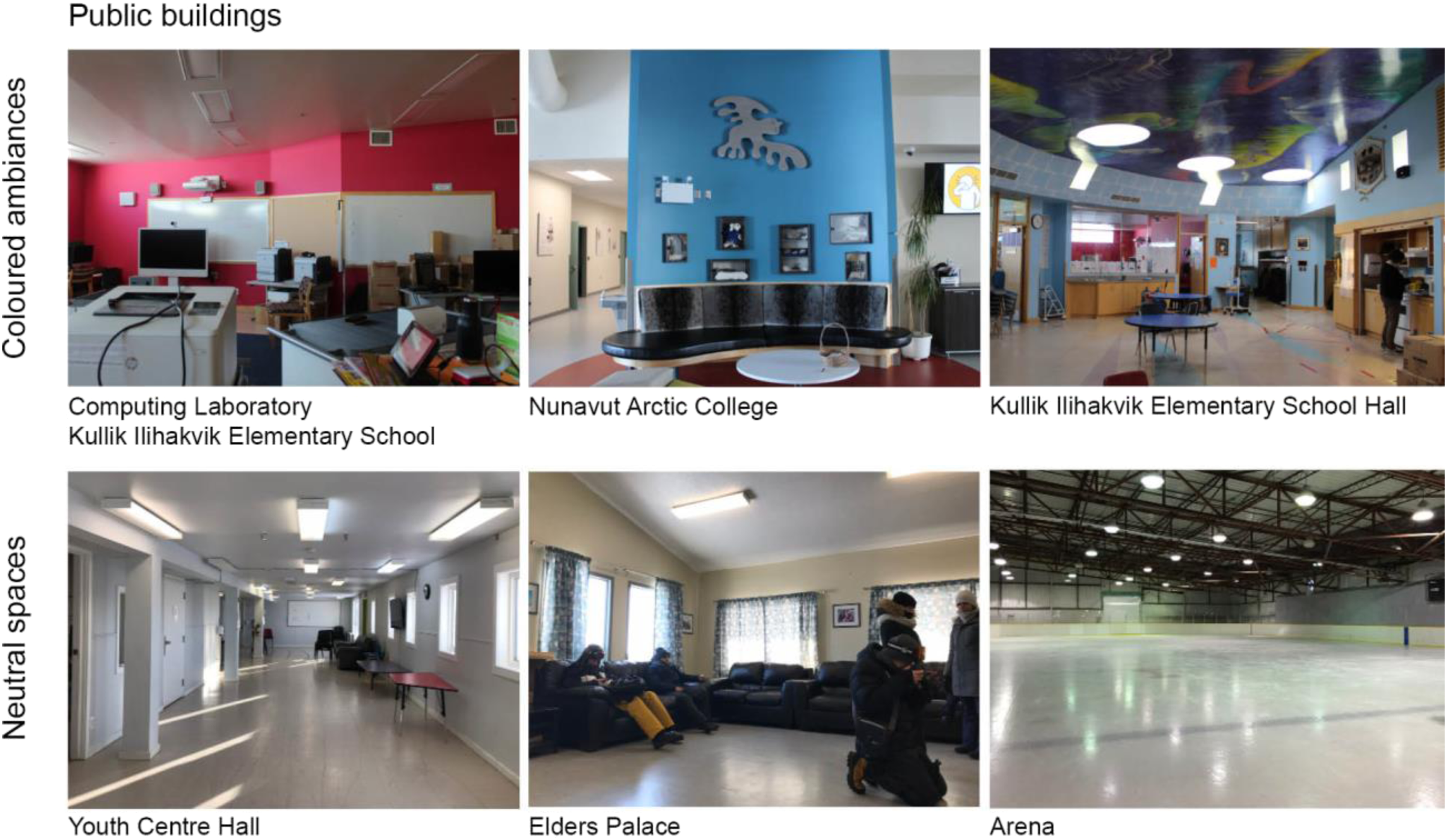
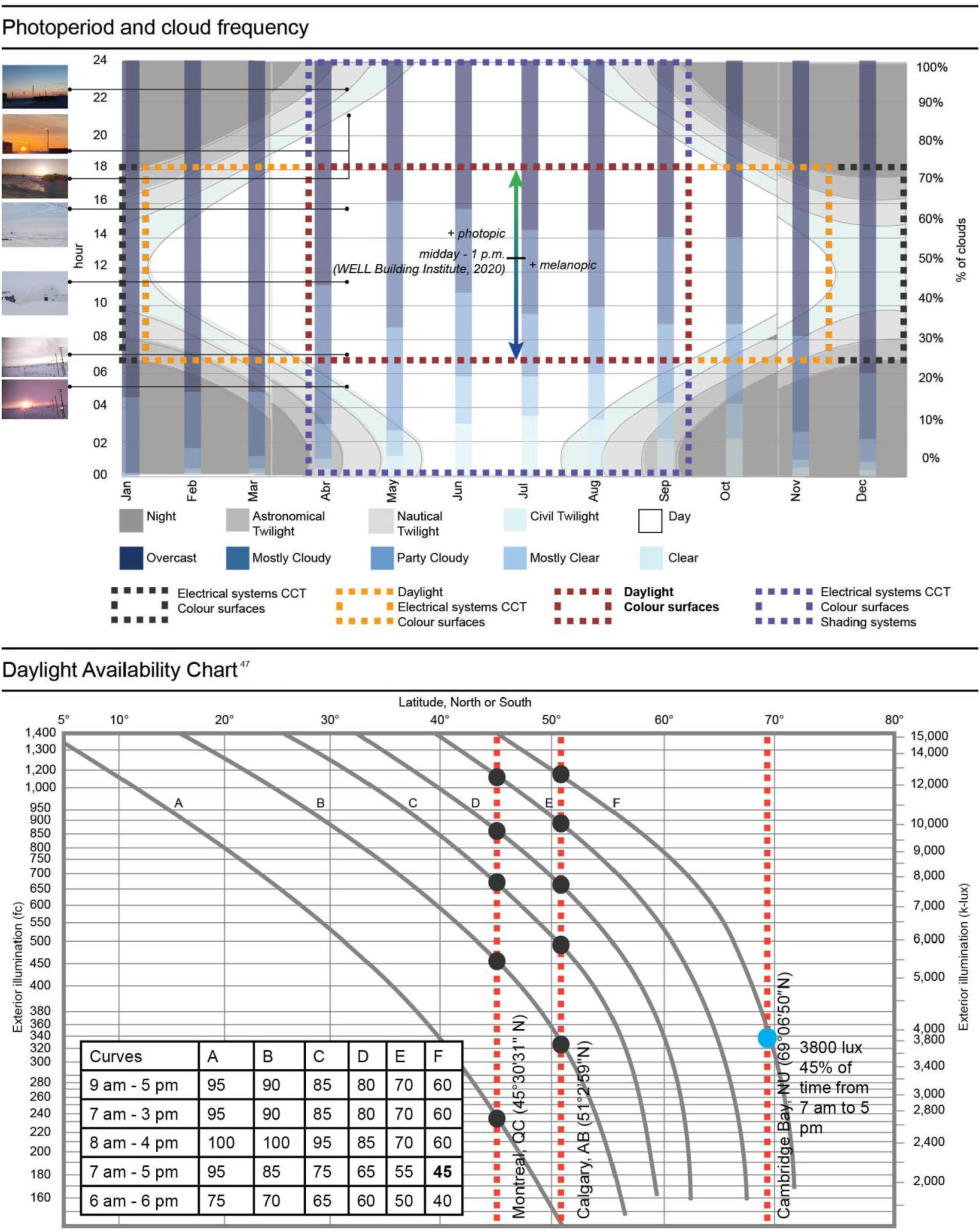
several northern public buildings used white or pale neutral tones in recreational spaces as illustrated in Figure 2. Neutral tones serve to enhance light distribution on surfaces during dark periods of the year; yet, the benefits of the use of colour and the incidence of spectral variations are mostly neglected in northern architectural design. Figure 3 shows the daylight photoperiod, the frequency of cloudy skies over a year in Cambridge Bay, Nunavut (NU), and the possible combinations of architectural strategies such as daylight, electrical light, shading systems and colour in multiple periods of the year. Passive strategies such as daylight and colour indoors can be used from April to mid-September and during a portion of October corresponding to at least 50% of the year. This period also presents an average of 65.6% of overcast skies, which encourages the study of light and colour under cloudy sky conditions. The daylight availability table (Figure 3)
47
presents the percentage of daylight access from overcast skies as a function of latitude and outdoor illumination. Cambridge Bay (69°7’2” N) is characterized by low daylight intensity at 3800 lux for 45% of the annual time during working hours. In comparison, lower latitudes such as Montreal, QC (45°30’31” N) present greater values associated with typical overcast skies with outdoor illumination of 5500 lux for at least 85% of the annual time during working hours. Calgary, AB (51°2’59” N) shows similarities with Cambridge Bay, NU, where its typical overcast sky provides only ∼3600–3700 lux, but the percentage (85%) of the annual time for working hours is almost double. Given the overcast sky factors and percentage of outdoor illumination over a year in which colour and daylighting strategies can be used to benefit individuals, these factors should be evaluated as major passive design strategies to improve the spatial experience and physiological well-being of individuals in a northern climate. Surveyed ambiances in Cambridge Bay, NU (69°7’2” N, 105°3’11” W), public buildings. Photo credit: C. Espinoza-Sanhueza © (2022). Daylight photoperiod, envisaged light and colour strategies, cloud frequency and daylight availability chart over a year for Cambridge Bay, NU (69°7’2” N 105°3’11” W). From DeKay and Brown.
47
An overview of the potential IF and NIF effects of light and colour that could affect northern occupants’ well-being and the need to seek methods to simulate architectural and lighting conditions of distant locations have been described. The research, therefore, addresses the following questions: What is the impact of variables such as colour, surface colour (SC) configuration and finish on the spectral properties of light in the context of the developing biophilic spaces for northern architecture? How can consistent results be generated to analyze these variables during a remote design process? The following sections present the variables explored in relation to surface properties of indoor environments under conditions representative of a northern sky in Canada. The methodology applies research of lighting effects on humans to architectural design. The findings of this research could inspire the use of colour and different finish properties in the development of biophilic architecture in northern territories.
Methods
This research reports on the exploration of daylight and colour patterns in northern territories by addressing a combination of methods to enhance environmental qualities of buildings located in harsh climates. The methods approached in this study to test the effects of light and colour biophilic patterns for human health and well-being in a northern daylight context are presented. The section is divided into Experimental Setup and Variable Combination, which details the materials applied in the experiments, and Measurement and Analyses that explains the data collection, photometric calculation and analysis metrics. This research hypothesizes that the introduction of advanced tools such as a mirror-box artificial sky simulator that mimics the characteristics of a northern sky48,49 could enable the assessment of indoor architectural variables replicated in low-cost methods43,45,46,50 such as reduced-scale models. The use of mock-ups and reduced-scale models have generated reliable results when emulating indoor variables under real skies,36,48–55 which could respond to the objective of this research. Nevertheless, conducting at-distance lighting research such as in northern Canada is costly because of the difficulty of accessing specialized equipment, transportation and time delays,
56
which restrain the possibilities of using physical reproduction models on-site. For this end, we used a specially designed room fitted with a complete LED light ceiling and mirror wall equipment that can be used to simulate characteristics of a northern sky.43,47,57,58 The reduced-scale model represented a generic architectural space with windows only on the left side wall,
59
where three correlated colour temperatures (CCT) of light were experimented, in combination with colour, variations of surface colour (SC) configurations and surface finish.38,39,53,57,60 Image acquisition inside the reduced-scale model was performed by small cameras remotely accessible with a microcomputer device to avoid handling and movement during the data collection process. The analyses and simulation process conducted using high dynamic range imagery (HDRi) allow studying the IF effects that generate results in photopic units,61,62 in illuminance and brightness levels,50,63–65 which serve to evaluate the luminous attributes of an ambiance. Overall ambiance CCT is calculated in regard to IF and NIF effects since it provides key characteristics of colour temperature spatial perception
66
and reveals colour temperature differences of an original simulated sky and the one generated by the surface properties in a room, as evidenced by Jung and Inanici.
67
The Equivalent Melanopic Lux (EML) metric is used to analyze the NIF effects. EML calculates the melanopic illuminance levels which, depending on other parameters such as time
68
and directionality,
69
could prompt the synchronization of the circadian clock and impact well-being. The results could foster an overall comprehension in early design stages of the main aspects of light, colour, surface colour configuration and finish in architecture. Figure 4 illustrates a) the experimental setup and b) the variable combinations considered in this study. (a) Experimental setup and (b) variable combination considered in this study.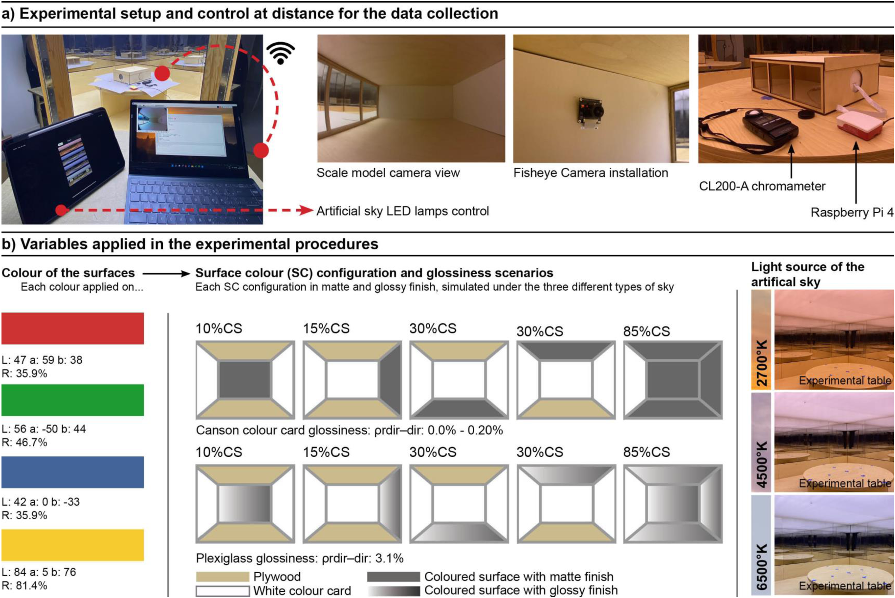
Experimental setup and variable combination
The experiment was performed as illustrated in Figure 4(a) using a novel mirror-box artificial sky simulator and a low-cost reduced-scale model to simulate the selected surface parameters and configurations. The combination of advanced tools with simple but effective analogical simulation techniques of the built environment delivered accurate results in previous lighting and colour studies such as Bodart et al.,
60
Jafarian et al.
50
and Parsaee et al.
43
Additionally, the technique has demonstrated an improvement in architectural strategy analysis during the decision-making process in early stages of the design.53,70,71 The physical model had dimensions of a generic room (10 m × 7 m × 3 m), constructed at 1:50 resulting in a box measuring 50 cm × 35 cm × 15 cm to replicate a daylight space that could support several types of activities. The study area comprehends the different components of an architectural space, such as the floor, ceiling and walls with a window on the left side of 100% WWR. The viewpoint was set from the back of a room. The baseline was characterized by floor and ceilings in plywood, while the walls were covered with white cardboards to exemplify white matte painting. The model was placed on the experimental table at the centre of the mirror-box artificial sky simulator, configured at ∼3800 lux horizontally (measured with a CL200-A Konica Minolta), which consisted of a box of 2.4 m × 2.4 m × 2.4 m coated with mirror acrylics on its interior surfaces to generate infinite light reflections in the experimental space. The device is equipped with 40 adjustable LED lamps which, by balancing warm and cool luminaires, can modify the CCTs as illustrated in Figure 5. The lamps are installed on the top of the cabin, with a distance of 24.1 cm to an acrylic diffuser, which spreads light and simulates overcast conditions. Despite the fact that spectral CCT curves differ with real daylight conditions, this tool presents similarities to a northern overcast sky in terms of cloud frequency, exterior illuminance and colour temperature as shown in Figure 3.
47
The equipment cannot simulate the effects of direct light under a clear sky; however, the developed scenarios can be compared to a north-oriented room with a cloudy or partly cloudy sky with comparable CCT values corresponding to morning (cool), midday (white light) and evening light (warm light)
43
as presented in Figure 5(b). To prompt the image capture, a low-cost 170° field of view Fisheye Camera Module attached to a Raspberry Pi 4 was introduced in the physical model. The Raspberry Pi comprised a Python script developed by Lalande et al.
72
to start the image capture. The Pi was remotely managed using a Virtual Network Computer (VNC) server to avoid movement during the image and data acquisition. (a) Section of the mirror-box sky simulator and its composition
73
and (b) CCTs of sunset, sunrise and midday hours in Cambridge Bay, Nunavut (69°7’2” N), and their similitudes with the artificial sky settings.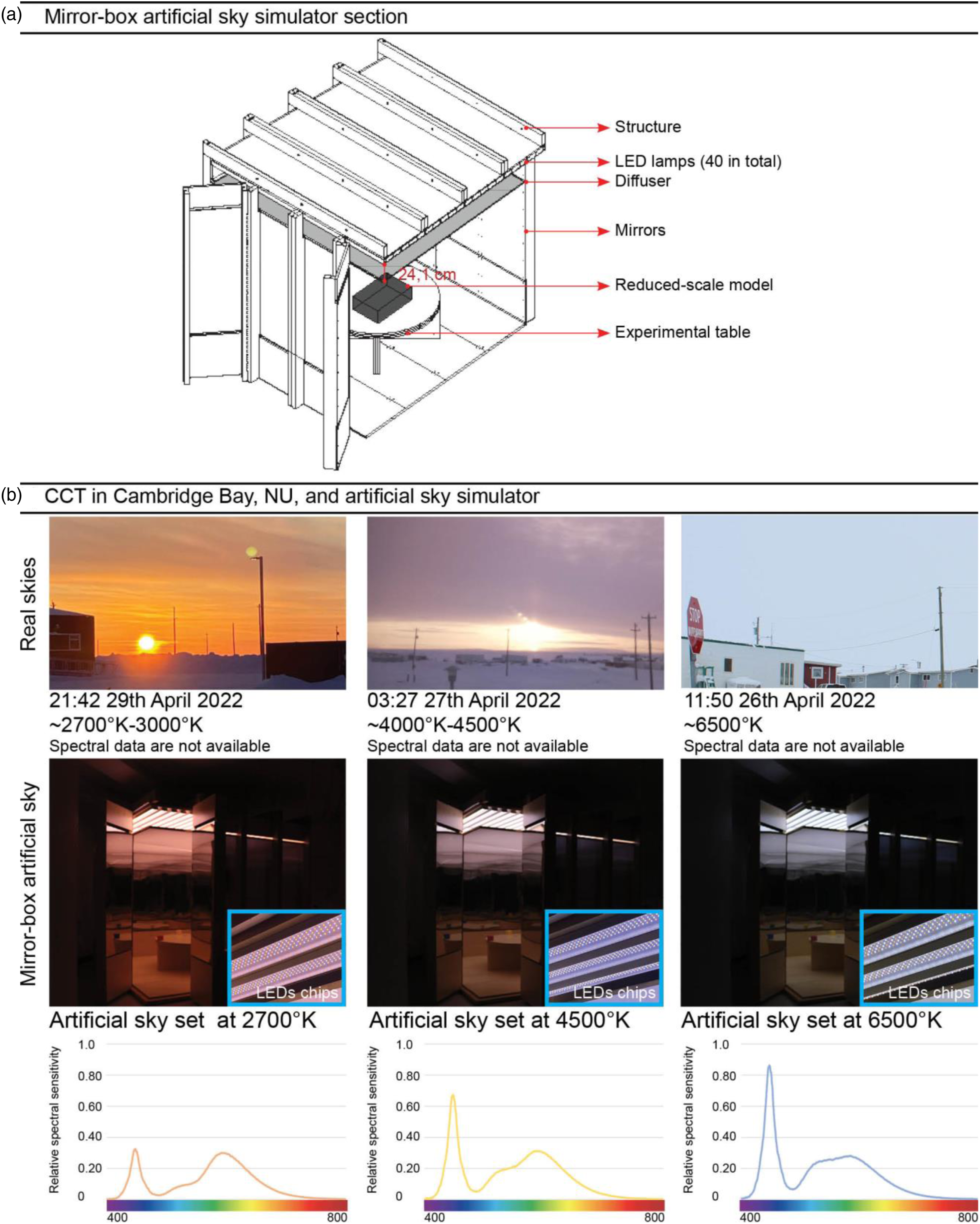
The surface colour, surface colour (SC) configuration, surface finish and light source variables were selected in this research to address the photobiological effects of four main hues experimented under northern or similar daylight conditions. The hues (or colours) in the reduced-scale model were created using coloured cardboard. Its colour was determined based on the CIELab 74 and Natural Colour System (NCS). 75 Both colour systems are displayed as a three-dimensional chromatic space where red, green, blue and yellow are ‘pure’. As exemplified in Figure 4, the colour was incorporated on walls, floor and ceiling of the reduced-scale model to study the impact of the hue families in the indoor environment. The colour information was corroborated using a BYK colorimeter, model Colour Guide 45°/0 (Germany, 2014), 76 providing the coordinates in the CIELab colour system and the reflectance percentages in each tone. Although the coloured cardboard does not represent the exact pure hues stipulated in the CIELab or NCS chromatic space, it provides essential information related to family hues and introduces the possibility of making introduces better decisions when they are applied indoors. The quantity of coloured surfaces on the walls, floor or ceiling was also tested because of its potential effect to polarize the spectral responses 77 and perceptual spatial qualities of each ambiance perceived in the field of view of the observer. DiLaura et al. 78 and DeKay and Brown 47 established guidelines for floor, wall and ceiling reflectance to assure proper light distribution. However, the exploration of colour applications in the entirety of a room could provide additional characteristics to rethink the use of colour on surfaces. Higher percentages of colour applications can intensify spectral results, whether photopic or melanopic, since the configurations and images include more coloured areas. Greater colour applications with high and low lightness could also affect the brightness and contrast levels between indoors and outdoors. The coloured cardboard applied in the study area served to create four surface colour (SC) configurations: frontal (10% SC), sidewalls (15% SC), floor (30% SC), ceilings (30% SC) and a colour configuration covering almost entirely the space with the exception of the window on the left-hand side wall (85% SC). Finally, two types of finishes were compared: matte and glossy. Finish properties modify light performance–related brightness, uniformity 78 as well as the perception and quality of an overall ambiance.79,80 The matte surface finish of the walls, ceilings and floors was simulated using coloured cardboard with its regular texture, in which the glossiness (ρdir-dir) oscillates between 0.0% and 0.20%. 60 For the glossy surface finish, a transparent plexiglass sheet was applied on all the surface of the coloured cardboards to offer a highly reflective coating that could influence light distribution and visual perception of an ambiance. The plexiglass glossiness (ρdir-dir) is 3.1% according to Bodart et al. 60 CCT properties of the artificial sky correspond to the daylight conditions found during the equinox periods of autumn, early spring and spring seasons of an Arctic sky. Winter was not considered in this analysis since the polar night phenomenon demands electrical lighting systems indoors. During a visit held in April 2022 (near the equinox), Cambridge Bay skies (latitude 69°7’2” N) revealed that warm, white-warm and cool light are spawned during the sunset, sunrise and midday hours, as shown in Figure 5. Following similar CCT properties from Parsaee et al., 43 Manav 39 and the lighting conditions found on-site, the artificial sky simulator was configured at ∼2700°K (warm), ∼4500°K (warm white) and ∼6500°K (cool white) CCT values.
Measurement and analyses
Figure 6 illustrates an example of the data acquisition, photometrical calculation and results of a neutral white scenario under 6500°K using a Fisheye Camera Module attached to a Raspberry Pi Microcomputer. The analysis was performed by means of high dynamic range imagery (HDRi) operated by a Python
81
script to control the image capture. The script was configured to capture scenes (from eight to nine images) with multiple exposure values (EV) varying from −4EV to +4EV as shown in Figure 6(a). The HDRi creation was also conducted by Python and OpenCV package
82
and postprocessed using the RGB calibration, exemplified in Figure 6(b), from Jung and Inanici
67
and Parsaee et al.,
34
and enhanced by Bolduc et al.
83
The results were obtained by calculating and calibrating the spectral composition of light sources and reflectance properties of the surfaces into the study area. The RGB calibration allows to precisely compute photopic levels (illuminance and CCT), melanopic levels and final HDRi tone mapped images. The illuminance levels, measured in lux, served to compare the intensity of light needed to perform specific tasks.
78
These illuminance levels can then be used to classify specific colour configurations according to specific activities and programing. Average CCT of a scene was used to analyze how a colour, colour surface configuration and finish could impact the results of the spectral composition from a light source.
67
According to specifications from Durmus,
83
CCT corresponds to one-dimensional metric that aims to quantify the perceived visual quality of nominal white light sources, through warmness and coolness aspects of light. As mentioned, it was assumed that higher CCT could induce circadian stimulation in humans since light sources with higher CCT could emit higher intensity in the blue portion. New findings have established that CCT is not a suitable proxy to measure circadian stimulation
84
since light can be composed by a combination of wavelengths in the visible spectrum, and photobiological responses in relation to light are exclusively managed by light intensity.
85
Although there is no established thresholds for CCT in relation to photobiological effects of light, the significance of such calculation lies in its potential to discuss the overall perceived quality of an ambiance, the incidence surface variables in the resulted spatial CCT compared to the original light source and to comprehend its relation to photopic and melanopic lux light composition, as evidenced in Jung’s
86
research, where spaces with >6500°K presented higher EML compared to photopic lux. Remote connection and IF and NIF photometric analysis of physical model experiments.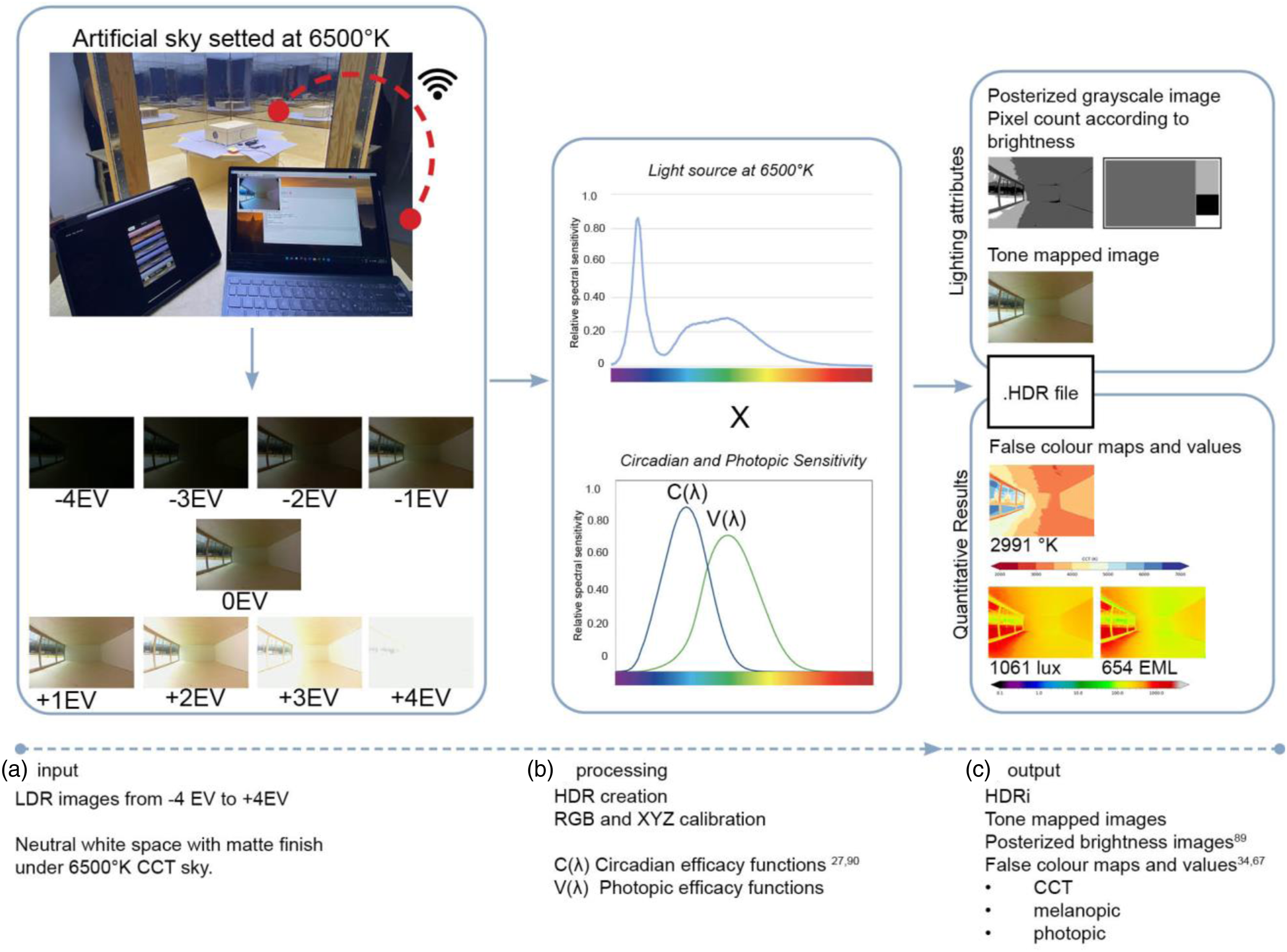
Tone mapped images served to conduct brightness evaluations employing the technique of greyscale analysis of each ambiance developed by Demers.87,88 This technique reveals perceptual characteristics and light behaviour of visual spaces using luminous patterns on a customized greyscale and predicts attention points and potential experiences of ambiances in early design stages. In the present study, we employed a posterization analysis using a 4-degree scale to compare high lightness ambiances, such as yellow tones, with low lightness of the blue scenarios. The posterized pixel analysis creates brightness distribution maps to visualize dominant brightness zones in the scenes. 87 The physiological effects of light and colour interaction were determined by measuring Equivalent Melanopic Lux levels developed by Lucas et al., 89 an alternate metric that is weighted to the ipRGCs. A required lighting intensity of 150 EML (accepted) and 275 EML (recommended) was established by the Well Building Institute 68 for Day-Active People to align the circadian rhythm from 9:00 to 13:00. This experiment did not analyze the lighting conditions necessary not to impact melatonin production in the evening to induce sleep which would require the introduction of architectural strategies such as intelligent facades. 43
Results
The variable combinations generated 120 distinct scenarios and three different baseline scenarios at ∼2700°K, ∼4500°K and ∼6500°K, which were compared in terms of EML, CCT and brightness properties. The results are presented using the following organization: (1) photobiological effects of colour and light source combinations and (2) lighting attributes of surface colour (SC) configuration and finish. Figure 7 presents the photopic, melanopic and overall CCT levels of the baseline under the three different simulated light sources. The results indicate that EML and CCT of the overall ambiance are influenced by the colour temperature of the light source. False colour maps were used to visually distinguish the intensity differences amongst the three cases in terms of photopic and melanopic luminance levels and CCT. It is possible to observe that the three cases present similar conditions with respect to illuminance levels for vision. However, the melanopic levels decreased as the light source CCT was decreased. It should be also noted that the baseline scenarios with a neutral colour had a lower CCT than the original light source, with the largest CCT difference of 40% in the 6500°K ambiance. Photopic, melanopic and CCT results of the baseline scenario under 2700°K, 4500°K and 6500°K simulated northern sky.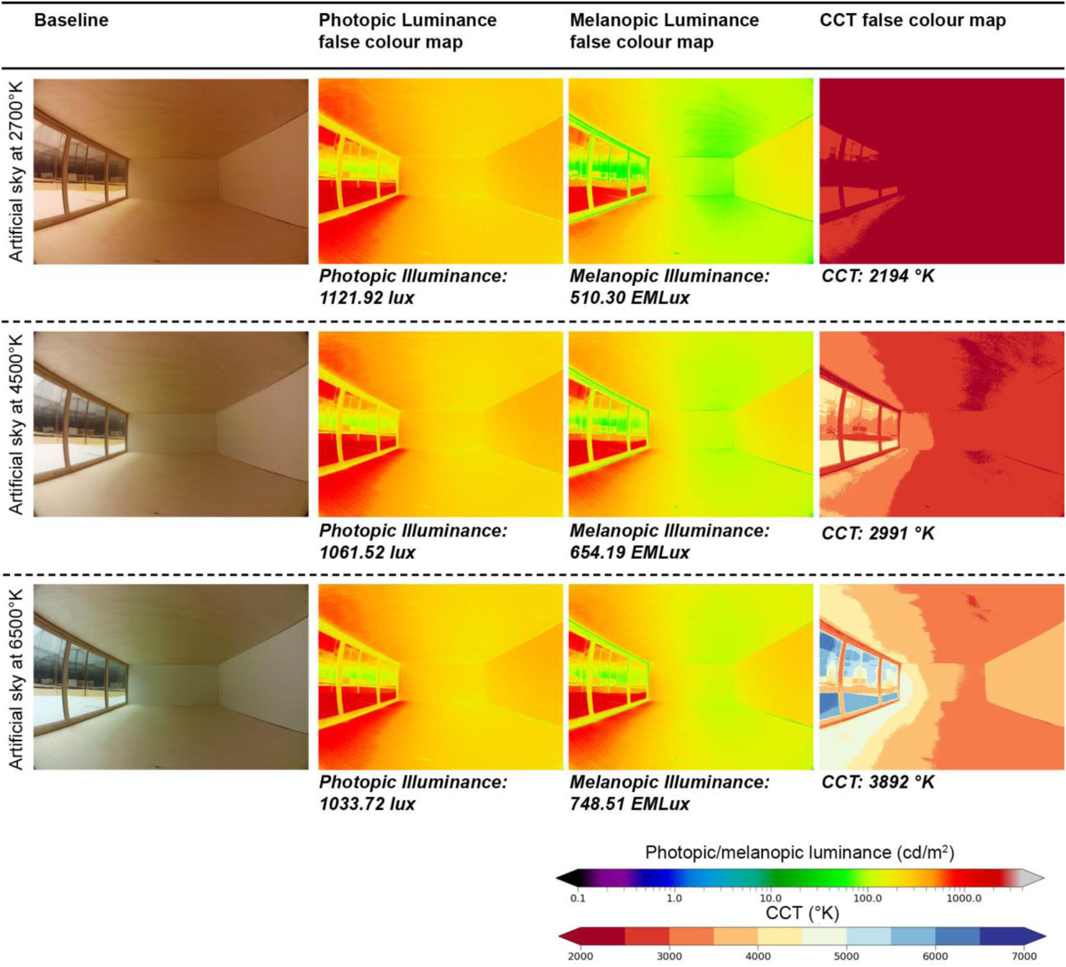
Photobiological effects of colour, colour surface configuration and light source combinations
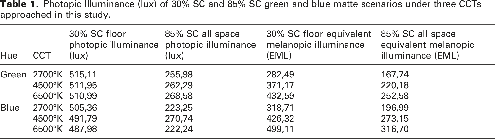
Colour, surface colour properties and light source interactions impacted melanopic lux levels and spectral properties of each ambiance. Figure 8 shows that about 89% of scenarios generated more than 275 EML under a representative northern sky, suiting as a solution that responds to Day-Active People lighting requirements. Amongst those, only four scenarios generated a CCT higher than ∼6500°K corresponding to blue and green scenarios with 85% SC which could indicate a higher melanopic/photopic ratio. This finding could be explained because of multiple factors that, when combined, have produced an elevated colour temperature and reflected a higher amount of melanopic illuminance instead of photopic: (1) cool colours that emit radiation close to the short/medium-wavelength portion such as blue and green which under an external light source CCT of 6500°K provided a higher peak on the blue portion of the visible spectrum and (2) probably the most important variable is the colour percentage of 85% SC. This noteworthy reason relies on the fact that a higher percentage of coloured surfaces was captured by the camera lens, which approximates the field of view of the human eye, and thus accounted for in the analysis of these scenarios. The few scenarios that did not reach 275 EML correspond to 85% SC scenarios at red illuminated at 2700°K and 4500°K, blue scenes at 2700°K and several green scenes at 2700°K, 4500°K and 6500°K. The number of coloured surfaces presented a direct impact on the spectral properties of light as well as on the distribution of light in a room. Table 1 compares the photopic lux of 30% SC and 85% SC of green and blue matte scenes, under the three CCTs studied in this experiment. The results indicate that CCT did not have a substantial effect on the photopic lux levels compared to EML. However, the major differences in photopic lux were observed with respect to surface colour configuration. The analysis showed that photopic levels could be decreased by up to half when the percentage of colour in the space was increased. The presented outcomes of this experiment could suggest that CCT and intensity levels from a light source are certainly significant in inducing circadian stimulation. Yet, colour configuration of an architectural setting affects both melanopic and photopic levels, as well as the overall CCT perceived in a scene. EML and CCT relation of the 120 tested spaces in relation to the three baseline scenarios at 2700°K, 4500°K and 6500°K. Photopic Illuminance (lux) of 30% SC and 85% SC green and blue matte scenarios under three CCTs approached in this study.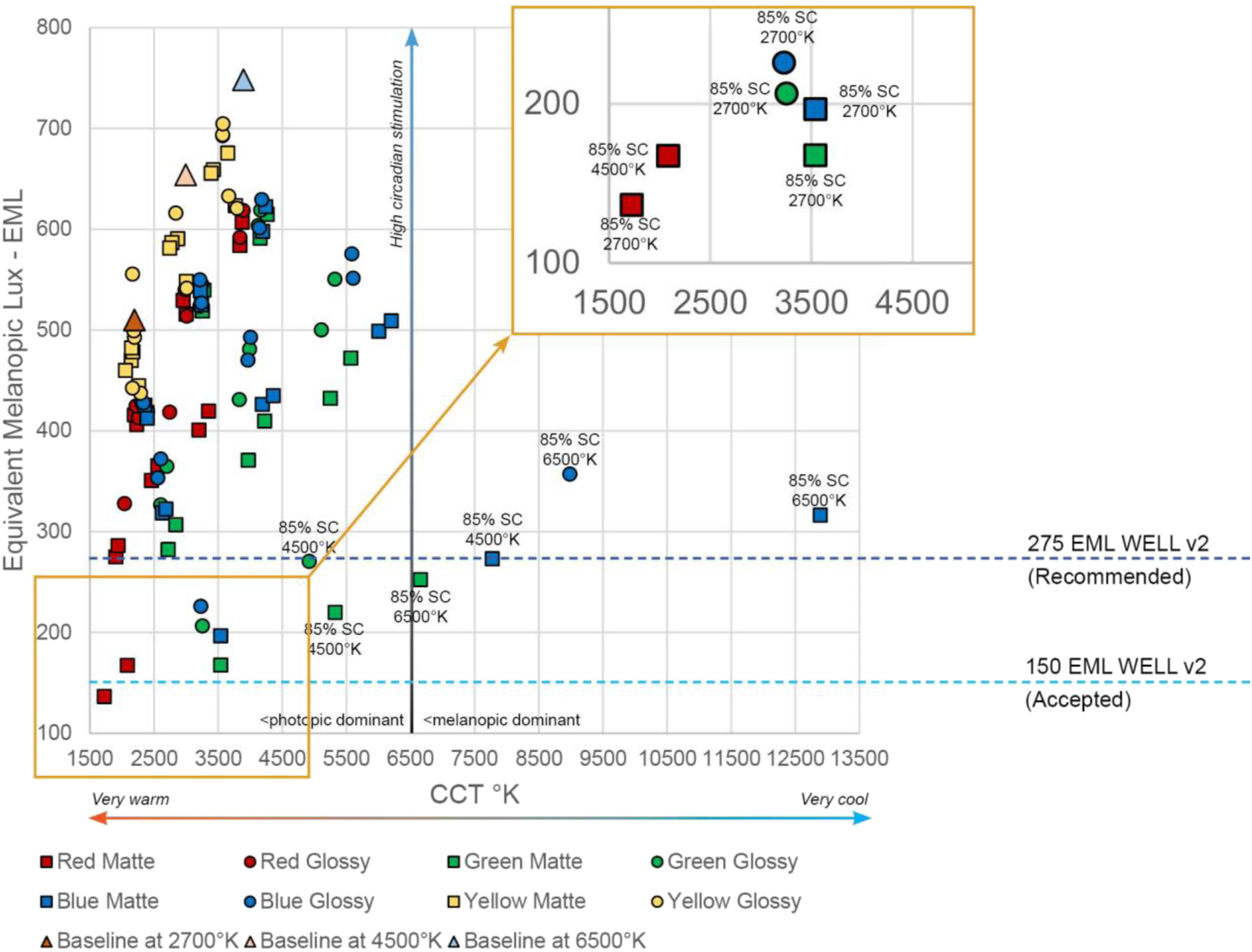
Reddish 85% SC scenarios presented inferior EML according to the recommendations of the WELL Building Standard 68 as well as low colour temperature properties under the simulated overcast sky and three different CCT scenarios. The results show that the combination of these strategies is not recommended when the objective is to enhance the levels of EML for Day-Active People requirements. In this case, further SC configurations using red tones should be implemented as shown in Figure 8. No important differences were revealed in terms of EML or CCT when comparing floor and ceiling scenarios.
Polarized CCT values were estimated in scenarios with 85% SC configuration illuminated at 6500°K. The analyses revealed that spaces configured at 85% SC intensified the CCT by ∼130% (matte) and ∼230% (glossy) for bluish ambiances and by ∼65% (matte) and ∼70% (glossy) for greenish spaces. Contrarily, the CCT in yellow scenarios was decreased by 14% and was decreased by 34% in red scenarios compared to the baseline as shown in Figure 9. Relation of EML and CCT values between baseline spaces and blue, green, yellow and red scenarios with 85% CS configuration under 6500°K.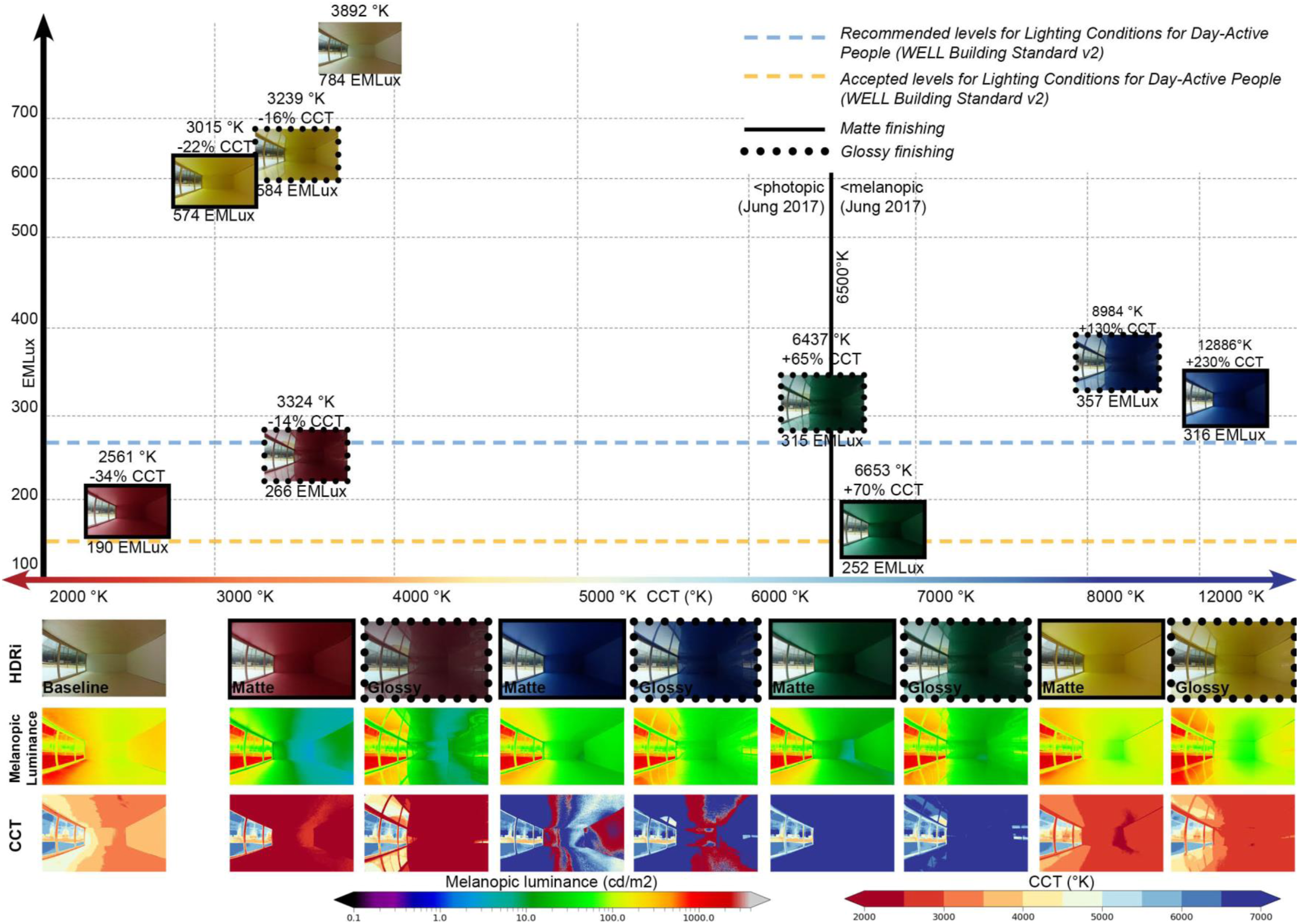
Lighting attributes of surface colour configuration and finish
Surface colour configuration and finish generated differences in the luminous spatial aspects related to brightness and contrast results. Figure 10 presents an analysis of floor (30% SC), ceiling (30% SC) and entire space configurations (85% SC) of green ambiances through a brightness distribution map to represent the intensity level proportions of the scenarios. The analysis evidenced that rooms with higher percentages of colour integration in the space (85% SC) specifically with low lightness levels, such as green, presented abrupt brightness partitions between indoor and outdoor spaces. The greyscale distribution map corroborated larger dark areas (0% brightness – black) compared to the baseline in which its greyscale proportion map is constituted of greater regions of ∼70% brightness. Floor and ceiling scenarios produced similar brightness distribution maps, despite the colour position differences; but the brighter (at 70%) floor areas had a slightly greater brightness penetration compared to those in ceiling configurations. An important difference amongst the scenarios concerns the visual appearance generated by the finish variable. The greyscale map and posterization analysis, retrieved by the work from Demers,
88
yielded variations in the visual appearance and size of window elements. A comparison between glossy and matte finishes showed that window edges of the glossy surface ambiances were not clearly delimited as in the matte scenarios. Window reflections create a visual impression of window enlargement composed of glossy finishes. This result highlights the significance of surface finish properties that could be integrated into spaces with restricted access to outdoors as evidenced in territories of the north. Intensity contrast analysis according to colour configuration and finish (matte and glossy). Tone mapped images from HDR capture using Raspberry Pi Microcomputer (left column); method of analysis showing greyscale image mapping (centre) from Demers
88
and the 4-greyscale categories of pixels (right).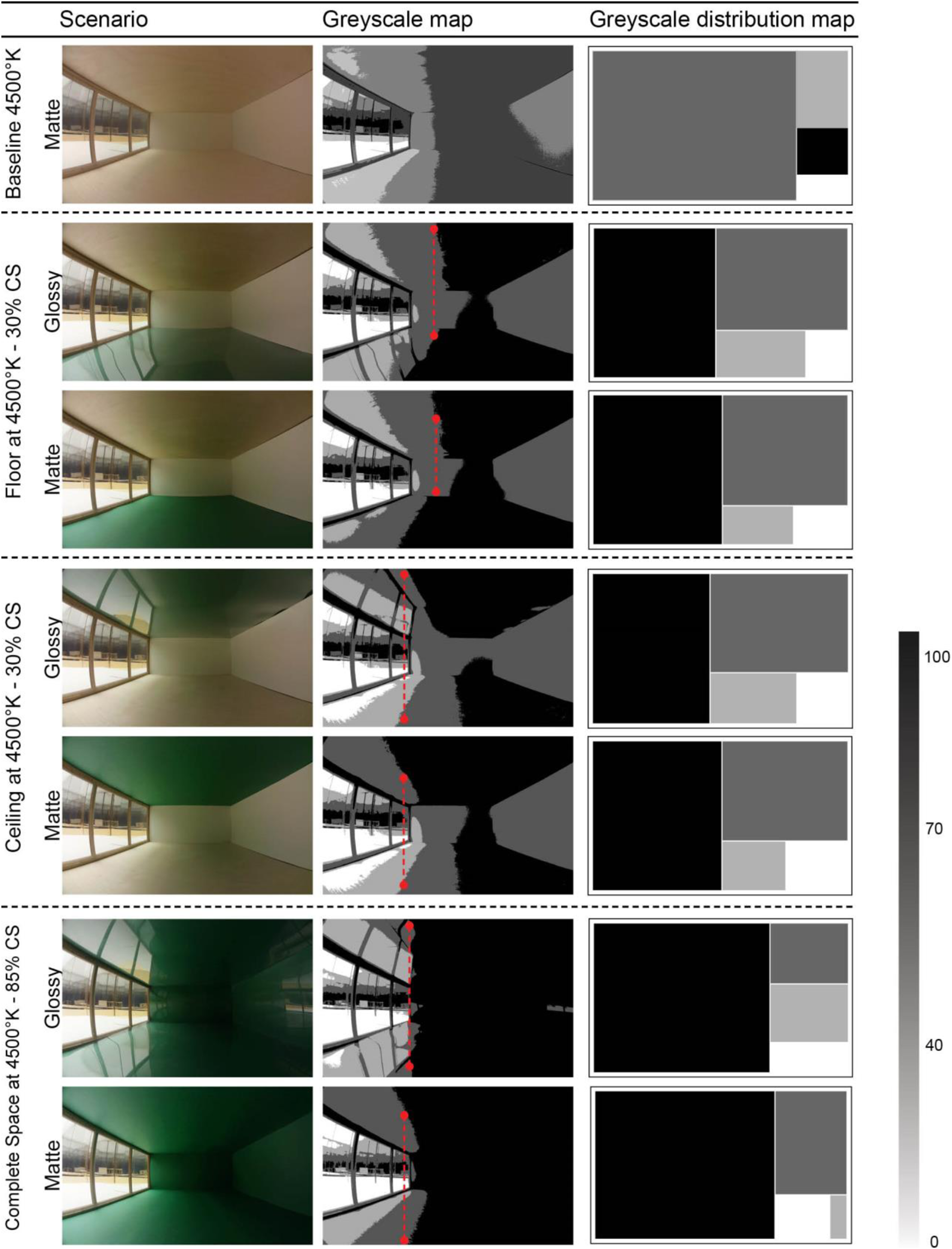
Discussion
This article explored the effects of light and colour as a potential design strategy in architecture with the objective of providing responsive lighting ambiances to northern communities. The exploration provided a general understanding of the characteristics and main effects of colour in the built environment. Further studies could integrate a wider range of colour combinations that respond to these needs and continue to develop an overall knowledge regarding colour, visual comfort and photobiological outcomes for individuals. A straightforward and accurate methodology replicated real spaces by employing reduced-scale models and a mirror-box sky simulator of an overcast arctic sky. These methods accurately represented attributes of the built environment. Nonetheless, the perceptual experience and photobiological effects generated by the inhabitation of real ambiances located in northern regions can be affected by multiple aspects such as contextual physical characteristics of the outdoor environment, including the presence of snow and human factors. Likewise, the materials employed in the reduced-scale models imitated characteristics of materials typically found in the built environment, but they cannot completely represent the real spectral properties of materials used in architecture. Building materials present distinct characteristics related to lightness, saturation, roughness and glossiness that cannot be entirely reproduced in experimental studies. Additionally, on-site and subjective analyses could allow researchers to obtain conclusions that cannot be truly predicted using physical scale models and imagery analysis in a laboratory experiment. Although this research did not include people’s subjective appreciation of light and colour interaction, it used analysis methods to assess fundamental aspects of ambiance qualities such as the visual effects of intensity contrasts.
The present research investigated lighting attributes of light and colour interactions in the built environment to promote human well-being and foster biophilia in northern architecture. Light sources, colour surfaces, percentages of coloured surfaces and surface finish properties presented multiple characteristics of spaces that may influence individuals’ environmental satisfaction. They also revealed the likelihood of generating responsive lighting ambiances according to people’s photobiological needs. Results demonstrated that 89% of the tested scenarios projected EML values over 275 EML under several colour surface configurations. Combined with further variables such as directionality, timing and intensity during the recommended hours, these scenarios could favour the synchronization of the circadian clock under northern daylight conditions and colour temperature.
The analyses further revealed that 11 scenarios did not reach the recommended EML levels identified in this paper. Specifically, the reddish scenarios at 85% SC presented the lowest EML levels. We infer that other strategies such as electrical lighting systems could be integrated to achieve the EML light levels recommended by the WELL Building Standard. Future studies should consider the IF and NIF effects of colour and electrical lighting systems at other times of the year, such as during polar night periods in northern latitudes.
This research supports the premise that higher CCT does not relate to higher circadian stimulation, since the scenarios that have generated cool colour temperature (>6500°K) have presented lower intensity EML levels compared to scenarios with warmer colour temperature. The integration of CCT analysis of a whole ambiance could assist architects in predicting the potential changes of the spectral composition of a space compared to the original light source CCT as well as analyzing the relation between photopic and melanopic lux. Distinguished CCT outcomes were estimated in blue and green scenarios with 85% SC configuration illuminated at 6500°K. While the causes can be explained because of the spectral combination of short/medium wavelengths between surfaces and the light source, the main effects related to the higher percentage of coloured surfaces captured in the field of view of the camera, which was accounted for in the analysis of these scenarios. No important differences were revealed in terms of CCT and EML levels when comparing floor and ceiling scenarios. This suggests that architects can apply a coloured surface to the floor or the ceiling of a space to obtain similar photobiological responses in building occupants. This study did however not comprehend the potential outcomes of CCT related to subjective impressions, perceptual performance and mood which would require the participation of human subjects, and such conclusions cannot be implicitly predicted by photo calibrated calculations. Future research should consider using participants to analyze the perceptual effects of a space in regard to CCT and surface colour or propose conceptual methods to predict potential subjective impressions of individuals by means of reduced-scale models and imagery treatment.
Finish parameters demonstrated that their architectural significance lies more in the perceptual qualities of an ambiance than in photobiological benefits. The experiment indeed revealed that glossy finishes could bring attention to architectural elements such as windows, improving the connection between indoors and outdoors by considerably enlarging the dominant brightness area through light reflections. These outcomes reveal the potential of thoughtfully introducing coloured surface configurations and finishes in architecture to shape the overall ambiance experience, moreover, avoiding the instabilities of the spectral dominance that affect people’s photobiological stimulation.
Conclusion
This study demonstrated the significance of light and colour interactions that respond to people’s photobiological needs and the enhancement of physical and psychological well-being. Understanding the potential effects of these parameters may enable designers and researchers to suitably associate what people need in terms of light stimulation during the day in relation to architectural parameters. Studies using physical models, such as those presented in this paper, allow the integration of architectural elements that affect well-being in the early design stages of new construction and building renovations in northern communities. Architects and researchers may consider the potential of light and colour to respond to individuals’ photobiological needs that are critical under northern Canada’s extreme latitudes. In doing so, their implementation should contribute to the creation of spaces and ambiances that respond to the needs and aspirations of the community.
Footnotes
Acknowledgements
The authors would like to thank Charles-Antoine Pelletier, student of medicine and CERVO research assistant, for his help in preparing the experimental setup and data collection. The authors would also like to thank Christophe Bolduc, master student of electrical engineering, for his assistance in the validation of the image processing and calibration.
Author’s contribution
This article is part of the doctoral research of the first author Carolina Espinoza-Sanhueza. The co-authors correspond to a supervisor and two co-supervisors of this interdisciplinary research and participated as advisors and proofreaders. Each co-author contributed to different parts of the paper. Claude Demers supervised the research, architectural part, methodological design, data collection and results analysis. Marc Hébert supervised the photobiological part, methodological design and results analysis. Jean-François Lalonde supervised the data collection and analysis methods.
Declaration of conflicting interests
The author(s) declared no potential conflicts of interest with respect to the research, authorship, and/or publication of this article.
Funding
This research was supported by the Sentinel North Strategy program of Université Laval, made possible, in part, thanks to funding from the Canada First Research Excellence Fund. More specifically, this research was funded by the project 2.1. Optimizing biophilia in extreme climates through architecture.