
Abstract
This article examines whether, how, and to what extent eighteen UK audience participants developed diagrammatic thinking while reading eleven COVID-19 data visualisations published by UK newspapers. Despite data visualisations being a prominent feature in COVID-19 news coverage, audience perception of data visualisations is a relatively new field of study. This study reveals the presence of Stuart Hall’s three types of reading (dominant, opposition or negotiated reading) in the participants’ reading, with the prominent role played by their reflections and the influence cast by their levels of data literacy and familiarity with terminologies. As an experience of reflection and reflexivity, reading data visualisations prompted the participants to rethink the pandemic-related issues posed in data visualisations and reflect on their personal experiences and views. Their reflections confirmed or developed their understanding of these issues or led them to reject the message they perceived. This process suggests their diagrammatic thinking is in practice.
Keywords
Introduction
Data visualisations – visual representations of data such as charts, graphs, maps, timelines and other interactive gadgets – can be used as a tool or method to understand, learn and develop ideas and concepts about objects in a thought process known as diagrammatic thinking (McCosker and Wilken, 2014). Data visualisations have been widely used in the news coverage about the COVID-19 pandemic. Visualising the crisis reduces the complexity of COVID-19 data and is thought to facilitate audience engagement (Young et al., 2018; Zamith, 2019) and help audiences understand the pandemic (Comba, 2020). Audiences have been actively using data visualisations, such as those featuring infection metrics provided by news media during the pandemic, to monitor the situation (Dahl and Ytre-Arne., 2023). Interactive data visualisations in COVID-19 news stories have even triggered audiences’ fear and perception of threat, prompting them to adjust their actions to prevent the virus (Oh and Hwang, 2021).
Despite the recognised importance of COVID-19 data visualisations to audiences, we do not know enough about how audiences interpret meanings in them (Kennedy, 2020). With a long tradition traced back to the early 20th century, audience reception studies mostly examine how audiences perceive conventional print and broadcast coverage, entertainment content, such as films and, later, online content, leaving audience reception of data visualisations in news largely understudied (Engebretsen, 2020). Existing studies regarding audience perception of data visualisations are often about the effectiveness of data visualisations; more research about audiences’ interpretation of meanings in data visualisations is urgently needed, as Kennedy and her collaborators have rightly pointed out (Kennedy et al., 2016).
When it comes to COVID-19 visualisations, current studies (such as Marju et al., 2022; Zhang et al., 2021; Jacob, 2020; Falisse and McAteer, 2022) are often about how the pandemic is visualised and represented (Allen et al., 2023). However, audiences’ reading of COVID-19 data visualisations is central to their news experiences, influencing their understanding of public health information and the pandemic. As an important communicative medium, data visualisations can summarise usually complicated data and present it in an easy-to-understand way. Involving diagrammatic reasoning, data visualisations enable the development, expression and understanding of concepts and problems and serve as a space of exploration (McCosker and Wilken, 2014). The extent to which and how audiences develop an understanding of the pandemic and related issues through reading data visualisations is thus an important topic for research. Researchers (such as Padilla et al., 2022; Kennedy, 2020; Ivanković et al., 2021) have started to tackle this question, but we are still developing knowledge of this area.
This research aims to contribute to this area by examining eighteen UK audience participants’ reading of eleven COVID-19 data visualisations published by British newspapers. We ask two questions in this study. First, how do audiences interpret meanings in COVID-19 data visualisations? Second, what understandings about the pandemic do audiences develop from reading COVID-19 data visualisations, and how?
The paper starts with a discussion about the theoretical framework before introducing its methodology including the method, data and analytical framework. It then discusses the findings and explains the contribution this study makes to our understanding of data visualisation and audience reception, in particular data visualisations’ diagrammatic capacities in facilitating audiences to develop ideas through data visualisations. A reflection on its limitations is presented at the end of the paper.
Theoretical framework
Data visualisations and diagrammatic thinking
Data visualisation is usually defined as data’s visual representation that communicates meaning to audiences (Kennedy et al., 2016; Kirk, 2016). Communicating complex information in an accessible way (Smiciklas, 2012), data visualisations have become an important, integrated story-telling element in journalism (Engebretsen, 2020; Gynnild, 2014; Loosen et al., 2020; Rinsdorf and Boers, 2016; Weber and Rall, 2012; Stalph, 2017). The prominence of data visualisations in COVID-19 news coverage is partly because data is essential to our understanding of the situation, but partly due to the common assumption that data visualisations can present the data and convey meaning as an effective way of engaging audiences.
Academic views about data visualisations are divergent. Data visualisations are seen as presenting data through beauty (Tufte, 2001), having the power to benefit the world, and conventionally making data look transparent, factual and objective (Kennedy et al., 2016; Kosara et al., 2009). Data can be difficult to access, interrogate and understand; but data visualisation can help audiences understand complex data and related issues (Ancker et al., 2006).
However, scholars also find that audience engagement with data visualisations may be influenced by multiple factors such as topics, emotions, and skills (Kennedy et al., 2016). In addition, scholars with critical approaches to data visualisations regard them as subjective rather than objective, embodying meanings and the producers’ intentions. Visualising data occurs in a process of decision making: decisions are made about which data to collect and how to interpret and visualise it. As a result of this process, data visualisations reflect their designers’ overt intentions and hidden assumptions (Boehnert, 2016). Data visualisation is only one specific way of interpreting and illustrating the data as a component of story-telling in news (Loosen et al., 2017). To effectively communicate with audiences, data visualisation producers should make the message clear in their data visualisations (Kirk, 2016). Data journalism producers have been found to construct meaning with data visualisations’ parameters (Anderson and Borges-Rey, 2019). Elements such as titles, legends, captions, colours, position, text boxes and layout are important to constructing meaning (Engebretsen and Weber, 2017; Weber, 2019). For example, a title usually functions as a guide to the meaning of the data visualisation. As a method of communication, therefore, data visualisations are designed to effectively convey specific meanings derived from data, reflecting the producers’ intentions.
More recent studies direct our attention to data visualisations’ diagrammatic components that pose and repack – instead of solving – problems that confront audiences who rethink them through data visualisations (Stalph and Heravi, 2021). By involving diagrammatic reasoning (Peirce, 1976), data visualisations facilitate and support creative thinking, representation and understanding of otherwise complicated or abstract concepts, existing social forces and relationships (Tylén et al., 2014). The diagrammatic reasoning process involves loops between steps including ‘construction’, ‘observation’ and ‘manipulation’ before reaching ‘conclusion’ (Stjernfelt, 2007: p138-142). For producers who are the first audiences of their data visualisations, it is a process of learning and developing ideas and concepts through drafting/constructing data visualisations, then applying the learnt knowledge to improve data visualisations and produce the final versions in the production stage. The diagrammatic reasoning involved in the data visualisation production process suggests that data visualisations convey the producers’ intentions as a means of communicating their concepts.
Following these discussions, therefore, this article defines data visualisations as diagrams that are purposefully constructed to reveal social relations between the parts of the object they represent and enable diagrammatic thinking. Diagrammatic thinking refers to a thought process that uses data visualisations as a tool and method for developing and learning ideas, concepts, and social relations, which can be involved in both the production and consumption of the data visualisations. With this diagrammatic capacity, data visualisations offer ‘a virtual space for exploration’ through which knowledge can emerge and people are prompted to think diagrammatically (McCosker and Wilken, 2014: 162; De Landa, 1998). For audiences, data visualisations can provide an innovative way to understand social dynamics, realities and relations surrounding the particular objects that data visualisations represent (Gerner, 2010). However, they may or may not appreciate the producers’ concepts, as data visualisations offer an explorative space to rethink the related problems and concepts. The way audiences (re)think these concepts and what they ultimately understand may be open to discussion.
Audience reception of data visualisation
While existing studies on audience reception of data visualisation often examine their effectiveness, few have researched how audiences interpret data visualisations. The study by Kennedy and her collaborators identified six factors that impact audience engagement with data visualisation (Kennedy et al., 2016). However, it did not explore how audiences understand and develop concepts and ideas in data visualisations. In the contexts of the UK and Poland, a study concluded that audiences’ emotional reactions to climate change data visualisations can encourage their participation (Fratczak, 2022). Audiences may also be mobilised to think about and act on issues such as human rights (Rall et al., 2016), abortion (Hill, 2017) and immigration (William, 2021). Audience engagement with infographics on Facebook was found to be linked to the characteristics of the infographics during election campaigns (Amit-Danhi and Shifman, 2020).
Scholars have examined the representation of the COVID-19 pandemic in data visualisations. Narratives and language in COVID-19 data visualisations were examined (Ostherr, 2023; Wilhelm and VanderPlas, 2022). Brenn and his colleagues examined the content of visuals in misinformation about COVID-19 during the first three months of 2020 (Brennen et al., 2021). Facing the enormous uncertainty triggered by the pandemic, data journalists were found to heavily provide forecasts about the pandemic through their visualisations as knowledge brokers (Pentzold et al., 2021). Aiello and her collaborators studied how nationalism, localism, and cosmopolitanism were promoted in generic visuals during the early stages of the pandemic (Aiello et al., 2022). Zhao and Ye examined Chinese users’ responses to COVID-19 visualisations published by the government, evaluating the factors that influenced engagement with data visualisations and their overall effectiveness (Zhao and Ye, 2022).
These studies contribute to our understanding of the role of data visualisations in mobilising public participation and engaging audiences. These valuable contributions can also improve our knowledge of how events like the COVID-19 pandemic are represented in data visualisations. However, they have not examined how data visualisations prompt audiences to think diagrammatically, that is, how and to what extent audiences can learn and develop ideas from reading data visualisations, which is the focus of this paper.
Like other types of media text, audiences may interpret meanings in data visualisations in multiple ways. Rejecting the linear media effect model, Stuart Hall (Hall, 1973, 1977) argues the meaning of cultural content is co-produced by producers and audiences. Media texts can have diverse meanings in different socio-cultural contexts (Hall, 2010). Hall stresses the role of ideology, in particular the dominant ideology reflecting the interests of dominant groups or those in positions of power, in audiences’ reading. In the context of television, he assumes media texts are encoded within the dominant ideology, as media producers’ professional codes operate ‘within the “hegemony” of the dominant code’ and ‘serve to reproduce hegemonic definitions’ (Hall, 2010: 52 and 53). Audiences who accept the dominant ideology are likely to decode the message (‘dominant code’) encoded by the producers who produce the content within the dominant ideology/code, which is termed the dominant-hegemonic – or preferred – reading. However, those who generally accept the dominant ideology but are critical at a specific level may partly accept the intended message encoded by the producers (negotiated reading). Audiences may reject the dominant message encoded within the dominant ideology but create their own message (oppositional reading) (Hall, 2010). Hall regards audiences’ social situations, such as class and positions, impact their reading positions: those who are disempowered are likely to defy the dominant meanings of media texts (Fiske, 1987). However, his later work abandons the direct influence of audiences’ socioeconomic positions on their readings (Pillai, 1992).
Hall’s encoding and decoding theory is no doubt seminal and has been underpinning media communication studies since its publication. However, his work has also received considerable critiques. David Morley, for example, regarded it necessary to separate ‘comprehension and evaluation’ and argued that ‘oppositional reading’ may stem from audiences’ political opposition and refusal to engage with the text (Morley, 2006). Ross pointed out that media texts may not always be encoded within the dominant ideology. Instead, they may embody multiple voices, some of which may oppose the dominant meaning system. Therefore, the encoding/decoding typology needs to be modified, and it is necessary to differentiate ideological positions from pure text acceptance (Ross, 2011). Wren-Lewis criticised that seeing television messages as inscribed with a dominant/preferred meaning denies the material existence of a sign (Wren-Lewis, 1983). Critics also pointed out that audiences’ readings are more diverse than the three categories of reading. For example, an audience rejecting the preferred meaning of a media text may still accept the dominant ideology (Pillai, 1992).
Hall’s theory, particularly his encoding and decoding model, has started to be applied – but less frequently – to data visualisations. Data visualisations are diagrams and different to other types of media content such as TV programmes or print text. Their diagrammatic components make them an exploratory space for audiences to think about the problems they pose. In particular, when the problems are about contested issues and conflicting forces and relationships, their relevant parts can be presented in data visualisations and become ‘an object of exploration’ for audiences to rethink (Hoffmann, 2011). These diagrammatic components of data visualisations also suggest when interpreting data visualisations, audiences do not just interpret their meanings but also can develop an understanding and knowledge about the objects depicted through data visualisations. This learning aspect during interpretation and the influencing factors are, however, not sufficiently examined in previous studies applying Hall’s theory (such as Kennedy et al., 2016; Ridley and Birchall, 2020; Ridley, 2021). How do audiences perceive and interpret the concepts and ideas about objects posed in data visualisations? Do they gain knowledge and understanding of these objects through data visualisations? If so, what do they gain and how?
Data visualisations, the COVID-19 pandemic and the UK context
The pivotal role played by data visualisations in news coverage of the COVID-19 pandemic is shown in two aspects. First is the sheer amount of data visualisations published by news media around the world during the pandemic. Secondly, journalists serve as ‘knowledge brokers’, guiding public opinion and helping the public to understand the pandemic through data visualisations (Pentzold et al., 2021). Both aspects are prominent in the UK context.
The COVID-19 pandemic is not only a public health crisis but also a societal, economic and political crisis. It has triggered a partial ideological reconfiguration (Ioannou and Charalambous, 2024) and tested governments’ ability to manage public health emergencies while maintaining social order. As well as chaos and disruption, the COVID-19 pandemic has brought up contested and disputable issues such as social distancing, lockdowns, death tolls and vaccination. These issues have raised questions about governments’ ability to manage the crisis and uncertainty. In the UK context, the UK government’s decision to impose a lockdown did not come until late March 2020. Initially it attempted to push forward the idea of ‘herd immunity’. When it made a U-turn and tried to impose a lockdown on March 16, 2020, the government needed to justify this decision and garner public support, especially in light of a lack of support and the presence of opposition among some members of the public (Collignona et al., 2021). People were concerned about the economic consequences of lockdown and social distancing. Later, questions were raised regarding the high mortality rate in the UK, the impact of lockdown on the economy, and the actual number of deaths. Most notably, the death toll was called into question when the statistics published by the government differed from those released by the Office for National Statistics (ONS) and when the government changed the criteria for counting cases and deaths. And, later, the safety of the AstraZeneca COVID-19 vaccine and its potential association with blood clots were in the spotlight. The government pushed the vaccine rollout amid rumours, conspiracy theories and public hesitancy. In the UK, while vaccine hesitancy was low, it still existed. An ONS survey revealed that between February 17 and March 14, 2021, vaccine hesitancy was lowest among adults aged 60 and older, while 12% of younger individuals aged 16 to 29 expressed more hesitancy (The ONS, 2021). However, reports of blood clots associated with AstraZeneca stirred public fear about the vaccine.
Similar to news media in other countries, UK news media dedicated substantial coverage to COVID-19-related issues. They seemed to actively shape public opinion and proactively critique and scrutinise the UK government’s policies, responses and performance (Lawson and Lugo-Ocando, 2022). Data visualisation played an important role in illustrating the arguments presented by UK news media. For example, The Economist, based in London, was the first to publish a simple but powerful chart – adapted from a 2007 research paper by the Centre for Disease Control (CDC) – captioned ‘Press down firmly’ on February 29, 2020. This chart clarified and advocated the impact of social distancing measures (The Economist, 2020). Nearly one month later, the first UK lockdown began on March 23, 2020. Afterwards, ‘flatten the curve’ became the aim of public health rallies (Mailman School of Public Health (Columbia University), 2020). It is seen as a good example to show the role of data visualisation in communicating public health information to the public and supporting public health decisions (Nash et al., 2022). Later, there were media storms criticising the UK government’s handling of the pandemic, led by left-wing news media such as the Guardian. The true death toll was at the centre of media scrutiny. When it came to the risk of blood clots associated with the Oxford/AstraZeneca COVID-19 vaccine, however, the UK news media such as the Daily Mail, the Daily Mirror, the Sun, and the Daily Telegraph were generally much more supportive of the UK government’s vaccine rollout campaign, trumpeting its low risk, and urging people to continue getting vaccinated (Tobitt, 2021). Again, data visualisation was used to represent the low risk of AstraZeneca, exemplified by the three graphs appearing in an opinion article published by the Guardian (Vally, 2021). While the news media extensively used data visualisations to convey their messages, how did audiences interpret the message(s) about the issues presented in data visualisations (RQ1)? What and how did they understand and learn about the pandemic through data visualisations (RQ2)? What factors influenced their learning and understanding of the related issues through data visualisations (RQ3)?
Methodology
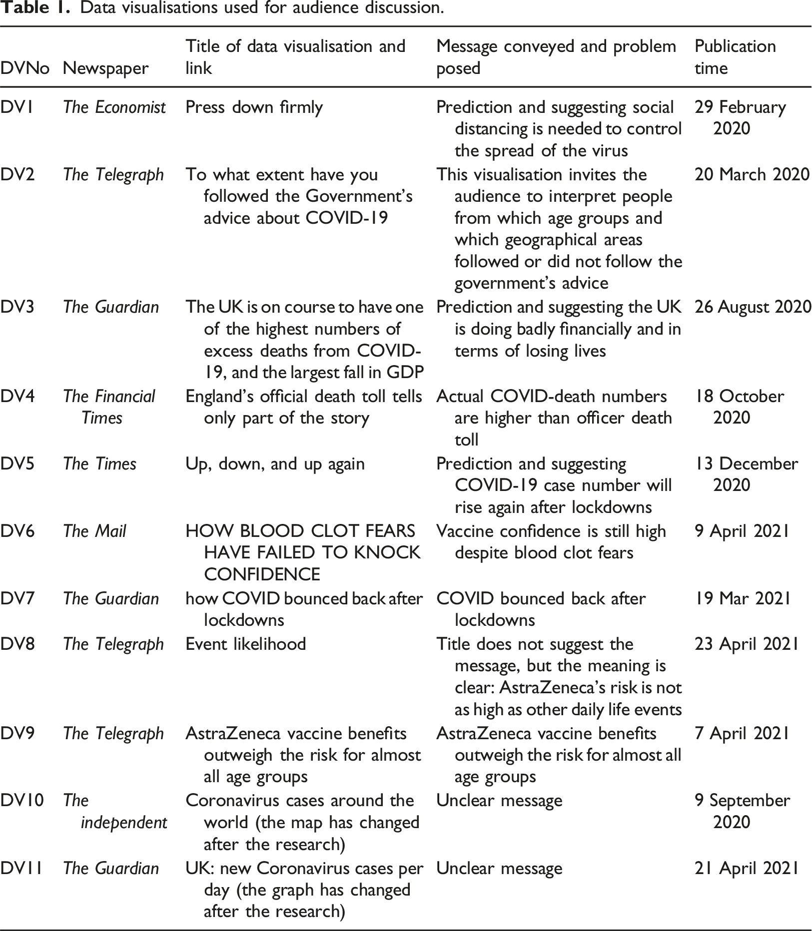
Data visualisations used for audience discussion.
Audience participants’ backgrounds.
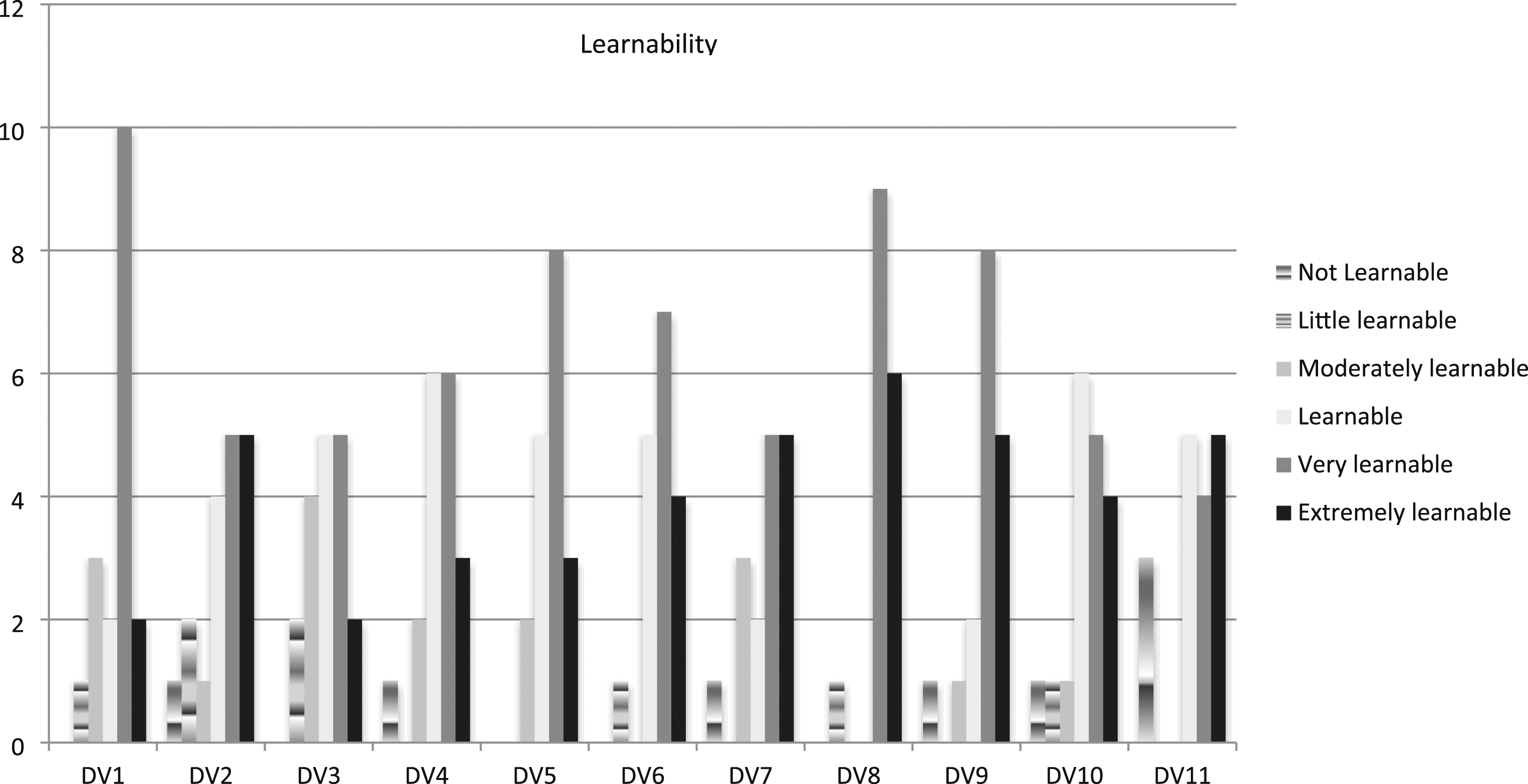
Learnability scores for each data visualisation.
Findings
The study reveals that most participants saw these COVID-19 data visualisations as learnable (see Figure 1). Overall, the majority of them considered the data visualisations as either ‘extremely learnable’, ‘very learnable’, or ‘learnable’ (Figure 1). Their views on DV3 were the most divided due to difficulties in understanding it. DV8 had the largest proportion (94%) of participants voting for either ‘extremely learnable’ or ‘very learnable’, followed by DV9 (76%) and DV1 (67%). Both DV8 and DV9 were published by The Telegraph. Those Guardian reading participants also thought them learnable because they offered a new perspective to vaccines.
Influenced by the properties of data visualisations, participants interpreted meanings by reflecting on their personal experiences and understanding of the pandemic-related issues presented in the data visualisations. Their reflections led to a reaffirmation or development of their understanding, the discovery of new perspectives, or sometimes a rejection of the messages they had perceived. The findings confirm the diagrammatic capacities of data visualisations, the levels of which, however, vary depending on participants’ ability to read data visualisations and their knowledge of related topics and terminologies.
The three types of reading in interpreting the message(s) about the pandemic-related issues (RQ1)
COVID-19-related issues addressed in these eleven data visualisations included the importance of social distancing, people following the government’s advice, the losses financially and in terms of losing lives, death tolls, the impact of lockdowns, the association between blood clots and AstraZeneca and the performance of the UK government compared with other countries. Most of the data visualisations convey clear messages about these issues in their titles (see Table 1). With DV6, DV8, and DV9 clearly supporting the UK government’s vaccine programme, other data visualisations convey diverse voices, including dissenting and critical perspectives on the government’s management of the pandemic.
Despite conveying clear messages, the data visualisations, as data architects, still provide an explorative space for participants to interpret their meanings in a way that may differ from what the titles suggest. Especially for those data visualisations with multiple information or dimensions, such as DV2, DV3, DV4, DV6, and DV10, participants’ interpretations were quite diverse. That said, DV1 is an exception: even though its information is quite simple, the participants’ interpretations still varied.
Hall’s three types of reading were present in the participants’ interpretations. Data visualisation properties, in particular titles, guided their understanding. Most of the participants read the titles first and then explored other properties such as colours, shapes of lines and columns and textual information. Most of the time, they perceived the meanings in line with the dominant/preferred reading of the data visualisations suggested by their titles. A typical example is DV1, advancing the importance of social distancing. All participants perceived and agreed with the message, as exemplified by the following quote: ‘(It says) when you’re not social distancing then everything is increasing, the COVID case, the number of infections is increasing, but when you do keep the social distance, obviously, then it reduces the numbers of cases or infections. … No, (I don’t have difficulty understanding it), I think because of the text, … it’s very simple. You can quickly see what’s there’. (Participant 2, content in the brackets added by the author)
However, participants also noted that if they had encountered it at the time of its publication, before the first lockdown, they would have needed to consider whether social distancing was necessary, although it would definitely have provided a new perspective.
At other times, participants understood the message yet also generated their own interpretations. Take DV3. It has a title projecting that the UK is doing (and going to do) particularly badly in terms of both excess death and the economy and is set to be one of the countries hardest hit by the pandemic. Apart from one participant who did not understand it due to a lack of knowledge of what GDP means, other participants understood the message conveyed by the data visualisation and echoed the criticism directed at the UK government, as shown in Participant 3’s comments: ‘So, that UK will be one of the countries that will have the highest amount of deaths caused by COVID that will go alongside their really big loss in GDP, and that’s the forecast’.
However, participants’ interpretations were diverse and influenced by a lot of other types of information on the graph about different countries. This visual’s properties opened massive space for participants to interpret its meaning and their interpretations might be different from the dominant message the title suggests. For example, Participant 4 first read its title, looked at the two text boxes and arrows pointing to the UK and South Korea, and then read the information on the Y axis and the X axis. She then explored countries’ information on the graph and discussed about how Belgium was doing and regarded Belgium was not doing much better than the UK: ‘So, Belgium, you can see more deaths as compared to other countries. But the UK, Spain and Italy are pretty much in the same vein. But if you do not compare it with the GDP loss, then the number of deaths, they pretty much fall into the same group as Sweden, Chile, US, Italy and Spain. You can group them together with Belgium being the highest’.
Participant 7 was guessing the intention of the producers and meanwhile expressed her own understanding of what DV3 told her: ‘I would say the highlight of the UK makes it clear that it is trying to say that the UK's government, the UK government's response, by both avoiding lockdowns for GDP reasons and allowing cases to proliferate in that sense, has been a failure in both ways because we have both got a high death rate and a high GDP loss. … I think I would say that, in general, it seems like countries with high death rates have also got a high GDP loss, but that this isn't a uniform rule, and that other elements, such as economic policy and government bailouts and stuff, probably influence GDP loss. It seems like the only thing that they can really control are the deaths, is what it seems to me to be saying, because even if you do everything right, like New Zealand, they still have got a GDP loss’.
Participants also had oppositional readings of some data visualisations, in particular DV4. This visual suggests England’s official death toll was lower than the actual number of deaths. This meaning was conveyed through its properties, including the title, the line of excess deaths being higher than the line for death certificates mentioning COVID-19, and the bars representing deaths occurring within 28 days of a positive test. This visual turned out to be among the most difficult to understand. Many participants did not get the message because they did not understand what ‘excess deaths’, ‘death certificates mentioning COVID-19’ and ‘deaths occurring within 28 days of a positive test’ meant and how to interpret the differences between them. For example, Participant 3’s reflection on the situation led her to understand it in the opposite way: ‘there were questions with regards to whether everyone who was dying was actually dying of COVID. Even if the death certificate mentioned COVID, it doesn’t mean that someone actually died of COVID (which means the true death toll might be lower than the official death toll)’.
Participant 15 interpreted the difference in death tolls as caused by other unknown reasons and regarded the FT should have explained what caused excess deaths:
‘As a person, I’m looking at that and I’m thinking: “Right, so was COVID really the only thing we should have been worrying about over that period of time? Probably not (the only thing) because there was something else out there that was killing a whole bunch more people, wasn’t it?” Maybe the focus should have been on that’.
His reading rejected the dominant meaning and raised questions about the quality of the data visualisation as he felt key information missing.
What and how did they learn about the pandemic (RQ 2)
The participants’ understandings of the pandemic, developed from reading the data visualisations, include: the importance of social distancing, the differences between different social groups in following the government’s advice, the connection between death numbers and GDP losses, the dubiousness about official death toll, and the risk levels and benefits of vaccines. They developed their understanding through an interactive process of reading the data visualisations, during which they reflected on their personal experiences and perspectives related to the COVID-19 situations, informing their approaches to reading. For example, Participant 1 initially had an oppositional reading of DV2 because:
‘Not really. I feel like it’s quite possible that a lot of people are not being honest in giving their answer. Maybe they are concerned that they could be punished if they are honest’.
However, after reflecting on his own experiences, he gained clarity about his viewpoint and swapped his position to a dominant reading and gave 4 out of 5 for its learnability:
‘At the start of the COVID pandemic, people were much more likely to follow the rules. I noticed people were basically staying indoors and not socialising. They were following the guidelines to the dot’.
Another example is that on DV2, Participant 13 dug into his own perspectives on the North-South divide to interpret the difference between the two regions in terms of how people had followed the government’s advice:
‘If I did have a prejudice about region I think… Well, maybe it does confirm that: The north has got a bad reputation, since we are seeing outbreaks, we have had problems in Manchester, Liverpool and places in the north … or there have been allegations that the people in the north are not following the rules as much. But that also might be just because of circumstances or terraced houses and goodness knows what else, family circumstances and whatever else’.
Through reflecting on personal experiences, many participants confirmed their understanding of the situations, agreed with the dominant meaning of the data visualisations, and acknowledged the educational function of the data visualisations. For example, Participant 15 used a personal example to support the argument of DV9: ‘I think 4 (for learnability) as well. I think it gives you good information. … I’ll give you an example. … I met a couple of lads in Sainsbury’s just this morning who literally were, “Well we’re not vaccinated, and we don’t really care.” I was like, “What the hell are you talking about?” He was like, “Well we think we’re young enough and strong enough to be able to fight off the virus.” I was like, “Yes, tell that to the nine year old child that almost lost her life weeks back, who ended up spending three months in hospital.” I think this again would be a very good graphic to present to an audience like that to say, “Hey listen, it doesn’t matter what age group you are at, it will have benefits for you and prevent some of the harm. Just because you’re in the younger age groups, it doesn’t mean that it will not be of benefit to you.”’
When the message participants understood matched their own understanding or personal experiences, they tended to agree with this message. A good example is that a consensus emerged from the discussion about various data visualisations that the UK was not doing well, as shown in the following quote: Participant 5: ‘I mean, (the UK is doing) not brilliantly, because I can see that, as of June last year, I remember it wasn’t being dealt with. It was being dealt with, but I felt like it wasn’t as good as maybe we could have done’.
On other occasions, participants’ understanding developed from their reflections on personal experiences, their comprehension of the related situation, and knowledge of data, leading to their negotiated or oppositional reading of the data visualisations, or a rejection of what they interpreted from them. For DV10, some participants raised questions about the message they had perceived, based on their understanding of the COVID situation and the data. For example: Participant 3: ‘The other thing, you know, when I think about Africa, for those cases that actually people get sick, I don’t know whether they actually get reported. It would be quite interesting how this data is gathered. You know, how do they identify sick people? Is it because there are very, very few infections over there or is it because the data is not captured?’
Reading DV11, Participant 13 remarked:
‘The graph is probably telling us that it (the peak of the pandemic) was in mid-January, but we can’t quite compare that with April and May, because they didn’t have enough tests in April and May. I think it’s distorted because we couldn’t measure everything. We got better and better at measuring as the thing went on. It’s not completely the truth. It’s not completely the actual number of coronaviruses per day because of the distortion introduced by the test methodology and the lack of availability of tests as it was early on’.
Some participants changed their views about the related issues and developed new understanding of them after reading the data visualisations. On the Independent’s case map, Participant 6 said: ‘I thought China had more cases. But actually, (I learnt from the graph that) China has had far fewer cases than I thought. Obviously, it was on 29th June. But it demonstrates how much better they were at it, than we were’.
Participant 18’s reading of DV3 is representative of how participants developed new ideas: ‘I do think this is a really useful visual and I think it’s something that needs to be discussed: the GDP. … I think what you’d learn from this is you would look at the UK, Italy, and Spain and see what went wrong and look at South Korea and see – I suppose you’re looking to South Korea for how they managed it so well, that’s what I would do if I was somebody senior’.
For Participant 13, DV3 triggered his interest and curiosity and for this reason, he gave it a learning score 5 out of five: ‘I’ve learned something. I’ve changed my prejudice that they should correlate and I’ve changed it to maybe it’s because these countries spent some money or were prepared to sacrifice the GDP to save lives’.
Participants’ reflections on their lived experiences while reading data visualisations suggest these reading experiences prompted them to rethink related issues and reach their own conclusions, confirming that they were developing diagrammatic thinking through reading these data visualisations.
Factors influencing diagrammatic thinking (RQ3)
However, participants’ knowledge of related topics and terminologies and their data literacy levels influenced their diagrammatic thinking. Most participants particularly struggled to understand DV3 and DV4, although both data visualisations had clear titles that conveyed their meanings. Participants agreed that DV3 made them think about the situations from a new angle. However, because it contained too much information, there were too many ways of interpreting it, and they became confused, even though they understood the message the visual was trying to convey. For one participant, she did not know what GDP stood for and thus refused to try to interpret its meaning and learn from it.
Most participants’ struggles with DV4 came from their unfamiliarity with the terminologies it used: ‘excess deaths’, ‘all cause mortality’, ‘official death toll’, ‘death certificates mentioning COVID-19’, and ‘deaths occurring within 28 days of a positive test’. They also did not know how these terminologies differed from one another and what the differences meant. Some of them did say DV4 made them relook at the situation, but most of them thought it was too complicated to get its full meaning. Consequently, many participants did not understand the message despite the title clearly conveying the message.
Levels of data literacy and background knowledge had also influenced their interpretations and learning. Take DV11. This type of visual was frequently seen in news reports and press conferences during the pandemic. Some participants naturally interpreted that the worst time of COVID in the UK was January 2022, where the peak of the line was. Others approached it more critically by thinking about the related situations at the earlier and later stages of the pandemic. They pointed out that due to the lack of mass testing at the start of the pandemic, the line in the visual did not accurately reflect the true situation.
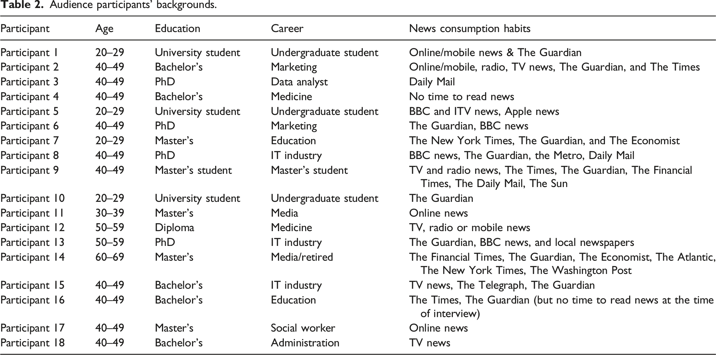
The participants’ discussions show that in most cases, their differing interpretations and learning stemmed from the diverse information and interpretive possibilities offered by the data visualisations, as well as their data literacy and knowledge levels. Their reading was also based on their personal experiences and understandings of the situation. What types of newspapers the participants read did not appear to be an important factor influencing their interpretations. Guardian readers had dominant reading of the messages about lockdowns and vaccines in data visualisations published by The Times, The Telegraph and Daily Mail and right-wing newspaper readers had opposite reading of right-wing newspapers’ data visualisations.
A typical example is that Participant 3, a Mail reader, had the dominant reading of DV8 by the Telegraph, conveying a message: the risk of COVID vaccine is extremely low, but had an opposite reading of DV6 by Daily Mail:
‘it (72% of parents want to get their children vaccinated) may not be true because why would you get your kids, whose systems are still developing, vaccinated with an experimental vaccine? So, especially, you know, those AstraZeneca and, sorry, Pfizer and Moderna. It’s a completely new way of vaccinating and why would you want to do that, you know, this idea, organisms, they still need to build immunity. So, I’m quite surprised, 72%, that they are 100% convinced that they want to vaccinate their children’.
She made the comments based on her personal experiences and views on the vaccine, rather than the news outlet covering the data visualisation. If we saw data visualisations supporting the government’s vaccine programme as reflecting the dominant narrative promoted by the government, then her reading rejected this narrative. However, this was the only occasion in this research when an opposite reading arose from a disagreement with the government’s dominant narrative.
Discussion and conclusion
The above discussion suggests that reading data visualisations has become an experience of reflection and reflexivity for these participants. The selected data visualisations mix various viewpoints, including those critical of the UK government’s handling of the pandemic, those making predictions and portraying the actual situations such as people’s behaviours and case numbers, and those supporting the government’s vaccine programme. Except for the last viewpoint, most of these data visualisations do not convey dominant discourses promoted by the government. Instead, they present diverse and even critical perspectives on the related issues. Although Hall’s three types of reading were present, the differences in the participants’ reading were not a result of their political views, which were not explicitly expressed in the interviews. The political stances of these newspapers also did not influence their reading (in fact the participants did not exhibit a clear preference for newspapers with specific political leanings. Some participants read both right-wing and left-wing newspapers (see Table 2). This contrasts with the findings of Kennedy and her collaborators, who identified a strong link between the trustworthiness of data visualisations and their original media sources (Kennedy et al., 2016). Instead, their reading was primarily influenced by their data literacy, as well as their personal experiences and understanding of the related situation.
The issues presented in these COVID-19 data visualisations were about what had happened or was happening in the participants’ living environments. Prompted by these data visualisations to reconsider the related situations, they instinctively drew on their life experiences to seek answers to these questions. They compared their experiences and perspectives with the insights gained from the data visualisations. They reaffirmed their understandings, formed new ones, or rejected their perceived meanings.
Clearly, data visualisations offered an explorative space for participants to rethink the related issues presented in data visualisations through their reflections on the UK (government)’s performance, the effectiveness of social distancing, people following advice, death tolls and case numbers and vaccine hesitancy and their attitudes toward vaccine. The properties of the data visualisations contributed to structuring participants’ readings, with their data literacy, knowledge of terminology, and personal experiences and perspectives on related issues influencing their diagrammatic thinking and ability to develop a critical understanding of those issues.
Through reading these data visualisations, the participants reinforced or expanded their understanding of the related issues. Although negotiated reading and oppositional reading did exist, dominant reading was the most prominent. Their understanding largely aligned with the messages promoted by these newspapers regarding the unsatisfactory performance of the UK government, individual accountability, the question about the actual death toll, the effectiveness of lockdowns, and the relatively low risks associated with COVID-19 vaccines. Overall, they celebrated the insights gained from the data visualisations, regardless of whether the messages confirmed their existing understanding, were rejected by them, or resulted in new insights.
However, their dominant reading was largely unrelated to the dominant narratives advanced by the UK government, which were mostly absent, except in the three data visualisations concerning vaccines. This is partly due to the fact that most of these data visualisations presented diverse, and even critical, voices. It is partly because participants had first-hand lived experiences regarding these issues. The findings thus echo Ross’s argument about multiple voices – rather than the dominant ideology – encoded in messages (Ross, 2011) and confirm Morley’s argument about the separation between comprehension and evaluation in audience reading (Morley, 2006). The findings also suggest the participants’ overall acceptance of UK newspapers’ active advocacy role in advancing certain concepts and perspectives and guiding public opinion through data visualisations during the pandemic.
This study highlights the importance of reflections, data literacy and knowledge of terminologies in audiences’ diagrammatic thinking while reading COVID-19 data visualisations. The study contributes to our understanding of audience reception in general, and in particular audience reception of data visualisation. However, it is limited by its focus on COVID-19 and the fact that the participants were not given the accompanying articles to read. In addition, the sample in the study was small and not representative and the backgrounds of the participants – particularly, their high levels of education – might have influenced the findings. For future research, it would be interesting to study whether and to what extent reflections are also decisive in audience reception of data visualisations on other topics, if the accompanying articles would make a difference, and if data visualisations have similar diagrammatic capabilities for audiences from different backgrounds. It would also be interesting to examine how political ideologies of audiences influence their reception of data visualisations, a topic not specifically addressed in this study.
Footnotes
Acknowledgments
The author would like to thank The School of Journalism, Media and Communication (previously Department of Journalism Studies), The University of Sheffield, for supporting this work through the research stimulation fund. Thanks also go to all the participants for their contributions and to the anonymous reviewers for their valuable feedback, which has helped improve the article.
Funding
The author(s) disclosed receipt of the following financial support for The research received the research stimulation fund from The School of Journalism, Media and Communication (previously Department of Journalism Studies), The University of Sheffield.