
Abstract
We propose a graphical device—Three I’s of Anomalies (TIA) curves—that provides information on the incidence, intensity, and inequality (variability) of air temperature anomalies. We also propose a class of indices that help to compare different TIA curves when visual inspection alone is inconclusive. This class of indices identifies the 3 dimensions of anomalies and can be decomposed to evaluate air temperature anomalies according to different characteristics. Moreover, the results from this class of indices are consistent with the graphical device. We calculated TIA curves and a class of indices to analyze temperature anomalies in Málaga, Spain, from 2000 to 2017. Comparison of sequential 5-year periods indicated that maximum and minimum temperature anomalies have generally increased in frequency and intensity over time. The proposed index, which considers all dimensions, indicated that maximum and minimum temperature anomalies have increased. Analysis of different geographical areas indicated that inland areas had the greatest anomalies for minimum temperatures and mountainous areas had the greatest anomalies for maximum temperatures. Inland areas also had a stronger pattern of increasing anomalies. The coastline, especially in the western region, had weaker maximum and minimum temperature anomalies.
Introduction
Climate change is one of the greatest environmental issues facing mankind in the 21st century. 1 The continuing increases of surface temperatures worldwide are likely to cause major changes in global hydrological and energy cycles. 1 Meehl et al 2 concluded that the type, frequency, and intensity of extreme events will also change as the earth’s climate changes, and these changes could occur even when there are relatively small overall mean climate changes. The increase of extreme events has manifested as an increase of droughts, heat waves, heavy precipitation, wind storms, and other events.3,4 These extreme events continue to cause significant damage throughout the world2,5-7 and are therefore of great concern to communities, businesses, and governments.8,9
Tebaldi et al 7 concluded that “the greatest threats to humans from climate change are regional changes in extreme climate events.” The exact definition of an extreme event varies widely in the literature. Nonetheless, several studies during the past decade have attempted to identify previous extreme events and to project future extreme events. These studies have employed diverse temperature and precipitation data for identification of return periods10-12; calculation of frequency-duration-intensity indices 13 ; analysis by multivariate statistics14,15; and development of indices based on frequency and variance.16,17 The Intergovernmental Panel on Climate Change 18 Fourth Assessment Report (AR4) focused on 6 types of “extreme weather events” in their discussions of observed changes in extreme events and projections of future extreme events19,20: (1) daily maximum and minimum temperatures (coldest and hottest 10% each year); (2) heat waves; (3) heavy precipitation events; (4) droughts; (5) intense tropical cyclone activity; and (6) incidences of extreme high sea levels.
A temperature anomaly distribution describes the frequency of thermic anomalies in units of the local standard deviation.10,21 Tebaldi et al 7 described 5 control indexes related to temperature anomalies: (1) total number of frost days, defined as the annual total number of days with an absolute minimum temperature below 0°C; (2) intra-annual extreme temperature range, defined as the difference between the highest and lowest temperature of the year; (3) growing season length, defined as the duration from the first occurrence of 5 consecutive days with mean temperature above 5°C to the last such occurrence during the year; (4) heat wave duration index, defined as the maximum period during each year in which there were at least 5 consecutive days that had maximum temperatures at least 5°C higher than the climatological norm for the same calendar days during a reference period; and (5) number of warm nights, defined as the number of times during the year when the minimum daily temperature is above the 90th percentile of the climatological distribution for that calendar day.
On a global scale, Hansen et al
21
showed that as the global distribution of seasonal mean temperature anomalies shifted toward higher temperatures over time, the range of anomalies also increased. Quantifying and understanding temperature anomalies at the regional scale is one of the most important issues in current debates about global change.
However, there are great uncertainties about regional temperature anomalies because climate variability can mask man-made forced signals, and characterization of the natural variability is necessary to evaluate the intensity of the change in the forced signal. Many previous studies described trends and variability over a wide range of scales, from the global to the local.6,10,21-26 The structure of climate series can differ considerably among regions and locations, and exhibit variability at different scales in response to changes in direct radiative forcing and because of variations in the internal modes of the climate system.10,24,26,27
In this article, we propose a graphical device that provides an intuitive understanding of air temperature anomalies that will facilitate communication with the general public and aid in advising policy makers. These graphs represent descriptive indices of the temperature anomalies most commonly analyzed: the frequency, intensity, and inequality (variability) of air temperature anomalies. Notably, comparison of 2 different distributions of anomalies can depend on the chosen dimension for analysis. To circumvent this problem, we also developed a class of indices to analyze air temperature anomalies. The proposed class of indices has important advantages. First, it can identify the relevance of all 3 major dimensions of anomalies in the air temperature distribution (frequency, intensity, and variability). Second, it is decomposable and therefore allows researchers to compare air temperature anomalies among seasons, time periods, and geographical areas. Third, its results are consistent with the proposed graphical device.
Our class of indices per se allows to track the joint evolution of the 3 dimensions of anomalies (frequency, intensity, and inequality) across time. It is attractive to analyze the evolution of each dimension separately, and indices in the literature usually focus in the frequency or/and intensity of anomalies, neglecting inequality. Our graphical device and our index also account for inequality in anomalies, a crucial feature in the climate change analysis given that we can get the same average intensity of a temperature anomaly having a quite homogeneous distribution of anomalies or with a very unequal distribution of anomalies. These 2 situations need to be treated differently and they can only be discerned with a proper measure that accounts for inequalities in anomalies.
Moreover, we can find situations in which the separate analysis of each dimensions is not conclusive and we need to aggregate the information of the 3 dimensions to have a complete picture of the situation. Our class of indices provides a consistent way to aggregate information on frequency, intensity, and inequality in anomalies. Furthermore, a graph in which the 3 dimensions are displayed is an appealing tool to communicate the results, allowing a better understanding of the change in the climate and a greater awareness of the population.
We illustrate the usefulness of the proposed class of measures of temperature anomalies by providing a detailed comparison of temperature anomalies in the province of Málaga (southern Spain) and decomposing the analysis by 5-year periods from 2000 to 2017. Our preliminary results show that our method is particularly useful in providing numerical and graphic results of temperature anomalies that have generally increased in frequency, although not in intensity, over time.
The second section of this study presents a graphical device that represents the 3 dimensions of air temperature anomalies indices. The third section introduces a class of indices that quantifies differences between profiles of air temperatures and describes their properties. The fourth section provides an empirical illustration, which shows the usefulness of our method for the numerical and graphic comparison of the frequency, severity, and variability of temperature anomalies. The last section provides a conclusion.
Graphical Tool for Analysis of Temperature Anomalies
The term temperature anomaly refers to a departure from a reference value or long-term average. A changing climate may lead to changes in the frequency, intensity, spatial extent, duration, and timing of temperature anomalies and may also lead to unprecedented anomalies. Because dynamical models project increases in the frequency, intensity, and duration of temperature anomalies during at least the next century,28-30 it is important to provide definitions for temperature anomalies that are clear and commonly accepted.
The Expert Team on Climate Change Detection and Indices (ETCCDI) defined a core set of descriptive indices of temperature extremes that provide a uniform perspective of observed changes of climate extremes. These indices describe specific characteristics of extremes, some of them regarding temperature. Some indices require calculation of the number of days in a year that exceeded a specific threshold.
The 2 dimensions usually analyzed in the study of temperature anomalies are the proportion of days with a temperature anomaly (AP) and the average intensity of a temperature anomaly (AI). We define these terms formally for maximum air temperatures, but they could also be defined for minimum air temperatures. Let
Thus, the proportion of days with a Tmax anomaly (the incidence of maximum temperature anomalies,
and the mean maximum temperature gap per anomalous day (anomaly intensity,

We are also interested in the variability of anomalies. More variability means that anomalies are more “spread out,” or equivalently that anomalies are further away from the average anomaly, showing more extreme events. One way of measuring variability is through the variance of the maximum temperature gaps
The next step is the graphical representation of these 3 aspects of temperature anomalies. This graph, which is based on temperature departure from the threshold (temperature gaps,
The TIA curve (Figure 1) is obtained by ranking temperature gaps,

Three I’s of Anomalies (TIA) curve of the 3 dimensions of temperature anomalies (incidence, intensity, and inequality).
The TIA curve is denoted by TIA (p, Γ) where
The shape of a TIA curve provides important information about the nature of the temperature anomalies. In particular, the incidence of anomalies (proportion of days with a temperature anomaly, AP) is indicated by the value of p on the horizontal axis where the TIA curve reaches its maximum. The mean temperature gap of days with an anomaly is represented by the maximum of the TIA curve, and is a measure of the intensity of temperature anomalies. The variability in temperature anomalies is indicated by the curve’s concavity. Thus, if all days with a temperature anomaly experienced the same temperature gap, the TIA curve would be a straight line with slope equal to the mean temperature gap. When temperature gaps are more unequal, the TIA curve increases in concavity.
As an illustration, consider the following 2 simulated temperature gap profiles over an observation period of 100 days (n = 100). The gaps in Tmax are

Note that the first series has 13 days with anomalies and the second series has 8 days with anomalies. Figure 2 shows the 2 resulting TIA curves.

Three I’s of Anomalies (TIA) curves for series
Series
Definition of dominance in temperature anomaly
Given 2 relative temperature gap profiles,
Furthermore, the TIA curve maintains its properties if truncated at low levels of anomaly for robustness (eg, excluding a gap of 0.5°C or less from analysis because of the presumably insignificant impact on well-being). The truncation point can be chosen arbitrarily. (We could have performed the same graph considering Q the set of days that belong to a heat wave, ie, the set of days in which
The dominance criterion is a very useful tool when comparing TIA curves that do not cross. However, consider simulated profile c,
In this case, the incidence is 0.14, the intensity is 0.94, and the coefficient of variation is 0.81. On comparison with profile

Three I’s of Anomalies (TIA) curves for profiles
Therefore, when TIA curves cross, or if it is necessary to quantify the differences between 2 profiles, then indices must be used to measure temperature anomalies.
Class of Air Temperature Anomaly Indices
This section describes a normative framework for the empirical study of temperature anomalies and is an adaptation of the family of poverty indices proposed by Foster et al (1984) 33 . This method provides aggregate indicators that are explicit in incorporating the necessary judgments about how to aggregate temperatures anomalies. The temperature anomaly index is based on air temperature gap, determined by the difference between the air temperature and the threshold.
Consider a maximum temperature anomaly measure,

The measure of a temperature anomaly is a weighted sum of the daily temperature gap,
For

For

For
Using expression (3) for the variance of the maximum temperature gaps allows determination of A2:

The parameter
The class of indices proposed,
1. Focus.
2. Continuity.
3. Anonymity. This means that the index does not favor any particular anomaly in a particular day.
4. Replication invariance. This allows for comparisons between distributions with different sizes.
5. Monotonicity. This refers that an increase in the temperature of an anomalous day yields a higher index value. Therefore, ceteris paribus, a higher Tmax leads to a greater anomaly index. This property is satisfied for
6. Effect of greater anomalies. The allocation of an additional increase of temperature in an anomalous day increases the index more if it occurs on a day that has a greater initial anomaly.
7. Decomposition in subgroups. This property allows decomposition of the overall temperature anomaly index into subgroups (geographical areas, years, seasons, etc). This feature is particularly useful for identification of subgroups that have experienced more anomalies than others, so that policy makers can develop more focused interventions. This property can also be used to determine the contribution of each subgroup to the overall temperature anomaly index. Our measure of temperature anomaly has reasonable normative properties.
An Empirical Illustration: The Incidence and Intensity of Anomalies in Málaga, Spain
The Intergovernmental Panel on Climate Change (IPCC) 18 concluded that an overall increase in the number of warm days and nights on a global scale will likely occur and that anthropogenic influences will likely lead to an increase of extreme daily temperatures on a global scale. In particular, climate change has led to increased average air temperature, a change of the natural air temperature limits, and more frequent high air temperature anomalies. 34
The report released by the IPCC in 2018, 35 Special Report on Global Warming of 1.5 degrees shows the impacts that global warming would have if exceeding pre-industrial levels by 1.5 degrees. The report warns that reducing carbon emissions will not be enough to stabilize world temperatures by 1.5 degrees; it will also require direct capture of CO2 from the atmosphere.
This index, therefore, is a tool that lets us to address the 3 main dimensions of thermal anomalies, those related to their frequency, intensity, and variability. Furthermore, it is comparable, making it possible to determine trends between seasons, time periods, and geographic areas.
It is also a tool within the framework of Sustainable Development Goals 13, 36 since it introduces climate change as a primary issue in the policies, strategies and plans of countries, companies, and civil society, improving the response to the problems it generates and promoting education and awareness of the entire population in relation to the phenomenon.
The application of climate models to Spain offers us various projections, coinciding that the increase in maximum temperatures will have direct implications for our health, with more intense and longer heat waves, reaching over 2 weeks duration. 37
We used daily air temperature data of 18 observatories from the Spanish meteorological agency (AEMET) to analyze maximum air temperature anomalies in the province of Málaga, in southern Spain. These data cover a variety of geographical settings (coastal, mountain, and inland regions). The air temperature data at these observatories are highly reliable for the period 1971 to 2017. Mediterranean basin ecosystems are specific climate zones that have significant interannual variability in precipitation and air temperature. Alpert et al 38 previously analyzed observational data from several areas of the Mediterranean basin using data from the 20th century and reported an increase in extreme events.
We analyzed the anomalies in daily maximum and minimum air temperatures from 2001 to 2017 and used data from 1971 to 2000 as the reference period for computation of Tmax and Tmin thresholds during the first year (2001). We then updated the reference period for subsequent years. The period of 2001 to 2017 had 105 167 daily values from 18 observatories; the period 1971 to 2000 had 186 404 daily values from the same 18 observatories.
We used a method described by Barcena-Martin et al (2019) 10 to define the daily thresholds Tmax and Tmin and to identify temperature anomalies. Below, we describe the method for computation of Tmax; Tmin thresholds can be computed similarly. These authors proposed calculation of a running average of the Tmax of a specific day with 2 adjacent days for all 30 previous calendar dates. The upper daily threshold air temperature for each day is the 95th percentile of the corresponding Tmax series.
Formally,

We set the threshold
These thresholds allow simple monitoring of trends in the frequency, intensity, and variability of anomalies. These anomalies, even if not particularly extreme, could stress human populations or the environment.
Summing up, the daily percentile thresholds are determined empirically from the observed
Figure 4 presents the 3 dimensions of anomalies (TIA curves) in Tmax and Tmin data. We decomposed the index into subgroups (described above) for 5-year periods.

Three I’s of Anomalies (TIA) curves for Tmax and Tmin for 5-year periods.
TIA curves for later time periods end further to the right (Figure 4), except for Tmin 2008-2012, indicating an increasing incidence of abnormalities at Tmax and Tmin. Furthermore, the intensity of Tmax (maximum height of the TIA curve) decreased slightly for the subsequent time periods (except the final period, in which the intensity reached its maximum); Tmin intensity also decreased for later time periods (except for the last period in which the intensity was slightly higher than the previous period). These results, as demonstrated by Barcena-Martin et al 10 , lead to the conclusion that temperature anomalies have generally become more frequent with time (although the intensity was less during the most recent period), except in the last period.
When ranking periods by the incidence, intensity, and variability of anomalies, rank depends on the dimension. Therefore, we can complement the TIA curves with information on indexes that combine the 3 aspects of these anomalies. We first analyzed Tmax and Tmin anomalies for the entire period (Table 1).
Indexes for Tmax and Tmin anomalies from 2001 to 2017.

These results indicate that the incidence of anomalies (ie, the proportion of anomalies, A0) of Tmax was slightly lower than that of Tmin, which is also consistent with what was stated by Tomczyk et al (2017). 39
However, when 2 dimensions (A1) or the 3 dimensions of anomalies (incidence, intensity and variability, A2) are combined, Tmax is more anomalous than Tmin, a circumstance that in our case may be due to the latitudinal factor. Division of the entire period into 5-year periods allows analysis of changes of anomalies in Tmax and Tmin over time (Table 2).
Indexes for Tmax and Tmin anomalies by 5-year periods.
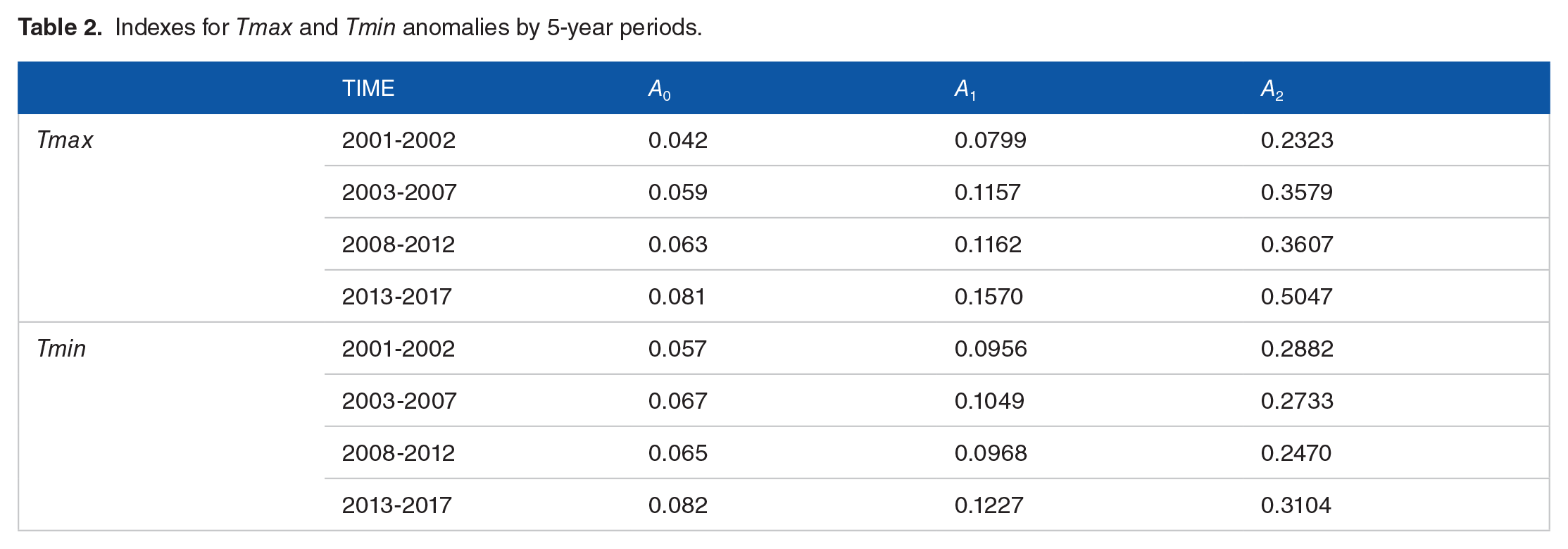
The decomposition into 5-year period shows, as in the TIA curves, that the proportion of Tmax and Tmin anomalies has increased over time, with an especially notable increase during the last period (2013-2017), which was also already reported by Chen et al (2017) 40 for China over a long period. Analysis of index A1 and A2, which combine dimensions of anomalies, affirms that Tmax had greater anomalies over time and Tmin had a more irregular increase of anomalies over time.
The information in Table 2 is clearly complemented by the information in Figure 4 because the TIA curves show important information that is not evident in the indices. The concavity of a TIA curve shows how temperature gaps are distributed. Our analysis allows us to compare the importance of large, medium, and small temperature gaps. For example, Tmax during the period from 2001 to 2002 has a strong initial increase (indicating large temperature differences); Tmax for the periods 2003 to 2007 and 2008 to 2012 had similar (but somewhat smaller) temperature gaps, as indicated by the initial overlap of these 2 curves. We consider this to be one of the greatest contributions of the TIA curves. In contrast, there were no large temperature gaps at Tmax for the period 2013 to 2017, but many medium-sized temperature gaps are sufficient to show the maximum incidence of the period. Our analysis of the TIAs for Tmin led to similar conclusions.
We also performed a geographic analysis for the province of Málaga for all 3 dimensions of anomalies (combined in the A2 index) to show areas where the combination of incidence, intensity, and variability of anomalies was higher (Figures 5-8). Figures 5 and 6 show the values of the A2 index for Tmax and Tmin during the entire period (2001-2017). Note that the geographical distribution of anomalies in Tmax does not necessarily show greater Tmax values; instead, it shows Tmax values greater than expected given the distribution of daily Tmax during the past 30 years (Figure 5). A similar interpretation applies to the geographical distribution of anomalies in Tmin (Figure 6).

Geographical distribution, using Kriging of the A2 Index for Tmax anomalies, in Málaga province for the entire study period (2001-2017).

Geographical distribution, using Kriging of the A2 Index for Tmin anomalies, in Málaga province for the entire study period (2001-2017).

Geographical distribution, using Kriging of the A2 Index, for the difference of Tmax from 2013 to 2017 relative to 2003 to 2007.

Geographical distribution, using Kriging of the A2 Index, for the difference of Tmin from 2013 to 2017 relative to 2003 to 2007.
The province of Malaga, due to its geographical characteristics, located at the western Mediterranean Sea and in the southernmost part of Spain, south of the Baetic mountain ranges, is suffering various effects closely related to the new climatic pattern. Its proximity to the Atlantic Ocean through the Strait of Gibraltar gives it a certain trait of oceanity, in such a way that it marks an incidence of the longitudinal pluviometric gradient, tending toward aridity as moving to the east. But its longitudinal arrangement is joined by the presence of an intricate orography, with a whole series of mountain ranges that rush from north to south toward the Mediterranean, but which also protect it from the dreaded north winds.
All this endows it with a singular climatic dynamic, and especially significant in the last decades. Proximity to the ocean has been translated into a double pluviometric pattern, with a divergent trend toward higher humidity in the western zone and toward greater aridity from the center to the east. 41 This modification of the pluviometric pattern has resulted, on the one hand, in a greater succession of droughts and dry spells, attending to this pattern along the pluviometric gradient42,43 and, on the other hand, in a higher frequency of torrentiality, generating serious territorial consequences.44,45
These modifications in the climatic pattern have also affected the thermal dynamics of the area, manifested in a greater succession of heat waves, 10 and thus having as a reference the period 1970-2000, has been verified both the proliferation of heat waves in all the years from 2001 to 2016, some even reaching a significant number (20 in 2015), and the circumstance of not only having heat waves during the summer periods, as, in fact, months with more heat waves were May and October.
The results, after the application of the proposed index, show that the greatest anomalies in Tmax (Figure 5) are found mainly in the mountainous areas (northwest), and the interior region has fewer anomalies. In contrast, the Tmin anomalies (Figure 6) mostly have a latitudinal pattern, with an increase from the coast to the more inland regions.
That is, they are the areas with the greatest temperature anomalies: inland for Tmin and mountainous areas for Tmax (Figures 5 and 6). Coastal regions, especially in the west, have apparently had less extreme maximum and minimum temperature anomalies.
The territorial representation of the percentage change for Tmax and Tmin between 2003 and 2017 shows that the region furthest from the coast had the greatest changes in Tmax over time (Figure 7). Furthermore, considering Figures 5 and 7 together shows that the northwest region had the least pronounced anomalies (A2) (Figure 5) and the largest increase in anomalies over time.
The Tmin analysis (Figure 8) indicates a mostly uniform pattern throughout Malaga, although the incidence of anomalies was lower in the mountainous areas (east, west, and some inland areas).
In short, the changes in the climatic pattern, also manifested by a greater succession of heat waves, follow an uneven spatial pattern. And thus, the greatest anomalies, the most frequent, intense and variable, are found in the interior areas, while in the coastal areas, the effect of the sea’s thermal smoothing attenuates them. This is especially evident in the maximum temperatures, which follow a clear pattern of continentality, while the minimum temperatures tend to be more uniform, because of the regulatory role of the Mediterranean.
Conclusions
The proposed index identifies the relevance of thermal anomalies in their incidence, intensity, and inequality, being able to be comparable in different seasons, time periods, geographic areas and according to the graphic device.
It is effective in representing noticeable changes in maximum and minimum temperature anomalies over time.
In southern Spain, in particular, these anomalies have increased in frequency, with a variable intensity, except during the last 5 years, in which there is a clear increase in both intensity and frequency.
Tmax has steadily increased anomalies throughout the period considered, while Tmin had major and irregular anomalies only at the end of the period.
In geographical terms, the distribution of thermal anomalies in Malaga seems to have a unique pattern. The inland region (for maximum and minimum temperatures) and the mountainous areas (for maximum temperatures) had the greatest temperature anomalies, being the coast, due to the smoothing effect of the sea, the least anomalous area.
Footnotes
Acknowledgements
The research project CSO2016-75898-P from the Spanish Ministry supported this research. The study was also supported by Campus Andalucía Tech.
Funding:
The author(s) received no financial support for the research, authorship, and/or publication of this article.
Declaration of conflicting interests:
The author(s) declared no potential conflicts of interest with respect to the research, authorship, and/or publication of this article.
Author Contributions
All authors have contributed equally to the research.