
Abstract
Program logic models are widespread and useful tools for stakeholder engagement, communication, program development and planning, and evaluation purposes. However, a key potential weakness includes the difficulty conveying the complexity associated with many interventions, which is exacerbated by the limited range of visuals used in most program logics. Program logics are almost always represented as text within rectangular boxes arranged in columns or rows, representing inputs, outputs, and outcomes; with arrows representing the linkages between them. The simplicity and consistency of this graphic language is useful but also presents a risk of over-simplifying and misleading non-evaluator users into a direct, causal set of relationships. In addition, rectangles and arrows have cultural and historical meanings that often go un-examined. This article provides a brief review of the symbology of program logics, identifies several issues with current practice, and provides several alternatives for conveying causal relationships and other aspects of program logics. It is hoped that the focus on an expanded visual vocabulary will help evaluators convey the complex reality of programs.
• Program logics/impact pathways are prevalent and valuable tools but are limited in their visual vocabulary, relying primarily on rectangles and arrows. • This limitation can have unintended consequences, such as unintentionally over-stating the likelihood of causal impacts of programs, primarily to non-evaluators.
• This article reviews the history and meanings behind common shapes used in program logics, and how they might influence users. • The article also outlines several opportunities to expand the breadth of graphics and shapes to more accurately and engagingly convey theories of change and impact.What We Already Know
The Original Contribution the Article Makes to Theory and/or Practice
Introduction
Program logic models are one of the most used tools in program evaluation (Onyura et al., 2021). Their consistency, simplicity, and visual nature make them powerfully useful for stakeholder engagement, communication, program development and planning, and evaluation purposes. However, their weaknesses include: the difficulty conveying the complexity associated with social and education interventions, underplaying external influences, and neglecting to identify undesirable unintended outcomes. Put another way: ‘...notable shortcomings of the logic model are…depicting the program theory linearly and failing to place the program in context. Both issues lead to an artificial depiction of reality making evaluation findings difficult to interpret’ (Renger et al., 2019, p. 17). Onyura et al. (2021) identified five ways to address these shortcomings, but improving the visual aspects of program logic models was not one of them. The benefits of logic models, according to evaluation experts, often specifically highlight their visual nature. A logic model’s ‘intended purpose [is] providing a clear visual representation of the underlying rationale’ (Renger & Titcomb, 2002, p. 493). Related to this is the simplicity of logic models. A survey of pharmacy students found that the majority felt ‘use of… [the logic model] is a simple way to monitor program performance and to communicate progress…’ (Carrion et al., 2021, p. 792). Therefore, logic modelling is the visual and simple representation of the program theory; that is, ‘the basis upon which it is supposed to lead to the desired effect’ (Brousselle & Champagne, 2011, p. 70). How the theory is represented visually therefore matters. This article is structured in three sections: A brief review of the symbology of program logics, including the history and meanings of shapes; identification of the main issues with the current symbols used; and recommendations for a more nuanced visualisation.
Review of the Symbology of Program Logics
This review comprises an analysis of a sample of program logics in a leading Australian evaluation journal to assess what symbols are currently being used in practice; an examination of the related organisational chart and flow chart diagrams and the cross-cultural meanings of symbols; and a synthesis of the literature on the history and meanings of common shapes used in program logics (specifically rectangles and lines/arrows).
Analysis of Common Symbols
Shapes Used in Sample of Program Logic Diagrams
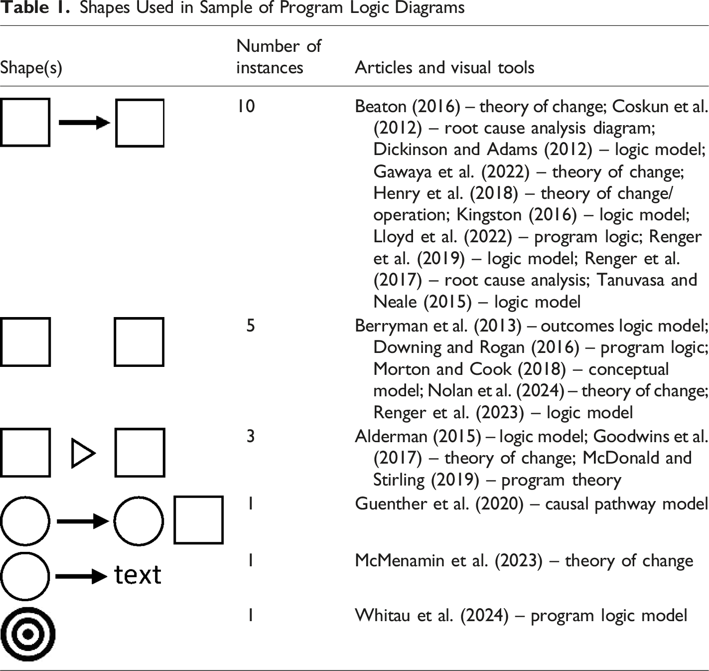
Similarly, guides to developing program logics rarely specifically advise on visuals beyond the basic rectangle and arrows. For example, Milstein and Chapel (2019) offer a thorough stepwise process with lengthy discussions of logic modelling. Interestingly, the authors state that ‘the arrows between the boxes indicate that review and adjustment are an ongoing process - both in enacting the initiative and developing the model’. The authors go on to emphasise that ‘although this example uses boxes and arrows, you…can use any format or imagery that communicates more effectively with your stakeholders’. However, based on the sample of examples in Table 1, few program logic developers do this.
Reasons for Using Rectangles and Arrows
Why are rectangles and arrows used to represent causal relationships? There are probably a few practical elements. First, word processing programs default to text boxes that are rectangular, and this shape can also contain a maximum amount of text. Similarly, aligning and fitting the maximum number of shapes on a single page is most efficiently achieved by using squares or rectangles. 1 Similarly, arrows are also prevalent, easy to understand, and easy to construct digitally, and they have become the overwhelming default option, possibly used uncritically.
Review of Related Diagram Types
Program logic diagrams have a shared legacy in other similar visual representations, particularly the organisational chart and the flow diagram. A typical organisational chart comprises rectangles arranged in rows, usually in a hierarchy, with lines connecting the rectangles. The rectangles and lines represent an organisation’s internal structure, with the rectangles denoting positions/people or business units, and the lines denoting reporting relationships or lines of communication or control. It is worth noting that positions of authority and power in social hierarchies are associated with elevated positions in space, in actual social practice, in metaphoric language, and thought (Giessner & Schubert, 2019). The use of rectangles, arrows, and the top to bottom or left to right orientation is similar to logic models, with the hierarchy of outcomes analogous to the hierarchy of an organisation. There have been attempts to modify the typical organisational chart (e.g. Fanning, 1997), but they are relatively rare.
Program logics and organisational charts employ a similarly small number of visual symbols; however, flowcharts are diagrams that use a large range of universally agreed symbols to represent a workflow or process. Flow or process charts were first documented over a century ago (Gilbreth & Gilbreth, 1921) and the basic visual representations remain similar: geometric shapes mapping steps in a process. There can be up to several dozen different symbols in a flow chart, for example, a decision, event, delay, communication link, start, end, sort, merge, document, compare, etc. represented by triangles, circles, ovals, parallelograms, diamonds, regular lines, dashed lines, parallel lines, arrows, etc. This substantial visual vocabulary, compared to program logics, allows flowcharts to map and communicate complex processes more accurately. However, compared to the complexity of social and education programs and human behaviour, most flow charts represent much simpler and linear phenomena, which makes the lack of visual diversity in program logics even more apparent.
Cross-Cultural Meanings of Shapes
Even though most program logics use only a few basic shapes, these symbols have deep cross-cultural meanings that reinforce the epistemology underlying them, beyond mere convenience and legacy. That is, the shapes have meanings that convey information to users, often unintentionally. Shapes not only have physical qualities but also have tertiary qualities, such as value and emotion, which are not solely attributed to the observer but also exist within the stimulus itself (Bertamini et al., 2016). For example, a smiley-face emoji  appears happy and a frowning-face emoji
  appears sad; therefore, the shapes convey meaning and elicit emotional responses. Importantly, shape recognition and form schemas are so fundamental to humans that the concept of shape for very young children is a field of study (Clements et al., 1999). Therefore, it’s important to consider shapes as symbols.
Review of the Meaning of Rectangles
The shapes encasing text in program logics are most commonly rectangles, which have deeply rooted cultural and cognitive meanings: ‘Of all geometric forms, the [rectangle is the] most rational, the most secure and regular; this is explained empirically by the fact that, at all times and in all places, it has been the shape favoured by man when preparing any space or object for immediate use in life: house, room, table, bed, for example’ (Cirlot, 2013). Rectangles and other primary shapes have been described as ‘good shapes’ by Gestalt theorists; however, recent thinking suggests that the general absence of straight lines and symmetry in nature make rectangles unusual and unnatural (Roberson et al., 2002). In program logic diagrams, rectangular text boxes are commonly aligned neatly in columns, further reinforcing the orderliness of the visual model, often in contrast to the substantial complexity and uncertainty of the underlying relationships that exist (or may not exist) in reality. Rectangles tell the user that there is order and understanding. Rectangles (squares) are also commonly used to symbolise males (with circles used to symbolise females), for example, in genetic nomenclature (Tuite et al., 2020). Experiments have indicated that people rate squares as more masculine (power, strength) and circles as more feminine (warmth, cooperation) (Stroessner et al., 2020). To further reinforce how important shapes are, drawing circles and squares has metaphor-consistent (warm vs. competent/rigorous) effects on personality judgements. For example, Okamura and Ura (2018) found that participants responded that there were significantly more competent and rigorous people around them after drawing squares, compared to those drawing circles. Given program logics almost always use rectangles, there should be greater awareness of these gendered and metaphorical associations.
Review of the Meaning of Lines and Arrows
In relation to lines, humans prefer curved objects and shapes over angular ones (Bertamini et al., 2016), possibly because curving, waving, and serpentine lines are more reflective of nature than straight lines. Indeed, rounder and curved line segments are linked to positive emotions and are generally preferred over angular ones (Salgado-Montejo et al., 2014). However, straight lines are much more commonly used in program logics. Similar to rectangles, a straight line implies directness and order.
Arrows are line segments resembling the weapon shot from a bow, usually with only the arrowhead shown (and not the fletching at the rear). The arrow is used to show direction, position, or movement; that is, it’s a pointer to a particular direction through space. Although arrows are simple, they allow the communication of dynamic information in a static diagram, but do not describe any meaning in of themselves. They only convey meaning in relation to the elements to which the arrows refer (Kurata, 2007). One of the first usages of the symbolic arrow was in a 1737 treatise on hydraulic architecture, which used an arrow to indicate the flow of water and direction of a waterwheel’s rotation (Finkel, 2015). In the early 20th Century, the arrow was first applied to set theory and logic and represented a logical implication rather than a direction. For example, in ‘X → Z’, the meaning is ‘X implies Z’, or ‘Z is a consequence of X’ (Hilbert, 1922). The interpretation of arrow symbols depends on the reader’s background knowledge of the illustrated elements and what semantic role the symbol has in the particular situation (Kurata, 2007). This presents a difficulty because it is not clear what knowledge is necessary or sufficient to interpret the arrow symbol, including in program logics. In program logics, like other visual communications, the arrow is employed ‘multi-purposely without specification’ (Kurata & Egenhofer, 2006, p. 1). For example, Kurata and Egenhofer (2005) distinguish the semantic roles of arrow symbols into four types: property (e.g. direction and vector), annotation (e.g. labelling a component), action (e.g. motion of one component may trigger or be triggered by an interaction with another component), and association (e.g. presence of certain relation between components). The multiplicity of meanings provides a cognitive advantage because one basic sign can express different ideas (Kolchenko, 2015). However, in program logics, this also presents an issue of understanding. However, overwhelmingly, the role of the arrow is given by the visual, graphic, and textual context, which is cause and effect.
Problems With the Symbols in Program Logics
There are several potential problems with the current narrow usage of primarily rectangles and arrows to represent the relationship among outputs and outcomes in program logic diagrams. Paying attention to shapes is important, as it signals an awareness of the realistic relationships among activities and outcomes. Kushner (2016) argues the ‘logic model has allegiance to linear rationality and identifiable causal chains’ (p. 6). Using a limited number and type of standard shapes are not the cause of the issue but rather a symptom of several larger issues. These include: (1) The linear and direct representation of outcome relationships is inappropriate for most social and education contexts, particularly complex ones. There is a general misrepresentation of highly complex, dependent relationships with unsophisticated cause-and-effect visuals. (2) The desire to convey a program’s causal logic in a highly simplified form, often to busy senior leaders, means many subtleties and complexities (context, assumptions, timing, external influences) are missed and therefore unrealistic expectations of the efficacy of programs may be set up. This can lead to an over-confidence that programs will work in the straight-forward and timely manner that they are represented graphically. (3) Many program logics are based primarily on hunches, aspirations, and/or individual experiences of program staff, rather than established evidence or specific, testable hypotheses. Overly simplified program logics become an extension of these aspirations.
It is fully acknowledged that it would be counterproductive for program logics to become overly complex visually, as some of their greatest strengths are simplicity and consistency. The aspiration of this article is not to advocate for program logic models to become comprehensive outcome measurement maps. Theories of change, impact pathways, or program logics are, by necessity, simplifications or models of the expected, actual, or aspirational. A full account of all the potential intended and possible outcomes and relationships would be unwieldy; however, there are many graphic alternatives that would assist in ensuring logics convey a proportionate amount of information compared to what is known or predicted about how program mechanisms work.
Visual Alternatives and Additions to Program Logics
To partially address the problems described above, there are alternate ways to portray and use program logics that may better encapsulate the complexity of human–program interactions and the likelihood of outcomes. Using these alternatives is meant to bring attention to the underlying complexities, and not add to them.
Circular Fields of Influence
In program logic, outcomes are sequential and consequential; that is, each outcome in a chain follows a previous outcome, but is also caused by it, akin to the Newtonian forces acting on billiard balls striking each other. However, outcome relationships are far more complex than an arrow would imply. Complex social processes and human/program interactions could be more genuinely represented by force fields or fields of influence (more akin to gravity) (see Figure 1). That is, an antecedent outcome exerts some degree of influence on a subsequent outcome, but the nature of this relationship is not linear or consistent, may overlap or interact with other antecedent outcomes, or may have minimal impact. Different sizes of waves could represent different strengths of association. Alternately, inspiration could be found in Lewin’s topology maps, which portrayed an individual’s life space and the field of forces that comprise it (Burnes & Cooke, 2012). Fields of Influence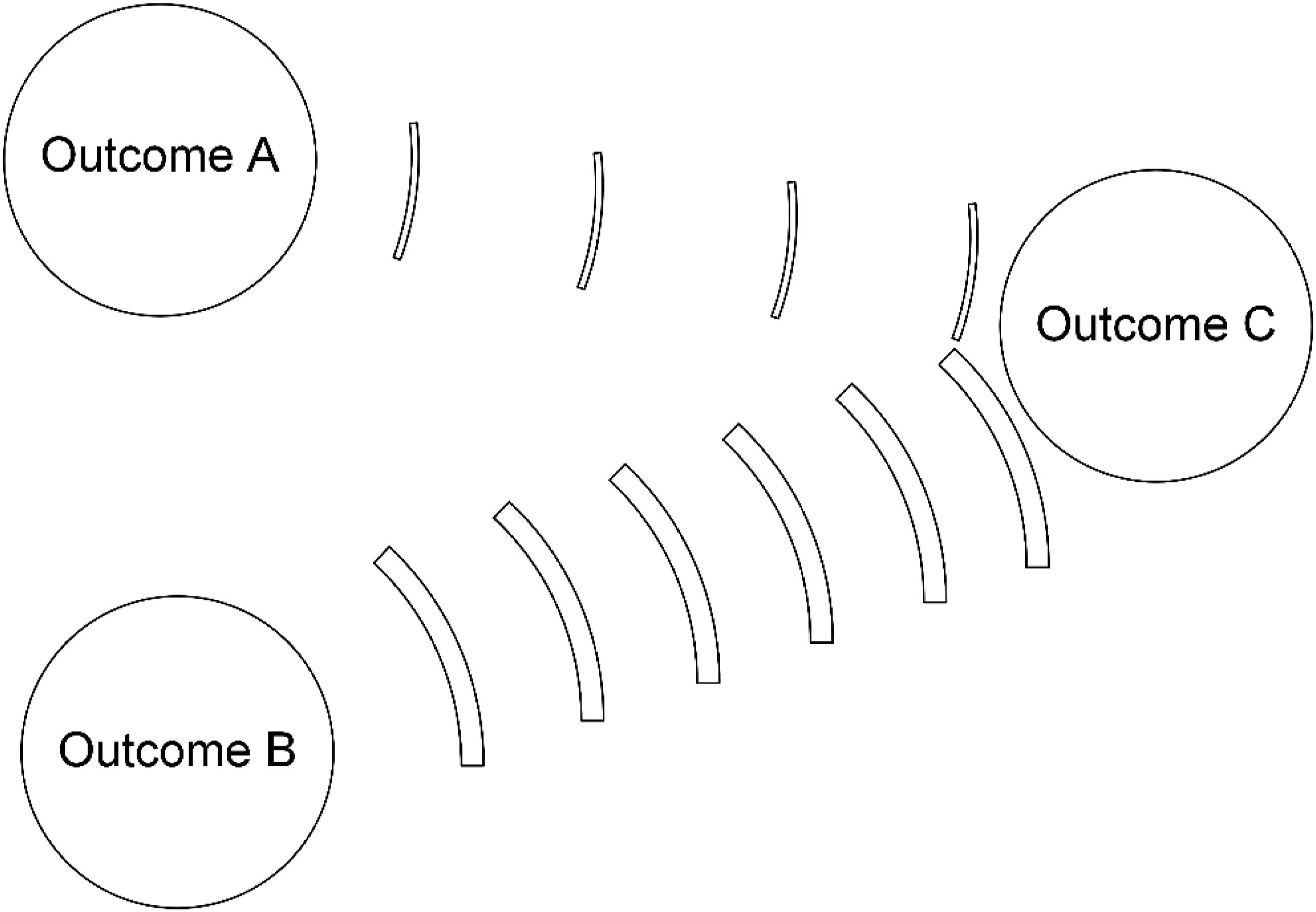
Probabilities
When a program logic indicates through a solid arrow that an intervention or activity causes or leads to an outcome, any subtlety that the likelihood of the outcome being achieved is variable is diminished, as there is no indication that the relationship could be probabilistic. Adding an indication of a probability that an outcome will be achieved at the individual or group level (or a correlation coefficient from the research literature) would provide useful information to readers. A likely objection to including probabilities may be that it’s ‘not possible to know’ or ‘this is a logic model not a path analysis diagram’, which are fair but the alternative is to unwittingly (or purposely) reinforce the illusion of direct and certain causal relationships.
Assigning a probability or ‘conversion rate’ that the outcome will be achieved by that particular activity could assist in increasing understanding, and even in the absence of robust evidence, it would signal that programs will likely not have a uniform impact on participants (see Figure 2). The conversion rate could be expressed as a number between 0.0 and 1.0 (similar to Bayesian causal inference graphs or Directed Acyclic Graphs, for example, see Kelter (2022)), or discrete categories (low, medium, high). It is acknowledged that it will be relatively rare that an accurate evidence-based probability could be ascertained; however, simply by including the categorical descriptors would help overcome the tendency to interpret the relationship as direct, casual, certain, and all-inclusive. The addition of a probability would introduce a realistic sense of uncertainty and realism to the visualisation of the relationships. Conveying the Probability of an Outcome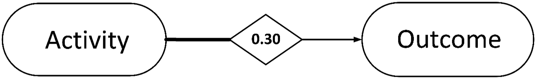
Another alternative could be showing how multiple activities or antecedent outcomes in combination are required to achieve outcomes. This transferability is like the thermal conduction in physical objects and could be shown by lines of different gradients, similar to heat being transferred, and lost among different outcomes.
Graphs
‘Graphic formats present information in a way that is easier for people to perceive and reason about [than text]’ (Pinker, 1990, p. 1). For example, graphs can convey information about the expected distribution of impact in a program logic model (see Figure 3). For example, are the outcomes anticipated among program participants normally or exponentially distributed? In most social programs, it would be expected that many participants would exhibit or experience some change, but others may experience no change, and a small number would be predicted to experience substantial change (a normal distribution). Graphs could convey this information in a simple way, such as: Expected Distributions of Impact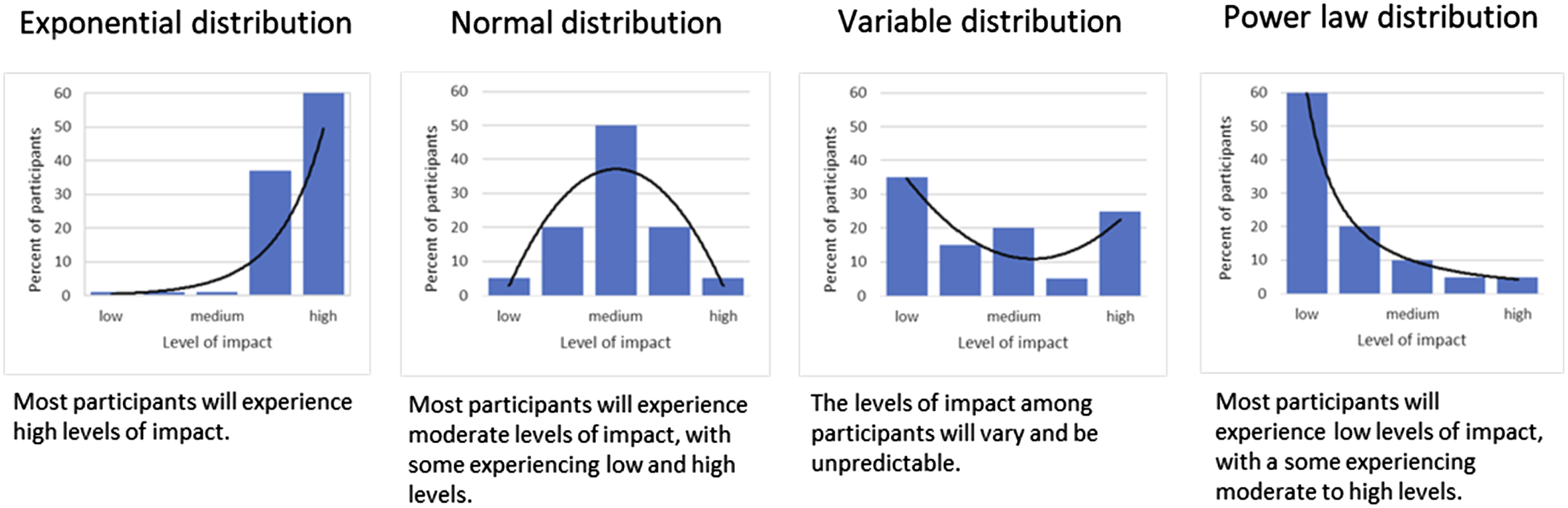
Similarly, perhaps there is a threshold of program participation or level of an outcome that needs to be achieved before change is expected in a consequent outcome, which could be conveyed in a graph as well. Finally, the longitudinal impact of a program on participants can take many trajectories, including persistence, fade-out, emergence, and re-emergence (Bailey et al., 2020), which could be shown in program logics using different arrow shapes (see Figure 4). Longitudinal Impact Trajectories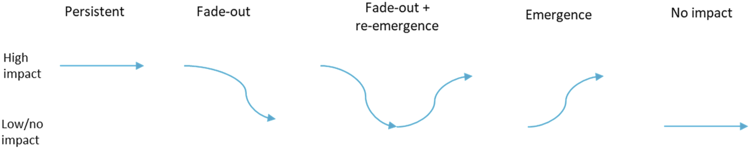
Systems Map
Systems maps come in many forms but one particularly relevant type shows nodes and the connections among the nodes. For example, McGlashan et al. (2016) developed a systems map of obesity that visualises the structure of the causal loops impacting obesity, and is by necessity quite detailed and complex to accurately reflect reality. Aspects of this approach could be employed in program logics, such as differentiating among types of variables or outcomes: ‘in-degree or effect’ (impacted by multiple other variables), ‘out-degree or cause’ (impacts other variables), and ‘betweenness or mediators’ (connect variables). In-degree, out-degree, and mediator variables can be implied by the paths of arrows in many program logics or by different shapes. Simply by undertaking the exercise of classifying variables could assist in greater refinement of a program logic.
Indigenous Ways of Knowing and Learning and Artistic Approaches
The program logic model is a largely non-Indigenous focused tool that may not align well with Indigenous ways of knowing and learning. Yunkaporta (2009) describes these ways of knowing and learning, which include ‘symbols and images’, ‘non-linear’, and ‘learning maps’. Although Yunkaporta (2009) states that ‘Aboriginal thinking is often done in images or shapes rather than words…concepts can be shown this way’, (p. 5) in an educational context, this approach can have benefits more broadly, including in program logics. One example of this approach is visual storyboarding, for example: • a program logic overlaid on a mountain, with the activities at the base of the mountain (LaFrance & Nichols, 2009) • a theory of change centred on a road with the sun as the long-term outcome (Step-It-Up-2-Thrive Resource Center, 2022) • a tree with social outcomes at the top and values and resources as roots (Carlson, Day, & Farrelly, 2021, p. 12) • the building of a traditional Hawaiian structure (Ikeda, 2012) • clouds, mountains, river, and sea (water cycle) (Lubeck et al., 2021) • a story of change based on an interconnected, holistic. and circular diagram (Community First Development, 2020).
If the primary purpose of the program logic is to convey how a program will achieve its intended outcomes, then these story-centred approaches using real-world objects, landscapes, and metaphors could be beneficial for First Nations and non-Indigenous peoples. Also, by rejecting the Western focus on order and simplicity, the focus can shift to more holistic understandings of culture and context, acknowledging that many of the same limitations apply to this approach in terms of expressing complex program understandings. However, First Nations’ cultural symbols have the potential to provide deeper meanings to users of program logics in some cases, such as the medicine wheel (Jenkins et al., 2015). Finally, Dart and Gates (2024) apply a futures thinking approach to theory of change, and the iterative artistic expressions employ a range of visually striking imagery that incorporates multiple perspectives in portraying change processes.
Multiple Arrow Types
Mill et al. (2019) outline four types of program logic models, including a ‘type 4’ that can accommodate complex interventions. In this type, the authors use different types of arrows to communicate different relationships: dotted arrows convey the peripheral nature of contextual outcomes, while double-headed arrows convey how the emergence of proximal outcomes can strengthen the work of the project. They advocate for ‘different types of lines and arrows to express dynamic relationships and contingencies….and…to use diverse shapes such as triangles and circles…’ (p. 8). Similarly, class diagrams allow computer programmers to graphically represent a system or program through object-oriented modelling. In these diagrams, there are multiple arrow types for different relationships among objects, for example, generalisation (solid line and a triangle head), realisation (dashed line and triangle head), dependency (dashed line and arrowhead), and aggregation (solid line and diamond head) (Chen et al., 2022) (see Figure 5). A similar categorisation and visualisation could be extended to impact pathways, for example, ‘solid line/solid arrowhead’ for direct causal relationships; ‘solid line/no arrowhead’ for a correlation between variables; and a ‘solid line/diamond head’ for outcomes that require several other antecedent outcomes to occur. Certainly, a wider repertoire of line and arrow types could lend itself to greater refinement of relationships among outcomes in program logics. Different Types of Arrows From Class Diagrams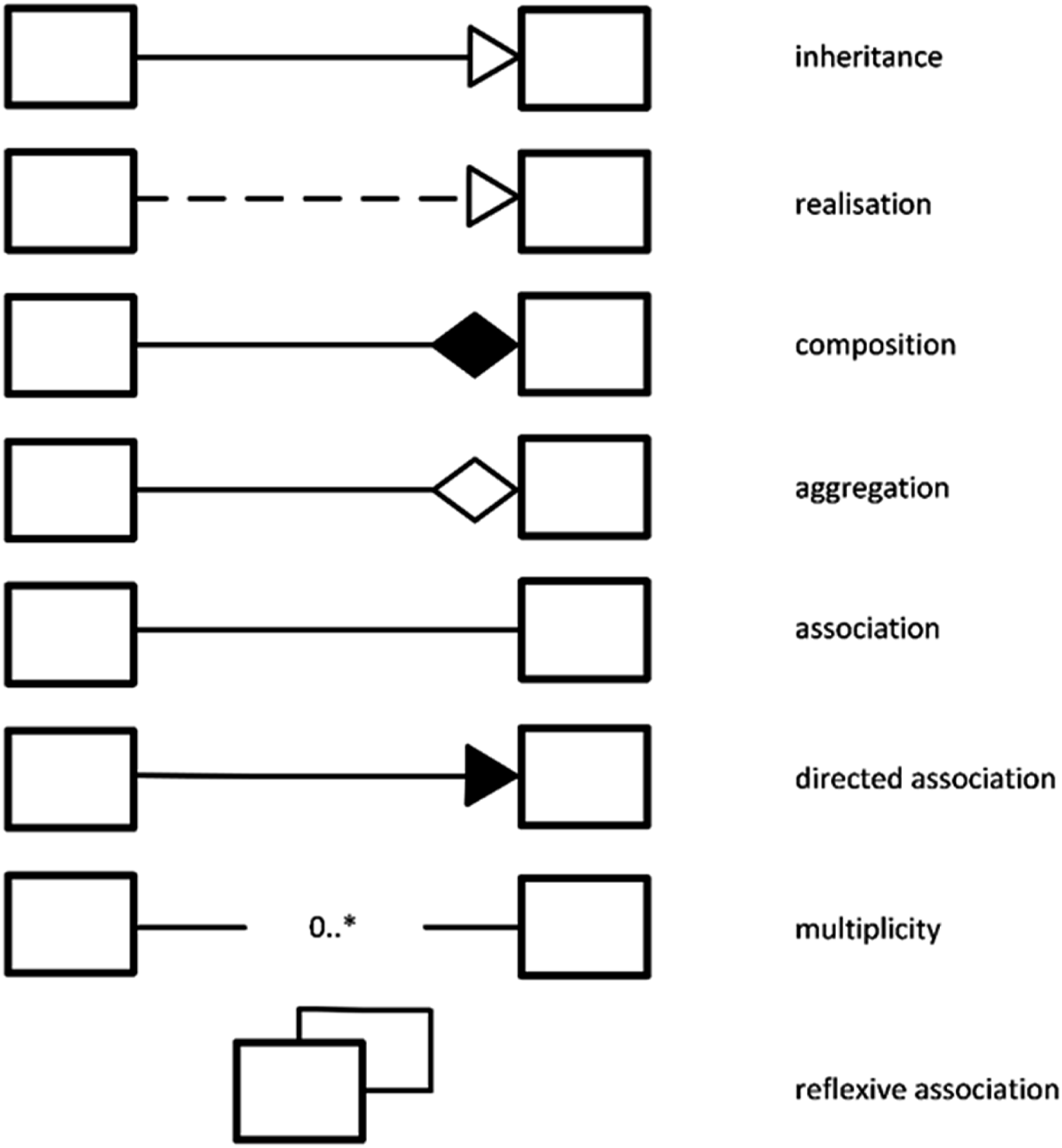
Pictographs, Icons, Colours, and Shadings
Pictographs may be beyond the ability of many program logic developers to draw or design themselves; however, with the widespread availability of icons, clipart, and other graphics, it is possible to include meaningful pictographs that help communicate complexity more artfully. For example, snakes ( ) and ladders (
 ) for external influences that are barriers and enablers, respectively, or onramps and offramps to a highway. There are a multitude of examples of using icons and pictographs in program logics, for example, the Santa Cruz Museum of Art’s theory of change, which uses cartoons of humans and interactions (Spellerberg et al., 2016). To date, colour and shading in most program logics usually conveys little additional information, other than grouping sets of outcomes or cohorts. There is an opportunity to employ colours more usefully; for example, in other fields, colour diversification has been proposed to increase clarity and concision (e.g. in computer syntax highlighting as described in Patrignani (2020)), and colour gradation to demonstrate transition from one state to another (Widyasari & Yani, 2019). An important consideration in relation to this is visual accessibility standards to ensure program logics can be perceived by everyone, including those with visual impairments (e.g. minimum contrast ratios, considering colour blindness, and not relying on colour alone).
Ishikawa Fishbone Diagram
The Ishikawa Fishbone diagram is a tool for identifying the root causes of quality control problems (Ilie & Ciocoiu, 2010) (see Figure 6). Some evaluators have used Fishbone diagrams for other purposes, such as comparing case studies (Davey & Morell, 2020). Although Fishbone diagrams most often employ only lines and rectangles, what they do offer is an ability to add more detailed branches and sub-branches to represent deeper root causes or more subtle processes or inputs. This ability to convey deeper and more refined relationships visually could be useful in a program logic context. Example of an Ishikawa Fishbone Diagram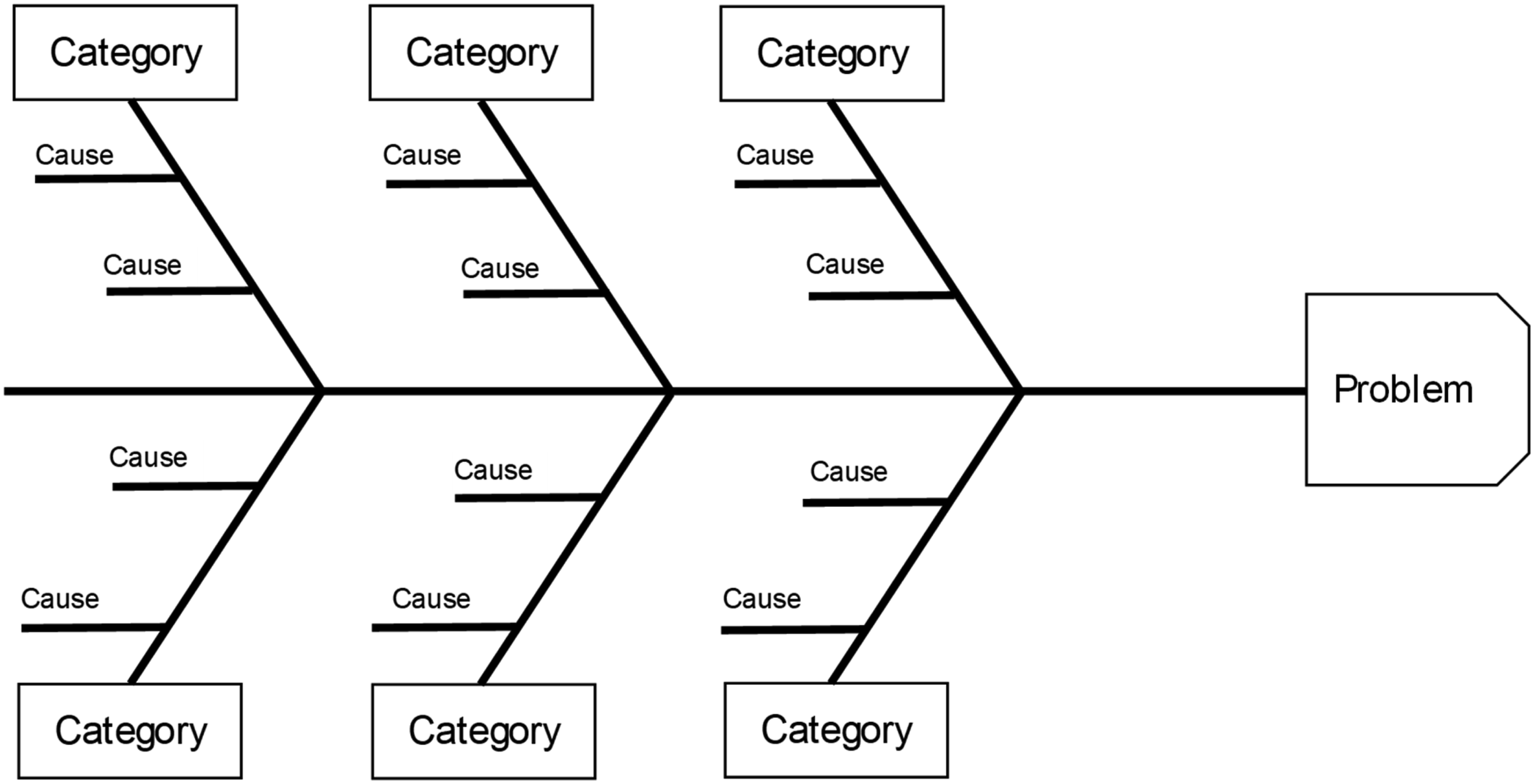
Metaphors
Most logic models rely on a linear, mechanistic representation of how interventions influence human behaviour, which often does not align with the complexity of those interactions. The use of extended metaphors can help communicate multiple aspects of program theory, such as the likelihood of impact or external influences. Metaphors have been used as a lens to understand qualitative data (Woodgate et al., 2021) and causal analysis (Hawkins, 2020, used a cake metaphor). Metaphors have also been used to increase the capacity to develop program logics, for example, using canoe building (Kuiper et al., 2020). In addition, metaphor has been used to describe program logics themselves, such as the logic model as a recipe (Institute of Museum and Library Services, 2015). There are opportunities to use metaphors within program logics more frequently, as they offer powerful communication tools and allow for deeper understanding. Metaphors are also useful in classifying programs; for example, the author has adapted Farazi et al. (2019) model of bodies of water to classify program types (see Banks et al., 2023). This could be visually used in program logics to metaphorically describe programs and their relative depth and breadth of expected impact.
Limitations
This article has proposed employing an expanded set of symbols to improve the accuracy of program logics and manage the risk of misinterpretation by non-evaluators. However, there are several limitations and drawbacks to this suggestion. First, the benefit of the current approach is its simplicity and consistency. The familiar rectangles and lines with arrowheads are firmly embedded in practice and changing this approach risks over-complicating program logics, and in addition, introducing new symbols would require efforts to achieve consistency and understanding. Introducing more symbols could also have the unintended consequence of reducing reduce understanding rather than increasing it. Second, there may be a limit to the degree of accuracy that is possible to convey. That is, one reason program logics don’t provide more nuanced symbology is because there the certainty of the connections among inputs, outputs, and outcomes is not available to include. Finally, there may be alternate ways to communicate the subtleties and limitations of causal or propositional program logics besides visually.
Conclusion
This article has provided an in-depth review of the visualisations currently used in program logic diagrams, which is a gap in the current literature. The intention is to raise awareness about the use of symbols and shapes and their meanings, and also to suggest a wider repertoire be considered. The American artist Al Held was quoted as saying, ‘We’re not going to get rid of chaos and complexity, but we can find a way to live with them’ (Rourke, 2005). Program logics are useful tools, but due to their often over-simplified construction of reality and limited visual vocabulary, are in danger of becoming Potemkin villages of evaluation; a false construct providing an external facade to an enormously complex underlying reality. This is not to say we should throw the baby out with the bathwater. Program logics are enormously useful and their consistency and ability to convey complex relationships and processes simply is admirable. However, more considered use of these visual models, especially how they are constructed and understood, could be aided by an extended range of symbols, shapes, and colours. This is true for many theories of causality, including the classic Newtonian cause-effect, and the propositional approach. In the end, it will be up to individual evaluators and stakeholders to decide the best format of their program logic. English and Kaleveld (2003) advocate for the development of alternative program logics, followed by a decision on which logic solution is the best. If this advice is taken by program logic developers, it is hoped that at least some of these alternative program logics employ the ideas in this article.
Footnotes
Funding
The author received no financial support for the research, authorship, and/or publication of this article.
Declaration of Conflicting Interests
The author declared no potential conflicts of interest with respect to the research, authorship, and/or publication of this article.