
Abstract
In safety-critical industries, it is essential to have clear and trustworthy predictive models to ensure reliability and build confidence. This paper presents a new framework to explain predictions made by Machine Learning (ML) and Artificial Intelligence (AI) models, specifically designed for experts who may not have technical knowledge of these technologies. The focus is on predicting potential issues in pumps that play a critical role in moving fluids within industrial systems. The framework uses real-world data and a tool called Shapley Additive exPlanations (SHAP) to explain how different factors influence the model’s predictions. These explanations are transformed into clear, easy-to-understand text and visuals, making them accessible to users without technical expertise. The framework was tested on predicting pump performance issues and demonstrated its ability to build trust by aligning explanations with existing expert knowledge. By offering accurate and reliable insights, this approach supports the adoption of ML tools in industries with strict regulations, fostering confidence in their use for critical decision-making.
Keywords
Introduction
Recently, AI and ML models have been increasingly deployed in safety-critical sectors. 1 Most AI and ML applications use black-box models because their outputs perform better than white-box models but lack transparency. Black-box models are ML or statistical models that make predictions or decisions based on complex algorithms that are not easily interpretable by humans. 2 A new rule is to be enforced by the General Data Protection Regulation (GDPR): “a right to an explanation of all decisions made by automated or artificially intelligent algorithmic systems”, 3 which means that there are additional requirements for the technology’s deployment.4,5 described the increased usage of black-box models in applications controlled by complex algorithms and the severe consequences of a lack of transparency, such as possible biases in decision-making and unfair competition. Therefore, blindly relying on black-box ML models to make decisions in safety-critical sectors is unacceptable, because serious safety-related consequences can occur. 6
In black-box models, stakeholders, including end-users, domain experts, and decision-makers 7 need help in understanding the underlying structure of how and why predictions are made. 8 By understanding how ML models behave, decision-makers will trust ML models and decide when and how they will deploy these ML models. 6 Many well-known companies enforce explainability in AI-powered applications to pass trustworthiness checks. 9 Explainable AI (XAI) techniques are intended to provide credibility to stakeholders by understanding how ML models work and why they generate predictions. 10 Explainability and trust are different concepts, but they are tied together in the literature to the extent that researchers assume a direct connection. For example, in, 11 the authors developed a new explainability and trust hypothesis, where explainability is one approach to establishing stakeholders’ trust. As a natural consequence of more complex ML models being proposed, developed, and deployed alongside new regulations, the need for XAI tools to understand predictions has also increased.
How explanations are conveyed to domain experts, who are usually non-ML experts, is essential. There is a knowledge gap between developers of ML models (e.g., data science experts) and domain experts who are to be considered the end users of these developed ML models. What is deemed understandable for AI and ML experts is often not comprehensible for domain experts. Researchers have identified and are proposing solutions to bridge this gap to increase the usability of AI and ML techniques.11,12 Recent advancements have highlighted the critical role of XAI in industrial condition monitoring and predictive maintenance, demonstrating its potential to improve decision-making, enhance resource optimisation, and increase trust in machine learning models. For instance, one study proposed an XAI framework utilising LIME to provide clear, actionable explanations for decision-makers, while linking predictions to spare parts management, thus improving maintenance strategies. 13
Another study leveraged the Shapley Additive exPlanation tool (SHAP), an explainability method that assigns each feature a contribution value for a model’s prediction in a fair and consistent manner, to enhance the interpretability of machine learning models in diagnosing faults in rotating machinery. By analysing vibration data from industrial bearings, the study identified skewness and shape factor as critical features, achieving over 98.5% accuracy with Support Vector Machine (SVM) and k-Nearest Neighbour (kNN) models. This highlights SHAP’s effectiveness in feature selection and fault classification. 14
XAI algorithms such as Gradient-weighted Class Activation Mapping (GradCAM), Layer-wise Relevance Propagation (LRP), and Local Interpretable Model-agnostic Explanations (LIME) have also been applied to convolutional neural networks (CNNs) for vibration-based condition monitoring. By analysing synthetic and real-world datasets, these methods generated saliency maps that identified class-specific features while excluding irrelevant ones, improving CNN interpretability for fault detection. 15
Further research has emphasised XAI’s broader applications in manufacturing and industrial cyber–physical systems, advocating for clear, understandable intelligent models. These studies underscore XAI’s role in increasing trustworthiness and reliability in industrial processes. 16
Additionally, the use of Shapley values has been explored for clustering frameworks in semi-supervised learning for fault diagnosis and prognosis. This approach demonstrated improvements in clustering quality and facilitated the identification of meaningful clusters related to fault classification. 17
In collaborative robotics, XAI-driven techniques like autoencoders have been applied to detect anomalies using multivariate operational data. These methods proved effective in identifying faults, enhancing the reliability and safety of robots in smart manufacturing environments. 18
Collectively, these studies demonstrate the transformative potential of XAI in industrial condition monitoring. By bridging the gap between complex machine learning models and actionable insights, XAI ensures enhanced fault detection, classification, and operational safety, contributing significantly to predictive maintenance and resource optimisation in industrial settings.
This paper presents a new framework to bridge the gap between ML model developers and technical and industrial specialists in engineering applications. The aim is to support specialists and domain experts in engineering applications in understanding ML models by providing clear explanations to help them make informed decisions.
The main objective of this framework is to assist specialists and domain experts in the engineering application field by delivering relevant explanations of ML models in the development and implementation phases of the ML models. This assistance empowers them to make well-informed decisions and aims to improve their understanding and foster effective collaboration between AI/ML developers and domain experts. A set of novel algorithms has been developed with a dual purpose: generating explanations in a text-based format and presenting them visually in a way that domain experts are accustomed to. These explanations were specifically designed to enable individuals without a background in ML to comprehend the utilised models. Furthermore, the value of this framework lies not only in the methodology itself but also in its successful application and evaluation in a specific real-world context involving roto-dynamic pumps. These pumps, which convert kinetic energy into pressure energy, operate according to performance curves. By using the framework, experts gained actionable insights into pump performance, improving operations and reducing wear.
The subsequent sections of this paper are structured as follows: The next section delves into the background of the term “explainability,” its recent usage in literature, and the diverse methodologies employed to achieve it. Following this, existing frameworks geared towards providing explanations to non-expert users are elucidated. Subsequent sections outline the proposed framework for addressing the explainability problem, describing the algorithms developed to furnish human-friendly explanations and graphical representations. Additionally, an introduction to the Iris dataset is provided, as well as insights into its application, and our main case study on thrust-bearing wear. The results demonstrating the utility of the novel approaches discussed herein are then presented. A section discussing how validation is done against existing domain knowledge is illustrated. Finally, the paper concludes with a summary section.
Explainability
Explainability has been referred to in the literature by various terminologies such as “Interpretability”,4,19 “Understandability”, 20 “Comprehensibility”, 21 “Accountability”, and “Responsible AI”. 2 The definitions of these terms may differ depending on the explanations provided to the target users. 22 Generally, in ML literature, the term “Interpretability” is used more often than the term “Explainability”. 23
24 suggested that even with the significant advancements in deep learning, the central issue of the “black box” dilemma persists, and the idea of XAI, which refers to a model that can provide clear and understandable explanations for its concluded output, becomes highly valuable, fostering greater transparency. 25 has defined interpretability as the ability to understand the internal structure of the ML model, while explainability is the ability to understand the reasons why ML models work. Some researchers have not defined explainability but rather its taxonomies. 9
One specific definition for XAI was given by, 26 ”XAI typically refers to post-hoc analysis and techniques used to understand a previously trained model or its predictions.”. Another definition was given in 27 : “XAI will create a suite of ML techniques that enable human users to understand, appropriately trust, and effectively manage the emerging generation of artificially intelligent partners.”. Thus, XAI generally allows users to gain insights into why specific predictions are made. 10 suggested that the system may or may not be explainable depending on the definition of explainability for that system and defined explainability as ensuring that predictions produced by ML models can be explained by non-experts.
A model can be defined as interpretable when it can provide accurate solutions to humans in an understandable way. 28 and 29 provided similar definitions of model interpretability as the degree to which humans can understand the logic behind generated predictions. Another definition was given by 30 : ”When you can no longer keep asking why”. However, achieving complete interpretability for a specific modelling problem can take time and effort. Therefore, when a clear explanation for all model outputs is available, then complete interpretability is achieved, which is a difficult task in reality. 31 Furthermore, 32 argued that ML experts should try to build interpretable models, especially in high-stake applications, rather than using XAI tools to interpret black-box models.
Based on the above definitions, this paper concludes that the definition of explainability might vary depending on the target audience. What is considered understandable by an AI expert may not be comprehensible by a domain expert. This paper focuses on industrial and engineering applications where decisions about critical assets with substantial financial and safety implications are made. Thus, it’s crucial to offer explainability in a context that domain experts who aren’t machine learning experts can understand.
Explainability in AI systems can be categorised based on different criteria, providing insights into the nature of interpretation methods. These classifications are. • Global and Local Explainability: – Global methods provide an overall understanding of the model’s behaviour across all data points, focusing on the relationship between input features and output predictions. – Local methods explain the behaviour of the model for specific or small subsets of data points, concentrating on feature importance for individual predictions. • Model-Agnostic and Model-Specific Explainability: – Model-agnostic techniques are applicable to any machine learning model, focusing on understanding the relationship between inputs and outputs without requiring knowledge of the model’s internals. – Model-specific techniques are tailored to particular model architectures or algorithms, providing explanations closely tied to the internal workings of the model. • Pre-model, During-model, and Post-hoc Techniques: – Pre-model techniques involve understanding data before model selection, often through exploratory data analysis (EDA) to gain insights into the dataset. – During-model techniques focus on using inherently understandable models for humans, such as transparent/white-box models, to provide explainability during model development. – Post-hoc techniques are applied after obtaining predictions from black-box models, aiming to explain model decisions without impacting model performance.
Existing frameworks to provide explanations to non-expert users
The attribute of explainability positively affects every stakeholder involved with an AI system. 33 However, most XAI tools produce explanations aimed at users with ML expertise. 34 Due to the knowledge gap between ML experts and non-ML experts, it is challenging to present explanations and communicate with stakeholders in a human-understandable context. Research suggests that experts in the application domain are more likely to trust ML models when provided with human-friendly explanations, allowing them to understand the decision-making process of ML models. 34
In, 35 the Authors divided users of ML and AI applications into ML and AI experts, domain experts, and newcomers to a domain. There are distinct explanations needed for stakeholders in different application domains. Researchers have proposed various techniques to address this challenge.
An explainability framework has been developed to address different user needs, incorporating three levels of explanations. At the first level, pre-model XAI methods are employed to provide an initial understanding of the data. At the second level, these low-level explanations are combined with expert knowledge to create high-level insights. Finally, co-created explanations are generated with the help of users who interact with the model, providing feedback that is later integrated to tailor explanations according to their specific requirements. 36
An online experiment involving 199 participants evaluated users’ understanding of different XAI interfaces. The results demonstrated that interactive explanations significantly enhance users’ comprehension of the provided explanations, highlighting the importance of user-friendly, engaging interfaces in XAI systems. 37
Existing XAI frameworks and approaches are primarily aimed at people with prior AI and ML capabilities. Although XAI has made significant progress in recent years, there is still room for improvement in addressing the needs of non-ML experts. In addition, there is a lack of dependency on the existing explanation frameworks. Future XAI frameworks will have to go beyond this if ML is adopted more widely.
The authors in 38 proposed a new framework to assess users’ understandability of LIME. Based on their assessments, they concluded LIME explanations target users with ML backgrounds, and additional human-understandable visualisations are required to enhance LIME explainability.
In this paper, a new framework is proposed in which a set of novel algorithms has been developed to provide non-expert users with more insights into the application of ML. The novelty of our framework lies in the integration, adaptation and combination of different stages to deliver human-understandable explanations tailored explicitly to domain experts. These explanations are also provided rapidly, as the process is automated. This framework solves a problem that other existing methodologies in industrial and engineering domains need to address. It is designed to bridge the gap between ML model developers and technical and industrial specialists in engineering applications. This framework is designed to assist specialists and domain experts in the engineering field by providing comprehensible explanations of Machine Learning (ML) models, empowering them to make well-informed decisions. It achieves this through a set of innovative algorithms developed to serve a dual purpose: generating human-readable text-based explanations and presenting them graphically in a format that aligns with common domain practices. These explanations are crafted to help non-ML experts understand the underlying models. A unique aspect of this framework is its ability to overcome a limitation of SHAP, a widely used ML explainability tool that can show correlations but cannot detect causal relationships. The framework’s graphical representation addresses this by establishing a causal context for SHAP explanations. This allows domain experts to identify critical operational areas to avoid based on these graphical representations, thereby enhancing the models’ interpretability and usability.
Additionally, a validation process is conducted against existing domain knowledge. This step not only provides domain experts with human-friendly explanations but also measures the reliability of the explanations, indicating to what extent these interpretations can be trusted. This approach helps build confidence among domain experts and fosters greater acceptance of ML-based decision-making in engineering contexts.
A new framework for understandable explanations for non-expert users in industrial and engineering applications
This section introduces the proposed framework based on,
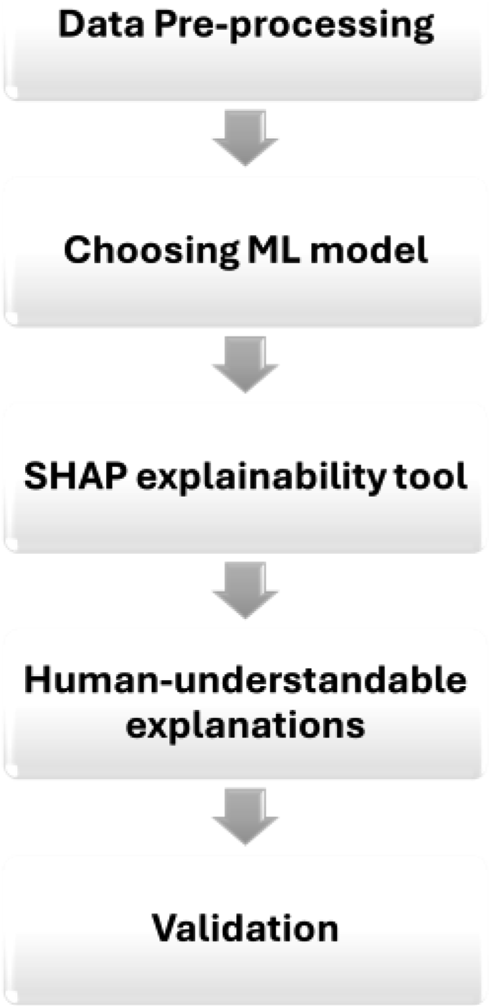
39
which provides human-understandable and graphical explanations to non-ML experts in industrial and engineering applications. The objective is to develop multiple alternatives to obtain explainability from predictive or diagnostic analytic tools. To achieve this goal, a framework comprising five complementary explanatory stages is proposed (see Figure 1). (1) Pre-processing of data: During the initial stage, the objective is to ease the understanding of the data set used and its features. The data quality is evaluated and transformed into an understandable format that can be employed later in ML/analytic models. (2) Prediction models: An appropriate ML prediction model is selected in the second stage. Most ML models are often deemed black-box models, making it challenging to understand how they work and how inputs are transformed into outputs. As a result, it is essential to employ XAI techniques that can explain predictions made, allowing industry stakeholders to understand the ML models adopted. (3) Applying XAI tools: Building on,
39
an additional layer to the explanation framework is proposed, where XAI tools are used to explain how ML models work and why they produce these predictions. SHAP is applied to: generate reliable explanations, provide local explanations for each prediction and produce a global, holistic explanation of how the ML model works. However, SHAP produces these explanations as complex plots, which can be challenging to understand, particularly for non-ML experts. The motivation behind introducing the following stages is to transform these explanations into a more user-friendly format. (4) Generating human-understandable explanations: How to convey explanations effectively to individuals in the application domain, who may not be experts in ML is important. Plots produced by SHAP can be difficult and time-consuming to interpret. Therefore, these plots must be transformed into human-understandable contexts to bridge the gap between developers and application domain experts. Innovative algorithms were developed to transform SHAP’s local and global explanations into human-friendly text-based and visual explanations. This paper introduces two levels of explainability that help enhance non-expert users’ explainability through text-based explanations and graphical representations related to domain experts (associated with a specific technical domain). A novel algorithm was developed to convert SHAP plots into a graphical representation suitable for users without ML expertise, and specifically, associated with the technical domain of this paper’s case study, that is, the predicted degradation of mechanical pumps. (5) Validation of explanation. This final stage holds significant importance in establishing trust among stakeholders and ensuring the successful implementation of AI models in various industrial settings, particularly those with high stakes and safety-critical applications. Trust plays a pivotal role in the adoption of AI technologies, making it imperative to subject XAI explanations to rigorous validation processes. Through such validation efforts, stakeholders can develop confidence in the accuracy, reliability, and alignment of these explanations with domain-specific knowledge. The validation of XAI explanations, particularly through collaboration with domain experts, is crucial for ensuring their alignment with domain expertise. This collaborative approach between end-users’ understanding of XAI and the validation process is fundamental in building trustworthy ML models. By incorporating the input and insights of domain experts, this process verifies that the explanations provided by XAI tools accurately reflect real-world domain knowledge and complexities. Leveraging domain experts’ expertise serves as a valuable benchmark for confirming the relevance and accuracy of explanations, thereby enhancing the reliability and trustworthiness of the model’s interpretations. A step-by-step framework for creating understandable ML explanations tailored for non-ML expert users.
Justification for using SHAP over other XAI methods
The selection of SHAP as the explanation method in this framework was based on a careful comparative evaluation, rather than default preference. SHAP was benchmarked against LIME by generating explanations for the same instance across 100 repeated runs. SHAP demonstrated perfect stability (Kendall’s Tau = 1.0), consistently producing identical feature rankings, while LIME yielded variable and less reliable results. This level of consistency is essential in industrial settings where interpretability must be robust and reproducible.
In addition to its stability, SHAP was preferred due to its ability to generate both local and global explanations, its strong theoretical foundation grounded in cooperative game theory, and its rich, intuitive visualisations that aid stakeholder understanding. Though SHAP incurs a higher computational cost than LIME, this was considered acceptable given the small number of critical predictions requiring explanation.
Other tools, such as Grad-CAM, were excluded due to their limited applicability to non-tabular data. SHAP, by contrast, supports multiple data types and integrates seamlessly with common ML libraries, offering flexibility across model types and future use cases. These combined advantages led to the deliberate and justified adoption of SHAP in this work.
Automated human-understandable explanations algorithms
In this section, the algorithms created to transform bespoke SHAP plots into easily understandable human text and (case-study-related) visually based graphical explanations are described.
Explaining SHAP local plots
After the standard application of SHAP tools, explanations are displayed in bespoke plots. This paper showcases a new approach to transform these plots into text-based explanations and graphical representations.
For local interpretability, SHAP produces ’force plots’. SHAP force plots are generated using SHAP tool. As an established tool, SHAP comes with its documentation, tutorials, and user guides that provide detailed instructions on its installation, usage, and the interpretation of its results.
40
For each prediction, force plots qualitatively define the most important features contributing towards each output and the quantitative impact of each feature on the output at that local level. Figure 2 provides an example of a SHAP force plot for a single instance. In the plot, each feature has an impact on the prediction, causing the prediction to either increase or decrease in magnitude from the baseline (which is the average of all predictions). Each feature value is compared to the mean to determine whether it is considered a high/low value. When a feature has a positive SHAP value, it indicates that the feature value positively affects the prediction, causing it to increase from the baseline, and it is depicted using the red colour, as observed in Feature 1 and Feature 3. Conversely, a negative value signifies that the feature negatively impacts the prediction, causing the prediction value to decrease from the baseline (i.e., Feature 2 negatively impacts the prediction). Finally, if the SHAP value is zero, then this feature has no impact on the output. While these outputs may be easily and rapidly assessed by an ML expert with a background in SHAP, this is not necessarily the case for a non-ML expert. Therefore, means of providing a more precise and rapid interpretation of these SHAP outputs are proposed in this paper. An example of SHAP force plot illustrating the contribution of individual features to a single prediction. The base value (mean value of all predictions) serves as a reference point. Features are shown as either increasing (red, positive impact) or decreasing (blue, negative impact) the prediction value, with the final predicted value displayed in bold.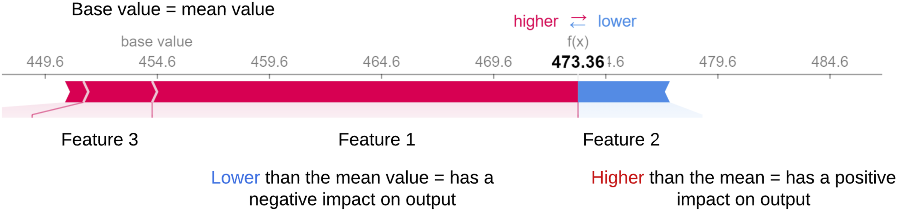
Figure 3 shows how the results generated from SHAP are transformed into text-based explanations, showing a flow chart that explains the logic behind the code that has been developed for generating text-based explanations. The concept behind this algorithm is to check the SHAP value for each feature in a single instance and determine whether it has a positive value (causing the prediction for this instance to increase), a negative value (causing the prediction to decrease), or 0 (has no impact on the output). Then, each feature value is compared to the mean to determine whether it is considered a high/low value. The pseudo-code illustrating the step-by-step implementation of this flow chart can be found in Appendix A. A flowchart for interpreting SHAP force plots. It evaluates a feature’s SHAP value to determine its impact on the prediction. A zero SHAP value means no impact, while a non-zero value indicates a positive or negative impact based on whether the feature’s value is above or below the mean. This process helps users understand the role of each feature in the prediction.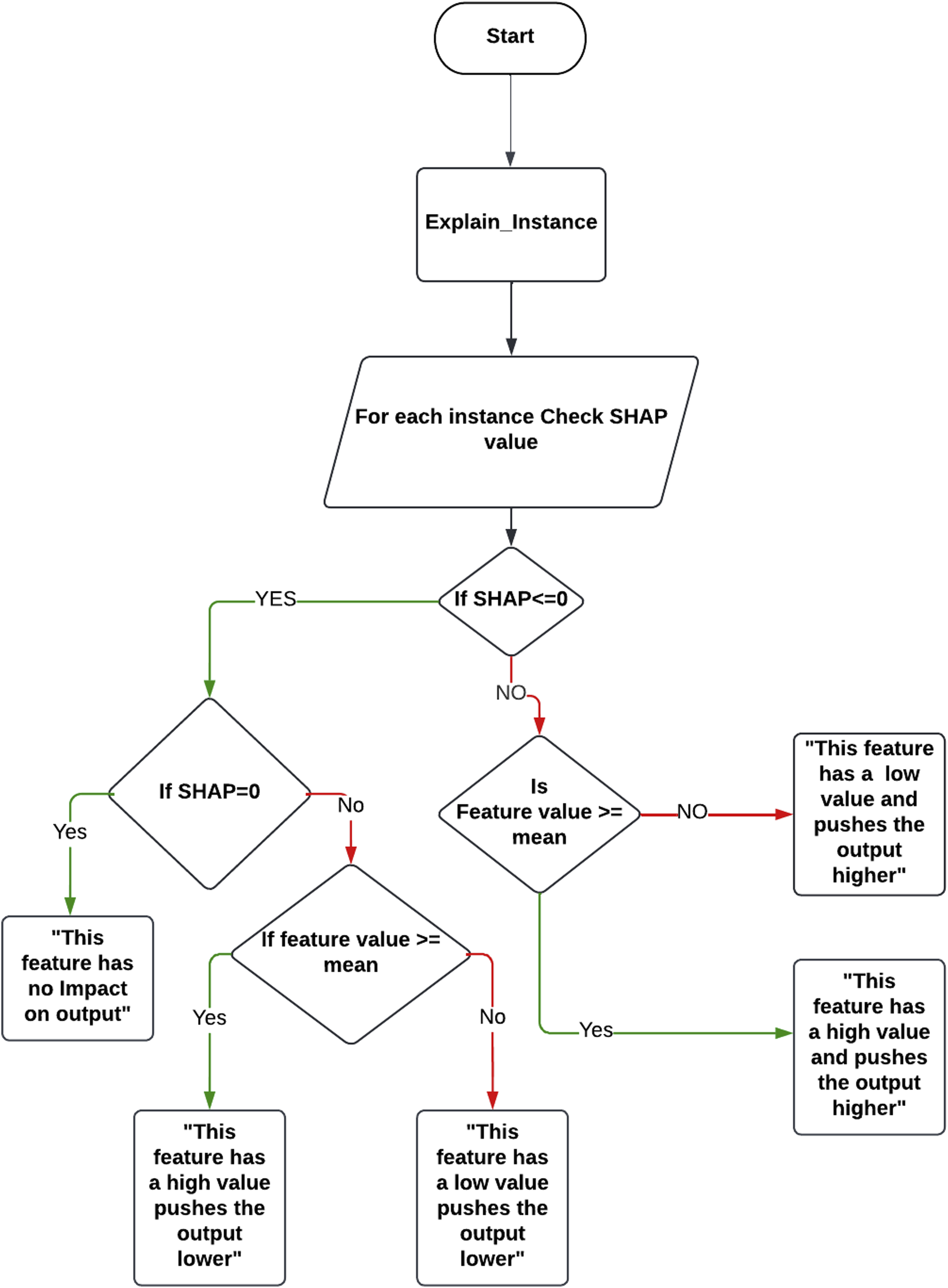
For each instance, the previous steps are done to determine how each feature value affects the prediction. The output from this automated process is a text-based description of SHAP outputs. The case study in the next Section provides examples of this process and associated results.
Explaining SHAP global summary plots
For global explainability, SHAP produces a ’summary plot’ which summarises the feature importance and impact of feature values on model outputs for the full range of predictions. 40
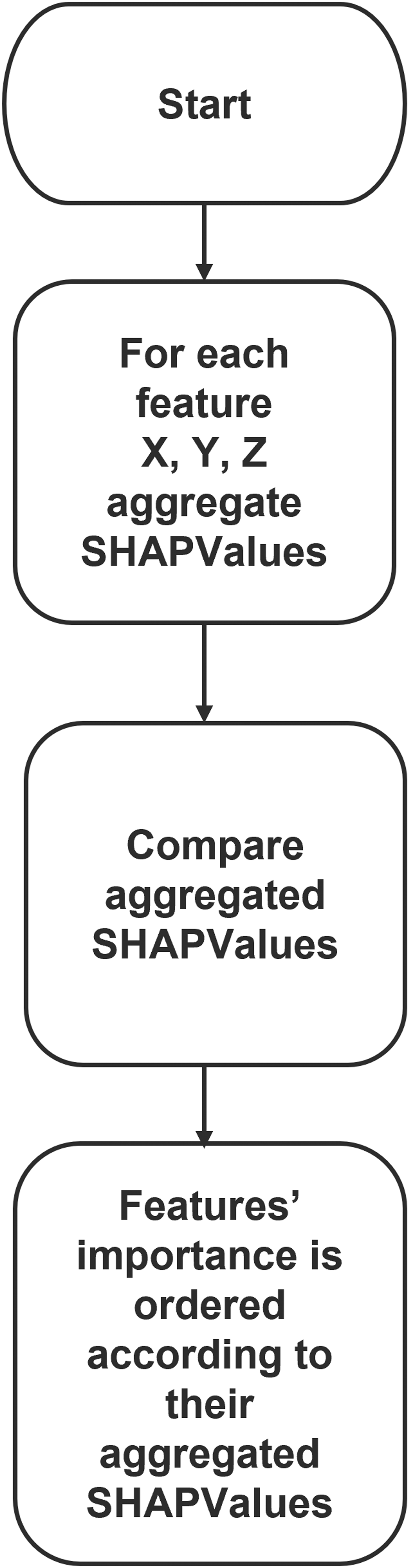
Figure 4 depicts an example of a SHAP summary plot. In a summary plot, all features have the effect of all their SHAP values displayed. Features with higher aggregated SHAP values have a more significant impact on the predicted output and vice versa (e.g., for Figure 4, the most important features in order are Feature 1, Feature 2, and Feature 3). In Figure 4, the vertical axis depicts feature values (blue represents low values, and red represents high values). The horizontal axis depicts SHAP values, which determine the effect of the feature values on model prediction. SHAP summary plot highlights the most important features and the impact of each feature’s value on the output. Similar to SHAP force plots, non-ML experts do not rapidly and easily assess summary plots. The authors propose an algorithm to explain SHAP global explainability plot intended for non-ML experts. How this information is transformed into human-understandable text is shown in Figure 5, as a flow chart that describes the logic behind the code that has been produced for generating text-based explanations. For each feature, SHAP values have been aggregated. The aggregated SHAP values for all the features were compared. The most important features will have greater aggregated SHAP values; hence, a more significant impact on predictions. Example of SHAP summary plot showing the most important features and their impact on predictions. The x-axis represents SHAP values, where positive values indicate an increase in the prediction and negative values indicate a decrease. Red dots represent high feature values, and blue dots represent low feature values, helping identify key contributors to the model’s output. Flowchart for interpreting a SHAP summary plot. The process involves aggregating SHAP values for each feature, comparing these aggregated values, and ranking features based on their overall importance to the model’s predictions.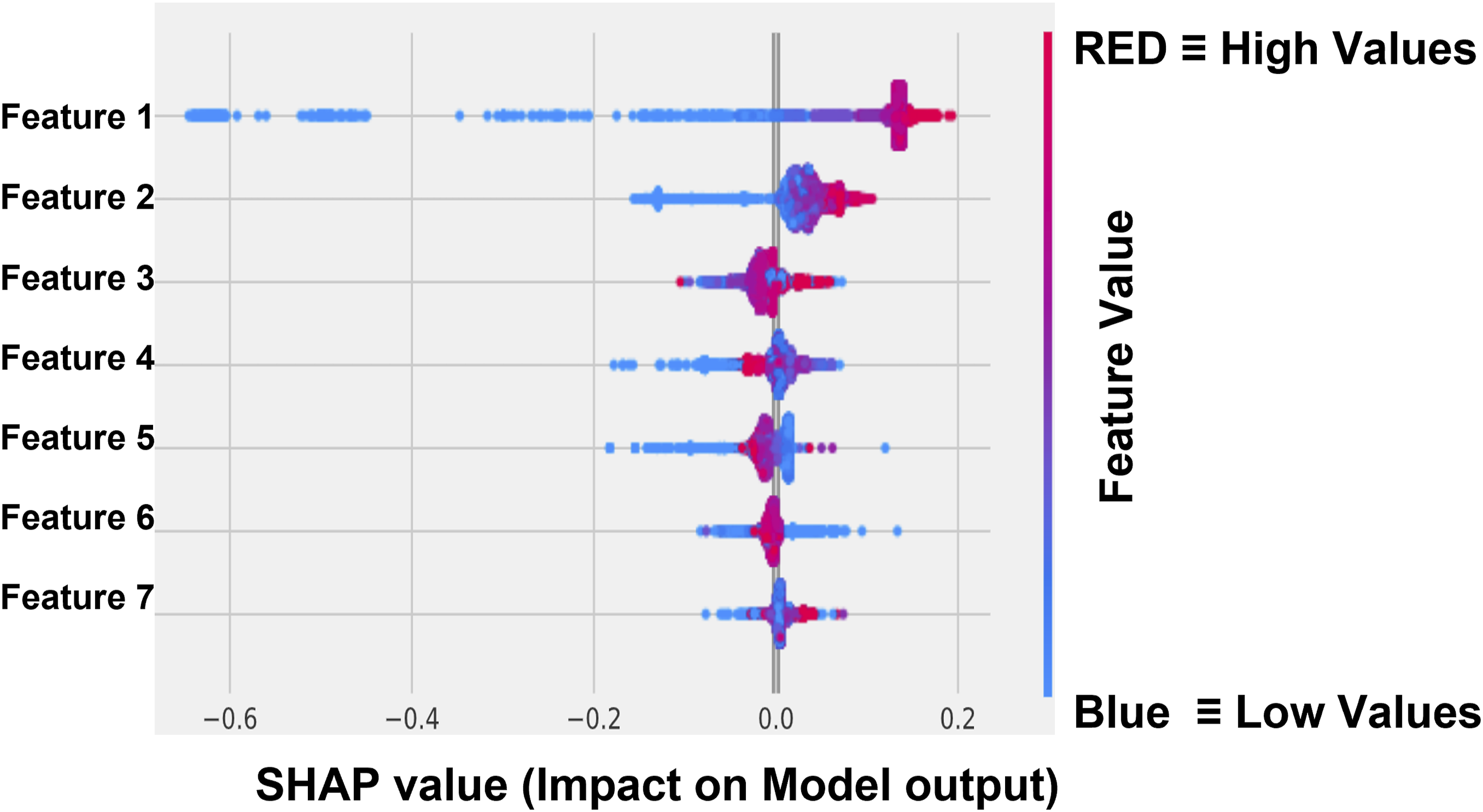
IRIS dataset
In this section, the application of our framework to the Iris dataset will be initiated, leveraging its status as an accessible open case dataset. This initial step will facilitate the subsequent transition to our main case study, which involves real-world monitoring data.
To ensure the credibility and reliability of our validation process, the Iris dataset was deliberately selected as the foundation for establishing a solid baseline. To illustrate the methodology applied to the IRIS dataset, Figure 6 showcases the approach undertaken. The approach used to verify SHAP explanations. The IRIS dataset is processed using a Random Forest Classifier to generate predictions. The SHAP tool is then applied to provide explanations for these predictions. These explanations are compared to domain knowledge to assess their reliability and determine how closely they align with expert understanding. This process ensures that SHAP explanations are trustworthy and meaningful for users. Methodology to verify SHAP explanations by comparing predictions from a Random Forest Classifier with domain knowledge. The similarity between SHAP explanations and expert knowledge assesses their reliability and trustworthiness.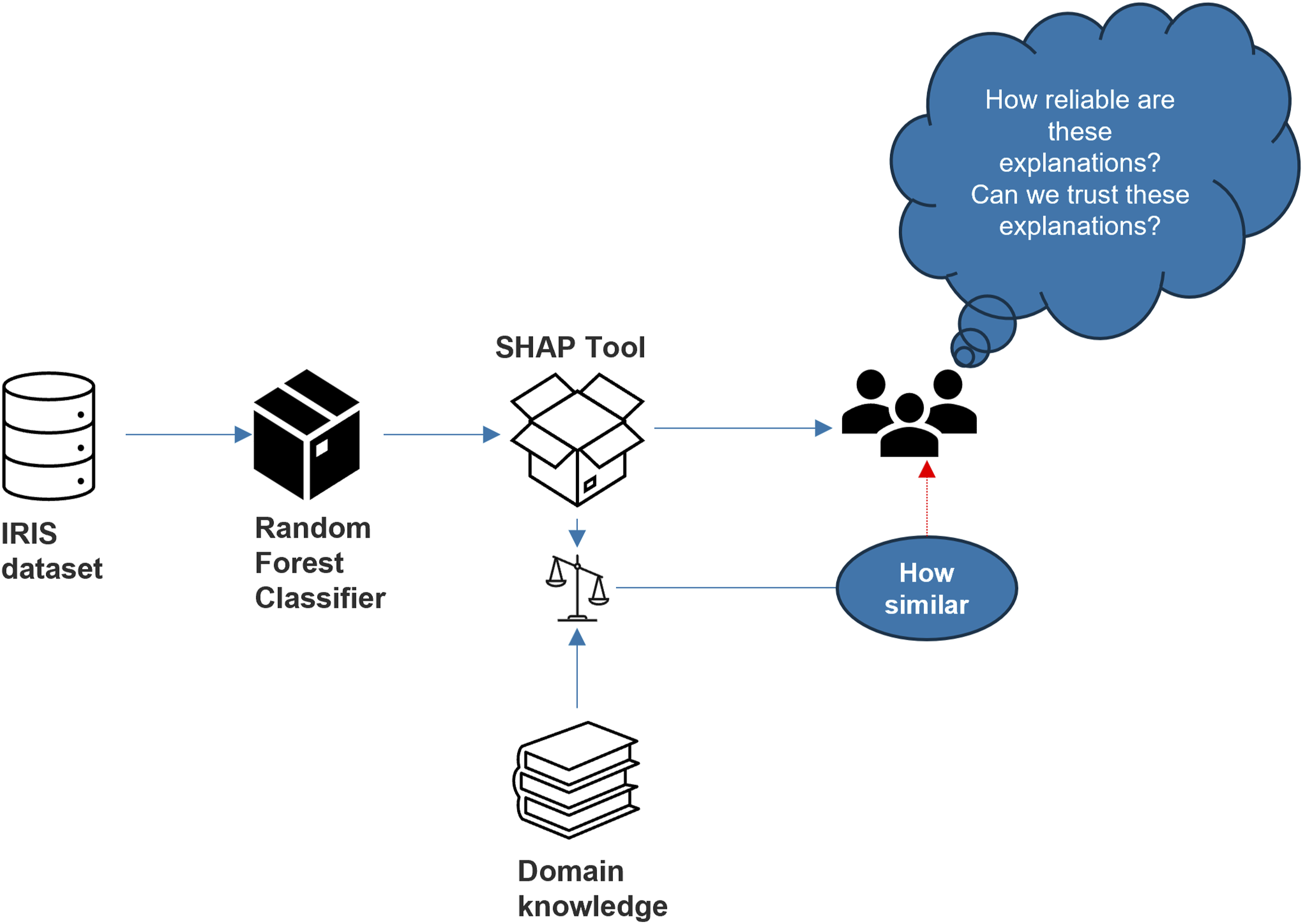
The Iris dataset holds a distinguished status in the field of data analysis and ML, recognised as a benchmark dataset with well-defined characteristics. It encompasses samples derived from three distinct species of iris flowers, and in total, it comprises 150 instances.
What lends added confidence to our validation effort is the wealth of established knowledge and research that has been conducted on the Iris dataset over the years. Numerous studies, as referenced in, 41 have thoroughly explored and documented the characteristics and patterns within this dataset. This extensive body of prior research provides us with a well-structured foundation for our validation process.
By leveraging the insights and findings from these established sources, the effectiveness of benchmarking our own validation procedures against widely accepted standards is achieved. This not only bolsters the credibility of our validation but also ensures that our results can be rigorously compared and validated within the broader context of the Iris dataset, a dataset known for its reliability and extensive history of analysis.
Initially, as part of the data pre-processing phase aimed at achieving a deeper understanding and uncovering potential correlations, data visualisation was conducted. In this process, the data was visualised using the sepal width and sepal length attributes as shown in Figure 7. However, as shown in Figure 7(a), it was observed that the separation between the different iris species might not have been as distinct as anticipated. This observation suggests that the influence of the sepal features alone in effectively distinguishing between the various iris species may not have been particularly pronounced. Comparison of scatter plots based on sepal length and petal length in the Iris dataset. Plot (a) shows the distribution of data points based on sepal length, while plot (b) shows the distribution based on petal length. The significant separation of data points in plot (b) suggests that petal length may be a more important feature in distinguishing between Iris species.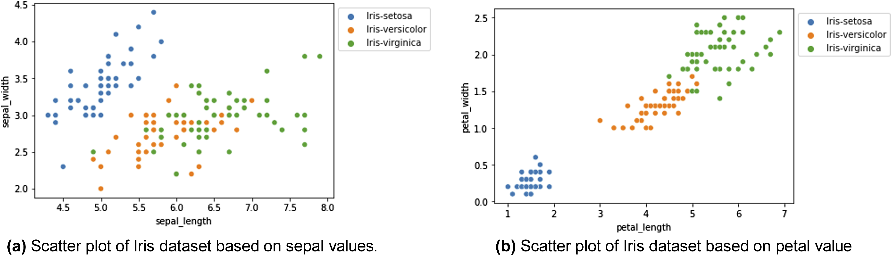
In essence, despite the exploration of the sepal width and sepal length attributes as potential discriminators, it was inferred that other factors or features may have played a more substantial role in the accurate differentiation of iris species. This insight underscores the significance of considering a broader set of attributes or features in our analysis to ensure precise species classification.
On the contrary, when visualising the data based on petal width and petal length as shown in Figure 7(b), distinct clusters for each species can be clearly discerned. This serves as a compelling illustration that these two features possess a high level of discriminative power when it comes to accurately classifying the various types of iris flowers.
Following that, the Iris dataset was subjected to classification using a Random Forest classifier, where instances were classified into one of three classes: Setosa, Versicolor and Virginica. This ML algorithm, renowned for its versatility and robustness, was employed to discern and allocate each instance to its respective class based on the dataset’s features.
The Random Forest classifier operates by constructing a multitude of decision trees, with each tree contributing to the classification decision. Through the amalgamation of these individual tree predictions, a robust and accurate classification outcome can be achieved.
By employing this classifier on the Iris dataset, the aim was to leverage its capabilities in effectively distinguishing and classifying instances into the three distinct categories. This classification process relied on the underlying patterns and relationships within the dataset, allowing informed and precise decisions regarding class assignments to be made for each instance.
Feature importance scores generated by the random forest classifier.
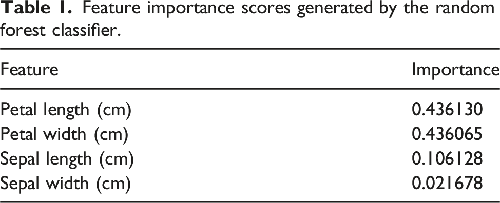
In addition to petal attributes, sepal length was also identified as a relevant discriminative feature, albeit with a lower importance value of 0.106,128. This indicates that variations in sepal length contribute significantly to species classification, although to a lesser extent compared to petal attributes.
Conversely, sepal width exhibited the lowest feature importance among the four attributes, with a score of 0.021,678. While its influence is relatively minor in comparison to the other features, it still plays a role in the classification process.
Collectively, these feature importance values provide a clear hierarchy of the features’ contributions to accurate species classification within the Iris dataset. The findings highlight the significance of petal characteristics, especially petal length and width, in differentiating iris species, offering valuable insights for further analysis and model interpretation.
Utilising the SHAP explainability tool in conjunction with the Random Forest classifier, a comprehensive analysis of feature importance was conducted. The outcome of this analysis is the paramount significance of certain features, with petal width and petal length emerging as the most influential. Following closely in importance are sepal length and sepal width, in that order.
Remarkably, the Random Forest classifier consistently and persistently identifies petal width and petal length as the preeminent features in the classification process, as shown in Table 1. This consistent recognition serves to underscore the pivotal role that these attributes play in effectively discerning between various iris species. In essence, these findings robustly reinforce the assertion that petal width and petal length are of paramount importance when it comes to classifying iris species, as consistently demonstrated by the Random Forest classifier.
SHAP, in addition to its role in feature importance analysis, offers valuable insights into the individual contributions of features to model predictions. In the context of this analysis, as exemplified in the provided figure, SHAP elucidates the specific contributions of each feature to predictions as shown in Figure 8. In this case, it affirms the profound significance of petal characteristics in effectively distinguishing between various types of iris flowers. SHAP force plot for a single instance in the Iris dataset, highlighting the most important features and their contributions to the prediction. Features with a negative impact are shown in blue, moving the prediction away from the base value.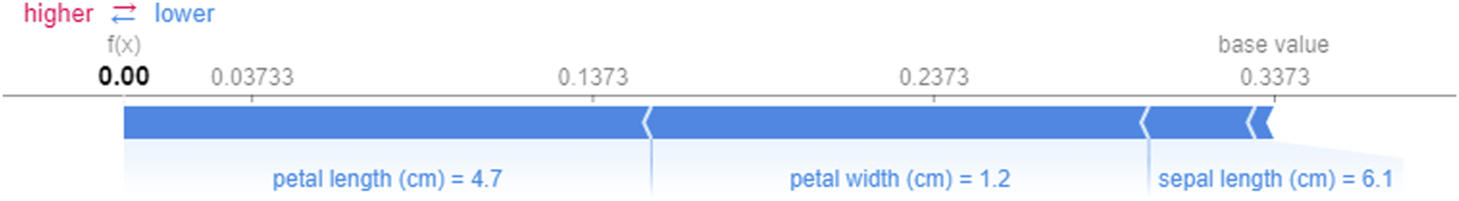
The figure illustrates how petal characteristics, notably petal width and petal length, exert a substantial influence on shaping the model’s predictions. These insights reinforce the understanding that variations in petal attributes serve as key discriminators in accurately classifying different iris species. SHAP’s ability to provide such granular insights enhances our comprehension of feature contributions within the predictive model and underscores the pivotal role of petal characteristics in the classification process.
After receiving SHAP explanations, domain knowledge rules were derived from established references, delineating feature thresholds within the context of various species. These rules encompassed feature thresholds pertinent to each species. Subsequently, SHAP value extraction was carried out by applying a trained Random Forest classification model to the Iris dataset, yielding SHAP values for a specific instance. The ensuing analysis of SHAP values for each feature within the given instance unveiled that positive SHAP values signified a feature’s affirmative contribution to the prediction, whereas negative SHAP values denoted a detrimental contribution. A crucial step in this process involved comparing the effects of SHAP values on the prediction with the predefined domain knowledge rules. This comparison elucidated whether the impact of each feature, as indicated by the SHAP values, concurred with the predictions made by the established domain knowledge.
In order to establish a robust baseline for measuring the alignment between SHAP explanations and domain knowledge, the same methodology was applied to this controlled dataset. The objective of this approach was to determine a satisfactory level of similarity accuracy between SHAP explanations and domain knowledge, which not only enhances our methodological confidence but also furnishes a valuable benchmark for assessing the degree of disparity observed within the original industrial context.
In analysing SHAP values, it is crucial to interpret their implications accurately. Figure 9 shows how SHAP values are verified against rules extracted from domain knowledge taken from.
41
Positive SHAP values for specific features indicate that the presence of those features positively contributes to the likelihood of predicting the corresponding class. For instance, a positive SHAP value associated with the ”petal width” feature in the ”Setosa” class suggests that higher values of petal width increase the probability of the model predicting the class as ”Setosa.” Conversely, negative SHAP values for features imply a negative contribution to class prediction likelihood. If a negative SHAP value is linked to the ”sepal length” feature in the ”Virginica” class, it signifies that lower sepal length values elevate the probability of the model predicting the class as ”Virginica.” Additionally, the magnitude of SHAP values reflects the extent of a feature’s impact on the prediction. Larger magnitudes indicate stronger influence, where a high positive SHAP value signifies a significant positive effect on class prediction, while a high negative value denotes a substantial negative impact. These insights are instrumental in comparing SHAP explanations with domain knowledge to assess the congruence of their findings. Process for verifying SHAP values against domain knowledge rules. SHAP local explanations are analysed for each feature’s impact on predictions, and these are compared with rules extracted from domain knowledge to assess alignment.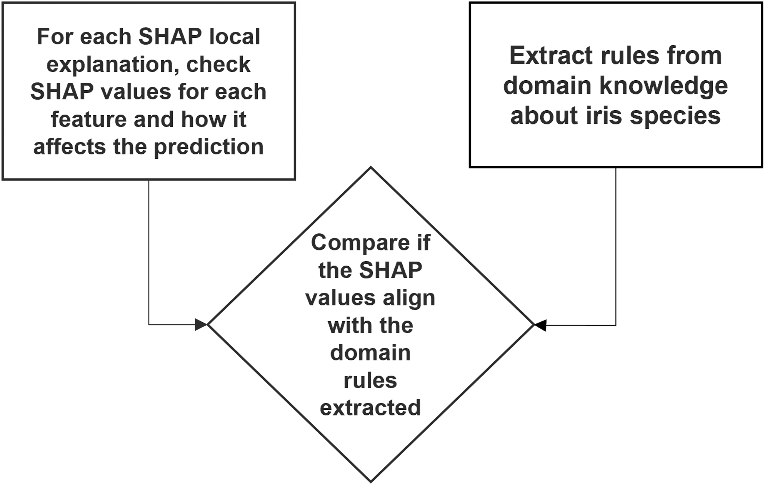
In Figure 10, a sample output from verifying SHAP values against domain knowledge rules. For each data instance in our analysis, SHAP values are computed to understand the impact of individual features on the model’s prediction. Specifically, the focus is placed on the two most critical features, petal length and petal width, which have consistently been found to be the most influential in our context. Sample output illustrating the validation of SHAP values against domain knowledge. For each instance, predicted Iris types and SHAP feature explanations (e.g., petal length and width) are compared to predefined domain knowledge ranges to check for alignment.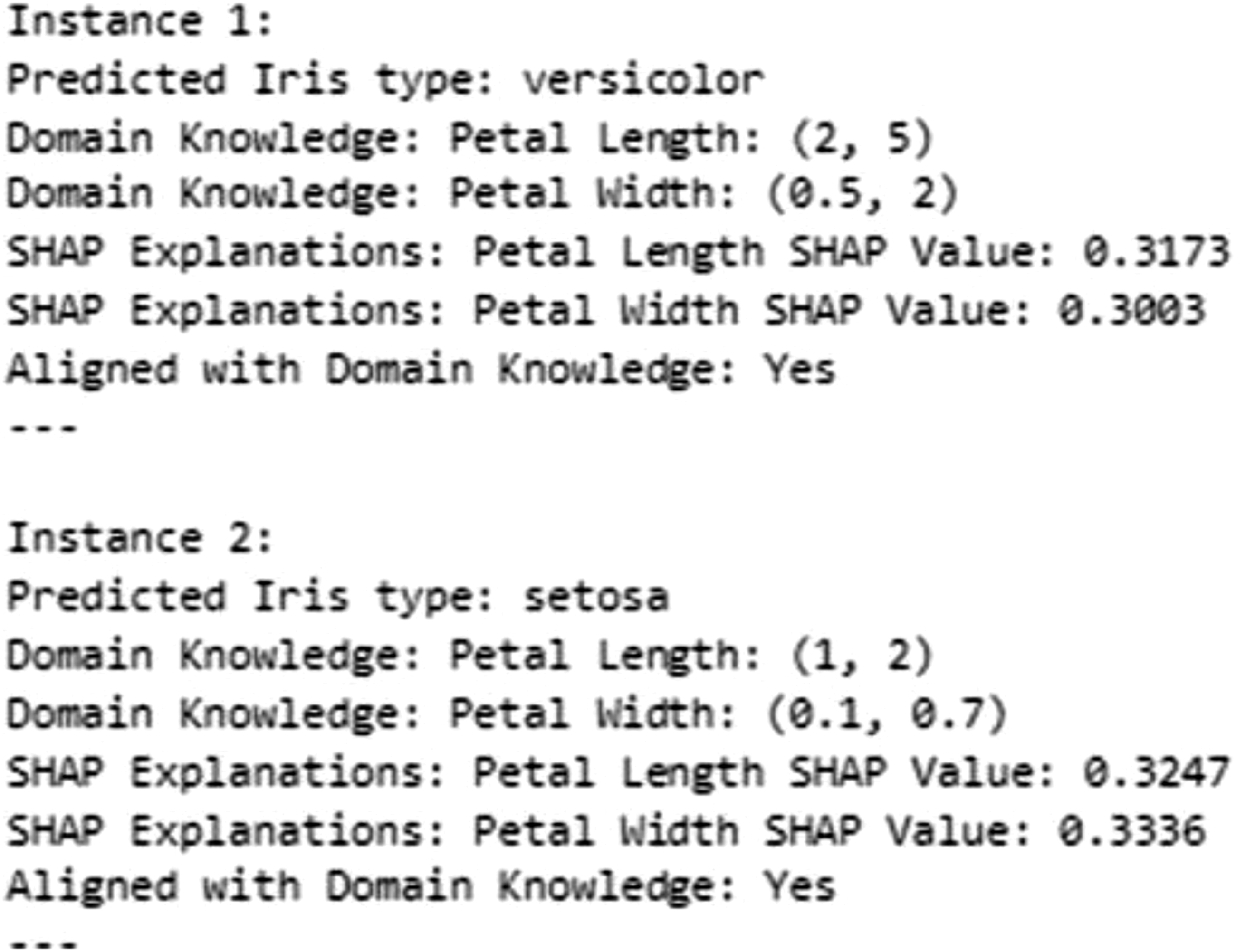
Firstly, an assessment is made to determine whether the SHAP values for these features in a given instance have a significant positive effect on the predicted output. In other words, it is checked whether higher values of petal length and petal width contribute positively to the likelihood of the model predicting a specific class. This step assists in identifying which features are deemed crucial for the model’s decision for that particular instance.
Once the impact of the SHAP values has been established, the next step involves comparing these findings with our domain knowledge rules, which define specific boundaries or thresholds for petal length and petal width based on established references. These rules encapsulate our understanding of how these features should behave in relation to the predicted class.
The crux of this analysis lies in determining whether the observed impact of petal length and petal width aligns with what our domain knowledge rules predict. If the SHAP values indicate that higher values of these features positively influence the prediction, and our domain knowledge rules are in agreement with this observation, it strengthens our confidence in both the model and the domain knowledge. Conversely, if there is a misalignment, it prompts further investigation into potential discrepancies or areas for improvement.
In summary, this analytical process involves the computation of SHAP values to assess the impact of crucial features, a comparison of these values with domain knowledge rules, and an evaluation of the degree of alignment between the two. This helps us validate the model’s behaviour and gain insights into the consistency between data-driven predictions and established domain expertise.
In our approach, the comparison between SHAP explanations and domain knowledge was structured around a set of predetermined rules well-established within the domain. These rules represent a concrete embodiment of expert understanding, detailing how various features are expected to influence outcomes. Each SHAP explanation was systematically compared against the domain knowledge, using these rules as a benchmark, to assess its accuracy.
The process entailed an examination of SHAP outputs to determine whether they adhered to or deviated from these predefined rules. A SHAP explanation was considered ’right’ when it aligned with the expectations set forth by these rules, indicating a correct identification of feature impacts. Conversely, explanations were deemed ’not right’ whenever there was a divergence from these established guidelines.
The similarity measure was thus calculated by tallying instances of agreement (where SHAP outputs conformed to the domain knowledge rules) versus instances of disagreement. This calculation yielded a similarity rate of 99%, demonstrating a high degree of concordance between the SHAP-generated insights and the established domain rules. Such a high similarity rate reinforces the validity of the SHAP explanations, showcasing their ability to accurately reflect the nuanced interplay of features as encapsulated by domain-specific rules. This methodical comparison underscores the robustness of our model in generating explanations that are not only interpretable but also deeply rooted in domain expertise.
A case study demonstrating the proposed approach to ML explainability: explaining a thrust bearing wear predictive model
In this section, a case study is presented where the proposed methods are applied, and the results from each stage are shown.
Understanding the reasoning behind the ML model predictions is essential for domain experts in industrial applications where high-stakes decisions are made. This framework will help domain experts understand ML model outputs, build trust in ML models, and ensure responsible and effective deployment in real-world applications. The impact of this framework is demonstrated in this case study, where these human-understandable explanations were used to explain a model predicting pump degradation. This application of the ML model led to more effective pump operations and extended pump lifespan. Centrifugal (or roto-dynamic) pumps are widely used in various industries. They accelerate the working fluids to generate pressure from kinetic energy. Centrifugal pumps operate according to a performance curve that describes their flow-pressure relationship. Figure 11 shows a typical performance curve of a centrifugal pump.
42
The plot describes the pressure increase (Head) a pump produces at different flow rates. Centrifugal pumps have different physical characteristics depending on the application for which they have been designed. During pump design, a predetermined operating criterion is used to develop a pump with the lowest mechanical losses due to vibration, heating, or cavitation.
42
Figure 11 shows the best efficiency point (BEP) at which the pump operates best in terms of energy generated and causes less or no wear to the pump. Operating away from the BEP leads to wear in some parts of the pump,
42
and accelerated degradation or loss of life. Centrifugal pump performance curves illustrating the Best Efficiency Point (BEP).
42
The BEP represents the optimal operating condition where the pump achieves maximum efficiency, balancing flow rate (gpm), head (ft), and brake horsepower (bhp).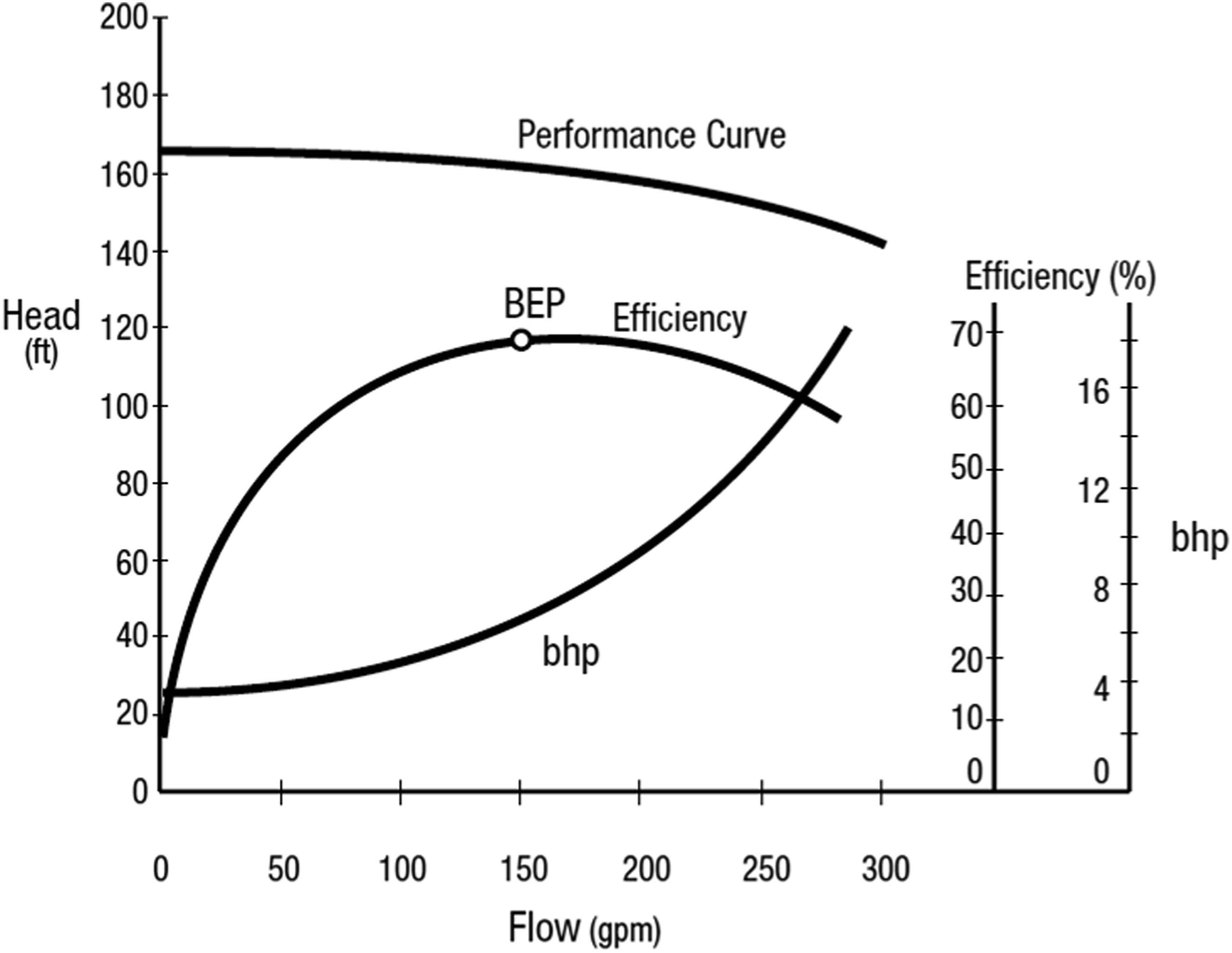
This case study used actual condition monitoring data from feed-water pumps to predict thrust-bearing positions. Thrust-bearing movement is analogous to thrust-bearing wear, which is regarded as a degradation in pump performance. Since thrust-bearing movement is an unwanted consequence of pump operation, and as the bearing moves, the associated pads wear as a result, minimising thrust-bearing movement helps extend the pump’s lifespan. For the ML model implemented in this case study and the associated analysis, the median thrust-bearing position is denoted “median-TB (t)”.
43
Median-TB (t) is predicted given predetermined pump operational profiles for flow (denoted “mean-flow”) and head (denoted as “mean-head”). The goal of the ML model is to identify the operational consequences (i.e., predicted thrust bearing wear) that result from proposed plant operating profiles and subsequently link the result with related domain expertise. A clear and rapid explanation of the prediction is provided in a context familiar to the end-user of the ML outputs. Two data sets were used. (1) Data taken during normal operation, which represents operating near the BEP. (2) A profile associated with a power-plant refuelling state represents a pump operating away from the BEP.
The following outlines how each stage of the proposed explainability framework, as previously mentioned, is applied in this case study.
Data pre-processing
The dataset used in this study comprises multivariate time series data, including flow and head measurements, designed to forecast thrust-bearing positions. To ensure the quality of the data and completeness, a thorough examination was conducted to identify and address missing values. Missing data were handled using the forward-filling method, which is particularly suitable for time-series datasets. This approach replaces missing values with the most recent valid observation, preserving the chronological continuity of the data and minimising the risk of introducing biases.
The stationarity of the dataset was assessed using the Augmented Dickey-Fuller (ADF) test, a widely used statistical method for determining whether a time series exhibits stable statistical properties such as mean and variance over time. The results confirmed the dataset’s stationarity, with no significant trends or variability, eliminating the need for additional transformations such as differencing or detrending. Ensuring stationarity is crucial for reliable analysis and modelling, as it provides a stable foundation for predictive tasks.
To further prepare the data for modelling, the time series were restructured into a supervised learning format to incorporate temporal dynamics. This transformation involved using lagged observations of the input features to forecast thrust-bearing positions, thereby aligning the data with the principles of supervised learning. Specifically, features such as mean-Flow(t-1), mean-Head(t-1), median-TB(t-1), mean-Flow(t), and mean-Head(t) were included to predict the target variable, median-TB(t). By leveraging lagged features, the model captured the inherent temporal relationships within the data, improving its predictive accuracy.
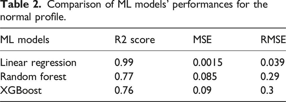
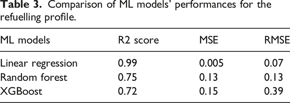
Modelling
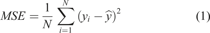
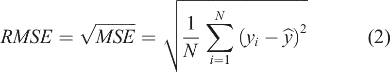
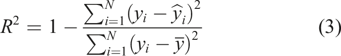
Comparison of ML models’ performances for the normal profile.
Comparison of ML models’ performances for the refuelling profile.
XAI tool application
As previously discussed, the SHAP explainability tool is built on a solid theoretical foundation and is capable of providing both local and global explanations, offering more reliable insights than other explainability tools. 40 The application of SHAP techniques in this study helps to elucidate the relationships between input features and the model predictions for thrust-bearing positions, providing valuable insights into the pump’s condition and performance.
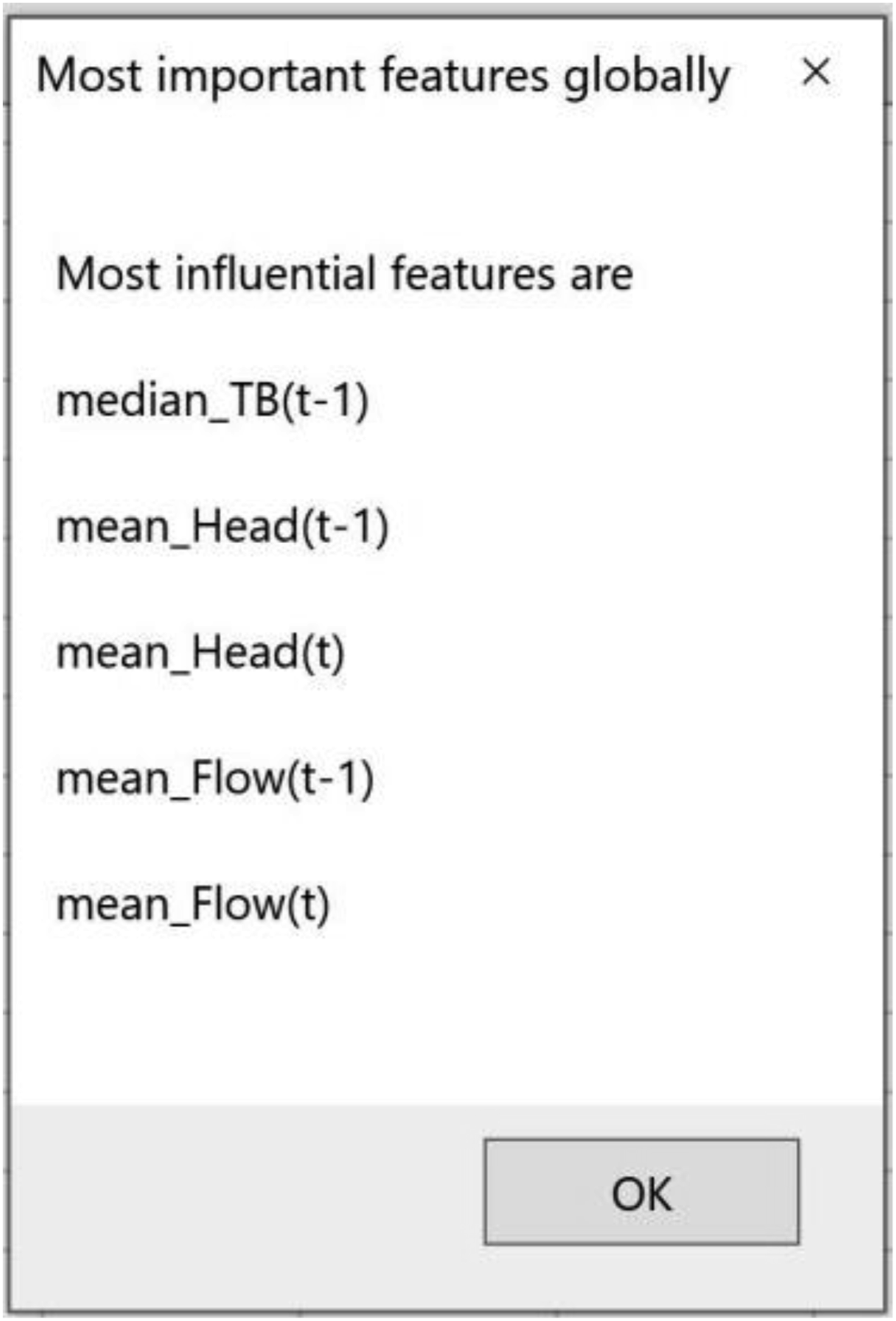
The SHAP summary plot for the normal profile data (Figure 12(a)) highlights the most influential features, which include median-TB(t-1), mean-Head(t-1), mean-Head(t), mean-Flow(t-1), and mean-Flow(t), ranked in descending order of importance. Similarly, the SHAP summary plot for the refuelling profile data (Figure 12(b)) reveals the same feature ranking, indicating their consistent significance across both operational scenarios. These plots provide a global perspective, illustrating the average contribution of each feature to the model’s predictions. Median-TB(t-1) emerges as the most important feature in both profiles, exhibiting a strong correlation with the output. An increase in median-TB(t-1) leads to an increase in the predicted thrust-bearing positions, which in turn contributes to an increase in thrust-bearing wear. This progression can adversely affect the overall performance and longevity of the pump system. These findings highlight the critical role of median-TB(t-1) in determining the stability and operational state of the thrust-bearing mechanism, emphasising its importance for monitoring and maintaining optimal pump performance. SHAP summary plots comparing the normal profile (a) and the refuelling profile (b). The plots illustrate the most influential features, their values, and their impacts on the model’s predictions. High feature values are shown in red, and low feature values are shown in blue. Positive SHAP values indicate that the feature has a positive impact on the prediction, while negative SHAP values indicate a negative impact.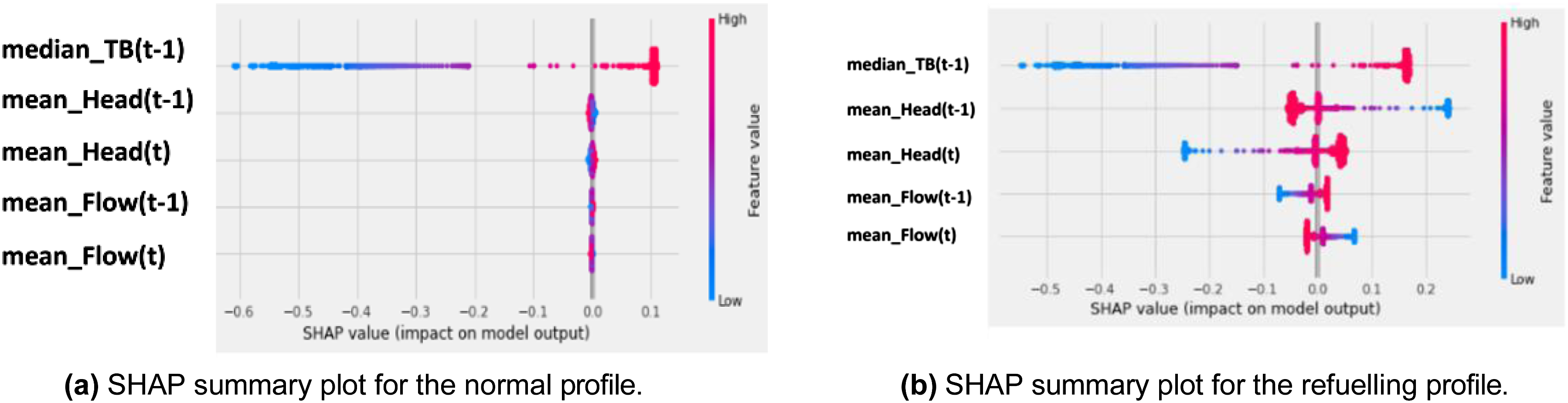
Local explanations derived from SHAP force plots provide deeper insights into the contribution of individual features to specific predictions. For the normal profile (Figure 13(a)), the force plot reveals that the most significant feature for a given prediction is median-TB(t-1), which negatively correlates with the output. This indicates that the specific value of median-TB(t-1) contributes to decreases in thrust-bearing positions. This insight highlights how certain operational dynamics, represented by this feature, can influence the stability of the thrust-bearing mechanism. Under normal conditions, such changes might act to either stabilise or destabilise the thrust-bearing positions, emphasising the importance of monitoring and understanding this feature for maintaining the system’s performance. SHAP force plots of instances taken from normal and refuelling profiles, indicating the most important features locally for this specific instance.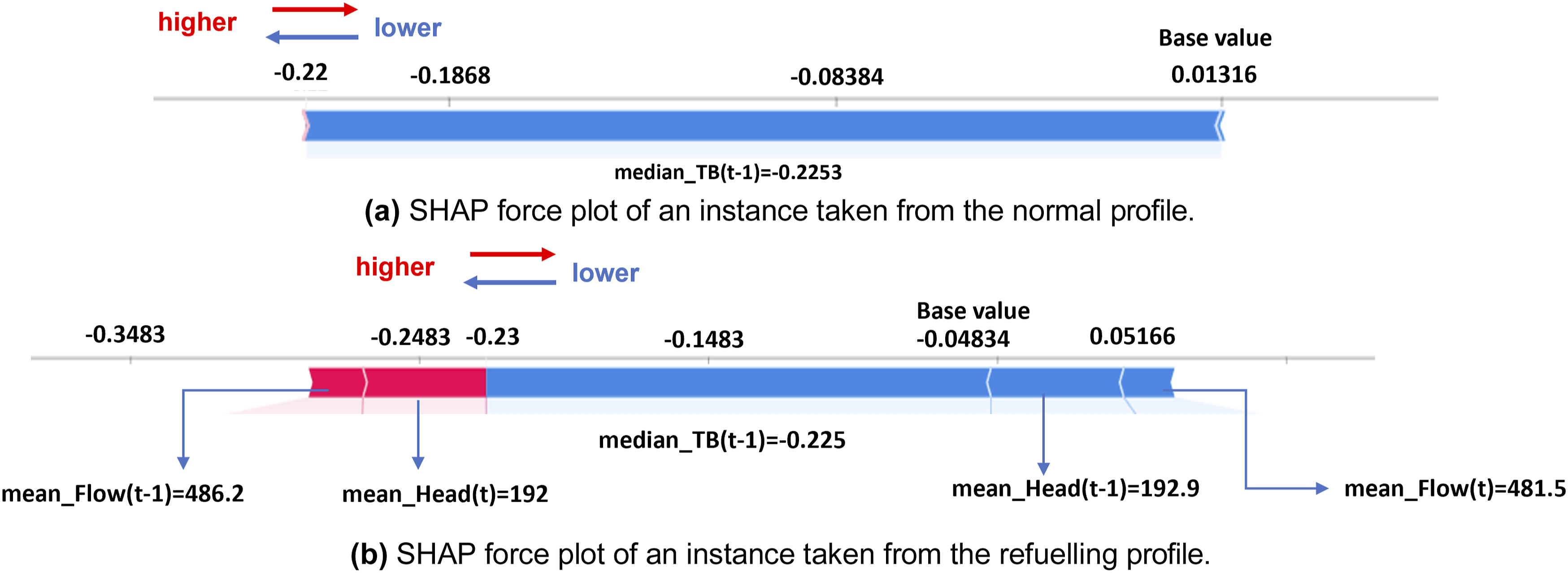
In the refuelling profile (Figure 13(b)), the SHAP force plot highlights the local impact of features for a specific instance. Median-TB(t-1) remains the most influential feature, exhibiting a negative correlation. This indicates that the specific value of median-TB(t-1) contributes to a reduction in thrust-bearing positions for this observation. Similarly, Mean-Head(t-1) emerges as another critical feature, also demonstrating a negative impact on the output. These findings underscore the significant role of these features in shaping the thrust-bearing dynamics during the refuelling operation, offering valuable insights into the system’s behaviour under this specific operational condition.
These results underscore the importance of median-TB(t-1) as a critical indicator of thrust-bearing stability and pump condition. The global trends revealed by SHAP summary plots confirm its overarching influence, while the local insights from SHAP force plots provide a granular understanding of how specific instances are influenced by variations in this feature and others. Additionally, the analysis highlights the interplay between flow and head dynamics, emphasising their importance in predicting thrust-bearing behaviour under varying operational conditions.
By connecting the SHAP values to both global trends and local behaviours, this study demonstrates how SHAP can provide actionable insights into the pump’s condition and performance. These explanations not only validate the robustness of the models but also align with the operational realities faced by domain experts, ensuring that the insights are both interpretable and practically relevant.
Generation of human-understandable explanations
The approaches described in the previous Sections were used to generate automated-text-based explanations that are proposed to be easier and faster to understand from a non-ML expert perspective. In Figure 14, an example of the text-based output generated for the refuelling profile,, which corresponds to the SHAP local explanations plot produced above and shown in Figure 13(b). Also, Figure 15 depicts text-based explanations for the refuelling profile, which corresponds to the SHAP summary plot in Figure 12(b), showing the most influential features of the refuelling profile. Text-based explanations for a SHAP force plot corresponding to the refuelling profile. The explanation outlines the key features affecting the prediction, their values, and whether they positively or negatively impact the output. Text-based explanations for the SHAP summary plot associated with the refuelling profile. The explanation identifies the most influential features globally.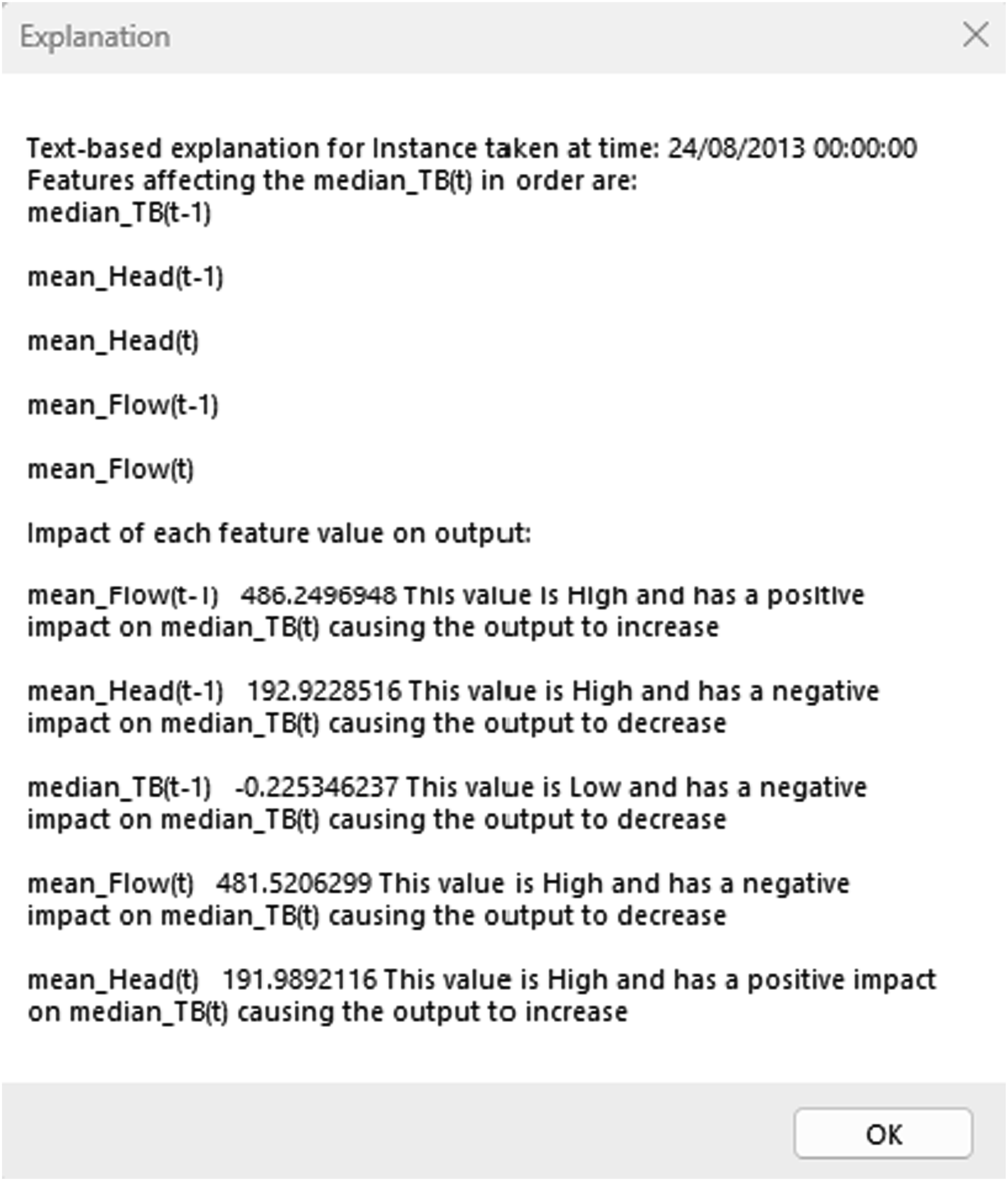
These algorithms will be added to existing software tools, 43 rather than being a standalone software application. The software tool implemented in 43 articulates the consequence of operating decisions using predictive features derived from domain expert knowledge - specifically, how the position of a pump set point within a pump curve (the relation between flow and head in efficiency terms) relates to lateral movement of the pump shaft. Domain expertise informed the need to partition the pump curve into sectors and capture the duration at which these are dwelt in. Specific sectors in the curve incur particular consequences in terms of wear. These are known to a pump asset expert but are not apparent in raw data. The design of this tool allows the raw data to be used to automatically predict the consequence of an operational decision without putting the pump through it. This framework is designed to seamlessly integrate with the referenced software tool, leveraging its functionalities and expanding its capabilities in terms of generating interpretable explanations. The framework will complement and extend the existing software’s functionality by enabling it to deliver human-understandable explanations. 43
Graphical representation of explanations
This section describes the novel algorithm developed to produce an understandable visual representation that non-ML-expert stakeholders can relate to. This graphical representation provides a causal link to SHAP-generated explanations. The output overlays a pump curve and is intended to identify safe operational areas. For each observation, SHAP values have been summed for all the features. If the summation value is less than 0, the expected output will decrease compared to the base value (because it is the average value of the predictions in the training set) and vice versa. For each observation, the sum of SHAP values is compared and the corresponding values of flow and head are marked with the following colours: red if the sum of SHAP is greater than 0, denoting operating areas away from the best efficiency point resulting in reduced efficiency and more thrust-bearing movement, therefore, more degradation operators aim to avoid, green if the sum of SHAP is less than 0, denoting safe operational areas at which the pump has the highest efficiency and the least amount of degradation, and cyan if the sum of SHAP is 0, denoting semi-safe operational areas (See Figure 16). Flowchart for creating a visual representation of SHAP values on a pump performance curve. Observations are colour-coded: red indicates unsafe conditions with higher wear and reduced efficiency, green shows safe conditions with high efficiency and minimal wear, and cyan represents semi-safe conditions.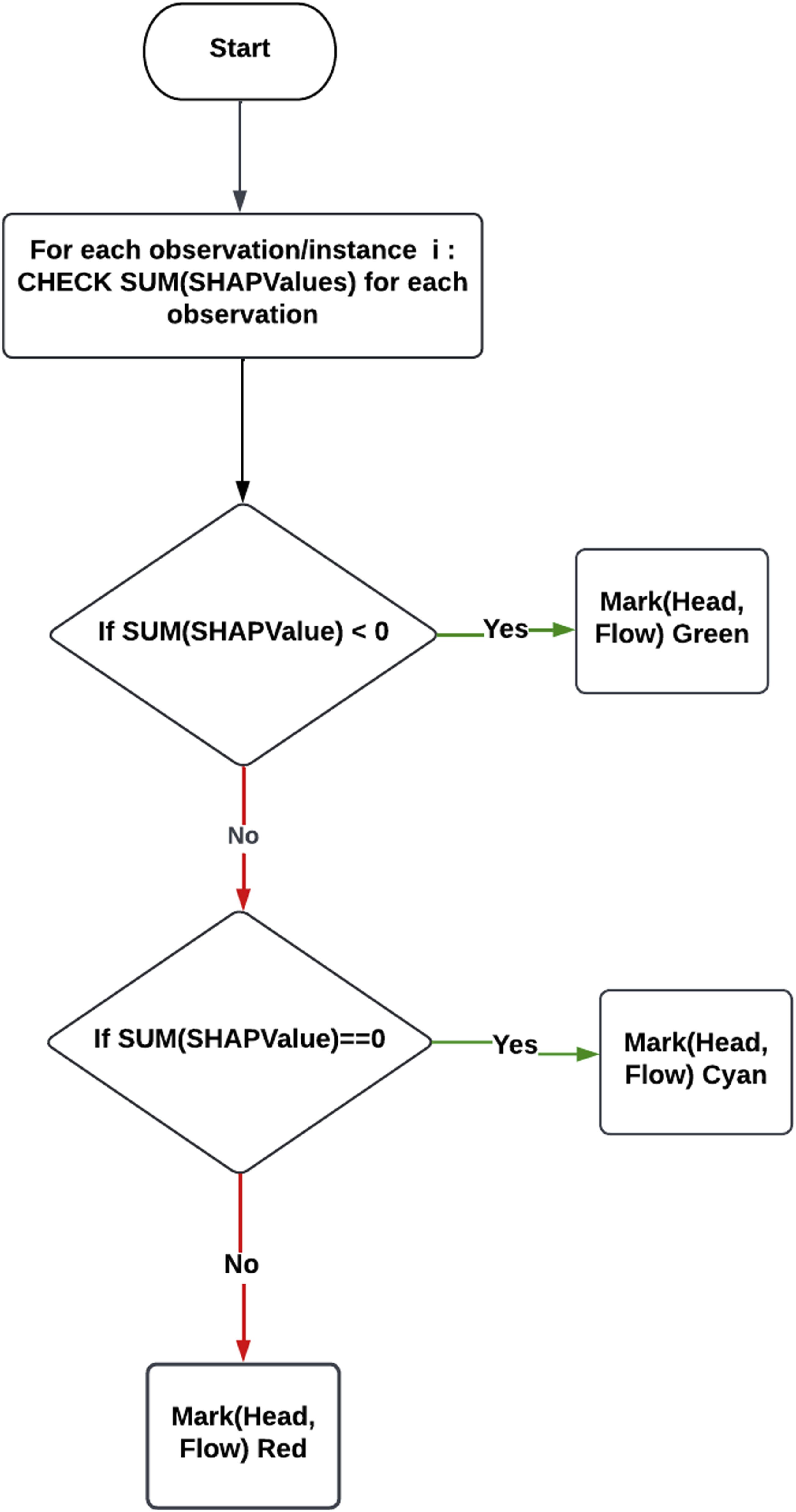
The algorithm described in this section has been applied to generate a graphical representation of the ML prediction that is familiar to a pump engineer with their related domain expertise. Figure 17(a) shows the operating state near the best efficiency point (BEP) overlaid by a schematic of the pump curve marked to show the areas of normal operations and best efficiency flow (BEQ). Green and cyan markers represent semi-safe and safe operational areas, respectively, as expected for data taken during normal operation, at which the pump has the highest efficiency, less thrust-bearing movement, and hence, less degradation. In Figure 17(b), the red markers in the graphical representation designate operating away from the BEP, which means that the pump does not operate under the optimal flow and head values and denotes operational values for head and flow that will lead to more thrust-bearing movement. Hence, more degradation operators aim to avoid. Cyan markers depict semi-safe operational areas. Upon comparing this graphical representation with the real pump curves for the assets, the graphical representation provides a causal link to the explanations provided. Hence, puts the explanations in context for a non-ML expert, helping them trust the ML algorithm’s outputs more easily. Graphical representations of normal and refuelling profiles overlaid on a pump curve. Green and cyan markers in the normal profile show safe and semi-safe areas near the best efficiency point. Red markers in the refuelling profile highlight unsafe areas with lower efficiency and higher thrust bearing wear, while green and cyan markers indicate safer regions.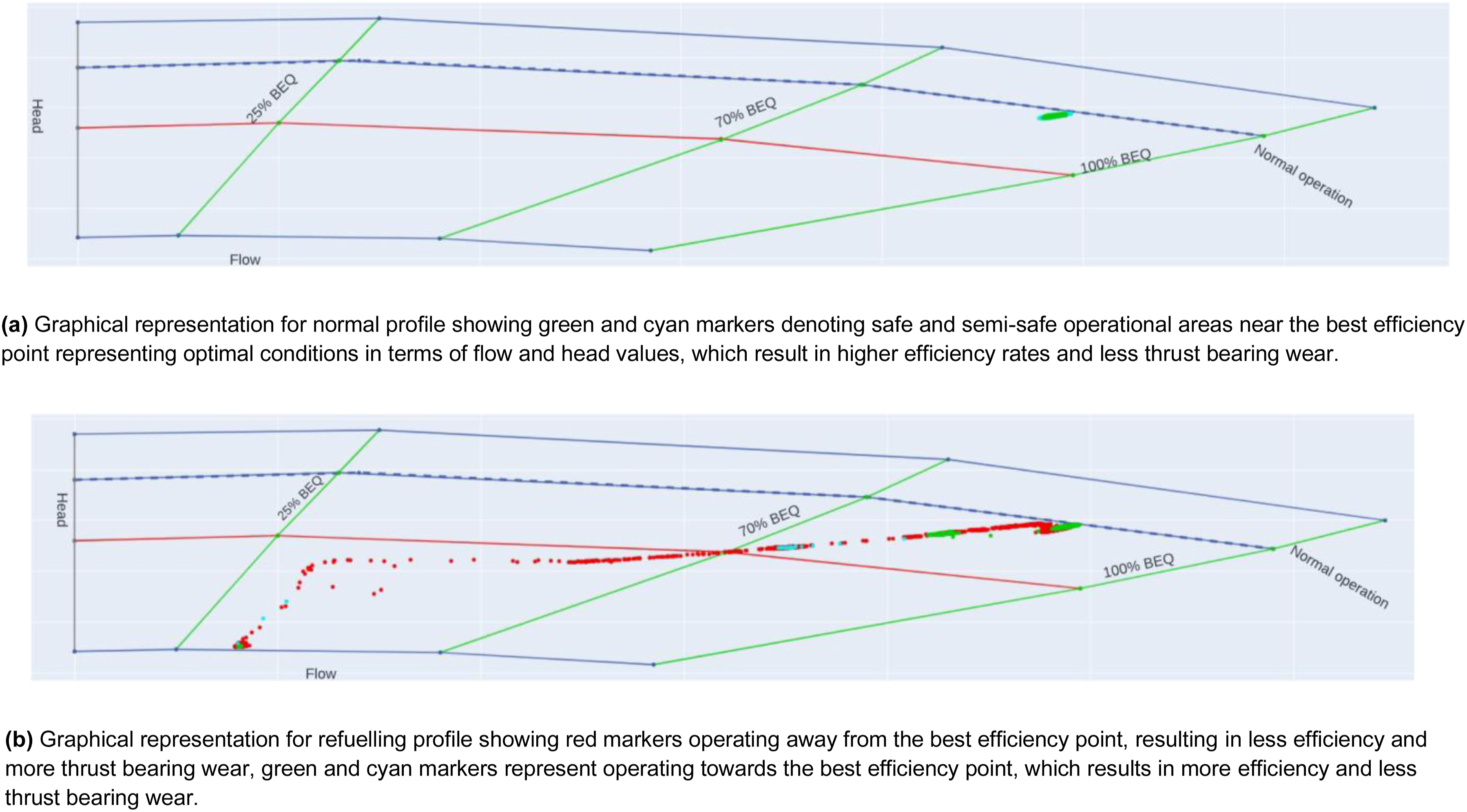
Validation of explanations
In the traditional approach to validation, experts well-versed in the domain would assess the explanations furnished by the SHAP explainability tool, ensuring their alignment with established principles. However, in the unique context of this case study, the availability of such domain experts was limited or nonexistent.
To overcome this challenge, an alternative path was sought by drawing upon existing and validated domain knowledge, particularly focusing on a set of principles known as the pump affinity laws. These laws are foundational within the realm of fluid mechanics and pump operation, providing precise insights into the inner workings of pumps and how variations in operational conditions influence their performance.
A key finding from the pump affinity laws is how power usage and pump efficiency are connected. According to these laws, if a pump uses more power than expected, it might not be working efficiently. Basically, when a pump consumes more power than it should for certain conditions, it might not be doing its job well, which can waste energy. Also, this inefficiency could cause more wear and tear on the pump’s parts, which isn’t good.
To validate the explanations generated by the SHAP tool, a thorough comparison has been conducted against the forecasts and insights derived from the pump affinity laws as denoted in equations (4)–(6). The assessment of whether the explanations are aligned with the well-established principles has been conducted by investigating how alterations in input variables influenced the SHAP values and, subsequently, the model’s predictions. In instances where the SHAP explanations indicated a notable increase in power consumption as a significant factor impacting predictions, it concurred with the tenets of domain knowledge, further affirming the validity of the generated explanations.
This approach, built on well-established domain knowledge, provided a robust method for validation. It ensured that the explanations from the SHAP tool aligned with established principles, even without direct input from domain experts. This validation framework enhanced the reliability and credibility of the explanations, making them more effective in understanding the ML model’s predictions in our specific case study context.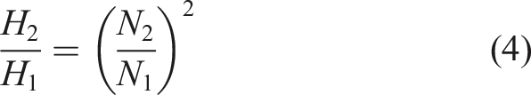
Where:
Where:
Where:
Domain knowledge: Using pump affinity laws to predict the performance of the pump
Utilising the invaluable insights provided by the pump affinity laws, a methodical process of categorising our datasets, encompassing measurements of head, flow, and thrust bearing movement, was embarked upon. As elucidated in the previous section, these principles served as our guiding compass. In particular, the pump affinity laws have been applied to discern patterns within the data that spanned head, flow, and thrust bearing movement measurements.
The pump affinity laws were utilised to categorise datasets, with a focus on the key measurements of head, flow, and thrust bearing movement, as illustrated in Figure 18. These laws provided valuable insights that allowed for the identification and interpretation of trends in the data, specifically related to power consumption. By analysing the correlation between power consumption and system performance, the approach highlighted instances where increased power usage could signify inefficiency, leading to potential power wastage and increased wear and tear on the pump system, as emphasised in.
44
Decision process using pump affinity laws to categorise the dataset. The flowchart outlines the steps of calculating power changes, comparing them with the average power change, and classifying data points as ”Red” or ”Cyan” based on efficiency levels.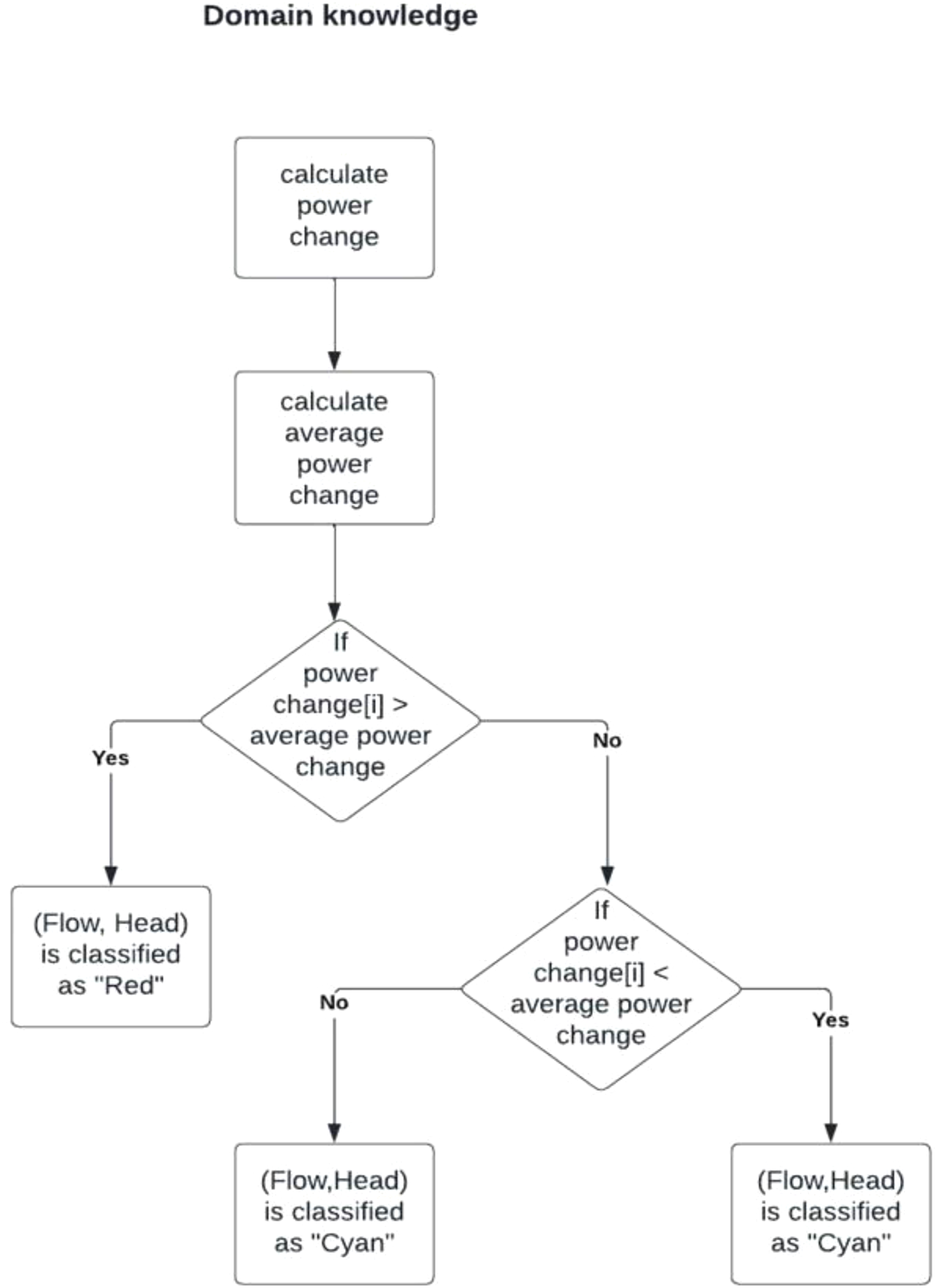
The process begins by calculating power changes over time or between measurements, followed by the computation of the average power change for the dataset. This average serves as a benchmark for categorising data points. If a data point’s power change exceeds the average, it is classified as Red, indicating potential inefficiency. If the power change is less than or equal to the average, further analysis is done. Data points with power changes strictly lower than the average are categorised as Green, signifying efficient operation, while those equal to the average are classified as Cyan, representing a balanced state.
This classification system, grounded in pump affinity laws, systematically detects patterns in power consumption and operational efficiency. The resulting classifications—Red, Green, and Cyan—provide clear insights into areas where power consumption is either optimised or wasted. By detecting these inefficiencies, the approach supports decision-making and lays the groundwork for further optimisation of pump performance, helping prevent wear and tear and improve system reliability.
SHAP explantaions vs domain knowledge
SHAP values were utilised to categorise the dataset by examining the cumulative sum of Shapley values for each data point. If the sum of Shapley values was negative, it indicated a reduction in thrust-bearing movement. This reduction suggested that the operational conditions represented by this data point would not increase thrust-bearing wear and, in fact, might contribute to maintaining or even improving thrust-bearing stability. Consequently, such data points were classified as “green,” signifying efficient operation and minimal wear on the thrust-bearing components.
Conversely, if the cumulative sum of Shapley values was positive and exceeded a certain threshold, it indicated an increase in thrust-bearing movement. This increase was interpreted as a condition likely to accelerate thrust-bearing wear or contribute to less stable operational states. These data points were categorised as “red,”V highlighting conditions that might require closer attention or potential intervention. Data points with cumulative Shapley values near zero were classified as “cyan,” representing a balanced state where neither significant wear nor notable efficiency gains were evident.
By using Shapley values to categorise data points in this way, we effectively translated the model’s predictive insights into actionable categories that align with known operational outcomes. This approach enabled the identification of scenarios where thrust-bearing wear was likely to occur and provided a structured framework for understanding and mitigating wear-related issues.
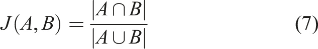
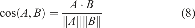
Subsequent to this, an in-depth analysis was undertaken, employing various similarity measures to evaluate the level of resemblance between these two datasets. The objective was to determine the degree of alignment between the domain knowledge-based categorisation and the categorisation derived from SHAP explanations. This analytical endeavour allowed for an assessment of how well the SHAP-generated explanations conformed to the established domain knowledge.
Comparison of similarity measures with corresponding scores.
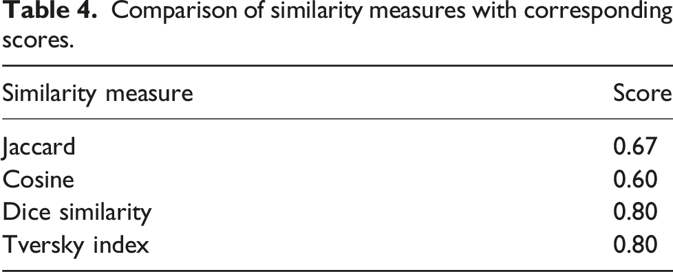
The Jaccard similarity score of 0.67 revealed a moderate level of similarity, indicating the presence of shared elements and categories between the two datasets. However, it should be noted that there were discernible differences, contributing to a moderate degree of dissimilarity.
Similarly, the cosine similarity score of 0.6 pointed to a moderate level of similarity, suggesting that the vectors representing the datasets exhibited some alignment in terms of direction and magnitude. Nevertheless, variations persisted, resulting in the moderate dissimilarity observed.
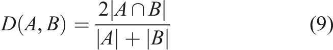
Conversely, the Dice similarity score of 0.8 unveiled a relatively high level of similarity, signifying a substantial overlap in categories or elements between the datasets. This underscored a strong degree of concordance.
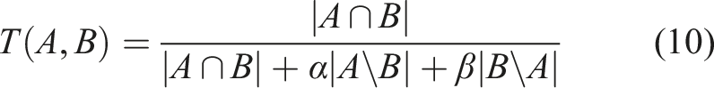
Similarly, the Tversky index, also yielding a score of 0.8, echoed the notion of relatively high similarity. It highlighted the robust alignment between the datasets, particularly in the context of shared categories or elements.
These similarity measures provided valuable insights into the comparative analysis, shedding light on the extent to which the categorisations and patterns elucidated by SHAP explanations were in harmony with those prescribed by the established domain knowledge encapsulated in the pump affinity laws. The higher scores in the Dice Similarity and Tversky Index indicated a notable degree of alignment, while the moderate scores in Jaccard and Cosine similarity denoted shared elements amidst discernible differences. This comprehensive assessment served to bolster the credibility of SHAP-generated explanations and their alignment with well-established domain principles, a critical facet of our thesis research.
Interpreting the similarity score between SHAP and domain knowledge
The real-world case study reported a similarity score of 67% between SHAP-generated explanations and those derived from established domain knowledge (i.e., pump affinity laws), in contrast to the 99% similarity observed with the Iris dataset. This difference warrants careful consideration.
A key contributor to this discrepancy lies in real-world industrial data’s inherent complexity and noisiness. Unlike the Iris dataset, which is clean, balanced, and well-understood, condition monitoring data from pump systems is often incomplete, contains outliers, and exhibits non-linear feature interactions. These characteristics make consistent interpretation more difficult and reduce alignment between model-driven and expert-derived explanations.
Moreover, the SHAP algorithm itself has known limitations. As a model-agnostic method based on cooperative game theory, SHAP distributes feature importance equally among features with similar predictive contributions. However, it lacks awareness of the underlying causal structures, which can result in high attribution scores for features that are statistically—but not causally—related to the output. This effect is amplified in domains like pump degradation analysis, where interactions among flow, head, and thrust bearing movement are physically complex and temporally correlated.
While the pump affinity laws offer a strong theoretical framework for categorising operational zones, their abstractions may not capture all the nuances present in noisy or hybrid operating conditions. SHAP’s more granular, instance-specific explanations may detect patterns that fall outside the scope of simplified domain rules, further contributing to differences in categorisation.
Future iterations of the framework will consider the use of synthetic data generation (e.g., GANs) to balance datasets and reduce noise. In addition, the incorporation of expert-in-the-loop validation is proposed. While this was not feasible at the time of the study due to limited access to domain experts, such collaboration will be prioritised in future work to provide retrospective validation and enhance confidence in the alignment between SHAP outputs and domain knowledge.
Discussion
The deployment of ML models in industrial applications is often met with hesitation by domain experts due to the opaque nature of black-box ML models. The lack of explainability creates barriers to trust, which in turn limits the widespread adoption of ML. To address this challenge, the use of XAI tools becomes crucial in establishing confidence in these models and encouraging their adoption within the industry.
While the proposed framework provides interpretable and domain-aligned explanations using SHAP, it is not without limitations. First, SHAP relies on a correlation-based, additive attribution model that does not capture underlying causal relationships between features. As a result, it may assign high importance to variables that are statistically influential but not causally responsible for the output. This limitation is partially mitigated in our framework by incorporating graphical overlays grounded in domain knowledge (e.g., pump affinity laws), which provide a physical context to interpret SHAP outputs.
Second, the computational complexity of SHAP—particularly for model-agnostic variants like Kernel SHAP—can become a bottleneck in real-time or high-frequency industrial monitoring applications. Although the current implementation targets post hoc analysis, future deployment in live systems may require lightweight approximation methods or parallelised computation to scale effectively.
Finally, the generalizability of the framework to other mechanical systems, such as turbines, compressors, or rotating machinery, depends on the availability of equivalent domain models (e.g., performance curves, physical laws). While the approach is modular and adaptable, its effectiveness in other domains should be validated with additional case studies and, ideally, expert-in-the-loop feedback.
This work introduces a novel framework designed to generate user-friendly explanations from SHAP outputs. It aims to bridge the gap between ML models and domain experts who might not have in-depth knowledge of ML. The framework was applied to a specific case study in the power generation sector, demonstrating its ability to offer domain experts both local and global explanations that are comprehensible and relevant. This facilitated the understanding of ML-generated results, allowing domain experts to confidently interpret model outputs.
One of the key contributions of this framework is its ability to address outliers and unexpected data scenarios. By providing explanations that reveal the underlying rationale for outliers, the framework aids in identifying suspicious data points and sheds light on their cause. This capacity to bridge complex ML models with domain experts’ understanding is critical in building trust and fostering transparency.
The framework was initially tested on the Iris dataset, an open-source benchmark, achieving a high similarity score of 99%, indicating that the SHAP-based explanations worked well with clean data. However, when applied to real-world industrial data, the framework achieved a lower similarity score of 67%, suggesting a moderate alignment between SHAP explanations and domain knowledge. This discrepancy underscores the challenges posed by real-world data, which often include noise, missing values, outliers, and biases.
The observed discrepancies highlight the limitations of SHAP in fully capturing the complexities of real-world data. While SHAP is a powerful tool for explainability, it may struggle with the nuanced and multifaceted nature of industrial data, leading to variations in explanation. This points to the need for ongoing improvements in XAI to ensure that explanations are accurate, reliable, and meaningful, especially in complex real-world applications.
Despite these challenges, the framework has proven effective in presenting explanations that are readily recognisable and understandable by pump engineers and other domain experts. It provides a valuable tool for enhancing transparency and decision-making in industrial applications. The potential for broader adoption lies in the framework’s ability to adapt to other contexts within the industry, encouraging domain experts to use XAI tools and ultimately driving greater acceptance of ML in safety-critical environments.
The practical value of the framework lies in its ability to transform model predictions into actionable maintenance decisions. In particular, the graphical overlays shown in Figure 17 enable operators to visually identify operational zones associated with elevated degradation risk. Instances falling in the “red” zone—defined by both SHAP explanations and affinity-law-based thresholds—correspond to increased power inefficiencies and mechanical strain, which are known precursors to thrust bearing wear. Observations in these zones were associated with noticeable increases in bearing temperature and vibration, suggesting the onset of performance decline.
By identifying and avoiding such high-risk zones, maintenance teams can prioritise interventions when they are most needed, supporting a transition from time-based to condition-based scheduling. This may help extend equipment lifespan and reduce unplanned downtime, improving overall cost efficiency. These insights demonstrate how SHAP explanations can inform proactive decision-making in industrial maintenance planning.
Conclusions and future work
In this work, a new framework has been proposed to provide non-expert users with more insight into the application of ML within a specific industrial domain through auto-generated text-based and visual-based explanations. A well-known explainability tool (SHAP) has been used to provide both local and global explanations. Most currently available ML explanation frameworks offer one level of explainability. This framework proposes two levels of explainability to increase ML model interpretability for non-ML experts. The first level offers text-based explanations, and the second level offers a graphical representation of these explanations. The explanations were then cross-referenced with domain knowledge to provide a degree of causation for ML prediction. Our approach can improve model understandability, which also contributes to enhancing users’ trust in the modelling methodology. Although a specific use case has been adopted for this model, this framework can be used in various prediction/classification applications. With adequate domain knowledge and a comprehensive understanding of the application, this innovative framework can be readily adapted and applied to offer domain experts clear and understandable explanations, contributing to increased trust in AI and ML techniques. Furthermore, even though certain explainability approaches claim theoretical guarantees based on specific criteria, these assurances might be lost during practical implementation. 45 However, our approach has demonstrated its effectiveness when practically applied, substantiating its reliability and performance in real-world scenarios. The work demonstrates the feasibility of generating more user-friendly explanations using the proposed framework, providing users with no ML expertise with both text-based and graphical-based explanations. Text-based and graphical-based explanations are proposed to be easier to understand than the conventional graphical results produced by SHAP tools. These explanations are particularly beneficial for domain experts with no background knowledge of ML predictive algorithms and SHAP tool. Ongoing work will enhance the proposed approach to overcome its limitations and deliver more enhanced explanations.
One significant advantage of our explainable AI framework, designed to deliver human-friendly explanations, is its potential for seamless integration into the V-cycle of ML software development. The alignment of our framework with established software engineering standards demonstrates its practical applicability and potential to enhance each phase of the development process. At the initial stages, our framework aids in feature selection and model development, providing data scientists and engineers with immediate insights for creating more interpretable models. In subsequent testing and validation phases, it assists in identifying unexpected model behaviours, allowing for fine-tuning and validation against domain-specific criteria. During deployment and maintenance, the framework continues to play a crucial role by supporting ongoing monitoring and explanation of model outputs to ensure transparency and accountability. This integration promotes trust, collaboration, and the development of robust and interpretable ML systems, thereby making it a valuable asset throughout the ML software development life cycle. 46
While SHAP has demonstrated its reliability compared to other XAI tools, our investigation has identified its vulnerability to adversarial attacks as a critical area for further research. These attacks exploit limitations in perturbation-based techniques by manipulating the local approximations of black-box models through strategically altered data points. Perturbations can fall into densely populated regions or sparsely populated areas, where even high-performing models may exhibit unexpected behaviour due to a lack of training data. 47 Such vulnerabilities in SHAP and similar methods like LIME underscore the need for future research to enhance the robustness of explanation techniques and safeguard against adversarial exploitation. 48
Advancing SHAP’s framework through approaches like WeightedSHAP 49 presents an opportunity to address its limitations in capturing causal relationships among features. WeightedSHAP allows for unequal attribution weights, aligning explanations more closely with real-world causal structures and improving their accuracy and interpretability, particularly in complex industrial applications.
Additionally, incorporating natural language processing (NLP) techniques to validate XAI explanations against user requirements and regulatory standards is a promising direction. By ensuring compliance with ethical norms and enhancing alignment with end-user expectations, these techniques can make XAI systems more transparent and trustworthy.
Future research should also prioritise developing causal-based XAI methods that move beyond correlations to provide insights into cause-and-effect relationships. This shift is critical for domain experts to gain a deeper understanding of the mechanisms driving AI decisions and to address potential biases. Constructing knowledge graphs from XAI-generated text explanations is another avenue for exploration. This innovative approach leverages NLP to transform narrative explanations into structured, queryable graphs, allowing users to uncover relationships and probe AI reasoning more effectively.
These directions collectively aim to enhance the robustness, interpretability, and usability of XAI systems, ensuring their applicability and reliability across diverse industries.
Footnotes
Acknowledgment
The authors gratefully acknowledge support from the UK’s National Physical Laboratory (NPL) and the Advanced Nuclear Research Centre (ANRC) at the University of Strathclyde, Glasgow.
Declaration of conflicting interests
The authors declared no potential conflicts of interest with respect to the research, authorship, and/or publication of this article.
Funding
The authors received no financial support for the research, authorship, and/or publication of this article.