
Abstract
A challenge emerging from the literature on measuring and modelling segregation at multiple scales is how to map the results. This Featured Graphic uses a method based on the CMY colour model, allowing each of the C, M and Y values to represent one of the micro-, meso- and macro-levels of analysis separately, then combining them in an overall map. It presents the method using a new index, a multilevel index of diversity, with a case study looking at the ethnic diversity of state-school pupils living in London’s neighbourhoods.
In recent literature about how to measure segregation, methods have been developed that treat segregation not just as a numeric quantity (the amount of segregation measured) but also in terms of a spatial pattern: the geographical scales at which population groups are clustered together or apart (see, for example, the special editions of two journals: Harris and Johnston, 2018; Piekut et al., 2019).
Some of these methods employ a three-level approach, casting segregation in terms of ‘micro’, ‘meso’ and ‘macro’ effects (Manley et al., 2015). An attraction of this, but not one previously employed, is to map each level to a base colour, providing a palette from which the various scales of segregation are painted. Here the approach is demonstrated with a multilevel index of ethnic diversity, a CMY(K) colour scheme and a case study mapping the ethnic diversity of state-school pupils in neighbourhoods within London based on information extracted from the National Pupil Database. 1
The multilevel index is based on the commonly used entropy index (Theil, 1972; Thiel and Finezza, 1971), which is
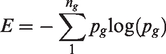
The results are shown in the graphic (Figure 1). In terms of the overall pattern of diversity, the greatest differences are between LAs: 46.9% of the variation in the spatial pattern is at the LA scale. LAs such as Waltham Forest (numbered 31 on the map), Redbridge (26), Barking and Dagenham (1), Newham (25) and Hackney (12) have the greatest ethnic diversity; Bromley (5), Bexley (3) and Havering (16) are amongst those with the least. Nevertheless, there are variations within LAs both at the Ward and LSOA level. For example, there is a Ward within Bromley with a diversity that is greater than expected for that LA (it is shaded dark magenta in the top-right panel of the map), and there are LSOAs within Redbridge and also within Barking and Dagenham that have the highest overall levels of ethnic diversity of any in London. Those spatial clusters of greatest ethnic diversity do not stop at the boundaries of LAs but ‘over-spill’ into adjoining areas, including a part of Havering. In short, the geographical scales of diversity vary across the map, with ‘pockets’ of diversity adding to more broad-scale trends.
Showing how the various geographic scales (Local Authorities, Wards and Census Lower Level Super Output Areas (LSOAs)) add up to produce the overall pattern of ethnic diversity for state school pupils living in London's neighbourhoods (2015/16/17). (a) Macro-level contribution (local authorities); (b) meso-level contribution (wards); (c) micro-level contribution (LSOAs).
A tutorial and code to reproduce the graphic (with minor variations) is available at https://rpubs.com/profrichharris/MLentropy.
Footnotes
Declaration of conflicting interests
The author declared no potential conflicts of interest with respect to the research, authorship and/or publication of this article.
Funding
The author received no financial support for the research, authorship and/or publication of this article.