
Abstract
The substance use disorder epidemic has emerged as a serious public health crisis, presenting complex challenges. Visual analytics offers a unique approach to address this complexity and facilitate effective interventions. This paper details the development of an innovative visual analytics dashboard, aimed at enhancing our understanding of the substance use disorder epidemic. By employing record linkage techniques, we integrate diverse data sources to provide a comprehensive view of the epidemic. Adherence to responsive, open, and user-centered design principles ensures the dashboard’s usefulness and usability. Our approach to data and design encourages collaboration among various stakeholders, including researchers, politicians, and healthcare practitioners. Through illustrative outputs, we demonstrate how the dashboard can deepen our understanding of the epidemic, support intervention strategies, and evaluate the effectiveness of implemented measures. The paper concludes with a discussion of the dashboard’s use cases and limitations.
Keywords
The substance epidemic is a serious public health crisis, and visual analytics can play a unique role in addressing this complex issue.
By using linked data and following the principles of good design, we develop a novel visual analytics dashboard that fosters collaboration among various stakeholders of this complex problem.
The dashboard can enhance understanding, aid intervention strategies, and assess the effectiveness of measures in combating the substance use disorder epidemic. This approach can be extended to other public health challenges, informing evidence-based decision-making and policy interventions.
Introduction
The drug overdose epidemic1,2 has cost the lives of over 700 000 people in the US, including 14 500 people in Indiana, over the last 10 years. i Effective solutions require close collaboration between experts that address the psychological, medical, and socioeconomic dimensions of the problem. Mental health and addiction, the overprescription of opioids, the availability of illicit opioids such as heroin and fentanyl, poverty, and unemployment are all contributing factors to the ongoing rise in overdose deaths,3 -5 which has been exacerbated by the COVID-19 pandemic. 6 Data analyses and visualizations can make unique contributions to the identification, communication, and implementation of effective interventions, ranging from prevention to medical treatment to long-term support. 7 They can help discern unexpected demographic patterns, identify high-risk populations and areas, track the effectiveness of interventions, and orient research and policy.
This paper introduces a data visualization and analysis dashboard that has been designed to help decision-makers and stakeholders understand and address the drug overdose epidemic. The rest of the Introduction summarizes the challenges of data visualization in this area and reviews several large scale data analysis systems. This overview motivates our dashboard design, which is described in the Methods section. This is followed by a presentation of some illustrative visualizations in Results. The Discussion and Limitations section examines the outcomes from a critical distance, highlighting its strengths as well as shortcomings. The paper concludes with a summary of our work.
Socio-Technical Complexities of Visual Analytics Approaches
Biomedical informatics, often perceived as purely technical, is fundamentally a sociotechnical discipline.8,9 Its hybrid nature underscores the intricate interplay between technology and human factors in healthcare, which are often complex and dynamic. Such factors bear on the design of visual analytics systems in 2 main ways. First, the data such systems collect, aggregate, link, analyze, and display are imbued with human nuance and complexity. Second, to be usable and useful, their development has to take users into account at every step of the design cycle. In this section, we expand on the first set of factors. We focus on the design challenges in the Methods section.
Limitations related to data sources pose a significant challenge to the design of visual analytics systems. The quality, quantity, comprehensiveness, and timeliness of the data shapes downstream processes of design and development in subtle ways. 7 For instance, one of the main sources of drug overdose fatality data are death certificates. Previous research has shown that as much as 25% of U.S. overdose deaths specified no drugs on the death certificate, resulting in the undercounting and underreporting of various drug classes. 10 Much of this is due to state-by-state variations in death certification methods. Decentralized or hybrid medical examiner systems are less likely to report drugs on death certificates compared to centralized systems due to the fact that states vary in their approaches to certification. Coroners are typically elected individuals who do not need to hold a medical degree while medical examiners are forensic pathologists appointed by a government agency. Another contributing factor to the poor quality and comprehensiveness of the data stems from the prohibitive cost of post-mortem toxicology testing. Many national labs, such as NMS Labs and Axis Forensic Toxicology, offer both “basic” and “expanded” toxicology panels, which can cost several hundred dollars per deceased person—often unaffordable given the limited budgets of many county coroners. This leads to gaps in death certificate completion and ultimately affects the quality and comprehensiveness of drug overdose data. Death certificates can also take several months to fully process, as they have to be initially completed by coroners or medical examiners, approved by a state’s Vital Records Agency, and analyzed by the National Center for Health Statistics before being published. As a result, the most current national drug overdose data released by the Centers for Disease Control and Prevention is almost always 6 months behind. Other data sources originate from electronic health records (EHRs), which are frequently real-time and contain information about health behaviors or laboratory test results that could indicate opioid misuse. However, EHRs still face quality problems and have limited generalizability due to biases inherent in particular healthcare recording processes.7,11
A second set of challenges concerns the typically siloed nature of data collection. Data relevant to the substance use disorder epidemic is collected in many settings, such as healthcare events (eg, emergency department visits and inpatient stays); prescriptions, procedures, and interventions in healthcare institutions; emergency department runs through emergency medical services; arrests and incarcerations through the justice system; and information on housing, counseling, and needle exchanges through social service organizations. Although these sources of data describe a common phenomenon—that is, the substance use disorder epidemic and the people touched by it—they are rarely, if ever, linked to each other. Record linkage can help elucidate interactions with healthcare, social services, and criminal justice systems and related outcomes as they arise and influence each other over time. 12 For example, linking individual overdose rescue data with medical records can provide new insights about risk factors for overdose as well as more systematic information on the consequences of nonfatal overdoses. 7 Despite such advantages, the existing infrastructure and protocols pose sociotechnical challenges for data linkage. On the technical side, different data sources often use different formats, structures, data types, and data scopes, which can make it difficult, even using advanced algorithms, to link them together. 13 Beyond technical issues, data governance poses privacy and security concerns, ethical and legal implications, and data ownership and access issues. Although “big data” is anonymized and bound by other safeguards designed to prevent individual-level harms, these data could still be used in decision-making processes for which they were not intended. Examples include denying health insurance claims, the use of social welfare programs, or increasing criminal justice surveillance, prosecution, and incarceration. 14 In addition, the anonymized individuals who are being examined in these data sets are often unaware of their existence and are therefore excluded from decisions about their use. The result is that the individuals who often contribute to these data systems do not stand to benefit from them in a direct way. Other ethical considerations include the exacerbation of community-level health and social inequities. For instance, geographical hotspot maps of opioid overdoses draw attention to communities that are at particular risk of suffering from the epidemic—attention that could have negative economic impacts.
Outside of ethical, legal, and privacy considerations, there are also obstacles to data ownership and access. In most states, drug overdose data is housed within state health departments. Despite recent efforts to make data more accessible to the public, especially through public-facing data dashboards, challenges persist. The requirement that data be “cleaned up” and examined by state agencies prior to public consumption limits access to data. Acquisition of more comprehensive and raw data is often possible but faces a variety of practical obstacles and delays. A further challenge to data access is the fragmentation of data across multiple state agencies. In Indiana, for example, the Indiana Department of Health and the Indiana Management Performance Hub ii house their data separately, creating obstacles in joint decision-making around the data.
Data-driven healthcare is heavily reliant on analytical methods, which introduces a third set of sociotechnical complications. Researchers need to understand what insights the data makes possible—a task that involves interpreting data variables and values. Despite being able to collect data, many health systems, public health departments, and other entities lack the infrastructure and resources to take this interpretation beyond simple descriptive reports. Such reports are limited in their ability to provide insight, as they often employ analyses that solely focus on the association between 2 variables (eg, time and overdose death, or geography and substance) and therefore fall short of addressing the intricacies of complex problems such as the substance use disorder epidemic. The challenge in such scenarios is to relate multiple variables and enable inferences that may incorporate an array of more advanced techniques such as multivariate analysis, 15 machine learning,16,17 and dynamic visualizations. 18 Only when this challenge is met can we expect data-driven analysis to provide a reasonably comprehensive and detailed understanding of the problem. Effective visual analytics requires overcoming such sociotechnical challenges in order to assemble high-quality data sources linked together and analyzed using advanced statistical, machine learning, and visualization techniques.
Review of Large-Scale Data Analysis Systems
Recently, several groups have attempted to address one or more of the discussed challenges by creating large-scale data analysis systems that link data sets from several sources. For instance, the Massachusetts’ Public Health Data (PHD) Warehouse includes individual-level linked administrative data from more than 20 sources on all Massachusetts residents aged 11 and older with public or private health insurance. 19 Events recorded in the PHD Warehouse include treatment for opioid and other substance use disorders, diagnosis and treatment for physical and mental health conditions, receipt of public welfare benefits, insurance claims, involvement with the criminal justice system, and mortality. 20 Findings generated thus far have informed public health efforts, resource allocation, community outreach, and intervention planning. 19 These include new legislation that promotes responsible opioid prescribing, expands access to treatment, and calibrates anti-opioid enforcement measures. Another example is work done in the Kaiser system, which has brought together clinical, dispensing, and socioeconomic data sources to examine opioid-related outcomes across patients in multiple market segments, though the data are limited to Kaiser membership. 21 Finally, in 2017, Governor Eric Holcomb of Indiana established the Management Performance Hub, an agency acting as the hub for data collection, analysis, and exchange for the Indiana state government. The goal of the agency was to implement data-driven policies within state government by creating a focal point for state-level data and providing technical assistance in partnership with state agencies. Another important area of work involves the effort to make linked data accessible to end users. Over the last several years, many state health departments have created “data dashboards” to better communicate substance use-related data to the public. In order to better gauge the gaps and weaknesses that currently exist in data dashboards, we reviewed substance use-focused dashboards from 43 different states (omitting instances where dashboards were either absent or under construction; see Appendix 1). The results show significant variability in 4 areas: the design of the dashboards, the data elements included in the dashboards, the programs used to build the dashboards (eg, Tableau vs Microsoft Power BI), and finally the degree of interactivity and manipulability by the end user. The list below notes several gaps among the dashboards examined:
None include linked data that followed an individual over the course of their substance use disorder until death;
very few highlight geographical patterns outside of general county data;
many lack demographic information such as age and sex;
many limit their data to overdose deaths, emergency department visits, hospitalizations, and prescription drug monitoring data; and
interactivity remains unavailable or limited, leaving the end user unable to filter data, include or exclude variables, or manipulate the visualizations.
These limitations suggest that existing dashboards are inadequate in addressing the needs of data end users, such as public health system leaders, policymakers, public, nonprofit, and prepaid healthcare systems, and other systems, such as the justice system. 7 Elaborately created data visualizations are not useful unless they can be used to develop and support practical decisions and guide healthcare, public health, and law enforcement actions.
The above review highlights the sociotechnical complexities involved in collecting, linking, analyzing, and visualizing data in support of data-driven approaches. The work described below seeks to tackle the diverse challenges identified by building information resources that can serve as effective tools in combating the substance use disorder epidemic. The end goal of our project, Advanced Analytics for Indiana University’s Addictions Grand Challenge, is to create visualizations and analytics to help viewers collaborate with each other and gain relevant insights from a rich set of linked data about deaths resulting from substance use. We have divided this goal into 2 objectives:
prepare, standardize and link several data sets to better understand trends and dynamics of the substance use disorder epidemic in Marion County, Indiana; and
develop visual analytics by following the principles of good design to make the dashboard usable and useful for a variety of stakeholders.
In the following section, we describe our methodology, introduce examples from the resulting visualization dashboard, discuss the possibilities and limitations of our work, and end with concluding remarks.
Methods
Record Linkage and Refinement
Our team collaborated with 4 organizations to obtain 4 datasets that had not previously been linked to understand the substance use disorder epidemic. The organizations were the Marion County Coroner’s Office (MCCO), Regenstrief Institute (RI)/Indiana Health Information Exchange (IHIE), Indianapolis Emergency Medical Services (IEMS), and Marion County Sheriff’s Office (MCCO). This collaboration was novel because (1) the organizations had not previously contributed their data sets to a common research project and (2) the intent was to link records about individuals across all data sets. Table 1 provides an overview of the datasets and their relevant characteristics. iii
Overview of Datasets.
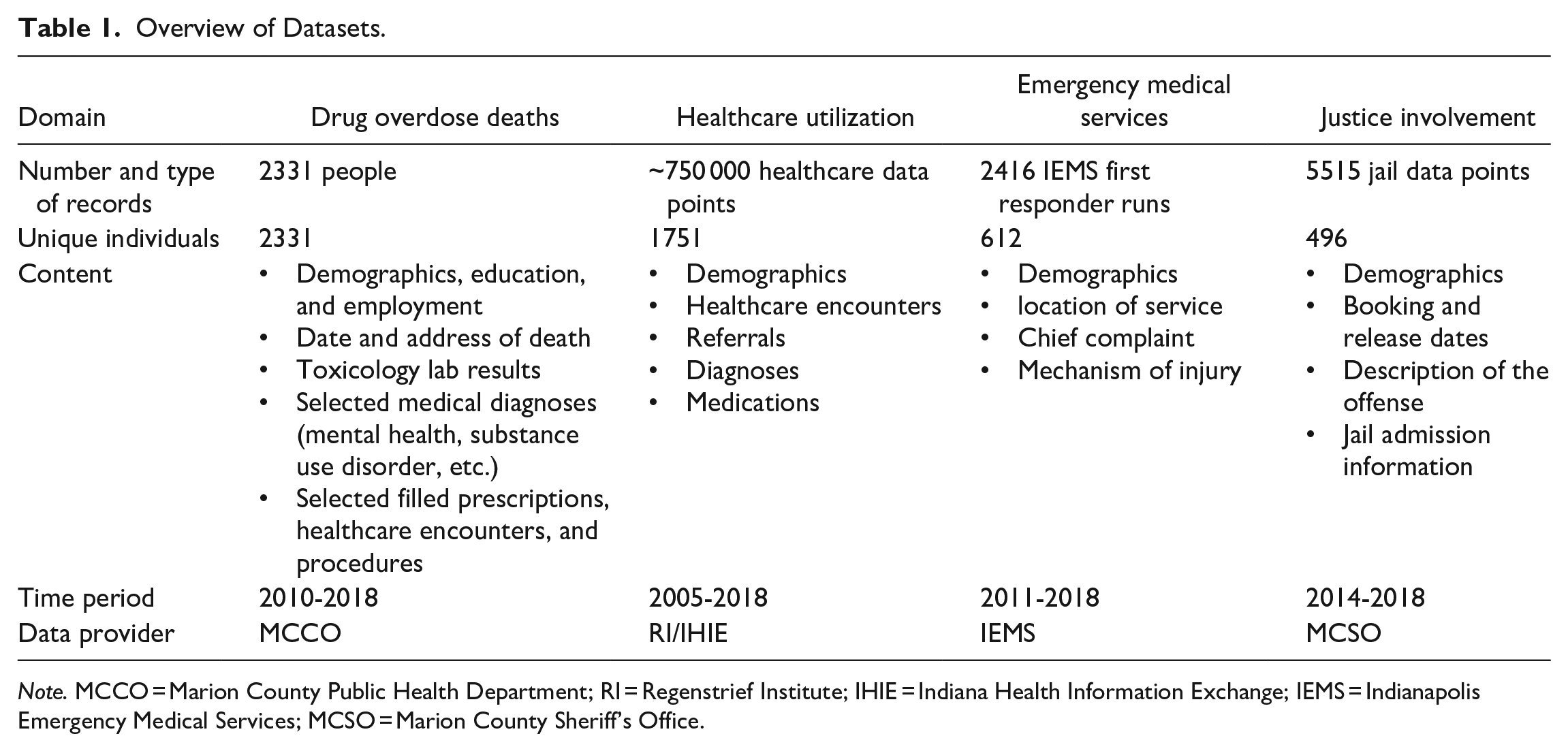
Note. MCCO = Marion County Public Health Department; RI = Regenstrief Institute; IHIE = Indiana Health Information Exchange; IEMS = Indianapolis Emergency Medical Services; MCSO = Marion County Sheriff’s Office.
The core dataset was a highly curated collection of data on 2331 individuals who died of an overdose in Marion County between 2010 and 2018. In order to help us obtain this information, the MCCO first provided a list of case numbers that were determined to be accidental fatal overdoses. A researcher then accessed the MCCO’s database to search for each case and manually extract information from vital records and toxicology reports in order to compile the data into a single, composite file. Vital records included the entire death certificate for each deceased person. Demographic information included name, sex, race, date of birth, home address, marital status, education, and employment. Toxicology reports contained information on all substances that were detected in the deceased at the time of the decedent’s death. The MCCO data was then linked to the other data using primarily the first name, last name, date of birth, and social security number (if available) of the deceased. 22 In the case of IEMS and MCSO, the data contained only the first and last name, as well as the date of birth. The RI/IHIE data was linked using these identifiers as well as social security numbers.
The RI/IHIE dataset deserves further comment due to its unique nature in terms of provenance and method of data collection. In contrast to the other data sets, which were collected directly and made available to the research team by a single organizational entity, IHIE data was collected through a large Health Information Exchange (HIE) and shared with the researchers via the Regenstrief Institute (RI). Since 2004, IHIE has overseen the Exchange to support patient care among its members while also allowing the Institute to provide data for research by a diverse range of partners. At the time of this writing, IHIE iv has been involved in the collection and exchange of data with over 117 hospitals, 18 486 practices, and 51 688 providers in Indiana and elsewhere. v Following a recent merger with 2 regional HIEs, IHIE has expanded its coverage of the Indiana Network for Patient Care (INPC) to all regions in Indiana and portions of southern Michigan. The information in the INPC comprises over 13 billion clinical data elements, such as encounters, lab tests, microbiology, pathology, radiology, cardiology, electrocardiograms, pharmacy data, and text reports. INPC data are aggregated from providers, payers, and public health agencies in real time, enabling functions such as clinical alerts that can influence patient care decisions at the point of care. Toward the end of 2022, the INPC contained at least one patient encounter for nearly two-thirds of the population in Indiana’s 92 counties.
As Table 1 demonstrates, not all datasets covered the same time period. There are several reasons for this circumstance, such as changes in record-keeping processes and systems that housed the data. We included all data we could obtain but did not exclude individuals with incomplete data. To allow users to assess the impact of incomplete data, we designed a visualization that allows exploring the intersection of various datasets (see Appendix 2).
Dashboard Design
The design rationale for our visualization dashboard has been to make the interlinked data described above useful for research projects, policy development, and effective interventions.
In order to fulfill these goals, we have strived to follow the principles of responsive design, open design, and user-centered design.
Responsive design
From the use of scalable graphics and flexible grids to the clarity and concision of content, responsive design is primarily a question of detail, which makes it unsuitable for a written exposition. With this caveat, 2 aspects of the dashboard’s responsiveness deserve specific mention.
First, in order to make the dashboard useful and usable to end users, we have interrogated data using a variety of visualization formats, including bar graphs, heat maps, timelines, and geographical distribution maps. Each format draws attention to and allows inferences about certain facets of the complex dataset. For instance, bar graphs offer a comparative view of different data points and can be used to correlate and contrast data associated with various substances and prescriptions; heat maps provide a visual summary of changes in the intensity of substance use across time and age groups; timelines are good for illustrating trends and patterns over time; and geographical distribution maps provide insights into regional patterns and disparities. Combined, these visualizations can be used to glean insights that would have been challenging to discern in a more monolithic and/or less sophisticated presentation format.
Another key feature of the dashboard is its high degree of interactivity, which was made possible thanks to the incorporation of dynamic affordances into the design. 23 Affordances, which originate in the perceptual psychology of Gibson, 24 refer to the possibilities of use that an object offers. Thus, for example, the handle of a cup affords grasping, and its concavity affords carrying liquids. In the digital domain, designers can guide users in their interactions with digital objects through the careful design of affordances. Our visualizations offer many of the dynamic affordances that users have come to expect from digital objects. Users can turn various data filters on and off, select and de-select data variables, zoom and pan across maps, and slice time into custom intervals. The visualizations dynamically update themselves in response to these actions. This responsiveness makes for a more pleasant experience and encourages active user engagement, which has been shown to foster a deeper understanding of data and more nuanced interpretations of patterns.25 -27
User-centered design
User acceptance and satisfaction is the ultimate goal of any design intervention. The primary audience for our visualizations are public health personnel at the local, regional, and federal levels, who are likely to have both the greatest interest in and use for the dashboard. A second group of users includes researchers, policymakers, and others with a stake in the substance use disorder epidemic. In evaluating the dashboard, our methodology was grounded in the principles of user-centered design, 28 which translated to 3 different practices:
At the outset of the project, 2 senior project researchers conducted individual, 30-min. semi-structured interviews with 8 researchers funded by IU’s Addictions Grand Challenge. These interviews explored the different aspects of the projects in which the interviewees were involved, including stakeholders, interventions, outcome measurements, evaluation plans, and data and visualization needs. The interviews were subsequently analyzed and the insights were synthesized to inform the design of our project.
The research team designed the visualizations with occasional input from individual stakeholders. Although the project was designed with more thorough stakeholder engagement, our plans were disrupted by the COVID-19 pandemic, which severely limited the availability of and access to public health personnel. The initial plan was thus scaled down to reflect these practical constraints. We conducted formal cognitive walkthroughs with a group of 8 stakeholders, encompassing researchers, policymakers, and public health officials. Walkthrough sessions were virtual and consisted of facilitators sharing their screens, explaining the motivation behind the dashboard design, demonstrating the functionality of 5 distinct visualizations, and subsequently seeking participant queries and feedback. The insights and suggestions provided by the stakeholders were used to iterate on the dashboard design. We will return to this feedback in subsequent sections of the paper.
The dashboard was subjected to a heuristic review
29
by a human-computer interaction expert. Throughout this process, the expert investigated the user interface and visualizations, became familiar with the data, conducted a search operation using the term “Emergency Medical Services,” and scrutinized the results they received. The review aimed to identify potential concerns in 3 categories: a. cosmetic issues pertaining to visual design that minimally affect the user experience; b. minor problems causing some interactional difficulties and user confusion; and c. major challenges that significantly disrupt the interaction flow, hindering the user’s progression
Our expert documented several concerns within the cosmetic category (eg, unconventional navigation menu links and naming inconsistencies), the minor category (eg, navigational difficulties between visualizations and readability complications), and the major category (eg, ambiguous user communication, limitations on user freedom, confusing links between interface elements, and so forth). A majority of these concerns have been addressed in subsequent iterations of the dashboard design, which we present below.
Open design
Last but not least, the dashboard design is fully transparent about the relationship between data sources and data visualizations. Underneath each visualization page is an accordion section titled Data and Graphic Variable Extraction Information, which details how the visualization is grounded in the linked data set. It makes the following available to users:
-
-
-
Ensuring easy user access to data sources provides 2 main benefits. First, it helps improve user trust in the visualizations. According to Park et al, 30 knowledge of data source makes a significant positive contribution to how users interpret visual information. Second, it contributes to data openness by adhering to the principles of FAIRness, that is, findability, accessibility, reusability, and interoperability of data.31,vii FAIRness, however, does not entail lax access to data and accessibility should be granted under carefully defined conditions. viii
Results
The interviews with 8 researchers funded by IU’s Addictions Grand Challenge conducted at the outset of the project provided a rich set of requirements for potential visualizations. Some examples follow:
Researchers emphasized the need to link data about individuals across different sources of data, including risk factors for substance use, prescriptions and mental health diagnoses, or justice involvement history and results of drug screens.
They underscored the value of capturing longitudinal data about individuals in order to “examine individual stories” about their trajectory through substance use disorder.
They highlighted the importance of designing flexible visualizations that can be used to identify emerging trends, for instance the appearance of new substances (or combinations thereof) in the data.
They insisted on the requirement that visualizations be able to focus on diverse populations, such as babies born to mothers suffering from substance use disorder, youths, and adults.
Findings from the cognitive walkthrough sessions enhanced our dashboard designs in different ways. The following list summarizes these findings and offers examples from each category:
- absence of clear action prompts for users, for example, ambiguity in instructions for zooming, selecting a specific range, or resetting the visualization;
- minor discrepancies across the visualizations, for example, age data, should consistently be displayed either from low to high or vice versa across all figures;
- recommendations for enhancing the clarity of information presentation, for example, modifications to the color palette used in figure legends; and
- calls for expanded functionality, for example, a heightened emphasis on justice data
The developed visualizations help viewers gain insights from a rich set of data about overdose deaths. In what follows, we illustrate the visual tools and analytics our dashboard offers using 3 examples. Based on the same dataset, each visualization illuminates a different facet of the data, enabling users to gain insights and potentially answering distinct questions regarding the substance use disorder epidemic.
The visualization in Figure 1 provides a dynamic distribution of overdose data, informing users about the geographic context of deaths and allowing them to ask questions such as, How are overdose deaths distributed across counties and neighborhoods? The map shown in panel (a) of Figure 1 affords zooming and panning to compare deaths between neighborhoods in Marion County and across the different counties of Indiana. Users can also explore how the distribution evolves across time using panel (d)’s interactive line chart. They can left-click and drag the mouse pointer to specify a customized window of time. As the user moves this time window back and forth in the chart, the map updates the death distributions accordingly. The variables in panel (b) can be used to select one or several data variables of interest in order to compare changes and discern patterns. Some examples of these patterns include:
The map illustrates a differential distribution of deaths in Marion County and draws attention to “hotspots,” that is, areas of high overdose concentration. Although these hotspots move over time, they appear to cycle between a few locations.
Injury sites appear more concentrated in Marion County for the youngest (under 20) and oldest (over 50) people, and more dispersed throughout Indiana for the middle bracket (20-50). This makes intuitive sense, given the lower mobility of the youngest and oldest age groups.
Non-Indiana residents who overdose seem to be more concentrated in Marion County.

Visualization of the geographic context of accidental drug overdose deaths. This interactive visualization allows users to explore the relationship between the geographic distribution of deaths (a) and a range of variables (b), filters (c), and time slices (d). The panels have been rearranged to improve presentation clarity.
All of these are, of course, exploratory observations that must be further probed and substantiated through rigorous statistical analyses and machine learning techniques, highlighting once again the importance of making the chain of inference between datasets and visualizations fully transparent.
Figure 2 illustrates shifts in substance use, and invites the user to interrogate age, gender, and time patterns. Color gradients in heatmaps make them particularly effective tools for making patterns visible. Two kinds of patterns that can be more easily observed with heatmaps are clusters and thresholds. For example, the 30 to 39 age group shows the highest number of deaths for all substances between 2010 and 2018. Similarly, the 4 age groups that make up the range between 20 and 59 form a single age cluster with the highest death rate. One can make related observations about threshold phenomena. For example, the heatmap shows an ascending “staircase” of intensity beginning with the years 2012 and 2013, suggesting that something potentially significant may have happened around that time. A similar threshold phenomenon can be observed if we filter the results by substance (not shown in Figure 2). We can see a significant increase in the number of deaths associated with Fentanyl and methamphetamines starting around 2017, as well as a relative decline in the number of deaths associated with prescription opioids starting in 2017. This correlates with a change in Indiana law: Among other stipulations, Indiana Senate Bill 226 32 required state-licensed practitioners to limit the quantity of opioids that they prescribed. These clusters, thresholds, and staircases are higher-order visualization phenomena that can sensitize us to patterns that otherwise might be missed.

Visualization of drug overdose deaths by substance, gender, and age. The heat map in panel (a) at the top left depicts the distribution of deaths by age group and year, while the bar chart on the right sums each row of the heat map. Panel (b) allows the user to filter these 2 linked interactive visualizations by time, gender, and one or more substances. The panels have been rearranged to improve presentation clarity.
Figure 3 presents another view of the dataset that is more focused on aggregating individual data and highlighting differences between individual trajectories. Some people receive prescription opioids for many years before experiencing their first overdose, whereas others do not experience any overdose events until they die. However, the main advantage of this visualization over others is that it depicts life trajectories rather than statistical patterns. The visual correlations it draws allow the user to follow 4 types of events (ie, health encounters, opioid prescriptions, incarcerations, and overdoses) across the life of an individual up to its tragic end. The user can hover over each line to display detailed information about the person, including but not limited to time of first overdose, age at death, total number of prescriptions, overdoses, and incarcerations.

Map of Health: (a) longitudinal death, (b) legend, (c) sort criteria, (d) schematic summary, and (e) significant distributions. One of the 3 maps of health included in the dashboard, this visualization offers a unique perspective on the dataset. Each row combines data from the 4 original datasets in a way that is unique to the person in question. The data can be sorted according to different criteria. Panel (e) on the right shows distribution by age, total encounters, and total number of incarcerations. The panels have been rearranged to improve presentation clarity.
The health trajectories of Figure 3 supply the user with the elements of a sequential story line that begins with each individual’s first encounter and ends with their death by accidental overdose. Of the 3 visualization formats we have discussed, this is the most narratologically rich. Narrative visualization is an emerging area of research that pairs data visualization with narrative techniques.33,34 This pairing introduces new opportunities for storytelling about or through data using novel interaction patterns.
Different data visualization techniques can be based on the same data set but follow different display logics. In our dashboard design, for example, Figure 1 highlights a logic of distribution, Figure 2 a logic of intensity, and Figure 3 a logic of stratification and layering. Understanding these display logics is important for both designers and users if the dashboard is to serve its purpose as a plank in the various platforms for research, policy development, and practical interventions with regard to the substance use crisis. ix
Discussion and Limitations
It is vital to understand and appreciate the critical role large datasets can play in developing a cohesive, data-driven plan for understanding and addressing public health problems such as the substance use disorder epidemic. Consolidating diverse data sources in one place creates nuance, gives a more complete picture of individuals’ lives, and allows stakeholders and decision-makers to identify patterns that might be less apparent when examining data sources separately. Suppose, for example, that individuals who experienced fatal opioid overdoses also had a high frequency of specific encounters with healthcare providers or particular arrest records. Such correlations could be investigated for an increased risk of opioid overdose. As another example, linking deceased individuals to prescription drug histories encourages a deeper analysis of correlations between prescribed medications and the onset of substance use disorders. Such patterns can inform targeted prevention strategies. Similar trends may remain siloed in separate datasets (eg, between geographic location, gender, health history, and interactions with emergency services and law enforcement).
Although record linkage is both necessary and insightful, it has not been devoid of complexity. A considerable amount of effort is required to procure data from a multitude of organizations. Diverse privacy requirements make data acquisition a complex task, occasionally even rendering it unfeasible. As an example, we were unable to gain direct access to data from Indiana’s prescription drug management program, INSPECT. x Overcoming such obstacles is a delicate sociotechnical dance to improve data accessibility without jeopardizing privacy and confidentiality. It goes without saying that higher quality datasets can decrease the burden of research and expedite the generation of timely insights into public health issues.
Mere data linkage is insufficient, however. For data to serve its public health purpose effectively, it should also be highly usable. The stakeholders involved in addressing the substance use disorder epidemic come from diverse backgrounds and tend to have varying levels of technical expertise, data and/or visualization literacy, or domain knowledge. By following the principles of user-centered, responsive, and open design, our dashboard makes it easier for them to comprehend and engage with the data, identify patterns and trends, and make informed, data-driven decisions. During our cognitive walkthroughs, feedback from several participants emphasized this point. An employee of the Indiana Department of Health succinctly captured this sentiment, commenting that the dashboard design is “so much better than anything we have available.” Another participant envisioned the possibility of conducting comparative analyses with multiple dashboards in parallel, exploring, for instance, the correlations between the relative fall in the rate of opioid incidents and the relative rise in the rate of methamphetamine incidents.
Our work is subject to several limitations. First, while our core dataset covers the period of 2010 to 2018, we were not able to obtain data from all other sources for the same time period. Most notably, the justice involvement data only cover the period of 2014 to 2018 (see Table 1). The resulting “holes” in our data limit the conclusions that can be drawn. Second, while we used state-of-the-art linking approaches, probabilistic linking of data is subject to a certain degree of imprecision and is prone to both false positive and false negative matches. Despite our best efforts, failure to match and errors in matching are inevitable. Formal quantification of matching precision is possible but was beyond the scope of this project. Third, our cognitive walkthroughs demonstrated that complex interactivity and usability do not always go together. For instance, one of the most useful features of the first visualization (Figure 1) is the ability to zoom and pan across the geographical map. Yet the user-centered imperative to keep the interface simple and lean necessitated implementing these features using mouse controls, which hindered their discoverability. Like many of the subtler features of the interface, our solution to this problem was to deploy a context-sensitive help menu. Whether this and many other information design choices have been sound ones awaits larger-scale user testing and broader adoption of our dashboard. Fourth, our current dashboard system is only accessible to authorized users due to privacy reasons. To address this limitation, we are working to create a public version that uses simulated data. Last, while this study’s focus has been on data visualization, it is essential to note that linked datasets can offer valuable insights in other ways that are beyond the scope of the current work. These include, but are not limited to, analyses using statistical methods, machine learning techniques, and more sophisticated visualization narratives.
Conclusion
This project has been an attempt to “push the envelope” in aggregating and visualizing data to help foster collaboration among stakeholders and generate useful insights for addressing the substance use disorder epidemic. We have successfully integrated 4 different data sets about healthcare encounters, opioid prescriptions, incarcerations, and overdoses for 2331 individuals who died from drug overdoses between 2010 and 2018 in Marion County, IN. The linked dataset has been the basis for the development and implementation of visualizations beyond the standard dashboard designs for the substance use disorder epidemic and similar public health applications. Key to our success has been a high-quality, comprehensive dataset about overdose deaths in Marion County, which was developed through a multi-year effort. The principles of responsive, user-centered, and open design have served as our design guidelines. The resulting visualizations, including those profiled in this paper, use different display logics to shed light on the same data from different perspectives. They also provide a high degree of interactivity through a simple and highly usable interface. Further work is needed to expand and iterate on our visualization dashboard design, in particular when it comes to its ability to help public health personnel make practical decisions about the substance use disorder epidemic.
Footnotes
Appendix 1
List of state dashboards that were reviewed:
Appendix 2
Acknowledgements
We are grateful for the help of many individuals in this project, including Brad Ray, Philip Huynh, Kosali Simon, Sumedha Gupta, the members of our technical teams, our colleagues funded by the IU Addictions Grand Challenge, and the group of stakeholders who worked with us on the design and evaluation of the visualizations. Finally, we thank two anonymous reviewers for their encouragements and constructive critiques.
Declaration of Conflicting Interests
The author(s) declared no potential conflicts of interest with respect to the research, authorship, and/or publication of this article.
Funding
The author(s) disclosed receipt of the following financial support for the research, authorship, and/or publication of this article: This project was funded by Indiana University Addictions Grand Challenge and the Indiana University Health and the Indiana Clinical and Translational Sciences Institute, grant ULI TR002529 from the National Institutes of Health, National Center for Advancing Translational Sciences, Clinical and Translational Science Award.