
Abstract
The pharmaceutical industry manufactures products of the highest importance to society. Keeping the cost of the production of medicines at low levels is very important to ensure better accessibility to medicines, especially if we think of the less wealthy countries of the planet. Among the production steps that need to be carefully monitored and optimized, the final packaging phase is sometimes considered less important. This is a mistake, because, being the last stage of production, it can negatively affect all other upstream phases. The aim of this work is to evaluate whether the throughput and work in process diagrams can be useful for the rapid and effective control of the line activity. The result was positive, given that, with the help of a case study, we could identify four patterns corresponding to the same number of typical operating conditions of the line, either regular or altered. After identifying the typical pattern of the line studied, the use of such diagrams can be employed either in real-time or retrospectively for an accurate analysis of the behaviour of the production line.
1. Introduction
The pharmaceutical industry is one of the world's most important production sectors. First of all, its importance is related to the category of such products: drugs, in fact, are essential to attend, to prevent and to alleviate the effects of the bulk of the syndromes that can damage people, thus contributing to keeping good health.
Nowadays, drugs are widespread in most industrialized countries, though they are not yet equally available in developing ones.
The unavailability of drugs for the poorest has many causes: the unavailability of suitable human, technical and financial resources; the low purchasing power of the Third World; the running out of production of non-fruitful drugs, their use only for the diseases of developing countries [1], etc.
This situation occurs even though the World Health Organization (WHO), which is the association dealing with international public health, has defined a list of essential medicines that should be available everyone around the world. The last updated list was drawn up around one year ago, in April 2013 [2].
The manufacture of products with high social impact is only one of two sides of the coin of pharmaceutical firms. On the other hand, significantly, they are firms, with all the features related to a productive background and, notably, the necessity to have a profit margin.
According to the Boston Consulting Group [3], the pharmaceutical industry is one of the world's most profitable businesses, most obviously because its products have a high added value per mass unit [4]. We can consider the example of the bio-pharmaceutical firm Pharmacyclics [3]: during the period from 2008 to 2012, its average total shareholder return was about 109%.
The attainment of a high profit in this industry is, however, quite difficult to achieve and maintain over time. For this reason, it is very important to apply specific strategies to have a strong, competitive advantage.
The reasons for this complexity are related to the specific structure of the pharmaceutical industry, comprising patents, huge investments, and long lead times and product pipelines. Drugs production, in fact, has several different phases, the first of which, research [5], entails huge financial, human and time investments. Furthermore, only a small percentage of the new substances identified during the research phase as a final point becomes a real drug.
After a new drug's discovery and development, we have the production phase. Production control is extremely important, since it affects the profitability of the entire process. This is why a great deal of attention must be given to effectiveness and efficiency, using theoretical approaches or more complex simulation strategies.
After manufacturing activities, the packaging phase takes place. Packaging activity represents a direct link between production and sales [6], essential for the commercialization of products to final consumers. Even though it is the last activity of the production chain, packaging elements might be considered during the first phases of the manufacturing process and development. In fact, it is an essential and central part in the retail and commercialization of products, and a key point in the marketing mix definition. Good packaging management, moreover, requires a deep knowledge of operations management and operations research [7]. Packaging lines need to be deeply analysed as well as other production systems, along with complex approaches like simulation [8].
The packaging of a product is strictly related to its appearance for potential customers: this element, in fact, can be an important factor in the choice of one product compared to its competitors.
In the pharmaceutical sector, however, the appearance of a product is less important than in the many sectors. The majority of drugs, in fact, are prescribed by doctors based on their active principles. Over-the-counter drugs, on the other hand, are chosen by patients personally in relation to usual utilization, to the producer pharmaceutical firm, to possible allergies and also – perhaps - to their packaging.
The package provides protection for products [9], which is essential to retailing, carriage and selling activities. This function is crucial for fragile products, for example, drugs requiring a specific temperature for conservation and transportation.
For pharmaceutical products' commercialization, the package of the final products can perform several functions [10], such as:
Containment: this is the main function required of the drug package; it could be appropriate to drug features, manufacturing and transportation necessities.
Protection: the package must protect medicines from the external environment and all possible contamination factors [11], like light, dust and biological substances, etc.
Preservation and information: looking at the package, consumers must be able to obtain all the main information about the product they want to buy.
Identification: the package must allow the customer to identify and distinguish a product from any competitors.
Convenience: for some kinds of medicines, it is essential that the product should have a package of suitable size (the size of eye drops, for example, is designed for the need to use the product within a few days of opening the package).
The material used is another important element in packaging activities, since it must be suitable to contain substances for inhaling, eating and injections, etc. In recent years, the way in which drugs are used has changed a lot, in favour of inhaling and transdermal giving. These have caused significant improvement in packaging activities: the generation of solutions to the customer's specification is now ever more widespread [10].
In the pharmaceutical sector, there are several kinds of packages that are chosen according to aspects such as the type of drug (pills, cream, inhaling drugs, etc.), the kind of patient (children, adults, old men, etc.) and the reference market (who administers drugs, whether a doctor or the patient) [10]. The blister pack is the most common package type for solid drugs. Its use is widespread in Europe, while it is also diffusing gradually in the USA [12] (to the detriment of glass bottles). The choice of blister is related to several aspects, and first of all to the certainty of having an intact product, from manufacture to final consumer: to sabotage a blister, in fact, breaking is essential. Moreover, the contamination of an undamaged blister is rather dubious [12]. During packaging and retailing, damage to glass bottles is avoided. There are advantages also for consumers, which can better control the advised dosage in a portable package.
From the above, it stands to reason that each phase of a new drug manufacturing process - from research to the packaging phase - is essential to achieving an inside track on the competition.
Considering the difficulty to achieve and maintain high profit margins in the pharmaceutical industry (because of the specific features of products and markets), it is essential to optimize each phase of the supply chain (SC) [13]. In the literature, there are many papers concerning this specific topic [4] [13] [14] [15]: Rotstein et al. (1999) [15] were the first to deal with this subject [13], presenting an optimization model about research phase problems, capacity planning and investment strategies. Papageorgiou et al. [16] improved the model with additional information about the manufacturing process and the firm's structure. Supply chain optimization models for the pharmaceutical industry have also been used for the identification of the optimal outsourcing level [17] to maximize profit.
Supply chain optimization in a pharmaceutical firm requires both the careful design of its activities and the continuous monitoring of them. Manufacturing and logistic phases, for example, are critical in a SC, and so they are often supervised. Layout design [18], productivity improvement [19], effectiveness and efficiency are some of the most important parameters in promptly identifying critical situations and operating in order to eliminate them. The a posteriori analysis of manufacturing and retail process data is also useful to planning some improvement actions.
The possibility of controlling the operating phases of a multi-stage manufacturing process is essential in order to describe the processes and to identify all the undesirable situations. Production control is an optimization problem concerning the definition of when, and how much, to produce [20]. It has two aims, namely customer satisfaction (satisfying demands as quickly as possible) and low in-process inventories [21].
They are usually classified into push-type systems and pull-type systems [22]. Push control systems are based on systems which consider the available information to predict future customer demand. Pull control systems, on the other hand, are based on considering requests for finished parts as a trigger to produce. Pull production control is applied in between stages that form the production system. Each stage contains a manufacturing process (with the work in progress of the stage) and an output buffer (it contains the finished parts of the stage itself) [23]. Therefore there is a material flow from the upstream to the downstream stages which is caused by a flow of demands moving from the downstream to the upstream stages. The release of parts into each stage, in fact, is associated with the arrival of customer demand for final products [21].
The most well-known pull control systems are the kanban control system (KCS) and the base stock control system (BSCS). The KCS is based on kanban, which is a production authorization card: demand is forwarded upstream from a generic stage (i) to the previous stage (i- 1) only when the parts of the stage i itself flow downstream to the next stage (i+1). For this reason, the KCS restricts the maximal level of WIP and finished parts of a stage [24]. The BSCS, on the other hand, does not allow limiting WIP but is very reactive since, when an external demand arrives, it is immediately transmitted to all the stages of the system. The BSCS tries to maintain a target inventory of finished parts, called a ‘base stock’ [20].
These production control systems are very interesting but they are not suitable for high productivity production lines, which can be considered to be a single, very complex machine, and for which other appropriate tools are used. Very interestingly, in these cases, are methods of load-oriented manufacturing control, which are designed to limit and balance the WIP at the lowest level possible for the high utilization of work centres and the rapid flow of orders. This methodology, developed since the 1980s [25] [26], is particularly useful in production environments where the dynamic variation of the quantities involved causes effects which are very complex to manage with traditional static approaches.
This paper, in particular, inspects the use of production diagrams - above all the throughput diagram and the buffer level diagram - as a tool to identify production inefficiencies in a pharmaceutical packaging line. The aim of the study is to demonstrate the possibility of detecting causes of loss of performance thanks to simple instruments.
The remainder of this paper is organized as follows: Section 2 illustrates the theory of throughput diagrams and, in Section 3, the case study is presented. In Section 4, the experimental results are described, while in the last section a discussion is presented of the results along with some concluding remarks.
2. Methods
The throughput diagram is a tool widely used in manufacturing to describe and monitor the implementation phases of a product, and it remains today one of the most popular tools used to represent the complex manufacturing process in a job-shop.
The diagram of throughput originates from the so-called ‘funnel model’ [27], which is able to completely describe the behaviour of any production unit through the values of input, output and WIP. It is represented in Figure 1.

The Funnel model according to Bechte [28]. The model describes the processing of any order as the flow of a fluid through a funnel, highlighting incoming orders, those that are already in production and those that are completed.
The model considers that any order processed by a production station can be described as the flow of a liquid through a funnel. Considering a specific workstation, the work pieces already present on the machine, along with incoming orders, define the number of items in the queue for the workstation (WIP). Downstream, the worked parts are the output of the workstation in question (outgoing orders).
The basic ideas of the funnel model can be represented in a diagram called the throughput diagram [29], shown in Figure 2.

Throughput diagram. The horizontal axis indicates time while on the ordinates are the hours of work. The diagram shows the cumulative hours required for the completion of incoming orders (input curves) and the hour scheduled for orders already completed.
Completed orders (in terms of hours of work scheduled for their completion) are cumulatively presented in relation to their completion dates: in this way, we obtain the output curve. In a similar way, the input curve is achieved by representing the incoming orders in relation to their arrival times. On the chart, you can see the initial WIP, represented by the workstation WIP at the beginning of the reference period. The final WIP is visible at the end of the same period [28].
The classic throughput diagram of Figure 3 only shows the input and output curves for the machine considered. Actually, for a given order that arrives at a workstation, you can also consider the instances of generation, release and completion. In this way, to the curves of the input and output are added other three curves, each relating to one of the three moments just described. The diagram obtained is called an ‘extended work centre throughput diagram’ [29]. In Figure 4 is an example of such a diagram obtained by placing orders in ascending order of date of completion.
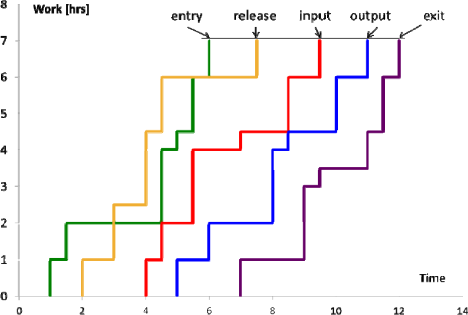
Extended work centre throughput diagram. We can note, in addition to the input and output curves of a typical throughput diagram, the entry, release and exit curves.

Lead time trend and time (red curve). The green line identifies the desired value of the lead time, while the blue one is the alert value, the overcoming of which must obviously be avoided.
The diagrams in Figure 3 and Figure 4 refer to only one work centre. From the extended work centre throughput diagram, one can still get a throughput diagram which refers to the entire order, called the ‘order throughput diagram’. To do this, it is essential to consider the different operations necessary for its completion as well as the time sequence and duration of each operation.
The use of graphical tools for representing the speed of the execution of an order originated with Schmitz [29], in 1961, who wanted to describe and represent the relationship between the production plan and the use of machinery. To do this, he represented graphically the progress of the cumulative production of a machine with respect to time. In this way, Schmitz provided a general representation of a manufacturing process, highlighting certain key elements, such as the lead time, the WIP and the level of performance.
Around 10 years later, Veld proposed a similar representation, the so-called ‘Z-diagram’, so-called because it consists of three different graphs whose union is actually a z [29].
The first of the three diagrams represents the trend of the lead time versus time (red curve), highlighting the planned value of the lead time (in green) and a warning level (in blue) whose passing must be avoided.
The second diagram, the fundamental one (Figure 5), shows the curves of input and output (number of items); the vertical distance between the two curves identifies the WIP while the horizontal shows the lead time.
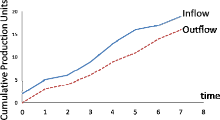
trend of the cumulated production (in number of pieces) with respect to time. The blue curve identifies the orders to be completed while the red curve shows the completed orders.
Finally, the third diagram (Figure 6) shows the variations of the curves of the input and output in various time intervals.
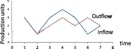
Trend of changes in the curves of input and output with respect to time
The importance of the diagrams presented here is to associate the fact that the information derivable can be used both for the continuous monitoring of the production processes and for the diagnosis of the problems they encounter. Together, these aspects are essential for the improvement of production performance.
3. Case Study
The application case of this work relates to a packaging line of a pharmaceutical company. The product to be packed is represented by glass phials which, by their nature, require special care in handling.
The packaging line consists of several stations through which the product flows. The sequence of operations necessary to complete the packaging phase of the vials is described below:
Label the vial with a sticker that shows the main information about the product (type of product, batch number, country of destination, date, etc.).
Formation of blisters, each containing five vials.
Assembly of the boxes, each containing a blister pack and a leaflet.
Assembly of burdens, composed of two or 10 cases according to the country to which the product is destined.
Combination of bundles in containers, each holding eight or 40 bundles, depending on the type of burden (2 or 10 cases).
Assemblage of the pallets.
The line just described is shown schematically in Figure 7.

ASME representation of the packaging line for the drug vials
As you can see from Figure 7, secondary materials also needed for the packaging of the vials are added to the main stream of material (vials) represented by the black arrows. Specifically:
For the labelling phase, a roller will provide the necessary labels for each vial.
The formation of blisters requires two secondary materials, i.e., the housing for containing the vials (usually plastic) and the ‘lid’ (usually aluminium).
The formation of the bundles requires a secondary material, represented by a ribbon of plastic material able to join the boxes that make up the packs themselves.
The line just described is not perfectly balanced: the average productivity of each machine, in fact, differs from the others, and the blister machine (BLI) is the bottleneck of the entire line. It is also the work station seeing major issues, due to the presence of two secondary materials which often cause halts (especially during the replacement of their respective rollers). Even the control logic of the line is critical, because it should optimally manage the buffer decoupling between the labelling and the blistering machine itself.
The labeller (LAB) and the BLI, in fact, are connected by a conveyor belt that carries the labelled vials on a vibrating conveyor, immediately upstream of the BLI. The latter, therefore, takes the labelled vials from the vibrating plate on the basis of its rate of production. Since the BLI is the bottleneck, in ideal operating conditions, without failure or stops of any kind, the vibrating plate fills up faster than it empties. This means that the rate at which the LAB puts labelled vials on the vibrating belt is higher than the BLI feeding pace.
Since the buffer has a limited capacity, the control logic of the line was designed to avoid exceeding this limit, though verifiable only in an ideal situation. The controls, on the basis of the quantity of vials on the vibrating plane, generate a stop signal for the LAB or the BLI and, afterwards, rule the restart.
For this reason, the vibrating table has three sensors:
Vacuum sensor: if it detects no more vials, it blocks the production of the downstream machine (BLI) to avoid problems in the path of the vials, such as tipping, breakage, etc. Its position is such that the stop BLI occurs when there are approximately 1,000 vials on the vibrating plane.
Minimum acceptable sensor: it generates the signal to the restart BLI (and eventually after a line stop of LAB) when the number of vials on the vibrating plan is considered acceptable (about 2,000 vials).
Full sensor: located at the left end of the plan, it blocks the production of the labelling machine when the plan is considered to be too full (about 2,400 vials).
Obviously, the values presented above are not intended as fixed, but rather as reference values within a certain range. The packaging line analysed in this work, exhibits several problems. First of all, there are those related to the non-production times of the bottleneck. For this reason, the focus of this work was the first part of the line, in particular the first two machines and the connecting element between them. To fully understand the criticality of the line, ‘genba’ on the field, observations were carried out accompanied by a careful analysis of the production data of each workstation.
4. Results
The diagrams presented in the methods section were used to analyse the packaging line of a pharmaceutical firm. This use was intended to help identifying anomalous behaviours of the line and, consequently, to improve its production performance.
Our attention has focused on the first two machines because of their criticality. In particular, we analysed the production rates of the LAB and the BLI and the buffer level between them.
The numeric data came from the control system of the line. It gave information like the good pieces from each machine, while the WIP and the number of pieces in each specific buffer had to be calculated, thanks to a lengthy observation of the line.
The input data of our analysis were, therefore, the number of good pieces from each machine, evaluated on a minute by minute basis. Clearly, the quantity produced by a machine in a paced assembly line is the input for the following station after the throughput time of their in-between buffer.
In the following diagrams, we present the diagrams resulting for the first part of the line.
The packaging line starts with the loading of the ‘raw materials’ that are the medicine phials. These are tagged with labels and then sent to the vibrating plate. The labelling operation can slow down for the replacement of the labels bobbin. In order to quantify the effects caused by this activity, we used the diagram of the LAB-BLI buffer. As specified in the previous section, between the LAB and the BLI there is a buffer that is a vibrating top, from which the pieces move from the first to the second machine of the line. Since the good pieces worked by the LAB and the BLI could be known from data, we looked for the quantity on the vibrating. Figure 8 shows the buffer-level diagram for a period of about 80 minutes of production.

Quantity of pieces on the vibrating top between the LAB and the BLI. The graph shows the units on the vibrating top over time, expressed in minutes.
In the diagram, it is possible to see that around every 50 minutes, there is a decreasing trend as to the quantity on the vibrating top. To understand the cause of this situation, we verified that the times with a decreasing buffer correspond to the moments of replacement of the label reel. This situation is in contrast to the theoretical design of the line with well-balanced machines without any inter-operational buffer. The LAB-BLI buffer can therefore be used to identify specific production situations, such as the normal functioning of the line or the stopping of a downstream or upstream machine. In order to use this information to identify different behaviours of the packaging line, we considered the LAB-BLI buffer diagram for a typical production time period, such as is shown in Figure 9.

LAB-BLI buffer diagram. The diagram shows the number of pieces that, for each minute, are waiting for the following machine. The diagram shows a period of about two hours.
The analysis of the diagram shows different trends, each of which is associated with a specific line production phase.
5. Discussion
As we saw, it was possible to construct diagrams and use them as a tool for the visualization of the system's operation. Besides this, we have tried to exploit the implicit information hidden in the diagrams in order to identify some typical critical situations encountered during the operation of the packaging line. In particular, they were used in two contexts:
Analysis of the behaviour of the line, and in particular of the bottleneck, in conjunction with the label roll change.
Characterization of the typical production trends.
Such applications are shown below. Each of them concerns the analysis of the buffer-level in order to identify undesired productive situations.
The first diagram made shows the trend of the number of vials on the vibrating belt with respect to time in order to identify a possible relationship with the change of the roll of labels.
Figure 10 highlights the decreasing trend for the LAB-BLI buffer related to a replacement of the labels bobbin. As it is possible to see on the graph, immediately after the replacement, there is a reduction in the number of the pieces on the vibrating top due to the reduction of the LAB productivity. This situation is also evident in the throughput diagram of Figure 11.

LAB-BLI buffer diagram during a replacement of the labels reel

Throughput diagram of a period of time during the replacement of the reel labels of the LAB. The input curve (in blue) represents the quantity produced by the LAB, while the output curve (in red) refers to the quantity produced by the BLI.
The input curve, from the 24th minute to the 25th minute, has a lower slope than in the minutes immediately before and after. This situation is due to a reduction of the quantities produced by the LAB caused by a stop of the same machine - lasting some seconds - necessary to replace the labels reel.
In particular, from the 23rd minute to the 24th minute, the LAB produces 109 pieces, from 24th to the 25th only 42 pieces, and from the 25th to the 26th 369 pieces. This is shown in Figure 12.

Focus on the trend of the input curve of Figure 11
The LAB-BLI buffer can also be useful to identify different production trends, which are described below. In particular, four different trends were (and are) shown in Figure 13.

LAB-BLI buffer diagram: identification of the main trends
The first pattern, highlighted in the green circle of Figure 13, is specific to the normal functioning of the two workstations. When the line slope is positive, both the LAB and the BLI are working properly, while the decreasing buffer slope means that the LAB is stopped and the BLI is working. The stop of the LAB is due to the specific control logic of the packaging line. The productivity of the LAB, in fact, is greater than the productivity of the BLI, and when on the vibration top there is a certain number of pieces waiting to be processed by the downstream machine, the LAB is stopped until an acceptable number of pieces arrive on the top. To better understand the functioning of the two machines related to this buffer diagram, it is useful to consider the throughput diagram, referring to the considered time period. Figure 14 shows the throughput diagram from minute 53 to minute 75 (that is the time interval highlighted in Figure 13).
The blue line is the input trend, while the red one refers to the output trend. The vertical distance between the two curves is the WIP. In the normal line operation, this quantity is quite constant over time, as the diagram shows.
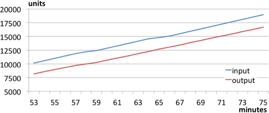
Throughput diagram of the first pattern
In Figure 15, you can see a schematic representation of the first two machines functioning. In normal conditions, both the LAB and the BLI are working with their specific productivity.
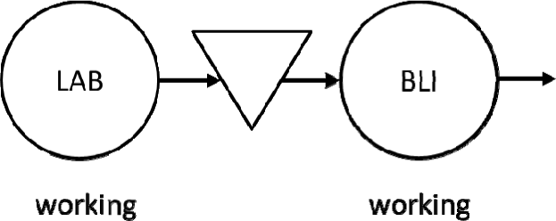
Schematic representation of the normal functioning of the first part of the packaging line. Both stations are properly working at their production rate.
A second pattern is highlighted in the red circle in Figure 13. It is a constant value, referring to the case in which the BLI is stopped because of problems caused by itself or to by other downstream machines. As it is possible to see on the graph, the stopping value of the LAB is quite high and corresponds to the quantity for which the vibrating top is full (2,400–2,600 phials). This situation, because of the specific control logic for the vibration plane and for the LAB and the BLI, causes the stoppage of the upstream machine (LAB). This means that the LAB is blocked by the BLI. Ultimately, the bottleneck of the system is stopped, and then the line as a whole loses production. This condition should be avoided and the graph could highlight it very quickly, both in real-time and a posteriori.
Figure 16 magnifies the throughput diagram for the period in which this block occurs.

Throughput diagram for the second pattern. Both the LAB and the BLI are blocked, and the intermediate buffer is at its maximum level of capacity.
It is possible to see that the output curve (red curve) reaches a constant value two minutes before the input curve (blue curve). This is consistent with the real functioning of the line, because the LAB stops after the BLI has stopped and the vibrating top is full. Conversely, at the 37th minute the output curve begins to rise and, after some minutes, when the vibrating top is emptied, the input curve starts rising too. Figure 17 shows a schematic representation of the functioning of the first two machines.
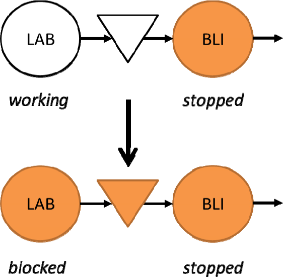
Schematic representation of the first part of the line when a BLI stop causes LAB blocking
The BLI stop, which might be related to itself or to a downstream halt, causes LAB blocking because of the vibrating top overfilling.
The third pattern, highlighted in the yellow circle in Figure 13, is linked to a stop of the upstream machine (LAB). This stop could be due to a failure or to a substitution of the secondary material of the LAB. If the substitution is done during production, there will be an arresting of the LAB itself, causing a loss of production because very soon the bottleneck BLI will stop. This stop could be due to a failure or to a substitution of the secondary material of the LAB. If the substitution is done during production, there will be an arresting of the LAB itself, causing a loss of production because very soon the bottleneck BLI will stop.
In Figure 18 is displayed the throughput diagram of this situation: as usual, the red curve represents the output curve (BLI production) while the blue curve represents the input curve (LAB production).

Throughput diagram for the third pattern. After the LAB stops, the BLI can work for some minutes processing the pieces on the vibrating top, but soon it has to stop as well.
The output curve levels off to a constant value some minutes after the input curve, since the BLI can work the items on the vibrating plan. When the system restarts, the BLI begins to work with just enough material on the vibrating top (some minutes after the restart of the LAB).
Figure 19 presents a schematic representation of the first part of the line in this problematic working condition.

Schematic representation of the first part of the line functioning when a LAB stop causes the BLI to starve
After a LAB stop, when the quantity on the vibrating top is not sufficient for the BLI to work, it stops since it is starving and too few phials in the vibrating plane could lead to them falling and breaking.
Finally, in the violet circle of Figure 13 is highlighted the fourth pattern, which forms when the downstream machine stops because of, for example, a failure or a stoppage of some downstream machine, or even the replacement of a second material.
In Figure 20 you can notice the throughput diagram from minute 93 to minute 103, the period in which this situation is verified.

Throughput diagram for the fourth trend. It is possible to see how the output curve (BLI production) is constant for some minutes while the input curve (LAB production) is increasing.
In this case, the BLI stopping does not cause an immediate LAB blocking because of the overfilling of the vibrating top: this is verified until the number of pieces on the top is within the acceptable range of the control logic.
In Figure 21 is presented a schematic representation of the state of the LAB and the BLI in such a condition.

Schematic representation of the first part of the line functioning when a BLI stop does not cause a consequent LAB to block
As can be seen, here, the BLI stops because of a problem related to itself or else to some downstream machine. This does not cause an immediate LAB stoppage. Clearly, if the interruption continues for a long time, the LAB will have to stop as well.
6. Conclusion
The throughput and WIP diagrams have proven to be a valuable tool to identify undesirable situations in a production line - first of all, those that generate productivity losses. In the case study presented in this paper, in particular, we have noticed that the replacement of the label roll of the labelling machine, during production time, generates a stoppage of the LAB and, consequently, the emptying of the downstream buffer. This activity impacts on the productivity of the bottleneck too, because the operation speed of the BLI is adjusted depending on the number of vials on the vibrating surface. If, in fact, the vibrating belt empties, then according to the vacuum sensor, the blistering machine would be stopped too. Being the bottleneck, this situation is absolutely critical and should be avoided.
Much the same can be said for the other secondary materials, as shown in Figure 7. It can be concluded, therefore, that for the packaging line any setup should be made “in the shade” with respect to production, to avoid unwanted delays.
From the analysis it becomes clear that some production situations should be avoided in order to have higher overall productivity values. Specifically, all those cases in which the control logics impose a stoppage on the blistering (the bottleneck of the line) are situations to be avoided for the attainment of best production performance. In quantitative terms, the application of all the changes to the line identified by analysing the trends and patterns could help to raise the value of the OEE by three percentage points. These results are seemingly intuitive, but they should be especially appreciated because they were obtained both by analysing the line in person and by the analysis of a buffer diagram. Considering the tool used to analyse the problems of blocking and starving, we can conclude that the results obtained show that the throughput and WIP diagrams are effective tools that, if used carefully, can reveal patterns typical of some production situations. The patterns identified on the diagrams allow the rapid detection of these abnormalities, both during production and during a subsequent phase of analysis of the production process.