
Abstract
Visual analytics is a costly endeavor in which analysts must coordinate the execution of incompatible visualization tools to derive coherent presentations from complex information. Distributed environments such as the Web pose additional costs since analysts must also establish logical connections among shared results, decode unfamiliar data formats, and engage with broader sets of tools that support the heterogeneity of different information sources. These ancillary activities are often limiting factors to our vision of seamless analytics, which we define as the low-cost generation and reuse of analytical resources. In this paper, we offer a theory of analytics that formally explains how analysts can employ Linked Data to maintain and leverage explicit connections across shared results as well as manage different representations of information required by visualization tools. Our theory builds on the well-known benefits of interconnected data and provides new metrics that quantify the utility of interconnected user- and task-centric, analytical applications. To describe our theory, we first introduce an extension of the W3C PROV Ontology to model analytic applications regardless of the type of data, tool, or objective involved. Next, we exercise the ontology to model a series of applications performed in a hypothetical but realistic and fully-implemented scenario. We then introduce a measure of seamlessness for any chain of applications described in our Application Ontology. Finally, we extend the ontology to distinguish five types of applications based on the structure of data involved and the behavior of the tools used. Together, our seamlessness measure and application ontology compose our Five-Star application theory that embodies tenets of Linked Data in a form that emits falsifiable predictions and which can be revised to better reflect and thus reduce the costs embedded within analytical environments.
Introduction
Linked Data (LD) is a large, decentralized, and loosely-coupled conglomerate covering a variety of topical domains and slowly converging to use well-known vocabularies [13,35]. To more fully reap the benefits of such diverse data, LD analysts must employ an equally diverse array of analytical tools. Meanwhile, the Visual Analytics community (VA) has been forging a science of analytical reasoning and interactive visual interfaces to facilitate analysis of “overwhelming amounts of disparate, conflicting, and dynamic information [9].” Although the VA community has produced a vast array of tools and techniques that could assist [28], these tools cannot be easily reused in evolving environments such as the world of LD analytics. The tools are typically developed to work with very particular non-semantic representations that make it difficult to establish and maintain connections across analyses. Regardless of which community’s approaches are adopted, the need to continually form explicit and well-defined interconnections among the triad consisting of data, analyst, and tool remains a costly endeavor – and to benefit from both VA and LD research, these costs need to be more clearly portrayed, assessed, and overcome.
We attribute a large portion of analytical costs to two major factors:
the ability to easily apply software tools to arbitrary data
the ability to easily reuse and repurpose prior analytical materials
With respect to using software, the flexibility afforded by new APIs such as D3 [4] has resulted in a proliferation of “one-off” visualization tools that inhibit low-cost reusability. These new visualizations often lack documentation describing the schema of input data and can cause analysts to spend 80% of their time uncovering hard-coded, hidden assumptions [17]. With respect to reusing prior results, even if analysts could easily use the near two-thousand cataloged D3 visualizations1
Given these cost factors, we formalize a “five-star theory of analytics” that formally explains analytical costs and describes how analysts can use Linked Data to mitigate these costs. The theory combines work from the VA and LD communities and explains analytical costs in terms of data evolution (i.e., VA theory) and data structuredness (i.e., LD theory). As data evolves into ordered forms that facilitate analytic reasoning, it oscillates between two levels: a high-cost, mundane level (i.e., non-semantic) and a low-cost, semantic level that maintains connections.
Figure 1 highlights that our five-star theory is just one instance in a class of possible analytical cost theories which all should contain: a model to represent analyses, a cost metric defined in terms of the model, and cost reduction strategies.
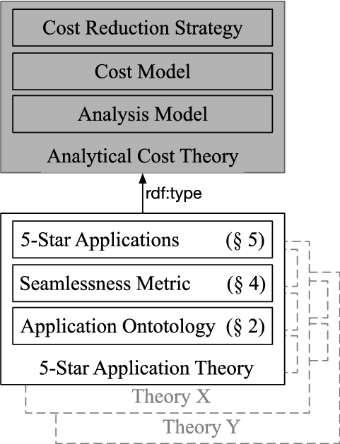
A theory of seamless analytics comprises three elements: a model, a cost model, and cost reduction strategies.
Our contributions and sectioning of this paper are also illustrated in Fig. 1. At the bottom of the image, Section 2 introduces an extension of the W3C PROV Ontology to model analytic applications regardless of the type of data, tool, or objective involved. Section 3 (not shown) exercises the ontology to model a series of applications performed in a hypothetical but realistic and fully-implemented scenario. Section 4 introduces a “measure of seamlessness” based on the cost of performing applications in ecosystems described using our application ontology. Section 5 extends the application ontology to distinguish five types of applications that progressively reduce the cost of analyses. Section 6 (not shown) describes past work in the area of analytical models and techniques for supporting interoperability in analytical environments. Finally, Section 7 (not shown) discusses future work before the conclusion in Section 8 (not shown).
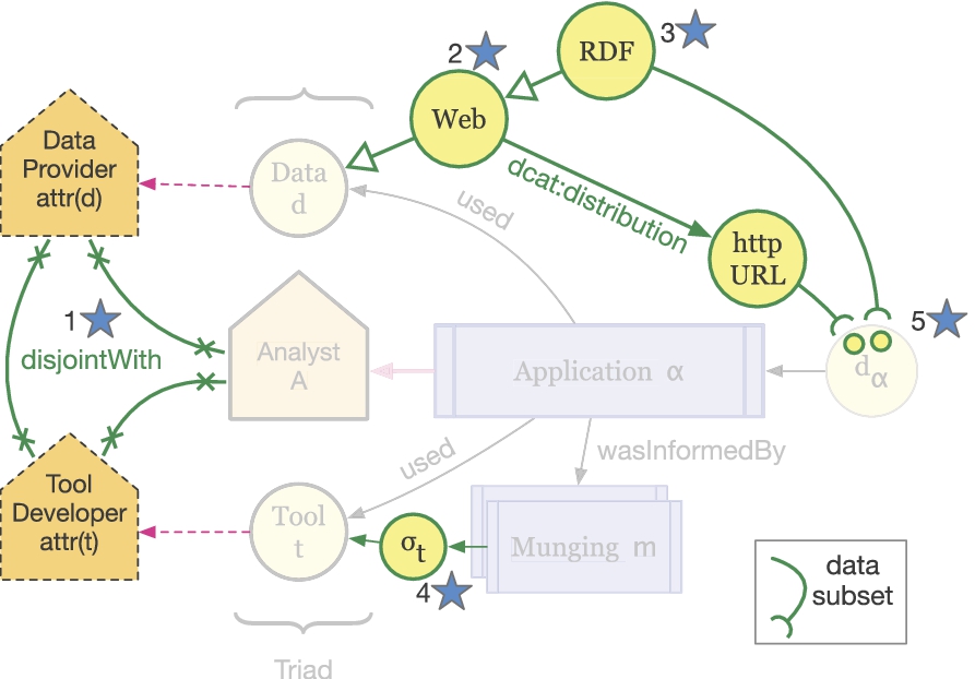
Our core Application Ontology (AO) provides a minimal set of concepts to describe an analytical step, herein known as an

Application Ontology Core is an extension of PROV. Applications use tools to generate new datasets which could include visualizations. Applications are informed by munging activities that transform data representations. Figure 9 illustrates an extension to further distinguish among our five types of applications.
An application also associates three key entities that we collectively refer to as the “application triad”: 1) the input dataset, 2) the orchestrating analyst and 3) the employed software tool. Figure 2 illustrates these relations using the PROV layout conventions2
The distinguishing aspect of our AO is the focus on
The relationship between applications and munges is also shown in Fig. 2 using PROV, but we further relate munging activities as also being part of the application.3
Using Dublin Core

Munging activities defined in terms of the Tim Berners-Lee’s linked data scale. Not shown is content negotiation because it applies to all data types (an ideal situation).
As shown in Fig. 3, we establish seven sub-classes of munging and group them into three intermediate super-classes. These intermediate classes (mundane, semantic, and trivial munging) are distinguished according to a dichotomy that can be found within Tim Berners-Lee’s Linked Data rating scheme [13]. Broadly speaking, Berners-Lee’s scale can be used to partition data into two groups: non-RDF and RDF. Let
We continue to follow PROV terminology to describe activities.
Mundane munges incur the highest cost and are shown in Fig. 3 with heaviest edges. Semantic munges are less expensive than mundane munges and are shown with medium weight lines. Finally, trivial munges are the least expensive of all and are shown with lightest lines. These abstract and coarse level costs are intended to reflect the ease at which data can be used within and across applications.
Three kinds of munging activities are common in that they all require the analyst to understand both the structure and semantics of mundane datasets (
generates generates
generates
Two kinds of munging activities are common in that they require the analyst to understand only the semantics of datasets (
generates generates
Two kinds of munging activities are common in that they do not require the analyst to understand any of the dataset’s structure or semantics.
generates
generates
This section presents two representative analyses modeled according to our application ontology presented in the previous section. Both analyses are centered on the broad topic of Earth’s artificial satellites, e.g., their locations, type distribution, and associated launch sites. As our two analysts perform applications and inspect generated results, they will incrementally and serendipitously gain insight, formulate new questions, and perform subsequent applications to address their new inquiries. Collectively, the two analyses exemplify the “subsequent analyst” setting, where results of the first analyst are re-purposed by a second analyst with a different objective.
We use the scenario to unify the perspectives from the Visual Analytics (VA) and Linked Data (LD) communities. The VA community understands how information evolves into ordered frames that facilitate analytical reasoning [22,31,33]. The LD community understands how data structuredness (e.g., mundane or semantic) facilitates discovery, reuse, and integration [13,16]. We describe our representative analyses from both perspectives: as information evolves into ordered frames, it oscillates between mundane or semantic representations that affect how easily results can be repurposed.
We also use the scenario to highlight certain “anti-patterns,” that can degrade an analyst’s work performance [10,19] We posit that these anti-patterns create certain analytical “pain points” that have been well-documented by the VA community and which are paraphrased below:
understanding the structure and semantics of data
reusing prior application results
avoiding redundant work
obtaining different representations of data
understanding tools’ input data requirements
obtaining the provenance of results

Amy’s analysis described using munge glyphs.
Finally, the applications described in this section are instances of the application class described in the previous section. To identify these application instances, we use subscripts, for example,
Amy, a student enrolled in a physics course, is learning about satellite launch trajectories and becomes curious about the amount of equipment launched into space. Although her professor states that over 2,000 functioning satellites have been launched from various countries, she remains curious about the satellites’ location, classification, and ownership.
Application 1 (
): Where are the satellites located?
Amy begins her analysis with a URL of a Keyhole Markup Language (KML) dataset9
locations in orbit
owning countries
launch sites
Knowing that KML is a popular format for encoding geographical information, she uses an off-the-shelf Geographical Information System (GIS), such as Google Earth, to plot the location of the satellites.
Amy’s activities are described by the provenance trace in Fig. 4, which illustrates data transformations in terms of the seven types of munges defined in Section 2. In her first application,
The provenance trace for Amy’s application
Realizing that many satellites are inactive, Amy becomes interested in assessing launch efficiency by comparing the quantity of active, “useful” satellites to “space junk,” which she defines as rocket bodies, debris, and inactive satellites. She clicks on the checkbox associated with active satellites and un-checks all other boxes, thus inducing a custom satellite grouping. She takes a screen shot of the map window and transitions into a new application, with a new objective.

Amy’s application results.
Amy can begin her second inquiry by building on materials generated in her first application:
URL to a KML satellite dataset
map screenshot showing “useful” and “junk” satellites
The map screenshot,
Fortunately, the map screenshot displays the URL of the source KML dataset thereby supporting a kind of natural provenance
Using the KML dataset, Amy decides to generate a histogram showing the distribution of satellites by type. She first re-partitions satellites into her two groups, encodes these custom groupings using RDF, and uses an RDF visualization tool, such as Sgvizler [37], to generate a histogram.
This second application is described by the provenance trace labeled
Once she obtained RDF, Amy used an ontology mapping tool [29] to align her raw satellite RDF into a new dataset,

Amy finally used an RDF visualization tool to cast the grouped satellite data,
The segment of provenance from
R2RML is a more recent standard for mapping relational data to RDF.
We refer to these lift-then-cast sequences as the “house top” anti-pattern. With Amy’s house top, information about the custom satellite groups and their corresponding member count (i.e., sio:count) became implicit in the SVG encoding; is the size of the bar graphic the membership size, some factor of the size, or is the graphic indicative of membership size at all? If the histogram labels are not informative or the provenance of histogram lost, it may be difficult for subsequent analysts to understand what the graphics represent
The resultant histogram, shown in the center of Fig. 5, provides Amy with an easy, side-by-side comparison of relative bar lengths, which depict the number of useful and junk satellites. Amy can clearly see an order of magnitude difference between active satellites and junk, which leads her to believe that countries are inefficient when launching space materials. She does not know, however, which countries are most responsible for the resulting environmental condition. She performs the next application to explore launch efficiency on a per-country basis.
Amy can begin her final inquiry using materials generated by her two previous applications:
URL to a KML satellite dataset
map screenshot showing “useful” and “junk” satellites
CSV representation of the KML satellite dataset
RDF representation of the KML satellite dataset
RDF representation of satellites grouped as useful or junk
SVG histogram showing satellite distribution by type
PNG image of a histogram depicting satellite distribution by type
Once again, Amy must choose between an analytical frame (i.e., the PNG or SVG of the histogram) encoded in some mundane format
In a distributed analytical environment without LD or provenance, a second analyst would unlikely be able to determine what intermediate result would be best to use.
As presented by the provenance trace in Fig. 4, Amy used a custom script to cast
Widgets, such as D3 stacked bars,13
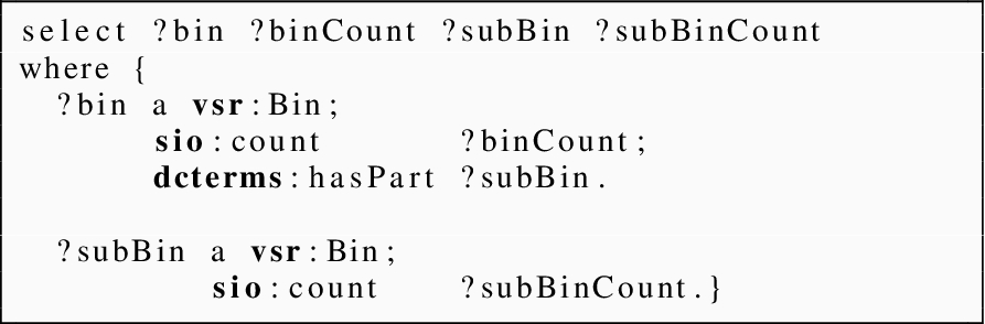
often impose custom input data requirements which are not explicitly or formally described. The lack of documentation forces analysts to inspect sample inputs and source code in order to infer the complete set of ingestion requirements. In Amy’s scenario, the stacked bars tool only provided one example input CSV dataset such as the one show below:After tediously inspecting both the example dataset and the widget’s JavaScript code, Amy realized that each row in the table specifies a single stacked bar. The first column specifies the label of the bar and the following columns specify the sizes of the sub-bars. By running some tests, she also realized that the input table can specify an arbitrary number of sub-bars, with the caveat that all stacked bars (i.e., rows) must have the same number of sub-bars (i.e., columns)
The stacked bars widget, in turn, cast the JSON data into a set of stacked bars encoded in SVG. Since the widget is web-based, Amy’s third application also exhibits the “SVG to PNG” transformation pattern between
From the stacked bar chart, shown at the bottom of Fig. 5, Amy can see that most countries launch space junk to some degree. The bars are normalized and thus convey the relative efficiency of satellite launches. Amy notices that the Common Wealth of the Independent States (CIS), United States, China, and France all launch a large percentage of junk compared to other countries.
Amy shows the normalized stacked bars to her classmate Bart and exclaims her concerns about the proliferation of space junk. She asks Bart to determine if the United States, her home country, allows any of other junk-producing countries to launch from its facilities and hands him all of her analytical materials including: source datasets, intermediate datasets, and application results. She points him to the normalized stacked bars where she left off, but also points out sources of information that were easiest for her to use, namely the KML file and her RDF that groups satellites as useful or junk.
Application 1 (
): What other countries launch space junk with the help of the United States?
To complete his task, Bart needs to find information about:
what kinds of satellites Amy considers junk
which countries launch this junk
what sites do these countries launch the junk from
where are these sites geographically located
Reviewing a flat collection of Amy’s materials without any context is a daunting task, even with pointers to the files she believed were easiest to work with. The relationships among source materials, intermediate datasets, and application results are not captured and preserved. Bart, therefore, is unable to easily determine what information each dataset captures, how the information overlaps,14
To save time and effort, Bart contacts Amy and asks for help addressing his aforementioned concerns, which can be impractical in some settings. From their interaction, both analysts determine that dataset
To support his task, Bart uses a categorical visualization tool, such as Aduna ClusterMap,15
to generate a cluster map that groups countries by the launch sites they use. Bart is particularly interested in identifying countries that are cross-categorized (i.e., countries that use multiple launch sites), which will be rendered as nodes within “intersection clusters”, much like Venn Diagrams that illustrate intersection.Bart’s application is described by the provenance trace labeled


Bart’s analysis described using munge glyphs.
The property
Bart then used a custom script to cast the resulting dataset

Bart’s application results. The top cluster map shows all launch sites. The bottom cluster map shows only sites associated with countries that launch from the United States.
The resulting cluster visualization in the top of Fig. 7 shows the global set of junk-launching sites and countries that use them. In the cluster map, launch sites are depicted as the shaded “octopus-like” figures and countries are depicted as nodes within them. Bart relies on his geographic expertise to identify launch sites that are located in the United States, namely the “Mid-Atlantic Regional Spaceport” and “Eastern Range.” From these two clusters, expanded at the bottom in Fig. 7, Bart can see that both France and CIS launch space junk from these facilities, as well as from Baikonur Cosmodrome located in Kazakhstan. He tries to save only the United States clusters, but the tool does not allow him to export selections made in the canvas.
As it stands, the cluster map is not immediately useful to Amy; the map is not focused on the United States and instead displays all launch sites from across the globe. To answer her question, Amy would first need to identify which launch sites are located in the United States, effectively re-establishing information already known to Bart. To reduce her workload, Bart can send Amy:
a zipped file that contains both the full visualization and a text file that lists the sites of interest
a manually cropped image, shown at the bottom of Fig. 7, that contains only those clusters located in the United States
With option 1, Amy must reference a separate text file while she browses, interprets, and gleans information from the cluster map, essentially establishing cognitive links between the text file and the figures in the cluster map. Although this approach is high cost, Amy is provided a global information source about launch sites, which may be of interest to her in subsequent analyses. With option 2, Amy is provided with only the pertinent clusters relevant to her inquiry, but she loses information about the broader, global perspective on launch site usage.
Ideally, the information depicted in the cropped image would be physically and semantically linked with the larger, underlying information source from which the image was derived. Going even further, if Amy had referenced DBPedia launch sites in dataset

Juxtaposition of an actual analysis vs. an ideal hypothetical analysis.
Figure 8 provides an overview of Amy’s and Bart’s analysis that is juxtaposed with an ideal analysis, where every application outputs two results: a mundane dataset and an equivalent, semantic version. The dashed lines in the figure indicate that a dataset was reused in a subsequent application.
In the actual analysis shown at the top, the final result (i.e,
In the hypothetical analysis, every application uses semantic datasets and generates both mundane and equivalent semantic results. Humans rely on their broadband visual channel to receive information and, therefore, will always need mundane representations of information such as rendered graphics. However, when materials are passed to subsequent analysts, it may be more convenient for them to work with linked, machine readable representations. We can accommodate both settings if more tools would generate RDFa and GRDDL or publish results to content negotiable servers, for example.
A metric for application seamlessness
In the previous section, Amy and Bart each composed unique application chains. Amy generated geospatial plots and histograms, while Bart generated a visualization that depicts categorical relationships between entities. Each unique sequence of applications induces a unique analytical ecosystem, E. Since Amy and Bart each performed a unique set of applications, they each induced a unique ecosystem, i.e.,
Formally, an ecosystem E is defined as the set of applications that influenced17
Each application α18
The set-theoretic definition of an application is an alternate expression of the OWL ontology, described in Section 2, and is better suited for defining cost metrics.
The remainder of this section defines a seamlessness metric, S, that can be used to assess the cost of ecosystems from two perspectives:
how easily can analysts generate materials
how easily can those materials be used by subsequent analysts
To capture the two perspectives, we first define a “result generation metric” that measures the cost for an analyst to generate results. We then define a “reuse potential” metric that predicts the ease by which future, subsequent analysts can reuse those results. We finally combine the generation and reuse potential metrics to formulate the analytical seamlessness metric S.
We define a score, μ, that expresses how easily analysts were able to generate materials during a single application. Since we assume that munging dominates the cost of applications, the score is only a function of the kinds of munges performed during an application α.
The numerator contains the actual cost of the application, which is calculated by summing the cost of each munge. The denominator reflects the hypothetical worst-case, where an application consists entirely of shims. Therefore, the equation has a range of
The generation score depends on a cost function that maps munge types to cost values. To bound our munge-level cost function, we first present a complete ordering of munge costs that aligns with the partial ternary ordering introduced in Section 3.
The horizontal lines delimit the three munge groups shown in Fig. 3; the top group corresponds with mundane munges, the middle group corresponds with semantic munges, and the bottom group corresponds with trivial munges. The least expensive munge is a
We use one such solution of the cost ordering constraints to define a munge-level cost function shown below:
Given these munge cost bindings, we see that μ favors applications that contain a larger proportion of trivial and semantic functions. For example, compare Amy’s μ for her
Amy’s and Bart’s μ for each application. The scores are broken down by actual and worst case cost
Amy’s and Bart’s μ for each application. The scores are broken down by actual and worst case cost
In practice, analysts should assign munge costs that are based on different measures, e.g., man hours, lines of code, and commit frequencies. As long as the cost ordering constraints are satisfied, analysts can experiment with different cost valuations and obtain new μ scores that are consistent with previously computed rankings of their ecosystems. For example, given two ecosystems
We define a score that expresses how easily subsequent analysts can reuse materials generated by prior analyses. Since this score is looking at the seams (i.e., data) between different ecosystems, the score is a function of the kind of results that are generated by applications. We assume that LD, including data that can be trivially munged to yield LD, is easier for subsequent analysts to reuse. On the other hand, mundane results such as PowerPoint slides, CSV files, and raster images pose greater challenges [19] since these results are rarely explicitly connected to their source materials.
In the analysis described in Section 3, Bart made a strategic decision to reuse the intermediate and structured, albeit less evolved, satellite RDF dataset instead of the normalized histogram image. The histogram, although representative of Amy’s analytical frame, is an island from a LD standpoint and is not linked to the source RDF information that Bart needed to complete his task.
To embody this idea, we define the potential (
The
Since
On the Web, capturing downstream usage of analytical results may be challenging for provenance systems. The
Also, the
Seamlessness score S
We can now define the seamlessness score, S, that is built from the μ expression and
Unlike μ, the seamlessness metric S computes scores for ecosystems, rather than single applications. The seamlessness score S sums up all scaled μ scores and normalizes these values by the hypothetical worst case: when an ecosystem is informed entirely by shims. As described in the previous subsection, the scale factors are computed by the
Amy’s and Bart’s scores
Table 2 presents the seamlessness scores for Amy’s and Bart’s ecosystem. The table breaks down the scores in terms of μ and
Amy’s and Bart’s seamlessness score S. The scores are broken down into their constituent integration and reuse costs
Amy’s and Bart’s seamlessness score S. The scores are broken down into their constituent integration and reuse costs
From the table, we see that Bart’s ecosystem, which scored 0.48, was more seamless than Amy’s ecosystem which scored 0.66. Overall, Amy performed more shims that resulted with mundane datasets that degraded her work performance. Note, however, that neither analyst generated an RDF representation for any of their resultant visualizations,
We propose a “5-star application rating scheme” that analysts can use to design more efficient applications that avoid the anti-patterns and analytical pain points described in Section 3. The rating scheme is expressed in the form of ontological restrictions that progressively reduce the space of possible munge sequences. As the application ratings increase, the possibility of performing certain anti-patterns decrease.
We outline these ontology restrictions by extending the application ontology, presented in Section 2, to distinguish among five types of application subclasses that are illustrated in Fig. 9. These subclasses are rated according their predicted cost, which is expressed as an interval. We use intervals since we are describing classes of applications, each of which contains a set of different applications instances that have different predicted costs. The interval thus captures the min and max predicted cost of the application instances.
Table 3 enumerates all five application star ratings and pairs each with their associated restriction(s). Figure 10 uses this table to rate the applications performed by Amy and Bart in their analyses presented in Section 3.
An extension of the Application Ontology Core (Fig. 2) to distinguish five subclasses of Application. The figure distinguishes between generic application concepts, shown in gray, and the extension concepts shown in bold-face.

Star ratings for the applications in Bart’s and Amy’s ecosystems. White star indicate “conditional stars.”
Five-star rating scheme to assess the seamlessness of a single application
In the scenario presented in Section 3, Amy’s use of the GIS tool in application
Similarly to Amy’s
The one-star application restriction speaks more from a tool developer perspective than from analysts who use those tools. If developers would design software with one-star applications in mind, they might refrain from hard-coding tools to accept only certain data sources (e.g., a particular quad store), and thus provide analysts with greater flexibility regarding which tools they can use.
The one-star application class also describes a set of possible munges sequence that we refer to as a munge space. Since the one-star application class does not place any restrictions on the structure of the data used and generated, the class describes applications that range from exclusive shims (i.e., flatlines described in Section 3) to exclusive computes, and every possible combination in between (i.e., housetops and hillsides). We depict the one-star munge space at the top in Fig. 11. Without loss of generality, the munge spaces presented in the figure:
assume that applications are composed of two non-trivial munges (see Section 2); one non-trivial munge to satisfy a tool’s input requirements and another non-trivial munge performed by the tool itself;
assume that applications that accept semantic data (i.e.,
Our μ score, presented in Section 4, assigns a negligible cost to trivial munges.

Possible munge patterns associated with each application subclass. As the application restrictions increase, the space of possible munge sequences decreases.
Because each application in this section describes a set of possible munge sequences, we describe their costs in terms of an interval. The lower bound specifies the cost the cheapest possible munge sequence while the upper bound specifies the cost of the most expensive possible sequence in the munge space. Therefore, the cost bounds for the one-star application class is expressed by the interval:
Figure 9 depicts the two-star restriction near the top, where:
data d is available on the Web
data d has an associated dcat:Distribution pointing to where d can be accessed
the distribution URL is referenced by the output dataset,
Amy’s application
We take Amy’s
In contrast, the use of LOV and SPARQL-ES would likely result with two conditional stars; both tools accept URLs (e.g., OWL files and SPARQL endpoints) and the HTML reports these tools produce reference those same input URLs. Conditionality refers to cases when an application fulfills a particular star level requirement but fails to fulfill the immediately-preceding requirement(s). Although LOV and SPARQL-ES accept URLs and thus implicitly encourage analysts to use URLs in their applications, these two tools violate the one-star condition since the tool maintainers have control over input data sources.
In terms of munge space, the two-star application class is equivalent to the one-star class since two-star applications do not restrict the structure of data consumed or generated.
Three-star applications
Both Amy’s
Applications designed around linked data browsers [1,3,12] can earn at least three-stars iff the applications meet the one- and two-star requirements. These tools accept RDF and thus encourage analysts to use RDF in their applications.
The three-star application class defines a smaller munge space than one- and two-star application classes. If data d is encoded in RDF, it can only be computed, aligned, and cast. The three-star restriction thus removes the possibility for flat-line and house top munges, although hill slides are still possible. We depict the three-star munge space in Fig. 11.
The cost bounds for the three-star application class is expressed by the interval:
The cost bound for the three-star application class is not only tighter than one- and two-star application classes, but also lower since the upper cost is reduced from 40 to 25.
Four-star applications
Amy and Bart did not use any tools that made their input semantics available and, therefore, did not perform any four-star applications. However, the Semantic Automated Discovery and Integration (SADI) framework [40] pairs services with OWL class definitions that describe the expected input and output graph patterns. These OWL classes provide service consumers with an unambiguous expression (
In terms of munge space, the four-star application class is equivalent to the three-star class; no restrictions are placed on the data consumed or generated.

Amy’s ideal analysis supported entirely by five-star applications.
Amy and Bart did not perform any applications that generated Linked Data, and, therefore, neither of their ecosystems contains a five-star application. Similarly, some applications analyzing the Linked Data cloud [14,32] do not earn five-stars since the results are typically images or journal articles. On the other hand, Tim Berners-Lee’s tabulator [3] can be used by analysts to perform five-star applications. As analysts make edits to third-party RDF, tabulator emits new RDF describing those edits. Analysts can also use SADI to perform five-star applications, since SADI services generate RDF graphs that expand on the inputs graphs.
When applications generate LD, they eliminate a number of analytical pain points. With LD, subsequent analysts can more easily determine how prior results are connected to source information and thus be better informed about meaning of those results
The five-star application class defines the smallest munge space. Five-star applications use RDF and generate Linked Data, or results that can be trivial gleaned to yield Linked Data. Therefore the munge space includes a best case of exclusive computes and a worst case sequence exhibiting the“inverted house top” pattern (i.e., cast-lift combination), as shown in Fig. 11. Essentially, five-star applications eliminate the possibility of anti-patterns described in Section 3.
The cost bounds for the five-star application class is expressed by the interval:
The cost bound for five-star applications is not only tighter than the three- and four-star application classes, but also lower since the upper cost is reduced from 25 to 11.
Boosting Amy’s seamlessness scores
In this section we will use Amy’s ecosystem
Ecosystem
Figure 12 shows the provenance for the applications comprising
Amy first used a script to cast the input satellite RDF dataset,
Since this application is five-star, the GIS tool provided its input semantics in the form of the SPARQL query shown below:

Although the SPARQL query does not include information about the particular KML format required by the GIS tool, the conceptual description, coupled with example KML dataset provided by tool, was enough information for Amy to produce the appropriate KML file,
Amy then used the gleanable map,
A snippet of the LD histogram is shown below24
The values of

In her final application,
Once again, the input semantics coupled with an example dataset, provided by stacked bars, was enough information for Amy to produce the appropriate JSON file,
Using the same mechanics in Section 4, we calculate the seamlessness score for
The seamlessness scores for ecosystem
Early visualization researchers developed a variety of models to help them understand the visualization process [6,11]. For example, Chi [8] devised a visualization transform model that describes of how data evolves from its “raw” state to a “view” state as it passes through a four-stage pipeline. Chi’s intention was to establish a canonical way to describe any visualization technique, which would enable developers to compare and contrast different techniques as well as identify pipeline stages where techniques overlap [7]. Although Chi’s effort was centered on data transformation, his model lacked a cost structure that could be used to establish metrics for rating or ranking visualizations.
In contrast, the Visual Analytics (VA) community has continually developed and revised analytical cost models for decades [31,33]. These models, however, mainly consider cognitive costs associated with user interactions [23] and visual pattern recognition. In particular, Patterson [30] described how analysts use visualizations to make decisions and suggested six leverage points that make visualizations easier to interpret.
Other VA researchers have taken a more data-centric perspective on visualization cost. Wijk, for example, proposed an economic model that considers the ratio of insight gained to the cost of generating a visualization [39]. Wijk specifically highlighted cost
Kandel [17], on the other hand, provided a detailed account of the challenges analysts face when generating visualizations and even developed a tool that can mitigate those challenges [18]. He discusses different classes of analysts with regards to their experience and tools they use. He also describes how each class of analyst approaches the problem of munging data, determining data quality, and reusing prior results. His work largely motivates our theory, which we believe is the next logical step in his work; formally articulate his analysts’ testimonies. In addition to providing motivation, Kandel also touches on how semantic data can be used to address the challenges of formatting, extracting, and converting data to fit input data requirements. He even suggests that these data types should be shared and reused across analyses, similarly to how the Linked Data community advocates the reuse of popular vocabularies [36].
Similarly, Fink provided an account of the challenges faced in cyber-security settings [10]. He found that, much like Kandel’s enterprise subjects, cyber security analysts are limited by their ability to cheaply mitigate disparities among diverse data and tools. Additionally, some analysts even noted the difficulty in linking applications and expressed their desire for environments that support result chaining.
The models from VA provide good explanations of how visualization quality, user experience, and workplace politics impact analytical costs, especially when results must flow from one analyst to the next. These models, however, do not emphasize how data structuredness and linkability impact cost; structure in VA refers to the conceptual schema of information rather than the physical format in which the information resides [22,31,33]. The Linked Data (LD) community, on the other hand, has long considered the potential costs and benefits associated with publishing and consuming structured, linked data, but not necessarily in analytical settings where results flow across analysts. For example, Tim Berners-Lee is a proponent of Linked Data because of the potential benefits afforded to data consumers, whom can more easily discover, integrate, and reuse linked RDF.25
Similarly, Janowicz and Hitzler [16] describe how the Semantic Web provides analysts with opportunities to use third-party data in contexts not envisioned by the data provider. Analysts can use OWL to formally articulate the input schema to their analytical applications, and then use those formal expressions as an alignment target, much like our notion of input semantics. In the same spirit, Heath and Bizer describe an application architecture for LD applications, citing data access (e.g., HTTP Get) and vocabulary mapping (i.e., a kind of munging) as major components [13].
In terms of our seamlessness score described in Section 4, we can enhance our cost models to consider an analyst’s experience. Different visualizations,
We can also elaborate on the distinction between mundane (1–3) and semantic (4–5) munges. Currently, our model stereotypes four- and five-star data into the same class, however, we observe significant cost differences in creating quality five-star data [14,35] Analysts must have experience in good URI design and popular vocabularies.26
Linked Open Vocabularies (LOV) maintains a listing of crowd sourced vocabularies
We also need engineered approaches for developing software tools that operate on Linked Data. Currently, most VA tools do not accept and generate RDF and thus it is up to analysts to employ munges that conform to the Five-Star requirements. We are working to provide the Software Engineering community with a suitable software abstraction and set of requirements that can guide the development of tools that better facilitate five-star usage. These new tools would expose their input semantics and generate linkages between source data and derived visualizations.
Ultimately, we believe our theory is a first step towards embodying the LD community’s assumptions, claims, and hypothesis in a simple form that can be used to better understand the limitations and practical applications of LD. When our theory predicts a lower cost that what is observed, we may be able to locate high-cost applications and determine which munges contribute to the inflation; perhaps ontology alignment is still too expensive. In these cases, we may also be able to characterize work environments where the overhead of generating and maintaining LD is not outweighed by the prospective cost savings, for example, in settings where analysts do not share results and materials.
We forged a Theory of application seamlessness that predicts the cost of non-trivial analyses that span multiple applications. The theory is a conglomerate of theories from the Visualization Analytics and Linked Data communities and explains analytical costs in terms of data evolution (i.e., Visualization Analytics theory) and data structuredness (i.e., Linked Data theory). As data evolves into ordered forms that facilitate analytic reasoning, it jumps within a dichotomous space of mundane and semantic formats. The theory suggests that when data occupies the mundane space, the cost to perform the analysis increases.
We described our theory in three parts: a Application Ontology (AO) that describes analytic applications regardless of the type of data, tool, or objective involved; a scoring metric to assess the cost of analyses described in AO; and a set of cost reduction strategies that are expressed in the form of restrictions on AO. We demonstrated the utility of the theory by comparing the actual cost and predicted cost of two analyses: one real-world example based on the current state of practice and an alternative, hypothetical analysis that employs the cost reduction strategies.