
Abstract
Explainable Machine Learning brings expandability, interpretability, and accountability to Data Mining Algorithms. Existing explanation frameworks focus on explaining the decision process of a single model in a static dataset. However, in data stream mining changes in data distribution over time, called concept drift, may require updating the learning models to reflect the current data environment. It is therefore important to go beyond static models and understand what has changed among the learning models before and after a concept drift. We propose a Data Stream Explanability framework (DSE) that works together with a typical data stream mining framework where support vector machine models are used. DSE aims to help non-expert users understand model dynamics in a concept drifting data stream. DSE visualizes differences between SVM models before and after concept drift, to produce explanations on why the new model fits the data better. A survey was carried out between expert and non-expert users on the effectiveness of the framework. Although results showed non-expert users on average responded with less understanding of the issue compared to expert users, the difference is not statistically significant. This indicates that DSE successfully brings the explanability of model change to non-expert users.
Introduction
Explainable Machine Learning aims to bring explanation and interpretation to the decision-making process of a predictive model used in data mining [1]. It aims to make machine learning applications a white-box process, where users will be able to understand how a prediction come about [2, 3]. Existing state-of-the-art studies on Explainable Machine Learning focus on providing explanations for static learning models [4, 5]. Static learning models are used in traditional data mining tasks, where a learning model is trained on offline datasets that do not change over time. Such static approaches, though adequate for traditional data mining applications, may not be sufficient for online data stream mining applications [6].
Data stream mining deals with online streaming data such as weather measurements, financial market pricing, and energy consumption. A common characteristic of streaming data is that they are often dynamic, with unpredictable changes in data distribution [7, 8]. These changes may lead to concept drift [9], where existing data mining models in the stream might be outdated because they represent data distribution prior to the drift. To maintain data stream mining performance, these outdated learning models often need to be updated or replaced with new models trained with the new data distribution. This is a continuous, adaptive process. The explanation frameworks for a data stream mining application need to reflect this dynamic.
This paper proposes a visualization framework called Data Stream Explainability (DSE) framework. There are three key differences between traditional explainability frameworks and DSE. First, DSE aims to explain how the change in data distribution affects the performance of existing learning models. Second, DSE aims to explain how the improvement of performance occurs after updating existing models for concept drift. Third, if no change is detected, DES aims to confirm the current model still works well for the data distribution. To achieve these explanations, the framework uses Support Vector Machine as the primary learning algorithm but can be expanded to other learning algorithms. The SVM models are visualized together with data, and multiple visualizations are created to compare model changes before and after concept drift. In the cases when concept drift is not detected, visualizations are also produced to examine against possible false-negative detection. The goal of the framework is to bring explanation of change in data stream mining to data analyst experts and non-experts alike. Data analyst experts are people who have background knowledge of data mining and concept drift, and who can correctly interpret related data visualization when presented. The contributions of the paper are the following:
Defined a set of visualizations needed for explaining changes in SVM models before and after concept drift. Interpret the visualization to explain changes in data stream mining. Measured the effectiveness of the framework with expert and non-expert users.
The rest of the paper is organized as the following. Current related explainable AI studies are presented in Section 2. The proposed visualization framework is formalized in Section 3. The guidance on how the visualization should be interpreted when applied to an example dataset is presented in Section 4. Section 5 presents user survey of the effectiveness of the visualization and explanation. Section 6 concludes the study and provides directions for future work.
This paper concerns with explaining data mining in a dynamic data stream with concept drift. This section will introduce related research on both model explainability and machine learning with concept drift.
Explainability
Several methods and strategies have been proposed to explain the data mining process. According to Adadi and Berrada [10], these strategies can be classified into three categories: complexity-related, scope-related, and model-related explainability.
Complexity-related strategies achieve interpretability by employing less complex machine learning methods. The less complex the methods are, the easier it is to be interpreted by users. Letham et al. [11] proposed a model called Bayesian Rule Lists (BRL). The model is based on decision tree algorithms. It is to provide an interpretable model to be used by domain experts. Caruana et al. [12] described an application for the pneumonia problem using a learning method based on generalized additive models. By using real medical data and case studies, they showed the interpretability of their method. Xu et al. [13] proposed a model for describing the content of images. The model is attention based where the most important features of the image are emphasized. Visualizations were used to show how their result can be explainable. Ustun and Rudin [14] presented a data-driven scoring system called SLIM. SLIM used a sparse linear model to score a certain decision from a machine learning system. The scores are used to provide users with a qualitative understanding of the system.
Scope-related strategies achieve explainability by either trying to understand the entire model behavior or by understanding each sample of data and the corresponding predicted result. The former is called Global Interpretability and the latter is Local Interpretability. For global interpretability, Kuwajima et al. [15] proposed a framework that improves the interpretability of deep learning neural networks. The framework uses feature analysis to understand the inference process within a deep learning framework. Yang et al. [16] proposed a global interpretation model based on interpretation trees built using recursive partitioning, called GIRP. Their experiments show that their method is able to discover whether a learning model is overfitted to an unreasonable degree. Zupon et al. [17] proposed an approach that provides a global, deterministic interpretation by combining traditional bootstrapping model learning with an explainable method. Their method is able to make representation learning interpretable. Nguyen et al. [18] proposed an approach for image recognition. The approach is based on activation maximization, which can generate preferred input for neurons in a neural network. The generated input is then used to interpretable models for image recognition. For local interpretability, Ribeiro et al. [19] proposed Local Interpretable Model-Agnostic Explanation (LIME). LIME is used to approximate a black-box learning model locally in the area of interest. Thus, for a small number of decisions, LIME can explain the decisions of a previously difficult-to-explain model. Another framework called anchors [19]extends LIME using decision rules. Lei et al. [20] proposed the leave-one-covariate-out (LOCO) technique. LOCO is used to generate local models to measure local feature importance.
Model-related strategies are explainability methods that either explain a single type of model (model specific) or can be applied to any machine learning model (model agnostic). Many interpretability methods for critical applications uses model-specific methods. Ghosal et al. [21] proposed an explainable deep vision network to identify crop stress and disease. The framework not only can predict but also explain which visual symptoms are used for prediction. Lundberg et al. [22] presented an explainable framework for preventing hypoxemia during surgery. The prediction model provides risk factors in the decision-making process in real-time during general anesthesia. Their experiments suggest that these risk factors are consistent with the current understanding of anesthesia. Klauschen et al. [23] proposed an approach to estimate the effect of lymphocytes on a tumor. The approach uses a heat map to show where the most impactful area of the image is for decision-making. Lee et al. [24] applied an explainable deep learning algorithm for detecting acute intracranial hemorrhage from small datasets. The prediction results are integrated with an attention map and a prediction basis from training data to enhance explainability. Lundberg et al. [25] proposed a unified approach for explainable AI. The approach is in parallel with model training. Once a learning model is trained, the same training data, along with the learning model, is given as input to their framework named Shapley Addictive Explanations (SHAP). The framework dissects each prediction made by the model and provides an explanation based on feature importance.
For model-agnostic methods, the approach itself is independent of any models used. Model agnostic methods include visualization, knowledge extraction, and influence method. Visualization aims to understand the decision process through illustrative graphs. Knowledge extraction aims to generate rules from models that do not originally provide rules, such as artificial neural networks. Kuo et al. [26] proposed an approach that utilized domain experts in explaining patterns recognized from clinical data mining. Their approach uses association rule mining and Bayesian Networks for explanation generation. Zhang et al. [27] proposed an explainable framework for recommendation systems. The framework, called Explicit Factor Model (EFM), extract product features. When a recommendation is made based on user sentiment analysis, these features are given a score and used to explain the reason behind the recommendation. McInerney et al. [28] formulate a recommendation engine that provides explainable exploitation and exploration aspect of a recommendation. The framework aims to balance suggesting similar products (exploitation) and providing new products (exploration) while explaining the reason behind each decision. Hu et al. [29] proposed an explainable neural computing framework using stack neural model networks. The framework uses modules of sub neural networks to break down prediction tasks into subtasks. The process of analyzing subtasks provide users insight into how intermediate results are obtained, therefore enhancing explainability compared to traditional neural networks. The previously mentioned SHAP method can also belong to this category. SHAP has a component that analyses feature importance for each sample and calculates how each feature contributes to the decision.
Learning with concept drift
Concept drift is shown as changing in distribution of the underlying data.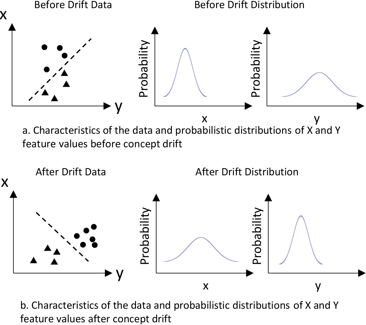
Concept drift can be defined as changes in underlying data distribution over time [30]. The distribution can be seen as a probability distribution of future data samples. Such statistical-test-based approaches utilize statistical tests to track significant data distribution change. This is illustrated in Fig. 1 using two-dimensional data (X, Y). The actual underlying class boundary of the demonstrated two-dimensional data would be unknown if class labels are not available. However, there are changes in the probability distribution of the two features before and after the drift, as shown in Fig. 1. If such features pass some statistical test to be significantly different, then a concept drift can be detected without labels of data samples. Kifer et al. [31] applied Kolmogorov-Smirnov (KS) test for concept drift detection. Glazer et al. [32] applied KS test for the detection of change in high-density areas in high dimensional data. The study modified classic minimum-volume set (MV-set) estimators for density estimation and enables KS test to be applied to high-dimensional data. The author also noted that change in high density area is directly related to concept drift detection in streaming data. Webb et al. [33] introduced concept drift mapping to tackle changes in the data stream. Their proposed method showed the importance of shifts in data distribution. Hidalgo et al. [34] proposed the PEP framework, an ensemble learning model that adjusts single model diversity in reaction to concept drift. The diversity of members within an ensemble can ensure the robustness of the entire framework when changes occur. Li et al. [35] proposed an ensemble framework called CDRDT that employs random decision trees, which focuses on detecting a diversity of concept drift. The framework uses the inequality of Hoeffding bounds and the principle of statistical quality control to detect and distinguish different types of concept drift. Li et al. [36] proposed an ensemble framework that can identify recurring concept drift. The framework measures the divergence of concept distributions between adjoining data chunks, which helps in identifying which recurring drift is occurring. Dries and Rückert [37] utilized samples within the SVM margin to detect concept drift. The detection mechanism compares average margins induced by the Support Vector Machines. Sethi and Kantardzic [38] proposed the MD3 framework that further improves the margin approach by extending it to partially labeled data streams. MD3 computes the density within a margin created by the decision boundary and support of a linear SVM trained on original training data. MD3 is the approach of focus in our explanation framework.
The DSE framework produces visualization that utilizes the SVM margin to show how concept drift makes the old model in the stream outdated and how the new model reflects the current data environment better. The DSE is a chunk-based framework, which splits streaming data into fixed-sized groups of samples, called chunks. The framework will detect concept drift in a chunk and will decide that the existing model no longer reflects the underlying data distribution. Thereafter, a new model is trained using the current data after concept drift and the old model is replaced. DSE thus tries to visualize and explain what has happened within each chunk.
The SVM margin method for concept drift detection
Illustration of margin density drift detection.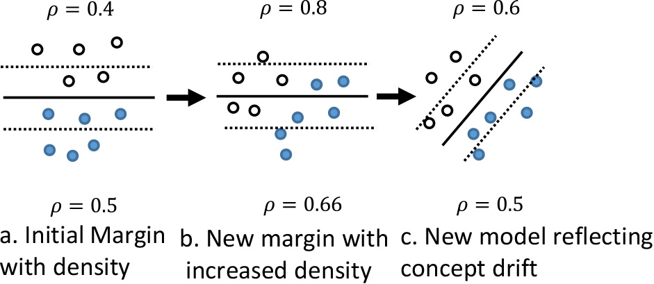
Based on the margin density method from Sethi and Kantardzic [38] concept drift can be detected by calculating the change in the sample density between the two support vectors of the SVM learning model. This density calculation is shown by Eq. (1)
#samples is the number of data samples within the current time step in a data stream. The separating hyperplane of the SVM is defined by
The margin density indicates a level of classification confidence. The width of the margin and the number of samples that exist within the margin shows how well the SVM learning machine can separate the two classes of samples. Having significantly more samples in the margin means that the current SVM model may no longer be optimal. By visualizing the margin between the two support vectors and keeping track of margin density, the proposed framework aims to explain how well an SVM model performs before and after concept drifts.
In order to visualize high-dimensional data samples and models, all visualizations are produced after the data space has been projected to a two-dimensional space using Principal Component Analysis. All discussions onward assume that the transformation has been performed prior to visualization.
To visualize the SVM model, the equation for the classification boundary and the two support vectors f
The x
Since the data points for the classification boundary and support vectors are in high dimension, these points are projected into 2D space using the same PCA vectors as the data samples.
Visualization of support, class boundary, and the number of samples within the SVM margin.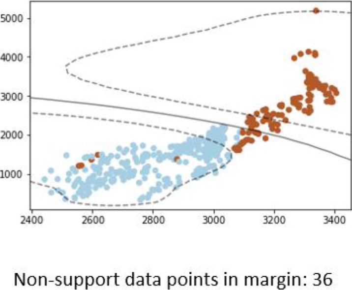
An example visualization produced is presented in Fig. 3. The two axes show the data value range. The blue and brown dots show the two classes of samples. The two dotted curve shows the support vectors, while the solid curve shows the class boundary. Notice that the support and class boundary are both non-linear, this is due to the RBF kernel. The number of data points within the margin is shown at the bottom of the visualization graph. Ideally, the SVM classification boundary should separate all blue samples to one side and brown samples to the other side. When this is not the case, it shows which samples the learning model predicts the wrong labels. The number of samples within the SVM margin is shown at the bottom of the graph. The visualization presents the shape of the SVM model, how well it classifies the current chunk of data, and how much margin density is in one visualization.
Visualization such as the one shown in Fig. 3 is produced chunk by chunk, regardless of the existence of concept drift. When no concept drift is detected, the visualization helps to explain how the current model is still suitable for the current data distribution. In an ideal situation, the visualization between two different chunks without concept drift should show that the margin density does not increase or decrease significantly and that the classification boundary of the SVM can separate the two classes well. However, it is possible for visualization to show the existence of the concept drift, but the concept drift detection in the explained framework failed to detect it. In this case, the proposed framework can help explain why a new model should have been trained.
In the case of concept drift detection, the explained framework typically trains a new model using the chunk of data when a drift occurs. Due to this new model being trained, our proposed framework will produce two visualizations: one with the outdated model and one with the new model. An example is demonstrated in Fig. 4 which shows how the previous model and updated model are different in both the support vector margin (dotted line) and classification boundary (solid line).
Interpreting visualization result using real-world data
The interpretation of the visualizations should focus on the following key aspects:
If concept drift was detected, how change in data distribution affects the existing learning model. How the new model better fits the new data distribution after concept drift. If concept drift was not detected, how the existing model still performs well.
Overview of the datasets used in experiments
Visualization in changing support, class boundary, and the number of data samples within the SVM margin.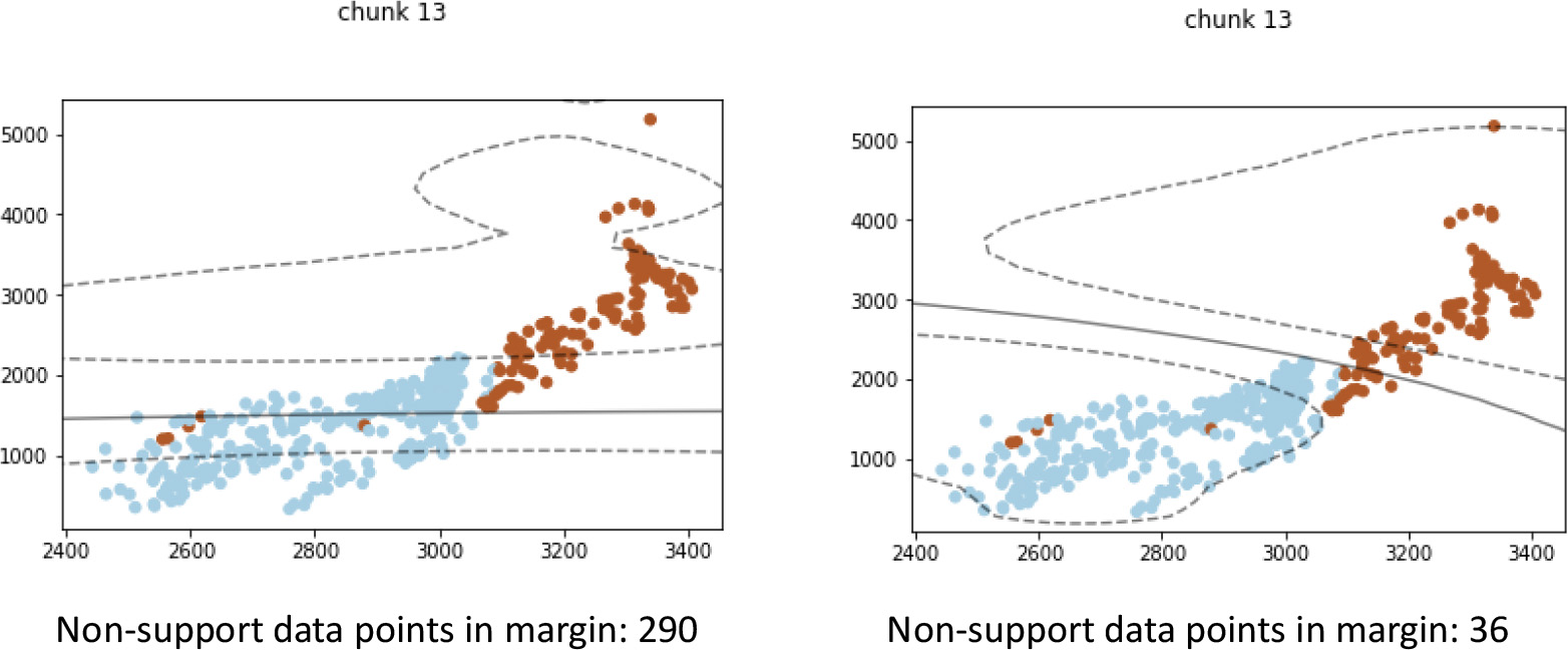
In order to demonstrate the interpretation, the framework is applied to several real-world datasets listed in Table 1. The Forest Cover Type [39] dataset (Covtype) predicts the forest cover type from cartographic variables. This dataset is selected because it has been shown to contain multiple types of concept drift [40]. The original dataset has 250 K data points, 54 features and 7 classes. To avoid the complications of predicting multiple class labels, only samples from 2 classes were used for model training, and explanation, making it a binary prediction problem. The features are a mixture of numerical values and categorical values, describing soil types, site locations and sun exposure. Categorical values are converted to numerical values using one-hot vector [41]. Market (EM) dataset is a real-world dataset that keeps track of the rise and fall of electricity prices [42]. Some features, such as date and time, of the original dataset are useless for concept drift detection. These features are removed to avoid their interference with the detection result. After the selection of the features, our EM dataset contains 6 features. Those 6 features contain values for the demand and price of electricity during different 30-minute time periods in the Australian New South Wales Electricity Market. The dataset’s classes describe a change of price relative to the moving average of the previous 24 hours.
SVM classifies data points by separating the two classes of data using a linear function in hyperspace. Ideally, each side of the linear function should contain only one data class. Furthermore, there should be few data points that fall between the two support vectors, such that the classification confidence of the SVM model is high. When changes occur in a data stream, look for data distribution changes that either (a) increase the number of data points on the wrong side of the classification model or (b) increase the number of data points within the support margin of the SVM.
Changes in data distribution are shown in the visualization created by the DSE framework. The change lowers the previous model’s prediction performance.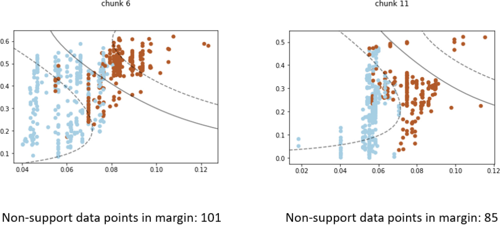
Figure 5 demonstrated a case where the visualization explains how concept drift impacts the performance of learning models. Initial in “chunk 6”, the model before concept drift was able to separate the brown and blue classes of data well. The majority of data instances from either class fall on their respective side of the SVM class boundary (solid line). Although the classification confidence is low, many data points fall between the support vector margin (dotted line). In “chunk 11”, changes in data distribution are clearly seen as the majority of data points from both classes now reside on the same side of the SVM classification boundary. This means that most of the blue-class and brown-class instances will be classified with the same class label. Thus, one can conclude that the changes in data distribution severely affect the performance of the current model, and concept drift detection is justified.
The increased performance of the updated model after concept drift can be shown through the rebalancing of data points on each side of the classification boundary. In this interpretation, look for the SVM boundary once again being able to split the two classes of data well, compared to the previous model in the same chunk of data. Ideally, the number of data points between the support vector margin should also decrease, showing an increase in classification confidence.
Comparing previous and updated models within the same chunk as concept drift occurs. The new model can classify new data distribution better than the previous model.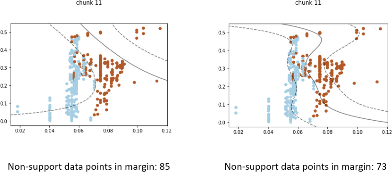
Figure 6 illustrates the difference in model performance when concept drift is detected in “chunk 11”, which is a continuation of Fig. 5. As mentioned earlier, the outdated model can no longer separate the blue and brown data points well, as shown in the visualization on the left. The updated model, shown in the visualization on the right, have different support vectors and class boundary that conform to the shape of the data distribution much better. In this new model, the blue samples and brown samples are once again rebalanced on each side of the classification boundary. This shows a clear improvement in classification performance.
Data distribution changes don’t always result in a need for updating the learning model. In such cases, concept drift will not be detected because the change does not affect the performance of the current learning model. This occurs when the change doesn’t result in data samples of either class label appearing on the wrong side of the SVM boundary.
Although data distribution changed between the chunk 2 and 3, the change does not affect classification performance.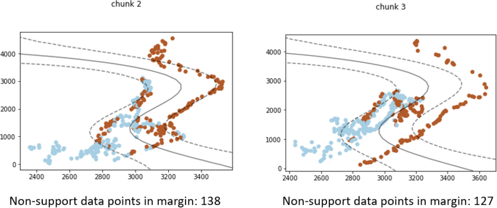
Figure 7 shows two chunks of data with distribution change, but no concept drift is detected. The contour shape of both the brown and blue data points changed between “chunk 2” and “chunk 3”. However, the existing model still separates the majority of the two classes on their respective side of the class boundary. Although some misclassification occurred in both “chunk 2” and “chunk 3”, there is no significant change in how many data points are misclassified. Furthermore, the classification confidence, shown as non-support data points in the support vector margin, remains mostly unchanged. Thus, one can conclude that the change does not warrant the training of a new updated model.
The goal of the DSE framework is to explain changes in data stream mining to both expert users and non-expert users alike. To measure the effectiveness of the explanation, the dataset and explanation generated in Section 4 were compiled into a survey so that users can evaluate the effectiveness of the explanation.
Survey preparation
An example question from the explanation effectiveness survey showing visualizations of chunks with concept drift.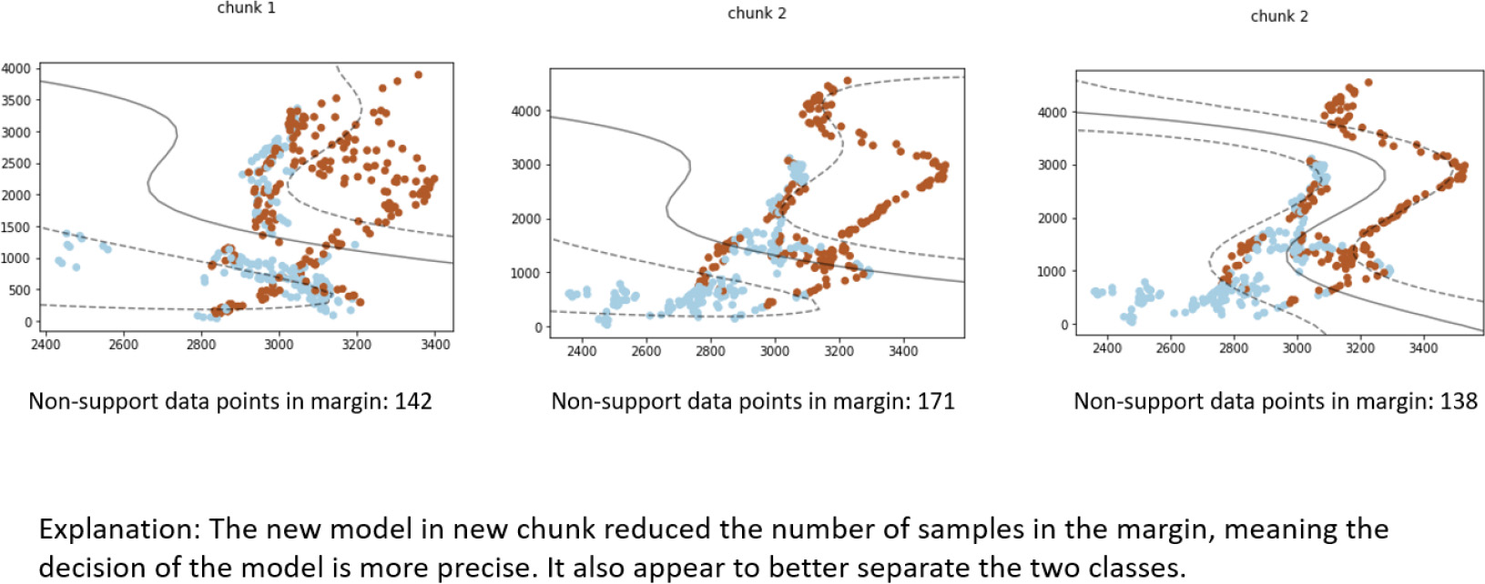
The survey consists of 9–11 questions. The questions are randomly selected visualizations created by the DSE framework. Also provided are written explanations by machine learning researchers on the result of the visualization, as mere visualization will not help non-technical users understand the visualization. An example of the question is shown in Fig. 8. The effectiveness of the visualization is assessed by how much the average user agrees with the written explanations. If non-expert users agree with the explanation as much as expert users, it shows that the visualizations can help non-experts understand model changes on a similar level as expert users. For each survey question, users assign a rating of 1 to 5 on how much they think they agree with the explanation provided within the survey. The meaning behind the rating is listed in Table 2, which is also explained to the surveyed users.
The survey is provided to two groups of people. Group one consists of seven peer data mining researchers who are experts on data stream mining. Group two consists of ten users who have little to no background knowledge of data mining. The first group’s feedback will reflect how accurate the provided written explanation is and how well the visualization is presented. The second group’s feedback, by comparing it with the first group, will reveal how much the explanation framework can help them understand model changes in data stream mining. The average score and the standard deviation of the survey results will be used to construct a 90% confidence interval using Student’s t-distribution. To show users agree with the explanation, the confidence interval should be greater than 3.
Meaning behind survey scoring
Meaning behind survey scoring
Average score, standard deviation, and confidence interval of group-one user ratings
A total of four surveys were provided to the two groups of users. Group one’s average scores, standard deviations, and 90% confidence interval are given in Table 3. The confidence interval of user group one most fell between the rating 3 and 4 range. This means that the group-one users agree with the explanations but think there are problems within the visualization that need to be addressed.
Average score, standard deviation, and confidence interval of group-two user ratings
Group-two user rating averages are shown in Table 4. The group two users give lower average ratings with higher standard deviations compared with group one user ratings. This result is to be expected. Without a data mining background, it is more likely that group-two users have less understanding of the meaning behind the visualization and the written explanation. The confidence intervals show that rating “3” falls in the middle of most of the intervals, which means that users believe there are both merits and problems to the visualizations and written explanations. However, the confidence intervals still overlap with group one’s user results. This means that group-two users do not have a statistically significant difference in ratings compared to group one at the 90% confidence level.
Figure 9 shows the comparison of confidence intervals between expert (blue) and non-expert users (orange). Based on the Student’s T distribution, surveys 2 and 3 show expert and non-expert users overlapping in most of the confidence intervals. Surveys 1 and 4 have less overlapping, which means that there are more differences between the expert and non-expert opinions. Overall, all confidence intervals between the two group overlaps, which means that group two users do not have a statistically significant difference in ratings compared to group one at the 90% confidence level under Student’s T distribution.
Common improvement needed for the DSE framework according to non-expert user feedback when the user rated less than 3 on a survey question
Common merits for DSE framework according to non-expert user feedback when the user rated more than 3 on a survey question
90% student T’s confidence interval comparison between expert and non-expert group.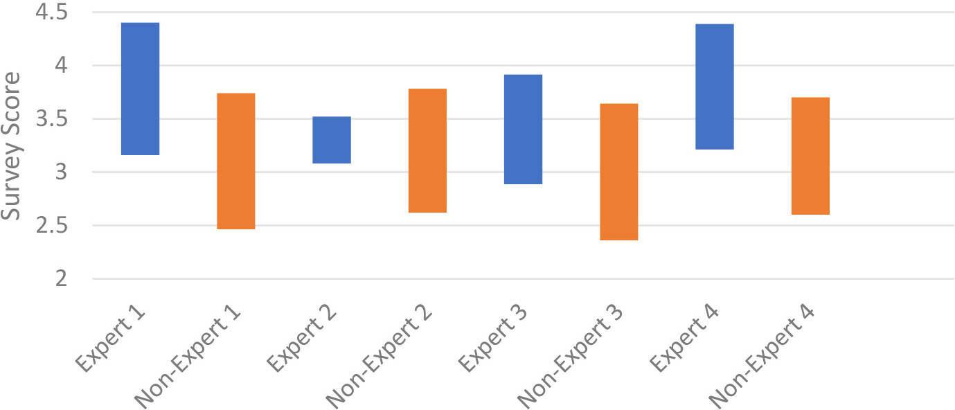
A follow-up questionnaire is provided for group-two users to identify what can be improved in the visualization. Four provided feedback. The questionnaire asks them what can be improved on the questions where they rated low and what is good on questions that they rated high. The common elements in their feedback are compiled and sorted from the most common problem to the least. The summary of improvement is shown in Table 5 and the summary of merit is shown in Table 6. The questionnaire also asks the user’s opinion who rated 3. Three out of four responses said the graphs did not clearly show whether the explanation is correct or wrong. One out of four responses said the explanation is not understandable. The questionnaire revealed that non-expert users face the same difficulty as expert users when using the DSE framework. In both groups, the need to clearer representation of change and model performance is needed for understanding the explanation.
Current machine-learning explanation frameworks aim to explain and interpret the decision-making process of complex machine-learning algorithms. In the case of data stream mining, explaining each individual learning model is not sufficient because of the existence of concept drift. A typical stream mining framework trains a new model when concept drift is detected because the existing model no longer can predict the current data distribution. It is therefore necessary to explain the difference between the new model and the old model, to justify the change in the decision process. This paper proposed DSE, a visualization framework that visualizes how the new model is better suited for the new data distribution when concept drifts occur. The framework also shows how the current model is still sufficient when concept drift does not occur. The visualization uses the margin density method to compare classification confidence of the SVM learning model through the data stream. Some guidance was provided for interpreting the visualization in the case of concept drift versus no concept drift. The effectiveness was measured using a survey, with the majority of survey answers agreeing with the explanation. The survey also identified problems with the visualization and points to the following improvement:
Better representation of high-dimensional data and learning model. Increase visual cues to highlight changes in models before and after concept drift. Increase visual cues to show data distribution change that does not affect model performance.
The limitation of our methodology mostly lies in the limitation of 2D visualization. Such visualization cannot handle very high dimensional data. Several dimensionality reduction techniques can be used, but the resulting visualization might still be highly distorted due to the curse of dimensionality [43].
To apply our methodology beyond the SVM margin density method described above, we have the following recommendations:
Outline the concept drift detection criterion. Our study used changes in the number of samples that fall between the SVM support margins as detection criterion. Visualize how the detection criterion changes overtime to capture what has changed in the data stream. For our study, we visualized where new samples arrive relative to the original SVM margin and visualized how the original margin fails to separate the two classes after concept drift occurs. Provide interpretation guidelines for visualizations.
Future works include making visualization more generalized for different learning models other than SVM, following the recommendation mentioned above. a novel representation of high dimensional models in 2D or 3D space, and expanding the explanation to ensemble frameworks, where models were not replaced but added to the ensemble.