
Abstract
Maps are a common tool for visualizing various statistical figures that describe development in our society. Domain experts, journalists, and general public can pose questions on how to emphasize regions where, for instance, most young patients have long stayed in hospitals. One of the visualization’s problems is expressing validities of short-quantified sentences for regions on maps. The truth value of a summary assigns a value from the unit interval, which makes it suitable for interpretation on maps by hues of a selected colour, but it does not reflect the data distribution among regions. To meet this goal, a new quality measure covering data distribution among districts and its aggregation by the ordinal sums of conjunctive and disjunctive functions with the truth value is proposed and documented on examples. The next proposal is a relative quantifier expressing significant proportion of entities. This model is applied to the interpretation of COVID-19 cases development in the Slovak Republic on real data from one health insurance company. Finally, this article discusses the applicability of the proposed approach in other areas where the interpretation of summarized sentences on maps is beneficial.
Keywords
Introduction
Public administrations, domain experts, journalists, and the public are generally interested in the data and information that describe various aspects of our society. Currently, they are interested more in the data and information regarding the COVID-19 or environmental problems. Such information is often related to territorial units and therefore could be explained on maps. The visualization of statistical figures and graphs on maps is a well-established field. Users ranked from the domain experts to the general audience get an overview of the distribution of the considered figures among territorial units at first glance. However, statistical figures are comprehensible only for users having a considerable level of statistical literacy (Hudec et al., 2018). Charts are also a common way to visually interpret data and relationships, but require training and experience to be interpreted quickly and accurately (Reiter, 2017). An intelligent visualization on maps should understand user’s information-seeking goals, i.e. possessing the capability to select, process, and visualize the relevant data in a way that is productive for achieving user’s goals (Paliulionis, 2000).
Maps are a common sight in official statistics data dissemination and visualization (e.g. GDP, poverty, income, and currently COVID-19). Figures are usually aggregated from the lower territorial levels (for instance, the amount of produced waste in districts is calculated from their respective municipalities) or institutions (e.g. the number of people with a particular diagnosis from all medical doctors’ reports in a region). In the European Union, countries are divided into three NUTS (Nomenclature des Unités Territoriales Statistiques) levels and two LAU (Local Administrative Unit) levels (Eurostat, 2003). The first three levels have a unique code assigned by Eurostat. It makes the comparison of these units among the EU countries easier.
A single statistical figure can be interpreted by hues of a selected colour reflecting the values for each region. Pie charts are applied when the proportion of several values should be visualized (e.g. votes in elections by parties for each region). However, the problem is interpreting dependencies among several attributes when sharp boundaries of the considered categories cannot be constructed, or a natural uncertainty prevails. For instance, to visualize regions, where the most of low-altitude municipalities have high pollution. The terms most of, low-altitude, and high pollution are intuitively clear. The same holds for evaluating regions with a sentence like the most of young customers buy groceries in the early evening. However, we are not able to clearly express which moment separates the early evening from the late evening. The same holds for other adjectives and linguistic quantifiers. For the quantifier most of, a higher proportion of entities satisfying a condition means a higher truth value of the sentence.
This structure of Linguistic Summaries (LSs) has been proposed by Yager (1982). Since then, summaries have been significantly advanced (Kacprzyk and Yager, 2001; Kacprzyk and Zadrożny, 2005; Kacprzyk et al., 2006; Liétard, 2006; Wilbik et al., 2020). The truth value of an LS can be false (value 0), true (value 1), or true to some extent (a value from the open unit interval) and therefore it is interpretable on maps. To avoid summaries based on the outliers or low data coverage, quality measures have been developed in, e.g. (Hudec, 2017; Kacprzyk and Strykowski, 1999; Wu et al., 2010). Quality measures usually focus on a single summary or a set of summaries to recognize the most representative ones (Bugarín et al., 2015).
The use of linguistic summaries provides a way for verbalizing data mining tasks by a graphical interface contributing to the interpretation of results (Kacprzyk and Zadrożny, 2010). The research questions of this work are the following: Could we interpret the validity of a single LS for all districts on maps covering the data distributions among districts, and for this purpose develop a new quality measure to calculate the validity of the same summarized sentence for each district? By this approach, we can bridge the research gap in evaluating the quality of a summary for diverse regions and interpret the intensities of summaries’ validities on maps.
The first novelty is a new quality measure covering data distribution among districts and integrating it with the truth value by an aggregation function of the mixed behaviour. The second novelty is applying it on real-world data to provide a practical solution for explaining COVID-19 cases in all districts of the Slovak Republic on maps. The compactness and robustness of the proposed solution make it interesting for other medical data as well as for environmental or business data.
The remainder of this article is organized as follows: Section 2 introduces linguistic summaries and related concepts. Section 3 is dedicated to the new quality measure for summaries on the subsets of data. Section 4 explains the interpretation of summaries on maps by the proposed method, whereas Section 5 is devoted to the experiments on real-data. Section 6 discusses the solution and its applicability. Finally, Section 7 answers the research questions and concludes the article.
Preliminaries of Linguistic Summaries and Quality Measures
The field of linguistic summarization splits into several directions: classic prototype forms, temporal summaries, summaries of time series, summaries of textual data. A brief overview can be found in Boran et al. (2016), Lesot et al. (2016). In this work, we focus on the classic prototype forms initially proposed by Yager (1982) as Q entities in
Classic Prototype Forms
Linguistic summaries rely on the theory of fuzzy sets and fuzzy logic, where belonging to a set is a matter of degree. A fuzzy set F is defined by a membership function
The next concept required for this work is Linguistic Variable (LV). It is a variable, whose values (often called labels) are words of natural language determined by a quintuple
L is the name of the variable,
X is the universe of discourse,
M is the syntactic rule for generating
H is the semantic rule that relates each linguistic label of
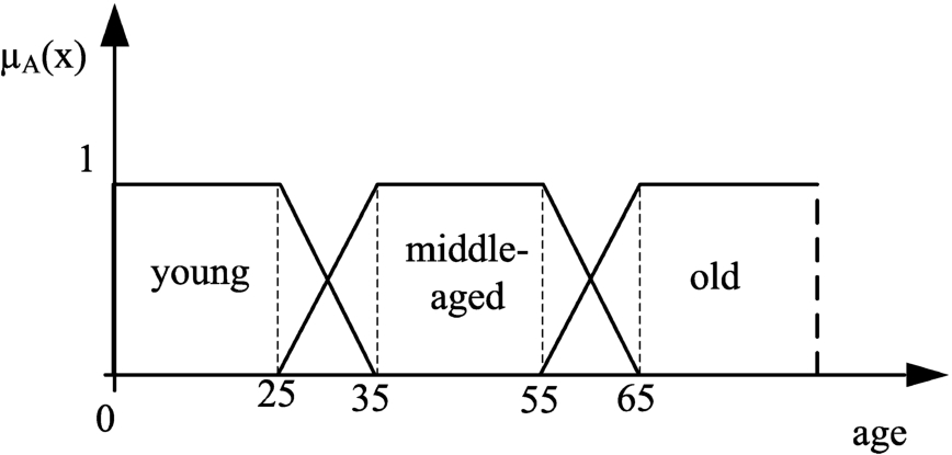
A LV should also be a fuzzy partition (Ruspini, 1969; Alonso et al., 2021) to ensure that the sum of matching degrees to all sets is equal to 1 (usually to the neighbouring ones). An example of LV is any attribute whose domain can be divided into overlapping granules, e.g. length of stay. The LV length of stay consisting of labels short, medium, and long is plotted in Fig. 1, where α is the uncertainty area between the two neighbouring sets and β is the length of the fuzzy set core, i.e. values which fully belong to the set. Observe that, when
The syntactic rule explains the required number of linguistic labels and their names (in this case three, but a finer or coarser granularity can be created), whereas the semantic rule assigns the context-dependent meaning to each label by fuzzy sets. Generally, the fuzzy set long (or other terms expressing larger amounts like high or big) is expressed as an increasing function. In this work, we adopted the linear functions due to their simplicity, but non-linear ones can be straightforwardly applied (Holzinger et al., 2017; Hudec et al., 2018). In this context, the fuzzy set long is formalized as (see Fig. 1):
Value
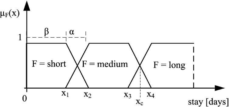
Linguistic variable length of stay and its labels.
The next key element in LSs is the fuzzy relative quantifier. In this work, we adopted the sigma-counts approach (Zadeh, 1983) for its simplicity. In this way, all building blocks of LSs are modelled by the same approach, which makes the whole process effective, especially for visualization on maps. Within that approach, the proportional non-decreasing quantifier is formalized by a function where
When formalizing quantifier most of, the non-decreasing function starts to increase in 0.5, to cover the natural meaning of majority, i.e.
By the above defined fuzzy sets and the quantifier, we can calculate the truth value of LS of the form Q entities in
The truth value of LS of the form Q R entities in
The truth value of a summary can be calculated by other approaches. The conjunction of Q entities in
The truth value is a significant measure, but it is not sufficient (Kacprzyk and Yager, 2001). Hirota and Pedrycz (1999) have introduced five features for measuring the quality of mined and aggregated information (not necessarily linguistically): validity (corresponds to truth value), novelty, usefulness, simplicity, and generality. Based on this observation, Wu et al. (2010) have proposed equations for calculating quality measures for LSs with restriction (see Eq. (6)) for transforming them into the IF-THEN rules. For instance, the degree of usefulness is computed as a minimum of truth value and coverage. Usually, quality measures focus on a single summary or a set of summaries to recognize the most representative ones (Bugarín et al., 2015). Aggregation of several quality measures is examined in Hudec (2017). Kacprzyk and Strykowski (1999) have introduced quality measures: truth value, degree of fuzziness, degree of coverage, degree of appropriateness, and length of summary mainly related to the basic structure of LSs (see Eq. (5)). Recently, the quality measure conjunctively aggregating a summary and the summary consisting of antonym Q and negation of predicate P by the Sugeno integral for the summaries with restriction has been considered in Wilbik et al. (2020).
Another problem occurs when evaluating several subsets of data (in our case districts) by a single summarized sentence. The data distribution among regions varies and therefore it might cause skewed summaries, even though quality measures like data coverage, degree of fuzziness, or degree of focus do not report problems. However, not a single quality measure, to our best knowledge, is related to the quality of a summary evaluated over a hierarchical data, e.g. the most of entities in a district have the low value of attribute A calculated for each district. We need a quality measure for evaluating summaries on subsets of different sizes and compare the computed results. In the literature, theoretical works often illustrate achievements with smaller data sets for diverse summaries. The problem and proposed solution are discussed in the next section.
A New Quality Measure for a Single Summary Evaluated on Hierarchically Organized Subsets of Data
In this section, theoretical problems regarding the quality of the same LS (basic structure and structure with restriction) for all districts are evaluated and the new quality measure is proposed.
The foundation for the proposed approach is the theory of fuzzy sets introduced by Zadeh (1965), the theory of linguistic summarization proposed in Yager (1982) and Rasmussen and Yager (1997), the theory of aggregation functions summarized in Beliakov et al. (2007), and the aggregation functions of mixed behaviour proposed by De Baets and Mesiar (2002) and improved in Hudec et al. (2021). Hence, the methodology of our work is based on the key findings in these fields.
Basic Structure of LSs
To illustrate the problem of a summary Q entities in
Example of a truth value of summary on districts with different number of entities.
Example of a truth value of summary on districts with different number of entities.
District D1 has a higher truth value than district D2, which means a slightly darker hue on a map. But, a higher concern should be focused on D2, instead of on D1. Thus, we should include the data distribution among districts to emphasize D2 on a map. It has a significantly higher number of patients which should be reflected in the summary, while a lower number of patients should reduce the relevance (alarm) of a summary. Theoretically, not a single record in a district might be recorded, which leads to undefined operation
The first (and simple) option is considering the proportion index p as a weight of the summary, i.e.
Next,
Apparently, we should emphasize a summary for districts where both the truth value and proportion of data are high, and reduce the relevance of summaries when these two values are low. This observation leads to the aggregation by functions known as uninorms.
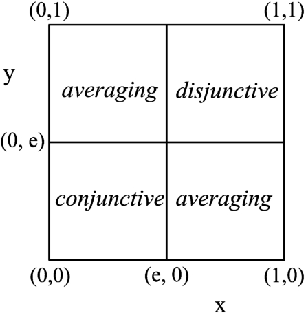
Uninorms generalize t-norms and t-conorms using the fact that these two classes of aggregation functions are defined by the same axioms of associativity, commutativity, monotonicity, and the presence of a neutral element. It means that uninorms consider neutral element e inside the unit interval (Beliakov et al., 2007).
A uninorm is a bi-variate aggregation function
where
The graphical interpretation of a uninorm function.
Representative uninorms are continuous everywhere except for the corners
An important family of parametrized representative uninorms is (Fodor et al., 1997; Klement et al., 1996):
This function can meet the needs for aggregating the truth value (consider
Moving back to the example in Table 1, we get
On the other hand, due to discontinuity in the proximity of (0, 1) this function is unstable, especially for the imprecision of input data, i.e.
The next option is aggregating a truth value and data proportion by the ordinal sums, which are an extension for semigroups (Clifford, 1954) or for posets (Birkhoff, 1967). In the framework of fuzzy sets theory, they were considered to build new t-norms/t-conorms from the scaled versions of existing ones (Klement et al., 2000). The ordinal sum of conjunctive and disjunctive functions has been proposed by De Baets and Mesiar (2002) as follows.
For an n-ary aggregation function
Analogously,
(i)
Functions
Then:
if
if
if
if
The next task is the suitable variation of conjunctive, disjunctive, and averaging functions in ordinal sums. In this work, we need upward reinforcement when both values are high, downward reinforcement when both are low and averaging behaviour when one measure is high and another is low. In addition, we need the stability in the ϵ neighbour of
The option is a strict t-norm for the conjunctive part, strict t-conorm for the disjunctive part and a logically neutral averaging function (arithmetic mean), because we do not consider inclinations towards conjunctive or disjunctive areas provided by, e.g. geometric and quadratic mean, respectively.
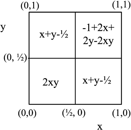
The representative function of strict behaviour is product t-norm (expressed as
The result for
Analogously, strict t-conorm on
Finally, the aggregation on the averaging part is expressed as:
From the logic perspective, the arithmetic mean and its variants thereof (weighted arithmetic mean and the like) are the logically neutral averaging functions, with the ORNESS measure equal to 0.5. The other functions either incline towards conjunction
Considering again the example in Table 1 (consider
The downward and dual upward reinforcement behaviour is also a property of nilpotent t-norms and t-conorms, respectively. The representative functions are the Łukasiewicz t-norm and its dual Łukasiewicz t-conorm. In order to keep the expected value on edges of subinterval
When the truth value and proportion are higher than 0.75, the solution is equal to 1. Thus, we cannot distinguish between two summaries, for which the truth value and proportion are
In summary Q R entities in
Since a summary of the structure (Eq. (6)) covers a subset of the entire database,
To illustrate these calculations, let us have 2000 records,
Example of a ratio of included records and coverage.
The method for calculating a truth value of conjunction of summary and its antonym based on the Sugeno integral (Jain and Keller, 2015) also solves this problem (Wilbik et al., 2020).
The same problem as for a basic structure of a summary holds here. Even though quality measures filter summaries on outliers, the distinction among subsets of different sizes should be reflected on the map. Districts, where the number of patients is higher, should be emphasized when the truth value of a summary and data coverage are high. In addition, we have a truth value of a summary, data coverage, and proportion. Hence, we should aggregate these three measures.
The truth value and coverage are measures for evaluating different summaries on the same data set. As both should be satisfied, we aggregate them by t-norm function (Hudec, 2017). In the next step, we apply ordinal sums (see Eqs. (14), (15), (16)).
A single statistical figure can be interpreted by hues of a selected colour reflecting the values for each district (or variants thereof). These hues can be continuous coverage from the smallest to the highest value of the considered statistical figure. The next option is dividing a domain of the possible values into several categories which could be equi-length, equi-depth and equi-log (where log stands for logarithm) (Aggarwal, 2015). Consequently, each category gets its unique colour. Next, bar and pie charts are suitable for explaining several figures for each region (when figures cannot be aggregated into single figure). Usually, charts require training and experience to be interpreted quickly and accurately (Reiter, 2017). A possible solution is interpreting the quality of a LS on maps.
The validity of a LS gets value from the unit interval. Thus, we can straightforwardly convert this value into the hues by the chosen colour. The next option is applying one colour for value 0, applying another colour (quite different) for value 1 and for values in
Quantifier most of (see Eq. (4)), and its variants thereof, for the proportions greater than or equal to 0.8 assigns truth value equal to 1. It is a convenient way to explain storytelling like the most of young customers buy groceries in the early evening, the most of middle-aged customers buy groceries around the noon, the most of old customers buy groceries in the morning. In our task, we explore the same summary among the disjoint subsets of data. When we adopt the quantifier (Eq. (4)) for visualizing districts by the sentence the most of patients are young, for instance, then the user would appreciate a difference between the proportions of 0.81 and 0.99. Next, proportions lower than 0.5 should be also evaluated. This problem can be solved by modifying quantifier (Eq. (3)) to be strictly linear (or non-linear) function as
All districts having a proportion lower than or equal to 0.3 get a truth value of 0. It is an acceptable solution. However, the next question is enveloping low proportions. Such proportions can be covered by the quantifier few to emphasize districts with a low proportion of entities satisfying a predicate. Interpreting two sentences on a map might be confusing. Thus, we propose the quantifier significant proportion as:
In this way, we get a strictly increased (and decreased, respectively) function for expressing the proportion of entities satisfying a summarized sentence and therefore distinguishing districts by hues of the selected colour. Generally, fuzzy relative quantifiers can be formalized by non-linear functions. In the case of non-linear functions, the users have to specify the shapes, which is not a simple task for domain experts, the case in the medical domain (Holzinger et al., 2017). Hence, we adopted the linear ones due to their simplicity for the end users.
The next section explains the technical background for interpreting summaries on maps and illustrates the developed model on real data.
At the beginning of the pandemic, the cases were rare. Thus, the approach based on LSs was not suitable for interpreting aggregated data. Within one year of the pandemic situation, a significant number of cases were recorded. It opens the space for the application of linguistic summaries.
The application is realized for all 79 districts of the Slovak Republic. The country has approximately 5 400 000 inhabitants. The data source consists of 13 967 records for all 79 districts collected in 2021 in one of the three health insurance companies in Slovak Republic, which takes care of the health of about 30% of the population of Slovak Republic. The number of cases has significantly increased to the end of 2020. The culmination was registered in early spring of 2021. The data are in a matrix form, which is usual for data analysis. The personal data were fully anonymized before transferring from the health insurance company to this model. The only data related to patients are age calculated from the year of birth and the district of the patient’s permanent residence.
To illustrate the proposed approach, we created a simplified web application. The structure of this application was created using Hyper Text Markup Language (HTML), whereas the dynamic content was added using Hypertext Preprocessor (PHP). We used a MySQL database to store and query data. After executing a flexible quantified query over the data stored in the database, the results are saved to a JSON file, so that they can be used for displaying on a map. To interpret the query results on a map by hues of the selected colour, the JavaScript library Leaflet has been adopted. It is a simple open-source JavaScript library for interactive maps (more on
To display the polygons of districts on a map, their exact coordinates are required. These coordinates should be in a format usable for programming. For this reason, we used the GeoJSON file, which is a format for encoding a variety of geographic data structures (more on
After launching the application, the user has the option to choose between age analysis, age analysis of death cases, and relations between the length of hospitalization and age. Age analysis and age analysis of death cases are basic linguistic summaries, whereas the analysis of length of hospitalization and age relationship is the linguistic summary with restriction. A user also chooses which linguistic terms he/she wants to analyse by selecting them in a simple form shown in Fig. 4. Linguistic variable for attribute age consisting of three terms is shown in Fig. 5.
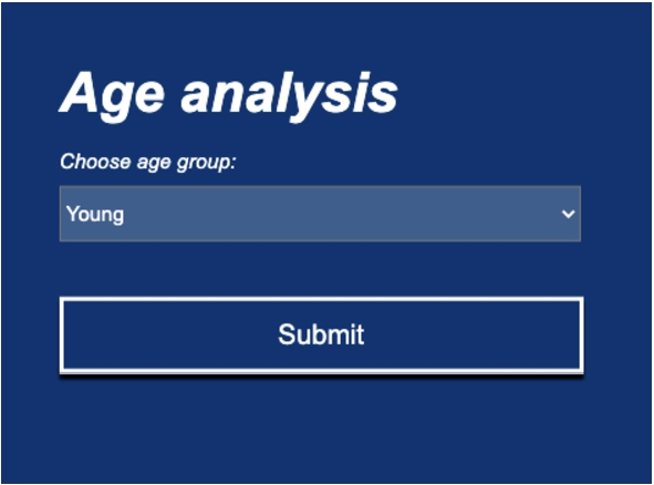
The interface for a basic structure of a LS for attribute age.
The LV for attribute age.
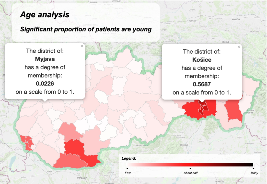
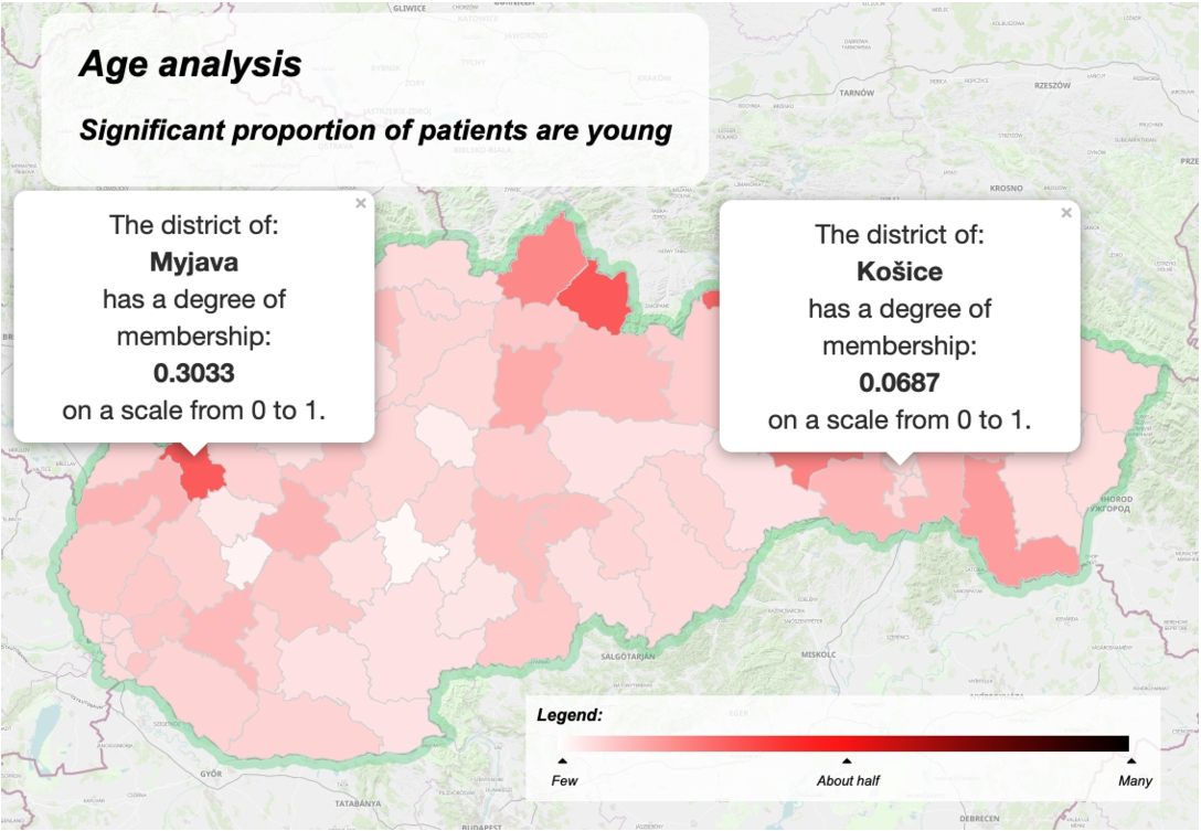
The solution for the summary is visualized on the map of the Slovak Republic in Fig. 6. The solution is obtained by aggregating the truth value (Eq. (5)) with the data proportion by the ordinal sums (Eqs. (14), (15), (16)). To illustrate the problem of applying only the truth value, we can observe the interpretation in Fig. 7, where the Myjava district is indicated as a critical one, but the total number of patients in this district is very low in comparison to the Košice district. It is the same problem as the problem illustrated in Table 1. The LV age reflects a usual consideration of age. Thus, the degree of fuzziness is correct. When using an attribute like the number of sold items, then low, medium, and high significantly vary for diverse products and therefore the measure of fuzziness can be adopted to increase the quality of the summary.
Interpreting the basic structure of the summary significant proportion of patients are young by the proposed quality measure.
Interpreting the basic structure of the summary significant proportion of patients are young considering only truth value.
The evaluated question of the structure with restriction (6) is the following: the significant proportion of old patients has a long stay in hospitals. The linguistic term long of the variable stay has parameters
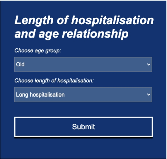
The interface for a structure with restriction of a LS for attributes age and length of hospitalisation.
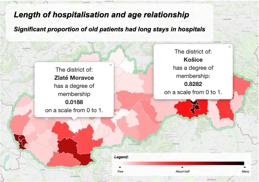
Interpreting the summary with restriction significant proportion of old patients has a long stay in hospitals by the proposed quality measure.
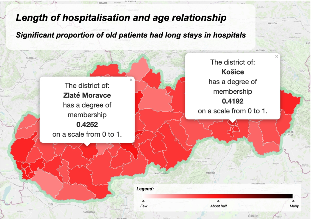
Interpreting the summary with restriction significant proportion of old patients has a long stay in hospitals considering only the truth value.
The next option is the comparison of developments between the years 2020 and 2021. The summary significant proportion of old patients have a long stay in hospitals for 2021 is shown in Fig. 9, whereas the same summary for the 2020 year is shown in Fig. 11. We can see not only where the waves had a stronger impact on elderly people, but also how the waves had moved among the districts.
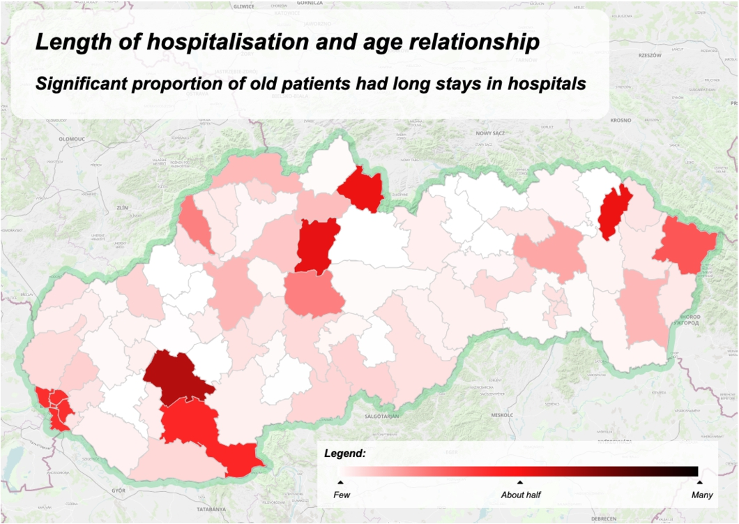
Interpreting the summary with restriction significant proportion of old patients has a long stay in hospitals for year 2020.
This approach proposes a novel way for interpreting linguistically summarized sentences on maps. The question is posed linguistically by selecting attributes and adjectives from the list of linguistic terms.
Linguistic terms are vague, but very effective. Here, “vague” means non-sharp boundaries expressed by fuzzy sets, whereas “effective” means that we distinguish elements by the intensity of belonging to a set without adding further properties (Radojević, 2008).
The solution is realized on the data from one health insurance company (DÔVERA zdravotná poisťovňa, a.s.). This solution provides an insight into the distributions of patients for this company. Currently, three health insurance companies covering health services guaranteed by the government operate in Slovak Republic. To get the full overview of the situation regarding the COVID-19 cases for governmental organizations, journalists, researchers, and the general public, data from all health insurance companies should be merged. This integration does not affect the mathematical and programming background as one patient is a client of only one health insurance company. It is worth noting that this solution is not restricted to COVID-19 cases. It can be extended to monitor other illnesses. Moreover, this solution can be adapted to monitor the development in other areas like pollution among districts and socio-economic aspects, which might augment (official statistics) data dissemination (Hudec et al., 2018) by interpreting summaries on maps.
This concept can easily be applied to any human language. Adjectives expressing fuzzy sets like high, long and old, and quantifiers such as significant amount of, most of and almost all are always expressed by increasing functions (linear or non–linear), regardless of their translation to other languages and examined concepts.
The quality measures for linguistic summaries and parameters of fuzzy sets are computed from the data. While this is a convenient solution, we should also consider experts at a health insurance company (or any other experts). For such users it might be useful to adjust parameters to meet particular requirements.
The further important activity of research is to develop advanced designs of easy-to-use application interfaces for diverse categories of users (as experts in the field and the general public). Developing and testing the interfaces can be realized within the health insurance companies and requires cooperation between health insurance experts, web developers, especially web designers, and data dissemination experts.
The proposed approach explains summaries from the data (by interpreting them on a map), not the data itself. Generally speaking, the data disclosure in summarization would not be a problem; however, care should be taken when summarizing from small data sets. The decision which data might be available to realize summaries and interpret them on maps should meet regulations and other relevant rules when disseminating them to public.
Considering the interpretation of summaries on maps, the future task will be focused on evaluating the proposed quality measure and quantifiers on diverse data sources and their potential in various domain areas. For example, creating the business intelligence dashboards that respect specifics of strategic, tactic, and operational needs in business (Vaisman and Zimányi, 2014).
Conclusion
The interpretation of linguistically summarized sentences on maps provides a quick overview of the developments in districts. In order to contribute to this field, we raised research questions of calculating the quality of summaries for each district and interpreting them on maps.
The existing quality measures are focused on a single summary or to find the most suitable summary from the set of summaries. In this work, we proposed a new quality measure for evaluating the same summary on different subsets of hierarchical data (i.e. the number of patients by districts). This quality measure considers data proportion among districts. The answer to our research questions is that we can express the relevance of a summary on a map by aggregating proportions of data among districts and the truth value by the recently developed ordinal sums of conjunctive and disjunctive functions. More precisely, only strict conjunctive and disjunctive functions are suitable. Consequently, the result (assigned value from the unit interval) is interpreted on a map.
The potential of linguistic summaries in interpreting and disseminating summarized information on maps is demonstrated on real-world data regarding COVID-19 cases. In order to reduce the burden on users for using the quality measure and visualization of the short-quantified sentences on maps, we have developed an interface for selecting attributes and their adjectives. It brings a user-friendly environment for visualization without deeper knowledge of the data and the computing process.
Further, our research has documented perspectives for the application of the proposed method in other health insurance tasks and beyond. The next task will be focused on evaluating the proposed quality measure and quantifiers on diverse data sources and for different tasks (e.g. mapping civilization diseases, environmental problems, distribution of different types of enterprises in the regions, the poverty rate in the regions). Finally, we underline that the proposed approach should be considered as a complementary data interpretation to the established practice of interpreting statistical figures on maps.
Footnotes
Acknowledgments
The authors would like to thank the health insurance company DÔVERA zdravotná poisťovňa, a. s., Bratislava, Slovak Republic for advice regarding the research topic and provided anonymized data.