
Abstract
Three-dimensional packages are complex multimodal ensembles and serve important communicative functions for the discursive construction of marketing strategies or social and cultural values to be conveyed by the products they contain. One particularly interesting type of such packages is that of physical movie releases. In this article, we offer an exploratory study into how multimodal cohesion analysis can be applied to these artefacts. While multimodal cohesion has mainly been analysed in narrative artefacts such as films or comics, the examination of three-dimensional packages is a new field of application within the broad context of multimodality research. Building on existing theories and frameworks for multimodal cohesion analysis, we suggest a five-step framework to fit the genre of three-dimensional packaging. A case study using three releases from the film distribution company Eureka is employed to test the developed framework. The analysis shows that the majority of relations between units in and on these packages is of the type ‘repetition’. These relations are established both through verbal and visual elements, both with regards to form and content. The repetition of style results in a strong uniformity, whereas the repetition of contents allows the object to understandably convey information despite its three-dimensional non-linear structure.
Introduction
Packaging has always served a straightforward function: to contain a product. However, over time, the wide array of product packaging has changed a lot and many, if not all, today serve purposes far beyond this mere containing. They are meant to inform, attract, distinguish, and more. In the context of health and sustainability communication, for example, food packages in particular have been analysed as playing an important role for the discursive construction of healthiness and sustainable living and as supporting the call for action to follow a certain eating diet or to change one’s attitude towards ethical consumption of food (see Machin and Chen, 2023). In corporate communication, packaging design has always been an important factor for product marketing and brand recognition.
A particularly interesting instance of packaging is the case of special edition (hereafter SE) releases of films. These are physical movie formats on DVD or Blu-Ray discs complemented by bonus features such as commentaries or featurettes. In addition, the discs come packed in often colourful boxes that do not only feature the title of the film, often repeated several times on the spine and the back, but also show pictures from the original film material, insights from behind the scenes, and other artwork. The inside includes not only the disc with the actual film on it, but most commonly also a variety of extras are added: cardboard covers for around the case, booklets, posters. From time to time, distributors even decide to include something more extravagant: For instance, The Expendables collector’s edition comes with a lighter; Sin City’s Ultimate Killer Edition features playing cards, a tin plate, and magnets; the Harry Potter collector’s edition even includes a 30 cm replica of Hogwarts Castle. These SEs have increased in sales in the last two decades, even though the general interest in physical film releases has gone down substantially (cf. Whitten, 2019).
An interesting question in this regard is what the exact purpose of these SEs is. What once was there mostly for protection of the product has other functions now. These releases shift and blur the boundaries of what is packaging and what is product. Indeed, cardboard slipcovers are far from necessary to house the product and neither do they contain essential information about the product. They simultaneously do and do not function as packaging. Additional elements like booklets and posters are also clearly not there to house the product, they are in a sense extensions of it. In contrast to packaging of food, phones or fidgetspinners, movie releases are supposed to last and attract people’s interest again after they have finished watching the movie. In fact, it is not uncommon for film collectors to own multiple copies of the same film, often in several SE releases.
The purchasing of movie releases to own rather than watch the film is part of a larger trend in media consumption (Cunningham et al., 2017). In fact, the purchasing of physical books also remains very popular and so does the purchasing of vinyl and even CDs. Data shows, however, that 50 percent of the U.S. vinyl purchasers do not own a record player (Caulfield, 2023). Half of the people that purchase vinyl thus do not purchase it to actually listen to the music, but instead to own a record on vinyl. For these people the packaging is key to what they are purchasing. With this, the artwork itself does no longer seem to be the most important product and the package instead becomes the main object of interest and fascination. This merging of artwork and their copy results in interesting and complex pieces of media which we see as particularly complex examples of multimodal artefacts. Their complexity indeed not only lies in the three-dimensional package as an artefact by itself, but also in the several layers and levels of material on which and with which information about the film is distributed. Hence, the packages create meaning on several layers of their partly very different material forms and with different semiotic modes, that is, expressive forms. They combine visual, verbal, and textural qualities of the physical object.
This combination of a high number of expressive forms into such a specific case of the physical form of a film represents an interesting object of multimodal analysis and it is particularly interesting to ask for the meaning and functions constructed by these expressive forms. How are characters of the film represented on the package? How are settings introduced and how is the story represented? Compared to linear multimodal texts such as films or comics, for example, product packages convey their information on many different layers in a seemingly complex way which might challenge the users’ perception and interpretation. Our aim is therefore to find out how important elements of the film itself are signalled to the viewers (and users) of the package and which kind of information is shared and how. More specifically, we will apply a multimodal cohesion approach in order to systematically unravel how specific elements of the film are reproduced on the package and how they are constructed within and across the different expressive forms. This methodological approach extends the linguistic notion of cohesion as developed in the context of systemic-functional linguistics (see Halliday and Hasan, 1976) to multimodal artefacts to find out how cohesive ties are established between units of a text.
Multimodal cohesion analysis has so far mainly been applied to media types such as films, movie trailers, and comics (see e.g. Tseng, 2012; Stainbrook, 2016; Tseng and Bateman, 2018; Drummond and Wildfeuer, 2020; Hoffmann, 2021). Further work has been done on educational, instructional, and persuasive multimodal documents (see Acartürk et al., 2013; Sanchez-Stockhammer, 2021; Stöckl and Pflaeging, 2022). All of these documents represent two-dimensional artefacts, while product packages are three-dimensional. It is therefore particularly interesting and also challenging to apply the multimodal approach to cohesion to these more complex artefacts: How does a three-dimensional, multi-faceted object achieve cohesion across the entirety of all individual parts of this object?
This article is dedicated to developing and testing a model for the analysis of cohesion in three-dimensional packaging. We understand this type of packaging as one specific genre of three-dimensional, multi-face objects in the form of actual boxes or packages. Often, but not always, these boxes have an angular shape. These objects are not to be confused with other three-dimensional objects such as sculptures, or buildings, for example (for which specific multimodal-analytical approaches are available, see, e.g., Bowcher and Liang, 2022; Ravelli and McMurtrie, 2016). In defining these objects as communicative situations, we follow the canvas classification provided in Bateman et al. (2017: chap. 3; see below). Our main questions for the analysis of these packages is: How is cohesion achieved in SE movie releases through the use of a variety of semiotic modes? With this question, we first of all aim at addressing basic meaning-making processes during the readers’ or users’ processing of the text. 1
Literature overview: Product packaging and multimodal cohesion
Most multimodal analyses of packaging have looked at either food or healthcare and cosmetics products. Thomas (2008: 1) describes these types of products as “fast moving consumer goods packaging” and shows that these can indeed be considered a separate genre of text. According to him, texts within a genre “share a common set of communicative purposes. They are readily recognized by members of the community. Their recognition and instantiation are social processes” (Thomas, 2008: 28). With this comes both constraints and an aid for identification and use (cf. Waller, 1987). While movie releases do not fall under this genre, Thomas underlines the need to move beyond linguistics when analysing, as it is integral to look at the intertextual links of both linguistic- and non-linguistic semiotic modes (Thomas, 2008). In further work, Thomas (2009) also discusses the application of multimodal cohesion analysis to three-dimensional product packages. In his analysis, he concludes that only seldomly individual modes work alone to create cohesion. The different faces feature modes that work together across faces and with this create cohesion intrafacially (Thomas, 2009).
Other studies into product packaging seem to follow a similar trend. They show that a lot of the traditional ways of multimodal analysis still hold true, but the additional dimension complicates things. Jones (2014), for example, illustrates the complexities of creating guidelines for presenting claims on food packing. Machin and Chen, 2023 show how modes work together on packaging to present products as healthy, Chen and Eriksson (2019) show the same with regards to the healthiness of protein snacks. In general, the relations between packaging, food and language play an important role in recent works (see also Jones, 2014; Rüdiger and Mühleisen, 2020). Through the combination of modes both inter- and intratextually, packaging can bypass laws and guidelines to communicate things without directly stating them (Chen and Eriksson, 2019).
For the analysis of cohesive relations or cohesive ties, most multimodal scholars draw from Halliday and Hasan (1976) and their work on text-connectedness. As Stöckl and Pflaeging (2022) highlight, the combination and integration of semiotic modes through formal, semantic and rhetorical mode-linking goes hand in hand with cohesion. Despite the multitude of modes existing, most studies have focused on the relation of text and image in two-dimensional objects. Acaturk and Taboada (2013) show that cohesion achieved through directive reference results in higher attention and higher information retention. Tseng (2012) adds the auditory mode of sound and the dimension of time to her description. Using cohesive chains she tracks characters, objects and settings. Tseng et al. (2021) show the increased level of comprehension in films with higher cohesion. Tseng and Bateman (2018) extend the framework developed in Tseng (2012) and apply it to graphic novels, revealing the difference in cohesion relation between novels and graphic novels.
A seminal overview and review of most of these and other classic approaches is given in Bateman (2014), who also discusses their applicability to text-image relations, and Stöckl and Pflaeging (2022) who also look at studies from a comprehensive multimodal perspective. With the help of these they develop a framework structure for a multimodal coherence analysis for two-dimensional print advertisements. The latter have so far been the focus of multimodal-analytical approaches to cohesion, frequently with some kind of narrative or other linear structure. Whilst most of the studies share similarities, there is not one generally accepted framework for multimodal cohesion analysis. This is quite logical, as Schubert and Sanchez-Stockhammer (2022) state that cohesive ties are relative to genre.
Methodology: Synthesizing a new analytical framework for multimodal packaging
In the following, we provide a new framework for a comprehensive qualitative analysis of these specific packaging formats. This framework triangulates different approaches into a larger multi-level and multi-step framework. In total, we suggest two levels of analysis with five main steps to follow when analyzing product packages, which are in the present case physical movie releases. In order to clarify each step of the framework, The Man from Laramie (hereafter TMfL) is used for illustration.
Canvas, face and unit identification
The first level in our analysis is the analysis of cohesive relations. At this level, the first step is the categorization of the distinct elements included in a SE release. As it is standard practice for SE releases to include multiple elements, it is important to label these. For this, we use the approach provided in Bateman et al. (2017) to describe the material canvases on which meaning is made. A canvas is understood as “anything where we can inscribe material regularities that may then be perceived and taken up in interpretation” (Bateman et al., 2017: 87). A standard release consists of at least three different canvases: the disc, the case, and the paper inlay. SEs usually have more canvases. According to Bateman et al.'s (2017) categorization, these canvases are usually static and permanent, since the objects do not change over time. Exceptions would be when perishable items are included in these releases. While physical movie releases are intended to inform and entertain, recipients remain observers of the canvases and do not interact with them. Most importantly, physical movie releases and the majority of their canvases are in most cases not linear and recipients must put some compositional effort in constructing meaning out of the many information layers. This makes them a micro-ergodic communicative situation (see Bateman et al., 2017: chap. 3). For the analysis, each of the example releases to be examined will be separated into their main canvases and each canvas will be numbered and given a short description. The numbering is based on the order in which consumers generally interact with a movie release. The canvas number is placed second in the number order, with the first digit denoting the release itself. TMfL will serve as the first object of analysis and will thus be labelled ‘1’. It consists of five canvases: a case, a paper-inlay (1.1), a booklet (1.2) and two discs (1.3/1.4). All three selected releases use clear colourless cases with standard texture. The exact cases used do differ per object but not in a way that influences the textual, visual or textural in a significant way. For this reason the clear cases will not be taken into account in the numbering.
The second step distinguishes the different sides of each canvas, this is integral to the analysis as it deals with three-dimensional objects. Following Thomas (2008, 2009), these sides will be labelled as faces. The numbering of the faces is dependent on the type of canvas, with the front always being face 1. The face number is the third identifying digit in the number order. It is important here to take into account the malleable nature of physical movie releases. They are intended to be opened, having the disc or booklet removed and they might have a paper-inlay with multiple potential fronts. Because of this, what a face is and how these faces relate to each other depends on the state of the object. While all objects are three-dimensional, the depth dimension of some object is extremely limited. Only faces with more than one mode of communication are numbered. This simplifies the analysis without sacrificing any data, as the faces contain minimal information. For TMfL this results in a total of eight face. The booklet has four: front (1.1.1), spine (1.1.2), back (1.1.3), and the face visible inside the case (1.1.4). The booklet has a front (1.2.1) and a back (1.2.2), with the discs only having a front face (1.3.1/1.3.1).
The (a): Original (Stöckl and Pflaeging, 2022: 7) and (b): adapted model for cohesive ties analysis of product packaging. Sin City’s Ultimate Killer Edition with embossed elements resulting in deviating textural qualities.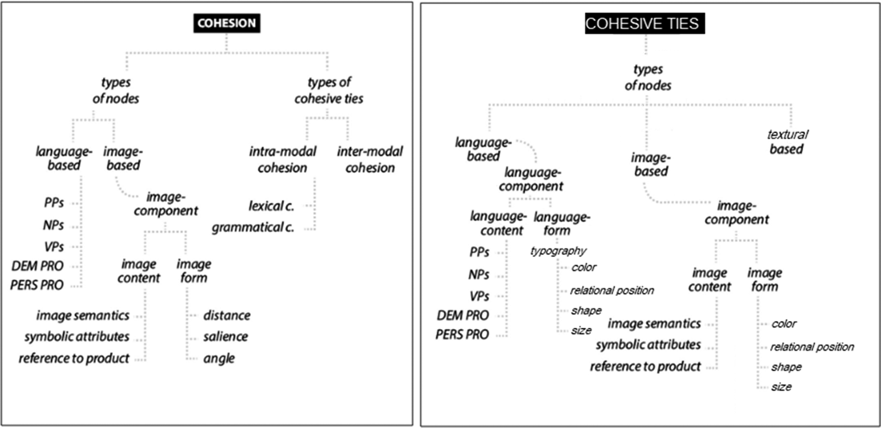

As captured in Figure 1, the model we propose here has been adapted from that developed by Stöckl and Pflaeging (2022) for analysing multimodal cohesion in print advertisements. The adaptation introduces finer distinctions for form of the language-based nodes and the image-component. These are mainly based on Ledin and Machin (2020) and their application by Chen and Eriksson (2019). Using this terminology is common in packaging analysis and has yielded good results. The changed terminology is similar to that of Stöckl and Pflaeging (2022), but more extensive. In their discussion of language-based nodes Stöckl and Pflaeging (2022) do not fully take into account the visual qualities of written language, instead focussing on language content. For this reason a language-form path is added to the language based node, looking at the typography of the language. The image content path is entirely unchanged. The concepts in the image form path are replaced with four other concepts: colour, shape, size, and relational position. These same four concepts are included in the newly added language-form path. For colour, hue, value and chroma are taken into account. Relational position will include a discussion of distance, salience and angle.
Colour, shape and size are all elements that influence the salience but they are far more important than just that. By supplementing these elements the framework becomes more suitable for analysing cohesion of objects within the packing genre. The fully changed model and hence the framework to be used in the following analysis is shown in Figure 1(b). With this framework, we are able to describe the example in Figure 2 in detail and show, for example, the importance of the matching red colour of the border and the title as well as the different fonts that are used. The red colour of the title mixed with the thick smear-like font give the impression of blood, which matches the “Sin” part of text. The font of “The ultimate killer edition” is similar to that used in comic-books, linking the packing of the movies to the comic-books that they are based on.
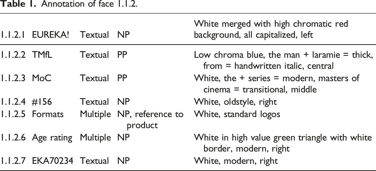
In order to describe all these details, we continue the numbering as introduced for the first two steps in the third step, so that each identified unit will be given a number. The number of the unit is the fourth identifying digit, that is 1.1.2.1 (see Figure 3 for an example). Different elements within images are numbered individually, this is done to allow for a more specific description of cohesive ties, relationships (see step 4) and referencing (see step 5). Additionally, we will provide short descriptions for all units based on the adapted model as well as categorize them in a node type: textual, visual, textural or multiple. The latter category will most often be used when logos are included, as these frequently include both a strong visual and textual element. Annotation of face 1.1.2 of TMfL.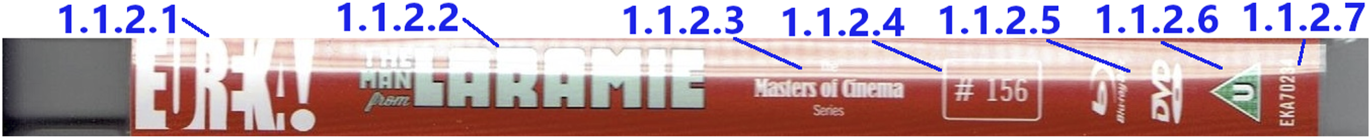
Annotation of face 1.1.2.
Identification of relations between units: Rhetorical structure and cohesive chains
The Types of relation (Stöckl and Pflaeging, 2022: 10).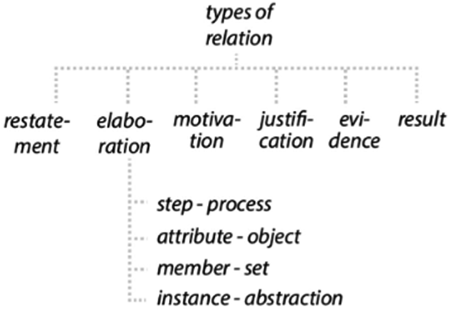
To determine these relations, information from the previous steps is used. These relationships will be tracked within faces, between faces, and between canvases. This will be represented via a relational web-model, with stripes indicating the relation and colour indicating the specific type of relation. For the within face analysis each of the units will be placed within the web. For the visualization of the between faces and between canvases images, the faces/canvases themselves will be used. An example analysis of face 1.1.2 is shown in Figure 5. Cohesive links of face 1.1.2 of TMfL established through either content or content in combination with form.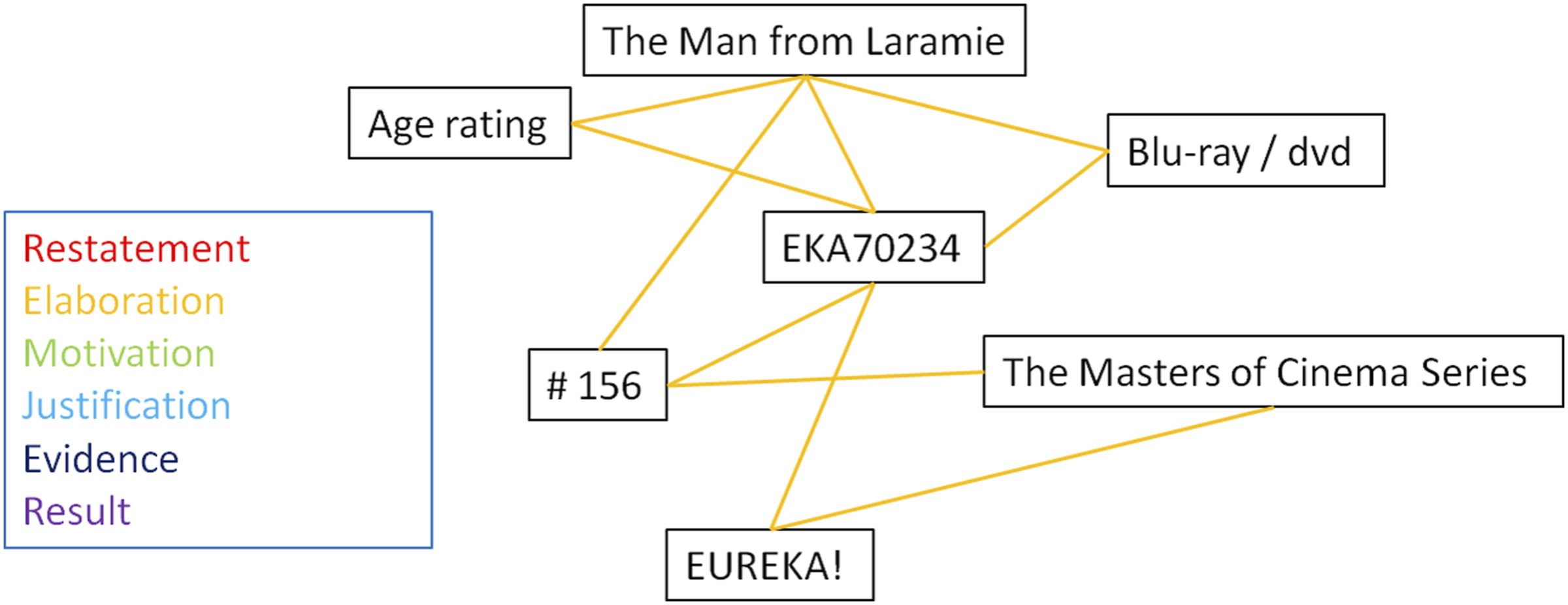
The final and
Since the cohesive ties model in Figure 1(b) already includes salience, this quality will be addressed twice. However, they will serve different purposes. In Figure 1(b) the purpose is merely to analyse the different semiotic modes and describe them in order to establish which elements are tied to each other. With Tseng (2012) the salience will be used to track the referent across faces and canvases. This way cohesion is analysed both with regard to semiotic modes that do not refer to the same thing as well as with regard to the same referent across faces and canvases. The original framework will be followed closely including the transcription style provided by Tseng. The tracking of referents is done in two tables, one with the type of reference and the other with the exact unit. Only those referents that are referenced on more than one face and using more than one reference are included. This distinction has to be made in order to prevent cluttering and keeping the table manageable. More examples of these will be provided in section 5. Cohesive references in filmic narrative according to Tseng (2012: 30) and our adjustment for product packages.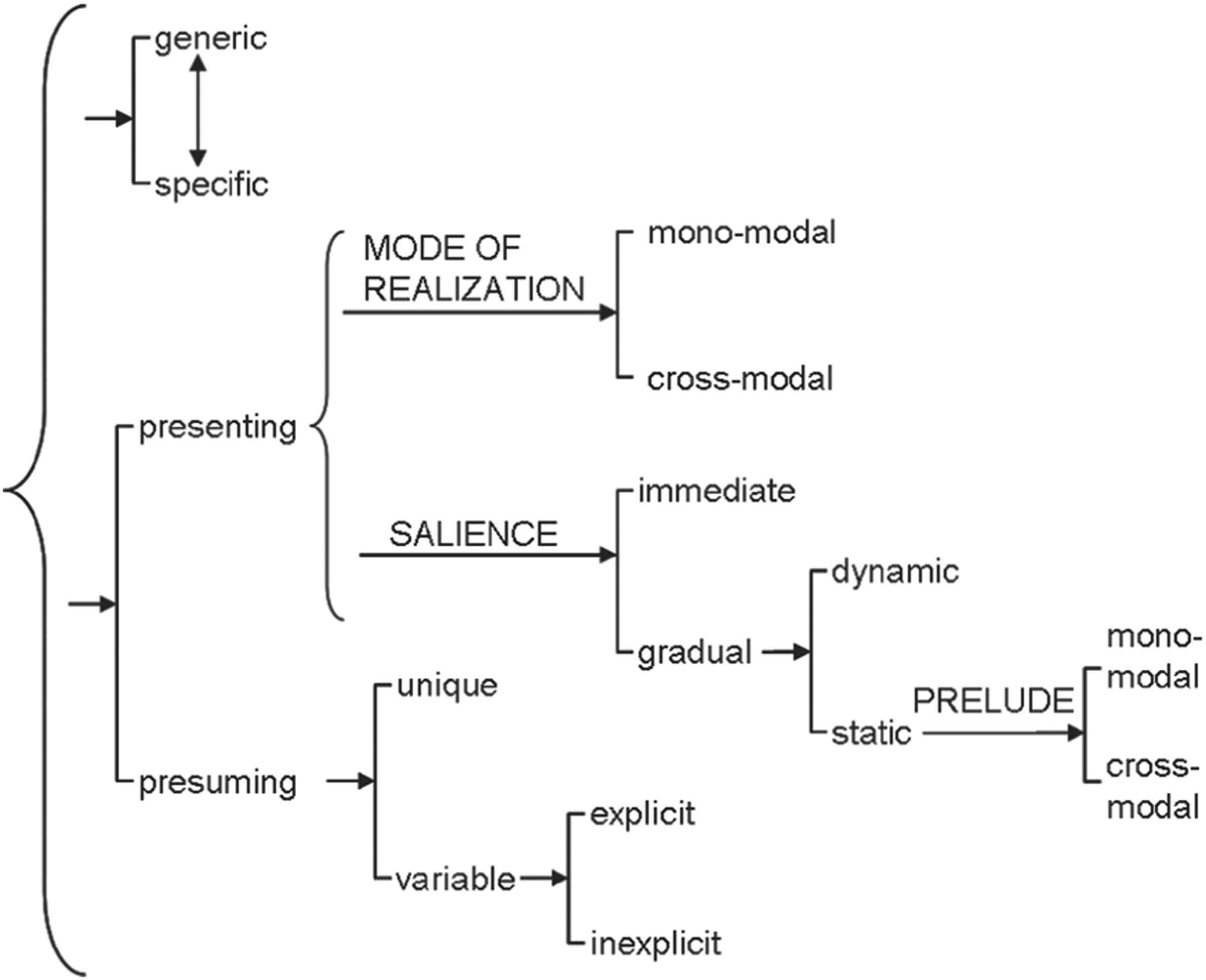
Data & analysis: cohesive ties in Eureka special edition releases
The objects used in this study were selected using several criteria to allow for the optimal application of the framework as well as being most suitable for answering the research question: • The object is a physical three-dimensional object with multiple different types of canvases of which at least one has multiple faces. • The object includes an on-disc copy of a movie. • The object must have been marketed as a film release. • The principal written language of the object should be in English.
Based on these criteria it was decided to select three releases from the British distribution company Eureka Entertainment Ltd (hereafter Eureka), which is considered one of the most prestige physical film distribution companies, both nationally and internationally (cf. Jenkins, 2015). Their films are distributed under different labels, principal amongst these being The Masters of Cinema Series (hereafter MoC). For their MoC releases, Eureka follows a trend: First a limited edition is released, usually consisting of 2000-3000 copies, after this the ‘standard’ edition is released. The difference between the limited and the standard edition is usually a cardboard slipcover. For some releases the company deviates from this. This results in three different types of releases; ‘standard’, ‘limited', and ‘special limited’. One release from each of these groups is selected in order to accommodate for different canvas types: (1) The Man from Laramie, Eureka Entertainment Ltd. Special Dual Format (Blu-ray & DVD). ‘Standard’ edition (2016) (2) Straight Shooting & Hell Bent: Two Films by John Ford, Eureka Entertainment Ltd. ‘Limited' edition (2021, hereafter JF) (3) Johnny Guitar, Eureka Entertainment Ltd. ‘Special limited’ edition (2021, hereafter JG)
We present an analysis of these three releases in the following sections. While the choice of such a selected sample might on the one hand give very detailed results about this particular series and with this also a specific genre of special release editions, the results might not be too generalizable in the first instance. We will discuss this more critically in our conclusion.
Identifying canvases, faces, and units
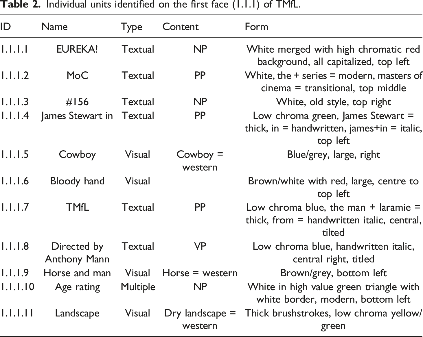
As initial steps of our framework, we identify the different material canvases and faces as well as the individual units on these faces for each artefact. For example, Figure 7 shows the front cover of TMfL, which we identify as one face (1.1.1) that includes several individual units. All these units are listed exemplarily in Table 2 where we identify both the content and form of each unit on the face. Front of TMfL with individual units identified and marked visually. Individual units identified on the first face (1.1.1) of TMfL.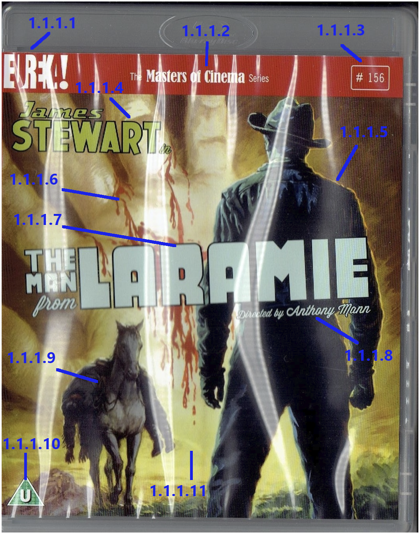
The content of the visual units in this face serves a multipurpose role. They simultaneously reference the movie and the object. This is due to the intertwining of movie itself and the movie release, as discussed in section 2.2. Since the movie is in a sense the product, units 1.1.1.5, 1.1.1.6, 1.1.1.9, 1.1.1.11 show a representation of both the movie and the object. This is further cemented by the use of typical western imagery such as a cowboy hat, horse and dry landscape.
Applying this kind of analysis to all three releases reveals that the more special a MoC release is, the more canvases and faces it has. TMfL has eight information bearing faces spread over four canvases, JF has 11 faces over five canvases, and JG has 12 faces over five canvases. This difference in canvases and faces does not entirely translate over to the amount of individual units. TMfL is the object with the least units (60); however, JG has far less units (72) than JF (100). This difference can largely be explained by looking at specific faces, for example 2.2.4 of JF which serves as a reversible inlay. The inlay can be turned around and still properly function; it largely contains the same information as three other faces, that is 2.2.1, 2.2.2, and 2.2.3, combined. Faces 2.2.1 and 2.2.2 contain specific information related to the movie Straight Shooting while not mentioning Hell Bent. The same is true for their mirrored parts on 2.2.4.
Having identified the units, faces, and canvases, it is possible to describe patterns of cohesion, which we will progressively do in the next sections.
Cohesion within faces, between faces, and between canvases
The next step in our framework is to identify the types of relationships holding between units. According to Stöckl and Pflaeging (2022), cohesion can be established in three ways, through content, through form, or through a combination of both. This can be illustrated by looking at face 1.1.1 of TMfL again (see Figure 7 and Table 2). A majority of the face is taken up by the visual and textual units 1.1.1.4, 1.1.1.7, 1.1.1.8, which are layers on top of the image (1.1.1.5). Together, they form the core of the face; the units are mainly linked through their form, in this case by the same use of colours of low chroma. The textual units are further linked through a restatement of form by using the same fonts. As Figure 8 shows, besides these restatements of form, the majority of cohesive links are elaboration, providing more details of the respective other units. For example, 1.1.1.7 takes up a central position as the title of the movie which holds several Elaboration relations to other visual and verbal units. Cohesive link web of face 1.1.1 of TMfL.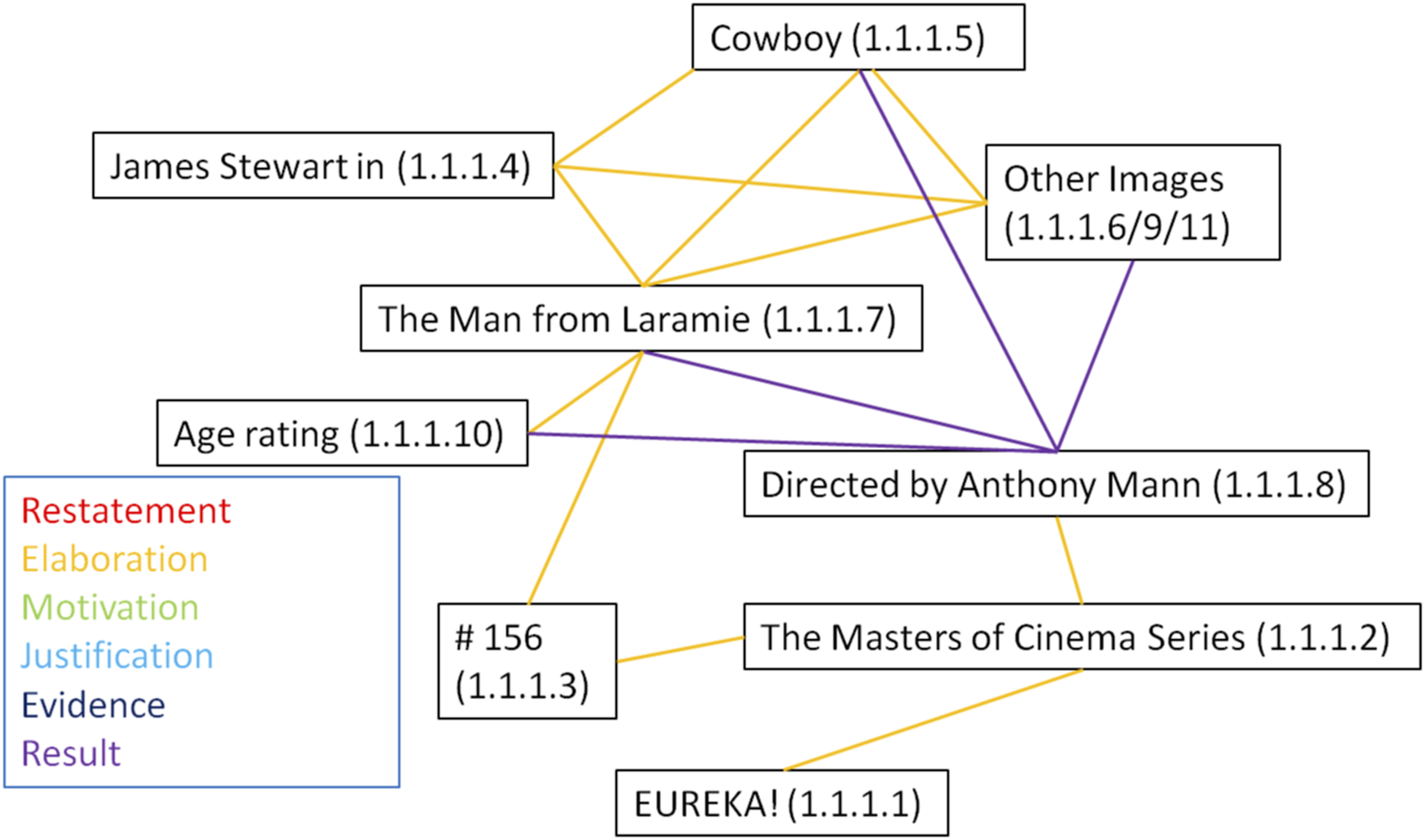
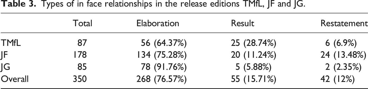
Types of in face relationships in the release editions TMfL, JF and JG.
Similar to within-face cohesion, relationships between faces are also made using form, content, and their combination. The frequency of types of relationships differs. Restatements are far more common between faces than within face. Where restatements within face are only based on formal qualities, all three ways of establishing cohesion are used between faces to restate.
Figure 9 shows the high amount of restatement relationships between faces in TMfL. These relationships are established through an almost exact copying of units in both content and form, only their size and relational positioning change. Another element that Figure 9 highlights is that relationships of units can skip faces. There is no mention of James Stewart or Anthony Mann in 1.1.2, but the names are mentioned textually multiple times, in one way or the other, in 1.1.3. Again, the analysis of TMfL is representative of the other objects. The majority of relationship types between faces are also again restatements. The same pattern of a high amount of Elaboration relations between the title units and textual units on the third face of the first canvas is also present on both other objects. Cohesive links between face 1.1.1, 1.1.2 and 1.1.3 based on either content or content in combination with form.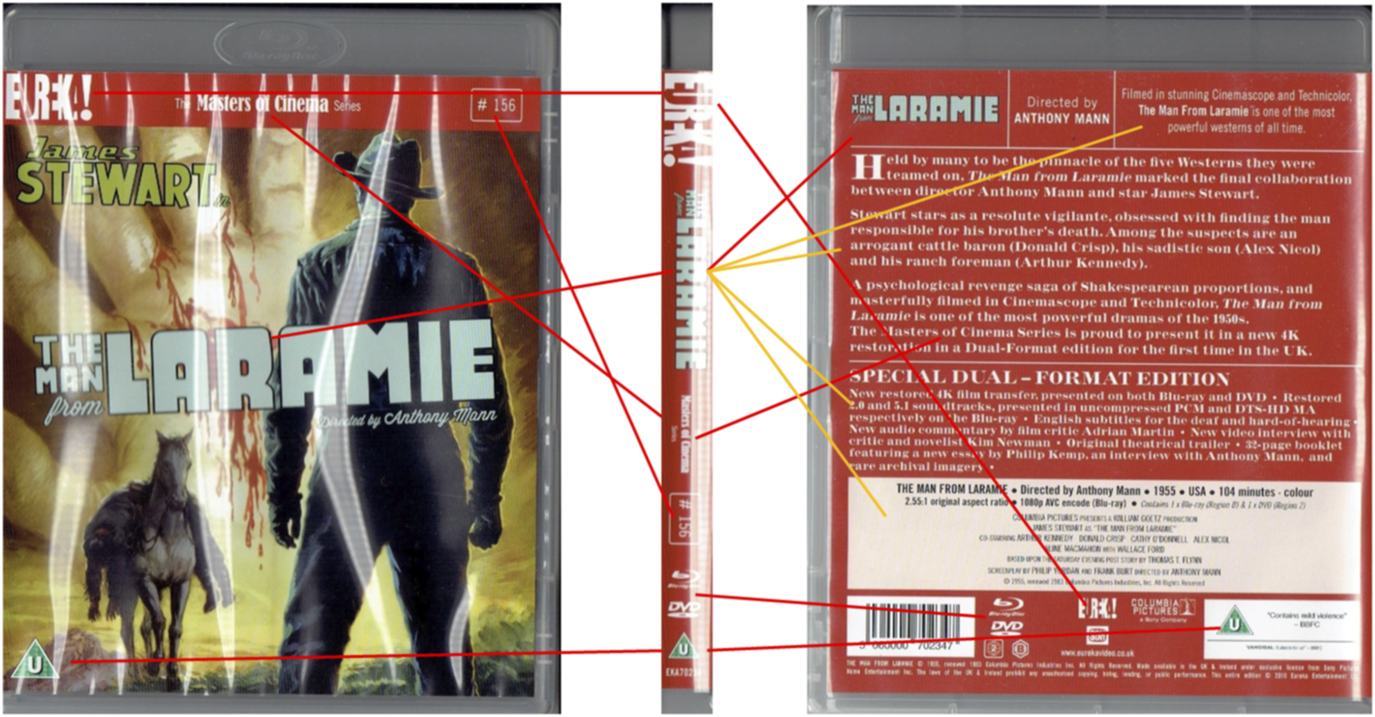
Similar to the between faces analysis, the between canvases analysis shows a high amount of restatement relations. Large amounts of units are reused across canvases, sometimes in such a way that their characteristics are practically identical.
Figure 10 shows parts of the canvases 1.2, 1.3, and 1.4 for TMfL. The only differences between canvas 1.3 and 1.4 are the units that indicate the disc format (Blu-ray or DVD) and the background image. The remaining units are identical. A large amount of units present on these canvases are thus restatements. Most of them are not only restatements of each other but also of units on other canvases, particularly face 1.1.3. Even the units that are not the same still share some qualities. There are three units related to the disc format, units 1, 4, and 6 on both canvases. Unit 4 uses white logos, canvas 3 features a Blu-ray logo and canvas 4 a DVD logo. The other units are textual and the relevant words are simply exchanged. The images share similar content and form. Both depict a shot from the film, featuring a male character with a cowboy hat who is placed in almost the same position. As a result, both characters have roughly the same salience on their respective canvas. The two faces are different in their colour, but they share a low chroma. This low chroma is actually a trend throughout object 1 and links all four canvases together through form restatement. This quality was already discussed in relation to the visuals of face 1.1.1. These visuals are recreated on face 1.2.1, the units are almost identical to the once used in 1.1.1, they are only slightly smaller to accommodate for the size difference of the canvas as a whole. On the other face of canvas 1.2, a similar level of chroma is used, this time in green. A comparison of canvases 1.2, 1.3, and 1.4 is shown in Figure 10 where the chromatic similarity is clearly visible. Faces 1.3.1, 1.4.1, 1.2.2 of TMfL.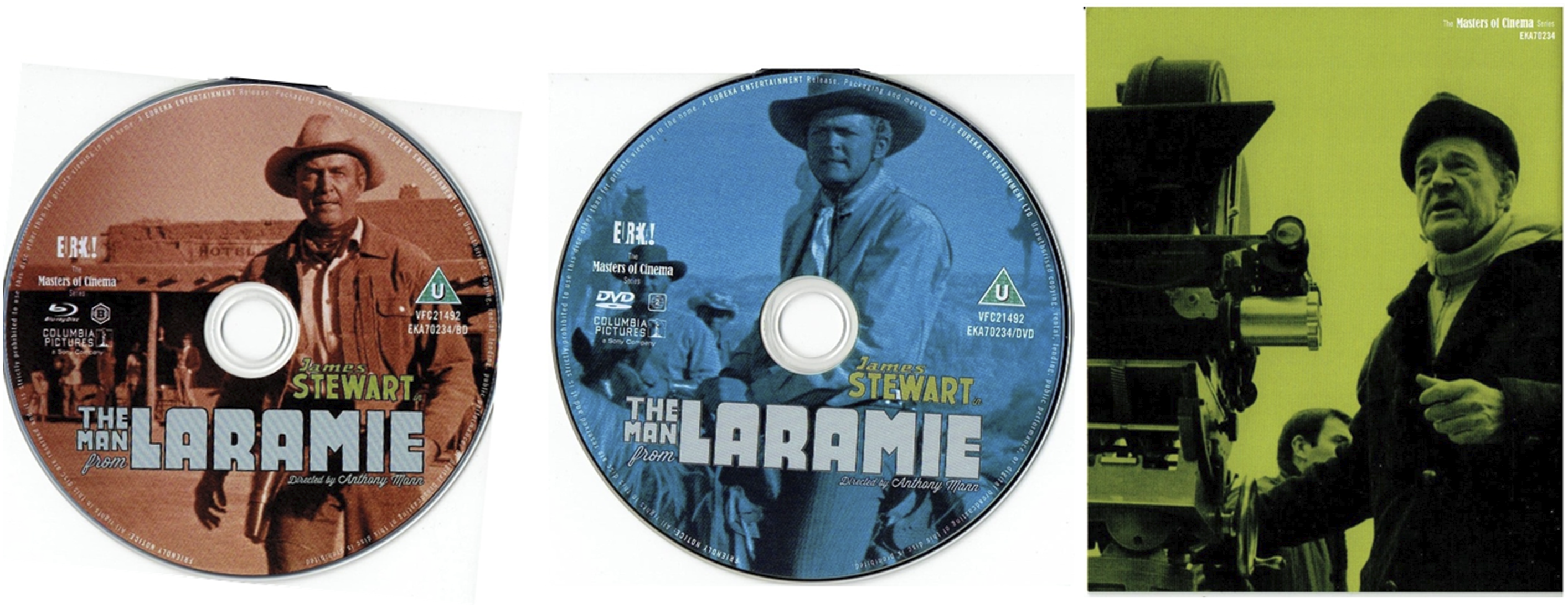
When comparing the cohesive relation ties between the canvases, a small difference can be seen between the objects. While both JF and JG also employ a lot of direct restatements, there appears to be more variation in those objects than for TMfL. Where TMfL uses the same chroma throughout, JF uses grey tones across all canvases. JG also has a dominant colour scheme: yellow with red accents. This yellow is present in all five canvases. However, the way it is used and the colours it is used in combination with differ per canvas. This results in colour use of the canvases of JG being very different, but each with specific schemes Canvas 3.1 and 3.2 use yellow as background colour, with red and black as accents.
All three main colour combinations share a similarity, that is the relation they have with the other part of their duo. In all instances there is a 1/3 distance on the colour circle for the colour combinations. The addition of a piece of paper (canvas 3.1) around canvas 3.2 results in an interesting situation: This J-shaped card covers certain parts: the back, the bottom, and roughly 15% of the bottom of the front of 3.2. The back and the bottom of 3.2 are completely yellow, the front is not. 3.1 covers the boots of the woman and the text “A Film By Nicholas Ray”. These items are exactly the same on 3.1, resulting in a restatement based on all aspects of form and content. Additionally, 3.1 contains the age rating which is not present on 3.2.
Cohesive references in non-narrative media
Step 5 of our framework applies Tseng’s (2012) cohesive reference model. For the analysis of physical movie releases, it becomes clear that references in physical movie releases are different to references in movies or comic books. In a narrative fiction movie, for example, voices usually refer to a certain character and with this to a single and usually uniquely identifiable reference. In movie releases, in contrast, there are often instances of one unit that refer to multiple referents. Some of the most common references for the three objects analysed are the following: • If a character is visually represented, this unit refers both to the actor and the character. • If the format of the movie is mentioned, it can refer to the brand, the type of object, or the specific object included. • The title of the movie can refer both to the movie and the product. In the case of TMfL and JG, additionally, it can also refer to a character. • Visual units taken from or based on the movie refer to things they directly represent (character, landscape, etc.), but also to the movie itself.
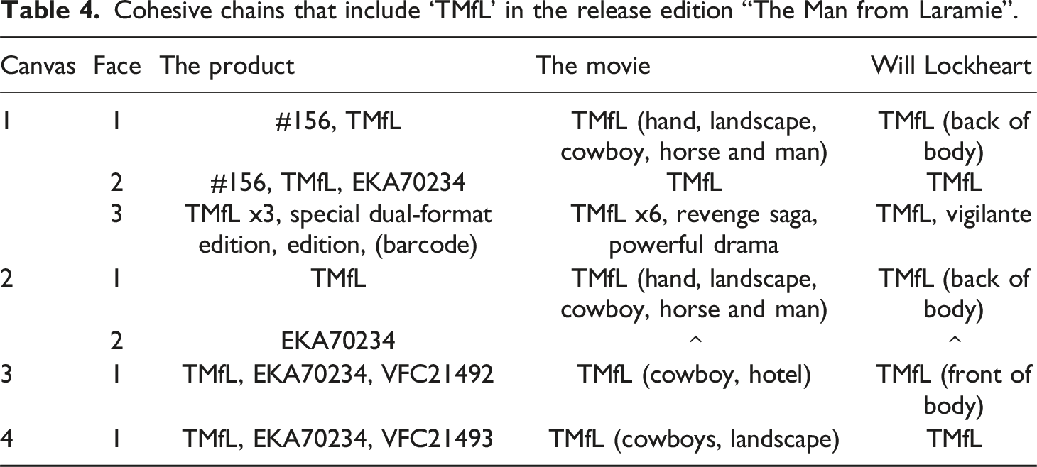
Cohesive chains that include ‘TMfL’ in the release edition “The Man from Laramie”.
As Tseng’s (2012) use of the framework usually always references things within a narrative, things only come into existence when the narrative first introduces them. There are exceptions to this: when real life things are referenced, when the narrative is related to an already existing one, and when viewers/readers are familiar with elements through the viewing of trailers or other material. With physical movie releases, things are again very different. As physical movie releases deal with things that already exist, either because they are actual things or because they are part of actual things (e.g. characters in the movie are part of the movie), references will always refer to something that has existed prior to the reference. Therefore things referred to as part of a physical movie release do not need reference to exist, since the referents are in the real world and not within a narrative.
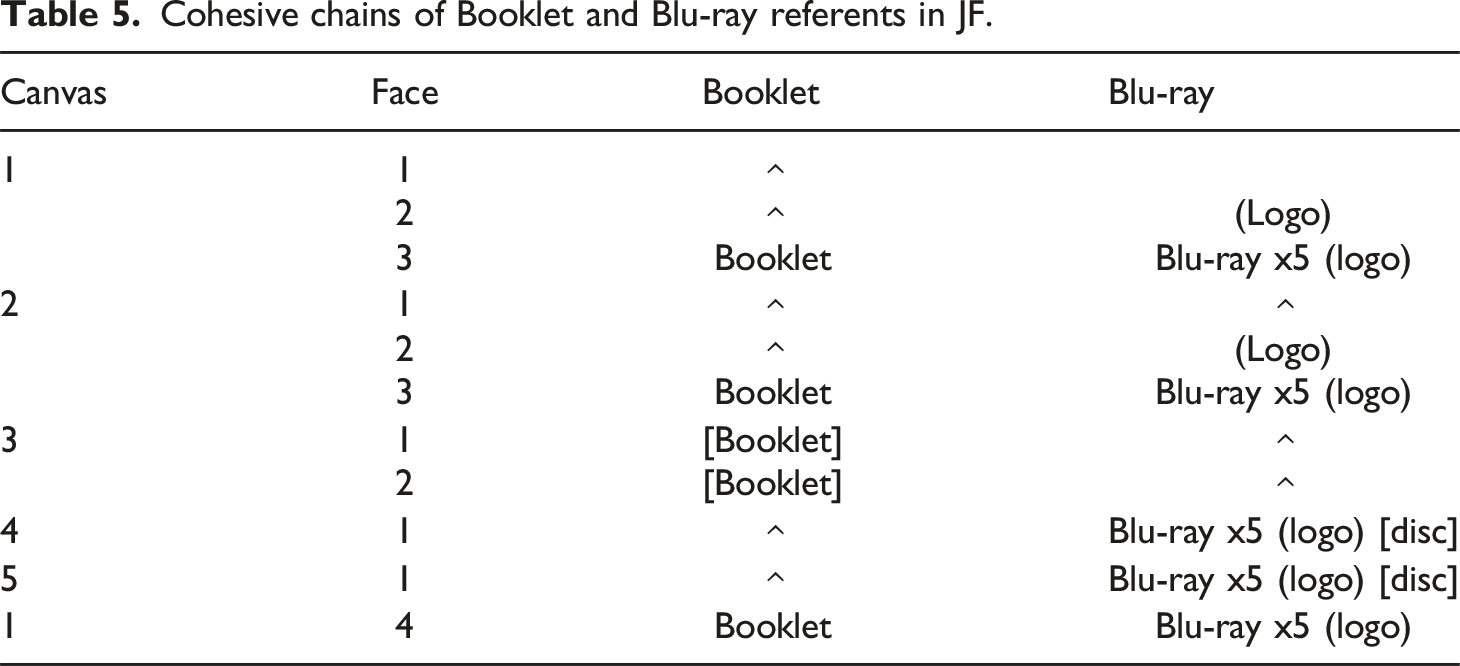
Cohesive chains of Booklet and Blu-ray referents in JF.
Cohesive reference between face
Cohesive chains of EUREKA! in the release editions TMfL, JF and JG.
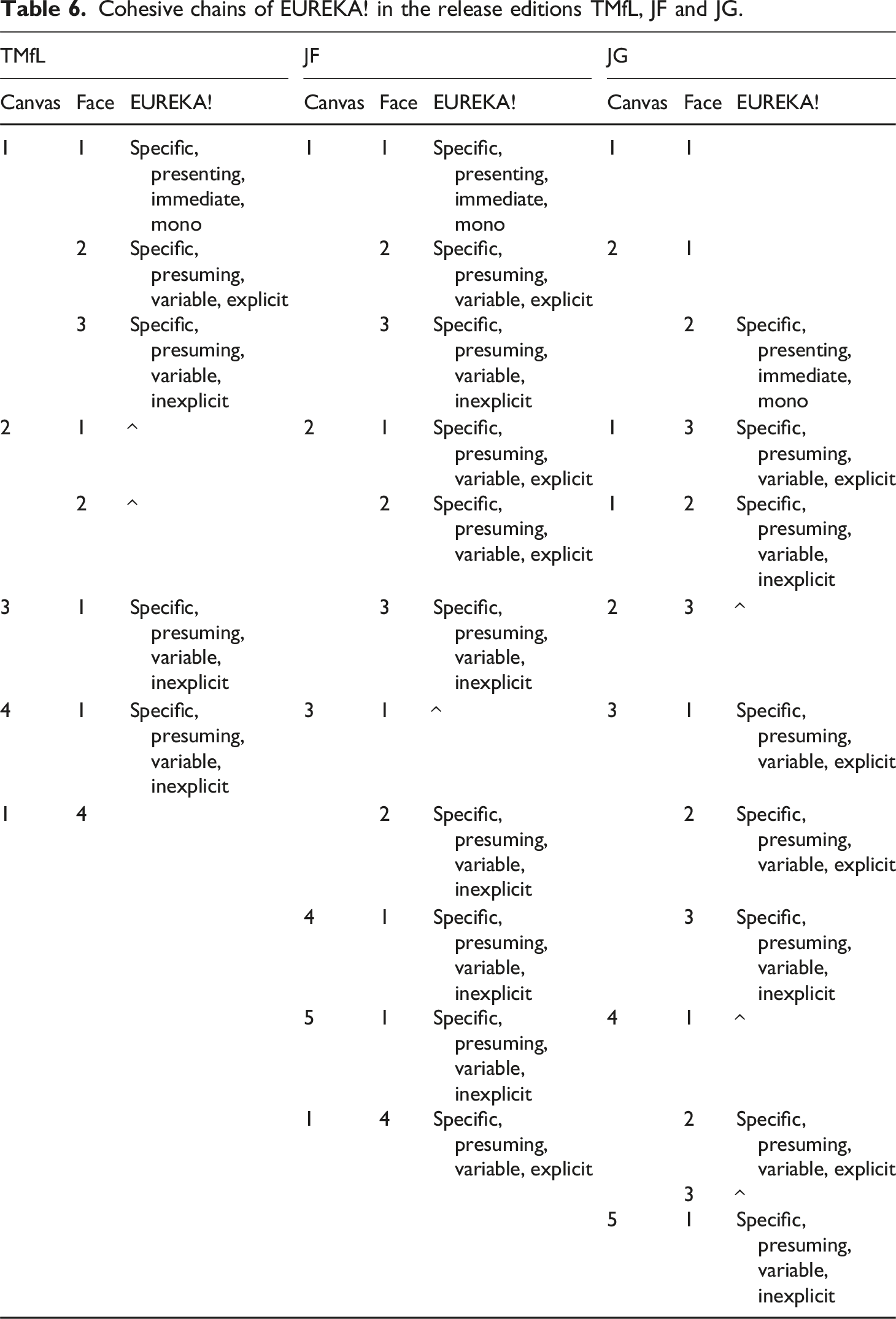
‘MoC’ has comparable cohesive links for the unit ‘EUREKA!’. It often starts out in a highly salient position on the first face it appears on while in later faces the unit has less salience. Figure 3 above illustrates this: ‘EUREKA!’ on face 1.1.1 is positioned in the top left corner, a highly salient position. The unit on face 1.1.2 has a similar salience due to its position at the top of the face. Finally, on face 1.1.3 the reference is placed near the bottom and is smaller. As a consequence, the unit loses some salience with each face. The reference becomes smaller, and even loses its distinctive dual font use in face 1.1.3.
A clear distinction is present between, on the one hand, lead actors and main characters and, on the other hand, supporting actors and characters. In each object, many of the first faces of multiple canvases show the main character and lead actor in high salience. Supporting characters and actors, generally, do not appear on the primary face and if they do, they are shown with low salience and monomodally. This is nicely shown in Figure 7 as well as Figure 11. faces 2.1.3 and 2.2.1 with the unit ‘Molly Mallone’ marked in a red circle.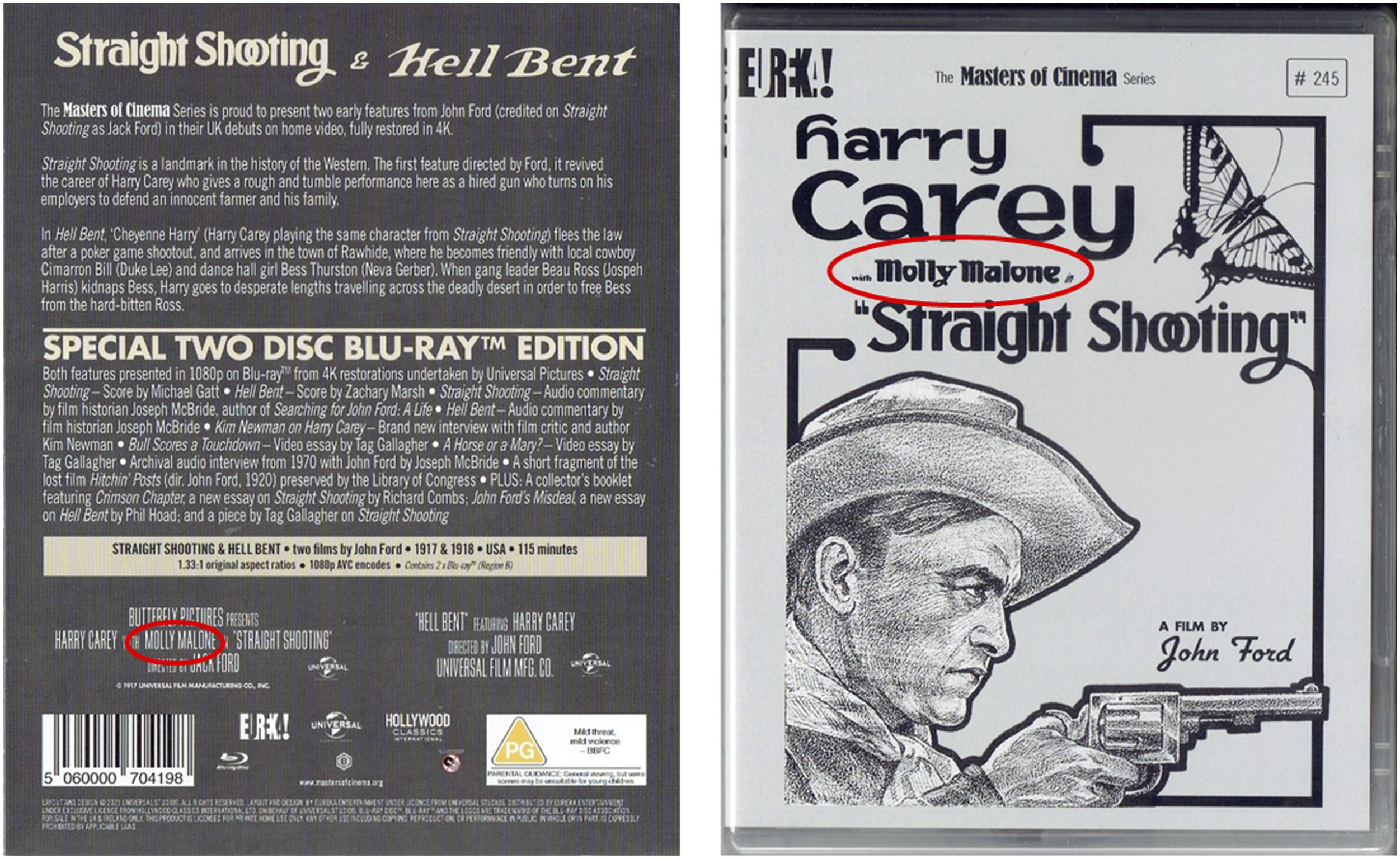
Cohesion between canvases
Similar results are found when analyzing relationships between canvases. TMfL is an interesting example of portraying characters. It largely follows the same trend as the across-face analysis. However, on canvas 1.4 (see Figure 10) one of the side characters (Vic Hansboro) takes up a position of high salience. This is comparable to the comparatively high salience of supporting actress Molly Malone in face 2.2.1 and 3.3.1, where their names are placed near the centre and the top in a decent size, even though they show a rather low salience in other canvases. A comparison can be seen in Figure 11 in which the front cover and the back cover feature the unit ‘Molly Mallone’ in different sizes and with low and high salience.
Cohesive chains for ‘EUREKA!’ and ‘MoC’ in TMfL.
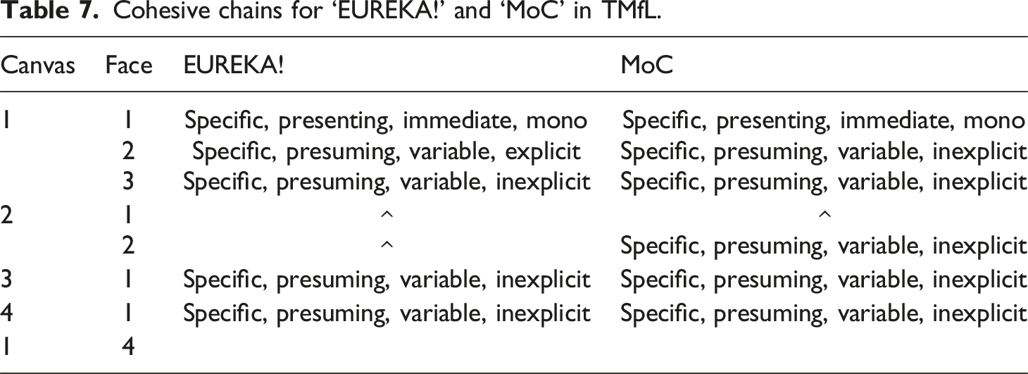
JF and JG, however, have a different cohesive chain with a mix of immediate and gradual salience. Table 7 shows that this is comparable for the cohesive chain ‘EUREKA!’ and ‘MoC’.
Discussion & conclusion: Movie releases and other packaging purposes
As an exploratory study, the purpose of our paper was twofold. On the one hand, we were interested in how SE movie releases build cohesion throughout their usually complexly designed packaging with different material units and expressive forms. On the other hand, we wanted to test the suitability of existing theories and frameworks for the analysis of cohesion in non-narrative artefacts for three-dimensional product packages. Our analysis has shown that a combined application of several approaches is possible and brings about interesting results.
By far the most common cohesive relation of units within a face is elaboration, while cohesion between faces and canvases is dominated by repetition. Faces contain a lot of different units which often expand or elaborate on what is given in other units. These units usually operate in small distance to each other and sometimes even overlapping spatially. Displayed objects have a distinct style, but most units share this style by similar colours and fonts and with this contribute to the overall cohesion. Faces thus present complex documents by themselves with a relatively dense multimodal interplay of units, and this is repeated throughout the package, that is on different faces and canvases. Some individually units such as logos and titles are repeated on different faces almost identically, sometimes only differing in size and location and their salience. There are also some complete repetitions of faces.
As discussed, most of the textual units either represent the title of the film, production details, or basic information about actors and directors, which is mainly metatextual information. The analysed examples rather do not provide a long summary of the film’s content, but give critical voices and persuasive statements about the film and the additional material available. Visual units either show logos or layout units or represent actors as characters of the film and in specific scenes or settings. The latter is more content-related information.
Looking at the high number of elaborations and repetitions holding between these units, we can confirm what we discussed in the introduction to this article: The product packages of these SE releases are not just containers for the actual product, they are extensions of it. The individual elaborations and repetitions identified on the faces can be understood as extensions of what the film itself contains, both on a content level, but also on a more metatextual, referential level. While characters in their typical posture and dress are repeated on the package with similar material (static shots from the film), background information provides the user/reader with more knowledge about the film. It would indeed be an interesting follow-up study here to analyse the exact intra-filmic cohesive references for characters and setting throughout the film and compare them with how they are represented on the product package.
Getting elaborated knowledge about the film is surely a strong motivation to own such a special release edition and we pointed out in the introduction that these movie releases are supposed to last and attract people’s interest again mainly after watching the movie. An interesting observation to be made in this regard is the order in which information can be received from the faces. In contrast to a linear film, product packages as three-dimensional objects allow a more flexible reception of the different faces and canvases without a clearly pre-defined order. For our systematic analysis, we always started with the front page as the first face and then worked through the packages in a somewhat linear way. In this way, the referents on the first face of the first canvas can often be seen as most important, because this first face generally includes reference to the product, the movie itself, and the production of the movie (e.g. actors). The second face mostly focuses on the product, repeating references of the first face and including new product related information such as the product code and format. The third faces are similar to the first when it comes to the things that are referenced; however, they are far more text based with additional information. Booklets are all similar to the first face, but instead with fewer references, and references to the product itself are usually also left out.
The tracking of referents across face and canvas becomes tricky because of the aforementioned non-definitive order of faces and canvases. Ignoring this and following the order used in this study only yielded limited results. Where with the relationship types clear trends across the canvases and objects were present, this is not the case for the cohesive reference analysis. Nevertheless the results do not disprove the applicability of the framework. While the current study did not yield entirely conclusive results, a larger scale study still might.
Thus, the more information is received from the package by working through different faces, the more detailed and less repetitive it gets. This is also interesting with regard to the fact that owning such a special release edition often comes with presenting it in a collection with other editions on a shelf, similar to books, with which these editions also become symbols of cultural value and for which the textual materiality then also comes into play. While there was no additional textural unit besides the package itself in this study, it will be particularly interesting to examine other such release editions with more use of textural units and their specific role in the meaning-making process. Haptic details surely bring with them yet another, very different type of extension of the audio-visual artefact, potentially also contributing to an immersive experience.
This latter point is particularly interesting from a broader perspective on packaging and with regard to its use in persuasive and argumentative contexts such as marketing and sustainability communication. While the movie releases analysed above show one particular pattern of cohesive ties, namely that of extension and repetition, this might be very different for other packaging – and our framework provides the basis for more analyses of this kind and a comparative perspective on the different genres of packaging. It is to be assumed, for instance, that packages with a strong persuasive purpose for the promotion of a specific behaviour or attitude change more heavily built on rhetorical relations such as justification, evidence or result in order to make their point. Such a hypothesis needs to be tested with a detailed and fine-grained analysis of packaging genres with such a purpose, for which our framework now builds a fruitful basis.
With such a basis, we hope to initiate further analyses of multimodal packaging with regard to the functions and roles these objects and their design can take up in broader communication contexts. These are not only media and fandom contexts such as the one of special edition releases, but likewise contexts of healthy eating or consumption behaviour or those of marketing and branding. Similarly, regulatory questions of labelling and providing necessary information for production contexts can be of relevance. Following Ledin and Machin (2020), communication on and with these packages usually follows broader and often global strategies which have not yet been analysed extensively with such a particular focus on their design. Machin and Chen (2023: 99), for example, highlight the particular value of zooming in on the “smaller scale choices in communication carried out by product packaging through which globalized concepts of healthy and ethical food are infused with local accents”. Their study focuses on food packaging from China and global influences on the design of these packages which the authors analyse with a multimodal critical discourse analytical perspective. Our framework can add to this analysis by providing another level of examining the communicative and rhetoric choices made in such packages. Our analytical approach to the meaning-making patterns of cohesion in product packages can be understood as a first step towards a more comprehensive analysis of these strategies in the future.
Furthermore, the identification of the formal units in such a complex artefact can most likely easily be automated and recognized units that are repeated could then be automatically linked, so that the type of relationship between these units can easily be modelled. This is particularly interesting for large-scale studies of such design. Automated image captioning is a fast developing field and image linking has recently gained more traction, but there are still challenges to overcome. Multimodal cohesion analysis on the other hand has proven as a useful addition to the automatic analysis of multimodal artefacts (see, e.g., the use of Tseng’s work in the automatic analysis of news patterns in Cheema et al., 2024) and thus brings with it a huge potential for further triangulation.
Footnotes
Declaration of conflicting interests
The author(s) declared no potential conflicts of interest with respect to the research, authorship, and/or publication of this article.
Funding
The author(s) received no financial support for the research, authorship, and/or publication of this article.