
Abstract
Background
Medical incidents cause harm in both human and veterinary care. Repercussions are similar and reach far beyond the patient, negatively impacting the people close to the patient, healthcare professionals, and the healthcare organization. Whilst good practice is to capture events in incident reporting systems to facilitate learning, critics argue that there is too much focus on this process and too little focus on harnessing the benefits from the data. This exploratory study aimed to investigate how graphic display of data could influence awareness and understanding of patient safety risks.
Methods
A dashboard graphically displaying incident data was created and a mixed methods approach was utilized to investigate how the dashboard influenced participants awareness and understanding of incidents. Quantitative pre-intervention and post-intervention survey data was integrated with semi-structured interview data through a pillar integration process.
Results
The survey response rates were 48% (n = 77) and 46% (n = 74), and 12 interviews were conducted. The four pillars: Emerging enlightenment, tools, behaviours and habits, language and education were identified. There was a difference in understanding of incident data between clinically and non-clinically trained participants.
Conclusion
This novel study suggests that graphic displays of data may bring increased understanding of safety risks, trigger activity, and bridge conversations between clinically and non-clinically trained stakeholders.
Keywords
Introduction
Incident reporting in human healthcare
In human healthcare, it has been a growing trend to capture patient safety incidents in incident reporting systems (IRS) since the landmark report ‘To Err is Human’ was published in 2000. 1 The incident reporting process consists of several steps: recognition that an event has occurred, capturing and analyzing data, addressing underlying issues, and sharing learnings and feedback. A patient safety incident is defined as an event or circumstance that could have resulted, or did result, in unnecessary harm to a patient. 2
What value IRS bring has been debated, with studies presenting both advantages and disadvantages.3,4 Sceptics argue that healthcare has incorrectly focused on capturing data, a dataset that does not provide a trustworthy index,4–8 and missed introducing the necessary systematic investigations needed to see improvements. 9 Advocates, on the other hand, argue that capturing data brings valuable insights into safety hazards10–13 and weaknesses in systems. 14 These insights can facilitate an essential understanding of what causes or contributes to the incidents, allowing for preventative measures and learnings, both within 15 and across individual hospitals. 16
Incident reporting in veterinary care
IRS are a relatively new phenomenon in veterinary care.17,18 Published data suggests that 40% of reported incidents involve harm to patients, medication related-incidents being most common, and anesthesia-related incidents most severe. 19 Feedback, learning opportunities, and a structured reporting system are facilitators to reporting, while fear, lack of time or understanding, and organizational concerns are barriers. 20 Challenges faced in veterinary care, such as communication barriers between teams, 21 limited resources to process and respond to incidents in a timely manner, alongside difficulties in capturing and analyzing incidents accurately and efficiently, are similar to what has been seen in human healthcare. 3
Business intelligence tools
In a data-driven world, effective and timely access to information is essential for successful organizations.22,23 However, deriving proper value from data is often challenging, resulting in difficulties integrating data-driven insights into routine business operation. 24 The public is exposed daily to enormous amounts to comprehend, with one estimate suggesting that the average person is exposed to data equivalent to 147 newspapers every day. 25 Therefore, a shift from capturing data to making sense of data has been seen in the past decade. 26 Easy access to such information is of importance, hence the growing use of business intelligence systems (BIS). BIS are digital tools capable of managing and analyzing large amounts of data in a systematic and precise way. The fundamental principle is to make it easier for leaders to see patterns, trends, and risks, as well as simplify the comparison of groups and quantities, all of which can support well-informed decisions. 27
Using images to convey a message – How it works
The concepts of visual display are influenced by psychology, usability, graphic design and statistics. 28 Nearly half of the cerebral cortex is busy processing visual information 29 and the visual interpretation of data can enhance comprehension by forming mental images to convey information. Done well, visual images help illustrate relationships by highlighting meaning and reducing complexity. Graphical display of large amounts of complex data in ways that require little, or no effort allows intuitive interpretation, which is often easier to digest and remember compared to text. Thereby graphic display could facilitate overcoming barriers such as time and information overload. Infographics are one sort of data visualization among many others. 30 This communication technique is not new; an early example comes from the nineteenth century when Florence Nightingale graphically depicted how death from preventable disease outnumbered other causes of mortality amongst British forces fighting in the Crimean war (Figure 1). 31 ‘When babies are born’ is a more contemporary example illustrating the power of graphic display (Figure 2). 32 In human healthcare, graphic display of patient-reported outcomes show promising results and studies are identifying guidelines for presentation of data to promote clinician and patient understanding. 33
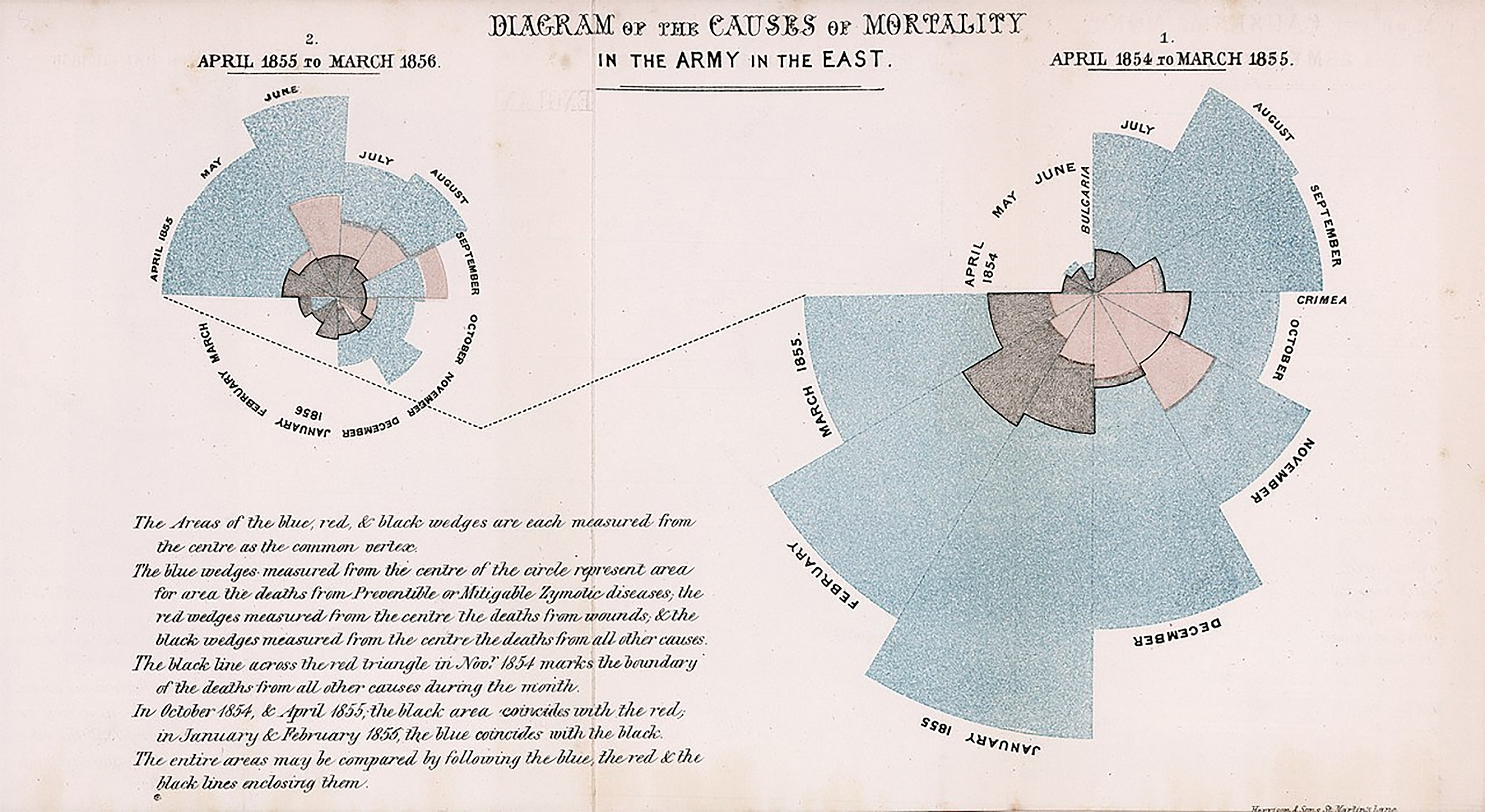
Florence Nightingale's two graphs represent deaths from sickness, wounds and other causes. Each segment, proportional to the number of deaths per 1000 soldiers, represents 1 month.
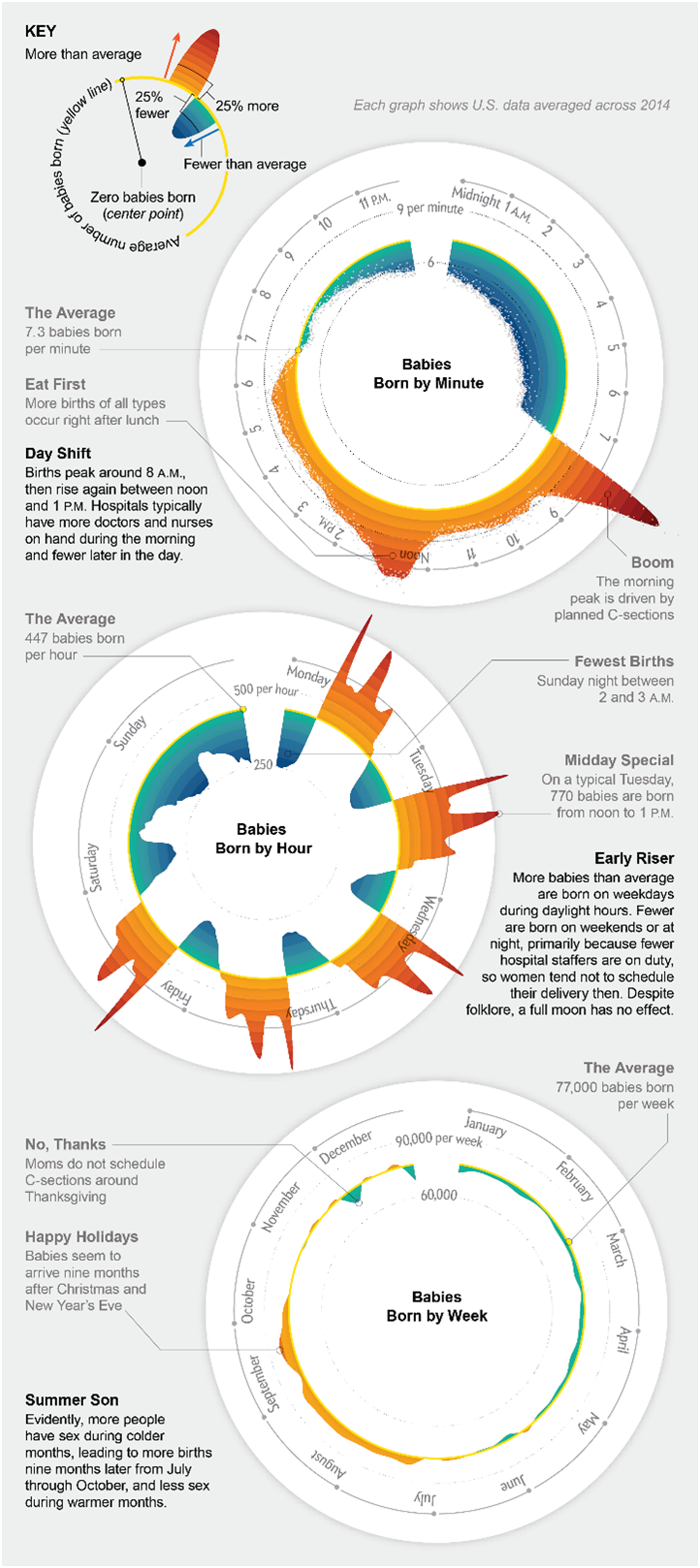
The graphic ‘when babies are born’ designed by Bremer and Armstrong. Reproduced with approval from designer.
Study aim
This study aims to utilize the principles of BIS to explore whether an interactive dashboard can help increase understanding and awareness of patient safety incidents. Furthermore, it examines if there is a difference in understanding between clinically and non-clinically trained participants, between countries, or between different levels in an organization.
Materials and methods
An exploratory mixed-method approach was employed to investigate how different stakeholders perceive their awareness and understanding of incident data. Two surveys were utilized to collect quantitative data, one to capture awareness and understanding before having access to a BIS, and one after. To further explore the views on what the analytical tool could or could not offer, in light of the survey results, semi-structured interviews were performed. Following initial data analysis an integrative interpretation of results utilizing a Pillar Integration Process (PIP) 34 was conducted.
Participants
This study was conducted in a small animal veterinary group in Mainland Europe in May 2022. Purposive sampling was used with participants from 101 clinics, in 8 countries, on 3 levels of the organization (Figure 3), with a mix of clinical and non-clinical backgrounds and responsibilities. The participant information sheet and consent form were distributed to participants together with information about the study. Participation was voluntary and not incentivized. Participants had access to incident data for clinics under their jurisdiction in a tabular format in the IRS prior to commencement of this study. The study only included participants in charge of the 101 clinics who had reported an incident in the company's voluntary IRS within the previous 12 months to ensure relevant data.
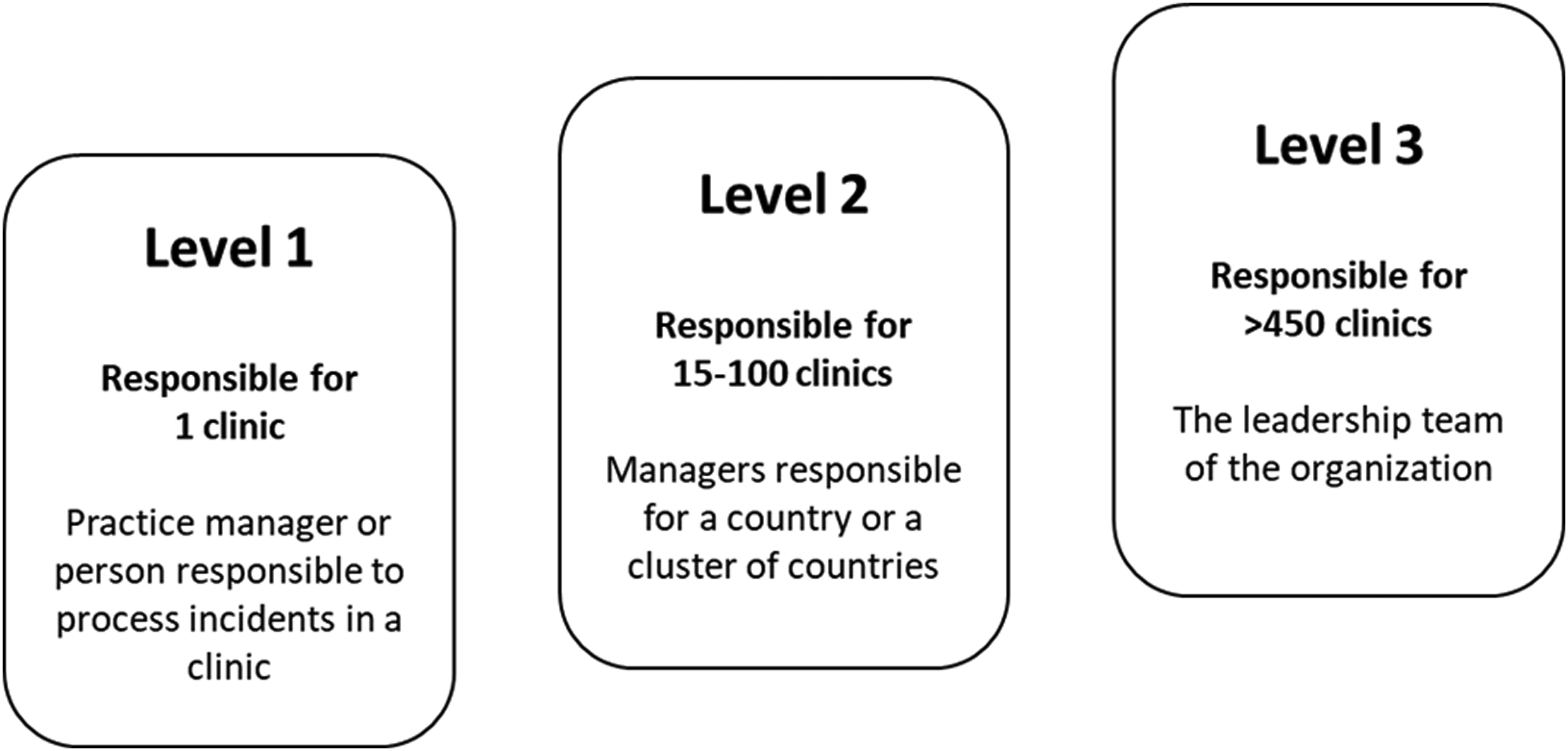
The three different levels of area responsibility in a small animal organization.
Incident reporting system
The IRS is cloud-based, accessible to all associates in the organization, with an incident form built on free-text fields and drop-down menus. The system is described in detail in a previous publication. 19
Dashboard
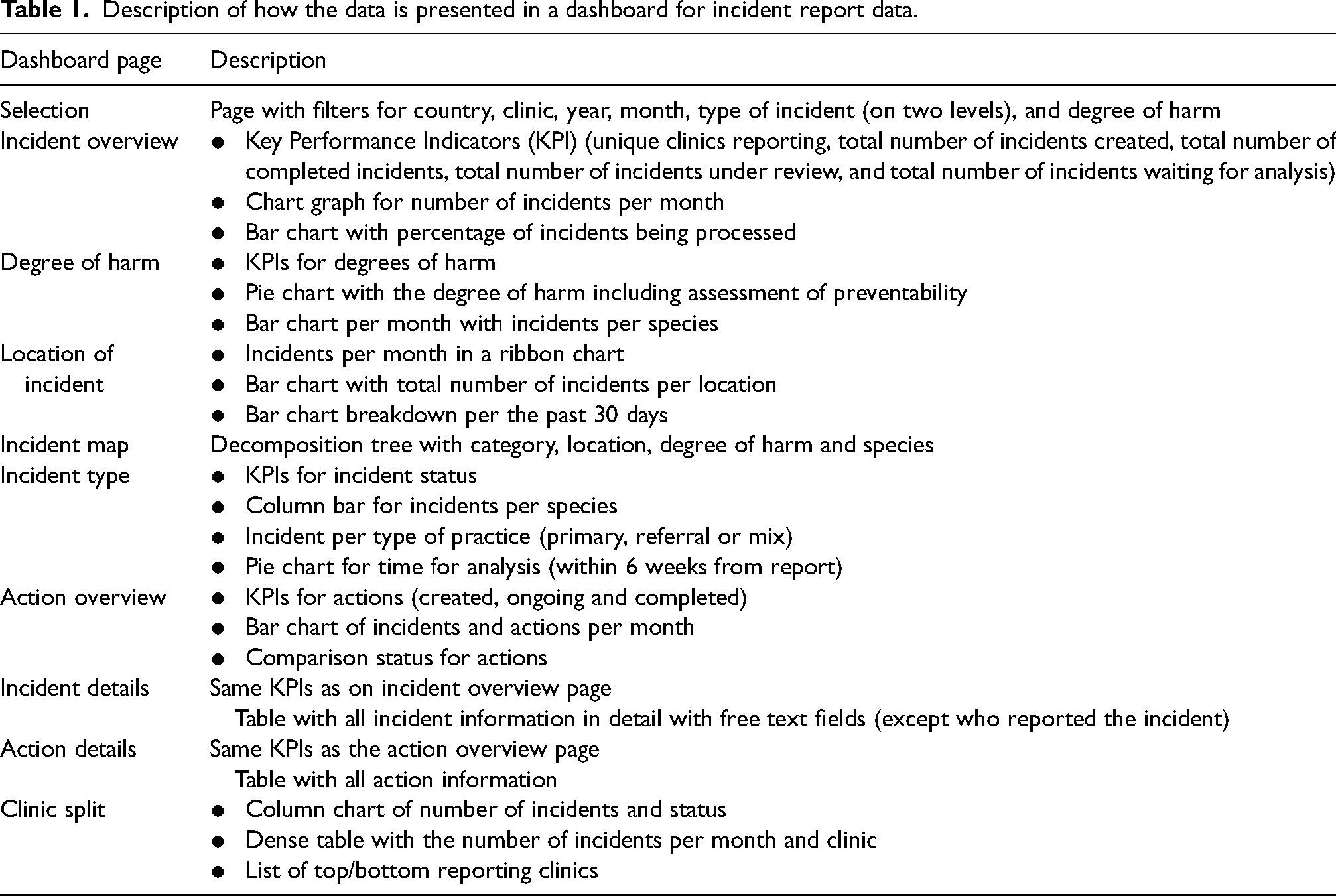
An interactive dashboard was created in the software visualization product Power BI (version 2.105.1143.0), developed by Microsoft. The dashboard aimed to increase and simplify access for managers owning resources contributing to patient safety. The dashboard included eight pages explained in Table 1. The dashboard graphics were a mix of pie charts, bar charts, area charts, decomposition trees, ribbon charts and tables (Figures 4, 5 and 6). The pages include filters and selection fields allowing the user to cut and slice the data. A Microsoft Excel sheet, extracted from the company's voluntary IRS, was used as raw data for the dashboard. All person-identifying data were excluded.
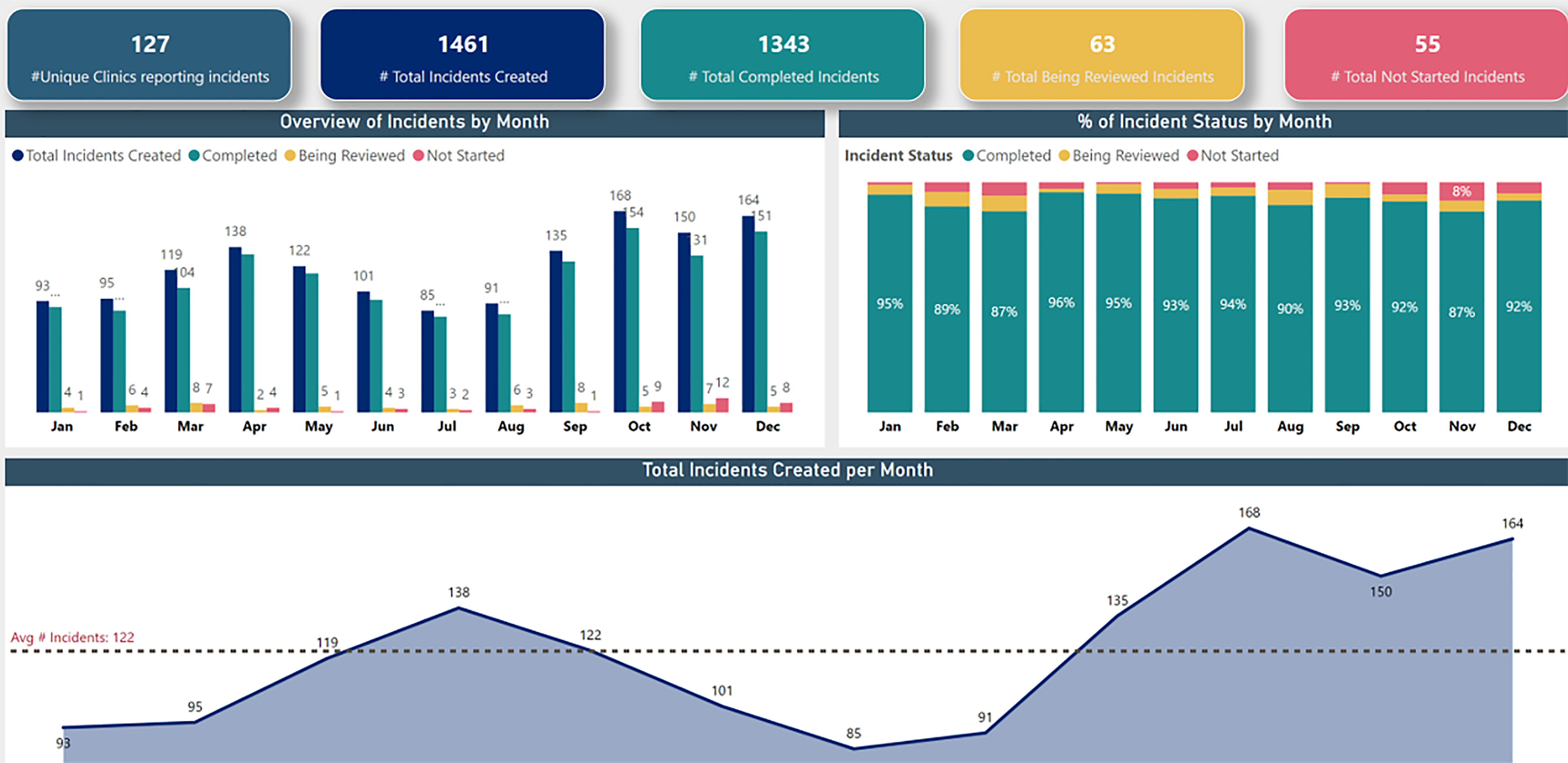
Dashboard displaying the number of incidents reported in a small animal practice incident reporting system.
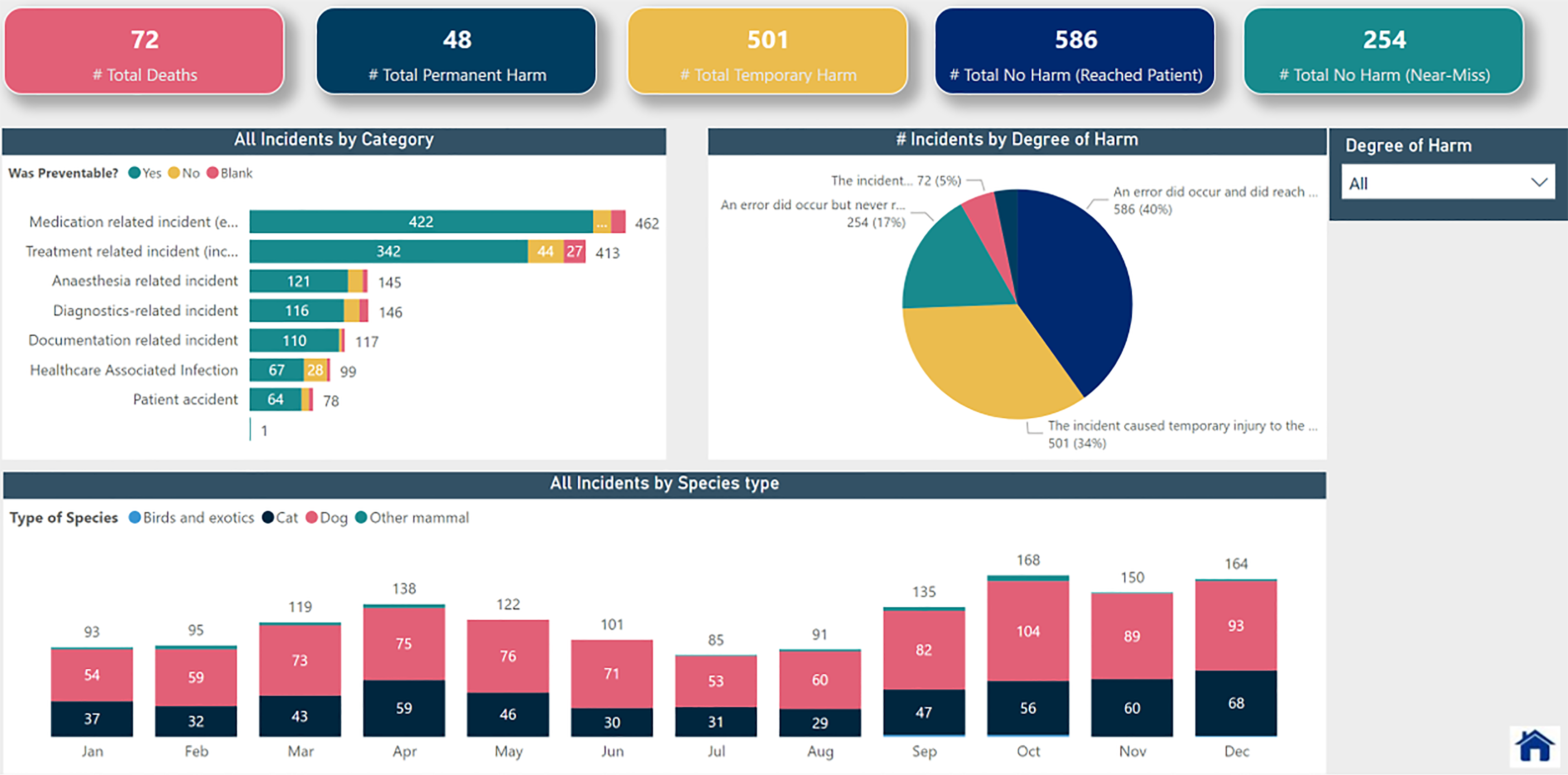
Dashboard displaying the types of incidents reported in a small animal practice incident reporting system.
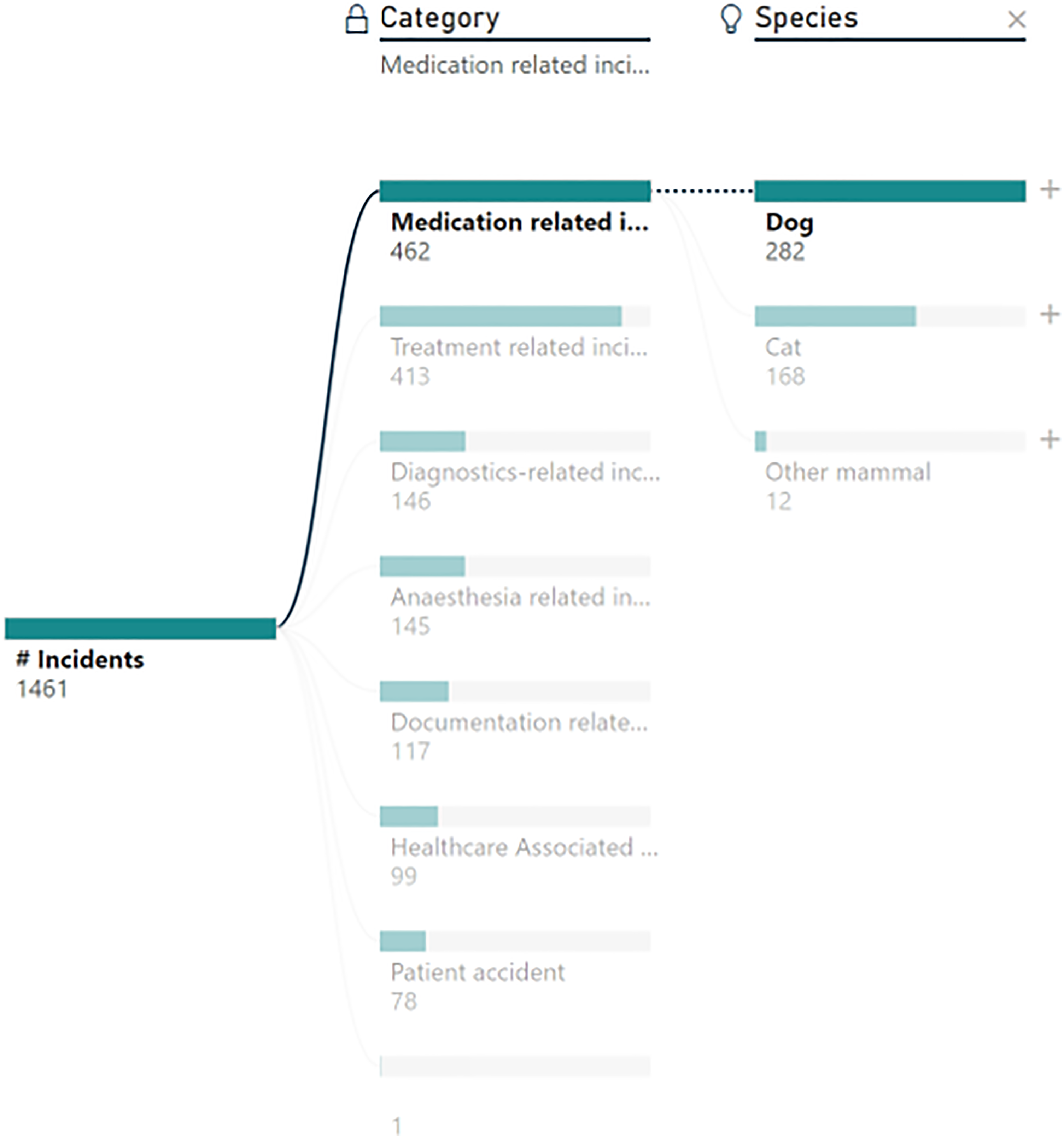
Interactive ribbon page in a dashboard displaying incidents reported from in a small animal practice incident reporting system.
Description of how the data is presented in a dashboard for incident report data.
Questionnaire
The purpose of the questionnaires was to capture awareness and understanding of incident data. The questions were adapted from the Technology Acceptance Model, a validated approach for evaluating perceived usefulness and perceived ease of use of technology.35,36 The questionnaire consisted of two sections: one for demographics and one for awareness and understanding (Table 2). Participants were asked to share additional information about patient safety, incidents, incident data, access to data, their role, and the dashboard (only in the second questionnaire) in free text fields. The second questionnaire had the same questions as the first one, but with an additional section of five questions about the functionality and relevance of the dashboard. The surveys were anonymous in order for participants to provide honest responses and to avoid biases. Pre-access and post-access to the new visualization, participants were invited to respond to both questionnaires. Likert responses were graded using a four-point or five-point ordinal scale (1 = strongly agree, 2 = agree, 3 = disagree, 4 = strongly disagree, 0 = not applicable).
Questionnaire exploring understanding and awareness of incident data in a small animal veterinary group in Mainland Europe.
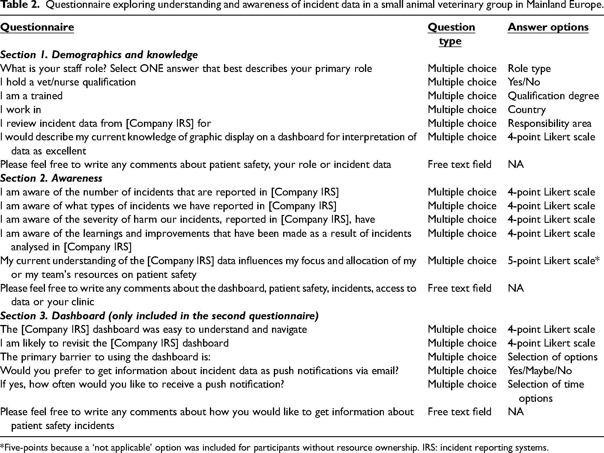
Five-points because a ‘not applicable’ option was included for participants without resource ownership. IRS: incident reporting systems.
Data collection
The questionnaires were sent to participants via personalized email with written consent gathered before participation, with reminders to increase response rates. To gather qualitative information and gain a deeper understanding of the value of the tool, 12 post-survey semi-structured interviews were conducted with participants from each organizational level, with medical and/or operational responsibilities. In the interviews, participants were asked to describe what value it brought having access to the dashboard. Interviews were held digitally using Microsoft Teams, and field notes were taken continuously. Probing questions were asked to obtain further information when needed. The point of theoretical saturation served as a guidance for the number of interviews. By saturation, we mean that there was enough information to provide a logical analysis and theme production, not that more interviews would not produce new ideas. During the analysis process field notes and recorded material were merged. Interviews were held in Swedish or English, depending on the preference of the interviewee.
Quantitative analysis
Descriptive statistics and analysis were employed using Microsoft Excel and IBM SPSS Statistics for Windows, version 28. Questionnaire results were categorized for a group level comparison, generating an independent sample for statistical analysis. Responses regarding staff roles were grouped to levels 1 to 3. Responses were split between questionnaires one (Q1) and two (Q2) to compare the difference of pre-access and post-access to the dashboard. Responses were split between clinical versus non-clinical background to explore if there was a difference between the two groups. Non-parametric data were compared using the Mann-Whitney test or the Kruskal-Wallis test. The null hypothesis was accepted if the p-value was <0.05.
Qualitative analysis
Inductive thematic analysis37–39 was applied to identify themes across the interview dataset. Both analyses were performed using NVivo 12. The process of developing themes was done by first reading the data and highlighting text excerpts relevant to the research questions. The excerpts were reduced by coding, following merging into clusters. The clusters were transformed into higher-level insights as themes. Throughout the process, the researcher went back to the raw data to anchor findings. Identified themes were continuously verified with the wider research team.
Integrative analysis
To improve the synthesis and integration of data PIP was used to combine quantitative and qualitative data. 34 In the listing process quantitative raw data and qualitative themes were presented in different columns, followed by matching and checking of findings. To conceptualize insights, the findings were compared and contrasted in the final pillar building step, formulating the integrated analysis of the different data sources. Since the quantitative data was the first data collection source it was listed in column A. The qualitative finding matching a quantitative finding was listed in column E. This process allowed organization of coherent organization of data and subsequent pattern identification.
Results
Comparing pre-access and post-access to dashboard
Out of 160 persons invited to participate, 77 (48%) participated in Q1 and 74 (46%) in Q2. The distribution of respondents was similar in both questionnaires, with level 2 having most participants, followed by levels 1 and 3 (Table 3).
Distribution of participant from the different levels in the questionnaire pre-access and post-access to dashboard.
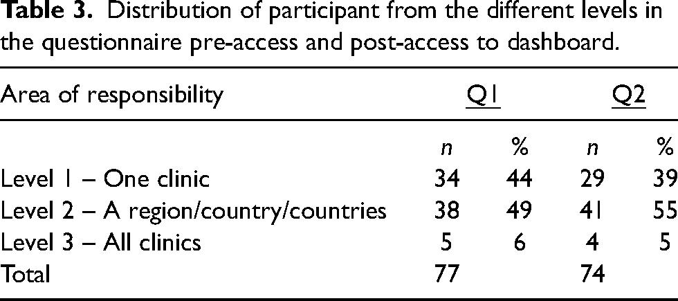
Participants came from Belgium, Denmark, Germany, Italy, Norway, the Netherlands, Spain, and Sweden. In both questionnaires most respondents were Swedish (Q1: 39%, n = 30, Q2: 34%, n = 25), followed by Dutch (Q1: 27%, n = 21, Q2: 28%, n = 21). In both questionnaires, a little more than two-thirds of the participants responded that they had good knowledge of interpreting data in dashboard format (Q1: 68%, n = 49, Q2: 63%, n = 45).
There was no statistical difference before and after access to the dashboard in awareness of numbers of incidents, types of incidents, severity of incidents, or the likeliness of resource allocation for working with incidents (Figure 7). There was no statistical difference in the self-assessed awareness and understanding of the incident data between the different countries or between the different levels of responsibility. Eighty-six percent found the dashboard user-friendly (agreed 64%, n = 47; strongly agreed 22%, n = 16), and 89% reported that they were either likely (54%, n = 40) or highly likely (35%, n = 26) to revisit the dashboard. Time was stated as the primary barrier to revisiting (45%, n = 33), followed by awareness of existence (12%, n = 6), relevance to role (11%, n = 8), or relevance of content (11%, n = 8). Forty-two percent (n = 31) were positive about receiving push notifications about incidents.
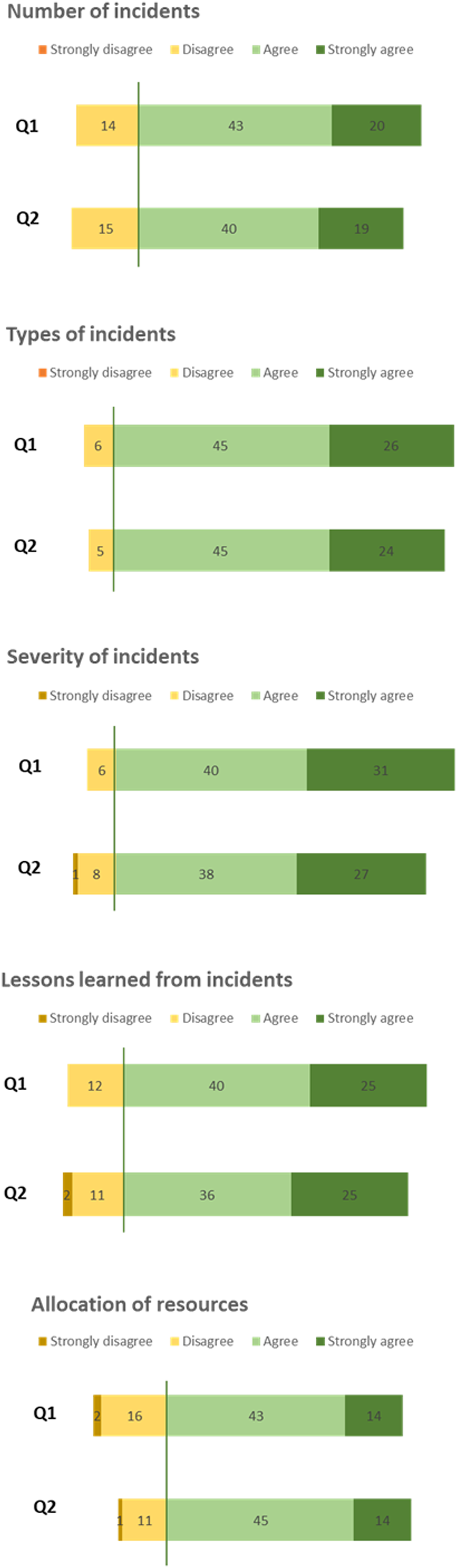
Comparing questionnaire responses between surveys 1 and 2. There were no statistical differences between the two surveys.
Differences between clinical and non-clinically trained individuals
Seventy six percent (n = 25) of non-clinically trained participants self-assessed to have excellent knowledge about working with dashboards, while 58% (n = 69) of the clinically trained participants did. Awareness of the number, types and severity of incidents were comparable between clinically and non-clinically trained participants. More than 90% of the clinically trained participants agreed or strongly agreed lessons could be learned from incidents, whereas only 58% of the non-clinically trained participants did (Figure 8). This finding was statistically significant (U(Nnon-clinically trained = 33, Nclinically trained = 118) = 1207, Z = −3.65, p≤0.05).
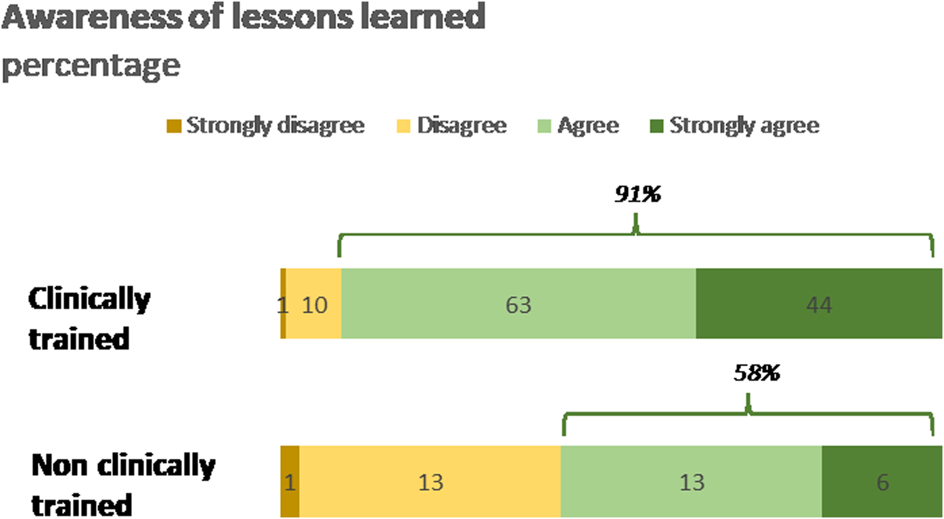
Comparing clinically versus non-clinically trained participants responding to awareness of lessons learned from incidents, with clinically trained participants significantly more aware.
Clinically trained participants, compared to non-clinically trained, were significantly (p≤0.05) more likely to allocate resources – particularly protected time for team members to focus on patient safety (Figure 9).
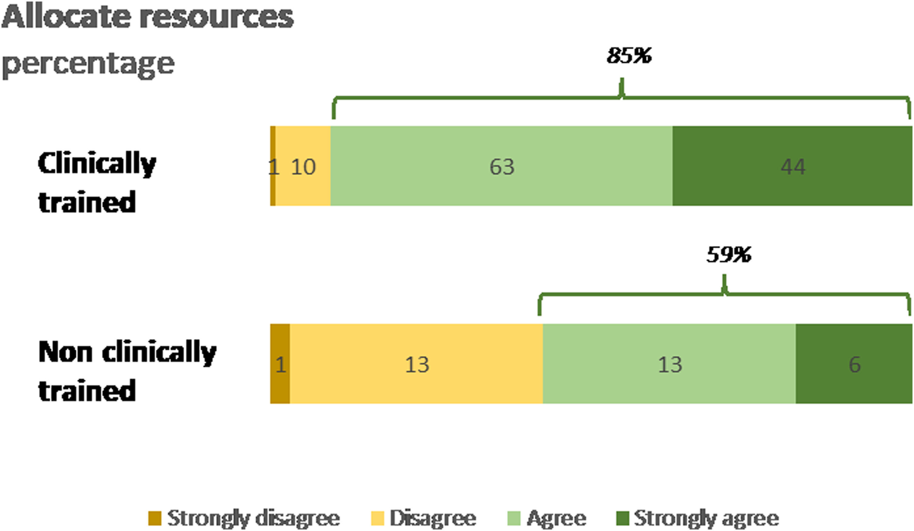
Comparing clinically versus non-clinically trained participants responding to the question ‘My current understanding of the incident data influences my focus and allocation of my or my team's resources on patient safety’. Findings suggest that the increased understanding of the incident data significantly influenced clinically trained participants to allocate resources to patient safety.
Qualitative results
Interviewed participants came from Sweden, France, the Netherlands and Belgium, whereof four were male and eight were female. The interviews varied between 14 and 32 min. Four core themes were found and formulate what a dashboard may provide.
Integration of quantitative and qualitative results
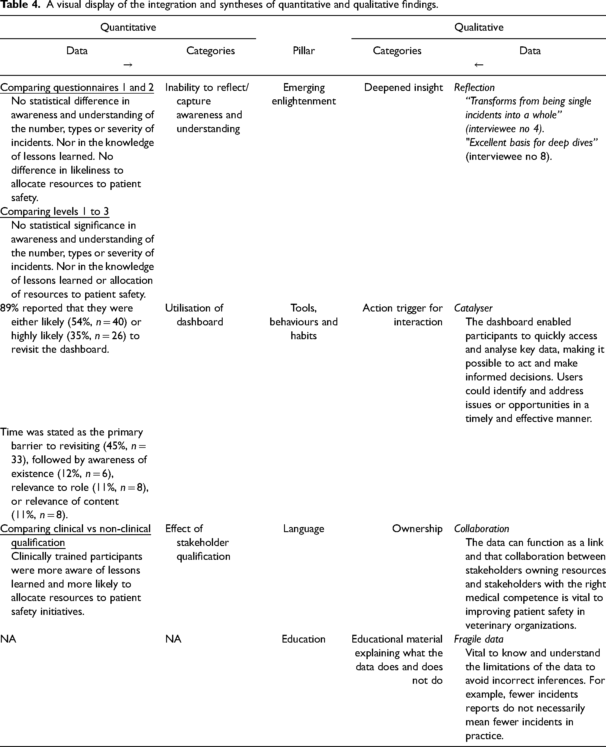
From the PIP process the four pillars emerging enlightenment, tools, behaviours and habits and language were identified (Table 4). Each of the pillars is reported below.
A visual display of the integration and syntheses of quantitative and qualitative findings.
Discussion
Both human healthcare and veterinary care encounter similar challenges with regards to gaining insights from medical incidents and effectively managing data. This exploratory study, the first to explore what value displaying incident data visually brings to stakeholders in organizations, is showing promising findings in how to overcome those challenges. Findings suggest that graphic display, a novel method to display incident data, increased the awareness and understanding of ‘what was going on’ in the clinic and worked as a trigger for interaction and follow up between different levels of stakeholders. Quantitative findings suggest that clinically trained participants, compared to non-clinically trained, had better understanding of implemented learnings and were more likely to allocate resources to patient safety. The majority of participants responded that they were likely to revisit the dashboard; with time identified as the main barrier.
Aiming to increase access and insights of incident data, the dashboard helped visualize which clinics recorded incidents, and which did not. For participants responsible for a region of clinics, a country, or across the group it was now clearly visible, suggesting the tool had deepened their knowledge of the data. If a large size clinic had few reports, that was taken as a ‘call to action’ and put on the agenda, suggesting that viewing facts could trigger attentiveness. This may be explained by the findings from Pandey et al., 40 who discovered that a participant's initial attitude affects how easily they can be persuaded by data. Data presented graphically rather than in a table is more likely to influence participants with little or an initial negative attitude about a subject, whereas participants with initial solid opinions were less likely to be convinced by evidence provided in a table. 40 The dashboard was found by participants to work as a trigger, which is promising, since action is needed to form habits. 41 With the dashboard working as a trigger, it could potentially be used to form habits relating to patient safety. It would be interesting to investigate if the trigger would be strengthened by a preceding event, for example by a notification from the dashboard.
Similarly to human healthcare, the scarcity of resources makes it important to have timely access to data in a smart way. 3 Without a way to view data as a whole, grouped or segmented, there is a risk of not capturing trends indicating safety hazards or outliers that signal for attention. With time the dashboard was found a useful tool for monitoring and analysis.
In human healthcare, Kam et al. 42 used a mixed-method approach to study how IRS could stimulate social and participatory learning. They found that ‘IRS both hits and misses the mark’, 42 suggesting that even though IRS contributes to a range of procedures, reflection and opportunities for aggregated learning do not get as much attention as it should. Initiating conversations about clinical matters such as patient safety can be challenging for non-clinical leaders. 43 Findings in this study suggest that conversations between stakeholders with different areas of responsibility and professional groups were seldomly held but having an analytical tool was found to assist facilitating patient safety-related conversations.
The results suggest that participants with a medical education valued the dashboard more, since it provided them with both high-level and detailed information about reported incidents may not be unexpected. However, it indicates that the tool's usefulness may vary depending on stakeholder and that it could function as a link for collaboration between different stakeholder groups.
While incident data can be used as one piece of the puzzle to identify learnings, trends and areas of risk, findings in this study suggest that it is important to keep the fragility of the data in mind to avoid incorrect inferences. Concluding that there is a decrease in incidents because the number of reports has gone down may be too simplistic if not considering that it could, for example, be due to staff not having time to report incidents, not knowing how to report, or not wanting to because of how a previous colleague was treated when they did report an incident.8,9,44 Reporting maturity, culture, subjectiveness of reporting and technical IRS restrictions are some of the factors contributing to making the data fragile. A complementary method, using an observational session, for example, to confirm or explore findings further, is recommended. In human healthcare, a UK study concluded that medical record restrictions profoundly reduced the capability of research studies, and considering the implications of the restriction is vital since they underpin evidence based-medicine. 45 Creating educational material and conducting regular training to complement the digital tool may help ensure understanding of the data and how it can be acted upon.
Study limitation
The participants in this study were selected based on whether they were responsible for a clinic that reported incidents or not. Thus, these findings only represent the group of stakeholders with reporting clinics, excluding the experience from stakeholders with clinics not reporting incidents. It could be interesting to show non-reporting stakeholders’ data from other clinics to understand if that could stimulate reporting. Whilst the survey questions were adapted from the validated TAM, they were not validated in this context which may have introduced limitations in the dataset. Future research studies could validate the questionnaire. The participant response rate was low in both questionnaires. A low response rate could compromise the reliability of the findings and question the conclusion. The follow-up interviews, however, might have assisted in contextualizing results. Not collecting person identifying responses in the questionnaires made it impossible to pair results pre-dashboard and post-dashboard access. This resulted in comparing the results of population groups, rather than at an individual level, potentially desensitizing the method from detecting difference.
Conclusion
This study is a first step in exploring how patient safety can benefit from the utilization of BIS in healthcare professions. Visual display of incident data indicates promising results which may help overcoming challenges associated with IRS. A dashboard tool might trigger activity, as well as function as a language to bridge conversations between clinically and non-clinically trained stakeholders. Educational material and training for healthcare managers and leaders explaining what the data is, and what it is not, as well as how to interpret and act upon it, is important. Clinically and non-clinically trained participants understood the data differently, highlighting and emphasizing the need of having a diverse range of expertise among leaders in veterinary organizations. Further research, both with data display methods similar and contrasting to the ones used in this study, will strengthen the evidence base and our confidence in these findings.
Footnotes
Acknowledgements
The authors would like to thank AniCura for access to data and to participants who gave up their time to participate.
Author note
Lisen Schortz is currently affiliated with AniCura, Stockholm, Sweden.
Declaration of conflicting interests
The authors declared no potential conflicts of interest with respect to the research, authorship, and/or publication of this article.
Ethical approval
Ethical approval was granted by the University of Lincoln, School of Health and Social Care ethics committee (2022_8861).
Funding
The authors disclosed receipt of the following financial support for the research, authorship, and/or publication of this article: This work was supported by the AniCura Group.