
Abstract
My early years as a statistician were with the Eastern Co-operative Oncology Group and the Radiation Oncology Therapy Group; three of these years were spent at the Sidney Farber Cancer Institute. Later, I collaborated widely with investigators in many clinical research areas. I reflect on the “statistical interrogations of nature” I saw (and helped some of these) investigators plan and carry out. I look back on their (and my own) statistical behaviors when interpreting the information these interrogations produced and—using a few vignettes and some computer-generated observations—draw some lessons from them. These mainly have to do with making too much of one’s data.
Introduction
I began my career as a biostatistician in 1973 “BC” (before computers). The BC is not entirely accurate, since we did have mainframe computers, but they were slow and not user-friendly, and statistical packages were few, specialized, and not very transportable. Data-generating instruments were also crude: there were no ultrasound, CT, or MR images, or genetic or genomic analyses—and only a few tumor markers. Staging, treatment planning (particularly in radiotherapy), and treatment delivery were very crude, and treatments were often of the shotgun variety. And the data concerning the pretreatment profiles and treatment outcomes of patients could only be conveyed by mail via paper and stored on punch cards or tape.
Yet the statisticians in the various cooperative groups and large cancer research centers who joined the “war on cancer” in the 1970s felt like pioneers. We were bringing scientific rigor to oncology investigations by insisting on detailed study protocols for randomized clinical trials, which included criteria for inclusion and exclusion, measurement quality, and assessing response to therapy and grading toxicity. They included prespecified analyses and sample size considerations. Individual data were submitted regularly by designated “data managers” in institutions and carefully checked by statistical office data managers. At each of the twice- or thrice-yearly group meetings, the data generated up until the 2-month cutoff for the meeting were reported on.
By the time I came to McGill in 1980, the SAS software had already reached there, but the walk to the mainframe was longer. PCs came in the early 1980s, followed in the late 1980s and early 1990s by the fax and Internet. I collaborated widely, on topics such as pediatrics, geriatrics, and heart disease prevention. I lost touch with the cancer trials, which were becoming much more sophisticated, and focused more on nonexperimental data, where we had to be more cautious and think more. I came back into the cancer field in 1994, when I was asked to join a team advising the Quebec Health Ministry on whether it should pay for prostate-specific antigen (PSA) tests to screen for prostate cancer. I have spent the last decade on the statistical task of measuring the mortality reductions produced by cancer screening and arguing against unprincipled one-number measures that ignore the way screening achieves its intended goals. 1
In the remainder of this article, I recount some personal experiences. Some are from the Eastern Co-operative Oncology Group (ECOG) and Radiation Oncology Therapy Group (RTOG) trials my fellow biostatisticians and I worked on; one is from a statistical consultation: it came from a neurologist who was involved in a multicenter trial of a possible drug treatment for multiple sclerosis. The last one links back to an issue that we tended to ignore in the early oncology trials but is now much bigger in scope. My hope in recounting these personal experiences and in using modern computing to generate illustrative data is to show that the statistical interrogation of nature is more complicated than we first thought, and that we should not always trust our tools and our intuition. We do not like to admit that we do not know, or that we cannot truly distinguish between two important alternatives, or that we just do not have enough data to be sure. Instead, we tend to focus on the data that support our theories or those of our clients. Fortunately, some statistical errors are self-correcting, even if post hoc; for the remainder, the best we can do is to appreciate how common they will be.
Before I address these personal observations, I begin with two Big Data discoveries from much earlier times. One took 600 years for the explanation to be overturned; the other, although correct, took almost 50 years to be accepted.
Big Data from 14th and 19th Centuries
On the Nature and Mode of Transmission of the Black Death/Plague
In late 1348, in response to a request from the king of France, the college of the Faculty of Medicine at the University of Paris consulted “very many knowledgeable men in modern astrology and medicine concerning the causes of” the epidemic now known as the Black Death, which began to ravage Europe in late 1347. As to the “distant” cause “which is up above and in the heavens,” they ascribed it to a certain configuration in the heavens: “in the year of our Lord 1345, at precisely one hour past noon on the twentieth day of the month of March, there was a major conjunction [lining up] of three higher planets [Saturn, Jupiter, and Mars] in Aquarius.”
They cited a considerable amount of literature and mathematical models, dating back to Aristotle and the ancient philosophers, to back this up.
Mortalities of men and depopulation of kingdoms happen whenever there is a conjunction of Saturn and Jupiter: on account of their interaction disasters are magnified threefold to the third power. Moreover, the conjunction of Mars and Jupiter brings about a great pestilence in the air. So in 1345, Jupiter, being hot and wet, drew up evil vapors from the earth, but Mars, since it is immoderately hot and dry, then ignited the risen vapors, and therefore there were many lightning flashes, sparks, and pestiferous vapors and fires throughout the atmosphere.
I call this an example of Big Data because the investigators had the entire heavens and an unspecified and virtually unlimited time window within which to search for and discover a cause. They were not limited to planets, or to these three planets: any two objects of the same genre would do, and any three would be better, and in any of the 12 signs of the zodiac. Nor were they limited to a specific latency between their alignment and the onset of the epidemic.
Whenever a skeptical colleague of mine is asked after the fact to calculate the p value for a coincidence, he replies that it must be 1. By that he means that if one first gets to pick the extreme data and then asks someone else to calculate a p value, it is not the same as “calling the shot” first, calculating the probabilities of all the possible extreme results, and then seeing if one can make the shot. Imagine all elementary schools in a large country, for simplicity all the same size, with an average 1.5 sets of twins per school. Some school somewhere will, just by chance alone, that is, even in the absence of any real cause, have seven sets. In an attempt to discover/investigate a possible cause, the probability of observing such an extreme school is very high if one first sought out such a school; it is very different if one first targeted one or more schools where the potential causal agent was present and then determined how many sets they had.
This reluctance to carry out after-the-fact probability calculations may be extreme, but it illustrates the difficulty of enumerating all the data possibilities one would have considered had one been asked to do the calculation before the fact (the polymath Sir John Herschel was one of the 19th-century philosophers of science who argued similarly). As I have illustrated using after-the-fact calculations concerning lotteries and birthdays, 2 we tend to overlook the ones that did not happen (but would have also made for a good headline or publication) and focus only on the ones that fit our theory. Those who come upon the results of the “Texas sharpshooter” (who first fires shots randomly at the side of the barn and then draws a bull’s-eye around each of the bullet holes)3,4 do likewise and are then surprised when the results fail to replicate. Big Data tend to be unplanned or collected without a prespecified plan as to their exact purpose; just as with scanning the entire heavens for a cause, they allow us to be more precisely and spectacularly wrong.
The observations from other epidemics in subsequent centuries, such as in London in 1665, did not change the thinking as to the origins of vapor/miasma. It was only in 1894 that Yersin described and cultured the causative bacterium and in 1898 that Simond discovered the transmission of the bacteria from rodents by flea bites.
On the Mode of Transmission of Cholera
John Snow is remembered and revered by epidemiology students and textbooks for the data map showing the spatial distribution of more than 600 cholera deaths in a few weeks in 1854 in a small neighborhood of central London, and their connection with a particular water pump. But these data by themselves did not establish that the cholera was spread by water or by that pump; indeed, as one critic put it, there were so many pumps in the district that the outbreak would have to occur near one of them. It was only after his book was published that a local curate discovered the “smoking gun” and established the index case. However, the book does contain data collected by Snow for the much larger area of South London over several months, where two rival water companies were in competition. Many consider that these (planned) data provide much stronger evidence for the “waterborne” hypothesis. Sadly, Snow died in 1858, having convinced no one. One, William Farr, did convert in 1866 and made a critical intervention that saved many lives in East London. But it was only when Koch (re)discovered the cholera Vibrio bacterium under the microscope in 1884 that the theory began to be accepted, and even in Hamburg in 1892, the opposition to Koch’s theory led to more than 8000 deaths.
By contrast, a much smaller and little-known epidemiologic and laboratory investigation by English physician scientist George Baker, published 250 years ago,5,6 was a “drug discovery” that led to rapid success in eradicating the “Devonshire colic.” Today’s investigators, who wish to contribute to knowledge rather than information, might wonder why Baker’s discovery succeeded and Snow’s failed. To be fair, Baker had an easier task, since there had already been other instances involving, and prohibitions against, adulterating wine, using an agent the consumer could “see.” By contrast, the competing agents for the explanation of the mode of transmission of cholera were both invisible. The “germ” had been visualized 7 the very year that Snow completed his book, but this discovery was overlooked and dismissed until the rediscovery 30 years later by the more authoritative Robert Koch, in an era when it was easier to replace the long-prevailing miasma theory.
Lessons from My Work in Oncology
As part of my doctoral work, I had used a crude breathalyzer to measure carbon monoxide levels in cigarette smokers. But I did not appreciate the important role of measurement error in statistical work until, in ECOG, I worked with Mayo Clinic oncologist Charles Moertel. His demonstration 8 of the large measurement errors in measuring the sizes of tumors—even in ideal simulated conditions—was directly responsible for ECOG adopting a much more stringent criterion for a “partial response” to therapy. Until then, the cutoff had been a 25% reduction from baseline; as a result of his study, it was changed to 50%.
Another statistical practice of the ECOG investigators took longer to change, and it was only years later that I became sensitized to the issue. Many of the ECOG trials addressed new agents as last-resort treatment for advanced cancer (where survival was maybe 2–4 months). At that time, it was common to assess the validity and genuineness of the tumor responses by comparing the survival (since randomization) of the responders and nonresponders. Invariably, the responders lived longer. Our boss, Marvin Zelen, kept preaching that this was an unfair comparison, as one had to live 3 or 6 weeks (one or two cycles) just to show a response, whereas nonresponders might die at any time before or after that. A similar selection force was operating in the comparisons of the first heart transplant recipients, where time was measured from the day one was placed on the waiting list. Those who received a transplant had to wait (i.e., still be alive) for a donor to become available, but those who did not had no such constraint. This meant that any intervention that required a wait (even if it were completely ineffectual) had an inbuilt survival advantage. In an oncology journal in 1983, three statisticians from Zelen’s group 9 described this error and called for the practice of comparing the survival of responders and nonresponders to stop.
For many years, this bias went by a number of names, including survivor bias, but it did not get much attention. Once the term immortal time (a term that I have since traced back to the 1970s) was used as the title of a 2003 article; the bias is now widely referred to as immortal time bias. We review its long history—going back to the mid-1800s—and its still-increasing and disturbing prevalence in a 2014 article. 10 One of the drug classes whose reputation has benefitted considerably from several Big Data “discoveries” is the statin medications. 11 Sadly, these benefit discoveries are mostly false. This is not just because the (nonexperimental) data in the large administrative and clinical databases are imperfect, but also because the investigators used flawed comparisons and were then reluctant to relinquish the recognition their findings had brought them and their institutions. Not all discoveries are for the good of patients: some are merely for the good of academics, and even when these are refuted, the original publications continue to be cited.
During my 7 years in oncology, I was associated with maybe a dozen trials (when I moved to McGill, other statisticians took over the ones still ongoing). Most of them were eventually published, but I suspect a few (the negative ones) were not. At the time, advances in cancer therapy were few, and so I was happy to have been involved in one ECOG study that reported a statistically significant difference (“The response rate to 5-FU + methyl CCNU without cyclophosphamide induction was 40% and this was significantly superior to all other regimens”). The article made it into the journal Cancer. 12 Two years later, a larger study conducted by another cooperative group 13 was unable to demonstrate any superiority. Thus, I now suspect that our “positive” study was in fact a false positive.
All along, Zelen had reminded us that this can happen, especially as many of the agents tested against advanced cancer are ineffectual. But he did not publicize his reasoning widely. During the 1980s and 1990s, in the course notes I gave to our McGill graduate students in epidemiology, I included this paragraph:
The influence of “background” is easily understood if one considers an example such as a testing program for potential chemotherapeutic agents. Assume a certain proportion P are truly active and that statistical testing of them uses type I and type II error rates of α and β respectively. A certain proportion of all the agents will test positive, but what fraction of these “positives” are truly positive? It obviously depends on α and β, but it also depends in a big way on P, as is shown below for the case of α = 0.05, β = 0.2.
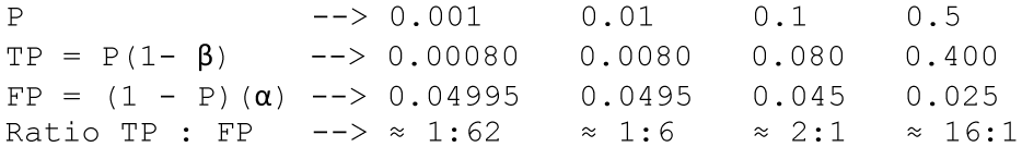
Zelen was well ahead of his time. These are the same calculations that form the basis for the 2005 article “Why Most Published Research Findings Are False” 14 ; see also the Economist 15 for a very effective figure that simplifies the mathematics. The main difference is that Zelen (and clinicians who refer to the positive predictive value of a medical test) emphasized the true ones, whereas the tendency nowadays is to highlight how common are the false ones and to use the term false discovery rate, introduced in 1995 by Benjamini and Hochberg. 16
But Zelen could not have anticipated just how many compounds get screened today, and so we should focus on the proportions closer to the left-hand side (0.0001) of the above table—the Economist used the 0.1 in the column second from the right.
Neurology
In the 1990s, a neurologist who had taken my statistics class later consulted me on a clinical trial of an agent to slow the progression of multiple sclerosis. At the time, there were no effective treatments for this condition, so everyone was hoping for a breakthrough. The just-concluded trial had enrolled and followed for 2 years a large number of patients at several North American sites. But again, the results based on the primary endpoint (clinical exacerbations) were negative: the curves for the experimental and placebo arms were “virtually twins of each other.” The company had already informed the Securities and Exchange Commission that the study had been negative.
However, there was a glimmer of hope: the study included, as a secondary endpoint, the changes in lesion volumes, as measured by MRI scans at baseline and at 2 years. In one disease subgroup, there was one patient in the experimental arm whose lesion volume had dramatically regressed—something seldom seen. I was skeptical and wondered if it might be a data error, but the investigator insisted that could not be, telling me that “everything is done by computer.” The Montreal Neurological Institute and Hospital acted as the reference center and repository for all of the images and used a computer algorithm to automatically compute the lesion volumes. I also wondered if the pre- and postimages were of the same brain.
That evening, the neurologist called me to say that he had gone back to the hospital and checked the images. Even though there can be small discrepancies in aligning two images from the same patient, it was immediately obvious that the problem was much bigger: the pre- and postimages were indeed from two different patients! But in the meantime, on the basis of this miracle regression, the executive of the small (one-product) drug company was in Europe trying to sell the company to a larger one.
Errors of this type are still easily made and can be large consequences, but nowadays the data that contain them are also more easily disseminated online, and it can take considerable time to undo them. 17
Even sadder was the longer time the trial had taken. Typically, all eligible multiple sclerosis patients at the trial centers were enrolled in a single trial, and when it ended without any evidence of benefit, they were all enrolled in a trial of the next promising agent. But in this particular trial, the accrual had taken considerably longer. Before mounting it, the company had carried out a pilot study and found especially promising preliminary results in one (relatively infrequent) disease subtype. Based on this, it insisted that the trial should accrue a sufficient number of patients into this particular stratum. Because of this desire to replicate the preliminary findings and gather convincing evidence for the drug approval process, the accrual to the trial enrolled a very large number of patients in the other more common subtypes while waiting to fill the quota for the one with promise.
The statistical lesson I took from this is that one should not bet the bank on an extreme result in a small subgroup. By definition, results in smaller samples are more volatile, and thus the most likely to be the most extreme. Regression to the mean is not just a theoretical concept. It happens to real investigators.
Evidence That Accrues in Time
In our oncology trials in the early 1970s, evidence was accrued over time but traveled from individual university medical centers to our statistical office in small paper packets at the speed of the U.S. Postal Service. Since the motto of the cooperative oncology groups was to speed up time, we statisticians introduced interim analyses with blinded reporting of treatment arm comparisons. But we did not allow for the statistical side effects of these multiple looks at the accumulating data.
In keeping with today’s faster timescales and ease of computing, I end this piece with a computer simulation of the accruing evidence from investigations of compounds: in this simulation, most of these are inert; a small percentage have (different levels of) activity. A sample size of n = 155 in each panel would have been sufficient to be 80% sure, if using a one-sided test with an alpha level of 0.05, of obtaining a statistically significant departure from the null if in fact the true signal-to-noise ratio was 0.2 (considered a small effect size). 18 However, I have simulated the more common situation where the investigators run out of resources, patience, or time at n = 50 (an actual sample size that provides 80% power against an effect size of 0.35).
Analyze Once
What happens when the traditional “analyze once” plan is actually followed? The results at the end of 96 of these studies (i.e., when n = 50) are shown as diamonds/circles at the right-hand side of each of the 96 panels in Figure 1 . The reader can count how many of them showed a statistically significant effect and wonder how many of these positive results are genuine and how many are false leads. One cannot get a reliable estimate from a mere 96, but one can from the table in the bottom right corner, which is based on a much larger number. Of any 100 compounds tested, on average 11 would show a statistically significant result at the end of n = 50. If a slight majority (say 60%) of all compounds are inert, then this majority will still generate an expected 60% × 5% = 3 false positives per 100 compounds tested, so (again on average) 8 of the 11 may be genuine.
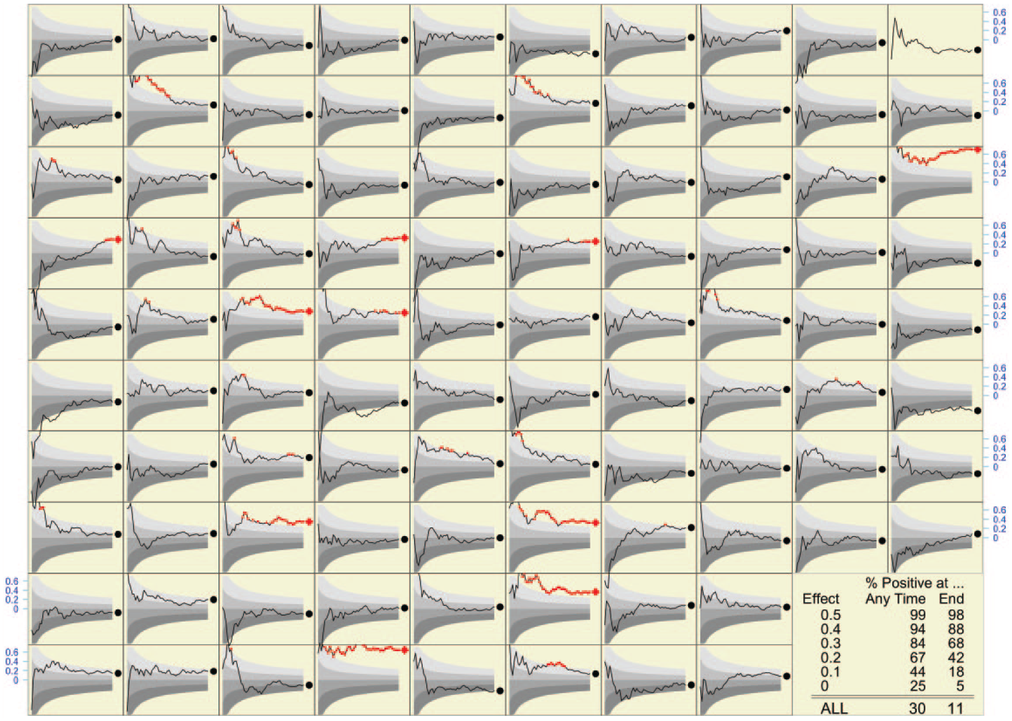
Final (indicated by red diamonds [p < 0.05] or black circles) and accumulating (shown as lines) evidence in the investigation of many compounds (96 shown). The final sample size in each case is 50. The upper boundaries of the colored bands correspond to p values of 0.75, 0.5, 0.25, and 0.05. Shown as red dots are the observed effect sizes when the calculated p values are less than 0.05. Shown in blue on the vertical axis at the boundary is the scale for the effect sizes. The table in the bottom right corner shows the percentage of compounds that resulted in a positive statistical test, both at the end—when the final sample size was reached—and at some point as the evidence was being accumulated.
The percentages positive at the end in each row of that table bear out the prestudy sample size calculations. Some 5% of inert compounds yield statistically significant results, whereas 68% of those with a strength of 0.2 and 88% of those with a strength of 0.3 do so (we had calculated that 80% of those with a strength of 0.35 would do so). If we trace the results back to the categories they come from, the overall (or average) positivity rate of 11% suggests that in the mix of compounds, somewhat more than 60% are inert.
Figure 2 shows what would be observed if each of the 96 compounds (and each of the many more in the table) were retested with a much larger sample size (of just over n = 600), designed to detect signals as small as 0.1; it also shows, for each of the 10 truly active compounds among the 96, the true effect size, that is, what one would measure using an infinite sample size. I leave it as an instructive exercise for readers to determine how many of the compounds identified in the initial screen were again identified in the second, how many of the 10 truly active ones were identified initially or in the second round, and how many additional false leads arose from the second round.
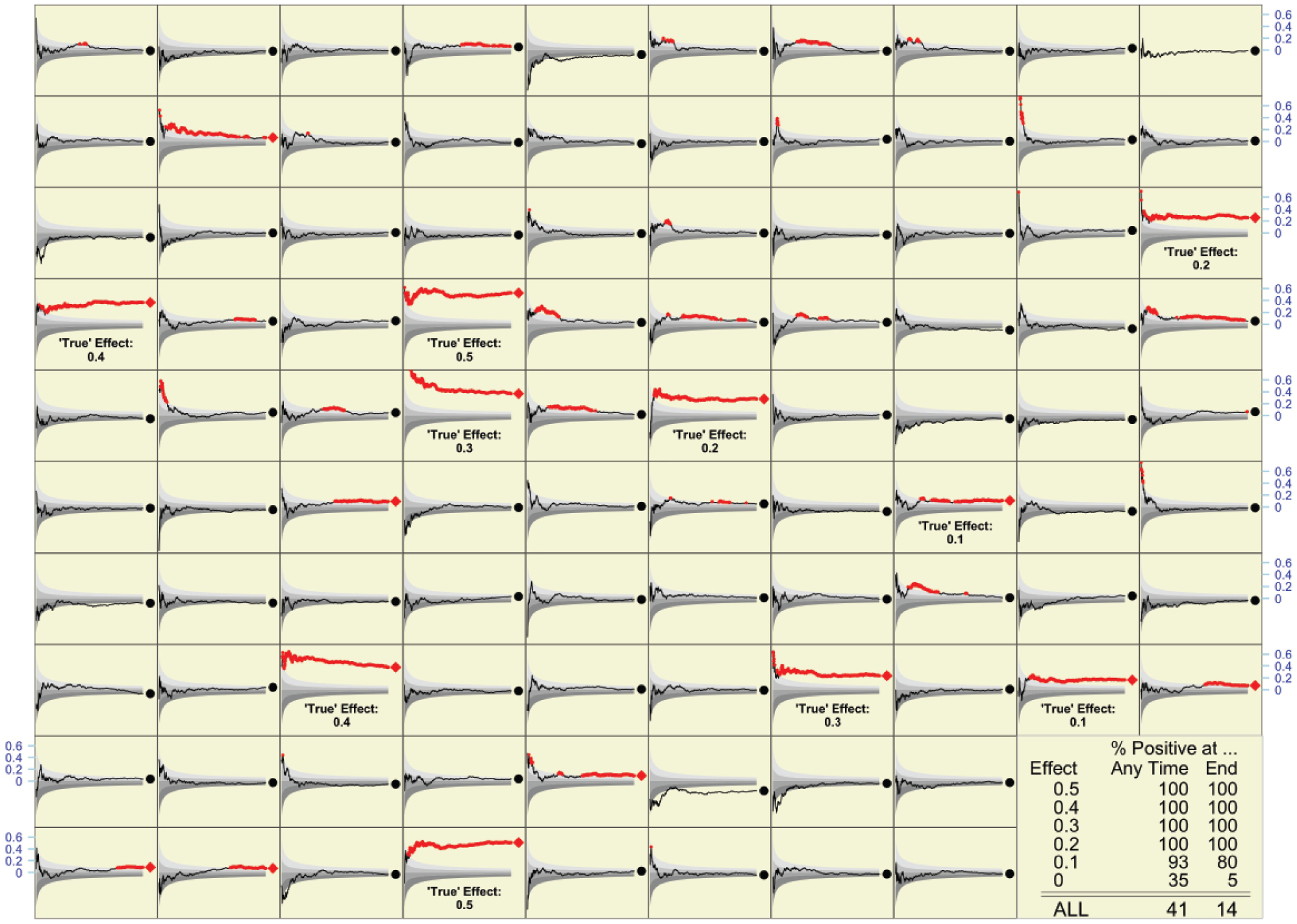
What might be observed if each of the compounds in Figure 1 were retested with sample sizes of n = 618. As in Figure 1, final results are indicated by red diamonds (p < 0.05) or black circles; accumulating evidence is shown as a line. The true magnitude of the effect is shown for each of the 10 active compounds among the 96 shown. Overall, of the many compounds that are the subject of the table in the bottom right corner, some 10% were active (2% at each of the five effect sizes shown).
Again, what one observes in the 96 compounds shown is not as reliable as the rates shown in the table. Overall, of any 100 compounds tested, an average of 14 would show a statistically significant result at the end of n = 600. This makes sense, as the average of 14 will continue to contain 3 (if 60% are inert), 4 (if 80% are inert), or 4.5 (if 90% are inert) false positives, but now the remaining 9 or so will be genuine. I can now reveal that the “mix” of strengths in the very large simulated series is exactly as it appears in the panels shown; 90% are inert, while 2% each have one of the five strengths shown. So, 14 is a weighted average (90%, 2%, 2%, 2%, 2%, and 2%) of the test positivity rates in the last column. All but the compounds with the lowest strength (0.1) are reliably identified by the large sample size employed.
In summary, if the traditional analyze once plan is actually followed, then the operating characteristics are as the statistical laws predict.
Analyze Often
Naturally, many investigators do not wait until all the data are in, but instead monitor the accumulating evidence, shown as a p value tracing in each panel of Figure 1 . In the 96 panels shown, a large number of panels demonstrate a statistically significant effect at some time point during the study. The much larger number used to compute the table shows that the positivity rate is 30 per 100 compounds tested. In light of what we saw in the definitive table ( Fig. 1 bottom right), this large number carries an important warning: if we repeatedly test the accumulating data, we can no longer count on an average of fewer than five false positives per 100 compounds tested. Indeed, just using the samples of size 50 in Figure 1 , on average, some 90% of 25, or 22.5 of the 30 positive tests, will be false positives. Only the 7.5 strongest (or luckiest) of the 10 active compounds will reliably test positive.
As expected, when (re)tested with a much larger sample size (n = 618), now virtually all (almost 9.9 of every 10) active compounds can be expected to test positive under the “analyze often” strategy. But so will 90% of 35, or 31.5 of the 90 inert ones, making a total of 41 or so positive tests per 100 compounds tested. The gain of 9.9 – 7.5 = 2.4 active compounds that test positive comes at a cost of 9 additional compounds that yielded false-positive tests.
Concluding Remarks
Even when datasets were smaller and looked at less often, those of us who were statisticians at ECOG and RTOG should have known that we were not immune from false-positive tests, no matter how noble we considered our calling or neutral we were. But, as in the case of the neurologists who chased a promising subgroup, our actual experience was a more convincing teacher than the statistical caveats we had been taught in classrooms.
Over these 45 years that I have been a statistical observer, much in medical statistics has changed for the better. But with bigger and more rapid data, more accessible statistical tools available to nonstatisticians, more ways to subset our data, and more journals to publish in, there is also a much higher risk not just of being wrong, but also of being more precisely wrong. We can now cause more harm or waste more resources. And unless more journals like PLoS One readily publish well-designed studies that turn out to be negative, we will see an even more distorted view of reality.
The formulas I used to decide the fixed n that I would use for Figure 1 were worked out in the late 1930s and early 1940s in the context of setting up quality control procedures and appeared in one place in publications such as that by Ferris et al. 19 In that context, the aim was to detect an undesirable departure from the null so as to immediately remedy it and get back to “normal.” In today’s use of statistical testing in drug discovery, the aim is different, namely, to detect a desirable departure from the null and to take it further.
Over the last 40 years, statisticians have been able to derive strict rules for “spending alpha” over a small number of interim analyses. Phase III trials intended to support a drug approval are required by the FDA to document these up front, to enforce them, and to prespecify the primary hypothesis and any subgroup analyses. Outside of this public milieu, however, what happens is much less structured. Nor is this lack of discipline limited to drug development. Recent statistics graduates who work in large e-commerce organizations tell us that one of their biggest frustrations in the experimental (A/B) testing of online tools and advertising methods is that trial plans seldom prespecify a primary metric, a fixed sample size, or a stopping rule. Test results accumulate very quickly (sometimes overnight) and can be quite high-dimensional. But often, it is the most forceful advocate for a particular new feature or option who carries the day and whose idea is adopted.
Given the much larger dimensions of today’s data, and the many more opportunities for examining accumulating data, it is virtually impossible to devise formal statistical rules with specified operating characteristics. Instead, investigators will have to rely on retesting to be sure that a positive statistical result did in fact arise from an active compound and was not a false positive. Simulations such as those I have presented are a way to get some sense of what the probabilities might be, and a more concrete way to understand how we can be easily fooled in our interrogations of nature.
Footnotes
Declaration of Conflicting Interests
The author declared no potential conflicts of interest with respect to the research, authorship, and/or publication of this article.
Funding
The author received no financial support for the research, authorship, and/or publication of this article.