
Abstract
Screening is a methodology widely used in biological and biomedical research. There are numerous visualization methods to validate screening data quality but very few visualization applications capable of hit selection. Here, we present MightyScreen (mightyscreen.net), a novel web-based application designed for visual data evaluation as well as visual hit selection. We believe MightyScreen is an intuitive and interactive addition to conventional hit selection methods. We also provide study cases showing how MightyScreen is used to visually explore screening data and make hit selections.
Introduction
Screening methods are essential in biological research. They connect basic and translational research by allowing researchers to rapidly assay a multitude of molecules (e.g., compounds and nucleotide oligos).1,2 Screening has been predominantly utilized for drug discovery, but with recent advances in high-throughput technology, it has become a widely used technique for hypothesis generation. 3 Many researchers choose novel targets (e.g., transcription factors and RNA-binding proteins) and use cutting-edge but less robust screening methods that compromise data quality and challenge the data analysis procedures. 4 Recent technology advances also allow screeners to carry out multiple assays at the same time, or to perform a number of replicate/counterscreens in parallel, which results in multidimensional datasets with flexible numbers of columns. 5
The typical data analysis procedures for screening involve data wrangling, quality control, and hit selection. Hit selection is the most important step because it marks hit molecules for further testing and discards the rest. Most hit selection methods are based on data normalizations, including, but not limited to, Z score, percent inhibition, B score, median absolute deviation (MAD), interquartile mean (IQM), and rank ordering.6 –12 Z score assumes normal distribution of data and therefore is sensitive to outliners and not suitable for nonnormal distributed data. Nonparametric methods, like B score, MAD, IQM, and rank ordering, do not assume data distributions during normalization. In addition, the decision making of hit selection often involves the consideration of other factors, like structure, druglike properties, and promiscuity.
Here, we describe a visualization method for hit selections using a plate-by-plate procedure that does not require normalization of the data. As an implementation of this method, we present MightyScreen, an interactive data visualization application designed for screening data analysis. MightyScreen is (1) web based and completely free, (2) intuitive to use with interactive visualizations, (3) capable of handling multidimensional datasets, and (4) fully open source and modular designed.
Materials and Methods
Implementation
MightyScreen is an open-source web-based software, which is freely available at http://mightyscreen.net. The back end of MightyScreen is developed in the Django Python Web framework and PostgresSQL. The front end is written in Bootstrap, D3.js, and the jQuery JavaScript library, which is compatible with all modern web browsers. RESTFul framework is used for communications between the back end and front end for better abstraction and extensibility. Source codes are available in Github to facilitate community efforts in further developments.
Input
MightyScreen visualizes screenings of any biological modulators as long as the readings are quantitative (numeric and within 64 bits). It supports an unlimited number of columns to store different types of readings (within the physical limit of the PostgresSQL database setup), including, but not limited to fluorescence, fluorescence polarization, luminescence, absorption, categorical variables, counts, and time.
Workflow
In a typical workflow, the user uploads screening data and then performs plate-by-plate visual evaluation and visual hit selection. In addition, users can explore the data using features including filtering, sorting, ranking, and labeling. At the end of hit selection, the data, including the selected hits and external links, can be exported or, alternatively, users can create accounts and store data online with password protection. Exported data are compatible with other tools for further analysis.
Interface
MightyScreen has three main visualizations panels ( Fig. 1 ): channel visualization, plate heat map, and scatterplots. The channel visualization shows the distributions of the readings. Each channel represents a selected type of readings. Through channel visualization ( Figs. 1 and 2 ), users (1) have an overview of the population distribution, (2) can examine the separation and variations of positive and negative control groups, and (3) can set a selection window for hit selection by drag-select. In the channel visualization panel, up to three channels can be loaded at once and changed at will. The scale of each channel is based on the smallest and largest numbers. Scatterplots present correlation between two channels (channel 1 vs. 2 and channel 1 vs. 3, Figs. 1 and 3 ) for users to inspect two-dimensional distributions of screened modulators.
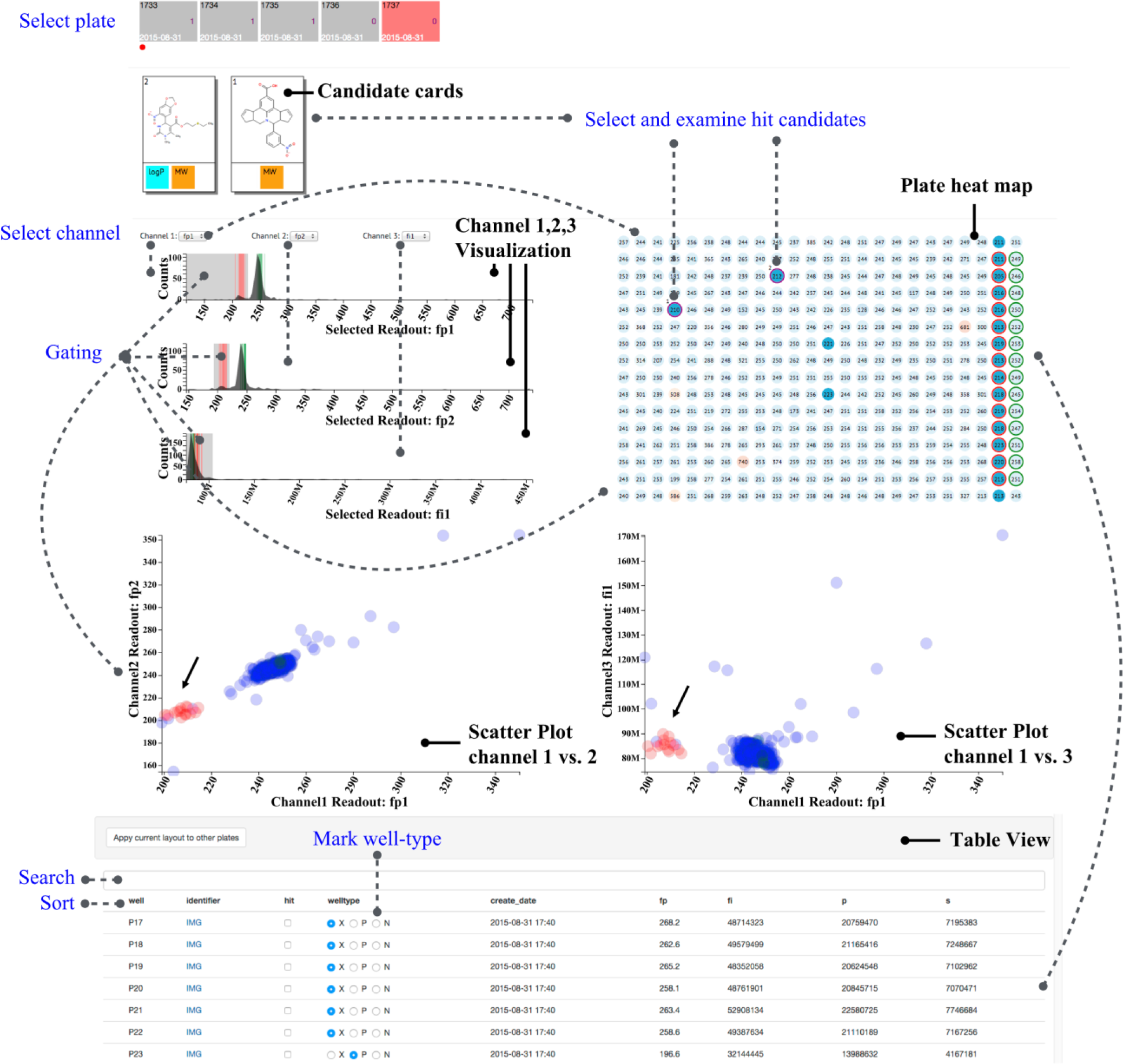
MightyScreen overview. The visual design of MightyScreen includes six major components: plate selector, hit candidates, channel selector, channel visualization, plate heat map, and correlation graphs. In addition, functions like search, filter, sort, and well-labeling are also supported. The dotted lines indicate actions that would result in real-time changes in visual presentation of data.
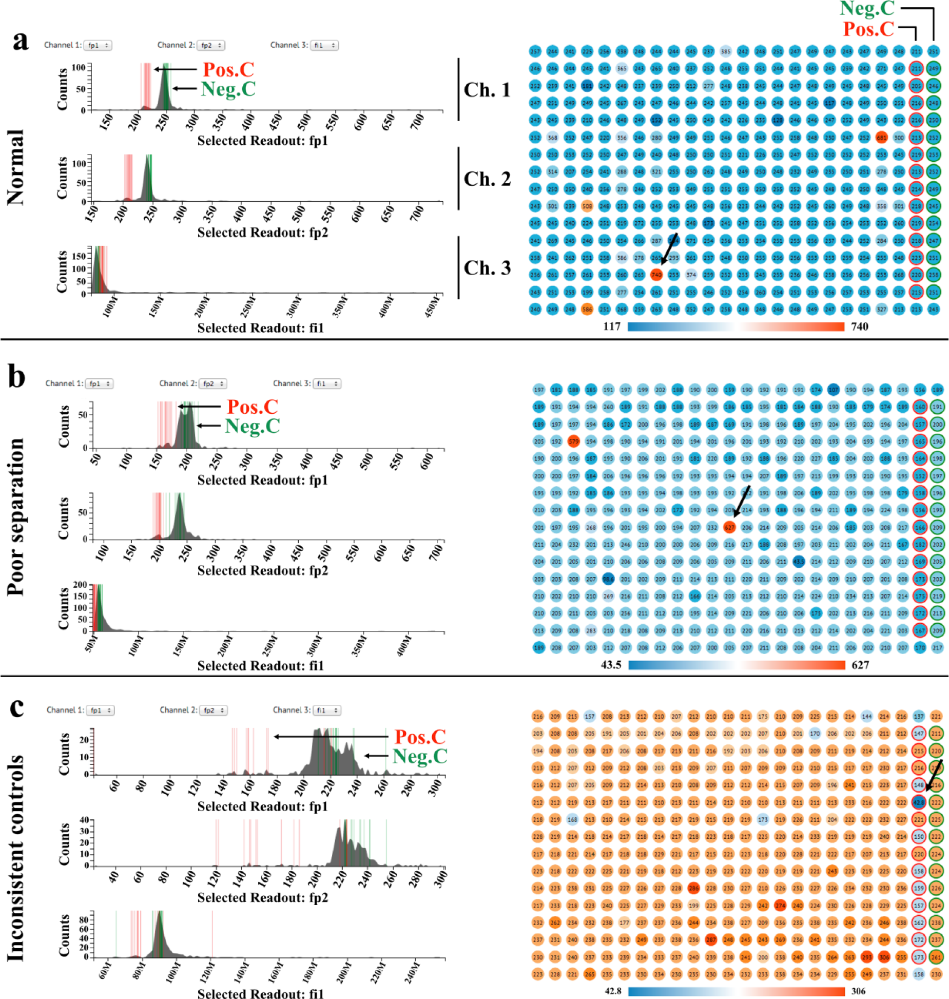
Channel visualization and plate heat map for visual quality evaluations. (
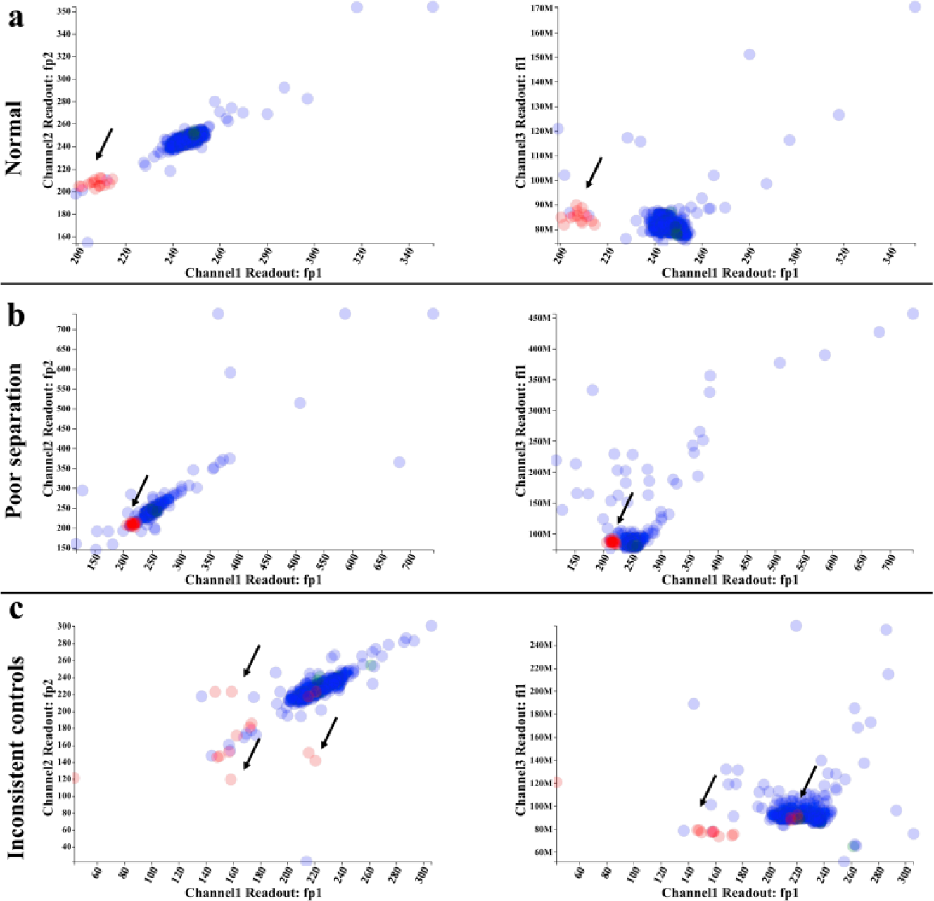
Correlation graphs reveal two-dimensional distribution of compounds. Two scatterplot graphs (channel 1 vs. channel 2 and channel 1 vs. channel 3) are plotted to assist in visual evaluation. (
The plate heat map displays the spatial distribution of the selected channel ( Figs. 1 and 2 ). Each well is shaded on a gradient corresponding to channel readings, and positive and negative controls are highlighted with red and blue outlines, respectively. Multiple selection conditions can be set by gating through click-and-drag on the channels in the channel visualization panel. Samples that meet all desired conditions are then highlighted in the plate heat map and correlation graphs.
Users can then select hits by clicking on desired wells. If the modulator has a chemical identifier (e.g., SMILES, InChI, InChIKEY, or CID), its chemical properties, including the chemical structure, calculated logP, tPSA, and molecular weight, are presented as hit candidate cards ( Fig. 1 ). PubChem links are also provided and will redirect the user to the National Center for Biotechnology Information website, which offers additional information such as patents or activities in other published assays.
Results and Discussion
We developed an open-source visualization application for screening data analysis. MightyScreen has several novel features: (1) MightyScreen was designed to support multidimensional datasets, which enable screening data analysis of different assays with the same modulators at once. This feature could also be useful for high-content screenings, where multiple parameters are measured at the same time. (2) MightyScreen offers competitive data processing speed by allowing visual quality validation, visual hit selection, and assessment of drugability to be performed simultaneously. (3) MightyScreen facilitates more informed hit selection by decoding complex data from multiple assays and drugability into visual patterns.
One major drawback of the per-plate visualization approach is low throughput, which in some cases can be improved by utility of high-well-density assay plates. Another concern of the visualization approach is the subjectivity and inconsistency introduced by visually selecting hits. To address such a concern, MightyScreen supports data analysis in conjugation with score-based methods, as the data can be imported to and exported from MightyScreen through CSV files, which are commonly used in other analysis tools.13–17
Here, we demonstrate a case study of common MightyScreen visualizations, although uses are not limited to these examples. The data used in the case study are from a fluorescence polarization compound screening with four readings: fluorescence polarization (fp), total fluorescence intensity (fi), s channel (s), and p channel (p).
Use of Data Visualizations for Quality Assessment
We first use the visualizations to assess the quality of the experimental data. In Figure 2a and 3a , there is good separation between the two control groups in the two fluorescence polarization channels (channels 1 and 2 are selected to display replicate fluorescence polarization readings from the same plate). In addition, the samples’ distribution overlays with that of negative controls, indicating that most samples are inactive. In the total fluorescence channel (channel 3), positive controls, negative controls, and samples all follow the same distribution with the exception of a few autofluorescent compounds that are easily spotted in the plate heat map. Figure 2b and 3b showcase a plate suffering from poor separation between positive and negative controls. As shown in the channel visualizations, the separation between controls suffers from high variance within control groups. Figure 2c and 3c are examples of poor controls. The two control groups are scattered, and the variation within control groups is significantly larger than that of previous cases. Outliers in control groups could be easily identified on the plate heat map (pointed out by arrows). These examples demonstrate that the data visualization design of MightyScreen is powerful for data quality assessment.
Interactive Design Facilitates Hit Selection
After data quality control, we continue to select the hit candidates. As shown in Figure 1 , areas with fluorescence polarization values equal to or lower than all positive controls were selected by drag-select on the two fluorescence polarization channels (channels 1 and 2); samples with normal total fluorescence are also selected in order to exclude autofluorescent compounds. Four compounds satisfied the conditions we set and are therefore highlighted in purple on the plate heat map ( Fig. 1 ). We then examined the druglike properties of the compound by click-select on the plate heat map. As shown in Figure 1 , we found that compound 1 has optimal molecular weight but nonoptimal calculated logP (partition coefficient) and PSA (polar surface area). This is consistent with the number of hydrophobic rings in the structure of compound 1. Compound 2 has optimal molecular weight and calculated logP but not optimal PSA. Since the PSA is a predictor for cell permeability, both compounds were expected to have low efficiency to enter the cell membrane. We next examined the activity of the compound reported from other assays in PubChem by clicking the hit candidate card to remove promiscuous compounds. The selected hit candidates are automatically stored and can be exported for further analysis. All exported files are in CSV file format and can be loaded by other analysis tools.
MightyScreen is a novel visualization application for screening data analysis. The visualization-based design provides a simple but comprehensive open-source solution for screeners. Additionally, MightyScreen’s visualizations can supplement the widely used score-based hit selection tools. It can be used through its stand-alone website, or integrated with other high-throughput screening data analysis workflows. Because of its intuitive and interactive visualizations, MightyScreen could also serve as an educational and illustrative tool for screening studies.
Footnotes
Acknowledgements
The authors gratefully acknowledge Jennifer Smith, Sean Erickson, David J. Wrobel, and Jennifer B. Nale for constructive feedback and Justin O’Connor for technical support.
Authors’ Contributions
L.W., Q.Y., and P.S. jointly conceived the project. L.W. designed the methods. L.W., Q.Y., and P.S. wrote the manuscript with contributions from A.J., T.W., H.S., and J.C. L.W. and Q.Y. led the implementation of the software. L.W. contributed to the visualization design under guidance from H.S.
Declaration of Conflicting Interests
The authors declared no potential conflicts of interest with respect to the research, authorship, and/or publication of this article.
Funding
The authors disclosed receipt of the following financial support for the research, authorship, and/or publication of this article: This work was supported by a grant to P.S. from the National Cancer Institute (R01CA163647).