
Abstract
Segregation is a highly nuanced concept that researchers have worked to define and measure over the past several decades. Conventional approaches tend to estimate segregation based on residential patterns. However, the residential dimension does not fully comprise individuals’ interactions with their environment and, consequently, can misrepresent individuals’ lived experiences. To address this gap, we analyse how segregation extends to other dimensions of the urban life. We accomplish this by using the Index of Concentration at the Extremes (ICE) to measure socioeconomic segregation at amenities and on public transit lines. Moreover, we consider the pivotal role that transport plays in democratising access to opportunities. Using transport networks, amenity visitations, and census data, we leverage agent-based models to approximate socioeconomic composition at amenities and on transit lines. Consequently, we can estimate socioeconomic segregation within the United States, for various aspects of urban life. We find that neighbourhoods that are segregated in the residential domain tend to exhibit similar levels of segregation in amenity visitation patterns and transit usage, albeit to a lesser extent. Moreover, we discover that low-income neighbourhoods experience a greater decrease from residential to amenity segregation, than their high-income segregated counterparts, highlighting how mobility can be used as a tool for overcoming residential inequalities, given the proper infrastructure. We identify inequalities embedded into transit service, which impose constraints on residents from segregated areas, limiting the neighbourhoods that they can access within an hour to areas that are similarly disadvantaged. By exploring socioeconomic segregation from a transit perspective, we underscore the importance of conceptualising experiential segregation, while also highlighting how transport systems can contribute to a cycle of disadvantage.
Introduction
Public transportation is a crucial component of urban environments, providing access to employment opportunities and amenities within a region. However, characteristics of transit systems, such as their urban layout and service frequency, can create pockets of transport deprivation, isolating particular neighbourhoods from conveniently accessing transit service (Nicoletti et al., 2022). This is dire for demographics that rely more on public transportation as their mode of transport (Hu and Chen, 2021). Lack of access to transport can impact how individuals perceive their activity space, by restricting or providing access to particular destinations (Tiznado-Aitken et al., 2022). In this work, we analyse how US public transportation systems interact with segregation in residential and mobility landscapes, ultimately exploring whether they worsen or reduce existing levels of socioeconomic inequality.
Understanding the effects of social integration has been at the forefront of sociological research for centuries, highlighting the many benefits of well-integrated communities, such as lower crime rates and better health outcomes (Kang, 2016; Scott et al., 2022; Asabor et al., 2022). Much of the research on integration, and its counterpart, segregation, tends to focus on residential characteristics, assuming the individuals that one interacts with are likely to be from one’s neighbourhood. Segregation is usually derived by comparing the empirical distribution of demographics in a region to an equally distributed version of the population. This is often followed by disclaimers that an equal distribution may not be just (Bruce Newbold, 2021). Therefore, it is important to distinguish whether homophilic processes are occurring as a result of individual preferences or systemic constraints. Often, cities have highly concentrated pockets of immigrants, which, depending on the environmental context, has the potential to provide a sense of community to residents while also exposing the broader population to different cultures and practices (McPherson et al., 2001; Klaesson and Öner, 2021). Disparities arise when urban transport hinders individuals within these communities from travelling to other neighbourhoods in the region, allowing urban planning to shape segregation in mobility behaviour.
The increasing availability of mobility data has enabled new forms of segregation to be conceptualised, addressing how segregation may persist in various urban domains (Phillips et al., 2021; Moro et al., 2021). Our work aims to expand on these studies, exploring the extent to which segregation persists in various dimensions of the urban experience. We consider urban experience in terms of where individuals live, the amenities they visit, and how public transit systems facilitate their trips between the two locations. Thus, to explore whether residential segregation spills over into mobility-oriented aspects of urban life, such as amenity visitations and transit use, we pose the following research questions:
We address the first research question by measuring segregation at a residential level. We estimate segregation using the Index of Concentration at the Extremes, evaluating the relationship between neighbourhoods’ economic and racial segregation levels for 16 US cities (Massey, 2001). We approach the second research question by defining segregation at the amenity level, leveraging SafeGraph mobility data and Census income distributions to define the composition of individuals visiting an amenity. Thus, we can analyse how neighbourhood levels of segregation change based on its residential composition and the amenities to which its residents are travelling. Finally, we construct transit-pedestrian networks to evaluate how public transportation can mitigate or worsen existing levels of segregation. For different travel time thresholds, we assess the socioeconomic profile of neighbourhoods that can be accessed through public transit compared to driving. Moreover, we implement a stochastic model to estimate the level of segregation experienced while using the transit network, to ultimately investigate whether disparities in mobility destinations can contribute to particularly segregated segments in the transit network. Our results show that segregated low-income neighbourhoods tend to exhibit less segregated mobility behaviour than segregated high-income neighbourhoods. Ultimately, our findings highlight disparities in how transit systems provide access to different neighbourhoods, while revealing that levels of residential segregation linger in other aspects of urban life.
Background
Segregation
Residential segregation has been in the spotlight of sociological and urban studies for centuries, with research consistently churning out new methods for conceptualising and measuring how sociodemographic groups share spaces (Massey and Denton, 1988). In this work, we quantify segregation using the Index of Concentration at the Extremes (ICE), which reconciles the diverging studies of concentrated affluence and concentrated poverty, to ultimately interpret them as one continuum. This is achieved by comparing how many households or individuals from the most deprived and privileged groups share the same residential area. As proposed by Massey (2001), for a given region i, with T
i
total households, A
i
affluent, or privileged households, and P
i
households in poverty, the ICE can be calculated as follows:

Values can range from −1 to 1, reflecting extreme concentration of disadvantaged and privileged households, respectively. Thus, the ICE can capture levels of imbalance given the sociodemographic composition of a region. It is frequently applied to identify inequalities in public health, incarceration, and natural resource quality (Chambers et al., 2019; Wise et al., 2023; Tetteh et al., 2022). Section S1 in the Supplementary Materials illustrates how ICE values correspond to measures of Dissimilarity, Exposure, Mutual Information, and social distance. We move forward, using ICE, as it clearly distinguishes between segregation of the most and least privileged demographics.
Human mobility
Mobility offers opportunities for overcoming the segregation that residential mechanisms, such as the housing market, impose on individuals. Common sources of mobility data include Location-Based Social Networks (LBSNs), GPS, and mobile phone records. Digital traces collected using individuals’ mobile devices are generally extracted in a passive manner, granting higher population representation in the data but raising privacy concerns (De Montjoye et al., 2018). Data from LBSNs are often collected using Application Programming Interfaces (APIs) and are typically considered less intrusive because users are actively engaging with content sharing (Hawelka et al., 2014). Consequently, the resulting data offers a less comprehensive representation of the entire population (Jiang et al., 2019). Barbosa et al. (2018) provide an overview of different mobility data sources and their limitations.
The prevalence of mobility data sources has allowed for high-resolution analysis of travel behaviours (Barbosa et al., 2018). Access to descriptive mobility data provides insight in whether one’s mobility patterns are influenced by their economic standing (Barbosa et al., 2021). Moro et al. (2021) use mobility data to build an extension of the Exploration and Preferential Return model, which identifies an association between experienced income segregation and individuals’ level of place exploration. In doing so, they demonstrate how experienced segregation is related to residential characteristics and amenity visitation patterns. Various research in mobility inequalities has identified exacerbated levels of income segregation following natural disasters and relationships between income inequality and segregation in various countries, hindering social mobility (Yabe and Ukkusuri, 2020; Nieuwenhuis et al., 2020). Moreover, studies have found persisting segregation in activity spaces for disadvantaged neighbourhoods (Abbasi et al., 2021; Wang et al., 2018). These studies highlight the benefits of considering segregation from both a residential and a mobility-based perspective.
Furthermore, inequalities in transport systems, and the types of amenities and neighbourhoods they provide access to, are important to consider as they can impact the level of choice that disadvantaged groups have when using transit (Tiznado-Aitken et al., 2022). Moreover, an analysis of Colombian cities found more affluent areas to benefit from better transit coverage and employment opportunities, identifying longer average travel times for individuals in poorer neighbourhoods (Arellana et al., 2021). We extend these analyses, by exploring how US transit systems relate to residential and amenity segregation.
Methods and data
This work combines census, mobility, and transit data to analyse how transportation systems intersect with segregation in different aspects of urban life. We first define the state of residential segregation, using US Census data. Then, with anonymised mobility patterns from SafeGraph, we define segregation levels for amenities, based on the socioeconomic composition of its visitors. The estimations of segregation and agent-based modelling are achieved using Python. Finally, drawing upon open source resources, such as The Mobility Database, OpenStreetMap, and UrbanAccess, we construct transit networks to identify disadvantages within the system, analysing both the transport service and experience of using transit routes as potential sources of inequality.
Sociodemographic data for measuring segregation
Typical measures of segregation focus on inequalities experienced in residential areas. In this work, using the ICE metric from equation (1), we define segregation with respect to the socioeconomic concentration in three urban contexts: (a) residential, (b) amenities, and (c) public transit. We define residential segregation by drawing upon the 2020 American Community Survey 5-Year Estimates (ACS), provided by the US Census Bureau. Household income distributions, from Table B19001 of the ACS, inform the economic composition of a neighbourhood, at the Census Block Group (CBG) level (Bureau, 2022). CBGs are the smallest spatial unit that the Census Bureau publishes data for, typically consisting of 600 to 3,000 individuals. Thus, segregation levels of CBGs are calculated using these income distributions. To compare levels of economic, we use Table B02001 from the ACS, which captures the racial distribution of individuals in a CBG. Considering US history, and its persistent discrimination against the Black population, we select Black and White racial groups to represent the extremes in the context of racial segregation (Franklin, 1956).
Mobility data
In order to capture more dynamic forms of segregation, we draw upon mobility data sources to better understand the role of mobility in overcoming residential segregation. Our mobility data is sourced from SafeGraph, a data company that aggregates anonymised location data from numerous applications in order to provide insights about physical places, via the SafeGraph Community (SafeGraph, 2021). To enhance privacy, SafeGraph excludes census block group information if fewer than two devices visited an establishment in a month from a given census block group. The SafeGraph Weekly Patterns data provide visitation counts, on a weekly level, to amenities across the US, along with the distribution of CBGs from which the visitors came. Home CBGs are defined by SafeGraph, using users’ locations from 18:00 to 07:00 over a 6-week time frame. For this analysis, we use amenity visitations from January 2021 to characterise mobility flows from CBGs to amenities. With this data we can estimate the volume of trips between any pair of CBGs in a city. Moreover, we can define a CBG by the types of destinations to which its residents travel.
Transportation
We leverage General Transit Feed Specification (GTFS) data, from the Mobility Database, to build public transportation networks for 16 US cities (MobilityData, 2023). GTFS refers to a data format for publishing public transit schedules and routes, for various forms of transit. Using UrbanAccess is an open source tool that combines transit and pedestrian networks to create a bipartite, transit-pedestrian network (Blanchard and Waddell, 2017). Nodes are either transit nodes, representing public transit stops, or pedestrian nodes, reflecting street nodes from the OpenStreetMap network. The edges are weighted by travel time in minutes. Further details regarding the construction of the transit-pedestrian network can be found in S2.1 of the Supplementary Materials.
Moreover, we use Open Source Routing Machine (OSRM) to generate driving times and distances between any pair of coordinates in a city, given an OpenStreetMap (OSM) extract. OSRM is a high-performing routing engine that integrates well with OSM to find shortest paths on a road network. Driving times serve as a baseline for travel time, allowing us to compare how much longer trips take using transit than by driving. While cars and public transit vehicles both use road networks, transit vehicles must adhere to determined schedules and routes, while cars have much fewer constraints as to how they can traverse the road network. Thus, driving terms are useful for understanding the impedance, in terms of travel time, of using the transit system.
Residential segregation
We begin by exploring the state of residential segregation in 16 US cities. We take a closer look at the relationship between racial and socioeconomic composition to develop a better understanding of the residential landscape throughout the US. In doing so, residential segregation acts as a baseline, to which we can compare segregation levels in the other urban dimensions we consider in the coming sections.
Sociodemographic residential segregation
The ACS data provides the number of households belonging to each of the 16 income brackets, for every census block group. We denote the lower three income brackets, that earn less than $20,000 per year, as households in poverty. Meanwhile, the upper three income brackets indicate affluent households, which earn more than $125,000 per year. We define these brackets as high-income households. Middle class households are reflected by the middle 10 income brackets. Thus, we can categorise each of the 16 income brackets into 3 income classes: low-income, middle-income, and high-income. Using these cutoffs to define income classes is a common practice when measuring ICE at the CBG-level (Larrabee Sonderlund et al., 2022; Bishop-Royse et al., 2021). Section S1.2 in the Supplementary Materials conveys how ICE distributions would change within each city if we were to shift these income-bracket cutoffs. With this in mind, we define IDn,i as the number of households belonging to an income class, i in CBG n. We combine this data with our measure of segregation (Eq. (1)) to define residential segregation for a census block group, n: Socioeconomic residential segregation in 16 US cities, calculated using ICE. Each box plot reflects the distribution of ICE values in census block groups, for a given city.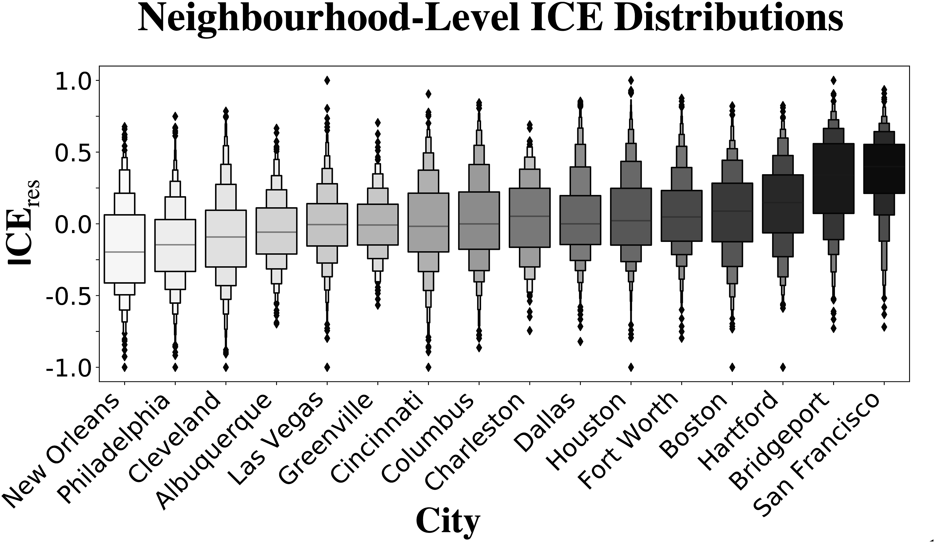

Similarly, we compute the residential segregation of Black and White residents using equation (1), such that A
i
and P
i
represent the number of White and Black residents, respectively, in a neighbourhood i. Accordingly, values of −1 indicate a high concentration of Black residents while +1 ICE levels reflect a large share of White residents. The second column in Panel A of Figure 2 captures the relationship, using Pearson correlation coefficients, between a neighbourhood’s economic and racial segregation level, for 16 US cities. A positive correlation indicates that neighbourhoods, or CBGs, with a large share of affluent households also have a high concentration of White residents. While the degree of correlation between the two demographic types varies across cities, we observe that all cities do have a positive, significant correlation between racial and economic segregation, indicated by the asterisks. (a) Pearson correlation coefficients, emphasising the relationship between economic and racial segregation in 16 US cities. (b) Maps illustrating the entangled nature of economic and racial segregation for Dallas and New Orleans. Orange and purple reflect low- and high-income concentrations, respectively. Brown and blue capture a high residential concentration of Black and White residents, respectively.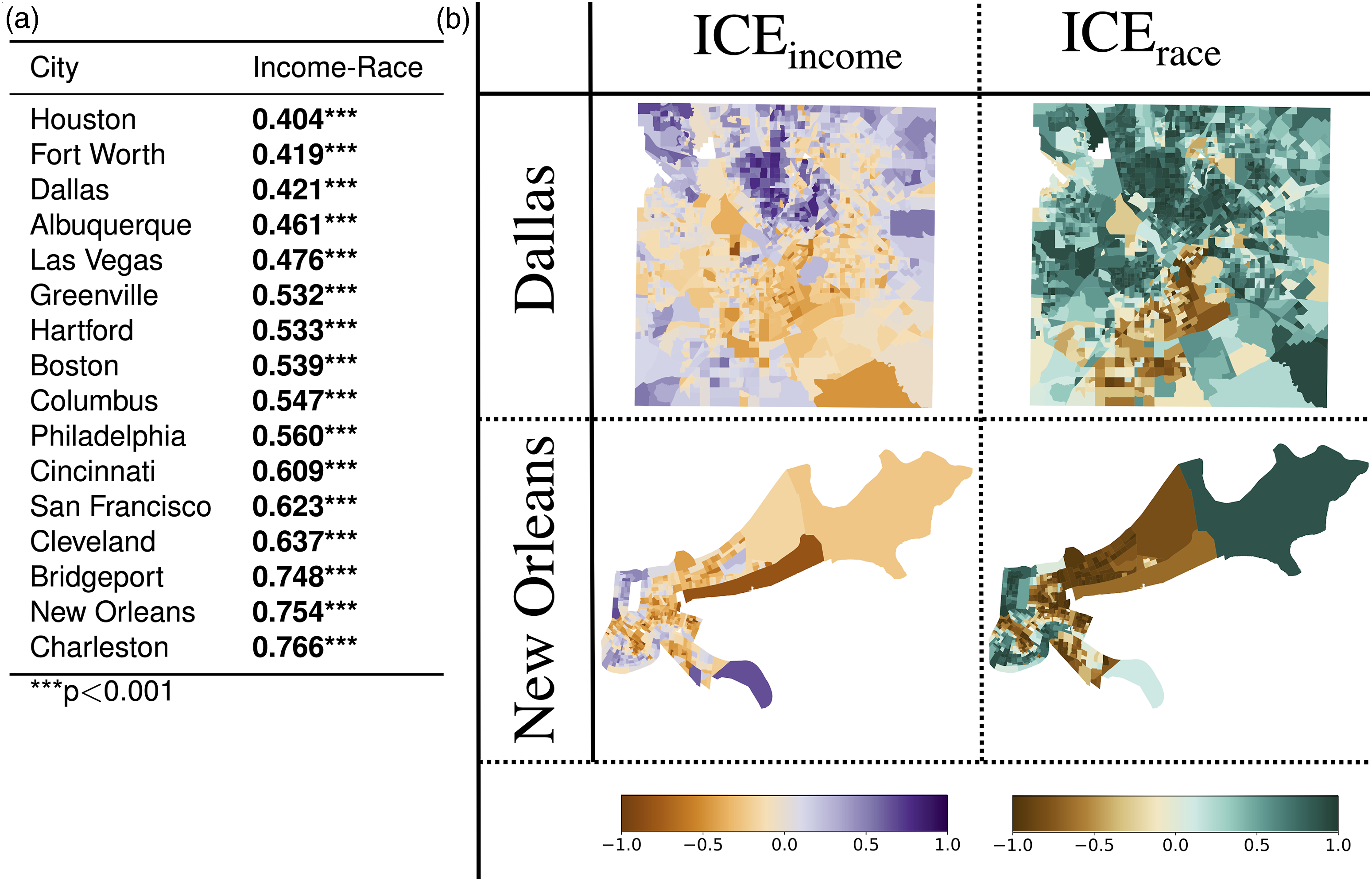
Panel B in Figure 2 visualises the spatial landscape of economic and racial segregation in cities with lower and higher correlation coefficients (Dallas and New Orleans, respectively). Comparing ICE income to ICE race in Dallas reveals that areas with a large concentration of low-income residents are not directly translatable to highly segregated Black or highly segregated White neighbourhoods. On the other hand, New Orleans shows strong associations between neighbourhoods that are low-income and segregated (orange CBGs) and those that are largely composed of Black residents (brown CBGs). By comparing CBG-level segregation measures, with respect to socioeconomic and Black–White composition, we illustrate how residential patterns for income and racial groups can be intertwined. Moving forward, we focus on analysing income segregation; however, the proposed methodology can be applied to explore whether racial segregation persists in urban dimensions.
Mobility segregation
In this section, we extend our analyses of residential segregation in US cities, to explore whether residents from segregated neighbourhoods tend to exhibit segregation in their amenity visitation patterns. To do so, we define the segregation of amenities, based on the socioeconomic composition of its visitors during January 2021. Then, we explore whether residents from the most segregated neighbourhoods mitigate their residential segregation by travelling to amenities that have visitors from different economic backgrounds. This approach allows us to understand mobility differences between highly segregated high-income neighbourhoods and highly segregated low-income neighbourhoods.
Segregation at the amenity level
We begin analysing segregation from a human mobility perspective, by measuring segregation based on the socioeconomic makeup of an amenity’s visitors. We define ID′ as the normalised form of the income distribution, ID, defined by the ACS data:


Here, C
j
represents an individual from CBG n, who visits amenity a, and belongs to an income class i ∈ I, which is sampled from
We can modify

Equation (5) computes the average segregation of an amenity’s visitor composition using ICE, such that the economic makeup of visitors is determined through a stochastic, weighted sampling with respect to visitation frequency and the socioeconomic characteristics of visitors’ origins. Having used ICE and visitation patterns to measure amenity segregation, we define mobility segregation from the perspective of residents in a neighbourhood, based on the average segregation they experience at the amenities they visit. We refer to this measure as

Mobility segregation and residential segregation
From a broader perspective, TAS aims to depict how individuals experience segregation in the mobility dimension, by considering their visitation patterns and the segregation levels of the amenities they visit. We examine the relationship between residential segregation and TAS (Figure 3) by calculating how much a segregation value, for a given neighbourhood, changes between two urban dimensions, given its original ICE value, x, and its ICE value in a different dimension, y: Differences in segregation levels in the residential and mobility domain, where each scatter plot resembles one of the 16 US cities. The x-axis depicts the magnitude of residential segregation, for the highly segregated, high-income neighbourhoods (purple) and the highly segregated, low-income CBGs (orange). The y-axis shows the direction and magnitude of change in a CBG’s mobility segregation level, compared to its residential segregation level.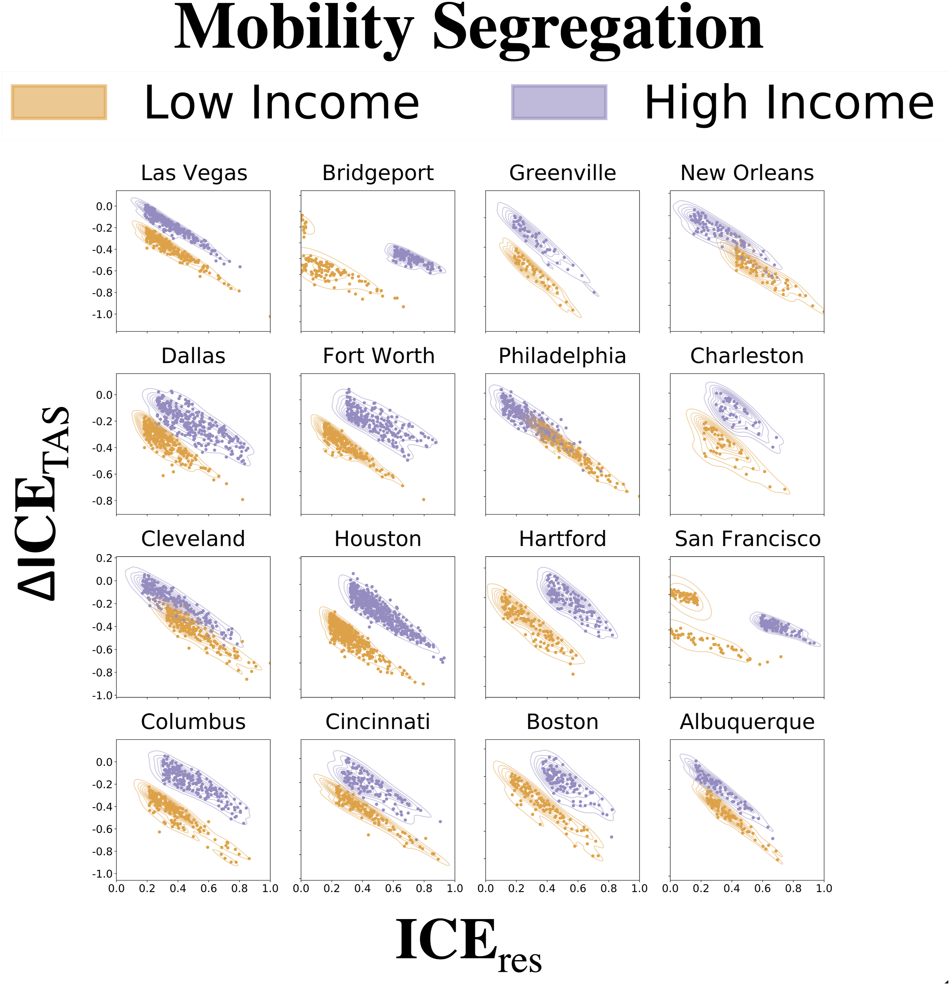

ΔICE ranges from −2 to 2, where negative values signal a decrease in segregation levels. We denote the difference between ICE res (n) and TAS(n) in a neighbourhood n as ΔICETAS,n, which expresses how segregation levels change between the residential and mobility dimension.
For each city, we split neighbourhoods, using residential ICE values, into five, equally sized segregation groups: (1) highly segregated, low-income (
We focus on the highly segregated low-income and high-income neighbourhoods, represented in Figure 3 by the orange and purple points, respectively. The x-axis captures the magnitude of residential segregation (|ICEres,n|), which allows us to compare the most segregated neighbourhoods in a city within the same frame of reference. The negative slopes in Figure 3 can be attributed to the positive correlations between residential segregation and TAS, shown in Table S2 of the Supplementary Materials. Figure 3 reveals that the majority of CBGs have negative ΔICE TAS values. This decrease implies less segregation in the mobility dimension, compared to the residential one.
The key takeaway of Figure 3, however, is that, for most cities, the highly segregated, low-income neighbourhoods exhibit smaller values of ΔICE TAS than their high-income counterparts. This can be observed by considering how each group’s points are distributed along the y-axis. Yet, two cities emerge as exceptions to this trend. A subset of highly segregated, low-income neighbourhoods in San Francisco and Bridgeport exhibit distinctive patterns in which they experience an increase in ΔICE TAS , pointing to an increase in mobility segregation levels, despite already having high levels of residential segregation. In this manner, Figure 3 reveals that, generally, segregated low-income neighbourhoods tend to mitigate their residential segregation level by travelling to amenities with a much different economic composition, than compared to segregated high-income neighbourhoods. These findings emphasise the importance of considering segregation from various urban layers, as mobility can be used as a means to decrease the overall segregation that one experiences. While, we find the mobility segregation occurs in lower magnitudes than residential segregation, this section highlights how segregation continues to exist when considering amenity visitation patterns, finding strong associations between the two domains.
Transport segregation
Having demonstrated the role that segregation plays in the residential and mobility facets of the urban experience, we move on to consider the intersection between segregation and public transportation systems. In this section, we leverage public transit networks to analyse how structural properties of transportation systems coincide with the residential landscape. Employing the SafeGraph mobility data, we model potential transit use to estimate the level of segregation one would experience while using transit to satisfy her mobility demands. Due to the computational complexity of stochastically modelling transit use, we use five of the 16 cities as an example for how levels of structural and experiential segregation can be assessed in the transit system. We specifically choose New Orleans, Philadelphia, Cincinnati, Dallas, and San Francisco as the 5 focal cities, as each city spans different parts of the socioeconomic residential composition, as depicted in Figure 1.
Structural transport segregation
We assess segregation in the context of transport by, first, examining how transit systems serve neighbourhoods of various segregation levels. To do so, we consider average travel times between every possible pair of neighbourhoods in a city. Then, we calculate the average segregation level of areas that all neighbourhoods in a segregation group can reach via transit, within a given time frame. We refer to this value as NA
transit
. Further details regarding the mathematical formulations for determining this metric are outlined in the Section S4.3 of the Supplementary Materials (equation S1). We can calculate the same metric, but with respect to driving times, to compute the set of reachable neighbourhoods, for a given segregation group and time threshold. We refer to this measure of segregation in driving access as NA
driving
. We visualise both metrics in Figure 4, for time thresholds from 5 to 60 min, at 5 min intervals. For every matrix, the top row illustrates the changes in segregation characteristics of neighbourhoods that are accessible by the highly segregated, low-income neighbourhoods (HS-Lo), for various time thresholds. Meanwhile, the bottom row captures average segregation levels, based on which neighbourhoods the highly segregated, high-income neighbourhoods can reach. The top row of matrices illustrates how segregation of accessible neighbourhoods changes for transit time thresholds, measured using NA
transit
. Meanwhile the bottom row of matrices captures driving accessibility (NA
driving
) and serves as a baseline for comparison, as driving times calculated with OSRM are void of any transit schedule, route, or traffic constraints that are within the GTFS data used to build the transit-pedestrian networks. It is apparent that, when comparing transit to driving access for each city, segregation values for neighbourhoods accessible by car converge to reflect the city’s overall socioeconomic composition much quicker than their public transit counterparts. Average residential segregation level of neighbourhoods that are reachable within a given travel time, by public transit (top row) and car (bottom row), for 5 US cities. The y-axis shows accessibility for neighbourhoods from different segregation groups, while the x-axis defines different time thresholds. Orange cells reflect accessibility for neighbourhoods that are more segregated, with a concentration of low-income households. Purple cells capture transit service to neighbourhoods with a higher income concentration.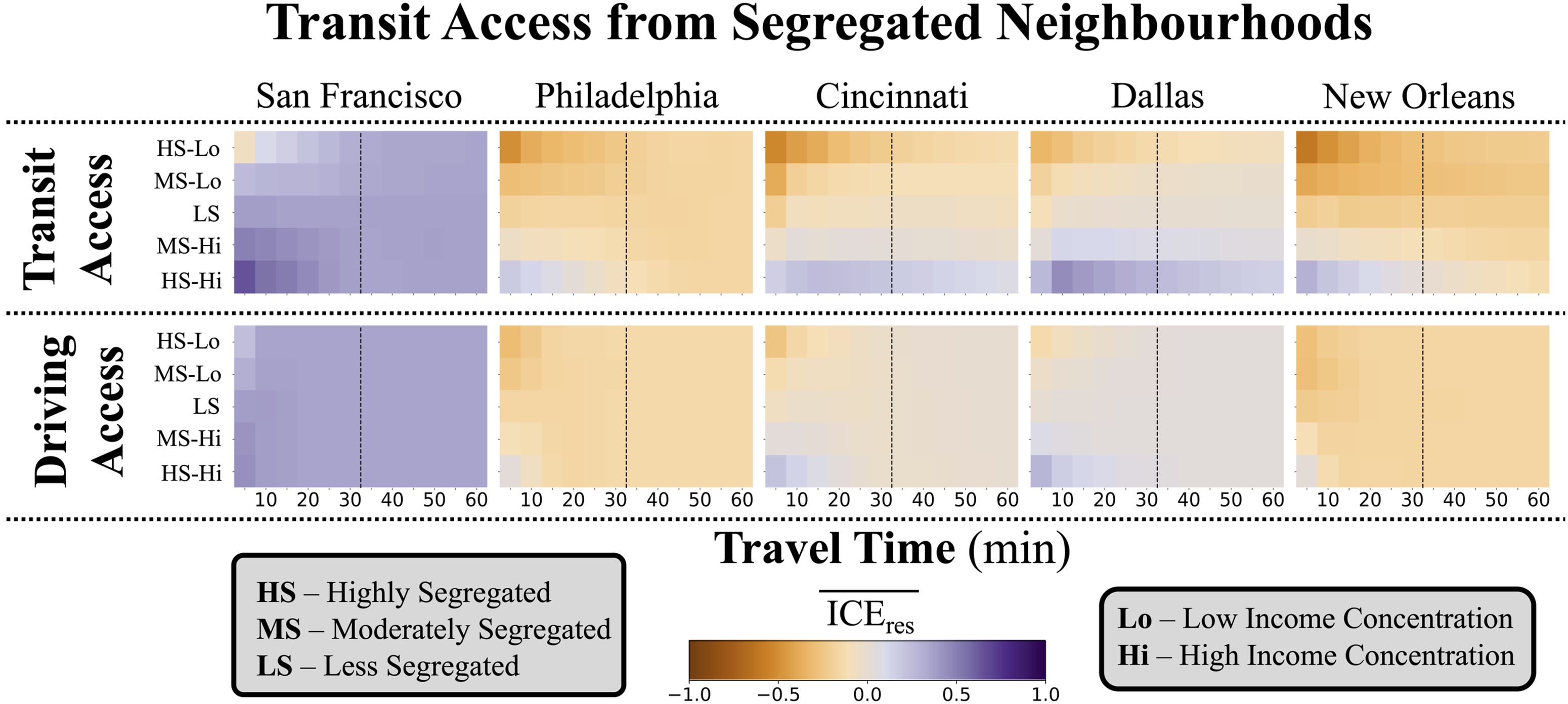
To some extent, we would expect transit segregation to have different values across segregation groups, especially for smaller time thresholds, as a reflection of spatial auto-correlation in residential segregation. However, the differences in transit segregation levels persist beyond 60 min journeys for Dallas, Cincinnati, and New Orleans, revealing apparent structural inequalities in the transit systems of those cities. The driving access matrices in Figure 4 emphasise the disparities in transit service, using driving times to convey the possibility for transit services to provide less segregated accessibility.
Transit use segregation
We wrap up our analysis of urban segregation by analysing how the areas to which individuals travel can impact the level of segregation experienced when using the transit system. First, using the shortest paths that travellers use to navigate from their residential origins to their amenity destinations, we can calculate the socioeconomic composition, and consequently the extent of segregation, at the edge level of a transit network. Then, to compare how segregation levels change across the residential, amenity, and public transport domains, we aggregate edge-level transit segregation to the census block group level, which we refer to as ICE transit . Section S4.2 in the Supplementary Materials mathematically outlines how we derive socioeconomic composition on the edge level and how we aggregate these values to a census tract level. Furthermore, it acknowledges limitations incurred by assuming uniform use of the transit system across socioeconomic groups.
ICE
transit
conveys how residents in a given neighbourhood experience segregation within the transit system and allow us to compare transit segregation (equation S4) to segregation in the residential (Eq. (2)) and amenity (Eq. (6)) dimensions. The top row in Figure 5 highlights how segregation levels persist across the three dimensions, focusing on the highly segregated, low-income and highly segregated, high-income segregation groups. The results for Dallas and New Orleans are included in Section S4.3 of the Supplementary Materials; however, we highlight the results for San Francisco, Cincinnati, and Philadelphia for brevity. Regardless of city-level economic composition, the parallel plots convey that segregation continues to exist in the transit and destination dimension, although to a lesser extent. Urban segregation levels in Philadelphia, Cincinnati, and San Francisco. The top row illustrates segregation across the residential, transit, and mobility domains, for the highly segregated high- and low-income groups, reflected by purple and orange, respectively. The bottom row shows how mobility segregation influences transit segregation by comparing empirical transit segregation to that of a null model, shown on the y-axis. The x-axis shows empirical levels of transit segregation as a baseline.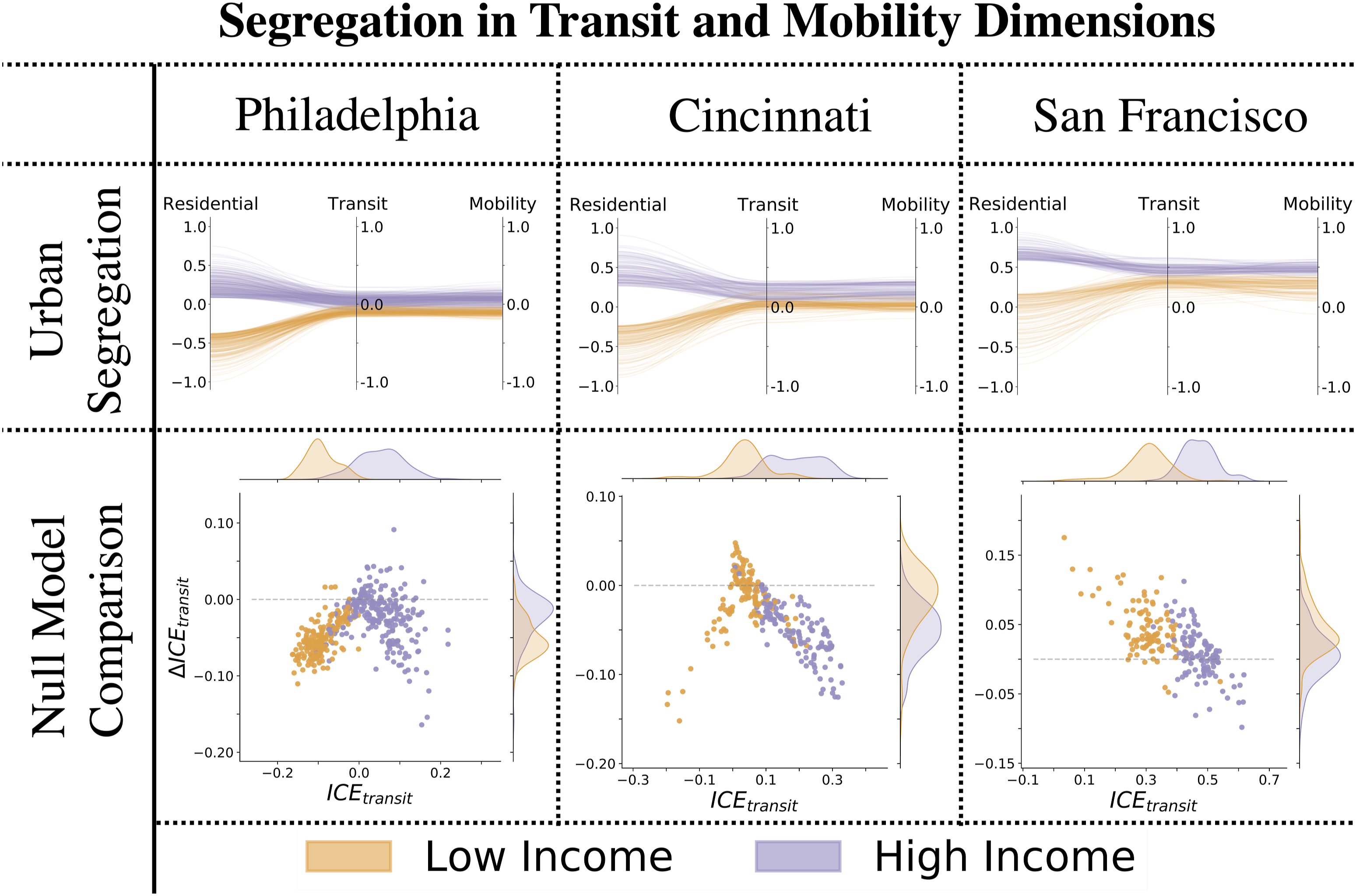
To gain a deeper insight regarding the extent to which disparities in mobility destinations impact segregation while using the transit system, we develop a null model, which hypothesises that transit segregation is an artefact of disparities in the amenity landscape. To accomplish this, we retain the same distribution of trip counts across neighbourhoods in a city. However, we modify the destinations of every trip in the SafeGraph amenity visitations data, by randomly sampling a coordinate within a randomly sampled CBG. We construct a mobility matrix,
We can, then, compare segregation estimated from the empirical data, to that of the null model, which eliminates apparent disparities in the amenity dimension, illustrated in the bottom row of Figure 5. The x-axis and its corresponding distribution above it convey the average level of segregation a neighbourhood’s residents experience while using transit to satisfy their mobility demands. Thus, the x-axis more clearly visualises the Transit axis in the parallel line plots on the top row. Meanwhile, the y-axis, and respective distribution on the right, emphasises how transit segregation measures change when removing inequalities in amenity visitations and the amenity landscape. This is achieved by calculating ΔICE transit , as defined in equation (7), comparing a neighbourhood’s empirical transit segregation to that measured in the null model. For most cities, we observe the majority of neighbourhoods having decreased levels of transit segregation when removing amenity visitation inequalities – indicated by points falling below the dashed line. San Francisco remains an exception, implying that the amenity landscape and economic inequalities in amenity visitation shape the level of segregation individuals experience while using its transport system.
Moreover, we observe the high-income group experience larger decreases in transit segregation for most cities, as seen by the distribution on the y-axis. This suggests that the transit segregation experienced by individuals in highly segregated, low-income neighbourhoods remains consistent, despite socioeconomic characteristics of their destinations. Additionally, the low magnitudes of ΔICE transit in the scatter plots elucidate how removing inequalities in amenity visitations and the amenity landscape does not significantly change segregation in the transit realm. We hypothesise that the identified transit segregation could, then, be a result of how the socioeconomic residential landscape intersects with the transport service and layout.
Ultimately, we identify inequalities in how transit systems connect neighbourhoods from different socioeconomic backgrounds. We compare the average segregation of neighbourhoods that are reachable withing a given time, between trips taken using public transport versus cars. We note that San Francisco and Philadelphia allow residents from different segregation groups to reach a wider array of neighbourhoods within an hour long trip. Moreover, we stochastically model the transit lines individuals would use to satisfy their mobility demands. Finally, we test our empirical results against a null model to find that while disparities in amenity distribution and travel behaviour increase the level of economic concentration on transit lines, mobility and amenity inequalities do not fully account for the level of experienced transit segregation that we do identify.
Discussion
Inequalities in urban infrastructure can have a significant impact on perceived activity space and, consequently, travel behaviour. Urban analytics research aims to create more just cities by characterising these disparities, with recent attention focusing on accessibility measures (Moreno et al., 2021). However, research in transport poverty highlights how lower-income individuals tend to live in areas with higher levels of amenity accessibility (Allen and Farber, 2019). This work puts forward a framework for defining inequalities in transit systems in terms of where transit provides access to and how individuals experience segregation while using transport. In doing so, our results reveal that residential segregation levels persist through other aspects of the urban experience, namely, amenity visitations and transport usage. These results are consistent with research that shows residual effects of residential segregation in school, work, and mobility dimensions (Nieuwenhuis and Xu, 2021; Delmelle et al., 2021; Silm et al., 2021).
Furthermore, we show how highly segregated, low-income neighbourhoods tend to correct for their extreme levels of residential segregation through their mobility patterns. This is in line with findings that unveil demographic associations with social exploration of amenities (Moro et al., 2021). Bridgeport and San Francisco serve as two exceptions to this trend, where a subset of the neighbourhoods with low-income concentration tends to visit amenities with high levels of segregation. In these cases, it is imperative to develop adequate urban infrastructure that is designed to benefit the disadvantaged groups that have low amenity accessibility (Allen and Farber, 2019). We also find that transit systems can hinder access to neighbourhoods, limiting the potential of exposure to individuals from different backgrounds. These results underscore findings that underprivileged demographics, be it immigrant or ethnic minorities, tend to have more constrained activity spaces than their privileged counterparts (Hedman et al., 2021; Silm et al., 2021). It is unclear whether mobility patterns are dictated by limited transit access to other neighbourhoods. However, our findings reveal that by limiting exposure to different types of neighbourhoods, transit systems impose constraints on the activity space and urban experience of individuals, namely, those without access to personal vehicles.
Limitations of this work include the assumption that the economic composition of a neighbourhood’s travellers directly reflects the neighbourhood’s income distribution. Although it is striking that we identify inequalities under this assumption, which removes demographic mobility preferences within a neighbourhood, higher resolution mobility data can provide closer approximations of urban segregation. Thus, this work can be further developed to analyse how segregation experienced within transit lines is impacted by empirically informed levels of socioeconomic transit usage. Moreover, using higher-resolution mobility data, such as those that tag mobility trajectories with the associated demographics of the traveller, could shine light on further disparities in how transport and amenity landscapes intersect. Additionally, the proposed methodology can be applied to data spanning a larger time frame, to analyse temporal features of mobility and transit segregation. We emphasise that this framework can be applied to any region, given transit feeds for modelling transport networks and mobility data which includes or can be merged with demographic characteristics. This framework can provide a clearer insight as to how cultural differences in mobility patterns and the level of transit infrastructure can impact inequalities experienced in various facets of the urban environment.
In essence, we consider segregation from multiple urban dimensions to highlight the benefit of analysing segregation as a spatio-temporal experience rather than a static variable. Moreover, identifying inequalities within transit systems is the first step in providing improved transit service, particularly to individuals from especially vulnerable demographics. By studying segregation from multiple perspectives, we can observe whether mobility is used as a tool to try and overcome residential segregation.
Supplemental Material
Supplemental Material - Mobility and transit segregation in urban spaces
Supplemental Material for Mobility and transit segregation in urban spaces by Nandini Iyer, Ronaldo Menezes, and Hugo Barbosa in Environment and Planning B: Urban Analytics and City Science.
Footnotes
Declaration of conflicting interests
The author(s) declared no potential conflicts of interest with respect to the research, authorship, and/or publication of this article.
Funding
The author(s) disclosed receipt of the following financial support for the research, authorship, and/or publication of this article: This work was supported by the US Army Research Office for the partial support provided to RM under grant number W911NF-18-1-0421.
Supplemental Material
Supplemental material for this article is available online.
References
Supplementary Material
Please find the following supplemental material available below.
For Open Access articles published under a Creative Commons License, all supplemental material carries the same license as the article it is associated with.
For non-Open Access articles published, all supplemental material carries a non-exclusive license, and permission requests for re-use of supplemental material or any part of supplemental material shall be sent directly to the copyright owner as specified in the copyright notice associated with the article.