
Abstract
Each day, buses crisscross New York, carrying incarcerated people from one prison to another. This is the case for prison systems across the United States, where prison-to-prison transfers are a routine aspect of penal administration. Such transfers run counter to dominant theorizations of prisons as singular, stationary, and totalizing. Instead, they suggest a view of prisons as a dynamically connected network. Little is known, however, about how often transfers occur and which prisons are involved in them. Using a novel dataset compiled from administrative records, this visualization maps transfers between New York’s state prisons in 2022. Doing so demonstrates their pervasiveness, including in sheer volume, the number of prisons implicated, and their resulting facility-level turnover. The maps also suggest variation within the prison network, for example, by a prison’s gender designation or status as a reception facility. These findings underscore how movement, in addition to immobility, is a constant presence in incarcerated life, raising further questions about the structural dynamics of prison networks and their implications for incarcerated people.
Each day, buses crisscross New York, carrying incarcerated people from one prison to another. This is the case for prison systems across the country, where people are routinely transferred for security, program, medical, and administrative reasons (Brooks forthcoming; Cochran 2019; Kaufman 2020). In contrast to the theoretical view of prisons as total institutions, in which people “together lead an enclosed . . . life” (Goffman 1961:xiii), foregrounding transfers suggests conceptualizing prisons as a “network deeply crisscrossed by internal patterns of mobility” (Follis 2015:945). Yet, while a small literature describes the impacts of transferring (Brooks forthcoming; Brooks and Best 2021; Kigerl and Hamilton 2016; Turnbull and Moore 2024), its person-level prevalence (Cochran 2019), and its relation to theoretical accounts of circulation within prisons (Follis 2015; Gill et al. 2018), few empirical studies document the scale of transfers or which prisons are involved in them. In other words, little is known about the prison network that transfers produce.
These maps provide a novel view of within-state prison transfers in New York in 2022, using data released by public records requests (Figure 1). 1 Their points mark New York’s state prisons, while each line signifies aggregate transfers between pairs of prisons, weighted in width and color by the number of people transferred. To give a sense of turnover, each prison’s point is weighted in size by its population at the start of 2022 and in color by the proportion of total transfers out to its starting population size.
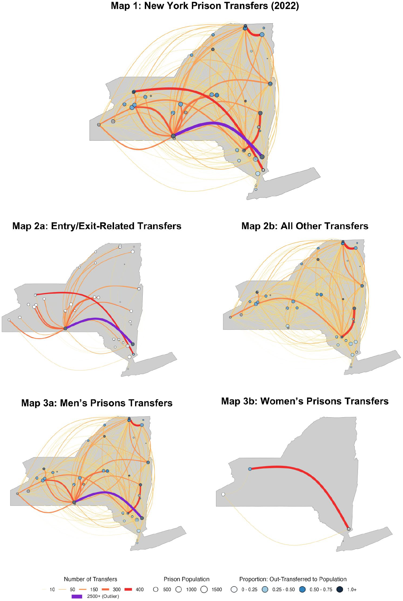
Maps of the cumulative number of people transferred between prisons in New York in 2022. Each transfer is an individual who was moved from one prison facility in New York’s state prison system (The Department of Corrections and Community Supervision) to another while serving their sentence. All maps aggregate transfers throughout the year, with each point representing a prison (its size weighted by its population at the start of the year) and each line representing the total transfers between the pair of prisons it connects. To give a sense of turnover, the prisons are colored according to the proportion of people transferred out to the facility’s population at the start of 2022 (sourced from the population on December 31, 2021). The first map (map 1) shows all transfers in 2022. Maps 2a and 2b disaggregate transfers designated for intake, reception, and release (map 2a) from all other transfers (map 2b). Maps 3a and 3b disaggregate transfers within the men’s prison system (map 3a) and the women’s (map 3b).
Map 1 shows all transfers in 2022. 2 Below it are maps dividing entry and exit-related transfers (map 2a) from transfers for all other reasons (map 2b), as well as transfers between men’s prisons (map 3a) and women’s (map 3b). 3 In New York, like many states, incarcerated people begin their sentences at reception centers before transferring to less temporary prison placements (Goodman 2008). In some cases, they are also transferred immediately prior to release. For brevity, I term all transfers for reception, intake, and release purposes as related to “entry or exit” from the prison system. New York’s prisons are also gender segregated. 4 In 2022, there were 45 men’s, 3 women’s, and 2 mixed-gender substance use treatment prisons. By mapping transfers across these categories, this visualization underscores the scale and interconnectedness of the prison transfer network, its impact on facility-level turnover, and aspects of its internal dynamics.
Results
Transfers are pervasive, both in overall scale and in the number of facilities implicated. Map 1 shows a total of nearly 38,000 transfers across 1,349 unique sets of sending and receiving prison pairs. Setting aside entry- and exit-related transfers, prisons sent transferees to a median of 31 facilities and received them from a median of 30 (see map). These transfers significantly affected populations. In 2022, prisons transferred out up to 10 times their starting populations for reasons other than system entry and exit, with an average of 78 percent of their starting population size transferred out (median = 57 percent). In sum, even without considering the transfers built into entry and exit processes, prisons are consistently connected to their peers and transfer out meaningful portions of their populations.
A system-level view raises questions about the structural dynamics of the prison transfer network. For instance, as shown in map 2a, system entry and exit transfers are more concentrated than other transfers. They involved just 168 unique prison pairs, with the median prison sending and receiving people for entry and exit reasons to only two other prisons. Aside from the prisons serving as reception centers in this period (shown with dark gray points), most prisons transferred out smaller proportions of their populations for entry and exit reasons (average = 17 percent, shown with white-colored points).
Finally, women make up 4 percent of New York’s prison population. Likewise, the smaller network of women’s prisons made 1,819 transfers in 2022, with these prisons trading people to and from a median of three other facilities. On average, women’s prisons transferred out 33 percent of their starting population size and transferred in 43 percent. In other words, the smaller women’s system makes fewer transfers and has lower facility-level turnover than the men’s system.
Implications
New York’s prisons are engulfed in movement. The maps presented here demonstrate the diverse array of prisons connected by transfers and the substantial facility-level population change these moves produce. They also suggest structural variation within the prison network. A smaller set of prisons conduct transfers for intake and reentry processing than for all other transfers, while designated women’s prisons have less transfer-related turnover than men’s.
Altogether, these findings underscore that movement, in addition to immobility, is a constant presence in incarcerated life. Whereas prisons are often studied through single-site ethnographies (bracketing transfers) or aggregate systemwide data (subsuming them), these findings underscore that we can additionally conceptualize and study them as a dynamic network. This perspective invites novel avenues for future research, including on prison networks’ attributes, evolution, and structural variations.
Meanwhile, for incarcerated people, transfers can be disruptive and arduous (Brooks and Best 2021; Buckley 2022), upending aspects of prison life that have long interested scholars, from prison employment (Gibson-Light 2022) and religious programs (Ellis 2023) to distance from home (Clark and Duwe 2017) and social networks (Kreager and Kruttschnitt 2018). More research is needed on the impacts of the prison network for the incarcerated people shuffled within it.
Supplemental Material
sj-docx-1-srd-10.1177_23780231251330341 – Supplemental material for “Shipping Out”: Mapping the Prison Transfer Network
Supplemental material, sj-docx-1-srd-10.1177_23780231251330341 for “Shipping Out”: Mapping the Prison Transfer Network by Iolanthe Brooks in Socius
Footnotes
Funding
The author disclosed receipt of the following financial support for the research, authorship, and/or publication of this article: This article draws from research conducted by the author and supported by the National Science Foundation Graduate Research Fellowship under grant DGE-2234667, as well as the Northwestern University Department of Sociology and the Northwestern University Council for Race and Ethnic Studies Transformative Justice Grant.
Supplemental Material
Supplemental material for this article is available online.
Notes
Author Biography
References
Supplementary Material
Please find the following supplemental material available below.
For Open Access articles published under a Creative Commons License, all supplemental material carries the same license as the article it is associated with.
For non-Open Access articles published, all supplemental material carries a non-exclusive license, and permission requests for re-use of supplemental material or any part of supplemental material shall be sent directly to the copyright owner as specified in the copyright notice associated with the article.