
Abstract
Vaccine equity holds the key to ending the coronavirus disease 2019 (COVID-19) pandemic. Yet most prior work on vaccine equity has compared vaccine uptake across neighborhoods with varying sociodemographic composition or assessed whether vaccine disparity across neighborhoods has diminished over time. Researchers seldom examine the extent to which vaccination helps reduce inequalities in the prevalence of COVID-19 across neighborhoods. Using administrative data from the City of Toronto, the authors compare the vaccine trajectories of neighborhoods with low, moderate, and high COVID-19 rates. The authors also examine whether disparities in COVID-19 rates have narrowed or widened as vaccinations have become more available. By mid-June 2021, differences in vaccination rates by neighborhoods’ COVID-19 levels were small, but disparities in COVID-19 rates across neighborhoods persisted. Equality in vaccination rates is not a silver bullet to reducing inequalities in COVID-19 infections across neighborhoods with varying sociodemographic characteristics and likely variations in exposure to the COVID-19 virus.
Racial minorities, immigrants, and the socioeconomically disadvantaged have had disproportionately higher coronavirus disease 2019 (COVID-19) case and fatality rates (Choi et al. 2021; Wrigley-Field et al. 2020; Yancy 2020) , but they have lower vaccination rates than non-Hispanic whites and the socioeconomically advantaged (Ndugga, Hill, and Artiga 2021). These findings, coupled with the more recent emergence of deadly variants, have kindled concerns about vaccine equity (Jean-Jacques and Bauchner 2021). Public health officials and scientists have underscored that vaccine equity holds the key to ending the pandemic (Georgieva et al. 2021). Some scientists and medical professionals have emphasized the importance of prioritizing vaccine doses to at-risk populations and communities with the most COVID-19 cases to optimize the effectiveness of coronavirus vaccinations (Bibbins-Domingo, Petersen, and Havlir 2021; Jean-Jacques and Bauchner 2021).
Motivated by these concerns, most empirical work on vaccine equity has compared vaccine uptake across neighborhoods with varying sociodemographic compositions (Chernyavskiy, Richardson, and Ratcliffe 2021; Iveniuk and Leon 2021) or assessed whether vaccine disparities across neighborhoods have diminished over time (Maul, Reddy, and Joshi, 2021). To date, no study has explored how disparities in COVID-19 rates across neighborhoods have changed as inequalities in coronavirus vaccination rates have diminished (or increased) over time.
Using administrative data about coronavirus infection and vaccination rates obtained from the City of Toronto’s Open Data Portal, we examine COVID-19 trajectories across neighborhoods with low, moderate, and high COVID-19 rates between mid-April and mid-June 2021, a period when vaccine availability surged in Toronto and the provincial government prioritized vaccine doses to areas with high COVID-19 rates. We also identify neighborhoods in the City of Toronto that had low vaccination rates in mid-April and whose vaccination rates continued to be lower than those of other neighborhoods over time. We further describe whether differences in COVID-19 trajectories changed between early May and late June, as a higher share of residents of Toronto became vaccinated. For this analysis, we measure COVID-19 rates two weeks after vaccination rates to ensure proper temporal ordering. Finally, we assess the extent to which vaccine access and the sociodemographic profiles of neighborhoods contribute to disparities in coronavirus vaccination and infection trajectories.
Background
Social Determinants of COVID-19
Rates of COVID-19 cases and fatalities differ vastly by race/ethnicity, nativity, socioeconomic status, and place of residence (Choi et al. 2021; Rossen et al. 2020; Wrigley-Field et al. 2020; Yancy 2020). These differences have been attributed to systemic inequalities in occupational attainment, health status, neighborhood contexts, and housing conditions (Bambra et al. 2020; Choi and Denice 2020; Krieger, Waterman, and Chen 2020; Schneider and Harknett 2020).
Of these explanations, three are particularly relevant for our study. First, racial minorities, immigrants, and low-income individuals may not be able to take time off to get vaccinated or to recover from the side effects following vaccination (Schneider and Harknett 2020; St-Denis 2020). Second, immigrants may face language barriers to navigating the health care system and obtaining high-quality care. Limited language proficiency and cultural know-how may also preclude immigrants, particularly recent arrivals, from engaging with the provincial vaccine booking system. Third, these groups more often reside in overcrowded households and dense neighborhoods with fewer health-promoting amenities such as access to family physicians and pharmacies (Bambra et al. 2020; Choi and Denice 2020; Kamis et al. 2021; Krieger et al. 2020; Yang et al. 2020). Limited access to health care may mean that racial minorities and low-income individuals have to travel long distances or wait long periods to get vaccinated.
Empirical Work on Coronavirus Vaccination Rates
An emerging body of work has documented variations in coronavirus vaccine uptake across communities and neighborhoods with varying sociodemographic compositions. Many public health departments, including the Centers for Disease Control and Prevention and Toronto Public Health, report vaccine trajectories for different age groups (Centers for Disease Control and Prevention 2021; City of Toronto 2021). Chernyavskiy et al. (2021) showed that vaccines rates were greater in U.S. counties with higher shares of college graduates and racial minorities. Iveniuk and McKenzie (2021) showed a negative correlation between previous COVID-19 levels and vaccination rates in Ontario between late March and mid-April 2021. Others have assessed the efficacy of policy efforts aimed at improving vaccine access for at-risk populations with low vaccine uptake. Maul and Joshi (2021), for example, showed that efforts to improve vaccine access were effective at increasing vaccination rates among Black and Latino residents aged 65 years and older in Maryland.
Although these studies offer important insights, they focused solely on vaccine trajectories and did not assess whether disparities in COVID-19 rates across neighborhoods have changed as inequalities in coronavirus vaccination rates have diminished (or increased) over time. Furthermore, Iveniuk and McKenzie (2021) examined vaccine uptake in Ontario between early March and mid-April. This was a time when vaccines were extremely scarce in Canada (Lindeman 2021). After mid-April, the vaccine supply in Ontario increased significantly, and the Province of Ontario enacted policies to improve vaccine equity, including allocating more doses of the coronavirus vaccine to hotspots (Crawley 2021; Iveniuk and McKenzie 2021). Whether the vaccine inequality observed by Iveniuk and McKenzie (2021) in early April has persisted is unclear. There is a need to systematically address whether vaccine inequities lessened as vaccines became less scarce and the provincial government implemented policies that prioritized geographic areas with high COVID-19 rates. More broadly, missing in the literature is an evaluation of whether inequalities in COVID-19 rates changed over time as higher shares of adults became vaccinated. Rising rates of and diminishing inequalities in vaccination may in turn attenuate inequalities across neighborhoods in the prevalence of COVID-19. It is also possible, however, that inequalities in vaccination rates may not have diminished fast enough to counteract at-risk neighborhoods’ greater exposure to the coronavirus.
COVID-19 and Vaccination Efforts in the City of Toronto
The context of our study is the City of Toronto in the province of Ontario, Canada. Canada’s COVID-19 death rates fall near the middle of Organisation for Economic Co-operation and Development countries: lower than countries such as the United States and France, but higher than Japan and Germany (Fallis 2020). Toronto is a global city with an ethnoracially and socioeconomically diverse population (Social Policy Analysis and Research 2014). In 2016, 52 percent of residents of Toronto identified as racial minorities, and 47 percent identified as foreign born. Of Toronto’s foreign-born residents, roughly 70 percent identified as racial minorities, compared with just under a third of their Canadian-born counterparts (City of Toronto 2019). Toronto consists of 140 neighborhoods composed of two to five census tracts with an average population of 20,000. Neighborhoods in Toronto serve as planning areas for the municipal government, are service areas for local businesses, and are perceived as “actual neighborhoods” by Torontonians (Social Policy Analysis and Research 2014). Like other metropolitan areas, Toronto is segregated by race, although its level of segregation is lower than those of major metropolitan areas in the United States. For instance, its level of Black-white segregation was lower than 38 of the 50 largest metropolitan areas in the United States (Hulchanski 2019).
During the COVID-19 pandemic, Toronto rapidly became an epicenter in Canada, partly reflecting the higher presence of subpopulations hit hardest by the pandemic (Choi and Denice 2020). COVID-19 rates peaked for the third time in early April 2021 because of the emergence of variants and vaccine scarcity. This peak subsided as vaccines became more readily available in mid-April. By mid-June 2021, there have been nearly 170,000 confirmed cases and 3,500 COVID-19-related deaths in the city (City of Toronto 2021). Toronto experienced a shortage of vaccines until mid-April 2021: only 21 percent of adults in Toronto had received at least one dose by mid-April. Vaccine supply increased over time, and by late June 2021, roughly 70 percent of adults in Toronto had received at least one dose (City of Toronto 2021).
Two policies were enacted to address vaccine and infection inequalities. First, Ontario prioritized vaccine distribution to older adults and to COVID-19 hotspots, which are small geographical areas with the greatest number of COVID-19 cases (Brown et al. 2021). 1 For two weeks in early May, half of all new vaccination doses were allocated to COVID-19 hotspots (Beattie 2021). Second, unlike other provincial and municipal governments in Canada that did not collect or release COVID-19 data for geographic units smaller than provinces, the City of Toronto made COVID-19 infection rates, vaccination rates, and sociodemographic profiles for each neighborhood publicly available (City of Toronto 2021). These rich administrative data released by the municipal government make Toronto an ideal setting to analyze issues of vaccine equity in real-time.
Data and Methods
Data
We combine several pieces of publicly available data. First, daily cumulative vaccination rates for each neighborhood were obtained from the municipal government’s coronavirus Vaccine Dashboard. Second, the sociodemographic composition of each neighborhood based on the 2016 Canadian census was obtained from the City of Toronto’s Open Data Catalogue. Third, we obtained the list and locations of pharmacies, hospitals, and clinics administering the coronavirus vaccines in Toronto. 2 Our analyses are conducted on the census of the city’s neighborhoods, all 140 of them.
Measures
We examine two outcomes. First, we measure the cumulative percentage of adult residents (≥18 years of age) who have received at least one dose of the coronavirus vaccine at five time points in the spring and early summer of 2021: April 17, May 1, May 15, May 29, and June 12. These points correspond roughly to major events in the Province of Ontario’s vaccination rollout, including changes in age eligibility, increases in the supply of messenger ribonucleic acid (mRNA) vaccines, the discontinuation of the use of the AstraZeneca vaccine for the first dose because of the risk for developing vaccine-induced prothrombotic immune thrombocytopenia, and the initiation of administration of the second dose (Ontario 2021). We focus on first doses given growing evidence of protection following one of the two doses of vaccines (Thompson et al. 2021).
Second, we measure neighborhood-specific cumulative COVID-19 rates as the number of new COVID-19 cases per 100,000 residents through May 1, May 15, May 29, June 12, and June 22, 2021. 3
Our key independent variable classifies Toronto’s neighborhoods into three categories on the basis of their baseline cumulative COVID-19 rates as of March 31, 2021, the day before Ontario transitioned into the second phase of its vaccination rollout plan, which prioritized geographic areas with the greatest COVID-19 rates. The histograms in Figure 1 illustrate the distribution of cumulative COVID-19 rates across neighborhoods, separated by three thresholds. Neighborhoods with low COVID-19 levels are those with fewer than 2,615 cumulative COVID-19 cases per 100,000 residents. Neighborhoods with moderate COVID-19 levels had at least 2,615, but fewer than 4,071, cases per 100,000 residents. Neighborhoods with high COVID-19 levels are those with at least 4,071 cumulative COVID-19 cases per 100,000 residents as of March 31. Figure 1 suggests that these cutoff points represent three groups of neighborhoods with qualitatively different levels of COVID-19 infections. Importantly, our results are not sensitive to the specific choice of groups. As a robustness check, we operationalized the neighborhoods using several different thresholds, including dividing neighborhoods into terciles. These results are substantively similar to those reported here and are available upon request. 4

Distribution of cumulative COVID-19 cases per 100,000 residents, as of March 31, 2021.
Several time-invariant variables capture the sociodemographic composition of each neighborhood: percentage Black, percentage South Asian, percentage Hispanic, percentage East Asian, percentage foreign-born, percentage who live below the poverty line, 5 percentage of health care workers, percentage of adults aged 55 years and older, and population density. We opted for this age cutoff because vaccination eligibility was extended to residents younger than 55 on April 19, 2021 (Ontario 2021). These variables are standardized with a mean of 0 and a standard deviation of 1 to account for their different distributions. 6
To account for vaccine availability, we note whether a neighborhood included areas designated as COVID-19 hotspots and the per capita number of vaccination sites in the neighborhood. COVID-19 hotspot is coded 1 if the neighborhood includes areas designated by the provincial government as COVID-19 hotspots and 0 otherwise. The map in Figure 2 illustrates Toronto’s neighborhoods by both their COVID-19 levels and whether they include hotspots. The per capita number of immunization clinics is obtained by dividing the count of mass vaccination sites, hospitals, and pharmacies that could administer vaccines by the size of the population in the neighborhoods and multiplying by 100,000. 7 The Ontario government initially released a list of pharmacies that could administer coronavirus vaccinations in mid-March and then added pharmacies to the list over time. We do not know when many of the new vaccination sites (i.e., those added after mid-March) were designated as vaccination sites. To ensure that we are not predicting COVID-19 rates from an earlier period based on the per capita number of pharmacies at a later point in time, we use the initial list of pharmacies. For the analyses of COVID-19 trajectories, we also control for the vaccination rates two weeks before the measurement of COVID-19 case rates.

Levels of COVID-19 and the presence of hotspots among Toronto’s neighborhoods.
Analytical Strategy
In the first stage of our analysis, we estimate two-level growth curve models to compare the vaccine trajectories of neighborhoods with low, moderate, and high COVID-19 rates. Growth curve models estimate differences in COVID-19 vaccination rates in mid-April (i.e., intercepts) and the rate of growth across distinct time points (i.e., slopes) (Curran, Obeidat, and Losardo 2010).
The level 1 equation describes within-neighborhood changes in cumulative vaccination (n) over time (t):

Cumulative vaccination rates (ynt) are characterized by a unique intercept (α n ) and a time-dependent slope (β nt ). Time (t) is added as a series of dichotomous variables indicating the day when the cumulative vaccination rates were measured to capture nonlinearities in vaccination trajectories.
The level 2 equation models variation in cumulative vaccination rates among neighborhoods with low, moderate, and high COVID-19 rates (i.e., between-neighborhood effects):

and

These equations indicate that the random intercepts (α n ) and slopes (β n ) are a function of time-invariant covariates (xnk) and error terms (unt, vnt).
We estimate three additive models. Model 1 compares the vaccine trajectories of neighborhoods with varying levels of COVID-19 in the absence of any controls. Model 2 accounts for differences in vaccine availability by adding hotspot status and the per capita number of vaccination sites in the neighborhoods. Comparing the results from models 1 and 2 helps assess the extent to which differences in vaccine access are associated with disparities in initial vaccination rates and changes in vaccination rates over time. Model 3 adds sociodemographic controls to gain insights into the relationship between neighborhood composition and vaccination trajectories and to identify the neighborhoods with lower initial rates and persistent lower vaccination rates. Comparing the results from models 2 and 3 helps assess the extent to which differences in sociodemographic composition are associated with disparities in initial vaccination rates and changes in vaccination rates over time. Such a comparison yields insights about the barriers to vaccine access for neighborhoods with higher shares of ethnoracial minorities, immigrants, and low-income residents. To ensure that multicollinearity does not bias our results, we estimate the variance inflation factors of all estimated models and ensure that the variance inflation factors of all our models do not exceed 4. Using the coefficients from each model and population means, we predict the percentage of adults in neighborhoods with low, moderate, and high COVID-19 levels who received at least one vaccine dose.
In the second stage of our analysis, we estimate two-level growth curve models comparing the cumulative number of COVID-19 cases (per 100,000 residents) in neighborhoods with varying levels of COVID-19 in March 31, 2021. We ran analogous growth curve models (as those predicted during the first stage of analyses) to predict the COVID-19 trajectories between early May and late June. The only difference is the inclusion of cumulative vaccination rates (two weeks prior to the period of interest) in models 2 and 3. As in the first stage, we use population means and the coefficients from the three additive models to predict the cumulative number of COVID-19 cases per 100,000 residents for neighborhoods with low, moderate, and high COVID-19 rates.
Our analyses are conducted using the census of all 140 neighborhoods in Toronto. Because our estimates are based on the population (and not on a sample) of neighborhoods in Toronto, we focus on the estimates themselves and do not report confidence intervals, standard errors, and statistical significance.
Results
Sample Characteristics
Table 1 documents variation in the sociodemographic composition of neighborhoods by their COVID-19 rates in late March 2021. Higher shares of neighborhoods with higher COVID-19 rates are more likely to include areas designated as COVID-19 hotspots: 94 percent of neighborhoods with high COVID-19 rates versus 87 percent of neighborhoods with moderate and 34 percent of neighborhoods with low COVID-19 rates. Neighborhoods with higher COVID-19 rates had fewer per capita coronavirus vaccination sites than those with lower COVID-19 rates. On average, there were 12.3 vaccination sites for every 100,000 residents in neighborhoods with low COVID-19 rates, compared with 9.2 vaccination sites in neighborhoods with moderate and 6.6 vaccination sites in neighborhoods with high COVID-19 rates. In line with prior work (Choi et al. 2021; Wrigley-Field et al. 2020), neighborhoods with higher COVID-19 rates are more ethnoracially diverse than neighborhoods with lower COVID-19 levels. Fifteen percent of residents of neighborhoods with high COVID-19 rates self-identify as Black, compared with 6 percent of residents of neighborhoods with moderate COVID-19 rates and 4 percent of residents of neighborhoods with low COVID-19 rates. Nearly 60 percent of residents of neighborhoods with high COVID-19 rates are foreign born, compared with 49 percent of residents of neighborhoods with moderate COVID-19 rates and 38 percent of residents of neighborhoods with low COVID-19 rates. They are also more socioeconomically disadvantaged than neighborhoods with lower COVID-19 rates. Just under 30 percent of residents of neighborhoods with high COVID-19 rates were college graduates, compared with 45 percent of residents of neighborhoods with moderate and 59 percent of residents of neighborhoods with low COVID-19 rates.
Sample Characteristics.
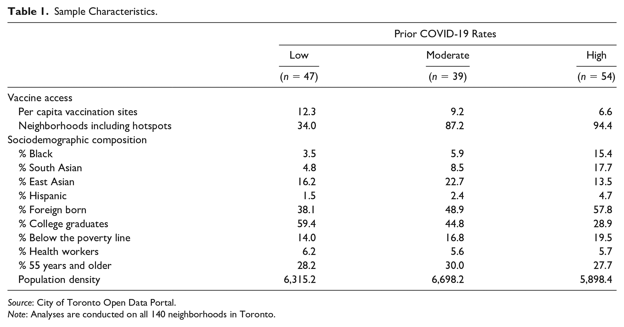
Source: City of Toronto Open Data Portal.
Note: Analyses are conducted on all 140 neighborhoods in Toronto.
How Have Disparities in Vaccination Rates across Neighborhoods Changed over Time?
Figure 3 presents the predicted percentage of residents of a neighborhood who received at least one dose of the vaccine between April 17 and June 12, 2021. The predicted percentages are computed using population means and the coefficients from the three additive models in Appendix Table A2. 8 The left panel visualizes the results from model 1, which does not include any controls. By mid-April, the cumulative percentage of adults in neighborhoods with moderate and high COVID-19 rates were, respectively, 2 and 5 percentage points lower than the corresponding percentages for neighborhoods with low COVID-19 rates. Between mid-April and early May, vaccination rates grew much faster in neighborhoods with higher cumulative COVID-19 rates. In early May, vaccination rates across neighborhoods with low, moderate, or high COVID-19 rates were within 1 percentage point of one another. After early May, vaccination rates continued to grow faster in neighborhoods with moderate COVID-19 rates than in neighborhoods with low COVID-19 rates. By mid-June, the cumulative percentage of adults in neighborhoods with moderate COVID-19 rates was 1.0 percentage point higher than the corresponding percentages for neighborhoods with low COVID-19 rates. By contrast, between early and mid-May, neighborhoods with high COVID-19 rates lost some of the relative gains made during the previous period. By mid-May, the cumulative percentage of adults in neighborhoods with high COVID-19 rates was 3 percentage points lower than the corresponding percentages for neighborhoods with low COVID-19 rates. Nonetheless, after mid-May, their vaccination rates continued to grow faster than the corresponding rates for neighborhoods with low COVID-19 rates. By mid-June, disparities in coronavirus vaccination rates between neighborhoods with low and high COVID-19 rates had diminished again to 2 percentage points.

Predicted share of adults who received their first coronavirus vaccination, by baseline COVID-19 level.
The middle panel visualizes the results from model 2, which controls only for differences in vaccine access. By mid-April, vaccination rates were lower in COVID-19 hotspots and neighborhoods with more vaccination sites. After early May, vaccination rates grew faster in neighborhoods with areas designated as COVID-19 hotspots. Until mid-May, vaccination rates initially grew slower in neighborhoods with more per capita vaccination sites, but they grew faster after mid-May 2021. The vaccine trajectories visualized in the second panel are very similar to those in the first panel. This finding suggests that disparities in initial vaccine rates and vaccine rate growth across low, moderate, and high COVID-19 rates remained largely unchanged after we controlled for differences in vaccine access. This lack of explanatory power likely reflects the fact that even though vaccine doses were allocated at higher rates in neighborhoods with higher COVID-19 cases, there were fewer per capita vaccination sites in these neighborhoods. The two contrasting forces—the promoting effect of additional doses and the deterring effect of limited vaccination sites—are canceling each other out.
The right panel visualizes the results from model 3, which controls for differences in vaccine access and sociodemographic composition. Net of other controls, the initial vaccination rates were lower in neighborhoods with higher shares of foreign-born and Black residents but higher in neighborhoods with higher shares of residents who are college graduates, 55 years and older, and health care workers. Coronavirus vaccination rates increased at a faster pace in neighborhoods with higher shares of South Asian and East Asian residents, but they increased at a slower pace in low-income and immigrant neighborhoods. Because of lower initial rates and slower rates of growth, vaccination rates were consistently and exceptionally lower in neighborhoods with high shares of foreign-born residents. By mid-June, a standard deviation increase in the share of immigrant residents was associated with 6 percentage points lower vaccination rates, net of other controls.
A comparison of the middle and right panels reveals that once we adjust for differences in sociodemographic composition, vaccination rates are in fact higher in neighborhoods with higher COVID-19 rates than in neighborhoods with lower COVID-19 rates. The cumulative percentage of adults in neighborhoods with moderate and high COVID-19 rates were, respectively, 2 and 4 percentage points higher than the corresponding percentages for neighborhoods with low COVID-19 rates with comparable vaccine access and similar sociodemographic composition. Together, these findings attest to the barriers to vaccination among residents of neighborhoods with a higher prevalence of COVID-19 who are disproportionately more likely to be immigrants and to have low income.
Have Disparities in COVID-19 Diminished as Vaccine Access Has Become More Equal over Time?
Figure 4 presents the predicted cumulative number of COVID-19 cases per 100,000 residents between May 1 and June 22, 2021. The predicted cumulative rates are computed using population means and the coefficients from the three additive models in Appendix Table A3. 9 The left panel visualizes the results from model 1, which does not include any controls. By early May, neighborhoods with moderate COVID-19 rates had roughly 2,000 more cumulative infections, and neighborhoods with high COVID-19 rates had roughly 6,000 cumulative infections per 100,000 residents than those with low levels of COVID-19. Infections spread faster in neighborhoods with higher COVID-19 rates. Inequalities in COVID-19 cases across neighborhoods with low, moderate, and high COVID-19 rates increased over time.

Predicted number of cumulative COVID-19 cases per 100,00 residents, by baseline COVID-19 level.
The middle panel visualizes the results from model 2, which also controls for differences in vaccine access and vaccine uptake. In early May 2021, the cumulative COVID-19 rates were higher in COVID-19 hotspots and neighborhoods with high vaccination rates, but they were lower in neighborhoods with more per capita vaccination sites. Between early May and late June, COVID-19 cases grew at a slower pace in neighborhoods with more vaccination sites and higher vaccination rates. The predicted COVID-19 trajectories in the left panel are very similar to those in the middle panel. Stated differently, disparities in cumulative COVID-19 rates across neighborhoods with low, moderate, and high COVID-19 rates remain largely unchanged ever after we control for differences in vaccine access and uptake.
The right panel visualizes the results from model 3, which controls for differences in vaccine access and sociodemographic composition. Net of other controls, initial COVID-19 rates were higher in neighborhoods with higher shares of Blacks, South Asians, Hispanics, and immigrants but lower in neighborhoods with higher shares of East Asians, college graduates, and individuals 55 years and older. Between early May and late June, COVID-19 grew at a slower pace in neighborhoods with large shares of residents who belonged to groups who initially had higher COVID-19 rates. The only exception was observed in neighborhoods with higher shares of immigrant residents.
A comparison of the middle and right panels reveals that the variation in initial COVID-19 rates and COVID-19 growth rates across low, moderate, and high COVID-19 prevalence is much smaller once we account for differences in sociodemographic composition. For example, once we account for differences in sociodemographic traits, neighborhoods with high COVID-19 rates had roughly 3,000 more cumulative infections by early May compared to neighborhoods with low COVID-19 rates. This compares with roughly 6,000 more cumulative infections in the absence of such controls. Together, these findings suggest that differences in the sociodemographic characteristics of neighborhoods and their residents’ differential risk for contracting COVID-19 are key factors behind disparities in initial COVID-19 rates and COVID-19 growth rates across communities.
Discussion
Researchers and public health officials posit that equitable vaccine access is the best hope for defeating the COVID-19 pandemic. We compare the vaccine trajectories of neighborhoods with low, moderate, and high COVID-19 rates between mid-April and mid-June. We also investigate whether differences in COVID-19 rates across neighborhoods with low, moderate, and high prevalence of COVID-19 have diminished (or increased) as a higher share of adults in Toronto received at least one dose of the coronavirus vaccine.
Consistent with prior work, we show that in mid-April 2021, vaccination rates were lower in neighborhoods in Toronto with higher COVID-19 rates (Iveniuk and Leon 2021). Between mid-April and early May, vaccination rates increased at a faster pace in neighborhoods with higher COVID-19 rates. For neighborhoods with high COVID-19 rates, much of the “catch-up” occurred during the period when Ontario prioritized geographic areas with a higher prevalence of COVID-19, including allocating half of their new doses to COVID-19 hotspots for two weeks in May. By early May, differences in vaccination rates between neighborhoods with high COVID-19 rates and other neighborhoods were small. By mid-May, neighborhoods with high COVID-19 rates had lost some of their relative gains in vaccination rates. The difference in average vaccination rates between neighborhoods with low and high COVID-19 rates were larger in mid-May than in early May: 3 percentage points versus less than 1 percentage point. Nonetheless, after mid-May, the vaccination rates of neighborhoods with high COVID-19 rates continued to grow faster than neighborhoods with low COVID-19 rates. By mid-June, the difference in average vaccination rates between these two communities had diminished again to 2 percentage points. These findings suggest that the prioritization of neighborhoods with high COVID-19 rates may be an effective way to achieve parity in vaccination rates, but such practices must be sustained over time. Nonetheless, it is also possible that the municipal government started to prioritize vaccination availability in racialized urban neighborhoods after mid-April as vaccine supply increased. In this way, barriers to vaccination among the disadvantaged may have decreased as vaccines became less scarce and parity in vaccination rates would have partially occurred even in the absence of such policies.
Differences in vaccination trajectories across neighborhoods with varying COVID-19 levels emerge in large part because of the sociodemographic traits of their residents. Neighborhoods with greater shares of immigrant residents had lower initial vaccination rates, and their vaccination rates grew at a slower pace. These neighborhoods initially had high COVID-19 rates, and infections spread at a faster pace in these communities. When designing vaccination outreach programs, policy makers should pay greater attention to immigrant neighborhoods that have persistently lower vaccination rates and higher COVID-19 rates.
Despite having achieved high vaccination rates and inequalities in vaccination rates diminishing over time, neighborhoods in Toronto with higher initial COVID-19 levels continued to experience significantly more infections. Adjusting for differences in vaccine access and vaccine uptake explains little of the disparities in COVID-19 rates across neighborhoods with low, moderate, and high COVID-19 rates. By contrast, accounting for differences in sociodemographic composition explains a significant portion of these disparities. Overall, this suggests that differences in COVID-19 rates emerge in large part because of variation in the sociodemographic makeup of residents with differential exposure to the coronavirus. In the absence of universal vaccination rates, achieving equal vaccination rates will not reduce disparities in COVID-19 rates. To ensure true equity, residents of neighborhoods with higher COVID-19 rates may have to be vaccinated at higher rates to account for their greater exposure to the coronavirus. Furthermore, vaccination rollouts must work in tandem with other efforts aimed at reducing exposure to the COVID-19 virus, such as the enforcement of safety measures to curb the coronavirus at some work sites (Su et al. 2021).
Like prior work, our study has some limitations. First, we have access to neighborhood-level vaccination rates. Given that recent polls revealed that vaccine hesitancy differs little by race and income levels (Summers 2021), we attribute disparities in vaccination rates largely to differential barriers to access. The extent to which these disparities emerge because of vaccine hesitancy needs to be formally examined for Toronto.
Second, information on place of residence was missing for 7.7 percent of Toronto residents who received at least one dose of the coronavirus vaccine. We thus understate the share of Torontonians who have received at least one dose; however, whether missing rates are higher for residents of neighborhoods with higher COVID-19 is unknown.
Third, we do not have access to data about the number of daily first doses that were made available to each neighborhood. We indirectly capture vaccine supply using (1) designation as a COVID-19 hotspot and (2) the per capita vaccination sites in the neighborhood. Our measure of the per capita number of vaccination sites in mid-March may have not adequately captured vaccine supply at various points in time. Vaccines may have not been readily available at the vaccination sites. Before mid-April, Canada experienced severe vaccine shortages (Lindeman 2021). The Province of Ontario also suspended the administration of the AstraZeneca vaccine for the first doses in May 2021. During periods of vaccine scarcity and policy shifts, coronavirus vaccines may have not been available at vaccination sites.
Fourth, neighborhood boundaries delineated by the City of Toronto do not align perfectly with the boundaries used by the Province of Ontario to designate hotspots (i.e., forward sortation areas). We operationalize COVID-19 hotspots as neighborhoods that included geographic areas that were designated as COVID-19 hotspots. Therefore, unknown is what share of the residents of these neighborhoods had faster access to vaccines given their residence in a hotspot. Nonetheless, it is worth noting that alternative operationalizations of COVID-19 hotspots yield similar results.
Finally, the emergence of variants with higher infectiousness may have canceled out the impact of vaccination in reducing COVID-19 disparities across neighborhoods. Future forecasting models should make this assessment when the requisite data become available.
Our study highlights the fact that achieving full vaccine equity may require more than simple parity in vaccination availability and uptake. Instead, it may entail that we develop a more nuanced understanding of the structural conditions of neighborhoods and design a more comprehensive strategy to protect the vulnerable from exposure to the coronavirus. Doing so may be our best weapon to defeat the COVID-19 epidemic.
Supplemental Material
sj-docx-1-srd-10.1177_23780231211052946 – Supplemental material for Vaccine and COVID-19 Trajectories
Supplemental material, sj-docx-1-srd-10.1177_23780231211052946 for Vaccine and COVID-19 Trajectories by Kate H. Choi, Patrick A. Denice and Sagi Ramaj in Socius
Footnotes
Funding
This work was supported by the Social Sciences and Humanities Research Council (SSHRC) (grant 430-2017-00920).
Data Accessibility Statement
Supplemental Material
Supplemental material for this article is available online.
1
Provinces are the Canadian equivalent of U.S. states. The Province of Ontario determined the vaccine rollout for the City of Toronto.
2
Vaccination rate data come from https://www.toronto.ca/home/covid-19/covid-19-latest-city-of-toronto-news/covid-19-pandemic-data/covid-19-vaccine-data/. Neighborhood sociodemographic profiles come from: https://www.toronto.ca/city-government/data-researchmaps/open-data/open-data-catalogue. Vaccination administration sites are available at https://www.toronto.ca/home/covid-19/covid-19-protect-yourself-others/covid-19-vaccines/covid-19-how-to-get-vaccinated/covid-19-future-city-operated-immunization-clinics/#location=&lat=&lng=. All data were retrieved before June 30, 2021.
3
In supplementary analyses, we modeled the number of cases (instead of rates) and obtained substantively similar results.
4
The Appendix includes additional robustness checks. ![]() rerun the analyses of vaccination and infection rates using a continuous (rather than categorical) measure of cumulative COVID-19 cases as of March 31, and Tables A6 and A7 use recent COVID-19 rates (instead of the total as of March 31). The core findings are generally consistent.
rerun the analyses of vaccination and infection rates using a continuous (rather than categorical) measure of cumulative COVID-19 cases as of March 31, and Tables A6 and A7 use recent COVID-19 rates (instead of the total as of March 31). The core findings are generally consistent.
5
This measure is based on the percentage of residents whose family incomes fall below the low-income cutoff, the Canadian equivalent of the U.S. poverty line.
6
Models with unstandardized coefficients yield similar results.
7
We multiplied by 100,000 to ensure that we were comparing units that were roughly similar to infection rates.
8
For results specific to a neighborhood trait, please see Appendix Table A2. ![]() shows the differences in predicted percentages of adult residents who received at least one dose of the vaccine by neighborhood COVID-19 rates.
shows the differences in predicted percentages of adult residents who received at least one dose of the vaccine by neighborhood COVID-19 rates.
9
Please see Appendix Table A3 for the results specific to a neighborhood trait. ![]() shows the differences in predicted cumulative number of COVID-19 infections per 100,000 residents by neighborhood COVID-19 rates.
shows the differences in predicted cumulative number of COVID-19 infections per 100,000 residents by neighborhood COVID-19 rates.
Author Biographies
References
Supplementary Material
Please find the following supplemental material available below.
For Open Access articles published under a Creative Commons License, all supplemental material carries the same license as the article it is associated with.
For non-Open Access articles published, all supplemental material carries a non-exclusive license, and permission requests for re-use of supplemental material or any part of supplemental material shall be sent directly to the copyright owner as specified in the copyright notice associated with the article.