
Abstract

A forest plot is a useful graphical display of findings from a meta-analysis. It provides essential information to inform our interpretation of the results. Typically, a forest plot contains 6 basic “columns”, though additional columns can be added to provide more information. The 6 basic columns include details relating to the following:
included studies (and subgroups if analyzed)
intervention group
control group
weight
outcome effect measure in numeric format
outcome effect measure in graphical presentation
Let’s look at 2 examples from a study comparing total disc replacement with anterior lumbar interbody fusion to discover the usefulness of forest plots. 1
Begin at the End to Get Your Bearings
We suggest first looking at the
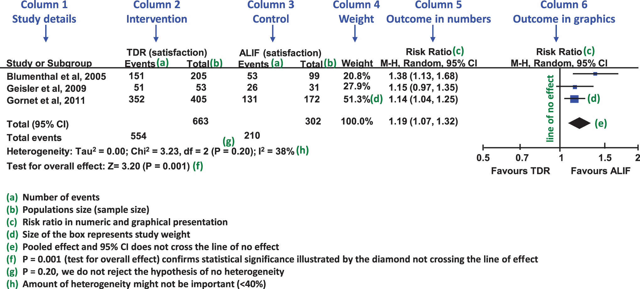
Proportion of patients satisfied with total disc replacement (TDR) versus anterior lumbar interbody fusion (ALIF) (Mu et al, 20 181).
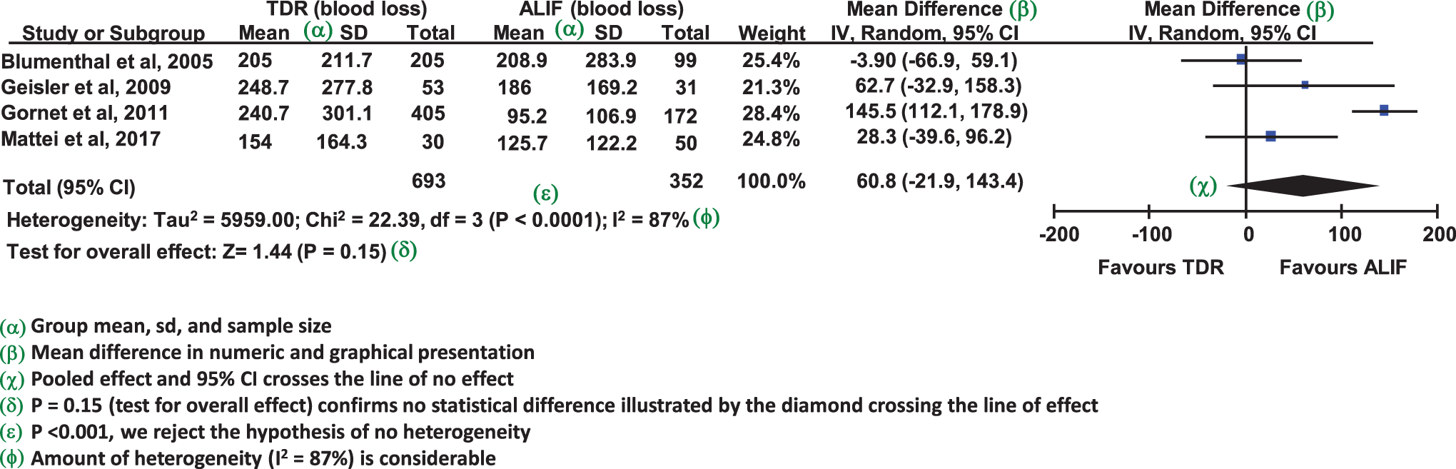
Blood loss comparing TDR vs ALIF (Mu et al, 20 181).
Understand the Graphical Display
Each line in the graphical display represents a study. The midpoint of the box symbolizes the point estimate of the effect (effect size; e.g. risk ratio, odds ratio, or mean difference), and its size (area) is proportionate to the weight of the study. Not all studies contribute equally to the pooled results. In general, studies that have a larger N provide more information and are therefore allotted greater weight. The design draws our eyes toward the studies that are given more weight. This is seen readily in the study by Gornet et al in Figure 1 which has a sample size of 405 compared to 205 and 53 in Blumenthal and Geisler, respectively.
Remember, the point estimate is the best guess of the true effect in the population. The width of the study lines extending through the boxes shows their confidence intervals. The confidence interval represents the chance that the true effect in the population will lie within the range.
The diamond below the studies represents the overall pooled effect from the included studies. The width of the diamond shows the confidence interval for the overall effect.
Each forest plot contains a vertical line, the line of ‘no effect’, which corresponds to the value 1 for binary outcomes such as the risk ratio or odds ratio and 0 in the case of continuous outcomes. When the 95% CI from a single study or the pooled estimate crosses the line of no effect, the difference in outcome between intervention and comparator is not statistically significant. Otherwise, statistical significance exists. In Figure 1, the pooled point estimate and the 95% CI lies entirely to the right of the line of no effect. This tells us that there is a statistical difference in the outcome between groups. In this figure, the results of satisfaction favor the ALIF group. It is confirmed by the test for overall effect located at the bottom left of Figure 1, P = .001. On the other hand, the diamond in Figure 2 crosses the line of no effect suggesting no statistically significant difference. This is verified by the test of overall effect, P = .15.
Understand Heterogeneity
A forest plot provides information about the heterogeneity among studies. Since several primary studies are brought together to provide one estimate (represented by the diamond in the forest plot), variability among them is inevitable. Clinical heterogeneity (variability in participants, treatments and outcomes) and methodological heterogeneity (variability in study design and risk of bias) can be reflected in statistical heterogeneity (variability in the treatment effects being evaluated). This statistical heterogeneity, often referred to simply as heterogeneity, can be evaluated in 3 ways: By gauging the overlap of the included studies’ point estimates and their 95% confidence intervals. By looking at the P-value of the Chi.
2
By assessing the I2 test, which quantifies the magnitude of the heterogeneity.
Compare Figures 1 and 2 for heterogeneity. The overlap of point estimates and confidence intervals in Figure 1 tend to be more consistent compared with Figure 2. This is corroborated by the Chi 2 test of heterogeneity that tests the hypothesis of no heterogeneity. P < .001 in Figure 2 rejects the hypothesis of no heterogeneity whereas P = .20 from Figure 1 does not reject the hypothesis of no heterogeneity. The magnitude of heterogeneity is estimated by the I2 and its interpretation is roughly as follows 2 :
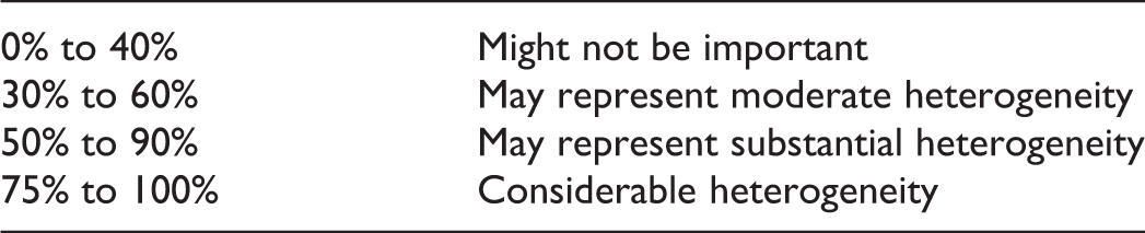
The I2 in Figure 1 is 38% suggesting any heterogeneity might not be important, whereas the 87% in Figure 2 suggests substantial heterogeneity.
Summary
Forest plots are useful graphical displays summarizing results from a meta-analysis.
When interpreting a forest plot, first identify the type of outcome used (e.g., binary or continuous).
Each study included in a meta-analysis is represented by a box (point estimate) and a horizontal line through the box (95% confidence interval). The size of the box represents the study weight; the larger the box, the more information the study provides and the greater the weight. The diamond below the studies represents the overall pooled effect from the included studies.
Each forest plot contains a vertical line, the line of ‘no effect’, which corresponds to the value 1 for binary outcomes (e.g., risk ratio or odds ratio) and 0 in the case of continuous outcomes.
When the 95% CI from a single study or the pooled estimate crosses the line of no effect, the difference between intervention and comparator is not statistically significant. Otherwise, statistical significance exists.
Heterogeneity among studies is inevitable, and its magnitude is estimated by the I2 statistic.
Footnotes
Declaration of Conflicting Interests
The author(s) declared no potential conflicts of interest with respect to the research, authorship, and/or publication of this article.
Funding
The author(s) received no financial support for the research, authorship, and/or publication of this article.