
Abstract
Introduction
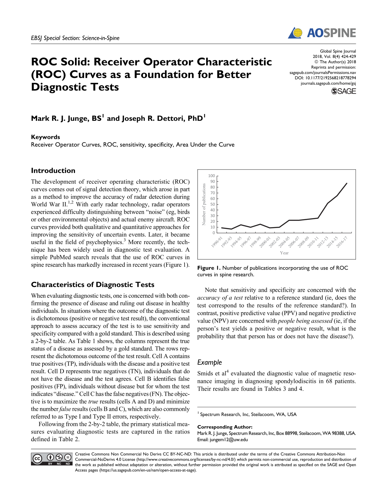
The development of receiver operating characteristic (ROC) curves comes out of signal detection theory, which arose in part as a method to improve the accuracy of radar detection during World War II. 1,2 With early radar technology, radar operators experienced difficulty distinguishing between “noise” (eg, birds or other environmental objects) and actual enemy aircraft. ROC curves provided both qualitative and quantitative approaches for improving the sensitivity of uncertain events. Later, it became useful in the field of psychophysics. 3 More recently, the technique has been widely used in diagnostic test evaluation. A simple PubMed search reveals that the use of ROC curves in spine research has markedly increased in recent years (Figure 1).
Number of publications incorporating the use of ROC curves in spine research.
Characteristics of Diagnostic Tests
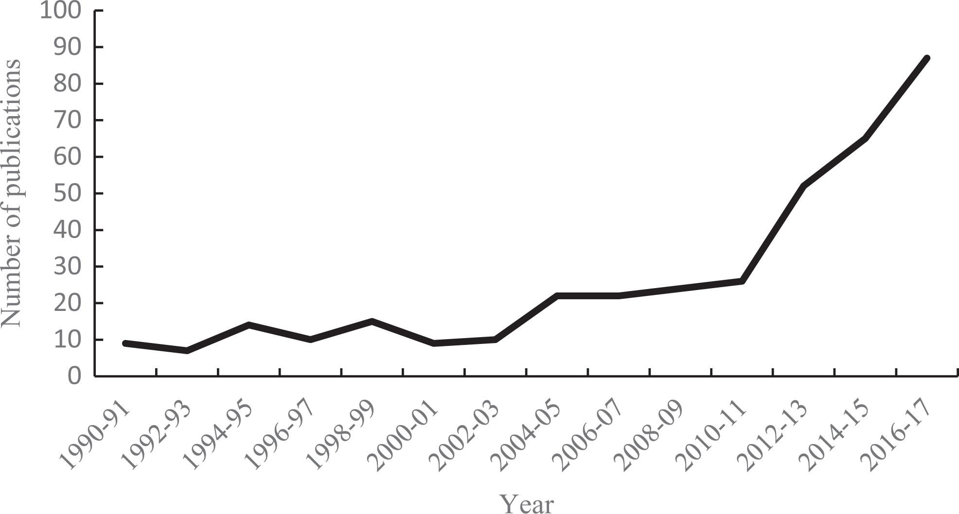
When evaluating diagnostic tests, one is concerned with both confirming the presence of disease and ruling out disease in healthy individuals. In situations where the outcome of the diagnostic test is dichotomous (positive or negative test result), the conventional approach to assess accuracy of the test is to use sensitivity and specificity compared with a gold standard. This is described using a 2-by-2 table. As Table 1 shows, the columns represent the true status of a disease as assessed by a gold standard. The rows represent the dichotomous outcome of the test result. Cell A contains true positives (TP), individuals with the disease and a positive test result. Cell D represents true negatives (TN), individuals that do not have the disease and the test agrees. Cell B identifies false positives (FP), individuals without disease but for whom the test indicates “disease.” Cell C has the false negatives (FN). The objective is to maximize the true results (cells A and D) and minimize the number false results (cells B and C), which are also commonly referred to as Type I and Type II errors, respectively.
Two-by-Two Table in Evaluating Diagnostic Tests.
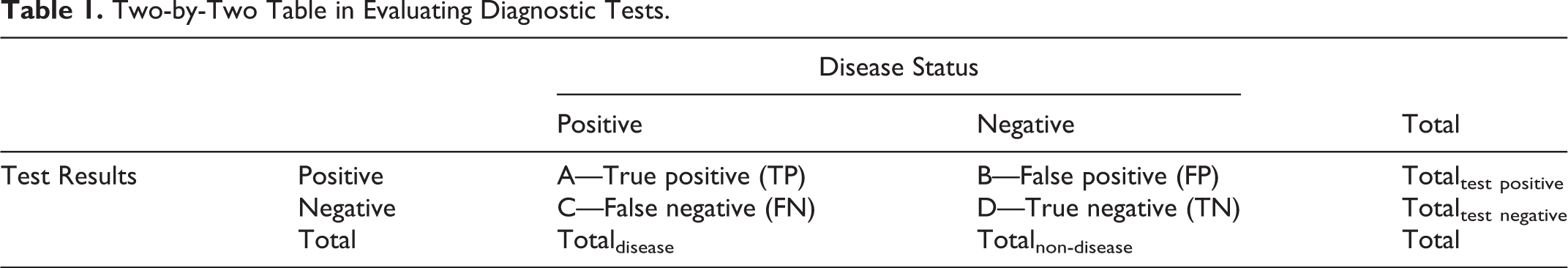
Following from the 2-by-2 table, the primary statistical measures evaluating diagnostic tests are captured in the ratios defined in Table 2.
Definition, Related Terms, and and Formula of Key Concepts.
Note that sensitivity and specificity are concerned with the accuracy of a test relative to a reference standard (ie, does the test correspond to the results of the reference standard?). In contrast, positive predictive value (PPV) and negative predictive value (NPV) are concerned with people being assessed (ie, if the person’s test yields a positive or negative result, what is the probability that that person has or does not have the disease?).
Example
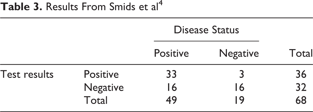
Smids et al 4 evaluated the diagnostic value of magnetic resonance imaging in diagnosing spondylodiscitis in 68 patients. Their results are found in Tables 3 and 4.
Results From Smids et al 4
Statistics From Smids et al 4
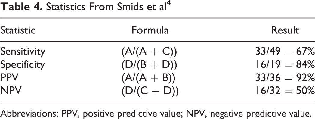
Abbreviations: PPV, positive predictive value; NPV, negative predictive value.
Conclusion
Using magnetic resonance imaging to diagnose spondylodiscitis results in a moderate sensitivity, missing 33% of the cases (false negative). If a patient is tested positive, the PPV indicates that there is a high probability (92%) that he/she has the disease. However, if the person has a negative test, the NPV suggests that there is a 50% chance that he/she still has the disease.
ROC Curves
Underlying Concept
In the previous section, we discussed the sensitivity and specificity that rely on a single cutoff to classify a test result as positive or negative. But what if the outcome of a test is continuous or ordinal with the possibility of many different cutoffs? How do we determine the best cutoff in this case?
To better understand the dynamics between sensitivity and specificity, it helps to consider the ideal diagnostic test. An ideal diagnostic test would be one that returns positive for all patients who are indeed positive (perfect sensitivity or 100% sensitive) while also returning negative for all of the patients that are indeed negative (perfect specificity or 100% specific). Figure 2 illustrates the distribution of test results for each population in an ideal diagnostic test with the area below the curve representing the proportion of patients that received the score as measured along the horizontal axis. For any continuous scaled test, there is likely to be some variation in both groups centered on an average; thus, when plotted it is typical to observe the usual bell-shape. The overarching goal of the test is to systematically ascribe a discrete diagnosis from these naturally ranging values. In the ideal diagnostic test there exists a cutoff value (CV) that separates the 2 populations, positive and negative patients, with no overlap.
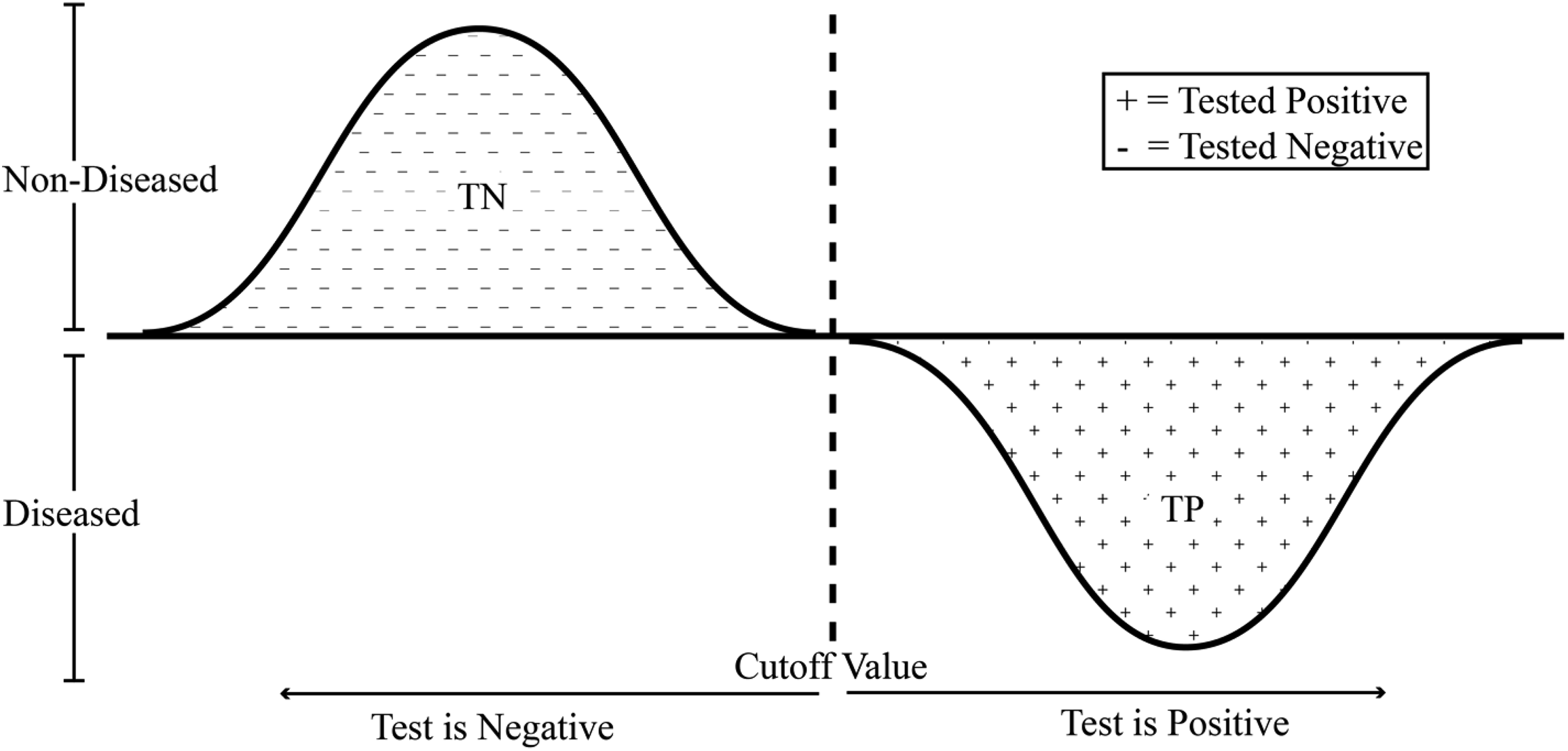
Ideal test in which all patients are classified correctly. While there may exist variation within the patient groups, as indicated by the bell curves, all positive patients receive results beyond the CV and all negative patients receive results below the CV. Here 100% sensitivity and 100% specificity exists.
Realistically, often tests fall short of the ideal scenario with perfect detection being unfeasible. Frequently the test result distributions look more like Figure 3. Diagnosis is now complicated by the existence of false regions (FN and FP) that appear on either side of the CV line. Here positive patients are being identified as negative and negative patients identified as positive.
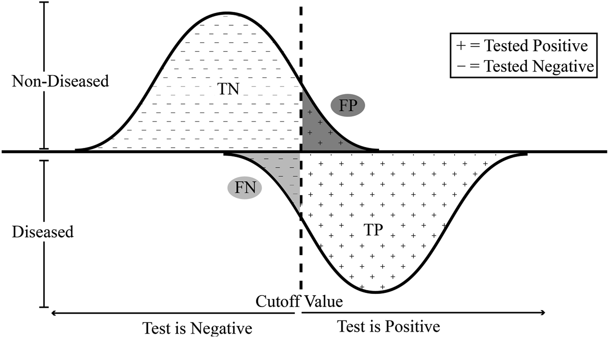
Diagnostic test where patients are misclassified as either positive or negative. The false negative (FN) area represents healthy patients who were tested to be below the cutoff and received a negative result. The reverse being true for the false positives (FP).
There is the possibility of reducing the amount of false readings for a particular positive/negative group; however, it comes at the cost of increasing the number of false readings for the other positive/negative group. In Figure 3, moving, for example, the CV to the left, the number of false negatives (FN) will decrease, that is, patients who are in fact positive will be more likely classified correctly as such. Put another way, true positives (TP) will be detected with greater sensitivity. At the same time though, moving the CV to the left leads to more negative patients falsely testing positive (FP). By shifting the CV to the right, the opposite is also true. Here lies the driving principle behind the ROC curve.
Definition of ROC Curve
An ROC curve describes the relationship between the sensitivity and specificity of a test by plotting the two against one another while varying the CV, which determines the outcome of a test. The two are inversely related—as one increases the other decreases. Conventionally, since both values range between 0 and 1, the sensitivity (true positive rate) is plotted against 1 minus the specificity (false positive rate). The plot is, therefore, in essence, a representation of the tradeoff between detecting true and false positive cases.
Figure 4 shows the derivation of an ROC curve (right) for a moderately well-performing test. From the distribution of test scores there is a clear overlap that indicates the inevitable presence of false regions. The placement of the CV line determines how the total error is distributed. Placing the CV at Point E, there is a 0 FP rate and 0 TP rate (sensitivity). Therefore, the test has no applicable value—everyone is testing negative. Likewise, at the other extreme (Point A), the sensitivity is 1 and the FP rate approaches 1. The optimal balance lies somewhere between the two, such as Point C where the majority of patients are receiving accurate results. The overall contour of the ROC curve is dictated by the overlap of the 2 patient populations test scores distributions.
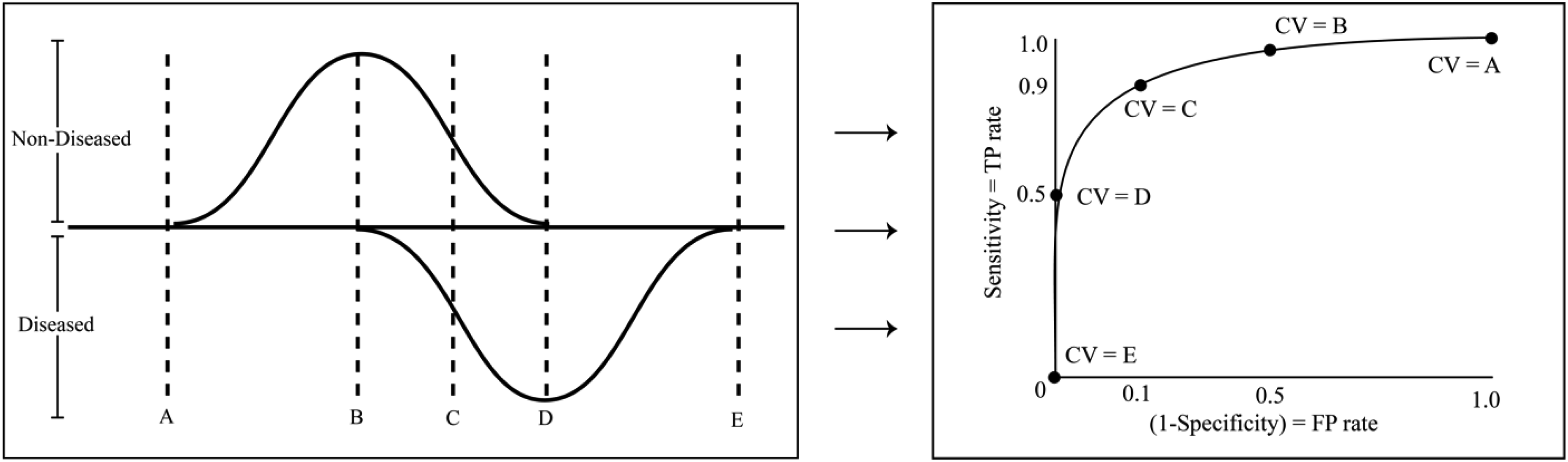
On the right, a typical ROC curve plots the true positive rate (sensitivity) on the vertical axis against the false positive rate (1 − Specificity) on the horizontal axis for a range of cutoff values. By shifting the CV from A to E in the distribution figure on the left, the corresponding points along the ROC curve are generated. Note that depending on the methodology used to construct the plot, both smooth ROC curves (using a parametric approach) and ROC curves made up of piecewise, interconnected, straight lines (a nonparametric approach) are both commonly seen.
Applications and Analysis Using ROC Curves
Example
Suppose it is necessary to determine if a patient is suffering from Disease X. There is a test available that returns a score between 0 and 100. Further suppose that from an earlier study it was found that patients with Disease X received an average of 70 (95% confidence interval = 40-100) and patients who did not have Disease X had a mean score of 35 (95% confidence interval = 10-60). The distributions of test result for Disease X are depicted in Figure 5. In this example, there are patients without the disease who scored higher than those with the disease and vice versa. What CV should be chosen to determine if the patient has Disease X or not?
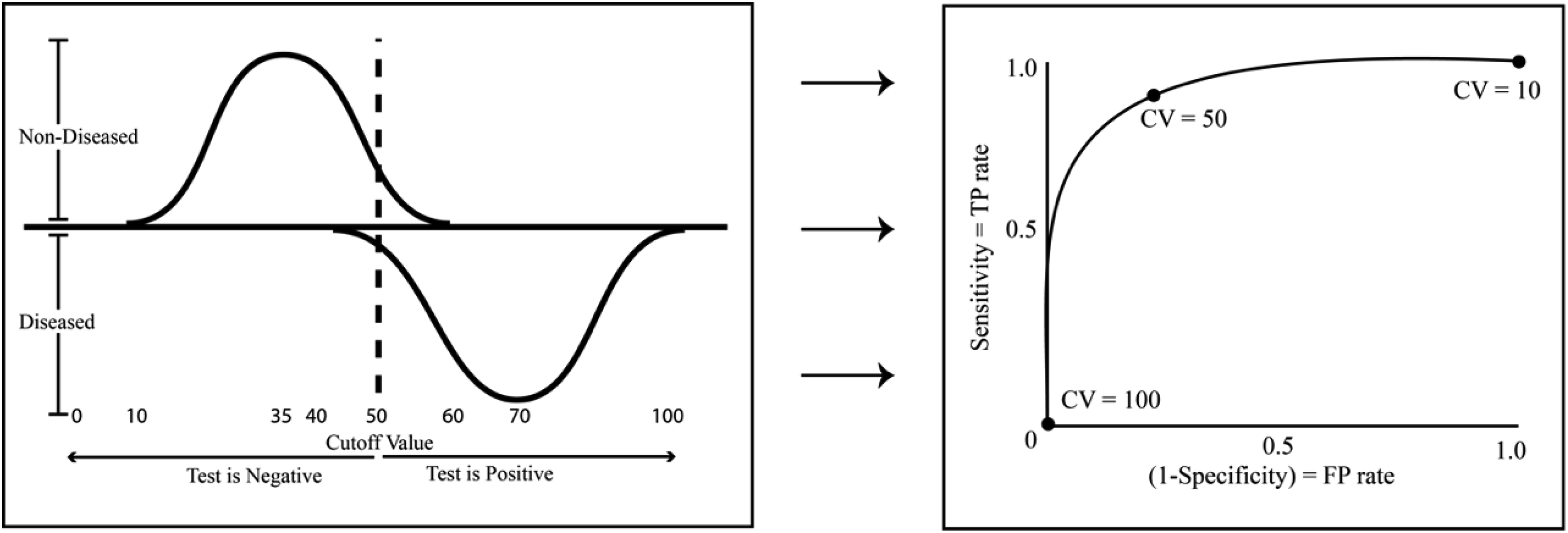
Distribution of test results populations (left) and corresponding ROC curve (right) representing the combination of sensitivity and specificity values associated with choosing the CV. At CV = 100 there are no false positives but that is because there are positives of any kind (true or false) since the CV is set too high. The opposite occurs at CV = 10 and all patients test positive. Setting the CV = 50 gives the test greater utility.
Conclusion
When setting the CV = 50 the errors are optimally balanced; however, there will continue to be both false positives and false negatives. Administers of the test could decide that circumstances suggest a more appropriate CV would be 40. By doing so, the test would capture the vast majority of patients with Disease X. However, it would also mean more patients who do not have Disease X would test positive. Alternatively, shifting the CV to 60 would mean almost no patients without the disease would test positive, yet at the same time more would go undiagnosed. Therefore, setting the best CV may involve additional considerations.
Choosing the Cutoff Value
A number of statistical software packages can be used to mathematically determine the “optimal” CV—the value that numerically maximizes sensitivity and specificity. However, as seen from the example above, the question of “optimal” is often less a mathematical one and more so a clinical matter. Many factors should be considered when defining the most appropriate CV. The invasiveness of subsequent interventions, the loss of health caused by a false negative result, the financial cost of treatment along with other considerations should be made. If the health consequences are high from missing a positive diagnosis (a false negative), it stands to reason that the CV should be set lower, thereby creating less false negatives and increasing the sensitivity and positive predictive value. Conversely, if the medical intervention following a false positive is painfully invasive or comes at a high financial cost, then there exists an argument for increasing the CV so that there are less false positives. Ultimately, it is a balancing act that involves considering the impact of many competing assumptions, but this is precisely why the ROC curve is a valuable tool.
Reading the Curve
ROC curves serve many functions. They can help determine the optimal CV; provide a logical, qualitative comparison for competing tests; and assess the accuracy and validity of a diagnostic test. When working in the ROC space the uppermost left-hand corner (coordinate [0, 1]) is the optimal point. It is here that the sensitivity and specificity both equal 1 (remembering that the horizontal axis measures 1 minus Sensitivity). Furthermore, no ROC curve will ever cross below the 45° line (the random chance line), recognizing that even without any test, patients could be classified with at least 50% accuracy. 5 Figure 6 contains 3 ROC curves—I, II, and III. Curve I represents a very strong test, Curve II a moderate test, and Curve III is a test of no utility. Possible distributions from which the ROC curves are derived from are given on the left.
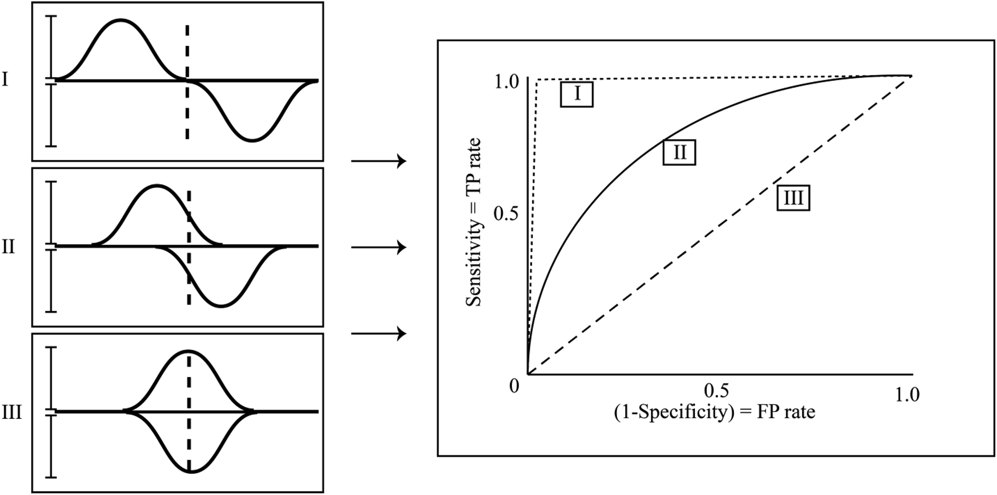
All ROC curves will be above the 45° line and inside the box made by the vertical axis and sensitivity = 1. Curves I, II, and III represent tests of decreasing strength, respectively. On the left are hypothetical corresponding distributions. Here the variation within distributions remains constant and only the measure of center varies. The strength of a test can also be improved by narrowing the precision of a test.
Area Under the Curve (AUC)
An important feature of ROC curves is that they can naturally be reduced to a single quantitative, index measure for assessing the performance of a diagnostic test. ROC curves occupy the upper diagonal half of the unit square. As the shape of the curve approaches the upper left corner [0, 1], the sensitivity and specificity both are approaching 1 and the area under the curve (AUC) similarly approaches 1. As the true positive rate and false positive rate approach each other—anywhere along the 45° line—the AUC approaches its minimum 0.5. It follows that the AUC will always be between 0.5, a test that performs equally well as assigning a diagnosis at random, and 1.0, an ideal diagnostic test that correctly classifies all patients.
Precautions in Reading the Curve
Sensitivity and specificity are influenced by many factors. Any bias that affects either of these 2 values will in turn affect the shape of the ROC curve. Of first and foremost concern relates to the decisions surrounding the derivation and selection of the gold standard, the measure of which all subsequent measures are based on. If an imprecise or inaccurate gold standard is used, the shape of the curve will be biased. In addition, verification and selection bias should also be reviewed both relating to a consistency of care that is given in an independent manner. And last, test review bias, where the one administering the test has a preconceived notion of the outcome.
Summary
An ROC curve describes the relationship between the sensitivity and specificity of a test by plotting the two against one another while varying the CV. It is helpful when the outcome of a diagnostic test is continuous or ordinal. The key to an effective diagnostic test is to accurately classify 2 distinct populations into their respective groups of diseased versus nondiseased. Choosing the optimum CV is a tradeoff between the sensitivity (true positive rate) and the false positive rate. ROC curves are an important tool in evaluating the shape of uncertainty and are a valuable method in characterizing the strengths and weaknesses of diagnostic tests. The AUC provides a single quantitative, index measure for assessing the performance of a diagnostic test. They also provide an intuitive, qualitative assessment of the interrelated dynamics influencing decisions behind diagnostic tests. Their effectiveness spans multiple fields of study and their presence in modern diagnostic analysis is likely only to grow.
Footnotes
Declaration of Conflicting Interests
The author(s) declared no potential conflicts of interest with respect to the research, authorship, and/or publication of this article.
Funding
The author(s) disclosed receipt of the following financial support for the research, authorship, and/or publication of this article: Spectrum Research, Inc. received financial support for the writing of this article.