
Abstract
The primary purpose of this paper is to advocate the use of multidimensional scaling (MDS) preference plot to study relationships among variables and individual differences in these variables. MDS preference plot is not a new visual technique; nevertheless, its application to visualize individual differences in variables for high-dimensional data is rare, particularly in education and social sciences. We illustrated its application using a real example in an educational setting. The results indicate that the MDS preference plot is a viable visualization technique for data mining and analytics. Traditional statistical methods, such as the analysis of variance, can be used to further support the visual analysis results.
Visual analytics is the science of analytical reasoning via the visual interface (Thomas and Cook, 2005). Vieira et al. (2018) define visual learning analytics as visualization techniques to understand behavioral phenomena. It can integrate visual representations of data and data analysis into a coherent fashion to enhance our understanding of complex data because visual analytics leverage our perceptual abilities to detect patterns in a large volume of data more effectively and efficiently (Fekete et al., 2008). Carney and Levin (2002) indicate that research shows that individuals understand and remember better information presented in visual format than in words or sentences. As the volume and variety of data grow, data visualization and analytics become an increasingly important part of data analytics in educational and social science research. The advancement in computer technologies and the availability of graphic software make visual analytics more accessible, and it has received more attention in recent years. For example, the common goals in educational research have been modeling student behavior, improving assessment, predicting learning outcomes, enhancing student emotional well-being and social skills, and reducing dropout or delinquency. Various visualization techniques have been used to meet these goals in addition to more conventional methods such as clustering, regression, and analysis of variance (e.g. Davis et al., 2016; Hsiao et al., 2017; Martinez-Maldonado et al., 2016; Xing et al., 2015).
Many researchers have discussed the advantages of visualization (e.g. Pastore et al., 2017; Tay et al., 2016). For example, Otten et al. (2015) state that graphs improve communication between researchers and the public because sophisticated statistical methods can be understood relatively quickly when the information is presented graphically. Information in graphics can also help formulate models and serve as an essential first step to guide further analytic decisions (Butner et al., 2015). Studies from neuroscience indicate that human visual processing can encode information in a 10th of a second, and nearly half of the brain is devoted to visual processing (Abbott et al., 2012; Otten et al., 2015; Semetko and Scammell, 2012). Some researchers recommend a graphic accompanying every statistical model (e.g. Fife, 2020; Fife and Rodgers, 2022; Tay et al., 2016).
Regarding visualization techniques, Vieira et al. (2018) found in their literature review that visualization techniques most used included bar or histogram, line plot, scatter plot, bubble plot, radar plot, timeline, pie chart, concept map, correlation plot or heat map, word cloud, and word tree. More novel visualization methods included interaction matrix, glyph, geomap, spiral timeline, circular graph, adjacency matrix, and social network graph (Ertug et al., 2018; Hsiao et al., 2017; Vieira et al., 2018). However, most of these visualization methods are used to show relations between variables (e.g. variable distributions, trends, and relationships) or among individuals. For instance, the correlation plot shows relationships among variables using different shades of color, with a dark color showing a strong relationship and light color showing a weak relationship. Word cloud shows groupings of words according to usage frequency, and the social network graph shows connections among individuals. How about simultaneously visualizing the clustering of variables and individuals on the same graph? How should we visually investigate relationships among variables and individual differences in “preference” for these behaviors as assessed by these variables? The visualization methods, as mentioned above, fall short since they can not easily classify or group variables and individuals according to specific characteristics (Heer et al., 2010). For example, a correlation or adjacency matrix can show relationships between variables or individuals but not both. When we deal with large volumes of data, simultaneously visually grouping many variables and individuals can enhance the quality of the data analysis by quickly determining the focus of the analysis.
In this paper, we suggest the use of multidimensional scaling (MDS) preference plot (also known as perceptual mapping) as an additional graphic representation that can simultaneously capture the clustering of variables and individuals on the same graph and show the relationships between clustered variables and individuals (Carroll, 1972). As a visualization technique, the MDS preference plot is a clustering plot representing complex and nonlinear relationships among variables and individuals. The equation-based statistical method (e.g. analysis of variance or regression modeling) can then be used for further analyses based on information derived from it. In other words, based on the MDS preference plot, we can conduct further statistical analysis to test the visual information to its fullest extent. This paper aims to illustrate MDS preference visual analysis, accompanied by a statistical model for numeric testing, in conducting research. We will use an example with real data to highlight this process.
The framework of the MDS preference plot
This paper illustrates the innovative use of the MDS preference plot in research, particularly in education and social sciences. The MDS preference plot visualizes proximity data among a group of variables and individuals in a low-dimensional space (Carroll, 1972). With the advent of big data and data analytics, MDS is considered part of visual analytics and unsupervised machine learning and works to embed high-dimensional data points in some low-dimensional space (Buja et al., 2008). It may be one of the most powerful visualization methods to analyze high-dimensional data, and it can project the individual preference among high-dimensional data into a low-dimensional space, typically in a two-dimensional space for easy visualization. More technically, given high-dimensional data v1, . . ., vN €Rk, the MDS preference plot attempts to find the variable and people configuration in a low-dimensional Euclidean space by embedding variables v = 1, . . ., V and people p = 1, . . ., P, to a configuration by plotting coordinates of both variables and individuals on the same plot, allowing us to examine the relational patterns embedded in the plot visually.
Since its introduction over 40 years ago, its usage as a visualization technique has been underutilized in educational research, particularly as a visual analytic tool based on high-dimensional data, as evidenced by few studies that have used such a method. However, recent years have seen growth in applying artificial intelligence in education (Chen et al., 2020; Roll and Wylie, 2016), such as intelligent tutoring (Hwang et al., 2020), machine learning as a classification and predictive system (Musso and Cascallar, 2009; Musso et al., 2020). As a visual analytics method, the MDS preference plot 1 can simultaneously depict relationships among variables, individuals, and individual differences concerning these variables from an unsupervised machine learning framework.
The MDS preference plot is not a new visual technique and is closely related to a biplot (Gabriel, 1971; Gower et al., 2011), a joint display of rows and columns in a two-dimensional space. In a biplot, the row coordinates (i.e. individuals) are plotted as points, and the column coordinates (i.e. variables) are plotted as vectors. It is a visual display of multivariate data, and its underlying methodology can be used for a novel approach to data analysis and decision making (Roux and Gardner, 2006). Gower et al. (2011) consider a biplot a multivariate extension of an ordinary scatter plot. There are different variants of biplot, such as principal component analysis (PCA) biplot and MDS preference plot. The MDS preference plot is basically a PCA biplot on the transposed input data matrix. In applying MDS preference plot analysis, we need to consider the data as a matrix of individuals’ preference ratings on a set of variables. A high score indicates that individuals are more likely to endorse the behavior assessed by that variable. For example, if a person gives a rating of 5 for the item “Because there is no support available to me, I would not do it now” on a scale of 1–5, with 5 indicating a high level of endorsement of this item, we can consider this rating represents his/her behavior preference. This type of data is common when we use surveys or questionnaires. We could use the MDS preference plot to visualize this preference, with variables represented by points and subjects represented by vectors, showing individual differences in preferences.
Visual analysis of MDS preference plot
The analysis of the MDS preference plot is based on patterns identified in the graph. First, the MDS preference visual analysis displays the clustering of variables, and variables that show similarities are typically located together. Second, the visual analysis shows the direction and clusterings of individuals in the graph. Individuals with the same direction and approximate location indicate the closeness of these individuals. Since vectors represent the individuals, the vectors’ length suggests the individuals’ preference, and a short vector length suggests that the individual does not show preference.
Third and more importantly, the plot shows the relationships between individuals and variables. Since individuals and variables are jointly depicted in the same graph, we can examine how the clustering of individuals is related to the clustering of variables. We may detect individual differences by looking at the direction of vectors and how individuals are clustered.
Figure 1 shows an example of an MDS preference plot of decision-making behaviors among 30 individuals. Participants rated their decision-making styles on a scale of 1 (strongly disagree) to 4 (strongly agree) for a set of nine items (e.g. “I always do things calmly.,” “Because there is no support available to me, I would not do it now.,” “I know to act differently under different conditions”). The MDS preference plot analysis was conducted regarding their decision-making style preference. As shown in Figure 1, the red points or dots represent variables or items of decision-making behaviors, and vectors indicate individuals. First, items 14, 15, and 16 are located close together on the opposite side of other items, while items 1, 5, and 21 are close, and items 10, 19, and 22 are somewhat close together. Second, individuals’ preferences are mainly located on the right side of the plot. Four individuals (as indicated by v5, v7, v12, and v30) are away from the rest. Interestingly, cases 7 and 23 have a very short vector length, suggesting that these two persons do not prefer any items and are different from the others. Third, concerning individual differences in decision-making behaviors, individuals do not seem to endorse or prefer items 14, 15, and 16. Some individuals prefer items 1, 5, and 21, while others prefer items 10, 19, and 22. However, their preference for all these items is not strong, as indicated by the relatively short vector length. No one prefers items 14, 15, and 16.
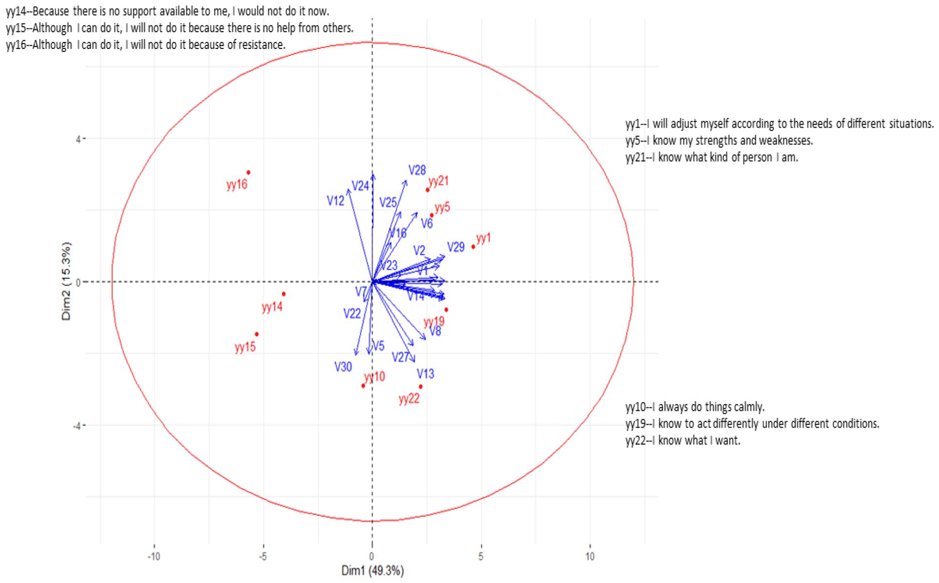
Example of MDS preference visual analysis of decision-making behaviors.
We could perform further statistical analyses to test different hypotheses based on these visual findings. For instance, we could hypothesize individual differences in decision-making behaviors by location in the biplot. Specifically, we could classify individuals into different groups according to their coordinates. Then we can conduct the analysis of variance to examine the individual differences. Below we present a real example of an MDS preference plot to examine school differences in science literacy.
A real example
Science literacy has become a fundamental skill in an increasingly complex world, and enhancing students’ science literacy is a core focus in public education (Anderson et al., 2007). Success in science, technology, engineering, and mathematics (STEM) is a national focus across the globe, and many efforts and resources have been dedicated to student achievement in this area (Young et al., 2018). For example, in the United States, schools are pressured to improve science achievement in all students (Every Student Succeeds Act, 2015), and schools are expected to conduct scientifically-based teaching practices. Schoolwide approaches to enhancing student performance are being explored, particularly in STEM education (Bybee, 2018).
Because school science literacy outcome is a function of various characteristics of school context, examining the relationships between school science literacy level and school context as assessed by various factors related to students, teachers, and administrators can reveal how these variables are associated and operate as a system for schools to achieve better. Although assessment outcomes may not be the best indicators of school achievement level (Chingos and West, 2015), schools still attempt to improve these outcomes to enhance public perceptions of school quality (Dee, 1998; Heck, 2000). From the pragmatic perspective of school policy and practice, school administrators and teachers may be interested in knowing the associations between factors in the school context and school science literacy achievement. Although such data do not account for student differences in science learning outcomes, they can be used to examine school differences concerning school science literacy outcomes. Because many variables are involved in school success, we used the MDS preference plot as an unsupervised machine learning tool for pattern classification and prediction for school science literacy outcomes. We are interested in the question, “In what way do the schools differ regarding their science literacy outcomes?” As a machine learning approach, we described the MDS preference plot analysis based on a basic approach for applying machine learning techniques suggested by Alyahyan and Dustegor (2020) .
Data source
The data used in this example were drawn from the PISA 2015. PISA operates on a 3-year cycle, and achievement areas are assessed in each cycle, but one specific area is emphasized each cycle. In 2015, science performance was the focus of the assessment. According to PISA, science literacy is “the ability to engage in reasoned discourse about science and technology, which requires the competencies to: explain phenomena scientifically, evaluate and design scientific enquiry, and interpret data and evidence scientifically” (OECD, 2017: 22). In this illustration, 2015 PISA data from 179 Chinese schools were used.
Initial preparation
The study included 48 variables. These variables were derived from the student, teacher, and principal questionnaires of PISA 2015. Variables derived from the school principal questionnaire included: school resources, school climate, school leadership, the quantity of teaching staff, school type, school responsibility, and school extra-curricular activities. Variables derived from the teacher questionnaire included: educational resources, job satisfaction, school leadership, teaching and assessment practices, and teaching and teacher collaboration. Variables derived from student questionnaires included: student disposition toward collaborative work, interest in science, science learning in school, student motivation, and science-related disposition. Table 1 lists and describes all the variables used in this study.
Variables used to assess context for school science literacy outcomes.
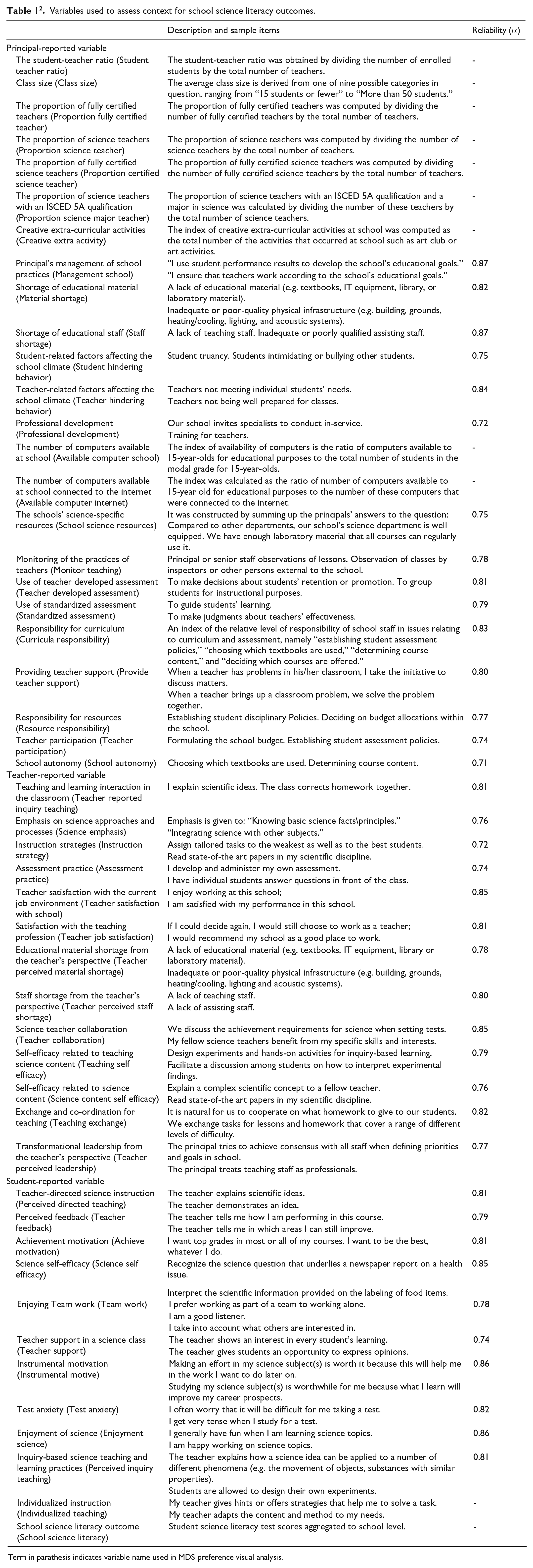
Term in parathesis indicates variable name used in MDS preference visual analysis.
Data processing
We first aggregated the student and teacher data to the school level to create school-level variables since these variables are not nested with each other. These variables were used as a measure of the school learning context. We then checked for outliers in the data to ensure all variables’ values were within a reasonable range. No outliers were found in these variables. Next, all the continuous variables were standardized with a mean of 0 and a standard deviation of 1, as they were measured using different scales. Finally, all variables were scored, with a high score indicating a higher characteristic level as assessed by that variable. For example, a high score for student-reported inquiry-based teaching indicated a higher average at the school level. A high score for job satisfaction reported by teachers indicated a higher average job satisfaction at the school level.
Visual analysis and results
MDS preference plot analysis was conducted using R (R Core Team, 2013), and the subsequent analysis was conducted using SAS (SAS Institute Inc, 2013). In this illustrative example, the evaluation of the MDS preference plot was based on identifying patterns in the graph, as mentioned previously. First, the visual display of schools and variables was divided into four quadrants for discussing patterns according to each quadrant. Second, vector length indicated the degree of a school’s preference for an item, and the relatively longer vector length suggested more preference than the short vector length. Third, the angle of vectors (i.e. direction) indicated the degree of association among schools as well as item preference, with a smaller angle indicating a stronger association among schools. Fourth, schools whose vectors were in the direction of the variable indicated a preference for that variable, with a longer vector length suggesting a higher preference level. For example, if a school’s vector is pointed toward the student-reported variable “science self-efficacy,” it suggests a higher degree of student science self-efficacy at the school level.
Figure 2 shows the MDS preference plot. We could discuss the plot in terms of four quadrants. First, for easy visualization, the variable plot is shown in panel A of Figure 2. As can be seen, variables are scattered around four quadrants. On the one hand, variables in the same quadrant tended to be more associated than those from other quadrants, notably the opposite quadrants. On the other hand, school literacy level is more likely to be associated with variables inside the black circle than those outside the circle.
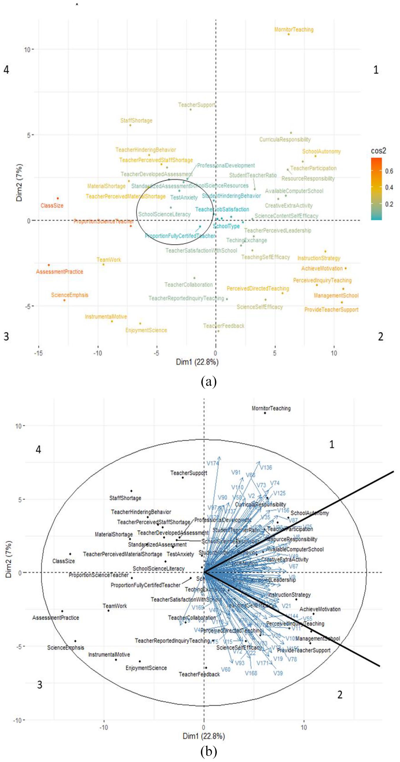
The MDS preference visual analysis. Panel (a) Variable plot and panel (b) MDS preference plot. Number labeling of the quadrant is arbitrary. The black circle in Panel A depicts the region where other variables are close to the “school science literacy” variable. We show the variable plot for easy reference when viewing the MDS preference plot. The black circle in Panel B depicts a 95% confidence interval of variable distribution.
Second, nearly all schools were located in quadrants 1 and 2, as shown in panel B of Figure 2. Schools in quadrant 1 are more likely to differ from schools in quadrant 2 for variables located on the top of the solid black line in quadrant 1. This information indicated that these schools were more closely matched with features represented by variables in that quadrant region. Similarly, the schools in quadrant 2 are more likely to differ from schools in quadrant 1 for variables located at the bottom of the solid black line in quadrant 2. Nevertheless, schools are less likely to differ for variables in the region between the two solid black lines. For instance, regarding item “curricula responsibility,” schools in quadrant 1 showed a higher mean level than those in quadrant 2. This result is shown in panel A of Figure 3 via the mean plot with a 95% confidence interval from the analysis of variance. The finding supports the conclusion drawn based on visual analysis concerning “curricula responsibility.”
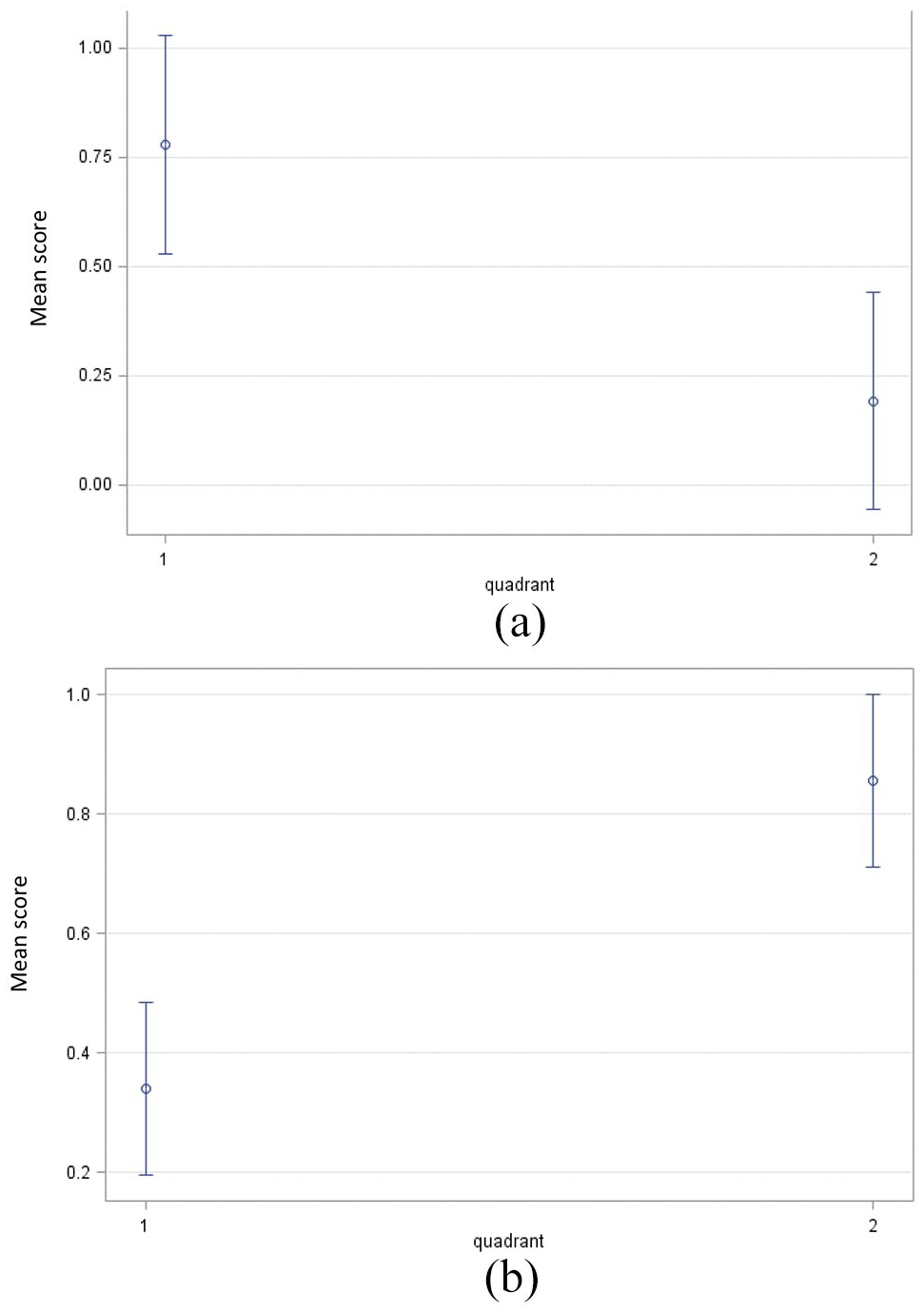
Mean Plot of School Differences with 95% CI by quadrant. Panel (a) responsibility for curriculum design and assessment and panel (b) students perceived inquiry-based teaching. The mean score is in a standardized unit.
In contrast, for item “perceived inquiry teaching,” schools in quadrant 2 showed a higher mean level than those in quadrant 1, as shown in panel B of Figure 3 via the mean plot with a 95% confidence interval from the analysis of variance. However, it is interesting that all these schools do not differ concerning school science literacy achievement and no school vectors go in that direction. Thus, we could not explicitly address the question, “In what way do schools differ regarding science literacy outcomes?” for these Chinese schools. One reason may be that these schools in the PISA sample are based on the purposeful sample and do not differ in their science literacy level.
Discussion
This paper’s primary aim was to advocate using the MDS preference plot as an innovative visual method to study individual differences in outcomes for high-dimensional data. Although the MDS preference plot is not a new visualization technique, not many studies of education or social sciences have taken advantage of its visual capability for pattern discovery and prediction. Visual analytics is becoming an essential part of data analytics and machine learning. Visual analytics of high-dimensional data can help enhance the interpretability of results from data analytics, which provides a convenient way to understand the relationships among variables and individual differences in these variables. In our example of PISA data, we could see that schools show no differences concerning school science literacy outcomes, although they differed in other aspects of school-related issues, such as the responsibility of school staff in issues relating to curriculum and assessment.
As part of visual analytics and machine learning, the MDS preference plot identifies patterns among variables and individuals for classification and prediction, establishing connections between variables and individuals and their direct correlates. Its graphical representation captures key aspects of complex interactions between variables and displays the individual differences in behavioral preferences toward these variables. Although we tend to use mathematical equations first (e.g. hierarchical linear modeling) to study the complex relationships among variables, this process can be reversed with visual analytics (Butner et al., 2015). For instance, visual analytics can be the first step used in statistical modeling. We can then test the results or hypotheses derived from visual analytics with traditional statistical modeling. In our example illustrated here, from our MDS preference plot, we further examined how schools differ in certain school features using the analysis of variance. The results of such analysis supported this expectation. Thus, visual analytics can aid in testing one’s expectations via visual clues.
Although we advocate using the MDS preference plot as a machine learning approach in research, the MDS preference visual analysis also has limitations. First, high-dimensional data are visualized in the low-dimensional space, leading to information loss. However, it should be noted that the first two dimensions typically account for most of the variances in the high-dimensional data, and the first two dimensions are the most important visual representations of key relationships. Second, analyzing an MDS preference plot involves certain subjectivity and a work of art. For instance, we drew a circle around the “school science literacy” variable to assess its relationships with other variables in the variable plot. It is subjective to decide how big this circle should be. Similarly, we drew two solid black lines with a 50° angle in the MDS preference plot to decide school differences in variables in these regions. However, we could draw lines with a different degree angle. This decision is based on our own experiences and our analysis of visual results rather than some objective criteria. Thus, it is also important to stress the role of theory in developing complex visual representations.
Despite these limitations, using the MDS preference plot as an unsupervised machine learning approach effectively communicates research results via a visual technique. Methodologically, it is a novel application of MDS modeling based on high-dimensional data.
Footnotes
Declaration of conflicting interests
The author(s) declared no potential conflicts of interest with respect to the research, authorship, and/or publication of this article.
Funding
The author(s) received no financial support for the research, authorship, and/or publication of this article.