
Abstract
This article reviews approaches to presenting qualitative comparative analysis and set-theoretic research, with an emphasis on graphic presentation. Although visualization is an important aspect of presenting empirical research, techniques for visualizing qualitative comparative analysis remains underdeveloped. This article reviews existing and emerging standards of presenting qualitative comparative analysis and introduces a number of new ones. Techniques are presented for visualizing calibrated data, truth tables, and consistency/coverage solutions, with particular attention given to strategies for presenting superset/subset relationships.
Introduction
How we present our research is important. Using existing standards—including established notation and shared nomenclature—helps us to efficiently convey our findings to others. A well-designed table provides both a high-level overview of one’s data and the ability to drill down into the details of individual observations. Visualization is a particularly crucial aspect of presenting empirical research: an effective graphic identifies and clarifies the relationships within our data by highlighting particular patterns of interest.
There is considerable opportunity for improving how we present our applications of qualitative comparative analysis (QCA). This article offers a survey of strategies for effectively presenting QCA, primarily focusing on visualization techniques. QCA notation is relatively well-established in the contemporary literature, somewhat complicated by the fact that two distinct notations are widely used. The quality of our tabular presentations often leaves much to be desired, with far too many authors omitting expected metrics or essential contextual information and/or including superfluous detail. Techniques for visualizing QCA are, in particular, lamentably underdeveloped. Indeed, it is rare for QCA publications to include any visual presentation, aside from tables and the occasional XY plot or Fiss-style configuration chart.
I confront these matters in this article. I describe existing QCA notations and provide recommendations for and examples of effective tabular layout. I review existing techniques for visualizing QCA and introduce a number of new ones. Because QCA is a set-theoretic method, I pay particular attention to ways of depicting superset/subset relationships. Therefore, although my discussion focuses on QCA, many of the visualization techniques I discuss are also appropriate for other forms of set-theoretic empirical research.
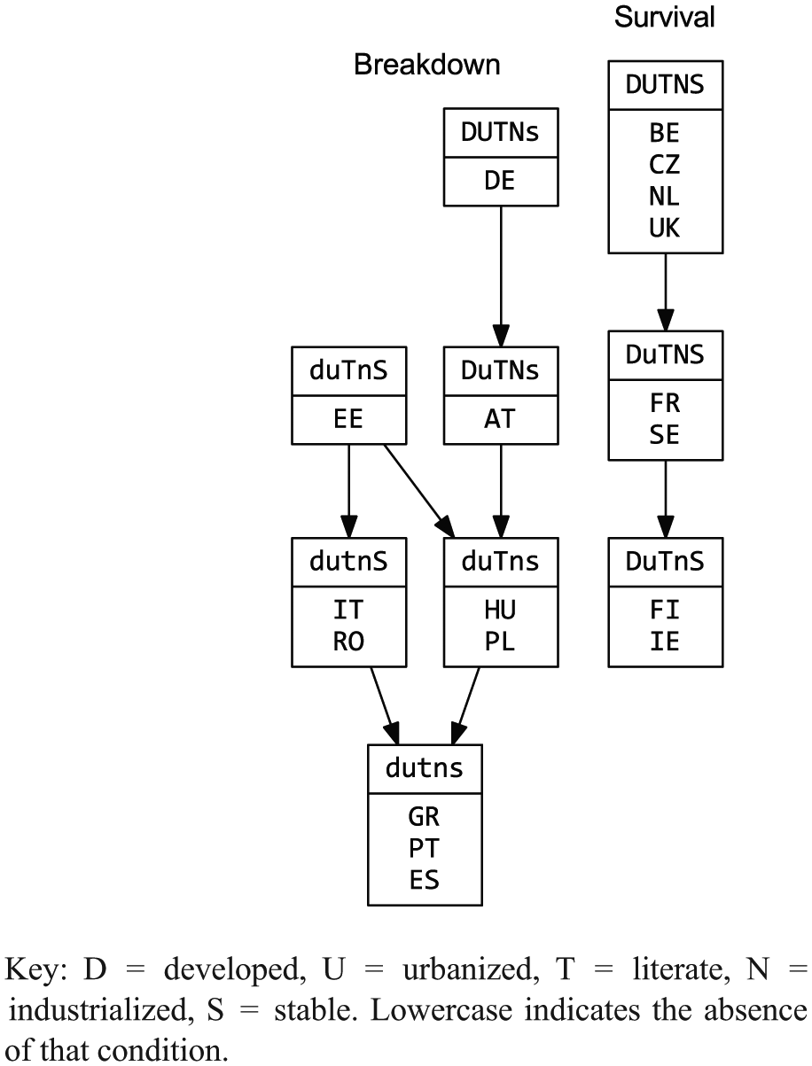
I use two data sets for illustration. The first is Berg-Schlosser and Mitchell’s (2000, 2003) democracy breakdown data. Measuring the causal conditions associated with the survival or breakdown of 18 European democracies during the interwar period, this data set will be familiar to many QCA practitioners because it served as the central example in Rihoux and Ragin’s (2009) popular Configurational Comparative Methods. Table 1 reproduces this data calibrated to, respectively, crisp and fuzzy sets. I refer the reader to chapter 3 of Rihoux and Ragin (2009) for details as to how the data were compiled and calibrated to crisp sets and chapter 5 describes the calibration to fuzzy sets. 1 Note that I have renamed the crisp set labels to be consistent with the fuzzy set labels, so as to emphasize that the calibration process creates sets: “GNP per capita” names a variable while “Developed” identifies a set of countries.
Democracy breakdown data calibrated into crisp and fuzzy sets.
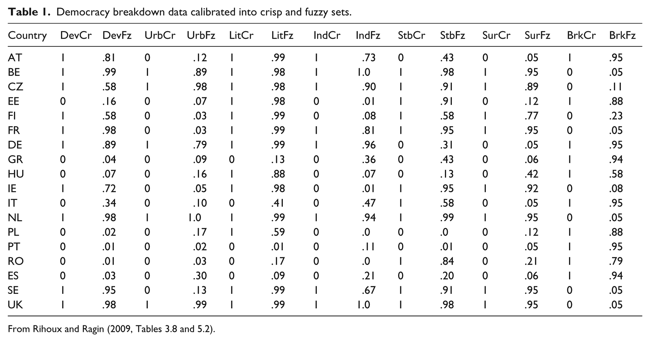
From Rihoux and Ragin (2009, Tables 3.8 and 5.2).
The second data set is a large-N study: Ragin and Fiss’ (2008) reanalysis of Herrnstein and Murray’s (1994) Bell Curve data, from chapter 11 of Redesigning Social Inquiry (Ragin, 2008). 2 Because QCA focuses on the analysis of configurations (i.e. sets of observations), most of the techniques presented in this article are agnostic with regard to the size of the underlying data set and readily transfer from small- to large-N situations. In fact, visualizations constructed for large-N data are often simpler than those for small-N data. This is because with large-N analysis, we are usually uninterested in the individual observations and focus exclusively on the configurations. As the Bell Curve data are large-N, the calibrated data are not reproduced here. Instead, Table 2 presents the corresponding truth table, which enumerates the configurations present in the data and identifies whether each configuration is or is not associated with the outcome under investigation: the avoidance of poverty by African American males.
Truth table explaining avoidance of poverty among African American males.
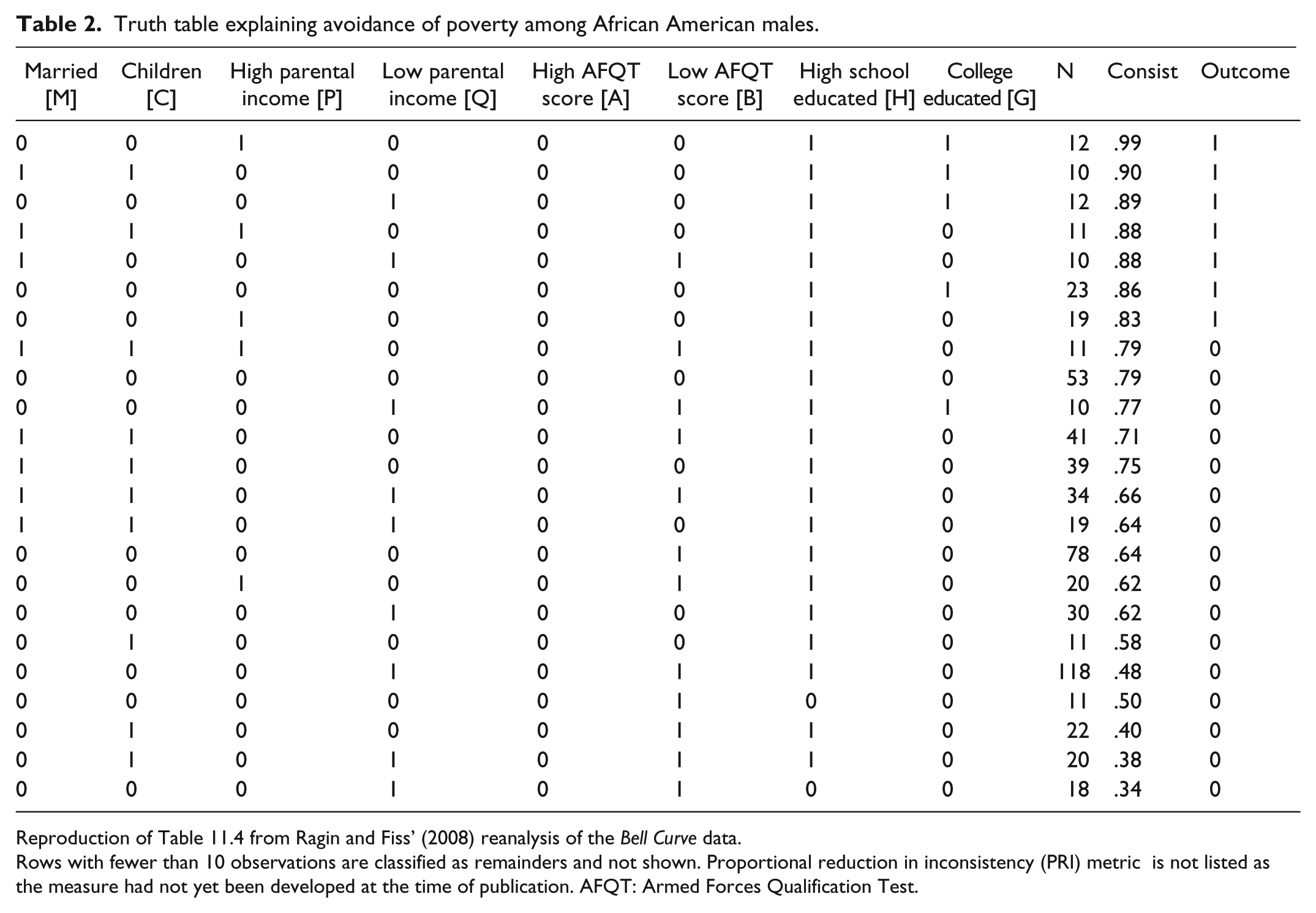
Reproduction of Table 11.4 from Ragin and Fiss’ (2008) reanalysis of the Bell Curve data.
Rows with fewer than 10 observations are classified as remainders and not shown. Proportional reduction in inconsistency (PRI) metric is not listed as the measure had not yet been developed at the time of publication. AFQT: Armed Forces Qualification Test.
Like any empirical investigation, a QCA produces a variety of analytic objects along the way; those fundamental to QCA are calibrated data sets, truth tables, and necessity/sufficiency solutions associated with a particular outcome, discussed in the third, fourth, and fifth sections, respectively. These objects offer different ways of perceiving the set-theoretic relationships present within one’s data. A sufficiency analysis proceeds by converting a calibrated data set into a truth table which, in turn, is reduced to a set of Boolean expressions. A necessity analysis, on the other hand, derives its Boolean solution directly from the calibrated data set. Because QCA is a case-oriented and configurational method (Goertz and Mahoney, 2012; Ragin, 1987, 2000, 2008; Rihoux and Ragin, 2009; Schneider and Wagemann, 2012), presentational forms that convey these aspects of one’s data by foregrounding cases and which are sensitive to empirical diversity and causal complexity are to be preferred. Approaches to visualizing QCA should treat observations and configurations holistically, mapping the relationships among observations, among configurations, and between observations and configurations. Superset/subset diagrams, discussed in the sixth section, effectively accomplish this and are broadly useful when presenting QCA and for diagramming the set-theoretic relationships embedded within calibrated data, truth tables, and necessity/sufficiency solutions. The penultimate section offers general recommendations for presenting QCA research, identifying questions for presenters to consider, and summarizing the different rhetorical uses of the visualizations presented. As it will be helpful to first describe existing formatting conventions in QCA, the following section discusses notational forms for Boolean expressions.
Some disclaimers and qualifications are in order. My discussion of QCA assumes that the reader is already familiar with the method and I do not provide an overview of the technique or review its underlying mathematical model. Plenty of these resources already exist for the interested reader (e.g. Duşa, 2019; Rihoux and Ragin, 2009; Schneider and Wagemann, 2012); the most important continue to be Ragin’s (1987) seminal texts, The Comparative Method and Redesigning Social Inquiry (Ragin, 2008). Likewise, I do not focus on issues of interpreting QCA results and visualizations for audiences unfamiliar with the method, offering only occasional comments toward this end. Schneider and Grofman (2006) address this issue and their recommendations for making QCA results accessible to those unfamiliar with the method apply equally well to the techniques and approaches discussed here.
Due to space constraints, I also do not review software packages for creating the visualizations discussed herein. I have listed in italics the software I used for creating each figure as part of its caption. Unfortunately, existing QCA software packages offer limited built-in visualization capabilities and it is usually necessary to turn to external programs. For manually drawing diagrams, I highly recommend the free software package Inkscape, which is feature-rich, stable, and well-documented. Work is progressing in this area with a handful of QCA methodologists, including myself, currently developing software for automating the production of QCA visualizations; releases will be announced via the COMPASSS website and mailing list (http://compasss.org).
Notation
There are three common Boolean operations in QCA: negation, logical AND, and logical OR. Negation is accomplished by subtracting an observation’s membership score from 1. Sets may be joined through logical AND (Boolean multiplication) or logical OR (Boolean addition). Boolean multiplication involves taking the minimum of an observation’s membership scores across the associated sets, while Boolean addition involves taking the maximum membership score. The resulting membership score indicates the observation’s degree of membership in that combination of sets.
Notation for logical AND and logical OR follow standard mathematical conventions, with ×, *, or · indicating Boolean multiplication and + indicating Boolean addition. Less commonly, logical AND is represented by ∩ (set intersection) or ∧ (conjunction) and logical OR by ∪ (set union) or ∨ (disjunction). There are two different conventions for indicating negation. The classical notation, introduced in Ragin (1987), uses uppercase to indicate the presence of a condition and lowercase to indicate its absence. A more recent approach uses a complement operator, either ∼ or ¬, to indicate negation. Both conventions are widely used, with the contemporary notation growing in popularity.
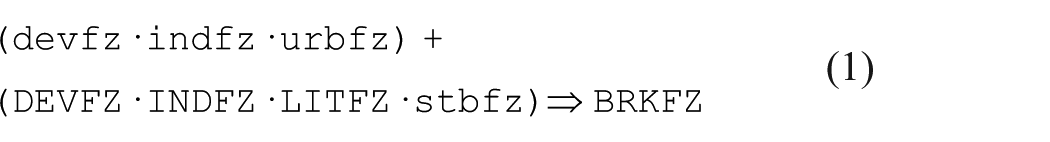
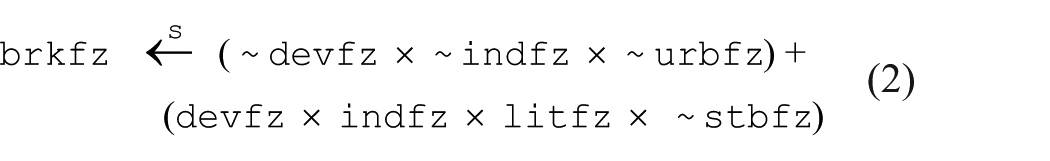
Statements 1 and 2, below, offer two different ways of presenting the “complex” solution explaining democracy breakdown, derived from reducing the fuzzy set scores of Table 1. With the classical notation, it can be easier to distinguish between the presence and absence of a condition, particularly when solutions are complicated. Formatting and aligning recipes are also simpler because the negated and non-negated forms of a condition have the same number of characters; using a monospace font enables recipes to line up nicely which facilitates comparisons across recipes. On the other hand, with some fonts it can be difficult to distinguish between upper- and lowercase letters, such as L/l and I/i (Schneider and Wagemann, 2012). Avoid this by not using single, easily confused alphanumeric characters to name your conditions when possible. 3 A more serious problem with the classical notation is that it is decidedly nonstandard outside of QCA: the meaning of the complement operator is well-established among mathematicians, natural scientists, and computer scientists. The complement operator’s main weakness is that it is a single character that can be difficult to see on a presentation slide, especially if the font is small and/or the audience is some distance from the projection screen. It is also far too easy to accidentally omit the operator during transcription or copy editing, accidentally changing one’s intended meaning.
Authors have formatted Boolean expressions using a variety of relational operators (Table 3). The most common form simply uses the equality (=) sign. I strongly discourage this notation because it fails to convey whether the expression describes a subset relationship of necessity or sufficiency. Moreover, as Schneider and Wagemann (2012: 55) point out, aside from the rare situation of perfect set coincidence, Boolean expressions do not in fact describe equivalences but, rather, asymmetric superset/subset relationships; in other words, situations of inequality, not equality. 4
Boolean operations and operators.
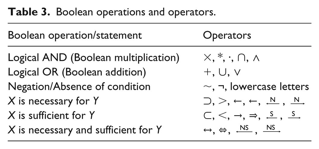
Different relational operators may be used in place of the equals sign. One approach adopts notation from set theory, using ⊂ or < to indicate a sufficient condition in which the cause is a subset of the outcome and ⊃ or > to indicate a necessary condition in which the cause is a superset of the outcome. An increasingly popular notation drawing from propositional logic uses arrows to indicate implication, with a rightward arrow indicating sufficiency and leftward one, necessity. An advantage of this notation is that it naturally extends to conditions that are both necessary and sufficient, using the operator ↔ or ⇔, which are the conventional symbols for material equivalence in propositional logic. Because these notations are likely to be unfamiliar to many readers, I often prefer using superscripted arrows. This notation uses an arrow annotated with an “N” or “S” to indicate the nature of the relationship. This notation can also accommodate necessary-and-sufficient conditions by superscripting “NS.” QCA researchers have not yet converged on a standard notation and, as such, one should be familiar with them all. Pay attention to the different directions of the subset and propositional operators: X ⊃ Y indicates necessity (the cause is a superset of the outcome) while X ⇒ Y indicates sufficiency (the cause is a subset of the outcome).
Specific variants of QCA have introduced their own notations, as needed. Multivalued QCA (Cronqvist, 2004), for example, indicates a condition’s value via brackets (e.g. SURCR{0}) or as a subscript (e.g. SURCR0). Temporal QCA (Caren and Panofsky, 2005; Ragin and Strand, 2008) uses slashes 5 to indicate temporal sequences (i.e. A/B/C is read as “A, then B, then C”).
Calibrated data
Because crisp sets and fuzzy sets are ratio-level measures, it is perfectly appropriate to describe and analyze them using conventional quantitative visualization techniques, such as histograms or box-and-whisker plots. But as QCA is a case-oriented comparative method, techniques that (1) preserve case integrity and (2) facilitate cross-case comparison are preferred. Two-by-two tables and XY plots, while simple, accomplish both. Furthermore, they meet Kenworthy’s (2007) mandate to “show the data.” With small-to-moderate data sets, it is usually possible to identify the individual observations—enumerating them within a table’s cells (Figure 1) or by using their names as the data labels within a XY plot (Figure 2a). For larger Ns, XY plots easily scale up while 2×2 tables can be replaced with contingency tables describing the frequency distribution of the data. (Note that these techniques, as well as those presented below, cf. Figures 3 and 4, apply equally to individual conditions and arbitrary Boolean expressions.)
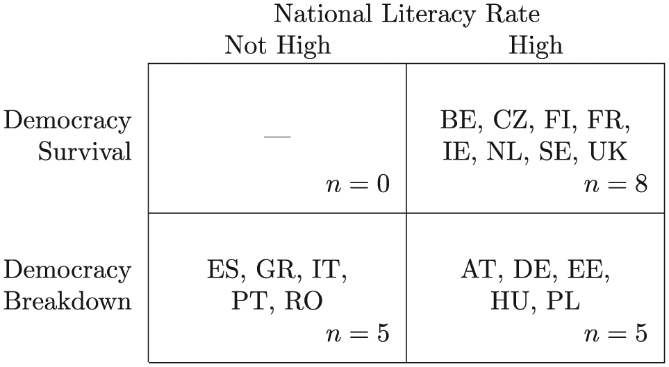
A 2×2 table reporting democracy survival by National Literacy rate. [LATEX]
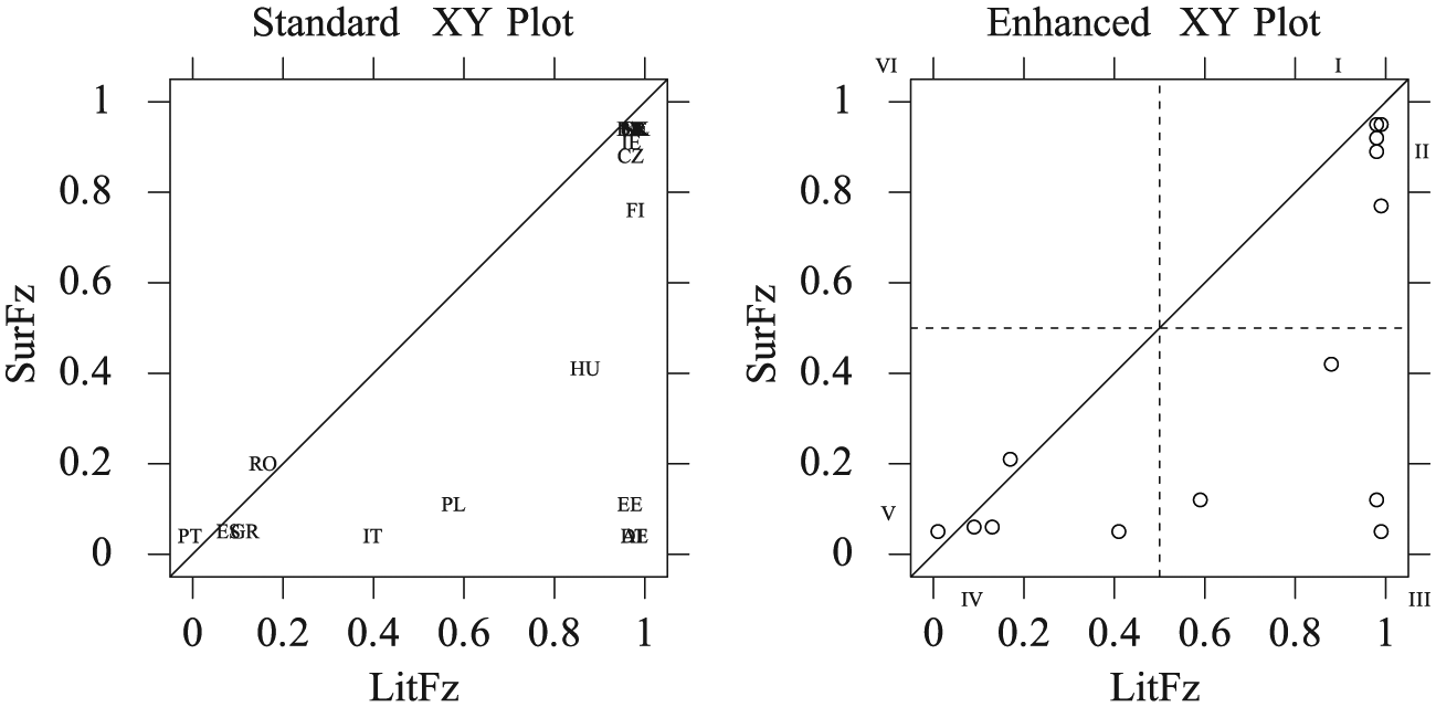
XY plots of degree of democracy survival by degree of literacy.
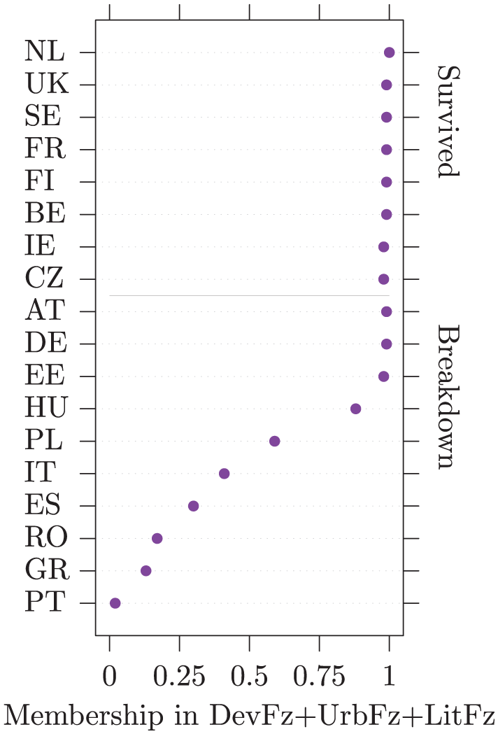
Rank-order plot of DevFz + UrbFz + LitFz by democracy survival/breakdown.
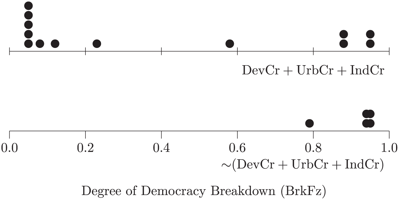
Dot plots of effect of absence of development, urbanization, and industrialization on degree of democracy breakdown.
Be aware that 2×2 tables and XY plots may be deceptively accessible: particularly for those coming from the conventional statistical perspective, it is easy to misread the presence of a subset relationship as the absence of correlation. It is therefore important to describe how to interpret these diagrams, especially when the audience may include those unfamiliar with QCA. This discussion need not be lengthy. For 2×2 tables, it is generally enough to explain that necessity is indicated by the presence of observations in the upper-right cell and their absence from the upper-left cell, while sufficiency is indicated by the presence of observations in the upper-right cell and their absence from the lower-right cell. If you have observations falling into the irrelevant cells (lower-left and -right for necessity and upper- and lower-left for sufficiency), you might also explain that those cells are not relevant to establishing the presence of a consistent subset relationship. For XY plots, one need only explain that lower-triangular plots are consistent with necessity and upper-triangular plots, with sufficiency. It is, of course, crucial to include the diagonal in your XY plot. So that it will not be mistaken for a trend line, connect the diagonal to the plot’s borders preferably using the same weight and style. This will help to convey that it is part of the diagram’s structure and not a description of the data. It is good practice to constrain the XY plot’s borders to form a square; this puts the X and Y axes on the same scale and aids data lookup. An emerging standard superimposes a 2×2 table upon the XY plot (Rohlfing and Schneider, 2013; Schneider and Rohlfing, 2013). The resulting enhanced XY plot highlights the crucial role of the .5 qualitative anchor and divides the plot into six regions, distinguishing among different types of observations and whether they are typical, deviant, or irrelevant with regard to the analysis of necessity or sufficiency.
With data sets that include a mix of crisp and fuzzy indicators, one option is to split a conventional continuous-measure plot into two parts, with one half representing those observations belonging to the crisp set and the other half, those that do not. Figure 3 presents a rank-order plot (Cleveland, 1993, 1994) that lists degrees of membership in the set of states that are neither highly developed, nor highly urbanized, nor highly literate, using the fuzzy calibrations from Table 1. As is conventional with rank-order plots, the observations are sorted in descending order. By splitting the plot, Figure 3 also groups states according to whether their democracy did or did not break down, using the crisp calibration of BrkCr. The other option for presenting a fuzzy set crossed with a crisp set is to present two continuous-measure graphs, one for each value of the crisp set. Dot plots (Wilkinson, 1999, 2001) are effective for smaller data sets. As illustrated by Figure 4, these are one-dimensional XY plots with tied observations laid out vertically (or horizontally) adjacent to one another. Jitter plots (Wilkinson, 2001), which shift tied observations by introducing a small amount of random error, are another possibility. As a rule, jitter plots can support larger data sets than dot plots (Wilkinson, 2001), although smaller dot sizes permit the latter to accommodate more observations (Wilkinson, 1999). Conventional histograms can be used for large data sets. The automated binning process applied by statistical software can distort the data, however, so it is best to specify bin widths manually and keep them small. It is usually necessary to explicitly set frequency ranges in order to align both histograms to the same scale. The advantage of dot and jitter plots over histograms for QCA is that they plot each observation individually, thereby avoiding the information loss and data distortion associated with summary representations.
Truth tables
A calibrated data set represents a multidimensional vector space, with one dimension per explanatory condition. Truth tables summarize the distribution of observations across this vector space. Each row of the truth table represents one corner of the vector space—that is, one logically possible combination of conditions—and identifies the observations belonging to that corner. QCA uses truth tables to help determine which combinations of conditions (i.e. “configurations”) are sufficient to produce the outcome under investigation.
A truth table classifies observations into types, presenting one’s data as a multidimensional taxonomy. The smallest possible truth table possesses two dimensions, an outcome and a single explanatory condition, and corresponds to a 2×2 table (see previous section). As with all taxonomies, the configurations represented in a truth table are exhaustive and mutually exclusive: each observation belongs to one, and only one, type. The phrase “belongs to” requires qualification: with fuzzy sets, observations may have partial membership in multiple types but will only ever have a single membership score greater than .5 and be “more in than out” of one, and only one, configuration (Ragin, 2008, chapter 7). 6
When one wishes to simply enumerate the types (configurations) of a truth table and their associated observations, a conventional tabular layout is best. This format is relatively compact, easy to read, and already well-established. It is also usually the case that one of the first things that reviewers look for is whether the draft includes the truth table.
Laying out truth tables
There is a standard way of laying out truth tables, as presented in Table 4: the first row describes the configuration for which all conditions are present and the last row describes the configuration for which all conditions are absent. To format a truth table in this manner, lay it out beginning with the final column of explanatory conditions. Moving down the rows of the truth table, this column alternates between True and False: one (20) True followed by one (20) False. The penultimate condition follows the pattern True, True, False, False: two (21) Trues followed by two (21) Falses. The antepenultimate condition follows the pattern True, True, True, True, False, False, False, False: four (22) Trues followed by four (22) Falses. And so forth until you close with the first column, the first half (2k−1, where k equals the number of explanatory conditions) of which will be True and the second half of which will be False.
Truth table of causes of interwar democracy breakdown.
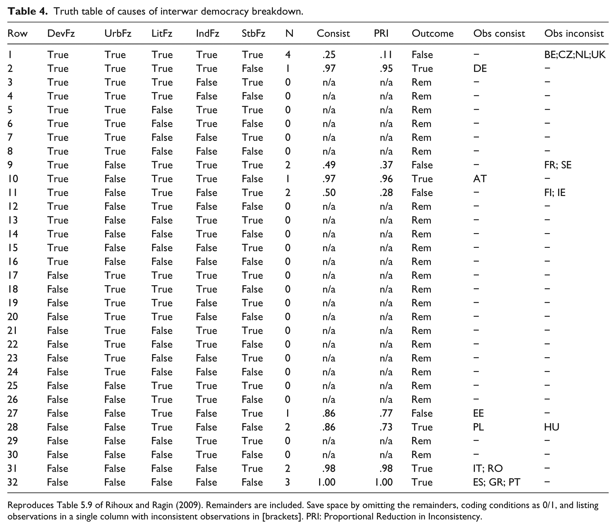
Reproduces Table 5.9 of Rihoux and Ragin (2009). Remainders are included. Save space by omitting the remainders, coding conditions as 0/1, and listing observations in a single column with inconsistent observations in [brackets]. PRI: Proportional Reduction in Inconsistency.
Consistency scores and outcomes should be presented as part of the table. Conventionally, a dash (−) is used to represent remainders. Because there are multiple ways of computing consistency, it is good to identify the variant(s) applied. If this is not specified, readers will assume the conventional measure (i.e. “raw consistency”) described in chapter 3 of Redesigning Social Inquiry (Ragin, 2008). At a minimum, both raw and proportional reduction in inconsistency (PRI) consistency should be included. It is helpful to list the observations belonging to each configuration and distinguish those that are consistent with the outcome from those that are not. Enumerating the rows of the truth table makes it easy to refer to them: “In Table 4, configurations 2, 10, 31, and 32 exhibit very high consistency scores of .97 or greater.” Some QCA software packages produce this numbering automatically. To save space, omit the remainders (noting this in the caption to the table).
You can also replace “True” and “False” with “1” and “0” to save a few characters. I do not recommend using “T” and “F” for this because these letters are visually similar and easily confused. Finally, observations may be listed in a single column; distinguish inconsistent observations by enclosing them in brackets.
Many authors prefer to present their truth tables sorted by consistency. This approach makes it easier to identify which configurations do and do not exhibit the outcome but can make it more difficult to locate specific configurations. If you present your truth table in a format other than the two described here, note this in your caption to avoid confusing readers. If, like many QCA projects, yours examines both the outcome and its negation, it can be helpful to include both in a single truth table to facilitate comparison across outcomes, assuming that space is available for the additional columns.
TOSMANA diagram
The QCA software program TOSMANA (Cronqvist, 2007) includes a visualizer that produces Carroll diagrams (Carroll, 1958), limited to a maximum of five sets. 7 Developed specifically for visualizing truth tables, 8 the software identifies sets (i.e. conditions), set intersections (i.e. truth table rows) and associated observations, and automatically color-codes intersections by outcome value, including remainders and contradictions (Figure 5). Prime implicants and the minimized sufficiency solution may optionally be highlighted. The high information density of the TOSMANA diagram makes it difficult to decode for those previously unfamiliar with it; Rihoux and De Meur (2009) have a good explanation of how to interpret it. The visualizer does not output consistency and coverage metrics for either truth table rows or solutions; manually adding these will increase its utility.
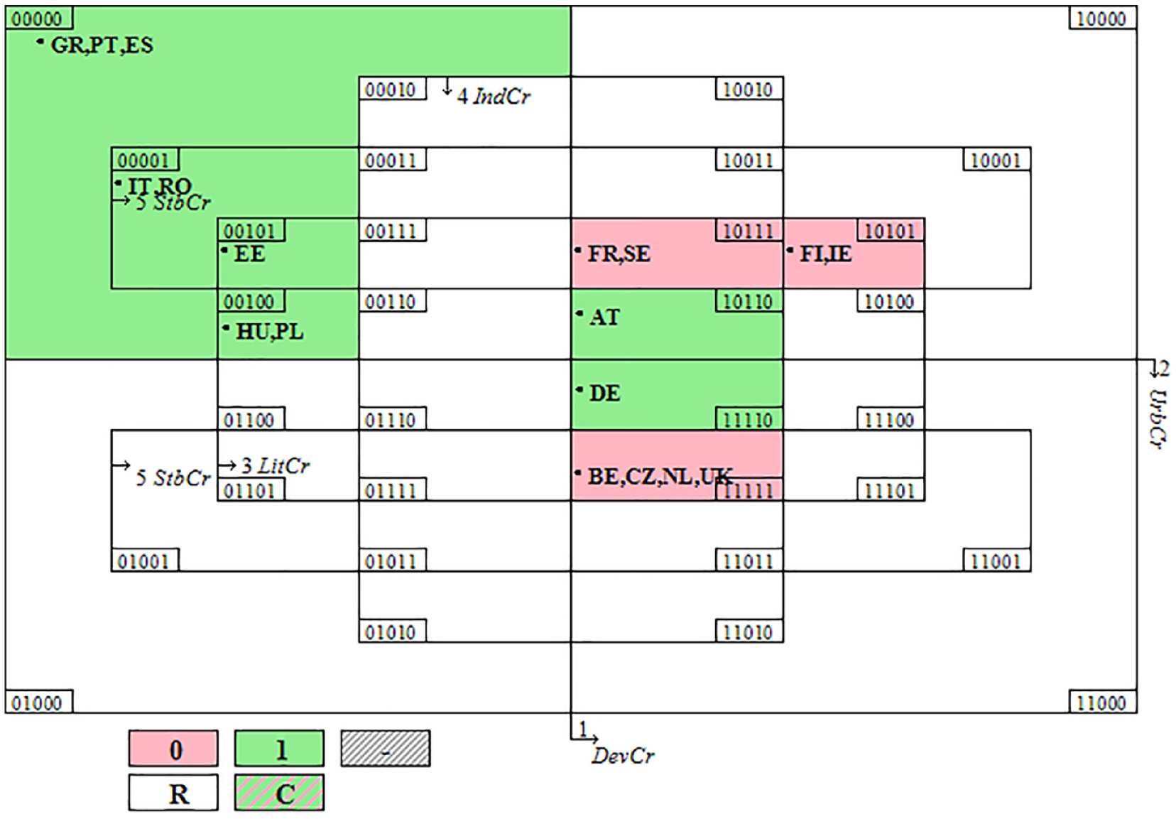
TOSMANA diagram of truth table for causes of interwar democracy breakdown.
Treemaps
Treemaps implement a rectangular space-filling algorithm, similar to the mosaic plots on which they are based (Shneiderman, 1992). The distinguishing characteristic of a treemap is that it models the subset relationships present within a hierarchy as a series of nested rectangles. In Figure 6, which depicts the truth table of the Bell Curve reanalysis, the left set of rectangles identifies Black males, who failed to avoid poverty and the right set, those who did. Each rectangle represents a single configuration from the corresponding truth table (Ragin, 2008, Table 11.4), omitting remainders. Of particular benefit to QCA researchers is that the size of the nested rectangles are scaled to reflect frequency counts (here, the number of Black males belonging to each configuration), conveying the limited diversity (Ragin, 2000) present within the data, and enabling one to assess the relative empirical importance (i.e. coverage) of the different configurations. Configurations are shaded to indicate their degree of consistency. The darker shadings of mcpqabHg, MCPqaBHg, mcpQaBHg, and MCpqabHg indicate that these configurations were “near misses” that came close but failed to meet the specified consistency threshold of .8. It would be worth reexamining the individuals described by these configurations to understand what distinguishes those who successfully avoided poverty from those who did not.
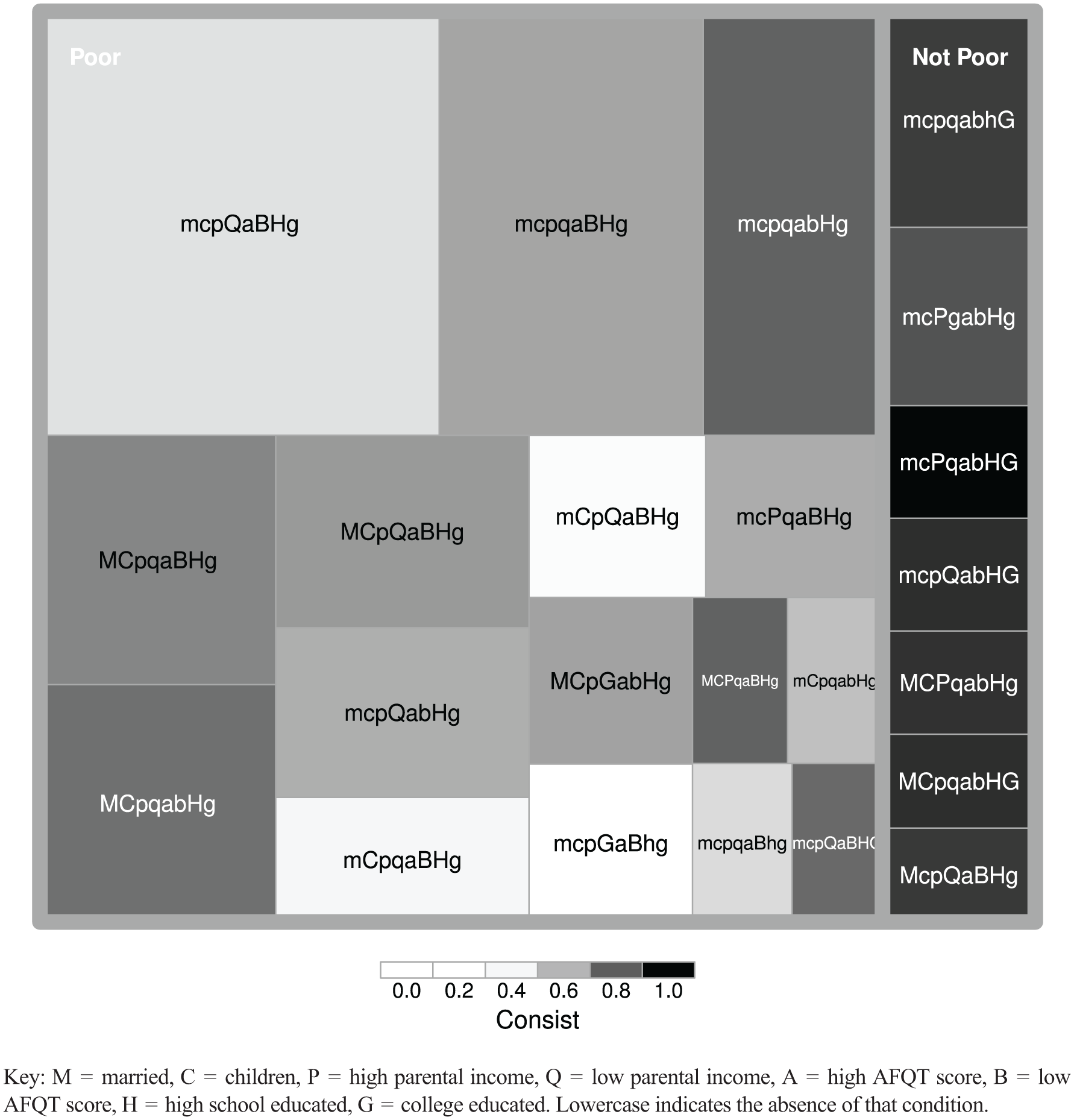
Treemap of Bell Curve data, for the 23 configurations with at least 10 observations.
Treemaps strictly implement proper hierarchies in which each node has a single parent and, therefore, cannot accommodate elements belonging to multiple sets. They can therefore be used to visualize crisp data as well as truth tables but are generally incapable of modeling necessity and sufficiency solutions, which commonly exhibit overlapping sets.
Necessity and sufficiency solutions
The standard format for presenting necessity and sufficiency solutions is as a “consistency/coverage” (concov) table. A concov table reports six pieces of information for each solution presented: (1) the recipes that comprise the solution, (2) the consistency and coverage scores associated with each recipe, (3) the observations explained by each recipe, (4) whether an observation exhibits the outcome or not, (5) the consistency and coverage scores associated with the solution as a whole, and (6) the parameters of the analysis.
It is common to present necessary and sufficient conditions separately. I prefer presenting them as a single table whenever possible. This makes it easier to compare them and examine how the necessity and sufficiency results inform one another. Table 5 presents the necessary and sufficient conditions for democracy breakdown, using the fuzzy-calibrated data. 9 With a consistency score of .95, the necessity results indicate that democracy breakdown almost always required a low level of economic development and/or urbanization and/or political stability.
Concov table identifying necessary and sufficient conditions for democracy break down.
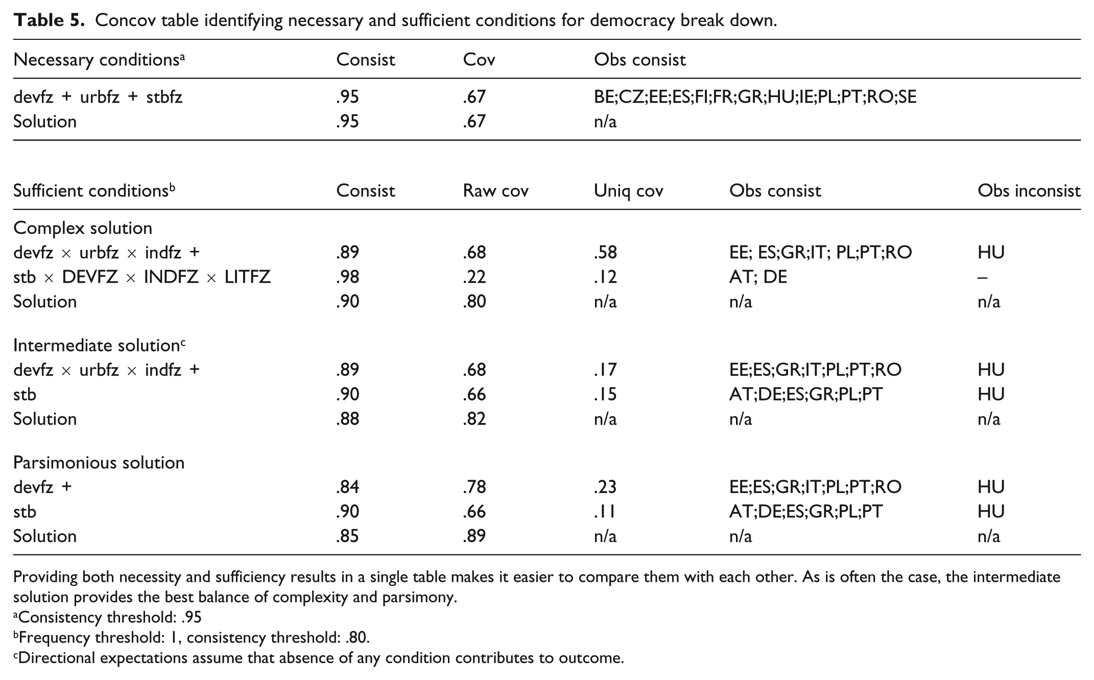
Providing both necessity and sufficiency results in a single table makes it easier to compare them with each other. As is often the case, the intermediate solution provides the best balance of complexity and parsimony.
Consistency threshold: .95
Frequency threshold: 1, consistency threshold: .80.
Directional expectations assume that absence of any condition contributes to outcome.
The sufficiency results complement the necessity results. Setting the consistency threshold to .8, the complex solution identifies the same two paths to democracy breakdown previously presented as expressions 1 and 2 on page 4. The first describes countries that combined low levels of development, urbanization, and industrialization; the second, countries that possessed high levels of development, industrialization, and literacy but were politically unstable. The second pathway of the complex solution exhibits very high consistency, indicating that this combination of conditions nearly always led to democracy breaking down in these countries. However, its coverage is low because it only describes two of the 18 democracies that comprise the data set. Coverage is higher for the first pathway, which describes eight countries, while its consistency is lower. It is often the case that consistency and coverage work against one another in this manner and, here, Hungary stands out because its democracy only partially broke down, despite that the country was neither highly developed, nor highly urbanized, nor highly industrialized.
Fiss configuration charts
Configuration charts (“Fiss charts”) are an established method of presenting QCA results. Introduced by Ragin and Fiss (2008) and further developed by Fiss (2011), configuration charts are designed to facilitate comparisons across recipes and are particularly helpful when comparing three or more recipes. Figure 7 reproduces the configuration chart from Ragin and Fiss’ (2008) Bell Curve reanalysis.
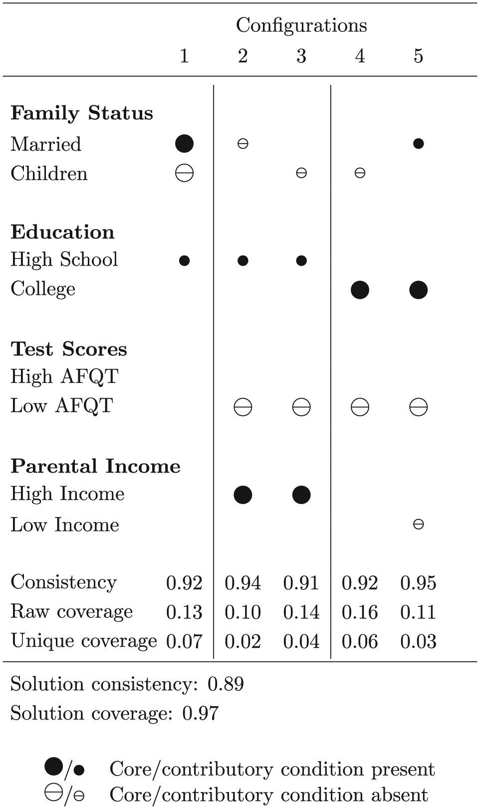
Fiss configuration chart explaining poverty avoidance for Black males.
In a Fiss chart, filled circles indicate the presence of a condition while crossed circles indicate their absence. Empty cells indicate conditions that are not part of that recipe. A Fiss chart provides the same information that a concov table does but makes it easier to identify the roles that individual conditions play. The importance of not having a low AFQT score, for example, stands out in Figure 7 as a component of four of the five recipes, as does having at least a high school education.
A unique contribution of Fiss charts is that they distinguish between “core” and “contributory” conditions, with the former indicated by larger glyphs and the latter, by smaller ones. The core conditions of a recipe are those that make up the associated parsimonious solution, conditions that are fundamental to the recipe, cannot be eliminated, and must be part of any final solution (Ragin and Sonnett, 2004). The smaller glyphs represent conditions from either the intermediate or complex solution, both of which are, by definition, subsets of the parsimonious solution. In Figure 7, the contributory conditions indicate the intermediate solution. Distinguishing between core and contributory conditions in this way is valuable because a distinctive feature of QCA is that it typically produces a range of sufficiency solutions of varying complexity. Fiss charts permit one to view multiple solutions simultaneously.
Greckhamer (2016) extends the Fiss chart to accommodate necessary conditions, represented by square glyphs. If adopting this approach, be certain to report consistency and coverage scores that include the necessary condition(s) and not just the sufficient conditions. This may involve recalculating the consistency and coverage scores for each recipe as well as the complete solution. Because the Fiss chart presents simultaneous solutions, I recommend using the accompanying caption to identify which solutions are presented as well as the particular solution to which the parameters of fit refer.
When constructing a Fiss chart, it is up to the researcher to determine the order of the configurations. Fiss (2011) recommends sorting according to core conditions. In Figure 7, this positions the configurations containing high parental income, not-low AFQT score, and college education adjacent to one another, highlighting the importance of these conditions. The authors also inserted vertical rules to distinguish three sets of configurations, based upon common core conditions: configuration 1 describes Black males who are married without children; configurations 2 and 3, those with high parental income and a not-low AFQT score; and configurations 4 and 5, those with a not-low AFQT score and a college education.
Star charts
Star charts provide a way of visualizing configuration charts, likewise allowing one to depict multiple solutions simultaneously. Figure 8 presents the star charts corresponding to Figure 7, one per configuration. In a star chart, the conditions are placed in a circular layout. The presence or absence of a condition is indicated by the type of glyph. Consistent with Figure 7, filled circles here indicate a condition’s presence and open circles, its absence; irrelevant conditions lack a corresponding glyph. The spokes that give the graph its star-like appearance present the solution(s) to which the conditions belong. In Figure 8, solid lines identify the parsimonious solution. The dashed lines indicate the contributory conditions that, in combination with the parsimonious solution’s core conditions, make up the intermediate solution. Star charts can be easily extended to accommodate additional solutions: for example, dotted lines could be added to Figure 8 to indicate conditions unique to the complex solution.
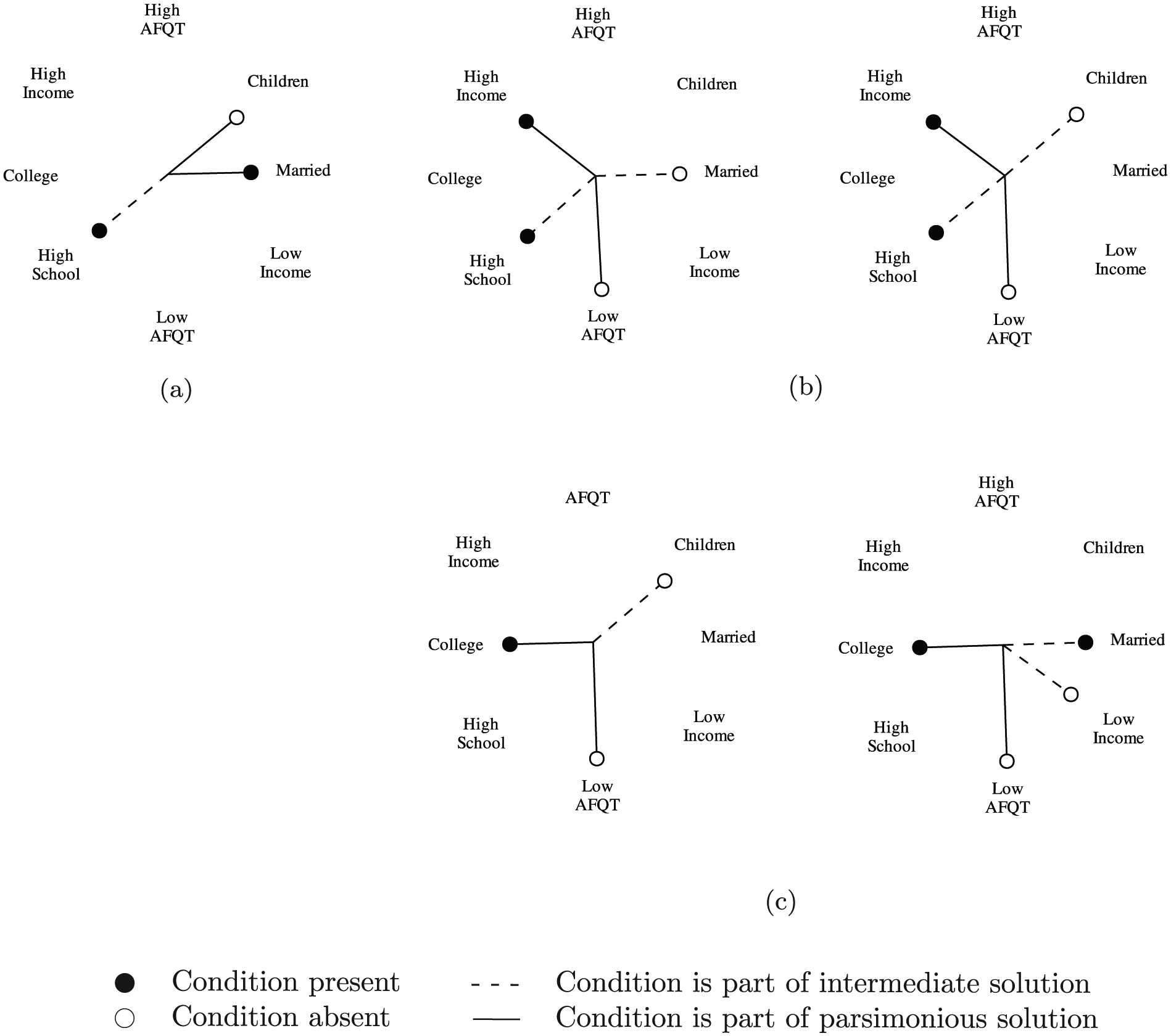
Star charts of Bell Curve sufficiency solutions.
Radar charts
Meuer et al. (2015) introduced radar charts as a technique for visualizing QCA configurations. Like star charts, radar charts also use a radial layout to depict multiple conditions. In radar charts, however, nodes are placed at varying distances from the origin, with this distance representing the magnitude of the associated condition. A line is then drawn connecting the nodes, which produces a shape that can be used for comparison. Conventionally, radar charts are used to compare a limited number of observations. 10 For example, Figure 9 presents the radar chart for the eight democracies that survived the interwar period. Finland stands out as unique, with notably low scores for development, urbanization, industrialization, and stability.
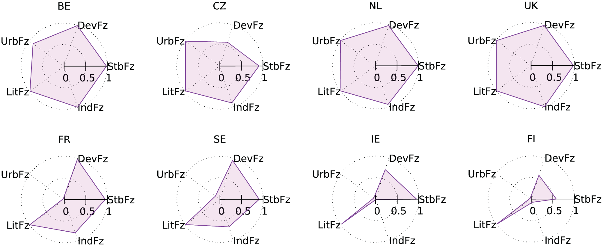
Radar charts of democracy survival.
Meuer et al. (2015) repurposed radar charts to compare configurations, rather than observations, by averaging the fuzzy set scores of the observations associated with particular configurations. Averaging is not the only way of aggregating observations to produce a configuration-level representation: Figure 10 presents the minimum (Boolean AND) and the maximum (Boolean OR) fuzzy set values for the eight surviving democracies. That degree of literacy is always high is consistent with it being a necessary condition for democracy survival.
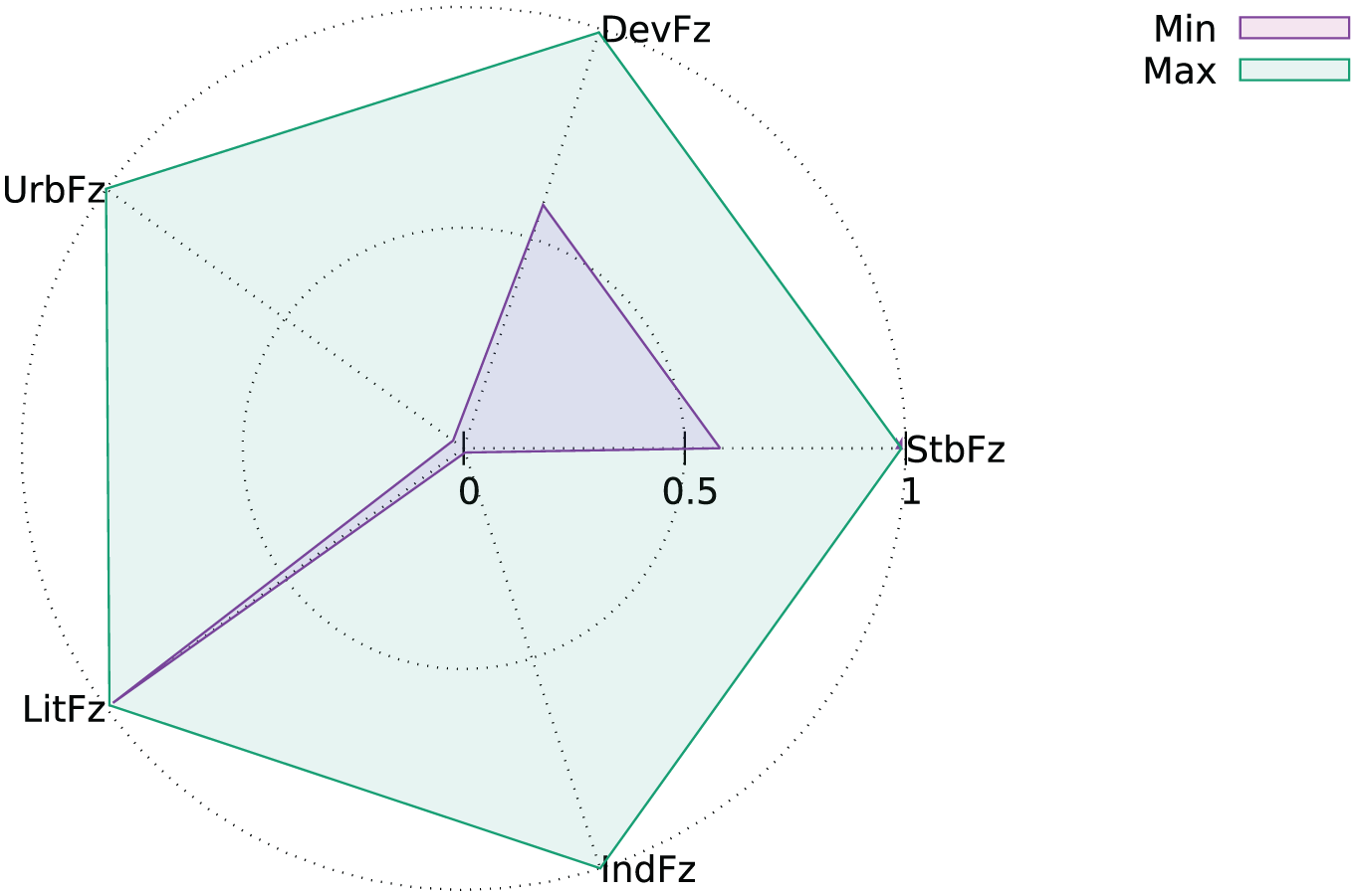
Radar chart of Dev × Urb × Lit × Ind × Stb configuration.
Branching diagrams
Providing a visual representation of the “pathways” that produce an outcome, branching diagrams (“dendrograms”) were first promoted as a technique for visualizing QCA solutions by Schneider and Grofman (2006). In branching diagrams, the explanatory conditions are laid out such that each branch describes a complete configuration. Because the explanatory conditions that occupy branching points are shared by their offshoots, redundancy between configurations is reduced (although not necessarily minimized). Branching diagrams are, therefore, an especially effective way of presenting the complexity that frequently accompanies QCA results. This also permits them to be useful for comparing across different solutions, as in Figure 11 which presents the complete standard analysis of complex, intermediate, and parsimonious solutions from the Bell Curve reanalysis. It is also possible to present multiple solutions in a single branching diagram (e.g. Figure 11(a) distinguishes among conditions belonging to the complex, intermediate, and parsimonious solutions.).
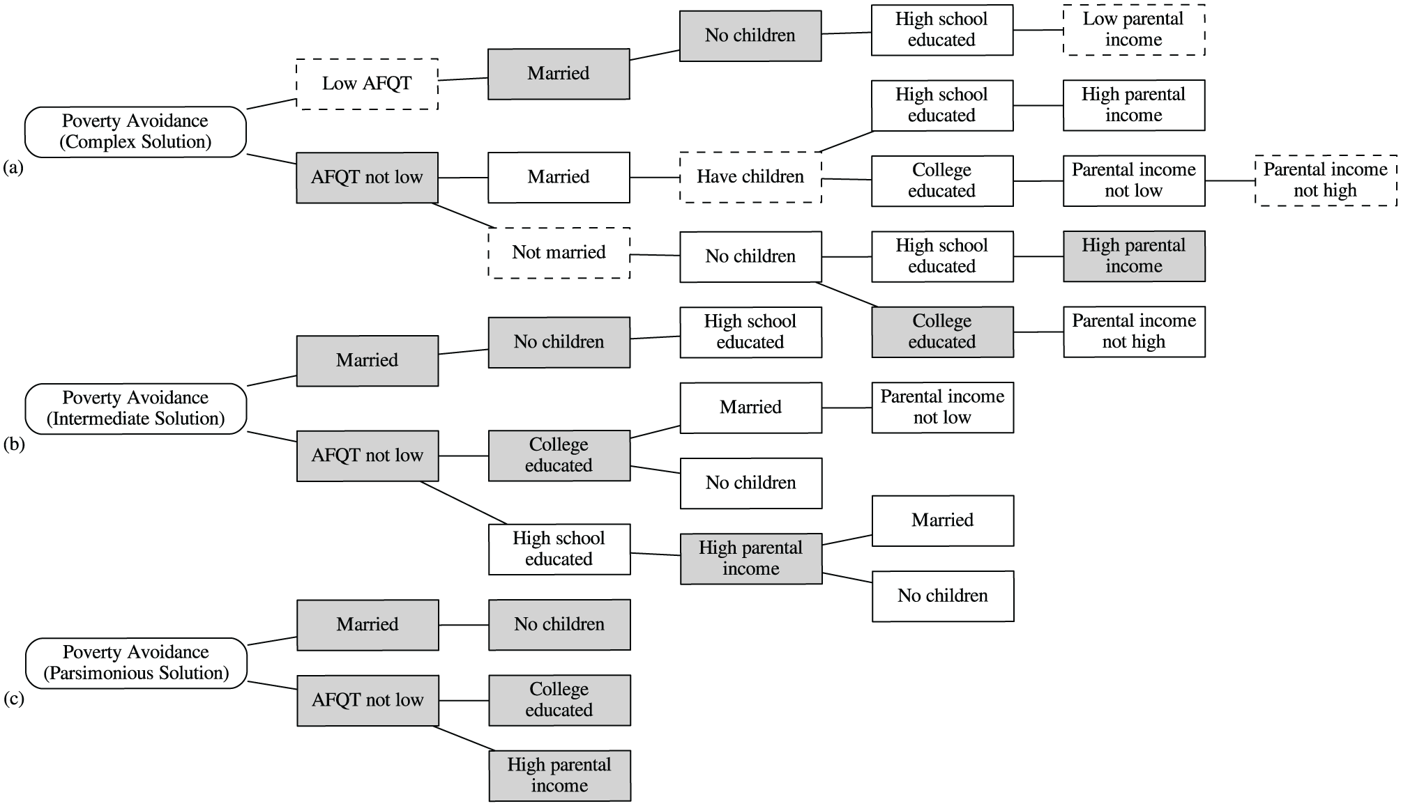
Branching diagrams for Bell Curve sufficiency solutions.
Figure 11(b), which presents the intermediate solution, identifies five different pathways for the avoidance of poverty by Black males. The branching diagram helps us to see how these pathways are related to one another. One pathway to poverty avoidance describes Black males who are married, do not have children, and have a high school degree or equivalent. The other four pathways describe Black males who do not have a low AFQT score. Two of these pathways describe those with a high school education and two describe those with a college education. For those with a high school education, what matters is coming from a well-off family and either being married or not having children; for those with a college education, what matters is not having children or, alternatively, being married and coming from a family that was not poor.
Computer software packages such as GraphViz can automatically optimize the spatial layout of branching diagrams. But it is up to the researcher to determine the nodes’ positional order. Decisions regarding the order of the conditions will influence the interpretation and discussion of the results: placing AFQT scores early in the hierarchy allowed me in the previous paragraph to associate four pathways as describing “Black males who do not have a low AFQT score.” Mathematically, however, there is no reason that one could not privilege educational attainment, and correspondingly characterize the intermediate solution as “three pathways describing Black males with a high school education and two describing Black males with a college education.” There are different guidelines that one may draw upon when laying out branching diagrams. Schneider and Grofman (2006) suggest using sequential ordering, if a temporal dimension is embedded in the data. Alternatively, one might follow Fiss’ (2011) recommendation for configuration charts and privilege conditions from the parsimonious solution as fundamentally explanatory. Figure 11 emphasizes AFQT scores primarily for this latter reason and also for a rhetorical one: the role of intelligence was central to the Bell Curve controversy and the primary motivation for Ragin and Fiss’ reanalysis.
Superset/subset relationships
As QCA is a set-theoretic method, techniques for visualizing superset/subset relationships frequently provide the best representations of one’s data. Such techniques are uniquely suited to presenting the relationships among observations while maintaining case holism and foregrounding their configurational nature. Reflecting QCA’s sensitivity to causal complexity, techniques that can represent partially overlapping sets are often desirable. Proportionality is also of interest. Some visualizations present only the logical relationships among observations (which observations belong to which sets); others present both logical relationships and proportionality (the sizes of sets and set intersections).
Venn and Euler diagrams
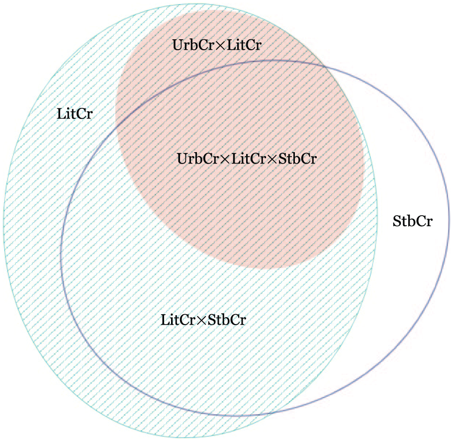
The classic way of depicting set-theoretic relationships is of course through Venn diagrams (Figure 12), which are also the most effective way of explaining the method to audiences unfamiliar with QCA. But although these forms are familiar and easy to interpret, they also suffer a number of significant weaknesses. They do not scale well. Because the number of intersections increases exponentially as sets are added, it is difficult to decode and interpret Venn diagrams of more than a handful of sets. They also offer low information density: they take up a lot of space and convey relatively little. At best, a coding might be applied to distinguish among different types. For QCA, one might differentially color those configurations that do and do not exhibit the outcome or use saturation to reflect the consistency scores of different configurations. One may label intersections with the number or names of the observations belonging to that configuration, although this data is readily available in the corresponding truth table. Although conventional Venn diagrams based on circles, ellipses, or another common form are most familiar (Figure 12a), I generally prefer Edwards-Venn diagrams (Figure 12b). Edwards’ (2004) formulation is based upon projecting a sphere onto a two-dimensional surface to produce a geometrically coherent structure which is extensible to an arbitrary number of sets, making the figure easier to decode visually and permitting direct comparison across arities. Of particular benefit to the Edwards-Venn variant is the center ring which intuitively corresponds to the outcome of the analysis. When desiring to present only the intersections among predictive conditions, this ring may be removed without disrupting the rest of the diagram.
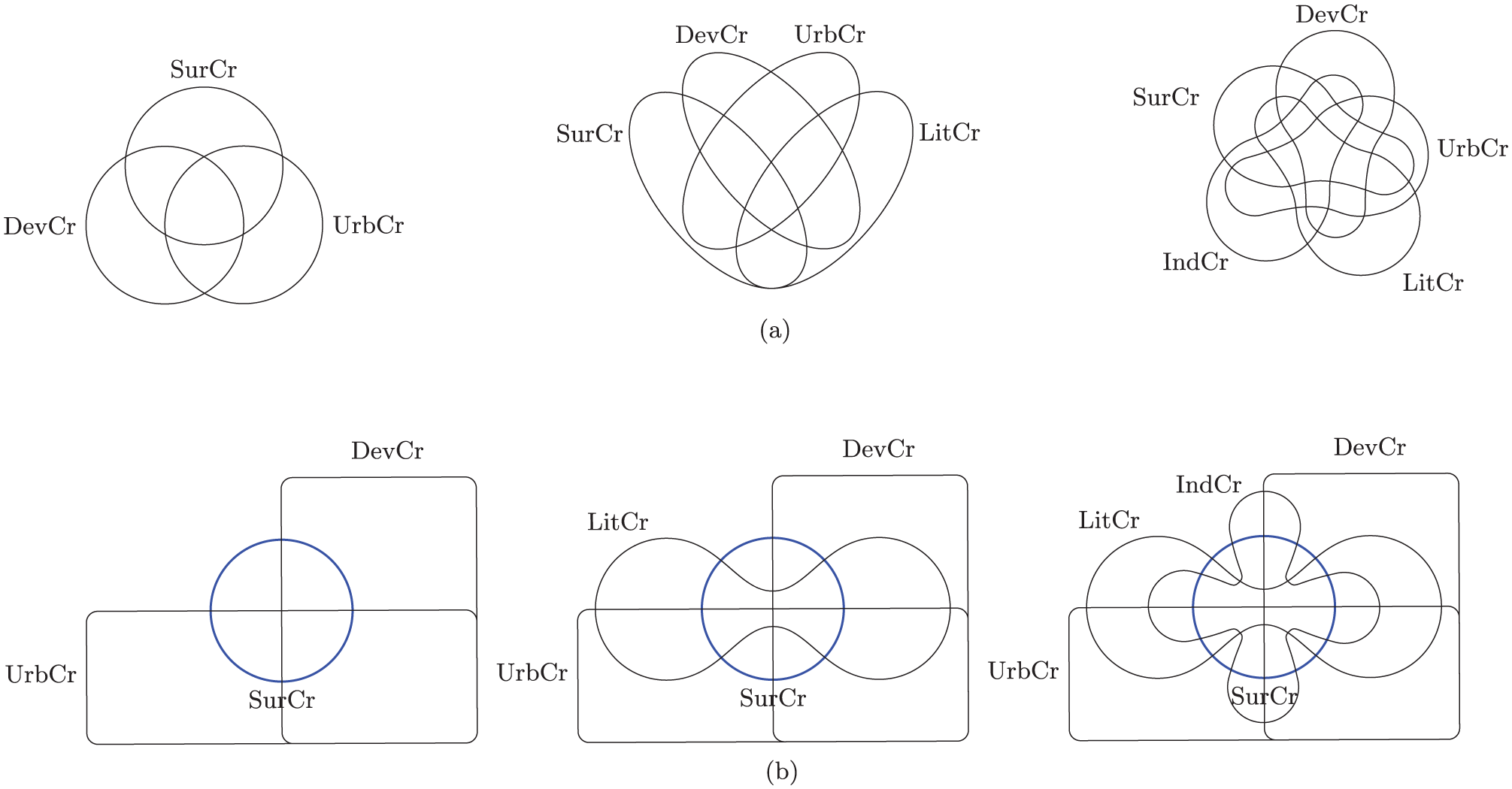
Conventional and Edwards-Venn diagrams for three, four, and five sets.
Although Venn diagrams become increasingly difficult to read as the number of sets increases, it is quite often the case that simple two-set Venn diagrams are perfectly appropriate. Indeed, all concov recipes and solutions may be represented as the intersection of one (usually complex) explanatory condition and one outcome. Furthermore, it is straightforward to produce area-proportional two-set Venn diagrams, as illustrated by Figure 13, which presents area-proportional Venn representations of Table 5.
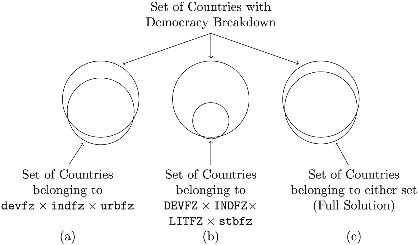
Area-proportional Venn representations of democracy breakdown sufficiency solutions from Table 5.
Two-set area-proportional Venn diagrams valuably allow one to compare consistency and coverage. Figure 13 demonstrates the trade-off between consistency and coverage that is characteristic of QCA. The first diagram exhibits lower consistency but greater coverage than the second diagram, which trades greater consistency for lower coverage. For the full solution, consistency falls in between those of the individual recipes while coverage is greater. Numerous websites exist that will generate area-proportional two-set Venn diagrams; at least one R package will as well.
Beyond two sets, we are often not interested in Venn diagrams at all but, rather, Euler diagrams. The difference between a Venn diagram and an Euler diagram is that the former depicts all set intersections, while the latter depicts only those that empirically exist. In other words, where a Venn diagram represents the full truth table, an Euler diagram omits the remainders. Because the number of intersections is not fixed, drawing Euler diagrams is more complicated than drawing Venn diagrams and the automated generation of Euler diagrams—area-proportional Euler diagrams, especially—is a largely unsolved problem. Building upon the work of Chow and Ruskey (2003, 2005a, 2005b), Chow and Rodgers (2005) had previously developed a technique for generating approximate area-proportional three-set Venn diagrams using circles. However, it is mathematically impossible to construct exact area-proportional three-set Venn (or Euler) diagrams using circles. This limitation was overcome by Micallef (Alsallakh et al., 2015; Micallef and Rodgers, 2014), who developed a technique for generating exact area-proportional three-set Venn and Euler diagrams using ellipses (Figure 14).
Area-Proportional Euler Diagram.
Beyond three sets, any area-proportional Euler representation will necessarily have to rely upon approximation. Wilkinson (2012) developed an algorithm using circles, implemented in the venneuler package for R. Usefully, the package also provides an accompanying stress factor that measures the degree to which the generated diagram departs from input parameters of set sizes and degrees of overlap. In my experience, however, applying venneuler to QCA data frequently produces excessively high stress factors, indicating that the resulting diagram poorly represents the underlying data set. A formal study of the suitability of venneuler for QCA data would be welcome.
Hierarchical graphs and Galois lattices
It is often useful to diagram the subset relationships among either only conditions or only observations. Figure 15 presents the subset relationships among countries for the crisp-set democracy breakdown data. (Due to space limitations, a hierarchical graph of conditions—logically equivalent to the corresponding Euler diagram—is not presented here.) In what way was Austria a subset of Germany? Germany was an instance of democracy breakdown (B) that combined high levels of economic development (D), urbanization (U), literacy (T), and industrialization (N) with the absence of government stability (s). 11 Austria was a similar case, except that it was not highly urbanized (DuTNsB). Hungary and Poland (duTnsB) are subsets of both Austria (DuTNsB) and Estonia (duTnSB). Similarly, among the countries where democracy survived, Finland and Ireland (DuTnSb) are a subset of France and Sweden (DuTNSb), which are a subset of Belgium, Czechoslovakia, the Netherlands, and the UK (DUTNSb).
Hierarchical graph of cases of democracy survival/breakdown.
While hierarchical graphs of conditions may readily be understood causally, the analysis of the superset/subset relationships among observations does not easily lend itself to such interpretation. It would be absurd to conceive of France and Sweden as “necessary” for Finland and Ireland, although the mathematical relationship is equivalent. Rather, hierarchical graphs of observations such as Figure 15 direct our attention to the configurational nature of observations (Breiger, 2009). France and Sweden are like Finland and Ireland: they are all instances of democracy survival among countries that were highly developed, literate, and stable, but not highly urbanized. They differed with regard to industrialization; France and Sweden were highly industrialized, while Finland and Ireland were not.
Hierarchical graphs’ diagram the subset relationships among conditions or observations. QCA directs our attention to the relationship between the two, which may be rendered as a Galois lattice (Breiger, 2000; Freeman and White, 1993). Figure 16 presents the Galois lattice for democracy survival and breakdown. Read bottom-up, the lattice describes observations as configurations of conditions: Finland and Ireland, for example, were instances of democracy survival that combined high levels of literacy, economic development, and government stability, to which France and Sweden added high industrialization. In comparison, Austria was an instance of democracy breakdown that combined high levels of literacy, economic development, and industrialization. Read top-to-bottom, the lattice describes conditions as combinations of observations: industrialization is below urbanization because the set of highly urbanized countries (Germany, Berlin, Czechoslovakia, the Netherlands, and the UK) also belong to the set of highly industrialized countries (those five, plus Austria, France, and Sweden).
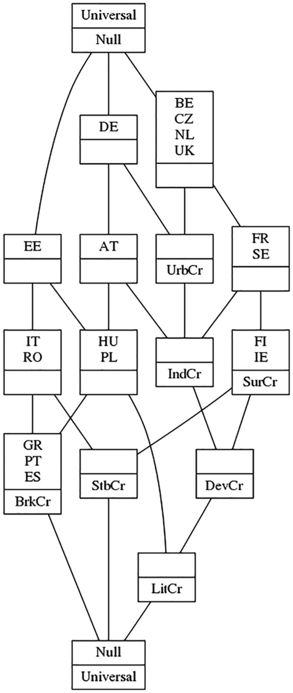
Galois lattice of democracy survival/breakdown.
Galois lattices faithfully reproduce the information presented in the corresponding truth table. Including the remainders is optional and Figure 16 omits them in order to produce a compact representation. Although Galois lattices cannot convey proportionality and are not as intuitive as Euler diagrams, they are far more effective at communicating complex superset/subset relationships. Moreover, they foreground the configurational nature of observations. Estonia, for example, combines the characteristics of Italy and Romania; Hungary and Poland; and Greece, Portugal, and Spain. Finally, the structure of Galois lattices permits them to readily accommodate any number of conditions while remaining interpretable.
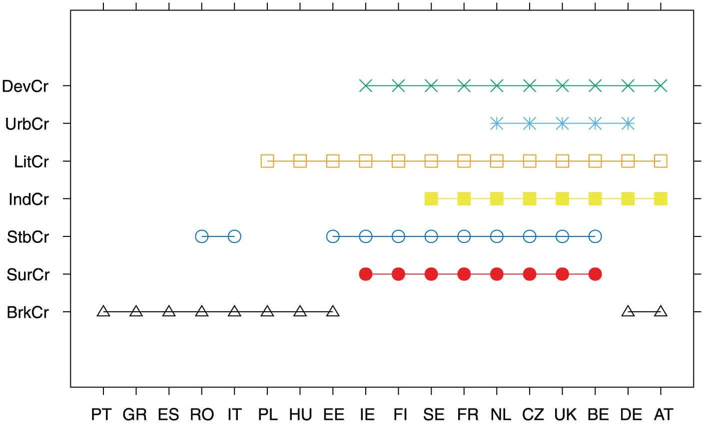
Linear diagrams
An alternative to Venn and Euler diagrams, and Galois lattices, is the linear diagram, introduced by Liebniz in 1686 (Rodgers et al., 2015). As presented by Figure 17, in a linear diagram the conditions are arrayed along the Y-axis and the observations, along the X-axis. Set intersections are read vertically. Figure 17 clearly distinguishes the combinations of conditions associated with democracy survival and breakdown, while also presenting which observations are associated with each configuration.
Linear diagram of democracy survival/breakdown.
In many ways, linear diagrams are far superior to conventional Euler diagrams. While not as familiar as Euler diagrams, linear diagrams present a more compact representation of the same information and are typically easier to decode, particular for a large number of intersections (Chapman et al., 2014; Rodgers et al., 2015). They also have the unique advantage of easily scaling to a large number of conditions and/or observations: each additional condition merely adds another row to the figure; for a large number of observations, the spans within the diagram may be defined as proportional to the number of observations, rather than identifying each observation individually. Linear diagrams are also flexible: there is not, in fact, any requirement that they be proportional; by ignoring the number of observations associated with each configuration, one may present only the logical configurations present within one’s data. Like Galois lattices, the production of linear diagrams may be automated by computer software.
Discussion
How to best present our research depends upon three things: what we wish to convey, the medium of delivery (e.g. print publication, poster, or slide deck), and the audience’s prior familiarity with QCA. When the audience is unfamiliar with QCA, I often recommend eschewing mathematical terminology and notation entirely. Unless the project includes a pedagogical aspect, it is often unnecessary to devote the time and space to explaining that Boolean multiplication means logical AND, that Boolean addition means logical OR, and then introducing the associated notation. Instead, consider just writing out the terms “and” and “or” which are clear, straightforward, and readily understood. The less-familiar notations can distract audiences and offer no semantic advantage over the everyday terminology. For negation, I find that the classical convention of using uppercase to indicate the presence of a condition and lowercase to indicate its absence is easier for novices to understand. The classical convention is also best for slide decks and posters as the single-character complement operators can be difficult to see from far away and is, therefore, slower to decode. For print publications where the audience is already familiar with QCA, one’s choice of notation is a matter of personal preference.
Presentation medium is important because it affects the amount of information that may be successfully conveyed to audiences. The low resolution of projectors limits the detail that slide decks can offer (Tufte, 2006b), while ever-advancing delivery curtails the opportunity for audience members to closely examine a particular figure or dig into a specific table. When you have dense information to convey, consider taking Tufte’s (1997, 2018) advice and using handouts to supplement or in lieu of your slide deck. Publications, in contrast, afford readers maximum control and print’s high resolution encourages detail and nuance. Poster presentations exist in between. They possess the high resolution of print but are constrained by the audience’s limited time and attention.
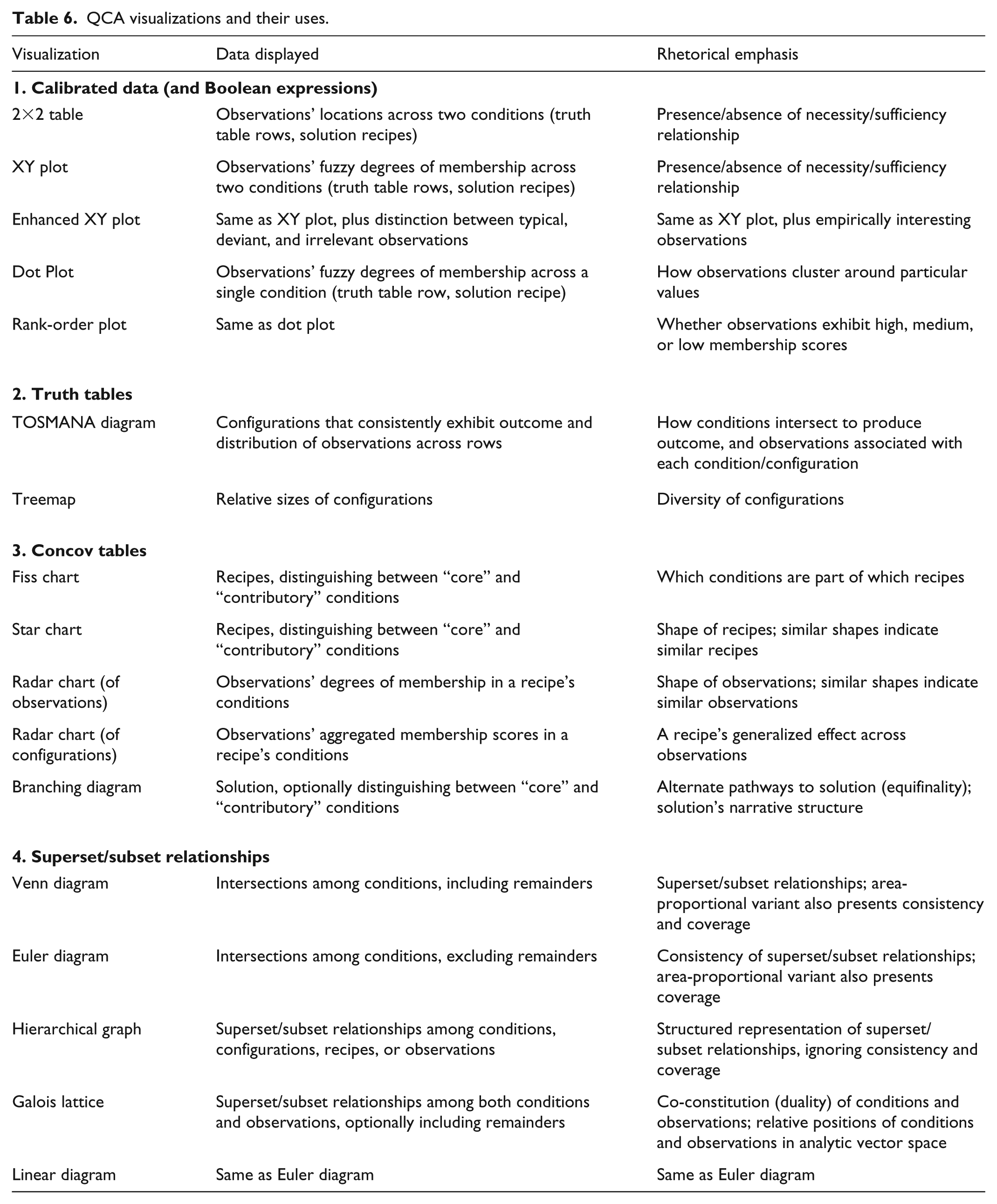
The most important consideration is purpose. What information do you wish to share with your audience and why? Calibrated data sets, truth tables, and concov tables 12 report essential elements of the analysis and should be presented as a matter of course. When space limitations preclude their inclusion, they must be made available as supplemental material. Figures, in contrast, are presented for the rhetorical purpose of highlighting a particular aspect of the analysis and/or offering an interpretation of the results (Bertin, 2011).
Table 6 summarizes the rhetorical uses of the visualization techniques that have been presented. The visualization of calibrated data and Boolean expressions focuses on the distribution of observations, highlighting how observations are clustered and establishing the presence, strength (consistency), and empirical importance (coverage) of necessity and sufficiency relationships. Visual representations of truth tables direct attention to configurational diversity, both the relative frequency of configurations and the degree to which limited diversity is present in one’s data. Truth table visualization is particularly useful when identifying and/or comparing the configurations associated with the presence or absence of an outcome. Different ways of diagramming concov tables emphasize different aspects of the solution: the presence or absence of individual conditions by recipe (Fiss charts), similarities and differences among observations (radar charts) or recipes (star charts, radar charts), or the narrative structure of a solution (branching diagrams). The complexity and nuance of superset/subset relationships are often most effectively conveyed by following the maxim of “show, don’t tell.” Venn, Euler, and linear diagrams present set-theoretic relationships via the intersections among conditions. Hierarchical graphs and Galois lattices reveal the logical relationships among conditions and/or observations and their distribution within the analytic vector space.
QCA visualizations and their uses.
Conclusion
It is not always true that “a picture is worth a thousand words.” A concov table conveys more information in less space than any of the visualizations introduced here. The same is generally true of truth tables and calibrated data sets. What visualization offers is the opportunity to see one’s data, making it easier to discern patterns and identify relationships (Cleveland, 1993, 1994; Tufte, 1983, 1990, 1997, 2006a; Wainer, 1997, 2005). While such an observation is uncontroversial (Gelman et al., 2002), I offer that visualization is especially valuable in QCA research, as the method is designed to retain complexity. The techniques presented here are not data reduction procedures or simplifying processes; rather, they are transformations, each offering a different perspective of one’s data and providing a unique opportunity for getting to know one’s data. Particularly important to QCA researchers are that these procedures treat cases holistically and configurationally, allowing one to interrogate the combinations of conditions that constitute a case (Ragin, 2004).
Visualization can also be understood to constitute a form of “casing,” the process of constructing cases. As described by Ragin (1992), casing is a fundamental aspect of the research process, an attempt to bring operational closure to some problematic relationship between theory and data. That is, it seeks to answer the question “What is this a case of?” Casing creates cases through an identification process: defining the nature of the relationship among observations of “a kind” and distinguishing among observations of different kinds. All research involves casing, but QCA foregrounds this process by problematizing the conception of “a case.” A case in QCA is explicitly a complex, nested construct: types of democratic states, for example, nested within instances of democracy survival; or instances of poverty avoidance by different types of African American males. By offering different perspectives of one’s data, the visualizations reviewed here clarify the casing process: How are observations classified and grouped? To what extent does a particular configuration of conditions consistently exhibit the outcome under investigation, or not? What are the characteristics that distinguish one recipe from another?
In formalizing the practice of comparative analysis as QCA, Ragin (1987) made explicit the assumptions, algorithms, and logic of comparative research (Goertz and Mahoney, 2012). This formalization sought not to reform or revise the method but, rather, to develop technical procedures of comparison so that comparativists could instead focus on the more important task of getting to know their cases well (Ragin and Rubinson, 2009; Rubinson and Ragin, 2007).
The presentation techniques discussed here complement this intent, as it is equally important that researchers disseminate their research in a manner that retains fidelity to the methodology. For QCA researchers, this means not only using common nomenclature and established conventions but also, and more importantly, establishing how knowledge is developed through comparative case analysis. It is simple enough to share our findings and conclusions but explaining and justifying them is only possible by maintaining case holism, clarifying the configurational nature of our explanations, and demonstrating the set-theoretic relationships embedded in our data.
Footnotes
Acknowledgements
I thank Ricci Rodriguez for her assistance with this project, and Griffin and Thomas Jager-Cash for a series of provocative conversations regarding the drawing of tree diagrams. I also thank the participants of the 4th and 5th International QCA Expert Workshops for their feedback on earlier versions of this paper as well as three anonymous reviewers for especially helpful comments and suggestions for improvement.
Declaration of conflicting interests
The author(s) declared no potential conflicts of interest with respect to the research, authorship, and/or publication of this article.
Funding
The author(s) received no financial support for the research, authorship, and/or publication of this article.