
Abstract
This article explores the presentation of fake news, the most salient kind of disinformation, focusing neither on its text-based content nor its image-based form, but instead on its overall aesthetic composition—and how and why that composition contributes to the proliferation of disinformation. It begins with an analysis of “real news”—the genre that fake news attempts to copy—and its reliance on what Gaye Tuchman calls the “web of facticity” to communicate “good” information. It then turns to examine how fake news uses the logic of graphic design to exploit features of the web of facticity to create a “web of plausibility”—the web of facticity’s evil twin—to generate momentum for circulation through the analysis of several specific aesthetic features of the news genre. The conclusion offers some possible ways that this sort of perspective can better equip us to help stop the spread of disinformation.
Introduction
The first hints of a global disinformation problem surfaced around 2016, in the aftermath of the Brexit referendum in the U.K. and the U.S. presidential election. Within a short period of time, what had originally been treated as a weird internet phenomenon would become the central mechanism of a vast, slow-moving, and intractable mess that governments and social media companies seemed ill-equipped to address.
While the problem of disinformation is now obvious, how exactly to confront it is still under deliberation. A critical move in that effort has been the careful delineation of what exactly makes something “disinformation” (Kapantai et al., 2021; Wardle & Derakhshan, 2017). Inaccurate information can appear in many guises, including hoaxes, jokes gone bad, good faith misinterpretations, bad reporting, and of course, outright lies, including lies told by well-known media personalities and politicians (see Evanega et al., 2020; Flynn et al., 2017). One factor commonly invoked to help draw some distinctions is the intention behind bad information (e.g., Jack, 2017): misinformation is mostly inadvertently wrong, while disinformation is mostly purposively misleading.
The species of disinformation that has arguably caused the most alarm is what is often called “fake news”—disinformation that somehow takes a journalistic or journalism-adjacent form. But that, too, is often difficult to pin down, since what counts as both “fake” and “news” is not necessarily consistent. Maria Molina and colleagues (2021, p. 181) have advised researchers “to be very disciplined in defining it and differentiating it from legitimate news,” and to that end have expanded “fake news” into a typology of categories, including false news, polarized content, satire, misreporting, commentary, persuasive information, and citizen journalism. Others have proposed “junk news” instead, redirecting attention from the relative truth of fake news to its poor quality (Howard et al., 2017; Venturini, 2019). Further approaches bracket the definitional challenge that haunts fake news by examining the contexts in which it circulates, including specific social media platforms (Bakir & McStay, 2018; Carlson, 2018; Mustafaraj and Metaxas, 2017) and websites (Mourão & Robertson, 2019; Robertson & Mourão, 2020). Researchers have also studied the consumers of fake news, revealing, for example, that readers with high levels of information literacy (Jones-Jang et al., 2021) and familiarity with how journalism works (Amazeen & Bucy, 2019) are better at spotting fake news than more casual news consumers. Underlying these and other approaches is a common fundamental concern: fake news is perhaps the most pervasive component of a media landscape full of degrading information (Nielsen & Graves, 2017). It is now implicated in almost every aspect of online communication, and as such, understanding what it is and how it operates is crucial for preventing its worst potential consequences.
One premise shared across these and similar studies is that fake news is, first and foremost, a content-oriented phenomenon. From this perspective content typically refers to chunks of language, such as descriptions (Robertson & Mourão, 2020) or claims (Humprecht, 2018), but might also include ways of ordering language, like news style (Horne & Adali, 2017; Waisbord, 2018), and specific writing structures, like the inverted pyramid used in news reporting (Tandoc et al., 2021). While it is widely acknowledged that “fake news appropriates the look and feel of real news” (Tandoc et al., 2018, p. 11; cf. Brennen, 2017; Mourão & Robertson, 2019), a strong underlying assumption is that it manifests online primarily in and as text.
But this position seems not quite right. As it circulates in the world, fake news is rarely consumed as a free-floating textual “description” or “claim.” Instead, it almost always appears within discrete and familiar “containers” or “objects,” like a post on Facebook, a tweet, or a news article hosted on a website—what Magnus Nielsen (2017) describes as “news-as-items”—each of which has a distinct “look and feel” of its own. Beyond a small number of studies of “multimodal disinformation” (Hameleers et al., 2020; Lee & Shin, 2022) and ruminations on the design of fake news (Gelfert, 2018; Ruiz, 2018), the aesthetic aspects of fake news have received comparatively little analytic attention—this despite their ubiquity, and a growing awareness that “visual mis/disinformation is proliferating” (Thomson et al., 2022, p. 939) so intensely that even traditional news venues can be tricked into spreading it.
In this article, I offer an alternative framework for understanding and studying fake news. I analyze the presentation of fake news by focusing neither on its text-based content nor its image-based form, but instead on its overall aesthetic composition—and how and why that composition contributes to the proliferation of disinformation. Despite important critical efforts to define, differentiate, and complicate the fake news category, I am using the term here because it does retain useful conceptual affordances: “fake,” as in a fake, like a counterfeit object, 1 can simultaneously indicate that something is both “not the real thing” and “of poor quality”; and importantly, counterfeits are things intentionally designed to be perceived as real precisely by “citing” the qualities of an original type (Nakassis, 2012). My analysis of fake news as an aesthetic composition thus begins by examining the design of “real news”—the genre whose compositional features fake news attempts to cite—and its reliance on what Gaye Tuchman (1978) calls the “web of facticity” to communicate “good” information. I then explore how fake news uses the logic of graphic design to exploit features of the web of facticity to create a “web of plausibility”—the web of facticity’s evil twin—to generate momentum for circulation through the analysis of several specific aesthetic features of the news genre. In the conclusion, I offer some possible ways that this sort of perspective can better equip us to help stop the spread of disinformation.
A focus on minimalist design features of fake news may seem trivial, but the approach complements existing research in several ways. First, it provides a more concrete account of how fake news comprehensively appears to people in their everyday experience, which is where fake news thrives most vivaciously. Second, attending to the specific forms that fake news takes allows researchers to better understand how and why it is interpreted as plausible, and how and why it propagates as it does. Finally, more accurate analyses of how fake news manifests and circulates allow researchers and journalism institutions to develop new and stronger methods for combating it.
Real News and the Web of Facticity
A common assumption about news—both the legitimate and “fake” varieties—is that it unquestionably constitutes a genre (Egelhofer & Lecheler, 2019; Finneman & Thomas, 2018; Tandoc et al., 2018, 2021). But while the concept of genre is typically used to distinguish one kind of text from another, usually by means of their linguistic and structural features, it can also be viewed as a sociocommunicative formation that is necessarily shared by both people who create messages and those who receive them. As linguistic anthropologist William Hanks (1987, p. 679) put it: genres can be defined as the historically specific conventions and ideals according to which authors compose discourse and audiences receive it. In this view, genres consist of orienting frameworks, interpretive procedures, and sets of expectations that are not part of discourse structure, but of the ways actors relate to and use language.
From this perspective, genres are not simply collections of identifiable classificatory features. Instead, they function as assemblages of formal qualities—as aesthetic compositions—that create “a conventionalized orienting framework for the production and reception of discourse” (Bauman, 1999, p. 84) that both authors and audiences understand. They’re also always historically embedded. The use of a recognizable genre in the present implies its use at some point in the past and treats the current instance as one additional link in a long chain of similar instances (Briggs & Bauman, 1992). Genres are also associated with or available to particular groups of people, or only to people who find themselves in particular situations. For example, while there are few social constraints on who can meaningfully perform a genre like “small talk,” this is not true of others like “sermon,” “cross-examination,” and “valedictorian address,” all of which are ideologically linked to high-value social roles and places. What this all means, then, is that genres are inherently sense-making devices—that through their formal features, the associations that accompany those features, and the historical echoes invoked in their use, genres provide people a mechanism for converting new information into something that is socially understandable, so that it conforms to things that are already known.
The most important motivating force of the news genre—or really, the set of news genres used across different media—is documenting a world of facts (Tuchman, 1978), particularly through a commitment to objectivity (Tuchman, 1972). Typically, this commitment is expressed to the public as a simple unstated formula: the information presented here is known to be accurate and true. In her influential sociological study of how traditional news is made, Gaye Tuchman (1978, p. 82) defines facts, at least within the news context, as “pertinent information gathered by professionally validated methods specifying the relationship between what is known and how it is known.” For a piece of information to function as a fact, a range of conditions must be considered and worked, including the identity, status, and social position of a person who says something, corroboration of that something by another person, or verification through some other means, like a video recording or historical document (see Clayman, 1990). Importantly, journalists are not supposed to let facts stand on their own when crafting a news story but must embed them alongside a meshwork of other facts that help ground an overall narrative representation. Tuchman calls this the “web of facticity.”
From the late 19th century well into the 20th news organizations developed and enhanced the web of facticity by deploying news presentation features—some subtle, some less so; some linguistic, some visual—for communicating facts to their audiences and distinguishing them from less fact-based content. Such features have largely granted journalism a distinctive sense of social trust and authority (Carlson, 2017). Genre conventions for reporting, for example, use unique linguistic phrasing to signal a relation to reality (Kress, 1983). This includes cues like verbal keyings and visual slugs— “Live from Baghdad”—that link a report, a reporter, a time, and a place all at once (Zelizer, 1990). It also involves formal news style features like summary lead sentences, augmented syntax—for example, starting a lead sentence with a dependent clause—and specific vocabulary. Some of these conventions are set as news organization policy (Cameron, 1996), but all of them, combined into an aesthetic composition of various features, create a specific kind of representation for a reader or viewer. As Tuchman (1978, p. 107) put it, “the language of news prose contains a special relationship to the everyday world, for, like any other language, it both frames and accomplishes discourse. It is a perception and it guides perception; it reconstitutes the everyday world.”
Importantly, while Tuchman conceives of the web of facticity as primarily textual and structural—which, note, are still visual features of a news object from the point of view of a print news consumer—other graphic cues contribute to its construction, including typography, imagery, logotype, color, and more (see Kress & van Leeuwen, 1998), all of which together enhance the complex aesthetic composition of the web of facticity. The size of headline’s type can subtly indicate its significance, where bigger type indicates that something is more significant. Stories that editors judge to be important (rather than merely interesting) might be placed on the front page or at the start of a newscast, while editorials and opinions, which are not subject to verification standards, would be separated from fact-based news in their own sections (Tuchman, 1978). Prioritizing significant information is mirrored in the famous “inverted pyramid” approach to news writing (Tandoc et al., 2021), in which the most important facts are placed at the start of an article while more extraneous details come at the end. Other techniques are even more demure, like short paragraphs that avoid a feeling of clutter around facts, and the deliberate distinction between representing direct—and thus more factual—speech in quotation marks, and indirectly summarized speech without them.
One reasonable conclusion to draw is that traditional news is designed for specific kinds of mediated interactions between an author or institution and a reader, always by means of a complex news item meant to support what cognitive scientists call “epistemic vigilance” (see Sperber et al., 2010)—the capacity to distinguish and evaluate different kinds of information—for readers and viewers. But closely examining features like these demonstrates that the work of communicating the web of facticity to the public has been done less through overt declarations—“these are facts”—than through understated forms of news presentation and information design. As Michael Schudson (1982, p. 98) put it, News in a newspaper or on television has a relationship to the “real world,” not only in content but in form; that is, in the way the world is incorporated into unquestioned and unnoticed conventions of narration, and then transfigured, no longer a subject for discussion but a premise of any conversation at all.
In other words, while the web of facticity is designed to promote epistemic vigilance to news consumers, it tends to do so in indistinct and unclear ways because the web of facticity, while powerful, has been designed to be subtle and leave only slight impressions on the reader.
The news industry has drastically changed since the era of print journalism in which the web of facticity originated. But the web of facticity has evolved as broadcast television, cable television, and digital news environments emerged. In that evolution some features have loosened. For example, modern online-only news organizations like BuzzFeed and Vox have largely replaced older characteristics of news- and headline-writing with more colloquial approaches, which has in turn influenced the writing style at some legacy institutions. Most features, though, have persisted, largely by adapting to new modes of communication. Digital formats that Nielsen (2017, p. 93) calls news-as-items—“decontextualized snippets of information presented via headline services, news alerts, live tickers”; and news-as-impressions—“self-contained, discrete articles and news stories bundled together in a newspaper, a broadcast stream, on a website, or in an app,” have not so much altered the web of facticity as facilitated its overall re-casting. Indeed, in some respects, digital environments have enhanced the web of facticity’s impressionistic mechanics by streamlining and repackaging them for quick circulation on social media platforms.
Ironically, some of the very technological conditions that precipitated the rise of digital news—the prevalence of desktop computers, smartphones, and powerful apps—combined with a heavy reliance on subtlety to communicate facts, have also made replicating the aesthetic composition of real news and the web of facticity easy and efficient. Bad actors looking to create fake news do not require a printing press, television cameras, or a broadcast license, as they would have in the past. They simply need basic image editing software and an internet connection.
Facticity and Plausibility
In 2016, a story appeared on the website of a publication called The Denver Guardian (Figure 1) with the headline

Headline from the Denver Guardian, 2016.
At first glance, this news item 2 displays several features of the web of facticity, the most prominent of which is a bold, all-caps headline written in a classic headline style using no articles, no copula (the verb “to be”), and the passive voice. This, combined with the publication’s common-sounding name and the “National” tag indicating a specific news desk, suggests that the information presented is based in a set of facts. But the story is fake, and can be confidently described as such because nearly everything about it has been determined to be false: there was no FBI agent, there was no murder-suicide, and The Denver Guardian is not a real news site. This, then, presents a paradox: the item is composed using visual and linguistic features that users rely on to gauge levels of facticity, but the story has no basis in fact.
But facticity is not the only quality that matters when assessing new information. It is also evaluated on its plausibility, the relative degree to which it can be judged as reasonably representing some possible truth about the world. And plausibility is often just as critical as facticity. For information to seem plausible it must, at minimum, be “compatible with our present experience of some phenomenal properties of reality” (Cellucci, 2014, p. 529), and that relationship is important. 3 If facticity concerns the link between information and the facts it purportedly represents, plausibility concerns the link between a person and the information they are confronting. In other words, while plausibility prefers that information be true, it does not require it; it only requires information to feel true to the person receiving it. Thus, while it might be plausible that an FBI agent featured in a national news story was involved in a violent act—even if that act has nothing to do with the national news story—that plausibility can be assessed independent of any facts, and differently for different people.
In an ideal media environment, high facticity information would be widely assessed as plausible, and low facticity information would be assessed as implausible, and thus disregarded. But disinformation, especially fake news, works precisely because it disrupts this equation. In traditional formats that communicate high facticity information, plausibility tends to travel as a “semiotic hitchhiker” (Mendoza-Denton, 2011) alongside facticity. The cues used to convey the web of facticity—through language and visual forms—simultaneously convey plausibility, which in turn makes it difficult for people to disambiguate one from the other. Importantly, plausibility has one advantage over facticity in the context of disinformation: plausibility is judged immediately when confronting a piece of disinformation, “approved for the moment” (Cellucci, 2014, p. 529) without requiring recourse to whether it is true or false; but facticity is always deferred, checkable but left unchecked because to do so is usually difficult. In other words, while plausibility is determinate in an act of consuming disinformation but farther from truth, facticity is closer to truth but indeterminate in the act.
Here is why that matters for fake news: by exploiting a format in which facticity and plausibility tend to co-occur, fake news works by simply swapping their roles, turning plausibility into the driver and facticity into the hitchhiker without ever having to reveal the switch. The real news format that fake news cites is designed to communicate the web of facticity, but in so doing simultaneously conveys a “web of plausibility” that communicates that the information presented should, at least for now, be taken as legitimate.
Importantly, research has demonstrated that in “epistemic genres” (Gloning, 2020) centered on communicating knowledge, the plausibility of information is enhanced when it’s presented as an aesthetic composition. Studies of scientific literature, for example, have determined that texts accompanied by graphs (Isberner et al., 2013) and mathematical formulas (Hahn et al., 2020) are perceived as more plausible than those without them, and that the kind of document a text appears in—a textbook, scientific report, newspaper article, and so on—impacts the degree to which people find the information trustworthy (Bråten et al., 2011). Other studies have shown that news articles that contain neuroscience data and include brain scan images are more likely to be judged as scientifically accurate than those without such images (McCabe & Castel, 2008). What these studies imply is that in cases where facticity is central to a communicated message, plausibility is also directly implicated in the overall aesthetic composition of the message and its context.
Fake News and the Web of Plausibility
Like the web of facticity of legitimate news, the web of plausibility of fake news is not experienced strictly as textual claims and descriptions with relative degrees of truthfulness, but as composed news items that mostly circulate on social media. In one of the most extensive (and only) studies of “multimodal disinformation”—conceived as disinformation built from combinations of visuals and text—Hameleers et al. (2020) explored, among other things, whether people are more likely to find multimodal disinformation more credible than disinformation expressed only as text. They took the reasonable assumption that the “true-to-life quality of photographs means that the audience may be less suspicious of disinformation in multimodal rather than textual form” (Hameleers et al., 2020, p. 282) and found that, under specific conditions, there is a “modest” increase in credibility when an image is added to text-only disinformation. These findings are intriguing but may be limited by a framing that treats multimodality as primarily additive—a “text mode” plus an “image mode” that operate independently—rather than designed, wherein these and other modes operate compositionally to communicate complex meanings, including facticity and plausibility.
At its core, graphic design involves the arrangement of visual forms into relations that communicate specific meanings. Those forms are typically very basic, like dots, lines, shapes, and colors—as well as, and especially, typography and imagery (McCoy, 1988)— placed and ordered on a field, as an aesthetic composition (Dondis, 1973). Malcolm Barnard (2005) has identified five functions of graphic design, all of which matter to the design of fake news. Some are expected, like providing information through text and images, offering decoration by packaging that information in particular aesthetic forms, and attempting to persuade by presenting text and images in ways that favor a particular message. These are common to almost all objects of graphic design. But two other capacities of graphic design more directly implicate the web of plausibility. Barnard (2005) argues that graphic design performs what he calls “magic,” transforming one thing into another by hiding and revealing details at will—if not necessarily to deceive, then certainly to nudge perception in a desired direction. Graphic design is also always “metacommunicative,” in that graphic design products tend to communicate something about how they themselves are communicating. For example, a newspaper advertisement that presents the price of an item with a horizontal line through it, with a lower price in a different color placed beside it, communicates several things—including that the item’s price has dropped and, more abstractly, that this is an advertisement—all without having to say so explicitly.
As aesthetic compositions, the web of plausibility mimics the graphic and structural genre conventions of real news, which, through the powerful historical and social ideologies attached to real news conventions, signal to an audience that what is presented is plausible and based in fact. Supported by the magic function of graphic design, fake news designers can transform bad information into minimally plausible “good” information simply by hijacking design features of the web of facticity to signal metacommunicatively that “this is news,” and in so doing, invoke the genre effects afforded to traditional journalism. As Matt Carlson (2017, p.7) put it, “[a]udiences expect journalists to know and to communicate their knowing. And the news is expected to be a quality product, comprehensive and truthful and vital to public life.” These expectations are not particularly difficult to trigger. For both real news and the fake news that imitates it, the presence of subtle indicators that a journalist’s knowledge is sourced—and therefore evidence that the information is “real”—and other small details particular to the news genre might be all that is needed to pass off an item as legitimate.
Some Features of the Web of Plausibility
Site Names
Traditional 20th-century news outlets, from major television networks to local newspapers and television stations, tend to use recognizable naming formats. National networks in the USA use some combination of letters (e.g., ABC, NBC), local papers usually combine a city name with a term like “herald” or “post” (e.g., The Boston Herald), and local TV and radio stations use 3- or 4-letter call signs. These conventions make fabricating news sources that look and sound familiar exceptionally easy. Some fake news sites mimic traditional newspaper names, like The Boston Tribune (Figure 2) and The Business Standard (Figure 3). Others are designed to seem like the websites of local TV channels, like newswatch28.com (Figure 4), while still others are designed to trick readers into thinking they are major network sources, like cnn-trending.com, and usatoday.com.co. Still others contain bad rip-offs of official corporate logos, like abcnews. com. co (Figure 5). None of these site names provide any hint of a partisan or political affiliation. Indeed, by directly mimicking the mundane names of traditional non-partisan news sources, these fake news sites provide a “straight news” cover for the partisan content they host without having to do any extra work because the name does that work already.

Fake news site The Boston Tribune.

Fake news site The Business Standard.
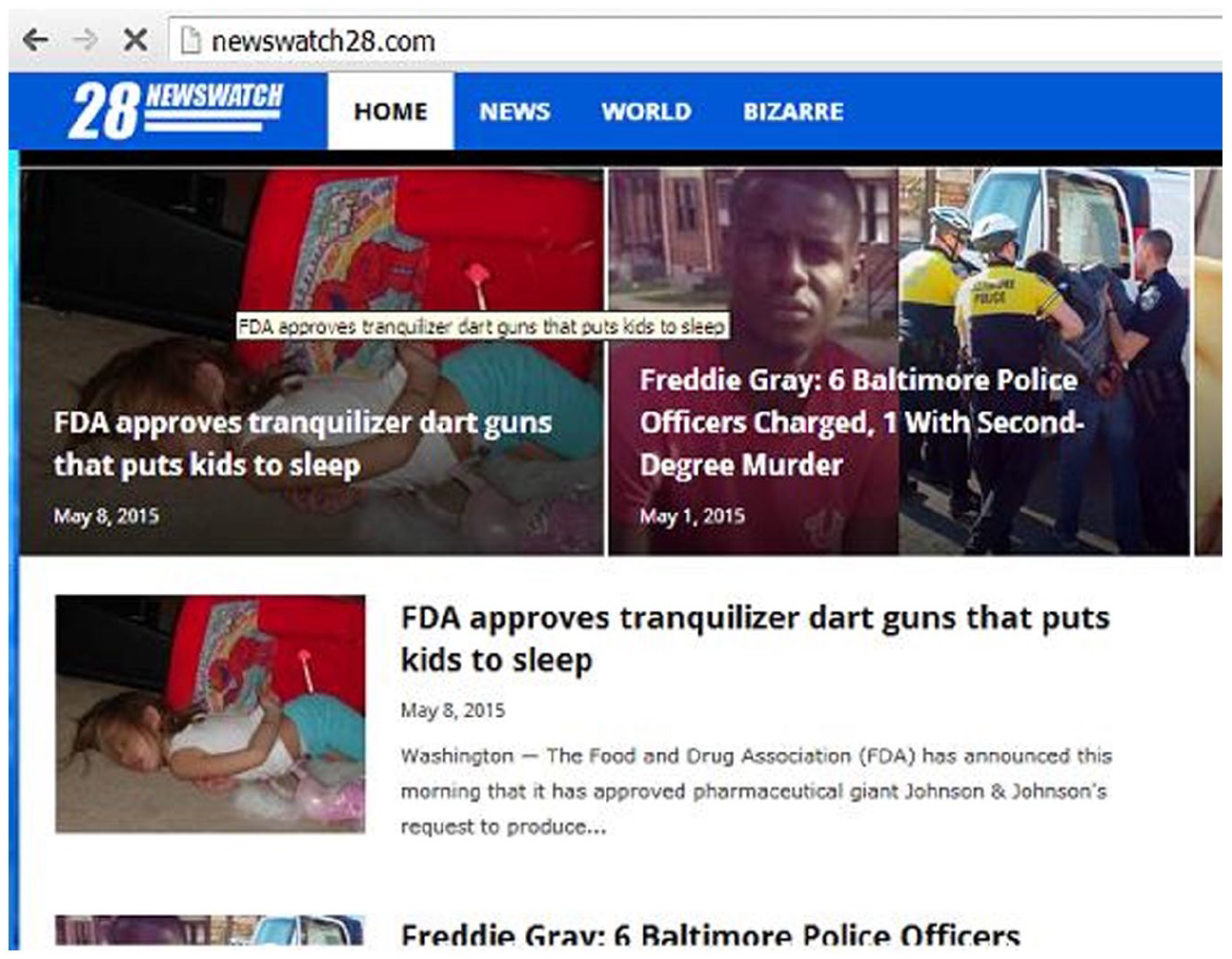
Fake news site NewsWatch28.

Fake news site abcnews.com.co.
Moreover, designing a logo to look like a familiar one and choosing a name that sounds or looks like a known news organization do not simply misrepresent a site as some other. News organizations invest significant resources in brand development, such that basic graphics like the NBC peacock or the CBS eye stand as a highly recognizable warrant of trustworthiness to an audience (Mirsky, 1995). While a fake news site like abcnews.com.co is a more brazen example of mimicking an existing brand, it is sometimes sufficiently effective to simply indicate that a site has a brand in the first place by, for example, choosing a slightly unorthodox typeface and a name that “sounds” like a media company, however vaguely (Figure 6). And it need not be just a news format that is mimicked. One early source of a false claim that the Chinese government manufactured COVID-19 as a bioweapon used the format of an academic journal. The site’s most prominent feature was its masthead, which included an elaborate seal and the site’s name—GreatGameIndia: Journal on Geopolitics and International Relations—all typeset in a sober font (Figure 7). That the supposed purview of the journal is discordant with its title (along with its non-standard use of “on” rather than “of”) are details that don’t really matter. So long as the site gives the minimal impression of a trustworthy source, its designed purpose to communicate bad information as plausible facts has been fulfilled.
Lightly branded fake news.

GreatGameIndia spreads COVID disinformation.
Type and Typesetting
Typography is important for newspaper branding, so much so that they often rely on custom-designed typefaces to typeset the news, like NYT Cheltenham, used by the New York Times, and Times New Roman, originally designed for the British newspaper the Times. These typefaces are not semiotically neutral but operate according to specific graphic ideologies (Spitzmüller, 2021) that link the aesthetics of letterforms to ideas about what kinds of actors use them and what kinds of discourse those typefaces are good at representing (Murphy, 2017).
Many fake news sites set their names, logos, and text in common and recognizable typefaces; the same kinds of typefaces found on legitimate news sites. In the 2010s, a popular trend developed in news-oriented web design that emphasized simple sans-serif type for headlines and text—following a graphic ideology emphasizing simplicity and unobtrusiveness—which was very easy for fake news sites to copy. If a site attempted to look more “local,” it would probably use simple typography (this is still somewhat true in the 2020s, even after advances in webfont technology make using many typefaces in web design much easier). Thus, a site like Newswatch28 (Figure 4), set entirely in a generic sans-serif font, is so boring a graphic object, and yet one that still feels so familiar, that it neatly fits into a basic sense of the overall news landscape.
News Style
Studies of other epistemic genres have found that enhancing or increasing the presence of certain features typically associated with the genre will seem more convincing to readers, but only if they are non-experts in the field. For example, science texts containing more “neuroscience” language (Weisberg et al., 2008) than texts with less—even if the neuroscience language is gibberish—have been shown to be significantly more convincing to lay audiences. This suggests that genre features impact how a range of readers interprets a text, but only those specifically trained to critically evaluate those features are well-equipped to spot the fakes.
In addition to exploiting common news style forms like the inverted pyramid, fake news copies several other subtle news style features, like datelines and bylines, phrases like “according to reports” and “sources confirm,” and tags like “BREAKING” or “JUST IN.” These do not just appear in static forms. For example, a second promoter of the “COVID-19 as bioweapon” idea came from a video posted to YouTube in January 2020. The video opens with a stereotyped “breaking news” graphic (Figure 8), followed by the amateur presenter dramatically looking down at his notes, as if he has just received them from his harried producer and hasn’t had time to review them (Figure 9). While the video is of mostly poor quality, there are enough basic details imitating news frame features to lend the format and its message at least surface plausibility.

Breaking news graphic on YouTube.
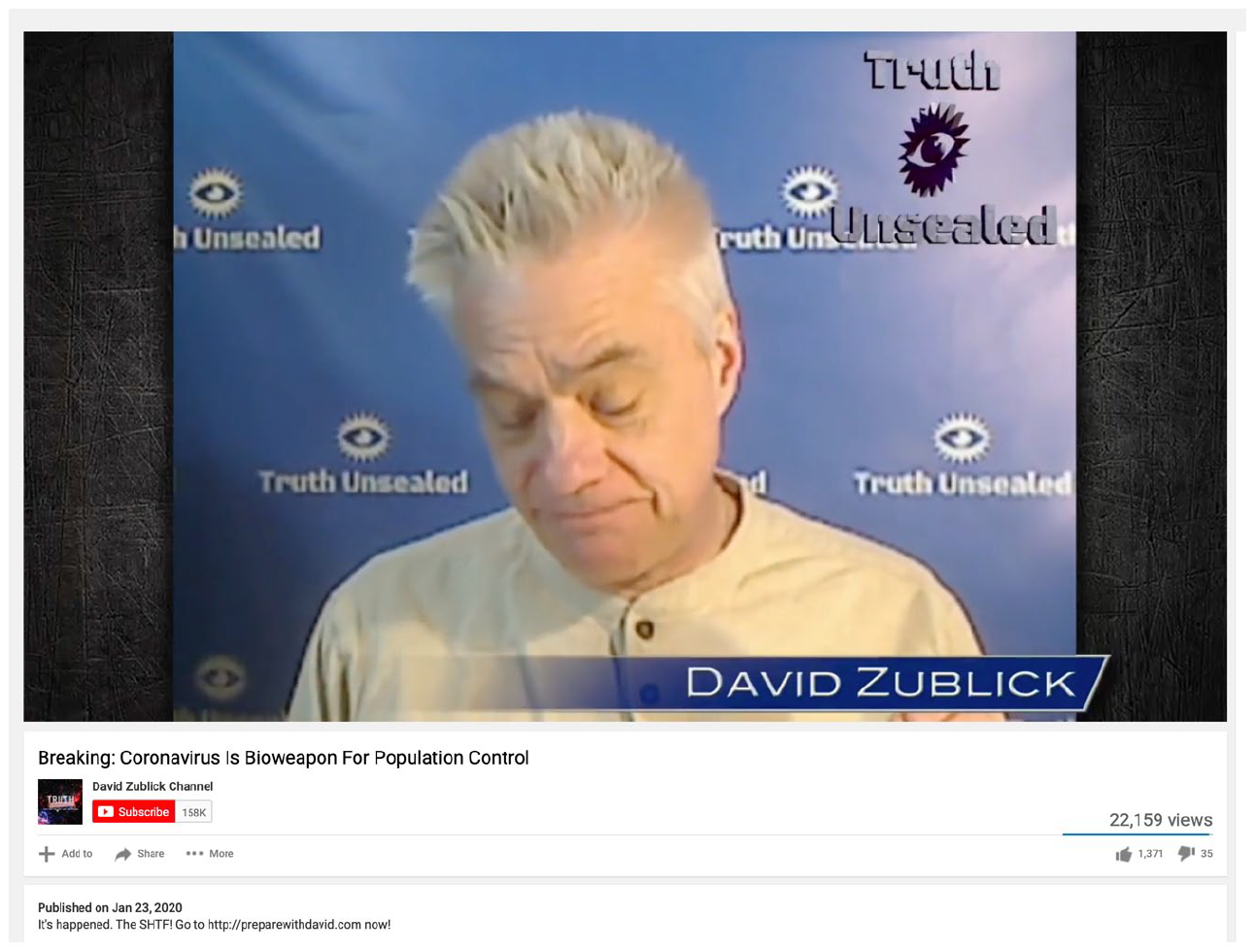
YouTube host mimicking anchor body language.
Headlines work in similar ways. Traditional news headlines take very recognizable syntactic forms. In some of the most common, adverbs, articles, and auxiliary verbs are usually left out in favor of pithy statements (or sometimes questions) composed of nouns, verbs, and adjectives (e.g., MEN WALK ON MOON). It is very common to see a noun or noun phrase at the start (e.g., DEWEY), followed by predicate (e.g., DEFEATS TRUMAN) without much variation in that syntactic arrangement. Moreover, headlines are intended to distill the “facts” of a situation, so they tend to avoid any overt editorial spin.
Fake news headlines tend to follow these patterns. In effect, this works to enhance the site’s appearance as a legitimate news site and to obscure the partisan or misleading character of its information. For example, the site presented in Figure 2 lays out individual headlines on a grid that could, in theory, describe newsworthy stories: an executive order by then-president Obama, the arrest of a mass murderer, a shootout with many casualties, and a law restricting ammunition sales. In aggregate, however, this collection of stories (none of which happened) presents a very specific right-wing worldview centered on grievance, violence, gun rights, sex trafficking, censorship by the left, and so on. By combining these headlines while also excluding headlines that do not support this worldview, the fake news site hints at, without directly describing, a version of the social world distorted to match a very narrow political agenda.
Layout
Following a long-standing modernist trend in news design that prioritizes clarity (Barnhurst & Nerone, 2001), and in more recent years, scannability (Cooke, 2005), legitimate news sites have increasingly adopted several design choices to minimize visual clutter. These include the use of grids, prominent images and headlines, and large amounts of white space, especially on the site’s main page. To mirror the look and feel of these sites, fake news sites have begun using the same design choices, though often with shoddier results. They present various topics in legible grids of images and headlines, just like legitimate news sites, but those images are often low-quality stock photos, and the headlines are often poorly constructed.
Fake news sites also tend to use the legitimate news convention of news sections (see Barnhurst & Nerone, 2001 for some history on this) to help with website navigation. Most of the high-level sections are, at first glance, generic and non-partisan, like “Politics,” “Crime,” “Religion,” and “Health,” or “Commentary,” “Entertainment,” “Sports,” and “Life.” These categories work to create a fleeting sense of a legitimate news venue but may not stand up to deeper scrutiny. They are meant to leave a plausible impression of a real news site, rather than stand as an instance of one itself (see Figures 2, 5, and 6).
Infographics
Beyond exploiting news text genres, many fake news sites also mimic legitimate news organizations that are developing innovative ways to display information. This is most obvious in the case of “data journalism,” which blends the use of statistics and other quantitative methods with traditional reportage and data visualizations. While powerhouse institutions like the New York Times have invested heavily in this genre of journalism, the site FiveThirtyEight and the work of its founder, Nate Silver, have been very influential for establishing a standard for presenting well-articulated interpretations of complex data through clear and compelling visualizations (Figure 10). The site is very interactive, with maps that users can play with, buttons to push and sliders to drag, all of which transform how data is presented and experienced.

fivethirtyeight.com.
During the 2020 election in the USA, fake news sites mimicking the style of FiveThirtyEight, but with some additional questionable details, began to emerge. One of the most popular was a site called EveryLegalVote, which used a very similar design style to FiveThirtyEight. This included prominent, colorful, interactive maps, with sliders and buttons for users to interact with. The big difference, though, was that alongside the expected maps, scales, and tables that data journalism sites tend to feature, there was a repeated insistence of election “fraud,” usually color-coded as orange in text, maps, and icons. In Figure 11, for example, the electoral map marks with orange states in which fraud was supposedly detected. This has a double effect: because all of the orange states should have been marked blue—they were all states that went to the Democratic candidate, Joe Biden—it reduced the number of blue states on the map, giving the impression of a far smaller presence of Democratic states; simultaneously, the unexpected use of orange—a marked color in the familiar red/blue election maps—focused attention on those states while linking them to “fraud” through the site’s repeated association of the color with that word. Thus, what looks, at first glance, to be a specimen of a typical data journalism site is actually a highly partisan and misleading fake news source, though one designed with some sophistication.

everylegalvote.com.
Not-News as News
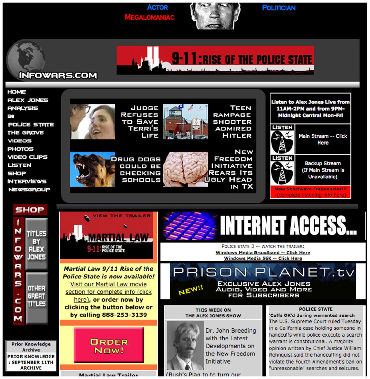
While many websites have been designed specifically to imitate the “look and feel” of a legitimate news site, other sites that previously functioned more like personal websites or blogs have increasingly taken on design forms associated with news sites. One of the best examples of this is InfoWars, the website of noted conspiracy theorist Alex Jones. 4 For much of its existence InfoWars served as a publicity vehicle for its proprietor. As such, Jones’s name has typically appeared multiple times on the site’s front page—four times in 2001 (Figure 12), twice in 2005 (Figure 13), and seven times, along with three different pictures of Jones, in 2011 (Figure 14)—which reduces the sense that the site operates with objectivity. By 2020 (Figure 15), however, the InfoWars front page contained no mention of Jones or images of his face. The site is designed with a mainstream graphic architecture: significant white space replaces the older black background; a well-designed and clear logo (including the use of a highly regarded typeface, Avant Garde Gothic) replaces the older generic logos and anonymous logotype; and a bold typographic headline and a colorful (though uncredited) photo replace the older amalgam of boxes, colors, and text. There is also a shift in terms of the use of news sections. Early versions of the site used tabs for basic site navigation, but in 2020 the tabs for classic conspiracy theories that once peppered the site (e.g., “Bohemian Grove” and the U.S. “Police State”) are gone, replaced by more expected sections, like “Economy,” “World News,” and “Health” (Figures 12–15).

InfoWars in 2001.
InfoWars in 2005.

InfoWars in 2011.

InfoWars in 2020.
A Pathway Forward
From one perspective it’s striking how easy it is to design fake news to look and feel plausible. As with carefully chosen set pieces for a play, the sense of reality invoked by fake news is constructed with only the most minimal of building blocks that, when viewed as such, are obviously not “the real thing.” But from another perspective, the magic behind the design of fake news makes some sense. All sorts of fraud rely on barebones presentations to work, from phishing emails designed to look like they were sent by a bank, to the miniLab machines built by the now-defunct blood-testing company, Theranos. The goal in such cases is not to design a perfectly convincing product that anyone would assume is real. Instead, the point is to convince enough people, or the right people, to maintain the fraud’s forward momentum. Erving Goffman’s (1959) metaphor of the dramaturgical “performance” is sometimes invoked to explain how different social formations, including fake news (Robertson & Mourão, 2020), give and give off different meanings and impressions. Often left under-appreciated, though, is that Goffman’s framework originated in his analysis of the “plays” that con men make on their marks (Goffman, 1952; see Pettit, 2011). Indeed, one important aspect of Goffman’s dramaturgical metaphor is that performance need not be sincerely felt by the performer, as with a con game; what matters is simply putting in sufficient effort to ensure that the performance is plausible enough to continue.
The fraud designed into fake news sites and stories does not rely on the web of facticity of legitimate news, but a web of plausibility constructed through the cynical copying of surface visual forms. These features not only create the impression that a fake news item, as an aesthetic composition, is itself an instance of “real news,” but they also piggyback on the cultural trust and authority that legitimate news engenders by hijacking the small, little-noticed metacommunicative design features of the web of facticity, which helps keep the disinformation fraud moving forward.
This leads to a question: now what? If disinformation in general, and fake news in particular, functions as a widespread act of fraud perpetrated through graphic means, then perhaps it is appropriate to approach it from a fraud detection and prevention point of view. The surface visual forms that disinformation objects take are very easy to manipulate, which implies that they are also easy to detect, with some preparation. It also suggests that designing legitimate information sources, especially news, in ways that make them more difficult to imitate could, at the very least, make copying less appealing to aspiring disinformation creators.
A commonly invoked solution to the disinformation problem is a push for increased media literacy, whereby news consumers are instructed on how to analyze the media they consume. While there are few strong arguments against this approach, many have pointed out that, given the enormity and complexity of the problem, media literacy alone is certainly insufficient (Mourão & Robertson, 2019; Steensen, 2019). It is also somewhat unjust. Most readers are generally not dupes, nor should they be responsible for rebuffing a massive system whose mechanics are largely engineered to deceive them. Nevertheless, some reformulations of how individuals do experience the aesthetics of information could help stem the disinformation problem, at least as it manifests “on the ground floor.”
Drawing on insights from genre, graphic design, and epistemic vigilance, an augmented approach to media literacy that emphasizes fraud detection might include basic, mundane techniques for scrutinizing the knowledge claims and graphic design of news items and other information forms. People are generally quite comfortable with assessing sources of knowledge in everyday communication. They are also generally quite good at it, even though the forms used to express knowledge sources are typically understated and implicit. While the phrases “she seems tired,” “she is tired,” and “she told me she’s tired” can all plausibly refer to the same set of circumstances, most speakers of English can detect their subtle formal distinctions, each of which orients differently to the knowledge behind the claim. Fake news also relies on subtle formal features to signal different orientations to knowledge. A fraud detection approach to media literacy would build from people’s capacity to detect formal distinctions in natural language to help them attend to the subtle formal details of the graphic information they consume to ascertain its possible provenance.
One avenue for achieving this would be linking media literacy to a more fundamental “visual literacy” approach. In her influential book on the topic, Donis Dondis (1973) argued that decoding complex visual communication requires a kind of literacy that is somewhat akin to verbal literacy but also distinct in its own ways. Visual literacy involves understanding what sorts of elements are used to create graphic objects, the rules and patterns for how they are arranged compositionally, and the cultural and historical context that contributes to how all of this is made to be meaningful. Given that most disinformation objects are quite badly designed, and that higher quality information tends to be better designed, an increased base level of visual literacy could provide people the tools for detecting how the visual objects they consume are composed, which in turn could be used to judge their reliability.
In terms of fake news in particular, legitimate news organizations should design new ways to convey the web of facticity to readers, rather than continue to rely on worn and outdated tactics. As has been described, many of those that Tuchman (1978) identified as contributing to the web of facticity are tacit, lean, and certainly undiscussed among most news consumers. Rather than relying on subtle stylistic choices to package information—like specific syntax, paragraph structure, and placement on a page—journalists and editors should be more explicit and transparent about reporting, writing, and publishing, and, crucially, they should design these factors into how news is conventionally communicated. News is no longer limited by the printing press or the size of a broadsheet, and no longer shows up to our televisions for brief, scheduled visits, which means there is no need to stick with standards developed to fit those technologies. And yet most of the information objects we confront—legitimate or otherwise—are still composed as a square or rectangle, with all the inherent restrictions those shapes confer. In contrast, it is now possible, for example, to include links with an article to some other location, or left-right scrolling away from the main text, where it is explained how information was obtained, why certain sources are anonymous and others are not, what information was left out of a narrative and why, and so on, effectively rendering the basic format of a news story “multi-dimensional.” Redesigning news items to prioritize robustness instead of leanness as a standard, to include more information instead of less, in new forms and formats instead of those inherited from the past, would make creating fake news that looks like legitimate news more difficult. This would not eliminate it, of course, and it is impossible to stop people from lying, but it is nonetheless possible to develop new ways to intervene in how news representations relate to the everyday world.
It might also be instructive to take lessons from the field of counterfeit deterrence. Certain kinds of extremely valuable objects—most obviously banknotes—are prime targets for copying and forgery. In addition to establishing procedures for detecting possible fakes, counterfeit deterrence focuses on the design of the valuable object itself, which is optimized to reduce, if not eliminate, its easy reproducibility. Banknote design is particularly relevant, because currency shares some features with news: both perform critical social functions, and both must communicate trust and reliability in their formal features to be accepted as “real.” A report issued by the US National Research Council (NRC, 1993) in the early 1990s detailed many of the features of banknote design pertinent at that time to counterfeit deterrence. Many of them are physical features, like single-source proprietary paper, security threads embedded in the notes, and holograms. But many others are graphic features, ranging from the simple—in the USA, banknote serial numbers correspond with the specific Federal Reserve bank listed on the note—to the more complex, like line moiré elements and dot patterns that vary by dot size and color. When the NRC (2007) compiled a new report 14 years later, technology had dramatically shifted. New physical anti-counterfeiting features included “thermoresponsive” notes that change color when touched, or that feel different in different areas of the note. New graphic features involved printing notes with variable color saturation, or “high-complexity spatial patterns”—basically moiré patterns on steroids—and imagery that shifts depending on the viewing angle.
The point here is not that these specific features should be used to design real news items in the fight against fake news. Rather, the same counterfeit deterrence logic that informs banknote design could be imported into the design and presentation of legitimate news and other communication systems to slow, if not fully stem, the ability of disinformation objects to hijack their graphic forms. It is, of course, extremely difficult to make news and other information forms “uncopyable.” But the same is true of currency. The difference is that banknotes (and other highly counterfeited things) have teams of people working to solve the problem despite its near impossibility. If the disinformation problem truly is a threat to democracy (McKay & Tenove, 2021), and democracy is something that societies value, then attempting to tackle it even through means that seem both trivial and quixotic might in fact be worth it.
Footnotes
Acknowledgements
I would like to thank the following people for reading and commenting on various drafts of this article: Emily Baum, Terra Edwards, Sue Gal, Jonas Hassemer, Graham Jones, Taylor Lowe, Carina Lozo, Costas Nakassis, Kamala Russell, Danilyn Rutherford, Jürgen Spitzmüller, Anna Weichselbraun, Eitan Wilf, and two anonymous reviewers.
Declaration of Conflicting Interests
The author(s) declared no potential conflicts of interest with respect to the research, authorship, and/or publication of this article.
Funding
The author(s) disclosed receipt of the following financial support for the research, authorship, and/or publication of this article: This research was supported from the National Science Foundation (Award 1851282).